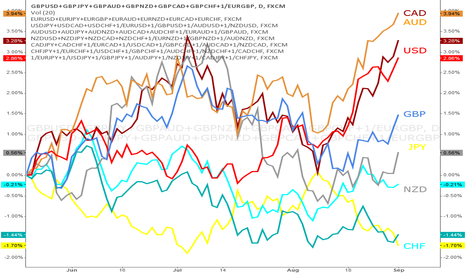
Overall Strength of the Pound Versus the Yen

I'm sure a lot of us have seen this chart 
I'm just applying his idea as I think it is a great way to view the strength of currencies relative to one another. Especially for a trader like me who is a trend trader. Here we can see the Pound (red line) in an overall strong bear trend, while the Yen (blue line) has been in a bull trend for sometime.
I have been short GBP/JPY since February 4th, with multiple positions running.
Hope this helps someone see the power and profitability of trading trends.
(Side note, I have been working with the calculations of the values, but even if it currently may not be perfect it still gives a good picture of the strength of a currency)
إخلاء المسؤولية
لا يُقصد بالمعلومات والمنشورات أن تكون، أو تشكل، أي نصيحة مالية أو استثمارية أو تجارية أو أنواع أخرى من النصائح أو التوصيات المقدمة أو المعتمدة من TradingView. اقرأ المزيد في شروط الاستخدام.