Support & Resistance AnalyzerThis script analyzes the effectiveness of support and resistance (S&R) levels by examining their impact on price action. It measures the compression or reversion of price action around these levels to determine their overall performance.
To use the script, simply copy and paste the Moving Average (MA) or desired level script that you want to test. The results will be displayed in the data window for easy reference.
The script provides a metric called S&R overperformance or underperformance, which offers a concise summary of the S&R level's effectiveness. This metric is determined by comparing the price action near the S&R level to the overall price action throughout the dataset.
Additionally, the script includes specific metrics to further illustrate how the S&R level affects the price. These metrics provide more detailed insights into the S&R's influence on price action, enabling users to make better-informed decisions when applying S&R levels to their trading strategies.
Analyzer

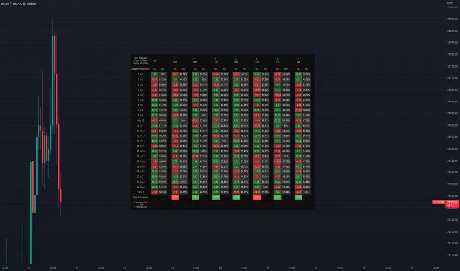
Bias AnalyzerName: Bias Analyzer
Category: Market Analyzer
Timeframe: 1H and 1D, depending on the Analysis type.
Technical Analysis: Usually when we think about a Trading System we start from an idea. This idea comes normally from observation and the study of the market.
Have we ever observed a market - for example Bitcoin - and thought that it increases at the start of a USA session? Great, this is a well-known category of Trading System and the purpose of the Bias Analyzer is to study these phenomena.
There are different types of Trading System that we can classify considering the market in-efficiency that we use to our advantage. In this case we make the Bias. Literally "inclination" or "presupposition" or precisely "tendency" of the price to go up or down in a temporal way.
The characteristics of the Bias depend on how much the Bias is persistent on the market since the analysed period. therefore we can consider:
Hourly Bias : analysing the hourly behaviours during the week. Trades normally last from a few hours to a few days.
Seasonal Bias : analysing the behaviour of the weeks in the monthly or annual context, evaluating the seasons.
Suggested usage: The possibilities of the tool are infinite, these are some scenarios of use:
Development of Intraday Trading Systems based on Hourly Bias with possible filters for specific days of the week.
Development of a Multi-day Trading System based on daily Bias with monthly analysis.
To identify the best day to execute our investment through Dollar Cost Average with a bit of healthy buy the dip
Main features:
Hourly Summary organized in Week
The cells contain the sum of the various price deltas for the single hour. The transparency indicates the frequency in which the candles close positive or negative. This information is available both in a synthetic way, as in the first column "Sum", and for each day of the week.
Hourly Details organized in different entry/exit
Shows the cumulative data of the various deltas, considering the purchase and the sale at certain times. In the rows are represented the buying hours and in the columns the selling hours.
Daily Summary organized in Months
The cells contain the summation of the various price deltas for the single day.
Hourly Details organized in different entry/exit
Allows to visualise the detailed analysis table, choosing to do it for all the months or for a specific month and shows the cumulative data of the various deltas, considering the purchase and the sale in certain days.
Configuration: You can configure the tool easily and completely.
Analysis
Calculate from Close to Open : this is the core of the whole analysis where the "Price Delta" to be calculated is defined. At this moment there is the possibility to calculate the distance between opening and closing.
Calculate in Percent or Cash : this allows to calculate the Price Delta in Percent or in Cash.
Analysis on 1H Timeframe
Show Hourly Summary on : allows to visualise the summary analysis table of the week. The cells contain the sum of the various price deltas for the single hour. The transparency indicates the frequency in which the candles close positive or negative. This information is available both in a synthetic way, as in the first column "Sum", and for each day of the week. At the bottom left there is also data which allows us to understand how many candles are being analysed. At the bottom of each day it is possible to visualise the cumulative data of the day. The position of the table is customizable.
Show Hourly Details of on : allows to visualise the detailed analysis table, choosing to do it for all days or for a specific day, and shows the cumulative data of the various deltas, considering the purchase and the sale at certain times. In the rows are represented the buying hours and in the columns the selling hours. For example, going to the table "All Days" we can see in the cell of row 13 and in column 22 the cumulative data of a possible buy on 13 and a sell at the end of 22. To facilitate the research of the values there is a configurable transparency system.
Analysis on 1D Timeframe
Show Daily Summary on : allows to visualise the summary analysis table of the month. The cells contain the summation of the various price deltas for the single day: The first row is the summation of all days of the month for all months in the analysis period, while the other rows represent the analysis for the various days of the individual months.
Show Daily Details of on : allows to visualise the detailed analysis table, choosing to do it for all the months or for a specific month and shows the cumulative data of the various deltas, considering the purchase and the sale in certain days. In the rows are represented the buying days and in the columns the selling days. For example, going to the table "All Months" we can see in the cell at row 1 and at column 3 the cumulative of a possible purchase on the 1st and the sale on the 3rd. To facilitate the research of the values, there is a configurable transparency system.
Table Layout
Size : allows to define the size of the text in the table.
Precision : it is possible to define the decimal precision of the calculations presented in the tables.
Transparency Factor : allows the application of a multiplication factor when the table calculates the transparency of detail tables.
Colours : allows to specify the colours of Profit, Loss and Neutral, besides to adapt a style coherent with the Dark Mode or Light Mode of Trading View
Volatility Filter
It is possible to directly apply a filter to the time series on which the delta is calculated. The volatility filter uses the ATR - an indicator that allows you to calculate the volatility in a given period. Briefly: the higher the ATR value, the higher the volatility. Therefore the filter works by comparing the volatility on two periods and indicates compression or expansion.
Backtest Dates
In order to facilitate the identification of in-sample and out-of-sample data, as well as the degradation of a given behaviour, it is possible to specify a period in which to do the analysis.
NEXT Strategy VisualizerAs suggestive by its name, NEXT Strategy Visualizer enables traders to discover, configure, and plot strategy signals (in the form of arrows) based on any of our NEXT TradingView indicators, as well as other TradingView indicators (built-in and 3rd party). It is intended to be a visual strategy builder, primarily for discretionary trading. Historic and real-time signals are plotted when strategy conditions are met. NEXT add-ons can be used standalone or as part of a broader trading system (e.g. validation or enter / exit signal only). As of this writing, NEXT Strategy Visualizer fully supports our first TradingView add-on, NEXT RSI , a volume-weighed RSI indicator. All future NEXT indicators (and we have many planned) will also be fully compatible and pluggable into Strategy Visualizer. Below is an example of a NEXT RSI (Length 9, P/V Weighing 3) overbought/oversold (contra-trend, momentum) strategy plotted on EURUSD 10-Range chart via NEXT Strategy Visualizer.
Input Parameters
Signal Source: This should be set to whichever NEXT add-on strategy you wish to visualize. In the example above, it is NEXT RSI. Signal Source will also take any other built-in or 3rd party TradingView indicator.
LE Level: When this level is crossed from below, a long entry signal is displayed on the chart. In the EURUSD example above, we used 10. Putting it together: when the NEXT RSI line (as selected in the Signal Source) crosses above 10, an up arrow, representing a long signal, is drawn.
SE Level: when this level is crossed from above, a short entry signal is displayed on the chart. In the EURUSD example above, we used 90. Putting it together: when the NEXT RSI line (as selected in the Signal Source) crosses below 90, a down arrow, representing a short signal, is drawn.
Use LX/SX: Checking this box will enable the next 2 parameters, LX Level and SX Level, intended for long exit and short exit signals.
LX Level: When this level is crossed from above, a long exit signal, in the form of a green "X", is displayed on the chart. For example, if we wanted to exit a long signal when RSI reaches and retraces under 75, we would set this value to 75. This way, an up arrow would be drawn at 10 and an "X" at 75.
SX Level: When this level is crossed from below, a short exit signal, in the form of a red "X", is displayed on the chart. For example, if we wanted to exit a short signal when RSI reaches and retraces over 25, we would set this value to 25. This way, a down arrow would be drawn at 90 and an "X" at 25.
Remember, all Level values are relative to the Signal Source . For example, the NEXT RSI scale runs 0 to 100 so numbers in that range make sense. Setting levels to any other number would cause the Strategy Visualizer to never draw a signal.
Important: In order to effectively use the NEXT Strategy Visualizer you must attach both the indicator you wish to visualize (NEXT RSI in our example) and the NEXT Strategy Visualizer indicator itself.
All strategy ideas and tutorials for individual NEXT indicators will be powered by NEXT Strategy Visualizer and published on our TradingView page under Ideas .

Original Wave AnalyzerThis can be applied to Forex, Stocks, and Crypto.
Understanding it
When the buy or sell signal align with the wave, it means the price is heading in the direction of alignment.
This indicator is intended to be used as a confirmation indicator for other algorithms for the best result.
Indicators with specifically tested and chosen settings have been shown to work on a number of timeframes.
How to use on a buy
When you receive a buy signal if it's within the wave or above the wave, it's an indication the market is about to continue that direction. You could aim for 20-50 pips depending on the pair.
When to sell
When you receive a sell signal if it's within the wave or below the wave, it's an indication the market is about to continue that direction. You could aim for 20-50 pips depending on the pair.
When to exit
You can set our indicator to alert you when it's a good time to exit the trade.
How to Access
Gain access to FX Social Entry Finder for your TradingView account by being a active member of FX Social.

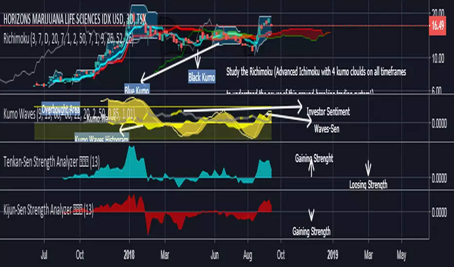
Kijun-Sen Strength Analyzer 基準線The Kijun-Sen Strength Analyzer 基準線 is included in the Richimoku Traiding System.
The Kijun-Sen Strength Analyzer (Indentify divergences. Know First. Act Faster. A must-have for every Ichimoku trader)
*As some indicators you may come across are using the repainting mode (which consists in correcting the false signal back in time).
You'll never see such thing in the Richimoku Trading System. What's on the charts is displayed in real time, no cheating...
Feel free to test the Kijun-Sen Strength Analyzer 基準線 or the Richimoku Trading System For 12 hours! Study the chart history on all timeframes. Study all details incl. divergences etc.
FAQ.
How to access the Kijun-Sen Strength Analyzer 基準線 in tradingview?
To access your indicator simply click on “Indicators” at the top of your Chart, and click on “Invite-Only Scripts”. Click on the indicator to activate it. That’s it!
Will the the Kijun-Sen Strength Analyzer 基準線 work for Stock and Index trading?
Sure! It works on all Forex, Stocks, Indexes, Metals and Crypto's!
Does this indicator work with a free TradingView Account?
Yes you can use the Kijun-Sen Strength Analyzer 基準線 or the Richimoku Indicator Trading System with a free TradingView account.
Does the indiators work on all timeframes?
Yes, the indicators can be used on all time frames!