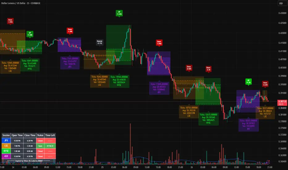
Bills Advanced Market Sessions V5Bill007 Advanced Enhanced Market Sessions & Table V5 is a TradingView Pine Script indicator that
visualizes major stock market sessions and data for (Tokyo, London, New York, Sydney, Frankfurt) on charts.
**Purpose and Logic:**
- Visual Displays include session boxes, open/close/average lines, labels for session
names/metrics (ticks, avg price, volume), and trend labels (UP/Down/Neutral with % change)
and a Debug table.
- Uses custom types (SessionDisplay, SessionInfo) and methods to create/update sessions
dynamically, handling multi-part sessions (e.g., Tokyo breaks).
- Batch updates sessions for efficiency, checks timezones, weekdays, and daily changes to avoid
duplicates.
- Includes tables for session times/status/countdowns and debug metrics (tick range, average
price, volume, trend %, open, close).
- Supports 25 timezones for accurate global session timing.
- All labels have dynamaic tooltips that provide extra outputs which saves chart clutter
- Realtime lastbar session updates for current session
**Settings:**
- Select Market Sessions to suit
- Toggles for lines, ranges, averages, volumes, labels, boxes, weekends.
- Customizable colors, timezones, session times, thresholds for neutral trends, label offsets to
move labels around for clearer visuals.
- Table position/timezone, debug options.
- Timezone select to update Session times open close according to what time zone you're in
**Benefits:**
- Enhanced session data at a glance
- Enhances multi-market awareness, highlights session overlaps, trends, and key metrics.
- Aids timing entries/exits, volume analysis, reduces clutter with toggles.
- Supports global trading strategies with accurate timezone handling and visuals.
Stats
Backtesting Stats (Altrady)Track and analyze your backtesting results directly on your chart.
This indicator simplifies manual backtesting by summarizing your trades in a clear, structured table. Enter your R-values (one per line) in the text area, and instantly see:
✅ Trade list – All entries displayed with color-coded wins/losses.
✅ Key stats – Total trades, win rate, and RR sum in the top row.
✅ Quick insights – Spot trends, refine your strategy, and track performance without spreadsheets.
How to Use
1️⃣ Open settings and enter R-values, one per line (e.g., 2.5, -1, 3.2) along with short comments (bad entry, counter trend, etc)
2️⃣ View the table in the top-right corner of your chart.
3️⃣ Analyze your results, adjust your strategy, and improve consistency.
Perfect for manual backtesters who want a fast, no-spreadsheet solution. 🚀

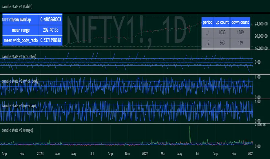
candle stats v1Objective:
Capture sequential/subsequent candle's relative properties
Average observations to represent the landscape of the marketplace
Parameters:
"range" : high-low
"overlap" : range - range
"wick_body_ratio" : (range - abs(open-close))/range
"up_count" for "period" : number of occurrences where consecutive candles have low>low . (note: the values are not cumulative over period)
*"down_count" for "period" : number of occurrences where consecutive candles have high
Correlation Confluence Trend IndicatorCorrelation Confluence Trend Indicator
Overview
The Correlation Confluence Trend Indicator combines exponential moving averages (EMAs) and statistical correlation measures to identify high-confidence trend alignments between an asset and a benchmark. By filtering signals through correlation strength, this indicator highlights opportunities when the asset and benchmark move together. In other words, it defines a trend and then uses correlation strength and the trend of a second asset to identify high-confidence trends.
Key Features
Dual EMA Trend Analysis :
Calculates fast and slow EMAs for both the asset and the selected benchmark (e.g., SPY) to identify bullish and bearish trends.
Correlation Strength Filtering :
Evaluates correlation between the asset and benchmark, identifying stronger-than-average relationships based on the mean and standard deviation.
Background Color Coding :
- Green : Strong correlation, both asset and benchmark bullish.
- Aqua : Weak correlation, both asset and benchmark bullish.
- Red : Strong correlation, both asset and benchmark bearish.
- Fuchsia : Weak correlation, both asset and benchmark bearish.
- Orange : Strong correlation, benchmark bullish, asset bearish.
- Yellow : Weak correlation, benchmark bullish, asset bearish.
- Purple : Strong correlation, benchmark bearish, asset bullish.
- Lime : Weak correlation, benchmark bearish, asset bullish.
Visual Trend Indicators :
Plots fast and slow EMAs for the asset, dynamically colored based on aggregate trend signals. The color of this corresponds to the main trend signal.
Inputs
Benchmark Symbol : Symbol of the benchmark asset to compare against.
Fast EMA Length : Period for the fast EMA calculation.
Slow EMA Length : Period for the slow EMA calculation.
Correlation Length : Number of bars for correlation calculation.
Correlation Mean Length : Number of bars for mean and standard deviation calculation.
Std Dev Multiplier : Multiplier for standard deviation to define correlation strength. When the correlation is Std Dev Multiplier standard deviations above the mean, it counts as a strong correlation.
Set Background Color : Toggle background coloring on or off.
Notes
This indicator is primarily designed for trend-following strategies. By combining trend analysis and correlation filtering, it ensures that signals occur during aligned market conditions, reducing false signals.
Before incorporating this indicator into your trading strategy:
Always backtest on historical data to evaluate its performance before committing capital.
Use proper risk management to control position sizes and mitigate potential losses.
Remember that no indicator guarantees success. I'm quite proud of this one, but it's not the holy grail.

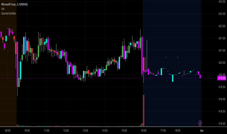
QuarterCandlesChanges candle color when close is within the top 25% or bottom 25% of candle range (High - Low) on the last candle update.
Due to limitations of barcolor command, I'd suggest that you turn OFF the candle borders (chart settings--> right click on chart --> settings -->symbol and uncheck the border option) to ensure that the bar color is easily identifiable.
Blockunity Performance Oscillator (BPO)The Performance Oscillator (BPO) is an intuitive indicator that makes it easy to analyze the performance of any asset. It operates over 5 simultaneously configurable periods. All design elements are also customizable. The integrated table summarizes the information in color, so you can quickly assess the different variations.
How it works
The operation of this script is quite simple. It calculates the performance of the selected asset over the different lookback periods indicated in the parameters (default: 1, 7, 30, 120 and 365). It then plots the lines in an independent panel (it is possible to hide lines by unchecking them in the parameters). Finally, performance information is displayed in a table for enhanced clarity.
The Idea
The idea is to bring information about the performance of any asset into your TradingView chart, and to make it visual. What's more, it can give an idea of the asset's trend, as, for example, if all periods are green (positive) in the table, then we can deduce that the selected asset is in a clear uptrend.
Being able to visually analyze several variations over different periods at the same time, while adding this information to a colorful table, makes it unique.
Usage Advice
You can use this indicator on any asset or index.
For example, if you use the indicator in a daily timeframe, the default periods will be 1 day, 7 days, 30 days, etc. If you use the indicator in a horary timeframe, the default periods will be 1 hour, 7 hours, 30 hours, etc.
Parameters
Display of different periods.
Periods according to the timeframe selected on the graph.
Line widths.
Line colors.
Table parameters.

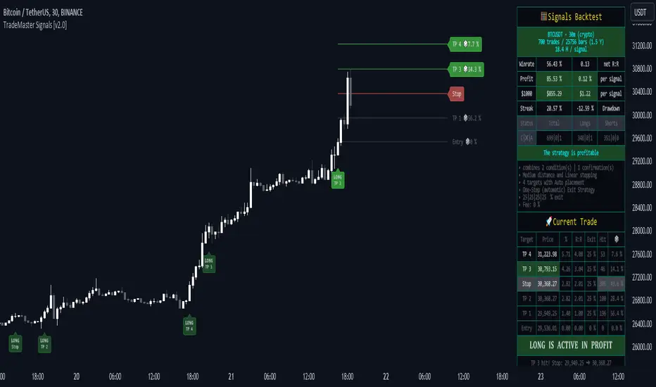
TradeMaster SignalsTrading effectively requires a range of techniques, experience, and expertise. From technical analysis to market fundamentals, traders must navigate multiple factors, including market sentiment and economic conditions. However, traders often find themselves overwhelmed by market noise, making it challenging to filter out distractions and make informed decisions. To address this, we present a powerful indicator package designed to assist traders on their journey to success.
The TradeMaster indicator package encompasses a variety of trading strategies, including the SMC (Supply, Demand, and Price Action) approach, along with many other techniques. By leveraging concepts such as price action trading, support and resistance analysis, supply and demand dynamics, these indicators can empower traders to analyze entry and exit positions with precision. Unlike other forms of technical analysis that produce values or plots based on historical price data, Price Action brings you the facts straight from the source - the current price movements.
The indicator package consists of three powerful indicators that can be used individually or together to maximize trading effectiveness.
⭐ About the Signals Indicator
This indicator offers a unique opportunity for traders to design their own personalized trading strategy. It has a built-in backtesting system, which allows you to thoroughly analyze the performance of your strategy before implementing it in live trading. With the ability to customize and test your strategy using historical data, the Signals indicator empowers you to make data-driven decisions and refine your trading approach.
👉 How does it work?
The Signals indicator provides users with the ability to select trigger conditions and further narrow them down using confirmations.
Conditions are quantitative factors that influence the generation of signals on the chart and in the backtest table. You can enable multiple conditions to create a comprehensive set of criteria for signal generation.
Confirmations, on the other hand, are qualitative factors that selectively filter out conditions based on their alignment with the chosen confirmations. This helps refine the signals and provide more targeted trading opportunities. Multiple confirmations can be enabled to further enhance the precision of the signals.
A well-balanced strategy in the Signals indicator involves carefully selecting a combination of conditions and confirmations to generate accurate trading signals. Finding the right balance between them is crucial for consistent and profitable trading.
To offer even more flexibility, the Signals indicator includes two powerful main functions:
Target Placement System: This feature allows you to set up to 6 targets with a stop loss level and partial exit percentages. You can choose between automatic target creation or manual customization, giving you control over your profit targets.
Exit Strategy: With this feature, you can define your preferred trailing stop strategy, allowing you to implement a systematic approach to exiting trades. By setting appropriate trailing stop levels, you can limit potential losses, while the system secures profits by automatically closing positions partially when certain price targets are reached. This may help you to maintain discipline in your trading and optimize your risk-reward ratio.
With over 30 unique conditions, 10 confirmations, and the deep Target Placement and Exit Strategy systems, the Signals indicator offers a vast array of possibilities. In fact, there are potentially millions of different strategy outputs available for each ticker. Despite its complexity, the script remains lightweight and fast, ensuring smooth performance.
The Signals Backtest table provides a comprehensive overview of your strategy's performance. You can track your current position with all the necessary details, allowing you to monitor your trades effectively and make informed decisions based on the backtest results.
⚠️ WARNING!
Backtest results do not guarantee future performance. Strategies tested on synthetic data may not accurately represent real-world results. Testing should be conducted on charts that reflect actual closing prices.
The indicator displays buy/sell signals intended to support traders' analysis. There are numerous possibilities and combinations available to create your own unique strategies, whether trading with or against the trend or capturing oversold bounces. These are just a few of the many options! Our indicator can easily be tailored to fit your trading strategy.
The settings that influence the signal-generating algorithm play a crucial role in effectively utilizing the signals. We provide users with the flexibility to modify the settings to align with their trading style, while also offering simple adjustment methods using various techniques.
Each method for modifying the signal settings has been designed to meet specific user needs. It is important to understand that one method is not necessarily more accurate than another.
It is essential to understand that signal indications generally serve as trend confirmations, rather than direct entry and exit points. Focusing on the easy use of signal settings and utilizing other functionalities in our toolkit will likely be a better decision than attempting to find the "holy grail" of optimized signal settings and solely relying on following the signals.
⭐ Conclusion
We hold the view that the true path to success is the synergy between the trader and the tool, contrary to the common belief that the tool itself is the sole determinant of profitability. The actual scenario is more nuanced than such an oversimplification. Our aim is to offer useful features that meet the needs of the 21st century and that we actually use.
🛑 Risk Notice:
Everything provided by trademasterindicator – from scripts, tools, and articles to educational materials – is intended solely for educational and informational purposes. Past performance does not assure future returns.
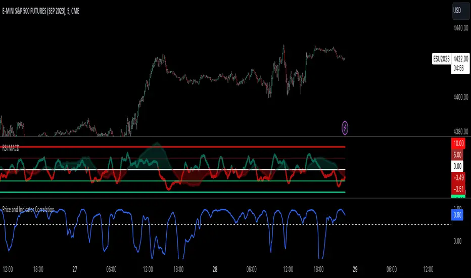
Price and Indicator CorrelationFIRST, CHANGE SOURCE OF INDICATOR FROM CLOSE TO WHATEVER INDICATOR YOU ARE COMPARING TO PRICE!!!!
Confirming Indicator Validity: By calculating the correlation coefficient between the price and a specific indicator, you can assess the degree to which the indicator and price move together. If there is a high positive correlation, it suggests that the indicator tends to move in the same direction as the price, increasing confidence in the indicator's validity. On the other hand, a low or negative correlation may indicate a weaker relationship between the indicator and price, signaling caution in relying solely on that indicator for trading decisions.
Identifying Divergence: Divergence occurs when the price and the indicator move in opposite directions. By monitoring the correlation coefficient, you can identify periods of divergence between the price and the selected indicator. Divergence may signal a potential reversal or significant price move, providing an opportunity to enter or exit trades.
Enhancing Trading Strategies: The correlation coefficient can be used to enhance trading strategies by incorporating the relationship between the price and the indicator. For example, if the correlation coefficient consistently shows a strong positive correlation, you may use the indicator as a confirmation tool for price-based trading signals. Conversely, if the correlation is consistently negative, it may indicate an inverse relationship that could be used for contrarian trading strategies.
Indicator Optimization : The correlation coefficient can help traders compare the effectiveness of different indicators. By calculating the correlation coefficient for multiple indicators against the price, you can identify which indicators have a stronger or weaker relationship with price movements. This information can guide the selection and optimization of indicators in your trading strategy.
Example:
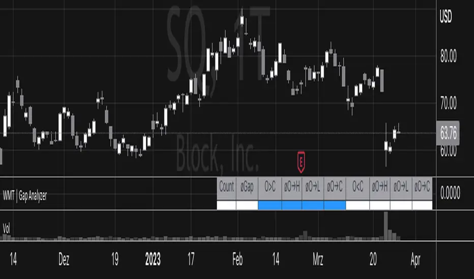
Gap Analyzer [WMT] - Data for Gap Up and Gap DownGet data for gaps with Gap Analyzer
Change the gap mode in settings to switch between a Gap Up (default) or Gap Down
Change the threshold for the minimum (Gap Up) and maximum (Gap Down) gap
Change Data Years -> Years of the look back period to calculate the stats
Retrieve valuable information for past statistics on how the instrument behaved with the given gap
Definitions for Gap Up
Price can fade lower from the open or (Gap Up Fade)
Price can continue higher from the open (Gap Up Continuation)
Definitions for Gap Down
Price can continue lower from the open or (Gap Down Continuation)
Price can bounce higher from the open (Gap Down Bounce)
For each of those, we get:
"øO→H": average percentage movement from open to high of the day
"øO→L": average percentage movement from open to low of the day
"øO→C": Average percentage movement from open to close of the day
Divergence Backtester - V2Further attempts to study divergence impact on price in shorter terms.
Previous study can be found here:
In this script, we are trying to gather the stats based on last two pivot state together. For example, Individual table of Pivot High Projection is as explained below:
But, by looking at the bigger picture, we can further estimate following things regarding the current unconfirmed pivot and the new pivot which is yet to be formed.

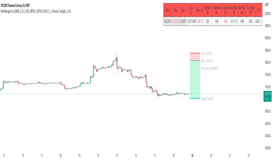
Risk Management & Position Size Dashboard ProThis version of the dashboard system factors in trading fees to your max risk to account per trade. This comes in handy when trading very low timeframes where trade risk can be tiny and leverage high where traditional position size calculations can yield huge position sizes where just the fees can far exceed your risk appetite. This system calculates your position size factoring in fees so you will never exceed your risk settings. Details below.
****
This indicator is designed to assist traders by instantly providing the necessary information to execute orders based on defined risk parameters. This is not an indicator that tells you WHEN to buy or sell, but HOW MUCH to buy or sell based on your risk appetite. The indicator is compatible with any strategy and any instrument
The indicator uses some great pinescript features, allowing you to drag and drop your levels directly on the chart for instant feedback from the risk management dashboard. Huge timesaver.
Instructions:
1. The first time you add the indicator to your chart, you will be asked to identify your Entry, Stop and Target levels by clicking on them directly on the chart. You can at any point adjust these levels directly on the chart, or you can manually enter them in settings
2. Setup your risk profile in the indicator settings:
(a) Current Capital: Enter the current value of your trading account
(b) Max Risk Per Trade: Enter the maximum % of your Capital you want to risk per trade
(c) Max Leverage: Enter the maximum leverage you want applied to your account. This comes in handy when you trade on very low timeframes where position sizes can become very large. No matter what you enter here, position size will never exceed Max Risk Per Trade
(d) Stop Ticks: Number of ticks to use above/below the identified high/low for stops
(e) % fee per trade: enter your brokers fees here to ensure the system takes this into consideration while calculating position size
(e) Use Current Price as Entry (Market Orders): By default, the system will use the entry level you have selected for limit orders. If you want to use the system to display data based on current price for market orders, select “Use Current Price as Entry (Market Orders)”
(f) number of TP levels: enter the number of TP levels you are planning to use to ensure the fees are calculated for them
3. Based on your stop and target levels, the system will automatically determine if you're looking to long or short and accordingly display all relevant data to you.
4. Display Free Trade Level: toggle this on to display the level you should exit 50% of your position to make the trade risk free
5. Dashboard / Text size / level colours and positions are customisable
The Dashboard displays the following information at all times:
1. Entry
2. Stop
3. Trade Risk (%): Percentage price difference between Entry and Stop
4. Max Risk ($): Currency value of loss if the trade is stopped out
5. Size: Position Size to execute your trade based on your risk profile/appetite
6. Size($): Position Size in currency value
7. Total Fees: Total fees for the trade based on settings above
7. P&L($): Potential profit to your Capital in currency value
8. P&L(%): Potential profit to your Capital in %
9. Risk to account: % risk to account - used as confirmation that the max risk to your account, factoring fees is circa your risk appetite
10. R:R: Risk to Reward Ratio
11. % to Target: Percent price needs to move to achieve your target
Hope this helps you with your trading. I built this as I was tired of wasting time opening up spreadsheets or calculators to execute trades - especially on lower timeframes. Making the code open source so if you do make improvements to this I'd love to hear from you. Also open to suggestions.
Happy Trading!
Market StatsThis script escapes much of the subjective technical analysis and discretionary trading in general. With this Script/Indicator, you will be able to have access to the statistics tested day by day in the markets, statistics that will be a decisive support in your trading plan. Its analysis and creation is based on the quantitative trading system, since these statistics have a testing and database behind, which makes it a potential indicator for your trading.
You can change the time of the market you want to operate, also the colors of the labels of the statistics, their distance, color of the letters, fully editable to adapt it to the type of market you operate.
Its design involves values of the previous session ( RTH ) and extension session (OVERNIGHT), so it will be complemented with markets that are assimilated to that configuration (indices, stocks, futures, CFDs, forex, commodities ) maybe you can adapt it with cryptocurrencies, but being 24/7 you would have to modify its schedule.
Important levels included:
YHOD: Yesterday High of Day
ONH: Onvernight High
ONM: Overnight Mid
YPOC: Yesterday Point of Control
HALFGAP: Close Price Mid
GAP: Yesterday Close Price
ONL: Overnight Low
YLOD: Yesterday Low of Day
IBH: Initial Balance High
IBL: Initial Balance Low
The IBH and IBL levels will appear after 60 minutes into the session, indicating our balance zone. The one that will add more statistics to our trading.
_________________________________________________________________________________________________________________________________________________________________________________________________________
Este script, escapa mucho del análisis técnico subjetivo y del trading discrecional en general. Con este Script/Indicador, podrás tener acceso a las estadísticas testeadas día a día en los mercados, estadísticas que serán un apoyo decisivo en tu plan de trading. Su análisis y creación se basa en el sistema de trading cuantitativo, ya que estas estadísticas, tienen un testeo y base de datos por detrás, lo cual lo hace un indicador potencial para tu trading.
Podrás modificar el horario del mercado que quieres operar, también los colores de las etiquetas de las estadísticas, su distancia, color de las letras, completamente editable para que lo adaptes al tipo de mercado que operas.
Su diseño implica valores de la sesión anterior ( RTH ) y sesión de extensión (OVERNIGHT), por lo que se complementará con los mercados que se asimilen a esa configuración (índices, acciones, futuros, CFDs, forex, commodities ) quizás lo puedas adaptar con criptomonedas, pero al ser 24/7 habría que modificar su programación.
Niveles importantes incluidos:
YHOD: Yesterday High of Day
ONH: Onvernight High
ONM: Overnight Mid
YPOC: Yesterday Point of Control
HALFGAP: Close Price Mid
GAP: Yesterday Close Price
ONL: Overnight Low
YLOD: yesterday Low of Day
IBH: Initial Balance High
IBL: Initial Balance Low
Los niveles de IBH y IBL, aparecerán después de 60 minutos iniciada la sesión, indicando así́, nuestra zona de balance. La que agregará más estadísticas a nuestra operativa.

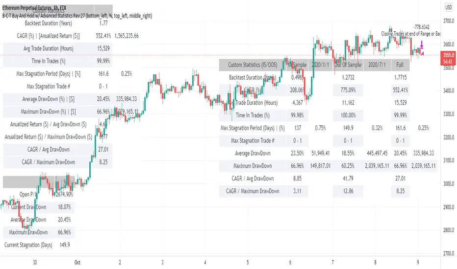
BCT Buy And Hold w/ Advanced StatisticsThis is a script designed to simulate a buy and hold strategy in the chart that its applied to.
Tradingview backtester is really limited in the statistics it gives you based on equity and information of open trades. For that reason many of the buy and hold scripts suffer from the same problem, a lack of useful statistics about your buy and hold strategy.
This script allows you to filter a specific buy and hold period (or use the whole data available in the tradingivew chart) and get useful statistics based on equity on a bar by bar basis.
Date Range Filtering
This allows you to chose a specific period to test the buy and hold strategy and to visualize the statistics.
We include 3 main tables which offer useful information so you can compare your strategy vs buy and hold strategy.
This 3 tables are:
Draw Downs Table
This table shows the Current P/L, Current Draw Down, Average and Maximum Draw Downs based on the equity of the buy and hold strategy calculated by candle. This can show you how much average and maximum loss or pain you would have to go through in order to stick to the buy and hold strategy.
Custom Statistics Table
This table shows useful advanced statistics to compare the buy and hold strategy to other strategies.
CAGR: Compounded annual growth rate is the industry standard in terms of showing annualized returns for any strategy or investment.
Annualized Return ($)
Trade Duration (Days): Self explanatory, displays how long the buy and hold trade was open or is open counted in days.
Max Stagnation Period (Days): Measures the Maximum time taken between new equity highs.
Average Draw Down : Average value of all draw downs from equity highs over the period (sampled 1 time per candle).
Maximum Draw Down : Largest draw down from equity highs in the whole period.
Return / Avg DrawDown: Advanced Proprietary statistic in which the annualized (non compounding) return is divided by the Average Draw Down (displayed in the Draw Downs Table)
Return / Maximum DrawDown: Advanced statistic in which the annualized (non compounding) return is divided by the Maximum Draw Down (displayed in the Draw Downs Table)
CAGR / Avg DrawDown: Advanced Proprietary statistic in which the CAGR (compounding) is divided by the Average Draw Down (displayed in the Draw Downs Table)
CAGR / Maximum DrawDown: Advanced Proprietary statistic in which the CAGR (compounding) is divided by the Maximum Draw Down (displayed in the Draw Downs Table)
Note: All the advanced statistics show, in slightly different ways, how much a strategy compensates you in relation to the risk taken. In other words you can see this as a way to quantify risk adjusted returns between multiple strategies. We prefer using the CAGR based advanced Statistics as they give a more universal value to compare across multiple strategies and asset classes.
In Sample / Out Of Sample Custom Stats (IS/OOS) Table
This table shows similar statistics as the Custom Statistics Table but is able to break down the backtest period into segments, this is useful when testing strategies as it can be used to test optimization quality. In this Buy and Hold strategy this can be used to visualize the stats of 2 periods at the same time and compare them without need to change settings or use another instance of the script.
All the Stats are the same as in the Custom Statistics Table with the difference of some being removed and the table being constructed in a way that facilitates the comparison of stats between In Sample, Out Of Sample and Full periods
Chonky Hourly Volatility StatsShows a table of the average volatility per hour of day.
Can inform about the more/less opportune times to trade a particular asset.
Gaps are not accounted for; ranges only consist of high - low.
Use on the hourly time frame only.

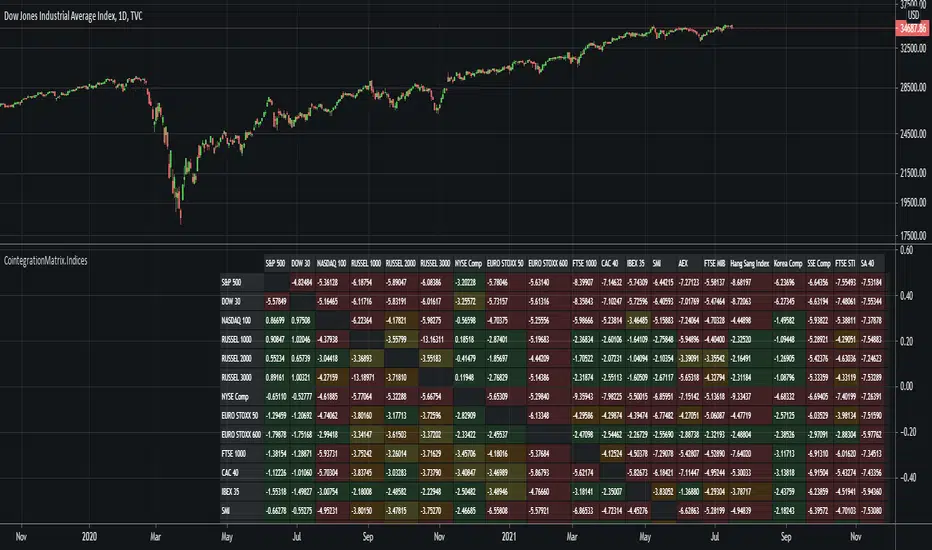
Cointegration Matrix (Indices)This indicator plots a cointegration matrix for pairings of most major stock indices. The matrix is populated with ADF t-stats (from an ADF-test with 1 lag). An ADF-test (Augmented Dickey-Fuller test) tests the null hypothesis that an AR process has a unit root. If rejected, the alternative hypothesis is usually that the AR process is either stationary or trend-stationary.
Technically what we're doing is running an ADF-test on the residuals (spread) of each pairing (i.e. a cointegration test). So we're testing if there is a unit root in the spread between the two assets of a pairing. A unit root being present in the spread essentially means the spread varies randomly over time, and any mean reversion in the spread is very hard to predict, or may never happen. If there is no evidence of a unit root, the spread (distance between the assets) should remain more or less constant over time, or rise/fall in close to the same rate over time (if it can be modelled as an AR process). The more negative the number, the stronger the rejection of the idea that the spread has a unit root. So in statistics we choose a critical value that corresponds to a confidence level of the test. In this case, -3.238 equals a confidence level of 90%, -3.589 equals a confidence level of 95% and -4.375 equals a confidence level of 99%. So the colors are based on the confidence level of the test statistic (the t-stat, i.e. the number of the pairing in the matrix). So if the number is greater than -3.238 it is green, if it's between -3.238 and -3.589 it's yellow, if it's between -3.589 and -4.375 it's orange, and if its lower than -4.375 it's red.
There are multiple ways to interpret the results. A strong rejection of the presence of a unit root (i.e. a value of -4.375 or below) is not a guarantee that there is no unit root, or that any of the two alternative hypotheses (that the spread is stationary or trend-stationary) are correct. It only means that in 99% of the cases, if the spread is an AR process, the test is right, and there is no unit root in the spread. Therefore, the results of this test is no guarantee that the result proves one of the alternative solutions. Green therefore means that a unit root cannot be ruled out (which can be interpreted as "the two indices probably don't move together over time"), and red means that a unit root is likely not present (which can be interpreted as "the two indices may move together over time").
NOTE: The indicator can take a while to load since it is loading data from 20 stock indices and calculating the ADF t-stat for 380 pairings.
Cointegration Matrix (FX)This indicator plots a cointegration matrix for pairings of all 28 major forex pairs. The matrix is populated with ADF t-stats (from an ADF-test with 1 lag). An ADF-test (Augmented Dickey-Fuller test) tests the null hypothesis that an AR process has a unit root. If rejected, the alternative hypothesis is usually that the AR process is either stationary or trend-stationary.
Technically what we're doing is running an ADF-test on the residuals (spread) of each pairing (i.e. a cointegration test). So we're testing if there is a unit root in the spread between the two assets of a pairing. A unit root being present in the spread essentially means the spread varies randomly over time, and any mean reversion in the spread is very hard to predict, or may never happen. If there is no evidence of a unit root, the spread (distance between the assets) should remain more or less constant over time, or rise/fall in close to the same rate over time (if it can be modelled as an AR process). The more negative the number, the stronger the rejection of the idea that the spread has a unit root. So in statistics we choose a critical value that corresponds to a confidence level of the test. In this case, -3.238 equals a confidence level of 90%, -3.589 equals a confidence level of 95% and -4.375 equals a confidence level of 99%. So the colors are based on the confidence level of the test statistic (the t-stat, i.e. the number of the pairing in the matrix). So if the number is greater than -3.238 it is green, if it's between -3.238 and -3.589 it's yellow, if it's between -3.589 and -4.375 it's orange, and if its lower than -4.375 it's red.
There are multiple ways to interpret the results. A strong rejection of the presence of a unit root (i.e. a value of -4.375 or below) is not a guarantee that there is no unit root, or that any of the two alternative hypotheses (that the spread is stationary or trend-stationary) are correct. It only means that in 99% of the cases, if the spread is an AR process, the test is right, and there is no unit root in the spread. Therefore, the results of this test is no guarantee that the result proves one of the alternative solutions. Green therefore means that a unit root cannot be ruled out (which can be interpreted as "the two forex pairs probably don't move together over time"), and red means that a unit root is likely not present (which can be interpreted as "the two forex pairs may move together over time").
One possible way to use this indicator is to make sure you don't trade two pairs that move together at the same time. So basically the idea is that if you already have a trade open in one of the currency pairs of the pairing, only enter a trade in the other currency pair of that pairing if the color is green, or you may be doubling your risk.
NOTE: The indicator can take a while to load since it is loading data from 28 pairs and calculating the ADF t-stat for 756 pairings.

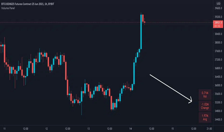
Volume PanelDisplays volume data in panel on bottom right of screen. Shows current bar, change from last bar and average of last 20 bars. This number can be changed in settings if you wish to have the average calculated on a different amount of bars.
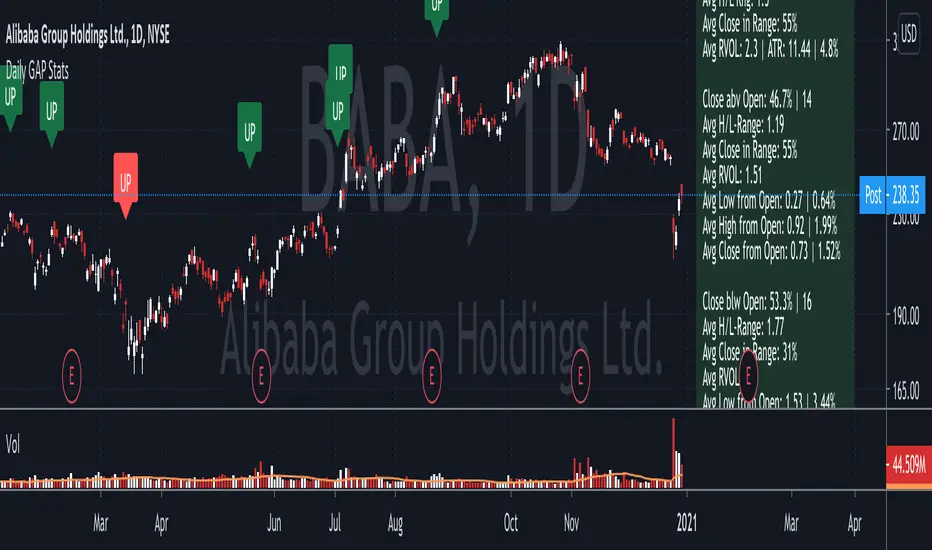
Daily GAP StatsI did not write the script from scratch but rather started editing code of an existing one. The original code came from a script called GAP DETECTOR by @Asch-
First up: I am a trader, not a programmer and therefore my code most likely is inefficient. If someone with more expertise would like to help and optimize it - feel free to get in touch, I am always happy to learn some new tricks. :)
This script does 2 things:
- It shows daily gaps stats based on user inputs
- It shows color coded labels on gap days with additional information in tooltips ( important: make sure to read 'known issues/limitations' at the end )
User Inputs
==========
Although the input dialog is pretty straight forward, I do a quick rundown:
- Length: max lookback time
- Gap Direction: self explanatory
- Show All Gaps | Cont Only | Reversal Only | Off:
This refers to the way labels are displayed on gap days (again: make sure to read known issues/limitations!)
- Show All Gaps: does what it says
- Cont Only: only shows gaps where price continued in the gap direction. If you filter for gap ups and chose 'Cont only' you will only see labels on gap days where price closed above the open (and vice versa if you scan for gap downs).
- Reversal Only: you will only see labels for closes below the open on gap up days (and the opposite on gap down days)
- Off: self explanatory
- Gap Measure in ATR/PCT: self explanatory, ATR is calculated over a 10d period
- Gap Size (Abs Values): no negative values allowed here. If you filter for gap downs and enter 3 it means it will show gaps where the stock fell more than 3 ATR/PCT on the open.
- RVOL Factor: along with significant gaps should come significant volume. RVOL = volume of the gap day / 20d average volume
- Viewing Options: Placing the stats label in the window is a bit tricky (see knonw issues/limitations) and I was not sure which way I liked better. See for yourself what works best for you.
Known Isusses/Limitations:
=======================
- Positioning of the stats table:
As to my knowledge, Tradingview only allows label positioning relative to price and not relative to the chart window. I tried to always display the gap stats table in the upper right corner, using 52wk high as y-coordinate. This works ok most of the time, but is not pretty. If anybody has some fancy way to tag the label in a fixed position, please get in touch.
- Max number of labels per script:
TradingView has a limitation that allows a maxium of ~50 labels per script. If there are more labels, TradingView will automatically cut the oldest ones, without any notification. I have found this behaviour to be rather inconsistent - sometimes it'll dump labels even if there are a lot fewer than 50. Hopefully TradingView will drop this limitation at one point in the future.
Important: The inconsistent display of the gap day labels has NO INFLUENCE on the calculations in the gap stats table - the count and the calculations are complete and correct!
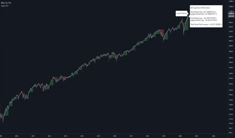
Alpha Performance of PeriodAlpha Performance of Period (PoP) produces a visualization of returns (gains and losses) over a quarterly, monthly, or annual period. It also displays the total % gain and loss over any length of days, months, and years as defined by the user.
Performance of Period (PoP) can be used to understand the performance of an asset over multiple periods using a single chart layout, and to compare the performance of different assets by using a multi-chart layout.
This can, for example, be used to compare the NASDAQ, S&P, and DJI over the past 20 years to create a dow vs. nasdaq vs. s&p performance chart. This can help you understand a comparison of historical returns by showing which performs the best month-over-month, quarter-to-quarter, year-to-year, throughout any custom period of days/months/years.
The ability to get a visualization of the % gain/loss can help to better understand how markets have performed over time and which markets have historically performed the best.
Check out the up and coming Educational Idea we will be releasing soon after this is live to see an example of how we use this tool.
Current Period Label
-----
Current Period : This label shows the current period's performance only when you hover over it.
(This label is located to the left of the current period's open candle and at the current candles close price)
TICKER "Time Period" Performance Label
-----
Total Period Gain : The total of all % gain periods from the start to end date.
Largest Period Gain : The biggest % gain period from the start to end date.
Total Period Loss : The total of all % loss periods from the start to end date.
Largest Period Loss : The biggest % loss period from the start to end date.
Total period Performance : The total % performance, the difference between the total gain and total loss.
NOTE : The "Current Period" performance is excluded from ALL five of the above-mentioned figures. This was done to avoid giving inaccurate comparison figures due to the period not being finished yet.
Inputs
-----
Current Script Version + Info : A drop-down list of instructions for the user to refer to.
Dark Mode Labels : Toggle on for Dark Mode. This is done since Labels text and background color can not be adjusted separately within the visual inputs so this is the best fit solution.
Time Period of Returns : Pick the period of performance you would like to emulate monthly/quarterly/annual.
Start Date : The day to start tracking performance.
Start Month : The month to start tracking performance.
Start Year : The year to start tracking performance.
End Date : The day to stop tracking performance.
End Month : The month to stop tracking performance.
End Year : The year to stop tracking performance.
As always if you have any feedback let us know in the comments and leave a like if you enjoy this tool :)
Bullish/Bearish Candle Series DistributionThe tool counts the number of consecutive bullish or bearish candles in a row and build a distribution of those series lengths. The entire history of an instrument is used.
Available modes:
Strict Bullish ( close > open )
Bullish ( close >= open )
Strict Bearish ( close <= open )
Bearish ( close < open )
Different chart types have different distributions:
Renko
Line Break

Buy The Dip - Does It Work?Buying the dip has become a meme in crypto, but does it actually work?
Using this script you can find out.
The dip is defined here as the average true range multiplied by a number of your choosing (dipness input) and subtracted from the low.
When price crosses under the dip level, a long is initiated. The long is then closed using a timestop (default value 20 bars), no fancy exits here.
A general rule for buying the dip should be to be more passive in a bull market and aggressive in a bear market.
Same goes for all counter trend trading.
Heres a few other examples of dip buying statistics using the H4 timeframe:
50% profitable, 1.692 Profit Factor
BINANCE:PIVXBTC
56.52% profitable, 1.254 Profit Factor
BINANCE:KMDBTC
27.27% Profitable, 0.257 Profit Factor... yikes!
BINANCE:BTSBTC
73.33% Profitable, 13.627 Profit Factor... o.O
BINANCE:MANABTC
Candles HistoryA utility tool to get some metrics from the whole candles history.
Consider it as my Christmas gift to the community.
Available metrics
Starting Year
Starting Month
Starting Day
Starting Weekday
Starting Hour
Starting Minute
Highest Volume (works correctly only on the tickers with available volume data)
Lowest Volume (works correctly only on the tickers with available volume data)
Longest Candle Range
Average Candle Range
Longest Candle Body
Average Candle Body
Available Candles
Bullish Candles
Bullish Trend Candles (body >= range / 2)
Bearish Candles
Bearish Trend Candles (body >= range / 2)
Doji Candles
Bullish Marubozu Candles
Bearish Marubozu Candles
Longest Bullish Serie
Longest Bearish Serie
Good luck!