YenCarry IndexA risk gauge that signals when USD/JPY is moving fast enough to make yen intervention likely by Ministry of Finance.
النطاقات والقنوات

🌊 QUANTUM FLOW PRO - Ultimate Trading System🌊 QUANTUM FLOW PRO - Ultimate Trading System
Description:
QUANTUM FLOW PRO (QFP) is a comprehensive, all-in-one professional trading ecosystem designed for Crypto, Forex, and Stock markets. Unlike simple indicators that rely on a single metric, QFP combines Trend Analysis, Volume Profiles, Order Flow, and Institutional Accumulation logic into a single, powerful decision-making engine.
This system calculates a "Signal Score" (0-100) for every potential trade by analyzing over 10 different technical factors simultaneously.
🚀 KEY FEATURES
1. 🧠 Smart Signal Scoring System Every Buy or Sell signal is not just a guess; it is the result of a complex calculation. The system evaluates:
Trend: SuperTrend & EMA confluence.
Momentum: RSI, MACD, and Stochastic levels.
Volume: Money Flow, OBV, and Volume Z-Score.
Multi-Timeframe (HTF): Checks 4H and Daily trends for confirmation.
Result: You get a score (e.g., 85/100) indicating the probability of success.
2. 🐋 Whale & Accumulation Detection Identify where big players are positioning themselves before the move happens.
Purple Zones: High Accumulation areas (potential explosive breakouts).
Whale Activity: Detects unusual volume spikes often associated with institutional entries.
Consolidation: Measures volatility contraction to predict expansion.
3. 🔵 Order Flow & Pressure Visualize the battle between buyers and sellers directly on the chart.
Green/Red Dots: Show real-time Buying or Selling pressure based on price-volume divergence.
Order Walls: Identifies potential liquidity zones where price might stall or reverse.
4. 💰 Advanced Risk Management Stop guessing your exits. QFP provides dynamic levels automatically:
Entry, Stop Loss, and 3 Take Profit Levels.
Methods: Choose between ATR-based (Volatility), Fibonacci-based, or a Hybrid calculation.
Win Probability: Shows the statistical probability of reaching the next target (DN1, DN2, DN3).
5. 📊 Professional Dashboard A sleek, non-intrusive panel displaying:
Current Trend & Strength.
HTF Status.
RSI, MACD, VWAP status.
Accumulation Score & Volume Health.
🛠️ HOW TO USE
Select your Mode:
Conservative: Best for beginners. Fewer signals, higher confirmation (Wait 30 bars).
Balanced: Standard approach for day trading.
Aggressive: For scalping and volatile markets.
Wait for a Signal:
Look for the "STRONG BUY" (Green Triangle) or "STRONG SELL" (Red Triangle) labels.
Check the Score on the label (e.g., Score: 75/60). Higher is better.
Confirm with Dashboard:
Ensure the "Trend" and "HTF" (Higher Timeframe) match the signal direction.
Look for "Healthy" volume.
Execute & Manage:
Enter the trade.
Place your Stop Loss at the suggested SL line.
Take partial profits at TP1 and TP2.
Move SL to Breakeven after TP1 is hit (the script suggests this visually).
⚙️ SETTINGS OVERVIEW
Market Type: Optimize calculations for Crypto, Forex, or Stocks (BIST).
Risk Level: Low, Medium, High (Adjusts the signal threshold score).
TP Method: Hybrid (Recommended) blends ATR and Fib levels for precision.
⚠️ DISCLAIMER
This tool is for educational and analytical purposes only. Trading involves significant risk. Always perform your own due diligence and never trade with money you cannot afford to lose

Live Bollinger Buy/Sell Signal + Custom EMA by RAJU📌 DESCRIPTION
Live Bollinger Buy/Sell Signal is a price-action-based entry system built on Bollinger Bands. This indicator automatically detects high-probability reversal points when price interacts with the outer Bollinger Bands and provides instant Buy & Sell signals directly on the chart. It is designed for traders who want clean and fast signals without complex settings.
________________________________________
🧠 LOGIC OF INDICATOR
The indicator uses a standard Bollinger Band setup (SMA + Standard deviation).
A Buy or Sell signal is triggered when a candle forms outside or near the Bollinger Band extremes and then reverses direction. This behaviour often indicates a potential trend reversal or strong bounce from volatility exhaustion.
________________________________________
⚙ USER INPUT
Setting Description
Bollinger Band Length SMA period length used to form Bollinger Bands (Default: 20)
Std.Dev Multiplier Standard deviation multiplier for upper/lower bands (Default: 2.0)
________________________________________
🟩 LONG CONDITION (Buy Signal)
A Buy signal is plotted when:
• The candle closes bullish (close > open)
• The candle opens below the lower Bollinger Band
• The candle closes back above the lower Bollinger Band
• The next candle must trade above signal candle
• If a candle before or after signal candle closes without touching 5 EMA then probability of reversal is high (optional)
This indicates a strong price rejection from oversold levels.
________________________________________
🟥 SHORT CONDITION (Sell Signal)
A Sell signal is plotted when:
• The candle closes bearish (close < open)
• The candle opens above the upper Bollinger Band
• The candle closes back below the upper Bollinger Band
• The next candle must trade below signal candle
• If a candle before or after signal candle closes without touching 5 EMA then probability of reversal is high (optional)
This indicates a strong rejection from overbought levels.
________________________________________
📤 LONG EXIT
Users may exit long trades when:
• A Sell signal appears and signal candle closes without touching 5 EMA, or
• Price reaches the middle SMA line, or
• Personal trailing stop or resistance level is reached
________________________________________
📥 SHORT EXIT
Users may exit short trades when:
• A Buy signal appears and signal candle closes without touching 5 EMA, or
• Price reaches the middle SMA line, or
• Personal trailing stop or support level is reached
________________________________________
🌟 WHY IT IS UNIQUE
• Extremely simple yet powerful price-action confirmation mechanism
• No repainting — signals appear only after candle close
• Works across all timeframes and markets (Crypto, Forex, Stocks, Indices)
• Built-in signal level plotting to verify correct candle positioning
• Fast visual signal markers without clutter
________________________________________
💹 HOW USER CAN BE BENEFITED FROM THIS
• Helps traders catch early reversal entries with high probability
• Reduces emotional decision-making with visual Buy/Sell arrows
• Ideal for scalping, intraday, and swing strategies
• Can be used as an entry confirmation with other indicators like RSI, MACD, or trend filters
• Helps avoid false breakouts by confirming rejection from volatility extremes
________________________________________
⚠ DISCLAIMER: This tool is for educational purposes only and not trading advice. Always use proper risk management.

jg ndog/nwogthis is an indicator for new week opening gaps along with daily opening gaps marking out potential liq zones

Sniper BB + VWAP System (with SMT Divergence Arrows)STEP 1: Load two correlated futures charts.
Example: CL + RB/SI+GC/ NQ+ES
STEP 2: Add Bollinger Bands (20, 2.0) on both.
Optional add (20, 3.0).
STEP 3: Watch for a BB tag on one chart but not the other.
STEP 4: Wait for a reclaim candle back inside the band.
STEP 5: Enter with stop below/above the wick + 3.0 BB.
STEP 6: Scale out midline, then opposite band.
STEP 7: Hold partials when both pairs confirm trend.
*You can take the vwap bands off the chart if it is too cluttered.

Mizan v5 - L-Score (Minimal)DESCRIPTION:
The Architecture of Market Probability
Mizan v5 is not just another technical indicator; it is a quantitative implementation of the "Ontological Probability" philosophy. It is designed to decipher the market's hidden intent by analyzing the relationship between Balance, Order, and Harmony (DDU Principles).
Unlike standard oscillators that blindly follow price action, Mizan v5 operates on a multi-dimensional logic structure to separate "Market Noise" from "True Momentum."
CORE LOGIC & FEATURES
1. The L-Score Engine (Composite Momentum)
The heart of this algorithm is the "L-Score," a weighted composite index that answers the question: "Is the move supported by energy and mass?"
It fuses three distinct market dimensions into a single actionable score (0-100):
Volume Flow (45% Weight): Uses customized Chaikin Money Flow (CMF) logic to detect "Smart Money" accumulation before price reacts.
Velocity (35% Weight): Uses CCI to measure the speed of the breakout.
Saturation (20% Weight): Uses RSI as a limiter to identify overextended conditions.
2. Adaptive Regime Detection (The Histogram Logic)
Markets are not linear; they switch between "Global" and "Local" realities. Mizan v5 calculates statistical Price Density Zones (similar to Market Profile logic) to find the "Fair Value."
Global Mode: Analyzes the long-term balance (70 bars).
Local Mode: Automatically switches focus to short-term volatility (20 bars) when a "Regime Change" (high deviation) is detected.
HOW TO USE
1. The L-Score Line (Signal):
🟢 GREEN Line (> 65): Bullish Phase. Volume and Momentum are aligned. High probability of continuation.
🔴 RED Line (< 45): Bearish/Neutral Phase. Lack of energy. Avoid long positions ("Don't catch a falling knife").
🟠 ORANGE Line: Indecision/Transition zone.
2. Background Zones (Valuation):
🟩 Green Background: "Statistical Cheap Zone." Price is below the density band. Potential for Mean Reversion (Dip Buying).
🟥 Red Background: "Statistical Expensive Zone." Price is extended above the density band. High risk of Distribution (Selling).
PHILOSOPHY
"Chaos is merely order waiting to be deciphered." This tool is the visual manifestation of the "Cosmic Architect" project, aiming to bridge the gap between abstract philosophy and algorithmic trading.
Disclaimer: This tool is for educational and analytical purposes only. It is not financial advice.
© MuratKavak | Idea Architect

EMA CloudSimple EMA cloud using a fast, a slow and an optinal middle EMA.
It has EMA, EMA cloud and candle coloring depending on whether it's a downtrend or an uptrend.
It has a dashboard also with 4 customizable time frames that tells you if they are bullish or bearish and tells you the strength of the trend for the timeframe you are viewing.

6 EMA - 6 SMA This indicator will allow you to place on the chart at the same time 6 EMAs and 6 SMAs if you want — a total of 12 EMAs/SMAs!

Gold Thai CompassGold Thai Compass Indicator
Calculates Thai Gold Price (96.5%) by converting XAU/USD with the USD/THB exchange rate in real time
Displays the calculated gold_price_thb directly on the chart with a clean right-aligned label for easy price reading
Includes customizable reference lines — add, remove, rename, recolor, and adjust each line independently
Supports multiple editable lines (e.g., 4 levels) with price labels displayed beside each line
Provides user-friendly input settings (e.g., custom price sources, spread/adjustment options)
Updates dynamically with live market data — suitable for trading, analysis, and Thai gold price tracking
Designed for TradingView (Pine Script) and optimized for clarity and usability
Optional visibility controls to show/hide labels and reference lines for a cleaner chart layout

SAFI Strategy V1.0 motaz indicator SAFI Strategy V1.0 motaz indicator
indicator with many options and filters to give you clear signals with special strategies

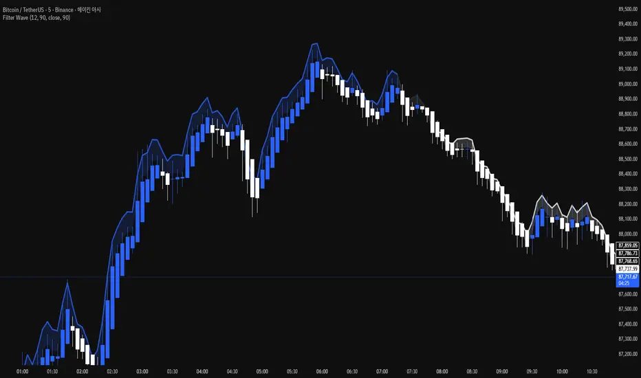
Filter Wave1. Indicator Name
Filter Wave
2. One-line Introduction
A visually enhanced trend strength indicator that uses linear regression scoring to render smoothed, color-shifting waves synced to price action.
3. General Overview
Filter Wave+ is a trend analysis tool designed to provide an intuitive and visually dynamic representation of market momentum.
It uses a pairwise comparison algorithm on linear regression values over a lookback period to determine whether price action is consistently moving upward or downward.
The result is a trend score, which is normalized and translated into a color-coded wave that floats above or below the current price. The wave's opacity increases with trend strength, giving a visual cue for confidence in the trend.
The wave itself is not a raw line—it goes through a three-stage smoothing process, producing a natural, flowing curve that is aesthetically aligned with price movement.
This makes it ideal for traders who need a quick visual context before acting on signals from other tools.
While Filter Wave+ does not generate buy/sell signals directly, its secure and efficient design allows it to serve as a high-confidence trend filter in any trading system.
4. Key Advantages
🌊 Smooth, Dynamic Wave Output
3-stage smoothed curves give clean, flowing visual feedback on market conditions.
🎨 Trend Strength Visualized by Color Intensity
Stronger trends appear with more solid coloring, while weak/neutral trends fade visually.
🔍 Quantitative Trend Detection
Linear regression ordering delivers precise, math-based trend scoring for confidence assessment.
📊 Price-Synced Floating Wave
Wave is dynamically positioned based on ATR and price to align naturally with market structure.
🧩 Compatible with Any Strategy
No conflicting signals—Filter Wave+ serves as a directional overlay that enhances clarity.
🔒 Secure Core Logic
Core algorithm is lightweight and secure, with minimal code exposure and strong encapsulation.
📘 Indicator User Guide
📌 Basic Concept
Filter Wave+ calculates trend direction and intensity using linear regression alignment over time.
The resulting wave is rendered as a smoothed curve, colored based on trend direction (green for up, red for down, gray for neutral), and adjusted in transparency to reflect trend strength.
This allows for fast trend interpretation without overwhelming the chart with signals.
⚙️ Settings Explained
Lookback Period: Number of bars used for pairwise regression comparisons (higher = smoother detection)
Range Tolerance (%): Threshold to qualify as an up/down trend (lower = more sensitive)
Regression Source: The price input used in regression calculation (default: close)
Linear Regression Length: The period used for the core regression line
Bull/Bear Color: Customize the color for bullish and bearish waves
📈 Timing Example
Wave color changes to green and becomes more visible (less transparent)
Wave floats above price and aligns with an uptrend
Use as trend confirmation when other signals are present
📉 Timing Example
Wave shifts to red and darkens, floating below the price
Regression direction down; price continues beneath the wave
Acts as bearish confirmation for short trades or risk-off positioning
🧪 Recommended Use Cases
Use as a trend confidence overlay on your existing strategies
Especially useful in swing trading for detecting and confirming dominant market direction
Combine with RSI, MACD, or price action for high-accuracy setups
🔒 Precautions
This is not a signal generator—intended as a trend filter or directional guide
May respond slightly slower in volatile reversals; pair with responsive indicators
Wave position is influenced by ATR and price but does not represent exact entry/exit levels
Parameter optimization is recommended based on asset class and timeframe
Ultimate Multi-Asset Correlation System by able eiei Ultimate Multi-Asset Correlation System - User Guide
Overview
This advanced TradingView indicator combines WaveTrend oscillator analysis with comprehensive multi-asset correlation tracking. It helps traders understand market relationships, identify regime changes, and spot high-probability trading opportunities across different asset classes.
Key Features
1. WaveTrend Oscillator
Main Signal Lines: WT1 (blue) and WT2 (red) plot momentum and its moving average
Overbought/Oversold Zones: Default levels at +60/-60
Cross Signals:
🟢 Bullish: WT1 crosses above WT2 in oversold territory
🔴 Bearish: WT1 crosses below WT2 in overbought territory
Higher Timeframe (HTF) Analysis: Shows WT1 from 4H, Daily, and Weekly timeframes for trend confirmation
2. Multi-Asset Correlation Tracking
Monitors relationships between:
Major Assets: Gold (XAUUSD), Dollar Index (DXY), US 10-Year Yield, S&P 500
Crypto Assets: Bitcoin, Ethereum, Solana, BNB
Cross-Asset Analysis: Correlation between traditional markets and crypto
3. Market Regime Detection
Automatically identifies market conditions:
Risk-On: High correlation + positive sentiment (🟢 Green background)
Risk-Off: High correlation + negative sentiment (🔴 Red background)
Crypto-Risk-On: Strong crypto correlations (🟠 Orange background)
Low-Correlation: Divergent market behavior (⚪ Gray background)
Neutral: Mixed signals (🟡 Yellow background)
How to Use
Basic Setup
Add to Chart: Apply the indicator to any chart (works on all timeframes)
Choose Display Mode (Display Options):
All: Shows everything (recommended for comprehensive analysis)
WaveTrend Only: Focus on momentum signals
Correlation Only: View market relationships
Heatmap Only: Simplified correlation view
Enable Asset Groups:
✅ Major Assets: Traditional markets (stocks, bonds, commodities)
✅ Crypto Assets: Digital currencies
Mix and match based on your trading focus
Reading the Charts
WaveTrend Section (Bottom Panel)
Above 0 = Bullish momentum
Below 0 = Bearish momentum
Above +60 = Overbought (potential reversal)
Below -60 = Oversold (potential bounce)
Lighter lines = Higher timeframe trends
Correlation Histogram (Colored Bars)
Blue bars: Major asset correlations
Orange bars: Crypto correlations
Purple bars: Cross-asset correlations
Bar height: Correlation strength (-50 to +50 scale)
Background Color
Intensity reflects correlation strength
Color shows market regime
Dashboard Elements
🎯 Market Regime Analysis (Top Left)
Current Regime: Overall market condition
Average Correlation: Strength of relationships (0-1 scale)
Risk Sentiment: -100% (risk-off) to +100% (risk-on)
HTF Alignment: Multi-timeframe trend agreement
Signal Quality: Confidence level for current signals
📊 Correlation Matrix (Top Right)
Shows correlation values between asset pairs:
1.00: Perfect positive correlation
0.75+: Strong correlation (🟢 Green)
0.50+: Medium correlation (🟡 Yellow)
0.25+: Weak correlation (🟠 Orange)
Below 0.25: Negative/no correlation (🔴 Red)
🔥 Correlation Heatmap (Bottom Right)
Visual matrix showing:
Gold vs. DXY, BTC, ETH
DXY vs. BTC, ETH
BTC vs. ETH
Color-coded strength
📈 Performance Tracker (Bottom Left)
Tracks individual asset momentum:
WT1 Values: Current momentum reading
Status: OB (overbought) / OS (oversold) / Normal
Trading Strategies
1. High-Probability Trend Following
✅ Entry Conditions:
WaveTrend bullish/bearish cross
HTF Alignment matches signal direction
Signal Quality > 70%
Correlation supports direction
2. Regime Change Trading
🎯 Watch for regime shifts:
Risk-Off → Risk-On = Consider long positions
High correlation → Low correlation = Reduce position size
Crypto-Risk-On = Focus on crypto longs
3. Divergence Trading
🔍 Look for:
Strong correlation breakdown = Potential volatility
Cross-asset correlation surge = Follow the leader
Volume-price correlation extremes = Trend confirmation
4. Overbought/Oversold Reversals
⚡ Trade reversals when:
WT crosses in extreme zones (-60/+60)
HTF alignment shows opposite trend weakening
Correlation confirms mean reversion setup
Customization Tips
Fine-Tuning Parameters
WaveTrend Core:
Channel Length (10): Lower = more sensitive, Higher = smoother
Average Length (21): Adjust for your timeframe
Correlation Settings:
Length (50): Longer = more stable, Shorter = more responsive
Smoothing (5): Reduce noise in correlation readings
Market Regime:
Risk-On Threshold (0.6): Lower = earlier regime signals
High Correlation Threshold (0.75): Adjust sensitivity
Custom Asset Selection
Replace default symbols with your preferred markets:
Major Assets: Any forex, indices, bonds
Crypto: Any digital currencies
Must use correct exchange prefix (e.g., BINANCE:BTCUSDT)
Alert System
Enable "Advanced Alerts" to receive notifications for:
✅ Market regime changes
✅ Correlation breakdowns/surges
✅ Strong signals with high correlation
✅ Extreme volume-price correlation
✅ Complete HTF alignment
Correlation Interpretation Guide
ValueMeaningTrading Implication+0.75 to +1.0Strong positiveAssets move together+0.5 to +0.75Moderate positiveGenerally aligned+0.25 to +0.5Weak positiveLoose relationship-0.25 to +0.25No correlationIndependent movements-0.5 to -0.25Weak negativeSlight inverse relationship-0.75 to -0.5Moderate negativeTend to move opposite-1.0 to -0.75Strong negativeStrongly inversely correlated
Best Practices
Use Multiple Timeframes: Check HTF alignment before trading
Confirm with Correlation: Strong signals work best with supportive correlations
Watch Regime Changes: Adjust strategy based on market conditions
Volume Matters: Enable volume-price correlation for confirmation
Quality Over Quantity: Trade only high-quality setups (>70% signal quality)
Common Patterns to Watch
🔵 Risk-On Environment:
Gold-BTC positive correlation
DXY negative correlation with risk assets
High crypto correlations
🔴 Risk-Off Environment:
Flight to safety (Gold up, stocks down)
DXY strength
Correlation breakdowns
🟡 Transition Periods:
Low correlation across assets
Mixed HTF signals
Use caution, reduce position sizes
Technical Notes
Calculation Period: Uses HLC3 (average of high, low, close)
Correlation Window: Rolling correlation over specified length
HTF Data: Accurately calculated using security() function
Performance: Optimized for real-time calculation on all timeframes
Support
For optimal performance:
Use on 15-minute to daily timeframes
Enable only needed asset groups
Adjust correlation length based on trading style
Combine with your existing strategy for confirmation
Enjoy comprehensive multi-asset analysis! 🚀

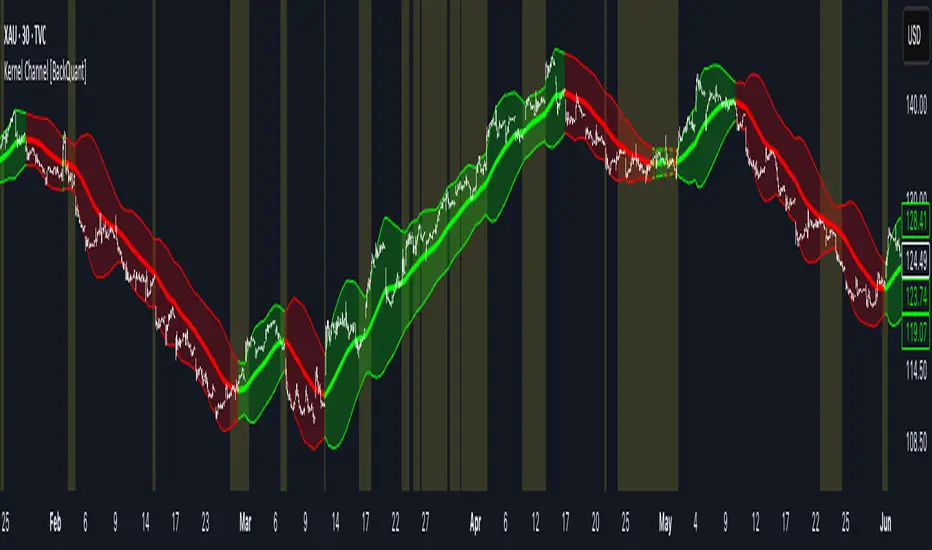
Kernel Channel [BackQuant]Kernel Channel
A non-parametric, kernel-weighted trend channel that adapts to local structure, smooths noise without lagging like moving averages, and highlights volatility compressions, expansions, and directional bias through a flexible choice of kernels, band types, and squeeze logic.
What this is
This indicator builds a full trend channel using kernel regression rather than classical averaging. Instead of a simple moving average or exponential weighting, the midline is computed as a kernel-weighted expectation of past values. This allows it to adapt to local shape, give more weight to nearby bars, and reduce distortion from outliers.
You can think of it as a sliding local smoother where you define both the “window” of influence (Window Length) and the “locality strength” (Bandwidth). The result is a flexible midline with optional upper and lower bands derived from kernel-weighted ATR or kernel-weighted standard deviation, letting you visualize volatility in a structurally consistent way.
Three plotting modes help demonstrate this difference:
When the midline is shown alone, you get a smooth, adaptive baseline that behaves almost like a regression moving average, as shown in this view:
When full channels are enabled, you see how standard deviation reacts to local structure with dynamically widening and tightening bands, a mode illustrated here:
When ATR mode is chosen instead of StdDev, band width reflects breadth of movement rather than variance, creating a volatility-aware envelope like the example here:
Why kernels
Classical moving averages allocate fixed weights. Kernels let the user define weighting shape:
Epanechnikov — emphasizes bars near the current bar, fades fast, stable and smooth.
Triangular — linear decay, simple and responsive.
Laplacian — exponential decay from the current point, sharper reactivity.
Cosine — gentle periodic decay, balanced smoothness for trend filters.
Using these in combination with a bandwidth parameter gives fine control over smoothness vs responsiveness. Smaller bandwidths give sharper local sensitivity, larger bandwidths give smoother curvature.
How it works (core logic)
The indicator computes three building blocks:
1) Kernel-weighted midline
For every bar, a sliding window looks back Window Length bars. Each bar in this window receives a kernel weight depending on:
its index distance from the present
the chosen kernel shape
the bandwidth parameter (locality)
Weights form the denominator, weighted values form the numerator, and the resulting ratio is the kernel regression mean. This midline is the central trend.
2) Kernel-based width
You choose one of two band types:
Kernel ATR — ATR values are kernel-averaged, producing a smooth, volatility-based width that is not dependent on variance. Ideal for directional trend channels and regime separation.
Kernel StdDev — local variance around the midline is computed through kernel weighting. This produces a true statistical envelope that narrows in quiet periods and widens in noisy areas.
Width is scaled using Band Multiplier , controlling how far the envelope extends.
3) Upper and lower channels
Provided midline and width exist, the channel edges are:
Upper = midline + bandMult × width
Lower = midline − bandMult × width
These create smooth structures around price that adapt continuously.
Plotting modes
The indicator supports multiple visual styles depending on what you want to emphasize.
When only the midline is displayed, you get a pure kernel trend: a smooth regression-like curve that reacts to local structure while filtering noise, demonstrated here: This provides a clean read on direction and slope.
With full channels enabled, the behavior of the bands becomes visible. Standard deviation mode creates elastic boundaries that tighten during compressions and widen during turbulence, which you can see in the band-focused demonstration: This helps identify expansion events, volatility clusters, and breakouts.
ATR mode shifts interpretation from statistical variance to raw movement amplitude. This makes channels less sensitive to outliers and more consistent across trend phases, as shown in this ATR variation example: This mode is particularly useful for breakout systems and bar-range regimes.
Regime detection and bar coloring
The slope of the midline defines directional bias:
Up-slope → green
Down-slope → red
Flat → gray
A secondary regime filter compares close to the channel:
Trend Up Strong — close above upper band and midline rising.
Trend Down Strong — close below lower band and midline falling.
Trend Up Weak — close between midline and upper band with rising slope.
Trend Down Weak — close between lower band and midline with falling slope.
Compression mode — squeeze conditions.
Bar coloring is optional and can be toggled for cleaner charts.
Squeeze logic
The indicator includes non-standard squeeze detection based on relative width , defined as:
width / |midline|
This gives a dimensionless measure of how “tight” or “loose” the channel is, normalized for trend level.
A rolling window evaluates the percentile rank of current width relative to past behavior. If the width is in the lowest X% of its last N observations, the script flags a squeeze environment. This highlights compression regions that may precede breakouts or regime shifts.
Deviation highlighting
When using Kernel StdDev mode, you may enable deviation flags that highlight bars where price moves outside the channel:
Above upper band → bullish momentum overextension
Below lower band → bearish momentum overextension
This is turned off in ATR mode because ATR widths do not represent distributional variance.
Alerts included
Kernel Channel Long — midline turns up.
Kernel Channel Short — midline turns down.
Price Crossed Midline — crossover or crossunder of the midline.
Price Above Upper — early momentum expansion.
Price Below Lower — downward volatility expansion.
These help automate regime changes and breakout detection.
How to use it
Trend identification
The midline acts as a bias filter. Rising midline means trend strength upward, falling midline means downward behavior. The channel width contextualizes confidence.
Breakout anticipation
Kernel StdDev compressions highlight areas where price is coiling. Breakouts often follow narrow relative width. ATR mode provides structural expansion cues that are smooth and robust.
Mean reversion
StdDev mode is suitable for fade setups. Moves to outer bands during low volatility often revert to the midline.
Continuation logic
If price breaks above the upper band while midline is rising, the indicator flags strong directional expansion. Same logic for breakdowns on the lower band.
Volatility characterization
Kernel ATR maps raw bar movements and is excellent for identifying regime shifts in markets where variance is unstable.
Tuning guidance
For smoother long-term trend tracking
Larger window (150–300).
Moderate bandwidth (1.0–2.0).
Epanechnikov or Cosine kernel.
ATR mode for stable envelopes.
For swing trading / short-term structure
Window length around 50–100.
Bandwidth 0.6–1.2.
Triangular for speed, Laplacian for sharper reactions.
StdDev bands for precise volatility compression.
For breakout systems
Smaller bandwidth for sharp local detection.
ATR mode for stable envelopes.
Enable squeeze highlighting for identifying setups early.
For mean-reversion systems
Use StdDev bands.
Moderate window length.
Highlight deviations to locate overextended bars.
Settings overview
Kernel Settings
Source
Window Length
Bandwidth
Kernel Type (Epanechnikov, Triangular, Laplacian, Cosine)
Channel Width
Band Type (Kernel ATR or Kernel StdDev)
Band Multiplier
Visuals
Show Bands
Color Bars By Regime
Highlight Squeeze Periods
Highlight Deviation
Lookback and Percentile settings
Colors for uptrend, downtrend, squeeze, flat
Trading applications
Trend filtering — trade only in direction of the midline slope.
Breakout confirmation — expansion outside the bands while slope agrees.
Squeeze timing — compression periods often precede the next directional leg.
Volatility-aware stops — ATR mode makes channel edges suitable for adaptive stop placement.
Structural swing mapping — StdDev bands help locate midline pullbacks vs distributional extremes.
Bias rotation — bar coloring highlights when regime shifts occur.
Notes
The Kernel Channel is not a signal generator by itself, but a structural map. It helps classify trend direction, volatility environment, distribution shape, and compression cycles. Combine it with your entry and exit framework, risk parameters, and higher-timeframe confirmation.
It is designed to behave consistently across markets, to avoid the bluntness of classical averages, and to reveal subtle curvature in price that traditional channels miss. Adjust kernel type, bandwidth, and band source to match the noise profile of your instrument, then use squeeze logic and deviation highlighting to guide timing.
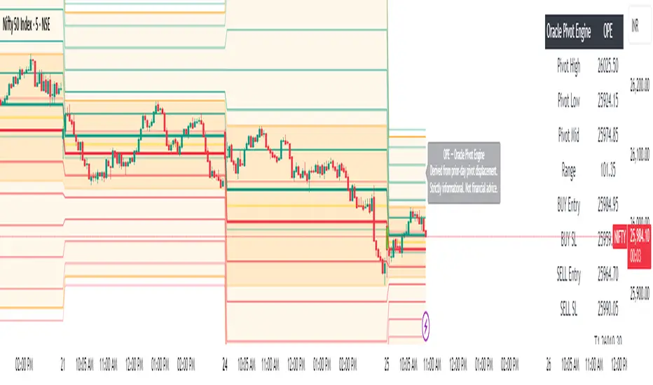
Oracle Pivot Engine (OPE) — @darshaksscThe Oracle Pivot Engine (OPE) is a market-structure visualization tool that derives all its levels exclusively from historical price data — specifically, the previous day’s high, low, and mid-range.
It does not provide signals, alerts, entries, exits, predictions, or trade recommendations.
Instead, it creates a non-repainting reference framework that helps users observe how the current session interacts with the prior session’s completed price structure.
All calculations are analytical, static, and based on fully closed candles.
🧠 How It Works (Core Logic Explained)
OPE computes the following values from the completed prior daily candle:
Prior-Day High
Prior-Day Low
Prior-Day Midpoint
Displacement Range = High − Low
This displacement range is used to generate symmetrical upward and downward reference zones.
These levels do not update during the session.
They refresh only once per day when a new daily candle closes.
This ensures the indicator remains fully non-repainting and stable on every intraday chart.
📐 Reference Levels Generated
Using the fixed prior-day displacement range, OPE plots:
1. BUY-Side Reference Map (Upward Bias)
BUY Reference Entry
BUY Reference Stop
BUY T1
BUY T2
BUY T3
BUY T4
BUY T5
BUY T6
These are not trade signals — they are mathematical extensions above the prior-day midpoint for structural interpretation only.
2. SELL-Side Reference Map (Downward Bias)
SELL Reference Entry
SELL Reference Stop
SELL T1
SELL T2
SELL T3
SELL T4
SELL T5
SELL T6
Again, these levels are not directives.
They are mirrored displacement extensions below the prior-day midpoint.
📊 Pivot Zone & Bands
The indicator includes optional visual layers derived from the same prior-day pivots:
Pivot High–Low Zone Shading → shows the prior-day full range
Pivot Midline → prior-day mid-price
Outer Displacement Bands → extended contextual boundaries
These are purely visual boundaries meant to improve market context.
🧾 Dashboard / HUD Explanation
A compact on-chart HUD summarizes all values.
It displays:
Section | Information (All Historical)
Prior-Day Pivots | High, Low, Mid, Range
BUY Map | Entry, Stop, T1–T6
SELL Map | Entry, Stop, T1–T6
The HUD allows you to quickly review:
Where the current price is relative to the previous day’s structure
How far price is from each level
Whether the session is operating inside or outside the prior-day displacement zones
Everything shown is static, non-repainting , and for reference only .
📊 How to Analyze It
✔ 1. Contextual Awareness
OPE helps users visually compare current intraday price to prior daily structure.
You can observe whether price is:
Inside yesterday’s high/low zone
Above the prior-day displacement
Below the prior-day displacement
This offers a clearer understanding of daily context and volatility.
✔ 2. Structural Symmetry
The BUY-side and SELL-side maps extend from the same pivot logic.
This can help visualize:
Expansion away from the prior-day midpoint
Compression within the prior-day range
Symmetrical displacement around key reference levels
Again — these are observational insights , not signals.
✔ 3. Range Interaction
As the session unfolds, users often study:
How price reacts around prior-day midpoint
Whether price is gravitating toward or away from the displacement levels
How intraday swings behave within these historical boundaries
This type of analysis is contextual , not predictive.
⚠️ Important Disclosures
This script does NOT generate trading signals.
It does NOT predict future price movement.
It does NOT contain advice, instructions, recommendations, or strategies.
All levels are derived exclusively from historical daily candle data .
This is strictly an informational visualization tool meant to support chart analysis.
Past price levels do not guarantee any future price behavior.
🛑 Disclaimer
This indicator is provided solely for educational and informational purposes.
It should not be interpreted as financial advice or a call to action of any kind.
Users should apply independent judgment and discretion when analyzing markets.
3x ORB Alerts (JSON webhook, 3 ORBs)2× ORB Alerts (JSON Webhook, ORB4 + ORB5) is a clean, lightweight multi-session Opening Range Breakout (ORB) alert engine designed for automated trading systems using TradingView webhooks.
This indicator provides up to 3 independent ORB windows, each with:
Custom session time
Custom cutoff time (HHMM or HH:MM)
First-close breakout detection (Up or Down)
Dedicated alert conditions
Persistent ORB range + breakout price
Full JSON webhook output for bots
No boxes, no lines, no visual clutter (performance-optimized)
✔️ What this indicator does
Tracks ORB high/low during the selected session
Locks the range once the session ends
Waits for a valid breakout (close > high or close < low)
Triggers alerts only once per ORB per day
Sends a clean JSON payload to your trading bot
✔️ Webhook JSON includes
Symbol
Timeframe
ORB window number (1–3)
Breakout direction
Break price
ORB range
ATR (optional filtering)
Close price
Timestamp
Custom API key
✔️ Why this script exists
This indicator is built specifically for automated ORB trading bots, where reliability, clean signals, and low-latency alerts are critical.
No repainting, no noise — just clear breakout confirmations for fully automated systems.
✔️ Use Cases
Futures (GC, NQ, ES, CL, FDAX, etc.)
Forex session breakout strategies
Crypto ORB systems (BTC, ETH)
Multi-session automated strategies
Proprietary trading automation
✔️ How to use
Set up 1,2,3 ORB sessions
Add corresponding alert conditions
Select "Once per bar close"
Paste your webhook URL
Your trading bot receives a JSON package on every breakout

Absorption Meter — M15/M5/M3Absorption Meter — EMA200 + Wick + Absorption Combo
Absorption Meter is a synthetic orderflow/absorption tool built only on OHLCV data. It plots two lines — Buy Absorption and Sell Absorption — plus optional EMA200-based reversion and trend-continuation signals. The idea is to highlight where aggressive buyers or sellers are likely being absorbed, not rewarded.
The script uses a simple delta/CVD proxy (volume signed by candle direction), volume z-scores, candle structure (wicks vs body), VWAP proximity, and distance from EMA200. For each bar it builds two scores from 0–100:
• Buy Absorption (green): high when selling pressure is strong (negative delta and CVD slope), volume is above normal, the candle is wicky/inefficient, price is near VWAP, and the bar looks like a stall or has a strong lower wick. This suggests shorts are hitting into bids and being absorbed.
• Sell Absorption (red): high when buying pressure is strong (positive delta and CVD slope), volume is above normal, the candle is wicky, price is near VWAP, and the bar looks like a stall or has a strong upper wick. This suggests longs are hitting into offers and being absorbed.
I use this mostly as contrarian context: high Buy Absorption near lows is a reason to stop chasing shorts and look for long/cover zones; high Sell Absorption near highs is a reason to stop chasing longs and look for short/profit zones. It is not a stand-alone “buy/sell” signal.
On top of the lines, the script can draw arrows and fire alerts when several conditions align:
• EMA200 mean reversion (price stretched from EMA200, recent big wick, strong absorption).
• Optional base VWAP triggers (absorption near VWAP).
• Optional strong distance-only reversions.
• Optional trend-bias continuation (on the right side of EMA200 with supportive slope and absorption/wicks).
Key settings (short overview):
• Z-Score and Volume Z lookbacks: control how “unusual” delta, CVD and volume must be.
• ATR Length: used for volatility, gates, and EMA distance.
• Weights (Delta, CVD Slope, Volume Z, 1–Body Efficiency, VWAP Proximity): control how much each component contributes to the score.
• Gates (Small Move, Wick Size, Soft Factor): control how strict the bar structure must be to count as absorption.
• EMA200 / StdDev / distance thresholds: control when EMA reversion logic activates.
• Big Wick filters (min wick vs ATR, wick percent, body percent, reclaim rules, min volume Z): define what a real “rejection wick” looks like.
• Session filter and cooldown: restrict signals to your session and avoid arrow spam.
This is a context tool: it shows where aggressive volume is running into resistance or support so you can make better decisions around chasing, fading, or taking profits.

2x ORB Alerts (JSON webhook, ORB4 + ORB5)2× ORB Alerts (JSON Webhook, ORB4 + ORB5) is a clean, lightweight multi-session Opening Range Breakout (ORB) alert engine designed for automated trading systems using TradingView webhooks.
This indicator provides 2 independent ORB windows, each with:
Custom session time
Custom cutoff time (HHMM or HH:MM)
First-close breakout detection (Up or Down)
Dedicated alert conditions
Persistent ORB range + breakout price
Full JSON webhook output for bots
No boxes, no lines, no visual clutter (performance-optimized)
✔️ What this indicator does
Tracks ORB high/low during the selected session
Locks the range once the session ends
Waits for a valid breakout (close > high or close < low)
Triggers alerts only once per ORB per day
Sends a clean JSON payload to your trading bot
✔️ Webhook JSON includes
Symbol
Timeframe
ORB window number (4&5)
Breakout direction
Break price
ORB range
ATR (optional filtering)
Close price
Timestamp
Custom API key
✔️ Why this script exists
This indicator is built specifically for automated ORB trading bots, where reliability, clean signals, and low-latency alerts are critical.
No repainting, no noise — just clear breakout confirmations for fully automated systems.
✔️ Use Cases
Futures (GC, NQ, ES, CL, FDAX, etc.)
Forex session breakout strategies
Crypto ORB systems (BTC, ETH)
Multi-session automated strategies
Proprietary trading automation
✔️ How to use
Set up to 4&5 ORB sessions
Add corresponding alert conditions
Select "Once per bar close"
Paste your webhook URL
Your trading bot receives a JSON package on every breakout

PA + Volatility + Volume Confluence (3/3) — v5Volume price action and volatility. It gives you early warning when market is about to move.

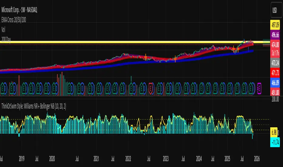
Abacus Community Williams %R + Bollinger %B📌 Indicator Description (Professional & Clear)
Williams %R + Bollinger %B Momentum Indicator (ThinkOrSwim Style)
This custom indicator combines Williams %R and Bollinger %B into a single, unified panel to provide a powerful momentum-and-positioning view of price action. Modeled after the ThinkOrSwim version used by professional traders, it displays:
✅ Williams %R (10-period) – Yellow Line
This oscillator measures the market's position relative to recent highs and lows.
It plots on a 0% to 100% scale, where:
80–100% → Overbought region
20–0% → Oversold region
50% → Momentum equilibrium
Williams %R helps identify exhaustion, trend strength, and potential reversal zones.
✅ Bollinger %B (20, 2.0) – Turquoise Histogram Bars
%B shows where price is trading relative to the Bollinger Bands:
Above 50% → Price is in the upper half of the band (bullish pressure)
Below 50% → Price is in the lower half (bearish pressure)
Near 100% → Price pushing upper band (possible breakout)
Near 0% → Price testing lower band (possible breakdown)
The histogram visually represents momentum shifts in real time, creating a clean profile of volatility and strength.
🎯 Why This Combination Works
Together, Williams %R and Bollinger %B reveal:
Momentum direction
Overbought/oversold conditions
Volatility compression & expansion
Trend continuation vs reversal zones
High-probability inflection points
Williams %R shows oscillation and exhaustion, while %B shows pressure inside volatility bands.
The combination helps identify whether momentum supports the current trend or is weakening.
🔍 Use Cases
Detect early trend reversals
Validate breakouts and breakdowns
Spot momentum failure in price extremes
Confirm pullbacks and continuation setups
Time entries and exits with higher precision
💡 Best For
Swing traders
Momentum traders
Trend-followers
Options traders (for timing premium decay or volatility expansion)
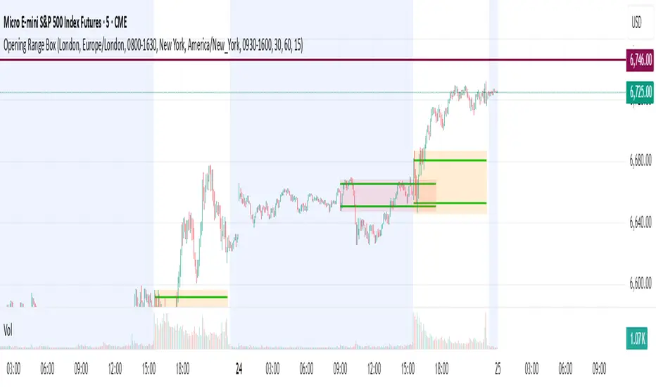
Opening Range Box, 2 SessionsOpening Range & Session Box Indicator
This indicator automatically draws Opening Range (OR) boxes and Session Boxes based on specific time zone settings, helping you visualize key trading periods across different global markets.
Key Features:
Custom Sessions: Define two independent trading sessions (e.g., New York and London).
Time Zone Selection: Choose the exact time zone for each session from a simple dropdown menu, ensuring accurate session mapping regardless of your chart's time zone.
Opening Range Definition: The initial portion of each session (defined by the Opening Range Minutes input) establishes the high and low of the box.
Offset Lines: Automatically draws two percentage offset lines inside the box, allowing you to easily track price movement relative to the Opening Range high and low (e.g., 10% retracement levels).
How to Use the Inputs:
Session A/B Timezone - Select the time zone for Session A (e.g., America/New_York).
Session A/B Time - Define the start and end time for Session A (e.g., 0930-1600).
Opening Range Minutes - Set how long the initial opening range period lasts (e.g., 30 minutes).
Percent from High/Low for Line - Set the percentage distance for the inner offset lines (e.g., 10.0 for 10% retracement).
Number of Boxes to Show - Controls the number of historical session boxes and lines that remain visible on the chart.
Key Levels: ATH + Previous Day + HTF S/RKey levels line indicator for all time high, previous day low and high for momentum trading
Orbital Barycenter Matrix @darshaksscThe Orbital Barycenter Matrix is a visual, informational-only tool that models how price behaves around a dynamically calculated barycenter —a type of moving equilibrium derived entirely from historical price data.
Instead of focusing on signals, this indicator focuses on market structure symmetry, distance, compression, expansion, and volatility-adjusted movement.
This script does not predict future price and does not provide buy/sell signals .
All values and visuals come solely from confirmed historical data , in full compliance with TradingView policy.
📘 How the Indicator Works
1. Dynamic Barycenter (Core Mean Line)
The barycenter is calculated from a smoothed blend of historical price components.
It represents the center of mass around which price tends to oscillate.
This is not a forecast line—only a representation of historical average behavior.
2. Orbital Rings (Distance Zones)
Around the barycenter, the indicator draws several “orbital rings.”
Each ring shows a volatility-scaled distance from the barycenter using ATR-based calculations.
These rings help visualize:
How far price has drifted from its historical center
Whether price is moving in an inner, mid, or outer region
How volatility influences the spacing of the rings
Rings do not imply future targets and are informational only.
3. Orbital Extension Range
Beyond the outermost ring, a wider band (extension range) shows a high-volatility reference distance.
It represents extended displacement relative to past price behavior—not a projected target.
4. Orbit Trail (Motion Trace)
The Orbit Trail plots small circles behind price, helping visualize how price has moved through the orbital regions over time.
Colors adjust with “pressure” (distance from center), making compression and expansion easy to observe.
5. Satellite Nodes (Swing Markers)
Confirmed swing highs and lows (using fixed pivots) are marked as small dots.
Their color reflects the orbital zone they formed in, giving context to how significant or extended each pivot was.
These swing markers do not repaint because they use confirmed pivots.
6. Pressure & Distance Calculations
The indicator converts price displacement away from the barycenter into a pressure metric, scaled between 0%–100%.
Higher pressure means price is further from its historical center relative to volatility.
The dashboard displays:
Zone classification
ATR-based distance
Pressure level
A small intensity gauge
All are informational readings—no direction or forecast.
📊 Key Features
✔ Dynamic barycenter core
✔ Up to four orbital rings
✔ Informational orbital extension band
✔ Visual orbit trail showing recent movement
✔ Non-repainting satellite swing nodes
✔ Distance & pressure analytics
✔ Fully adjustable HUD
✔ Always-visible floating dashboard (screen-anchored)
✔ Zero repainting on confirmed elements
✔ 100% sourced from historical data only
✔ Policy-safe: no predictions, no signals, no targets
🎯 What to Look For
1. How close price is to the barycenter
This can reveal whether price is in:
The inner region
The mid zone
The outer region
The extended field
2. Pressure level
Shows how “stretched” price is relative to its past behavior.
3. Satellite nodes
Indicate where confirmed pivots formed and in which orbital band.
4. Ring interactions
Observe how price moves between rings—inside, outside, or oscillating around them.
5. Color changes in the orbit trail
These show changes in market compression/expansion.
🧭 How to Read the Indicator
Inner Orbit
Price close to its historical equilibrium.
Mid Orbit
Moderate displacement from typical range.
Outer Orbit
Historically extended movement.
Beyond Extension Field
Price has moved further than usual relative to historical volatility.
These are descriptive conditions only , not trade recommendations.
🛠 How to Apply It on the Chart
Use the barycenter to understand where price has historically balanced.
Observe how volatility changes the spacing between rings.
Use pressure readings to identify when price is compressed, neutral, or extended.
Use swing nodes to contextualize historical pivot formation.
Watch how price interacts with rings to better understand rhythm, velocity, and structural behavior.
This tool is meant to enhance visual understanding—not to generate trade entries or exits.
⚠️ Important Disclosure
This indicator is strictly informational.
It does not predict or project future price movement.
It does not provide buy/sell/long/short signals.
All lines, zones, and values are derived solely from past market data.
Any interpretation is at the user’s discretion.

FBB Buy/Sell ProDisclaimer : This script is for educational purposes only and does not constitute financial advice. Use at your own risk.
FBB Buy/Sell Pro is a volatility based reversal tool that builds a dynamic channel around a volume weighted moving average and highlights potential turning points at the extremes. The indicator paints a smooth "funnel" of bands around price and generates Buy/Sell labels when candles reject the outer zones, helping you spot exhaustion and mean reversion opportunities in trending or ranging markets.
Signals are based on price interaction with the outer bands combined with candle direction, optionally filtered by RSI to reduce noise. When enabled, the built in TP/SL module projects an ATR based stop and target using a configurable risk to reward ratio and clearly draws entry, risk and reward zones directly on the chart.
For tracking performance, FBB Pro includes an on chart statistics table that simulates trades using your own base capital, leverage and fee settings. It displays net profit, number of trades and win rate so you can quickly evaluate how the logic behaves on different symbols and timeframes.
Key features
Dynamic FBB volatility channel around VWMA with smooth gradient visualization
Clear reversal Buy/Sell labels at outer band reactions with optional RSI filter
Automatic TP/SL projection based on ATR and custom risk to reward
Realistic stats module with leverage and fee simulation shown in a compact table
Works on most markets and timeframes. It is recommended to combine FBB Buy/Sell Pro with your own higher timeframe context and risk management.
