Simulated Liquidation Heatmap [QuantAlgo]🟢 Overview
This indicator visualizes where clusters of stop-loss orders and liquidation levels are likely located, displayed as a 'heatmap'. It's based on the concept of market structure liquidity: large groups of stop orders tend to gather around obvious technical levels (like swing highs and lows), and these pools of orders often attract price movement from institutional traders. The indicator uses a fractal-based algorithm to identify these high-probability liquidation zones and displays them as dynamic, color-coded boxes.
The key feature is the thermal color gradient, which indicates the freshness (age) and therefore the relative relevance of the liquidity zone. Hot colors (e.g., Red/Yellow) represent fresh clusters that have just formed, suggesting strong and immediate liquidity interest. Cold colors (e.g., Blue/Purple) represent aged or decaying clusters that are becoming less relevant over time. This visualization allows traders to anticipate potential liquidity sweeps (stop hunts) and understand areas of significant retail and institutional positioning.
🟢 Key Features
1. Liquidity Zone Heatmap
The core function is the identification of swing high and swing low price points using a user-defined Lookback period. These points are where retail traders are statistically most likely to place their stop-loss orders. The indicator simulates the clustering of these orders by drawing a zone (box) around the detected swing point, with the vertical size controlled by the Stop/Liquidation Zone Width (%) setting.
▶ Cluster Lookback: Defines the sensitivity of swing point detection. Lower values detect frequent, minor zones (scalping/intraday); higher values detect major, stronger swing points (swing trading).
▶ Zone Width (%): Sets the percentage range above and below the swing point where stops are simulated to cluster, accounting for slippage and typical stop placement spread.
▶ Liquidity Decay: Zones gradually fade in color intensity and are eventually removed after the user-defined Liquidity Decay Period (Bars), ensuring the heatmap only displays relevant, current liquidity areas.
▶ Round Number Filter: An optional filter that limits the display to liquidity zones occurring only at psychologically significant round numbers (e.g., $100, $1,500.00), which typically attract higher concentrations of orders.
2. Thermal Color Gradient
The heatmap's color is a direct function of the zone's age, providing a visual proxy for immediate relevance.
▶ Freshness: Newly created zones are displayed in the Hot Color (high relevance).
▶ Decay: As bars pass, the zone color transitions along the gradient toward the Cold Color and increased transparency (lower relevance), until it is removed entirely.
▶ Color Schemes: Multiple pre-configured and custom color schemes are available to optimize the visualization for different chart themes and color preferences.
3. Liquidity Heat Thermometer
An optional visual thermometer is displayed on the chart to provide an instant, overall assessment of the current liquidation heat level in the immediate vicinity of the price.
▶ Calculation: The thermometer calculates an aggregate heat score based on the age and proximity of all liquidity zones within a user-defined Zone Detection Range (%) of the current price.
▶ Visual Feedback: A marker (triangle) points to the corresponding level on the thermometer's color gradient (Hot to Cold). A high reading indicates price is close to fresh, dense stop clusters, suggesting high volatility or an imminent liquidity sweep is probable. A low reading indicates price is in a low-density or aged liquidity area.
▶ Customization: The thermometer's resolution, position, and text size are fully customizable for optimal chart placement and readability.
🟢 Practical Applications
▶ Anticipate Sweeps: Prioritize trading in the direction of Hot (fresh) liquidity zones. For example, a hot low-side zone suggests strong sell-side liquidity (stop-losses) is available for large buyers to sweep.
▶ Filter Noise: Use the Round Number Filter to focus only on the highest probability liquidation zones, which are often at clean, psychological price levels.
▶ Validate Entries: Combine the Heat Thermometer with price action analysis. A rising heat level indicates increasing proximity to a major stop cluster, signaling a potential turn or an aggressive market move to sweep those stops.
▶ Risk Management: Understand that price often acts dynamically around these zones. High heat levels imply high risk/reward setups; stops should be placed strategically beyond the defined Liquidation Zone Width.
▶ Multi-Timeframe Context: Higher timeframes (e.g., Daily, 4-Hour) often reveal more significant, major liquidity zones. Use this indicator on lower timeframes (e.g., 5-min, 15-min) for execution, but prioritize zones that align with higher-timeframe structures.
Liquidationheatmap

Liqudation HeatMap [BigBeluga]🔵 OVERVIEW
An advanced liquidity visualization tool that plots horizontal heat zones to highlight where potential liquidations and volume clusters are most likely hiding beneath price action.
Liqudation HeatMap scans historical price movements for local highs and lows with elevated volume or candle range. It then draws dynamic heatmap boxes—shaded from lime (low interest) to yellow (high interest)—revealing potential zones of trapped positions or stop clusters. A vertical scale on the right shows you the relative strength of volume behind each level, from 0 to the highest detected.
🔵 CONCEPTS
Maps areas of potential liquidity using volume or candle range (if volume is unavailable).
Identifies swing highs/lows (pivots) and extends heatmap boxes outward from these levels. Colors each zone based on the relative strength of volume concentration.
Fades or removes zones once price crosses their midpoints, simulating the idea of liquidity being “consumed.”
Displays a live vertical scale that shows the volume range for quick reference.
🔵 FEATURES
Dynamic Heatmap Zones:
Draws few boxes above and after pivot highs and below pivot lows, each shaded based on volume concentration.
Smart Coloring System:
Uses a gradient from lime (low) to yellow (high) to visually distinguish between weak and strong liquidity zones.
Adaptive ATR Widths:
Automatically adjusts zone thickness based on volatility (ATR), scaling intelligently across timeframes.
Liquidity Consumption Logic:
Zones are stope extending once price interacts with them—mimicking the behavior of real liquidation sweeps.
Volume Scale Legend:
A real-time scale is plotted on the right side, showing the min-max range of volume used for heat calculations.
🔵 HOW TO USE
Look for thick yellow zones to identify areas of concentrated stop losses or liquidation triggers.
Use these levels to anticipate mean reversion points or high-volatility zones.
Combine with your trend or structure tools to trade into or fade these liquidity pools.
On lower timeframes, use this tool to confirm entries around sweeps or deviations.
Use the right-side scale to compare relative zone strength instantly.
🔵 CONCLUSION
Liqudation HeatMap is a powerful visualization tool that uncovers where liquidity likely resides on the chart. By highlighting hidden traps and reactive levels in real-time, it gives traders a significant edge when it comes to spotting stop hunts, mean reversions, and areas of institutional interest. Whether you’re scalping or swing trading, this heatmap provides unmatched context on the market’s hidden intent.

IQ Liquidation Heatmap [TradingIQ]Introducing "IQ Liquidation Heatmap".
IQ Liquidation Heatmap is a proprietary indicator designed to identify and display price zones where large numbers of crypto position liquidations are likely to occur. It presents both current liquidation zones—areas where a cascade of liquidations would be triggered if the price is reached—and historical liquidation zones, where such events have taken place before.
Why Liquidations and Liquidation Cascades Are Important
Liquidation cascades are important because they can lead to rapid and significant price moves in the market. When many traders have set stop-loss orders or are highly leveraged at similar price levels, a move that hits these zones can force a large number of positions to close at once. This mass closing of positions not only accelerates the price movement but can also trigger further liquidations in a self-reinforcing loop.
Understanding where these cascades occur helps traders recognize potential support and resistance levels. It also provides insights into where market participants are most vulnerable, allowing for better risk management and more informed trading decisions. In short, liquidation cascades highlight key areas of market stress that can lead to increased volatility and opportunities for those prepared to act.
In short, if a lot of short positions are liquidated simultaneously, an upside liquidation cascade can occur. During an upside liquidation cascade, price will increase intensely to the upside with high volatility.
If a lot of long positions are liquidated simultaneously, a downside liquidation cascade can occur. During a downside liquidation cascade, price will decrease intensely to the downside with high volatility.
Knowing where these liquidation cascades can occur is invaluable information for crypto traders.
What IQ Liquidation Heatmap Does
IQ Liquidation Heatmap visually maps price levels that have seen or may see liquidation cascades. In plain terms, it shows you where many stop-losses or leveraged positions have been triggered in the past and where similar events can occur in the future. By highlighting these zones, the indicator helps you understand areas of market stress that could lead to rapid price movements.
The image above shows a historical liquidation cascade occurring. Clustered bubbles show large amounts of liquidations occurring - the more bubbles and the brighter they are, the stronger the liquidation cascade. During a liquidation cascade, there is a higher chance that a strong downtrend or uptrend will continue.
Current Liquidation Levels
The image above explains current liquidation levels.
Current liquidations levels are price areas where a large number of positions will be liquidated. If a liquidation level is above the current price, then it is considered a price zone where shorts will be liquidated. If a liquidation level is below the current price, then it is considered a price zone where longs will be liquidated.
In this image, bright green levels represent price areas where the highest amount of positions will be liquidated, while dark purple levels represent price areas where the lowest amount of positions will be liquidated.
An active (current) liquidation level will extend to the right beyond the current price because they have not yet been hit.
When strong liquidation levels (green - bright green) are hit and are above price, it is expected that an upside liquidation cascade will occur. When strong liquidations are hit and are below price, it is expected that a downside liquidation cascade will occur.
Historical Liquidation Levels
The image above explains historical liquidation levels.
Historical liquidation levels stop at the bar where they are hit, so you can see how price responded to hitting a key liquidation level.
In this image, bright green levels represent price areas where the highest amount of positions will be liquidated, while dark purple levels represent price areas where the lowest amount of positions will be liquidated.
If price moves up into a liquidation level, then shorts are being liquidated. If price moves down into a liquidation level, then longs are being liquidated. In the image, we can see that when bright green liquidation levels were hit - a liquidation cascade occurred. During this cascade, price continued to move strongly to the downside with high volatility.
During the uptrend after the downtrend, we can see some bright green liquidation levels were also hit - causing an upside liquidation cascade that resulted in strong, volatile upside price moves.
Gradient Bar
The image above explains the liquidations gradient bar.
The bar located on the right of your chart shows what colors correspond to low, medium, and high liquidation levels.
In this image, bright green means the liquidation level is strong, while dark purple means the liquidation level is weak. By extension, we would expect liquidation cascades or strong price moves to more likely occur when a cluster of bright green liquidation zones are hit. Additionally, we would expect a small reaction (or no reaction at all) when dark purple liquidation zones are hit.
Colors are customizable.
Liquidation Cluster Bar
The image above explains the liquidation cluster bar.
The liquidation cluster bar aggregates liquidation zones and shows the approximate price areas where the highest number of liquidation points are located.
In this image, the green portion of the bar represents where the largest number of traders will be liquidated in aggregate. While the purple portions of the bar shows where the smallest number of traders will be liquidated in aggregate.
This bar is useful for clustering liquidations zones across larger price areas to see where the highest number of traders are likely to be liquidated.
Concept Behind IQ Liquidation Heatmap
The basic idea is simple: in crypto markets, when price reaches certain levels, many traders’ positions can be liquidated at once, causing sharp moves in price. These zones are not random. They are built on historical price data and statistical analysis of past liquidation events. IQ Liquidation Heatmap captures this information and presents it in an easy-to-read format.
Key points include:
Current Liquidation Zones: These are the areas where, if the price moves into them, a high number of liquidations could occur.
Historical Liquidation Zones: These show where liquidation cascades have happened in the past, offering context on how the market has behaved under stress.
Key Features of IQ Liquidation Heatmap
Real-Time and Historical Data:
The indicator combines current market conditions with historical liquidation events. It updates dynamically to reflect real-time data while also showing past liquidation zones.
Visual Heatmap:
The display uses color gradients to represent the intensity of liquidation activity. Brighter or more intense colors indicate zones with a higher likelihood of triggering liquidations, while darker colors represent areas with lower activity.
User-Friendly Interface:
IQ Liquidation Heatmap is designed to be simple and straightforward. The visual output clearly marks the price levels of interest, making it easy for traders to see where liquidations might occur.
Proprietary Calculation:
The data behind the indicator is calculated using proprietary methods that consider historical price action, statistical ranges, and liquidity distribution. This means the indicator adapts to the specific characteristics of different crypto assets and timeframes.
Dynamic Updates:
The indicator recalculates its output in real time as new price data comes in. This ensures that the displayed liquidation zones are always current and reflect the latest market conditions.
How IQ Liquidation Heatmap Works
Data Collection:
IQ Liquidation Heatmap gathers historical price data as well as data on liquidation events. This data is used to identify key price ranges and levels where liquidations have previously occurred.
Statistical Analysis:
The indicator applies statistical methods—such as calculating medians and percentiles—to determine the significance of each price range. This analysis helps to rank the importance of various liquidation zones.
Liquidity Clustering:
Areas with a high concentration of liquidations are identified by examining how many positions or stop orders are clustered at specific price levels. These clusters are then represented on the chart using a heatmap style.
Visual Mapping:
The calculated data is overlaid onto the trading chart. Graphical elements like lines, boxes, or filled regions mark the identified liquidation zones. Color gradients help to differentiate between zones with high versus low liquidation risk.
Real-Time Recalculation:
As new price data becomes available, IQ Liquidation Heatmap continuously updates its analysis. This ensures that the indicator remains relevant throughout the trading session and can quickly adjust if market conditions change.
Using IQ Liquidation Heatmap
Traders can use IQ Liquidation Heatmap as an additional tool to support their trading decisions. Here are some practical applications:
Trade Entry And Exit Planning:
The visual cues provided by the indicator can serve as reference points for planning entries and exits. When the price nears a zone known for triggering liquidations, traders can adjust their strategies accordingly.
Risk Management:
By identifying key liquidation zones, traders can better manage risk. Knowing where a liquidation cascade is likely to occur helps in setting more effective stop-loss orders and managing overall exposure.
Market Structure Analysis:
The historical data offered by IQ Liquidation Heatmap gives insight into how the market has reacted in the past during periods of stress. This historical perspective can help in understanding broader market trends and potential future movements.
Summary
IQ Liquidation Heatmap is a straightforward indicator that provides clear visual information about price levels where liquidation cascades have occurred or are likely to occur. By merging historical data with real-time updates and proprietary liquidity analysis, it offers traders a neutral and data-driven way to understand areas of potential market stress for entries and exits. The indicator is simple to use and does not require complex adjustments, making it suitable for traders looking for clear visual cues in the crypto market.
By incorporating IQ Liquidation Heatmap into your analysis toolkit, you can gain a better understanding of key price zones, support effective risk management, and identify liquidation cascades before they occur and potentially identify breakouts before they occur.
Paid script

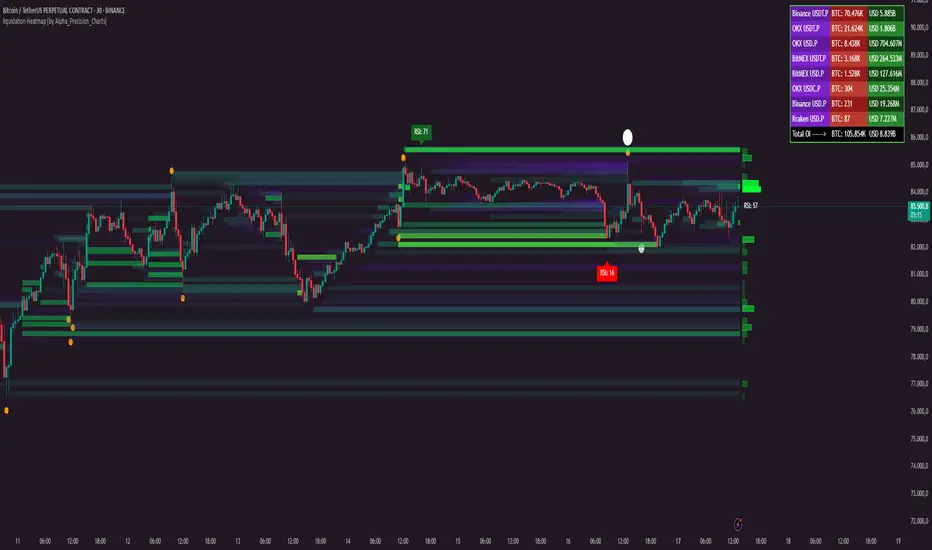
liquidation Heatmap [by Alpha_Precision_Charts]Indicator Description: Heatmap Longs/Shorts with OI Sensitivity & Aggregated Tools
Overview
The "Heatmap Longs/Shorts with OI Sensitivity & Aggregated Tools" is an advanced, multi-functional indicator crafted for futures traders seeking a deeper understanding of market dynamics. This tool integrates several key features—Heatmap of Longs and Shorts with Open Interest (OI) sensitivity, Histograms, Liquidity Exit Bubbles, Volume Bubbles, RSI Labels, Moving Averages, and an OI Table—into a single, cohesive package. By pulling real-time OI data from major exchanges (Binance, BitMEX, OKX, Kraken), it offers a robust framework for analyzing liquidity, order flow, momentum, and trends across various timeframes.
Why Aggregation Matters
Market analysis thrives on combining diverse insights, as relying on a single tool often leaves gaps in understanding. Each component of this indicator addresses a distinct aspect of market behavior:
Heatmap Longs/Shorts with OI Sensitivity: Maps potential liquidation zones based on OI, pinpointing where leveraged positions might cluster.
Histograms: Visualize the density of potential liquidity across price levels, enhancing OI-based analysis.
OI Table: Provides a breakdown of OI across all supported exchanges, offering transparency into total market exposure.
Liquidity Exit Bubbles: Highlight significant position exits (negative OI delta), signaling potential reversals or liquidations.
Volume Bubbles: Detect high-volume events from perpetual futures, revealing aggressive market participation.
RSI Labels: Track momentum with overbought and oversold conditions, refining entry and exit timing.
Moving Averages: Establish trend direction and dynamic support/resistance levels.
The power of aggregation lies in its ability to connect these dots. For instance, the Heatmap identifies potential liquidation zones, Volume Bubbles confirm aggressive moves, and RSI Labels add momentum context. Histograms and the OI Table further enrich this by detailing liquidity density and market exposure, creating a comprehensive view critical for navigating volatile markets.
Key Features
Heatmap Longs/Shorts with OI Sensitivity
Displays potential liquidation levels above (Shorts) and below (Longs) the price, with leverage settings from 5x to 125x.
Includes a Minimum Liquidity Sensitivity filter (0.1-1.0) to exclude small-order noise.
Features a dynamic gradient (purple to yellow) with adjustable intensity based on OI.
Note: Exact trader leverage isn’t known; liquidation zones are inferred from market psychology, as traders often favor specific leverage levels (e.g., 25x, 50x, 125x).
Histograms
Display the density of potential liquidity across price levels, complementing the Heatmap. Note that the largest histogram bars may appear in different locations compared to the most intense (yellow) areas of the Heatmap, as histograms primarily focus on the accumulation of smaller orders.
OI Table
Aggregates OI data from all supported exchanges (Binance, BitMEX, OKX, Kraken) in base currency and USD, sortable by volume.
Displays total OI and individual exchange contributions automatically.
Liquidity Exit Bubbles
Plots bubbles for significant negative OI changes, sized as small, medium, or large based on magnitude.
Positioned above or below candles depending on volatility direction, with customizable colors.
Volume Bubbles
Marks high-volume activity from perpetual futures, with sizes (normal, high, ultra-high) tied to intensity.
Offers adjustable sensitivity and offset for precise placement.
RSI Labels
Provides real-time RSI readings, highlighting overbought (≥70) and oversold (≤30) levels.
Configurable by price source (e.g., High/Low, Close) and timeframe, with customizable appearance.
Moving Averages
Supports SMA, EMA, WMA, and VWMA with three user-defined periods (default: 21, 50, 100).
Toggleable visibility and colors for trend analysis.
How to Use
Scalping/Day Trading (1m-15m):
Load the indicator three times: one at 125x leverage (visible), one at 50x (hidden), and one at 25x (hidden). Use the 125x Heatmap to identify immediate liquidation zones. When price breaks through the 125x liquidity pool, enable the 50x instance, then 25x as needed, to track cascading liquidations.
Pair with Histograms to monitor potential liquidity density, Volume Bubbles for breakout signals, and Liquidity Exit Bubbles for reversals.
Check RSI Labels on short timeframes (e.g., 15m) for overextended moves.
Swing Trading (1H-4H):
Set the Heatmap to lower leverage (e.g., 25x, 10x) and combine with Moving Averages to confirm trends.
Use RSI Labels on matching timeframes to time entries/exits based on momentum.
Reference the OI Table to assess overall market exposure.
Liquidity Analysis:
Adjust the Minimum Liquidity Sensitivity to focus on significant OI clusters. Higher filtering removes small orders, so use Volume Bubbles and the OI Table for broader context in sideways markets.
Use the OI Table to see total OI across all exchanges.
General Tips:
Toggle features (e.g., Bubbles, MAs) to focus on relevant data.
Test settings on your asset—optimized for Bitcoin, adjustable for altcoins.
Settings
Exchanges: Data from Binance, BitMEX, OKX, and Kraken is automatically included.
Heatmap: Enable Longs/Shorts, set start date, adjust leverage and color intensity.
Liquidity Filtering: Tune Minimum Liquidity Sensitivity (0.1-1.0) to balance detail and noise.
Histograms: Automatically active, showing potential liquidity density; no direct settings.
OI Table: Toggle visibility and choose position (e.g., Top Right).
Bubbles: Enable/disable Liquidity Exit and Volume Bubbles, set sensitivities and colors.
RSI: Pick price source, timeframe, and label style (size, color, offset).
Moving Averages: Select type, periods, and visibility.
Why It’s Unique
This indicator blends liquidity tools (Heatmap, Histograms, OI Table, Bubbles) with momentum and trend analysis (RSI, MAs). The adjustable Heatmap intensity enhances visibility of significant OI levels, while the multi-tool approach provides a fuller market perspective.
Notes
Best suited for perpetual futures; test on spot or other instruments for compatibility.
High leverage (e.g., 125x) excels on short timeframes; use 5x-25x for daily/weekly views.
Experiment with settings to optimize for your asset and timeframe.
This indicator relies on the availability of Open Interest (OI) data from TradingView. Functionality may vary depending on data access for your chosen asset and exchange.
Feedback
Your input is valued to enhance this tool. Enjoy trading with a fuller market perspective!
Crypto Liquidation HeatmapThis indicator is designed to identify potential areas of liquidations, in most crypto assets.
How does it work?
At the core of this indicator, it utilizes Open Interest (a statistic measuring the sum of all open futures positions), which I will refer to as OI.
The script monitors changes in OI, and then correlates these changes to the price action trend to derive an estimation of whether an increase in OI relates to an increase in Shorts or in Longs.
The trend is currently identified by the candle closing direction, therefore a bullish candle with increasing OI, results in the script counting an increase in Long Positions. Whereas a bearish candle and increasing OI, results in an increase of Short Positions.
Following that, the script estimates where these new positions will be liquidated (set either as a manual percentage, or using one of the defined presets).
~~~~~~~~~~~~~~~~~~~~~~~~~~~~~~~~~~~~~~~~~~~~~~~~~~~~~
What makes this indicator unique from "Liquidation Levels" scripts, is the the way it groups potential liquidation volumes in segments, creating a cumulative view of liquidity potential - a true heatmap, not simply levels. To further clarify, liquidity within a set range is added to the segment of that range. The settings allow you to set the resolution of the range, according to preference. There is also an Automatic mode (at this moment limited to Bitcoin).
Regular OI Liquidation levels do not combine their volumes when overlapped, nor do they adhere to any ranges - making them scattered and not representative of the true liquidity in that area. This Liquidation Heatmap fixes all of those limitations.
Another unique addition to this Liquidation Heatmap, is my custom three tier color gradients with alpha support (transparency). This function allows a seamless transition of the coloring in liquidation potential from purple (minimum), to blue (medium), to yellow (maximum). This allows a larger range of liquidity identification, along with further aesthetic bonuses.
~~~~~~~~~~~~~~~~~~~~~~~~~~~~~~~~~~~~~~~~~~~~~~~~~~~~~
How to use this indicator?
In general, such a tool can be used in numerous ways. It is not a standalone signal, meaning you should always compliment this tool with your own TA and reasoning.
One way of using this tool, is to anticipate that the price will continue on its trend, when you see it moving towards a zone of high liquidity (expecting that liquidity to be taken out).
Another way of using this tool, would be to anticipate a kickback after a liquidation event has taken place, thus returning to the mean.
