Volume Bubbles & Liquidity Heatmap [LuxAlgo]The Volume Bubbles & Liquidity Heatmap indicator highlights volume and liquidity clearly and precisely with its volume bubbles and liquidity heat map, allowing to identify key price areas.
Customize the bubbles with different time frames and different display modes: total volume, buy and sell volume, or delta volume.
🔶 USAGE
The primary objective of this tool is to offer traders a straightforward method for analyzing volume on any selected timeframe.
By default, the tool displays buy and sell volume bubbles for the daily timeframe over the last 2,000 bars. Traders should be aware of the difference between the timeframe of the chart and that of the bubbles.
The tool also displays a liquidity heat map to help traders identify price areas where liquidity accumulates or is lacking.
🔹 Volume Bubbles
The bubbles have three possible display modes:
Total Volume: Displays the total volume of trades per bubble.
Buy & Sell Volume: Each bubble is divided into buy and sell volume.
Delta Volume: Displays the difference between buy and sell volume.
Each bubble represents the trading volume for a given period. By default, the timeframe for each bubble is set to daily, meaning each bubble represents the trading volume for each day.
The size of each bubble is proportional to the volume traded; a larger bubble indicates greater volume, while a smaller bubble indicates lower volume.
The color of each bubble indicates the dominant volume: green for buy volume and red for sell volume.
One of the tool's main goals is to facilitate simple, clear, multi-timeframe volume analysis.
The previous chart shows Delta Volume bubbles with various chart and bubble timeframe configurations.
To correctly visualize the bubbles, traders must ensure there is a sufficient number of bars per bubble. This is achieved by using a lower chart timeframe and a higher bubble timeframe.
As can be seen in the image above, the greater the difference between the chart and bubble timeframes, the better the visualization.
🔹 Liquidity Heatmap
The other main element of the tool is the liquidity heatmap. By default, it divides the chart into 25 different price areas and displays the accumulated trading volume on each.
The image above shows a 4-hour BTC chart displaying only the liquidity heatmap. Traders should be aware of these key price areas and observe how the price behaves in them, looking for possible opportunities to engage with the market.
The main parameters for controlling the heatmap on the settings panel are Rows and Cell Minimum Size. Rows modifies the number of horizontal price areas displayed, while Cell Minimum Size modifies the minimum size of each liquidity cell in each row.
As can be seen in the above BTC hourly chart, the cell size is 24 at the top and 168 at the bottom. The cells are smaller on top and bigger on the bottom.
The color of each cell reflects the liquidity size with a gradient; this reflects the total volume traded within each cell. The default colors are:
Red: larger liquidity
Yellow: medium liquidity
Blue: lower liquidity
🔹 Using Both Tools Together
This indicator provides the means to identify directional bias and market timing.
The main idea is that if buyers are strong, prices are likely to increase, and if sellers are strong, prices are likely to decrease. This gives us a directional bias for opening long or short positions. Then, we combine our directional bias with price rejection or acceptance of key liquidity levels to determine the timing of opening or closing our positions.
Now, let's review some charts.
This first chart is BTC 1H with Delta Weekly Bubbles. Delta Bubbles measure the difference between buy and sell volume, so we can easily see which group is dominant (buyers or sellers) and how strong they are in any given week. This, along with the key price areas displayed by the Liquidity Heatmap, can help us navigate the markets.
We divided market behavior into seven groups, and each group has several bubbles, numbered from 1 to 17.
Bubbles 1, 2, and 3: After strong buyers market consolidates with positive delta, prices move up next week.
Bubbles 3, 4, and 5: Strength changes from buyers to sellers. Next week, prices go down.
Bubbles 6 and 7: The market trades at higher prices, but with negative delta. Next week, prices go down.
Bubbles 7, 8, and 9: Strength changes from sellers to buyers. Next weeks (9 and 10), prices go up.
Bubbles 10, 11, and 12: After strong buyers prices trade higher with a negative delta. Next weeks (12 and 13) prices go down.
Bubbles 12, 14, and 15: Strength changes from sellers to buyers; next week, prices increase.
Bubbles 15 and 16: The market trades higher with a very small positive delta; next week, prices go down.
Current bubble/week 17 is not yet finished. Right now, it is trading lower, but with a smaller negative delta than last week. This may signal that sellers are losing strength and that a potential reversal will follow, with prices trading higher.
This is the same BTC 1H chart, but with price rejections from key liquidity areas acting as strong price barriers.
When prices reach a key area with strong liquidity and are rejected, it signals a good time to take action.
By observing price behavior at certain key price levels, we can improve our timing for entering or exiting the markets.
🔶 DETAILS
🔹 Bubbles Display
From the settings panel, traders can configure the bubbles with four main parameters: Mode, Timeframe, Size%, and Shape.
The image above shows five-minute BTC charts with execution over the last 3,500 bars, different display modes, a daily timeframe, 100% size, and shape one.
The Size % parameter controls the overall size of the bubbles, while the Shape parameter controls their vertical growth.
Since the chart has two scales, one for time and one for price, traders can use the Shape parameter to make the bubbles round.
The chart above shows the same bubbles with different size and shape parameters.
You can also customize data labels and timeframe separators from the settings panel.
🔶 SETTINGS
Execute on last X bars: Number of bars for indicator execution
🔹 Bubbles
Display Bubbles: Enable/Disable volume bubbles.
Bubble Mode: Select from the following options: total volume, buy and sell volume, or the delta between buy and sell volume.
Bubble Timeframe: Select the timeframe for which the bubbles will be displayed.
Bubble Size %: Select the size of the bubbles as a percentage.
Bubble Shape: Select the shape of the bubbles. The larger the number, the more vertical the bubbles will be stretched.
🔹 Labels
Display Labels: Enable/Disable data labels, select size and location.
🔹 Separators
Display Separators: Enable/Disable timeframe separators and select color.
🔹 Liquidity Heatmap
Display Heatmap: Enable/Disable liquidity heatmap.
Heatmap Rows: select number of rows to be displayed.
Cell Minimum Size: Select the minimum size for each cell in each row.
Colors.
🔹 Style
Buy & Sell Volume Colors.
Liquidity-heatmap

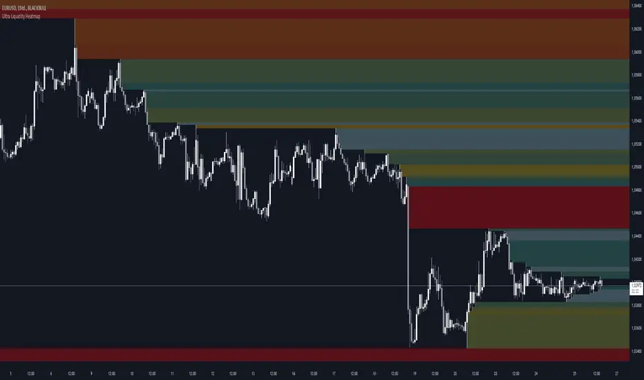
Ultra Liquidity HeatmapThe Ultra Liquditiy Heatmap is a unique visualization tool designed to map out areas of high liquidity on the chart using a dynamic heatmap, helping traders identify significant price zones effectively.
Introduction
The Ultra Liquidity Heatmap is an advanced indicator for visualizing key liquidity areas on your chart. Whether you're a scalper, swing trader, or long-term investor, understanding liquidity dynamics can offer a powerful edge in market analysis. This tool provides a straightforward visual representation of these zones directly on your chart.
Detailed Description
The Ultra Liquidity Heatmap identifies high and low liquidity zones by dynamically marking price ranges with heatmap-like boxes.
.........
Dynamic Zone Creation
For low liquidity zones, the script draws boxes extending from the low to the high of the bar. If the price breaks below a previously defined zone, that box is removed.
Similarly, for high liquidity zones, the script tracks and highlights price ranges above the current high, removing boxes if the price exceeds the zone.
.....
Customizable Visuals
Users can adjust the transparency and color of the heatmap, tailoring the visualization to their preference.
.....
Real-Time Updates
The indicator constantly updates as new price data comes in, ensuring that the heatmap reflects the most current liquidity zones.
.....
Efficiency and Scalability
The script uses optimized arrays and a maximum box limit of 500 to ensure smooth performance even on higher timeframes or during high-volatility periods.
.........
The Ultra Liquidity Heatmap bridges the gap between raw price data and actionable market insight. Add it to your toolbox and elevate your trading strategy today!
[DarkTrader] Liquidity Regression MapLinear Regression Function Reference by @RicardoSantos :
Liquidity Regression Map is an advanced indicator designed to assist traders in identifying key liquidity zones, reversals, and potential breakout areas within the market. By visualizing liquidity shifts and regression patterns, this tool provides a powerful visual guide to price movements that often go unnoticed by conventional indicators. The indicator's dynamic and adaptive approach helps traders better navigate complex market environments.
Purpose :
This indicator focuses on analyzing the behavior of liquidity in the market and mapping it out in a visual format on your TradingView charts. It provides a deeper understanding of where large clusters of liquidity exist, helping traders pinpoint potential areas where price is likely to react. It aims to highlight key liquidity zones and assess when price is likely to reverse or continue its trend, providing a comprehensive view of the market's internal structure.
Liquidity Regression Map supports multiple timeframes and multiple assets, providing traders with flexibility to analyze different market conditions. Whether you're analyzing short-term charts for scalping or higher timeframes for swing trades, the indicator adjusts its liquidity and regression calculations accordingly, ensuring accurate insights across all timeframes. Additionally, it is compatible with various asset classes, including stocks, forex, cryptocurrencies, and commodities, allowing you to apply the same powerful liquidity analysis across multiple markets for a unified trading strategy.
How It Works :
The indicator identifies liquidity zones by looking at the highs and lows of recent price action within a user-defined period, known as the lookback period. These zones represent areas where market participants are likely to have placed a significant number of stop orders or large positions, creating pockets of liquidity. The zones are visualized as levels on the chart, showing where the market is likely to react.
Next, the indicator performs a linear regression analysis on the price data. Linear regression helps smooth out the price action and gives an indication of the overall trend within the defined liquidity zone. This analysis is critical for determining the slope and direction of price movement, which provides insights into the market's momentum and strength in these liquidity areas.
A key feature of this indicator is its ability to detect liquidity swipes—sharp moves in price that sweep liquidity levels. When price approaches a liquidity zone and crosses it aggressively, the indicator highlights this as a swipe. Swipes often signal significant price reversals or trend continuation because they indicate that liquidity has been absorbed. The Akastra Liquidity Regression Map highlights these areas, helping traders anticipate where a reversal or continuation may occur.
As new price data comes in, the liquidity zones and regression lines dynamically adjust. This real-time update ensures that traders are always working with the most relevant and up-to-date liquidity information. The indicator recalculates the liquidity levels based on the recent highs and lows and repositions the regression lines accordingly. This makes it adaptive to both short-term volatility and long-term trends.
To make the analysis intuitive and easy to interpret, the liquidity levels are color-coded based on their strength and importance. Liquidity zones are shown using a gradient of colors, from weak liquidity (indicating potential minor reactions) to strong liquidity (where a significant price reaction is more likely). The heatmap visually communicates how liquidity is distributed across different levels and timeframes.
Liquidity Condition Filtering :
Another important aspect of the mechanism is the liquidity condition filtering, which only highlights significant liquidity shifts. The indicator evaluates if price movement meets certain thresholds, such as exceeding a 1.618 threshold for liquidity absorption or rejection . This filtering ensures that only the most relevant and impactful liquidity conditions are displayed, minimizing noise and false signals on the chart.
Finally, the indicator calculates and displays liquidity levels across multiple timeframes simultaneously, providing a more comprehensive view. For example, liquidity from a higher timeframe may interact with liquidity from a lower timeframe, providing traders with an overlapping view of where significant liquidity is concentrated. This multi-layer analysis helps to confirm trading setups and increases the probability of successful trades.

Open Liquidity Heatmap [BigBeluga]Open Liquidity Heatmap is an indicator designed to display accumulated resting liquidity on the chart.
Unlike any other liquidity heatmap, this aims to accumulate liquidity at specific levels that build up over time, showing larger areas of liquidity.
🔶 FEATURES
The indicator includes the following settings:
Lookback : Used to determine the range calculation of the heatmap.
Leverage : Leverage of the liquidation (Counted as % in price, Example: 4.5 will return a distance from price of 4.5%, indicating any possible resting liquidity in this range).
Levels : Amount of levels to display (Each level is counted as liquidity resting on the chart; fewer levels will return a bigger area of liquidity sitting on the chart).
Mode : Apply a color gradient from the minimum liquidation to the maximum liquidity level. Set the maximum color gradient value (Counted as volume).
Offset : Automatically determine the offset range of the Volume Profiles. Manual offset of the Volume Profiles.
🔶 CALCULATION
for i = 0 to step - 1
float plotter = na
switch i
0 =>
plotter := hs
=>
plotter := hs - diff * ( i )
cls.hm.gnL(plotter)
cls.vp.put(plotter, 0)
We calculate levels like a normal volume profile with steps, from the highest point within the lookback to the lowest one. Each level will contain the corresponding amount of volume that the candle has closed in that range.
As we can see in the image above, we add liquidity each time the distance in % from price is between two levels.
Unlike many liquidity indicators that provide a single candle liquidity heatmap, this aims to add up liquidity (volume) in already present levels.
This can be extremely useful to see which levels are likely to be more liquid and tend to get a bigger reaction to the price.
Imagine it like a range of levels that each time price revisits that area, a new position area is added; we add volume in that area each time price visits that zone. Liquidity builds up in those zones, causing a bigger reaction to the price once the price visits it.
This indicator is not the same as a single candle heatmap like many others. What is a single candle heatmap?
A single candle heatmap is when a level is created on every new candle, coloring the level based on the total volume of it.
This indicator, on the contrary, aims to provide a more specific use by adding up liquidity each time price visits it.
🔶 BASIC DEMOSTRATION
This is a basic demonstration of how we can spot high liquidity points overall using confluence:
We see the POC of the liquidation in a low volume area of the normal volume profile adding up as confluence.
Resistance from the POC Volume Profile suggesting price will go lower.
Major long open liquidity down.
As we can see, price takes out all the long liquidity and right after pumping, indicating that all the major liquidity got taken out.
Some key note to take is that a POC in the liquidation heatmap in a low volume area of the normal Volume Profile add confluence of a possible big reaction in that zone.
In the forex market, we suggest to use a low distance from price (Leverage) while in a crypto market you can use the one that fit the best the current timeframe.
🔶 CONCLUSION
This indicator aims to show open resting liquidity that had built up over time, showing the most amount of liquidation in specific areas in an aggregated way unlike many liquidation heatmap indicators that show single-level liquidation.
🔶 RELATED SCRIPT

AlgoRhythmica - Liquidity MapThe AlgoRhythmica - Liquidity Map is a complex and performance heavy indicator, attempting to visualize and highlight areas of liquidity on the chart. It paints lines above and below price with different color and opacity based on the volume, and then highlight the areas with the highest cumulative volume.
What is liquidity and a liquidity map?
Liquidity refers to how quickly and easily an asset can be bought or sold in the market without affecting its price. High liquidity means that there are many buyers and sellers, and transactions can happen rapidly and smoothly.
Liquidity analysis involves examining where and how liquidity is distributed across different price levels.
Price often moves from liquidity zone to liquidity zone, and therefore, having an idea of where those zones are can give traders an understanding of potential support and resistance levels and where significant trading activities might occur.
Those looking to fill large buy orders for example would want to do that in liquid sell areas and vice versa. This indicator attempts to estimate the price levels where traders using leverage get liquidated, and therefore creates liquid areas for buying and selling.
In contrast to Bookmaps which chart the orders in the order book where traders want to transact, a liquidity map is charting where traders are 'forced' to transact due to stop-losses or margin calls. To do that, liquidity maps are mostly based on estimations. It could be based on pivot points, common stop-loss amounts, common leverage amounts or a combination of multiple factors.
As of the current version on release, this indicator is only using the leverage input by the user to estimate the liquidity.
How does it work and what makes it unique?
The indicator takes the volume in a candle and saves that volume in a line. Based on the leverage settings it then offsets that line above and below price. Say, a trader using 20x leverage without a stop-loss gets liquidated if price goes roughly 5% in the wrong direction. Therefore, by assuming common leverage amounts or common risk amounts, we can estimate where traders get liquidated or have their stop-losses based on their leverage or amount they are willing to risk.
Now keep in mind, this liquidity map is just estimating based on general assumptions, it doesn't have access to actual liquidity data.
But at the same time, we're not trading single individual traders, but we're trading the market as a whole, and interestingly enough, some risk and leverage amounts are more common than others. People like using those even numbers like 10x, 20x, 1% risk etc. That's why price do often react on the liquidity in liquidity maps such as this one.
So, when a candle is printed, and you are on a smaller timeframe and decided this is just the kind of market for 100x scalpers. You set the leverage to 100x in the settings and the indicator will paint lines above and below price offset by 1%. There are settings for three leverage amounts at the same time, so you might also set it to paint lines at 5% and 10%, just to catch those traders on higher timeframes if price really takes off.
Now let's talk about what makes this indicator really shine and stand out!
Normally, if we just left the indicator doing as above, there would be lines all over the place and very difficult to interpret which areas matter, or we could limit the indicator to only print lines at high volume candles. Now, you do have that option, but that wouldn't pick up areas where low volume trading has cumulated in the same range, such as over a weekend or during market gaps. Where other liquidity indicators out there might miss that liquidity, this indicator has several solutions for it.
The first solution is stacking semi-transparent lines on top of each other. Normally, lines of the same color and transparency wouldn't add and blend together. But this script offers a seamless transition from one color the next, blending those low volume liquidity lines together.
The second solution, and this is what I believe is really unique and powerful, is that this indicator also has the ability highlight certain liquidity. When enabled, it scans through all the lines, cumulate the volume within a specified range around the lines and then compare the cumulated volume range with the ranges around the other lines. New lines created in the range with the highest cumulated volume gets highlighted.
Without this feature you wouldn't necessarily be able to tell which of two strong areas are more liquid. When price later enters that area and crosses those lines, the liquidity there is then considered consumed and lines created in a different range will now begin to highlight.
All of this is of course enhanced, as in the picture above, when multiple copies of the indicator is used together and assigned to only calculate specific parts of the liquidity map, such as longs, shorts or specific leverage amounts.
Oh, and there's also options for assigning which part of the candle should generate the liquidity. Close, Middle Body or Open. The indicator will then assume that the majority of traders are entering their position in that part of the candle.
The offset is calculated from that part of the candle. By using multiple copies of the indicator, you can assign one for each part and that will give you the whole range of the candle. And you might assume more traders go long from the top, so to emphasize that liquidity, you could increase the size or transparency slightly of the lines generated from that part.
How do I use it?
Well, this isn't gonna give you trading signals or anything, but it will visualize the market for you in a new perspective.
Typically, high liquidity areas are often good areas for entry and TP. But always watch how the price reacts in those areas before entering a position. And remember, the liquidity estimation might not always be accurate.
Particularly watch the highlighted areas for long wicks and high volume, indicating that the liquidity was enough to meet the orders and a retrace or reversal could be imminent.
Watch what happens during consolidation, market gaps and weekends. Notice the lack of liquidity and how the market maker creates liquidity by inducing traders to take positions with quick moves that instantly reverses. You might know how that works in theory, but watching it happen real-time with visualized liquidity is very interesting.
While not necessary, and as I've mentioned earlier, dividing the different functions of the indicator on multiple copies will substantially increase it's accuracy and performance!
For example, use one copy of the indicator per leverage level, or one for shorts, one for longs. One that generates from the close, one from the middle etc. creating a much clearer picture of the liquidity like the picture comparison above.
This is what the indicator offers:
When you're estimating liquidity, you want to be able to do it with accuracy and interpretability. That's why the customization options of this indicator has been really important in the development.
Timeframe Options:
It supports a wide range of time periods, from daily to yearly, enabling traders to apply it across various trading strategies, from short-term day trading to long-term investment analysis. Assuming traders are eventually taking their profits, liquidity after the set time period disappears.
Rich Visual Settings:
The indicator comes with multiple preset color themes and a completely customizable option as well. These visual settings are designed to enhance the interpretability of liquidity data, with adjustable transparency and contrast features.
Liquidity Highlighting Function:
This unique feature emphasizes areas with high liquidity concentration. It scans and highlights significant liquidity zones, aiding traders in identifying critical market levels.
Liquidity Profile:
The LQ-Profile extends liquidity lines based on their associated volume, giving traders another way of identifying high liquidity zones.
Adjustable Liquidity Estimation:
Select and adjust leverage amounts based on your particular chart and analysis. Choose what positions and leverage amounts to display liquidity for. You also have the option to determine if wicks consume liquidity or not.
Since wicks indicate that price was rejected from that area, it doesn't necessarily mean all the liquidity in that area was consumed. You could assign an additional copy of the indicator consuming with wicks and another that doesn't. That way, half the liquidity gets consumed and the other half remains until another candle closes in that area. They choices are endless and it's all about your understanding and analysis here.
Multiple Performance Options:
Depending on your particular chart and timeframe, this indicator can be very performance heavy to load. Luckily it has plenty of performance options for limiting the calculations of the indicator.
Tooltips:
As usual, this indicator comes with extensive tooltips for every function, making sure you understand every part of it.
Happy trading!

Volume CVD and Open Interest HeatmapTaking Volume and Open Interest data to the next level of visualization I created a 'heatmap'. The indicator uses a colour gradient and plots boxes from the source candle to the current candle with one of the following data sources:
- Volume - the total volume of transactions, buys and sells
- Up Volume - the total volume from buys only
- Down Volume - the total volume from sells only
- Up/Down Volume (Net) - the difference in the Buy Volume and Sell Volume
- Cumulative Delta - the sum of the up/down volume for the previous 14 bars
- Cumulative Delta EMA - a smoothed average of the sum of the up/down volume for the previous 14 bars, over a 14 period EMA
- Open Interest - a user defined ticker, whose value is added to the plot, while this is designed to be used with Open Interest tickers, you can actually choose any ticker you want, perhaps you want to see DXY while charting Bitcoin!
You can define the lookback period, though you should make sure your timeframe for volume source data, is high enough to accommodate the lookback. TradingView will only fetch 5000 candles worth of data, so at 1 min volume data, you can only lookback 83 hours.
While similar, Volume and Open Interest are not the same. To me the simplest explanation is Volume shows the trades that have been executed and the buy/sell direction, while Open Interest shows the value of open trades that are yet to be completed.
Volume shows strength, sentiment and volatility .
Open Interest does not show direction, but does indicate momentum and liquidity in the market.
With this novel way of visualizing these, you can also now determine where all that liquidity and positions came from and therefore might have resting liquidity below.
