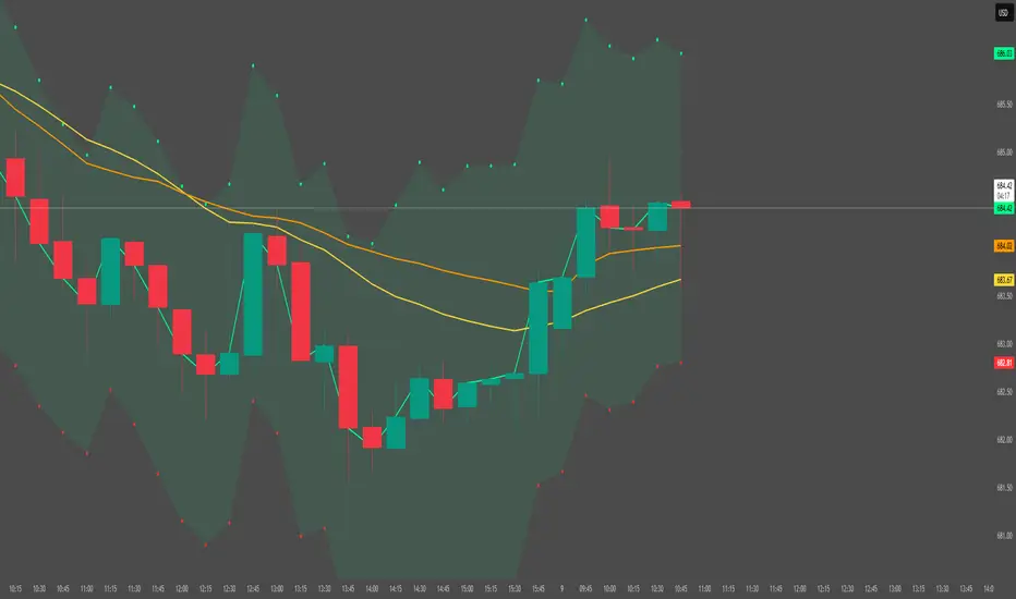
Trend & Pullback Cycle How to use.
Trend Identification:
Green Columns: The cycle is above 50. Look for Longs.
Red Columns: The cycle is below 50. Look for Shorts.
Pullback Detection:
I added a Colour Change feature. If the Green bars turn Dark Green, it means momentum is fading (a pullback is happening). This is your signal to get ready to enter or add to a position once it turns Bright Green again.
The Yellow Line:
This is your trigger. In the screenshot, you see the bars cross the yellow line.
Entry Signal: When the Histogram crosses above the Yellow line (while generally green) or crosses below it (while generally red).
M-oscillator

Mean Reversion Framework [LTS]LHAMA Trading Suite's Mean Reversion Framework is a VWAP-centric mean reversion and exhaustion tool that combines volatility regimes, volume-weighted extension zones, and multi-oscillator divergence detection into a single framework. It is designed to help traders quickly answer three questions on any chart:
How far is price stretched away from VWAP in standard deviations?
Is the current environment favorable or hostile to mean reversion?
Are there momentum divergences supporting a reversal or trend continuation idea?
Core components
1. Adaptive VWAP with standard deviation bands
The framework builds around a dynamically anchored VWAP with statistical bands:
VWAP line plotted from a rolling anchor point.
Standard deviation bands : ±1σ, ±2σ, ±2.5σ, and ±3σ around VWAP.
Extension zones : the area between ±2.5σ and ±3σ is highlighted as an “extension zone,” where price is statistically stretched from its mean.
Anchoring is automatic and timeframe-aware. When you change your charts timeframe, this will automatically adjust what VWAP you are looking at to make sure you're always using the anchoring research has shown to be most appropriate and relevant for that timeframe.
2. Reversion candle coloring
To highlight potentially climactic moves:
The script tracks a configurable volume average and multiplier.
When price touches the ±2.5σ extension zone and a candle meets one of these conditions, candles can be recolored:
Has above average volume, but below average candle body size.
Has lower volume than the previous candle.
An optional alert can be triggered when these extension touches occur.
The ideal reversion setup is a quick extension into the marked zone, which includes a high volume, small body candle at its peak, surrounded by lower volume candles in opposite directions. This shows an energetic push in one direction, followed by exhaustion and a fade back toward the mean.
3. Volatility regime detection
The script classifies the current volatility regime using ATR:
Calculates ATR over a user-defined lookback.
Computes the percentile rank of current ATR relative to its recent history.
Labels the environment as:
HIGH volatility (ATR percentile at or above the high threshold).
LOW volatility (at or below the low threshold).
MODERATE otherwise.
The current regime and ATR percentile are displayed on the dashboard and can be used as context for whether mean-reversion setups may be more or less favorable. Alerts can fire when volatility crosses into high or low regimes so users can adjust expectations or strategies if desired.
4. RSI & Stochastic divergence framework
The indicator includes a combined divergence engine using RSI and Stochastic:
User-configurable RSI length.
User-configurable Stochastic K/D parameters.
Pivot-based detection with left/right lookbacks and a max lookback window.
Two main categories:
Regular divergences – potential reversal context.
Hidden divergences – potential trend continuation context.
For both RSI and Stochastic, the script looks for:
Bullish regular : price lower low vs. oscillator higher low.
Bearish regular : price higher high vs. oscillator lower high.
Hidden bullish : price higher low vs. oscillator lower low.
Hidden bearish : price lower high vs. oscillator higher high.
When conditions are met, the script will:
Plot labels on the price chart:
🔃 icons for regular (reversal) divergences.
⏩ icons for hidden (continuation) divergences.
Combine RSI and Stochastic confirmation into a single label when both agree, with tooltips explaining:
Price structure (HH/HL/LL/LH).
Which oscillator(s) confirmed the divergence.
Whether the pattern suggests potential reversal or continuation.
Optionally trigger alerts for each divergence type when alerts are enabled.
Divergence labels are based on confirmed pivots, so they appear with a delay relative to the pivot bar. They are not predictive and should be treated as contextual information rather than standalone trade signals.
5. Dashboard overlay
An on-chart dashboard summarizes the most important state variables in a compact table:
VWAP Anchor – shows the effective anchor logic currently in use (“Session/Week/Month”, “5-Day Rolling” or “Yearly (Jan 1)”).
Alert Status – ACTIVE, COOLDOWN, or DISABLED.
Volatility Regime – HIGH / MODERATE / LOW with the current ATR percentile.
VWAP Value – current VWAP price.
Price vs VWAP – distance of price from VWAP in standard deviations (σ).
ATR – current ATR value for the selected length.
The dashboard can be toggled on or off and moved to any corner of the chart (top/bottom, left/right).
6. Alert system & cooldown
The script defines multiple alert conditions so users can build their own rules around mean reversion and volatility changes:
Extension zone alerts :
Price enters upper extension (≥ +2.5σ).
Price enters lower extension (≤ −2.5σ).
Price enters any extension zone.
High-volume candle touching an extension zone.
Divergence alerts :
Regular bullish / bearish divergence.
Hidden bullish / bearish divergence.
Volatility regime alerts :
ATR percentile crosses into HIGH volatility.
ATR percentile crosses into LOW volatility.
To reduce alert noise around VWAP resets, there is an optional alert cooldown :
At the start of a new VWAP period (session/5-day/yearly, depending on timeframe), the script can enter a cooldown phase.
During cooldown, extension-related alerts are temporarily suppressed for a user-defined number of minutes.
Volatility regime alerts remain active, as they reflect broader structural changes rather than short-term VWAP resets.
Users can disable the cooldown by setting its duration to 0.

Sen Channel LiteSen Channel Lite
Sen Channel Lite calculates a robust, median-based regression channel using the Theil–Sen slope method. This visual tool helps traders identify trend direction and potential breakout zones in real time.
Key Features
Dynamic Trend Line: The median-based regression line adapts to price movement, providing a central reference for trend direction.
Upper and Lower Bands: Automatically updated bands highlight potential breakout or reversal areas.
Breakout Markers: Optional triangles indicate when price crosses above the upper band or below the lower band.
Midline (EMA/SMA): Toggleable trend line for additional context on price direction.
VWAP Anchor: Optional VWAP plot to visualize volume-weighted average price levels.
Customizable Inputs:
Lookback Period for slope calculation
Band Multiplier to adjust sensitivity
Option to use Standard Deviation or ATR for band width
Midline type, length, and color
VWAP visibility and color
Channel cloud transparency
How to Read Signals (Educational Use Only):
Trend Context: The midline provides a reference for general trend direction. Price above the midline suggests bullish bias; below indicates bearish bias.
Breakouts:
Triangle up → price crossed above the upper band; potential strong move upward.
Triangle down → price crossed below the lower band; potential strong move downward.
Channel Interpretation:
Price near the upper band → market may be overextended.
Price near the lower band → market may be oversold.
Price moving within the channel → trend is balanced; use additional analysis for direction.
VWAP Context: Compare price to VWAP for intraday support/resistance insights.
Usage Notes:
Fully visual tool; no trading or financial advice.
All calculations are protected to preserve intellectual property.
Results reflect real-time calculations; no repainting.
Suitable for intraday to daily timeframes.
Important: This script is published as protected/closed-source to safeguard GammaBulldog intellectual property.
Hemanth's Pure Z-Score IndicatorThe Pure Z-Score Indicator is a statistical tool that measures how far the current price is from its recent average in terms of standard deviations. It helps traders identify overbought, oversold, and mean-reverting conditions in the market. This indicator is fully customizable, lightweight, and easy to use.
Key Features:
Displays the Z-Score of the price with optional smoothing.
Highlights overbought and oversold zones based on standard deviation thresholds.
Highlights mean (0) level for tracking price reversion.
Optional SMA or EMA smoothing to reduce noise.
Background highlights visually indicate extreme zones for easier analysis.
Inputs:
Length – Number of bars used to calculate the Z-Score.
Higher values smooth the indicator but react slower.
Lower values make it more sensitive but may produce more noise.
Overbought Level – Upper threshold for the Z-Score.
Default: 2.0 (2 standard deviations above the mean).
Crossing above this level signals a statistically overbought condition.
Oversold Level – Lower threshold for the Z-Score.
Default: -2.0 (2 standard deviations below the mean).
Crossing below this level signals a statistically oversold condition.
Use EMA instead of SMA – Determines whether the basis for Z-Score calculation is an Exponential Moving Average (EMA) or a Simple Moving Average (SMA).
EMA reacts faster to recent price changes.
SMA gives a smoother, slower-reacting average.
Smooth Z-Score (0 = no smoothing) – Apply additional smoothing to the Z-Score using a moving average.
Reduces noise and false spikes for cleaner visualization.
How to Use:
Overbought/Oversold: Watch for the Z-Score crossing the upper or lower levels to identify potential reversal zones.
Mean Reversion: Z-Score crossing the mean (0) can indicate short-term trend shifts.
Smoothing Options: Adjust the smoothing length and type to suit your trading style and timeframe.
Recommended Timeframes:
Works on any timeframe; suitable for day trading, swing trading, or longer-term analysis.
Best used in combination with price action or other indicators for confirmation.
Note:
This is a pure statistical indicator based on standard deviations. It does not provide buy/sell signals by itself, but helps traders identify areas of extreme price movement and potential reversals.

XAU Micro ScalperThis indicator is designed for short-term price rotation detection on XAUUSD, especially on the 1-minute timeframe.
It combines three momentum components—Stochastic, RSI, and OBV slope—to highlight potential reversal points and short-term scalping opportunities.
Core Logic
The script generates a signal only when multiple conditions align:
1. Stochastic Reversal (Timing Component)
A basic long/short trigger occurs when the Stochastic oscillator exits oversold (long) or overbought (short).
This represents a potential shift in short-term momentum.
2. RSI “Smart Rotation” Filter (Context Component)
Instead of using fixed oversold/overbought thresholds, the indicator checks whether RSI is turning:
Long: RSI is below a contextual ceiling (default 50) and rising
Short: RSI is above a contextual floor (default 55) and falling
This avoids premature entries during strong trending phases and confirms that momentum is actually rotating.
3. OBV Slope Filter (Volume Confirmation)
The On-Balance Volume trend is compared to its previous value:
Long: OBV slope improving
Short: OBV slope deteriorating
This helps confirm whether volume pressure is shifting in favor of the trade direction.
Both RSI and OBV filters can be enabled or disabled independently via the indicator settings.
Signals
Small circles mark raw Stochastic reversal points (unfiltered).
Green / red triangles represent validated long/short signals where all active filters agree.
Optional candle coloring highlights confirmed entry signals on the chart.
Use Cases
Intraday and scalping strategies on XAUUSD
Identifying short-term momentum reversals
Filtering noisy signals during high-volatility sessions
Studying how volume and momentum align around turning points
Customization
Users can adjust:
RSI contextual thresholds
Lookback periods
OBV slope sensitivity
Stochastic parameters
Activation of RSI and OBV filters
This flexibility allows the indicator to adapt to different market conditions and timeframes.
Disclaimer
This indicator does not provide financial advice or guarantee performance.
Always test any strategy on historical data and use proper risk management.

KSL-Fullsystem V2.0Trend Following & Reversal Trading System. It combines **Price Action (Market Structure)** with multiple technical indicators to generate high-quality Buy and Sell signals.
---
1. How Signals are Generated (The Core Logic)
The script uses **"Internal Shifts"** (Market Structure Breaks) to find entry points.
* BUY Signal: The price breaks above a previous bearish structure (Higher High) + All enabled filters are Green.
* SELL Signal: The price breaks below a previous bullish structure (Lower Low) + All enabled filters are Red.
When a signal occurs, the script automatically calculates:
* Stop Loss (SL): Based on the recent Swing High/Low.
* Take Profit (TP): Three levels (TP1, TP2, TP3) based on risk-reward ratios (1.5x, 2.0x, 3.0x).
---
2. The Filters (Your Confirmation Checklist)
You can turn these On/Off in the settings. **Note:** If you turn *all* of them on, you might get very few signals because the conditions become too strict.
**A. Bollinger Bands (BB) Filters (Primary Feature)**
This is the main filter for this version.
* Squeeze Filter: Prevents trading when the bands are too narrow (low volatility). If the background turns **Yellow**, it means the market is "Squeezing" – **Do Not Trade.**
* Touch Entry: Looks for price bouncing off the Lower Band (Buy) or Upper Band (Sell).
* Breakout Entry: Looks for price blasting through the bands.
* Mean Reversion: Checks if price is reverting to the middle line (Basis).
**B. Moving Average Filters (Trend)**
The script includes three types of Moving Averages. You can choose which style suits you:
* EMA (Exponential): Fast-reacting. Good for scalping.
* SMA (Simple): Standard trend lines. Good for position trading.
* LWMA (Linear Weighted): Focuses heavily on recent data.
* Configuration: You can select specific setups like "Scalping" (9/21/50 EMA) or "Trend" (50/200 EMA).
**C. Momentum Filters**
* MACD: Checks momentum. You can choose settings for Scalping, Day Trading, or Swing Trading.
* AO (Awesome Oscillator) & AC: Helps confirm if the momentum is strong enough to support the trend.
---
**3. Visual Guide: What You See on the Chart**
* Green Box: A Buy Zone (Demand).
* Red Box: A Sell Zone (Supply).
* Labels (Text): Shows "BUY" or "SELL" with exact prices for TP1, TP2, TP3, and SL.
* Blue Lines: The Bollinger Bands (Upper and Lower).
* Orange Line: The Bollinger Band Basis (Middle).
* Small Triangles:
* Green Triangle (Below Bar): Price touched the Lower Bollinger Band.
* Red Triangle (Above Bar): Price touched the Upper Bollinger Band.
* Yellow Background: **WARNING.** The market has low volume/volatility (BB Squeeze). Wait for a breakout.
---
4. How to Use This Script
1. Select Your Style: Go to the Settings (Inputs).
* If you are a **Scalper**, turn on "Scalping EMA" or "Scalping MACD".
* If you are a **Swing Trader**, turn on "Swing SMA" or "Trend EMA".
2. Configure Bollinger Bands: Keep `Use Bollinger Bands Filter` checked. Decide if you want to trade "Squeezes" (usually safer to avoid them).
3. Wait for the Label: Do not enter blindly. Wait for the script to print a **BUY** or **SELL** label with the TP/SL targets.
4. Check the Background: If the background is **Yellow**, ignore the signal or wait until the color clears.
5. Manage Risk: Place your Stop Loss at the price shown on the label ("SL").

VAPO OsilatorThe Real Map of Buying and Selling Pressure.
VAPO Advanced is fundamentally different from conventional oscillators that only measure momentum based on price. By integrating Volume and price movement (Pressure), it quantitatively maps the true buying and selling pressure in the market.
How It Works and What Are Its Advantages?
1. Core Pressure Measurement
Logic: The oscillator interprets high-volume price increases as strong buying pressure (+P) and high-volume price decreases as strong selling pressure (-P). Low-volume moves weaken the signal strength.
Benefit: This effectively filters out misleading signals caused by "fake" price movements (manipulation or low-volume spikes). It only displays momentum shifts that are supported by volume.
2. Dynamic Signal Line and Histogram
Signal Line: Provides a dynamic signal line smoothed by your choice of Moving Average type (EMA, SMA, WMA).
Histogram: Shows the difference between the VAPO line and the Signal line. A zero-line crossover of the histogram is the clearest signal that pressure is shifting direction. As the Green histogram grows, Buying Pressure accelerates; as the Red histogram grows, Selling Pressure accelerates.
3. Reliable Confirmation Tool
VAPO serves as an excellent confirmation tool when used alongside your primary trend indicators. For instance, when a trend indicator gives a BUY signal, VAPO crossing above the zero line (positive pressure) significantly increases the reliability of that signal.
⚠️ DISCLAIMER: THIS IS NOT FINANCIAL ADVICE. ALL INFORMATION PROVIDED IS FOR EDUCATIONAL AND ANALYTICAL PURPOSES ONLY.
YASAL UYARI: BU BİR YATIRIM TAVSİYESİ DEĞİLDİR. SUNULAN TÜM BİLGİLER YALNIZCA EĞİTİM VE ANALİZ AMAÇLIDIR.

SBMS RSIThis is everyones favourite RSI with small modification as it has 60 as breaout level and 40 as breakdown level, 80 as Overbrought zone and 20 as oversold zone. An EMA helps to stay in the trend.

RSI + Psy + ADX P2RSI + Psy + ADX
This indicator combines multi-length RSI analysis with the Psychological Line (PSY) and ADX trend strength to highlight reversal zones, emotional extremes, and trend conditions in a single unified panel.
🔹 Features
1️⃣ Triple RSI with Dynamic Colors
Displays Short / Mid / Long RSI values (9 / 26 / 52 by default)
Line color changes based on RSI levels:
🔴 Overbought (above 68)
🟢 Oversold (below 32)
⚪ Neutral market conditions
Fixed zone levels at 70 / 50 / 30 for simple visual analysis
2️⃣ Psychological Line (PSY) Extreme Signal
Measures the percentage of bearish candles in the selected period
Only highlights emotional extremes (overbought & oversold conditions)
Red/Green histogram makes market sentiment easy to read
3️⃣ ADX Trend Strength Detector
Confirms trend momentum using ADX
Color-coded levels:
🔵 Weak trend
🟡 Moderate trend
🔴 Strong trend (possible trend continuation)
Helps avoid counter-trend trades during strong momentum
4️⃣ RSI Background Highlight (Mid-term RSI Only)
Background turns RED in overbought area
Background turns GREEN in oversold area
Provides fast and clean recognition of reversal zones
🎯 Best Uses
Identifying low-risk reversal entry zones
Avoiding entries against strong trends
Confirming momentum and sentiment alignment
Useful for scalping, day-trading, and swing-trading strategies
💡 Tip
For higher precision, combine this indicator with:
🔹 Support/Resistance Levels
🔹 Candlestick Reversal Patterns
🔹 Volume Spikes or Breakout Tools

3 Lines RCI + Psy Signal + RSI Background📌 3 Lines RCI + Psy Signal + RSI Background
This indicator combines three RCI lines, Psychological Line signals, RSI-based background highlights, and ADX strength detection to visualize market momentum, trend strength, and potential reversal zones.
🔍 Main Features
📌 1. Triple RCI (Rank Correlation Index)
Displays Short / Mid / Long RCI
Detects momentum shifts and trend reversals
Highlight zones:
Overbought: +80 ~ +100 (Red Zone)
Oversold: -80 ~ -100 (Green Zone)
📌 2. Psychological Line Signal
Column bars appear only in extreme conditions:
Overbought → Red Bars
Oversold → Green Bars
Helps detect short-term sentiment extremes
📌 3. RSI Background Highlight
Red Background: RSI > Overbought threshold
Green Background: RSI < Oversold threshold
Provides a visual cue of underlying market pressure.
📌 4. ADX Trend Strength
ADX line color shows strength level:
Blue: Weak trend
Yellow: Moderate trend
Red: Strong trend
Useful to identify whether signals occur in a trend or range state.
🎯 Trading Usage Tips
RCI + RSI + Psy confluence can identify strong reversal timing.
Use signals only when ADX is weak or moderate to avoid counter-trading a strong trend.
Combine short/mid RCI crossovers with extreme zones for potential entry timing.
⚙️ Suitable For
Scalping, day trading, swing trading
Stocks, Forex, Crypto, Indices, Commodities

Momentum Marks - Buy and Sell IndicatorsIndicator Overview
This tool is a multi‑factor entry signal system designed to highlight potential BUY and SHORT opportunities directly on the chart with hard‑anchored labels. It combines trend, momentum, volatility, and volume conditions to reduce noise and provide more reliable trade signals.
Core Components
- EMA Trend Filter
- Uses a fast EMA (9) and a slow EMA (21) to determine short‑term vs. medium‑term trend direction.
- Signals only trigger when price aligns with the EMA relationship (e.g., fast above slow for shorts, fast below slow for buys).
- RSI Extremes
- RSI thresholds (default 65/35) ensure signals occur only when momentum is stretched into overbought or oversold zones.
- Helps avoid false triggers during neutral conditions.
- Linear Regression Channel
- A regression line with ±2 standard deviation bands defines dynamic support and resistance.
- Signals require price to be near the top (for shorts) or bottom (for buys) of the channel, adding a structural filter.
- TTM Squeeze Histogram
- Measures momentum shifts by comparing price to its EMA.
- Signals require histogram confirmation: weakening momentum for shorts, strengthening momentum for buys.
- Volume Confirmation
- Volume must fade for shorts or surge for buys relative to a 20‑period average.
- Ensures signals align with participation strength.
Visual Output
- Red “SHORT” label above bars when all short conditions align.
- Green “BUY” label below bars when all buy conditions align.
- Optional plotshape arrows (triangles) as backup markers.
- Linear regression channel shaded between upper and lower bands.
- EMA lines plotted for trend context.
Key Features
- Hard‑anchored labels: Signals are locked to confirmed bars, preventing repainting or shifting.
- Multi‑layer confirmation: Requires trend, momentum, volume, and structure to align before firing.
- Customizable inputs: Users can adjust EMA lengths, RSI thresholds, regression length, and squeeze parameters.

Smart Risk Meter (Adaptive v2)How it works
The Smart Risk Meter reads momentum, distance from the long-term trend, and drawdown pressure, then adapts those signals to the asset’s volatility. Low-vol assets get tighter scaling, high-vol assets get wider scaling, so the 0–1 risk score stays meaningful on anything from SPX to BTC.
How to use it
• 0.0–0.4: Accumulation zone. Market is calm or recovering — ideal for building positions.
• 0.4–0.6: Neutral. Trend can go either way — manage sizing.
• 0.6–0.8: Elevated risk. Momentum is stretched — tighten stops or reduce exposure.
• 0.8–1.0: Overheated. High risk of sharp pullbacks — avoid chasing.
Use it as a bias filter, a DCA timing tool, or a simple risk-on/risk-off read. It won’t predict tops or bottoms, but it keeps you aligned with the market’s temperature.

Gyspy Bot Trade Engine - V1.2B - Alerts - 12-7-25 - SignalLynxGypsy Bot Trade Engine (MK6 V1.2B) - Alerts & Visualization
Brought to you by Signal Lynx | Automation for the Night-Shift Nation 🌙
1. Executive Summary & Architecture
Gypsy Bot (MK6 V1.2B) is not merely a strategy; it is a massive, modular Trade Engine built specifically for the TradingView Pine Script V6 environment. While most tools rely on a single dominant indicator to generate signals, Gypsy Bot functions as a sophisticated Consensus Algorithm.
Note: This is the Indicator / Alerts version of the engine. It is designed for visual analysis and generating live alert signals for automation. If you wish to see Backtest data (Equity Curves, Drawdown, Profit Factors), please use the Strategy version of this script.
The engine calculates data from up to 12 distinct Technical Analysis Modules simultaneously on every bar closing. It aggregates these signals into a "Vote Count" and only fires a signal plot when a user-defined threshold of concurring signals is met. This "Voting System" acts as a noise filter, requiring multiple independent mathematical models—ranging from volume flow and momentum to cyclical harmonics and trend strength—to agree on market direction.
Beyond entries, Gypsy Bot features a proprietary Risk Management suite called the Dump Protection Team (DPT). This logic layer operates independently of the entry modules, specifically scanning for "Moon" (Parabolic) or "Nuke" (Crash) volatility events to signal forced exits, preserving capital during Black Swan events.
2. ⚠️ The Philosophy of "Curve Fitting" (Must Read)
One must be careful when applying Gypsy Bot to new pairs or charts.
To be fully transparent: Gypsy Bot is, by definition, a very advanced curve-fitting engine. Because it grants the user granular control over 12 modules, dozens of thresholds, and specific voting requirements, it is extremely easy to "over-fit" the data. You can easily toggle switches until the charts look perfect in hindsight, only to have the signals fail in live markets because they were tuned to historical noise rather than market structure.
To use this engine successfully:
Visual Verification: Do not just look for "green arrows." Look for signals that occur at logical market structure points.
Stability: Ensure signals are not flickering. This script uses closed-candle logic for key decisions to ensure that once a signal plots, it remains painted.
Regular Maintenance is Mandatory: Markets shift regimes (e.g., from Bull Trend to Crab Range). Gypsy Bot settings should be reviewed and adjusted at regular intervals to ensure the voting logic remains aligned with current market volatility.
Timeframe Recommendations:
Gypsy Bot is optimized for High Time Frame (HTF) trend following. It generally produces the most reliable results on charts ranging from 1-Hour to 12-Hours, with the 4-Hour timeframe historically serving as the "sweet spot" for most major cryptocurrency assets.
3. The Voting Mechanism: How Entries Are Generated
The heart of the Gypsy Bot engine is the ActivateOrders input (found in the "Order Signal Modifier" settings).
The engine constantly monitors the output of all enabled Modules.
Long Votes: GoLongCount
Short Votes: GoShortCount
If you have 10 Modules enabled, and you set ActivateOrders to 7:
The engine will ONLY plot a Buy Signal if 7 or more modules return a valid "Buy" signal on the same closed candle.
If only 6 modules agree, the signal is rejected.
4. Technical Deep Dive: The 12 Modules
Gypsy Bot allows you to toggle the following modules On/Off individually to suit the asset you are trading.
Module 1: Modified Slope Angle (MSA)
Logic: Calculates the geometric angle of a moving average relative to the timeline.
Function: Filters out "lazy" trends. A trend is only considered valid if the slope exceeds a specific steepness threshold.
Module 2: Correlation Trend Indicator (CTI)
Logic: Measures how closely the current price action correlates to a straight line (a perfect trend).
Function: Ensures that we are moving up with high statistical correlation, reducing fake-outs.
Module 3: Ehlers Roofing Filter
Logic: A spectral filter combining High-Pass (trend removal) and Super Smoother (noise removal).
Function: Isolates the "Roof" of price action to catch cyclical turning points before standard moving averages.
Module 4: Forecast Oscillator
Logic: Uses Linear Regression forecasting to predict where price "should" be relative to where it is.
Function: Signals when the regression trend flips. Offers "Aggressive" and "Conservative" calculation modes.
Module 5: Chandelier ATR Stop
Logic: A volatility-based trend follower that hangs a "leash" (ATR multiple) from extremes.
Function: Used as an entry filter. If price is above the Chandelier line, the trend is Bullish.
Module 6: Crypto Market Breadth (CMB)
Logic: Pulls data from multiple major tickers (BTC, ETH, and Perpetual Contracts).
Function: Calculates "Market Health." If Bitcoin is rising but the rest of the market is dumping, this module can veto a trade.
Module 7: Directional Index Convergence (DIC)
Logic: Analyzes the convergence/divergence between Fast and Slow Directional Movement indices.
Function: Identifies when trend strength is expanding.
Module 8: Market Thrust Indicator (MTI)
Logic: A volume-weighted breadth indicator using Advance/Decline and Volume data.
Function: One of the most powerful modules. Confirms that price movement is supported by actual volume flow. Recommended setting: "SSMA" (Super Smoother).
Module 9: Simple Ichimoku Cloud
Logic: Traditional Japanese trend analysis.
Function: Checks for a "Kumo Breakout." Price must be fully above/below the Cloud to confirm entry.
Module 10: Simple Harmonic Oscillator
Logic: Analyzes harmonic wave properties to detect cyclical tops and bottoms.
Function: Serves as a counter-trend or early-reversal detector.
Module 11: HSRS Compression / Super AO
Logic: Detects volatility compression (HSRS) or Momentum/Trend confluence (Super AO).
Function: Great for catching explosive moves resulting from consolidation.
Module 12: Fisher Transform (MTF)
Logic: Converts price data into a Gaussian normal distribution.
Function: Identifies extreme price deviations. Uses Multi-Timeframe (MTF) logic to ensure you aren't trading against the major trend.
5. Global Inhibitors (The Veto Power)
Even if 12 out of 12 modules vote "Buy," Gypsy Bot performs a final safety check using Global Inhibitors.
Bitcoin Halving Logic: Prevents trading during chaotic weeks surrounding Halving events (dates projected through 2040).
Miner Capitulation: Uses Hash Rate Ribbons to identify bearish regimes when miners are shutting down.
ADX Filter: Prevents trading in "Flat/Choppy" markets (Low ADX).
CryptoCap Trend: Checks the total Crypto Market Cap chart for broad market alignment.
6. Risk Management & The Dump Protection Team (DPT)
Even in this Indicator version, the RM logic runs to generate Exit Signals.
Dump Protection Team (DPT): Detects "Nuke" (Crash) or "Moon" (Pump) volatility signatures. If triggered, it plots an immediate Exit Signal (Yellow Plot).
Advanced Adaptive Trailing Stop (AATS): Dynamically tightens stops in low volatility ("Dungeon") and loosens them in high volatility ("Penthouse").
Staged Take Profits: Plots TP1, TP2, and TP3 events on the chart for visual confirmation or partial exit alerts.
7. Recommended Setup Guide
When applying Gypsy Bot to a new chart, follow this sequence:
Set Timeframe: 4 Hours (4H).
Tune DPT: Adjust "Dump/Moon Protection" inputs first. These filter out bad signals during high volatility.
Tune Module 8 (MTI): Experiment with the MA Type (SSMA is recommended).
Select Modules: Enable/Disable modules based on the asset's personality (Trending vs. Ranging).
Voting Threshold: Adjust ActivateOrders to filter out noise.
Alert Setup: Once visually satisfied, use the "Any Alert Function Call" option when creating an alert in TradingView to capture all Buy/Sell/Close events generated by the engine.
8. Technical Specs
Engine Version: Pine Script V6
Repainting: This indicator uses Closed Candle data for all Risk Management and Entry decisions. This ensures that signals do not vanish after the candle closes.
Visuals:
Blue Plot: Buy/Sell Signal.
Yellow Plot: Risk Management (RM) / DPT Close Signal.
Green/Lime/Olive Plots: Take Profit hits.
Disclaimer:
This script is a complex algorithmic tool for market analysis. Past performance is not indicative of future results. Cryptocurrency trading involves substantial risk of loss. Use this tool to assist your own decision-making, not to replace it.
9. About Signal Lynx
Automation for the Night-Shift Nation 🌙
Signal Lynx focuses on helping traders and developers bridge the gap between indicator logic and real-world automation. The same RM engine you see here powers multiple internal systems and templates, including other public scripts like the Super-AO Strategy with Advanced Risk Management.
We provide this code open source under the Mozilla Public License 2.0 (MPL-2.0) to:
Demonstrate how Adaptive Logic and structured Risk Management can outperform static, one-layer indicators
Give Pine Script users a battle-tested RM backbone they can reuse, remix, and extend
If you are looking to automate your TradingView strategies, route signals to exchanges, or simply want safer, smarter strategy structures, please keep Signal Lynx in your search.
License: Mozilla Public License 2.0 (Open Source).
If you make beneficial modifications, please consider releasing them back to the community so everyone can benefit.

Omni-Divergence Pro [Hodldean]Omni-Divergence Pro
Most traders rely on a single indicator (like RSI or MACD) to make decisions. The problem? Single indicators are noisy, prone to false signals, and fail in changing market conditions.
Omni-Divergence Pro is different. It does not rely on one data point. Instead, it deploys a Consensus Engine—an underlying algorithm that aggregates 11 professional-grade market models into a single "Vote."
Only when the Price Action structurally disagrees with this Mathematical Consensus do you get a signal.
How It Works: The 3-Layer Filter
This script is designed to filter out 90% of market noise and only present high-probability setups using a proprietary 3-step validation process:
1. The Consensus Engine (11-Factor Model) Instead of just looking at momentum, we calculate a normalized score based on 11 distinct market dimensions, ranging from standard trend followers to advanced Digital Signal Processing (DSP):
Trend: Hull MA (HMA), Kaufman Adaptive MA (KAMA), Ichimoku Cloud.
Momentum: Smoothed RSI, Stochastic RSI, Donchian Channels.
Advanced DSP: Ehlers Super Smoother, Ehlers Fisher Transform, Ehlers Cyber Cycle.
Next-Gen Filters: Laguerre Filter, ALMA (Arnaud Legoux / JMA Proxy).
2. Structural Divergence (The Trigger) We do not look for simple "oversold" levels. We look for Structural Disagreement.
Bullish Signal: Price makes a Lower Low, but the Consensus of 11 indicators makes a Higher Low. The underlying data is screaming "Strength" while price is still dropping.
Bearish Signal: Price makes a Higher High, but the Consensus fails to confirm it.
3. The Volume Veto (The Confirmation) A divergence without volume is a trap. This system includes an integrated RVOL (Relative Volume) Filter.
If a signal forms on low volume (weekend/lunch hour), it is rejected.
Signals are only valid if Institutional Volume supports the move.
Features at a Glance
Clean Charts: No messy lines or oscillators. You only see "BUY" and "SELL" labels when a validated signal occurs.
Dual-Mode Detection:
Regular Divergence: For catching tops and bottoms (Reversals).
Hidden Divergence: For entering pullbacks in a strong trend (Trend Continuation).
Zero Repainting Logic: Signals are generated based on strict pivot confirmation. Once a signal is printed and the candle closes, it never disappears.
Technical Specifications
Confirmation Lag: This system prioritizes accuracy over speed. Signals appear upon the confirmation of a Pivot High/Low (default: 5 bars).
Visual Offset: Labels are plotted in the past (offset) to pinpoint exactly where the structural top/bottom occurred, providing clear context for stop-loss placement.
Best Timeframes: Optimized for 15m, 1H, 4H, and Daily charts. (For higher timeframes like 4H/Daily, consider lowering the Lookback setting to 3).
⛔ ACCESS & PRICING
This is an Invite-Only script. To protect the proprietary "Consensus Engine" logic, the source code is hidden.
Trading involves risk. This tool is designed to assist in analysis, not to guarantee profits. Past performance is not indicative of future results.
SuperWaveTrendWaveTrend with Crosses + HyperWave + Confluence Zones + Thresholds
SuperWaveTrend — Advanced Momentum System Integrating WaveTrend, HyperWave, Confluence Zones & Threshold Filters
SuperWaveTrend is an enhanced momentum indicator built upon the classic WaveTrend (WT) framework.
It integrates HyperWave extreme zones, top/bottom Confluence Zones, trend hesitation Threshold regions, WT crossover reversal signals, and more.
This indicator is suitable for:
• Trend following
• Swing trading
• Reversal spotting
• Overbought/oversold structure analysis
• Extreme market sentiment detection
Whether you’re scalping or planning swing entries, SuperWaveTrend offers a more precise and visually intuitive momentum structure.
Key Features
1. WaveTrend Core Structure (WT1 / WT2)
• WT1: Primary momentum line
• WT2: Signal line
• Momentum Spread Area (WT1 − WT2) visualization highlights shifts in trend strength
2. HyperWave Extreme Momentum Zones
Background highlight automatically appears during extreme momentum conditions:
• Purple-red: Extreme bullish zone
• Orange: Extreme bearish zone
Helps identify:
• Blow-off tops
• Panic sell-offs
• Extreme trend continuation phases
3. Confluence Zones (Top/Bottom Resonance)
Combines overbought/oversold signals with momentum structure to mark:
• Gold top zones → weakening bullish momentum
• Blue bottom zones → weakening bearish momentum
Useful for detecting:
• Bearish divergence tops
• Reversal bounces
• High-level exhaustion / low-level capitulation
4. Threshold Hesitation Zone (Gray)
When WT1 and WT2 converge tightly, a gray background highlights:
• Unclear direction
• Trend weakening
• Higher risk of false signals
Generally not recommended for new entries.
5. WT Crossover Signals (Cross Signals)
WT1 and WT2 crossovers are marked with color-coded dots:
• Green: Bullish cross
• Red: Bearish cross
A core signal for capturing reversal shifts.
⚠️ Creator’s Disclaimer & Usage Insights
***WARNING***
SuperWaveTrend is not designed for extremely strong one-sided trends.
During highly impulsive markets, signals may become delayed or less reliable.
Optimal Timeframes
Based on extensive backtesting, In swing-trading environments, the indicator performs most effectively on the 1H–4H timeframes, where momentum cycles form cleanly and Confluence Zones provide high-probability setups.
Trading Insights
• In swing-trading environments, Confluence Zones often coincide with excellent long/short opportunities, especially when momentum exhaustion is confirmed.
• When paired with a Bollinger Bands framework, the system exhibits significantly improved accuracy and structure clarity.
Have fun,
BigTrunks

STUDENT WYCKOFF Smart RSISTUDENT WYCKOFF Smart RSI is not just “RSI above 70 / below 30”.
It adapts its levels to volatility, highlights real extreme zones and marks the moments when momentum is leaving them.
Use it to see where buying or selling pressure is truly exhausting and combine it with your own price action and Wyckoff logic.
STUDENT WYCKOFF Smart RSI is a flexible, context-driven version of the classic RSI. It is designed for traders who want to read momentum in a more intelligent way than just “RSI above 70, RSI below 30”.
━━━━━━━━━━
1. Concept
━━━━━━━━━━
Instead of fixing RSI to one rigid set of levels, this script lets you choose how sensitive you want the oscillator to be and how you want to visualize that information:
• Classic 70/30 – standard overbought/oversold bands, familiar to most traders.
• Aggressive 80/20 – fewer but more extreme signals, useful for strong trends.
• Dynamic Std Bands – adaptive zones based on the mean and standard deviation of RSI, so the levels “breathe” with volatility rather than staying flat.
The goal is not to create magic entry signals, but to give you a clean, configurable picture of buying/selling pressure that fits different market conditions and styles of trading.
━━━━━━━━━━
2. RSI logic and plotting
━━━━━━━━━━
• Base indicator: standard RSI calculated on a chosen source (by default – close) with a configurable length.
• Optional smoothing: a short SMA of RSI (signal length) to reduce noise. If you set the smoothing length to 1, the script plots the raw RSI.
• Auto-coloring:
– Above 50 → “bullish pressure” color.
– Below 50 → “bearish pressure” color.
– Around 50 → neutral color.
You can fully customize all colors directly in the settings.
The script can also show:
• Overbought / oversold level lines (depending on the selected mode).
• A middle line at 50 to quickly see which side of the market is dominant.
• Background highlighting when RSI is inside overbought or oversold zones, so you can read the context at a glance without staring at numbers.
━━━━━━━━━━
3. Smart zone exits and signals
━━━━━━━━━━
Instead of signaling every time RSI simply “touches” a level, the script focuses on exits from extreme zones:
• LONG context signal
– RSI has been below the lower band (oversold).
– Then RSI crosses back above this lower band.
– A small green upward triangle is plotted at the RSI value.
• SHORT context signal
– RSI has been above the upper band (overbought).
– Then RSI crosses back below this upper band.
– A small red downward triangle is plotted at the RSI value.
All signals are calculated only on bar close using `barstate.isconfirmed`. This helps reduce repaint-like behaviour and makes the signals more reliable for alerts and discretionary decision-making.
These signals are NOT a complete trading system. They are context markers that tell you: “momentum is leaving an extreme zone, pay attention to the price action, volume and higher-timeframe structure”.
━━━━━━━━━━
4. Alerts
━━━━━━━━━━
The script contains two built-in alertconditions with constant messages:
• STUDENT WYCKOFF Smart RSI LONG – triggers when RSI exits the oversold zone upward.
• STUDENT WYCKOFF Smart RSI SHORT – triggers when RSI exits the overbought zone downward.
To use them:
1. Add the indicator to your chart.
2. Open the Alerts panel in TradingView.
3. Choose this script as the condition.
4. Select one of the available alert names (LONG or SHORT).
5. Set your preferred timeframe, expiry and notification method.
Once configured, the alerts will inform you every time a new arrow appears.
━━━━━━━━━━
5. How to use in practice
━━━━━━━━━━
• Works on any symbol and timeframe supported by TradingView.
• On higher timeframes, the Dynamic Std Bands mode can help you see where RSI is “statistically unusual” relative to its recent behaviour.
• On lower timeframes, Classic or Aggressive modes can help filter noise by waiting for strong expansions of momentum and subsequent exits.
• Combine the signals with your own price action, Wyckoff logic, volume analysis, trend structure and risk management. RSI alone should never be the only reason to enter or exit a position.
━━━━━━━━━━
6. Disclaimer
━━━━━━━━━━
This script is published for educational and analytical purposes only. It does not provide financial, investment or trading advice and does not guarantee any results. Always test tools on historical data, understand the logic behind them and use proper risk management according to your own trading plan.

SHUBHAM 50000 ULTRA OPTIONSHUBHAM 50000 ULTRA OPTION
OptionFlow Pro: Smart Money & Anomaly Detection Indicator
Tagline: Don't just follow the flow. Understand it.
Core Concept:
OptionFlow Pro is an advanced, real-time market scanner and visual indicator that transforms raw options chain data into actionable trading intelligence. It goes beyond simple volume and open interest by identifying Unusual Options Activity (UOA), tracking Sweep Orders, and calculating the Volume-Weighted Put/Call Ratio to highlight where institutional "smart money" is placing its bets.
Key Features for Traders:
Unusual Activity & Sweep Detector:
What it does: Scans every tick for orders that significantly deviate from normal trading patterns—large block trades executed at the ask (for calls) or bid (for puts), and "sweep" orders that clean out multiple price levels instantly.
Trader Benefit: Pinpoints potential breakout or breakdown candidates before major moves occur in the underlying stock. Alerts you to aggressive, high-conviction buying or selling that retail traders often miss.
Volume-Weighted Put/Call Ratio (with Trend):
What it does: Calculates the put/call ratio not just by volume, but by the premium spent. A high premium-weighted put/call ratio shows bears are putting serious money behind their bets, making it a stronger signal.
Trader Benefit: Offers a more nuanced view of market sentiment than standard PCR. Helps gauge extreme fear (potential oversold bounce) or complacency (overbought top) in a specific stock or index (SPX/SPY).
Max Pain & Gamma Exposure (GEX) Visualizer:
What it does: Dynamically calculates the "Max Pain" strike (where option sellers face minimal losses) and estimates Gamma Exposure levels. Visual overlays on the chart show key pin levels and large gamma walls.
Trader Benefit: Identifies potential price magnets for weekly/monthly expiry. Understand where hedging activity by market makers may amplify volatility (negative gamma) or suppress it (positive gamma), aiding in entry/exit planning.
Implied Volatility (IV) Rank & Skew Analysis:
What it does: Compares current IV to its historical range (IV Rank) and visualizes the volatility smile/skew across strikes. Highlights expensive vs. cheap option premiums.
Trader Benefit: Empowers you to sell overpriced volatility (high IV Rank) and buy underpriced volatility (low IV Rank). Skew anomalies can signal asymmetric risk/reward opportunities or market fears about a sharp directional move.
Customizable Alerts & Heatmaps:
What it does: Set alerts for specific UOA criteria, PCR spikes, or IV changes. The platform-wide heatmap aggregates flow data across all symbols to show sector-level money movement.
Trader Benefit: Saves hours of manual scanning. Focus only on the setups that match your strategy (e.g., "Alert me for any $1M+ call sweeps in tech stocks").
Who Is It For?
Active Options Traders & Scalpers: Find high-probability directional plays with institutional confirmation.
Hedgers & Portfolio Managers: Identify tail-risk hedging activity and gauge overall market dealer positioning.
Volatility Traders: Precisely time entries for strangles, straddles, or iron condors based on IV regime and gamma.
Swing Traders & Technical Analysts: Confirms or diverges from classic chart patterns (e.g., breakout with strong call flow = higher conviction).
Why It's Different:
Most indicators look backward at price. OptionFlow Pro looks forward at market structure, liquidity, and dealer hedging flows. It doesn't predict the future; it reveals the present positioning that will influence future price action.
Platform Integration: Available as a standalone web platform, a TradingView custom script, and a direct data feed into thinkorswim, Interactive Brokers, and other major brokerages.

TradePulse ProTradepulse is a proprietary trading tool that combines a directional signal engine, a trend-adaptive trailing stop system, and a momentum confirmation oscillator into a unified decision framework. Instead of simply stacking separate indicators on a chart, TradePulse integrates these components into a single rules-based system designed to help traders act with structure rather than emotion by identifying conditions where trend and momentum are aligning.
How It Works:
Directional Signals - TradePulse uses a custom price-average model with ATR-based volatility thresholds to detect transitions between bullish and bearish environments. Buy and Sell markers appear only when price strength and volatility conditions confirm a shift. Reducing noise and late entries.
Trend-Adaptive Trailing Stop - A dynamic trailing system combines smoothed moving averages with ATR expansion logic. As price develops, the trailing level adjusts automatically and target projections update based on symmetry extensions. Helping guide structured exits and trade management.
Momentum Confirmation - A proprietary oscillator blends stochastic positioning with center-of-gravity transformation and dual smoothing. It highlights whether momentum aligns with the directional shift, helping traders avoid weaker setups and focus on higher-quality conditions.
Key Features:
- Clear Buy/Sell transitions based on multi-factor confluence
- Adaptive trailing stop + projected targets for structured management
- Momentum filtering to support higher-quality opportunities
- Sensitivity adjustments to suit different markets & styles
TradePulse is original work protected under invite-only access. It is provided for educational and informational purposes only. Trading involves risk, and signals should always be validated with your own analysis and risk management.

UDL Matrix: MTF Divergence System [WangBlack]【使用說明 / How to Use】
多頭訊號 (Long Signal):出現綠色「多」標籤。
條件:UDL 進入超賣區 + K線出現反轉型態 + 趨勢過濾通過。
空頭訊號 (Short Signal):出現紅色「空」標籤。
條件:UDL 進入超買區 + K線出現反轉型態 + 趨勢過濾通過。
背離線 (Divergence Lines):
綠色實線:底背離(看漲)。
紅色實線:頂背離(看跌)。
背景色 (Background):
綠色背景:HTF(大級別)處於低位,適合做多。
紅色背景:HTF(大級別)處於高位,適合做空。
【適用市場】 加密貨幣、外匯(黃金 XAUUSD)、指數期貨。適合 1分/5分/15分/1小時 級別操作。
Here is the English translation for the "How to Use" section, optimized for TradingView descriptions:
【How to Use】
Long Signal:
Indicator: A Green label with the text "多" (Long) appears.
Conditions: UDL enters the Oversold zone + Candlestick Reversal Pattern detected + Trend Filter validation passed.
Short Signal:
Indicator: A Red label with the text "空" (Short) appears.
Conditions: UDL enters the Overbought zone + Candlestick Reversal Pattern detected + Trend Filter validation passed.
Divergence Lines:
Green Solid Line: Regular Bullish Divergence (Signal to Buy).
Red Solid Line: Regular Bearish Divergence (Signal to Sell).
Background Color (HTF Context):
Green Background: HTF (Higher Timeframe) is in a low zone; favorable for Long positions.
Red Background: HTF (Higher Timeframe) is in a high zone; favorable for Short positions.
【Applicable Markets】 Cryptocurrencies, Forex (specifically Gold/XAUUSD), and Index Futures. Recommended Timeframes: 1-minute, 5-minute, 15-minute, and 1-hour charts.

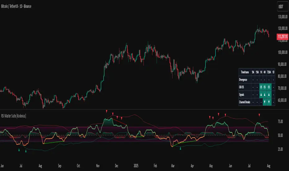
RSI Master Suite [Kodexius]RSI Master Suite is a custom momentum engine built around a proprietary RSI style oscillator, designed to go far beyond a simple overbought and oversold line. The core calculation uses internal smoothing and optional adaptive logic to create a cleaner, more stable signal that is still responsive to real time price action. On top of that engine, the script adds structure, context and visual layers that turn the oscillator into a complete decision support panel.
Instead of watching a single line cross fixed levels, you get dynamic channels, gradient zones, reversal markers, divergence mapping, multi timeframe readings, a compressed stochastic flow and automated RSI based trendlines. The goal is to let you read the state of momentum at a glance: where it is stretched, where it is reverting, how different timeframes align and where conditions may support a potential shift in direction.
This is not ordinary RSI. It is a complete momentum intelligence engine that is designed to help you identify trend strength, exhaustion, breakout style conditions and potential reversal points with a structured and visually guided approach.
⚠️ Note:
This suite builds on a custom RSI engine and enhances it with an MTF dashboard, dynamic channels, divergence and deviation logic, stochastic flow and smart alerting. It is suitable for traders who rely on price action and momentum context, from short term scalpers to swing traders and more systematic trend followers.
🔹 Features
🔸 Enhanced RSI Core
- Custom RSI style oscillator with optional adaptive smoothing that aims to reduce noise while keeping momentum turns visible in real time.
- Configurable source and oscillator length to adapt the tool to different markets, assets and styles.
- Optional RSI moving average for an extra layer of confirmation on crosses and reversals.
♦️ Adaptiveness Logic - Heart of the Oscillator
The adaptive RSI engine continuously measures how efficiently price has been moving over a recent window comparing net directional movement to the total back-and-forth volatility.
When price is trending cleanly, the engine behaves closer to a fast response, allowing the oscillator to track momentum shifts more aggressively. In choppy or noisy phases, it automatically slows down and applies a heavier smoothing profile, down-weighting random fluctuations while preserving the larger structural swings.
🔸 Dynamic Channel Suite
- Multiple channel modes (Bollinger-style, Keltner-style or Donchian-style) applied directly to RSI, giving a clear view of volatility and expansion/contraction phases in momentum.
- Upper and lower channel bands highlight when RSI is pressing into extreme territory or breaking out of its usual range.
- Channel touches and breaks can be used as an additional filter for exhaustion or continuation behavior.
🔸 Gradient Overbought/Oversold Zones
- Customizable OB/OS levels with gradient fills, making it easy to see when RSI is entering, residing in, or exiting critical zones.
- Smooth shading between overbought, oversold and midline areas provides instant visual context instead of relying on hard lines alone.
- Midline (50) is clearly marked, helping to distinguish between bullish and bearish momentum regimes.
🔸 Reversal Signal Markers
- Bullish and bearish reversal markers are plotted when RSI conditions suggest a potential shift after reaching OB/OS zones.
- Signals rely on interactions between Enhanced RSI and its internal smoothing, reducing noise compared to raw threshold crosses.
- Markers are placed directly on the RSI line for quick recognition without cluttering the price chart.
🔸 Divergence Mapping (Regular & Hidden)
- Detects regular bullish/bearish divergences as well as hidden bullish/bearish divergences between price and RSI.
- Optional “wait for candle close” behavior, giving you the choice between more reactive or more conservative confirmations.
- Separate visibility toggles for each divergence type so you can focus only on the signals that fit your approach.
🔸 Compressed Stochastic “Flow” Overlay
- Built-in adaptive and normalized Stochastic RSI layer, normalized into a compact band around the midline to avoid overcrowding the panel.
- The design focuses on direction and pressure rather than raw values: the flow band shows whether short-term momentum is actively feeding into the current RSI regime or fading against it, giving an immediate read on micro-structure underneath the main signal.
- Visual emphasis on whether the stochastic flow is leaning bullish or bearish, rather than on exact numeric values.
- Filled zones above/below the midline help to quickly gauge short-term momentum thrusts within the broader RSI context.
🔸 Multi-Timeframe (MTF) Dashboard
- Compact dashboard table that summarizes RSI conditions across multiple user-defined timeframes.
Per-timeframe cells show:
- Divergence bias (bullish/bearish/none),
- OB/OS state,
- Basic directional “signal” hints,
- RSI channel breaks (upside/downside).
Makes it easy to see alignment or conflict between intraday and higher-timeframe momentum without changing charts.
Timeframe labels auto-format into familiar units (e.g., 1H, 4H, 1D) for readability.
🔸 Oscillator-Based Trendlines & Break Detection
- Automatic drawing of oscillator trendlines derived from swing pivots on the oscillator, not just on price.
- Lines adapt to bullish or bearish structures, focusing on clean slopes with minimal internal violations.
- Breaks of these RSI trendlines are highlighted with labels, providing an additional structural confirmation of potential momentum shifts.
🔸 Alert-Ready Event Logic
- Integrated alert conditions for RSI-based reversals and all four divergence types (regular/hidden, bullish/bearish).
- Designed so you can create alerts directly from the indicator, turning key RSI events into actionable notifications.
Altogether, RSI Master Suite consolidates multiple momentum tools into one cohesive interface, helping you read the “story” of RSI and its derivatives more intuitively and efficiently.
🔹 How To Use
▶ Reading the Core Momentum Engine
- The main line represents the custom momentum engine: values sustained above the midline indicate a bullish-leaning regime, while values below it point to a more bearish-leaning backdrop. Gradient OB/OS zones make it easy to see where conditions are stretched or rotating out of extremes instead of behaving like simple on/off thresholds.
- The dynamic channel adds a second layer of structure:
• When the engine is pressing into or outside the outer channel, momentum is extended relative to its recent behaviour.
• When it oscillates closer to the mid-area of the channel, conditions are more neutral or mean-reverting.
- If the internal moving average is enabled, crosses between the engine and its average can highlight transitions between phases rather than just single-bar spikes, especially around overbought/oversold zones.
▶ Working With Reversals & Divergences
- Reversal markers appear when the engine has pushed into OB/OS regions and then begins to turn with confirmation from its internal smoothing. They are meant as attention points around potential inflection zones in momentum, not as blind entry or exit signals on their own.
- Divergence mapping compares the structure of price swings with the structure of the engine:
• Regular bullish/bearish divergences highlight potential exhaustion when price makes a new extreme but momentum does not confirm.
• Hidden bullish/bearish divergences highlight potential continuation when price pulls back but the engine remains relatively strong (or weak) underneath.
- You can choose which divergence types to display and whether they should only confirm on candle close. Keeping “wait for close” enabled generally provides a more conservative, less noisy view of divergence structure.
▶ Using the Compressed Stochastic “Flow” Overlay
- The Stochastic flow band is designed as a micro-structure layer on top of the main engine, compressed into a tight band around the midzone so it doesn’t require a separate oscillator panel.
- When the flow spends more time in the upper side of its band, short-term impulse is aligning with bullish pressure; when it leans to the lower side, short-term activity is skewed bearish. This makes it easier to judge whether recent pushes are driving with, or fading against, the current momentum regime.
- Filled areas above and below the central line turn this overlay into a quick visual gauge of short-term thrust inside the broader momentum context, especially when viewed together with reversals and divergences.
▶ Reading the Multi-Timeframe Dashboard
- The MTF dashboard compresses multiple timeframes into a small table so you can see cross-timeframe alignment without changing charts. Each column corresponds to one timeframe from your list, and each row represents a different aspect of the engine: divergence bias, OB/OS status, directional hint and channel break state.
- A practical approach is to:
• Scan for alignment, where several higher timeframes show similar momentum regimes or biases.
• Note areas of conflict, where lower timeframes are diverging or reverting while higher timeframes remain extended.
- Used this way, the dashboard acts as a context map you glance at before drilling into any individual setup.
▶ Trendlines, Breaks & Structure
- The oscillator-based trendlines are drawn from swing pivots on the engine itself. This can reveal underlying momentum structure that does not always appear clearly on raw price swings.
- Rising lines typically reflect underlying strength, while falling lines reflect underlying weakness. When these lines are broken and annotated on the panel, they can serve as structural confirmation that a prior momentum phase is weakening or transitioning into something new.
- Many users keep this component off for day-to-day monitoring and switch it on when they want a more detailed structural read on momentum phases.
ADX Trend VisualizerThis is an enhanced version of the excellent indicator created by ⓒ BeikabuOyaji (Thank You!).
I've made it more visually intuitive by improving the ADX DI line crossover visualization and adding signal alerts.
This indicator utilizes standard ADX calculations and focuses on intuitive visual separation of signals.
It serves as an excellent reference tool for comparison with existing indicators.

Value Charts by Mark Helweg1. Introduction
This script is a simplified implementation of the Value Charts concept introduced by Mark Helweg and David Stendahl in their work on “Dynamic Trading Indicators”. It converts raw price into value units by normalizing distance from a dynamic fair‑value line, making it easier to see when price is relatively overvalued or undervalued across different markets and timeframes. The code focuses on plotting Value Chart candlesticks and clean visual bands, keeping the logic close to the original idea while remaining lightweight for intraday and swing trading.
2. Key Features
- Dynamic fair‑value axis
Uses a moving average of the chosen price source as the fair‑value line and a volatility‑based deviation (smoothed True Range) to scale all price moves into comparable value units.
- Normalized Value Chart candlesticks
OHLC prices are transformed into value units and displayed as a dedicated candlestick panel, visually similar to standard candles but detached from raw price, highlighting relative extremes instead of absolute levels.
- Custom upper and lower visual limits
User‑defined upper and lower bands frame the majority of action and emphasize extreme value zones, helping the trader spot potential exhaustion or mean‑reversion conditions at a glance.
- Clean, publishing‑friendly layout
Only the normalized candles and three simple reference lines (top, bottom, zero) are plotted, keeping the chart uncluttered and compliant with presentation standards for published scripts.
3. How to Use
1. Attach the indicator to a separate pane (overlay = false) on any market and timeframe you trade.
2. Set the “Period (Value Chart)” to control how fast the fair‑value line adapts: shorter values react more quickly, longer values smooth more.
3. Adjust the “Volatility Factor” so that most candles stay between the upper and lower limits, with only true extremes touching or exceeding them.
4. Use the Value Chart candlesticks as a relative overbought/oversold tool:
- Candles pressing into the Top band suggest overvalued conditions and potential for pullbacks or reversions.
- Candles pressing into the Bottom band suggest undervalued conditions and potential for bounces.
5. Combine the signals with your existing price‑action, volume, or trend‑filter rules on the main chart; the Value Chart panel is designed as a context and timing tool, not a standalone trading system.

Session Volume Profile – Asia, London, NYSession Volume Profile – Asia, London, New York
Product Description
This tool displays intraday volume distribution for the Asian, London, and New York trading sessions.
It provides a visual breakdown of where trading activity concentrated during each session, helping users study volume structure across global market phases.
What the Tool Shows
1. Session Levels
Each session plots three main reference levels:
Point of Control (POC) — the price level with the highest volume traded during that session
Value Area High (VAH) — upper boundary of the primary volume region
Value Area Low (VAL) — lower boundary of the primary volume region
Each session is assigned its own color for easier differentiation.
2. Session Volume Histogram
A horizontal volume histogram displays how activity is distributed within each session.
Longer bars indicate higher relative volume at that price.
3. Session Highlighting (Optional)
Background shading can be enabled to visually identify the current active session.
4. Session Countdown (Optional)
A small text label shows how much time is left in the current session. This is for chart awareness only.
How to Read the Display (Educational Use Only)
POC is often viewed by many traders as a key reference point when studying intraday balance or activity clusters.
VAH / VAL can help users observe where the majority of volume occurred within a session.
Comparing session profiles may help identify how participation shifts from Asia → London → New York.
Observing how price interacts with these historical volume areas can provide context when studying intraday structure.
This panel does not generate trading signals. It is intended for chart analysis, market study, and understanding how volume distributes across global sessions.
Customization Options
Accessible via Settings → Inputs:
Enable/disable any session
Adjust value area percentage
Modify histogram density
Adjust visual opacity
Toggle countdown timer or session shading
These options allow users to tailor the display to different chart styles and timeframes.
Notes
This tool is for educational and informational purposes only.
It does not provide trading or financial advice.
No signals are produced; all outputs are historical/analytical.
Code is published as protected/closed-source to preserve the structure of the underlying calculations.
