Symbol Seasonality Matrix (w/ BTC Base) Symbol Seasonality Matrix (w/ BTC Base)
Compare monthly performance between Bitcoin and any symbol across time
🧠 Overview
This indicator provides a side-by-side monthly return table of Bitcoin (BTCUSD from Bitfinex) and any selected symbol (e.g., ETH, stocks, etc.). It visualizes seasonality patterns, historical performance shifts, and relative trends in a clean matrix layout with dynamic line overlays.
⚙️ Mechanism
BTC Benchmarking:
BTC monthly returns are always shown as a benchmark against the selected chart symbol.
Monthly ROI Calculation:
For each month, the indicator tracks the open and close price and calculates the monthly return using:
(close_end - close_start) / close_start × 100%
It stores both price and return for BTC and the chart symbol.
Table Structure:
Each year is split into two halves:
2023 (Jan ~ Jun) and 2023 (Jul ~ Dec) for clarity.
Color Coding:
Green for positive months
Red for negative months
Monthly trend lines and labels drawn in consistent colors
Background shading per month helps track seasonality
Plot Modes:
regular: raw price
percent: relative % change from the start of selected period
normalized: base=1 scaling to compare trends
Time Range Selector:
You can define start time and end time for comparison — all logic, including table, plots, and highlights, will focus only on this window.
🧭 How to Use
Set the time range:
Choose a meaningful window such as the past 3 years or 2018–2021 to study behavior.
Compare Symbol vs BTC:
Load BTCUSD in a separate chart for baseline.
Switch to ETHUSD, SPY, or any altcoin/equity to view overlayed performance.
Analyze Seasonality:
Look for months with repeated strong/weak performance (e.g., BTC strong in October).
Compare how your asset aligns with BTC trends or diverges.
Choose View Mode:
Use percent to adjust Y-axis scaling and directly compare relative movements.
Use normalized to detect trend correlation without caring about price level.
🔍 Why It’s Useful
Spot seasonal alpha and align entries with favorable months
See if a symbol outperforms or underperforms BTC consistently
Get price-to-return context visually, not just via numbers
Quickly compare assets in real scale or normalized scale
📌 Tip
Try publishing this to a layout with multiple tickers (ETH, SOL, AAPL) to instantly switch comparisons.
Pair with volume-based or macro indicators to layer signals.
Mby_lab

Market Convergence&Divergence IndexIndicator Description:
This indicator is based on two different simple moving averages (SMA). While the typical condition for a crossover of moving averages to be valid is after the crossover has been confirmed, this indicator calculates the alpha value, which represents the condition value of the crossover between the two SMA. It then calculates the distance between this alpha value and the value set in the source to indicate the convergence or divergence of the current market.
Interpretation:
This indicator is based on one of the indicators that I have distributed(). Typically, when the market is considered a bear market, the indicator value can be judged after it has turned from positive to negative (if it is negative, it remains negative), and vice versa for a bull market. The highs and lows indicated by this indicator are highly likely to be the highs and lows of the stock price, and their strength is indicated by the gradient color.
Additional Information:
Anyone can use this indicator, but it should be emphasized that it may be subject to change through future updates.
Thank you.

Cashew NutsThis indicator used the average regression of stock prices.
In general, stock prices show how they form new prices when they are outside the average price or range.
Therefore, when stock prices show an average price flow, if you take both long and short positions, you will have an opportunity to convert the spread into profit in the meantime.
How to use -
When the direction is determined from the average price, and when the direction is up, it is generally interpreted as a drop as soon as it deviates from the resistance line.
When the direction is determined from the average price, and when the direction is lowered, it is generally expected to rise as soon as it breaks the support line.
Precautions -
These indicators do not guarantee profits.

Trend Resistance & SupportThis indicator determines the trend of stock prices and outputs prices that must be broken through or deviated from the trend to change.
------How to Use?
At the bottom of the screen, the trend judged by the indicator is written.
If the price forms a resistance line, it can be judged that the trend will not change until it breaks through the resistance line.
It can be judged that the perfect trend shift is when it breaks through the resistance line.
If the price forms a support line, it is expected to fall after leaving the support line.
Each resistor line and support line are valid until they deviate from or break through its price.

MBYLab_Max Profit & Draw DownThis indicator can check the MDD of the stock price for the set period, and is a secondary indicator that shows the highest return (increase rate) from the newly updated low.
In Loss mode, the red line shows the MDD based on the closing price of each candle, and the black line shows the historical MDD .
If the MDD for each closing price reaches 0%, it means that continuous profit is in progress, and when the stock price breaks out of this trend, it can be seen that correction by overbought begins.
In Profit mode, the green line shows the rate of return against the newly updated lowest price, and the blue line shows the rate of return per candle.
This rate of return can be applied as the rate of share price increase,
Comparing the above two values will help you determine how healthy the stock is.
"May the Bit be with You."

Daily Trend Line ©MBY_LABHello.
This indicator uses the intersection of the moving average to output a trend line .
In general, the price at which the moving average crosses is interpreted as a meaningful point.
This indicator can be used by anyone.
This indicator outputs three lines.
1. Intersection
This intersection is marked by a horizontal line and can be used as an appropriate stop loss section.
2. Trend line (upper)
This trend line reflects the trend line that reflects the maximum increase. In general, a breakout of this trend line means that the medium-term trend has been broken.
3. Trend line (lower)
This trend line reflects the trend line with the largest decline. In general, a deviation from this trend line is interpreted as a dead cat.
4. Color
The green color appears at the golden cross of the moving average, and the black color appears at the dead cross.

Trend Line © MBY_LABHello.
This indicator uses the intersection of the moving average to output a trend line.
In general, the price at which the moving average crosses is interpreted as a meaningful point.
This indicator can be used by anyo ne.
This indicator outputs three lines.
1. Intersection
This intersection is marked by a horizontal line and can be used as an appropriate stop loss section.
2. Trend line (upper)
This trend line reflects the trend line that reflects the maximum increase. In general, a breakout of this trend line means that the medium-term trend has been broken.
3. Trend line (lower)
This trend line reflects the trend line with the largest decline. In general, a deviation from this trend line is interpreted as a dead cat.
4. Color
The green color appears at the golden cross of the moving average, and the black color appears at the dead cross.

Greed Trading ©MBY_LABHi
I'm Yong from MBY Lab.
The index distributed this time is purchased in the "pyramid" method when the price falls by the percentage set by the user from the standard price (default: market price),
and is also "pyramid" when the price rises by the percentage set by the user.
It's an indicator that allows you to sell in a way.
If you buy in installments when the stock price is falling, the trader can lower the average purchase price and trade stably.
Trading through this indicator does not guarantee returns.
How to use
First, a reference price is established.
Set how many % to buy when the base price falls, and enter the number of installments (up to 10 times).
Set the selling period in the same way and you are done.

MBY_Quant_APOLOHello.
MBY_LAB.
Finally, I am happy to introduce this strategy.
The APOLO strategy uses the volume factor to estimate the fair price of a stock.
A buy/sell signal is calculated based on the “fair price” of a stock as defined by APOLO.
this indicator is a momentum indicator , and it can be said to be a non-trend following indicator.
The blue line that outputs as blue shows a graph of the asset change when buying or selling at the price pointed to by this indicator, including 0.2% slippage and 0.2% transaction fee.
Of course, this doesn't mean that this metric is always profitable.
This strategy was created to aid trading.
This indicator is a private indicator, please comment if you wish to use it.
**notice**
"Use the link(Invite only script Contact) below to obtain access to this indicator".

Korean BTC Traders' Open interest ©MBY_LABGood morning. This is Yong.
We created an open interest for Korean bitcoin traders using the Upbit chart and Bithumb chart, which were recently added to TradingView.
This indicator estimates and displays the open interest of bitcoin traders actually traded through the trading volume of bitcoin traders in Korea.
Logic
In general, once a buy or sell is executed, this trade has no choice but to be reflected in the volume.
Therefore, if the price trend is up, the concept that the volume of buyers will be greater than the volume of sellers is applied.
How to Use
When the OI value, which is usually indicated in green, starts to decrease, it is interpreted as a liquidation of long positions by Korean traders.
Conversely, when the red OI value starts to decrease, it can be interpreted as a liquidation of short positions by Korean traders.

Market Divergence (Line version) ©MBYLABGood morning.
This indicator measures the distance between the moving average line and the current price position, so you can check the price divergence.
logic
In general, when the closing price breaks below the moving average and closes, it can be interpreted as downward divergence.
Based on the logic described above, this indicator will have a darker color as the current price position is further away from the set moving average.
When this indicator starts changing from red to yellow, it can be interpreted that the trend is reversing.(Bearish -> Bullish)
How to use
First, set the existing candle chart in the upper left to invisible and then apply the corresponding indicator.
Anyone can use this indicator, no special conditions are required.
Prediction SMA Cross(linear regression) ©MBYLABGood morning.
This indicator outputs the price that must be reached for the different moving averages to cross.
logic
The moving average line whose source is the closing price changes before today's closing price is closed, but yesterday's closing price is fixed,
so it calculates and outputs the value at which different moving averages become the same through calculation.
For example
1,2,3,4,5
The overall (5) average of the above values is (1+2+3+4+5) / 5
, and it is the same as finding the value of X necessary for the value of (5+4+3)/3 including the most recent value 5 to be the same.
and also,
In this published indicator, a linear regression line is additionally output based on the price that broke or broke each condition value.
There are two lines, the linear regression line that must regress to cross the moving average line and the linear regression line of the price reached when the current trend is maintained.
++
The right to use this indicator is open to all. Anyone can use it without any restrictions.
THX

Option Premium Chart (©MBY_LAB)Hi, This is Yong.
This indicator shows a candle chart that outputs the difference between the option market price and the spot market price.
On the expiration date of the options market, the volatility of the bitcoin price increases.
I hope that indicator is helpful.
Anyone can use this indicator.

MBY_KOREA_PREMIUM_Candle_ver(1.0)Nice to meet you all.
This indicator outputs a candle that shows the difference between the price of the Korean exchange of Bitcoin and the price of the dollar.
This indicator includes the moving average line and the Bollinger band .
It is a free indicator that anyone can use.
Thank you.

MBY_Bitcoin miners' Revenue PowerThis indicator tracks the reward rate of Bitcoin miners.
In general, as the price of bitcoin increases, the difficulty of mining and the transfer fee increase.
Therefore, miners will need an index that they can refer to when selling stably mined bitcoins.
This indicator indicates when miners are focused on mining and when it is effective to sell.
How to use
After printing this indicator, you can use the same as above by dragging and dropping it on the main chart.
Notice*
This indicator can be used for free.

MBY_LAB_Calculate your profit(ver.21.02.16)Hi.
This is MBY_LAB.
This indicator allows you to check the real-time rate of return by entering your buying average.
You can also set an alarm when the stop loss and target price are reached.
The average price is automatically calculated when you enter the price and quantity you purchased in installments.
Anyone can use it.

MBY_ATH/ATLHi, This is YONG, from MBY_LAB
This indicator displays the highest and lowest points over a certain period of time.
Traders can use this indicator to see the newly updated highs and lows.
The logic used in this metric can be applied to a “break through volatility” strategy.
Anyone can use this indicator.

MBY_Predict Ma CrossGood morning.
This is MBY Lab.
This indicator calculates the conditions for the intersection of two different moving average lines.
What the "Point" value means is the price at which the moving average line with different opening and closing prices for today or tomorrow crosses.
Traders can use this indicator to predict the conditions in which Golden Cross or Dead Cross will or will not occur in the future.
This indicator is an open indicator and anyone can use it.

MBYLAB_ETH Traders' Open interestHi This is Yong From MBYLAB.
Finally, we released the ETH Traders' Open Interest index.
This indicator calculates Open Interest through the trading volume of the top etherium exchanges.
This indicator helps your trading by checking the incline and decline divergence.
This indicator is available to anyone.
Thank you.
"May the Bit be with You."

MBY_BTC Traders' Open interestThis indicator is an oscillator that represents the open contracts of the traders of the exchanges with the highest Bitcoin trading volumes.
This indicator can be used for free and anyone can use it through search without authorization.

Bitcoinminers stablized revenueHello.
This indicator uses the bitcoin miners' profits and bitcoin mining difficulty to find a stable profit realization period for bitcoin miners.
It shows the opposite trend direction to Bitcoin.
If you use this indicator, you can close your position before the price rises and falls sharply.
If you would like to use this indicator, please send a message to the Telegram ID in the signature or leave a comment.
This indicator has been provided free of charge for a while.
"May the Bit be with You."

MBY_BTC_DIFF_IndicatorHI,
This is MBY_LAB.
We are pleased to take this opportunity to introduce the "MBY_BTC_DIFF_Indicator.
DIFF represents the mining difficulty of bitcoin, and MBY used this mining difficulty to create an index indicating the fair price of bitcoin.
This indicator is an invitation-only indicator.
If you would like to use it, please inquire at the place written on the signature.
thx:)
"May the Bit be with You."

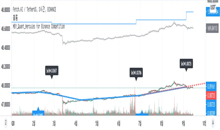
MBY_Quant_Hercules_Ver.CustomHello.
This is MBY Lab.
We are very excited to deploy Hercules metrics.
Hercules strategy operates based on the Relative Strength Index , and displays the price when each Relative Strength Index maintains an upward trend or decreases.
When the stock price rises, the price at the time of entering the overbought or oversold section is displayed as the market price, or when the relative strength index falls when the stock price rises, it is captured and the market price is displayed.
Therefore, this indicator is a momentum indicator , and it can be said to be a non-trend following indicator.
The blue line that outputs as blue shows a graph of the asset change when buying or selling at the price pointed to by this indicator, including 0.2% slippage and 0.2% transaction fee.
Of course, this doesn't mean that this metric is always profitable.
This strategy was created to aid trading.
This indicator is a private indicator, please comment if you wish to use it.
And this version is for VSOP
**notice**
"Use the link(Invite only script Contact) below to obtain access to this indicator".