CHOCH & Liquidity Sweep Detectorso think of this one as an upgraded version from the previous liquidity sweep and reversal indicator i shared. This one:
Identifies when price wicks above a swing high then closes below it (bearish sweep 💧)
Identifies when price wicks below a swing low then closes above it (bullish sweep 💧)
Orange labels mark the sweeps with dashed lines showing the liquidity level
CHOCH (Change of Character) Detection
After a liquidity sweep, it watches for structure breaks
Bearish CHOCH: After bullish sweep, price breaks below previous structure low (🔴 SHORT setup)
Bullish CHOCH: After bearish sweep, price breaks above previous structure high (🟢 LONG setup)
Market Structure Tracking
Shows current structure highs/lows with dotted lines
Tracks whether market is in bullish, bearish, or neutral trend
Dashboard (bottom-right)
Shows current trend direction
Liquidity sweep status
CHOCH confirmation
Setup Ready alert when both conditions align
Clear action recommendation
How to use with tf alignment indicator:
Apply both indicators to your 1hr/4hr chart
Wait for alignment (Daily/Weekly/Monthly all bearish or bullish)
Look for liquidity sweep (💧 label appears)
Wait for CHOCH (big red/green label with "CHOCH")
Enter on retest of the broken structure level
Multitimeframe

Price Forecast - Future price Ichimoku ATR RSI Kumo It predicts
Future price (projected close)
future high-low (ATR projection)
Ichimoku Future Span overlay
alerts "future price above/below threshold".
Ichimoku Kumo Projection (Leading Span A & B). Senkou Span A (Future A) Senkou Span B (Future B).
ATR Projection Channel (ATR Bands/Volatility Forecast).
Linear regression forecast for +1 bar.
Multi timeframe
RSI+Kumo filter for clearer signals.

SMAs TimePortalPlots 5× SMAs from 3 different timeframes - plus current chart timeframe
Plots 2× VWAPs with bands.
Meant for personal use, but maybe you can find it useful too.
Disclaimer: Beware I might update this with big changes in the future.

LiquidityPulse Higher Timeframe Consecutive Candle Run LevelsLiquidityPulse Higher Timeframe Consecutive Candle Run Levels
Research suggests that financial markets can alternate between trend-persistence and mean-reversion regimes, particularly at short (intraday) or very long timeframes. Extended directional moves, whether prolonged intraday rallies or sell-offs, also carry a statistically higher chance of retracing or reversing (Safari & Schmidhuber, 2025). In addition, studies examining support and resistance behaviour show that swing highs or lows formed after strong directional moves may act as structurally and psychologically important price levels, where subsequent price interactions have an increased likelihood of stalling or bouncing rather than passing through directly (Chung & Bellotti, 2021). By highlighting higher-timeframe candle runs and marking their extremal levels, this indicator aims to display areas where directional momentum previously stopped, providing contextual "watch levels" that traders may incorporate into their broader analysis.
How this information is used in the indicator:
When a sequence of consecutive higher-timeframe candles prints in the same direction, the indicator highlights the lower-timeframe chart with a green or red background, depending on whether the higher-timeframe run was bullish or bearish. The highest high (for a bull run) or lowest low (for a bear run) of that sequence forms a recent extremum, and this value is plotted as a swing-high or swing-low level. These levels appear only after the required number of consecutive higher-timeframe candles (set by the user) have closed, and they continue updating as long as the higher-timeframe streak remains intact. A level "freezes" and stops updating only when an opposite-colour higher-timeframe candle closes (e.g., a red candle ending a bull run, or a green candle ending a bear run). Once frozen, the level remains fixed to preserve that structural information for future analysis or retests. The number of past bull/bear levels displayed on the chart is also adjustable in the settings.
Why capture a level after a long directional run:
When price moves in one direction for several consecutive candles (e.g. 4, 5, or more), it reflects strong directional bias, often associated with momentum, liquidity imbalance, or liquidity grabs. Once that sequence breaks, the final level reached marks a point of exhaustion or structural resistance/support, where that bias failed to continue. These inflection points are often used by traders and trading algorithms to assess potential reversals, retests, or breakout setups. By freezing these levels once the run ends, the indicator creates a map of historically significant price zones, allowing traders to observe how price behaves around them over time.
Additional information displayed by the indicator:
Each detected run includes a label showing the run length (the number of consecutive higher-timeframe candles in the streak) along with the source timeframe used for detection. The indicator also displays an overstretch marker: this numerical value appears when the total size of the candle bodies within the run exceeds a user-defined multiple of the average higher-timeframe body size (default: 1.5x). This helps highlight runs that were unusually strong or extended relative to typical volatility. You can also enable alerts that trigger when this overstretch ratio exceeds a higher threshold.
Key Settings
Timeframe: Choose which HTF to analyse (e.g., 15m, 1h, 4h)
Minimum Candle Run Length: Define how many consecutive candles are needed to trigger a level (e.g., 4)
Overstretch Settings: Customize detection threshold and alert trigger (in multiples of average body size)
Background Tints: Enable/disable visual highlights for bull and bear runs
Display Capacity: Choose how many past bull/bear levels to show
How Traders Can Use This Indicator
Traders can:
-Watch levels for retests, reversals, breakouts, or consolidation
-Identify areas where price showed strong directional conviction
-Spot extended or aggressive moves based on overstretch detection
-Monitor how price reacts when retesting prior run levels
-Build confluence with your existing levels, zones, or indicators
Disclaimer
This tool does not reflect true order flow, liquidity, or institutional positioning. It is a visual aid that highlights specific candle behaviour patterns and does not produce predictive signals. All analysis is subject to interpretation, and past price behaviour does not imply future outcomes.
References:
Trends and Reversion in Financial Markets on Time Scales from Minutes to Decades (Sara A. Safari & Christof Schmidhuber, 2025)
Evidence and Behaviour of Support and Resistance Levels in Financial Time Series (Chung & Bellotti, 2021)

TrendForce X🔹 Indicator Overview
This indicator is built to give traders simple, reliable, and high-probability signals by combining three powerful concepts:
market structure, trend direction, and premium/discount zones.
It removes complexity and delivers clean BUY and SELL signals that align with the true flow of the market.
📌 Key Features
Accurate trend detection to stay aligned with market direction
Premium & Discount model to identify smart-money price zones
Automatic Market Structure analysis ( CHoCH & BOS )
BUY signals when price shifts bullishly from a discount area
SELL signals when price breaks structure bearish from a premium area
Clean, user-friendly visual signals
Works on any pair , market , or timeframe .
🟢 Buy Signal Logic
A BUY signal is generated when:
Price is in a discount zone
The market shows a bullish change of structure
This combination filters out weak setups and highlights strong upside reversals.
🔻 Sell Signal Logic
A SELL signal is triggered when:
Price is in a premium zone
The market forms a bearish break of structure
This helps catch high-probability downside moves with precision.
⚠️ Disclaimer
This indicator is a powerful tool, but no indicator guarantees 100% accuracy. Always practice proper risk management and confirm signals with your trading plan.

MTF Alignment & Key Levelsso this one is specifically for the 1hr and 4hr time frame. but what it does is alert you once the monthly weekly and daily timeframes align with a trend in a certain direction wether its bearish or bullish but then it will mark out key levels on the 1hr and 4hr time frame to indicate when price breaks through that level to enter a trade in the direction of the higher timeframes alignment.

sXSwingssXSwings is a swing point indicator that identifies and plots horizontal lines at swing highs and swing lows on your chart. It operates on two levels:
Historical Swings - Uses a longer pivot length (default: 5) to identify significant swing points from price history. These appear as dotted lines and provide reference levels for major support and resistance zones.
Most Recent Swings - Uses a shorter pivot length (default: 1) to identify the most current swing high and swing low. These appear as solid lines and are more responsive to recent price action, updating dynamically as new pivots form.
The indicator automatically manages line cleanup, removing historical swing lines that exceed the lookback period to keep your chart clean. All visual aspects are fully customizable including line styles, colors, widths, and extension lengths.
Use Case: Traders can use this to quickly identify key swing levels for support/resistance trading, stop-loss placement, or analyzing price structure across different timeframes. The dual-layer approach helps distinguish between major structural levels and immediate price action swings.

UDL Matrix: MTF Divergence System [WangBlack]【使用說明 / How to Use】
多頭訊號 (Long Signal):出現綠色「多」標籤。
條件:UDL 進入超賣區 + K線出現反轉型態 + 趨勢過濾通過。
空頭訊號 (Short Signal):出現紅色「空」標籤。
條件:UDL 進入超買區 + K線出現反轉型態 + 趨勢過濾通過。
背離線 (Divergence Lines):
綠色實線:底背離(看漲)。
紅色實線:頂背離(看跌)。
背景色 (Background):
綠色背景:HTF(大級別)處於低位,適合做多。
紅色背景:HTF(大級別)處於高位,適合做空。
【適用市場】 加密貨幣、外匯(黃金 XAUUSD)、指數期貨。適合 1分/5分/15分/1小時 級別操作。
Here is the English translation for the "How to Use" section, optimized for TradingView descriptions:
【How to Use】
Long Signal:
Indicator: A Green label with the text "多" (Long) appears.
Conditions: UDL enters the Oversold zone + Candlestick Reversal Pattern detected + Trend Filter validation passed.
Short Signal:
Indicator: A Red label with the text "空" (Short) appears.
Conditions: UDL enters the Overbought zone + Candlestick Reversal Pattern detected + Trend Filter validation passed.
Divergence Lines:
Green Solid Line: Regular Bullish Divergence (Signal to Buy).
Red Solid Line: Regular Bearish Divergence (Signal to Sell).
Background Color (HTF Context):
Green Background: HTF (Higher Timeframe) is in a low zone; favorable for Long positions.
Red Background: HTF (Higher Timeframe) is in a high zone; favorable for Short positions.
【Applicable Markets】 Cryptocurrencies, Forex (specifically Gold/XAUUSD), and Index Futures. Recommended Timeframes: 1-minute, 5-minute, 15-minute, and 1-hour charts.

Luxy VWAP Magic - MTF Projection EngineThis indicator transforms the classic VWAP into a comprehensive trading system. Instead of switching between multiple indicators, you get everything in one place: multi-timeframe analysis, statistical bands, momentum detection, volume profiling, session tracking, and divergence signals.
What Makes This Different
Traditional VWAP indicators show a single line. This tool treats VWAP as a foundation for complete market analysis. The indicator automatically detects your asset type (stocks, crypto, forex, futures) and adjusts its behavior accordingly. Crypto traders get 24/7 session tracking. Stock traders get proper market hours handling. Everyone gets institutional-grade analytics.
Anchor Period Options
The anchor period determines when VWAP resets and recalculates. You have three categories of options:
Time-Based Anchors:
Session - Resets at market open. Best for intraday stock trading where you want fresh VWAP each day.
Day - Resets at midnight UTC. Standard option for most traders.
Week / Month / Quarter / Year - Longer reset periods for swing traders and position traders who want broader context.
Rolling Window Anchors:
Rolling 5D - A sliding 5-day window that never resets. Solves the Monday problem where weekly VWAP equals daily VWAP on first day of week.
Rolling 21D - Approximately one month of trading data in continuous calculation. Excellent for crypto and forex markets that trade 24/7 without clear session breaks.
Event-Based Anchors:
Dividends - Resets on ex-dividend dates. Track institutional cost basis from dividend events.
Splits - Resets on stock split dates. Useful for analyzing post-split trading behavior.
Earnings - Resets on earnings report dates. See where volume-weighted trading occurred since last quarterly report.
Standard Deviation Bands
Three sets of bands surround the main VWAP line:
Band 1 (Aqua) - Plus and minus one standard deviation. Approximately 68% of price action occurs within this range under normal distribution. Touches suggest minor extension.
Band 2 (Fuchsia) - Plus and minus two standard deviations. Only 5% of trading should occur outside this range statistically. Touches here indicate significant overextension and high probability of mean reversion.
Band 3 (Purple) - Plus and minus three standard deviations. Touches are rare (0.3% probability) and represent extreme conditions. Often marks climax moves or panic selling/buying.
Each band can be toggled independently. Most traders show Band 1 by default and add Band 2 and 3 for specific setups or volatile instruments.
Multi-Timeframe VWAP System
The MTF section plots previous period VWAPs as horizontal support and resistance levels:
Daily VWAP - Previous day's final VWAP value. Key intraday reference level.
Weekly VWAP - Previous week's final VWAP. Important for swing traders.
Monthly VWAP - Previous month's final VWAP. Institutional benchmark level.
Quarterly VWAP - Previous quarter's final VWAP. Major support/resistance for position traders.
Previous Day VWAP - Yesterday's closing VWAP specifically, separate from current daily calculation.
The Confluence Zone percentage setting determines how close multiple VWAPs must be to trigger a confluence alert. When two or more timeframe VWAPs converge within this threshold, you get a high-probability support/resistance zone.
Session VWAPs for Global Markets
For forex, crypto, and futures traders who operate in 24/7 markets, the indicator tracks three major global sessions:
Asia Session - UTC 21:00 to 08:00. Gold colored line. Typically lower volatility, range-bound action that sets overnight levels.
London Session - UTC 08:00 to 17:00. Orange colored line. Often determines daily direction with high volume European participation.
New York Session - UTC 13:00 to 22:00. Blue colored line. Highest volume session globally. Sharp directional moves common.
Previous session VWAP values display as horizontal lines when each session closes, acting as intraday support and resistance. The table shows which sessions are currently active with checkmarks.
On-Chart Labels and Signals
The indicator plots several types of labels directly on price action when significant events occur:
Volume Spike Labels
Fire when current bar volume exceeds configurable thresholds relative to both the previous bar and the 20-bar average. Default settings require 300% of previous bar AND 200% of average volume. Green labels indicate bullish candles. Red labels indicate bearish candles. These spikes often mark institutional entry points.
Momentum Shift Labels
Appear when VWAP acceleration changes direction. The Slowing label warns when an active trend loses steam, often preceding reversal. The Accelerating label confirms trend continuation or potential bottom during downtrends. Filters available to show only reversal signals in existing trends.
VWAP Squeeze Labels
Detect when standard deviation bands contract relative to ATR (Average True Range). Low volatility compression often precedes explosive breakout moves. When the squeeze fires (releases), a label appears with directional prediction based on VWAP slope.
Divergence Labels
Mark price/volume divergences using CVD (Cumulative Volume Delta) analysis:
Bullish divergence: Price makes lower low, but CVD makes higher low. Hidden accumulation despite price weakness.
Bearish divergence: Price makes higher high, but CVD makes lower high. Hidden distribution despite price strength.
Dynamic VWAP Coloring
The main VWAP line changes color based on its slope direction:
Green - VWAP is rising. Institutional buying pressure. Volume-weighted price increasing.
Red - VWAP is falling. Institutional selling pressure. Volume-weighted price decreasing.
Gray - VWAP is flat. Consolidation or balance between buyers and sellers.
This coloring can be disabled for a static blue line if you prefer cleaner visuals. The VWAP label next to the line shows the current trend direction and delta percentage.
Calculated Projection Cone
One of the most powerful features is the Calculated Projection Cone. Unlike traditional extrapolation methods that simply extend a trend line forward, this system analyzes what actually happened in similar market conditions throughout the chart's history.
How It Works:
The system classifies each bar into one of 27 unique market states:
Z-Score Level - LOW (oversold), MID (fair value), or HIGH (overbought) based on configurable thresholds
Trend Direction - DOWN, FLAT, or UP based on VWAP slope
Volume Profile - LOW (below 80%), NORMAL (80-150%), or HIGH (above 150%) relative volume
When you look at the current bar, the indicator:
1. Identifies the current market state (e.g., LOW Z-Score + UP Trend + HIGH Volume)
2. Searches through all historical bars on the chart that had the same state
3. Calculates what happened in those bars X bars later (where X is your projection horizon)
4. Shows you the probability of up/down and the average move size
Visual Elements:
Probability Cone - Colored green (bullish probability above 55%), red (bearish below 45%), or gold (neutral). The cone width represents the historical range of outcomes (roughly the 20th to 80th percentile).
Center Line - Shows the average expected price based on historical outcomes in similar conditions.
Probability Label - Displays direction probability and average move. Example: "67% UP (+0.8%)" means 67% of similar past cases moved up, averaging 0.8% gain.
Fallback System:
When the exact 27-state match has insufficient historical data:
First fallback: Uses Z-Score plus Trend only (9 broader states, ignoring volume)
Second fallback: Uses Z-Score only (3 states)
When fallback is active, confidence automatically adjusts
Settings:
Projection Horizon - How many bars forward to analyze outcomes (5, 10, 15, or 20 bars, default 10)
Lookback Period - Historical data window in days (30-252, default 60)
Minimum Samples - Cases needed before using fallback (5-30, default 10)
Z-Score Threshold - Bucket boundary for LOW/MID/HIGH classification (1.0, 1.5, or 2.0 sigma)
Cloud Transparency - Adjust visibility (50-95%)
Colors - Customize bullish, bearish, and neutral cone colors
Confidence Levels:
HIGH - 30 or more similar historical cases found
MEDIUM - 15-29 similar cases
LOW - Fewer than 15 cases (more uncertainty)
IMPORTANT DISCLAIMER:
The Calculated Projection is based on past patterns only. It is NOT a price prediction or financial advice. Similar market states in the past do not guarantee similar outcomes in the future. The probability shown is historical frequency, not a guarantee. Always combine with other analysis and never rely solely on projections for trading decisions.
Alert Conditions
The indicator includes over 20 pre-built alert conditions:
Price vs VWAP:
Price crosses above VWAP
Price crosses below VWAP
Band Touches:
Price touches plus or minus one sigma band
Price touches plus or minus two sigma band (extreme)
Price touches plus or minus three sigma band (very extreme)
Z-Score Extremes:
Z-Score crosses above plus two (overbought extreme)
Z-Score crosses below minus two (oversold extreme)
Momentum and Trend:
Momentum slowing
Momentum accelerating
Trend turns bullish/bearish/neutral
Volume:
Volume spike detected
CVD Direction:
Buyers take control
Sellers take control
High Probability Signals:
Bullish reversal signal (oversold plus accelerating momentum)
Bearish reversal signal (overbought plus slowing momentum)
MTF and Special:
MTF confluence zone entry
VWAP squeeze fired
Bullish/Bearish divergence detected
Any significant signal (catch-all)
All signals use confirmed bar data to prevent false alerts from incomplete candles.
Settings Overview
Settings are organized into logical groups:
VWAP Settings
Anchor Period selection
Show/Hide VWAP line
Dynamic coloring toggle
VWAP label visibility
Bands Visibility
Toggle each of three bands independently
Info Table
Show/Hide table
Table position (9 options)
Text size
Volume spike label settings with adjustable thresholds
Momentum label settings with filters
Signal labels limited to 5 most recent (auto-managed)
Probability engine lookback period
Multi-Timeframe VWAP
Enable/Disable MTF system
Show MTF in table
Show MTF lines on chart
Individual timeframe toggles
Confluence zone threshold
Squeeze detection toggle
Session VWAPs
Enable/Disable session tracking
Apply to all assets option
Show session labels
Divergence Detection
Enable/Disable divergence
Pivot lookback period
Show divergence labels
Calculated Projection
Enable/Disable projection cone
Projection horizon (5, 10, 15, or 20 bars)
Lookback period in days (30-252)
Minimum samples threshold
Z-Score classification threshold (1.0, 1.5, or 2.0 sigma)
Cloud transparency adjustment
Bullish, bearish, and neutral colors
The Info Table - Your Trading Dashboard
The right side of your chart displays a compact table with up to twelve metrics.
Row-by-Row Breakdown:
Asset and Period - Shows what the indicator detected (US Stock, Crypto, Forex, etc.) and your selected anchor period. The detection happens automatically based on exchange data, so VWAP resets and calculations match your actual trading instrument.
Delta Percentage - How far current price sits from VWAP, expressed as a percentage. Positive means price trades above fair value. Negative means below. Large delta values (beyond 1-2%) often precede mean reversion moves. Day traders watch this for overextension.
Z-Score - Statistical deviation from VWAP measured in standard deviations. Unlike raw delta, Z-Score accounts for volatility. A 2% move in a volatile biotech stock differs from 2% in a stable utility. Z-Score normalizes this. Values beyond plus or minus two sigma occur only 5% of the time statistically.
Trend Direction - Whether VWAP itself is rising, falling, or flat. Rising VWAP means the volume-weighted average price is increasing, which indicates institutional accumulation. Falling VWAP suggests distribution. This differs from price trend since it weights by volume.
Momentum State - Is the trend accelerating or slowing down? This measures the rate of change in VWAP slope. When an uptrend shows slowing momentum, it often precedes reversal. Accelerating momentum in a downtrend can signal capitulation and potential bottom.
Relative Volume - Current bar volume compared to the 20-bar average, shown as percentage. Values above 150% indicate above-average activity. Spikes above 200-300% often mark institutional involvement. Low volume (below 80%) warns of potential fake moves.
MTF Bias - Four checkmarks or X marks showing whether price sits above or below Daily, Weekly, Monthly, and Quarterly VWAP. Four checkmarks means strong bullish alignment across all timeframes. Four X marks indicates bearish alignment. Mixed readings suggest consolidation or transition.
Band Probabilities - Historical statistics showing how often price touched each standard deviation band over your lookback period. This helps you understand if mean reversion or trend following works better for your specific instrument.
Session Status - Which global trading sessions are currently active (Asia, London, New York). Shows checkmarks for active sessions. Important for forex and crypto traders who need to know when major liquidity windows open and close.
Divergence State - Whether the indicator detects bullish or bearish divergence between price and cumulative volume delta. Bullish divergence occurs when price makes lower lows but buying pressure (CVD) makes higher lows, suggesting hidden accumulation.
Confidence Score - A weighted composite of all factors displayed as a progress bar and percentage. Combines MTF alignment, Z-Score, trend direction, volume delta, momentum, and relative volume into a single 0-100 score. Higher scores indicate stronger conviction setups.
Calculated Projection - When the Projection Cone is enabled, shows the historical probability of price direction and expected move. For example: "▲ 67% (+0.8%)" means in similar market states historically, price moved up 67% of the time with an average gain of 0.8%. The system analyzes 27 unique market states based on Z-Score, Trend, and Volume conditions.
Recommended Use Cases
Day Trading Stocks:
Use Session anchor with Band 1 visible. Watch for price returning to VWAP after morning move. Volume spikes near VWAP often mark institutional accumulation zones.
Swing Trading:
Use Weekly or Rolling 21D anchor. Enable MTF lines for Daily and Weekly levels. Trade pullbacks to these levels in direction of MTF bias.
Crypto and Forex:
Enable Session VWAPs. Use Rolling anchors to avoid artificial resets. Monitor session transitions for breakout opportunities.
Mean Reversion:
Focus on Z-Score reaching plus or minus two. Add Band 2 visibility. Combine with slowing momentum for highest probability reversals.
Trend Following:
Watch MTF bias alignment. Four checkmarks plus accelerating momentum plus high volume confirms trend continuation setups.
Projection Planning:
Enable the Calculated Projection to see what happened historically in similar market conditions. Use 5-10 bars for intraday setups, 15-20 bars for swing trade planning. Focus on high probability readings (above 60%) with HIGH confidence (30 or more samples). The cone shows the probable range of outcomes based on actual historical data. Combine with other factors like MTF alignment and volume for higher conviction setups.
Important Notes
The indicator does not repaint. MTF values use previous period's confirmed data.
Rolling VWAP works best on 15-minute timeframes and above due to bar lookback requirements.
Session VWAPs apply to global markets by default (forex, crypto, futures). Enable the all-assets option for stocks if desired.
Volume data for forex represents tick volume, not actual traded volume.
All alert conditions fire only on confirmed (closed) bars to prevent false signals.
The Calculated Projection updates each bar as market state changes. This is expected behavior. The projection shows probabilities based on similar past conditions, not a fixed prediction.
Q AND A
Q: Does this indicator repaint?
A: No. The main VWAP calculation uses standard TradingView VWAP methodology. Multi-timeframe values use previous period's confirmed data with appropriate lookahead settings. All alert signals require bar confirmation.
Q: Why does my Rolling VWAP look different on 1-minute versus 15-minute charts?
A: Rolling VWAP calculates across a fixed number of trading days. On very short timeframes, the bar lookback may hit TradingView limits. For best Rolling VWAP accuracy, use 15-minute or higher timeframes.
Q: Can I use this on any instrument?
A: Yes. The indicator automatically detects asset type and adjusts behavior. Stocks use standard market hours. Crypto uses 24/7 calculations. Forex uses tick volume. Everything adapts automatically.
Q: What does the Confidence Score actually measure?
A: The score combines six weighted factors: MTF alignment (25%), Z-Score position (20%), Trend direction (20%), CVD pressure (15%), Momentum state (10%), and Relative volume (10%). Higher scores indicate more factors aligned in one direction.
Q: Why are Session VWAPs not showing on my stock chart?
A: Session VWAPs apply to 24-hour markets by default (forex, crypto, futures). For stocks, enable the Use for All Assets option in Session VWAP settings.
Q: The Divergence labels appear delayed. Is this a bug?
A: Divergence detection requires pivot confirmation, which needs bars on both sides of the pivot point. The label appears at the actual pivot location (several bars back) once confirmed. This is intentional and prevents false signals.
Q: Can I change the band colors?
A: Yes. Each of the three bands has its own color input setting. You can customize Band 1, Band 2, and Band 3 colors to match your preferences. The defaults are Aqua, Fuchsia, and Purple. The main VWAP line color adapts dynamically based on slope direction or can be set to static blue.
Q: How do I set up alerts?
A: Right-click on the chart, select Add Alert, choose this indicator, and select your desired condition from the dropdown. All conditions include descriptive alert messages with relevant data.
Q: What is the Probability Engine lookback period?
A: This setting determines how many trading days the indicator analyzes to calculate band touch rates and mean reversion statistics. Default is 60 days (approximately 3 months). Longer periods provide more stable statistics but may miss recent behavior changes.
Q: Why do I see fewer labels than expected?
A: Signal labels (Volume, Momentum, Squeeze, Divergence) are limited to 5 most recent labels on the chart to keep it clean. When a new label appears, the oldest one is automatically removed. Additionally, momentum labels have several filters: check the slope multiplier setting (higher values require stronger trends) and the Only Reversal Signals option (when enabled, labels only appear for potential reversals, not trend confirmations).
Q: What is the Calculated Projection and how accurate is it?
A: The Calculated Projection analyzes what happened in past market conditions similar to the current state. It classifies each bar by Z-Score level, Trend direction, and Volume profile (27 unique states), then shows the historical probability of up vs down and the average move size. It is NOT a price prediction or guarantee. The probability shown is how often similar conditions led to up/down moves historically, not a future guarantee. Always use it as one input among many.
Q: Why does the Projection probability change?
A: The projection updates on each bar as market state changes. If Z-Score moves from LOW to MID, or trend shifts from UP to FLAT, the system looks up a different historical category. This is expected behavior. The projection shows what happened in similar past conditions to the current bar's state.
Q: The Projection shows LOW confidence. What does that mean?
A: Confidence levels indicate sample size: HIGH means 30 or more historical cases found, MEDIUM means 15-29 cases, LOW means fewer than 15 cases. When sample size is low, the system uses a fallback: first aggregating by Z-Score plus Trend only (ignoring volume), then by Z-Score only. LOW confidence means less statistical reliability, so weight other factors more heavily in your decision.
Q: Why does the cone sometimes show 50/50 probability?
A: A 50/50 reading means that in similar past market states, price moved up roughly half the time and down half the time. This indicates a neutral or balanced condition where historical patterns provide no directional edge. Consider waiting for a higher probability setup or using other analysis methods.
CREDITS AND ACKNOWLEDGMENTS
Methodology Foundation:
VWAP (Volume Weighted Average Price) - Standard institutional benchmark calculation, widely used since the 1980s for algorithmic execution and fair value assessment
Standard Deviation Bands - Statistical volatility measurement applying normal distribution principles to price deviation from mean
Z-Score Analysis - Classic statistical normalization technique for comparing values across different volatility regimes
Cumulative Volume Delta (CVD) - Order flow analysis concept measuring aggressive buying versus selling pressure
Concept Integration:
Mean reversion probability engine - Custom historical statistics tracking for band touch rates
Momentum acceleration detection - Second derivative analysis of VWAP slope changes
VWAP Squeeze - Volatility compression concept adapted from TTM Squeeze methodology applied to VWAP bands versus ATR
Confidence scoring system - Weighted composite scoring combining multiple technical factors
Calculated Projection Cone - Probability-based projection using 27-state market classification (Z-Score, Trend, Volume) with historical outcome analysis and weighted fallback system
All calculations use standard public domain formulas and TradingView built-in functions. No proprietary third-party code was used.
For questions, feedback, or feature requests, please comment below or send a private message.
Happy Trading!

Multi-Timeframe Momentum DashboardMulti-Timeframe Momentum Matrix
EMA 20/50/200 position checks
MACD histogram direction
RSI zones (>50 bullish, <50 bearish)
ADX trend strength
Shows alignment across 4H/Daily/Weekly

Market Session Clock# Market Session Clock - Real-Time Global Trading Hours
A professional, real-time dashboard that displays the current time and trading status across major global financial markets. Perfect for forex, futures, and stock traders who need to track multiple market sessions simultaneously.
## Key Features
**Live Market Status Tracking**
- Visual color-coded indicators show which markets are currently open (green) or closed (red)
- Automatic weekend detection - all markets show as closed on Saturdays and Sundays
- Real-time clock updates with optional seconds display
**Major Global Markets Covered**
- Tokyo (Asian Session)
- Hong Kong (Asian Session)
- Frankfurt (European Session)
- London (European Session)
- New York (American Session)
- Your Local Time (optional)
**Highly Customizable**
*Display Options:*
- Choose dashboard position (Top Left/Right, Bottom Left/Right)
- Toggle seconds display on/off
- Show/hide your local time
- Three size options: Compact, Normal, Large
*Timezone Settings:*
- Select your local timezone from 40+ global options
- Customize market opening and closing hours for each session
*Professional Styling:*
- Fully customizable color scheme
- Adjustable background, text, header, border colors
- Custom colors for open and closed sessions
- Clean, modern interface that won't clutter your charts
## How It Works
The indicator uses TradingView's `timenow` function to display live, continuously updating times for each market. Session status automatically updates based on the current hour in each timezone, factoring in weekends when markets are closed.
## Use Cases
- **Multi-Market Trading**: Track overlapping sessions for increased volatility opportunities
- **Forex Trading**: Know exactly when major currency pairs are most active
- **Global Portfolio Management**: Monitor when different exchanges are open
- **Session-Based Strategies**: Time your entries and exits around specific market opens/closes
## Default Session Hours
- Tokyo: 9:00 - 18:00 JST
- Hong Kong: 9:00 - 17:00 HKT
- Frankfurt: 8:00 - 17:00 CET
- London: 8:00 - 17:00 GMT
- New York: 8:00 - 17:00 EST
All session times can be adjusted to match your preferred trading hours or specific market schedules.
---
*Note: This indicator is for informational purposes only. Market hours may vary due to holidays and special trading days. Always verify with official exchange schedules.*

NoProcess - PAX Opening RangeAll credit & honor goes to Matt Kenah (Pax)
PAX-OR is a high-precision, automated Opening Range indicator designed specifically for Futures Traders. Unlike standard OR indicators that require manual time inputs, PAX-OR automatically detects the asset class (Indices, Metals, Energies) and configures the correct Opening Time, Point Value, and Volatility "Rungs" without manual intervention.
It utilizes 30-second granularity to capture the exact opening wick/body mechanics, providing a distinct advantage over standard 1-minute or 5-minute calculations.
🎯 Key Features
1. Intelligent Asset Detection The indicator automatically recognizes the ticker symbol and adjusts its logic for:
Indices: ES, MES, NQ, MNQ, YM, RTY (Opens @ 9:30 AM ET)
Energies: CL, MCL, NG, QG (Opens @ 9:00 AM ET)
Metals: GC, MGC, SI, HG (Opens @ 8:20 AM ET)
2. Dynamic "Paylines" (Dollar-Based Targets) A unique feature of PAX-OR is the Payline. Instead of arbitrary ticks, you define a dollar amount (default: $200). The indicator calculates exactly how many points the market must move from the Opening Range High/Low to achieve that profit, based on the contract's point value (e.g., $50 for ES, $20 for NQ).
Use Case: Great for setting automated "Break Even" or "First Take Profit" levels.
3. Volatility "Rungs" The indicator projects fixed-interval targets (Rungs) above and below the range. These rung sizes are hardcoded to optimized values for each specific asset (e.g., 15 points for ES, 65 points for NQ) but can be overridden in the settings.
4. Overnight Context Automatically plots the Overnight High (ONH) and Overnight Low (ONL) relative to the current session, providing immediate context on whether the market is opening within or outside of the prior global session range.
5. Live Info Dashboard A clean data table in the top-right corner displays:
Current Symbol & Root
Rung Size (in points)
Payline Offset (in points)
Current Opening Range size
Dollar Value per Point
Minimum Tick Size
⚙️ How It Works
The Open: When the session begins (based on the asset class specific time), the indicator scans the first 30 seconds of data to establish the High, Low, and Open (Pit Open).
The Range: It draws the High and Low of that opening period, along with the Equilibrium (EQ/Midpoint).
The Extension:
Paylines: Dashed lines appear at the calculated dollar-target distance.
Rungs: Solid lines appear at fixed intervals to act as trend targets.
History: You can configure the indicator to show the OR levels for the current day only, or extend them for 2-3 days to see how price reacts to previous session levels.
🛠 Settings Overview
Opening Range: Toggle the visibility of the range, background shading, and the specific Pit Open price line.
Paylines & Rungs: Toggle specific lines (Short/Long) and customize colors/styles.
Config:
Payline $ Value: Set your target dollar amount (default $200).
Rung Override: Enter a custom point value if you disagree with the auto-detected volatility size.
Number of Rungs: How many levels to draw (default 15).
Extend Lines: Choose between "Current OR Only", "2 Day", "3 Day", or "All".
Note: This indicator is optimized for the assets listed above. If used on an unsupported ticker, it defaults to standard settings (9:30 Open, $50/point).
Disclaimer: Trading futures involves significant risk. This tool is for educational and technical analysis purposes only.

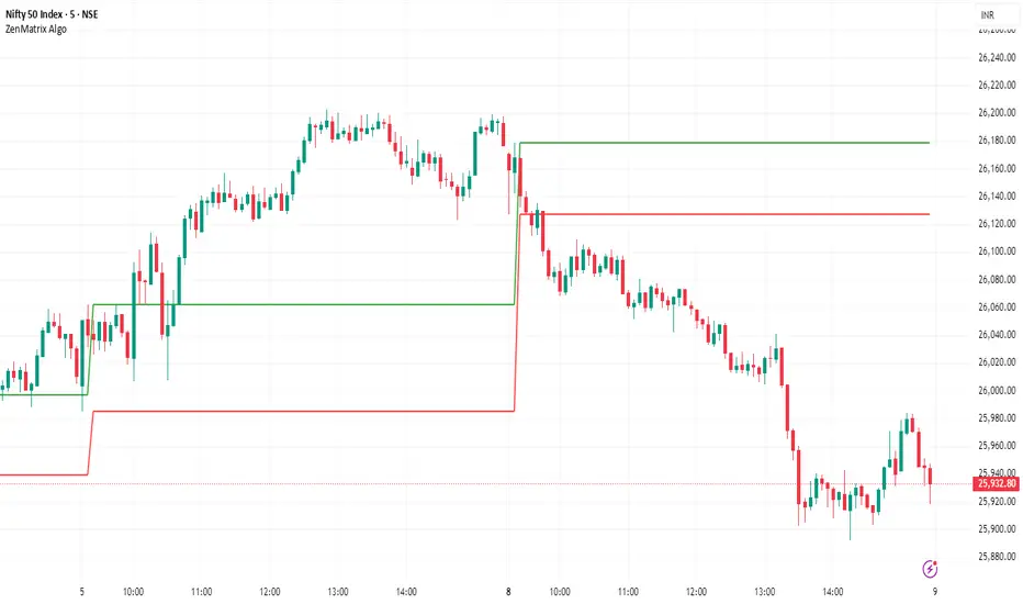
ZenMatrix AlgoZenMatrix Algo – Matrix Range Levels
ZenMatrix Algo automatically identifies the early market range for each trading day and plots clean horizontal support and resistance levels based on that range designed by Finovatech Solutions.
These levels often become important price reaction zones throughout the session.
✔ Features :--
Automatically detects the opening range each day
Plots dynamic support & resistance zones
Helps identify breakout areas and intraday structure
Works on any market: Crypto, Forex, Stocks & Indices
Multiple timeframe compatibility
🎯 Best For :--
Intraday scalping
Swing trading confirmations
index traders
anyone who uses early-session ranges as part of their market analysis
How to Use :--
Price breaking above the upper level may indicate bullish momentum
Price dropping below the lower level may indicate bearish continuation
Combine these levels with price action, volume, trend indicators, or your own strategy
Disclaimer :--
This script is for educational purposes only and is not financial advice.
BTC vs Russell2000Description
The BTC vs Russell2000 – Weekly Cycle Map compares Bitcoin’s performance against the Russell 2000 (IWM) to identify long-term risk-on and risk-off market regimes.
The indicator calculates the BTC/RUT ratio on a weekly timeframe and applies a moving average filter to highlight macro momentum shifts.
White line: BTC/RUT ratio (Bitcoin relative strength vs small-cap equities)
Yellow line: Weekly SMA of the ratio (trend filter)
Green background: BTC outperforming → macro bull regime
Red background: Russell 2000 outperforming → macro bear regime
Halving markers: Visual reference points for Bitcoin market cycles
This tool is designed to help traders understand capital rotation between crypto and traditional markets, improve timing of macro entries, and visualize where Bitcoin stands within its broader cycle.

HTF Frequency Zone [BigBeluga]🔵 OVERVIEW
HTF Frequency Zone highlights the dominant price level (Point of Control) and the full high–low expansion of any higher timeframe — Daily, Weekly, or Monthly. It captures the frequency of closes inside each HTF candle and plots the most traded “frequency zone”, allowing traders to easily see where price spent the most time and where buy/sell pressure accumulated.
This tool transforms each higher-timeframe bar into a fully visualized structure:
• Top = HTF high
• Bottom = HTF low
• Midline = HTF Frequency POC
• Color-coded zones = bullish or bearish bias
• Labels = counts of bullish and bearish candles inside the HTF range
It is designed to give traders an immediate understanding of high-timeframe balance, imbalance, and price attraction zones.
🔵 CONCEPTS
HTF Partitioning — Each Weekly/Daily/Monthly candle is converted into a dedicated zone with its own High, Low, and Frequency Point of Control.
Frequency POC (Most Touched Price) — The indicator divides the HTF range into 100 bins and counts how many times price closed near each level.
Dominant Zone — The level with the highest frequency becomes the HTF “Value Zone,” plotted as a bold central line.
Directional Bias —
• Bullish HTF zone
• Bearish HTF zone
Internal Candle Counting — Within each HTF period the indicator counts:
• Buy candles (close > open)
• Sell candles (close < open)
This reveals whether intraperiod flow was bullish or bearish.
HTF Structure Blocks — High, Low, and POC are connected across the entire higher-timeframe duration, showing the real shape of HTF balance.
🔵 FEATURES
Automatic HTF Zone Construction — Generates a complete price zone every time the selected timeframe flips (Daily / Weekly / Monthly).
Dynamic High & Low Extraction — The indicator scans every bar inside the HTF window to find true extremes of the range.
100-Level Frequency Scan — Each close within the period is assigned to a bin, creating a detailed distribution of price interaction.
HTF POC Highlighting — The most frequent price level is plotted with a bold red line for immediate visual clarity.
Bull/Bear Coloring —
• Green → Bullish HTF zone.
• Orange → Bearish HTF zone.
Zone Shading — High–Low range is filled with a semi-transparent color matching trend direction.
Buy/Sell Candle Counters — Printed at the top and bottom of each HTF block, showing how many internal candles were bullish or bearish.
POC Label — Displays frequency count (how many touches) at the POC level.
Adaptive Threshold Warning — If bars inside the HTF window are too few (<10), the indicator warns the trader to switch timeframe.
🔵 HOW TO USE
Higher-Timeframe Biasing — Read the zone color to determine if the HTF candle leaned bullish or bearish.
Value Zone Reactions — Price often reacts to the Frequency POC; use it as support/resistance or liquidity magnet.
Range Context — Identify when price is trading near HTF highs (breakout potential) or lows (reversal potential).
Momentum Evaluation — More bullish internal candles = internal buying pressure; more bearish = internal selling pressure.
Swing Trading — Use HTF zones as the “macro map,” then execute trades on lower timeframes aligned with the zone structure.
Liquidity Awareness — The HTF POC often aligns with algorithmic liquidity levels, making it a strong reaction point.
🔵 CONCLUSION
HTF Frequency Zone transforms raw higher-timeframe candles into detailed distribution zones that reveal true market behavior inside the HTF structure. By showing highs, lows, buying/selling activity, and the most interacted price level (Frequency POC), this tool becomes invaluable for traders who want to align executions with powerful HTF levels, liquidity magnets, and structural zones.

OXE MTF Support/Resistance+Demand/Supply Zone ArsenalOXE MTF Support/Resistance + Demand/Supply Zones Indicator
Your Complete Multi-Timeframe Zone Arsenal
This professional-grade indicator transforms your chart into a zone confluence powerhouse, simultaneously tracking high-probability price reaction areas across 5 timeframes (Daily, H4, H1, M15, M5) – giving you the institutional edge you need to dominate the markets.
🎯 What It Is
A sophisticated dual-system zone detector that identifies both:
Classic Support/Resistance levels using pivot point detection
Smart Money Demand/Supply zones triggered by Break-of-Structure (BOS) confirmations
Unlike basic S/R indicators, this tool employs institutional methodology – capturing order blocks and imbalance zones where smart money is positioned, not just where price bounced.
⚡ Core Capabilities
Multi-Timeframe Mastery
Track up to 5 timeframes simultaneously without switching charts
Identify confluence zones where multiple timeframe levels align
Customize which timeframes to display for clean, focused analysis
Intelligent Zone Management
Automatic zone validation – tracks when zones flip from resistance→support or supply→demand
Invalid zone filtering – hide broken/invalidated zones to focus only on active opportunities
Configurable zone limits – control the number of zones per timeframe (up to 8 each)
Smart Money Detection
BOS-confirmed zones – only marks demand/supply after break-of-structure confirmation
Precise zone timing – captures the exact candle that created the imbalance
Visual differentiation – dashed borders distinguish demand/supply from traditional S/R
Professional Dashboard
Real-time zone counter – shows active zones per timeframe at a glance
Filter status indicators – tracks which validation filters are enabled
Color-coded timeframe labels – instant visual organization
💰 How This Transforms Your Trading
1. Find High-Probability Entries
Enter trades at zones where multiple timeframes converge – when H4 demand aligns with Daily support, you've found institutional backing.
2. Stay on the Right Side of the Market
The zone flipping system shows you when market structure changes – a supply zone that flips to demand tells you the narrative has shifted bullish.
3. Eliminate Guesswork
No more wondering "is this level still valid?" The automatic invalidation tracking removes subjectivity – zones are either active (tradeable) or broken (ignored).
4. Scale Your Timeframe Analysis
Whether you're scalping M5 or swing trading Daily, access all relevant zones without the mental overhead of switching between charts and manually tracking levels.
5. Trade Like Institutions
By combining pivot-based S/R with BOS-confirmed order blocks, you're seeing where retail AND institutional money is positioned – giving you the complete picture.
🔥 Perfect For
Day traders seeking M15/H1 confluence for precise entries
Scalpers needing M5 zones with higher-timeframe confirmation
Swing traders looking for Daily/H4 zone alignment for position trades
ICT/SMC practitioners combining order blocks with traditional analysis
Any trader who values clean, validated, multi-timeframe zones over cluttered charts

Global Session MarkerA pinescript-coded indicator intended for TradingView that indicates US/EU/AS sessions, namely 16:00 closes for American equity and how that can impact cryptocurrency ETFs that are designed to deliver a multiple of the daily performance of their underlying benchmark.

MTF Fractal Manifold Support & Resistance Pro [Voidspire]Welcome to MTF Fractal Manifold Support & Resistance Pro. This is not a standard pivot point or zigzag indicator. This tool utilizes Topological Data Analysis (TDA) and Quantitative Physics concepts to treat price action as a high-dimensional manifold.
By applying Lorentzian Kernel Clustering and the Expectation-Maximization (EM) algorithm, the script identifies "High Energy" singularity points where price, time, and volatility (mass) converge. It distinguishes between significant structural levels and random market noise using Shannon Entropy Z-Scores.
🧠 Key Features
⚛️ Physics-Based Clustering: Instead of simple highs/lows, we calculate the "Mass" of a price level based on Tick Volume (Forex) or Real Volume (Equities) and Volatility.
📐 6-Dimensional Analysis: Monitors 6 different timeframes simultaneously (Micro, Meso, and Macro layers) to find Fractal resonance.
📊 Hurst Exponent Integration: Automatically detects whether the market is trending or mean-reverting (ranging) to adjust the search radius (Gamma) of the clusters dynamically.
🧪 Entropy Z-Score: Each level is assigned a Z-Score. Low scores (Green) indicate highly ordered, stable support. High scores (Red) indicate chaotic, unstable zones.
🔥 Topological Confluence Zones: When multiple timeframe levels overlap, they merge into high-probability "Heatmap Boxes," signaling major reversal or breakout zones.
🔥 This indicator does not use future functions and will not be repaint.
⚙️ Comprehensive Settings Guide
This script is highly customizable to fit any asset class (Crypto, Forex, Stocks, Indices).
1. Algorithm Settings (Core)
Asset Class Model:
Forex/Synthetic: Uses Tick Volume + Volatility to calculate Mass.
Equities: Uses Real Volume.
Pure Price: Uses pure geometry (Suitable for assets where accurate trading volume information is not available).
Fractal Gamma Sensitivity: Controls the "focus" of the clustering. Higher values detect finer, more local structures; lower values find broader, major structures.
Entropy Lookback: The historical window used to calculate the Z-Score statistics.
2. Manifold Layer Configuration (Layers 1-6)
You have control over 6 distinct timeframe layers.
Enable/Timeframe: Choose which timeframes to analyze (e.g., 15m, 1H, 4H, Daily).
K-Centers: How many support/resistance clusters to find on this specific timeframe.
Sample Size: How far back in history to analyze data for this layer.
3. Topological Confluence (The Heatmap)
Show High-Energy Confluence: Enables the drawing of rectangular zones where levels overlap.
Merge Threshold %: The distance required to merge two levels into a single zone.
Bullish/Bearish Heatmap: Custom colors for Support (Bullish) and Resistance (Bearish) zones.
4. Dynamic Visibility Control
Hide Micro/Meso Layer: Automatically hides lower timeframe levels when you zoom out to higher timeframes (e.g., hide 15m levels when looking at the Weekly chart) to keep your chart clean.
5. UI & Visual Interaction
Confluence Breakout Threshold: The percentage price must move beyond a zone to confirm a breakout signal.
Zone Transparency: Adjusts the alpha channel of the confluence boxes.
Label Size: Customize the text size of the energy/entropy data labels.
Show Dashboard: Toggles the stats panel.
Show Midline: Toggles the median line inside confluence zones.
6. Layer Coloring & Alerts
Layer Colors: Set unique colors for all 6 layers (Micro, Meso, Macro) to visually decode timeframe hierarchy.
Ghost Extension Transparency: Adjust the visibility of the dotted lines that project the support levels into the future.
Alerts: Configure custom messages for bullish breakouts or bearish breakdowns. Supports variables {ticker} and {price}.
Disclaimer
Trading involves substantial risk and is not suitable for every investor. This indicator is a tool for technical analysis and does not constitute financial advice. Past performance does not guarantee future results. Always use proper risk management.
------------------------------------
中文介绍
机构级市场支撑阻力分析系统
欢迎使用多时间框架高维流形支撑阻力分析系统。这不仅仅是一个普通的枢轴点或 Zigzag 指标。本脚本利用 拓扑数据分析 (TDA) 和 量化物理学 概念,将价格行为视为一个高维流形进行建模。
通过应用 洛伦兹核聚类 (Lorentzian Kernel Clustering) 和 期望最大化 (EM) 算法,该脚本能够识别价格、时间和波动率(质量)汇聚的“高能奇点”。同时,结合 香农熵 Z-Score (Shannon Entropy Z-Scores),它可以有效区分关键的市场结构位和随机的市场噪音。
🧠 核心特性
⚛️ 物理驱动聚类: 我们不单纯依赖高低点,而是根据 Tick 量(外汇)或真实成交量(股票)结合波动率来计算价格水平的“质量 (Mass)”。
📐 6维流形分析: 同时监控 6 个不同的时间周期(微观、中观、宏观层级),寻找分形共振。
📊 赫斯特指数 (Hurst Exponent): 自动检测市场是处于趋势状态还是均值回归(震荡)状态,并据此动态调整聚类算法的搜索半径 (Gamma)。
🧪 熵值 Z-Score: 每个支撑位都有一个 Z分数。低分(绿色)代表高度有序、稳固的支撑;高分(红色)代表混沌、不稳定的区域。
🔥 拓扑共振区: 当多个时间周期的水平位重叠时,它们会合并成高概率的“热力图箱体 (Heatmap Boxes)”,这通常是反转或突破的关键区域。
🔥该指标不使用未来函数,也不会重绘。
⚙️ 全面的参数设置指南
本脚本高度可定制,适用于任何资产类别(加密货币、外汇、股票、指数)。
1. Algorithm Settings (核心算法设置)
Asset Class Model (资产模型):
Forex/Synthetic: 使用 Tick 量 + 波动率计算质量。
Equities: 使用真实成交量。
Pure Price: 纯几何计算(适用于不能获取准确成交量信息的资产)。
Fractal Gamma Sensitivity (分形敏感度): 控制聚类的“焦点”。数值越高,生成的结构越精细;数值越低,寻找的结构越宏观。
Entropy Lookback: 计算熵值 Z-Score 统计数据的历史样本窗口大小。
2. Manifold Layer Configuration (流形层级 1-6)
您可以控制 6 个独立的时间框架层级。
Enable/Timeframe: 选择要分析的时间周期(例如:15分钟、1小时、4小时、日线)。
K-Centers: 在该时间周期上寻找多少个支撑/阻力聚类中心。
Sample Size: 分析该层级多少根历史 K 线的数据。
3. Topological Confluence (拓扑共振/热力图)
Show High-Energy Confluence: 开启后,将重叠的水平位显示为矩形区域。
Merge Threshold %: 将两个临近水平位合并为一个区域的距离阈值。
Bullish/Bearish Heatmap: 自定义支撑区(看涨)和阻力区(看跌)的颜色。
4. Dynamic Visibility Control (动态可视性)
Hide Micro/Meso Layer: 当您切换到大周期图表时,自动隐藏小周期的线条,保持图表整洁。
5. UI & Visual Interaction (UI 与交互)
Confluence Breakout Threshold: 价格必须突破区域宽度的百分之多少才被确认为突破信号。
Zone Transparency: 调整共振区箱体的透明度。
Label Size: 自定义能量/熵值数据标签的字体大小。
Show Dashboard: 显示/隐藏统计面板。
Show Midline: 显示/隐藏共振区内部的中轴线。
6. Layer Coloring & Alerts (着色与警报)
Layer Colors: 为所有 6 个层级设置不同的颜色,以便直观区分微观、中观和宏观结构。
Ghost Extension Transparency: 调整向右延伸的预测虚线的透明度。
Alerts: 配置看涨突破或看跌跌破的自定义警报消息。支持变量 {ticker} 和 {price}。
免责声明
交易涉及巨大风险,并不适合所有投资者。该指标仅供技术分析辅助使用,不构成任何财务建议。过往的表现并不能保证未来的结果。请务必做好风险管理。

Stop Hunt / Liquidity Sweep Detector with Momentum Ratingdetects liquidity sweeps as they happen then gives you a rating on how much momentum the reversal has.

FVG Maxing - Fair Value Gaps, Equilibrium, and Candle Patterns
What this script does
This open-source indicator highlights 3-candle fair value gaps (FVGs) on the active chart timeframe, draws their midpoint ("equilibrium") line, tracks when each gap is mitigated, and optionally marks simple candle patterns (engulfing and doji) for confluence. It is intended as an educational tool to study how price interacts with imbalances.
3-candle bullish and bearish FVG zones drawn as forward-extending boxes.
Equilibrium line at 50% of each gap.
Different styling for mitigated vs unmitigated gaps.
Compact statistics panel showing how many gaps are currently active and filled.
Optional overlays for bullish/bearish engulfing patterns and doji candles.
1. FVG logic (3-candle gaps)
The script focuses on a strict 3-candle definition of a fair value gap:
Three consecutive candles with the same body direction.
The wick of candle 3 is separated from the wick of candle 1 (no overlap).
A bullish gap is created when price moves up fast enough to leave a gap between candle 1 and 3. A bearish gap is the mirror case to the downside.
In Pine, the core detection looks like this:
// Three candles with the same body direction
bull_seq = close > open and close > open and close > open
bear_seq = close < open and close < open and close < open
// Wick gap between candle 1 and candle 3
bull_gap = bull_seq and low > high
bear_gap = bear_seq and high < low
// Final FVG flags
is_bull_fvg = bull_gap
is_bear_fvg = bear_gap
For each detected FVG:
Bullish FVG range: from high up to low (gap below current price).
Bearish FVG range: from low down to high (gap above current price).
Each zone is stored in a custom FVGData structure so it can be updated when price later trades back inside it.
2. Equilibrium line (0.5 of the gap)
Every FVG box gets an optional equilibrium line plotted at the midpoint between its top and bottom:
eq_level = (top + bottom) / 2.0
right_index = extend_boxes ? bar_index + extend_length_bars : bar_index
bx = box.new(bar_index - 2, top, right_index, bottom)
eq_ln = line.new(bar_index - 2, eq_level, right_index, eq_level)
line.set_style(eq_ln, line.style_dashed)
line.set_color(eq_ln, eq_color)
You can use this line as a neutral “fair value” reference inside the zone, or as a simple way to think in terms of premium/discount within each gap.
3. Mitigation rules and styling
Each FVG stays active until price trades back into the gap:
Bullish FVG is considered mitigated when the low touches or moves below the top of the gap.
Bearish FVG is considered mitigated when the high touches or moves above the bottom of the gap.
When that happens, the script:
Marks the internal FVGData entry as mitigated.
Softens the box fill and border colors.
Optionally updates the label text from "BULL EQ / BEAR EQ" to "BULL FILLED / BEAR FILLED".
Can hide mitigated zones almost completely if you only want to see unfilled imbalances.
This allows you to distinguish between current areas of interest and zones that have already been traded through.
4. Candle pattern overlays (engulfing and doji)
For additional confluence, the script can mark simple candle patterns on top of the FVG view:
Bullish engulfing — current candle body fully wraps the previous bearish body and is larger in size.
Bearish engulfing — current candle body fully wraps the previous bullish body and is larger in size.
Doji — candles where the real body is small relative to the full range (high–low).
The detection is based on basic body and range geometry:
curr_body = math.abs(close - open)
prev_body = math.abs(close - open )
curr_range = high - low
body_ratio = curr_range > 0 ? curr_body / curr_range : 1.0
bull_engulfing = close > open and close < open and open <= close and close >= open and curr_body > prev_body
bear_engulfing = close < open and close > open and open >= close and close <= open and curr_body > prev_body
is_doji = curr_range > 0 and body_ratio <= doji_body_ratio
On the chart, they appear as:
Small triangle markers below bullish engulfing candles.
Small triangle markers above bearish engulfing candles.
Small circles above doji candles.
All three overlays are optional and can be turned on or off and recolored in the CANDLE PATTERNS group of inputs.
5. Inputs overview
The script organizes settings into clear groups:
DISPLAY SETTINGS : Show bullish/bearish FVGs, show/hide mitigated zones, box extension length, box border width, and maximum number of boxes.
EQUILIBRIUM : Toggle equilibrium lines, color, and line width.
LABELS : Enable labels, choose whether to label unmitigated and/or mitigated zones, and select label size.
BULLISH COLORS / BEARISH COLORS : Separate fill and border colors for bullish and bearish gaps.
MITIGATED STYLE : Opacity used when a gap is marked as mitigated.
STATISTICS : Toggle the on-chart FVG statistics panel.
CANDLE PATTERNS : Show engulfing patterns, show dojis, colors, and the body-to-range threshold that defines a doji.
6. Statistics panel
An optional table in the corner of the chart summarizes the current state of all tracked gaps:
Total number of FVGs still being tracked.
Number of bullish vs bearish FVGs.
Number of unfilled vs mitigated FVGs.
Simple fill rate: percentage of tracked FVGs that have been marked as mitigated.
This can help you study how a particular market tends to treat gaps over time.
7. How you might use it (examples)
These are usage ideas only, not recommendations:
Study how often your symbol mitigates gaps and where inside the zone price tends to react.
Use higher-timeframe context and then refine entries near the equilibrium line on your trading timeframe.
Combine FVG zones with basic candle patterns (engulfing/doji) as an extra visual anchor, if that fits your process.
Hope you enjoy, give your feedback in the comments!
- officialjackofalltrades

Tempo's Trades IFVG Mastery IndicatorThe indicator I use is called IFVG Mastery. Below you can find all of the features, Automatically maps 50% of the daily range level, Marks out all equal highs and equal lows, Marks out all session killzones, Plots all FVG and IFVGs.
We will constantly a

Multi-Timeframe Fair Value Gap by Vigna📊 Multi-Timeframe Fair Value Gap (FVG) Indicator
This indicator displays Fair Value Gaps (FVGs) from multiple timeframes simultaneously on your chart. FVGs are price gaps that occur when the market moves quickly and skips certain price levels. These gaps tend to be "filled" later and often serve as important support and resistance zones.
🎯 What are Fair Value Gaps?
A Fair Value Gap occurs when:
Bullish FVG: The current low is higher than the high from 2 candles ago (gap upward)
Bearish FVG: The current high is lower than the low from 2 candles ago (gap downward)
⏱️ Supported Timeframes:
1 Hour (1H)
2 Hours (2H)
3 Hours (3H)
4 Hours (4H)
1 Day (1D)
1 Week (1W)
🎨 Features:
✅ All timeframes visible simultaneously
✅ Each timeframe has its own color (bullish & bearish)
✅ Labels show the timeframe of each gap
✅ Automatic deletion when gap is filled
✅ Optional: MidPoint Fill (gap marked as filled at 50%)
✅ Extend right: Gaps extend to the right until filled
✅ All colors fully customizable
⚙️ Settings:
Timeframes: Enable/disable individual timeframes as needed
MidPoint Fill: Mark gap as filled when 50% is reached
Delete On Fill: Automatically remove filled gaps from chart
Label Timeframes: Show labels with timeframe names
Colors: Customize all colors to your preferences
💡 Application:
FVGs often serve as magnetic attraction points for price
Higher timeframe FVGs (4H, 1D, 1W) are typically more significant
Use FVGs as potential entry/exit zones
Combine with other indicators for better confirmation
📈 Recommended Use:
Works best on timeframes from 15min to 1H
Ideal for Forex, Crypto, and Stocks
Especially useful for Swing Trading and Day Trading
🔧 Technical Details:
Uses optimized request.security() calls (12 total, under the 40 limit)
Employs tuple syntax for efficient data fetching
Real-time gap detection and filling mechanism
Memory-efficient array management with var keyword
