Delta VolDelta Volume BTC - Multi Pair
Description The Delta Volume BTC - Multi Pair indicator visualizes the balance between buying and selling volume across multiple Bitcoin exchanges. By analyzing price action within each bar, it provides insight into underlying market pressure that traditional volume indicators miss. This indicator allows traders to:
Compare volume flow across Coinbase, Binance, and Binance Perpetual markets
Identify divergences between exchanges that may signal market shifts
Detect accumulation or distribution patterns through volume imbalances
View exchanges individually or in aggregate for comprehensive analysis
Calculation Methods The indicator offers three volume delta calculation methods:
VWAP Based (default):
price_range = high - low
buy_percent = (close - low) / price_range
sell_percent = (high - close) / price_range
delta = volume * (buy_percent - sell_percent)
This method distributes volume based on where price closed within the bar's range, providing a nuanced view of buying/selling pressure.
Tick Based :
delta = volume * sign(hlc3 - previous_hlc3)
This approach assigns volume based on the direction of typical price movement between bars, capturing momentum between periods.
Simple :
delta = close > open ? volume : close < open ? -volume : 0
A straightforward method that assigns positive volume to up bars and negative volume to down bars.
When Aggregate Mode is enabled, the indicator sums the volume deltas from all selected exchanges:
aggregate_delta = coinbase_delta + binance_delta + binance_perp_delta
Features
Multi-Exchange Support : Track volume delta across Coinbase, Binance, and Binance Perpetual futures
Advanced Calculation Methods : Choose between VWAP-based, tick-based, or simple volume delta algorithms
Flexible Display Options : Visualize as histogram, columns, area, or line charts
Customizable Colors : Distinct color schemes for each exchange and direction
Smoothing Options : Apply EMA, SMA, or WMA to reduce noise
Aggregate Mode : Combine all exchanges to see total market flow
How to Use
Individual Exchange Analysis : Uncheck "Aggregate Mode" to see each exchange separately, revealing where smart money may be positioning
Divergence Detection : Watch for one exchange showing buying while others show selling
Volume Trend Confirmation : Strong price moves should be accompanied by strong delta in the same direction
Liquidity Analysis : Compare spot vs futures volume delta to identify market sentiment shifts
The Delta Volume BTC - Multi Pair indicator helps identify the "hidden" buying and selling pressure that may not be apparent from price action alone, giving you an edge in understanding market dynamics across the Bitcoin ecosystem.
ابحث في النصوص البرمجية عن "神户胜利+VS+磐田喜悦"

BTC Spot vs Perpetual CVD DivergenceThis indicator:
Data Sources:
Uses Binance BTC/USDT for spot market
Uses Binance BTC/USD perpetual (USD-M) for futures market
Both symbols should be available on TradingView
CVD Approximation:
Since true CVD requires order book data (not fully available in Pine Script), we approximate it by:
Multiplying volume by price direction (+1 for up bars, -1 for down bars)
Summing over the specified lookback period
Normalization:
Normalizes both CVD values to a -1 to 1 range for fair comparison
This accounts for different volume scales between spot and perpetual markets
Divergence Calculation:
Subtracts normalized perpetual CVD from spot CVD
Positive values indicate spot market is more bullish than perpetual
Negative values indicate perpetual market is more bullish than spot
Visualization:
Red line: Main divergence indicator
Green line: Normalized spot CVD
Blue line: Normalized perpetual CVD
Green background: Strong positive divergence (>0.5)
Red background: Strong negative divergence (<-0.5)
Gray dashed line at zero
Limitations:
This is an approximation since true CVD requires buy/sell volume separation, which isn't directly available
Results may vary depending on timeframe and lookback period
Assumes volume data reliability from both markets

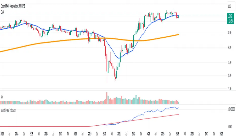
Monthly Buy IndicatorIt shows us the the total balance when buying monthly, ploting the total invested amount and total current balance along the time.
Opening the Data Window, it displays the profit (%) and the number of trades.
The "Allow Fractional Purchase" flag can be used to check the the performance of the ticker, disregarding how much the monthly amount is set vs the price of the ticker.
The trades are considering buying the available amount on the 1st candle of each month, at the Open price. The "Total Balance" considers the close price of each candle.
Multi-Asset Ratio (20 vs 5) - LuchapThis indicator calculates and displays the ratio between the sum of the prices of several base assets and the sum of the prices of several quote assets. You can select up to 20 base assets and 5 quote assets, and enable or disable each asset individually to refine your analysis. This ratio allows you to quickly evaluate the relative performance of different groups of assets.
US vs EU Interest Rate SpreadThis script plots the difference (Spread) between the US-Interest Rate (Symbol USINTR) and the EU Interest Rate (Symbol: EUINTR) and plots it in a seperate pane. Areas where the background is green are times were the spread was positive (US interest rate higher than EU interest rate), a red background indicates a higher EU interest rate than US interest rate.

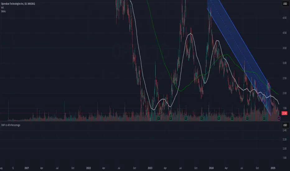
CMP vs ATH PercentageThis indicator helps traders and investors track how the current market price (CMP) compares to the all-time high (ATH) price of an asset. It calculates the percentage difference between the CMP and ATH and displays it visually on the chart. A label is placed on the latest bar, showing key information like:
ATH (All-Time High Price)
CMP (Current Market Price)
Percentage Comparison (CMP as a percentage of ATH)
Additionally, the indicator plots a horizontal line at the ATH level to provide a clear visual reference for the price history.
Use Cases:
Identify price levels relative to historical highs.
Gauge whether the price is nearing or far from its ATH.
Quickly assess how much the price has recovered or declined from the ATH.
Customization:
You can modify the label's style, color, or text formatting according to your preferences. This indicator is useful for long-term analysis, especially when tracking stocks, indices, or other financial instruments on a weekly timeframe.
Note:
This indicator is designed to work on higher timeframes (e.g., daily or weekly) where ATH levels are more meaningful.
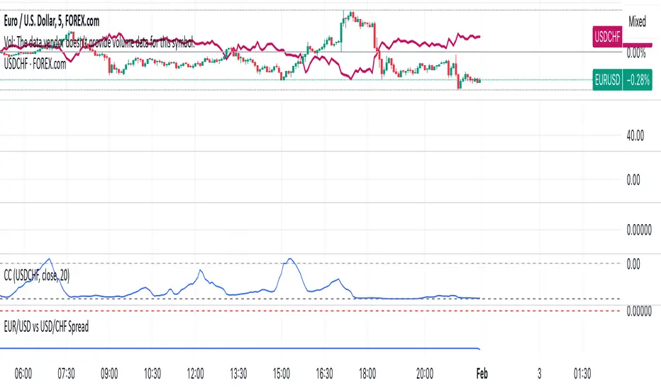
EUR/USD vs USD/CHF SpreadA typical Pine Script for spread trading would include:
Fetching Data: Getting the real-time price of EUR/USD and USD/CHF.
Calculating the Synthetic EUR/CHF Price: Since EUR/USD * USD/CHF ≈ EUR/CHF, we use this relation to analyze deviations.
Computing the Spread: Taking the difference between EUR/USD and the synthetic EUR/CHF price.
Z-Score Normalization: Measuring how far the spread deviates from the mean (Mean Reversion).
Overlay and Visuals: Plotting the spread and key levels to visualize trading signals.
Gold Pro StrategyHere’s the strategy description in a chat format:
---
**Gold (XAU/USD) Trend-Following Strategy**
This **trend-following strategy** is designed for trading gold (XAU/USD) by combining moving averages, MACD momentum indicators, and RSI filters to capture sustained trends while managing volatility risks. The strategy uses volatility-adjusted stops to protect gains and prevent overexposure during erratic price movements. The aim is to take advantage of trending markets by confirming momentum and ensuring entries are not made at extreme levels.
---
**Key Components**
1. **Trend Identification**
- **50 vs 200 EMA Crossover**
- **Bullish Trend:** 50 EMA crosses above 200 EMA, and the price closes above the 200 EMA
- **Bearish Trend:** 50 EMA crosses below 200 EMA, and the price closes below the 200 EMA
2. **Momentum Confirmation**
- **MACD (12,26,9)**
- **Buy Signal:** MACD line crosses above the signal line
- **Sell Signal:** MACD line crosses below the signal line
- **RSI (14 Period)**
- **Bullish Zone:** RSI between 50-70 to avoid overbought conditions
- **Bearish Zone:** RSI between 30-50 to avoid oversold conditions
3. **Entry Criteria**
- **Long Entry:** Bullish trend, MACD bullish crossover, and RSI between 50-70
- **Short Entry:** Bearish trend, MACD bearish crossover, and RSI between 30-50
4. **Exit & Risk Management**
- **ATR Trailing Stops (14 Period):**
- Initial Stop: 3x ATR from entry price
- Trailing Stop: Adjusts to lock in profits as price moves favorably
- **Position Sizing:** 100% of equity per trade (high-risk strategy)
---
**Key Logic Flow**
1. **Trend Filter:** Use the 50/200 EMA relationship to define the market's direction
2. **Momentum Confirmation:** Confirm trend momentum with MACD crossovers
3. **RSI Validation:** Ensure RSI is within non-extreme ranges before entering trades
4. **Volatility-Based Risk Management:** Use ATR stops to manage market volatility
---
**Visual Cues**
- **Blue Line:** 50 EMA
- **Red Line:** 200 EMA
- **Green Triangles:** Long entry signals
- **Red Triangles:** Short entry signals
---
**Strengths**
- **Clear Trend Focus:** Avoids counter-trend trades
- **RSI Filter:** Prevents entering overbought or oversold conditions
- **ATR Stops:** Adapts to gold’s inherent volatility
- **Simple Rules:** Easy to follow with minimal inputs
---
**Weaknesses & Risks**
- **Infrequent Signals:** 50/200 EMA crossovers are rare
- **Potential Missed Opportunities:** Strict RSI criteria may miss some valid trends
- **Aggressive Position Sizing:** 100% equity allocation can lead to large drawdowns
- **No Profit Targets:** Relies on trailing stops rather than defined exit targets
---
**Performance Profile**
| Metric | Expected Range |
|----------------------|---------------------|
| Annual Trades | 4-8 |
| Win Rate | 55-65% |
| Max Drawdown | 25-35% |
| Profit Factor | 1.8-2.5 |
---
**Optimization Recommendations**
1. **Increase Trade Frequency**
Adjust the EMAs to shorter periods:
- `emaFastLen = input.int(30, "Fast EMA")`
- `emaSlowLen = input.int(150, "Slow EMA")`
2. **Relax RSI Filters**
Adjust the RSI range to:
- `rsiBullish = rsi > 45 and rsi < 75`
- `rsiBearish = rsi < 55 and rsi > 25`
3. **Add Profit Targets**
Introduce a profit target at 1.5% above entry:
```pine
strategy.exit("Long Exit", "Long",
stop=longStopPrice,
profit=close*1.015, // 1.5% target
trail_offset=trailOffset)
```
4. **Reduce Position Sizing**
Risk a smaller percentage per trade:
- `default_qty_value=25`
---
**Best Use Case**
This strategy excels in **strong trending markets** such as gold rallies during economic or geopolitical crises. However, during sideways or choppy market conditions, the strategy might require manual intervention to avoid false signals. Additionally, integrating fundamental analysis—like monitoring USD weakness or geopolitical risks—can enhance its effectiveness.
---
This strategy offers a balanced approach for trading gold, combining trend-following principles with risk management tailored to the volatility of the market.

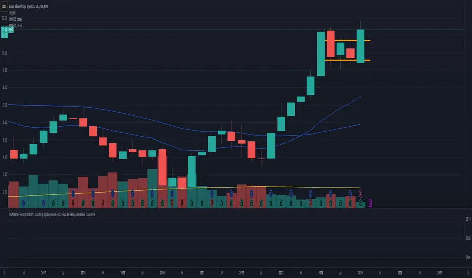
O'Neil Earnings StabilityO'Neil Earnings Stability Indicator
This indicator implements William O'Neil's earnings stability analysis, a key factor in identifying high-quality growth stocks. It measures both earnings stability (1-99 scale) and growth rate.
Scale Interpretation:
• 1-25: Highly stable earnings (ideal)
• 26-30: Moderately stable
• >30: More cyclical/less dependable
The stability score is calculated by measuring deviations from the earnings trend line, with lower scores indicating more consistent growth. Combined with the annual growth rate (target ≥25%), this helps identify stocks with both steady and strong earnings growth.
Optimal Criteria:
✓ Stability Score < 25
✓ Annual Growth > 25%
This tool helps filter out stocks with erratic earnings patterns and identify those with proven, sustainable growth records. Green label indicates both criteria are met; red indicates one or both criteria failed."
Would you like me to modify any part of this description or add more details about specific aspects of the calculation?
The key concepts in these calculations:
Stability Score (1-99 scale):
Lower score = more stable
Takes average deviation from mean earnings
Uses logarithmic scaling to emphasize smaller deviations
Multiplies by 20 to get into 1-99 range
Score ≤ 25 meets O'Neil's criteria
Growth Rate:
Year-over-year comparison (current quarter vs same quarter last year)
Calculated as percentage change
Growth ≥ 25% meets O'Neil's criteria
O'Neil's Combined Criteria:
Stability Score should be ≤ 25 (indicating stable earnings)
Growth Rate should be ≥ 25% (indicating strong growth)
Both must be met for ideal conditions
CAD CHF JPY (Index) vs USDDescription:
Analyze the combined performance of CAD, CHF, and JPY against the USD with this customized Forex currency index. This tool enables traders to gain a broader perspective of how these three currencies behave relative to the US Dollar by aggregating their movements into a single index. It’s a versatile tool designed for traders seeking actionable insights and trend identification.
Core Features:
Flexible Display Options:
Choose between Line Mode for a simplified view of the index trend or Candlestick Mode for detailed analysis of price action.
Custom Weight Adjustments:
Fine-tune the weight of each currency pair (USD/CAD, USD/CHF, USD/JPY) to better reflect your trading priorities or market expectations.
Moving Average Integration:
Add a moving average to smooth the data and identify trends more effectively. Choose your preferred type: SMA, EMA, WMA, or VWMA, and configure the number of periods to suit your strategy.
Streamlined Calculation:
The index aggregates data from USD/CAD, USD/CHF, and USD/JPY using a weighted average of their OHLC (Open, High, Low, Close) values, ensuring accuracy and adaptability to different market conditions.
Practical Applications:
Trend Identification:
Use the Line Mode with a moving average to confirm whether CAD, CHF, and JPY collectively show strength or weakness against the USD. A rising trendline signals currency strength, while a declining line suggests USD dominance.
Weight-Based Analysis:
If CAD is expected to lead, adjust its weight higher relative to CHF and JPY to emphasize its influence in the index. This customization makes the indicator adaptable to your market outlook.
Actionable Insights:
Identify key reversal points or breakout opportunities by analyzing the interaction of the index with its moving average. Combined with other technical tools, this indicator becomes a robust addition to any trader’s toolkit.
Additional Notes:
This indicator is a valuable resource for comparing the collective behavior of CAD, CHF, and JPY against the USD. Pair it with additional oscillators or divergence tools for a comprehensive market overview.
Perfect for both intraday analysis and swing trading strategies. Combine it with EUR GPB AUD (Index) indicator.
Good Profits!

Thin Liquidity Zones [PhenLabs]Thin Liquidity Zones with Volume Delta
Our advanced volume analysis tool identifies and visualizes significant liquidity zones using real-time volume delta analysis. This indicator helps traders pinpoint and monitor critical price levels where substantial trading activity occurs, providing precise volume flow measurement through lower timeframe analysis.
The tool works by leveraging the fact that hedge funds, institutions, and other large market participants strategically fill their orders in areas of thin liquidity to minimize slippage and market impact. By detecting these zones, traders gain valuable insights into potential areas of accumulation, distribution, and liquidity traps, allowing for more informed trading decisions.
🔍 Key Features
Real-time volume delta calculation using lower timeframe data
Dynamic zone creation based on volume spikes
Automatic timeframe optimization
Size-filtered zones to avoid noise
Custom delta timeframe scanning
Flexible analysis period selection
📊 Visual Demonstration
💡 How It Works
The indicator continuously scans for high-volume areas where trading activity exceeds the specified threshold (default 6.0x average volume). When detected, it creates zones that display the net volume delta, showing whether buying or selling pressure dominated that price level.
Key zone characteristics:
Size filtering prevents noise from large price swings
Volume delta shows actual buying/selling pressure
Zones automatically expire based on lookback period
Real-time updates as new volume data arrives
⚙️ Settings
Time Settings
Analysis Timeframe: 15M to 1W options
Custom Period: User-defined bar count
Delta Timeframe: Automatic or manual selection
Volume Analysis
Volume Threshold: Minimum spike multiple
Volume MA Length: Averaging period
Maximum Zone Size: Size filter percentage
Display Options
Zone Color: Customizable with transparency
Delta Display: On/Off toggle
Text Position: Left/Center/Right alignment
📌 Tips for Best Results
Adjust volume threshold based on instrument volatility
Monitor zone clusters for potential support/resistance
Consider reducing max zone size in volatile markets
Use in conjunction with price action and other indicators
⚠️ Important Notes
Requires volume data from your data provider
Lower timeframe scanning may impact performance
Maximum 500 zones maintained for optimization
Zone creation is filtered by both volume and size
🔧 Volume Delta Calculation
The indicator uses TradingView’s advanced volume delta calculation, which:
Scans lower timeframe data for precision
Measures actual buying vs selling pressure
Updates in real-time with new data
Provides clear positive/negative flow indication
This tool is ideal for traders focusing on volume analysis and order flow. It helps identify key levels where significant trading activity has occurred and provides insight into the nature of that activity through volume delta analysis.
Note: Performance may vary based on your chart’s timeframe. Adjust settings according to your trading style and the instrument’s characteristics. Past performance is not indicative of future results, DYOR.

BTC vs Mag7 Combined IndexThis Mag7 Combined Index script is a custom TradingView indicator that calculates and visualizes the collective performance of the Magnificent 7 (Mag7) stocks—Apple, Microsoft, Alphabet, Amazon, NVIDIA, Tesla, and Meta (red line) compared to Bitcoin (blue line). It normalizes the daily closing prices of each stock to their initial value on the chart, scales them into percentages, and then computes their simple average to form a combined index. The result is plotted as a single red line, offering a clear view of the aggregated performance of these influential stocks over time compared to Bitcoin.
This indicator is ideal for analyzing the overall market impact of Bitcoin compared to the Mag7 stocks.

Smart Money Breakouts [iskess 01-02 11:05]This is an big update to the excellent Smart Money Breakout Script published in Oct 2023 by ChartPrime who, to my knowledge, was the original author.
FULL CREDIT GOES TO CHARTPRIME FOR THIS ORIGINAL WORK.
Per the moderator's rules, you will find below a meaningful, detailed self-contained description that does not rely on delegation to the open source code or links to other content. You will find in the description details on what the script does, how it does that, how to use it, and how it is original.
The "Smart Money Breakouts" indicator is designed to identify breakouts based on changes in character (CHOCH) or breaks of structure (BOS) patterns, facilitating automated trading with user-defined Take Profit (TP) level.
The indicator incorporates essential elements such as volume analysis and a data table to assist traders in optimizing their strategies.
🔸Breakout Detection:
The indicator scans price movements for "Change in Character" (CHOCH) and "Break of Structure" (BOS) patterns, signaling potential breakout opportunities in the market.
🔸User-Defined TP/SL :
Traders can customize the Take Profit (TP) and Stop Loss (SL) through the indicator settings, with these levels dynamically calculated based on the Average True Range (ATR). This allows for precise risk management and profit targets that adapt to market volatility. Traders can also select the lookback period for the TP/SL calculations.
🔸Volume Analysis and Trade Direction Specific Analysis:
The indicator includes a volume checker that provides valuable insights into the strength of the breakout, taking into account trade direction.
🔸If the volume label is red and the trade is long, it suggests a higher likelihood of hitting the Stop Loss (SL).
🔸If the volume label is green and the trade is long, it indicates a higher probability of hitting the Take Profit (TP).
🔸For short trades, a red volume label suggests a higher likelihood of hitting TP, while a green label suggests a higher likelihood of hitting SL.
🔸A yellow volume label suggests that the volume is inconclusive, neither favoring bullish nor bearish movements.
🔸Data Table:
The indicator features a data table that keeps track of the number of winning and losing trades for specific timeframes or configurations. It also shows the percentage of profits vs losses, and the overall profit/loss for the selected lookback period.
This table serves as a valuable tool for traders to analyze performance and discover optimal settings and timeframes.
The "Smart Money Breakouts" indicator provides traders with a comprehensive solution for breakout trading, combining technical analysis of changes in character and breaks of structure, volume insights, and performance tracking while dynamically adjusting TP and SL levels based on market volatility through the ATR.
This version of the script is a "significant improvement" from Chart Prime's original work in the following ways:
- A selectable range of candles for the profit/loss calculations to look back on.
- An updated table that includes the percentage of wins/losses, and and overall P&L during the selected lookback range.
- The user can now select only Long trades, Short trades, or both.
- The percentage gain/loss is now indicated for every trade on the chart.
- The user can now select a different multiplier for Stop Loss or Take Profit thresholds.

Average Candle RangeThis indicator calculates and displays the average trading range of candles over a specified period, helping traders identify volatility patterns and potential trading opportunities.
Features:
- Customizable lookback period (1-500 bars)
- Clean visual display in a top-right table overlay
- High-precision calculation showing 10 decimal places
- Real-time updates with each new bar
How it Works:
The indicator calculates the range of each candle (High - Low) and then computes the Simple Moving Average (SMA) of these ranges over your specified lookback period. The result is displayed in an easy-to-read table overlay.
Use Cases:
- Volatility Analysis: Monitor market volatility trends
- Position Sizing: Help determine position sizes based on average price movements
- Trading Strategy Development: Use as a reference for setting stop losses and take profits
- Market Phase Identification: Help identify high vs low volatility market phases
Settings:
- Lookback Period: Default is 140 bars, adjustable from 1 to 500
Note:
The indicator displays values with 10 decimal places for high-precision analysis, particularly useful in markets with small price movements.

Exponential Avg Body Size Green vs RedDescription :
This indicator calculates and plots the Exponential Moving Average (EMA) of green and red candlestick body sizes, allowing traders to easily visualize market momentum and sentiment shifts. The script includes the following features:
Customizable EMA Period: Users can set the number of candles to calculate the EMA through an input setting, with a default value of 21.
Separate Green and Red Candle Averages: Differentiates between bullish (green) and bearish (red) candlestick movements, plotting them as distinct lines.
Dynamic Range Control: Users can adjust the chart range (e.g., -50 to 50) for better visibility of the plotted lines.
Baseline for Reference: A horizontal baseline at 0 serves as a visual aid for easier interpretation.
Standalone Indicator Pane: The script is designed to display in a separate pane, preventing overlap with the price chart.
Use Case:
This indicator is ideal for traders seeking to analyze the relative strength of bullish versus bearish price movements over a specific period. The separation of green and red averages helps identify trends, potential reversals, or shifts in momentum.

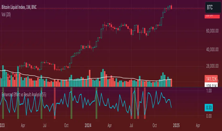
Enhanced Effort vs Result Analysis V.2How to Use in Trading
A. Confirm Breakouts
Check if the Effort-Result Ratio or Z-Score spikes above the Upper Band or Z > +2:
Suggests a strong, efficient price move.
Supports breakout continuation.
B. Identify Reversal or Exhaustion
Look for Effort-Result Ratio or Z-Score dropping below the Lower Band or Z < -2:
Indicates high effort but low price movement (inefficiency).
Often signals potential trend reversal or consolidation.
C. Assess Efficiency of Trends
Use Relative Efficiency Index (REI):
REI near 1 during a trend → Confirms strength (efficient movement).
REI near 0 → Weak or inefficient movement, likely signaling exhaustion.
D. Evaluate Volume-Price Relationship
Monitor the Volume-Price Correlation:
Positive correlation (+1): Confirms price is driven by volume.
Negative correlation (-1): Indicates divergence; price moves independently of volume (potential warning signal).
3. Example Scenarios
Scenario 1: Breakout Confirmation
Effort-Result Ratio spikes above the Upper Band.
Z-Score exceeds +2.
REI approaches 1.
Volume-Price Correlation is positive (near +1).
Action: Strong breakout confirmation → Trend continuation likely.
Scenario 2: Reversal or Exhaustion
Effort-Result Ratio drops below the Lower Band.
Z-Score is below -2.
REI approaches 0.
Volume-Price Correlation weakens or turns negative.
Action: Signals trend exhaustion → Watch for reversal or consolidation.
Scenario 3: Range-Bound Market
Effort-Result Ratio stays within the Bollinger Bands.
Z-Score remains between -1 and +1.
REI fluctuates around 0.5 (neutral efficiency).
Volume-Price Correlation hovers near 0.
Action: Normal conditions → Look for breakout signals before acting.
*IMPORTANT*
There is a problem with the overlay ... How to fix some of it
The Standard Deviation bands dont work while the other variable activated so Id suggest deselecting them. The fix for this is to make sure you have the background selected and by doing this it will highlight on the chart ( you may need to increase the opacity ) when the bands ( Second standard deviation) are touched.
- Also you can use them all at once if you can but you do not need to