ICT Silver Bullet Zones (All Sessions)This Pine Script v6 indicator highlights the ICT Silver Bullet windows (10:00–11:00 local time) for all major forex/trading sessions: London, New York AM, New York PM, and Asia.
✅ Features:
Clearly visualizes Silver Bullet zones for each session.
Labels are centered inside each zone for easy identification.
Fully compatible with Pine Script v6 and TradingView.
Adjustable opacity and label size for better chart visibility.
Works on any timeframe and keeps historical zones visible.
Use Case:
Perfect for ICT strategy traders who want to identify high-probability trading windows during major market sessions. Helps in planning entries and understanding liquidity timing without cluttering the chart.
Instructions:
Add the script to your TradingView chart.
Adjust opacity and label size to suit your chart style.
Observe the SB zones for all sessions and plan trades according to ICT methodology.
ابحث في النصوص البرمجية عن "BULL"
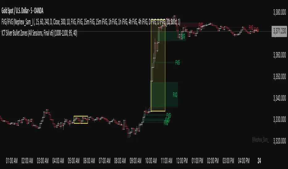
FVG Zones – shrink on fill (bull/bear)Detects classic 3-candle FVGs (ICT definition).
Draws zones as boxes that extend to the right.
On each bar close:
Checks overlap with the current candle.
Shrinks the zone when price wicks into it (bullish: top moves down; bearish: bottom moves up).
Deletes the zone once it’s completely filled/closed.
Inputs: bullish/bearish zone color, border color, and max number of visible FVGs.
Possible extensions:
Multi-timeframe FVGs (e.g. H1 FVGs shown on M5).
Separate limits for bullish and bearish zones.
Alerts for new FVG, partial fill, or closed FVG.
Option “Body only” (ignore wicks when detecting overlap).
Minimum FVG size filter (ticks/ATR).
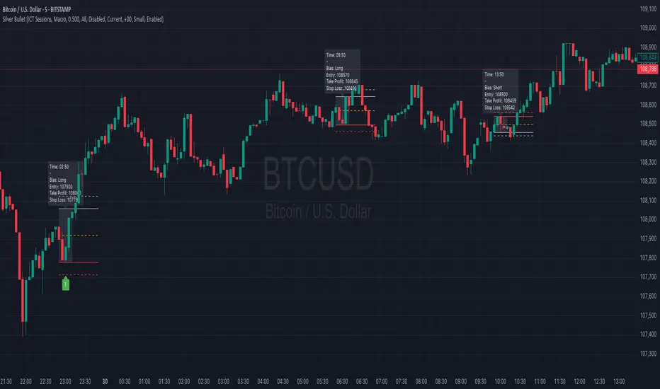
Silver BulletSilver Bullet is a trading tool built for finding cleaner, higher-probability setups. It focuses on key windows of market movement and adds helpful tools like daily range levels and candlestick patterns.
Whether you’re trading breakouts or reversals, Silver Bullet gives you a clearer view of the market and more confidence in your setups.
⸻
🔹 Trading Setup #1: Macro Time
The Macro Time setting offers two modes: Macro Bullet and Silver Bullet. Both help traders focus on specific times when the market tends to deliver clean moves.
• Macro Bullet is based on the high and low of a full macro session. It automatically detects the session’s range and bias, then offers optimal entries for either Long or Short setups. Once the session resolves, it provides Fibonacci-based levels for entry, target, and stop loss.
• Silver Bullet is based on ICT concepts and focuses on the hourly range for London, NY AM, and NY PM sessions. It’s designed for quick time blocks and highlights key levels as the session unfolds.
To use this setup, set Macro Time to “ICT Sessions” and select your preferred mode under Bullet Mode.
⸻
🔹 Trading Setup #2: Daily Range
Enable Daily Range to draw Fibonacci levels based on either the previous day’s candle or the current day’s developing range. These levels help you identify potential support, resistance, and midpoint zones throughout the day.
With the current day’s range, levels automatically update in real time as new highs or lows form — keeping your chart aligned with evolving price action.
⸻
🔹 Trading Setup #3: Candlestick Patterns
Turn on Candlestick Patterns to automatically highlight clean reversal signals such as Hammers, Hanging Men, Shooting Stars, and Tweezers. Each pattern is detected using specific criteria and trend filters to reduce noise and improve reliability. They work especially well as confirmation signals around key levels or session zones.
Silver Bullet brings structure, clarity, and precision to your intraday trading. By combining time-based bias, price action levels, and pattern recognition, it helps you trade with purpose — not guesswork. Use one setup or combine all three for a complete view of the market, tailored to your style and session of choice.
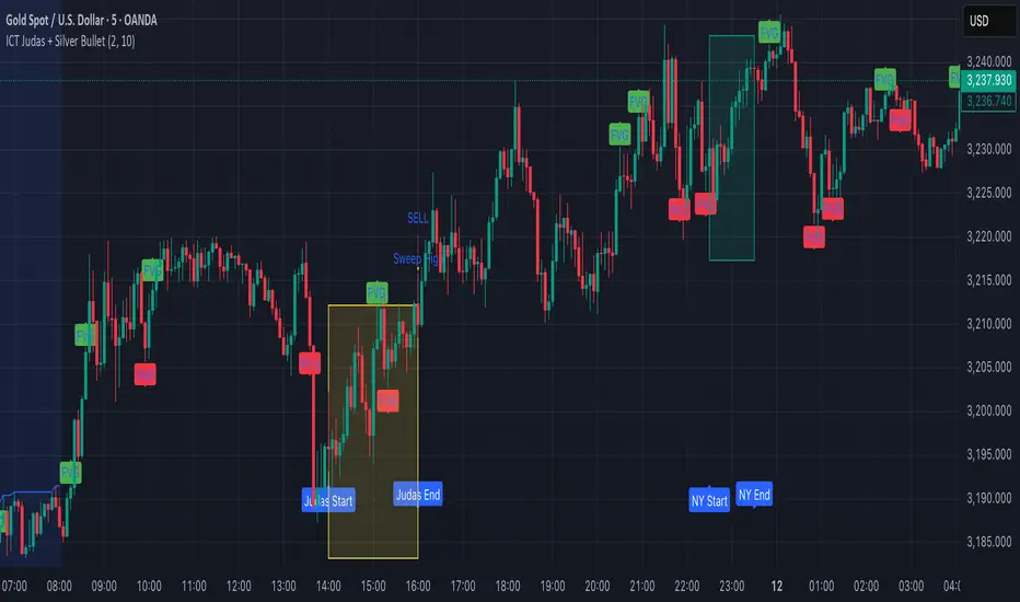
ICT Judas + Silver Bullet🔰 ICT Judas + Silver Bullet Indicator (SMC-based)
Built for Prop Firm and High Win Rate Intraday Traders
This indicator identifies key institutional setups from Inner Circle Trader (ICT) and Smart Money Concepts (SMC) strategies, optimized for XAUUSD, EURUSD, and other high-volume pairs on the 5-minute chart.
📌 Core Features:
✅ Asian Range Box (02:00–08:00 SGT) – used as manipulation anchor
✅ London Killzone (14:00–16:00 SGT) – Judas Swing detection
✅ New York Killzone (22:30–23:30 SGT) – Silver Bullet setups
✅ Automatic Fair Value Gap (FVG) detection
✅ Liquidity sweep detection based on 20-bar EQH/EQL
✅ Entry + Stop Loss + Take Profit visualization with adjustable RR
✅ Alerts for Judas and Silver setups
✅ Perfect for prop firm scalping and intraday swing logic
🛠️ How It Works:
- Judas Swing: triggers when liquidity above the Asian high is swept during London Killzone
- Silver Bullet: triggers when liquidity below recent lows is swept during NY Killzone
- Entry shown via circle, SL and TP lines based on user-defined RR and stop-loss pip distance
- Designed to be paired with SMC/ICT OB/FVG confirmation entries
⚙️ Settings:
- Adjustable session times
- Toggle FVG display
- Set RR and SL pips to match prop firm rules
- Compatible with alert webhooks for Telegram
🕰️ Note:
All times are fixed to **SGT (GMT+8)**. If you're in another timezone, adjust your TradingView timezone accordingly or update the session inputs manually during Daylight Saving Time changes.
🔔 Alert-Ready:
Use alerts for live signals and pair with webhooks for automation.
🔍 Recommended Pairings:
XAUUSD, EURUSD, GBPUSD, NAS100 on M5 chart
📈 Win Rate Potential:
Backtested with high-probability setups aligned with prop firm daily goals. Best used with strict discipline and 1-2 setups per day.
—
Built with ❤️ by a trader, for traders looking for precision-based executions using ICT logic.
Power Balance Bull&Bear - CoffeeKillerPower Balance Bull&Bear - CoffeeKiller Indicator Guide
Welcome traders! This guide will walk you through the Power Balance Bull&Bear indicator, a unique and powerful market analysis tool developed by CoffeeKiller that visualizes the ongoing battle between buyers and sellers in any market.
Core Concept: Buyers vs. Sellers
The foundation of this indicator rests on a simple yet profound concept: every price movement in the market represents a battle between buyers and sellers.
Positive Green Line: Buyer Power
- Represents cumulative buying pressure in the market
- Tracks positive directional movement over a specified period
- Rising positive line indicates increasing buying momentum
- Peaks in the positive line show moments of maximum buyer dominance
Negative Red Line: Seller Power
- Represents cumulative selling pressure in the market
- Tracks negative directional movement over a specified period
- Falling negative line indicates increasing selling momentum
- Troughs in the negative line show moments of maximum seller dominance
Master Line: Market Balance
- Calculated as the difference between positive and negative movements
- Above zero: buyers are in control
- Below zero: sellers are in control
- Peaks and troughs: moments of extreme buyer or seller dominance
Core Components
1. Directional Movement Analysis
- Cumulative measurement of price changes in both directions
- Normalization for consistent visualization
- Optional smoothing for clearer signals
- Custom box size for sensitivity control
2. Distance Measurement
- Calculation of separation between buyer and seller lines
- Convergence and divergence thresholds
- Dynamic fill coloring based on distance trends
- Distance trend visualization
3. Peak Detection System
- Identification of local maxima and minima in buyer/seller dominance
- Background highlighting of significant peaks
- Zero-line cross detection for trend changes
- Visual cues for market extremes
4. Trend Analysis
- Buyer/seller line crossovers for major trend signals
- Distance trending for momentum confirmation
- Status monitoring (Near, Far, Normal)
- Direction tracking for both buyer and seller lines
Main Features
Time Resolution Settings
- Normal mode: calculations based on chart timeframe
- Custom resolution mode: calculations based on specified timeframe
- Multi-timeframe analysis capabilities
- Flexible time projection options
Visual Elements
- Color-coded buyer and seller lines
- Dynamic fill coloring based on convergence/divergence
- Background highlighting for significant peaks
- Distance line with threshold markers
Signal Generation
- Buyer/seller crossover alerts
- Convergence/divergence notifications
- Peak detection signals
- Status change alerts
Analysis Table(I personally don't use the table it was coded to take longer signals to show strength or weakness in overall trend)
- Current distance measurement
- Distance trend indication
- Status monitoring (Near, Far, Normal)
- Buyer and seller line trend tracking
Trading Applications
1. Trend Identification
- Buyer line crossing above seller line: bullish trend beginning
- Seller line crossing above buyer line: bearish trend beginning
- Distance between lines: trend strength
- Distance trending: momentum confirmation
2. Reversal Detection
- Peak formation after extended trend: potential exhaustion
- Buyer/seller line convergence: decreasing trend strength
- Distance falling below convergence threshold: potential trend change
- Background highlighting: visual cue for significant peaks
3. Momentum Analysis
- Increasing distance: accelerating trend
- Decreasing distance: decelerating trend
- Distance above divergence threshold: strong momentum
- Distance below convergence threshold: weak momentum
4. Market Balance Assessment
- Buyer line trend: indicates strength/weakness of bulls
- Seller line trend: indicates strength/weakness of bears
- Master line position relative to zero: overall market bias
- Distance between lines: consensus or disagreement in the market
Optimization Guide
1. Period Settings
- Longer period: smoother signals, less noise, fewer false signals
- Shorter period: more responsive, captures minor moves, potentially more noise
- Default (20): balanced approach for most timeframes
2. Box Size Parameter
- Smaller box size: more sensitive to price changes
- Larger box size: less sensitive, focuses on major moves
- Default (0.001): calibrated for typical price ranges
3. Distance Thresholds
- Convergence threshold: determines when lines are considered "near"
- Divergence threshold: determines when lines are considered "far"
- Adjusting these based on volatility of the instrument
4. Color Customization
- Positive Green line: representing buyer strength
- Negative Red line: representing seller strength
- Diverging fill: when the gap between buyers and sellers is increasing
- Converging fill: when buyers and sellers are moving closer together
Best Practices
1. Signal Confirmation
- Wait for buyer/seller crossovers to confirm
- Look for background highlighting at peaks
- Check distance trends for momentum confirmation
- Use the analysis table for additional context
2. Timeframe Selection
- Lower timeframes: more signals, potential noise
- Higher timeframes: cleaner signals, less frequent
- Custom resolution: allows comparison across timeframes
- Consider using multiple timeframes for confirmation
3. Market Context
- Strong buyer line rising + weak seller line: very bullish
- Strong seller line falling + weak buyer line: very bearish
- Both lines rising: volatile uptrend
- Both lines falling: volatile downtrend
4. Combining with Other Indicators
- Use with trend indicators for confirmation
- Pair with oscillators for overbought/oversold conditions
- Combine with volume analysis for validation
- Consider support/resistance levels when peaks form
Advanced Trading Strategies
1. Buyer/Seller Balance Strategy
- Enter long when buyer line crosses above seller line
- Enter short when seller line crosses above buyer line
- Use distance trend for filtering quality of signals
- Exit when distance falls below convergence threshold
2. Peak Trading Strategy
- Identify significant peaks with background highlighting
- Look for consecutive lower peaks in buyer line for shorting opportunities
- Look for consecutive higher troughs in seller line for buying opportunities
- Use master line crosses through zero as confirmation
3. Convergence/Divergence Strategy
- Enter positions when distance exceeds divergence threshold (strong trend)
- Take partial profits when distance starts decreasing
- Exit fully when distance falls below convergence threshold
- Re-enter when a new trend forms with increasing distance
4. Line Trend Combination Strategy
- Strongest bullish signal: Rising buyer line + falling seller line + increasing distance
- Strongest bearish signal: Falling buyer line + rising seller line + increasing distance
- Potential reversal signal: Decreasing distance + peak formation + line trend change
- Continuation signal: Consistent buyer/seller dominance + increasing distance after consolidation
Practical Analysis Examples
Bullish Market Scenario
- Buyer line trends upward as buying pressure increases
- Seller line remains flat or trends downward as selling pressure decreases
- Distance between lines expands, showing divergence (strong trend)
- Positive background highlights appear at new peaks in buyer dominance
- Master line moves further above zero
Bearish Market Scenario
- Seller line trends downward as selling pressure increases
- Buyer line remains flat or trends downward as buying pressure decreases
- Distance between lines expands, showing divergence (strong trend)
- Negative background highlights appear at new troughs in seller dominance
- Master line moves further below zero
Consolidation Scenario
- Buyer and seller lines move sideways
- Distance between lines narrows, showing convergence
- Few or no new peak highlights appear
- Master line oscillates close to the zero line
- Analysis table shows "Stable" trends for both buyer and seller lines
Understanding Market Dynamics Through Power Balance
At its core, this indicator provides a unique lens to visualize the ongoing battle between bulls and bears:
1. **Relative Strength**: When the buyer line rises faster than the seller line, bulls are gaining strength relative to bears - a bullish signal. When the seller line falls faster than the buyer line, bears are dominating - a bearish signal.
2. **Market Consensus**: Convergence between lines suggests market participants are reaching consensus about price direction. Divergence suggests growing disagreement and potential for stronger moves.
3. **Exhaustion Signals**: Major peaks in either line that are highlighted by background colors suggest moments where one side (buyers or sellers) has reached maximum strength - often precursors to reversals.
4. **Trend Confirmation**: The status indicators (Near, Far, Normal) provide context about the current market phase, helping confirm whether a trend is establishing, continuing strongly, or potentially fading.
Remember:
- Combine signals from buyer/seller lines, distance measurements, and peak formations
- Use appropriate timeframe settings for your trading style
- Monitor the analysis table for additional context
- Consider market conditions and correlate with price action
This indicator works best when:
- Used as part of a comprehensive trading system
- Combined with proper risk management
- Applied with an understanding of current market conditions
- Signals are confirmed by price action and other indicators
**DISCLAIMER**: This indicator and its signals are intended solely for educational and informational purposes. They do not constitute financial advice. Trading involves significant risk of loss. Always conduct your own analysis and consult with financial professionals before making trading decisions.

Volume Bulls vs Bears (Improved)The "Volume Bulls vs Bears (Improved)" is a raw and powerful volume-based indicator for TradingView that visualizes market participation by separating volume into "bullish" and "bearish" components. It provides a clear and visually appealing stacked histogram alongside a moving average of total volume, helping traders identify trends in market participation.
Key Features
Bullish vs Bearish Volume Separation:
Bullish Volume: Represents the portion of volume contributed by buyers (when prices move up).
Bearish Volume: Represents the portion of volume contributed by sellers (when prices move down).
Volume is calculated based on price action within the range of the candle:
Bulls = ((Close - Low) / (High - Low)) * Total Volume
Bears = ((High - Close) / (High - Low)) * Total Volume
Stacked Histogram:
Bullish and bearish volumes are plotted as a stacked histogram.
Bull Color: Green (default).
Bear Color: Red (default).
This makes it easy to spot shifts in volume dominance between bulls and bears.
Volume SMA:
A Simple Moving Average (SMA) of total volume over a user-defined period helps smooth out fluctuations and shows overall volume trends.
Default period is 20 bars.
SMA Line: Yellow (default), adjustable in width.
User-Customizable Inputs:
Volume SMA Period: Adjust the lookback period for the moving average.
Bull/Bear Colors: Customizable histogram colors.
SMA Line Color and Width: Allows flexibility for better chart aesthetics.
Non-Overlapping Visuals:
The histogram avoids overlap, ensuring clarity by visually stacking bullish and bearish volumes.
How to Use the Indicator
Identify Bullish Volume Dominance:
If the green (bullish) volume bars are larger, it indicates stronger buying pressure within the candle range.
Identify Bearish Volume Dominance:
If the red (bearish) volume bars are larger, it signals stronger selling pressure.
Volume Trend:
Use the Volume SMA line to identify whether overall volume is increasing, decreasing, or staying stable. Rising volume typically strengthens trends, while declining volume can indicate weakness.
Use Cases
Spotting volume trends that confirm price movements (e.g., rising prices with rising bullish volume).
Recognizing potential reversals when bearish volume starts dominating previously bullish candles.
Identifying accumulation or distribution phases by analyzing volume behavior.
Conclusion
This "Volume Bulls vs Bears (Improved)" indicator provides traders with deeper insights into market participation. Its raw, no-frills design offers clear visuals to help assess bullish and bearish volume dynamics with an additional smoothing component through the SMA. It’s an essential tool for volume-focused traders looking to confirm trends or anticipate reversals.

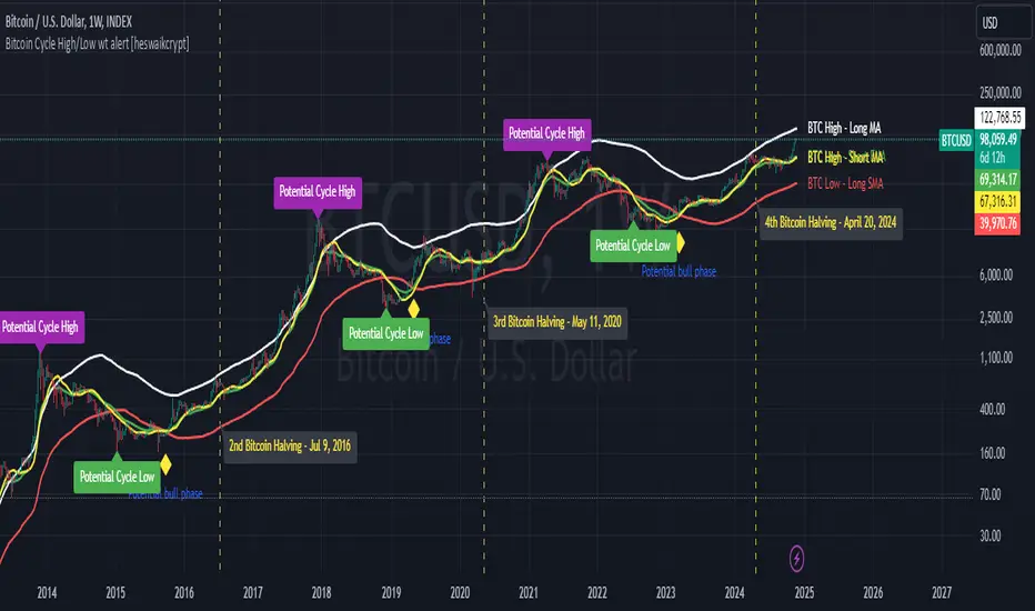
Bitcoin Cycle High/Low with functional Alert [heswaikcrypt]Introduction
Just as machines are fine-tuned for maximum efficiency, trading indicators must evolve to meet the demands of ever-changing markets.
Credit goes to the initial author, @NoCreditsLeft I only improved the existing Pi-cycle indicator with a functional alert and included a bull mode indicator in the script. The alert can help you get a live alert at candle close when the cycle tops, bottoms, and the potential bull phase switch occurs.
Philip Swift’s Pi Cycle Top Indicator is a brilliant example of leveraging mathematical relationships to signal critical turning points in Bitcoin’s price cycles. Historically, it has identified market and local tops with some relative accuracy, often within three days, as demonstrated in all the previous bull run cycles.
At its core, the Pi Cycle Indicator derives its name from the mathematical constant π (pi), achieved by using simple moving averages (MAs) in a specific ratio: 𝜋 = Long MA/short MA
The Bull mode switch is calculated using a crossover of the short exponentia moving average and the long moving average.
.
.
.
Knowing when Bitcoin reaches its top—and receiving timely alerts about it—is crucial for successful trading. The indicator is designed to signal;
Potential Bitcoin tops: Purple label
Potential Bitcoin bottoms : green Label, and
Parabolic swing : Yellow diamond shape (relating to the market switching to a potential bull mode)
"Please note: This indicator is tailored for Bitcoin using historical data analysis and should not be considered definitive. However accurate it might be."
Setting alerts
To set the alert conditions, select any alert function call to get alert whenever the conditions are met. The script is configured on dialy TF; you can set it on 1D or weekly TF.
Enjoy and Trade smartly
Flag Screener [QuantVue]Flag Screener is a screening tool that identify bull and bear flags in up to 40 different symbols.
The indicator takes a comma separated list of symbols and then scans the symbols in real time to detect bull or bear flags.
What are flags
Flags are continuation patterns that occur within the general trend of the security. A bull flag represents a temporary pause or consolidation before price resumes it's upward movement, while a bear flag occurs before price continues its downward movement.
Both flag patterns consist of two components:
The Pole
The Flag
The pole is the initial strong upward surge or decline that precedes the flag. The pole is usually a fast move accompanied by heavy volume signaling significant buying or selling pressure.
The flag is then formed as price consolidates after the initial surge or decline from the pole. For a bull flag price will drift slightly downward to sideways, a bear flag will drift upward to sideways. The best flags often see volume dry up during this phase of the pattern.
Indicator Settings
Both components are fully customizable in the indicator so the user can adjust for any time frame or volatility. Select the minimum and maximum accepted limits from the % gain loss required for the pole, the maximum acceptable flag depth or rally and the minimum and maximum number of bars for each component.

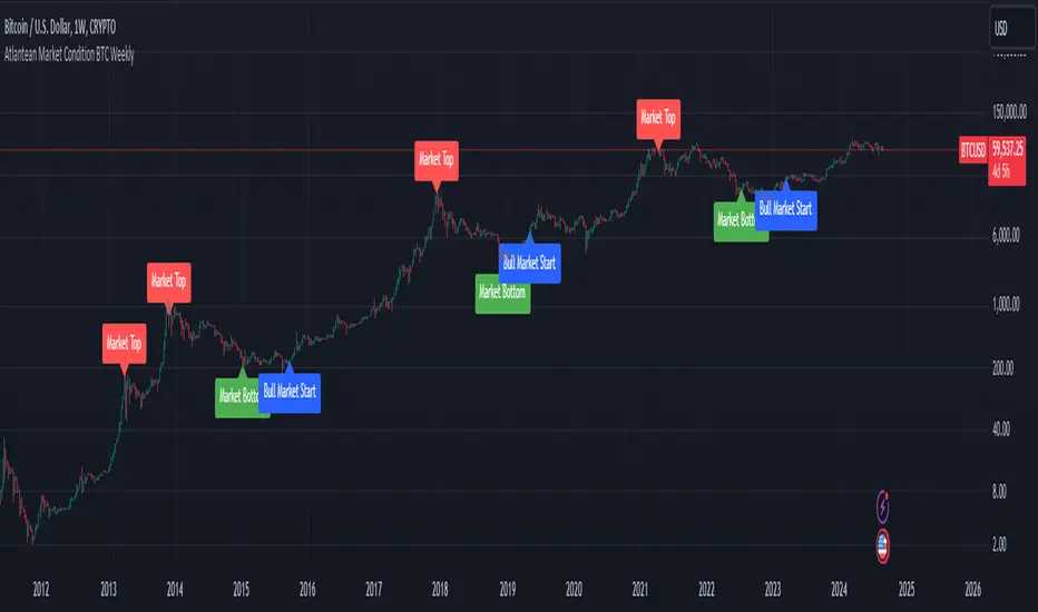
Atlantean Bitcoin Weekly Market Condition - Top/Bottom BTC Overview:
The "Atlantean Bitcoin Weekly Market Condition Detector - Top/Bottom BTC" is a specialized TradingView indicator designed to identify significant turning points in the Bitcoin market on a weekly basis. By analyzing long-term and short-term moving averages across two distinct resolutions, this indicator provides traders with valuable insights into potential market bottoms and tops, as well as the initiation of bull markets.
Key Features:
Market Bottom Detection: The script uses a combination of a simple moving average (SMA) and an exponential moving average (EMA) calculated over long and short periods to identify potential market bottoms. When these conditions are met, the script signals a "Market Bottom" label on the chart, indicating a possible buying opportunity.
Bull Market Start Indicator: When the short-term EMA crosses above the long-term SMA, it signals the beginning of a bull market. This is marked by a "Bull Market Start" label on the chart, helping traders to prepare for potential market upswings.
Market Top Detection: The script identifies potential market tops by analyzing the crossunder of long and short-term moving averages. A "Market Top" label is plotted, suggesting a potential selling point.
Customizable Moving Averages Display: Users can choose to display the moving averages used for detecting market tops and bottoms, providing additional insights into market conditions.
How It Works: The indicator operates by monitoring the interactions between the specified moving averages:
Market Bottom: Detected when the long-term SMA (adjusted by a factor of 0.745) crosses over the short-term EMA.
Bull Market Start: Detected when the short-term EMA crosses above the long-term SMA.
Market Top: Detected when the long-term SMA (adjusted by a factor of 2) crosses under the short-term SMA.
These conditions are highlighted on the chart, allowing traders to visualize significant market events and make informed decisions.
Intended Use: This indicator is best used on weekly Bitcoin charts. It’s designed to provide long-term market insights rather than short-term trading signals. Traders can use this tool to identify strategic entry and exit points during major market cycles. The optional display of moving averages can further enhance understanding of market dynamics.
Originality and Utility: Unlike many other indicators, this script not only highlights traditional market tops and bottoms but also identifies the aggressive start of bull markets, offering a comprehensive view of market conditions. The unique combination of adjusted moving averages makes this script a valuable tool for long-term Bitcoin traders.
Disclaimer: The signals provided by this indicator are based on historical data and mathematical calculations. They do not guarantee future market performance. Traders should use this tool as part of a broader trading strategy and consider other factors before making trading decisions. Not financial advice.
Happy Trading!
By Atlantean
Flags With Measured Move [QuantVue]Flags with Measured Moves is a technical analysis tool that identifies bull flags and provides a measured move target.
A bull flag is a continuation pattern that occurs within the context of a general uptrend. It represents a pause or small consolidation before the price resumes its upward movement.
A bull flag consists of two sections: the flagpole and the flag.
The flagpole is the initial upward movement that occurs before the flag forms.
The flag forms as the price consolidates after the initial uptrend. During this phase, the price tends to drift downward or sideways, ideally with declining volume.
Once the flag has put in a low, the initial range of thrust is added to the flag low to form the measured move target.
Every element of the flag is customizable by the trader, including the size and length of the prior uptrend and the minimum and maximum flag depth and length.
The indicator also includes alerts for when new flags are formed, when a breakout from the flag occurs, and when the measured move target is reached.
By default, the indicator settings are set for use on a daily timeframe. If using the indicator on an intraday timeframe, you will need to adjust the settings.
Give this indicator a BOOST and COMMENT your thoughts!
We hope you enjoy.
Cheers!
ICT Silver Bullet Vertical Lines by Fahmi EshaqThis indicator is designed for users interested in backtesting the Silver Bullet strategy. It eliminates the need for manual drawing of vertical lines by automatically highlighting specific times known as ICT Silver Bullet times. These times correspond to periods when smart money are active the market. The indicator marks these Silver Bullet times with vertical lines, making them easily identifiable. The specified Silver Bullet times are 3AM-4AM, 10AM-11AM, and 2PM-3PM New York time. Additionally, a vertical line is added at 12:00AM to demarcate the start of each day, as days begin at midnight.

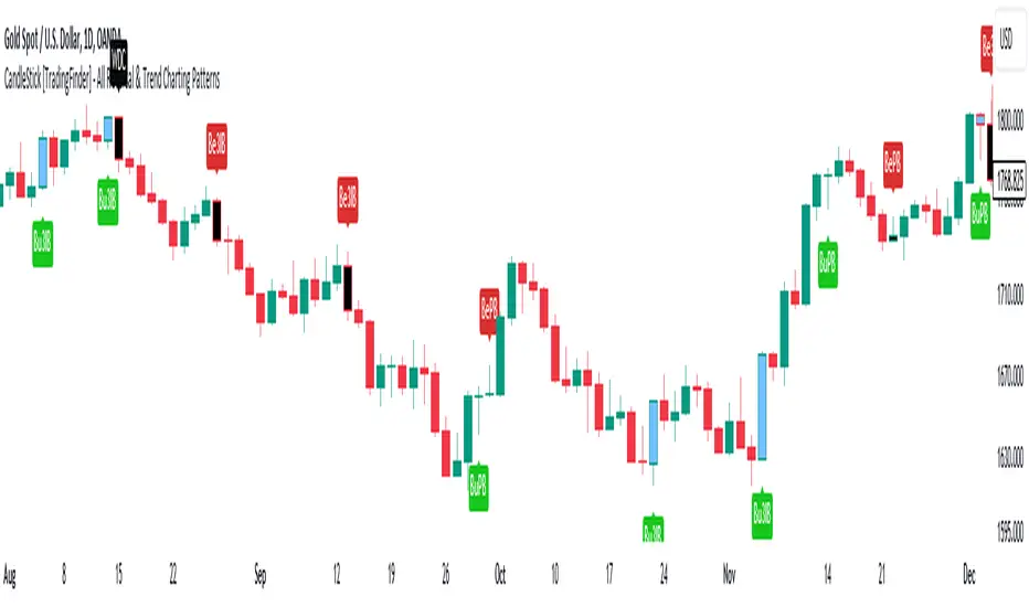
CandleStick [TradingFinder] - All Reversal & Trend Patterns🔵 Introduction
"Candlesticks" patterns are used to predict price movements. We have included 5 of the best candlestick patterns that are common and very useful in "technical analysis" in this script to identify them automatically. The most important advantage of this indicator for users is saving time and high precision in identifying patterns.
These patterns are "Pin Bar," "Dark Cloud," "Piercing Line," "3 Inside Bar," and "Engulfing." By using these patterns, you can predict price movements more accurately and therefore make better decisions in your trades.
🔵 How to Use
Pin Bar : This pattern consists of a Candle where "Open Price," "Close Price," "High Price," and "Low Price" form the "Candle Body," and it also has "Long Shadow" and "Short Shadow." In the visual appearance of the Pin Bar pattern, we have a candle body and a pin bar shadow, where the candle body is smaller relative to the shadow.
Just as the candle body plays an important role in analysis, the pin bar shadow can also be influential. The larger the pin bar shadow, the stronger the expectation of a trend reversal.
When a "bearish pin bar" occurs at resistance or the chart ceiling, it can be predicted that the price trend will be downward. Similarly, at support points and the chart floor, a "bullish pin bar" can indicate an upward price movement.
Additionally, patterns like "Hammer," "Shooting Star," "Hanging Man," and "Inverted Hammer" are types of pin bars. Pin bars are formed in two ways: bullish pin bars have a long lower shadow, and bearish pin bars have a long upper shadow. Important: Displaying "Bullish Pin Bar" is labeled "BuPB," and "Bearish Pin Bar" is labeled "BePB."
Dark Cloud : The Dark Cloud pattern is one type of two-candle patterns that occurs at the end of an uptrend. The 2-candle pattern indicates the shape of this pattern, which actually consists of 2 candles, one bullish and one bearish. This pattern indicates a trend reversal and is quite powerful.
The Dark Cloud pattern is seen when, after a bullish candle at the end of an uptrend, a bearish candle opens at a higher level (weakly, equal, or higher) than the closing point of the bullish candle and finally closes at a point approximately in the middle of the previous candle. In this indicator, the Dark Cloud pattern is identified as "Wick" and "Strong" .
The difference between these two lies in the strictness of their conditions. Important: Strong Dark Cloud is labeled "SDC," and Weak Dark Cloud is labeled "WDC."
Piercing Line : The Piercing candlestick pattern consists of 2 candles, the first being bearish and consistent with the previous trend, and the second being bullish. The conditions of the pattern are such that the first candle is bearish and a price gap is created between the two candles upon the opening of the next candle because its opening price is below (weakly equal to or less than) the closing price of the previous candle.
Additionally, its closing price must be at least 50% above the red candle.
This means that the second candle must penetrate at least 50% into the first candle. Important: Strong Piercing Line is labeled "SPL," and Weak Piercing Line is labeled "WPL."
3 Inside Bar (3 Bar Reversal) : The 3 Inside Bar pattern is a reversal pattern. This pattern consists of 3 consecutive candles and can be either bullish or bearish. In the bullish pattern (Inside Up) formed at the end of a downtrend, the last candle must be bullish, and the third candle from the end must be bearish.
Additionally, the close price must be more than 50% of the third candle from the end. In the bearish pattern (Inside Down) formed at the end of an uptrend, the last candle must be bearish, and the third candle from the end must be bullish. Additionally, the close price must be less than 50% of the third candle from the end. Important: Bullish 3 Inside Bar is labeled "Bu3IB," and Bearish 3 Inside Bar is labeled "Be3IB."
Engulfing : The Engulfing candlestick pattern is a reversal pattern and consists of at least two candles, where one of them completely engulfs the body of the previous or following candle due to high volatility.
For this reason, the term "engulfing" is used for this pattern. This pattern occurs when the price body of a candle encompasses one or more candles before it. Engulfing candles can be bullish or bearish. Bullish Engulfing forms as a reversal candle at the end of a downtrend.
Bullish Engulfing indicates strong buying power and signals the beginning of an uptrend. This pattern is a bullish candle with a long upward body that completely covers the downward body before it. Bearish Engulfing, as a reversal pattern, is a long bearish candle that engulfs the upward candle before it.
Bearish Engulfing forms at the end of an uptrend and indicates the pressure of new sellers and their strong power. Additionally, forming this pattern at resistance levels and the absence of a lower shadow increases its credibility. Important: Bullish Engulfing is labeled "BuE," and Bearish Engulfing is labeled "BeE."
🔵 Settings
This section, you can use the buttons "Show Pin Bar," "Show Dark Cloud," "Show Piercing Line," "Show 3 Inside Bar," and "Show Engulfing" to enable or disable the display of each of these candlestick patterns.
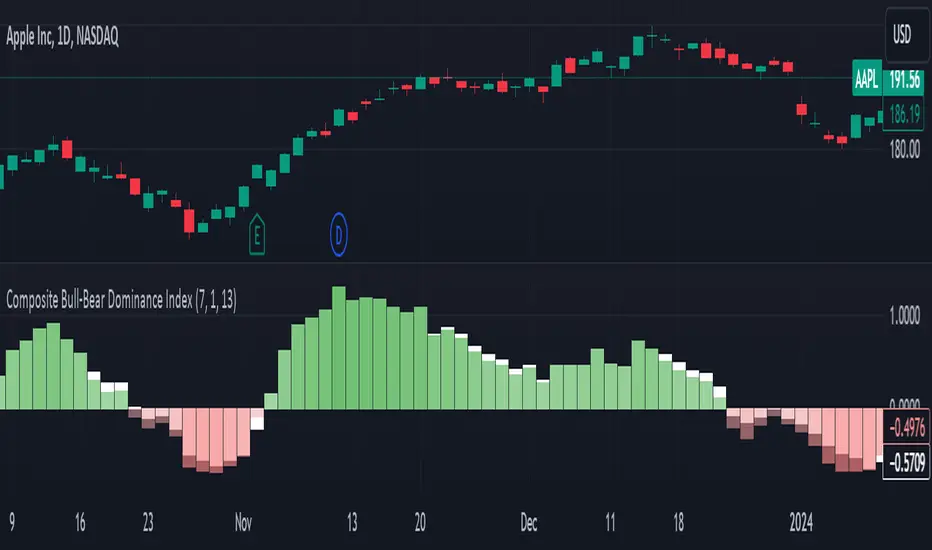
Composite Bull-Bear Dominance IndexNote: CREDITS: This is based on the Up Down Volume Indicator (published in Trading View) and Elder Ray Index (Bull Bear Power).
The Composite Bull Bear Dominance Index (CBBDI) is a indicator that combines up down volume analysis with Bull and Bear Power to provide a comprehensive view of market dynamics. It calculates Z-scores for up down volume delta and bull bear power measures, averages them, and then smoothes the result using Weighted Moving Average (WMA) for Bull and Bear Power and Volume Weighted Moving Average (VWMA) for Up and Down Volume Delta. The advantages include responsiveness to short-term trends, noise reduction through weighting, incorporation of volume information, and the ability to identify significant changes in buying and selling pressure. The indicator aims to offer clear signals for traders seeking insights into overall market dominance and indicate if the bulls or the bears have the upper hand.
Volume Analysis (Up/Down Volume Delta):
Up/Down Volume Delta reflects the net difference between buying and selling volume, providing insights into the prevailing market sentiment.
Positive Delta: Indicates potential bullish dominance due to higher buying volume.
Negative Delta: Suggests potential bearish dominance as selling volume surpasses buying volume.
Price Analysis (Bull and Bear Power):
Bull and Bear Power measure the strength of buying and selling forces based on price movements and the Exponential Moving Average (EMA) of the closing price.
Positive Bull Power: Reflects bullish dominance, indicating potential upward momentum.
Positive Bear Power: Suggests bearish dominance, indicating potential downward momentum.
Composite Bull Bear Dominance Index (CBBDI):
CBBDI combines the standardized Z-scores of Up/Down Volume Delta and Bull Bear Power, providing an average measure of both volume and price-related dominance.
Positive CBBDI: Indicates an overall bullish dominance in both volume and price dynamics.
Negative CBBDI: Suggests an overall bearish dominance in both volume and price dynamics.
Smoothing Techniques:
The use of Weighted Moving Average (WMA) for smoothing Bull and Bear Power Z-scores, and Volume Weighted Moving Average (VWMA) for smoothing Up/Down Volume Delta, reduces noise and provides a clearer trend signal.
Smoothing helps filter out short-term fluctuations and emphasizes more significant trends in both volume and price movements.
Color Coding:
CBBDI values are color-coded based on their direction, visually representing the prevailing market sentiment.
Green Colors: Positive values indicate potential bullish dominance.
Red Colors: Negative values suggest potential bearish dominance.
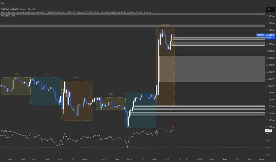
itradesize /\ Silver Bullet x Macro x KillzoneThis indicator shows the best way to annotate ICT Killzones, Silver Bullet and Macro times on the chart. With the help of a new pane, it will not distract your chart and will not cause any distractions to your eye, or brain but you can see when will they happen.
The indicator also draws everything beforehand when a proper new day starts.
You can customize them how you want to show up.
Collapsed or full view?
You can hide any of them and keep only the ones you would like to.
All the colors can be customized, texts & sizes or just use shortened texts and you are also able to hide those drawings which are older than the actual day.
You should minimize the pane where the script has been automatically drawn to therefore you will have the best experience and not show any distractions.
The script automatically shows the time-based boxes, based on the New York timezone.
Killzone Time windows ( for indices ):
London KZ 02:00 - 05:00
New York AM KZ 07:00 - 10:00
New York PM KZ 13:30 - 16:00
Silver Bullet times:
03:00 - 04:00
10:00 - 11:00
14:00 - 15:00
Macro times:
02:33 - 03:00
04:03 - 04:30
08:50 - 0910
09:50 - 10:10
10:50 - 11:10
11:50 - 12:50

ICT Session Opening FVG / Silver Bullet [MK]Students of ICT concepts will know that the first FVG found within particular session periods can identify an important price level for intraday traders.
"Find the first FVG at the start of the session and drag a box from it to the right"....ICT
The script finds the first FVG (either bull or bear) within the following periods:
London Killzone (0200 - 0500) EST
02:00 - 0259
03:00 - 0359
0400 - 0459
Dead Zone (05-00 - 0600) EST
05-00 - 0559
0600 - 0659
NY AM Killzone (0700 - 1100) EST
0700 - 0759
0830 - 0929
0929 - 0959
1000 - 1100 (Silver Bullet)
A chart higher timeframe can be chosen to detect the FVGs and they will be displayed on lower timeframe. Default is 5min for detection. I like to then following price reacting to 5mi FVGs on a 1 min chart.
FVG boxes can be extended to the end of the session, or to any time within the current days trading hours. Colors/Labels/ Session Periods can all be edited. A maximum timeframe for display is available and
timezone can be adjusted.
FVGs are only shown for the current days trading hours.

Balance of Force (BOF)The script "Balance of Force" is an indicator that aims to provide insight into the bullish and bearish forces present in the market by analyzing the relationship between bullish and bearish true ranges. The indicator first calculates the bearish and bullish true ranges by taking the absolute difference between the open and close prices for each period and summing these values over a user-specified length. It then calculates the ratio of the bullish true range to the bearish true range and takes the natural logarithm of this value, resulting in the "bullish-bearish ratio".
The script then calculates the standard deviation of this ratio over a user-specified length to create a measure of volatility. Using this deviation and the dominant cycle, it then applies an exponential moving average to smooth the ratio. The indicator plots the smoothed ratio, the raw ratio, and the deviation of the ratio multiplied by 1, 2 and 3 in addition to filling the area between the deviation multiplied by 3 and the log(1) with red and green. The user can use the indicator to identify potential bullish or bearish market conditions by analyzing the relationship between the smoothed ratio and the log(1) and the deviation of the ratio.

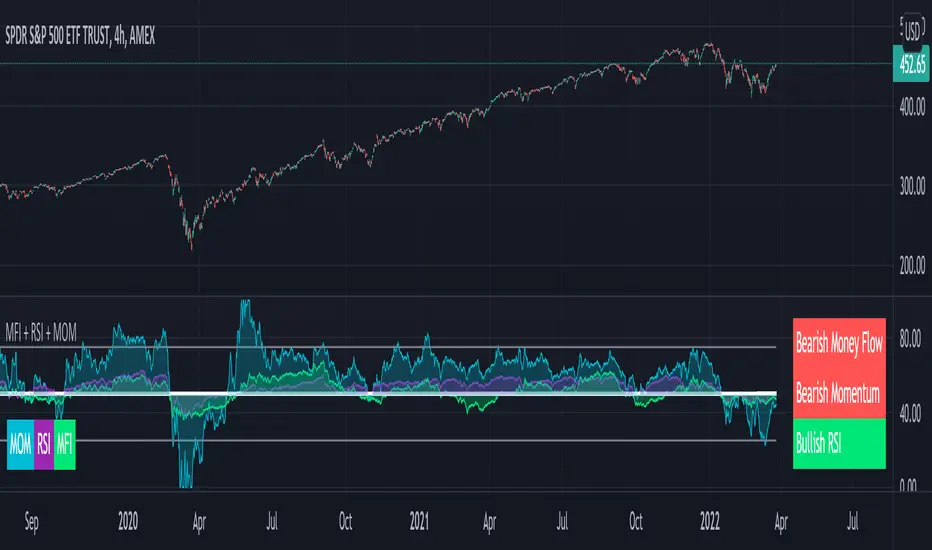
MFI + RSI + MOM With Bull & Bear Trend LabelMOMENTUM + MONEY FLOW INDEX + RELATIVE STRENGTH INDEX WITH BULL & BEAR LABELS
This is a combination of 3 popular indicators. Momentum(MOM), Money Flow Index(MFI) and Relative Strength Index(RSI) along with color changing labels that tell you each indicator's current trend.
The middle white line shows the level that each indicator needs to stay above to be bullish and below for bearish. Watch for all three indicators to cross and hold above or below the mid line for big moves.
It is important to note that these indicators do not need to be going up to be bullish or down to be bearish. They just need to hold above or below the mid line to understand the overall trend.
The momentum indicator is the most relevant in my opinion. If it is holding above the mid line steadily, usually the overall trend will continue upwards so look to buy the dips if the momentum cloud is staying above the white line and vice versa.
It is also important to note that the default settings for this indicator are the 100 period as I find it to be super relevant across most charts but these numbers can be changed in the indicator settings.
Since momentum swings wildly past the normal 0-100 range, it is important to note that the momentum line has been “normalized” to stay within this same range as the rsi and mfi. So if you look at a normal momentum indicator side by side with this indicator it will not look the same however, I find it to be a very good indicator of overall direction so I know the current market sentiment even when price is diverging from the indicator directions.
All of the colors, sources and lengths can be easily customized in the indicator settings input tab.
***HOW TO USE***
When Momentum is above the mid line, it is bullish. When Momentum is below the mid line, it is bearish.
A label on the right side will update in real time to tell you if momentum is Bullish or Bearish for faster recognition of the trend.
When RSI is above the mid line, it is bullish. When Momentum is below the mid line it is bearish.
A label on the right side will update in real time to tell you if RSI is Bullish or Bearish for faster recognition of the trend.
When MFI is above the mid line, it is bullish. When MFI is below the mid line it is bearish.
A label on the right side will update in real time to tell you if MFI is Bullish or Bearish for faster recognition of the trend.
This indicator was built to help you quickly identify the Bullish or Bearish nature of the current trend with a live color changing label so you can glance at the label and understand it's direction without analyzing the indicator data.
***MARKETS***
This indicator can be used as a signal on all markets, including stocks, crypto, futures and forex.
***TIMEFRAMES***
This mom + mfi + rsi indicator can be used on all timeframes.
***TIPS***
Try using numerous indicators of ours on your chart so you can instantly see the bullish or bearish trend of multiple indicators in real time without having to analyze the data. Some of our favorites are our Auto Fibonacci, Directional Movement Index, Volume Profile, Auto Support And Resistance and Money Flow Index in combination with this indicator. They all have real time Bullish and Bearish labels as well so you can immediately understand each indicator's trend.
Trend ExplorerAre we in a bull or a bear market?
From the technical analysis point of view, the answer is "It depends". It depends from the parameters of your indicator, the timeframe of the pair you are looking and the volatility of that specific market you are looking to.
After I experimented with various trending indicators I decided to develop a framework that potentially could "embed" already existing logic from well known indicators (e.g. Supertrend OTT etc.).
The most important part is that I managed to abstract that logic away and experiment even further to produce some more robust, market and timeframe resolution agnostic results. While at the same time I was able to switch between market and timeframe resolution specific configuration to take some decision.
Finally, I decided to share this code with you folks! Developed this indicator "Trend Explorer" in an effort to make the aforementioned abstraction of all those trending indicators.
The goal is to enable the user to explore and combine different approaches in order to create a more robust and market general/specific, timeframe resolution invariant/fluctuating and volatility auto/manual adjusted indicator according to his needs.
The logic behind the abstraction is fairly simple. The trending indicator consists of two boundary lines the "bull trend low boundary" (green) and the "bear trend high boundary" (red). The indicator also has a control line (orange). Every time the control line crosses a boundary there is a trend reversal! The boundary lines are defined by the thresholds. To be more precise, boundaries are pulled upwards by thresholds (blue) during a bull market and downwards during a bear market. I challenge the user to experiment with the different ways of calculating the thresholds and the control. I am open to suggestions that might improve and extend the possibilities of this indicator. Any feedback, comments, general thoughts or bug reports are welcome.
Why did I chose those defaults?
For threshold calculation I chose MINMAX which calculates the local minimum and maximum using a sliding window. As far as I know it is not used in any existing trending indicator, but it seems reasonable for a trader to search for local min and max to make a decision. The width of the sliding window a.k.a the "period to remember" the local min and max is 30 days by default, just because I believe that for regular people it is a reasonable period of time to forget too.
Also, compared to the SUBADD method MINMAX does not seem to lag behind, especially when using averages in the SUBADD mode. Moreover, I consider MINMAX to be more general than the margins used by the SUBADD since margins should be configured based on the underlying market volatility.
For a source of min and max I chose the low and high values just because they are timeframe resolution invariant, meaning that they have the same (not exactly due to number precision and rounding, but very close) results for a single pair whether you use "4 hour" or "1 day" time interval! Another popular choice might be (close, close) since many traders wait for the daily candle to close in order to discard outliers. However, this approach is not resolution invariant and it depends from the time interval the user has selected.
Do you have any interesting trending indicator you would like to see how it performs in this framework logic? Let me know!
Do you have in mind any variation of Control or Thresholds calculation you would like to test? Please describe it in the comments below so I can add it in my implementation for you!
Did you find any other bug or you experienced any strange behavior? PM me with a description of the bug, the trading pair the timeframe resolution the exact time (candle) and all the necessary configurations for this indicator so I can reproduce it on my machine!
Please enjoy with caution,
Jason

Trader Pressure Index (TPX)This is my take on the script by RedK
I kept the algorithm exactly the same, but changed the layout and the default look back period. Most important is that the resulting line, the TPX, is now a histogram with green and red staves.
To put the histogram on a logical place in the graph, I changed the way the control/dominance level is implemented, it now lowers or highers the whole graph, this way the zero level becomes the ‘no interest’ level.
I added two horizontal lines at a distance of 40 because I feel that this is sort of an oversold / overbought indication. In practice not very convincing, but provides a visual comparison.
In this layout I explain that grass is growing on bull hills peaking up behind the foreground and blood is dripping from the bear hills.
Enjoy.

Altered True Strength Indicator (TSI) Reupload-
Altered TSI provides a slightly more volatile signal that demonstrates extremities in price action with greater success than standard TSI. In addition, I added bull/bear cross indicators (green/red) to make it easier to notice the crosses to save time when the market is moving fast (I couldn't find a regular TSI script with this addition). Finally, the signal also has overextension parameters (red and green lines)
I think this is best used on Intraday time frames as the signals respond to volatility very well and using Heikin Ashi candles, trend is more visual. In this particular example, I am showing SPY on the 3m time chart (my favorite short time frame) and the signal alone provided many opportunities for trades when using simple divergences and countering overextension direction when short term (blue) signal crosses either
In the first example (purple lines), SPY ramps but it was a dull signal given the signal strength flatlining- we would be looking for a short entry. When the signal fires, it provides a clean $1.50 move down in spy.
In the second example (orange), the blue signal provides a nice V shape (rebound signal) in which we are looking for a long entry. 390.50 is a strong SPY support in confluence with 2nd std dev VWAP extension, but disregarding that bull signal fires resulting in a 2 dollar move upwards. Exit is provided when blue line crosses green overextension.
In the third example (white), we are searching for a short entry at 392.5 resistance in confluence with divergently higher highs. Bear cross signal when fired and a significant cross is visible provides a $2.50 move to the downside with a potential exit provided when blue line crosses red overextension line in confluence with previous LOD area.
In the fourth example (green), we watch as the blue line provides a V pattern, we are searching for a long entry. If you didn't take a riskier long at 2nd std dev VWAP overextension with V recovery on blue line at red overextension for a ride to vwap, then you are looking for a secondary entry long as you wouldn't take the trade at resistance (vwap). Bullishly divergent lows provide this entry and the signal does not bear cross at all (but looking for significant crosses is more important even if the signal were to make a minor bear cross). Bullishly divergent double bottom provides a long entry to end of day with a nice clean signal for a $5.00 move until eod or when signal crosses overextension range.
Ideally, close to the money options or SPY/SPXS/SPXL are best used in the intraday time frame.
Again, this is not a standalone indicator but it's best used in conjunction with other indicators/trading strategies
Any questions feel free to comment

Traders Dynamic Index(RSI) w/ Bull&Bear Control ZonesMomentum (RSI) is one of the most commonly used indicators for trading, but the vast majority of traders who use it, simply apply it as an oscillator to measure overbought and oversold conditions. However, momentum is much more complex than that and using a basic RSI fails to highlight these complexities.
What this highlights are some of the areas/zones that many people may not even know about or are unaware what the RSI can actually reveal about a particular trend.
What this indicator is showing:
Fast moving RSI (Green) - 1 period
Slow moving RSI (Red) - 9 period
Bollinger Bands
Relative Strength: 1 - 100
Bearish Control Zone: 30(Below) - 45
Bullish Control Zone: 60 - 70 (Above)
How this identifies trends:
Bear Market(Bearish Control Zone):
-Support: 20(Below) - 30
-Resistance: 55 - 65
-Momentum will test resistance but will fail to hold support at 50
Bull Market(Bullish Control Zone):
-Support: 45 - 50
-Resistance: 80 - 90(Above)
-Momentum will test support but will not continue past the 45 support
How this identifies reversals:
If a market is bullish, but loses support at 45 and tests 30, it has begun reversal. If a market is bearish, but breaks 60 and tests 70, it has begun reversal.
-A bull market reversal is confirmed if it finds resistance at 60 after testing bearish support
-A bear market reversal is confirmed if it finds support at 50 after testing bullish resistance
Slow & Fast RSI w/ Boll Bands:
-The Slow and Fast RSI crossovers will act as Intermediate trends within the Macro trend - Fast crosses slow, bullish. Slow cross fast, bearish.
-Use in confluence with the Macro trend.
-While under Bearish Control, the Slow RSI will act as resistance for the Fast RSI.
-While under Bullish Control, the Slow RSI will act as support for the Fast RSI.
-The two will have an impulsive crossover when the Macro trend reverses.
-The Bollinger Bands will act as a volatility gauge for potential approaching tests of Support & Resistances. (Expansions & Contractions)
This is an analog of TDIGM (GoldMinds)
-Added Bullish/Bearish Control Zones.
-Changed Fast RSI to Green and Slow RSI to Red.

Candlestick Patterns by Dipak V2I am really excited to publish my work, I know its at the beginning but there is a lot to come in the future. I am writing a script to identify the candlestick patterns. In this version, I have added Hammer and Hanging Man Pattern in the first version, I know its less but its a beginning, I will keep adding the new information in my script in upcoming versions.
This script is for only learning purpose and not for treading realtime. In this script, it only identifies the pattern and does not check for its confirmation or does not provide any stop-loss, Also it does not check the prior trend before the pattern. These things really matter in the live trade. But in future, I am planning to add these things.
If you like my work, please like or comment your ideas I will try to include those in upcoming versions.
Hanging Man:
Hanging man is a bearish reversal candlestick pattern that signals about the uptrend or advancing phase are over and bulls have lost their control. Color of the candle is not important.
Identity:
1) Comes after a significant up rally or uptrend or advancing phase.
2) Small real body at the top.
3) Long lower shadow at least twice the real body.
4) Very small or no upper shadow.
Confirmation:
Immediate next candle’s close should be below the hanging man’s real body.
StopLoss:
There is a potential resistance level above the top of the hanging man. Stoploss should be above the resistance area or at the high of the hanging man.
Hammer:
Hammer is a bullish reversal candlestick pattern that signals about the downtrend or declining phase are over and bears have lost their control. Color of the candle is not important.
Identity:
1) Comes after significant down rally or downtrend or declining phase.
2) Small real body at the top.
3) Long lower shadow at least twice the real body.
4) Very small or no upper shadow.
Confirmation:
Immediate next candle’s close should be above the hammer’s low.
StopLoss:
There is a potential support level below the low of the hammer. Stoploss should be below the support area or at the low of the hammer.
Note: The candle is the same for Hanging Man and Hammer , Difference is where they appear in the uptrend or in the downtrend that makes the real difference.

Weekly EMA Squeeze (Bullish + Bearish)Purpose
The Weekly EMA Squeeze indicator identifies periods where price is compressing tightly around a cluster of weekly EMAs and then flags when that compression resolves with directional bias. It is designed to surface high-timeframe inflection points where trends are most likely to begin or meaningfully change.
This indicator operates entirely on weekly data, even when viewed on lower timeframes.
________________________________________
Core Components
1. Weekly EMA Cluster
• Uses three weekly EMAs (fast / mid / slow)
• Compression is defined by:
o Tight EMA spread
o Reduced weekly volatility (ATR contraction)
• Represents balance and indecision at a higher timeframe
2. Bullish Weekly EMA Squeeze
Triggered when:
• EMAs are tightly compressed
• Price is holding above or within the EMA cluster
• EMA slopes flatten or turn upward (optional filter)
• Optional requirement: weekly close above EMA cluster
Displayed as:
• Green upward triangles
• Green vertical shaded band marking the squeeze event window
3. Bearish Weekly EMA Squeeze
Triggered when:
• EMAs are tightly compressed
• Price is holding below or within the EMA cluster
• EMA slopes flatten or turn downward (optional filter)
• Optional requirement: weekly close below EMA cluster
Displayed as:
• Red downward triangles
• Red vertical shaded band marking the squeeze event window
4. Vertical Shaded Event Bands
• Each squeeze event (bull or bear) is visually marked with a vertical shaded region
• Shading appears on every qualifying event, including consecutive ones
• Purpose: clearly identify when the market entered a compressed, directional decision state
________________________________________
What the Indicator Is Signaling
• Compression + directional bias, not immediate breakouts
• Transition points between:
o Range → trend
o Trend → reversal
o Trend → re-acceleration after consolidation
This indicator does not attempt to predict magnitude — it identifies timing and regime change risk.
________________________________________
How to Use It
Best used for:
• High-timeframe bias setting
• Filtering lower-timeframe signals
• Identifying when to stop fading price
• Recognizing when volatility expansion is likely
Typical interpretations:
• Bullish squeeze → bias shifts upward; favor long exposure
• Bearish squeeze → bias shifts downward; favor defensive or short exposure
• Multiple squeezes in same direction → trend reinforcement
• Rapid bull ↔ bear flips → higher-timeframe indecision
________________________________________
What It Is Not
• Not an entry trigger by itself
• Not a momentum oscillator
• Not a replacement for breakout confirmation
This indicator answers:
“Is the weekly market coiling, and in which direction is pressure building?”
