Rate Of Change [SIDD]This Oscillator is helping identify rate of change in Price.
Basic Definition :-
The Rate of Change ( ROC ) is a momentum technical indicator.
It measures the percentage change in price between the current price and the price a certain number of periods ago.
This indicator is plotted against zero, with the indicator moving upwards into positive territory if price changes are to the upside, and moving into negative territory if price changes are to the downside.
Customization of inbuilt ROC:- I have created EMA of ROC with 9 days exponential moving average and Coloring the plot of 9 EMA of ROC Green and RED. Green line indicates that Price change rate is positive in last 9 time period on selected resolution (time frame) and Red line indicated that negative price change rate.
I have identified the zone like +5 and -5 line area in study where some resistance or support is there for 9 EMA ROC line. and if 9 EMA ROC crosses those line then intensity of previous trend get increased.
I have drawn here breakout trendline from lower high candle with hand mark up and same time ROC is above 5 marked with hand up. Similarly I have drawn hand mark down where breakdown trendline is drawn for higher low candle breakdown.
You can see clearly ROC 9 EMA is sync correctly with breakout and breakdown candle when ROC 9 EMA
is above 5 and below 5.
I able to observed that ROC 9 EMA is helping in finding correct breakout and breakdown candles with proper trendline breakout and breakdown.
above all my observation is with daily time frame and 1 Hr time frame candles mostly. If you are changing time frame then see the difference and post same in comment so I can watch those changes as well,
You can modify this study and lets create better than this as well. As I think nothing is perfect in this world always there is scope of improvement.
This study to see how the price are getting changing and what is the rate of change .
This study doesn't give any buy and sell recommendation.
I have other indicator which is given in my signature below that you can check.
ابحث في النصوص البرمجية عن "BULL"

COT 3y Rolling IndicatorsThis is an indicator I use in my trading to easily identify the commercial sentiment on Fx-pairs. The indicator show commercials net positions from the CFTC COT reports and also the rolling 3 year max and min

SIDD-VortexSidd-Vortex strategy is using Vortex formula to generate 4 signals Bullish1 Bullish2 and Bearish1 Bearish2.
Bullish1 signal is getting generated when smooth ma of VIP is crossing over smooth ma of VIM and smooth VIM is falling from previous bar smooth VIM
Bullish2 signal is getting generated when smooth ma of VIP is crossing over smooth ma of VIM and smooth VIP is rising from previous bar smooth VIP
Bearish1 signal is getting generated when smooth ma of VIM is crossing over smooth ma of VIP and smooth VIP is falling from previous bar smooth VIP
Bearish2 signal is getting generated when smooth ma of VIM is crossing over smooth ma of VIP and smooth VIM is rising from previous bar smooth VIM
This strategy can be converted into study by un-commenting the plotshape and replace 15th line strategy with study and parameter overlay=false
and remove the if blocks.
I have seen trending market this strategy is working find but in choppy and consolidation zone strategy doesnt work and results are as expected.
This strategy can be used for stocks, commodity, Forex.
I have added commission and slippage with back test result.
Enjoy code is open.

SMOTHING_MOVE_SIDDThis Indicator is used to smooth the movement of scripts with SMMA and SEMA .
Inspired by Chris Moody RSI-EMA .
This indicator help to avoid any kind of small correction in trending direction and it filter small kind of correction.
Small correction like 2-15 irregular corrective candles is filtered with the help of smooth moving average and Arnaud Legoux Moving Average.
Keep default setting help for optimal trend filter changing setting may change the results.
This Indicator is not recommending for Buy and Sell.

Fibonacci EMA [sidd]EMA with Fibonacci Numbers, I have developed this system for finding trend , support and resistance in lower time frame and higher time frame.
If Candles closes below at least 4 Fibonacci line then trend is down if Candles closes are above minimum 4 Fibonacci line the trend is up.
Fibonacci line act as support for Uptrend market similarly same lines act as resistance for downtrend market.
Before new trend start all lines shrink together and looks like single thick line.
And When trend almost matures then all lines are expanded and they have spaces between them.
Hope it will help new trader. This study is not for Buy and Sell.

Bullseye NYSE 1st5mThis script, "BullseyeNYSE1st5m," is a TradingView indicator designed to highlight the high and low price levels during the first 5 minutes of the NYSE trading session. It works as follows:
1. **Identify NYSE Trading Hours**: The script identifies bars that fall within NYSE trading hours, specifically focusing on the first five minutes after the market opens.
2. **Calculate First 5-Minute High and Low**: During the first five minutes of the trading day, the script captures and updates the high and low prices, storing these values for the remainder of the session.
3. **Plot High and Low Levels**: The high and low values from the first five minutes are plotted as lines on the chart in yellow. This helps traders quickly identify the initial range set by the market.
4. **Fill the Area Between High and Low**: The area between the high and low levels is filled with a translucent yellow color to visually emphasize the first five-minute range.
5. **Alerts for Breakouts**: Alerts are set to notify the user when the price closes above or below the first five-minute range. This helps traders stay informed of potential breakout opportunities beyond this key opening range.
This indicator is useful for day traders looking to leverage the first few minutes of NYSE trading to identify early support and resistance levels and to spot breakout opportunities.
BULLSEYE BORDERS (Combined Price Action Follower)Developed for Crypto Currency Market! Use for 15 minutes period or more! Under 15 minutes, results are unpredictible.
This script had been orginized with Donchian Lines based on support and resistance levels.
Rules:
If the price is under top line, you will be ready for short position, and over the bottom line, long position.
When the price passes the red and green area you can take action and enter the trade!
Orange area refers the squeezed or floating position, so you can either stop or wait for price action!
If you see boring candles frequently, check out the last high and low levels.
If the price close to the last high, take long position. If not, short position.
Use ALMA , if you want to put and alert on script. It is identical to price line.
Thanks to @millerrh for 'Breakout Trend Follower'. Just used the last low and high features to complete the script. Combined with 'Boring Candles' from ©Prasad Raut, Modified on 20190811 (Updated to %30 full candle)
Trend Tip: You can use the script with Linear Channel so you can also see the trend. (not always)

Bullish Trailing stopIt is a trailing SL. Works very well. Good good very good. Looks like my description needs more, so here is more random text.

EMA Trend Alignment (10/20/50) with MTF & SignalsBullish Crossovers 10>20>50 and Bearish Crossover 10<20<50

Bullish/Bearish Divergence DetectorUsuable on all time-frames
Indicates multiple divergences (up to 3) with the same start point/date of the divergence

Bullish ATR Level indicatorThis indicator is used by OVTLYR Golden Ticket Trading strategy to determine the stop loss and option rollover levels. Super simple indicator that just shows the current price, -1/2 ATR for a stop loss and 1 and 2 ATR levels for possible take profit or option rollover points.

Bullish & Bearish Sucker Move Detector - Bilalian77How to understand the Impulsive Sucker move:
Pre Req: Stock should be in a clear uptrend and above 50MA on the daily chart.
Price should drop with 3-5 big red candles in a direction early in the morning, these candles are institutional manipulation candles. They happen with in first 20-30 minutes of the market open.
Price should be at or near a support level with previous liquidity bounce (this can be a previous day low, pre market low, previous day close or previous day high.
The last candle in this move can be a big red candle with Large volume compared to the previous candles.
The next candle will be a green candle (either TOWER candle aka ENGULFING or a JOHN WICK candle aka dragon fly) with SMALL volume than the previous candle.
This is a confirmed reversal signal.
Enter at the head of John Wick candle, stoploss below the John wick candle.
Profit target will be 9EMA retest, VWAP retest or 50% retracement of the Red candle moves.
Options should be at the money 7-14 days out.

Bullish & Bearish Reversal Pattern with Sequential Bars20 Bollinger Bands and custom Stochasti_MTM Setup
Both long and short reversal signals.

BMSB Watchlist Alert - Daily w/ 1% Proximity# Bull Market Support Band - Daily Updates with Proximity Alerts
## Overview
This indicator tracks the Bull Market Support Band (20-week SMA and 21-week EMA) with daily resolution updates and proximity warnings. The weekly moving averages update every day on your chart, giving you more frequent signals than traditional weekly-only scripts.
## What It Does
The script monitors price action relative to the BMSB and generates alerts for:
- Price crossing above or below either the 20W SMA or 21W EMA
- Price coming within 1% of either moving average (early warning system)
This proximity feature is useful for catching potential support/resistance tests before they actually happen, giving you advance notice to prepare for entries or exits.
## Key Features
- Weekly MAs that update daily for more responsive monitoring
- Configurable proximity threshold (default 1%, adjustable from 0.1% to 5%)
- Visual proximity zones shown as dotted lines around each MA
- Color-coded background highlighting (green when above both MAs, red when below both, orange when in proximity zone)
- On-chart labels for crosses and proximity warnings
- Status table showing current position relative to the band
## Setup for Watchlist Alerts
1. Add the indicator to any chart
2. Create alerts using these conditions:
- "BMSB Cross Alert" - fires on actual crosses
- "BMSB Proximity Alert" - fires when entering the 1% zone
3. Set interval to 1 day (recommended) or 4 hour for more frequent checks
4. Use "Once Per Bar Close" for the trigger option
5. Apply the same alert to your entire watchlist
## Settings
You can toggle on/off:
- Cross above alerts
- Cross below alerts
- Proximity alerts
- Proximity percentage adjustment
- Visual elements (labels, MA lines, proximity zones)
## Notes
The BMSB is commonly used in crypto markets to identify bull market pullback support levels. This implementation adds the proximity warning system to help you anticipate potential tests of these key levels rather than waiting for confirmed crosses.
Works on any timeframe but designed for daily monitoring of weekly moving averages.

Price Action: Engulfing PatternsBullish Engulfing Pattern Detection: A bullish engulfing pattern is identified when the previous candle is bearish (close < open ), the current candle is bullish (close > open), and the current candle's body engulfs the previous candle's body (close >= open and open <= close ).
Bearish Engulfing Pattern Detection: A bearish engulfing pattern is identified when the previous candle is bullish (close > open ), the current candle is bearish (close < open), and the current candle's body engulfs the previous candle's body (open >= close and close <= open ).
Plotting the Patterns: The plotshape function is used to mark the detected patterns on the chart. Bullish engulfing patterns are marked below the bar with a green upward label, while bearish engulfing patterns are marked above the bar with a red downward label.

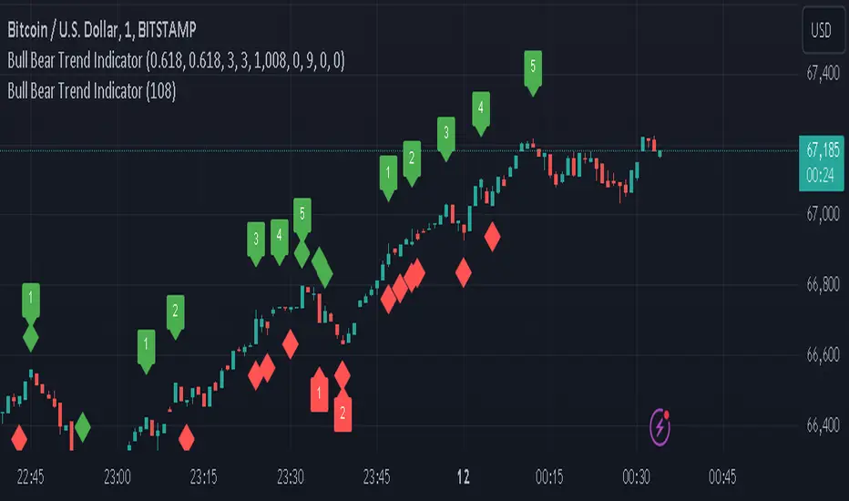
Bull Bear Trend IndicatorIntroduction: Origin of the Swing Point Indicator
In the quest for a reliable indicator that accurately predicts trend directions and identifies valid highs and lows, the genesis of the Swing Point Indicator emerged. Faced with the challenge of finding a tool that provided comprehensive market analysis and actionable insights, the need for a novel solution became evident. Combining insights gleaned from market analysis and innovative algorithmic approaches, the Swing Point Indicator was born.
Enhanced Feature: Highs and Lows Labeling in Trend Direction
In addition to its core functionalities, the Swing Point Indicator incorporates an advanced feature that enhances the visualization of trend direction. This feature provides further clarity by selectively labeling highs and lows based on the prevailing trend, reinforcing the identification of higher highs and lower lows in uptrends and downtrends, respectively. Overlapping labels on highs and lows signify a potential trend change, providing traders with valuable insight into market reversals.
Detailed Description:
1. Uptrend Labeling:
- Higher Highs (Green Label with Price): In an uptrend, where higher highs are observed, the indicator labels these points with vibrant green color and includes the corresponding price value. This visually highlights the significance of higher highs as pivotal points in the upward trajectory of prices.
- Higher Lows (Red Marker without Text or Diamond): To complement the identification of higher highs, higher lows are marked with a distinct red marker or diamond, devoid of any accompanying text. While these points are crucial in delineating the ascending trend, their emphasis lies in their role as support levels, providing a foundation for upward price movements.
2. Downtrend Labeling:
- Lower Lows (Red Label with Price): Conversely, in a downtrend characterized by lower lows, the indicator labels these points with conspicuous red color, accompanied by the corresponding price value. Lower lows signify critical levels of downward price momentum, acting as indicators of potential bearish continuation.
- Lower Highs (Green Marker without Text or Diamond): Lower highs, indicative of downward retracements in a downtrend, are marked by distinctive green markers or diamonds without accompanying text. While these points denote temporary pauses or pullbacks in the bearish trend, their emphasis lies in their role as resistance levels, impeding upward price movements.
Functionality and Utility:
- Customizable Lookback Candle Count: Traders have the option to adjust the lookback candle count, which is set by default at 108 candles in the settings. This flexibility allows traders to tailor the indicator to their specific trading preferences and timeframes.
- Equal Highs or Lows Option: When enabled, the Swing Point Indicator can identify equal highs or equal lows, providing traders with additional insight into market dynamics.
- Formation Confirmation: A new higher high along with its higher low or a new lower low along with its lower high is confirmed after two candles have closed following the swing point candle. This ensures the reliability of the identified trend direction.
Conclusion:
The incorporation of selective labeling for highs and lows based on trend direction, alongside the introduction of customizable settings and formation confirmation criteria, enhances the effectiveness of the Swing Point Indicator. This feature-rich tool empowers traders with a nuanced understanding of market dynamics, highlighting critical price levels and trend reversals. By offering enhanced visualization, customizable options, and confirmation criteria, the Swing Point Indicator equips traders with the confidence and precision needed to navigate the markets successfully, contributing to more informed and profitable trading strategies.

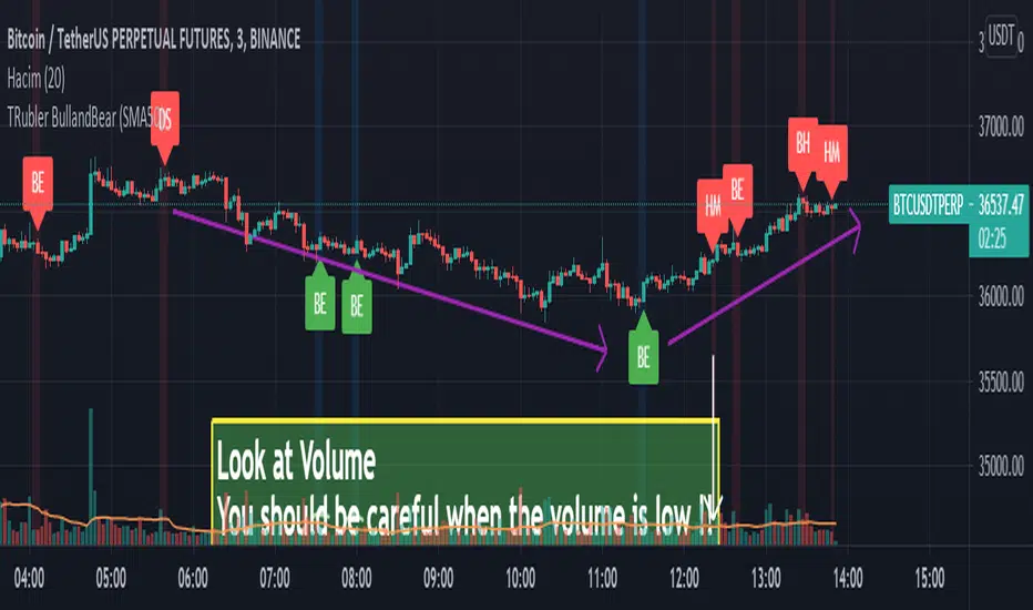
Bullish CandleI share candle pattern for everyone.
Hammer, Harami, Harami Cross, Doji Star, Engulfing
H is Hammer
BH is Harami
HC is Harami Cross
DS is Doji Star
BE is Engulfing
I made it to give you an idea while trading.
Different Timeframe
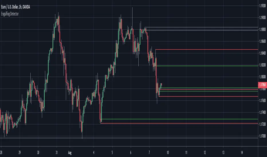
Engulfing Detector (Supply and Demand)Bullish and bearish engulfing candles marked with horizontal lines around engulfed candle.
This indicator can be used to assist in locating potential supply and demand zones.
The fresh zones will be of green and red line colors and the tested zone lines are grey in color.