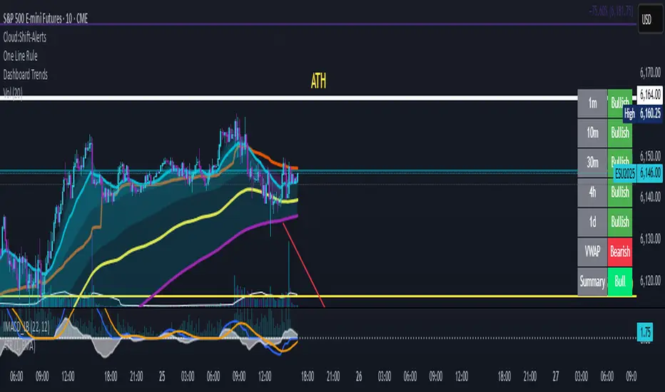
Dashboard Trends📊 Dashboard Trends + Anchored Daily VWAP
This indicator provides a real-time multi-timeframe trend dashboard alongside a daily anchored VWAP system, helping you assess both macro and intraday market sentiment at a glance.
🔍 Key Features
✅ Multi-Timeframe Trend Analysis
Tracks whether EMA(22) is above EMA(200) across:
1m, 10m, 30m, 4h, 1D timeframes
Color-coded "Bullish"/"Bearish" status for each
Aggregated trend summary using 6 signals (including VWAP)
✅ Anchored Daily VWAP
Uses ta.vwap to provide a session-resetting daily VWAP
VWAP resets at the beginning of each trading day
Live update throughout the day
Supports pre-market and after-hours if chart includes ETH
✅ VWAP Bands (±1σ to ±3σ)
Optional bands show price deviation from VWAP
Fully customizable:
Enable/disable each band
Set deviation multiplier
Adjust color and visibility
✅ Visual Dashboard
Table display in the bottom-right corner
Shows trend status per timeframe + VWAP + Summary
Easy-to-read green/yellow/red color codes
⚙️ Customization
Toggle VWAP line on/off
Enable or disable any band level
Adjust standard deviation multiplier
Choose your VWAP and band colors
🧠 Summary Logic
Strong Bull: 6 bullish signals
Bull: 5 signals
Mixed: 3–4 signals
Bear: 2 signals
Strong Bear: 0–1 signals
This tool is perfect for traders looking to combine trend-following and intraday mean-reversion awareness, with all the critical data visualized in one compact dashboard.
ابحث في النصوص البرمجية عن "BULL"
ICT TIME ELEMENTS [KaninFX]## Overview
The ICT Time Elements indicator is a comprehensive trading tool designed to visualize the most critical market sessions and timeframes according to Inner Circle Trader (ICT) methodology. This indicator helps traders identify high-probability trading opportunities by highlighting key market sessions, killzones, and liquidity periods throughout the trading day.
## Key Features
### 🕐 Complete ICT Time Framework
- **Asian Range**: 8:00 PM - 12:00 AM (NY Time) - Evening consolidation period
- **London Killzone**: 2:00 AM - 5:00 AM (NY Time) - European market opening liquidity
- **NY Killzone**: 7:00 AM - 10:00 AM (NY Time) - US market opening with high volatility
- **Silver Bullet Sessions**:
- London Silver Bullet: 3:00 AM - 4:00 AM
- AM Silver Bullet: 10:00 AM - 11:00 AM
- PM Silver Bullet: 2:00 PM - 3:00 PM
- **Lunch Hours**: 5:00 AM - 7:00 AM & 12:00 PM - 1:00 PM (Lower volatility periods)
- **News Embargo**: 8:30 AM - 9:30 AM (High impact news release window)
- **20-Minute Macros**: :50 to :10 minutes of each hour (Short-term reversal periods)
- **True Day Close**: 4:00 PM - 4:30 PM (Official market close)
### 🎨 Visual Customization
- **Multiple Themes**: Dark, Light, and Custom color schemes
- **Adjustable Opacity**: Control zone transparency (0-100%)
- **Font Customization**: Tiny, Small, Normal, Large text sizes
- **Custom Colors**: Personalize each zone with your preferred colors
- **Professional Display**: Clean histogram visualization with zone labels
### 🌍 Multi-Timezone Support
Built-in support for major trading centers:
- America/New_York (Default)
- America/Chicago
- America/Los_Angeles
- Europe/London
- Asia/Tokyo
- Asia/Shanghai
- Australia/Sydney
### 📊 Smart Information Display
- **Real-time Zone Detection**: Automatically identifies current active session
- **Zone Labels**: Clear labeling at the center of each time period
- **Current Zone Indicator**: Arrow pointer showing the active session
- **Comprehensive Info Table**: Quick reference for all time zones and their schedules
- **Flexible Table Positioning**: Place info table in any corner of your chart
### ⚡ Performance Optimized
- **Memory Management**: Automatic cleanup of old labels to maintain performance
- **Efficient Processing**: Optimized time calculations for smooth operation
- **Resource Control**: Limited label generation to prevent system overload
## How It Works
The indicator continuously monitors the current time against predefined ICT session schedules. When price action enters a recognized time zone, the indicator:
1. **Highlights the Period**: Colors the histogram bar according to the active session
2. **Labels the Zone**: Places descriptive text identifying the current market condition
3. **Updates Info Table**: Shows current session status and complete schedule
4. **Tracks Macro Periods**: Identifies 20-minute reversal windows within major sessions
### Special Features
- **Macro Detection**: Automatically identifies when current time falls within a 20-minute macro period
- **Session Overlap Handling**: Properly manages overlapping time zones with priority logic
- **Dynamic Color Adjustment**: Theme-aware color selection for optimal visibility
## Best Use Cases
### For ICT Traders
- Identify optimal entry times during killzone sessions
- Recognize silver bullet opportunities for quick scalps
- Avoid trading during lunch hour consolidations
- Prepare for news embargo volatility
### For Session Traders
- Track major market session transitions
- Plan trading strategy around high-liquidity periods
- Understand global market flow and timing
### For Swing Traders
- Identify macro trend continuation points
- Time position entries during optimal sessions
- Understand market structure changes across sessions
## Installation & Setup
1. Add the indicator to your TradingView chart
2. Select your preferred timezone from the dropdown
3. Choose theme (Dark/Light) or customize colors
4. Adjust font size and table position to your preference
5. Enable/disable features as needed for your trading style
## Pro Tips
- **Combine with Price Action**: Use time zones alongside support/resistance levels
- **Focus on Killzones**: Highest probability setups occur during London and NY killzones
- **Watch Silver Bullets**: These 1-hour windows often provide excellent reversal opportunities
- **Respect Lunch Hours**: Lower volatility periods - consider smaller position sizes
- **News Embargo Awareness**: Prepare for potential whipsaws during 8:30-9:30 AM
## Conclusion
The ICT Time Elements indicator transforms complex ICT timing concepts into an easy-to-read visual tool. Whether you're a beginner learning ICT methodology or an experienced trader looking to optimize your timing, this indicator provides the essential market session awareness needed for successful trading.
*Compatible with all TradingView plans and timeframes. Works best on 1-minute to 1-hour charts for optimal session visualization.*

Multiple (12) Strong Buy/Sell Signals + Momentum
Indicator Manual: "Multiple (12) Strong Buy/Sell Signals + Momentum"
This indicator is designed to identify strong buy and sell signals based on 12 configurable conditions, which include a variety of technical analysis methods such as trend-following indicators, pattern recognition, volume analysis, and momentum oscillators. It allows for customizable alerts and visual cues on the chart. The indicator helps traders spot potential entry and exit points by displaying buy and sell signals based on the selected conditions.
Key Observations:
• The script integrates multiple indicators and pattern recognition methods to provide comprehensive buy/sell signals.
• Trend-based indicators like EMAs and MACD are combined with pattern recognition (flags, triangles) and momentum-based signals (RSI, ADX, and volume analysis).
• User customization is a core feature, allowing adjustments to the conditions and thresholds for more tailored signals.
• The script is designed to be responsive to market conditions, with multiple conditions filtering out noise to generate reliable signals.
________________________________________
Key Features:
1. 12 Combined Buy/Sell Signal Conditions: This indicator incorporates a diverse set of conditions based on trend analysis, momentum, and price patterns.
2. Minimum Conditions Input: You can adjust the threshold of conditions that need to be met for the buy/sell signals to appear.
3. Alert Customization: Set alert thresholds for both buy and sell signals.
4. Dynamic Visualization: Buy and sell signals are shown as triangles on the chart, with momentum signals highlighted as circles.
________________________________________
Detailed Description of the 12 Conditions:
1. Exponential Moving Averages (EMA):
o Conditions: The indicator uses EMAs with periods 3, 8, and 13 for quick trend-following signals.
o Bullish Signal: EMA3 > EMA8 > EMA13 (Bullish stack).
o Bearish Signal: EMA3 < EMA8 < EMA13 (Bearish stack).
o Reversal Signal: The crossing over or under of these EMAs can signify trend reversals.
2. MACD (Moving Average Convergence Divergence):
o Fast MACD (2, 7, 3) is used to confirm trends quickly.
o Bullish Signal: When the MACD line crosses above the signal line.
o Bearish Signal: When the MACD line crosses below the signal line.
3. Donchian Channel:
o Tracks the highest high and lowest low over a given period (default 20).
o Breakout Signal: Price breaking above the upper band is bullish; breaking below the lower band is bearish.
4. VWAP (Volume-Weighted Average Price):
o Above VWAP: Bullish condition (price above VWAP).
o Below VWAP: Bearish condition (price below VWAP).
5. EMA Stacking & Reversal:
o Tracks the order of EMAs (3, 8, 13) to confirm strong trends and reversals.
o Bullish Reversal: EMA3 < EMA8 < EMA13 followed by a crossing to bullish.
o Bearish Reversal: EMA3 > EMA8 > EMA13 followed by a crossing to bearish.
6. Bull/Bear Flags:
o Bull Flag: Characterized by a strong price movement (flagpole) followed by a pullback and breakout.
o Bear Flag: Similar to Bull Flag but in the opposite direction.
7. Triangle Patterns (Ascending and Descending):
o Detects ascending and descending triangles using pivot highs and lows.
o Ascending Triangle: Higher lows and flat resistance.
o Descending Triangle: Lower highs and flat support.
8. Volume Sensitivity:
o Identifies price moves with significant volume increases.
o High Volume: When current volume is significantly above the moving average volume (set to 1.2x of the average).
9. Momentum Indicators:
o RSI (Relative Strength Index): Confirms overbought and oversold levels with thresholds set at 65 (overbought) and 35 (oversold).
o ADX (Average Directional Index): Confirms strong trends when ADX > 28.
o Momentum Up: Momentum is upward with strong volume and bullish RSI/ADX conditions.
o Momentum Down: Momentum is downward with strong volume and bearish RSI/ADX conditions.
10. Bollinger & Keltner Squeeze:
o Squeeze Condition: A contraction in both Bollinger Bands and Keltner Channels indicates low volatility, signaling a potential breakout.
o Squeeze Breakout: Price breaking above or below the squeeze bands.
11. 3 Consecutive Candles Condition:
o Bullish: Price rises for three consecutive candles with higher highs and lows.
o Bearish: Price falls for three consecutive candles with lower highs and lows.
12. Williams %R and Stochastic RSI:
o Williams %R: A momentum oscillator with signals when the line crosses certain levels.
o Stochastic RSI: Provides overbought/oversold levels with smoother signals.
o Combined Signals: You can choose whether to require both WPR and StochRSI to signal a buy/sell.
________________________________________
User Inputs (Inputs Tab):
1. Minimum Conditions for Buy/Sell:
o min_conditions: Number of conditions required to trigger a buy/sell signal on the chart (1 to 12).
o Alert_min_conditions: User-defined alert threshold (how many conditions must be met before an alert is triggered).
2. Donchian Channel Settings:
o Show Donchian: Toggle visibility of the Donchian channel.
o Donchian Length: The length of the Donchian Channel (default 20).
3. Bull/Bear Flag Settings:
o Bull Flag Flagpole Strength: ATR multiplier to define the strength of the flagpole.
o Bull Flag Pullback Length: Length of pullback for the bull flag pattern.
o Bull Flag EMA Length: EMA length used to confirm trend during bull flag pattern.
Similar settings exist for Bear Flag patterns.
4. Momentum Indicators:
o RSI Length: Period for calculating the RSI (default 9).
o RSI Overbought: Overbought threshold for the RSI (default 65).
o RSI Oversold: Oversold threshold for the RSI (default 35).
5. Bollinger/Keltner Squeeze Settings:
o Squeeze Width Threshold: The maximum width of the Bollinger and Keltner Bands for squeeze conditions.
6. Stochastic RSI Settings:
o Stochastic RSI Length: The period for calculating the Stochastic RSI.
7. WPR Settings:
o WPR Length: Period for calculating Williams %R (default 14).
________________________________________
User Inputs (Style Tab):
1. Signal Plotting:
o Control the display and colors of the buy/sell signals, momentum indicators, and pattern signals on the chart.
o Buy/Sell Signals: Can be customized with different colors and shapes (triangle up for buys, triangle down for sells).
o Momentum Signals: Custom circle placement for momentum-up or momentum-down signals.
2. Donchian Channel:
o Show Donchian: Toggle visibility of the Donchian upper, lower, and middle bands.
o Band Colors: Choose the color for each band (upper, lower, middle).
________________________________________
How to Use the Indicator:
1. Adjust Minimum Conditions: Set the minimum number of conditions that must be met for a signal to appear. For example, set it to 5 if you want only stronger signals.
2. Set Alert Threshold: Define the number of conditions needed to trigger an alert. This can be different from the minimum conditions for visual signals.
3. Customize Appearance: Modify the colors and styles of the signals to match your preferences.
________________________________________
Conclusion:
This comprehensive trading indicator uses a combination of trend-following, pattern recognition, and momentum-based conditions to help you spot potential buy and sell opportunities. By adjusting the input settings, you can fine-tune it to match your specific trading strategy, making it a versatile tool for different market conditions.
Signal Reliability Based on Condition Count
The reliability of the buy/sell signals increases as more conditions are met. Here's a breakdown of the probabilities:
1. 1-3 Conditions Met: Lower Probability
o Signals that meet only 1-3 conditions tend to have lower reliability and are considered less probable. These signals may represent false positives or weaker market movements, and traders should approach them with caution.
2. 4 Conditions Met: More Reliable Signal
o When 4 conditions are met, the signal becomes more reliable. This indicates that multiple indicators or market patterns are aligning, increasing the likelihood of a valid buy/sell opportunity. While not foolproof, it's a stronger indication that the market may be moving in a particular direction.
3. 5-6 Conditions Met: Strong Signal
o A signal meeting 5-6 conditions is considered a strong signal. This indicates a well-confirmed move, with several technical indicators and market factors aligning to suggest a higher probability of success. These are the signals that traders often prioritize.
4. 7+ Conditions Met: Rare and High-Confidence Signal
o Signals that meet 7 or more conditions are rare and should be considered high-confidence signals. These represent a significant alignment of multiple factors, and while they are less frequent, they are highly reliable when they do occur. Traders can be more confident in acting on these signals, but they should still monitor market conditions for confirmation.
________________________________________
You can adjust the number of conditions as needed, but this breakdown should give a clear structure on how the signal strength correlates with the number of conditions met!
C&B Auto MK5C&B Auto MK5.2ema BullBear
Overview
The C&B Auto MK5.2ema BullBear is a versatile Pine Script indicator designed to help traders identify bullish and bearish market conditions across various timeframes. It combines Exponential Moving Averages (EMAs), Relative Strength Index (RSI), Average True Range (ATR), and customizable time filters to generate actionable signals. The indicator overlays on the price chart, displaying EMAs, a dynamic cloud, scaled RSI levels, bull/bear signals, and market condition labels, making it suitable for swing trading, day trading, or scalping in trending or volatile markets.
What It Does
This indicator generates bull and bear signals based on the interaction of two EMAs, filtered by RSI thresholds, ATR-based volatility, a 50/200 EMA trend filter, and user-defined time windows. It adapts to market volatility by adjusting EMA lengths and RSI thresholds. A dynamic cloud highlights trend direction or neutral zones, with candlestick coloring in neutral conditions. Market condition labels (current and historical) provide real-time trend and volatility context, displayed above the chart.
How It Works
The indicator uses the following components:
EMAs: Two EMAs (short and long) are calculated on a user-selected timeframe (1, 5, 15, 30, or 60 minutes). Their crossover or crossunder triggers potential bull/bear signals. EMA lengths adjust based on volatility (e.g., 10/20 for volatile markets, 5/10 for non-volatile).
Dynamic Cloud: The area between the EMAs forms a cloud, colored green for bullish trends, red for bearish trends, or a user-defined color (default yellow) for neutral zones (when EMAs are close, determined by an ATR-based threshold). Users can widen the cloud for visibility.
RSI Filter: RSI is scaled to price levels and plotted on the chart (optional). Signals are filtered to ensure RSI is within volatility-adjusted bull/bear thresholds and not in overbought/oversold zones.
ATR Volatility Filter: An optional filter ensures signals occur during sufficient volatility (ATR(14) > SMA(ATR, 20)).
50/200 EMA Trend Filter: An optional filter restricts bull signals to bullish trends (50 EMA > 200 EMA) and bear signals to bearish trends (50 EMA < 200 EMA).
Time Filter: Signals are restricted to a user-defined UTC time window (default 9:00–15:00), aligning with active trading sessions.
Market Condition Labels: Labels above the chart display the current trend (Bullish, Bearish, Neutral) and optionally volatility (e.g., “Bullish Volatile”). Up to two historical labels persist for a user-defined number of bars (default 5) to show recent trend changes.
Visual Aids: Bull signals appear as green triangles/labels below the bar, bear signals as red triangles/labels above. Candlesticks in neutral zones are colored (default yellow).
The indicator ensures compatibility with standard chart types (e.g., candlestick or bar charts) to produce realistic signals, avoiding non-standard types like Heikin Ashi or Renko.
How to Use It
Add to Chart: Apply the indicator to a candlestick or bar chart on TradingView.
Configure Settings:
Timeframe: Choose a timeframe (1, 5, 15, 30, or 60 minutes) to match your trading style.
Filters:
Enable/disable the ATR volatility filter to focus on high-volatility periods.
Enable/disable the 50/200 EMA trend filter to align signals with the broader trend.
Enable the time filter and set custom UTC hours/minutes (default 9:00–15:00).
Cloud Settings: Adjust the cloud width, neutral zone threshold, color, and transparency.
EMA Colors: Use default trend-based colors or set custom colors for short/long EMAs.
RSI Display: Toggle the scaled RSI and its thresholds, with customizable colors.
Signal Settings: Toggle bull/bear labels and set signal colors.
Market Condition Labels: Toggle current/historical labels, include/exclude volatility, and adjust decay period.
Interpret Signals:
Bull Signal: A green triangle or “Bull” label below the bar indicates potential bullish momentum (EMA crossover, RSI above bull threshold, within time window, passing filters).
Bear Signal: A red triangle or “Bear” label above the bar indicates potential bearish momentum (EMA crossunder, RSI below bear threshold, within time window, passing filters).
Neutral Zone: Yellow candlesticks and cloud (if enabled) suggest a lack of clear trend; consider range-bound strategies or avoid trading.
Market Condition Labels: Check labels above the chart for real-time trend (Bullish, Bearish, Neutral) and volatility status to confirm market context.
Monitor Context: Use the cloud, RSI, and labels to assess trend strength and volatility before acting on signals.
Unique Features
Volatility-Adaptive EMAs: Automatically adjusts EMA lengths based on ATR to suit volatile or non-volatile markets, reducing manual configuration.
Neutral Zone Detection: Uses an ATR-based threshold to identify low-trend periods, helping traders avoid choppy markets.
Scaled RSI Visualization: Plots RSI and thresholds directly on the price chart, simplifying momentum analysis relative to price.
Flexible Time Filtering: Supports precise UTC-based trading windows, ideal for day traders targeting specific sessions.
Historical Market Labels: Displays recent trend changes (up to two) with a decay period, providing context for market shifts.
50/200 EMA Trend Filter: Aligns signals with the broader market trend, enhancing signal reliability.
Notes
Use on standard candlestick or bar charts to ensure accurate signals.
Test the indicator on a demo account to optimize settings for your market and timeframe.
Combine with other analysis (e.g., support/resistance, volume) for better decision-making.
The indicator is not a standalone system; use it as part of a broader trading strategy.
Limitations
Signals may lag in fast-moving markets due to EMA-based calculations.
Neutral zone detection may vary in extremely volatile or illiquid markets.
Time filters are UTC-based; ensure your platform’s timezone settings align.
This indicator is designed for traders seeking a customizable, trend-following tool that adapts to volatility and provides clear visual cues with robust filtering for bullish and bearish market conditions.
Supertrend TP SL (PRO)2. Main Components:
Supertrend Indicator:
Theoretical basis: The Supertrend indicator is based on two main concepts: Average True Range (ATR) and Factor. ATR measures the extent of price fluctuations in a given period of time, while Factor determines the sensitivity of the indicator to price changes.
Mechanism of operation: The indicator calculates two possible lines: one line representing the potential support level and another line representing the potential resistance level. The selection of the appropriate line depends on the current price direction. When the price is above the line, the indicator is considered to be in an uptrend, and vice versa.
Customizable inputs:
atrPeriod: Allows the trader to specify the time period for calculating the ATR. Shorter periods make the indicator more sensitive to price changes, while longer periods reduce its sensitivity.
factor: Allows the adjustment of the factor. Higher values make the indicator less likely to give false signals, but they may also delay entry signals.
Risk Management:
Take Profit and Stop Loss Orders:
TPPoints: Specifies the distance between the entry price and the take profit level. This distance is expressed in points, and is converted to an actual price value using syminfo.mintick (the smallest possible price movement of the traded asset).
SLPoints: Specifies the distance between the entry price and the stop loss level.
Importance: These orders allow the trader to specify the maximum loss he is willing to take and the profit target he is aiming to achieve, which helps in effective risk management.
Activate/Disable Trades:
isLongEnabled: Allows buy trades to be enabled or disabled, which allows the trader to trade in one direction only (for example, only trade in the uptrend during a bull market).
isShortEnabled: Allows sell trades to be enabled or disabled.
isTakeProfitEnabled: Allows take profit orders to be enabled or disabled. The trader may wish to disable them if he prefers to manage his trades manually.
isStopLossEnabled: Allows you to enable or disable stop loss orders. Although disabling them may seem tempting in some cases, it is a very risky move.
Visual Customization:
Line Style and Width:
lineStyle: Allows the trader to choose the style of lines used to draw TP and SL levels (Solid, Dashed, Dotted).
lineWidth: Sets the thickness of the lines.
Label Size:
labelSize: Allows you to set the size of the labels that display TP and SL levels (Small, Normal, Large).
Colors:
bullColor, bearColor, tpColor, slColor: Allows the trader to customize the colors of the different elements on the chart, making visual analysis easier.
3. Strategy Logic:
Determining Entry Signals: The strategy relies on the Supertrend indicator to determine entry signals. When the Supertrend trend changes from bearish to bullish, a buy trade is triggered (if isLongEnabled is enabled). When the trend changes from bullish to bearish, a sell trade is triggered (if isShortEnabled is enabled).
Order Execution: Once the entry signal is triggered, the strategy automatically places buy or sell orders.
Trade Management: After opening a trade, the strategy monitors the price and automatically triggers Take Profit and Stop Loss orders if the price reaches the specified levels.
Visualization: The strategy displays useful information on the chart, such as TP and SL lines, entry and exit signals, which helps the trader understand the strategy’s behavior and evaluate its performance.
4. Advanced Tips:
Optimizing Settings: The strategy’s performance can be improved by adjusting different input values. For example, the trader can experiment with different values for atrPeriod and factor to improve the accuracy of Supertrend signals.
Combining Indicators: This strategy can be combined with other indicators to improve the accuracy of entry signals. For example, the Relative Strength Index (RSI) can be used to confirm Supertrend signals.
Time Analysis: The strategy’s performance can be analyzed over different time periods to evaluate its effectiveness in various market conditions.
Strategy Testing: Before using the strategy in real trading, it should be tested on historical data (Backtesting) to evaluate its performance and determine the optimal settings.
5. Associated Risks:
False Signals: The Supertrend indicator may sometimes give false signals, especially in volatile markets.
Losses: Even with the use of stop loss orders, the trader may be exposed to significant losses.
Over-optimization: Over-optimization of settings on historical data may lead to misleading results. The trader should be careful about generalizing the results to future data.
Over-reliance on automation: The automated strategy should not be relied upon completely. The trader should monitor the trades and make appropriate decisions when necessary.
6. Disclaimer:
I am not a licensed financial advisor. This strategy is provided for educational and illustrative purposes only and should not be considered as investment advice. Trading in financial markets involves significant risks and you may lose your invested capital. Before making any investment decisions, consult a qualified financial advisor and conduct your own research. You alone are responsible for your trading decisions and their results. By using this strategy, you acknowledge and agree that I am not responsible for any losses or damages you may incur.
2. المكونات الرئيسية:
مؤشر Supertrend:
الأساس النظري: يعتمد مؤشر Supertrend على مفهومين رئيسيين هما: متوسط المدى الحقيقي (Average True Range - ATR) ومعامل الضرب (Factor). ATR يقيس مدى تقلبات الأسعار في فترة زمنية محددة، بينما Factor يحدد مدى حساسية المؤشر لتغيرات الأسعار.
آلية العمل: يقوم المؤشر بحساب خطين محتملين: خط يمثل مستوى الدعم المحتمل وخط آخر يمثل مستوى المقاومة المحتمل. يعتمد اختيار الخط المناسب على اتجاه السعر الحالي. عندما يكون السعر أعلى من الخط، يعتبر المؤشر في اتجاه صاعد، والعكس صحيح.
المدخلات القابلة للتخصيص:
atrPeriod: يتيح للمتداول تحديد الفترة الزمنية لحساب ATR. الفترات الأقصر تجعل المؤشر أكثر حساسية لتغيرات الأسعار، بينما الفترات الأطول تقلل من حساسيته.
factor: يسمح بتعديل معامل الضرب. القيم الأعلى تجعل المؤشر أقل عرضة لإعطاء إشارات خاطئة، ولكنها قد تؤخر أيضًا إشارات الدخول.
إدارة المخاطر:
أوامر جني الأرباح وإيقاف الخسارة:
TPPoints: يحدد المسافة بين سعر الدخول ومستوى جني الأرباح. يتم التعبير عن هذه المسافة بالنقاط (Points)، ويتم تحويلها إلى قيمة سعرية فعلية باستخدام syminfo.mintick (أصغر حركة سعرية ممكنة للأصل المتداول).
SLPoints: يحدد المسافة بين سعر الدخول ومستوى إيقاف الخسارة.
الأهمية: تتيح هذه الأوامر للمتداول تحديد الحد الأقصى للخسارة التي يرغب في تحملها والهدف الربحي الذي يسعى لتحقيقه، مما يساعد على إدارة المخاطر بشكل فعال.
تفعيل/تعطيل الصفقات:
isLongEnabled: يسمح بتفعيل أو تعطيل صفقات الشراء، مما يمكن المتداول من التداول في اتجاه واحد فقط (على سبيل المثال، التداول فقط في الاتجاه الصاعد خلال سوق صاعدة).
isShortEnabled: يسمح بتفعيل أو تعطيل صفقات البيع.
isTakeProfitEnabled: يسمح بتفعيل أو تعطيل أوامر جني الأرباح. قد يرغب المتداول في تعطيلها إذا كان يفضل إدارة صفقاته يدويًا.
isStopLossEnabled: يسمح بتفعيل أو تعطيل أوامر إيقاف الخسارة. على الرغم من أن تعطيلها قد يبدو مغريًا في بعض الحالات، إلا أنه يعتبر خطوة محفوفة بالمخاطر للغاية.
التخصيص المرئي:
نمط وعرض الخطوط:
lineStyle: يتيح للمتداول اختيار نمط الخطوط المستخدمة لرسم مستويات TP و SL (Solid, Dashed, Dotted).
lineWidth: يحدد سمك الخطوط.
حجم الملصقات:
labelSize: يسمح بتحديد حجم الملصقات التي تعرض مستويات TP و SL (Small, Normal, Large).
الألوان:
bullColor, bearColor, tpColor, slColor: تتيح للمتداول تخصيص ألوان العناصر المختلفة على الرسم البياني، مما يسهل عملية التحليل البصري.
3. منطق عمل الاستراتيجية:
تحديد إشارات الدخول: تعتمد الاستراتيجية على مؤشر Supertrend لتحديد إشارات الدخول. عندما يتغير اتجاه Supertrend من هابط إلى صاعد، يتم تفعيل صفقة شراء (إذا كانت isLongEnabled مفعلة). وعندما يتغير الاتجاه من صاعد إلى هابط، يتم تفعيل صفقة بيع (إذا كانت isShortEnabled مفعلة).
تنفيذ الأوامر: بمجرد تفعيل إشارة الدخول، تقوم الاستراتيجية بوضع أوامر الشراء أو البيع تلقائيًا.
إدارة الصفقات: بعد فتح الصفقة، تقوم الاستراتيجية بمراقبة السعر وتفعيل أوامر جني الأرباح وإيقاف الخسارة تلقائيًا في حالة وصول السعر إلى المستويات المحددة.
التمثيل المرئي: تعرض الاستراتيجية معلومات مفيدة على الرسم البياني، مثل خطوط TP و SL وإشارات الدخول والخروج، مما يساعد المتداول على فهم سلوك الاستراتيجية وتقييم أدائها.
4. نصائح متقدمة:
تحسين الإعدادات: يمكن تحسين أداء الاستراتيجية من خلال تعديل قيم المدخلات المختلفة. على سبيل المثال، يمكن للمتداول تجربة قيم مختلفة لـ atrPeriod و factor لتحسين دقة إشارات Supertrend.
الجمع بين المؤشرات: يمكن دمج هذه الاستراتيجية مع مؤشرات أخرى لتحسين دقة إشارات الدخول. على سبيل المثال، يمكن استخدام مؤشر القوة النسبية (RSI) لتأكيد إشارات Supertrend.
التحليل الزمني: يمكن تحليل أداء الاستراتيجية على مدى فترات زمنية مختلفة لتقييم مدى فعاليتها في ظروف السوق المتنوعة.
اختبار الاستراتيجية: قبل استخدام الاستراتيجية في التداول الحقيقي، يجب اختبارها على بيانات تاريخية (Backtesting) لتقييم أدائها وتحديد الإعدادات المثلى.
5. المخاطر المرتبطة:
الإشارات الخاطئة: قد يعطي مؤشر Supertrend إشارات خاطئة في بعض الأحيان، خاصة في الأسواق المتقلبة.
الخسائر: حتى مع استخدام أوامر إيقاف الخسارة، قد يتعرض المتداول لخسائر كبيرة.
التحسين المفرط: قد يؤدي التحسين المفرط للإعدادات على بيانات تاريخية إلى نتائج مضللة. يجب أن يكون المتداول حذرًا بشأن تعميم النتائج على البيانات المستقبلية.
الاعتماد الزائد على الأتمتة: يجب عدم الاعتماد بشكل كامل على الاستراتيجية الآلية. يجب على المتداول مراقبة الصفقات واتخاذ القرارات المناسبة عند الضرورة.
6. إخلاء المسؤولية:
أنا لست مستشارًا ماليًا مرخصًا. هذه الاستراتيجية مقدمة لأغراض تعليمية وتوضيحية فقط، ولا ينبغي اعتبارها نصيحة استثمارية. التداول في الأسواق المالية ينطوي على مخاطر كبيرة، وقد تخسر رأس المال المستثمر. قبل اتخاذ أي قرارات استثمارية، استشر مستشارًا ماليًا مؤهلاً وقم بإجراء بحثك الخاص. أنت وحدك المسؤول عن قراراتك التجارية ونتائجها. باستخدام هذه الاستراتيجية، فإنك تقر وتوافق على أنني لست مسؤولاً عن أي خسائر أو أضرار قد تتكبدها.

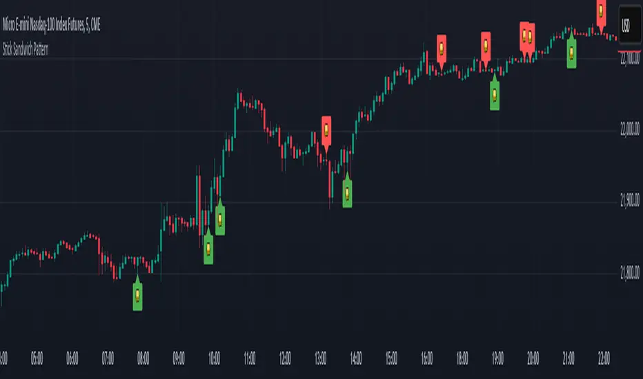
Stick Sandwich Pattern# Stick Sandwich Pattern Indicator
## Description
The Stick Sandwich Pattern Indicator is a custom TradingView script that identifies specific three-candle patterns in financial markets. The indicator uses a sandwich emoji (🥪) to mark pattern occurrences directly on the chart, making it visually intuitive and easy to spot potential trading opportunities.
## Pattern Types
### Bullish Stick Sandwich
A bullish stick sandwich pattern is identified when:
- First candle: Bullish (close > open)
- Second candle: Bearish (close < open)
- Third candle: Bullish (close > open)
- The closing price of the third candle is within 10% of the first candle's range from its closing price
### Bearish Stick Sandwich
A bearish stick sandwich pattern is identified when:
- First candle: Bearish (close < open)
- Second candle: Bullish (close > open)
- Third candle: Bearish (close < open)
- The closing price of the third candle is within 10% of the first candle's range from its closing price
## Technical Implementation
- Written in Pine Script v5
- Runs as an overlay indicator
- Uses a 10% tolerance range for closing price comparison
- Implements rolling pattern detection over the last 3 candles
- Break statement ensures only the most recent pattern is marked
## Visual Features
- Bullish patterns: Green sandwich emoji above the pattern
- Bearish patterns: Red sandwich emoji below the pattern
- Label size: Small
- Label styles:
- Bullish: Label points upward
- Bearish: Label points downward
## Usage
1. Add the indicator to your TradingView chart
2. Look for sandwich emojis that appear above or below price bars
3. Green emojis indicate potential bullish reversals
4. Red emojis indicate potential bearish reversals
## Code Structure
- Main indicator function with overlay setting
- Two separate functions for pattern detection:
- `bullishStickSandwich()`
- `bearishStickSandwich()`
- Pattern scanning loop that checks the last 3 candles
- Built-in label plotting for visual identification
## Formula Details
The closing price comparison uses the following tolerance calculation:
```
Tolerance = (High - Low of first candle) * 0.1
Valid if: |Close of third candle - Close of first candle| <= Tolerance
```
## Notes
- The indicator marks patterns in real-time as they form
- Only the most recent pattern within the last 3 candles is marked
- Pattern validation includes both candle direction and closing price proximity
- The 10% tolerance helps filter out weak patterns while catching meaningful ones
## Disclaimer
This indicator is for informational purposes only. Always use proper risk management and consider multiple factors when making trading decisions.
Volume EquilibriumThe intent behind this indicator is to provide comprehensive information relating to volume compared to multiple timeframes. This indicator allows one to see what the market 'theoretically' sees as 'fair-value' whilst also allowing one to gauge where the price of a stock is headed.
Volume Equilibrium
The main indicator finds the difference between buying volume and selling volume, under the basic presumption that more buying volume indicates greater bullish sentiment and vice versa.
Buying Volume = volume when close price is higher than open price.
Selling Volume = volume when close price is lower than open price.
Volume Balance = Cumulative Buying Volume − Cumulative Selling Volume
Volume Balance is then expressed as a percentage by dividing by total volume
This indicator is composed of three different lengths of the same indicator. Short, Mid, and Long term representations of Volume Equilibrium. The difference between the mid and long term are highlighted so to make it easy to see where volume is going relative to a longer time frame.
HOW TO USE:
At 0 ---> Equilibrium ---> Equal Buying/Selling Volume
Above 0 ---> More buying Volume
Below 0 ---> More selling Volume
Using theory, it is assumed that the price is at a 'fair-value' when the buying/selling volume is at 0. This is of course relative to the respective timeframe of your choosing. More weight given to larger timeframes.
Volume Histogram
It is a basic volume chart that represents the total volume though has highlighted bars so to indicate buying(green) and selling(red) volume. This allows one to see what the indicator is based off of.
Open-Close Oscillator(not needed)
Calculates the average open-close for a selected timeframe and then provides the current closing price relative to that average open-close. Very simply put, values below 0 indicate bearish and values above 0 generally indicate bullishness. This indicator is for a quick reference of price action relative to volume.
Another way to use this indicator, though unique, is to analyze the separate open-close lines themselves. Using the open-close bands, bullishness is defined as increasing closing prices and bearish as decreasing closing prices. So, in regard to this indicator, bear sessions can be indicated by the opening line being below the closing line and bull sessions as the opening line being above. Use the 'flip' of these lines to your advantage, they are very helpful at capturing long continuous sentiment.
This indicator is composed of great information though I still think it best to use many different indicators to help you with your trades.
NOTE: Be aware of what we are trying to analyze, Volume. This means that one should also look out for divergences to capture early indications of reversals. This indicator can be leveraged greatly.

Volume Standard Deviation Alert GusPurpose
The script detects and alerts traders when the volume of a trading asset significantly exceeds a calculated threshold based on the standard deviation of volume over a specified lookback period. It optionally filters these alerts based on whether the price action is bullish or bearish.
Key Components
Inputs
lookback (default: 20)
The number of bars to consider when calculating the moving average and standard deviation of volume.
stdDevFactor (default: 2.0)
The multiplier for the standard deviation to determine the threshold for a volume spike.
alertOnClose (default: true)
Determines whether alerts should only be triggered after the bar has closed.
checkBullBear (default: false)
Enables filtering of alerts based on the bullishness or bearishness of the bar.
Calculations
volSMA
The simple moving average (SMA) of the volume over the lookback period.
volStd
The standard deviation of the volume over the lookback period.
threshold
The alert threshold is calculated as:
Threshold
=
volSMA
+
(
stdDevFactor
×
volStd
)
Threshold=volSMA+(stdDevFactor×volStd)
isBullish & isBearish
Determines whether the current bar is bullish (close > open) or bearish (close < open).
volumeSpikeCondition
A condition that triggers when the current volume exceeds the calculated threshold.
bullishCondition & bearishCondition
Refines the spike condition by requiring the bar to be bullish or bearish when checkBullBear is enabled.
finalCondition
The ultimate alert condition based on the user’s preference for bullish/bearish filtering.
finalTrigger
Ensures the alert only triggers at bar close if alertOnClose is set to true.
Visualization
Plots the SMA of the volume (volSMA) and the threshold line (threshold), helping traders visually understand the conditions.
Histograms the current volume and colors the bars:
Red: Volume exceeds the threshold.
Blue: Volume is below the threshold.
Alerts
The script generates an alert message when the finalTrigger condition is met:
"Bullish Volume Spike!" if the bar is bullish.
"Bearish Volume Spike!" if the bar is bearish.
"High Volume Spike!" if no bull/bear filter is applied.
Alerts are sent using alert() with the message and set to trigger once per bar close.
Usage
Traders can use this script to identify unusual volume activity, which often precedes significant price movements.
Customizability allows traders to tune the lookback period, standard deviation multiplier, and whether to filter for bullish/bearish spikes.
Visual and audible cues help in identifying important market events in real time.
This indicator is particularly useful for spotting market breakouts or breakdowns driven by high trading activity.

Directional Volume IndexDirectional Volume Index (DVI) (buying/selling pressure)
This index is adapted from the Directional Movement Index (DMI), but based on volume instead of price movements. The idea is to detect building directional volume indicating a growing amount of orders that will eventually cause the price to follow. (DVI is not displayed by default)
The rough algorithm for the Positive Directional Volume Index (green bar):
calculate the delta to the previous green bar's volume
if the delta is positive (growing buying pressure) add it to an SMA, else add 0 (also for red bars)
divide these average deltas by the average volume
the result is the Positive Directional Volume Index (DVI+) (vice versa for DVI-)
Differential Directional Volume Index (DDVI) (relative pressure)
Creating the difference of both Directional Volume Indexes (DVI+ - DVI-) creates the Differential Directional Volume Index (DDVI) with rising values indicating a growing buying pressure, falling values a growing selling pressure. (DDVI is displayed by default, smoothed by a custom moving average)
Average Directional Volume Index (ADVX) (pressure strength)
Putting the relative pressure (DDVI) in relation to the total pressure (DVI+ + DVI-) we can determine the strength and duration of the currently building volume change / trend. For the DMI/ADX usually 20 is an indicator for a strong trend, values above 50 suggesting exhaustion and approaching reversals. (ADVX is not displayed by default, smoothed by a custom moving average)
Divergences of the Differential Directional Volume Index (DDVI) (imbalances)
By detecting divergences we can detect situations where e.g. bullish volume starts to build while price is in a downtrend, suggesting that there is growing buying pressure indicating an imminent bullish pullback/order block or reversal. (strong and hidden divergences are displayed by default)
Divergences Overview:
strong bull: higher lows on volume, lower lows on price
medium bull: higher lows on volume, equal lows on price
weak bull: equal lows on volume, lower lows on price
hidden bull: lower lows on volume, higher lows on price
strong bear: lower highs on volume, higher highs on price
medium bear: lower highs on volume, equal highs on price
weak bear: equal highs on volume, higher highs on price
hidden bear: higher highs on volume, lower highs on price
DDVI Bands (dynamic overbought/oversold levels)
Using Bollinger Bands with DDVI as source we receive an averaged relative pressure with stdev band offsets. This can be used as dynamic overbought/oversold levels indicating reversals on sharp crossovers.
Alerts
As of now there are no alerts built in, but all internal data is exposed via plot and plotshape functions, so it can be used for custom crossover conditions in the alert dialog. This is still a personal research project, so if you find good setups, please let me know.

Custom RSI & MACD Momentum Entry SignalsIndicator Explanation: Custom RSI & MACD Momentum Entry Signals
Introduction
The "Custom RSI & MACD Momentum Entry Signals" indicator combines the Relative Strength Index (RSI) and the Moving Average Convergence Divergence (MACD) to generate precise long and short entry signals. This indicator offers a powerful combination of overbought/oversold zones, momentum analysis, and RSI-EMA crossovers to assist traders in making better decisions.
How the Indicator Works
1. RSI Calculation and EMA
The RSI is calculated based on the closing price with an adjustable period (default: 14).
An Exponential Moving Average (EMA) of the RSI (default: 9) is plotted to identify RSI trend changes.
When the RSI crosses its EMA upwards, it signals a bullish impulse. Conversely, a downward cross indicates a bearish impulse.
2. MACD Calculation and Momentum Shifts
The MACD line is derived from the difference between a fast EMA (default: 12) and a slow EMA (default: 26).
The Signal line is the EMA of the MACD line (default: 9).
The MACD histogram represents the difference between the MACD line and the Signal line.
Momentum shifts are detected as follows:
Weakening Bearish: Histogram is negative but increasing (less bearish pressure).
Strengthening Bullish: Histogram is positive and rising.
Weakening Bullish: Histogram is positive but decreasing.
Strengthening Bearish: Histogram is negative and falling.
Signal Generation
Long Signals
A Long signal is triggered when all of the following conditions are met:
The RSI was previously below 30 (oversold condition).
MACD momentum shifts from "strengthening bearish" to "weakening bearish" or turns bullish.
The RSI crosses its EMA upwards.
A green upward arrow is displayed below the bar, and the background is lightly shaded green for additional visualization.
Short Signals
A Short signal is triggered when all of the following conditions are met:
The RSI was previously above 70 (overbought condition).
MACD momentum shifts from "strengthening bullish" to "weakening bullish" or turns bearish.
The RSI crosses its EMA downwards.
A red downward arrow is displayed above the bar, and the background is lightly shaded red for additional visualization.
Visual Elements
RSI and EMA:
The RSI is shown in purple.
The RSI EMA is shown in blue.
Horizontal lines at 30 (oversold) and 70 (overbought) provide additional context.
MACD:
The MACD line is displayed in blue.
The Signal line is displayed in orange.
The zero line is added for easier interpretation.
Signals:
Green arrows: Long signals.
Red arrows: Short signals.
Background color: Light green for long conditions, light red for short conditions.
Use Cases
This indicator is ideal for:
Trend Followers: Combining RSI and MACD allows traders to identify entry points during impulsive trend shifts.
Swing Traders: Long and short signals can be used at reversal points to capture short-term price movements.
Momentum Traders: By considering MACD momentum, the indicator provides additional confidence in signal generation.
Customizable Settings
The indicator provides flexible input options:
RSI Period (default: 14)
RSI EMA Period (default: 9)
MACD Parameters: Fast, slow, and signal EMAs can be adjusted.
Conclusion
The Custom RSI & MACD Momentum Entry Signals indicator is a powerful tool for traders looking to combine RSI and MACD to identify high-probability entry signals. With clear visualization and precise signal generation, traders can make decisions more efficiently and capitalize on market movements.

RSI ATR Range [SS]Hey everyone,
Over the course of the last year I had a bunch of requests to do something with RSI. I did do an RSI expected move plotter, but the requests were to overhaul RSI and make it better I guess.
So here is my attempt!
This is the RSI ATR plotter. Its similar to my RSI expected move plotter, however, it gives you the ATR ranges associated with the current RSI value. This allows you to conceptualize RSI in a different way. Instead of looking for "oversold" over "overbought", you can actually just see the expected high to open range and the expected open to low range based on the current RSI.
This will allow you to determine such things as:
a) Is it likely to be bullish?
b) Is it likely to be bearish?
c) The average move, in a dollar amount, associated with this RSI.
In addition to presenting RSI in terms of ranges as opposed to the actual RSI value, the indicator will also signal likely reversal areas. Whenever there is a huge spike in RSI and range, whether it be up or down, this generally corresponds to an imminent reversal. The indicator is programmed to recognize this and plot little grey circles to notify you of an impending reversal.
Let's take a look at some reversal examples using NVDA:
In the chart above, we can see that the RSI signaled a reversal. As it was part of a downtrend, the reversal was bullish.
Let's look at a top reversal:
The chart above shows a likely downside reversal.
And some little bounce reversals here and there:
In addition to showing you the ATR range and reversals, the indicator will show you the RSI in a bar graph format:
You won't be able to look for RSI divergences, if you are a believer of those. However, you can definitely visualize them in the ATR ranges which are directly affected by the RSI readings.
Aspects of the indicator:
Bull ranges are displayed in green.
Bear ranges are displayed in red.
When green is present we know its entering or currently in a bullish RSI range:
Inversely, when it starts to shift red, we know we are entering a bearish RSI range:
There is a border that circles the range. It will be green when we are in a bullish range and red when we are in a bearish range. In addition to these 2 signals, the RSI bar chart itself will turn green in bullish ranges, and red in bearish ranges.
Here is bullish:
Here is bearish:
Customizability
You can customize the Source input for the RSI (default is close). As well as the length (default is 14).
The ATR length is defaulted to 500. My suggestion is to leave this be. You can increase it but I would not suggest decreasing it as it may omit some of the RSI ranges from its history.
And that is the indicator my friends! Hope you enjoy!
As always, safe trades!

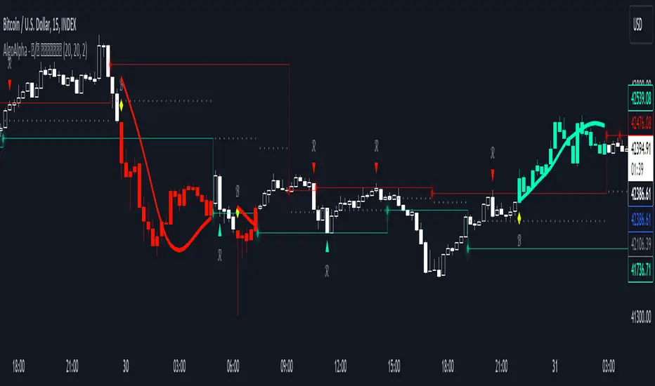
Reversal and Breakout Signals [AlgoAlpha]🚀🌟 Introducing the Reversal and Breakout Signals by AlgoAlpha 🌟🚀
This innovative tool is crafted to enhance your chart analysis by identifying potential reversal and breakout opportunities directly on your charts. It's designed with both novice and experienced traders in mind, providing intuitive visual cues for better decision-making. Let's dive into the key features and how it operates:
### Key Features:
🔶 Dynamic Period Settings: Customize the sensitivity of the indicator with user-defined periods for both the indicator and volume strength.
📊 Volume Threshold: Set a threshold to define what constitutes strong volume, enabling the identification of significant market movements.
💡 Trend Coloring: Option to color candles during trends, making it easier to visualize bullish and bearish market conditions.
🌈 Customizable Visuals: Choose your preferred colors for bullish, bearish, and breakout signals, personalizing the chart to your liking.
🚨 Advanced Alert System: Configure alerts for reversal and breakout signals, ensuring you never miss a potential trading opportunity.
### How to Use:
To maximize the effectiveness of the Reversal and Breakout Signals tool, follow these steps:
1. 🔧 Set Up Your Preferences:
- Adjust the Indicator Period and Volume Strength Period to match the timeframe of your trading strategy. This fine-tuning allows the indicator to better align with your specific market analysis needs.
- Define the Strong Volume Threshold to distinguish between ordinary and significant volume movements. This helps in identifying breakout or reversal signals with higher confidence.
2. 🎨 Customize Visuals:
- Choose colors for Bullish , Bearish , and Breakout Signals to visually differentiate between different types of market activities. This customization facilitates quicker decision-making while scanning charts.
3. 🔍 Reversal Signals:
- Bullish Reversal : Look for a triangle below the bar indicating a potential upward movement. It's identified when the price dips below the lower level but closes above it, suggesting a rejection of lower prices.
- Bearish Reversal : A triangle above the bar signals a potential downward movement. This occurs when the price spikes above the upper level but closes below, indicating a rejection of higher prices.
4. 📈 Trend and Breakout Signals:
- Diamonds represent breakout signals. A bullish breakout is marked below the bar when the price closes above the upper level, suggesting strong buying pressure. Conversely, a bearish breakout above the bar indicates strong selling pressure as the price closes below the lower level.
- The tool also features a Trend Tracker that highlights the current market trend using the Hull Moving Average (HMA). This can help you stay aligned with the overall market direction for your trades.
By integrating these steps into your trading strategy, the Reversal and Breakout Signals tool can provide actionable insights to help identify potential entry and exit points, enhancing your trading decisions with visual cues and alerts for market reversals and breakouts.
### How It Works:
The core logic revolves around calculating weighted moving averages of high and low prices over a user-defined period, identifying the highest and lowest points within this period to establish potential breakout or breakdown levels while reducing the amount of noise, hence the use of moving averages.
1. Weighted Moving Averages Calculation:
sh = ta.wma(high, len)
sl = ta.wma(low, len)
h = ta.highest(sh, len)
l = ta.lowest(sl, len)
2. Breakout and Reversal Detection:
The script then employs logic to detect bullish and bearish breakouts and reversals based on the closing price's position relative to these levels, combined with volume analysis to confirm the strength of the move.
if not (h < h or h > h )
hstore := h
if not (l < l or l > l )
lstore := l
bullishbreakout := (breakout or ((breakout or breakout or breakout or breakout ) and candledir == 1)) and strongvol and not (bullishbreakout or bullishbreakout or bullishbreakout )
bearishbreakout := (breakdown or ((breakdown or breakdown or breakdown or breakdown ) and candledir == -1)) and strongvol and not (bearishbreakout or bearishbreakout or bearishbreakout )
3. Visual Indicators and Alerts:
Visual cues such as triangle shapes for reversals and diamonds for breakouts, along with colored bars, make it easy to spot these opportunities. Additionally, alerts can be set up for these events, ensuring traders can react promptly to potential trading setups.
plotshape(bullishrej and not (state ==- 1) ? low * 0.9995 : na, " Bullish Reversal ", shape.triangleup, location.belowbar, color.new(green, 0), size = size.tiny, text = "𝓡", textcolor = color.gray)
plotshape(bearishrej and not (state == 1) ? high * 1.0005 : na, " Bearish Reversal ", shape.triangledown, location.abovebar, color.new(red, 0), size = size.tiny, text = "𝓡", textcolor = color.gray)
plotshape(bullishbreakout ? low * 0.999 : na, " Bullish Breakout ", shape.diamond, location.belowbar, color.new(yellow, 0), size = size.tiny, text = "𝓑", textcolor = color.gray)
plotshape(bearishbreakout ? high * 1.001 : na, " Bearish Breakout ", shape.diamond, location.abovebar, color.new(yellow, 0), size = size.tiny, text = "𝓑", textcolor = color.gray)
This script is a versatile tool designed to aid in the identification of key reversal and breakout points, helping traders to make informed decisions based on technical analysis. Its customization options allow for a tailored analysis experience, fitting the unique needs and strategies of each trader.
Cryptogrithm's Secret Momentum and Volatility IndicatorThis indicator is hard-coded for Bitcoin, but you may try it on other asset classes/coins. I have not updated this indicator in over 3 years, but it seems to still work very well for Bitcoin.
This indicator is NOT for beginners and is directed towards intermediate/advanced traders with a sensibility to agree/disagree with what this indicator is signalling (common sense).
This indicator was developed back in 2018 and I has not been maintained since, which is the reason why I am releasing it. (It still works great though! At the time of this writing of May 2022).
How to use:
Terms:
PA (Price Action): Literally the candlestick formations on your chart (and the trend formation). If you don't know how to read and understand price action, I will make a fast-track video/guide on this later (but in the meanwhile, you need to begin by learning Order-Flow Analysis, please google it first before asking).
CG Level (Cryptogrithm Level/Yellow Line): PA level above = bullish, PA level below = bearish
CG Bands (Cryptogrithm Bands): This is similar to how bollingers work, you can use this the same was as bollinger bands. The only difference is that the CG bands are more strict with the upper and lower levels as it uses different calculations to hug the price tighter allowing it to be more reactive to drastic price changes (earlier signals for oversold/overbought).
CG Upper Band (Red Upper Line): Above this upper bound line means overbought.
CG Middle Band (Light Blue Line): If PA trades above this line, the current PA trend is bullish continuing in the uptrend. If PA trades below this line, the current PA trend is bearish continuing in the downtrend. This band should only be used for short-term trends.
CG Lower Band (Green Lower Line): Below this lower bound line means oversold.
What the CG Level (yellow line) tells you:
PA is trading above CG Level = Bullish
PA is trading below CG Level = Bearish
Distance between CG Level and price = Momentum
What this means is that the further away the price is from the CG Level, the greater the momentum of the current PA trend. An increasing gap between the CG Level and PA indicates the price's strength (momentum) towards the current upward/downward trend. Basically when the PA and CG Level diverge, it means that the momentum is increasing in the current trend and when they converge, the current trend is losing momentum and the direction of the PA trend may flip towards the other direction (momentum flip).
PA+CG Level Momentum:
To use the CG Level as a momentum indicator, you need to pay attention to how the price and the CG level are moving away/closer from each other:
PA + CG Level Diverges = Momentum Increasing
PA + CG Level Converges = Momentum Decreasing
Examples (kind of common sense, but just for clarity):
Case 1: Bullish Divergence (Bullish): The PA is ABOVE and trending AWAY above from the CG Level = very bullish, this means that momentum is increasing towards the upside and larger moves will come (increasing gap between the price and CG Level)
Case 2: Bearish Convergence (Bearish): - The PA is ABOVE the CG Level and trending TOWARDS the CG Level = bearish, there is a possibility that the upward trend is ending. Look to start closing off long positions until case 1 (divergence) occurs again.
Case 3: Neutral - The PA is trading on the CG Level (no clear divergence or convergence between the PA and CG Level) = Indicates a back and forth (tug of war) between bears and bulls. Beware of choppy price patterns as the trend is undecisive until either supply/liquidity is dried out and a winner between bull/bear is chosen. This is a no trade zone, but do as you wish.
Case 4: Bearish Divergence (Bearish): The PA is BELOW and trending AWAY BELOW from the CG Level = very bearish, this means that momentum is increasing towards the downside and larger downward moves will come (increasing gap between the price and CG Level).
Case 5: Bullish Convergence (Bullish): - The PA is BELOW the CG Level and trending TOWARDS the CG Level = bullish, there is a possibility that the downward trend is ending and a trend flip is occuring. Look to start closing off short positions until case 4 (divergence) occurs again.
CG Bands + CG Level: You can use the CG bands instead of the PA candles to get a cleaner interpretation of reading the momentum. I won't go into detail as this is pretty self-explanatory. It is the same explanation as PA+CG Level Momentum, but you are replacing the PA candles with the CG Bands for interpretation. So instead of the PA converging/diverging from the CG Level, the Upper and Lower Bound levels are converging/diverging from the CG level instead.
Convergence: CG Level (yellow line) trades inside the CG bands
Divergence: CG Level (yellow line) trades outside the CG bands
Bullish/Bearish depends on whether the CG Band is trading below or above the CG level. If CG Band is above the CG Level, this is bullish. If CG Band is below the CG level, this is bearish.
Crosses (PA or CG Band crosses with CG level): This typically indicates volatility is incoming.
There are MANY MANY MANY other ways to use this indicator that is not explained here and even other undiscovered methods. Use some common sense as to how this indicator works (it is a momentum indicator and volatility predictor). You can get pretty creative and apply your own methods / knowledge to it and look for patterns that occur. Feel free to comment and share what you came up with!

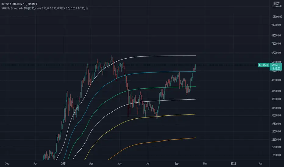
SRG Fibs SmoothedPLEASE READ: HOW TO UNDERSTAND HOW THIS INDICATOR WORKS FOR ME!
Why did I code this?
I never know where is the best place to buy
Sometimes I get greedy and just don't want to sell...
I want to protect myself from losses and still be able to make some trades
What does this do?
This script plots Fibonacci levels dynamically according to a specified length
It also has a smooting value so it looks a bit more clean (and allows for dynamic trailing stop loss)
Internal Fib levels allow to plot fibonacci levels between each main level (scalpers and day traders should be happy with this)
Fib Projection toggle so we can have "the same behaviour" during aggressive Bull Runs.
How to test this thing?
BTC USD Daily chart
For starters, use the following settings:
- Length: 365 (lookback of a full year)
- Smooth: 56 (8 week period)
- Inter Fib levels: OFF
- Fib projection: OFF
Have a look into the chart and check some support/resistance zones. Also check the behaviour of the indicator during the 2021 Jan -> Mar bull run (we will need it later)
If you like to check different time frames. Use these settings:
- Indicator Timeframe: 4 hours
- Length: 2190 (1 year)
- Smooth: 336 (8 weeks)
- Inter Fib Levels: ON
- Fib Projection: OFF
You can now test the chart using the 2H timeframe to see the movement, and how the Internal Fib levels work
Now as we're getting bullish:
- Indicator Timeframe: 4 hours
- Length: 2190 (1 year)
- Smooth: 336 (8 weeks)
- Inter Fib Levels: OFF
- Fib Projection: ON
You can now check the behaviour of the indicator during the 2021 Jan - Mar Bullrun in the 2H or 4H chart, to see some stop loss magic.
ICT Ultimate + SIGNALS [Entry/Exit/SL/TP]📖 ENTRY/EXIT RULES EXPLAINED (Hinglish):
🟢 BUY SIGNAL Kab Aayega?
Condition Required
Market Structure Bullish Trend (HH, HL)
BOS/CHoCH Bullish Break hona chahiye
Order Block Price Bullish OB par ho
Zone DISCOUNT zone mein ho
Time Kill Zone active ho (London/NY)
FVG Bullish FVG mein ho (optional)
Confluence Score: Kam se kam 2-4 conditions match honi chahiye (mode ke hisaab se)
🔴 SELL SIGNAL Kab Aayega?
Condition Required
Market Structure Bearish Trend (LH, LL)
BOS/CHoCH Bearish Break hona chahiye
Order Block Price Bearish OB par ho
Zone PREMIUM zone mein ho
Time Kill Zone active ho
FVG Bearish FVG mein ho (optional)
🛑 STOP LOSS Kahan Lagega?
Method Description
OB Based Order Block ke neeche/upar (recommended)
Swing Based Recent Swing Low/High ke neeche/upar
ATR Based ATR multiplier use karke
Fixed Pips Fixed pips (e.g., 20 pips)
🎯 TAKE PROFIT Levels:
Level Default R:R Example
TP1 1.5:1 Risk 20 pips = TP 30 pips
TP2 2.5:1 Risk 20 pips = TP 50 pips
TP3 4.0:1 Risk 20 pips = TP 80 pips
🎮 HOW TO USE (Step by Step):
Step 1: Add Indicator
text
1. TradingView kholein
2. Pine Editor open karein
3. Code paste karein
4. "Add to Chart" click karein
Step 2: Settings Adjust Karein
text
⚙️ Settings > ENTRY/EXIT SIGNALS section:
- Signal Mode:
• Conservative = 4+ confluence (kam signals, high accuracy)
• Moderate = 3+ confluence (balanced)
• Aggressive = 2+ confluence (zyada signals)
- Kill Zone Required: ON (recommended)
- Premium/Discount Required: ON (recommended)
Step 3: Trade Execution
text
1. 🔼 BUY ya 🔽 SELL arrow dekhein
2. Dashboard mein Entry, SL, TP levels check karein
3. Lines chart par draw ho jayengi
4. Trade lein!
Step 4: Trade Management
text
✓ TP1 Hit → 50% position close karein
✓ TP2 Hit → 30% aur close karein
✓ TP3 Hit → Full position close
✗ SL Hit → Exit trade
📱 DASHBOARD EXPLAINED:
text
┌─────────────────────────────────┐
│ ICT SIGNAL PANEL │
├─────────────────────────────────┤
│ 📈 Trend │ BULLISH 🟢 │
│ 📍 Zone │ DISCOUNT ⬇️ │
│ ⏰ Kill Zone │ NEW YORK 🟠 │
│ 🎯 Silver Bullet │ ACTIVE ✓ │
│ 🔢 Bull Confluence │ 5/3 │
│ 🔢 Bear Confluence │ 1/3 │
├─────────────────────────────────┤
│ ACTIVE TRADE │
├─────────────────────────────────┤
│ Direction │ 🔼 LONG │
│ Entry Price │ 1.0850 │
│ 🛑 Stop Loss │ 1.0820 │
│ 🎯 TP1 │ 1.0895 │
│ 🎯 TP2 │ 1.0925 │
│ 🎯 TP3 │ 1.0970 │
│ 📊 Risk (Pips)│ 30 │
└─────────────────────────────────┘
🔔 ALERTS Setup:
Chart par right-click karein
"Add Alert" select karein
Condition mein "ICT Ultimate + SIGNALS" select karein
Alert type choose karein:
ICT Buy Signal
ICT Sell Signal
TP1/TP2/TP3 Hit
Stop Loss Hit
Kill Zone Active
Silver Bullet Active
⚠️ IMPORTANT TIPS:
Best Practices:
text
✅ 15min ya 5min timeframe use karein
✅ Kill Zone mein hi trade karein
✅ Confluence 3+ hona chahiye
✅ Always SL lagayein
✅ Partial profit booking karein (TP1 par 50%)
Avoid:
text
❌ Asian session mein trade na karein
❌ News time par avoid karein
❌ Ek saath bohot trades na lein
❌ SL ke bina trade na karein
Koi bhi cheez samajh nahi aayi toh poochein! 🙏

TQ Gold Trend (Macro Regime)This indicator answers one question only:
Is gold in a monetary uptrend right now?
It does not:
Forecast prices
Time entries
Use momentum or volatility
It simply classifies the macro trend regime of gold.
3️⃣ Logic (Simple, Explicit)
Timeframe: Weekly
Indicator: 30-week Simple Moving Average
Interpretation:
Bullish: Price above a rising 30W SMA
Bearish: Price below a falling 30W SMA
Neutral: Everything else (transition / range)
This is classic macro trend / stage analysis, adapted for gold as a monetary asset.
4️⃣ How to Use It (User Instructions)
How to read the chart
>If Gold is Bull, precious metals matter.
>If Gold is Bear, ignore silver and miners.
>If Gold is Neutral, wait — no edge.
Best use
Check once per week
Use as the first filter before looking at:
Gold/DXY
Gold/SPY
Silver/Gold
Recommended timeframe
Weekly only (designed for macro regimes, not trading)

TQ Silver / Gold (Weekly Macro)This indicator tracks the Silver / Gold ratio on a weekly basis to determine whether silver is leading gold (risk appetite returning inside metals) or gold is leading silver (a more defensive precious-metals posture).
Within the TQ Weekly Macro Framework, this indicator is designed to be used after confirming the broader macro environment using TQ Gold Trend (Weekly Macro), TQ Gold / DXY (Weekly Macro), and TQ Gold / SPY (Weekly Macro).
Why Silver / Gold matters
>When Silver / Gold rises, silver is outperforming gold — often associated with reflation, growth expectations, or broad risk appetite within precious metals.
>When Silver / Gold falls, gold is outperforming silver — often associated with defense, uncertainty, or tighter financial conditions.
>This ratio is not a timing tool — it is a regime and leadership indicator within the metals complex.
How it works (regime rules)
Using weekly data:
Compute Silver ÷ Gold
Apply a 30-week SMA
Regime definitions:
Bull: Ratio above a rising 30-week SMA (silver leading)
Bear: Ratio below a falling 30-week SMA (gold leading)
Neutral: Transition / range
A clear label marks the current regime.
How to use it in your system
Use after confirming:
TQ Gold Trend (Weekly Macro)
TQ Gold / DXY (Weekly Macro)
TQ Gold / SPY (Weekly Macro)
> If Silver / Gold is Bull, metals participation is broadening and silver often has more upside torque.
> If Silver / Gold is Bear, gold leadership is defensive and silver exposure may underperform.
> Neutral often signals rotation or consolidation.
Best timeframe
Designed for weekly macro regime analysis.

TQ Gold / SPY (Weekly Macro)What this indicator does
This indicator tracks the Gold/SPY ratio on a weekly basis to show whether gold is outperforming U.S. equities (risk assets). It helps you determine if the market is favoring hard money / defensive leadership vs risk-on equity leadership.
Within the TQ Weekly Macro Framework, this indicator is intended to be used after confirming gold’s primary trend using TQ Gold Trend (Weekly Macro) and its monetary backdrop using TQ Gold / DXY (Weekly Macro).
Why Gold/SPY matters
Gold can rise during equity booms and during equity stress.
The Gold/SPY ratio tells you which asset class is winning in relative terms.
Rising Gold/SPY often signals defensive leadership, shifting macro preferences, or risk repricing, especially when aligned with TQ Gold Trend (Weekly Macro).
How it works (regime rules)
Using weekly data:
Compute Gold ÷ SPY
Apply a 30-week SMA
Regime definitions:
Bull: Ratio above a rising 30-week SMA (gold leading equities)
Bear: Ratio below a falling 30-week SMA (equities leading gold)
Neutral: Transition / range
A clear label marks the current regime.
How to use it in your system
Use after TQ Gold Trend (Weekly Macro) and TQ Gold / DXY (Weekly Macro).
> If Gold/SPY is Bull, gold is leading risk assets — metals tend to behave stronger and more “macro-relevant.”
> If Gold/SPY is Bear, equities are winning — gold moves may be less dominant.
> Neutral usually means rotation or consolidation.
Best timeframe
Designed for weekly macro regime analysis, not short-term trading.

Weekly macro ratio indicator tracking Silver/Gold with a 30-weekWhat this indicator does
This indicator tracks the Silver/Gold ratio on a weekly basis to determine whether silver is leading gold (risk appetite returning inside metals) or gold is leading silver (more defensive precious-metals posture).
Why Silver/Gold matters
When Silver/Gold rises, silver is outperforming gold — often associated with reflation, growth expectations, or broad risk appetite.
When Silver/Gold falls, gold is outperforming silver — often associated with defense, uncertainty, or tighter financial conditions.
This ratio is not a timing tool — it’s a regime/leadership indicator.
How it works (regime rules)
Using weekly data:
Compute Silver ÷ Gold
Apply a 30-week SMA
Regime definitions:
Bull: Ratio above a rising 30-week SMA (silver leading)
Bear: Ratio below a falling 30-week SMA (gold leading)
Neutral: Transition/range
A clear label marks the current regime.
How to use it in your system - This indicator is designed to be used as part of the broader TQ Weekly Macro Framework, alongside other TQ indicators such as TQ Gold Trend (Weekly Macro), TQ Gold / DXY (Weekly Macro), and TQ Gold / SPY (Weekly Macro).
Each indicator can also be used independently.
Use after confirming:
Pane 1: Gold Trend
Pane 2: Gold/DXY
Pane 3: Gold/SPY
If Silver/Gold is Bull, metals participation is broadening and silver often has more upside torque.
If Silver/Gold is Bear, gold leadership is defensive; silver exposure may underperform.
Neutral often signals rotation or consolidation.
Best timeframe
Designed for weekly macro regime analysis.

Weekly macro ratio indicator comparing gold vs SPY 30 SMAWhat this indicator does
This indicator tracks the Gold/SPY ratio on a weekly basis to show whether gold is outperforming U.S. equities (risk assets). It helps you determine if the market is favoring hard money / defensive leadership vs risk-on equity leadership.
Why Gold/SPY matters
Gold can rise during equity booms and during equity stress.
The Gold/SPY ratio tells you which asset class is winning in relative terms.
Rising Gold/SPY often signals defensive leadership, shifting macro preferences, or risk repricing.
How it works (regime rules)
Using weekly data:
Compute Gold ÷ SPY
Apply a 30-week SMA
Regime definitions:
Bull: Ratio above a rising 30-week SMA (gold leading equities)
Bear: Ratio below a falling 30-week SMA (equities leading gold)
Neutral: Transition/range
A clear label marks the current regime.
How to use it in your system
Use after Pane 1 (Gold Trend) and Pane 2 (Gold/DXY).
If Gold/SPY is Bull, gold is leading risk assets — metals tend to behave stronger and more “macro-relevant.”
If Gold/SPY is Bear, equities are winning — gold moves may be less dominant.
Neutral usually means rotation or consolidation.
Best timeframe
Designed for weekly macro regime analysis, not short-term trading.

Gold And Silver Macro Dashboard A weekly, macro-focused dashboard for precious metals that tracks gold’s trend plus three key relative-strength ratios: Gold/DXY, Gold/SPY, and Silver/Gold. Uses a 30-week SMA regime filter to label each series as Bull / Neutral / Bear and provides a quick “full picture” read.
What this indicator does
This dashboard helps you read the big picture for precious metals using a simple regime framework (weekly + 30-week SMA). It combines four signals into one view:
Gold (XAUUSD) — establishes the core precious-metals trend
Gold / DXY — shows whether gold is outperforming the U.S. dollar
Gold / SPY — shows whether gold is outperforming U.S. equities (risk assets)
Silver / Gold — shows whether risk appetite is returning inside metals (silver leadership)
How it works (simple rules)
Each item is classified using the same weekly regime logic:
Bull: price/ratio is above a rising 30-week SMA
Bear: price/ratio is below a falling 30-week SMA
Neutral: everything else (transition/range)
How to use it (30-second weekly scan)
Start with Gold: if Gold is Bull, metals have a tailwind.
Confirm with Gold/DXY: Bull means gold is beating fiat.
Confirm with Gold/SPY: Bull means gold is beating risk assets.
Use Silver/Gold to size aggressiveness: Bull implies reflation/confidence and often stronger silver participation.
Best timeframe
Designed for Weekly charts. The script can force weekly calculations, so it remains consistent even if you view other timeframes.
Customization
Change tickers if your preferred feed differs (OANDA spot vs futures vs ETFs).
Toggle the plotted lines on/off and keep only the dashboard table if you want a cleaner screen.
Important note
This is a macro regime tool for orientation and context. It is not meant to time entries/exits on lower timeframes.
Default symbols are:
Gold: OANDA:XAUUSD
Silver: OANDA:XAGUSD
Dollar Index: TVC:DXY
SPY: AMEX:SPY
Core Rule: Gold tells you WHEN metals matter. Ratios tell you WHY and HOW aggressive to be.
Bull across all four = strongest PM regime. Mixed readings = transition. Gold Bull + Silver/Gold Bear = defensive gold-led phase.

SA CloudRegimes GC.5min 1.12.2026 OVERNIGHTSignal Architect™ — Developer Note
These daily posts are intentional.
They are designed to help potential users visually observe consistency—not just in outcomes, but in process—across multiple futures products, market conditions, and timeframes, using the Stop Hunt Indicator alongside my proprietary Signal Architect™ framework.
The goal is simple:
To show how structure, behavior, and probability repeat—every day—despite a constantly changing market.
If you follow these posts over time, you will begin to recognize that:
• The same behaviors appear across different futures contracts
• The same reactions occur on multiple timeframes
• The same structural traps and stop events repeat regardless of volatility regime
That consistency is not coincidence.
Consistency is the signal.
Over time, that consistency should become familiar—
and familiarity should become your edge.
________________________________________
🧠 What You’re Seeing (And Why It Matters)
This indicator includes a limited visual preview of a proprietary power signal I have personally developed and refined across:
• Futures
• Algorithmic trading systems
• Options structure
• Equity market behavior
Every tool I release is built around one core principle:
Clarity of direction without over-promising or over-fitting.
That is why all Signal Architect™ tools emphasize:
• Market structure first
• High-probability directional context
• Clear, visual risk framing
• No predictive claims
• No curve-fit illusions
What you see publicly is not the full system—only controlled, educational previews meant to demonstrate how structure and probability align in real markets.
________________________________________
📊 Background & Scope
Over the years, I have personally developed 800+ programs, including:
• Equity systems
• Futures strategies
• Options structure tools
• Dividend & income frameworks
• Portfolio construction and allocation logic
This includes 40+ Nasdaq-100 trading bots, several operating under extremely strict rule-sets and controlled deployment conditions.
Nothing shared publicly represents my complete internal framework.
Public posts exist for education, observation, and pattern recognition—not signals, not advice, and not promises.
________________________________________
🤝 For Those Who Find Value
If these daily posts help you see the market more clearly:
• Follow, boost, and share my scripts, Ideas, and MINDS posts
• Feel free to message me directly with questions or build requests
• Constructive feedback and collaboration are always welcome
For traders who want to go deeper, optional memberships may include:
• Additional signal access
• Early previews
• Occasional free tools and upgrades
🔗 Membership & Signals:
trianchor.gumroad.com
________________________________________
⚠️ Final Note
Everything published publicly is educational and analytical only.
Markets carry risk.
Discipline, patience, and risk management always come first.
Watch the consistency.
Study the structure.
Let the market repeat itself.
— Signal Architect™
________________________________________
🔗 Personally Developed GPT Tools
• AuctionFlow GPT
chatgpt.com
• Signal Architect™ Gamma Desk – Market Intelligence
chatgpt.com
• Gamma Squeeze Watchtower™
chatgpt.com
SA CloudRegimes + HLC3 Reclaim + CONF% (VWAP Always-On)
Purpose:
This is a market-regime + trigger engine. It paints cloud zones to show what the market is doing (expanding vs contracting, bullish vs bearish) and then fires reclaim signals when price confirms continuation via HLC3 reclaim + wick reclaim behavior.
What makes it different
VWAP is always enforced (session VWAP when available; otherwise a rolling VWAP proxy).
It separates regime (cloud) from execution (signal).
It gives a real-time confirmation score (CONF%) so you can filter out low-quality setups.
1) The 4 Cloud Zones (Regimes)
Each cloud represents a behavioral state. You don’t “guess direction” inside the cloud — you use the cloud to understand what kind of market you’re in, then you wait for the reclaim trigger.
🟩 GREEN Cloud — Bullish Expansion (Uptrend continuation)
Meaning: Trend is aligned and volatility/energy is expanding upward.
Conditions (conceptually):
Trend stack bullish: SMA3 > SMA8 > SMA20 > SMA50
Price above VWAP
Momentum/pressure supportive: W%R bullish, PFE bullish
Range behavior indicates expansion
How to trade it:
Best for: continuation longs
Wait for: Bull reclaim trigger (triangle up) to enter
Risk: false continuation late in the move (use CONF% + wick gate)
💗 PINK Cloud — Bearish Contraction in an Uptrend (Bull pullback / hedge phase)
Meaning: The market is still in an uptrend, but it is pulling back and compressing (often a hedge/unwind pause before continuation).
Conditions:
Trend still bullish (uptrend stack)
Price remains above VWAP
W%R is oversold, PFE weak → indicating pullback pressure
Range indicates contraction
How to trade it:
Best for: “buy-the-pullback” continuation
Wait for: Bull reclaim trigger after the pullback stabilizes
This is your “reload zone” — don’t long blindly; let reclaim confirm.
🟥 RED Cloud — Bearish Expansion (Downtrend continuation)
Meaning: Trend is aligned bearish and volatility/energy is expanding downward.
Conditions:
Trend stack bearish: SMA3 < SMA8 < SMA20 < SMA50
Price below VWAP
W%R oversold + PFE weak/negative
Range behavior indicates expansion
How to trade it:
Best for: continuation shorts
Wait for: Bear reclaim trigger (triangle down) to enter
Risk: late-stage selling → use CONF% + wick gate.
🟩 (Light Green) Cloud — Bullish Contraction in a Downtrend (Bear pullback / bounce phase)
Meaning: The market is still in a downtrend, but it’s bouncing and compressing (often the pause before continuation lower).
Conditions:
Downtrend stack remains intact
Price remains below VWAP
W%R improving / PFE stabilizing
Range indicates contraction
How to trade it:
Best for: sell-the-bounce continuation
Wait for: Bear reclaim trigger to confirm the bounce is ending.
2) Zone Signals (G / P / R / LG markers)
These are zone-entry markers that fire only on the first bar when a zone turns on.
G = Green Zone started (bull expansion)
P = Pink Zone started (bear contraction inside uptrend)
R = Red Zone started (bear expansion)
LG = Light Green Zone started (bull contraction inside downtrend)
How to use them:
These are context markers, not trade entries.
They tell you: “We just entered a new regime. Now wait for reclaim.”
3) The Actual Trade Triggers: “Reclaim” Signals (RECL triangles)
The triangle “RECL” signals are your execution triggers.
Bull Reclaim (Triangle Up)
Fires only when the system believes the market is in a bullish regime (Green or Pink) and then sees:
A bull candle
A cross back above HLC3
A prior-bar reclaim wick (optional but recommended)
Interpretation:
Pullback resolved → price reclaimed balance (HLC3) → continuation likely.
Bear Reclaim (Triangle Down)
Fires only when the system believes the market is in a bearish regime (Red or Light Green) and then sees:
A bear candle
A cross back below HLC3
A prior-bar reclaim wick (optional)
Interpretation:
Bounce resolved → price lost balance (HLC3) → continuation lower likely.
4) CONF% Bubble (Real-Time Probability Filter)
Whenever a reclaim signal fires, the script calculates a confirmation score (0–100) using weighted factors:
Trend alignment
VWAP alignment
Zone alignment
HLC3 reclaim cross
Wick reclaim gate (if enabled)
W%R alignment
PFE alignment
Default filter
Bubble only prints if CONF% ≥ 40%
You can raise it if you want fewer, cleaner trades:
50–60% = fewer but higher quality
70%+ = very selective
How to use CONF% properly
It’s not “win rate.”
It’s a confluence meter: “How many of my conditions are aligned right now?”
Use it as a trade permission layer.
5) Recommended Workflow (The Correct Way)
Step 1 — Identify the active cloud
Green/ Pink = you’re looking for long continuation
Red/ Light Green = you’re looking for short continuation
Step 2 — Let the pullback finish
Pink and Light Green are pullback/bounce phases.
Don’t jump in — wait.
Step 3 — Take ONLY reclaim triggers
Triangle up/down is your “go” signal.
Step 4 — Use CONF% to filter
If CONF% is low, skip.
If CONF% is strong, you have confluence.
6) Best Timeframes (Practical)
This tool works on many charts, but it shines where regimes develop clearly.
Best (most stable)
15m
1H
2H
4H
Faster (more signals, more noise)
3m / 5m can work, but you’ll need:
tighter tickSize accuracy
slightly looser thresholds
higher CONF% filtering
7) Key Settings You’ll Actually Adjust
If you don’t see many clouds on a timeframe:
Lower pfeBullThresh (ex: 35 → 30)
Lower expansionMin (60 → 55)
Raise contractionMax (35 → 40)
If you see too many weak signals:
Raise minConfirmPct (40 → 50/60)
Keep usePrevWickGate = true
8) Simple Interpretation Cheat Sheet
Green: bull continuation environment → wait for bull reclaim
Pink: pullback in bull trend → best “reload” → wait for bull reclaim
Red: bear continuation environment → wait for bear reclaim
Light Green: bounce in bear trend → best “sell bounce” → wait for bear reclaim

Order Blocks Volume Delta 3D | Flux ChartsGENERAL OVERVIEW:
Order Blocks Volume Delta 3D by Flux Charts is a rule-based order block and volume delta visualization tool. It detects bullish and bearish order blocks using a profile-of-price approach: the indicator finds the most actively traded price area (Point of Control, or POC) between a swing high/low and the Break of Structure (BOS), then anchors the order block to the earliest still-valid candle that traded through that POC band. From there, it tracks all candles that continue to interact with that zone and overlays both 2D and 3D volume delta views directly inside the order block.
Unlike traditional order block tools that simply use candle bodies or wicks, this indicator is volume-aware. It lets you optionally pull volume from a lower timeframe feed (for example, using 1-minute data while watching a 5-minute chart) to build a much more accurate picture of how buyers and sellers actually traded inside the zone. This makes every block not just a price box, but a volume story: which side dominated, where, and by how much.
All order blocks printed by this indicator are confirmed: BOS and retests are evaluated strictly on closed candles. Nothing is drawn or alerted on partially formed bars, which helps avoid repaint-style flicker and keeps the signals clean and stable.
What is the theory behind the indicator?:
The core idea behind Order Blocks Volume Delta 3D is that not all price levels inside an order block are equal. Some prices are barely touched, while others act like magnets where candles repeatedly trade and heavy volume passes through.
The indicator first finds a swing high or swing low, waits for a clear Break of Structure (BOS), then scans the candles between the swing point and the BOS to find the price level that was touched the most. That level is treated as the POC.
From all candles in the swing-to-BOS range that interact with this POC band, the indicator looks for the earliest candle that is not already mitigated and uses that as the anchor candle for the order block:
The top of the block equals the anchor candle’s high (for a bearish OB) or the top of its wick zone.
The bottom equals the anchor candle’s low (for a bullish OB) or the bottom of its wick zone.
This “earliest valid POC-touching candle” rule makes it easier to visualize how price and volume developed from the very start of a meaningful zone, while ignoring POC touches that are already fully mitigated by the time the structure is confirmed. On top of that, each candle is split into bullish and bearish volume. If you choose a lower timeframe volume input, the tool aggregates lower timeframe candles into your chart timeframe, giving a more granular bull-versus-bear breakdown for each bar. The result is
an order block that not only shows where price moved but also which side pushed it, how aggressively, and how that balance shifted over time.
ORDER BLOCKS VOLUME DELTA 3D FEATURES:
The Order Blocks Volume Delta 3D indicator includes 4 main features:
1. Order Blocks
2. Volume Delta
3. 3D Visualization
4. Alerts
ORDER BLOCKS:
🔹What is an Order Block
An order block is a price zone where a clear displacement move began after liquidity was taken. It usually forms around the last consolidation or cluster of candles before price breaks structure with a strong move.
In this indicator, order blocks are defined as structured zones that:
Begin at the earliest unmitigated candle that interacted with the most-touched price level (POC) between swing and BOS.
Extend through the full wick range of that anchor candle.
Stretch forward in time, tracking how price continues to trade through, respect, retest, or invalidate the zone.
Are only printed once the BOS is fully confirmed on closed candles (confirmed order blocks only).
Example of bullish and bearish order blocks anchored at the earliest unmitigated candle in the POC zone:
🔹How are Order Blocks detected
The indicator uses a step-by-step, rules-based process to detect bullish and bearish order blocks. The logic is designed to match discretionary Smart Money concepts but with strict, repeatable rules.
Step 1: Detect swing highs and swing lows
Swing High: a candle whose high is higher than the highs of surrounding candles.
Swing Low: a candle whose low is lower than the lows of surrounding candles.
The Swing Length input controls how many candles are checked to the left and right.
Example of swing high and swing low detection:
Step 2: Confirm Break of Structure (BOS)
Once a swing is confirmed, the indicator waits for price to break past that swing:
Bullish BOS: price closes above a previous swing high.
Bearish BOS: price closes below a previous swing low.
To avoid “live” flicker, BOS logic is evaluated based on the previous closed candle. The order block is only confirmed once the BOS candle has fully closed and the next bar has opened. This is one of the reasons the script only shows confirmed, non-repainting order blocks.
Example of bullish BOS and bearish BOS:
Step 3: Build the POC range between swing and BOS
Between the swing candle and the BOS candle, the indicator:
Scans all candles in that range.
Tracks every price level touched using binning (POC bins).
Counts how many times each price band was touched by candle wicks.
The bin with the highest touch count becomes the POC band. This is where price traded most often, not necessarily where volume was highest.
Example of the POC band between swing and BOS.
Step 4 – Anchor the order block to the earliest valid POC candle
From all candles in the swing-to-BOS range, the indicator finds the earliest candle whose high/low overlaps the POC band and whose zone is not already mitigated. That candle becomes the anchor candle for the order block:
For a bearish OB, the block spans the anchor candle’s full wick range, with its top at the high.
For a bullish OB, the block spans the anchor candle’s full wick range, with its bottom at the low.
By requiring the anchor to be the earliest unmitigated interaction with POC, the script avoids building blocks from price action that has already been fully traded through and is less relevant.
Step 5: Extend and manage the order block
Once created, the block:
Extends to the right by a configurable number of candles (Extend Zones).
Continues until it is invalidated by wick or close, depending on the chosen method.
Can show retest labels when price revisits the zone after creation.
Is included or excluded from display depending on the Show Nearest and Hide Invalidated Zones settings.
Example of active and invalidated OB.
🔹Order Block Settings
◇ Swing Length
Swing Length controls how sensitive swing highs and lows are.
Lower Swing Length: Swings form more frequently, which leads to more frequent BOS events and order block formations.
Higher Swing Length: Only larger, more meaningful swings are detected, which leads to less frequent BOS events and less order block formations.
◇ Invalidation
Invalidation determines how an order block is considered “mitigated” or no longer valid.
Wick: For bullish OBs, if price wicks completely through the bottom of the zone, the order block is invalidated. For bearish OBs, if price wicks completely through the top, the order block is invalidated.
Close: For bullish OBs, the block is invalidated only when a candle closes below the bottom. For bearish OBs, it is invalidated only when a candle closes above the top.
Example of wick invalidation:
Example of close invalidation:
◇ Show Nearest
Show Nearest limits how many active order blocks are displayed based on proximity to current price. For example, a value of 2 will display only the two nearest bullish order blocks and two nearest bearish order blocks.
Chart with Show Nearest set to 3:
◇ Extend Zones
Extend Zones define how many candles forward each order block should project beyond the right most candle on the chart.
Chart with Extend Zones set to 10:
◇ Retest Labels
When enabled, the indicator prints labels on every clean retest of an active order block, as long as that block remains valid. Key points:
A retest label is only printed once the retest candle has fully closed – you always see confirmed retests, not intrabar tests.
Retest labels are positioned on the actual retest candle so you can visually see which bar interacted with the zone.
In addition, if multiple retests occur in quick succession, the indicator applies a built-in three-candle buffer between retests. That means only the first valid retest within each three-bar window is labeled (and can trigger an alert), helping to reduce clutter while still highlighting meaningful interactions with the zone.
Example of retest labels on bullish and bearish order blocks.
◇ Hide Invalidated Zones
Hide Invalidated Zones controls whether mitigated/invalidated blocks stay drawn.
Enabled: Only currently valid, unmitigated order blocks are shown (subject to Show Nearest)
Disabled: Both active and invalidated order blocks are displayed.
VOLUME DELTA:
🔹What is Volume Delta
Volume delta measures the difference between buying and selling volume. Instead of only showing “how much volume traded”, it separates volume into bullish and bearish components.
In this indicator:
Bullish volume = volume from candles (or lower timeframe candles) that closed higher.
Bearish volume = volume from candles that closed lower.
Delta % shows how dominant one side was compared to the total.
Example of bullish and bearish order blocks with volume delta and total volume.
🔹How is Volume Delta calculated?
The indicator uses a flexible, timeframe-aware volume engine.
1. Choose a Volume Delta Timeframe.
If the selected timeframe is equal to or higher than the chart timeframe, the indicator simply uses chart-volume per candle.
If the selected timeframe is lower than the chart timeframe (for example, 1‑minute volume on a 5‑minute chart), the indicator pulls all lower timeframe candles for each chart bar and sums them.
2. Split each bar into bull and bear volume.
For each contributing candle:
If close > open → its volume is added to bullish volume.
If close < open → its volume is added to bearish volume.
If close == open → its volume is split evenly between bullish and bearish.
3. Aggregate for each order block.
For each order block:
The indicator loops once from the swing candle to the BOS candle.
It records every candle that touches the POC band.
For each touching candle, it adds its bull and bear volumes (either directly from chart candles or from aggregated lower timeframe candles).
Total volume = bullish volume + bearish volume
Delta % = (bullish volume or bearish volume / total volume ) * 100, depending on which side is dominant.
🔹Volume Delta Settings:
◇ Display Style
Display Style controls how the volume delta is drawn inside each order block:
Horizontal:
Bullish and bearish fills extend horizontally from left to right.
The filled strip sits along the base of the block, with a bull vs bear gradient.
Vertical:
Bullish and bearish fills stretch vertically inside the zone.
The bullish percentage controls how much of the block is filled with the “dominant” color.
Example of Horizontal display style.
Example of Vertical display style.
◇ Volume Delta Timeframe
Volume Delta Timeframe tells the indicator whether to use chart volume or lower timeframe volume. When set to a lower timeframe, the indicator aggregates all lower timeframe candles that fall inside each chart bar, splitting their volume into bullish and bearish components before summing.
Using a lower timeframe:
Increases precision for how volume truly behaved inside each bar.
Helps reveal hidden absorption and aggressive flows that a higher timeframe candle might hide.
Example of volume delta based on chart timeframe.
Example of volume delta based on lower timeframe than chart(same OB as above)
◇ Display Total Volume
When enabled, the indicator prints the total volume for each order block as a label positioned inside the zone, near the bottom-right corner. This total is the sum of bullish and bearish volume used in the delta calculation and gives you a quick sense of how “heavy” the trading was in that block compared to others.
Example of total volume label inside multiple order blocks.
◇ Show Delta %
Show Delta % draws a small text label on the strip of the block that displays the dominant side’s percentage. For example, a bullish block might show “72%” if 72% of all volume inside that POC band came from bullish volume.
Example of Delta %:
3D VISUALIZATION:
The 3D Visualization feature turns each order block into a 3D plot.
🔹What the 3D Visualization does:
Wraps the order block with side faces and a top face to create a 3D bar effect.
Uses delta percentages to tilt the top face toward the dominant side.
Projects blocks into the future using Extend Zones, making the 3D blocks visually stand out.
🔹How it works:
The front face of the OB shows the standard 2D zone.
The side face extends forward in time based on the 3D depth setting.
The top face is angled depending on the Display Style and bull vs bear delta, making strong bullish blocks “rise” and strong bearish blocks “sink”.
🔹How the 3D depth setting affects visuals
Lower 3D depth:
Shorter side faces.
Subtle 3D effect.
Higher 3D depth:
Longer side faces projecting further into the future.
Stronger 3D effect that visually highlights key zones.
Example of lower 3D depth:
Example of higher 3D depth:
ALERTS:
The indicator supports alert conditions through TradingView’s AnyAlert() engine, allowing you to set alerts for the following:
New Bullish Order Block formed
New Bearish Order Block formed
Bullish OB Retest
Bearish OB Retest
Important alert behavior:
Order block alerts only fire when a new block is confirmed (after BOS closes and the next bar opens).
Retest alerts only fire when a retest candle has completely finished, matching the behavior of the visual retest labels.
IMPORTANT NOTES:
3D faces for order blocks are built using polylines. In some situations, especially when an order block’s starting point (its left edge) is beyond the chart’s left-most visible bar, the top 3D face may appear slightly irregular, skewed, or incomplete. This is purely a drawing limitation related to how the chart engine handles off-screen polyline points. Once the starting point of that order block comes into view (by zooming out or scrolling back), the 3D top face corrects itself and the visual becomes fully consistent. This issue affects only the 3D top face drawing, not the actual order-block box itself. The underlying zone, prices, and volume calculations remain accurate at all times.
If all conditions are met to create a new order block but the resulting zone would overlap an existing active order block, the new block is intentionally not created. A built-in guard prevents overlapping active zones to keep the structure clean and easier to interpret.
3D face drawing is implemented using an adaptive polyline method, which can be relatively calculation-heavy on certain symbols, timeframes, or chart histories. In some cases this may lead to calculation timeout error from TradingView.
UNIQUENESS:
This indicator is unique because it:
Anchors each order block to the earliest unmitigated candle that traded through the most-touched POC band between swing and BOS, rather than a generic “last up/down candle” or a random volume spike.
Builds a dedicated volume engine that can pull either chart timeframe volume or aggregated lower timeframe volume, then splits it into bull and bear components.
Adds 3D visualization on top of standard zones, turning each OB into a visually weighted slab rather than a flat rectangle.
Provides clean toggles (Show Nearest, Hide Invalidated Zones, Extend Zones, Display Style, Delta %, and total volume labels) so you can dial the indicator from extremely minimal to fully detailed, depending on your trading workflow.
Combined, these features make the indicator not just an order block plotter, but a complete volume‑informed structure tool tailored for traders who want to see where price actually traded and whether bulls or bears truly controlled the move inside each order block.
