Volume Pulse Indicator by Quantx TeamVolume Pulse by Quantx Team – A smart volume-tracking indicator that highlights market participation, detects unusual spikes, and reveals momentum strength through volume dynamics. Perfect for spotting high-activity zones and dry-up conditions
ابحث في النصوص البرمجية عن "Volume"

Volume With ColorVolume with color helps to quickly identify accumulation or distribution.
An accumulation day is an up day with volume greater than a user selected average.
A distribution day is a down day with volume greater than a user selected average.
This indicator will highlight those days by changing the volume bar colors for an easy visual.
Volume ChartVolume data can be interpreted in many different ways. This is a very basic script and novel idea to display volume as a chart. The purpose of this script is to visually help identify volume breakouts and other common chart patterns. While this indicator could be useful for finding big moves and early reversals it not reliable for determining the direction of the move.
Below is an example of a volume breakout:
Below is confirmation of the second ear in the batman pattern:
Lower highs and higher lows can give early signs of a reversal:
Below we can see retailers getting pumped and dumped on during the gaps while they sleep:

Volume Volatality IndicatorVolume Volatility Indicator
vol: volume; vma: rma of volume
Cyan column shows (vol - vma)/vma, if vol > vma else shows 0
0 value means vol less than vma: good for continuation
0 < value < 1 means vol more than vma: good for trend
value > 1 means vol more than 2 * vma: good for reversal
tr: truerange; atr: averagetruerange
Lime column show -(tr - atr)/atr, if tr > atr else show 0
0 value means tr less than atr: good for continuation
0 > value > -1 means tr more than atr: good for trend
value < -1 means tr more than 2 * atr: good for reversal
Cyan line = 1
Lime line = -1
This indicator shows the volume and truerange together.
Good for filtering trending and consolidating markets.
Thanks for the support.
Volume PredictionVolume Prediction has as a main goal to predict what would the volume be by the end of the candle period.
It could be hard to visualize if today's volume is going to be higher by just a few minutes into the day for example.
The script helps to give an idea if the volume is higher or lower in comparison to other days.
it first start the prediction with a light tone of red/green, as the real volume keeps increasing, a more vibrant red/green will fill the prediction to the final volume of the candle. The prediction will adapt and adjust during the candle cycle according to the volume flow.
The indicator also has an elaborated color variable scheme, changing from red to green by market inclination and order flow.
You can also highlight the candles that exceeded x% to help and find breakouts.
Volume Pressure Analysis - OverlayVolume Pressure Analysis is designed to show effort required to move price. This script is the overlay version that displays signals on the candles as well as changes the bar colors. Yellow arrows signal pressure in that direction and excessive amounts of volume is required to move price. These signals can lead to reversal/pivot points as price action struggles to continue its trend. Red and teal arrows indicate free flowing price action where very little effort or volume is needed to push price. These signals can confirm the beginning or continuation of a trend and is the natural direction the chart wants to travel at that time. For more information please check out the main Volume Pressure Analysis indicator.

Volume by SessionVolume divided by the Sessions (Asia, Europe, Usa, none)
Only works on daily TF
Can be used as:
Stacked (best with style Columns and len = 0)
Cumulative (best with style Area and len = 30)
Overlayed (best with style Line and len = 7)

Volume $A 1 BTC volume at 50.000 $/BTC is quite different from a 1 BTC volume at 20.000 $/BTC
It is a bit tricky to evaluate volume, especially at higher TF's, where BTC price can fluctuate a lot.
Therefore this script, where volume of the currency is multiplied by the currency's price.
Currency's can be:
- BTC
- ETH
- BNB
- TRX
- XRP
If it is not one of these currency's, the normal 'volume' will show
Some examples and differences between my 'Vol $' and regular 'Vol':
REV/BTC
s3.tradingview.com
DBC/BTC
s3.tradingview.com
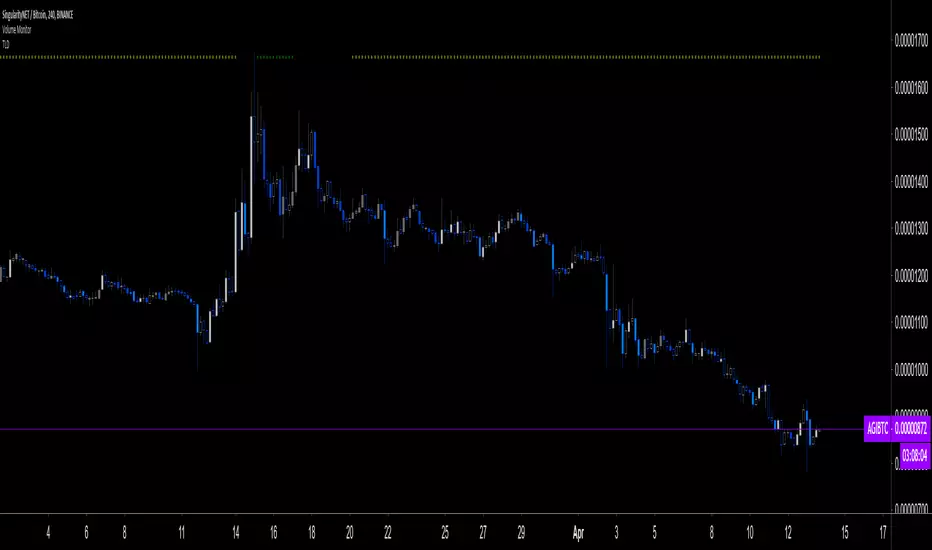
AGI/ETH
s3.tradingview.com
BAX/ETH
s3.tradingview.com
ALGO/BNB
s3.tradingview.com
Cheers!


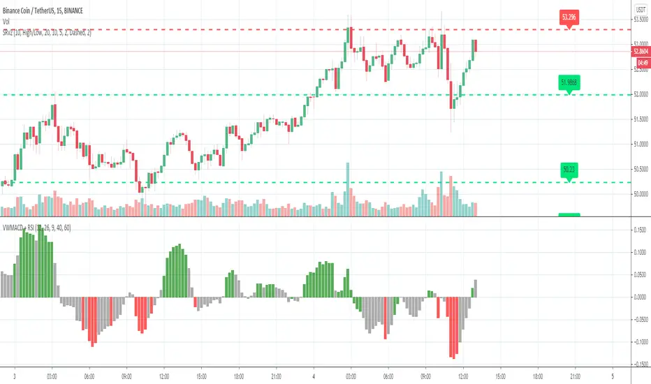
Volume Weighted MACD + RSIVolume Weighted MACD + RSI.
RSI > 60 signals market is bullish
RSI < 40 signals market is bearish
GREEN ZONE - bullish market
GREY ZONE - market reversal potential
RED ZONE - bearish market
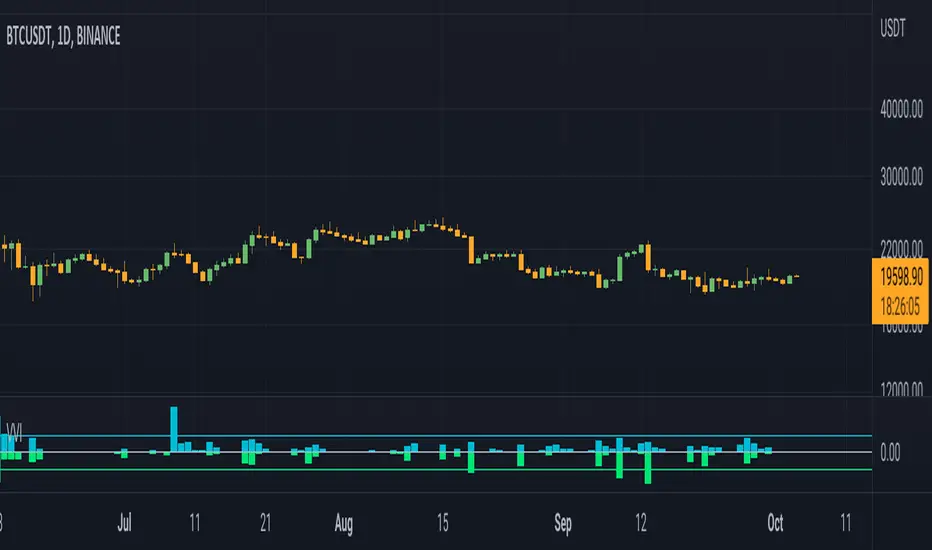
BINANCE:BTCUSDT
Volume BarsVolume Sato's Bar / Satos Bar / Raio X Preditivo
This is an experimental code based on Satos Bar by Raio X Preditivo
It's a way to check expressive volume in one bar, and it's can give you an idea of a important Zones to make decisions.
Example:

Volume BTC/USDVolume of all exchange BTC/USD in $ or in quantity
Exchange Used:
BITSTAMP:BTCUSD
COINBASE:BTCUSD
BITFINEX:BTCUSD
GEMINI:BTCUSD
BITBAY:BTCUSD
BITTREX:BTCUSD
OKCOIN:BTCUSD
CEXIO:BTCUSD
KRAKEN:XBTUSD

Volume Mass PsycheVolume Mass Psyche is a volume-based indicator that shows intensity and consistency of a uptrend and downtrend.
It takes into account the change of average momentum of volume flow to predict the trend reversals and show the psychological map of the market condition.
The key constants of the formula can be changed to adapt it to your time-frame making it flexible.
How to read a chart using VMP:
During a clear uptrend the indicator lights up greenish color.
Correction of an uptrend - orange.
A signal for a downtrend would be when indicator turns red.
Each time you see it blue, a correction from downtrend takes place.
I also applied EMA to VMP to play a role of confirming a signal.
This would make a perfect combination with price-based indicators.

Volume on Candles + Alerts [xdecow]Volume-based candle colors with alerts.
5 threshold levels:
-Extra High (red)
-High (orange)
-Medium (yellow)
-Normal (white)
-Low (aqua)


VolumeUse with my Volume Price Analysis script.
No need to use any other indicator.
You can feel about the battle between bulls and bears.

Volume Momentum‴ | Volume Momentum Colored HistogramVolume Momentum‴ is a Volume Pressure indicator that allows you to have a better understanding and interpretation of its behavior once you are able to see it through an histrogram.
Notice that is histogram has intern bars that allows you to understand the forces of the pressure (positive or negative forces).
This indicator allows you to see the end of the highest price tick which allows you to sell right before price drop.
What is the best is that you can use it with any kind of graphic that it will always considere the real open, close, high and low trading values.
To have access to this indicator, please contact me at: contato @ moneywise . com . br
Believe me, this indicator will make your life much easier!


Volume Monitor In Quote Currency [LucF]Volume Monitor calculates the daily volume in the quote currency and displays a warning sign when that volume is below or above user-defined low and high limits.
For those not familiar with the term, quote currency refers to the second part of a trading pair such as EUR/USD or BNB/BTC.
One use for the indicator is for cryptos, where one who does not wish to trade low volume markets can rely on the indicator to flag them. The default values of 300 and 1000 for the low and high limits mean that when looking at XXXBTC charts, a yellow dot will appear on the chart when the daily volume of the market is lower than 300 BTC, and a green dot will appear when it is higher than 1000 BTC.
If your chart settings are configured to show indicator values, the first value shown by the indicator is the daily volume in the quote currency. It will be green or red, depending on the day’s price action. In order to show the value, an invisible plot must be printed on the chart and for it not to wreak havoc on the price, the indicator’s scale should be set to “No scale” (the default) or to a different one than the price’s scale.