Bitcoin Impact AnalyzerSummary of the "Bitcoin Impact Analyzer" script, the adjustments users can make, and an explanation of what the chart and table represent:
Script Summary:
The "Bitcoin Impact Analyzer" script is designed to help traders and analysts understand the relationship between a chosen altcoin and Bitcoin (BTC). It does this by:
Fetching price data for the specified altcoin and Bitcoin.
Calculating several key comparative metrics:
Normalized Prices: Shows the percentage performance of both assets from a common starting point.
Price Correlation: Measures how similarly the two assets' prices move over a defined period.
Beta: Indicates the altcoin's volatility relative to Bitcoin.
Altcoin/BTC Ratio: Shows the altcoin's value expressed in Bitcoin.
Fetching and displaying Bitcoin Dominance (BTC.D) data.
Visualizing these metrics on the chart as distinct plots.
Displaying the current values of these key metrics in a data table on the chart for quick reference.
The script aims to provide insights into whether an altcoin is outperforming or underperforming Bitcoin, how closely its price movements are tied to Bitcoin's, and its relative volatility.
User Adjustments:
Users can customize the script's behavior through several input settings:
Symbol Inputs:
Altcoin Symbol: Users can enter the ticker symbol for any altcoin they wish to analyze (e.g., BINANCE:ETHUSDT, KUCOIN:SOLUSDT).
Bitcoin Reference Symbol: Users can specify the Bitcoin pair to use as a reference, though BINANCE:BTCUSDT is a common default.
Lookback for Correlation/Beta:
Lookback Period: This integer value (default 50 periods) determines how many past candles are used to calculate the price correlation and beta.
A shorter lookback makes the metrics more sensitive to recent price action.
A longer lookback provides a smoother, more stable indication of the longer-term relationship.
Plot Visibility Options:
Users can toggle on or off the display of each individual plot on the chart:
Normalized BTC & Altcoin Prices
Altcoin/BTC Ratio
Correlation Plot
Bitcoin Dominance (BTC.D)
Beta Plot
This allows users to focus on specific metrics and reduce chart clutter.
What the Chart Represents:
The chart visually displays the historical trends and relationships of the selected metrics:
Normalized Prices Plot: Two lines (typically orange for BTC, blue for the altcoin) show the percentage growth of each asset from the start of the loaded chart data (or the first available data point for each symbol). This makes it easy to see which asset has performed better over time on a relative basis.
Correlation Plot: A single line (purple) oscillates between -1 and +1.
Values near +1 indicate a strong positive correlation (altcoin and BTC prices tend to move in the same direction).
Values near -1 indicate a strong negative correlation (they tend to move in opposite directions).
Values near 0 indicate little to no linear relationship.
Lines at +0.7 and -0.7 are often plotted as thresholds for "strong" correlation.
Beta Plot (if enabled): A single line (teal) shows the altcoin's volatility relative to BTC.
A Beta of 1 (often marked by a dashed line) means the altcoin has, on average, the same volatility as BTC.
Beta > 1 suggests the altcoin is more volatile than BTC (moves by a larger percentage for a given BTC move).
Beta < 1 suggests the altcoin is less volatile than BTC.
Bitcoin Dominance Plot: An area plot (gray) shows the percentage of the total cryptocurrency market capitalization that Bitcoin holds. This helps understand broader market sentiment and capital flows.
Altcoin/BTC Ratio Plot: A line (fuchsia) shows the price of the altcoin denominated in BTC.
An upward trend means the altcoin is gaining value against Bitcoin (outperforming).
A downward trend means the altcoin is losing value against Bitcoin (underperforming).
What the Table Represents:
The data table, typically located in the bottom-right corner of the chart, provides a snapshot of the current values for the most important calculated metrics. It includes:
Altcoin: The ticker symbol of the analyzed altcoin.
Bitcoin Ref: The ticker symbol of the Bitcoin reference.
Correlation (lookback): The current correlation coefficient between the altcoin and BTC, based on the specified lookback period. The value is color-coded (e.g., green for strong positive, red for strong negative).
Beta (lookback): The current beta value of the altcoin relative to BTC, based on the specified lookback period. The value may be color-coded to highlight significantly high or low volatility.
BTC.D Current: The current Bitcoin Dominance percentage.
ALT/BTC Ratio: The current price of the altcoin expressed in Bitcoin.
The table offers a quick, at-a-glance summary of the present market dynamics between the two assets without needing to interpret the lines on the chart for their exact current values.
ابحث في النصوص البرمجية عن "bitcoin"

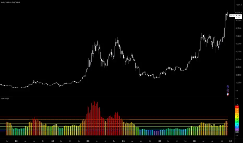
Bitcoin: Mayer MultipleMayer Multiple Indicator
The Mayer Multiple is a powerful tool designed to help traders assess market conditions and identify optimal buying or selling opportunities. It calculates the ratio between the current price and its 200-day simple moving average (SMA), visualizing key thresholds that indicate value zones, caution areas, and overheated markets.
Key Features:
Dynamic Market Zones: Clearly marked levels like "Smash Buy," "Boost DCA," and "Extreme Euphoria" to guide your trading decisions.
Customizable Input: Adjust the SMA length to fit your strategy.
Color-Coded Signals: Intuitive visualization of market sentiment for quick analysis.
Comprehensive Thresholds: Historical insights into price behavior with plotted reference levels based on probabilities.
This indicator is ideal for traders aiming to enhance their long-term strategies and improve decision-making in volatile markets. Use it to gain an edge in identifying potential turning points and managing risk effectively.
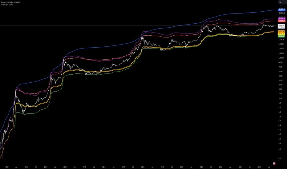
Bitcoin Cycle Master [InvestorUnknown]The "Bitcoin Cycle Master" indicator is designed for in-depth, long-term analysis of Bitcoin's price cycles, using several key metrics to track market behavior and forecast potential price tops and bottoms. The indicator integrates multiple moving averages and on-chain metrics, offering a comprehensive view of Bitcoin’s historical and projected performance. Each of its components plays a crucial role in identifying critical cycle points:
Top Cap: This is a multiple of the Average Cap, which is calculated as the cumulative sum of Bitcoin’s price (price has a longer history than Market Cap) divided by its age in days. Top Cap serves as an upper boundary for speculative price peaks, multiplied by a factor of 35.
Time_dif() =>
date = ta.valuewhen(bar_index == 0, time, 0)
sec_r = math.floor(date / 1000)
min_r = math.floor(sec_r / 60)
h_r = math.floor(min_r / 60)
d_r = math.floor(h_r / 24)
// Launch of BTC
start = timestamp(2009, 1, 3, 00, 00)
sec_rb = math.floor(start / 1000)
min_rb = math.floor(sec_rb / 60)
h_rb = math.floor(min_rb / 60)
d_rb = math.floor(h_rb / 24)
difference = d_r - d_rb
AverageCap() =>
ta.cum(btc_price) / (Time_dif() + btc_age)
TopCap() =>
// To calculate Top Cap, it is first necessary to calculate Average Cap, which is the cumulative sum of Market Cap divided by the age of the market in days.
// This creates a constant time-based moving average of market cap.
// Once Average cap is calculated, those values are multiplied by 35. The result is Top Cap.
// For AverageCap the BTC price was used instead of the MC because it has more history
// (the result should have minimal if any deviation since MC would have to be divided by Supply)
AverageCap() * 35
Delta Top: Defined as the difference between the Realized Cap and the Average Cap, this metric is further multiplied by a factor of 7. Delta Top provides a historically reliable signal for Bitcoin market cycle tops.
DeltaTop() =>
// Delta Cap = Realized Cap - Average Cap
// Average Cap is explained in the Top Cap section above.
// Once Delta Cap is calculated, its values over time are then multiplied by 7. The result is Delta Top.
(RealizedPrice() - AverageCap()) * 7
Terminal Price: Derived from Coin Days Destroyed, Terminal Price normalizes Bitcoin’s historical price behavior by its finite supply (21 million bitcoins), offering an adjusted price forecast as all bitcoins approach being mined. The original formula for Terminal Price didn’t produce expected results, hence the calculation was adjusted slightly.
CVDD() =>
// CVDD stands for Cumulative Value Coin Days Destroyed.
// Coin Days Destroyed is a term used for bitcoin to identify a value of sorts to UTXO’s (unspent transaction outputs). They can be thought of as coins moving between wallets.
(MCR - TV) / 21000000
TerminalPrice() =>
// Theory:
// Before Terminal price is calculated, it is first necessary to calculate Transferred Price.
// Transferred price takes the sum of > Coin Days Destroyed and divides it by the existing supply of bitcoin and the time it has been in circulation.
// The value of Transferred Price is then multiplied by 21. Remember that there can only ever be 21 million bitcoin mined.
// This creates a 'terminal' value as the supply is all mined, a kind of reverse supply adjustment.
// Instead of heavily weighting later behavior, it normalizes historical behavior to today. By normalizing by 21, a terminal value is created
// Unfortunately the theoretical calculation didn't produce results it should, in pinescript.
// Therefore the calculation was slightly adjusted/improvised
TransferredPrice = CVDD() / (Supply * math.log(btc_age))
tp = TransferredPrice * 210000000 * 3
Realized Price: Calculated as the Market Cap Realized divided by the current supply of Bitcoin, this metric shows the average value of Bitcoin based on the price at which coins last moved, giving a market consensus price for long-term holders.
CVDD (Cumulative Value Coin Days Destroyed): This on-chain metric analyzes Bitcoin’s UTXOs (unspent transaction outputs) and the velocity of coins moving between wallets. It highlights key market dynamics during prolonged accumulation or distribution phases.
Balanced Price: The Balanced Price is the difference between the Realized Price and the Terminal Price, adjusted by Bitcoin's supply constraints. This metric provides a useful signal for identifying oversold market conditions during bear markets.
BalancedPrice() =>
// It is calculated by subtracting Transferred Price from Realized Price
RealizedPrice() - (TerminalPrice() / (21 * 3))
Each component can be toggled individually, allowing users to focus on specific aspects of Bitcoin’s price cycle and derive meaningful insights from its long-term behavior. The combination of these models provides a well-rounded view of both speculative peaks and long-term value trends.
Important consideration:
Top Cap did historically provide reliable signals for cycle peaks, however it may not be a relevant indication of peaks in the future.
Bitcoin Wave RainbowThis Bitcoin Wave Rainbow model is a powerful tool designed to help traders of all levels understand and navigate the Bitcoin market. It works only with BTC in any timeframe, but better looks in dayly or weekly timeframes. It provides valuable insights into historical price behavior and offers forecasts for the next decade, making it an essential asset for both short-term and long-term strategies.
How the Model Works
The model is built on a logarithmic trend, also known as a power law, represented by the green line on the chart. This line illustrates the expected price trajectory of Bitcoin over time. The model also incorporates a range of price fluctuations around this trend, represented by colored bands.
The width of these bands narrows over time, indicating that the model becomes increasingly accurate as it progresses. This is due to the exponential decrease in the range of price fluctuations, making the model a reliable tool for predicting future price movements.
Understanding the Zones
Blue Zone: This zone signifies that the price is below its trend, making it a recommended area for buying Bitcoin. It represents a level where the price is unlikely to fall further, providing a potential opportunity for accumulation.
Green Zone: This zone represents a fair price range, where the price is relatively close to its trend. In this zone, the price may continue to go up or down, depending on the halving season. ransiting up around any halving and transiting down around 2 years after each halving.
Yellow Zone: This zone indicates that the price is somewhat overheated, often due to the hype following a halving event. While there may still be room for the price to rise, traders should exercise caution in this zone, as a price correction could occur.
Red Zone: This zone represents a strong overbought condition, where the price is significantly above its trend. Traders should be extremely cautious in this zone and consider reducing their positions, as the price is likely to revert back towards the trend or even lower.
Using the Model in Your Trading Strategy
This indicator can be used in conjunction with the Bitcoin Wave Model, which complements it by showing harmonic price fluctuations associated with halving events. Together, these indicators provide a comprehensive view of the Bitcoin market, allowing traders to make informed decisions based on both historical data and future projections.
Benefits for Traders
This Bitcoin price model offers numerous benefits for traders, including:
Clear Visualization: The model provides a clear and concise visual representation of Bitcoin's price behavior, making it easy to understand and interpret.
Accurate Forecasting: The model's accuracy increases over time, providing reliable forecasts for future price movements.
Risk Management: The model helps traders identify overbought and oversold conditions, allowing them to manage their risk more effectively.
Strategic Decision-Making: By understanding the different zones and their implications, traders can make more informed decisions about when to buy, sell, or hold Bitcoin.
By incorporating this Bitcoin price model into your trading strategy, you can gain a deeper understanding of the market dynamics and improve your chances of success.

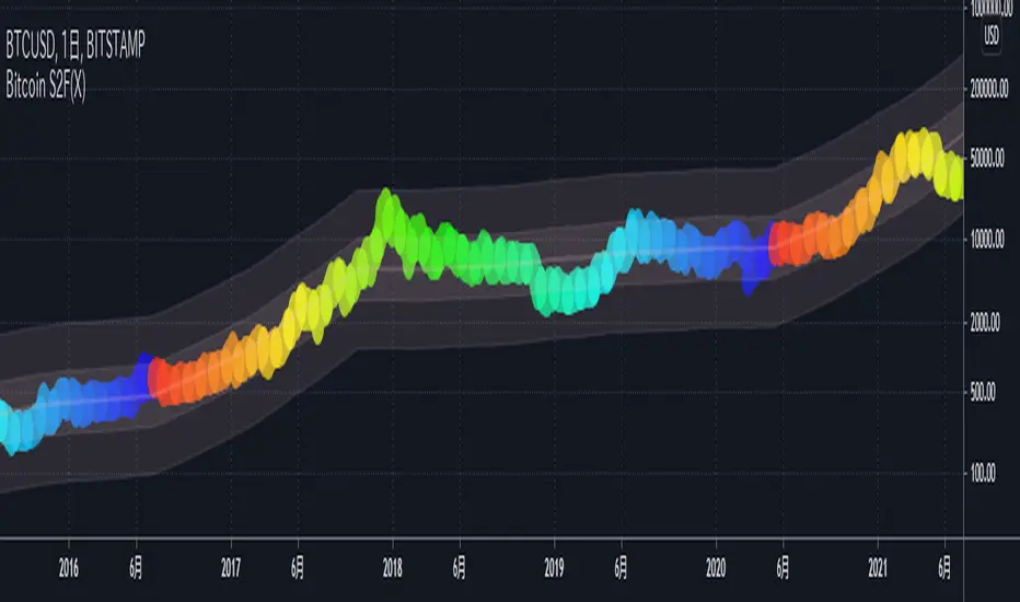
Bitcoin S2F(X)This indicator shows the BTCUSD price based on the S2F Model by PlanB.
We can see not only the S2F(Stock-to-Flow) but also the S2FX(Stock-to-Flow Cross Asset) model announced in 2020.
█ Overview
In this model, bitcoin is treated as comparable to commodities such as gold .
These commodities are known as "store of value" commodities because they retain their value over time due to their relative scarcity.
Bitcoins are scarce.
The number of coins in existence is limited, and the rate of supply is at an all-time low because mining the 2.2 million outstanding coins that have yet to be mined requires a lot of power and computing power.
The Stock-to-flow ratio is used to evaluate the current stock of a commodity (the total amount currently available) versus the flow of new production (the amount mined in a given year).
The higher this ratio, the more scarce the commodity is and the more valuable it is as a store of value.
█ How To View
On the above chart price is overlaid on top of the S2F(X) line. We can see that price has continued to follow the stock-to-flow of Bitcoin over time. By observing the S2F(X) line, we can expect to be able to predict where the price will go.
The coloured circles on the price line of this chart show the number of days until the next Bitcoin halving event. This is an event where the reward for mining new blocks is halved, meaning miners receive 50% fewer bitcoins for verifying transactions. Bitcoin halvings are scheduled to occur every 210,000 blocks until the maximum supply of 21 million bitcoins has been generated by the network. That makes stock-to-flow ratio (scarcity) higher so in theory price should go up.
The stock-to-flow line on this chart incorporates a 463-day average into the model to smooth out the changes caused in the market by the halving events.
I recommend using this indicator on a weekly or monthly basis for BITSTAMP:BTCUSD .
█ Reference Script
Bitcoin Stock to Flow Multiple by yomofoV
BitcoinNinjas NINJASIGNALS V4 (Script)BitcoinNinjas NINJASIGNALS V4 (Script)
(for Cryptocurrencies, Forex, GunBot, ProfitTrailer, Autoview, CryptoHopper, manual or automated trading, and more)
This is version 4 of our Ninja Signals trading script, with accompanying backtesting strategy.
BitcoinNinjas NINJASIGNALS V4 (Strategy)
•Allows users to easily set automated buy/long and sell/short alerts on TradingView for use with automatic and manual trading of cryptocurrencies, Forex securities, and more (alerts are compatible with automatic trading software such as GunBot, ProfitTrailer, Autoview, CryptoHopper, and more).
•Synthesizes many powerful indicators [e.g., Relative Strength Index (RSI), Stochastic RSI, Money Flow Index (MFI), Moving Average Convergence Divergence (MACD), etc.) into one powerful script to generate very precise buy and sell signals in virtually all market conditions.
•Features user-defined adjustable calibration settings, allowing traders to customize the script to fit any currency / security on any exchange available through TradingView.com, simply by adjusting settings.
•Buy/Long arrows, Sell/Short arrows, & EMA trendline can be customized or hidden, if desired.
•Complete with backtesting strategy version of script which allows users to test various trading strategies based on the alerts the script generates (see information and screenshots below).
•Backtesting strategy features a user-defined adjustable date range, so traders can estimate performance of the script over specific periods of time, such as the last week, month, or year.
•Script and backtesting strategy feature many user-adjustable settings including stop loss and take profit alerts, an ‘only sell for profit’ option (Gunbot-specific), many different buy and sell filters, and more. Simply adjust the script settings and the backtesting results will automatically refresh.
•Backtesting strategy allows for pyramid buying to test various average down / dollar cost average trading strategies. Simply adjust the number of pyramid buys and the quantity of each buy.
•Fully compatible with margin and futures trading for any currency / security on TradingView.com.
DISCLAIMER: By using our BitcoinNinjas ‘Ninja Signals’ planning script, you agree to the BitcoinNinjas 'Terms of Use'. No sharing, copying, reselling, modifying, or any other forms of use are authorized for our documents, script / strategy, and the information published with them. This informational planning script / strategy is strictly for individual use and educational purposes only. This is not financial or investment advice. Investments are always made at your own risk and are based on your personal judgement. BitcoinNinjas is not responsible for any losses you may incur. Please invest wisely.

Bitcoin - Asset manager Long vs Short - CME Hello everyone.
Today an indicator to show the difference between how many long and short position are taken by the group of asset managers .
At this time, we can guess :
If the indicator stay long time below 0 : bear market
If the indicator stay long time over 0 : bull market
If the indicator is below -270 : oversell area
If the indicator is over 270 : overbuy area
Subject to update.
Regards,

Bitcoin Risk Indicator v2Based on the work of Ben Cowen on Youtube. I can't link to the video due to TradingView promotion rules.

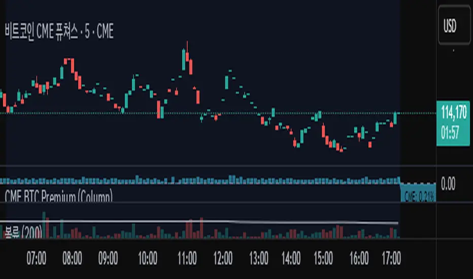
Bitcoin cme gap indicators, BINANCE vs CME exchanges premium gap
# CME BTC Premium Indicator Documentation CME:BTC1!
## 1. Overview
Indicator Name: CME BTC Premium
Platform: TradingView (Pine Script v6)
Type: Premium / Gap Analysis
Purpose:
* Visualize the CME BTC futures premium/discount relative to Binance BTCUSDT spot price.
* Detect gap-up or gap-down events on the daily chart.
* Assess short-term market sentiment and potential volatility through price discrepancies.
## 2. Key Features
1. CME Premium Calculation
* Formula:
CME Premium(%) = ((CME Price - Binance Price) / Binance Price) X 100
* Positive premium: CME futures are higher than spot → Color: Blue
* Negative premium: CME futures are lower than spot → Color: Purple
2. Premium Visualization Options
* `Column` (default)
* `Line`
3. Daily Gap Detection (Daily Chart Only)
* Gap Up: CME open > previous high × 1.0001 (≥ 0.01%)
* Gap Down: CME open < previous low × 0.9999 (≤ 0.01%)
* Visualization:
* Bar Color:
* Gap Up → Yellow (semi-transparent)
* Gap Down → Blue (semi-transparent)
* Background Color:
* Gap Up → Yellow (semi-transparent)
* Gap Down → Blue (semi-transparent)
4. Label Display
* If `Show CME Label` is enabled, the last bar displays a premium percentage label.
* Label color matches premium color; text color: Black.
* Style: `style_label_upper_left`, Size: `small`.
## 3. User Inputs
| Option Name | Description | Type / Default |
| -------------- | ------------------------- | --------------------------------------- |
| Show CME Label | Display CME premium label | Boolean / true |
| CME Plot Type | CME premium chart style | String / Column (Options: Column, Line) |
## 4. Data Sources
| Data Item | Symbol | Description |
| ------------- | ---------------- | ----------------------------- |
| Binance Price | BINANCE\:BTCUSDT | Spot BTC price |
| CME Price | CME\:BTC1! | CME BTC futures closing price |
| CME Open | CME\:BTC1! | CME BTC futures open price |
| CME Low | CME\:BTC1! | CME BTC futures low price |
| CME High | CME\:BTC1! | CME BTC futures high price |
## 5. Chart Display
1. Premium Column/Line
* Displays the CME premium percentage in real-time.
* Color: Premium ≥ 0 → Blue, Premium < 0 → Purple
2. Zero Line
* Indicates CME futures are at parity with spot for quick visual reference.
3. Gap Highlight
* Applied only on daily charts.
* Gap-up or gap-down is highlighted using bar and background colors.
4. Label
* Shows the latest CME premium percentage for quick monitoring.
## 6. Use Cases
* Analyze spot-futures premium to gauge CME market sentiment.
* Identify short-term volatility and potential trend reversals through daily gaps.
* Combine premium and gap analysis to support altcoin trend analysis and position strategy.
## 7. Limitations
* This indicator does not provide investment advice or trading recommendations; it is for informational purposes only.
* Data delays, API restrictions, or exchange differences may result in calculation discrepancies.
* Gap detection is meaningful only on daily charts; other timeframes may not provide valid signals.
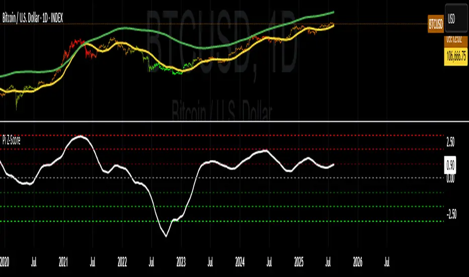
Bitcoin: Pi Cycle Top & Bottom Indicator Z ScoreIndicator Overview
The Pi Cycle Top Indicator has historically been effective in picking out the timing of market cycle highs within 3 days.
It uses the 111 day moving average (111DMA) and a newly created multiple of the 350 day moving average, the 350DMA x 2.
Note: The multiple is of the price values of the 350DMA, not the number of days.
For the past three market cycles, when the 111DMA moves up and crosses the 350DMA x 2 we see that it coincides with the price of Bitcoin peaking.
It is also interesting to note that 350 / 111 is 3.153, which is very close to Pi = 3.142. In fact, it is the closest we can get to Pi when dividing 350 by another whole number.
It once again demonstrates the cyclical nature of Bitcoin price action over long time frames. However, in this instance, it does so with a high degree of accuracy over Bitcoin's adoption phase of growth.
Bitcoin Price Prediction Using This Tool
The Pi Cycle Top Indicator forecasts the cycle top of Bitcoin’s market cycles. It attempts to predict the point where Bitcoin price will peak before pulling back. It does this on major high time frames and has picked the absolute tops of Bitcoin’s major price moves throughout most of its history.
How It Can Be Used
Pi Cycle Top is useful to indicate when the market is very overheated. So overheated that the shorter-term moving average, which is the 111-day moving average, has reached an x2 multiple of the 350-day moving average. Historically, it has proved advantageous to sell Bitcoin around this time in Bitcoin's price cycles.
It is also worth noting that this indicator has worked during Bitcoin's adoption growth phase, the first 15 years or so of Bitcoin's life. With the launch of Bitcoin ETF's and Bitcoin's increased integration into the global financial system, this indicator may cease to be relevant at some point in this new market structure.
Added the Z-Score metric for easy classification of the value of Bitcoin according to this indicator.
Created for TRW
Bitcoin Basket [100Zabaan]🟢🟢 Bitcoin Basket 🟢🟢
🟡 Overview
This indicator is a long-term analytical tool for Bitcoin investment, designed by drawing inspiration from historical halving cycles, historical peak growths and deepest declines, and the overall price growth trend. The main goal of this indicator is to provide a strategic perspective to investors so they can better identify key market phases, such as periods of major selling and major buying of Bitcoin.
🟡 This tool visually compares two scenarios:
Hold Strategy : The strategy of buying and holding Bitcoin from the time of investment until today ( Bitcoin Holding Strategy ).
Active Investment Strategy : An active investment strategy that cautiously buys and sells based on market cycle-driven signals ( Active Bitcoin Trading Strategy ).
This comparison helps you make more informed decisions regarding your long-term capital management.
🟡 Key Features of the Indicator
Performance Comparison : Displays the current value of your investment based on two strategies:
Bitcoin Holding Strategy : If you had invested an amount on your chosen date, how much Bitcoin (equivalent to how many dollars) would you have today.
Active Bitcoin Trading Strategy : How your capital would have grown if you had traded based on the indicator's buy and sell signals.
Also, in the status line section, you can see your asset amount (in USD) at each candle and compare the two strategies.
Identification of Buy and Sell Periods : Using colored boxes (red and green), it identifies time periods that have historically been suitable for selling or buying.
Identification of Suitable Price Ranges in Buy and Sell Periods : With a horizontal line within the red boxes, it informs us that prices above this line may be worth selling. With a horizontal line within the green boxes, it informs us that prices below this line may be worth buying.
Halving Display: Shows the exact time of each halving along with the block reward for each block produced during that halving.
Display of Maximum Drawdown During the Investment Period: In the provided table, you can see the maximum loss incurred in each of the two strategies during your hypothetical investment period, on what date this occurred, and what your capital was before and after in each of the two scenarios.
Display of Buy and Sell Suggestions: You can also see the suggested amount of Bitcoin to buy and sell at what prices, based on your investment amount.
Alarm: This indicator usually provides an alarm one or more days before the start of a selling period, notifying you that a sell signal will be issued soon.
Customization Options: In this indicator, you can customize your investment date and amount. You can also determine the display of label text (including price and buy/sell amount) and its size. This indicator also supports the Persian language.
🟡 How it Works and Signal Issuance Mechanism
This indicator uses three main methods for calculations:
Deceleration of Overall Price Growth : This indicator has found that the price of Bitcoin grows and fluctuates around an overall axis, and the intensity of this upward axis's growth gradually decreases.
Halving Impact : This indicator has found that the price of Bitcoin has grown from approximately one year before a halving and this growth continues for at least one year after the halving. It has also found that the price experiences a sharp one-year decline in the range between two halvings. Consequently, time-wise, based on halving, it displays a selling period (as a red box) on the chart. Considering the Bitcoin price growth explained in the previous point, it draws a line in the middle of the red box, identifying prices above that line as a suitable selling area. The inverse of this process is considered for buying.
Historical Peak Growths and Deepest Declines : This indicator analyzes Bitcoin's historical peak growths and deepest declines. Based on this, when declines are relatively large compared to what has occurred in the past, it issues the first buy suggestion. If the price decline continues, it sequentially issues the second and finally the third buy suggestion. The inverse of this process is followed for issuing sell suggestions.
🟡 Usage Guide
Add the indicator to your chart
Go to the indicator's settings section
In the Inputs tab, you can adjust the following values:
Set the initial investment amount in USD
Set the investment start date, from which calculations will begin
Set the language for displaying information on the chart, which is English by default
Display or hide labels for price and buy/sell volume on candles
The indicator will automatically display the results on the chart and in its information panel
🟡 Important Notes and Limitations
Compatibility : This indicator is specifically designed for the BTCUSD pair. To access the maximum historical data, you must use the INDEX broker chart and the Daily timeframe ; otherwise, the indicator will display a warning message.
Long-Term Tool : This indicator is a macro analysis tool. Its signals are rarely issued and are designed to capture large trends spanning several months or years. This tool is by no means suitable for day trading or scalping.
Non-Repainting : Buy and sell signals become definitive after the daily candle closes and do not change in the past. This feature increases the validity of backtests.
Note Regarding the Source Code : The core logic of this indicator, especially the proprietary formulas used, is the result of personal research and development. To preserve this unique methodology and ensure its integrity for future developments, this version is released as closed-source. However, we have made every effort to fully and transparently describe the indicator's logic and operational process in the explanations.
🔴 Disclaimer
This indicator is provided solely for educational, informational, and analytical purposes and should under no circumstances be considered financial advice or a definitive signal for buying and selling. Past market performance is by no means a guarantee of future results. All investment and trading activities involve risk, and the user is solely responsible for any profits or losses. Please conduct your own research and consult with a financial advisor before making any financial decisions.
🔴 Developers: Mr. Mohammad sanaei, Mrs. Hamideh Azari
⭐️⭐️ Feel free to share your feedback in the comments ⭐️⭐️
این اندیکاتور ابزاری تحلیلی و بلندمدت برای سرمایهگذاری در بیتکوین است که با الهام از چرخههای تاریخی هاوینگ، بیشترین رشد و افت ها تاریخی و روند کلی رشد قیمت طراحی شده است.
هدف اصلی این اندیکاتور، ارائه یک دیدگاه استراتژیک به سرمایهگذاران است تا بتوانند فازهای کلیدی بازار مانند دورههای فروش عمده و خرید عمده بیت کوین را بهتر شناسایی کنند.
🔴 توسعه دهندگان: محمد ثنائی، حمیده آذری
⭐️⭐️ لطفاً نظرات خود را در کامنتها با ما در میان بگذارید; از خواندن بازخوردهای شما خوشحال میشویم. ⭐️⭐️

Bitcoin Halving & Fibos LevelsThis Pine Script is designed to display key Bitcoin levels on a TradingView chart, based on historical halvings and Fibonacci levels. Here's a detailed breakdown of its functionality:
Main Functionality
Bitcoin Halvings:
The script defines the dates of the last two Bitcoin halvings: May 2020 and April 2024.
It uses these dates to delimit the time range for calculating relevant maximum and minimum levels.
Maximum and Minimum Calculation:
The script tracks the maximum and minimum Bitcoin prices between the previous and current halvings.
These values are used as the basis for drawing Fibonacci levels.
Fibonacci Levels:
It calculates and draws Fibonacci retracement and extension levels based on the price range between the calculated maximum and minimum.
It visually distinguishes between standard retracement levels and extensions.
Halving Vertical Lines:
It draws vertical lines at the halving dates to highlight these important events on the chart.
Customization:
The script allows the user to customize the colors of the maximum/minimum levels, Fibonacci levels, Fibonacci extensions, and halving lines.
This script is a useful tool for Bitcoin traders who want to visualize key levels based on historical halvings and Fibonacci analysis.
_________________________________________________________________________
Este script de Pine Script está diseñado para mostrar niveles clave de Bitcoin en un gráfico de TradingView, basados en los halvings históricos y los niveles de Fibonacci. Aquí hay un desglose detallado de su funcionalidad:
**Funcionalidad principal**
* **Halvings de Bitcoin**:
* El script define las fechas de los dos últimos halvings de Bitcoin: mayo de 2020 y abril de 2024.
* Utiliza estas fechas para delimitar el rango de tiempo para calcular los niveles máximo y mínimo relevantes.
* **Cálculo de máximos y mínimos**:
* El script rastrea el precio máximo y mínimo de Bitcoin entre el halving anterior y el halving actual.
* Estos valores se utilizan como base para dibujar los niveles de Fibonacci.
* **Niveles de Fibonacci**:
* Calcula y dibuja los niveles de retroceso y extensión de Fibonacci basados en el rango de precio entre el máximo y el mínimo calculados.
* Distingue visualmente entre los niveles de retroceso estándar y las extensiones.
* **Líneas verticales de Halving**:
* Dibuja líneas verticales en las fechas de los halvings para resaltar estos eventos importantes en el gráfico.
* **Personalización**:
* El script permite al usuario personalizar los colores de los niveles máximo/mínimo, los niveles de Fibonacci, las extensiones de Fibonacci y las líneas de halving.
Este script es una herramienta útil para los traders de Bitcoin que desean visualizar niveles clave basados en halvings históricos y análisis de Fibonacci.

Bitcoin Total VolumeThis Pine Script indicator, titled "Bitcoin Top 16 Volume," is designed to provide traders with an aggregate view of Bitcoin (BTC) spot trading volume across leading cryptocurrency exchanges. Unlike traditional volume indicators that focus on a single exchange, this tool compiles data from a selection of the top exchanges as ranked by CoinMarketCap, offering a broader perspective on overall market activity.
The indicator works by fetching real-time volume data for specific BTC trading pairs on various exchanges. It currently incorporates data from prominent platforms such as Binance (BTCUSDT), Coinbase (BTCUSD), OKX (BTCUSDT), Bybit (BTCUSDT), Kraken (BTCUSD), Bitfinex (BTCUSD), Bitstamp (BTCUSD), Gemini (BTCUSD), Upbit (BTCKRW), Bithumb (BTCKRW), KuCoin (BTCUSDT), Gate.io (BTCUSDT), MEXC (BTCUSDT), Crypto.com (BTCUSD), Poloniex (BTCUSDT), and BitMart (BTCUSDT). It's important to note that while the indicator aims to represent the "Top 16" exchanges, the actual number included may vary due to data availability within TradingView and the dynamic nature of exchange rankings.
The script then calculates the total volume by summing up the volume data retrieved from each of these exchanges. This aggregated volume is visually represented as a histogram directly on your TradingView chart, displayed in white by default. By observing the height of the histogram bars, traders can quickly assess the total trading volume for Bitcoin spot markets over different time periods, corresponding to the chart's timeframe.
This indicator is valuable for traders seeking to understand the overall market depth and liquidity of Bitcoin. Increased total volume can often signal heightened market interest and potential trend strength or reversals. Conversely, low volume might suggest consolidation or reduced market participation. Traders can use this indicator to confirm trends, identify potential breakouts, and gauge the general level of activity in the Bitcoin spot market across major exchanges. Keep in mind that the list of exchanges included may need periodic updates to accurately reflect the top exchanges as rankings on CoinMarketCap evolve.
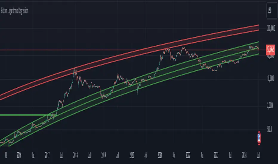
Bitcoin Logarithmic Regression BandsOverview
This indicator displays logarithmic regression bands for Bitcoin. Logarithmic regression is a statistical method used to model data where growth slows down over time. I initially created these bands in 2019 using a spreadsheet, and later coded them in TradingView in 2021. Over time, the bands proved effective at capturing Bitcoin's bull market peaks and bear market lows. In 2024, I decided to share this indicator because I believe these logarithmic regression bands offer the best fit for the Bitcoin chart.
How It Works
The logarithmic regression lines are fitted to the Bitcoin (BTCUSD) chart using two key factors: the 'a' factor (slope) and the 'b' factor (intercept). The two lines in the upper and lower bands share the same 'a' factor, but I adjust the 'b' factor by 0.2 to more accurately capture the bull market peaks and bear market lows. The formula for logaritmic regression is 10^((a * ln) - b).
How to Use the Logarithmic Regression Bands
1. Lower Band (Support Band):
The two lines in the lower band create a potential support area for Bitcoin’s price. Historically, Bitcoin’s price has always found its lows within this band during past market cycles. When the price is within the lower band, it suggests that Bitcoin is undervalued and could be set for a rebound.
2. Upper Band (Resistance Band):
The two lines in the upper band create a potential resistance area for Bitcoin’s price. Bitcoin has consistently reached its highs in this band during previous market cycles. If the price is within the upper band, it indicates that Bitcoin is overvalued, and a potential price correction may be imminent.
Use Cases
- Price Bottoming:
Bitcoin tends to bottom out at the lower band before entering a prolonged bull market or a period of sideways movement.
- Price Topping:
In reverse, Bitcoin tends to top out at the upper band before entering a bear market phase.
- Profitable Strategy:
Buying at the lower band and selling at the upper band can be a profitable trading strategy, as these bands often indicate key price levels for Bitcoin’s market cycles.

Bitcoin PivotFind [BTC Cycle Tops & Bottoms Finder]What is PivotFind?
PivotFind is a custom indicator designed to track 30+ data points of different nature (technical, sentiment, macro, on-chain), and across multiple timeframes (from 1D to 60D), to detect the market conditions that may indicate the formation of potential Cycle Tops and Bottoms .
PivotFind's goal is to help you navigate Bitcoin's price movements and key happenings over its approximately 4-year cycles to help you craft a mid-term investment plan focused on the larger swings, rather than the shorter-term fluctuations.
What Does PivotFind Show/Do?
Market Phase Assessment and Visualization:
- Uses color-coded backgrounds (green for bull, red for bear, yellow for trend reversal) to show the current (assessed) market phase. Note that the price line itself changes color to reinforce the current phase identification.
- Helps you understand if we're in a uptrend, downtrend, or potentially changing direction (reversal), often an open question for traders, with a mid-term horizon
Cycle Top and Bottom Warnings:
- Places red dots above the price line to warn of potential cycle peaks.
- Shows green dots below the price line to indicate possible cycle bottoms.
These markers appear when multiple indicators reach certain thresholds, which historically have often coincided with significant market pivots (from bull to bear, or viceversa). Clusters of tops and bottom warnings are expected to appear at truly pivotal moments.
Parabolic Growth Signals:
- Displays upward arrows when conditions suggest potential for the rapid price increases that historically anticipated blow-off tops
- These signals are based on a combination of technical indicators and market sentiment reaching certain thresholds.
Altcoin Season Indicators:
- Marks with white diamonds the conditions that have historically led to "altseasons" (i.e. Altcoins overperforming BTC's growth rate).
- Based on factors like Bitcoin dominance decrease and certain altcoin performance metrics.
Fibonacci Retracement Bands:
Plots long-term support and resistance zones based on Fibonacci retracement levels.
These bands are calculated from previous major market highs and lows and shed light on the nature of short-term retracements in the context of major trends.
Price Scenario
PivotFind also provides reference price levels for the upcoming halving cycle, including potential thresholds for increased market interest (retail FOMO), possible overvaluation, and theoretical cycle peak ranges. These projections are based on historical data and should be considered as points of reference rather than definitive predictions.
Comprehensive Data Tables:
Right-side Table: Shows current cycle stage, Bitcoin/Altcoin market dominance percentages, and evaluates key economic factors (like inflation and interest rates) for their potential impact.
Bottom Table: Displays real-time values of over 30 key indicators, including RSI, MVRV ratio, and Fear & Greed Index.
Alerts
PivotFind offers you the ability to set up custom alerts (via the standard TradingView alert functionality) or receive automated notifications for significant market events. Despite its sophisticated analysis, PivotFind is designed to be user-friendly, with pre-set parameters that don't require complex adjustments.
How Does It Work?
PivotFind analyzes over 30 different indicators across multiple timeframes (from 1 day to 60 days), grouped into four main categories:
1. Technical Analysis:
Uses standard indicators like RSI, Stochastic RSI, Williams %R, Elliot Oscillator, TDI, and mean reversion concepts.
Looks for divergences between price and multiple indicators (like OBV, MFI, CCI, RSI, SRSI, MACD and others) to spot potential reversals.
2. Market Sentiment:
Incorporates the Crypto Fear & Greed Index (0-100 scale).
Tracks social media trends and influencer follower counts as a gauge of public interest.
3. Macroeconomic Factors:
Monitors inflation rates, interest rates, US rate yields, and money supply (M2) figures.
Tracks the U.S. Dollar Index (DXY) and bond market health through ETFs like TLT and HYG.
4. On-Chain Analytics:
Analyzes MVRV (Market Value to Realized Value) ratio to spot potential over/undervaluation.
Examines NUPL (Net Unrealized Profit/Loss) and active Bitcoin addresses.
PivotFind analyzes these indicators collectively, looking for significant correlations and confluences, to provide a view of the market's position within the 4-year cycle and spot the conditions for potential Cycle tops and bottoms (cycle pivots).
Who Is This For?
PivotFind may be particularly useful for:
- Long-term investors looking to optimize entry and exit points within the 4-year cycle
- Individuals who want to understand mid-term trends without engaging in daily analysis of multiple charts (due to lack of time and/or financial knowledge)
- Bitcoin Holders and miners planning their decisions around critical market pivot points
It's less suitable for scalpers, day-traders or those focused on short-term price movements.
Value Proposition
PivotFind simplifies market analysis by bringing together a wide range of indicators and data sources across different timeframes. It uses built-in logic to interpret these inputs within the context of Bitcoin's cycles, giving users an efficient way to spot potential major market shifts. This all-in-one approach helps make sense of complex market conditions and supports more informed decision-making.
Since Bitcoin’s broader cycle strongly influences the entire crypto market, PivotFind can also be useful for investors who are focused on Altcoins, not just Bitcoin.
Important Note (Disclaimer)
Past performance, and patterns, do not guarantee future results. Therefore, PivotFind should be used as one of many tools in your analysis. While the indicator provides a multi-faceted and multi-timeframe analysis of factors historically correlated with pivotal price shifts, it cannot predict future prices with certainty. It's a tool to help inform your decisions, not make them for you. Always conduct your own research and remember that all investments, especially in cryptocurrencies, involve risk.
Recommended Settings
PivotFinds works best on the 1D INDEX:BTCUSD chart (dark-mode, logarithmic scale).
This indicator is not publicly available and requires special access.

Bitcoin Macro Trend Map [Ox_kali]
## Introduction
__________________________________________________________________________________
The “Bitcoin Macro Trend Map” script is designed to provide a comprehensive analysis of Bitcoin’s macroeconomic trends. By leveraging a unique combination of Bitcoin-specific macroeconomic indicators, this script helps traders identify potential market peaks and troughs with greater accuracy. It synthesizes data from multiple sources to offer a probabilistic view of market excesses, whether overbought or oversold conditions.
This script offers significant value for the following reasons:
1. Holistic Market Analysis : It integrates a diverse set of indicators that cover various aspects of the Bitcoin market, from investor sentiment and market liquidity to mining profitability and network health. This multi-faceted approach provides a more complete picture of the market than relying on a single indicator.
2. Customization and Flexibility : Users can customize the script to suit their specific trading strategies and preferences. The script offers configurable parameters for each indicator, allowing traders to adjust settings based on their analysis needs.
3. Visual Clarity : The script plots all indicators on a single chart with clear visual cues. This includes color-coded indicators and background changes based on market conditions, making it easy for traders to quickly interpret complex data.
4. Proven Indicators : The script utilizes well-established indicators like the EMA, NUPL, PUELL Multiple, and Hash Ribbons, which are widely recognized in the trading community for their effectiveness in predicting market movements.
5. A New Comprehensive Indicator : By integrating background color changes based on the aggregate signals of various indicators, this script essentially creates a new, comprehensive indicator tailored specifically for Bitcoin. This visual representation provides an immediate overview of market conditions, enhancing the ability to spot potential market reversals.
Optimal for use on timeframes ranging from 1 day to 1 week , the “Bitcoin Macro Trend Map” provides traders with actionable insights, enhancing their ability to make informed decisions in the highly volatile Bitcoin market. By combining these indicators, the script delivers a robust tool for identifying market extremes and potential reversal points.
## Key Indicators
__________________________________________________________________________________
Macroeconomic Data: The script combines several relevant macroeconomic indicators for Bitcoin, such as the 10-month EMA, M2 money supply, CVDD, Pi Cycle, NUPL, PUELL, MRVR Z-Scores, and Hash Ribbons (Full description bellow).
Open Source Sources: Most of the scripts used are sourced from open-source projects that I have modified to meet the specific needs of this script.
Recommended Timeframes: For optimal performance, it is recommended to use this script on timeframes ranging from 1 day to 1 week.
Objective: The primary goal is to provide a probabilistic solution to identify market excesses, whether overbought or oversold points.
## Originality and Purpose
__________________________________________________________________________________
This script stands out by integrating multiple macroeconomic indicators into a single comprehensive tool. Each indicator is carefully selected and customized to provide insights into different aspects of the Bitcoin market. By combining these indicators, the script offers a holistic view of market conditions, helping traders identify potential tops and bottoms with greater accuracy. This is the first version of the script, and additional macroeconomic indicators will be added in the future based on user feedback and other inputs.
## How It Works
__________________________________________________________________________________
The script works by plotting each macroeconomic indicator on a single chart, allowing users to visualize and interpret the data easily. Here’s a detailed look at how each indicator contributes to the analysis:
EMA 10 Monthly: Uses an exponential moving average over 10 monthly periods to signal bullish and bearish trends. This indicator helps identify long-term trends in the Bitcoin market by smoothing out price fluctuations to reveal the underlying trend direction.Moving Averages w/ 18 day/week/month.
Credit to @ryanman0
M2 Money Supply: Analyzes the evolution of global money supply, indicating market liquidity conditions. This indicator tracks the changes in the total amount of money available in the economy, which can impact Bitcoin’s value as a hedge against inflation or economic instability.
Credit to @dylanleclair
CVDD (Cumulative Value Days Destroyed): An indicator based on the cumulative value of days destroyed, useful for identifying market turning points. This metric helps assess the Bitcoin market’s health by evaluating the age and value of coins that are moved, indicating potential shifts in market sentiment.
Credit to @Da_Prof
Pi Cycle: Uses simple and exponential moving averages to detect potential sell points. This indicator aims to identify cyclical peaks in Bitcoin’s price, providing signals for potential market tops.
Credit to @NoCreditsLeft
NUPL (Net Unrealized Profit/Loss): Measures investors’ unrealized profit or loss to signal extreme market levels. This indicator shows the net profit or loss of Bitcoin holders as a percentage of the market cap, helping to identify periods of significant market optimism or pessimism.
Credit to @Da_Prof
PUELL Multiple: Assesses mining profitability relative to historical averages to indicate buying or selling opportunities. This indicator compares the daily issuance value of Bitcoin to its yearly average, providing insights into when the market is overbought or oversold based on miner behavior.
Credit to @Da_Prof
MRVR Z-Scores: Compares market value to realized value to identify overbought or oversold conditions. This metric helps gauge the overall market sentiment by comparing Bitcoin’s market value to its realized value, identifying potential reversal points.
Credit to @Pinnacle_Investor
Hash Ribbons: Uses hash rate variations to signal buying opportunities based on miner capitulation and recovery. This indicator tracks the health of the Bitcoin network by analyzing hash rate trends, helping to identify periods of miner capitulation and subsequent recoveries as potential buying opportunities.
Credit to @ROBO_Trading
## Indicator Visualization and Interpretation
__________________________________________________________________________________
For each horizontal line representing an indicator, a legend is displayed on the right side of the chart. If the conditions are positive for an indicator, it will turn green, indicating the end of a bearish trend. Conversely, if the conditions are negative, the indicator will turn red, signaling the end of a bullish trend.
The background color of the chart changes based on the average of green or red indicators. This parameter is configurable, allowing adjustment of the threshold at which the background color changes, providing a clear visual indication of overall market conditions.
## Script Parameters
__________________________________________________________________________________
The script includes several configurable parameters to customize the display and behavior of the indicators:
Color Style:
Normal: Default colors.
Modern: Modern color style.
Monochrome: Monochrome style.
User: User-customized colors.
Custom color settings for up trends (Up Trend Color), down trends (Down Trend Color), and NaN (NaN Color)
Background Color Thresholds:
Thresholds: Settings to define the thresholds for background color change.
Low/High Red Threshold: Low and high thresholds for bearish trends.
Low/High Green Threshold: Low and high thresholds for bullish trends.
Indicator Display:
Options to show or hide specific indicators such as EMA 10 Monthly, CVDD, Pi Cycle, M2 Money, NUPL, PUELL, MRVR Z-Scores, and Hash Ribbons.
Specific Indicator Settings:
EMA 10 Monthly: Options to customize the period for the exponential moving average calculation.
M2 Money: Aggregation of global money supply data.
CVDD: Adjustments for value normalization.
Pi Cycle: Settings for simple and exponential moving averages.
NUPL: Thresholds for unrealized profit/loss values.
PUELL: Adjustments for mining profitability multiples.
MRVR Z-Scores: Settings for overbought/oversold values.
Hash Ribbons: Options for hash rate moving averages and capitulation/recovery signals.
## Conclusion
__________________________________________________________________________________
The “Bitcoin Macro Trend Map” by Ox_kali is a tool designed to analyze the Bitcoin market. By combining several macroeconomic indicators, this script helps identify market peaks and troughs. It is recommended to use it on timeframes from 1 day to 1 week for optimal trend analysis. The scripts used are sourced from open-source projects, modified to suit the specific needs of this analysis.
## Notes
__________________________________________________________________________________
This is the first version of the script and it is still in development. More indicators will likely be added in the future. Feedback and comments are welcome to improve this tool.
## Disclaimer:
__________________________________________________________________________________
Please note that the Open Interest liquidation map is not a guarantee of future market performance and should be used in conjunction with proper risk management. Always ensure that you have a thorough understanding of the indicator’s methodology and its limitations before making any investment decisions. Additionally, past performance is not indicative of future results.

Bitcoin Logarithmic Regression
This indicator displays logarithmic regression channels for Bitcoin. A logarithmic regression is a function that increases or decreases rapidly at first, but then steadily slows as time moves. The original version of this indicator/model was created as an open source script by a user called Owain but is not available on TradingView anymore. So I decided to update the code to the latest version of pinescript and fine tune some of the parameters.
How to read and use the logarithmic regression:
There are 3 different regression lines or channels visible:
Green Channel: These lines represent different levels of support derived from the logarithmic regression model.
Purpose: The green channel is used to identify potential support levels where the price might find a bottom or bounce back upwards.
Interpretation:
If the price is approaching or touching the lower green lines, it might indicate a buying opportunity or an area where the price is considered undervalued.
------------------------------------------------
Red Channel: These lines represent different levels of resistance derived from the logarithmic regression model.
Purpose: The red channel is used to identify potential resistance levels where the price might encounter selling pressure or face difficulty moving higher.
Interpretation:
If the price is approaching or touching the upper red lines, it might indicate a selling opportunity or an area where the price is considered overvalued.
-------------------------------------------------
Purple Line This line represents to so-called "fair price" of Bitcoin according to the regression model.
Purpose: The purple line can be used to identify if the current price of Bitcoin is under- or overvalued.
Interpretation: A simple interpretation here would be that over time the price will have the tendency to always return to its "fair price", so starting to DCA more when price is under the line and less when it is over the line could be a suitable investment strategy.
----------------------------------------------------
Practical Application:
You can use this regression channel to build your own, long term, trading strategies. Notice how Bitcoin seems to always act in kind of the same 4 year cycle:
- Price likes to trade around the purple line at the time of the halvings
- After the halvings we see an extended sideways range for up to 300 days
- After the sideways range Bitcoin goes into a bull market frenzy (the area between the green and red channel)
- The price tops out at the upper red channel and then enters a prolonged bear market.
Buying around the purple line or lower line of the green channel and selling once the price reaches the red channel can be a suitable and very profitable strategy.
Bitcoin Destiny Line Model v1.1The Bitcoin Destiny Line Model
Table of Contents
1. Overview
2. Analytical and Technical Techniques Employed
3. Objectives of the Bitcoin Destiny Line Model
4. Key Technical Components and Functionalities
4.1. Bitcoin Destiny Line and Heatmap
4.2. Halving Cycles Markers
4.3. Dynamic Repricing Rails with Diminishing Volatility Adjustment
4.4. Seasonal Dynamics
4.5. Support and Resistance Zones
4.6. Market Action Indicators
4.7. Cycle Projections
4.8. Heatmap Only
5. Settings
6. Different Strategies to Utilize the Model
6.1. Value-Based Entry Strategy
6.2. Long-Term Position Strategy
6.3. Scaling Out Strategy
6.4. Portfolio Rebalancing Strategy
6.5. Bear Market Strategy
6.6. Short-Term Trading Strategy
7. Recommendations and Disclosures
1. Overview
The Bitcoin Destiny Line Model is a technical analysis toolset designed exclusively for Bitcoin. It integrates a comprehensive suite of analytical methodologies to provide deep insights into Bitcoin's market dynamics focusing on long-term investment strategies.
By analyzing historical data through various technical frameworks, the model helps investors gain insight into the current market structure, cycle dynamics, direction, and trend of Bitcoin, assisting investors and traders with data-driven decision-making.
2. Analytical and Technical Techniques Employed
The model integrates a range of analytical techniques:
Cycle Analysis - Centers on the Bitcoin halving event to anticipate phases within the Bitcoin cycle.
Logarithmic Regression Analysis - Calculates the logarithmic growth of Bitcoin over time.
Standard Deviation - Measures how significantly the price action differs from the long-term logarithmic trend.
Fibonacci Analysis - Identifies support and resistance levels.
Multi-Timeframe Momentum - Analyzes overbought or oversold conditions across multiple periods.
Trendlines - Draws trendlines from expected cycle lows to expected cycle highs extending logarithmic and deviation lines into the future as projection lines.
3. Objectives of the Bitcoin Destiny Line Model
The model is crafted to deliver an empirical framework for Bitcoin investing:
Bitcoin Market Structure - Offers insights into Bitcoin’s market structure.
Identify Value Opportunities and Risk Areas - Pinpoints potential value-entry opportunities and recognizes when the market is over-extended.
Leverage Market Cycles - Utilizes knowledge of Bitcoin’s seasonal dynamics and halving cycles to inform investment strategies.
Mitigate Downside Risk - Provides indicators for potential market corrections, aiding in risk management and avoidance of buying at peak prices.
4. Key Technical Components and Functionalities
4.1. Bitcoin Destiny Line and Heatmap
The cycle low to cycle high line with a risk-based color-coded heatmap serves as a central reference for Bitcoin’s price trajectory.
It emphasizes the long-term trend indicating areas of value in cool colors and areas of risk in warm colors.
4.2. Halving Cycles Markers
Bitcoin halving events are marked on the chart with vertical lines forming anchor points for cycle analysis.
4.3. Dynamic Repricing Rails with Diminishing Volatility Adjustment
Repricing rails based on the long-term logarithmic trend highlight the rails on which Bitcoin's price will reprice up or down.
Adjusts to the diminishing volatility of the asset over time as it matures.
4.4. Seasonal Dynamics
Integrates Bitcoin's inherent seasonal trends to provide additional context for market conditions aligning with broader market analysis.
Understanding Bitcoin’s seasons:
Spring Awakening - The initial recovery phase where the market begins to rebound from a bear market showing early signs of improvement. This is an ideal time for cautious optimism. Investors should consider gradually increasing their positions in Bitcoin, focusing on accumulation as confidence in market recovery grows.
Blossom Boom - A market bottom has been confirmed by now and market interest continues to pick up ahead of the Bitcoin halving. This typically presents a great opportunity for investors to position themselves advantageously ahead of expected price movements. It’s a good time to review and adjust portfolios to align with anticipated trends.
Midsummer Momentum - This phase follows the Bitcoin halving, characterized by a sideways to upward price trend often supported by heightened interest and media coverage. It represents potentially the last opportunity in the cycle for investors to purchase Bitcoin at lower price levels unlikely to be seen again. Investors should closely monitor the market for value buying opportunities to bolster their long-term investment strategies.
Rocket Rise - A phase where Bitcoin prices are likely to surge dramatically driven by a mix of Fear of Missing Out (FOMO) among new investors and widespread media hype. The strategy here is twofold: long-term holders should hold steady to reap maximum gains whereas more speculative investors might look to capitalize on the volatility by taking profits at optimal moments before a potential correction.
Winter Whispers - Following a bull run, the market begins to cool, marked by some investors taking profits and consequently increasing price fluctuations and volatility. During this time, investors should remain vigilant, tightening stop-loss orders to safeguard gains. This phase may be suitable for those looking to liquidate a portion of their long-term investments. However, for an investor to be selling the majority of their Bitcoin holdings is generally not advisable as it could preclude benefiting from potential future appreciations.
Deep Freeze - The market enters a bearish phase with significant price declines and market corrections. It's a period of consolidation and resetting of price levels. The end of this stage could typically be seen as a buying opportunity for the long-term investor. Accumulating Bitcoin during this phase can be advantageous as prices are lower and provide a foundation for significant growth in the next cycle.
4.5. Support and Resistance Zones
Calculates key levels that inform stop-loss placements and trading size decisions enhancing trading strategy around the Bitcoin Destiny Line.
4.6. Market Action Indicators
Suggests potential trading actions for different market phases aiding traders in identifying investment/trading opportunities.
Risk Indicator - Signals when prices are extremely over-extended helping to avoid entries during potential peak valuations.
4.7. Cycle Projections
Extends repricing levels into the future providing a visual forecast of expected price movements and enhancing strategic planning capabilities.
Cycle-High Price Projection Range - Provides a probabilistic range for upcoming cycle peaks based on historical trends and current market analysis.
4.8. Heatmap Only
It is also possible to plot the heatmap only as a background or as a bar in a second indicator.
4.9. Complete Visual View
A complete view of all key elements switched on the model.
5. Settings
Users can select to only show specific elements or all elements of the model.
They can set the sensitivity of some of the model elements and adjust certain view settings.
6. Different Strategies to Utilize the Model
The following strategies are enabled by the Bitcoin Destiny Line model:
6.1. Value-Based Entry Strategy
Investors can optimize their investment strategy by deploying investable cash either as a lump sum or on a dollar-cost averaging basis upon the display of a value indicator (Up-Triangles) which signals the highest probability for value entries.
6.2. Long-Term Position Strategy
As an alternative, investors may prefer to continue deploying investable funds while cooler colors (green or blue) are displayed on the value map, indicating favorable conditions for long-term positions.
6.3. Scaling Out Strategy
Investors may choose to scale out some of their investment upon the display of a risk indicator (circles) reducing exposure to potential downturns.
6.4. Portfolio Rebalancing Strategy
A sound strategy can also be to follow a portfolio rebalancing approach by deploying available investable cash upon the display of a value indicator. Rebalance the portfolio to maintain 25% in cash upon the display of a risk indicator. Adjust this ratio as subsequent risk indicators are triggered, deploying available cash upon future value signals.
6.5. Bear Market Strategy
In a bear market, traders may seek short positions upon the display of the Continued Downward Momentum indicator (Down Triangles) capitalizing on declining market trends.
6.6. Short-Term Trading Strategy
Traders can use hourly or 4-hourly data along with the daily Price Rails and Heatmap Bar for short-term positions. They may incorporate other preferred indicators such as RSI for entry/exit decisions.
7. Recommendations and Disclosures
Investors are recommended to take a prudent approach. It is not recommended for investors to scale out completely or significantly reduce the largest portion of their long-term Bitcoin positions in hopes of buying back at lower prices unless they have a compelling reason to do so. The future market conditions may not replicate past opportunities making this strategy uncertain. However, scaling out a smaller portion such as 25% can offer a high potential for an asymmetric risk-reward ratio. This approach is likely to provide a higher risk-adjusted return compared to traditional dollar-cost averaging or random lump sum adjustments.
The Bitcoin Destiny Line Model leverages 13.5 years of available price data across four complete Bitcoin market cycles.
While each additional cycle enriches the model's robustness and enhances the reliability of its forecasts, it is crucial for users to understand that historical trends are indicative of probable future directions and potential price ranges. Users should be cognizant that past performance is not a definitive predictor of future results and should not be the sole basis for investment decisions.

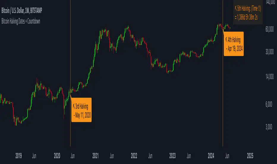
Bitcoin Halving Dates + CountdownBitcoin Halving Dates + Countdown Indicator
This unique TradingView Indicator is designed to provide traders and cryptocurrency enthusiasts with critical information about the Bitcoin halving events directly on their charts. Bitcoin halving is a significant event that reduces the reward for mining Bitcoin transactions by half, an occurrence that happens approximately every four years and is known to impact Bitcoin's price significantly.
Features:
▪ Halving Date Lines: The indicator plots vertical lines on the chart at the dates of past and the upcoming Bitcoin halving events.
Customizable Appearance: Users can personalize the look of the indicator with options to change the color of the halving lines, label background, and text for better visibility against their chart theme.
▪ Halving Event Labels: Each halving event is marked with a label indicating its sequence (e.g., 1st Halving) and the exact date it occurred or is expected to occur.
Countdown to Next Halving: For the upcoming halving event, the indicator displays a countdown in days, hours, minutes, and seconds, helping users anticipate the event with precise timing.
▪ User-friendly Options: Toggle the visibility of labels for a cleaner chart appearance and customize color schemes to match personal preferences or chart themes.
Usage:
This indicator is invaluable for those looking to understand Bitcoin's historical halving events and their timing in relation to price movements. It's also perfect for preparing for the next halving event, as the countdown feature provides a clear and timely reminder.
Customization Options:
▪ Show Labels: Toggle on/off the visibility of halving event labels.
Line Color: Choose the color of the vertical lines marking each halving event.
Label Background Color & Text Color: Customize the background and text color of the labels for better readability.
▪ Countdown Label Colors: Separate customization options for the countdown label's background and text colors, allowing for clear visibility and distinction from other chart elements.
Enhance your chart with this indicator and trade with more context and anticipation towards the future of Bitcoin.
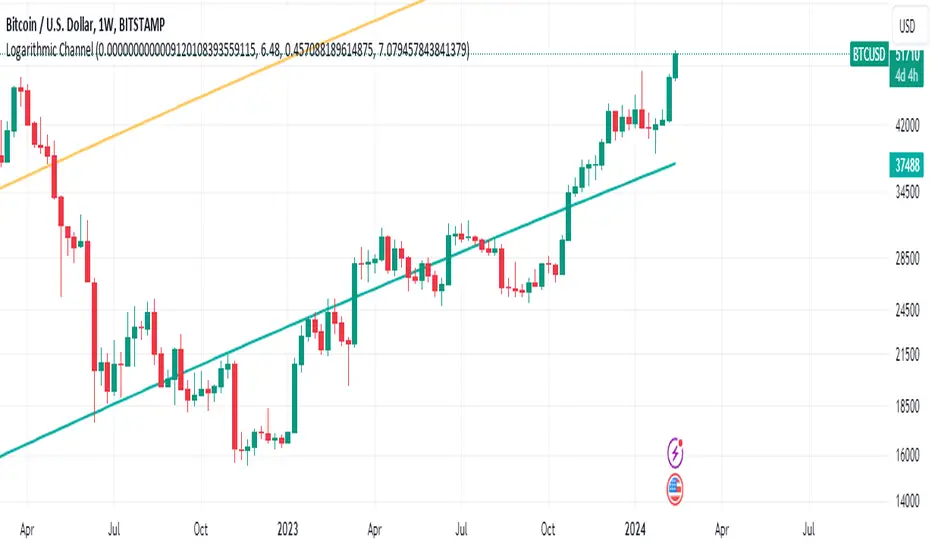
Bitcoin's Logarithmic ChannelLogarithmic growth is a reasonable way to describe the long term growth of bitcoin's market value: for a network that is experiencing growing adoption and is powered by an asset with a finite and disinflationary supply, it’s natural to expect a more explosive growth of its market capitalization early on, followed by diminishing returns as the network and the asset mature.
I used publicly available data to model the market capitalization of bitcoin, deriving thereform a set of three curves forming a logarithmic growth channel for the market capitalization of bitcoin. Using the time series for the circulating supply, we derive a logarithmic growth channel for the bitcoin price.
Model uses publicly available data from July 17, 2010 to December 31, 2022. Everything since the beginning of 2023 is a prediction.
Past performance is not a guarantee of future results.
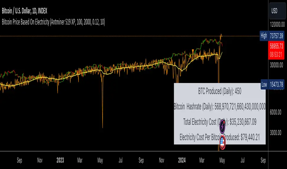
Bitcoin Price Based On ElectricityThis script Calculates the price of Bitcoin solely on the hashrate and the cost of electricity.
The calculation is quite conservative considering its based on the average cost of electricity globally and we are assuming that everyone is running the latest mining hardware, which is the most efficient and cost effective.
Under both of these assumptions the calculation for bitcoins price is almost identical to the price we are seeing now.
If we change the reward rate to 3.125 (Aprils reward amount) then the price of one bitcoin per cost of work will be around 100k.
I am sure I am missing some important numbers in this calculation, fees, start up costs etc. However, it is very interesting to see that the price of Bitcoin can be calculated almost perfectly based on the hashrate and cost of electricity.
PROOF OF WORK
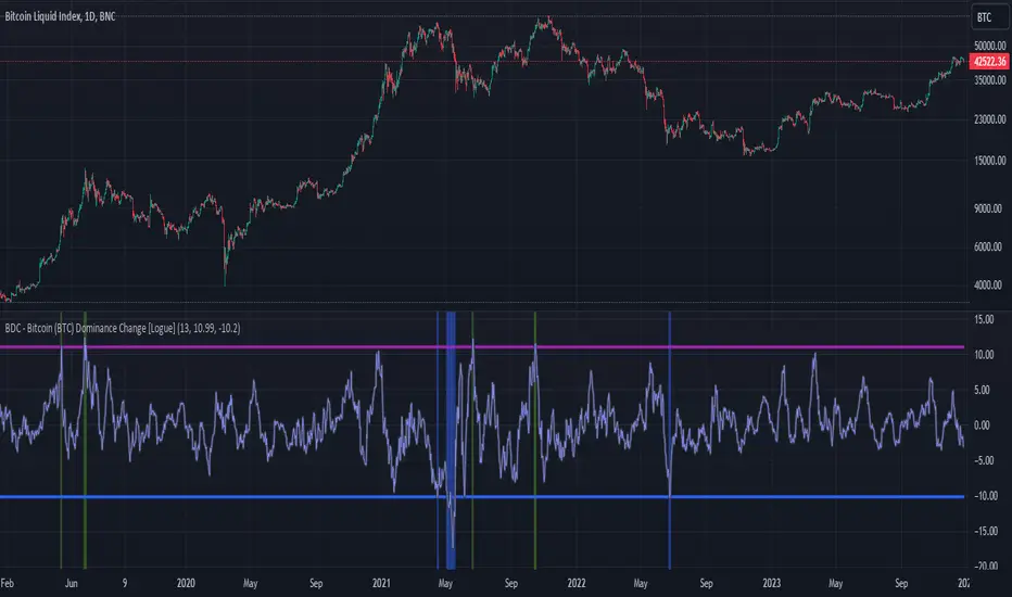
BDC - Bitcoin (BTC) Dominance Change [Logue]Bitcoin Dominance Change. Interesting things tend to happen when the Bitcoin dominance increases or decreases rapidly. Perhaps because there is overexuberance in the market in either BTC or the alts. In back testing, I found a rapid 13-day change in dominance indicates interesting switches in the BTC trends. Prior to 2019, the indicator doesn't work as well to signal trend shifts (i.e., local tops and bottoms) likely based on very few coins making up the crypto market.
The BTC dominance change is calculated as a percentage change of the daily dominance. You are able to change the upper bound, lower bound, and the period (daily) of the indicator to your own preferences. The indicator going above the upper bound or below the lower bound will trigger a different background color.
Use this indicator at your own risk. I make no claims as to its accuracy in forecasting future trend changes of Bitcoin.
Bitcoin Cycles IndicatorBitcoin Cycles Indicator
The "Bitcoin Cycles Indicator" is designed to provide insights into the current market cycle of Bitcoin. It utilizes a combination of market cap real and total volume transfer to generate a visual representation of the market cycle.
Indicator Phases:
Cycle Lows (Green): Indicates potential low points in the cycle.
Under Valued (Aqua): Represents phases where Bitcoin might be undervalued.
Fair Market Value (Purple): Reflects periods considered to be at fair market value.
Aggressively Valued (Orange): Marks phases where Bitcoin might be aggressively valued.
Over Valued (Red): Suggests potential overvaluation of Bitcoin in the cycle.
Bitcoin Cycles can identify periods of increased risk when transaction behavior on-chain is indicative of major cycle highs. It also identifies areas of value opportunity where on-chain transaction behavior signals major cycle lows.
Historically, Bitcoin has exhibited cyclical behavior roughly every four years, coinciding with significant events known as "halvings."
While the historical correlation between Bitcoin's cycles and halving events is compelling, market dynamics are subject to change. Traders and investors should approach the market with a comprehensive strategy, incorporating multiple indicators and risk management techniques to navigate Bitcoin's evolving landscape.
