Noro's Trend MAs Strategy v1.8Trade strategy which uses only 2 MA.
The slow MA (blue) is used for definition of a trend
The fast MA (red) is used for an entrance to the transaction
For:
- For H1
- For crypto/fiat or crypto/crypto
- Good for "BTC/USD", "ETH/USD", "ETH/BTC"
Recomended:
Long = true (if it is profitable as a result of backtests)
Short = true (if it is profitable as a result of backtests)
Stops = false
Stop, % = any
OHLC4 = any
Use Fast MA = true
Fast MA Period = 5
Slow MA Period = 21
Bars Q = (2 for "bitcoin/fiat" or 1 for "crypto/fiat" or 0 for "crypto/crypto")
In the new version 1.8
- The second PriceChannel is added
- Profit became more
- Losses became less
- The unnecessary types of MA are removed
ابحث في النصوص البرمجية عن "btc走势预测"

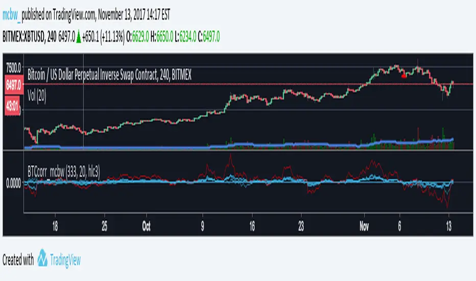
Bitcoin momentum correlation This is a pretty simple indicator, it measures the momentum of bitcoin as compared to usd,eur,eth,dash, and ltc, which you can see in all of the blue lines. If the red line is above zero then it means the overall value of btc is going up, opposite for down. The Ema_window controls how smooth the signal is. If you shorten the Ema_window parameter and open this on higher timeframe btc charts then the zero crossing gives pretty solid signals, despite being pretty choppy. A good way to interpret this is that if all the blue lines are moving in the same direction at once without disagreement, then the value of bitcoin has good momentum.
Mildly more technically:
Momentum is measured in the first derivative of an EMA for each ticker. To normalize the different values against each other they are all divided by their local maximums, which can be chosen in the parameter window, but shouldn't make a huge difference. All the checked values are then summed, as shown in the red line. To include a value into the red line simply keep it checked. Take a look at the script, it's kind of easy on the eyes.
It's pretty handy to look at, but doesn't seem too worthwhile to pursue much further. If someone wants much more out of the script then feel free to message me.
Remember rules #1 & #2
Don't lose money.
Happy trading
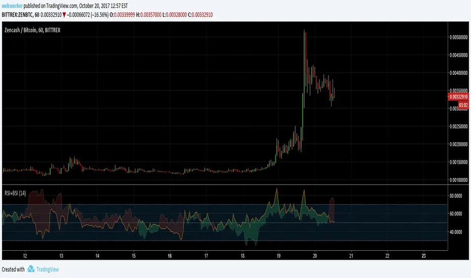
RSI+BSIThis script simply plots the current instruments RSI as well as Bitcoin's RSI from bitfinex. Helpful to identify when an alt is performing stronger than BTC or if BTC is dragging the alt down.
Volume Conversion IndicatorVolume Conversion Indicator
The volume conversion indicator is much like the in-built volume indicator. This particular volume indicator allows you to find out how much of something has been traded in a given timeframe.
This is done by multiplying volume by the average price at that point.
What does this mean?
Well, say, for example, you were watching DGB/BTC (DigiByte/Bitcoin). Instead of the volume being displayed in the amount of DGB traded, the amount of BTC traded is displayed instead.
Feel free to comment... Hope this helps :D

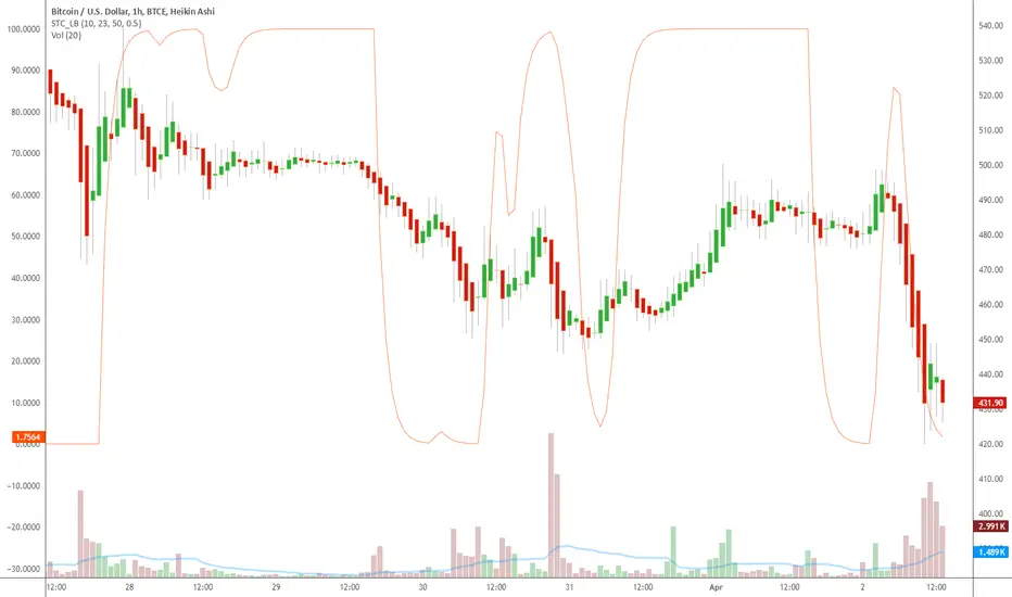
Indicator: Schaff Trend Cycle (STC)Another new indicator for TV community :)
STC detects up and down trends long before the MACD. It does this by using the same exponential moving averages (EMAs), but adds a cycle component to factor instrument cycle trends. STC gives more accuracy and reliability than the MACD.
More info: www.investopedia.com
Feel free to "Make mine" this chart and use the indicator in your charts. Appreciate any feedback on how effective this is for your instrument (I have tested this only with BTC).
For people trading BTC:
-------------------------------
Try 3/10 or 9/30 for MACD (fastLength/slowLength). They seem to catch the cycles better than the defaults. :)
Helix Protocol 7HELIX PROTOCOL 7
Overview
Helix Protocol 7 is an advanced trend-adaptive signal engine that dynamically adjusts its buy/sell thresholds based on real-time market regime detection. Unlike static indicators that use fixed overbought/oversold levels, Helix 7 recognizes that optimal entry and exit points shift dramatically depending on whether the market is trending strongly, ranging, or reversing.
The indicator fuses multiple analytical frameworks—momentum oscillators, trend strength metrics, volatility analysis, volume confirmation, and price structure—into a unified signal system that adapts to changing market conditions in real-time.
Core Philosophy
"Don't fight the trend—adapt to it."
In a strong uptrend, you want to buy dips early (before extreme oversold) and let winners run longer
In a downtrend, you want to sell bounces quickly and only buy true capitulation
In a neutral/ranging market, standard overbought/oversold levels apply
Helix Protocol 7 automatically detects which regime you're in and applies the appropriate thresholds.
Key Features
🔄 Trend-Adaptive Signal Thresholds
The indicator classifies markets into four states and adjusts Fisher Transform and RSI thresholds accordingly:
Trend StateDetection CriteriaBUY TriggersSELL TriggersSTRONG UPTRENDADX rising, ADX > 25, +DI > -DIFisher < 1.0, RSI < 50Fisher > 2.5, RSI > 70STRONG DOWNTRENDADX rising, ADX > 25, -DI > +DIFisher < -2.5, RSI < 25Fisher > 1.5, RSI > 60WEAK DOWNTRENDADX falling, -DI > +DIFisher < -2.5, RSI < 25Fisher > 1.5, RSI > 60NEUTRALDefault fallbackFisher < -2.0, RSI < 30Fisher > 2.0, RSI > 65
📊 Dynamic Envelope Bands
Adaptive bands that expand and contract based on:
ATR (Average True Range) - Base volatility measure
ADX (Trend Strength) - Bands widen in strong trends
Chaikin Oscillator - Volume-weighted band adjustment
🎯 Multi-Trigger Signal System
Signals can fire from multiple sources:
Trend-Based Signals - Fisher + RSI thresholds met for current regime
Band Touch Signals - Price touches upper/lower band (support/resistance)
EXTREME Signals - Price penetrates band by significant amount (bypasses cooldown)
⚡ Extreme Move Detection
When price makes an explosive move that penetrates the band by more than 30% of ATR (configurable), the signal fires with EXTREME priority and bypasses the normal cooldown period. This ensures you never miss major reversal opportunities.
📈 GXS Scoring System
A proprietary multi-factor scoring system (-1.0 to +1.0) that weighs:
Trend Strength (30%) - ADX direction and magnitude
Momentum (25%) - RSI, MACD, Stochastic, CCI, ROC consensus
Volume (20%) - OBV trend and volume surge detection
Price Structure (15%) - Band position and volatility percentile
Price Action (10%) - Bullish/bearish candle ratio
🔀 RSI Divergence Detection
Automatically detects and displays:
Regular Bullish Divergence - Price lower low + RSI higher low (reversal up)
Regular Bearish Divergence - Price higher high + RSI lower high (reversal down)
Hidden Bullish Divergence - Trend continuation signal (uptrend)
Hidden Bearish Divergence - Trend continuation signal (downtrend)
📉 BBWP Volatility Meter
Bollinger Band Width Percentile measures current volatility relative to historical norms:
LOW (< 30%) - Volatility compression, breakout imminent
MEDIUM (30-70%) - Normal market conditions
HIGH (> 70%) - Extended volatility, potential exhaustion
Visual Components
Money Line
A dynamic centerline (Linear Regression or Weighted EMA) colored by slope:
🟢 Green - Rising (bullish momentum)
🔴 Red - Falling (bearish momentum)
🟡 Yellow - Flat (consolidation)
Envelope Cloud
Shaded region between upper and lower bands, colored by Money Line slope direction for instant trend visualization.
Signal Labels
Clear entry/exit labels showing:
Price level
Trigger type (UPTREND DIP, CAPITULATION, BAND TOUCH, EXTREME, etc.)
Color coding (Green=Buy, Red=Sell, Lime=Extreme Buy, Fuchsia=Extreme Sell)
ADX Trend Bar
Bottom indicator showing trend state:
🟢 Lime - Strong Uptrend
🔴 Red - Downtrend
🟠 Orange - Weak/Transitional (ADX 15-24)
⚪ White - Ranging (ADX < 15)
🔵 Blue - Strong trend, neutral direction
Info Panel
Real-time dashboard displaying:
Current trend state
GXS Score
Active divergences
Volatility level (BBWP)
ADX value and direction
DI Spread
Fisher Transform value
RSI value
Context-sensitive BUY/SELL thresholds for current regime
Alert System
JSON Webhook Alerts (Bot-Ready)
json{
"action": "BUY",
"symbol": "BTC/USDT",
"price": "93500.00",
"trigger": "EXTREME",
"rsi": "28.5",
"fisher": "-2.31",
"adx": "32.4",
"trend_state": "STRONG DOWN"
}
Available Alert Conditions
Buy Signal / Sell Signal
Lower Band Touch / Upper Band Touch
EXTREME Lower Band / EXTREME Upper Band
Strong Uptrend Started
Downtrend Started
Neutral Trend Started
Trend State Change
Recommended Settings
Scalping (1m-5m)
Signal Cooldown: 3-5 bars
Extreme Penetration: 0.2 (more sensitive)
ADX Length: 10-12
Swing Trading (15m-4H)
Signal Cooldown: 5-8 bars
Extreme Penetration: 0.3 (default)
ADX Length: 14 (default)
Position Trading (Daily+)
Signal Cooldown: 8-12 bars
Extreme Penetration: 0.4-0.5 (less sensitive)
ADX Length: 14-20
Input Parameters
Core Settings
Money Line Type (Linear Regression / Weighted EMA)
Money Line Length
RSI Period
Fisher Period
Dynamic Bands
ATR Period & Multiplier
Adaptive Bands toggle
Chaikin Weight
Extreme Band Penetration threshold
Trend Detection
ADX Length & Slope Lookback
Strong Trend ADX Threshold
DI Spread for Neutral detection
Signal Thresholds (by Trend State)
Fully customizable Fisher/RSI/ADX levels for each regime
Separate BUY and SELL parameters
Display Options
Toggle bands, cloud, labels, panels
Cooldown period
Debug panel for troubleshooting
Best Practices
Confirm with price action - Signals are high-probability setups, not guarantees
Respect the trend state - The panel shows current thresholds for a reason
Watch for EXTREME signals - These indicate significant reversals
Use divergences as confluence - Especially powerful at band touches
Monitor volatility - Low BBWP often precedes big moves
Version: 7.0
Author: ralis24

YM Ultimate SNIPER v7# YM Ultimate SNIPER v7 - Documentation & Trading Guide
## 🎯 INTRABAR EDITION | Order Blocks + Liquidity Sweeps + IFVG + INTRABAR ANALYSIS
**TARGET: 3-7 High-Confluence Trades per Day**
**Philosophy: "Zones That Matter" + "See Inside The Candle"**
---
## ⚡ WHAT'S NEW IN v7
### Major Additions: INTRABAR ANALYSIS ENGINE
| Feature | Description | Edge It Provides |
|---------|-------------|------------------|
| **Intrabar Delta** | REAL buy/sell pressure from lower TF | Far more accurate than estimated delta |
| **Intrabar Momentum** | Direction consistency within bar | See if candle formed through conviction |
| **Absorption Detection** | High vol + low price movement | Spot institutional accumulation/distribution |
| **Internal Sweeps** | Stop hunts INSIDE candles | Catch hidden liquidity grabs |
| **Volume Distribution** | Where volume clustered in bar | TOP/MID/BOT volume clustering |
### The Intrabar Advantage
**Problem with Standard Analysis:**
- You only see the final OHLC of each candle
- Delta estimation is educated guesswork
- Internal price action is invisible
- Stop hunts inside bars go undetected
**Solution with Intrabar Analysis:**
- `request.security_lower_tf()` gives us the INSIDE view
- See actual lower timeframe candles within each bar
- Calculate TRUE delta from actual price direction
- Detect sweeps and reversals hidden from current timeframe
---
## 🔬 INTRABAR ANALYSIS DEEP DIVE
### How It Works
When you're on a 5-minute chart, intrabar analysis requests 1-minute data within each 5-minute bar. This gives us 5 sub-candles to analyze within each parent candle.
```
5-MIN CANDLE (What you normally see):
┌────────────────────────────────┐
│ │
│ OPEN ──────── CLOSE │
│ │
└────────────────────────────────┘
INTRABAR VIEW (What v7 sees):
┌────────────────────────────────┐
│ 🕐1 🕐2 🕐3 🕐4 🕐5 │
│ ▲ ▼ ▲ ▲ ▲ │
│ │ │ │ │ │ │
│ Each 1-min candle analyzed │
└────────────────────────────────┘
```
### Intrabar Delta (IB Delta)
**What It Is:**
Real buy/sell pressure calculated from actual lower timeframe candle directions.
**Why It's Better:**
- Standard delta: Estimated from close position within bar
- Intrabar delta: Calculated from 5+ actual candles with known direction
**Calculation:**
```
For each intrabar candle:
├── If bullish (close > open): More weight to buy volume
├── If bearish (close < open): More weight to sell volume
├── Volume distributed by close position within each micro-candle
└── Summed across all intrabar candles = TRUE DELTA
```
**Grades:**
| IB Delta % | Grade | Meaning |
|------------|-------|---------|
| 78%+ | 🔥 EXTREME | One side has overwhelming control |
| 70-77% | ✓✓ STRONG | Clear directional bias |
| 62-69% | ✓ DOMINANT | Healthy dominance |
| <62% | — NEUTRAL | Mixed/uncertain |
---
### Intrabar Momentum (IB Momentum)
**What It Is:**
The percentage of intrabar candles moving in the same direction.
**Why It Matters:**
A bullish candle could form through:
1. **High momentum:** 4 of 5 sub-candles bullish = Strong conviction
2. **Low momentum:** 2 bullish, 2 bearish, 1 bullish = Choppy formation
**Calculation:**
```
IB Momentum = max(bullish_count, bearish_count) / total_intrabar_candles
Example (5-min bar with 1-min intrabar):
├── 1st minute: Bullish ✓
├── 2nd minute: Bullish ✓
├── 3rd minute: Bearish ✗
├── 4th minute: Bullish ✓
├── 5th minute: Bullish ✓
└── IB Momentum = 4/5 = 80% BULLISH
```
**Thresholds:**
| IB Momentum % | Classification | Signal Quality |
|---------------|----------------|----------------|
| 75%+ | 🔥 STRONG | Very high conviction |
| 60-74% | ✓ CONFIRMED | Good directional bias |
| <60% | MIXED | Choppy, low conviction |
---
### Absorption Detection
**What It Is:**
Institutional accumulation/distribution signature - high volume with little price movement.
**The Theory:**
When institutions accumulate (buy), they absorb selling without moving price much:
- Retail sells → Institution buys at limit prices
- Volume spikes but price stays flat
- Once accumulation complete → price explodes up
**Detection Logic:**
```
ABSORPTION = High Volume + Low Price Movement + Volume Clustering
Conditions:
├── Volume per point > 1.5x average
├── Price movement < 60% of average range
├── Volume clusters in one zone (TOP/MID/BOT)
└── Cluster percentage >= 65% threshold
```
**Direction:**
- **BULL ABS:** Volume clustered at BOT + net buy delta = Buying at lows
- **BEAR ABS:** Volume clustered at TOP + net sell delta = Selling at highs
**Visual:** ✕ marker below (bull) or above (bear) the candle
---
### Internal Sweeps (Hidden Liquidity Grabs)
**What It Is:**
Stop hunts that happen INSIDE a candle - invisible on current timeframe.
**The Setup:**
```
INTERNAL BULLISH SWEEP:
┌─────────────────────────────────┐
│ │
│ First Half: Second Half: │
│ ▲▼▲▼ ▲▲▲ │
│ Forms lows Reverses UP │
│ ↓ ↑ │
│ SWEEP REJECTION │
└─────────────────────────────────┘
= Hidden liquidity grab at lows, bullish
```
**Detection:**
```
Internal Bull Sweep:
├── Early intrabar candles form a low
├── Later intrabar candles sweep below that low
├── Final intrabar candles close back above
├── Parent candle closes green
└── = Hidden sweep, bullish reversal
Internal Bear Sweep:
├── Early intrabar candles form a high
├── Later intrabar candles sweep above that high
├── Final intrabar candles close back below
├── Parent candle closes red
└── = Hidden sweep, bearish reversal
```
**Visual:** "iS" marker (intrabar Sweep) on the candle
---
### Volume Distribution
**What It Is:**
Where volume clustered within the parent candle - TOP, MID, or BOT third.
**Why It Matters:**
- **BOT clustering + bullish delta:** Institutions buying at lows (bullish)
- **TOP clustering + bearish delta:** Institutions selling at highs (bearish)
- **MID clustering:** Balanced/uncertain
**Calculation:**
```
Divide parent candle into 3 zones:
├── TOP third: high - (range/3)
├── MID third: middle zone
└── BOT third: low + (range/3)
For each intrabar candle:
├── Calculate midpoint
├── Assign volume to TOP/MID/BOT based on midpoint
└── Sum volumes by zone
```
---
## 📊 ENHANCED CONFLUENCE SCORING v7
### Score Components (Max ~14, normalized to 10)
| Factor | Points | Condition |
|--------|--------|-----------|
| **Tier** | 1-3 | B=1, A=2, S=3 |
| **FVG Zone** | +1.5 | Price in quality FVG |
| **Order Block** | +1.5 | Price in OB |
| **IFVG** | +1.0 | Price in Inverse FVG |
| **Strong Volume** | +1.0 | Volume ≥ 2x average |
| **Extreme Volume** | +0.5 | Volume ≥ 2.5x average |
| **Strong Delta** | +1.0 | Delta ≥ 70% |
| **Extreme Delta** | +0.5 | Delta ≥ 78% |
| **CVD Momentum** | +0.5-1.0 | CVD trending with signal |
| **Liquidity Sweep** | +1.5 | Recent sweep confirms direction |
| **IB Delta Confirm** | +0.9-1.5 | Intrabar delta matches direction |
| **IB Momentum** | +0.5-1.0 | Consistent intrabar direction |
| **IB Absorption** | +1.0 | Absorption detected matching direction |
| **IB Internal Sweep** | +1.0 | Hidden sweep confirms direction |
| **Volume Cluster** | +0.5 | Volume at favorable zone (BOT for bull) |
### Intrabar Confluence Breakdown
```
INTRABAR CONFLUENCE ADDITIONS:
IB Delta Confirmation:
├── Strong (70%+) + matching direction = +1.5 pts
├── Dominant (62%+) + matching direction = +0.9 pts
└── Not matching = +0 pts
IB Momentum:
├── Strong (75%+) + matching direction = +1.0 pts
├── Confirmed (60%+) + matching direction = +0.5 pts
└── Mixed/not matching = +0 pts
IB Absorption:
├── Bull absorption for LONG = +1.0 pts
├── Bear absorption for SHORT = +1.0 pts
└── No absorption or wrong direction = +0 pts
IB Internal Sweep:
├── Bull internal sweep for LONG = +1.0 pts
├── Bear internal sweep for SHORT = +1.0 pts
└── No internal sweep = +0 pts
Volume Cluster:
├── BOT cluster for LONG = +0.5 pts
├── TOP cluster for SHORT = +0.5 pts
└── MID cluster or wrong zone = +0 pts
```
---
## 🎯 IDEAL SETUPS v7 (HIGHEST WIN RATE)
### Setup 1: Absorption + Zone + Tier (NEW!)
```
Conditions:
├── Absorption detected (✕ marker)
├── Price at Order Block or FVG
├── Tier signal fires (S/A/B)
├── IB Delta confirms direction
├── Score: 8+ EXCELLENT
└── Win Rate: ~80-88%
WHY IT WORKS:
Absorption = institutions filling orders
Zone = known institutional level
Tier = significant move
= Triple institutional confirmation
```
### Setup 2: Internal Sweep + Zone
```
Conditions:
├── Internal sweep detected (iS marker)
├── At or near OB/FVG zone
├── IB momentum confirms (75%+)
├── Score: 7+ EXCELLENT
└── Win Rate: ~75-85%
WHY IT WORKS:
Hidden sweep = invisible stop hunt
Zone = where institutions defend
= Retail trapped, you enter with smart money
```
### Setup 3: Full Intrabar Alignment
```
Conditions:
├── IB Delta: Strong/Extreme (✓✓ or 🔥)
├── IB Momentum: Strong (🔥)
├── Volume Cluster: Favorable zone
├── Standard delta confirms
├── Score: 7+ EXCELLENT
└── Win Rate: ~75-82%
WHY IT WORKS:
All intrabar metrics align
= Maximum conviction in candle formation
= High probability continuation
```
### Setup 4: Standard v6 Setup (Still Valid)
```
Conditions:
├── Liquidity Sweep (LS↑ or LS↓)
├── Price at Order Block or FVG
├── Tier signal fires
├── Score: 7+ EXCELLENT
└── Win Rate: ~75-85%
```
---
## 📊 ENHANCED TABLE REFERENCE v7
The v7 table adds the **INTRABAR** section:
### CANDLE Section
| Row | What It Shows |
|-----|---------------|
| Points | Candle range in points + Tier (S/A/B/X) |
| Volume | Volume ratio + grade |
### ORDERFLOW Section
| Row | What It Shows |
|-----|---------------|
| Delta | Buy/Sell % + grade (now uses IB delta if available) |
| CVD | Direction + strength |
### INTRABAR Section (NEW!)
| Row | What It Shows |
|-----|---------------|
| IB Delta | TRUE intrabar buy/sell % + grade |
| IB Momentum | Direction consistency % + grade |
| Absorption | BULL ABS / BEAR ABS / — + 🎯 indicator |
### STRUCTURE Section
| Row | What It Shows |
|-----|---------------|
| FVG Zone | Current zone + quality score |
| Order Block | OB status |
| Liq Sweep | External LS↑/↓ or internal iS↑/↓ + indicator |
### SIGNAL Section
| Row | What It Shows |
|-----|---------------|
| Session | Current session + active indicator |
| SCORE | Numeric score /10 + classification |
---
## 🔧 INTRABAR SETTINGS GUIDE
### Intrabar Timeframe Selection
| Chart TF | Recommended Intrabar TF | Sub-candles |
|----------|------------------------|-------------|
| 1 min | 1 (same) | Limited data |
| 3 min | 1 | 3 candles |
| 5 min | 1 | 5 candles |
| 15 min | 1 or 5 | 15 or 3 candles |
| 30 min | 5 | 6 candles |
| 1 hour | 5 or 15 | 12 or 4 candles |
**Rule of Thumb:** Lower intrabar TF = more data = more accurate
### Parameter Tuning
**Absorption Threshold (Default: 65%)**
```
Lower (50-60%): More absorption signals, some false positives
Standard (65%): Balanced detection
Higher (70-80%): Fewer signals, higher quality
```
**Intrabar Momentum Min (Default: 60%)**
```
Lower (50-55%): Accepts mixed candles as directional
Standard (60%): Requires clear majority
Higher (70-80%): Requires strong conviction
```
**Intrabar Delta Weight (Default: 1.5)**
```
Lower (0.5-1.0): Intrabar delta contributes less to score
Standard (1.5): Full contribution
Higher (2.0-3.0): Intrabar delta heavily weighted
```
---
## ✅ ENTRY CHECKLIST v7
### Basic Requirements
- Signal present (S🎯/A🎯/B🎯 or Z)
- Score ≥ 4.5 (MEDIUM or better)
- Session active (🟢)
### Orderflow Confirmation
- Delta colored (not gray)
- CVD arrow matches direction
- Volume shows ✓ or better
### Intrabar Confirmation (NEW!)
- IB Delta matches direction (✓ or better)
- IB Momentum shows direction or strong (🔥)
- No conflicting absorption signal
### Structure Bonus
- In FVG Zone
- In Order Block
- Recent Liquidity Sweep
- Internal Sweep (iS)
- Absorption detected
- IFVG present
---
## 🚨 NEW ALERTS v7
### Intrabar-Specific Alerts
| Alert | What It Means | Priority |
|-------|---------------|----------|
| ⚡ INTRABAR BULL SWEEP | Hidden sweep lows inside candle | 🟠 HIGH |
| ⚡ INTRABAR BEAR SWEEP | Hidden sweep highs inside candle | 🟠 HIGH |
| 🎯 BULL ABSORPTION | Institutions accumulating | 🟠 HIGH |
| 🎯 BEAR ABSORPTION | Institutions distributing | 🟠 HIGH |
### Alert Priority Guide
| Alert | Priority | Action |
|-------|----------|--------|
| ⭐ EXCELLENT + ABSORPTION | 🔴 CRITICAL | Top-tier, enter immediately |
| ⭐ EXCELLENT LONG/SHORT | 🔴 CRITICAL | Check NOW |
| 🎯 ABSORPTION | 🟠 HIGH | Check for zone confluence |
| ⚡ INTRABAR SWEEP | 🟠 HIGH | Hidden opportunity |
| 🎯 S-TIER | 🟠 HIGH | Evaluate quickly |
---
## ⛔ DO NOT TRADE v7
All previous rules PLUS:
- IB Delta strongly conflicts with signal direction
- IB Momentum shows opposite direction at 75%+
- Absorption detected in OPPOSITE direction
- Score inflated only by intrabar (no structure)
- Intrabar data unavailable (empty array)
---
## 📝 TECHNICAL NOTES v7
### Compatibility
- **Pine Script v6** (required for `request.security_lower_tf()`)
- **Works on**: YM, MYM, NQ, MNQ, ES, MES, GC, MGC, BTC
- **Chart Type**: Standard candlestick (not Renko/Heikin Ashi)
- **Timeframes**: 1-minute to 4-hour recommended
- **Tick Charts**: Use 1-minute intrabar TF
### Performance Notes
- Intrabar analysis adds computational overhead
- If chart loads slowly, try higher intrabar TF
- `request.security_lower_tf()` returns array of data
- Empty arrays indicate no lower TF data available
### Timeframe Limitations
```
request.security_lower_tf() works when:
├── Intrabar TF < Chart TF (e.g., 1 min intrabar on 5 min chart)
└── Chart receives enough data from lower TF
Does NOT work when:
├── Intrabar TF >= Chart TF
├── Tick charts with minute intrabar (use seconds or same)
└── Very old historical data
```
---
## 📈 TRADE JOURNAL v7
```
DATE: ___________
SESSION: ☐ LDN ☐ NY ☐ PWR
SETUP TYPE:
☐ Absorption + Zone ☐ Internal Sweep ☐ Full IB Align
☐ Sweep + Zone ☐ IFVG ☐ OB+FVG ☐ Zone Entry
TRADE:
├── Time: _______
├── Signal: S🎯 / A🎯 / B🎯 / Z / LS / iS
├── Direction: LONG / SHORT
├── Score: ___/10 (EXCELLENT / MEDIUM)
├── Entry: _______
├── Stop: _______
├── Target: _______
│
├── In FVG Zone: ☐ Yes ☐ No
├── In Order Block: ☐ Yes ☐ No
├── Liquidity Sweep: ☐ Yes ☐ No
├── Internal Sweep: ☐ Yes ☐ No
├── Absorption: ☐ Yes ☐ No
├── IFVG Present: ☐ Yes ☐ No
│
├── IB Delta: _____% (BULL / BEAR)
├── IB Momentum: _____% (BULL / BEAR / MIXED)
├── Volume Cluster: TOP / MID / BOT
│
├── Result: +/- ___ pts ($_____)
└── Notes: _______________________
DAILY SUMMARY:
├── Trades: ___
├── EXCELLENT setups: ___
├── With Absorption: ___
├── With Internal Sweep: ___
├── Wins: ___ | Losses: ___
├── Net P/L: $_____
└── Best setup type: _______________________
```
---
## 🏆 GOLDEN RULES v7
> **"Intrabar shows the truth the candle hides."**
> **"Absorption = They're loading. Get ready."**
> **"Internal sweep = Hidden trap. Enter after."**
> **"IB Delta + IB Momentum aligned = Maximum conviction."**
> **"When intrabar conflicts with signal, trust intrabar."**
> **"Volume at lows + buying = Institutions accumulating."**
> **"Confluence beats conviction. Stack the factors."**
> **"Leave every trade with money. The next setup is coming."**
---
## 🔧 TROUBLESHOOTING v7
| Issue | Solution |
|-------|----------|
| No intrabar data | Lower your chart TF or raise intrabar TF |
| IB Delta always neutral | Check intrabar TF is lower than chart TF |
| Too many absorption signals | Raise absorption threshold to 70%+ |
| Missing internal sweeps | More common on volatile markets |
| Slow chart loading | Use higher intrabar TF (5 instead of 1) |
| IB section not in table | Enable "Show Intrabar Metrics" |
| Conflicting signals | Trust intrabar data over standard delta |
---
## 📚 QUICK REFERENCE CARD
```
┌─────────────────────────────────────────────────────────────────────────┐
│ YM ULTIMATE SNIPER v7 │
├─────────────────────────────────────────────────────────────────────────┤
│ │
│ SIGNALS: │
│ S🎯 = S-Tier (50+ pts) → HOLD position │
│ A🎯 = A-Tier (25-49 pts) → SWING trade │
│ B🎯 = B-Tier (12-24 pts) → SCALP quick │
│ Z = Zone entry │
│ LS↑/↓ = External Liquidity Sweep │
│ iS↑/↓ = Internal (intrabar) Sweep │
│ ✕ = Absorption detected │
│ │
│ INTRABAR METRICS: │
│ IB Delta = TRUE buy/sell from lower TF │
│ IB Momentum = Direction consistency within bar │
│ Absorption = High vol + low move = accumulation │
│ Vol Cluster = TOP/MID/BOT volume distribution │
│ │
│ INTRABAR GRADES: │
│ 🔥 = Extreme (78%+ delta or 75%+ momentum) │
│ ✓✓ = Strong (70%+ delta) │
│ ✓ = Confirmed (62%+ delta or 60%+ momentum) │
│ — = Neutral / Mixed │
│ │
│ HIGH PROBABILITY SETUPS: │
│ 1. Absorption + Zone + Tier (~80-88%) │
│ 2. Internal Sweep + Zone (~75-85%) │
│ 3. Full Intrabar Alignment (~75-82%) │
│ 4. Standard Sweep + Zone (~75-85%) │
│ │
│ SCORE CLASSIFICATION: │
│ EXCELLENT (7.0+) = Full size, high confidence │
│ MEDIUM (4.5-6.9) = Standard size, good setup │
│ WEAK (<4.5) = No signal shown │
│ │
└─────────────────────────────────────────────────────────────────────────┘
```
---
*© Alexandro Disla - YM Ultimate SNIPER v7*
*Intrabar Edition | See Inside The Candle*

Algoticks.in: RSI StrategyRSI Strategy - User Guide
Overview
This is a Relative Strength Index (RSI) strategy that generates trading signals based on overbought and oversold levels. It integrates with Algoticks.in API for automated trading on Delta Exchange.
Strategy Logic
Long Signal: When RSI crosses above the Oversold level (Mean Reversion / Dip Buy)
Short Signal: When RSI crosses below the Overbought level (Mean Reversion / Top Sell)
Automatically closes opposite positions before entering new ones
Quick Setup
1. Add to TradingView
Open TradingView and go to the chart
Click "Pine Editor" at the bottom
Paste the script code
Click "Add to Chart"
2. Configure Strategy Parameters
Strategy Settings
RSI Length (default: 14): The lookback period for RSI calculation
Overbought Level (default: 70): Level above which the asset is considered overbought
Oversold Level (default: 30): Level below which the asset is considered oversold
General API Settings
Paper Trading : Enable for testing without real money
Signal Type : Choose "Trading Signal" (default) for tracking
Exchange : DELTA (Delta Exchange)
Segment :
futures - Perpetual contracts
options - Call/Put options
spot - Spot trading
Order Settings: Basic
Quantity : Number of contracts (e.g., 1, 0.5, 2)
Validity :
GTC - Good Till Cancelled
IOC - Immediate or Cancel
FOK - Fill or Kill
DAY - Day order
Product : cross_margin or isolated_margin
Order Settings: Entry Type
Choose how orders are executed:
Market Order : Immediate fill at best price
Limit Order : Fill at specified price or better
Stop Market : Triggers at stop price, then market order
Stop Limit : Triggers at stop price, then limit order
Entry Prices (for Limit/Stop orders)
Limit Price:
Price : The value to use
Type : Last Price / Mark Price / Index Price
Mode :
Absolute - Exact price (e.g., 65000)
Relative - Offset from entry price
% Checkbox : If checked, relative uses percentage; if unchecked, uses points
Example:
Absolute: 65000 → Order at exactly 65000
Relative 1% (checked): Entry ± 1% of entry price
Relative 100 (unchecked): Entry ± 100 points
Trigger Price: Same logic as Limit Price, used for Stop orders
Exit / Bracket Prices (SL/TP)
Stop Loss (SL):
Type : Price type to monitor (Mark Price recommended)
Mode : Absolute or Relative
% : Percentage or points
SL : Stop loss value (e.g., 2 for 2%)
Trig : Optional trigger price (creates Stop-Limit SL)
Take Profit (TP): Same structure as SL
Example:
Long entry at 65000, SL = 2% → Exit at 63700 (65000 - 2%)
Short entry at 65000, TP = 3% → Exit at 63050 (65000 - 3%)
3. Options Trading Setup (Only if Segment = Options)
Strike Selection Method
User Defined Mode:
Manually specify exact strike and option type
Best for: Trading specific levels
Required fields:
Strike Price : e.g., "65000"
Option Type : Call or Put
Dynamic Mode:
System calculates strike based on ATM price
Best for: Automated strategies
Required fields:
Algo Type : Options Buying or Selling
Strike Offset : 0 (ATM), +1 (above ATM), -1 (below ATM)
Strike Interval : Gap between strikes (e.g., BTC: 500, ETH: 50)
Expiry Date Formats:
T+0 - Today
T+1 - Tomorrow
current week - This Friday
next week - Next Friday
current month - Last Friday of month
131125 - Specific date (13 Nov 2025)
4. Create Alert for Automation
Right-click on chart → "Add Alert"
Condition : Select your strategy name
Alert Actions : Webhook URL
Webhook URL : Your Algoticks.in API endpoint
Message : Leave as {{strategy.order.alert_message}} (contains JSON)
Click "Create"
The alert will automatically send JSON payloads to your API when signals occur.
Example Configurations
Standard RSI Reversal
Strategy: RSI Length = 14, OB = 70, OS = 30
Segment: futures
Order Type: market_order
Quantity: 1
SL: 1.5% (Relative)
TP: 3% (Relative)
Aggressive Scalping
Strategy: RSI Length = 7, OB = 80, OS = 20
Segment: futures
Order Type: market_order
Quantity: 0.5
SL: 0.5% (Relative)
TP: 1% (Relative)
Important Notes
Paper Trading First : Always test with paper trading enabled before live trading
Order Tags : Automatically generated for tracking (max 18 chars)
Position Management : Strategy closes opposite positions automatically
Signal Confirmation : Uses barstate.isconfirmed to prevent repainting
JSON Payload : All settings are converted to JSON and sent via webhook
Troubleshooting
No signals : Check if RSI is actually reaching your OB/OS levels
Orders not executing : Verify webhook URL and API credentials
Wrong strikes : Double-check Strike Interval for your asset
SL/TP not working : Ensure values are non-zero and mode is correct
Support
For API setup and connector configuration, visit Algoticks.in documentation.

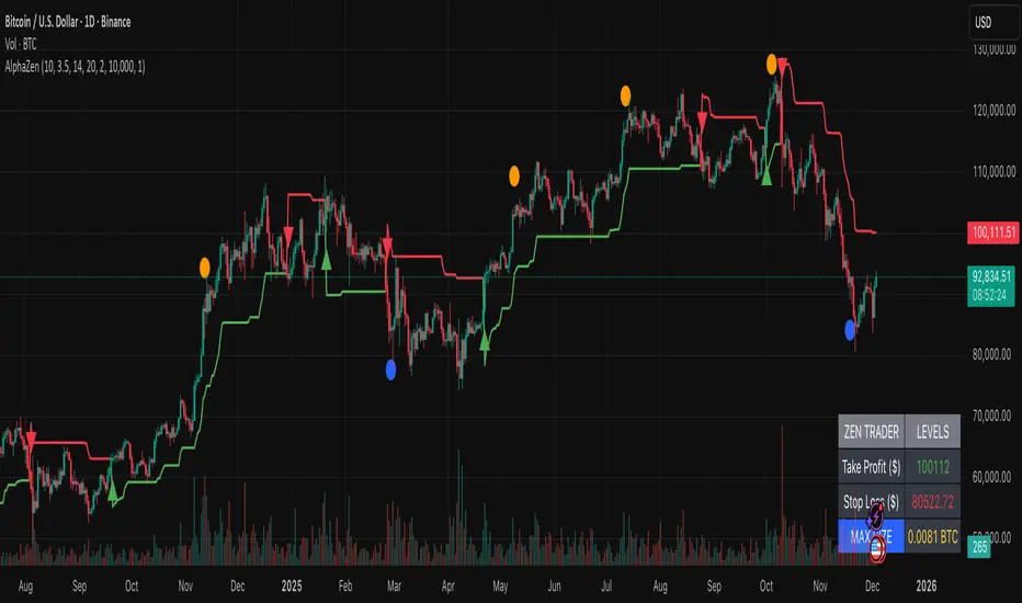
AlphaStrike: Zen ModeDescription:
The Problem most of us lose money because we try to do two opposing things at once: we chase trends when they are already overextended, and we try to catch falling knives before they are ready to bounce. We get chopped up in the middle.
The Solution AlphaStrike is a "Hybrid" system designed to separate these two battlefields. It combines a Trend Following engine (to keep you in big moves) with a Momentum Reversion engine (to spot exhaustion).
It essentially answers two questions:
"Is the trend my friend?" (Trend Filter)
"Is the rubber band about to snap?" (Reversal Signal)
How It Works (The "Zen" Logic) I stripped away the noise. No clouds, no confusing lines—just the signals that matter.
The Trend Line (Red/Green): This is your bias.
Green: Only look for buys.
Red: Only look for sells (or cash).
Rule: Never trade against the line color unless you are scalping a confirmed Reversal Signal.
The Circles (Reversals):
🔵 Blue Dot: "Oversold Rejection." Price stretched below the bands and wicked back up. This is a high-reward entry for dips.
🟠 Orange Dot: "Overbought Exhaustion." Price stretched too high and was rejected. This is your warning to take profits or tighten stops.
The Triangles (Breakouts):
Green/Red Triangles: These confirm the trend has officially flipped. This is the safer entry for conservative traders.
Risk Management (The Built-in Calculator) Trading is math, not magic. This indicator includes a "Smart Risk Table" in the bottom right corner.
It calculates the distance to the structural Stop Loss (invisible support/resistance swings).
It tells you exactly how much to buy to risk only 1% of your account.
Note: You must go to Settings and enter your actual Account Size for this to work.
Best Settings
Crypto (BTC/ETH): Use the default settings (Factor 3.5).
Forex/Stocks: Lower the Factor to 3.0 for more sensitivity.
Disclaimer: No indicator is perfect. This tool is designed to manage risk and identify probability, not to predict the future. Always use a stop loss.
Real Relative Strength Indicator### What is RRS (Real Relative Strength)?
RRS is a volatility-normalized relative strength indicator that shows you – in real time – whether your stock, crypto, or any asset is genuinely beating or lagging the broader market after adjusting for risk and volatility. Unlike the classic “price ÷ SPY” line that gets completely fooled by volatility regimes, RRS answers the only question that actually matters to professional traders:
“Is this ticker moving better (or worse) than the market on a risk-adjusted basis right now?”
It does this by measuring the excess momentum of your ticker versus a benchmark (SPY, QQQ, BTC, etc.) and then dividing that excess by the average volatility (ATR) of both instruments. The result is a clean, centered-around-zero oscillator that works the same way in calm markets, crash markets, or parabolic bull runs.
### How to Use the RRS Indicator (Aqua/Purple Area Version) in Practice
The indicator is deliberately simple to read once you know the rules:
Positive area (aqua) means genuine outperformance.
Negative area (purple) means genuine underperformance.
The farther from zero, the stronger the leadership or weakness.
#### Core Signals and How to Trade Them
- RRS crossing above zero → one of the highest-probability long signals in existence. The asset has just started outperforming the market on a risk-adjusted basis. Enter or add aggressively if price structure agrees.
- RRS crossing below zero → leadership is ending. Tighten stops, take partial or full profits, or flip short if you trade both sides.
- RRS above +2 (bright aqua area) → clear leadership. This is where the real money is made in bull markets. Trail stops, add on pullbacks, let winners run.
- RRS below –2 (bright purple area) → clear distribution or capitulation. Avoid new longs, consider short entries or protective puts.
- Extreme readings above +4 or below –4 (background tint appears) → rare, very high-conviction moves. Treat these like once-a-month opportunities.
- Divergence (not plotted here, but easy to spot visually): price making new highs while the aqua area is shrinking → distribution. Price making new lows while the purple area is shrinking → hidden buying and coming reversal.
#### Best Settings by Style and Asset Class
For stocks and ETFs: keep benchmark as SPY (or QQQ for tech-heavy names) and length 14–20 on daily/4H charts.
For crypto: change the benchmark to BTCUSD (or ETHUSD) immediately — otherwise the reading is meaningless. Length 10–14 works best on 1H–4H crypto charts because volatility is higher.
For day trading: drop length to 10–12 and use 15-minute or 5-minute charts. Signals are faster and still extremely clean.
#### Highest-Edge Setups (What Actually Prints Money)
- RRS crosses above zero while price is still below a major moving average (50 EMA, 200 SMA, etc.) → early leadership, often catches the exact bottom of a new leg up.
- RRS already deep aqua (+3 or higher) and price pulls back to support without RRS dropping below +1 → textbook add-on or re-entry zone.
- RRS deep purple and suddenly turns flat or starts curling up while price is still falling → hidden accumulation, usually the exact low tick.
That’s it. Master these few rules and the RRS becomes one of the most powerful edge tools you will ever use for rotation trading...

Titan AI: EWO Pro + Divergencias de VolumenBINANCE:BTCUSDT.P The indicator is only in Spanish.
Titan AI: EWO Pro is not your standard Elliott Wave Oscillator. It is a next-generation Order Flow & Volume engine designed to detect the true intent of the market. Unlike traditional oscillators that rely solely on price action, Titan EWO Pro incorporates a "Volume Efficiency" algorithm normalized via Z-Score (Standard Deviation).
This indicator is built for traders who need to see what is happening inside the candles. It answers the critical question: "Is the price moving with real institutional backing, or is it a fake-out with no volume?"
With the integrated "GOD MODE" Dashboard, you get a tactical Heads-Up Display (HUD) that translates complex mathematical data into clear, actionable signals in real-time.
💎 Key Features
Z-Score Normalized EWO:
Standard EWO indicators can vary wildly depending on the asset price (BTC vs. Forex).
Titan EWO Pro normalizes the data using Standard Deviations (Z-Score). This means a value of +2.0 represents a statistically significant extreme move, regardless of the timeframe or asset.
Volume Efficiency Algorithm:
The core calculation measures (Close - Open) / Volume. This determines how much volume was required to move the price.
High efficiency means price is moving easily (strong trend). Low efficiency means high volume but little movement (absorption/reversal).
Volume Divergences:
Automatically detects discrepancies between Price Action and Order Flow.
Bullish Divergence: Price makes a Lower Low, but Titan EWO makes a Higher Low (Accumulation).
Bearish Divergence: Price makes a Higher High, but Titan EWO makes a Lower High (Distribution).
Institutional Extremes (Reversals):
The indicator marks the +2.0 and -2.0 Standard Deviation levels.
When the histogram crosses these levels, the market is statistically overextended. Watch for Triangle Signals indicating a potential "V" reversal or exhaustion.
GOD MODE Dashboard (HUD):
A professional panel fixed to your screen (customizable position).
Trend: Displays strict Bullish (Green) or Bearish (Red) status.
Strength (Z): The exact Z-Score value.
Momentum: Tells you if the move is "Accelerating" or "Braking" (Decelerating).
Divergence: Real-time alert status.
🚀 How to Use
1. Trend Following (The Wave)
Green Bars: Look for Longs. Momentum is bullish and Order Flow supports the move.
Red Bars: Look for Shorts. Momentum is bearish.
Darker Colors: If the bars turn dark green or dark red, momentum is slowing down (Deceleration). This is a warning to tighten Stop Losses or wait for a new impulse.
2. Trading Reversals (The Extremes)
Statistical Extremes: If the histogram punches through the +2.0 or -2.0 dotted lines, the move is overextended (climax).
Triangles: Small triangles appear at the top/bottom of the chart when these extremes are hit. This is often a "Take Profit" signal or a contrarian entry point if confirmed by price action.
3. Divergences (The Smart Entry)
Look for the "Vol" circles.
A Green Circle at the bottom indicates that sellers are exhausted, but volume flow is shifting bullish.
A Red Circle at the top indicates that buyers are exhausted (price up, but volume flow down).
4. The Dashboard
Use the dashboard for confirmation.
Ideally: You want "ALCISTA" (Bullish), "ACELERANDO" (Accelerating), and a high Z-Score (> 0.5) for a strong Long trade.
⚙️ Settings
EWO Length: The lookback period for the oscillator (Default: 12).
Smoothing: Helps reduce noise in the histogram (Default: 10).
Pivot Lookback: Sensitivity for divergence detection (Default: 5).
Dashboard: You can toggle the panel ON/OFF, change its size (Tiny/Small/Normal), and move it to any corner of the chart.
Disclaimer
This tool is for educational and analytical purposes only. Trading involves risk. Always use proper risk management. Past performance does not guarantee future results.

Daily Anchored VWAPAnchors VWAP to whatever time you want instead of the usual start of session. I use it for BTC so that I can anchor around NY open instead of the night before.

AssetCorrelationLibraryLibrary "AssetCorrelationLibrary™"
detectIndicesFutures(ticker)
Detects Index Futures (NQ/ES/YM/RTY + micro variants)
Parameters:
ticker (string) : The ticker string to check (typically syminfo.ticker)
Returns: AssetPairing with secondary and tertiary assets configured
detectMetalsFutures(ticker)
Detects Metal Futures (GC/SI/HG + micro variants)
Parameters:
ticker (string) : The ticker string to check
Returns: AssetPairing with secondary and tertiary assets configured
detectForexFutures(ticker)
Detects Forex Futures (6E/6B + micro variants)
Parameters:
ticker (string) : The ticker string to check
Returns: AssetPairing with secondary and tertiary assets configured
detectEnergyFutures(ticker)
Detects Energy Futures (CL/RB/HO + micro variants)
Parameters:
ticker (string) : The ticker string to check
Returns: AssetPairing with secondary and tertiary assets configured
detectTreasuryFutures(ticker)
Detects Treasury Futures (ZB/ZF/ZN)
Parameters:
ticker (string) : The ticker string to check
Returns: AssetPairing with secondary and tertiary assets configured
detectForexCFD(ticker, tickerId)
Detects Forex CFD pairs (EUR/GBP/DXY, USD/JPY/CHF triads)
Parameters:
ticker (string) : The ticker string to check
tickerId (string) : The full ticker ID (syminfo.tickerid) for primary asset
Returns: AssetPairing with secondary and tertiary assets configured
detectCrypto(ticker, tickerId)
Detects major Crypto assets (BTC, ETH, SOL, XRP, alts)
Parameters:
ticker (string) : The ticker string to check
tickerId (string) : The full ticker ID for primary asset
Returns: AssetPairing with secondary and tertiary assets configured
detectMetalsCFD(ticker, tickerId)
Detects Metals CFD (XAU/XAG/Copper)
Parameters:
ticker (string) : The ticker string to check
tickerId (string) : The full ticker ID for primary asset
Returns: AssetPairing with secondary and tertiary assets configured
detectIndicesCFD(ticker, tickerId)
Detects Indices CFD (NAS100/SP500/DJ30)
Parameters:
ticker (string) : The ticker string to check
tickerId (string) : The full ticker ID for primary asset
Returns: AssetPairing with secondary and tertiary assets configured
detectEUStocks(ticker, tickerId)
Detects EU Stock Indices (GER40/EU50) - Dyad only
Parameters:
ticker (string) : The ticker string to check
tickerId (string) : The full ticker ID for primary asset
Returns: AssetPairing with secondary asset configured (tertiary empty for dyad)
getDefaultFallback(tickerId)
Returns default fallback assets (chart ticker only, no correlation)
Parameters:
tickerId (string) : The full ticker ID for primary asset
Returns: AssetPairing with chart ticker as primary, empty secondary/tertiary (no correlation)
applySessionModifierWithBackadjust(tickerStr, sessionType)
Applies futures session modifier to ticker WITH back adjustment
Parameters:
tickerStr (string) : The ticker to modify
sessionType (string) : The session type (syminfo.session)
Returns: Modified ticker string with session and backadjustment.on applied
applySessionModifierNoBackadjust(tickerStr, sessionType)
Applies futures session modifier to ticker WITHOUT back adjustment
Parameters:
tickerStr (string) : The ticker to modify
sessionType (string) : The session type (syminfo.session)
Returns: Modified ticker string with session and backadjustment.off applied
isTriadMode(pairing)
Checks if a pairing represents a valid triad (3 assets)
Parameters:
pairing (AssetPairing) : The AssetPairing to check
Returns: True if tertiary is non-empty (triad mode), false for dyad
getAssetTicker(tickerId)
Extracts clean ticker string from full ticker ID
Parameters:
tickerId (string) : The full ticker ID (e.g., "BITGET:BTCUSDT.P")
Returns: Clean ticker string (e.g., "BTCUSDT.P")
resolveTriad(chartTickerId, pairing)
Resolves triad asset assignments with proper inversion flags
Parameters:
chartTickerId (string) : The current chart's ticker ID (syminfo.tickerid)
pairing (AssetPairing) : The detected AssetPairing
Returns: Tuple
resolveDyad(chartTickerId, pairing)
Resolves dyad asset assignment with proper inversion flag
Parameters:
chartTickerId (string) : The current chart's ticker ID
pairing (AssetPairing) : The detected AssetPairing (dyad: tertiary is empty)
Returns: Tuple
resolveAssets(ticker, tickerId, assetType, sessionType, useBackadjust)
Main auto-detection entry point. Detects asset category and returns fully resolved config.
Parameters:
ticker (string) : The ticker string to check (typically syminfo.ticker)
tickerId (string) : The full ticker ID (typically syminfo.tickerid)
assetType (string) : The asset type (typically syminfo.type)
sessionType (string) : The session type for futures (typically syminfo.session)
useBackadjust (bool) : Whether to apply back adjustment for futures session alignment
Returns: AssetConfig with fully resolved assets, inversion flags, and detection status
resolveCurrentChart()
Simplified auto-detection using current chart's syminfo values
Returns: AssetConfig with fully resolved assets, inversion flags, and detection status
AssetPairing
Core asset pairing structure for triad/dyad configurations
Fields:
primary (series string) : The primary (chart) asset ticker ID
secondary (series string) : The secondary correlated asset ticker ID
tertiary (series string) : The tertiary correlated asset ticker ID (empty for dyad)
invertSecondary (series bool) : Whether secondary asset should be inverted for divergence calc
invertTertiary (series bool) : Whether tertiary asset should be inverted for divergence calc
AssetConfig
Full asset resolution result with mode detection and computed values
Fields:
detected (series bool) : Whether auto-detection succeeded
isTriadMode (series bool) : True if triad (3 assets), false if dyad (2 assets)
primary (series string) : The resolved primary asset ticker ID
secondary (series string) : The resolved secondary asset ticker ID
tertiary (series string) : The resolved tertiary asset ticker ID (empty for dyad)
invertSecondary (series bool) : Computed inversion flag for secondary asset
invertTertiary (series bool) : Computed inversion flag for tertiary asset
assetCategory (series string) : String describing the detected asset category
Note to potential users.
I did not really intend to make this public but i have to in order to avoid any potential compliance issues with the TradingView Moderation Team and the House Rules.
However if you are to use this library, you cannot make your code closed source / invite only as it is intellectual property. The only exception to this is if I am credited in the header of your code and i explicitly give permission to do so.
As per the TradingView house rules, you are completely FREE to do with this as you like, provided the script stays private.
Use the @fstarcapital tag to give credits
❤️ from cephxs

Trendline Breaks + Supertrend [Delta BTC-P]Trendline Breaks + Supertrend in same direct Best on 5 min

Easy Crypto Signal FREE🆓 FREE Bitcoin & Crypto Trading Indicator
Easy Crypto Signal FREE helps you make better trading decisions with real-time BUY/SELL signals based on multiple technical indicators.
✅ What you get in FREE version:
• Real-time BUY/SELL signals (green/red arrows)
• Trading SCORE (0-100%) - market strength indicator
• Works on BTC, ETH, and all major altcoins
• Optimized for 4h timeframe (works on all timeframes)
• Simple visual interface
• Basic alert system
📊 How it works:
The indicator combines RSI, MACD, EMA trends, and volume analysis to generate a composite SCORE (0-100%).
• SCORE > 65% = BUY signal 🟢
• SCORE < 35% = SELL signal 🔴
• SCORE 35-65% = WAIT (neutral zone) 🟡
⚠️ FREE Version Limitations:
• No detailed RSI values
• No MACD trend details
• No trend strength indicators
• Fixed sensitivity (65%)
• Limited customization
💎 Want the FULL PRO version?
🚀 PRO includes:
• Full RSI + MACD + Trend analysis displayed
• Customizable sensitivity (40-80%)
• Advanced alert customization
• Professional clean interface
• Volume strength indicator
• NO watermarks
• Premium support
📊 Proven Backtest Results:
• 57.1% Win Rate
• 3.36 Profit Factor (Excellent)
• +9.55% return in 3 months
• Only -2.69% Max Drawdown (Low Risk)
🔗 Get PRO version:
📈 Best practices:
1. Use on 4h timeframe for best results
2. Combine with your own analysis
3. Always set Stop Loss (5-10%)
4. Test on demo account first
5. Don't trade based on signals alone
⚠️ Risk Disclaimer:
Cryptocurrency trading involves substantial risk. This indicator is for educational purposes only and does not guarantee profits. Past performance does not indicate future results. Always do your own research and never invest more than you can afford to lose.
📧 Questions or Feedback?
Comment below or message me directly!
🌟 If you find this helpful, please give it a like and share!
v1.0 - Initial FREE release
• Basic BUY/SELL signal system
• Score indicator 0-100%
• Optimized for 4h timeframe
• Works on all crypto pairs

The Oracle: Dip & Top Adaptive Sniper [Hakan Yorganci]█ OVERVIEW
The Oracle: Dip & Top Adaptive Sniper is a precision-focused trend trading strategy designed to solve the biggest problem in swing trading: Timing.
Most trend-following strategies chase price ("FOMO"), buying when the asset is already overextended. The Oracle takes a different approach. It adopts a "Sniper" mentality: it identifies a strong macro trend but patiently waits for a Mean Reversion (pullback) to execute an entry at a discounted price.
By combining the structural strength of Moving Averages (SMA 50/200) with the momentum precision of RSI and the volatility filtering of ADX, this script filters out noise and targets high-probability setups.
█ HOW IT WORKS
This strategy operates on a strictly algorithmic protocol known as "The Yorganci Protocol," which involves three distinct phases: Filter, Target, and Execute.
1. The Macro Filter (Trend Identification)
* SMA 200 Rule: By default, the strategy only scans for buy signals when the price is trading above the 200-period Simple Moving Average. This ensures we are always trading in the direction of the long-term bull market.
* Adaptive Switch: A new feature allows users to toggle the Only Buy Above SMA 200? filter OFF. This enables the strategy to hunt for oversold bounces (dead cat bounces) even during bearish or neutral market structures.
2. The Volatility Filter (ADX Integration)
* Sideways Protection: One of the main weaknesses of moving average strategies is "whipsaw" losses during choppy, ranging markets.
* Solution: The Oracle utilizes the ADX (Average Directional Index). It will BLOCK any trade entry if the ADX is below the threshold (Default: 20). This ensures capital is only deployed when a genuine trend is present.
3. The Sniper Entry (Buying the Dip)
* Instead of buying on breakout strength (e.g., RSI > 60), The Oracle waits for the RSI Moving Average to dip into the "Value Zone" (Default: 45) and cross back up. This technique allows for tighter stops and higher Risk/Reward ratios compared to traditional breakout systems.
█ EXIT STRATEGY
The Oracle employs a dynamic dual-exit mechanism to maximize gains and protect capital:
* Take Profit (The Peak): The strategy monitors RSI heat. When the RSI Moving Average breaches the Overbought Threshold (Default: 75), it signals a "Take Profit", securing gains near the local top before a potential reversal.
* Stop Loss (Trend Invalidated): If the market structure fails and the price closes below the 50-period SMA, the position is immediately closed to prevent deep drawdowns.
█ SETTINGS & CONFIGURATION
* Moving Averages: Fully customizable lengths for Support (SMA 50) and Trend (SMA 200).
* Trend Filter: Checkbox to enable/disable the "Bull Market Only" rule.
* RSI Thresholds:
* Sniper Buy Level: Adjustable (Default: 45). Lower values = Deeper dips, fewer trades.
* Peak Sell Level: Adjustable (Default: 75). Higher values = Longer holds, potentially higher profit.
* ADX Filter: Checkbox to enable/disable volatility filtering.
█ BEST PRACTICES
* Timeframe: Designed primarily for 4H (4-Hour) charts for swing trading. It can also be used on 1H for more frequent signals.
* Assets: Highly effective on trending assets such as Bitcoin (BTC), Ethereum (ETH), and high-volume Altcoins.
* Risk Warning: This strategy is designed for "Long Only" spot or leverage trading. Always use proper risk management.
█ CREDITS
* Original Concept: Inspired by the foundational work of Murat Besiroglu (@muratkbesiroglu).
* Algorithm Development & Enhancements: Developed by Hakan Yorganci (@hknyrgnc).
* Modifications include: Integration of ADX filters, Mean Reversion entry logic (RSI Dip), and Dynamic Peak Profit taking.
