Two-Candle Highs & LowsSimple indicator which highlights highs and lows as two-candle reversal patterns:
1. High pattern : A bullish candle followed by a bearish candle, marking the highest price of the two.
2. Low pattern : A bearish candle followed by a bullish candle, marking the lowest price of the two.
It draws horizontal lines at the high/low levels, making it useful for price action analysis such as identifying potential reversals or support/resistance zones.
ابحث في النصوص البرمجية عن "candle"

Electronic Trading Hours Session/CandlesThis indicator visually distinguishes the electronic trading session, spanning from the prior day's close (e.g., 5:00 PM EST) through the overnight period until the next day's opening bell (e.g., 9:30 AM EST).
It can be customized to highlight this period with a shaded zone or colored candles depending on the trader’s preference.
The overnight levels that create the opening range gap often act as critical zones of liquidity.
The indicator provides a clear visual cue of potential price magnets that smart money (institutional traders) may target during the opening bell session to trigger liquidity sweeps.

EMA/MA with OHCL Candle and Long Wick – A Comprehensive Trading
Dear Traders,
I am excited to introduce EMA/MA with OHCL Candle and Long Wick, a powerful trading indicator designed to enhance market analysis by combining Exponential Moving Averages (EMA), Simple Moving Averages (MA), OHCL candle patterns, and long wick detection into a single tool.
Key Features:
✅ Customizable Wick Size & Timeframe – Adapt the indicator to different market conditions by adjusting wick size and analyzing price action over any timeframe.
✅ EMA & MA for Trend Analysis – Includes multiple EMAs and MAs (5, 9, 15, 20, 50, 100, 200) to help identify trends and potential reversals.
✅ Long Wick Signal Detection – Identifies strong Buy and Sell opportunities based on wick size, signaling potential market turning points.
✅ OHCL Candle Analysis – Highlights OHCL patterns to provide additional insights into price action.
✅ User-Friendly & Lightweight – Efficiently coded for seamless performance on TradingView.
This indicator is perfect for traders looking to refine their entry and exit strategies by leveraging price action and moving averages. Whether you're a scalper, day trader, or swing trader, this tool provides valuable insights to enhance your decision-making.
Give it a try, and let me know your feedback! 🚀
Best regards,
Purnendu Singh
Candle Bias ForecastCandle Bias Forecast Indicator
Description:
The Candle Bias Forecast Indicator is an original multi‐timeframe analysis tool that generates price forecast levels based on the difference between candle biases on two different timeframes. It uses innovative calculations to provide potential forecast levels that align with current price action.
How It Works:
1. Candle Bias Calculation:
For each candle, the indicator computes a “candle bias” using the formula:
candleBias = (((open + close)/2 - (high + low)/2) + ((close - open)/(high - low)))/2
This measure captures both the positioning of the candle’s body within its range and the normalized move from open to close.
2. Multi-Timeframe Analysis:
The script uses multiple timeframe pairs (e.g., 5-minute vs. 30-minute, 10-minute vs. 60-minute, etc.). For each pair, the bias is computed on the lower timeframe and on the higher timeframe.
3. Normalization with ATR:
To translate the dimensionless bias difference into price terms, the indicator multiplies the difference by the lower timeframe’s Average True Range (ATR). This scales the forecast adjustment to current market volatility.
4. Forecast Computation:
The forecast level for each pair is then calculated as:
forecast = close + (lowerTF_ATR * (lowerTF_bias - higherTF_bias))
This yields forecast levels that are plotted on the chart and connected by lines for a visual guide.
How to Use:
- Visual Confirmation: Add the indicator to your 1 to 15 minute chart to see forecast levels overlaid on the price.
- Supplementary Analysis: Use these forecast levels as an additional tool alongside your other analysis methods. They can help indicate potential support/resistance areas or directional bias.
Important Notes:
- Not a Standalone Signal: This indicator is intended to supplement your analysis. Always combine it with other tools and sound risk management practices.
- For Educational & Research Use: The indicator is provided “as is” without any guarantee of performance. It is designed to illustrate an innovative approach to multi-timeframe analysis.
- Disclaimer: Past performance is not indicative of future results. Use this tool at your own risk.
By combining candle bias with ATR-based normalization and multi-timeframe analysis, this indicator offers a unique perspective on market dynamics that can enrich your trading strategy.
---
*This is an original script designed to add value to the TradingView community. Please test and validate its outputs thoroughly before using it in live trading.*

Enhanced Interval Candle with Breakout Detection and Detailed InThis indicator visualizes the last candle of a user-defined time interval (e.g., 1 hour, 4 hours, 1 day) on the current chart, providing enhanced details and breakout detection. It fetches the open, high, low, and close prices of the interval candle and draws a stylized representation of it, offset to the right of the current bar. The candle body and wicks are colored according to whether the interval candle closed bullishly (green) or bearishly (red). In addition to the candle itself, the indicator displays horizontal dotted lines representing the high, low, and midpoint of the interval candle, along with labels showing their exact values. These labels are dynamically updated as the interval candle changes. Furthermore, the script detects and visualizes breakouts of the interval candle's high or low. When the current price closes above the interval high, a green dashed line and a "Bullish Breakout" label are displayed. Conversely, when the current price closes below the interval low, a red dashed line and a "Bearish Breakout" label are shown. The breakout lines and labels are also dynamically updated. This indicator helps traders easily track the price action of a higher timeframe candle and spot potential breakouts based on that candle's range. The user can configure the time interval to suit their trading needs.

[GrandAlgo] Candlestick ThemesTransform your TradingView charts with Candlestick Themes, an indicator that customizes candlestick colors using a variety of stunning themes. Whether you’re seeking improved clarity, enhanced personalization, or a fresh visual appeal, this indicator has something for everyone.
Key Features
This indicator offers a wide selection of pre-defined themes:
TradingView Default: The classic, familiar look of TradingView charts.
GrandAlgo: Our exclusive brand theme, blending vibrancy and professionalism for an exceptional charting experience.
MetaTrader-Inspired Themes: Green on Black, Yellow on Black, and Black on White, designed to replicate the iconic MetaTrader aesthetics.
Green Black: A calming and balanced theme for focused trading.
Darkblue Red: A bold and impactful combination with rich tones.
Darkblue Black: A subtle, sleek palette perfect for minimalists.
Lightblue Red: A mix of warm and cool tones for balanced visuals.
Lightblue Red (Gradient): Adds smooth transitions for a modern feel.
Lightblue Black: Crisp and clean for improved readability.
Crimson to Calm: A gradient theme transitioning from bold to tranquil tones.
Robinhood: Inspired by the clean and vibrant look of the popular trading platform.
Warm & Cool Harmony: A seamless blend of warm and cool tones.
Valentine: Passionate reds and pinks for a romantic visual.
Christmas: Festive greens and reds to match the holiday spirit.
Grapes: A playful mix of purples and greens.
Desert: Warm, sandy hues inspired by desert landscapes.
Real Madrid: A sporty theme with iconic colors for fans.
This indicator ensures seamless integration with TradingView charts, offering personalized trading experience. Whether you're a seasoned trader or just starting, these themes will make your charts both functional and visually appealing.

Previous Candle AverageDescription:
The Previous Candle Average indicator is a powerful tool designed to provide traders with insights into market momentum by visualizing the relationship between the current and previous open levels for a customizable timeframe. This versatile indicator allows you to select from various timeframes, including 1 Month, 1 Week, 1 Day, 8 Hours, 4 Hours, and 1 Hour, making it suitable for different trading strategies, whether you're a swing trader, day trader, or scalper.
The indicator plots the Current Open and Previous Open levels for the selected timeframe and calculates the average value between them. By displaying these critical levels, traders can quickly gauge the current market dynamics relative to the previous period, making it easier to identify support, resistance, or trend continuation.
Key Features:
Custom Timeframe Selection: Easily select the desired timeframe from a variety of options (1M, 1W, 1D, 8H, 4H, 1H) to align with your trading strategy.
Current and Previous Open Levels: The indicator plots both the Current Open and Previous Open levels for the chosen timeframe, providing clear visual guidance on where the market is opening relative to the previous period.
Open Fill with Adjustable Transparency: The area between the Current Open and Previous Open levels is filled with color to represent the relationship between the two. The fill color changes based on whether the Current Open is above or below the Previous Open, with a default 20% opacity for better clarity without overwhelming the chart.
Average Line: The indicator also plots the average value between the Current Open and Previous Open levels, painted by default in a solid white color with a line thickness of 2. This average helps identify potential key levels where the price might react.
Dynamic Coloring: The fill color changes dynamically based on whether the Current Open is higher or lower than the Previous Open, using green to indicate bullish behavior and red for bearish behavior.
How to Use:
The Previous Candle Average indicator can help traders identify the momentum of the market by visually comparing the relationship between consecutive open levels.
Use the Average Line as a reference for potential support or resistance, especially when the market opens near this average.
The Open Fill color can quickly indicate a shift in market sentiment. A green fill suggests that the market is opening stronger than the previous period, while a red fill indicates weakness.
Best Practices:
Combine this indicator with other technical analysis tools, such as trend lines, moving averages, or volume analysis, to confirm potential trading opportunities.
The custom timeframe feature is particularly useful for multi-timeframe analysis. For instance, you can monitor weekly open levels while trading on an hourly chart.
Note: The indicator uses real-time open data and is updated accordingly, ensuring there is no delay or repainting of historical values.
Ideal For:
Traders who want a clear visual representation of market open levels relative to previous periods.
Those who want to identify potential shifts in momentum by comparing open levels across different timeframes.
Traders seeking to add an additional layer of analysis to their existing strategy by incorporating key opening levels and their averages.

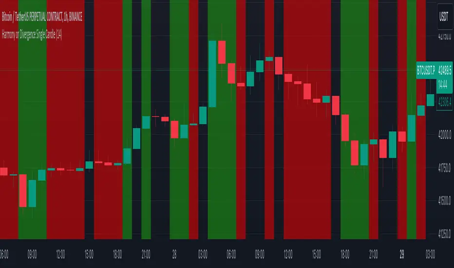
Harmony or Divergence Single CandleThis script is designed for traders who seek to visually identify and analyze patterns of harmony and divergence in the price action of securities directly on their trading charts. The script provides a nuanced approach to understanding market sentiment and potential price movement directions by examining candle sizes and volumes over a specified lookback period.
What the Script Does:
The script overlays indicators on the price chart that highlight periods of harmony and divergence using background colors. These periods are determined based on comparisons between current candle sizes, candle volumes, and their respective simple moving averages (SMAs) over a user-defined lookback period.
Harmony : A state where the candle size and volume are either both above or below their respective averages, indicating a consensus or agreement in market direction.
Divergence : A state where there's a mismatch, such as a larger candle size with lower volume or vice versa, suggesting uncertainty or potential reversal in market trends.
How It Does It:
User Inputs : Traders can customize several parameters, including the lookback period for averages, whether to include wicks in candle size calculations, and preferences for displaying harmony and divergence indicators with specific colors.
Calculations :
- The script calculates the simple moving average (SMA) of volume and candle sizes (with an option to consider the full candle range including wicks or just the body) over the specified lookback period.
- It then compares the current candle's size and volume against these averages to identify states of harmony or divergence.
Visualization :
- Based on the user's input, it colors the background of the chart to reflect identified patterns. Each state (harmony above or below average, divergence with higher volume or larger candle body) can be highlighted with different colors, providing immediate visual cues to the trader.
What Traders Can Do With the Script:
Traders can utilize this script to enhance their technical analysis by:
Identifying Trend Consistency : Harmony indicators can signal strong trends where price action and volume confirm each other, possibly supporting continuation strategies.
Spotting Potential Reversals : Divergence indicators may highlight potential exhaustion points or reversals, especially when price moves significantly without corresponding volume support.
Customizing Analysis : By adjusting the lookback period, candle size consideration (body or including wicks), and visualization options, traders can tailor the analysis to fit their trading style and strategy.
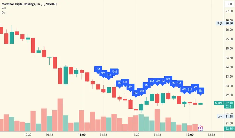
Dollar Volume Last 20 CandlesThe "Dollar Volume Last 20 Candles" indicator, abbreviated as "DV", is a practical and insightful tool for traders and analysts.
This indicator focuses on enhancing the visualization of trading data by calculating and displaying the dollar volume for each of the last 20 bars on a financial chart. It achieves this by multiplying the closing price of each bar with its trading volume, providing a clear dollar value of the trading activity.
The script also features an intuitive formatting system that simplifies large numbers into 'k' (thousands) and 'M' (millions), making the data easily digestible.
The dollar volume data is displayed directly above each bar, adjusted for visibility using the Average True Range (ATR), ensuring that it is both unobtrusive and readily accessible. This overlay feature integrates seamlessly with the existing chart, offering traders a quick and efficient way to assess monetary trading volume at a glance, which is particularly useful for identifying trends and market strength.
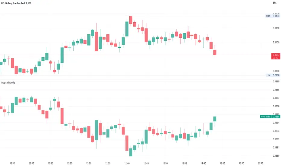
Inverted CandleInverts the candle of the current Symbol.
Useful to compare Forex.
Works on any intraday timerange
Inside Candle and mother candle range with alert++>>This script allows you the inside bar candle and the cnadle is shown in white.
The range of the mother candle is identified and tracked until it breaks.
Once the first range is over ridden then the next similar pattern will be occured and the tracking will be done for the mother candle latest occurrence.
It also has the alert mechanism where you can go and the alert for the indicator in Alerts.
5 min is the most preferrable time frame and while saving the alert Note to save the time frame of the chart. For which ever time frame is saved the Alert will be triggered for the same .
And when th inside bar is triggered it throws an alert condition. this alert condition has to be configured in your alerts and will be buzzing on the screen.
Oct 20
Release Notes: updated with Mother candle top and bottom lines of previous occurrences and tracks the current latest Inside bar mother candle
Release Notes: this script allows you the inside bar cnadle and the cnadle is shown in white. highlighter is configurable and line colors as well.

EMA + Bullish Engulfing Candle Pattern StrategyHello Guys! Nice to meet you all!
This is my first open source script!
### Long Condition
1. Bullish Engulfing Candle
2. No doge Candle
3. Present volume should be bigger than the previous volume (20%)
4. Trend filter (with 2 EMAs)
### Close Condition
1. When trend Changes
2. When Bearish Engulfing Candle appears
###
No stop loss and take profit.
Heikin-Ashi Candle ColorOne of the biggest complaints about Heikin Ashi is the lack of real price data you receive. This attempts to give you as much information as possible by displaying both the candle color and the Heikin Ashi color. The wick takes on the original color while the body of the candle gets the Heikin Ashi color. The only downside to this method is that you do not get to see candle patterns. As always I hope you enjoy this release!

Consecutive positive/negative candlesConsecutive positive/negative candles
Shows the consecutive negative or positive candles
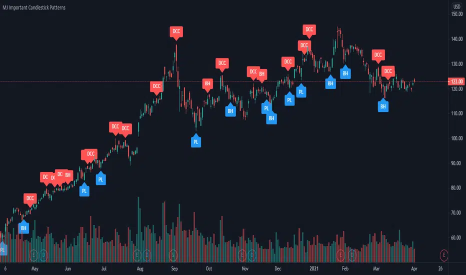
MJ Important Candlestick Patterns + Smart TrendThis script detects 6 important candlestick patterns defined by the author and puts chart labels on your chart for your attention. It also includes a smart trend checking algorithm to detect trends.
The six candlestick patterns covered are:
Bullish Engulfing
Bearish Engulfing
Piercing Line
Dark Cloud Cover
Bullish Harami
Bearish Harami
*** Smart feature of this indicator is that it can detect uptrends or downtrends before alerting you regarding the bullish or bearish reversal candlestick pattern. This is achieved by comparing the typical price (high+low+close divided by 3) of today's candle versus three days ago.
Candle Color ChangeSimple code for change in Barcolor if the range (high-low) is bigger than the last 5 candles.

Aggregate BTC CandlesThis script creates candles based on an aggregated Index price from various BTC exchange tickers. Since the early years in particular have a lot of exchange specific flash crash wicks, missing data, erraticness compared to other exchanges particularly in their first few months, this is an attempt to clean up the price history, be it for TA (trendlines, S/R etc.) or use in algos or other indicators, without reliance on one exchange. It uses the new Array functionality to generate median and averages, and is entirely original work.

Heikin Ashi Candles - Actual CloseHeikin Ashi Candles - Actual Close is a simple script that instead of displaying Heikin Ashi Close it displays the actual close.
This script is a handy tool for anyone that wants to use Heikin Ashi candles that displays the real close. The coloring of the candles is still based on the Heikin Ashi calculations.
Enjoy.

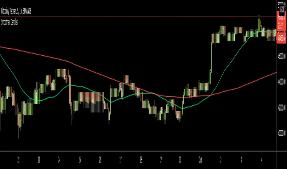
Smoothed CandlesHello Traders,
This is " Smoothed Candles " script to get rid of noises and to get a smoothed chart to figure out breakouts and price movements easily.
There are three scaling methods: User Defined, Dynamic (ATR) and Percentage
Optionally you can add 2 Simple Moving Averages and 2 Exponential Moving Averages
Optionally you can hide the Wicks, example:
You can add moving averages:
Easily find breakouts:
Enjoy!
Reverse candles chartTurn on all your animal instincts and trade using reverse candles! It is known that beginners do the wrong thing: they catch market reversals, hold losses and quickly take profits.
With reverse candles you will do it right, in theory :)
If anyone tries, please tell me about the results.

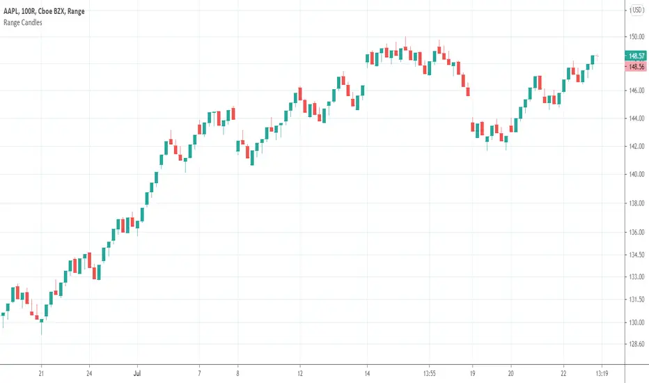
Range CandlesAn easy-peasy way to replace OHLC bars with candles on Range Bars chart. For further improvement you could also make "Up Bars" and "Down Bars" colors transparent (open Range Bars chart settings, do the change and save as default).
Compare
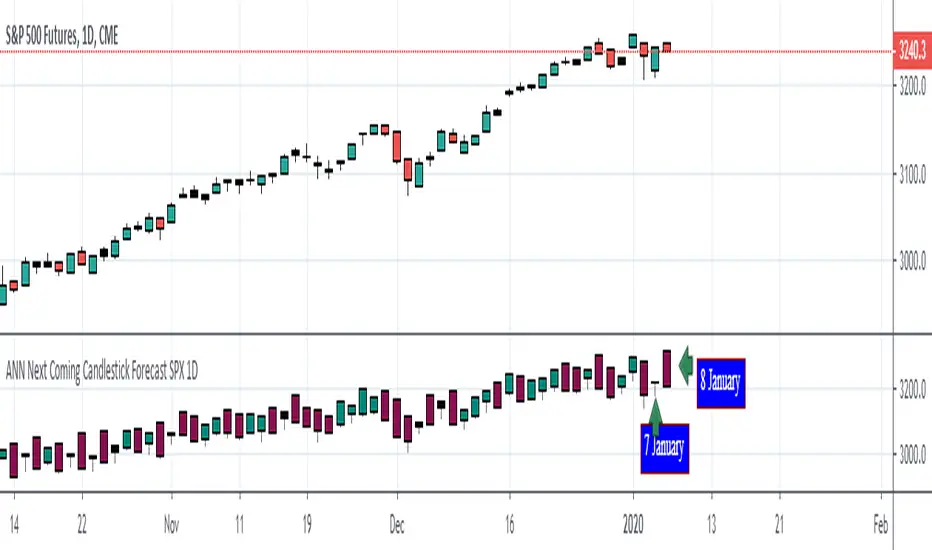
ANN Next Coming Candlestick Forecast SPX 1D v1.0WARNING:
Experimental and incomplete.
Script is open to development and will be developed.
This is just version 1.0
STRUCTURE
This script is trained according to the open, close, high and low values of the bars.
It is tried to predict the future values of opening, closing, high and low values.
A few simple codes were used to correlate expectation with current values. (You can see between line 129 - 159 )
Therefore, they are all individually trained.
You can see in functions.
The average training error of each variable is less than 0.011.
NOTE :
This script is designed for experimental use on S & P 500 and connected instruments only on 1-day bars.
The Plotcandle function is inspired by the following script of alexgrover :
Since we estimate the next values, our error rates should be much lower for all candlestick values. This is just first version to show logic.
I will continue to look for other variables to reach average error = 0.001 - 0.005 for each candlestick status.
Feel free to use and improve , this is open-source.
Best regards.