3-1-3 PatternThis Pine Script indicator analyzes and visualizes a specific candlestick pattern called the "3-1-3 Pattern" across multiple timeframes. Here's what it does:
Core Functionality
Pattern Detection: The script looks for a 7-bar candlestick pattern:
Bearish 3-1-3: 3 red candles + 1 green candle + 3 red candles
Bullish 3-1-3: 3 green candles + 1 red candle + 3 green candles
Visual Output
When a 3-1-3 pattern is detected, the script:
Creates a colored box around the middle bar (bar 3) of the pattern
Adds a small label showing the pattern type ("Bear 1H" or "Bull 4H", etc.)
Extends the box forward until the price breaks above the pattern's high or below its low
Pattern Management
The script actively manages the patterns by:
Tracking active patterns for each timeframe separately
Removing expired patterns when price breaks the pattern's high/low levels
Extending boxes to the current time to keep them visible
Practical Use
This indicator helps traders:
Spot reversal patterns across multiple timeframes simultaneously
See confluence when patterns align on different timeframes
Track pattern validity (boxes disappear when invalidated by price action)
Essentially, it's a multi-timeframe pattern recognition tool that automatically identifies and tracks these specific 7-bar reversal patterns on your chart.
ابحث في النصوص البرمجية عن "chart"
Daily High/Low Close Breakout - GOLD### **Daily High/Low Close Breakout Indicator**
This indicator is a powerful tool for identifying potential breakout opportunities based on the previous day's price action. It's built on a unique time-based logic that defines key support and resistance levels for the trading day.
---
### **How the Indicator Works**
The indicator operates in two main phases:
1. **Calculation Period (00:00 to 16:30 Tehran Time):** The indicator first observes the price action from the start of the day until 16:30. During this time, it records the highest and lowest **closing prices** of all candles. The chart background is shaded gray to visually mark this period.
2. **Trading Period (16:30 to 16:30 the next day):** At 16:30, the highest and lowest close levels are finalized and drawn as horizontal lines. These levels then become the primary breakout zones for the next 24 hours. The indicator will generate signals whenever the price crosses these lines.
---
### **Trading Signals**
The indicator uses a simple and effective crossover logic for its signals:
* **BUY Signal:** A signal is generated when a candle's closing price **crosses above** the high close line.
* **SELL Signal:** A signal is generated when a candle's closing price **crosses below** the low close line.
---
### **Important Usage Guidelines**
For optimal performance, please follow these specific recommendations:
* **Timeframe:** This indicator is designed and optimized to be used exclusively on the **15-minute timeframe**. Using it on other timeframes may produce inconsistent or unreliable results.
* **Primary Asset:** The logic for this indicator was developed and backtested primarily for **Gold (XAUUSD)**. Its performance and win rate have been observed to be the most consistent on this asset.
* **Asset Restriction:** It is strongly recommended to **avoid using this indicator on other currency pairs or assets**, as it has not been optimized for their specific market behavior.
---
### **Disclaimer**
*This indicator is provided for informational and educational purposes only. It is not financial advice. Past performance is not a guarantee of future results. All trading decisions should be based on your own research and risk analysis. Always use proper risk management.*
BTC Fractal Momentum ExtremesDescription – BTC Fractal Momentum Extremes (BTCFME)
BTC Fractal Momentum Extremes (BTCFME) is a multi-factor, multi-method technical indicator designed to detect potential top and bottom reversal points in Bitcoin price action by integrating a confluence of unconventional signals. It combines fractals, adaptive momentum, volume dynamics, price velocity convergence, and market structure shifts — all filtered through real-time volatility and contextualized by temporal market conditions.
This tool is best used by traders looking to spot high-confidence turning points on intraday or swing timeframes, and works particularly well in volatile, momentum-driven environments.
Key Components & Methodology
BTCFME utilizes five independent signal-generation methods:
1. Fractal Volume Divergence
Detects reversal fractals in price (5-bar patterns) and validates them with volume anomalies:
Volume spikes (e.g., climax moves) or
Volume exhaustion (e.g., waning participation)
2. Adaptive Momentum Oscillator
Calculates momentum normalized by ATR-adjusted volatility, filtering out noise in choppy markets. It spots directional shifts when momentum inflects from extreme levels.
3. Market Structure Breaks
Identifies dynamic support and resistance using a configurable lookback, and flags potential breakouts or breakdowns from those levels.
4. Price Velocity Convergence
Analyzes the rate of change (velocity) and its acceleration. When both compress within a narrow volatility range, it signals a potential inflection zone.
5. Temporal Confluence Filter
Signals are only considered valid during active market hours (9 AM – 4 PM, excluding weekends) to reduce false positives during illiquid or inefficient trading periods.
Signal Logic & Sensitivity
Signals are generated when at least 3 out of 4 core methods agree, controlled by the Signal Sensitivity setting:
1 (High Sensitivity) = Trigger signals with fewer confirmations
5 (Low Sensitivity) = Require stronger multi-factor confluence
🔹 Buy (Bottom) Signals trigger when:
Bullish fractals appear
Momentum is deeply negative but improving
Price tests structure support
Velocity compresses below average
🔺 Sell (Top) Signals trigger when:
Bearish fractals with volume spikes appear
Momentum peaks and starts to decline
Price tests resistance
Velocity compresses near highs
Visual Features
Arrows: Buy signals = green arrow below candle. Sell signals = red arrow above candle.
Background Color: Indicates overall momentum regime (green = bullish bias, red = bearish, gray = neutral).
Dynamic Support & Resistance Lines: Based on recent swing highs/lows.
Signal Table (top-right): Shows real-time stats on:
Momentum value
Volatility factor
Volume strength (vs. 20-SMA)
Market structure status
Alerts
You can set alerts using the built-in conditions:
BTC Bottom Alert → Fires on potential market bottoms.
BTC Top Alert → Fires on potential market tops.
These alerts are filtered to avoid whipsaw conditions, by checking that opposite signals did not trigger in the last 2 candles.
How to Use
Timeframes: Best suited for 1H–4H and Daily BTC charts, but adaptable to others with parameter tuning.
Confirm with Price Action: Use BTCFME signals in conjunction with candlestick patterns or S/R zones for best results.
Adjust Sensitivity: Lower values catch more signals (good for scalping), higher values filter for stronger reversals (ideal for swing trades).
Use in Trending or Reversing Markets: BTCFME performs best during trending environments or volatile reversals — avoid during prolonged flat/ranging zones.
Notes & Recommendations
BTCFME is not a standalone buy/sell signal; combine it with risk management and trend confirmation tools.
Avoid using it during extremely low-volume sessions (e.g., late weekends).
Adjust parameters based on BTC's evolving volatility and your trading style.

SCTI-MACDEnglish Description
SCTI-MACD is an advanced multi-feature MACD indicator that combines traditional MACD analysis with divergence detection and flexible display options. This enhanced version offers:
Key Features:
Customizable MACD parameters (fast EMA, slow EMA, signal line periods)
Multi-timeframe capability - analyze MACD from different timeframes on your current chart
Visual customization:
Toggle MACD line, signal line, and histogram visibility
Color-changing MACD line based on signal line crossovers
4-color histogram for better trend visualization
Signal cross markers
Advanced divergence detection:
Regular and hidden divergences for both histogram and MACD line
Configurable lookback periods and price reference (wicks or bodies)
Visual labels for easy identification
Flexible display options to show only the elements you need
The indicator helps identify trend direction, momentum shifts, and potential reversal points through its comprehensive divergence detection system.
中文描述
SCTI-MACD 是一个集成了多种功能的高级MACD指标,结合了传统MACD分析与背离检测功能,并提供灵活的显示选项。这个增强版本提供:
主要功能:
可定制的MACD参数(快EMA、慢EMA、信号线周期)
多时间周期功能 - 在当前图表上分析不同时间周期的MACD
可视化定制:
可切换显示MACD线、信号线和直方图
根据信号线交叉变化颜色的MACD线
四种颜色的直方图,提供更好的趋势可视化
信号交叉标记点
高级背离检测:
直方图和MACD线的常规背离和隐藏背离
可配置的回溯周期和价格参考(影线或实体)
视觉标签便于识别
灵活的显示选项,只显示您需要的元素
该指标通过其全面的背离检测系统,帮助识别趋势方向、动量变化和潜在反转点。
Publishing Notes
When uploading to the community, you may want to include:
Suggested Settings: Recommend your preferred parameter combinations
Usage Tips: Explain how to interpret the different divergence signals
Screenshots: Include images showing the indicator in action with different features enabled
Version Info: Note that it requires Pine Script v5
The indicator name "SCTI-MACD" suggests it may be part of a trading system or methodology - you may want to explain what "SCTI" stands for if it's meaningful to your approach.

90/30 Minute Cycle BoxesThis indicator automatically draws time-based cycle boxes to help visualize market structure and cyclical behavior.
Features:
90-Minute Primary Cycles: Highlights each 90-minute interval with a colored box, showing the high and low of that period.
30-Minute Sub-Cycles: Each 90-minute box is divided into 3 sub-boxes representing 30-minute phases.
Multi-Timeframe Compatible: Works on all timeframes, adapting dynamically to your chart.
Visual Clarity: Alternating box colors make it easy to track price action within and across cycles.
This tool is ideal for traders who use time cycles in their analysis, especially those applying ICT, Smart Money Concepts, or time-based market theories.
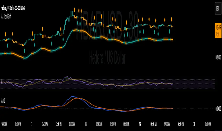
MA Shift (Offset Only + Flip Dots)Indicator Overview
This custom moving average indicator shifts the SMA away from price by a fixed percent or ATR multiple. It delivers a clear, uncluttered view of trend direction and momentum while keeping the price bars visible. A single offset line glows in semi-transparent shading and changes color based on trend state. When the price crosses the base SMA, a small dot marks the flip point.
Key Features
Adjustable Length
Choose any SMA period (default six) to suit your time frame and trading style.
Flexible Offset Mode
Percent mode places the line a fixed percentage above or below the SMA.
ATR mode spaces the line dynamically based on market volatility.
Direction Toggle
Shift the line up or down away from candles.
Glow Effect
A wide, semi-transparent band highlights the offset line for easy visibility.
Trend-Flip Dots
A tiny circle appears below the bar when the trend turns up and above the bar when it turns down, helping you spot reversals at a glance.
Custom Candle and Bar Coloring
Bars and candles recolor to reflect the current trend, reinforcing visual clarity.
How It Works
Base SMA Calculation
The indicator computes a standard SMA on your chosen source (high+low 2 by default).
Offset Application
It then adds or subtracts the percent or ATR-based distance to create a second line.
Trend Detection
When price moves above the SMA, the offset line and bars turn to your “up” color. When price drops below, they switch to your “down” color.
Flip Signals
On the bar that triggers a color change, a dot marks the exact reversal point.
Trading Signals and Usage
Trend Confirmation
Use the offset line as a clean trend guide. Price consistently above the line with green bars signals a bullish regime. Price below the line with orange bars signals bearish control.
Entry and Exit
Long Entry: Wait for a flip-up dot and a green close above the offset line.
Short Entry: Watch for a flip-down dot and an orange close below the offset line.
Stops and Targets: Place stops just inside the offset line on pullbacks for dynamic risk management.
Avoiding Whipsaws
The visual separation helps you ignore minor noise around price. Combine flip dots with bar color to filter false turns.
Confluence with MACD
Pair this offset SMA with the MACD for stronger signals:
MACD Trend Filter
Require the MACD line to be above its signal line (and histogram above zero) before taking a long flip-up from the offset MA.
Momentum Confirmation
When the offset SMA flips to a downtrend, look for the MACD histogram to turn negative. That alignment avoids fade-against-momentum trades.
Entry Timing
Use the MACD crossover as a lead-in filter and the offset SMA flip as the actual trigger. This two-step approach keeps you on the right side of larger moves.
Publishing Tips on TradingView
Description: Summarize features and usage in the indicator’s “About” field.
Inputs: List each setting clearly so users know how to tweak period, offset mode, percent/ATR values and color choices.
Examples: Include a chart snapshot showing a long setup with both the offset SMA flip and a confirming MACD crossover.
Release Notes: Mention version defaults (six-period SMA, ten-percent offset) and invite feedback for improvements.
Tags: Use relevant keywords like “Moving Average,” “Offset Indicator,” “Trend Filter,” and “MACD Confluence” to make it easy to find.
With its simple dot signals and customizable glow, this offset SMA becomes a powerful visual tool—especially when paired with MACD—for spotting clean trend entries and exits.
Buy Dip Multiple Positions🎯 Objective
This strategy aims to capture aggressive dip-buying opportunities during volume-confirmed price reversals in short term downtrending markets. It is optimized for multi-entry precision, adaptive stop management, and real-time trade monitoring.
It allows traders to execute multiple long entries and dynamically trail stops to maximize gains while capping risk. Designed with modular inputs, this strategy is ideal for intraday momentum scalping and swing trading alike.
🔧 How It Operates
The strategy triggers buy entries when three conditions align:
Reversal Candle: Current close < prior low × 0.998
Volume Confirmation: Current volume exceeds average of prior 2 bars × 1.2
Price Surge Threshold: Current close below user-defined % of close from N bars ago
Once a reversal candle is confirmed, the strategy:
Calculates position size based on user-defined risk parameters
Allows up to a max number of simultaneous trades
Trailing Stop kicks in 2 bars after entry, climbing by a user-defined % each bar
Exit occurs when price hits either the trailing stop or target price
🛠️ Inputs
Users can customize all major aspects of the strategy:
Max Simultaneous Trades: Default 20
Trailing Stop Increase per Bar (%): Default 1%
Initial Stop (% of Reversal Low): Default 85%
Target Price (% Above Reversal Low): Default 60%
Price Surge Threshold (% of Past Close): Default 89%
Surge Lookback Bars: Default 14
Show Active Trade Dot: Toggle to display green trade status dot
📊 Visual Overlays
The chart displays the following:
Marker Description
🟢 Green Dot Active trade (toggleable)
🔴 Red Dot Max trades reached
📈 Trailing Stop Applied internally but not plotted (can be added)
📊 Metrics Plots of win rate, winning/losing trade counts
📎 Notes
Strategy uses strategy.cash allocation logic
Entry size adapts to account equity and risk per trade
All parameters are accessible via the settings panel
Built entirely in Pine Script v5
This strategy balances flexibility and precision, giving traders control over entry timing, capital allocation, and stop behavior. Ideal for those looking to automate dip-buy setups with tactical overlays and visual alerts.

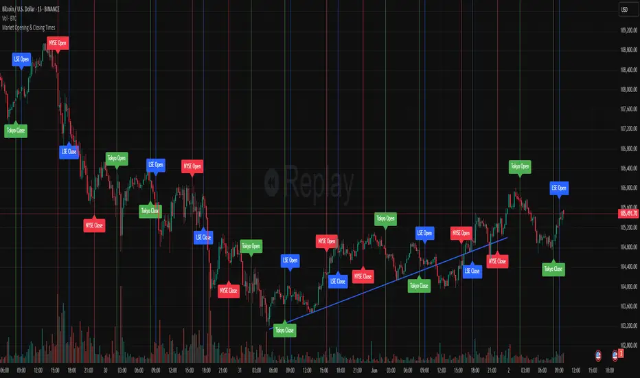
Market Opening & Closing TimesThis indicator highlights the opening and closing times of major global markets (NYSE, LSE, Tokyo) on any chart timeframe. Users can toggle the display of lines and labels, and customize colors per market.
Features:
Toggle each market’s Open/Close separately
Global toggles: Show/Hide all lines or labels
Customizable colors for NYSE, LSE, and Tokyo markers
Accurate event detection using timezone-aware timestamp checks within each bar
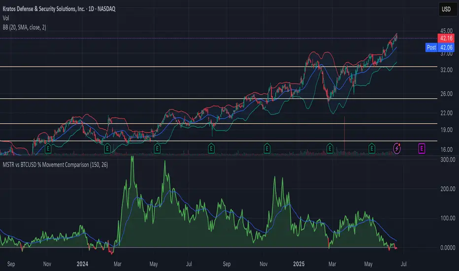
MSTR vs BTCUSD % Movement ComparisonThe indicator, in its current form, is a custom Pine Script (version 6) tool named "MSTR vs BTCUSD % Movement Comparison" that visually compares the percentage price movements of MicroStrategy (MSTR) and Bitcoin (BTCUSD) over a user-defined lookback period. It plots the difference in their percentage changes (diff_pct = mstr_pct - btcusd_pct) as a line, with a zero line for reference, and uses green/red coloring to indicate whether MSTR is outperforming (green, above zero) or underperforming (red, below zero) BTCUSD. The area between the difference line and zero line is filled with semi-transparent green or red for clarity. Additionally, an adjustable-period Exponential Moving Average (EMA) of the percentage difference smooths the trend, helping identify momentum shifts. The indicator is fixed to compare MSTR and BTCUSD, ensuring consistent output regardless of the chart’s active symbol (e.g., MSTR, MTPLF, or others).
Key Features:
Percentage Difference: Shows MSTR’s percentage change minus BTCUSD’s, highlighting relative performance.
Zero Line: A gray solid line at 0 for reference.
Color Coding: Green line/fill when MSTR outperforms, red when it underperforms.
Adjustable EMA: User-defined EMA period (default: 26) smooths the percentage difference.
Fixed Comparison: Always compares MSTR vs. BTCUSD, unaffected by the chart’s symbol.
User Inputs: Lookback period (default: 50 bars) and EMA period (default: 26) are customizable.
Example: On a 1-hour chart, if MSTR rises 4% and BTCUSD rises 1% over 50 bars, the difference line plots at +3 (green) with green fill, and the 26-period EMA might be at +2.2, indicating MSTR’s outperformance trend.
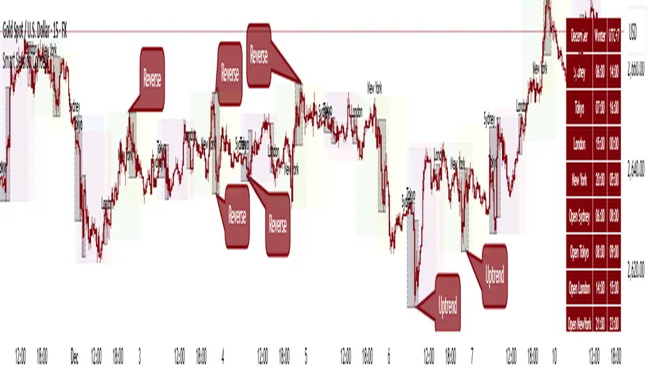
Smart Session ConceptSmart Session Concept — Intelligent Trading Session Overlay
Smart Session Concept is designed to detect major reversal points and key price pivots formed on higher timeframes, particularly during high-volume periods of the day — often marking the footprints of institutional orders and whales.
🔍 Key Features:
Displays standard sessions (Asian, London, New York) and allows adding custom time sessions.
Offers two visualization modes:
Time session table
Visual session boxes plotted on the chart
Auto-sync with seasonal time changes (Summer/Winter), supports Daylight Saving Time (DST)
Full flexibility:
Toggle table, boxes, and labels on/off
Customize colors for all session elements
Choose which months are considered summer/winter
💡 Suggested Use Case:
Use Smart Session Sync to pinpoint critical price structures such as:
Peaks and troughs of trending waves
Highs/lows in Wyckoff trading ranges
Liquidity sweeps or untouched liquidity zones
----------------------
Pin Bar Highlighter OnlyAbsolutely — here’s a full **description and breakdown** of what the script does:
---
## 📜 Script Name:
**"Pin Bar Highlighter Only"**
---
## 🎯 Purpose:
This script **detects and highlights classic pin bar reversal candles** directly on the chart — without plotting any entry, stop loss, or take profit levels.
It’s designed for traders who:
* Want to manually assess trades
* Prefer a clean chart
* Use pin bar price action as a signal for potential reversals
---
## ✅ What It Does:
* **Scans each candle** to check if it qualifies as a **bullish** or **bearish pin bar**
* If valid:
* Plots a **green triangle below** bullish pin bars
* Plots a **red triangle above** bearish pin bars
* Keeps your chart **minimal and uncluttered**
---
## 📌 How It Detects a Pin Bar:
### 🔹 1. Candle Structure:
* Measures the total candle range: `high - low`
* Calculates the **body size**: `abs(close - open)`
* Calculates the **upper and lower wick sizes**
### 🔹 2. Pin Bar Criteria:
* The **wick (nose)** must be at least **2/3 of the total candle length**
* The **body** must be small — **≤ 1/3** of the total range
* The **body** must be located at **one end** of the candle
* The wick must **pierce the high/low** of the previous candle
---
## 📍 Bullish Pin Bar Requirements:
* Close > Open (green candle)
* Lower wick ≥ 66% of candle range
* Body ≤ 33% of range
* Candle **makes a new low** (current low < previous low)
### 📍 Bearish Pin Bar Requirements:
* Close < Open (red candle)
* Upper wick ≥ 66% of candle range
* Body ≤ 33% of range
* Candle **makes a new high** (current high > previous high)
---
## 🖼️ Visual Output:
* 🔻 Red triangle **above** bearish pin bars
* 🔺 Green triangle **below** bullish pin bars
---
## 🛠️ Example Use Cases:
* Identify **reversal points** at support/resistance
* Confirm signals with **VWAP**, supply/demand zones, or AVWAP (manually plotted)
* Use in **conjunction with other strategies** — without clutter
---
Failure Swing IndicatorIdentify Failure Swing nice and easy
J. Welles Wilder Jr. describes Failure Swings as specific chart patterns used in conjunction with the Relative Strength Index (RSI) to identify potential reversals in price trends.
These patterns signal weakening momentum and can indicate a shift in market direction
Wilder emphasized that these patterns are more reliable when confirmed by price action or other technical indicators.
Inside/Outside Bar Sequence Detector# Inside/Outside Bar Sequence Detector
## English Description
**Inside/Outside Bar Sequence Detector**
This indicator identifies and visualizes sequences of Inside and Outside bars on any chart. It highlights important price action patterns that can signal potential market reversals or continuation moves.
**Key Features:**
- Automatically detects consecutive Inside bars (where price action is contained within the previous bar's range) and Outside bars (where price action exceeds the previous bar's range)
- Displays sequences with customizable labels showing the pattern type
- Highlights the price range of each sequence with a transparent box
- Marks individual Inside bars with "i" and Outside bars with "o" below each candle
- Applies special pattern recognition rules for more accurate trade signals
- Fully customizable appearance including colors, opacity, and label positioning
Adjust the minimum sequence length according to your trading timeframe and strategy to filter out noise and focus on significant patterns.
## 中文描述
**内包/外包K线序列检测器**
这个指标可以识别并可视化任何图表上的内包和外包K线序列。它突出显示重要的价格行为模式,这些模式可能预示市场潜在的反转或延续走势。
**主要特点:**
- 自动检测连续的内包K线(价格活动被限制在前一根K线范围内)和外包K线(价格活动超出前一根K线范围)
- 通过可自定义的标签显示模式类型
- 用透明框突出显示每个序列的价格范围
- 在每根K线下方用"i"标记内包蜡烛,用"o"标记外包蜡烛
- 应用特殊模式识别规则,提供更准确的交易信号
- 完全可自定义的外观,包括颜色、透明度和标签位置
根据您的交易时间框架和策略调整最小序列长度,以过滤噪音并专注于重要模式。
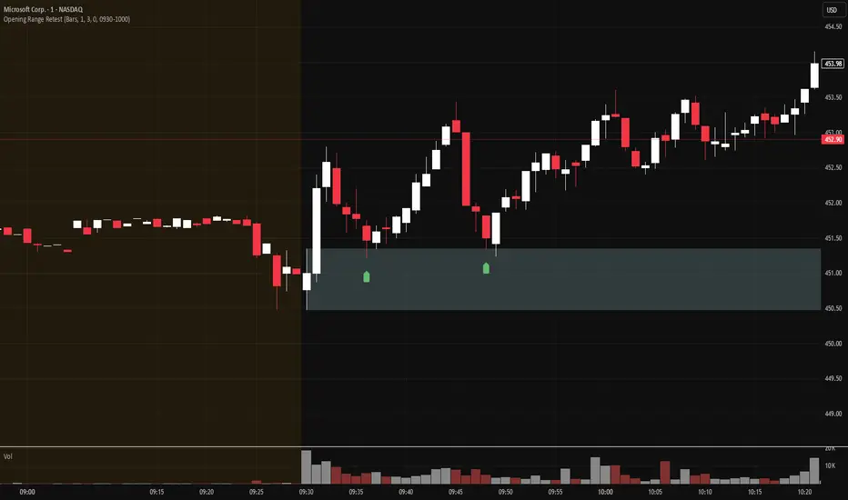
Opening Range Retest█ OVERVIEW
This indicator shows the opening range as a box. It also draws markers and triggers alerts when the opening range is retested. The opening range time is configurable, as is the period of time that must elapse before each return to the opening range is considered a retest.
█ FEATURES
Opening range time configurable in bars or minutes
Configurable "resting" period between the end of the opening range or since the last retest before a new retest is considered valid
Configurable tolerance so that a retest can trigger sooner
Active time range can be used to filter alerts and markers to a specific time window
Visual box showing the opening range, which can be optionally limited to the above-mentioned active time window
Well-documented, high-quality, open-source code for those interested
█ CONCEPTS
This indicator can be used for an opening range retest trading strategy, where long or short positions are taken on the retest of the opening range.
The opening range can be user-configured, so it is suitable for use with any opening range time period (e.g., 1-min, 5-min, 15-min, etc.).
The markers and alerts are equivalent, in the sense that whenever a marker appears, an alert will also trigger (assuming the user has set an alert up).
The alert active time range is simply used as a filter for markers and alerts, meaning that these will not draw or trigger outside of the specified time range.
█ LIMITATIONS
The indicator is intended for equities that have a highly active regular market open. For other security types, it will draw the opening range box from whenever TradingView specifies the market open time.
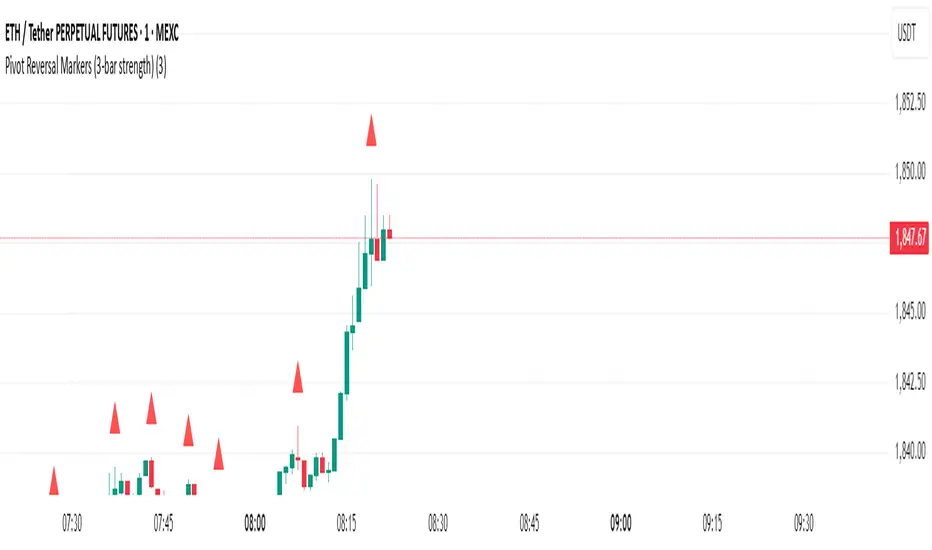
Pivot Reversal Markers (3-bar strength)### Pivot Reversal Markers (3-Bar Strength)
**Overview:**
This indicator identifies and marks pivot high and pivot low reversal points on your chart using a customizable pivot strength. Ideal for traders seeking clear visual signals of potential reversals.
**Settings:**
* **Pivot Strength:** Number of bars checked before and after to confirm a pivot (default = 3).
**Signals:**
* 🔺 **Red Triangle (Pivot High):** Potential short entry or reversal from upward to downward trend.
* 🔻 **Green Triangle (Pivot Low):** Potential long entry or reversal from downward to upward trend.
**Usage:**
Combine these pivot signals with other technical analysis tools or indicators for optimal results.
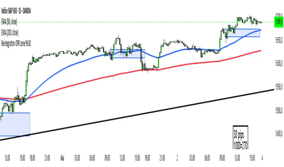
Reintegration OPR zone 9h30📝 Indicator Description (for TradingView):
Name: Reintegration OPR Zone – 9:30 AM EST (UTC-4)
Purpose:
This indicator is designed for US indices like NAS100, US30, or SPX500. It helps identify potential false breakouts or retests by tracking when the price re-enters the Opening Price Range (OPR) after an initial breakout.
🔍 How it works:
At 9:30 AM New York time (UTC-4), the script captures the high and low of the first 15-minute candle (which is key for the US session open).
It then draws a horizontal box (rectangle) from the high to the low of that candle.
The box extends horizontally for 7 hours (28 candles on a 15-minute chart).
The script tracks if price:
Breaks above or below the OPR zone
Then re-enters the zone (a potential "fakeout" or "retest" signal)
No label or text is displayed on the chart (you requested it to be hidden).
🕒 Timeframe:
Designed for the 15-minute chart (M15)
Assumes New York session open at 9:30 AM EST (UTC-4)
3+ Consecutive Higher or Lower Closes (Full Highlight)This indicator identifies 3 or more sequential bars of higher/lower candle closes and highlights them on the chart.
Candle colour is adjustable.
This is the first edition and has a small issue where it only starts highlighting from the 3rd bar in the sequence.
I'll continue working on this to try to debug

2HH2LL [CCE_Charts]Detects the "Two Higher Highs, Two Lower Lows" (2HH2LL) pattern formation and provides strength analysis with trade signals. The indicator displays visual markers, S/R zones, and clear signals for LONG or SHORT positions.
Pattern Description
The 2HH2LL pattern consists of two consecutive higher highs and two consecutive lower lows. This formation can signal potential trend reversals or continuations depending on market context.
Key Features
• Pattern strength analysis using S/R zone and volume confirmation
• Clear LONG or SHORT trade signals
• Visual markers highlighting pattern components
• Support/Resistance zone visualization
• Customizable alerts for real-time notifications
• Detailed information panel
How to Use This Indicator
1. Add the indicator to your chart
2. Configure settings based on your trading style
3. Look for the "2HH2LL" label when a valid pattern forms
4. Check the pattern strength (STRONG, MEDIUM, WEAK)
5. Note the trade direction signal (LONG or SHORT)
6. Verify the pattern with other technical tools
7. Set up alerts for real-time notifications
Settings Guide
Pattern Settings
• Lookback Period: Controls pivot point detection (5-50)
• Minimum Swing Strength: Required percentage change between highs/lows
Confirmation Settings
• S/R Zone Size: Size of support/resistance zone
• Volume Confirmation Threshold: Volume multiple required for confirmation
• Volume Average Period: Bars used for volume average calculation
Visual Settings
• Show H1/H2/L1/L2 Labels: Toggle pattern component labels
• Show S/R Zone: Toggle support/resistance zone display
Signal Settings
• Trade Direction: How trade direction is determined (SHORT, LONG, AUTO)
Alert Settings
• Alert on All Patterns: Trigger alerts for all valid patterns
• Alert on STRONG Patterns Only: Only alert on strong patterns
• Alert on Direction: Filter alerts by trade direction
Pattern Strength Analysis
The indicator classifies pattern strength into three categories:
• STRONG: Both confirmation factors present (S/R test and volume)
• MEDIUM: One confirmation factor present
• WEAK: No confirmation factors present
For best results, use this indicator in combination with other technical tools and always consider the broader market context.

The LBF modelThe LBF Model is a structural pattern detector that highlights potential reversal zones using a specific sequence of pivot points. It identifies both bearish (LL → LH → LL → HH → LH) and bullish (HH → HL → HH → LL → HL) formations, marking moments where price shows signs of exhaustion and directional shift.
Built purely on price action, the LBF Model avoids indicators and focuses on clean structure. It draws patterns directly on the chart, with customizable sensitivity and colors. Whether used on its own or with other tools, it helps traders spot key turning points with clarity and precision.

[blackcat] L3 Magic-9/13 with Reversal Points ConfirmationOVERVIEW
The L3 Magic-9/13 with Reversal Points Confirmation indicator is designed to help traders identify potential reversal points in the market using a sequential approach. This indicator adopts the "buy when fearful, sell when greedy" philosophy, focusing on capturing key reversal moments 📉↗️. It plots labels on the chart to indicate these reversal points and uses custom functions to filter occurrences based on specific conditions.
FEATURES
Identifies consecutive price movements to detect potential reversals.
Plots labels for various sequential patterns:
High Sequentials: 5, 6, 7, 8, 9, 12, 13
Low Sequentials: 5, 6, 7, 8, 9, 12, 13
Uses custom functions to count consecutive occurrences and filter conditions.
Provides visual confirmation of reversal points with colored labels 🏷️.
Allows customization of sequence lengths and lookback periods ⚙️.
HOW TO USE
Add the indicator to your TradingView chart by selecting it from the indicators list.
Observe the plotted labels indicating potential reversal zones:
Green labels for buy signals ('B').
Red labels for sell signals ('S').
Customize the sequence lengths and lookback periods as needed in the settings panel.
Combine this indicator with other tools for confirmation before making trading decisions.
LIMITATIONS
The indicator relies heavily on sequential patterns, which might not capture all market nuances.
False signals can occur in ranging or sideways markets 🌪️.
Users should always confirm signals with other forms of analysis.
NOTES
Ensure that you have sufficient historical data available for accurate calculations.
Test the indicator thoroughly on demo accounts before applying it to live trading 🔍.
Understand the concept of buying at bottoms and selling at tops before using this indicator.

[blackcat] L3 Magic-9 Sequential SetupOVERVIEW
The L3 Magic-9 Sequential Setup indicator is designed to identify potential reversal points in the market using a sequential pattern analysis. This script plots specific labels on the chart based on predefined conditions, helping traders spot key levels where price reversals might occur 📉↗️.
FEATURES
Identifies consecutive occurrences of price movements above or below certain thresholds.
Plots labeled markers on the chart for easy visualization:
Red Labels: Indicate potential sell signals (e.g., '5', '6', '7', etc.).
Green Labels: Indicate potential buy signals (e.g., '5', '6', '7', etc.)
Uses custom functions to filter and count occurrences over specified lookback periods ⚙️.
Changes bar colors based on detected signals for enhanced visual cues 🎨.
Supports extensive customization through input parameters for fine-tuning the setup.
HOW TO USE
Add the indicator to your TradingView chart by selecting it from the indicators list.
Observe the plotted labels ('5', '6', '7', etc.) indicating potential reversal zones.
Pay attention to bar color changes that confirm the identified patterns.
Combine this indicator with other tools for confirmation before making trading decisions.
LIMITATIONS
The indicator relies heavily on sequential patterns, which may not capture all market nuances.
False signals can occur in ranging or sideways markets 🌪️.
Users should always confirm signals with other forms of analysis.
NOTES
Ensure that you have sufficient historical data available for accurate calculations.
Test the indicator thoroughly on demo accounts before applying it to live trading 🔍.
Customize input parameters as needed to fit your trading strategy.

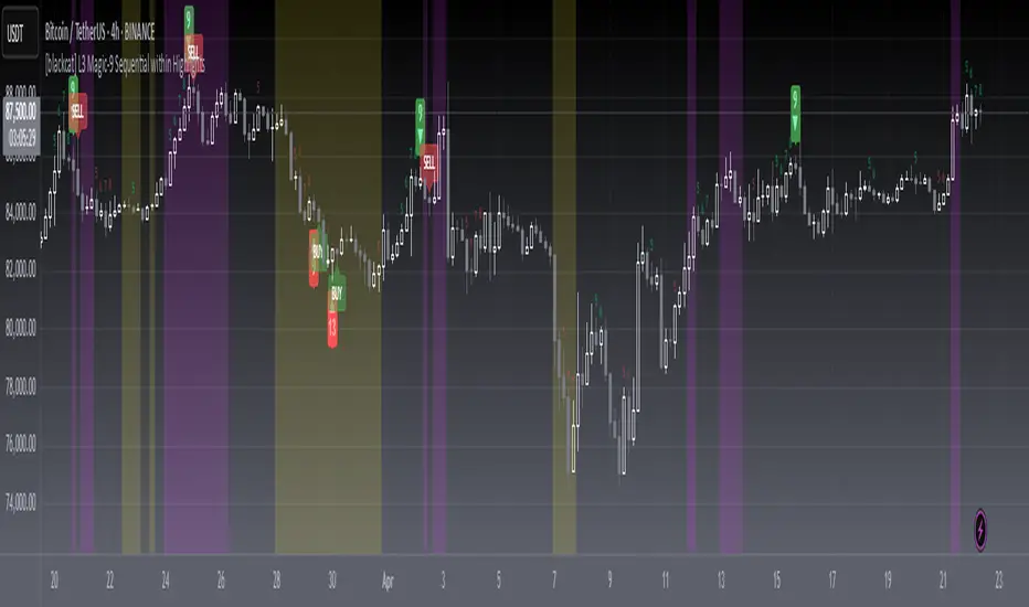
[blackcat] L3 Magic-9 Sequential within HighlightsOVERVIEW
The L3 Magic-9 Sequential within Highlights indicator is designed to identify potential buy and sell signals based on sequential price patterns. This script uses custom functions to detect consecutive occurrences of specific conditions and highlights these patterns on the chart with labels and background colors 📊🔍.
FEATURES
Detects sequential price patterns for both bullish and bearish movements:
High sequences: 5, 6, 7, 8, 9, 12, 13 bars.
Low sequences: 5, 6, 7, 8, 9, 12, 13 bars.
Plots characters ('5', '6', etc.) and shapes (arrows) on the chart to indicate detected sequences 🏷️↗️↘️.
Uses a customizable period for calculating averages of price differences.
Highlights overbought and oversold conditions using background colors 🎨.
Generates buy ('B') and sell ('S') labels based on filtered occurrences and index values.
HOW TO USE
Add the indicator to your TradingView chart by selecting it from the indicators list.
Observe the plotted characters and arrows indicating detected sequential patterns.
Monitor the background color changes to identify overbought and oversold conditions.
Look for generated buy ('B') and sell ('S') labels for potential trading opportunities.
Customize the period and thresholds in the settings panel as needed ⚙️.
LIMITATIONS
The indicator relies heavily on sequential price patterns, which might not capture all market nuances.
False signals can occur in ranging or sideways markets 🌪️.
Users should always confirm signals with other forms of analysis before making trading decisions.
NOTES
Ensure that you have sufficient historical data available for accurate calculations.
Test the indicator thoroughly on demo accounts before applying it to live trading 🔍.
Adjust the period and threshold inputs to fit your preferred trading strategy.
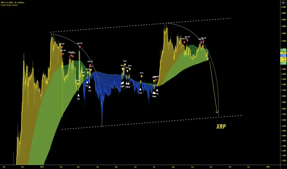
Master Simple IndicatorThe streamlined Pine Script, created by masterbtcltc, is a technical analysis indicator that overlays on a price chart to provide buy and sell signals based on a dynamic 120-day simple moving average (SMA). Here's how it works:
Dynamic Moving Average: Calculates a 120-day SMA (ma_dynamic) using closing prices to smooth out price fluctuations and identify trends.
Buy/Sell Signals:
Buy Signal: Triggered when the closing price crosses above the 120-day SMA (longSignal), indicating potential bullish momentum. A white triangle with "close" text appears below the bar.
Sell Signal: Triggered when the closing price crosses below the 120-day SMA (shortSignal), suggesting bearish momentum. A yellow triangle with "Short" text appears above the bar.
Alerts: Generates alerts for buy (Long Signal Alert) and sell (Short Signal Alert) signals, notifying users when the price crosses the SMA.
Visual Highlights:
Price vs. SMA: The area between the closing price and the 120-day SMA is filled with yellow if the price is above the SMA (bullish) or blue if below (bearish).
50-day vs. 120-day SMA: The area between the 50-day SMA and 120-day SMA is filled green when the 50-day SMA is above the 120-day SMA, indicating a stronger bullish trend.
Created by masterbtcltc, this indicator helps traders identify trend changes and potential entry/exit points based on price interactions with the 120-day SMA, with clear visual cues and alerts for decision-making.