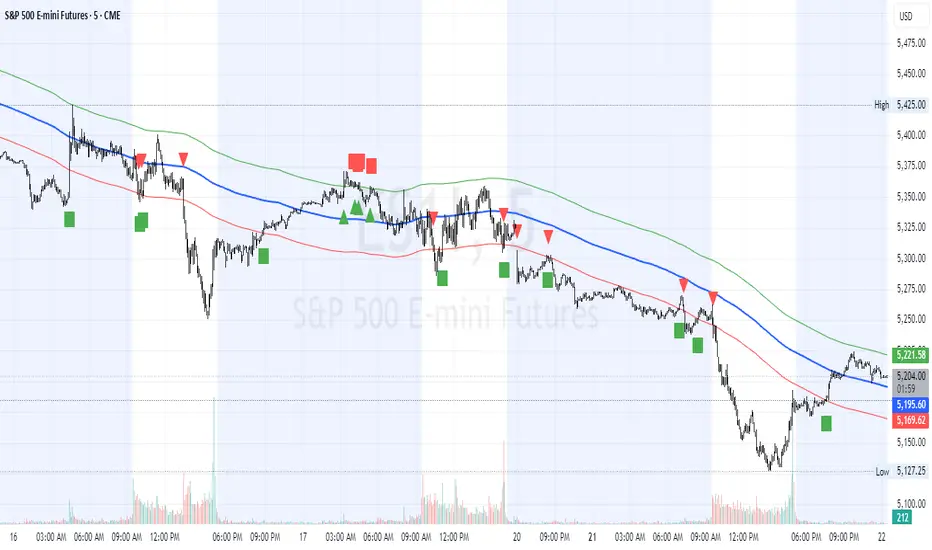
HL2 Moving Average with BandsThis indicator is designed to assist traders in identifying potential trade entries and exits for S&P 500 (ES) and Nasdaq-100 (NQ) futures. It calculates a Simple Moving Average (SMA) based on the HL2 value (average of high and low prices) of the current candle over a user-defined lookback period (default: 200 periods). The indicator plots this SMA as a blue line, providing a smoothed reference for price trends.
Additionally, it includes upper and lower bands calculated as a percentage (default: 0.5%) above and below the SMA, plotted as green and red lines, respectively. These bands act as dynamic thresholds to identify overbought or oversold conditions. The indicator generates trade signals based on price action relative to these bands:
Long Entry: A green upward triangle is plotted below the candle when the close crosses above the upper band, signaling a potential buy.
Close Long: A red square is plotted above the candle when the close crosses back below the upper band, indicating an exit for the long position.
Short Entry: A red downward triangle is plotted above the candle when the close crosses below the lower band, signaling a potential sell.
Close Short: A green square is plotted below the candle when the close crosses back above the lower band, indicating an exit for the short position.
The script is customizable, allowing users to adjust the SMA length and band percentage to suit their trading style or market conditions. It is plotted as an overlay on the price chart for easy integration with other technical analysis tools.
Recommended Time Frame and Settings for Trading S&P 500 and Nasdaq-100 Futures
Based on research and market dynamics for S&P 500 (ES) and Nasdaq-100 (NQ) futures, the 5-minute chart is recommended as the optimal time frame for day trading with this indicator. This time frame strikes a balance between capturing intraday trends and filtering out excessive noise, which is critical for futures trading due to their high volatility and leverage. The 5-minute chart aligns well with periods of high liquidity and volatility, such as the U.S. market open (9:30 AM–11:00 AM EST) and the afternoon session (2:00 PM–4:00 PM EST), when institutional traders are most active.
Why 5-minute? It allows traders to react to short-term price movements while avoiding the rapid fluctuations of 1-minute charts, which can be prone to false signals in choppy markets. It also provides enough data points to make the SMA and bands meaningful without the lag associated with longer time frames like 15-minute or hourly charts.
Recommended Settings
SMA Length: Set to 200 periods. This longer lookback period smooths the HL2 data, reducing noise and providing a reliable trend reference for the 5-minute chart. A 200-period SMA helps identify significant trend shifts without being overly sensitive to minor price fluctuations.
Band Percentage: 0.5% is more suitable for the volatility of ES and NQ futures on a 5-minute chart, as it generates fewer but higher-probability signals. Wider bands (e.g., 1%) may miss short-term opportunities, while narrower bands (e.g., 0.1%) may produce excessive false signals.
Trading Session Recommendations
Futures markets for ES and NQ are open nearly 24 hours (Sunday 6:00 PM EST to Friday 5:00 PM EST, with a daily break from 4:00 PM–5:00 PM EST), but not all hours are equally optimal due to varying liquidity and volatility. The best times to trade with this indicator are:
U.S. Market Open (9:30 AM–11:00 AM EST): This period is characterized by high volume and volatility, driven by the opening of U.S. equity markets and economic data releases (e.g., 8:30 AM EST reports like CPI or GDP). The indicator’s signals are more reliable during this window due to strong order flow and price momentum.
Afternoon Session (2:00 PM–4:00 PM EST): After the lunchtime lull, volume picks up as institutional traders return, and news or FOMC announcements often drive price action. The indicator can capture breakout moves as prices test the upper or lower bands.
Pre-Market (7:30 AM–9:30 AM EST): For traders comfortable with lower liquidity, this period can offer opportunities, especially around 8:30 AM EST economic releases. However, use tighter risk management due to wider spreads and potential volatility spikes.
Additional Tips
Avoid Low-Volume Periods: Steer clear of trading during low-liquidity hours, such as the overnight session (11:00 PM–3:00 AM EST), when spreads widen and price movements can be erratic, leading to false signals from the indicator.
Combine with Other Tools: Enhance the indicator’s effectiveness by pairing it with support/resistance levels, Fibonacci retracements, or volume analysis to confirm signals. For example, a long entry signal above the upper band is stronger if it coincides with a breakout above a key resistance level.
Risk Management: Given the leverage in futures (e.g., Micro E-mini contracts require ~$1,200 margin for ES), use tight stop-losses (e.g., below the lower band for longs or above the upper band for shorts) to manage risk. Aim for a risk-reward ratio of at least 1:2.
Test Settings: Backtest the indicator on a demo account to optimize the SMA length and band percentage for your specific trading style and risk tolerance. Micro E-mini contracts (MES for S&P 500, MNQ for Nasdaq-100) are ideal for testing due to their lower capital requirements.
Why These Settings and Time Frame?
The 5-minute chart with a 200-period SMA and 0.5% bands is tailored for the volatility and liquidity of ES and NQ futures during peak trading hours. The longer SMA period ensures the indicator captures meaningful trends, while the 0.5% bands are tight enough to signal actionable breakouts but wide enough to avoid excessive whipsaws. Trading during high-volume sessions maximizes the likelihood of valid signals, as institutional participation drives clearer price action.
By focusing on these settings and time frames, traders can leverage the indicator to capitalize on the dynamic price movements of S&P 500 and Nasdaq-100 futures while managing the inherent risks of these markets.
ابحث في النصوص البرمجية عن "charts"
Liquidity Levels (Smart Swing Lows)Liquidity Levels — Smart Swing Low Detection
Efficient Liquidity Sweep Visualization for Smart Money Traders
This script automatically identifies and plots liquidity-rich swing lows based on pivot logic, filters them to remove redundant levels, and overlays daily highs/lows for added context — giving Smart Money Concept (SMC) traders a clean, actionable map of liquidity.
It’s designed to be minimal yet powerful: perfect for spotting potential liquidity grabs, mitigation zones, and sweep targets with zero chart clutter.
🔍 What This Script Does:
Detects Smart Swing Lows
Uses fixed pivot detection (left = 3, right = customizable) to identify structurally significant swing lows.
Filters out swing lows that are too close together using a percentage-based spacing threshold to reduce noise.
Mitigation Cleanup Logic
Tracks whether recent price action breaches past swing lows.
If breached, the swing level is automatically removed, keeping only relevant, unmitigated liquidity levels on your chart.
Plots Daily Highs and Lows
Each new trading day, horizontal rays mark the prior day’s high and low — useful for identifying resting liquidity and possible sweep zones.
Labeling and Style Customization
Optional labels for swing lows.
Full control over label size, color, and visibility to match any chart aesthetic.
Timeframe Filtering
Runs exclusively on 5m, 10m, and 15m charts to ensure optimal reliability and signal clarity.
⚙️ Customization Features:
Pivot sensitivity (Right side control)
Minimum distance between swing lows (in %)
Label visibility, size, and color
Line width and colors for both swing levels and daily highs/lows
Mitigation cleanup lookback length
💡 How to Use:
Add the script to a qualifying intraday chart (5–15m).
Use the swing low levels to monitor liquidity-rich zones.
Combine with your personal strategy to identify liquidity grabs, potential reversal zones, or entry points following a sweep.
Let the built-in cleanup logic remove any already-mitigated levels so you can focus on active targets.
🚀 What Makes It Unique:
This isn’t just another pivot plotter — it’s a smart, self-cleaning SMC tool designed for modern liquidity-based trading strategies.
A must-have for traders using concepts like liquidity grabs, mitigation blocks, or sweep-to-reverse trade models.
🔗 Best used in combination with:
✅ First FVG — Opening Range Fair Value Gap Detector: Pinpoint the day’s first imbalance zone for intraday setups.
✅ ICT SMC Liquidity Grabs + OB + Fibonacci OTE Levels: Confluence-based entries powered by liquidity logic, order blocks, and premium/discount zones.
Used together, these scripts form a complete Smart Money toolkit — helping you build high-probability setups with confidence, clarity, and clean charts.
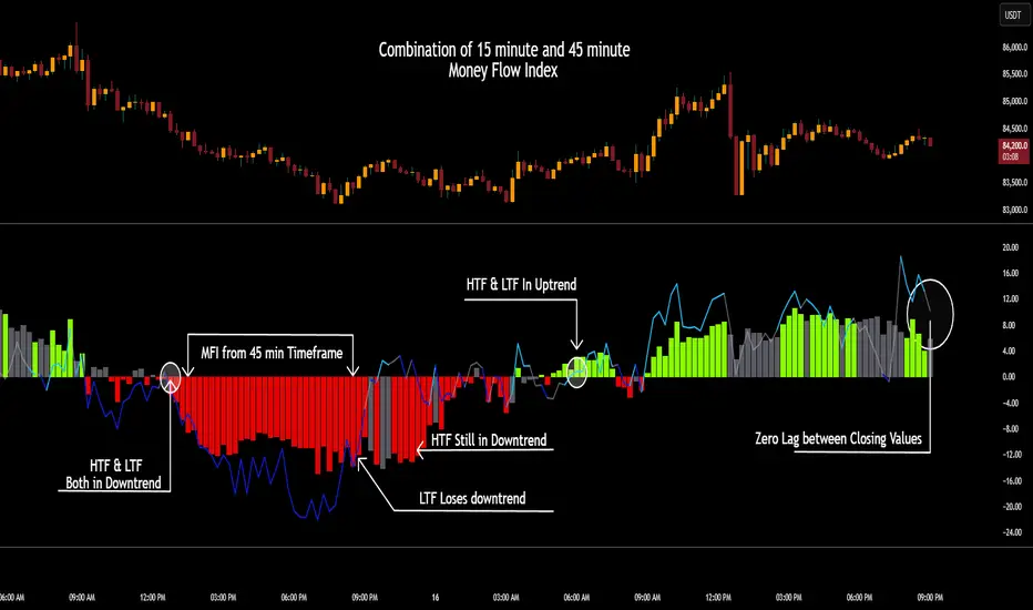
CSCMultiTimeframeToolsLibrary "CSCMultiTimeframeTools"
Calculates instant higher timeframe values for higher timeframe analysis with zero lag.
getAdjustedLookback(current_tf_minutes, higher_tf_minutes, length)
Calculate adjusted lookback period for higher timeframe conversion.
Parameters:
current_tf_minutes (int) : Current chart timeframe in minutes (e.g., 5 for 5m).
higher_tf_minutes (int) : Target higher timeframe in minutes (e.g., 15 for 15m).
length (int) : Base length value (e.g., 14 for RSI/MFI).
Returns: Adjusted lookback period (length × multiplier).
Purpose and Benefits of the TimeframeTools Library
This library is designed to solve a critical pain point for traders who rely on higher timeframe (HTF) indicator values while analyzing lower timeframe (LTF) charts. Traditional methods require waiting for multiple candles to close—for example, to see a 1-hour RSI on a 5-minute chart, you’d need 12 closed candles (5m × 12 = 60m) before the value updates. This lag means missed opportunities, delayed signals, and inefficient decision-making.
Why Traders Need This
Whether you’re scalping (5M/15M) or swing trading (1H/4H), this library bridges the gap between timeframes, giving you HTF context in real time—so you can act faster, with confidence.
How This Library Eliminates the Waiting Game
By dynamically calculating the adjusted lookback period, the library allows:
Real-time HTF values on LTF charts – No waiting for candle closes.
Accurate conversions – A 14-period RSI on a 1-hour chart translates to 168 periods (14 × 12) on a 5-minute chart, ensuring mathematical precision.
Flexible application – Works with common indicators like RSI, MFI, CCI, and moving averages (though confirmations should be done before publishing under your own secondary use).
Key Advantages Over Manual Methods
Speed: Instantly reflects HTF values without waiting for candle resolutions.
Adaptability: Adjusts automatically if the user changes timeframes or lengths.
Consistency: Removes human error in manual period calculations.
Limitations to Note
Not a magic bullet – While it solves the lag issue, traders should still:
Validate signals with price action or additional confirmations.
Be mindful of extreme lookback lengths (e.g., a 200-period daily SMA on a 1-minute chart requires 28,800 periods, which may strain performance).
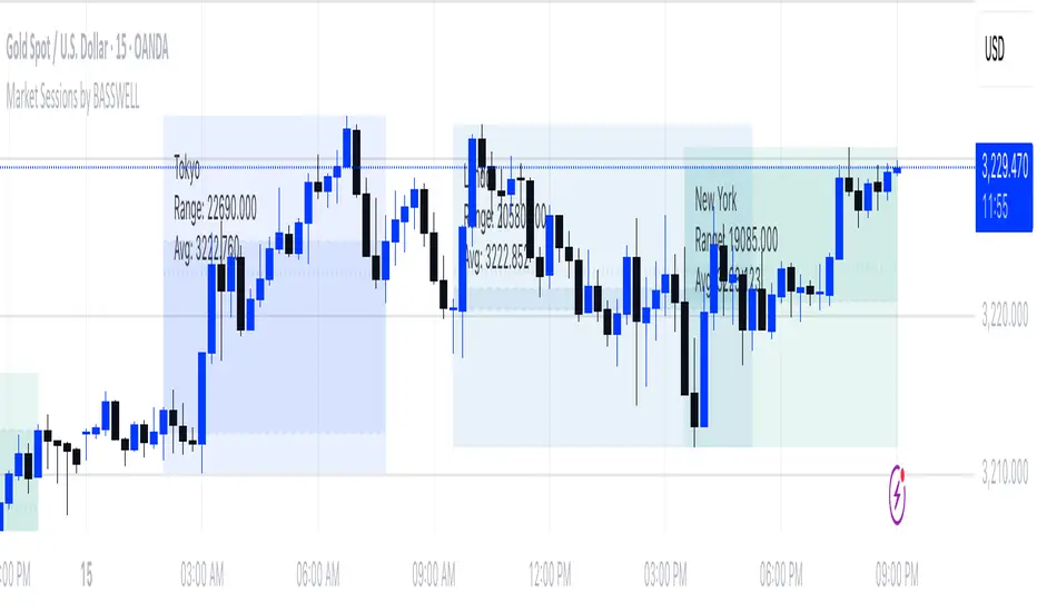
Market Sessions by BASSWELLThis TradingView indicator visually highlights major global trading sessions (Tokyo, London, New York) directly on intraday charts. It provides a clear, color-coded display of session activity and key statistics to help traders better understand session dynamics and overlaps.
✅ Key Features:
Visual Session Boxes: Draws background boxes for each session with configurable colors.
Session Names: Displays the name of each session as a label above the session box.
Open/Close Lines: Optionally shows dashed lines at session open and close prices.
Average Price Line: Plots the average session price as a dotted line.
Tick Range Display: Calculates and shows the high-low range in ticks.
Time Zone Support: Fully timezone-aware via IANA definitions (e.g. "Europe/London").
Overlap Handling: Automatically dims older sessions when a new one starts for visual clarity.
🔧 Configurable Parameters:
Show/hide each session individually.
Set session times and timezones.
Customize label visibility and box contents.
Adjust session colors with transparency.
Includes basic visual styling for better chart readability.
⚠️ Note: Works only on intraday timeframes. Daily/weekly/monthly charts are not supported.
Reversal & Breakout Strategy with ORB### Reversal & Breakout Strategy with ORB
This strategy combines three distinct trading approaches—reversals, trend breakouts, and opening range breakouts (ORB)—into a single, cohesive system. The goal is to capture high-probability setups across different market conditions, leveraging a mashup of technical indicators for confirmation and risk management. Below, I’ll explain why this combination works, how the components interact, and how to use it effectively.
#### Why the Mashup?
- **Reversals**: Identifies overextended moves using RSI (overbought/oversold) and SMA50 crosses, filtered by VWAP and SMA200 trend direction. This targets mean-reversion opportunities in trending markets.
- **Breakouts**: Uses EMA9/EMA20 crossovers with VWAP and SMA200 confirmation to catch momentum-driven trend continuations.
- **Opening Range Breakout (ORB)**: Detects early momentum by breaking the high/low of a user-defined opening range (default: 15 bars) with volume confirmation. This adds a time-based edge, ideal for intraday trading.
The synergy comes from blending these methods: reversals catch pullbacks, breakouts ride trends, and ORB exploits early volatility—all filtered by trend (SMA200) and anchored by VWAP for context.
#### How It Works
1. **Indicators**:
- **EMA9/EMA20**: Fast-moving averages for breakout signals.
- **SMA50**: Medium-term trend filter for reversals.
- **SMA200**: Long-term trend direction to align trades.
- **RSI (14)**: Measures overbought (>70) or oversold (<30) conditions.
- **VWAP**: Acts as a dynamic support/resistance level.
- **ATR (14)**: Sets stop-loss distance (default: 1.5x ATR).
- **Volume**: Confirms ORB breakouts (1.5x average volume of opening range).
2. **Entry Conditions**:
- **Long**: Triggers on reversal (SMA50 cross + RSI < 30 + below VWAP + uptrend), breakout (EMA9 > EMA20 + above VWAP + uptrend), or ORB (break above opening range high + volume).
- **Short**: Triggers on reversal (SMA50 cross + RSI > 70 + above VWAP + downtrend), breakout (EMA9 < EMA20 + below VWAP + downtrend), or ORB (break below opening range low + volume).
3. **Risk Management**:
- Risks 5% of equity per trade (based on the initial capital set in the strategy tester).
- Stop-loss: Based on lowest low/highest high over 7 bars ± 1.5x ATR.
- Targets: Two exits at 1:1 and 1:2 risk:reward (50% of position at each).
- Break-even: Stop moves to entry price after the first target is hit.
4. **Backtesting Settings**:
- Commission: Hardcoded at 0.1% per trade (realistic for most brokers).
- Slippage: Hardcoded at 2 ticks (realistic for most markets).
- Tested on datasets yielding 100+ trades (e.g., 2-min or 5-min charts over months).
#### How to Use It
- **Timeframe**: Works best on intraday (2-min, 5-min) or daily charts. Adjust `Opening Range Bars` (e.g., 15 bars = 30 min on 2-min chart) for your timeframe.
- **Settings**:
- Set your initial equity in the TradingView strategy tester’s "Properties" tab under "Initial Capital" (e.g., $10,000). The script automatically risks 5% of this equity per trade.
- Adjust `Stop Loss ATR Multiplier` or `Risk:Reward Targets` based on your risk tolerance.
- Note that commission (0.1%) and slippage (2 ticks) are fixed in the script for backtesting consistency.
- **Execution**: Enter on signal, monitor plotted stop (red) and targets (green/blue). The strategy supports pyramiding (up to 2 positions) for scaling into trends.
#### Backtesting Notes
Results are realistic with commission (0.1%) and slippage (2 ticks) included. For a sufficient sample, test on volatile instruments (e.g., stocks, forex) over 3-6 months on lower timeframes. The default 1.5x ATR stop may seem wide, but it’s justified to avoid premature exits in volatile markets—feel free to tweak it with justification. The script assumes an initial capital of $10,000 in the strategy tester for the 5% risk calculation (e.g., $500 risk per trade); adjust this in the "Properties" tab as needed.
This mashup isn’t just a random mix; it’s a deliberate fusion of complementary strategies, offering traders flexibility across market phases. Questions? Let me know!
Pixel Art ChickenPixel Art Chicken 🐔
This Pine Script (v6) script generates a Pixel Art of a Chicken on the TradingView chart.
📌 Features:
Draws a pixelated chicken using vibrant colors:
🔴 Red (comb)
🟡 Yellow (beak and legs)
⚪ Light gray (body)
⚫ Black (eyes and outline)
Overlays the chart at user-defined intervals.
Functions as a visual design without affecting market data.
Customizable in terms of location and spacing between images.
🎨 Main Use:
This script is perfect for adding a fun and creative touch to your TradingView charts.
🔧 Optional:
If you want to modify the repetition frequency of the pixel art, adjust the separation parameter.
💡 Note:
This script is not a technical indicator and does not influence market analysis.
🚀 Enjoy this Pixel Art on your charts! 🎮🐔🔥

1H/3m Concept [RunRox]🕘 1H/3m Concept is a versatile trading methodology based on liquidity sweeps from fractal points identified on higher timeframes, followed by price reversals at these key moments.
Below, I will explain this concept in detail and provide clear examples demonstrating its practical application.
⁉️ WHAT IS A FRACTALS?
In trading, a fractal is a technical analysis pattern composed of five consecutive candles, typically highlighting local market turning points. Specifically, a fractal high is formed when a candle’s high is higher than the highs of the two candles on either side, whereas a fractal low occurs when a candle’s low is lower than the lows of the two adjacent candles on both sides.
Traders use fractals as reference points for identifying significant support and resistance levels, potential reversal areas, and liquidity zones within price action analysis. Below is a screenshot illustrating clearly formed fractals on the chart.
📌 ABOUT THE CONCEPT
The 1H/3m Concept involves marking Higher Timeframe (HTF) fractals directly onto a Lower Timeframe (LTF) chart. When a liquidity sweep occurs at an HTF fractal level, we remain on the same LTF chart (since all HTF fractals are already plotted on this lower timeframe) and wait for a clear Market Structure Shift (MSS) to identify our potential entry point.
Below is a schematic illustration clearly demonstrating how this concept works in practice.
Below is another 💡 real-chart example , showing liquidity in the form of a 1H fractal, swept by a rapid impulse move. Immediately afterward, a clear Market Structure Shift (MSS) occurs, signaling a potential entry point into the trade.
Another example is shown below, where we see our hourly fractal, from which price clearly reacts, providing an opportunity to search for an entry point.
As illustrated on the chart, the fractal levels from the higher timeframe are clearly displayed, but we’re working directly on the 5-minute chart. This allows us to remain on one timeframe without needing to switch back and forth between charts to spot such trading setups.
🔍 MTF FRACTALS
This concept can be applied across various HTF-LTF timeframe combinations. Although our examples illustrate 1H fractals used on a 5-minute chart, you can effectively utilize many other timeframe combinations, such as:
30m HTF fractals on 1m chart
1H HTF fractals on 3m chart
4H HTF fractals on 15m chart
1D HTF fractals on 1H chart
The key idea behind this concept is always the same: identify liquidity at fractal levels on the higher timeframe (HTF), then wait for a clear Market Structure Shift (MSS) on the lower timeframe (LTF) to enter trades.
⚙️ SETTINGS
🔷 Trade Direction – Select the preferred trading direction (Long, Short, or Both).
🔷 HTF – Choose the higher timeframe from which fractals will be displayed on the current chart.
🔷 HTF Period – Number of candles required on both sides of a fractal candle (before and after) to confirm fractal formation on the HTF.
🔷 Current TF Period – Sensitivity to the impulse that sweeps liquidity, used for identifying and forming the MSS line.
🔷 Show HTF – Enable or disable displaying HTF fractal lines on your chart. You can also customize line style and color.
🔷 Max Age (Bars) – Number of recent bars within which fractals from the selected HTF will be displayed.
🔷 Show Entry – Enable or disable displaying the MSS line on the chart.
🔷 Enable Alert – Activates TradingView alerts whenever the MSS line is crossed.
You can also enable 🔔 alerts, which notify you whenever price crosses the MSS line. This significantly simplifies the process of identifying these setups on your charts. Simply configure your preferred timeframes and wait for notifications when the MSS line is crossed.
🔶 We greatly appreciate your feedback and suggestions for improving the indicator!

Wick to Candle Ratio with Multiple ColorsThe display in question likely provides visual representations or data related to the concept of the dot-based wick-to-body ratio. This ratio is a term often used in financial markets, particularly in the context of candlestick charts.
In candlestick charts, each candlestick represents a specific time period (such as a minute, hour, day, etc.) and provides four pieces of price data: the opening price, closing price, highest price, and lowest price of an asset within that timeframe. The "body" of the candlestick is the area between the opening and closing prices, while the "wicks" (or shadows) are the lines extending from the body, representing the highest and lowest prices during the period.
The dot-based wick-to-body ratio refers to a method of quantifying the relative lengths of the wicks compared to the body using dots or points. In this context, a display illustrating this ratio might show different candlesticks with highlighted dots representing the ratio between the length of the wick and the body. A higher ratio could indicate more volatility in price movements during that timeframe, while a lower ratio might suggest comparatively stable price action.

RSI & EMA IndicatorMulti-Timeframe EMA & RSI Analysis with Trend Merging Detection
Overview
This script provides traders with a multi-timeframe analysis tool that simplifies trend detection, momentum confirmation, and potential trend shifts. It integrates Exponential Moving Averages (EMAs) and the Relative Strength Index (RSI) across Daily, Weekly, and Monthly timeframes, helping traders assess both long-term and short-term market conditions at a glance.
This script is a simplification and modification of the EMA Cheatsheet by MarketMoves, reducing chart clutter while adding EMA merging detection to highlight potential trend reversals or breakouts.
Originality and Usefulness
Unlike traditional indicators, which focus on a single timeframe, this script combines multiple timeframes in a single view to offer a comprehensive market outlook.
What Makes This Indicator Unique?
This Indicator to Combine RSI and EMA Clouds for Multiple Timeframes
Multi-Timeframe Trend Analysis in One Visual Tool
EMA Merging Detection to Spot Trend Shifts Early
Momentum Validation Using RSI Across Daily, Weekly, and Monthly Timeframes
Reduces Chart Clutter While Providing Actionable Trade Signals
I couldn't find a TradingView indicator that displayed RSI and EMA clouds together across Daily, Weekly, and Monthly timeframes. This tool bridges that gap, allowing traders to see trend strength and momentum shifts across key timeframes without switching charts.
How the Script Works
1. Trend Direction via EMAs
The script tracks Short-term (5 & 12-period), Medium-term (34 & 50-period), and Long-term (72 & 89-period) EMAs across Daily, Weekly, and Monthly timeframes.
Bullish trend: When faster EMAs are above slower EMAs.
Bearish trend: When faster EMAs are below slower EMAs.
A visual table simplifies trend recognition with:
Green cells for bullish alignment.
Red cells for bearish alignment.
This color-coded system allows traders to quickly assess market momentum across different timeframes without excessive manual analysis.
2. Momentum Confirmation with RSI
The RSI(14) values for Daily, Weekly, and Monthly timeframes are displayed alongside the EMAs.
RSI above 70 suggests overbought conditions.
RSI below 30 suggests oversold conditions.
By combining RSI with EMA trends, traders can confirm whether momentum supports the trend direction or if the market is losing strength.
3. Trend Shift Detection (EMA Merging Mechanism)
A unique feature of this script is EMA merging detection, which occurs when:
The short, medium, and long-term EMAs come within 0.5% of the price.
This often signals trend reversals, breakouts, or consolidations.
When this condition is met, a warning signal appears, alerting traders to potential market shifts.
Who This Indicator Is For?
This script is designed for traders who want to track trends across multiple timeframes while keeping a clean and simplified chart.
Swing & Position Traders – Identify strong trends and potential momentum shifts for longer-term trades.
Trend Followers – Stay aligned with major market trends and avoid trading against momentum.
Day Traders – Use the Daily timeframe for entries while referencing higher timeframes for confirmation.
How to Use the Indicator
Add the indicator to any chart.
Check the trend table in the top-right corner:
Green cells indicate a bullish trend.
Red cells indicate a bearish trend.
Look at RSI values to confirm momentum:
RSI above 70 = Overbought.
RSI below 30 = Oversold.
Watch for the "Merge" alert to spot potential reversals or consolidations.
Combine signals from multiple timeframes for stronger trade decisions.
Why This Indicator is Unique on TradingView?
Before this script, no TradingView indicator displayed RSI and EMA clouds together across multiple timeframes (Daily, Weekly, Monthly).
This tool eliminates the need to:
Manually check multiple timeframes for trend alignment.
Add multiple EMA and RSI indicators to the same chart, creating clutter.
Constantly switch between different timeframes to confirm momentum and trend direction.
With this indicator, traders can see trend strength and momentum shifts instantly, improving their decision-making process.
Chart Guidelines
The script is designed for use on a clean chart to maximize clarity.
The trend alignment table is displayed in a non-intrusive manner so traders can focus on price action.
No additional indicators are required, but users may combine this script with volume-based indicators for further confirmation.
The script name and timeframe should always be visible on published charts to help traders understand the analysis.
Final Notes
This script is a simplification and modification of the EMA Cheatsheet by MarketMoves, improving trend detection, momentum confirmation, and EMA merging detection.
It is designed to help traders quickly identify trend direction, confirm momentum, and detect potential trend shifts, reducing the need for excessive manual analysis.
Disclaimer: This indicator is for educational purposes only and does not constitute financial advice. Trading involves risk; always use proper risk management when applying this tool in live markets.

Combined Sequences (Tribonacci, Tetranacci, Lucas)🎯 Combined Sequences (Tribonacci, Tetranacci, Lucas) Indicator 🎯
Unlock the power of advanced mathematical sequences in your trading strategy with the **Combined Sequences Indicator**! This tool integrates **Tribonacci**, **Tetranacci**, and **Lucas** levels to help you identify key support and resistance zones with precision. Whether you're a day trader, swing trader, or long-term investor, this indicator provides a unique perspective on price action by combining multiple sequence-based levels.
---
### **Key Features:**
1. **Multiple Sequence Levels**:
- **Tribonacci Levels**: Based on the Tribonacci sequence, these levels are ideal for identifying dynamic support and resistance.
- **Tetranacci Levels**: A more advanced sequence that adds depth to your analysis.
- **Lucas Levels**: Derived from the Lucas sequence, these levels offer additional insights into market structure.
2. **Customizable Levels**:
- Choose the number of levels to display (up to 20).
- Toggle between **positive** and **negative** levels for each sequence.
3. **Flexible Price Source**:
- Select your preferred price type: **Open**, **High**, **Low**, **Close**, **HL2**, **HLC3**, or **HLCC4**.
4. **Customizable Line Styles**:
- Choose from **Solid**, **Dashed**, or **Dotted** lines.
- Adjust line width and extension type (**Left**, **Right**, or **Both**).
5. **Dynamic Labels**:
- Add labels to levels for better readability.
- Customize label position (**Left**, **Center**, or **Right**) and text size (**Normal**, **Small**, or **Tiny**).
6. **Timeframe Flexibility**:
- Works on any timeframe, from **1-minute** charts to **monthly** charts.
---
### **How It Works:**
- The indicator calculates **Tribonacci**, **Tetranacci**, and **Lucas** levels based on the selected price source and timeframe.
- These levels are plotted on the chart, providing clear visual cues for potential support and resistance zones.
- You can toggle each sequence on or off, allowing you to focus on the levels that matter most to your strategy.
---
### **Why Use This Indicator?**
- **Enhanced Market Analysis**: Combine multiple mathematical sequences to gain a deeper understanding of price action.
- **Customizable**: Tailor the indicator to your trading style with flexible settings.
- **User-Friendly**: Easy-to-use interface with clear visual outputs.
- **Versatile**: Suitable for all trading styles and instruments (stocks, forex, crypto, commodities, etc.).
---
### **How to Use:**
1. Add the indicator to your chart.
2. Configure the settings in the **Inputs** tab:
- Choose which sequences to display (Tribonacci, Tetranacci, Lucas).
- Adjust the number of levels, line styles, and label settings.
3. Use the levels to identify potential entry, exit, and stop-loss points.
---
### **Perfect For:**
- Traders looking for advanced support and resistance levels.
- Those who want to incorporate mathematical sequences into their analysis.
- Anyone seeking a customizable and versatile trading tool.
---
**🚀 Take Your Trading to the Next Level with Combined Sequences! 🚀**
---
### **Disclaimer**:
This indicator is a tool to assist in your trading decisions. It does not guarantee profits or predict market movements. Always use proper risk management and combine this tool with other analysis techniques.
---
**📈 Ready to Elevate Your Trading? Add the Combined Sequences Indicator to Your Chart Today! 📉**

Dynamic Median EMA | QuantEdgeBIntroducing Dynamic Median EMA by QuantEdgeB
Dynamic Median EMA | QuantEdgeB is an adaptive moving average indicator that blends median filtering, a volatility-based dynamic EMA, and customizable filtering techniques to create a responsive yet stable trend detection system. By incorporating Standard Deviation (SD) or ATR bands, this indicator dynamically adjusts to market conditions, making it a powerful tool for both traders and investors.
Key Features:
1. Dynamic EMA with Efficiency Ratio 🟣
- Adjusts smoothing based on market conditions, ensuring optimal responsiveness to price changes.
- Uses an efficiency ratio to dynamically modify the smoothing factor, making it highly adaptive.
2. Median-Based vs. Traditional EMA Source 📊
- Users can choose between a Median-based smoothing method (default: ✅ enabled ) or a traditional price source.
- The median filter provides better noise reduction in choppy markets.
3. Volatility-Based Filtering with Custom Bands 🎯
- Two filtering methods:
a. Standard Deviation (SD) Bands 📏 (default ✅) – Expands and contracts based on
historical deviation.
b. ATR Bands 📈 – Uses Average True Range (ATR) to adjust dynamic thresholds.
- The user can toggle between SD and ATR filtering, depending on market behavior.
4. Customizable Signal Generation ✅❌
- Long Signal: Triggered when the price closes above the selected upper filter band .
- Short Signal: Triggered when the price closes below the lower filter band .
- Dynamically adjusts based on the filtering method (SD or ATR).
5. Enhanced Visuals & Customization🎨
- Multiple color modes available (Default, Solar, Warm, Cool, Classic, X).
- Gradient filter bands provide a clearer view of volatility expansion/contraction.
- Candlestick coloring for instant visual confirmation of bullish/bearish conditions.
________
How It Works:
- Source Selection : Users can choose to use the median of price action or a traditional price feed as the base input for the Dynamic EMA.
- Dynamic EMA Calculation : The indicator applies a volatility-adjusted smoothing algorithm based on the efficiency ratio, ensuring that price trends are detected quickly in volatile markets and smoothly in stable ones.
- Filtering Mechanism : 🎯 Use can chose between two filtering options. Standard deviation to dynamically adjust based on market deviations or ATR Bands to determine trend strength through volatility expansions
- Signal Generation :
1. Bullish (🔵) is triggered when price crosses above the upper band.
2. Bearish (🔴) is generated when price drops below the lower band.
- The filtering method (SD/ATR) determines how the bands expand/contract, allowing for better trade adaptability.
________
Use Cases:
✅ For Trend Trading & Breakouts:
- Use SD bands (default setting) to capture trend breakouts and avoid premature entries.
- SD bands expand during high volatility, helping confirm strong breakouts, and contract during low volatility, helping confirm earlier trend exit.
- Consider increasing Dynamic EMA length (default 8) for longer-term trend detection.
✅ For Smoother Trend Filtering:
- Enable ATR bands for a more stable and gradual trend filter.
- ATR bands help reduce noise in choppy conditions while maintaining responsiveness to volatility.
- This setting is useful for traders looking to ride trends with fewer false exits.
✅ For Volatility Awareness:
- Watch the expansion and contraction of the filter bands:
- Wide SD bands = High volatility, breakout potential.
- Tight SD bands = Consolidation, potential trend exhaustion.
- ATR bands provide steadier adjustments, making them ideal for traders who prefer
smoother trend confirmation.
________
Customization Options:
- Source Selection 🟢 (Default: Median filtering enabled ✅)
- Dynamic EMA Length ⏳ (Default: 8 )
- Filtering Method🎯 (SD Bands ✅ by default, toggle ATR if needed)
- Standard Deviation Length 📏 (Default: 30 )
- ATR Length 📈 (Default: 14, ATR multiplier 1.3)
- SD Bands Weights:📌
- Default settings (Upper = 1.035, Lower = 1.02) are optimized for daily charts.
- For lower timeframes (e.g., hourly charts), consider using lighter weights such as Upper =
1.024 / Lower = 1.008 to better capture price movements.
- The optimal SD Band weights depend on the asset's volatility, so adjust accordingly to align
with market conditions.
- Multiple Color Themes 🎨 (Default, Solar, Warm, Cool, Classic, X)
________
Conclusion
The Dynamic Median EMA | QuantEdgeB is a powerful trend-following & filtering indicator designed to adapt dynamically to market conditions. By combining a volatility-responsive EMA, custom filter bands, and signal-based candlestick coloring, this tool provides clear and reliable trade signals across different market environments. 🚀📈
🔹 Disclaimer: Past performance is not indicative of future results. No trading indicator can guarantee success in financial markets.
🔹 Strategic Consideration: As always, backtesting and strategic adjustments are essential to fully optimize this indicator for real-world trading. Traders should consider risk management practices and adapt settings to their specific market conditions and trading style.

Futuristic Indicator v3 - Enhanced Glow & Strength MetersTo ensure candles are display by script go to trading view settings and uncheck default Candle, Body and Wick to prevent them from plotting over your modified candles.
Futuristic Indicator v3 - Enhanced Glow & Strength Meters: Detailed Breakdown
This Modern styled Pine Script indicator is designed to enhance technical analysis by providing a visually striking OLED-style dashboard with multiple market insights. It integrates trend detection, momentum analysis, volatility tracking, and strength meters into a single, streamlined interface for traders.
1️⃣ Customizable Features for Flexibility
The indicator offers multiple user-configurable settings, allowing traders to adjust the display based on their trading strategy and preferences. Users can toggle elements such as strength meters, volatility indicators, trend arrows, moving averages, and buy/sell alerts. Additionally, background and candle colors can be customized for better readability.
🔹 Why is this useful?
Traders can customize their charts to focus on the data they care about.
Reduces chart clutter by allowing users to toggle features on or off.
2️⃣ Trend Detection Using EMAs
This indicator detects market trends using two Exponential Moving Averages (EMA):
A "Fast" EMA (shorter period) for quick trend shifts.
A "Slow" EMA (longer period) to confirm trends.
Comparison of the two EMAs determines if the trend is bullish (uptrend) or bearish (downtrend).
The indicator colors the trend lines accordingly and adds a trend arrow 📈📉 for quick visual cues.
🔹 Why is this useful?
EMA crossovers are widely used to identify trend reversals.
Provides clear visual cues for traders to confirm entry & exit points.
3️⃣ RSI-Based Momentum Analysis
The indicator integrates the Relative Strength Index (RSI) to gauge market momentum. The momentum value changes color dynamically based on whether it's in bullish (>50) or bearish (<50) territory.
🔹 Why is this useful?
RSI helps identify overbought and oversold conditions.
Detects trend strength by measuring the speed of price movements.
4️⃣ Bullish & Bearish Strength Meters
The indicator quantifies bullish and bearish market strength based on RSI and converts it into a percentage-based meter:
Bullish Strength (Long Strength)
Bearish Strength (Short Strength)
Strength meters are displayed using OLED-styled bars, dynamically changing in real-time.
🔹 Why is this useful?
Allows traders to visually gauge market sentiment at a glance.
Helps confirm if a trend has strong momentum or is losing strength.
5️⃣ Market Volatility Indicator (ATR-Based)
The indicator includes a volatility tracker using the Average True Range (ATR):
ATR is scaled up to provide easier readability.
Higher ATR values indicate higher market volatility.
🔹 Why is this useful?
Helps traders identify potential breakout or consolidation phases.
Allows better risk management by understanding price fluctuations.
6️⃣ Trend Strength Calculation
The indicator calculates trend strength based on the difference between the EMAs:
A higher trend strength value suggests a stronger directional trend.
Displayed as a percentage for better clarity.
🔹 Why is this useful?
Helps traders differentiate between strong and weak trends.
Reduces the likelihood of entering weak or choppy markets.
7️⃣ OLED-Style Dashboard for Market Data
A futuristic OLED-styled table is used to display critical market data in a visually appealing way:
Trend direction (Bullish/Bearish with an arrow 📈📉).
Current price.
Momentum value.
Strength meters (Bullish/Bearish).
Trend strength percentage.
Volatility Meter
The dashboard uses high-contrast colors and neon glow effects, making it easier to read against dark backgrounds.
🔹 Why is this useful?
Provides a centralized view of key trading metrics.
Eliminates the need to manually calculate trend strength.
8️⃣ Modern Style Neon Glow Effects
To enhance visibility, the indicator applies glowing effects to:
Moving Averages (EMAs): Highlighted with layered glow effects.
Candlesticks: Borders and wicks dynamically change color based on trend direction.
🔹 Why is this useful?
Improves readability in low-contrast or dark-mode charts.
Helps traders spot trends faster without reading numerical data.
9️⃣ Automated Buy & Sell Alerts
The script triggers alerts when momentum crosses key levels:
Above 55 → Potential Long Setup
Below 45 → Potential Short Setup.
🔹 Why is this useful?
Alerts help traders react quickly without constantly monitoring the chart.
Reduces the risk of missing critical trade opportunities.
🔹 Final Summary: Why is This Indicator Useful?
This futuristic cyberpunk-styled trading tool enhances traditional market analysis by combining technical indicators with high-visibility visuals.
🔹 Key Benefits:
✅ Customizable Display – Toggle elements based on trading needs.
✅ Trend Detection – EMAs highlight uptrends & downtrends.
✅ Momentum Tracking – RSI-based momentum gauge identifies strong moves.
✅ Strength Meters – Bullish/Bearish power is clearly visualized.
✅ Volatility Insights – ATR-based metric highlights market turbulence.
✅ Trend Strength Analysis – Quantifies trend intensity.
✅ Dashboard – Provides a centralized, easy-to-read data panel.
✅ Cyberpunk Neon Glow – Enhances clarity with stylish aesthetics.
✅ Real-Time Alerts – Helps traders react to key opportunities.
This indicator is designed to be both functional and visually appealing, making market analysis more intuitive and efficient. 🚀

Session Bar/Candle ColoringChange the color of candles within a user-defined trading session. Borders and wicks can be changed as well, not just the body color.
PREFACE
This script can be used an educational resource for those who are interested in learning Pine Script. Therefore, the script is published open source and is organized in a manner that follows the recommended Style Guide .
While the main premise of the indicator is rather simple, the script showcases various things that can be achieved such as conditional plotting, alignment of indicator settings, user input validation, script optimization, and more. The script also has examples of taking into consideration the chart timeframe and/or different chart types (Heikin Ashi, Renko, etc.) that a user might be running it on. Note: for complete beginners, I strongly suggest going through the Pine Script User Manual (possibly more than once).
FEATURES
Besides being able to select a specific time window, the indicator also provides additional color settings for changing the background color or changing the colors of neutral/indecisive candles, as shown in the image below.
This allows for a higher level of customization beyond the TradingView chart settings or other similar scripts that are currently available.
HOW TO USE
First, define the intraday trading session that will contain the candles to modify. The session can be limited to specific days of the week.
Next, select the parts of the candles that should be modified: Body, Borders, Wick, and/or Background.
For each of the candle parts that were enabled, you can select the colors that will be used depending on whether a candle is bullish (⇧), bearish (⇩), or neutral (⇆).
All other indicator settings will have a detailed tooltip to describe its usage and/or effect.
LIMITATIONS
The indicator is not intended to function on Daily or higher timeframes due to the intraday nature of session time windows.
The indicator cannot always automatically detect the chart type being used, therefore the user is requested to manually input the chart type via the " Chart Style " setting.
Depending on the available historical data and the selected choice for the " Portion of bar in session " setting, the indicator may not be able to update very old candles on the chart.
EXAMPLE USAGE
This section will show examples of different scenarios that the indicator can be used for.
Emphasizing a main trading session.
Defining a "Pre/post market hours background" like is available for some symbols (e.g., NASDAQ:AAPL ).
Highlighting in which bar the midnight candle occurs.
Hiding indecision bars (neutral candles).
Showing only "Regular Trading Hours" for a chart that does not have the option to toggle ETH/RTH. To achieve this, the actual chart data is hidden, and only the indicator is visible; alternatively, a 2nd instance of the indicator could change colors to match the chart background.
Using a combination of Bars and Japanese Candlesticks. Alternatively, this could be done by hiding the main chart data and using 2 instances of the indicator (one with " Chart Style " setting as Bars , and the other set to Candles ).
Using a combination of thin and thick bars on Range charts. Note: requires disabling the "Thin Bars" setting for Bar charts in the TradingView chart settings.
NOTES
If using more than one instance of this indicator on the same chart, you can use the TradingView "Save Indicator Template" feature to avoid having to re-configure the multiple indicators at a later time.
This indicator is intended to work "out-of-the-box" thanks to the behind_chart option introduced to Pine Script in October 2024. But you can always manually bring the indicator to the front just in case the color changes are not being seen (using the "More" option in the indicator status line: More > Visual Order > Bring to front ).
Many thanks to fikira for their help and inspiring me to create open source scripts.
Any feedback including bug reports or suggestions for improving the indicator (or source code itself) are always welcome in the comments section.

ICT Digital open Daily DividersDescription for "ICT Digital Open Daily Dividers" TradingView Indicator
Overview
The "ICT Digital Open Daily Dividers" is a versatile and comprehensive TradingView Pine Script indicator designed for traders who utilize Institutional Order Flow methodologies, particularly in ICT (Inner Circle Trader) trading. This indicator provides a structured visual framework to assist traders in identifying key daily market sessions, critical opening prices, and distinguishing different trading days, especially focusing on the Sunday open, which is a crucial element in the ICT trading strategy.
Core Functionalities
Daily Vertical Lines: The script plots vertical lines at the start of each trading day, which helps to demarcate daily trading sessions. These lines are customizable, allowing traders to choose their color, style (solid, dashed, or dotted), and width. This feature helps in visually segmenting each trading day, making it easier to analyze daily price action patterns.
Sunday Open Differentiation: Unlike many other daily divider indicators, this script uniquely provides the option to highlight the Sunday open at 6 PM EST with distinct lines. This feature is especially valuable for ICT traders who consider the Sunday open as a critical reference point for weekly analysis. The color, style, and width of the Sunday open lines can be set separately, providing a clear visual distinction from regular weekday separators.
12 AM Open Toggle: For markets that are influenced by midnight opens, the indicator includes an option to shift the daily open line to 12 AM instead of the default 6 PM. This flexibility allows traders to adapt the indicator to different market dynamics or trading strategies.
Timezone Customization: The indicator allows traders to set the timezone for the open lines, ensuring that the vertical lines align accurately with the trader’s specific market hours, whether they follow New York time or any other timezone.
Session Time Filters: The script can hide or show specific trading session markers, such as the New York session open and close, which are pivotal for ICT traders. These markers help in focusing on the most active and liquid trading times.
Customizable Style Settings: The script includes comprehensive styling options for the plotted lines and session markers, allowing traders to personalize their charts to suit their visual preferences and improve clarity.
Day of the Week Labels: The indicator can plot labels for each day of the week, providing a quick reference to the day’s price action. This feature is particularly useful in reviewing weekly trading patterns and performance.
Use in ICT Trading
In ICT trading, the concept of the "open" is fundamental. The "ICT Digital Open Daily Dividers" indicator serves multiple purposes:
Market Structure Identification: By clearly marking daily opens, traders can easily identify market structure changes such as breakouts, retracements, or consolidations around these key levels.
Reference Points: The Sunday open is often a key level in ICT analysis, serving as a benchmark for assessing market direction for the upcoming week. This indicator’s ability to plot Sunday opens separately makes it uniquely suited for ICT strategies.
Time-based Analysis: ICT methodology often involves analyzing the market at specific times of the day. This indicator supports such analysis by marking significant session opens and closes.
Uniqueness and Advantages
The "ICT Digital Open Daily Dividers" stands out from other similar indicators due to its specialized features:
Sunday Open Highlighting: Few indicators offer the capability to specifically mark the Sunday open with distinct styling options.
Flexibility in Time Adjustments: With options to adjust the open time to either 6 PM or 12 AM, this indicator caters to a broader range of trading strategies and market conditions.
Enhanced Visualization: The wide range of customization options ensures that traders can tailor the indicator to their specific needs, enhancing the usability and visual clarity of their charts.
Compliance with TradingView's Pine Script Community Guidelines
The description adheres to TradingView's guidelines by being comprehensive, clear, and informative. It highlights the utility of the script, its unique features, and its application in trading strategies without making exaggerated claims about performance or profitability. The detailed customization options and unique functionalities are emphasized to differentiate this script from other standard daily divider indicators.

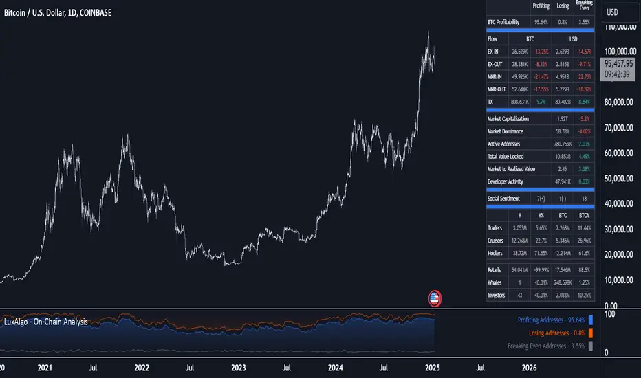
On-Chain Analysis [LuxAlgo]The On-Chain Analysis tool offers a comprehensive overview of essential on-chain metrics, enabling traders and investors to grasp the underlying activity and sentiment within the cryptocurrency market. By integrating metrics like wallet profitability, exchange flows, on-chain volume, social sentiment, and more into your charts, users can gain valuable insights into cryptocurrency network behavior, spot emerging trends, and better manage risk in the cryptocurrency market.
🔶 USAGE
🔹 On-Chain Analysis
When analyzing cryptocurrencies, several fundamental metrics are crucial for assessing the value and potential of a digital asset. This indicator is designed to help traders and analysts evaluate the markets by utilizing various data gathered directly from the blockchain. The gathered on-chain data includes wallet profitability, exchange flows, miner flows, on-chain volume, large buyers/sellers, market capitalization, market dominance, active addresses, total value locked (TVL), market value to realized value (MVRV), developer activity, social sentiment, holder behavior, and balance types.
Use wallet profitability and social sentiment metrics to gauge the overall mood of the market, helping to anticipate potential buying or selling pressure.
On-chain volume and active addresses provide insights into how actively a cryptocurrency is being used, indicating network health and adoption levels.
By tracking exchange flows and holder balance types, you can identify significant moves by whales or institutions, which may signal upcoming price shifts.
Market capitalization and miner flows give you an understanding of the supply side of the market, aiding in evaluating whether an asset is overvalued or undervalued.
The distribution of holdings among retail investors, whales, and institutional groups can greatly influence market dynamics. A large concentration of holdings by whales may indicate the potential for significant price swings, given their capacity to execute substantial trades. A higher proportion of institutional investors often suggests confidence in the asset's long-term potential, as these entities typically conduct thorough research before investing. While retail participation indicates broader adoption, it also introduces higher volatility, as these investors tend to be more reactive to market fluctuations.
Understanding the balance and behavior of short-term traders, mid-term cruisers, and long-term hodlers helps traders and analysts predict market trends and assess the underlying confidence in a particular cryptocurrency.
🔶 DETAILS
This script includes some of the most significant and insightful metrics in the crypto space, designed to evaluate and enhance trading decisions by assessing the value and growth potential of cryptocurrencies. The introduced metrics are:
🔹 Wallet Profitability
Definition: Represents the percentage distribution of addresses by profitability at the current price.
Importance: Indicates potential selling pressure or reduced selling pressure based on whether addresses are in profit or loss.
🔹 Exchange Flow
Definition: The total amount of a cryptocurrency moving in and out of exchanges.
Importance: Large inflows to exchanges can indicate potential selling pressure, while large outflows might suggest accumulation or long-term holding.
🔹 Miner Flow
Definition: Tracks the inflow and outflow of funds by miners.
Importance: High inflows could indicate selling pressure, whereas low inflows or outflows might reflect miner confidence.
🔹 On-Chain Volume
Definition: The total value of transactions conducted on a blockchain within a specific period.
Importance: On-chain volume reflects actual usage of the network, indicating how actively a cryptocurrency is being utilized for transactions.
🔹 Large Buyers/Sellers
Definition: Tracks the number of large buyers (bulls) and sellers (bears) based on transaction volume.
Importance: Comparing the number of large buyers (bulls) to large sellers (bears) helps gauge market trends and sentiment.
🔹 Market Capitalization
Definition: The total value of a cryptocurrency's circulating supply, calculated by multiplying the current price by the total supply.
Importance: Market cap is a key indicator of a cryptocurrency’s size and market dominance. It helps compare the relative size of different cryptocurrencies.
🔹 Market Dominance
Definition: Market dominance represents a cryptocurrency’s share of the total market capitalization of all cryptocurrencies. It is calculated by dividing the market cap of the cryptocurrency by the total market cap of the cryptocurrency market.
Importance: Market dominance is a crucial indicator of a cryptocurrency's influence and relative position in the market. It helps assess the strength of a cryptocurrency compared to others and provides insights into its market presence and potential influence.
Special Consideration: Since BTC and ETH dominance is relatively high compared to other cryptocurrencies, specific adjustments are made during the presentation of values and charts. When analyzing BTC, the total market capitalization is used. For ETH analysis, BTC is excluded from the total market cap. For any other cryptocurrency besides BTC and ETH, both BTC and ETH are excluded from the total market cap to provide a more accurate view.
🔹 Active Addresses
Definition: The number of unique addresses involved in transactions within a specific period.
Importance: A higher number of active addresses suggests greater network activity and user adoption, which can be a sign of a healthy ecosystem.
🔹 Total Value Locked (TVL)
Definition: The total value of assets locked in a decentralized finance (DeFi) protocol.
Importance: TVL is a key metric for DeFi platforms, indicating the level of trust and the amount of liquidity in a protocol.
🔹 Market Value to Realized Value (MVRV)
Definition: A ratio comparing the market cap to realized cap.
Importance: A high ratio may indicate overvaluation (potential selling), while a low ratio could signal undervaluation (potential buying).
🔹 Developer Activity
Definition: The level of activity on a cryptocurrency’s public repositories (e.g., GitHub).
Importance: Strong developer activity is a sign of ongoing innovation, updates, and a healthy project.
🔹 Social Sentiment
Definition: The general sentiment or mood of the community and investors as expressed on social media and forums.
Importance: Positive sentiment often correlates with price increases, while negative sentiment can signal potential downtrends.
🔹 Holder Balance (Behavior)
Definition: Distribution of addresses by holding behavior: Traders (short-term), Cruisers (mid-term), and Hodlers (long-term).
Importance: Helps predict market behavior based on different holder types.
🔹 Holder Balance (Type)
Definition: Distribution of cryptocurrency holdings among Retail (small holders), Whales (large holders), and Investors (institutional players).
Importance: Assesses the potential impact of different user groups on the market. A more decentralized distribution is generally viewed as positive, reducing the risk of price manipulation by large holders.
These metrics provide a comprehensive view of a cryptocurrency’s health, adoption, and potential for growth, making them essential for fundamental analysis in the crypto space.
🔶 SETTINGS
The script offers a range of customizable settings to tailor the analysis to your trading needs.
🔹 On-Chain Analysis
On-Chain Data: Choose the specific on-chain metric from the drop-down menu. Options include Wallet Profitability, Exchange Flow, Miner Flow, On-Chain Volume, Large Buyers/Sellers (Volume), Market Capitalization, Market Dominance, Active Addresses, Total Value Locked, Market Value to Realized Value, Developer Activity, Social Sentiment, Holder Balance (Behavior), and Holder Balance (Type).
Smoothing: Set the smoothing level to refine the displayed data. This can help in filtering out noise and getting a clearer view of trends.
Signal Line: Choose a signal line type (SMA, EMA, RMA, or None) and the length of the moving average for signal line calculation.
🔹 On-Chain Dashboard
On-Chain Stats: Toggle the display of the on-chain statistics.
Dashboard Size, Position, and Colors: Customize the size, position, and colors of the on-chain dashboard on the chart.
🔶 LIMITATIONS
Availability of on-chain data may vary and may not be accessible for all crypto assets.
🔶 RELATED SCRIPTS
Market-Sentiment-Technicals
SCE ReversalsThis tool uses past market data to attempt to identify where changes in “memory” may occur to spot reversals. The Hurst Exponent was a big inspiration for this code. The main driver is identifying when past ranges expand and contract, leading to a change in direction. With the use of Sum of Squared Errors, users do not need to input anything.
Getting optimized parameters
// Define ranges for N and lkb
N_range = array.from(15, 20, 25, 30, 35, 40, 45, 50, 55, 60)
// Function to calculate SSE
sse_calc(_N) =>
x = math.pow(close - close , 2)
y = math.pow(close - close , 2) + math.pow(close, 2)
z = x / y
scaled_z = z * math.log(_N)
min_r = ta.lowest(scaled_z, _N)
max_r = ta.highest(scaled_z, _N)
norm_r = (scaled_z - min_r) / (max_r - min_r)
SMA = ta.sma(close, _N)
reversal_bullish = norm_r == 1.000 and norm_r < 0.90 and close < SMA and session.ismarket and barstate.isconfirmed
reversal_bearish = norm_r == 1.000 and norm_r < 0.90 and close > SMA and session.ismarket and barstate.isconfirmed
var float error = na
if reversal_bullish or reversal_bearish
error := math.pow(close - SMA, 2)
error
else
error := 999999999999999999999999999999999999999
error
error
var int N_opt = na
var float min_SSE = na
// Loop through ranges and calculate SSE
for N in N_range
sse = sse_calc(N)
if na(min_SSE) or sse < min_SSE
min_SSE := sse
N_opt := N
The N_range list encompasses every lookback value to check with. The sse_calc function accepts an individual element to then perform the calculation for Reversals. If there is a reversal, the error becomes how far away the close is from a moving average with that look back. Lowest error wins. That would be the look back used for the Reversals calculation.
Reversals calculation
// Calculating with optimized parameters
x_opt = math.pow(close - close , 2)
y_opt = math.pow(close - close , 2) + math.pow(close, 2)
z_opt = x_opt / y_opt
scaled_z_opt = z_opt * math.log(N_opt)
min_r_opt = ta.lowest(scaled_z_opt, N_opt)
max_r_opt = ta.highest(scaled_z_opt, N_opt)
norm_r_opt = (scaled_z_opt - min_r_opt) / (max_r_opt - min_r_opt)
SMA_opt = ta.sma(close, N_opt)
reversal_bullish_opt = norm_r_opt == 1.000 and norm_r_opt < 0.90 and close < SMA_opt and close > high and close > open and session.ismarket and barstate.isconfirmed
reversal_bearish_opt = norm_r_opt == 1.000 and norm_r_opt < 0.90 and close > SMA_opt and close < low and close < open and session.ismarket and barstate.isconfirmed
X_opt and y_opt are the compared values to develop the system. Everything done afterwards is scaling and using it to spot the Reversals. X_opt is the current close, minus the close with the optimal N bars back, squared. Then y_opt is also that but plus the current close squared. Z_opt is then x_opt / y_opt. This gives us a pretty small number that will go up when we approach tops or bottoms. To make life a little easier I normalize the value between 0 and 1.
After I find the moving average with the optimal N, I can check if there is a Reversal. Reversals are there when the last value is at 1 and the current value drops below 0.90. This would tell us that “memory” was strong and is now changing. To determine direction and help with accuracy, if the close is above the moving average it is a bearish alert, and vice versa. As well as the close must be below the last low for a bearish Reversal, above the last high for a bullish Reversal. Also the close must be above the open for a bullish Reversal, and below for a bearish one.
Visual examples
This NASDAQ:TSLA chart shows how alerts may come around. The bullish and bearish labels are plotted on the chart along with a reference line to see price interact with.
The indicator has the potential to be inactive, like we see here on $OKLO. There is only one alert, and it marks the bottom nicely.
Stocks with strong trends like NYSE:NOW may be more susceptible to false alerts. Assets that are volatile and bounce around a lot may be better.
It works on intra day charts the same as on Daily or longer charts. We see here on NASDAQ:QQQ it spotted the bottom on this particular trading day.
This tool is meant to aid traders in making decisions, not to be followed blindly. No trading tool is 100% accurate and Sum of Squared Errors does not guarantee the most optimal value. I encourage feedback and constructive criticism.

Full Spectrum Delta BandsI created the Full Spectrum Delta Bands (FullSpec ΔBB) to go beyond traditional Bollinger Bands by incorporating both OHLC (Open, High, Low, Close) and Close-based data into the calculations. Instead of relying solely on closing prices, this indicator evaluates deviations from the complete bar range (OHLC), offering a more accurate view of market behavior.
A key feature is the Delta Flip, which highlights shifts between OHLC and Close-based bands. These flips are visually marked with color changes, signaling potential trend reversals, breakout zones, or volatility shifts. Traders can use these moments as inflection points to refine their entry and exit strategies.
The indicator also supports customizable sensitivity and deviation multiplier settings, allowing it to adapt to different trading styles and timeframes. Lower deviation values (e.g., 1σ or 1.5σ) are ideal for scalping on shorter timeframes like 5-min or 15-min charts, while higher values (e.g., 2.5σ or 3σ) are better suited for long-term trend analysis on weekly or monthly charts. The standard deviation multiplier fine-tunes the upper and lower bands to match specific trading goals and market conditions.
I designed Full Spectrum Delta Bands to provide deeper insights and a clearer view of market dynamics compared to traditional Bollinger Bands. Whether you’re a scalper, swing trader, or long-term investor, this tool helps you make informed and confident trading decisions.

[w3ss1] Timeframe SyncThe "Timeframe Sync" indicator provides a comprehensive view of price action across multiple timeframes for a single symbol, allowing traders to analyze market conditions from a multi-timeframe perspective with ease.
Key Features:
Flexible Symbol Selection: Choose between analyzing the symbol of the current chart or select another symbol to monitor.
Customizable Timeframes: Control which timeframes you want to analyze through toggle switches. Choose from 11 different timeframes ranging from 1-minute to Monthly charts, with the ability to customize each one:
1m, 5m, 15m, 30m, 1H, 4H, 8H, 12H, 1D, 1W, 1M
Visual Feedback:
-Candle Close Color: Each timeframe's last closed candle is color-coded. Bullish closes are highlighted in green, bearish in dark shades, and inside candles in orange.
-Bias Indicator: The indicator shows whether the close is "above", "below", or "inside" the previous candle's high/low range, providing insight into the market's momentum.
Table Display: Information is presented in a clear table format:
-The first row shows the symbol being analyzed.
-The second row displays "Candle close" to indicate the relevance of the information below.
-Each subsequent row represents a different timeframe, showing its abbreviation and the bias of the last close.
Conditional Display: Timeframes are only shown if they are relevant to the current chart's timeframe. This ensures that you're not looking at outdated data when on lower timeframes.
Customization:
-Adjust text size, table position, background color, text color, and colors for different candle close scenarios.
Usage:
Ideal for traders who need a quick multi-timeframe analysis without switching charts.
Helps in confirming short-term moves with longer-term trends or spotting divergences across timeframes.
Instructions:
Add the indicator to your chart.
Customize the timeframes you wish to monitor via the toggle switches.
Optionally, select a different symbol if not analyzing the current chart's symbol.
Adjust colors and table settings to your preference.
Observe how price action behaves across different timeframes to make informed trading decisions.
Multi-Timeframe Liquidity LevelsMulti-Timeframe Liquidity Levels – Overview
The Multi-Timeframe Liquidity Levels indicator automatically displays significant highs and lows from various timeframes (Daily, Weekly, Monthly, and Quarterly) on your current chart. This allows traders to quickly identify potential support and resistance zones without frequently switching between different timeframe charts. Additionally, the script offers extra lines for special reference points (e.g., the “Midnight” midpoint of the current day and the previous day’s open/close) to highlight potential liquidity zones even more clearly.
1. Core Idea and Benefits
Time-Saving: Instead of manually reviewing charts in different timeframes, the indicator fetches relevant high/low levels automatically and shows them on your active timeframe.
Clear Layout: Traders instantly see where the Daily, Weekly, Monthly, and Quarterly highs and lows lie—areas often associated with institutional orders or liquidity hunts.
Customizable: You can tailor the color scheme, line style (Solid, Dashed, Dotted), and line width, ensuring the displayed levels fit your personal charting style.
2. How It Works
Multi-Timeframe High/Low
For each timeframe (Day, Week, Month, Quarter), the indicator references the previous candle’s high and low (high , low ).
Using request.security(...), these values are plotted on the chart you’re currently viewing.
Flexible Display
You can individually enable or disable the Daily, Weekly, Monthly, and Quarterly lines, depending on which levels are most relevant to your trading.
With Line Style (Solid, Dashed, Dotted) and Line Width, you can easily emphasize certain lines you consider more important.
Additional Lines
“Midnight” Line: A theoretical midpoint between today’s high and low, which can be useful for gauging daily pivot areas.
Previous Day’s Open/Close: Many traders track these reference points to anticipate market reactions. You can show or hide these lines as desired.
Automatic Line Removal & Creation
When a particular timeframe (e.g., “Show Monthly Levels”) is disabled, the script automatically removes the existing monthly lines.
Enabling it again recreates those lines without hassle.
3. Usage and Interpretation
Identifying Support and Resistance
Highs and lows from higher timeframes are often key zones for entries, exits, or major market reactions.
A Daily level may be crucial for short-term traders, whereas Monthly or Quarterly levels can indicate long-term liquidity areas.
Spotting Market Shifts
If price decisively moves above a Higher-Timeframe line, it could signal strong momentum.
Conversely, a failed breakout (where price quickly returns under or above a level) might warn of a potential reversal.
Extra Lines as Filters
The “Midnight” Line helps visualize a rough central price for the current day, aiding in intraday directional bias.
Previous Day’s Open/Close: Common reference points for day traders, where swift approaches and rejections can indicate potential entries or partial take-profit zones.
4. Practical Tips
Use Color-Coding Wisely: Assign distinct colors (e.g., Blue for Daily, Green for Weekly, Orange for Monthly, Purple for Quarterly) so you can easily discern which timeframe you’re looking at.
Toggle On/Off As Needed: Day traders might focus on Daily and Weekly, while long-term traders may pay closer attention to Monthly and Quarterly.
Combine with Price Action: Lines alone don’t constitute a trading strategy. Use them alongside candlestick patterns, volume analysis, or other indicators for a more complete market perspective.
5. Important Notes & Recommendations
Not Financial Advice: This indicator simply reflects historical high/low data across multiple timeframes and does not constitute a buy or sell recommendation.
Trader Responsibility: Observe how the market actually behaves around these lines and adapt your risk management accordingly.

SMA Ribbon [A]SMA Ribbon with Adjustable MA200
20, 50, 100, and 200 -period Simple Moving Averages (SMAs) for trend analysis.
The SMA200 dynamically changes color based on its direction—green when rising and red when falling. Additionally, you can lock the SMA200 to the daily timeframe , allowing it to display the 200-day moving average on lower timeframes, such as 4-hour or 1-hour charts.
Features:
Dynamic SMA200 Color: Automatically adjusts to show upward (green) or downward (red) trends.
Daily SMA200 Option: Enables the SMA200 to represent the 200-day moving average on intraday charts for long-term trend insights.
Smart Adaptation: The daily SMA200 setting is automatically disabled on daily or higher timeframes, ensuring accurate period calculations.
How to Use:
Use this script to identify key support/resistance levels and overall market trends.
Adjust the "Daily MA for MA200" option in the settings to toggle between timeframe-specific and daily-locked SMA200.
This script is ideal for traders seeking a clean and customizable tool for long-term and short-term trend analysis.
[TheMandalor] Invert or Mirror Chart SUPPORT RESSISTANTThis is a new idea to find supports and resistant’s for any charts.
What is the concept of this indicator:
1. It is used close and inverted it on chart
2. When the real chart and the inverted chart is crossing together several times, this point will be important on this concept that means the price will care about this point again and again.
3. When you draw a horizontal line as support and resistance check it with this indicator too, if your support and resistance is touched with inverted chart, it will be more important than normal support/ resistance.
4. This indicator has plot candle too, it means you can compare regular chart with the inverted one at same time if you need.
Here is the steps:
1. When you add the indicator to your chart it will add your ticker as inverted.
2. Change your chart type to line chart.
3. Fix your scale in both sides left and right (the indicator's side is on the left).
4. Now you must have two type of line charts, one is yours (The blue one) and one is plotted with this indicator (The purple one).
5. Draw a horizontal line where these two lines have more crossing at the middle of chart, this line will be a powerful line later.
6. Find other more crossed points and draw horizontal line for them too.
7. Now you can see these indicator's support and resistant’s, now you can remove the indicator and watch how the price will touch, reverse, or stay on your new type of support and resistant’s lines.
PS: I have added candle plotting too if you need it.

Market Stats Panel [Daveatt]█ Introduction
I've created a script that brings TradingView's watchlist stats panel functionality directly to your charts. This isn't just another performance indicator - it's a pixel-perfect (kidding) recreation of TradingView's native stats panel.
Important Notes
You might need to adjust manually the scaling the firs time you're using this script to display nicely all the elements.
█ Core Features
Performance Metrics
The panel displays key performance metrics (1W, 1M, 3M, 6M, YTD, 1Y) in real-time, with color-coded boxes (green for positive, red for negative) for instant performance assessment.
Display Modes
Switch seamlessly between absolute prices and percentage returns, making it easy to compare assets across different price scales.
Absolute mode
Percent mode
Historical Comparison
View year-over-year performance with color-coded lines, allowing for quick historical pattern recognition and analysis.
Data Structure Innovation
Let's talk about one of the most interesting challenges I faced. PineScript has this quirky limitation where request.security() can only return 127 tuples at most. £To work around this, I implemented a dual-request system. The first request handles indices 0-63, while the second one takes care of indices 64-127.
This approach lets us maintain extensive historical data without compromising script stability.
And here's the cool part: if you need to handle even more years of historical data, you can simply extend this pattern by adding more request.security() calls.
Each additional call can fetch another batch of monthly open prices and timestamps, following the same structure I've used.
Think of it as building with LEGO blocks - you can keep adding more pieces to extend your historical reach.
Flexible Date Range
Unlike many scripts that box you into specific timeframes, I've designed this one to be completely flexible with your date selection. You can set any start year, any end year, and the script will dynamically scale everything to match. The visual presentation automatically adjusts to whatever range you choose, ensuring your data is always displayed optimally.
█ Customization Options
Visual Settings
The panel's visual elements are highly customizable. You can adjust the panel width to perfectly fit your workspace, fine-tune the line thickness to match your preferences, and enjoy the pre-defined year color scheme that makes tracking historical performance intuitive and visually appealing.
Box Dimensions
Every aspect of the performance boxes can be tailored to your needs. Adjust their height and width, fine-tune the spacing between them, and position the entire panel exactly where you want it on your chart. The goal is to make this tool feel like it's truly yours.
█ Technical Challenges Solved
Polyline Precision
Creating precise polylines was perhaps the most demanding aspect of this project.
The challenge was ensuring accurate positioning across both time and price axes, while handling percentage mode scaling with precision.
The script constantly updates the current year's data in real-time, seamlessly integrating new information as it comes in.
Axis Management
Getting the axes right was like solving a complex puzzle. The Y-axis needed to scale dynamically whether you're viewing absolute prices or percentages.
The X-axis required careful month labeling that stays clean and readable regardless of your selected timeframe.
Everything needed to align perfectly while maintaining proper spacing in all conditions.
█ Final Notes
This tool transforms complex market data into clear, actionable insights. Whether you're day trading or analyzing long-term trends, it provides the information you need to make informed decisions. And remember, while we can't predict the future, we can certainly be better prepared for it with the right tools at hand.
A word of warning though - seeing those red numbers in a beautifully formatted panel doesn't make them any less painful! 😉
---
Happy Trading! May your charts be green and your stops be far away!
Daveatt
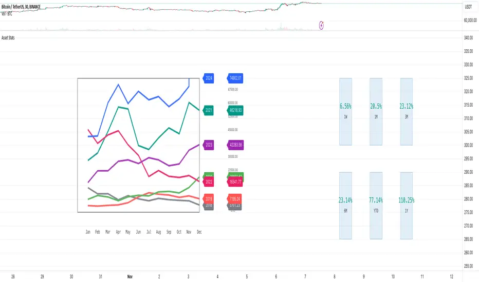
Implied Fair Value Gap (IFVG) ICT [TradingFinder] Hidden FVG OTE🔵 Introduction
The Implied Fair Value Gap (IFVG) is distinctive due to its unique three-candlestick formation, which differentiates it from conventional Fair Value Gaps.
Implied fair value represents an estimated worth of an asset—often a business or its goodwill—based on the price likely to be received in a structured transaction between market participants at a specific point in time.
In the ever-evolving world of technical analysis, pinpointing price reversal points and market anomalies can significantly enhance trading strategies and decision-making for traders and investors. Among the advanced concepts gaining traction in this field is the Implied Fair Value Gap (IFVG), introduced by the renowned analyst Inner Circle Trader (ICT).
This tool has proven to be an effective method for identifying hidden supply and demand zones in financial markets, offering a unique edge to traders looking for high-probability setups.
Unlike traditional gaps that are visible on price charts, IFVG is a hidden gap that doesn’t appear explicitly on the chart and thus requires specialized technical analysis tools for accurate identification.
This hidden gap can signal potential price reversals and offers traders insight into high-liquidity areas where price is likely to react. This article will guide you through using the ICT Implied Fair Value Gap Indicator effectively, covering its settings, usage strategies, and key features to help you make informed decisions in the market.
🟣 Bullish Implied FVG
🟣 Bearish Implied FVG
🔵 How to Use
The IFVG indicator is designed to assist traders in recognizing hidden support and resistance zones by identifying Bullish and Bearish IFVG patterns. With this tool, traders can make better-informed decisions about suitable entry and exit points for their trades based on these patterns.
🟣 Bullish Implied Fair Value Gap
This pattern occurs in an uptrend when a large bullish candlestick forms, with the wicks of the previous and following candles overlapping the body of the central candlestick.
This overlap creates a demand zone or a hidden support level, which can act as an ideal entry point for buy trades. Often, when the price returns to this area, it is likely to resume its upward trend, presenting a profitable buying opportunity.
🟣 Bearish Implied Fair Value Gap
This pattern is similar but forms in downtrends. Here, a large bearish candlestick appears on the chart, with the wicks of adjacent candles overlapping its body. This overlap defines a supply zone or a hidden resistance level and serves as a signal for potential sell trades.
When the price returns to this zone, it often continues its downward trend, providing an optimal point for entering sell trades.
The IFVG indicator also includes various filters that traders can use to refine their analysis based on market conditions. These filters, including Very Aggressive, Aggressive, Defensive, and Very Defensive, allow users to customize the IFVG zones' width, offering flexibility according to the trader’s risk tolerance and trading style.
🟣 Example Trading Scenarios
Suppose you’re in a strong uptrend and the IFVG indicator identifies a Bullish IFVG zone. In this scenario, you could consider entering a buy trade when the price retraces to this zone, expecting the uptrend to resume. Conversely, in a downtrend, a Bearish IFVG zone can signal a favorable entry point for short trades when the price revisits this area.
🔵 Settings
Implied Block Validity Period: This parameter specifies the validity period of each identified block, taking into account the number of bars that have passed since its formation. Proper adjustment of this period helps traders focus only on relevant zones, increasing the accuracy of the analysis.
Mitigation Level OB : This option defines the mitigation level for supply and demand blocks (Order Blocks), with settings including Proximal, 50% OB, and Distal.
Depending on the selected level, the indicator will focus on closer, mid-range, or farther points for block identification, allowing traders to adjust for the level of precision required.
Implied Filter : Activating this filter allows traders to apply conditions based on the width of the IFVG zones. With options like Very Aggressive and Very Defensive, traders can control the width of IFVG zones to suit their risk management strategy—whether they prefer high-risk setups or low-risk setups.
Display and Color Settings : This section enables users to customize the appearance of the IFVG zones on their charts. Traders can set different colors for Bullish and Bearish zones, allowing for easier distinction and improved visualization.
Alert Settings : One of the standout features of the IFVG indicator is the alert system. By setting up alerts, users can be notified whenever the price approaches a demand or supply zone.
Alerts can be customized to trigger Once Per Bar (one alert per bar) or Per Bar Close (alert at the close of each bar), ensuring that traders stay updated on critical price movements without needing to monitor the chart continuously.
🔵 Conclusion
The ICT Implied Fair Value Gap (IFVG) indicator is a powerful and sophisticated tool in technical analysis, allowing professional traders to identify hidden supply and demand zones and use them as entry and exit points for buy and sell trades.
This indicator’s automatic detection of IFVG zones helps traders uncover hidden trading opportunities that can enhance their analysis.
While the IFVG indicator offers numerous advantages, it is important to use it in conjunction with other technical analysis tools and sound risk management practices.
IFVG alone does not guarantee profitability in trading; it works best when combined with other indicators such as volume analysis and trend-following indicators for a comprehensive trading strategy.
