TradingGroundhog - Strategy & Fractal V1#-- Public Strategy - No Repaint - Fractals -- Short term
Here I come with another script, more simple than Wavetrend V1. You will love it.
#-- Synopsis --
Another simple idea, on a small time frame (15 min) we buy when the opening price goes below a Bottom fractals and sell when it goes over a Top fractals, but as this script do not use Wavetrends. You should stop by your self to use the script during long lasting downtrends.
I developed the strategy using BTC /EUR 3 MIN BINANCE but it can be applied to many other cryptos, I don't know for forex or others. You can use it for short term (to a month of uptrend) and automated trading.
#-- Graph reading --
And now, how to read it ?
Fractals:
Yellow Flags occur when the opening price goes below a Bottom fractal , it means Buy.
White Flags appear when the opening price goes over a Top fractal , it means Sell.
#-- Parameters --
*** Parameters have been intensively optimized using 10 cryptocurrency markets in order to have potent efficiency for each of them. I would recommend to only change the Can Be touch parameter. For the others, I don't recommend any modifications. The idea behind the script is to be able to switch between markets without having to optimize parameters, less work, easy to target active crypto and therefor limit the risks. ***
Can be touch :
'Filter fractals' : Activate or Disable the filtering fractal operation. If Enable, buy during less risky periods. (Activate is often better)
Can be touch but not necessary :
'VolumeMA' : The Volume corrector used by the fractals
'Extreme window' : The number of price individuals to look for if we want to remove extreme fractals.
Not to touch :
'Long Sop Loss (%)' : The minimal difference of price between a Fractal bottom and the opening price to buy.
#-- Time frame --
Should be used with the following time frames depending on the necessity:
1 MIN
3 MIN (Preferred with the parameters set)
5 MIN
#-- Last words --
The script can be set up to send Tradingview signals to 3comma just by adding comment = " " in strategy.close_all() and strategy.entry().
Good trades !
Disclaimer (As it should always be one to any script)
***
This script is intended for and only to be used for personal purposes only. No such information provided by it constitutes advice or a recommendation for any investment or trading strategy for any specific person. There is no guarantee presented or implied as to the accuracy of specific forecasts, projections, or predictive statements offered by the script. Users of the script agree that its original developer does not take responsibility for any of your investment decisions. Please seek professional advice before trading.
***
# Here are the results from the 20rst of September 2021 with 100% of equity on the BTC /EUR 3 Min and with a capital of 10 000 EUR. So almost, one month.
# As I saw, it goes from +30% to more than +160% (the great SHIB) depending on the selected crypto. It may be negative if you spot a downtrend.
ابحث في النصوص البرمجية عن "crypto"

TradingGroundhog - Strategy & Wavetrend V2#-- Public Strategy - No Repaint - Fractals - Wavetrend --
Here I come with another script, a nice and simple strategy based on fractals and Wavetrends.
#-- Synopsis --
A simple idea, on a small time frame (15 min) we buy when the opening price goes below a Bottom fractals and sell when it goes over a Top fractals, but in order to avoid bad and evil downtrends, we use Wavetrends based on a Daily time frame. From it, Tops and Bottoms are extracted. If the opening price goes above Wavetrend Tops, no trades will be conducted during the day. If the price goes below Wavetrend bottoms, no trades will be executed from 1 to N days, until a new Wavetrend bottom is generated.
I developed the strategy using BTC /EUR 15 MIN BINANCE but it can be applied to many other cryptos, I don't know for forex or others. You can use it for long term and automated trading, I implemented the Wavetrend indicator to do so, or for short term if you have spot a long coming uptrend. Test it, look at its profit and long or short period on your crypto of choice.
#-- Graph reading --
And now, how to read it ?
Wavetrends:
Red Backgrounds are associated to No Trade periods. These periods occur when the price goes below a Wavetrend bottom or above a Wavetrend Top. They are here to limit the loss.
Blue Gradient lines represent the past Tops. For each bar, only the increasing values of the Wavetrend tops are acquired. Going from light to dark blue based on the age of the Tops. Thus, if on line goes from dark to light, this means the price is approaching a previous Wavetrend top. In the opposite, if it darken, thus the price say 'buy buy' and go dropping.
Yellow Gradient lines represent the past Bottoms. They are based on the same principe that the blue lines.
Fractals:
Yellow Flags occur when the opening price goes below a Bottom fractal , it means Buy.
White Flags appear when the opening price goes over a Top fractal , it means Sell.
#-- Parameters --
*** Parameters have been intensively optimized using 10 cryptocurrency markets in order to have potent efficiency for each of them. I would recommend to only change the Can Be touch parameter. For the others, I don't recommend any modifications. The idea behind the script is to be able to switch between markets without having to optimize parameters, less work, easy to target active crypto and therefor limit the risks. ***
Can be touch :
'Combined Smoothness' : The number of open individuals used by the Wavetrend. (6 or 9, often 9 is better but with less volatile crypto it will be 6)
'Filter fractals' : Activate or Disable the filtering fractal operation. If Enable, buy during less risky periods. (Disable is often better)
Can be touch but not necessary :
'VolumeMA' : The Volume corrector used by the fractals
'Extreme window' : The number of price individuals to look for if we want to remove extreme fractals.
Not to touch :
'Limit_candle to look on' : Number of candles to use to compute the Wavetrend Tops and Bottoms.
'Length top bottom drawn' : Size of the lines
'Long Sop Loss (%)' : The minimal difference of price between a Fractal bottom and the opening price to buy.
#-- Time frame --
Should be used with the following time frames depending on the necessity:
1 MIN
3 MIN (Interesting for short term profit, may need some parameter ajustements)
5 MIN
15 MIN (Preferred for long term profit, the script was developed on it)
#-- Last words --
The script can be set up to send Tradingview signals to 3comma just by adding comment = " " in strategy.close_all() and strategy.entry().
Good trades !
Disclaimer (As it should always be one to any script)
***
This script is intended for and only to be used for personal purposes only. No such information provided by it constitutes advice or a recommendation for any investment or trading strategy for any specific person. There is no guarantee presented or implied as to the accuracy of specific forecasts, projections, or predictive statements offered by the script. Users of the script agree that its original developer does not take responsibility for any of your investment decisions. Please seek professional advice before trading.
***
# Here are the results from the 1rst of July 2021 with 100% of equity on the BTC /EUR 15 Min and with a capital of 1 000 EUR.
# As I saw, it goes from +20% to more than +100% depending on the selected crypto. Sometimes it's negative but it's quite rare on crypto using the EUR.

TradingGroundhog - Fundamental Analysis - Multiple RSI Ema(Script Available Version of my previous Fundamental Analysis - Multiple RSI Ema )
As the number of crypto currencies is expanding, we need to find the one which will boom in the next months, weeks or even days.
Therefore, I present to you a Fundamental Analysis tool based on RSI built in order to compare the RSI between the diverse cryptocurrencies.
When cryptocurrencies start to trend, become active, minable and especially "buyable", people are investing their money into them.
As a result,the Daily RSI rises and the price of the crypto in question increases steadily.
With "Fundamental Analysis - Multiple RSI EMA" you can :
Follow up to 20 RSI from different exchanges at the same time.
Find easily Increasing/Decreasing RSI as the lines get transparent if their RSI decrease.
You can also select market with high potential of booming as :
Booming Market : 60 < Daily RSI <= 100 (Strong green background)
Potent Market : 55 < Daily RSI <= 60 (Light green background)
Sleepy Market : 50 < Daily RSI <= 55 (Light red background)
Dying Market : 0 < Daily RSI <= 50 (Strong red background)
Futur booming crypto will go from the Potent Market to the Booming Market
Can be used with the following time frames depending on the necessity:
4H
Daily (Preferred)
Weekly
Monthly
Good trades !
Disclaimer (As it should always be one to any script)
***
This script is intended for and only to be used for personal purposes only. No such information provided by it constitutes advice or a recommendation for any investment or trading strategy for any specific person. There is no guarantee presented or implied as to the accuracy of specific forecasts, projections, or predictive statements offered by the script. Users of the script agree that its original developer does not take responsibility for any of your investment decisions. Please seek professional advice before trading.
***

robotrading bodyThis is a very simple and universal strategy. Good for crypto. For BTC/USD, shitcoin/BTC.
Strategy
Long positions only. If the candle is falling and the candle body is 3 or more times the average candle body, then open a long position.
If the candle is rising, we should close a long position.
Short positions are not used.
This is a counter-trend strategy.
The average body of a candlestick is the arithmetic average of the bodies of the previous 100 bodies.
Parameters
The multiplier is the number of times the candlestick body should be bigger than the average candlestick body to get a signal to open a long position.
Recommended
- A timeframe of 4 hours to 1 day
- Cryptocurrencies with large market capitalization
- you can use coin/USD, coin/USDT, coin/BTC, coin/ETH, etc

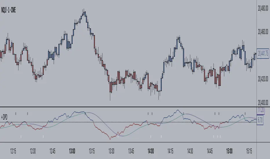
+ Detrended Price OscillatorAccording to TradingView the Detrended Price Oscillator is an oscillator that removes trend from price in order to more clearly show an instrument's cyclical
highs and lows so that an investor or trader may more easily time when to buy or sell the underlying instrument. Accordingly, it is not meant to be used as a way of gauging momentum, however, I find it perfectly suitable for the task (at least when used "un-centered" which is how it comes by default here). If you wish to read up more on the DPO just search for it under indicators. It's built in, so you'll find all the information you need on it there. Or check investopedia.
On to the good stuff. What have I done and how does this work?
As un-centered you can use it just like any other momentum oscillator. Price above the zero line is bullish and below is bearish, generally speaking.
I've added two moving averages that you can turn on or off, and choose amongst various types and lengths. Both of these are colored based on trend.
The DPO is also colored based on trend, with a neutral color based on where the DPO is relative to the primary MA and the zero line.
Candles are colored in the same way that the DPO is.
I've added Bollinger Bands because they could be useful on an indicator like this.
All the alert conditions you could dream of.
With this set to centered you will notice that the DPO is not inline with current price. That is intentional, as it's only designed to look at historical price
data to time highs and lows of price movement. As such, I don't recommend using this when set to centered, at least if you're trading crypto. The price volatility
perhaps makes for inconsistent timing of cyclical highs and lows, or perhaps it's the rather brief amount of time cryptocurrencies have been in existence.
I do not know. Just stick to using it un-centered.
The above image shows the indicator with Bollinger Bands turned on and the MA's turned off. Also, you should note that the candle color and DPO color is based on the primary moving average you are using. If you want consistency, and want to use the Bollinger Bands, then keep your primary moving average set as a 20 SMA, as that is the basis for Bollinger Bands.
Hope this is helpful to you. Definitely pair it with an additional indicator like an RSI, or my +ADP. I like to use something rangebound to compare its signals to.
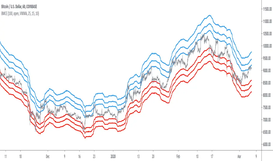
Bitcoin Margin Call Envelopes [saraphig & alexgrover]Bitcoin is the most well known digital currency, and allow two parties to make a transaction without the need of a central entity, this is why cryptocurrencies are said to be decentralized, there is no central unit in the transaction network, this can be achieved thanks to cryptography. Bitcoin is also the most traded cryptocurrency and has the largest market capitalization, this make it one of the most liquid cryptocurrency.
There has been tons of academic research studying the profitability of Bitcoin as well as its role as a safe heaven asset, with all giving mixed conclusions, some says that Bitcoin is to risky to be considered as an hedging instrument while others highlight similarities between Bitcoin and gold thus showing evidence on the usefulness of Bitcoin acting as an hedging instrument. Yet Bitcoin seems to attract more short term speculative investors rather than other ones that would use Bitcoin as an hedging instrument.
Once introduced, cryptocurrencies where of course heavily analyzed by technical analyst, and technical indicators where used by retail as well as institutional investors in order to forecast the future trends of bitcoin. I never really liked the idea of designing indicators that specifically worked for only one type of market and ever less on only one symbol. Yet the user @saraphig posted in Feb 20 an indicator called " Margin Call MovingAverage " who calculate liquidation price by using a volume weighted moving average. It took my attention and we decided to work together on a relatively more complete version that would include resistances levels.
I believe the proposed indicator might result useful to some users, the code also show a way to restrict the use of an indicator to only one symbol (line 9 to 16).
The Indicator
The indicator only work on BTCUSD, if you use another symbol you should see the following message:
The indicator plot 6 extremities, with 3 upper (resistance) extremities and 3 lower (support) extremities, each one based on the isolated margin mode liquidation price formula:
UPlp = MA/Leverage × (Leverage+1-(Leverage*0.005))
for upper extremities and:
DNlp = MA × Leverage/(Leverage+1-(Leverage*0.005))
for lower extremities.
Length control the period of the moving averages, with higher values of length increasing the probability of the price crossing an extremity. The Leverage's settings control how far away their associated extremities are from the price, with lower values of Leverage making the extremity farther away from the price, Leverage 3 control Up3 and Dn3, Leverage 2 control Up2 and Dn2, Leverage 1 control Up1 and Dn1, @saraphig recommend values for Leverage of either : 25, 20, 15, 10 ,5.
You can select 3 different types of moving average, the default moving average is the volume weighted moving average (VWMA), you can also choose a simple moving average (SMA) and the Kaufman adaptive moving average (KAMA).
Based on my understanding (which could be wrong) the original indicator aim to highlight points where margin calls might have occurred, hence the name of the indicator.
If you want a more "DSP" like description then i would say that each extremity represent a low-pass filter with a passband greater than 1 for upper extremities and lower than 1 for lower extremities, unlike bands indicators made by adding/subtracting a volatility indicator from another moving average this allow to conserve the original shape of the moving average, the downside of it being the inability to show properly on different scales.
here length = 200, on a 1h tf, each extremities are able to detect short-terms tops and bottoms. The extremity become wider when using lower time-frames.
You would then need to increase the Leverages settings, i recommend a time frame of 1h.
Conclusion
I'am not comfortable enough to make a conclusion, as i don't know the indicator that well, however i liked the original indicator posted by @saraphig and was curious about the idea behind it, studying the effect of margin calls on market liquidity as well as making indicators based on it might result a source of inspiration for other traders.
A big thanks to @saraphig who shared a lot of information about the original indicator and allowed me to post this one. I don't exclude working with him/her in the future, i invite you to follow him/her:
www.tradingview.com
Thx for reading and have a nice weekend! :3
Simple Alt Coin Strategy - EMA and MACD w/Profit and StopThis script prints BUY and SELL signals based on settings you input. I use it to save time while scrolling through charts deciding what alts I want to look at.
BUY SIGNALS
Positive EMA Crossover
Positive MACD Crossover
Single Candle Gains
SELL SIGNALS
Profit Capture
Stop Loss
I don't trade based just on the BUY or SELL from this strategy, but I have found that these indicators do very well well looking at the large cap alt coins. It backtests well.
Default Settings EMA 5/12/50, MACD 9/12/26, Single Candle Gain 10%, Stop 10%, Profit Capture 45%

[BoTo] RSI Trend StrategyOpen source code.
It is very old trade strategy. It is older than you :) Uses the RSI indicator. The RSI indicator has described Welles Wilder in the book in 1978. And all this is still profitable!
Additional articles
1. en.wikipedia.org
2. en.wikipedia.org
3. www.tradingview.com(RSI)
How it works
Step 1. The user chooses length for RSI
Step 2. If RSI is more than 50, then it is a uptrend and the long position opens. It is necessary to close a short position if it is opened earlier.
Step 3. If RSI is less than 50, that is a downtrend and the short position opens. It is necessary to close a long position if it is opened earlier.
Well is suitable for the market of cryptocurrencies. Well length from 3 to 7 approaches. Don't use length 14 because for cryptocurrencies it is too much. Cryptocurrencies it is very volatile market. You can also use the RSI indicator which is built in on TradingView.com.

Simple profitable trading strategyThis strategy has three components.
Philakones EMAs are a sequence of five fibonacci EMAs. They range from 55 candles (green) to 8 candles (red) in length. A strong trend or breakout is marked by the emas appearing in sequence of their length from 8 to 55 or vice versa. These EMAs are also used to signal an exit. Only two EMAs are used for exit signals - when the 13 EMA crosses over/under the 55 EMA.
RSI gives a bullish signal when 40 > rsi > 70. Exit signals are oversold (30) or overbought (70)
Stochastics give a bullish signal when stoch < 80 and an exit signal when > 95.
Results include 3 ticks of slippage and taker fees of .002. Provides a pretty smooth equity curve with a 73% win rate and beats buy and hold by than 10x (returns about 60x overall) since start of 2017.

Noro's SILA v1.6L StrategyBacktesting
Backtesting (for all the time of existence of couple) only with software configurations to default (without optimization of parameters):
US = Uptrend-Sensivity
DS = Downtrend-Sensivity
It is recommended and by default:
- the normal market requires US=DS (for example US=5, DS=5)
- very bear market requires US DS, (for example US=5, DS=0)
- very bull market requires US DS, (US=0, DS=5)
Cryptocurrencies it is very bull market (US=0, DS=5)
Backtesting BTC/FIAT
D1 timeframe
identical parameters for all pairs
BTC/USD (Bitstamp) profit of +41805%
BTC/EUR (BTC-e) profit of +1147%
BTC/RUB (BTC-e) profit of +1162%
BTC/JPY (Bitflyer) profit of +215%
BTC/CNY (BTCChina) profit of 54948%
Backtesting ALTCOIN/BTC
D1 timeframe
identical parameters for all pairs
the exchange Poloniex
top-10 of cryptocurrencies on capitalization at the time of this text
NA = TradingView can't make backtest because of too low price of this cryptocurrency, or on the website there are no quotations of this cryptocurrency
ETH/BTC (Etherium) profit of +11690%
XRP/BTC (Ripple) loss of-100%
LTC/BTC (Litecoin) NA
ETC/BTC (Etherium Classic) profit of +214%
NEM/BTC loss of-49%
DASH/BTC profit of +106%
IOTA/BTC NA
XMR/BTC (Monero) profit of +96%
STRAT/BTC (Stratis) loss of-31%
ALTCOIN/ALTCOIN - not recomended
I don't need your money, I need reputation and likes.

ETH - Log Regression BandsETH – Log Regression Bands: Detailed Description (Math + How to Use)
Overview
This indicator plots a long-term “fair value” growth curve for ETH and surrounds it with multiple upper and lower bands. The goal is to estimate where price sits relative to a long-term trend that is best interpreted in **logarithmic (percentage) terms**, not raw dollars.
The bands create clear zones showing when ETH is historically cheap or expensive relative to that long-term curve.
---
Why use logarithms?
Price action is typically more meaningful in **percentage moves** than in absolute dollar moves.
* A move from $100 → $200 is +100%
* A move from $2000 → $2100 is only +5%
By modelling the natural logarithm of price, multiplicative growth becomes additive. That makes long-term growth easier to model and band spacing more consistent across very different price regimes.
So instead of modelling (P), the indicator models:
---
The growth model: Power-law curve
The indicator uses “time since inception” as the x-axis. However, rather than using time directly, it uses the logarithm of time:
where (t) is the number of days (or bars) since the first data point.
It then fits a straight-line model in log-log space:
Substituting back in:
Exponentiating both sides gives the curve in normal price units:
This is a **power-law** trend curve. It naturally produces a smooth, slowly bending long-term curve similar to the “log regression” curves often seen in macro crypto reports.
---
What “expanding regression” means
The model uses all data available from the beginning of the chart up to the current bar. That means:
* Early in the asset’s history the curve can change more because there are fewer points.
* Over time the curve becomes more stable as more history is included.
Important note: this does **not** repaint past bars. It simply means the current curve will update as new data comes in.
---
Measuring “typical deviation” from the curve (residual volatility)
Once the trend curve is fitted in log space, the indicator measures how far price typically wanders away from it.
At any time point:
* Actual log price is (y = \ln(P))
* Predicted log price from the curve is (\hat{y} = a + b\ln(t))
The **residual** is:
The indicator computes the standard deviation of these residuals:
This (\sigma) is a measure of typical “distance from trend” in log terms.
---
Building the bands (the key idea)
The bands are evenly spaced in **log space** using multiples of (\sigma). A band number (k) is created by shifting the log-trend up or down:
Upper band (k):
Lower band (k):
Where:
* (k) is the band number (1, 2, 3, …)
* (s) is a user-chosen spacing factor (band spacing)
* (\sigma) is the residual standard deviation
Converting back to normal price:
Upper band (k):
Lower band (k):
Why bands look like “translated copies”
Because shifting by a constant in log space equals multiplying by a constant in price space:
So the bands are the same underlying curve scaled up or down by fixed multipliers. That produces the smooth “stacked curve” look associated with macro log regression charts.
---
Optional curve shift (manual adjustment)
A manual offset can be applied in log space. This is useful if you want to align the entire structure slightly higher or lower.
Because the shift is applied to (\ln(P)), this is not an additive dollar adjustment. It scales the entire curve by a constant factor:
* Positive shift → multiplies all bands upward
* Negative shift → multiplies all bands downward
---
How to interpret the zones
The base curve represents a long-term “trend center” in log-growth terms.
* Price near the base curve → near long-term trend
* Price in upper bands → expensive relative to long-term trend
* Price in lower bands → cheap relative to long-term trend
Because the bands are built using residual volatility in log space, “cheap/expensive” is measured in a way that remains meaningful across different eras and price levels.
---
Long-term buy zones (Lower 1 and Lower 2)
**Lower 1** and **Lower 2** are intended as **long-term accumulation zones**.
When ETH trades in these zones, it is significantly below the long-term growth curve in log terms, which typically corresponds to:
* deep bear markets,
* high fear / capitulation phases,
* long accumulation periods.
A simple long-term framework many users apply:
* **Accumulate gradually when price enters Lower 1**
* **Accumulate more aggressively when price enters Lower 2**
* Reduce risk / take profits progressively in higher upper bands
These are not guarantees — they are **statistical “distance from trend” zones**, designed to help structure long-term decisions.
---
## Notes / limitations
* This indicator is a **macro trend tool**, not an intraday trading system.
* The curve is derived from historical behavior; it can shift slowly as new data arrives.
* Extremely new market regimes or structural changes can reduce reliability.
* Use alongside risk management and additional confirmation if trading.
---

Liquidity Gravity Engine [Pineify]```markdown
Liquidity Gravity Engine - Market Structure, Displacement, Liquidity Rails
Overview
Liquidity Gravity Engine is a market structure + liquidity visualization indicator designed to help you read flow , impulse , and liquidity magnets on any symbol and timeframe. Instead of relying on a single moving average, it builds a dynamic “flow ribbon” from confirmed swing structure, highlights displacement candles that create imbalance (FVG-style gaps), and projects unmitigated swing levels as liquidity rails that price often revisits.
Key Features
Liquid Flow Ribbon: a structure-based dynamic band that adapts to volatility.
Displacement Highlighting: flags momentum candles that expand beyond ATR and form an imbalance.
Liquidity Rails: extends unmitigated swing highs/lows as potential targets until swept.
Trend Context: displacement is filtered using the ribbon’s smoothed centerline.
How It Works
Market Structure (Swings) : swing highs/lows are detected using pivot logic over your “Structure Lookback”. Pivots become confirmed only after the lookback window completes, which means historical swing points can update until they are confirmed.
Flow Construction : the most recent confirmed swing high and swing low define a top and bottom boundary. Their midpoint is then smoothed with an EMA to create the “liquid” centerline.
Displacement + Imbalance : a candle is considered displacement when its range expands beyond ATR(14) × Displacement Factor and it creates a simple FVG-style gap (current low above the high two bars back for bullish, or current high below the low two bars back for bearish). The bar is then filtered by being on the correct side of the smoothed flow center.
Liquidity Rails : each new confirmed swing high/low can become a dotted rail. Rails extend forward and are removed once price sweeps beyond the level (mitigation), keeping the chart focused on active liquidity.
Trading Ideas and Insights
Use the ribbon as context : bias is stronger when price holds one side of the flow centerline.
Treat displacement markers as impulse confirmation : they often appear at breakout moments or at the start of expansions.
Use liquidity rails as magnets : unmitigated swing highs/lows can act as targets for continuation or mean-reversion moves.
Combine structure + displacement: a sweep into a rail followed by an opposite displacement can hint at a reversal attempt.
How Multiple Components Work Together
This indicator is intentionally built as a single liquidity-driven workflow:
Swings define structure.
Structure defines the flow ribbon (trend/volatility context).
The ribbon filters displacement so you see momentum that aligns with flow.
Liquidity rails provide objective target zones derived from the same swing structure.
The result is a cohesive view of market structure flow, institutional-style displacement, and liquidity targets without stacking multiple separate indicators.
Unique Aspects
Structure-first ribbon: the band is anchored to confirmed swing points, not just a price average.
Imbalance-aware displacement: requires both range expansion and a gap-style condition, reducing generic “big candle” noise.
Self-cleaning liquidity rails: mitigated levels are removed to keep the chart readable.
How to Use
Start with defaults on a clean chart.
Identify the flow: price above the smoothed centerline favors bullish flow; below favors bearish flow.
Watch for displacement diamonds (“D”): they often validate a push away from structure and can mark the start of a leg.
Plan around rails: treat dotted lines as potential objectives and areas where reactions/sweeps can occur.
Customization
Structure Lookback : smaller values = more sensitive swings; larger values = cleaner, slower structure.
Displacement Factor : higher values = fewer, stronger displacement bars; lower values = more signals.
Show Liquidity Rails + Liquidity Lookback : control whether rails are plotted and how active levels are emphasized.
Visuals : adjust bullish/bearish flow colors and liquidity line styling for your chart theme.
Conclusion
Liquidity Gravity Engine helps you map market structure, highlight displacement and imbalance (FVG-style) momentum, and visualize liquidity targets with rails that stay relevant until swept. Use it for trend context, breakout confirmation, and liquidity-based trade planning on forex, crypto, stocks, and indices.

Smart Wedge Pattern [The_lurker]🔺 Smart Wedge Pattern نموذج الوتد الذكي
Advanced & Intelligent Wedge Detection Engine
This is not a traditional indicator that simply draws wedge lines — it is a comprehensive intelligent engine (system) for detecting and analyzing wedge patterns (Rising & Falling Wedge) based on price geometry, market context, and statistical quality of the pattern.
This indicator was designed to address the biggest problems in common wedge indicators:
❌ Too many false patterns
❌ Ignoring prior trend
❌ No real quality assessment for patterns
A comprehensive intelligent system that combines:
Adaptive algorithm that self-calibrates automatically according to market conditions
7 strict validation layers that filter out weak patterns and keep only the highest quality
Quality scoring system that evaluates each pattern from 0 to 100
3D visualization that makes patterns visually clear in an exceptional way
Smart targets based on Fibonacci ratios with real-time achievement tracking
The Result:
➡️ Fewer patterns
➡️ Cleaner, more accurate and reliable signals
➡️ Higher quality
➡️ Real practical use
═════════════════════════════════════════════════════════════
🎯 What Are Wedge Patterns?
1- Falling Wedge — Bullish Reversal Pattern
The falling wedge forms when price moves in a converging downward channel — meaning both the upper resistance line and the lower support line are declining, but the support line declines at a less steep angle, gradually narrowing the channel.
Why does the bullish breakout occur?
Declining highs show continuous selling pressure
But rising lows (P2 < P4) reveal that buyers are entering at higher levels
Convergence indicates decreasing bearish momentum
At a certain point, buying pressure overcomes and the breakout occurs
2- Rising Wedge — Bearish Reversal Pattern
The rising wedge is the exact opposite of the falling wedge — a converging upward channel where both lines rise, but the resistance line rises at a less steep angle.
Why does the bearish breakout occur?
Rising lows show continuous buying pressure
But declining highs (P2 > P4) reveal that sellers are entering at lower levels
Convergence indicates decreasing bullish momentum
At a certain point, selling pressure overcomes and the breakout occurs
═════════════════════════════════════════════════════════════
🧠 Adaptive Pivot System — The Heart of the Smart Indicator
The Problem with Traditional Indicators
Traditional indicators use a fixed value for pivot detection (like 5 bars left and 5 bars right). This means:
In quiet markets → Many delayed signals
In volatile markets → Few missed signals
No adaptation to the nature of each market or timeframe
The Solution: Smart Adaptation Algorithm
The indicator calculates optimal pivot sensitivity on each bar using 5 weighted factors:
Final Score = (Volatility_Score × 0.30) + (Trend_Score × 0.25) +
(Stability_Score × 0.20) + (Percentile_Context × 0.15) +
(Range_Score × 0.10)
Factor Weight How It's Calculated Why It's Important
Volatility Score 30% ATR(10) / ATR(50) Detects sudden changes in volatility
Trend Score 25% ADX(14) / 50 Trending markets need different sensitivity
Stability Score 20% StdDev(ATR) / Mean(ATR) Measures volatility consistency
Percentile Context 15% ATR / Percentile(ATR, 50) Places volatility in historical context
Range Score 10% Current_Range / Average_Range Detects unusual bars
The Result: The indicator uses low sensitivity (fewer, more important pivots) in quiet markets, and high sensitivity (more pivots, faster response) in volatile markets (more accurate pivots = correct geometric patterns).
═════════════════════════════════════════════════════════════
✅ Seven Validation Layers — Why This Indicator Is Different
Every detected pattern passes through 7 strict tests before being displayed:
1- Geometric Structure Validation
Validates:
P1 precedes P2 precedes P3 precedes P4 chronologically
Distance between each two points ≥ minimum threshold
Pattern width (P1→P4) within allowed range
Highs and lows order is correct for the wedge type
2- True Convergence Check
A true wedge must show convergence:
├── Gap at P4 < Gap at P1
├── Convergence ratio = End_Gap / Start_Gap
└── Ratio must be < defined convergence threshold (default 75%)
3- Slope Validation
For Falling Wedge:
├── Resistance line slope < 0 (declining)
├── Support line slope < 0 (declining)
└── Resistance slope < Support slope (convergence)
For Rising Wedge:
├── Resistance line slope > 0 (rising)
├── Support line slope > 0 (rising)
└── Support slope > Resistance slope (convergence)
4- Prior Trend Filter
Reversal patterns need a prior trend to reverse from:
├── Measures price movement during a defined period before P1
├── Normalizes movement using ATR for fair comparison
├── Falling wedge requires prior downtrend
└── Rising wedge requires prior uptrend
5- Channel Respect
Normal mode (close check):
└── Every close between P1 and P4 must be within wedge boundaries
Strict mode (high/low check):
├── Every high must be below resistance line (+ tolerance)
└── Every low must be above support line (- tolerance)
6- Post-P4 Validation
After the fourth point forms:
├── For falling wedge: Price doesn't break support or drop below P4
└── For rising wedge: Price doesn't break resistance or rise above P4
7- Quality Scoring System
Quality = (Convergence_Score × 0.30) + (Slope_Score × 0.25) +
(Width_Score × 0.20) + (Trend_Score × 0.15) +
(Height_Score × 0.10)
├── Convergence Score: More convergence = higher quality
├── Slope Score: Consistency of upper and lower line slopes
├── Width Score: Patterns with 40-100 bar width are ideal
├── Trend Score: Prior trend strength
└── Height Score: Pattern height relative to ATR
═════════════════════════════════════════════════════════════
✅ Pattern Lifecycle Management
The indicator doesn't just draw and disappear — it follows the complete pattern:
Pattern detection
Post-fourth point monitoring
Breakout confirmation
Target calculation
Target achievement tracking
Success or cancellation marking
❌ Pattern is automatically cancelled if:
Breakout fails
Channel is broken in reverse direction
Waiting period exceeded
═════════════════════════════════════════════════════════════
✅ Smart Targets + Success Level
After breakout:
Target is calculated based on pattern height
3 target modes:
Conservative (0.618)
Balanced (1.0)
Aggressive (1.618)
Independent Success level to measure move strength before target
═════════════════════════════════════════════════════════════
🎨 Advanced Visual Display (3D Visualization)
Three-dimensional pattern representation
Visual depth reflecting pattern size
3D target zone
Dynamic colors upon target achievement
🎨 The purpose of 3D is not decoration
But reading the pattern visually with speed and clarity
═════════════════════════════════════════════════════════════
⚙️ Key Features
✅ Automatic wedge detection
✅ Smart filtering reduces false signals
✅ Real quality assessment for each pattern
✅ Realistic and customizable targets
✅ Full support for Rising & Falling Wedge
✅ Works on all markets and timeframes
✅ Professional design and high performance
═════════════════════════════════════════════════════════════
📊 Usage Scenarios
🟢 Scalping
Timeframes: 1–15 minutes
Quality ≥ 60
Conservative targets
🔵 Day Trading
Timeframes: 15m–1h
Quality ≥ 50
Balanced targets
🟣 Swing Trading
Timeframes: 4h–Daily
Quality ≥ 40
Strict channel
Aggressive targets
🟠 Cryptocurrencies
Strict convergence
Strict channel
Quality ≥ 65
═════════════════════════════════════════════════════════════
🔔 Alerts
Falling wedge breakout ⇒ Buy
Rising wedge breakout ⇒ Sell
Any wedge breakout
═════════════════════════════════════════════════════════════
⚠️ Disclaimer
This indicator is for educational and analytical purposes only. It does not represent financial, investment, or trading advice. Use it in conjunction with your own strategy and risk management. Neither TradingView nor the developer is responsible for any financial decisions or losses.
═════════════════════════════════════════════════════════════
🔺 Smart Wedge Pattern نموذج الوتد الذكي
Advanced & Intelligent Wedge Detection Engine
ليس مؤشرًا تقليديًا يرسم خطوط وتد فقط ، بل هو محرك (نظام) ذكي متكامل لاكتشاف وتحليل نماذج الوتد (Rising & Falling Wedge) اعتمادًا على الهندسة السعرية ، السياق السوقي ، والجودة الإحصائية للنموذج.
تم تصميم هذا المؤشر لمعالجة أكبر مشكلة في مؤشرات الوتد الشائعة:
❌ كثرة النماذج الوهمية
❌ تجاهل الاتجاه السابق
❌ عدم وجود تقييم حقيقي لجودة النموذج
نظام ذكي متكامل يجمع بين:
خوارزمية تكيفية تُعاير نفسها تلقائياً حسب ظروف السوق
7 طبقات تحقق صارمة تُصفّي الأنماط الضعيفة وتُبقي فقط الأعلى جودة
نظام تسجيل جودة يُقيّم كل نموذج من 0 إلى 100
تصور ثلاثي الأبعاد يجعل الأنماط واضحة بصرياً بشكل استثنائي
أهداف ذكية مبنية على نسب فيبوناتشي مع تتبع التحقق الآني
النتيجة:
➡️ نماذج أقل
➡️ إشارات أنظف أكثر دقة وموثوقية
➡️ جودة أعلى
➡️ استخدام عملي حقيقي
═════════════════════════════════════════════════════════════
🎯 ما هي نماذج الأوتاد؟
1- الوتد الهابط (Falling Wedge) — نموذج انعكاسي صعودي
الوتد الهابط يتشكل عندما يتحرك السعر في قناة هابطة متقاربة — أي أن خط المقاومة العلوي وخط الدعم السفلي كلاهما يهبطان، لكن خط الدعم يهبط بزاوية أقل حدة، مما يُضيّق القناة تدريجياً.
لماذا يحدث الكسر الصعودي؟
القمم الهابطة تُظهر ضغطاً بيعياً مستمراً
لكن القيعان الصاعدة (P2 < P4) تكشف أن المشترين يدخلون عند مستويات أعلى
التقارب يُشير إلى تناقص الزخم الهبوطي
عند نقطة معينة، يتغلب ضغط الشراء ويحدث الكسر
2- الوتد الصاعد (Rising Wedge) — نموذج انعكاسي هبوطي
الوتد الصاعد هو عكس الهابط تماماً — قناة صاعدة متقاربة حيث يصعد كلا الخطين، لكن خط المقاومة يصعد بزاوية أقل حدة.
لماذا يحدث الكسر الهبوطي؟
القيعان الصاعدة تُظهر ضغطاً شرائياً مستمراً
لكن القمم الهابطة (P2 > P4) تكشف أن البائعين يدخلون عند مستويات أدنى
التقارب يُشير إلى تناقص الزخم الصعودي
عند نقطة معينة، يتغلب ضغط البيع ويحدث الكسر
═════════════════════════════════════════════════════════════
🧠 نظام المحاور التكيفي — قلب المؤشر الذكي
المشكلة مع المؤشرات التقليدية
المؤشرات التقليدية تستخدم قيمة ثابتة لاكتشاف المحاور (مثل 5 شموع يسار و5 شموع يمين). هذا يعني:
في الأسواق الهادئة → إشارات كثيرة ومتأخرة
في الأسواق المتقلبة → إشارات قليلة وضائعة
لا تكيف مع طبيعة كل سوق أو إطار زمني
الحل: خوارزمية التكيف الذكي
المؤشر يحسب حساسية المحور المثلى في كل شمعة باستخدام 5 عوامل مرجحة:
النتيجة النهائية = (درجة_التقلب × 0.30) + (درجة_الاتجاه × 0.25) +
(درجة_الاستقرار × 0.20) + (السياق_المئوي × 0.15) +
(درجة_النطاق × 0.10)
العامل الوزن كيف يُحسب لماذا مهم
درجة التقلب 30% ATR(10) / ATR(50) يكشف التغير المفاجئ في التقلب
درجة الاتجاه 25% ADX(14) / 50 الأسواق الاتجاهية تحتاج حساسية مختلفة
درجة الاستقرار 20% StdDev(ATR) / Mean(ATR) يقيس ثبات التقلب
السياق المئوي 15% ATR / Percentile(ATR, 50) يضع التقلب في سياقه التاريخي
درجة النطاق 10% النطاق_الحالي / متوسط_النطاق يكشف الشموع غير العادية
النتيجة: المؤشر يستخدم حساسية منخفضة (محاور أقل، أكثر أهمية) في الأسواق الهادئة، وحساسية عالية (محاور أكثر، استجابة أسرع) في الأسواق المتقلبة (محاور أدق = نماذج هندسية صحيحة).
═════════════════════════════════════════════════════════════
✅ طبقات التحقق السبع — لماذا هذا المؤشر مختلف
كل نموذج مُكتشف يمر عبر 7 اختبارات صارمة قبل عرضه:
1- التحقق من البنية الهندسية
يتحقق من:
P1 يسبق P2 يسبق P3 يسبق P4 زمنياً
المسافة بين كل نقطتين ≥ الحد الأدنى المحدد
عرض النموذج (P1→P4) ضمن النطاق المسموح
ترتيب القمم والقيعان صحيح حسب نوع الوتد
2- فحص التقارب الحقيقي
الوتد الحقيقي يجب أن يُظهر تقارباً:
├── الفجوة عند P4 < الفجوة عند P1
├── نسبة التقارب = الفجوة_النهائية / الفجوة_الابتدائية
└── النسبة يجب أن تكون < عتبة التقارب المحددة (افتراضي 75%)
3- التحقق من الميل
للوتد الهابط:
├── ميل خط المقاومة < 0 (هابط)
├── ميل خط الدعم < 0 (هابط)
└── ميل المقاومة < ميل الدعم (تقارب)
للوتد الصاعد:
├── ميل خط المقاومة > 0 (صاعد)
├── ميل خط الدعم > 0 (صاعد)
└── ميل الدعم > ميل المقاومة (تقارب)
4- فلتر الاتجاه السابق
النماذج الانعكاسية تحتاج اتجاهاً سابقاً لتنعكس منه:
├── يقيس حركة السعر خلال فترة محددة قبل P1
├── يُطبّع الحركة باستخدام ATR لمقارنة عادلة
├── الوتد الهابط يحتاج اتجاهاً هابطاً سابقاً
└── الوتد الصاعد يحتاج اتجاهاً صاعداً سابقاً
5- احترام القناة
وضع عادي (فحص الإغلاق):
└── كل إغلاق بين P1 و P4 يجب أن يكون داخل حدود الوتد
وضع صارم (فحص القمة/القاع):
├── كل قمة يجب أن تكون تحت خط المقاومة (+ نسبة تسامح)
└── كل قاع يجب أن يكون فوق خط الدعم (- نسبة تسامح)
6- التحقق بعد P4
بعد تشكل النقطة الرابعة:
├── للوتد الهابط: السعر لا يكسر خط الدعم أو ينزل تحت P4
└── للوتد الصاعد: السعر لا يكسر خط المقاومة أو يصعد فوق P4
7- نظام تسجيل الجودة
الجودة = (درجة_التقارب × 0.30) + (درجة_الميل × 0.25) +
(درجة_العرض × 0.20) + (درجة_الاتجاه × 0.15) +
(درجة_الارتفاع × 0.10)
├── درجة التقارب: كلما زاد التقارب، زادت الجودة
├── درجة الميل: تناسق ميل الخطين العلوي والسفلي
├── درجة العرض: الأنماط بعرض 40-100 شمعة مثالية
├── درجة الاتجاه: قوة الاتجاه السابق
└── درجة الارتفاع: ارتفاع النموذج نسبة لـ ATR
═════════════════════════════════════════════════════════════
✅ إدارة دورة حياة النموذج (Pattern Lifecycle)
المؤشر لا يرسم ثم يختفي، بل يتابع النموذج كاملًا:
اكتشاف النموذج
مراقبة ما بعد النقطة الرابعة
تأكيد الاختراق
حساب الهدف
تتبع الوصول للهدف
تمييز النجاح أو الإلغاء
❌ يتم إلغاء النموذج تلقائيًا إذا:
فشل في الاختراق
كُسرت القناة عكسيًا
تجاوز مدة الانتظار المحددة
═════════════════════════════════════════════════════════════
✅ أهداف ذكية + Success Level
بعد الاختراق:
يتم حساب الهدف بناءً على ارتفاع النموذج
3 أوضاع للأهداف:
Conservative (0.618)
Balanced (1.0)
Aggressive (1.618)
مستوى Success مستقل لقياس قوة الحركة قبل الهدف
═════════════════════════════════════════════════════════════
🎨 عرض بصري متقدم (3D Visualization)
تمثيل ثلاثي الأبعاد للنموذج
عمق بصري يعكس حجم النموذج
منطقة هدف ثلاثية الأبعاد
ألوان ديناميكية عند تحقق الهدف
🎨 الهدف من 3D ليس الزينة
بل قراءة النموذج بصريًا بسرعة ووضوح
═════════════════════════════════════════════════════════════
⚙️ أهم المميزات
✅ اكتشاف تلقائي للأوتاد
✅ فلترة ذكية تقلل الإشارات الوهمية
✅ تقييم جودة حقيقي لكل نموذج
✅ أهداف واقعية وقابلة للتخصيص
✅ دعم كامل لـ Rising & Falling Wedge
✅ يعمل على جميع الأسواق والفريمات
✅ تصميم احترافي وأداء عالي
═════════════════════════════════════════════════════════════
📊 سيناريوهات الاستخدام
🟢 المضاربة السريعة
أطر: 1–15 دقيقة
جودة ≥ 60
أهداف محافظة
🔵 التداول اليومي
أطر: 15د–1س
جودة ≥ 50
أهداف متوازنة
🟣 التداول المتأرجح
أطر: 4س–يومي
جودة ≥ 40
قناة صارمة
أهداف عدوانية
🟠 العملات الرقمية
تقارب صارم
قناة صارمة
جودة ≥ 65
═════════════════════════════════════════════════════════════
🔔 التنبيهات
كسر وتد هابط ⇒ شراء
كسر وتد صاعد ⇒ بيع
أي كسر وتد
═════════════════════════════════════════════════════════════
⚠️ إخلاء المسؤولية
هذا المؤشر لأغراض تعليمية وتحليلية فقط. لا يُمثل نصيحة مالية أو استثمارية أو تداولية. استخدمه بالتزامن مع استراتيجيتك الخاصة وإدارة المخاطر. لا يتحمل TradingView ولا المطور مسؤولية أي قرارات مالية أو خسائر.

My Swift-like Algo ALIMOJANIDSwift Algo Chart is a trend-following trading indicator designed to provide clear bias, precise entries, and visual risk management.
It combines EMA trend direction, pullback-based signals, market structure (HH/HL/LH/LL), and ATR-based Stop Loss & Take Profit levels to help traders make disciplined decisions.
🔑 Key Features
Trend Regime Detection
Identifies LONG, SHORT, or NO TRADE conditions using Fast & Slow EMAs.
Pullback Entry Signals
Signals appear only in the direction of the active trend, with optional RSI confirmation.
ATR-Based Risk Levels
Automatically plots SL, TP1, and TP2, including exact price values on the chart.
Preview Levels
Shows projected SL/TP levels when a trend is active, even before an entry.
Market Structure Visualization
Marks HH / HL / LH / LL, draws structure lines, and highlights BOS and CHOCH.
Clean & Non-Repainting Logic
Uses confirmed pivots and closed candles for stability.
Strategy-Compatible
Can be used for discretionary trading or full strategy backtesting.
🧠 Best Used For
Crypto, Forex, Indices
15m to 4H timeframes
Traders who want structure + trend + risk clarity in one tool

My Swift-like Algo J.ALIMOJANIDSwift Algo Chart — Trend, Structure & ATR Risk
Swift Algo Chart is a trend-following trading indicator designed to provide clear bias, precise entries, and visual risk management.
It combines EMA trend direction, pullback-based signals, market structure (HH/HL/LH/LL), and ATR-based Stop Loss & Take Profit levels to help traders make disciplined decisions.
🔑 Key Features
Trend Regime Detection
Identifies LONG, SHORT, or NO TRADE conditions using Fast & Slow EMAs.
Pullback Entry Signals
Signals appear only in the direction of the active trend, with optional RSI confirmation.
ATR-Based Risk Levels
Automatically plots SL, TP1, and TP2, including exact price values on the chart.
Preview Levels
Shows projected SL/TP levels when a trend is active, even before an entry.
Market Structure Visualization
Marks HH / HL / LH / LL, draws structure lines, and highlights BOS and CHOCH.
Clean & Non-Repainting Logic
Uses confirmed pivots and closed candles for stability.
Strategy-Compatible
Can be used for discretionary trading or full strategy backtesting.
🧠 Best Used For
Crypto, Forex, Indices
15m to 4H timeframes
Traders who want structure + trend + risk clarity in one tool

My Swiftlike Algo Backtest ATR SL/TP HH/HL/LH/LL BOS/CHOCHSwift-Like Algo is a trend-following strategy that trades pullbacks using EMA trend direction, market structure (HH/HL/LH/LL), and ATR-based risk management.
It enters only in the direction of the trend, with automatic Stop-Loss, TP1, and TP2, and supports full strategy backtesting.
Best used on 15m–4H timeframes for crypto, forex, and indices.
⚠️ For educational and testing purposes only.

Spearman Correlation🔗 Spearman Correlation – Ranked Relationship Tracker
Overview:
This indicator calculates and plots the Spearman Rank Correlation Coefficient between the current chart’s asset and a custom comparison ticker (the example shown is BTC vs the OTHERS market cap for crypto). Unlike Pearson correlation, which measures linear relationships, Spearman correlation captures monotonic (ranked) relationships—making it better suited for analysing assets that move in sync but not necessarily in a linear fashion.
🧠 What It Does:
Computes ranked correlation between two assets over a user-defined lookback period
Smooths the correlation curve for better readability
Visually shades the background by correlation strength and direction:
🟩 Strong Positive (+0.5 to +1)
🟨 Weak Positive (+0.1 to +0.5)
⬜ No Correlation (–0.1 to +0.1)
🟧 Weak Negative (–0.5 to –0.1)
🟥 Strong Negative (–1 to –0.5)
⚙️ User Inputs:
Lookback Period: Number of bars used to calculate correlation
Comparison Ticker: Choose any asset to compare against
Shading Toggles: Customize which correlation zones are highlighted
📈 Use Cases:
Identify evolving relationships between assets (e.g., BTC vs DXY, ETH vs SPX)
Spot when assets become inversely correlated or lose correlation entirely
Track regime shifts where traditional relationships break down or re-align
Use alongside trend or momentum strategies to add a cross-asset confirmation layer
🔍 Interpreting the Correlation:
+1 → Perfect positive (ranks match exactly)
+0.5 to +1 → Strong positive relationship
+0.1 to +0.5 → Weak but positive relationship
–0.1 to +0.1 → Essentially uncorrelated
–0.5 to –0.1 → Weak negative correlation
–1 to –0.5 → Strong inverse relationship
–1 → Perfect negative (rankings are completely opposite)
🧪 Technical Notes:
Calculation uses ranked returns to better reflect monotonic relationships
Smoothed with a simple moving average (SMA) for stability
Arrays are managed internally to maintain performance and adaptability
This script is ideal for traders seeking deeper insight into cross-asset dynamics, portfolio hedging, or timing divergence-based strategies.

Swift-like Algo (V1) Trend Pullback ATR Risk AlimojanidThis indicator is a simple, rule-based trend-following system designed to help identify potential LONG and SHORT opportunities using market structure, momentum, and volatility.
It is inspired by professional “algo-style” tools, but built from scratch for learning, transparency, and flexibility.
🔹 How it works
1️⃣ Trend Detection
Uses Fast EMA vs Slow EMA
Only looks for:
LONGs in bullish trends
SHORTs in bearish trends
2️⃣ Entry Logic
Waits for a pullback toward the fast EMA
Confirms direction using price behavior
Optional RSI filter to avoid weak momentum trades
3️⃣ Risk Management
Stop Loss (SL) and Take Profit (TP) levels are calculated using ATR
Risk is defined in R-multiples (TP1, TP2)
Designed to adapt to market volatility
4️⃣ Visual & Alerts
Clear LONG / SHORT arrows
Automatic SL / TP level plotting
Built-in alert conditions for trade notifications
⚙️ Settings You Can Adjust
EMA lengths (trend sensitivity)
RSI confirmation (on/off)
ATR stop size
Risk-reward targets
Cooldown bars to avoid over-trading
⚠️ Disclaimer
This indicator is NOT a guaranteed trading system and should not be used as financial advice.
Always:
Backtest on your own market and timeframe
Use proper risk management
Paper trade before using real funds
The author is not responsible for any trading losses.
💡 Notes
Best used on trending markets
Works on Forex, Crypto, Indices, and Commodities
Timeframes: 15m and higher recommended

LogTrend Retest EngineLogTrend Retest Engine (LTRE)
LogTrend Retest Engine (LTRE) is an advanced trend-continuation overlay designed to identify high-probability breakout retests using logarithmic regression , volatility-adjusted deviation bands , and market regime filtering .
Unlike traditional channels or moving averages, LTRE models price behavior in log space , allowing it to adapt naturally to exponential market moves common in crypto, indices, and long-term trends.
🔹 How It Works
Logarithmic Regression Core
Performs linear regression on log-transformed price and time
Produces a structurally accurate trend midline that scales with price growth
Volatility-Adjusted Deviation Bands
Dynamic upper and lower zones based on statistical deviation
ATR weighting expands or contracts bands as volatility changes
Adaptive Lookback (Optional)
Automatically adjusts regression length using volatility pressure
Faster response in high-volatility environments, smoother in consolidation
🔹 Market Regime Detection
LTRE actively filters conditions using:
R² trend strength (trend quality, not just slope)
Volatility compression vs expansion
User-defined minimum trend strength threshold
Signals are disabled during ranging or low-quality conditions .
🔹 Breakout → Retest Signal Logic
LTRE does not chase breakouts.
Signals trigger only when:
1. Price breaks cleanly outside the deviation band
2. Market regime is confirmed as trending
3. Price performs a controlled retest within a user-defined tolerance
BUY
Break above upper band → retest → trend confirmed
SELL
Break below lower band → retest → trend confirmed
This structure is designed to reduce false breakouts and late entries.
🔹 Visual & Projection Tools
Clean midline and deviation bands
Optional filled zones
Optional future trend projection for forward structure planning
On-chart statistics for trend strength and volatility compression
🔹 Best Use Cases
Trend continuation & pullback strategies
Crypto, Forex, Indices, and equities
Works best on 15m and higher timeframes
⚠️ Disclaimer
LTRE is a decision-support tool , not a complete trading system. Always use proper risk management and confirm signals with additional structure, volume, or higher-timeframe context.
Built for traders who wait for structure — not noise.

Adaptive Log Trend Zones + Retest SignalsAdaptive Log Trend Zones + Retest Signals
Adaptive Log Trend Zones is a trend-following overlay built to identify high-probability breakout retests in strong market conditions. It combines logarithmic regression , volatility-adaptive behavior , and ATR-based trend zones to help traders stay aligned with dominant momentum while avoiding chop.
🔹 Core Features
Logarithmic Regression Midline
Uses linear regression on log price to better handle exponential market moves
Produces smoother, more realistic trend structure on higher timeframes
Volatility-Adaptive Lookback
Automatically expands or contracts the regression length based on ATR volatility
Reacts faster in high volatility, smoother in consolidation
Dynamic Trend Zones
Upper and lower bands are ATR-adjusted and trend-colored
Optional future projection for visual trend guidance
Breakout → Retest Signal Logic
Detects clean breakouts beyond the trend zone
Waits for a controlled pullback (retest) before signaling
Signals only trigger when trend strength is confirmed
Trend Quality Filter
Internal regime detection filters out low-quality, sideways conditions
Uses slope strength and volatility compression to validate entries
🔹 Signals
BUY : Bullish breakout followed by a valid retest in a trending regime
SELL : Bearish breakout followed by a valid retest in a trending regime
Signals are designed for trend continuation , not mean reversion.
🔹 Best Use Cases
Crypto, Forex, and Index markets
Higher timeframes (15m+ recommended)
Trend continuation and pullback strategies
⚠️ Notes
This indicator is not a standalone trading system . Always use proper risk management and confirm signals with structure, volume, or higher-timeframe context.
Designed for traders who prefer structure, patience, and momentum alignment.

Institutional Confluence Mapper [JOAT]Institutional Confluence Mapper (ICM)
Introduction
The Institutional Confluence Mapper is an open-source multi-factor analysis tool that combines five analytical modules into a unified confluence scoring system. It synthesizes institutional trading concepts including Relative Rotation analysis, Smart Money flow detection, Liquidity zone mapping, Session-based timing, and Volatility regime classification.
Rather than relying on a single indicator, ICM evaluates market conditions through multiple lenses simultaneously, presenting a clear confluence score (0-100%) that reflects the alignment of various market factors.
This script is fully open-source under the Mozilla Public License 2.0.
Originality and Purpose
This indicator is NOT a random mashup of existing indicators. It is an original implementation that creates a unified institutional analysis framework:
Why Multiple Modules? Most retail traders struggle because they rely on single indicators that provide conflicting signals. Institutional traders evaluate markets through multiple frameworks simultaneously. ICM bridges this gap by providing a unified view of complementary analysis methods.
The Confluence Scoring System: Each module contributes to a weighted confluence score (0-100%). Scores above 65% indicate bullish confluence; below 35% indicates bearish confluence.
How Components Work Together:
RRG (Relative Rotation) determines macro bias - is this asset outperforming or underperforming its benchmark?
Institutional Flow confirms smart money activity - are institutions accumulating or distributing?
Volatility Regime determines strategy selection - trend-follow or mean-revert?
Liquidity Detection identifies key levels - where are the stop hunts happening?
Session Analysis optimizes timing - when should you trade?
The Five Core Modules
1. Relative Rotation Momentum Matrix (RRG)
Compares the current symbol against a benchmark (default: SPY) using the JdK RS-Ratio methodology with double-smoothed EMA. Assets rotate through four quadrants:
LEADING: Outperforming with positive momentum (strongest bullish)
WEAKENING: Outperforming but losing momentum
LAGGING: Underperforming with negative momentum (strongest bearish)
IMPROVING: Underperforming but gaining momentum
2. Institutional Flow Analysis
Analyzes volume patterns to detect smart money activity:
Volume Z-Score measures how unusual current volume is
Buy/Sell pressure estimation based on candle structure
Unusual volume detection highlights institutional activity
3. Volatility Regime System
Uses ATR percentile ranking to classify market conditions:
COMPRESSION: Low volatility (ATR < 20th percentile) - potential breakout
EXPANSION: High volatility (ATR > 80th percentile) - trending
TRENDING_BULL/BEAR: Directional trends based on EMA alignment
RANGING: Sideways consolidation
4. Liquidity Detection
Identifies institutional liquidity targets using swing point analysis:
Swing highs/lows are tracked and displayed as dashed lines
Purple dashed lines mark resistance/sell-side liquidity
Teal dashed lines mark support/buy-side liquidity
Gold diamonds appear when liquidity sweeps are detected (potential reversals)
5. Session Momentum Profiler
Tracks trading sessions based on your selected timezone:
Asian Session: 7PM - 4AM EST
London Session: 3AM - 12PM EST
New York Session: 9:30AM - 4PM EST
London/NY Overlap: 8AM - 12PM EST (peak liquidity)
Visual Elements
Main Dashboard (Top-Right):
BIAS: Overall direction with confluence percentage
RRG: Current quadrant and momentum
FLOW: Smart money bias and volume status
REGIME: Market condition and volatility percentile
SESSION: Active trading session and current time
LIQUIDITY: Active zones and grab signals
SIGNAL: Actionable recommendation
Chart Elements:
Gold Diamond: Liquidity grab (potential reversal point)
Teal Dashed Line: Support / Buy-side liquidity zone
Purple Dashed Line: Resistance / Sell-side liquidity zone
EMA 21/55/200: Trend structure with cloud fill
Volatility Bands: ATR-based channels
How to Use
Step 1: Check the BIAS row for overall market direction
Step 2: Check REGIME to understand market conditions
Step 3: Identify key levels using liquidity zones and EMAs
Step 4: Wait for confluence above 65% (bullish) or below 35% (bearish)
Step 5: Look for gold diamond signals at key levels
Best Setups
Bullish: Confluence >65%, RRG in LEADING/IMPROVING, bullish flow, price near teal support zone.
Bearish: Confluence <35%, RRG in LAGGING/WEAKENING, bearish flow, price near purple resistance zone.
Reversal: Gold diamond appears after price sweeps a liquidity zone.
Key Input Parameters
Benchmark Symbol: Compare against (default: SPY)
RS-Ratio/Momentum Lookback: RRG calculation periods
Volume Analysis Period: Flow detection lookback
Swing Length: Liquidity zone detection
ATR Period/Rank Period: Regime classification
Timezone: Session detection timezone
Alerts
Liquidity Grab Bull: Bullish sweep detected
Liquidity Grab Bear: Bearish sweep detected
High Confluence Bull: Confluence above 70%
High Confluence Bear: Confluence below 30%
Best Practices
Use on 1H, 4H, or Daily timeframes for reliable signals
Combine with price action for confirmation
Respect the regime - don't fight strong trends
Trade during London/NY overlap for best liquidity
Wait for high confluence scores before entering
Always use proper risk management
Limitations
Works best on liquid markets with sufficient volume
Session features optimized for forex/crypto markets
RRG requires a valid benchmark symbol
No indicator predicts the future - use proper risk management
Disclaimer
This indicator is for educational and informational purposes only. It is not financial advice. Trading involves substantial risk of loss. Past performance does not guarantee future results.
-Made with passion by officialjackofalltrades

Triple KDJ - CKThe Triple KDJ is a market-reading architecture based on multiscale confirmation, not a new indicator. It consists of the simultaneous use of three KDJ settings with different parameters to represent three levels of price behavior: short-, medium-, and long-term. The systemic logic is simple and robust: a move is considered tradable only when there is directional coherence across all three layers, which reduces noise, prevents entries against the dominant regime, and stabilizes decision-making.
At the slowest level, the KDJ acts as a structural regime filter. It defines whether the market is, at that moment, permissive for buying, selling, or remaining neutral. When the slow KDJ shows the hierarchy J > K > D, the environment is bullish; when J < K < D occurs, the environment is bearish. If this condition is not clear, any signal on the faster levels should be ignored, as it represents only local fluctuation without directional support.
The intermediate KDJ fulfills the role of continuity confirmation. It checks whether the impulse observed on the short-term level is supported by the developing move. In practical terms, it prevents entries based solely on micro-impulses that fail to evolve into real price displacement. When the intermediate KDJ replicates the same directional hierarchy as the slow KDJ, structure and movement are aligned.
The fast KDJ is used exclusively as a timing tool, never as a standalone signal generator. This is where the J line reacts first, often emerging from extreme zones and offering the lowest-risk entry point. In the Triple KDJ, the fast layer does not “command” the trade; it simply executes what has already been authorized by the higher levels.
The J line plays a central role in this architecture. In the fast KDJ, it anticipates the change in impulse; in the intermediate KDJ, it confirms the transformation of that impulse into movement; and in the slow KDJ, it determines whether the market accepts or rejects that direction. For this reason, in the Triple KDJ the correct reading is not about line crossovers, but about a consistent hierarchy among J, K, and D across multiple scales.

Dynamic ATR-based Renko Overlay - Non repaintingDaily ATR-Based Renko Overlay
Overview
This Pine Script v5 indicator creates a dynamic Renko overlay on your time-based charts (optimized for 1-minute timeframes), using the previous period's ATR from a user-specified higher timeframe (default: 1-hour) to determine brick sizes. Unlike traditional Renko charts, this is an overlay that draws Renko bricks directly on top of your existing candles, allowing you to combine the noise-filtering power of Renko with the full features of time-based charts.
It's designed for traders who want Renko's trend-clarity benefits without switching chart types, especially useful for intraday trading in volatile markets like forex, stocks, or crypto.
Key Features
- Adaptive Brick Sizing: Brick size is calculated as a percentage (default 40%) of the previous period's ATR (Average True Range, default length 14) from the selected higher timeframe (default: 1-hour). This makes bricks volatility-adjusted—larger in high-vol periods to reduce noise, smaller in low-vol for more detail.
- Periodic Recalculation: Resets brick size at the start of each new period based on the user-specified reset timeframe (default: daily), using the prior period's ATR from the chosen timeframe. This ensures relevance without unwanted disruptions.
- Traditional Renko Logic: Uses 1-box reversal (a full brick against the trend to reverse). Bricks form based on closing prices, ignoring time and minor fluctuations.
- Visual Style: Stepped lines with green (up) and red (down) fills for a box-like appearance. Semi-transparent for easy overlay on candles.
- Customizable Inputs:
- ATR Length: Adjust the ATR period (default: 14).
- Percentage of ATR: Fine-tune brick sensitivity (default: 0.4 or 40%; range 0-1).
- ATR Timeframe: Specify the timeframe for ATR calculation (default: "60" for 1-hour; enter as a string like "240" for 4-hour, "D" for daily, etc.).
- Reset Timeframe: Specify the period for recalculating the brick size (default: "D" for daily; enter as a string like "W" for weekly, "M" for monthly, etc.).
How It Works
1. Fetches ATR from the user-specified timeframe via `request.security` for higher-timeframe volatility data.
2. On new periods based on the reset timeframe (or first load), sets brick size to `percent * ATR_HTF`.
3. Tracks Renko "close" and "previous close" to calculate bricks:
- Upward moves add green bricks in multiples of the size.
- Downward moves add red bricks.
- Reversals require a full brick against the direction.
4. Plots and fills create the overlay, updating on each 1-min bar close.
Add it to a 1-minute chart for best results—bricks will adapt periodically while you retain full candle visibility.
Why This Indicator is Helpful
TradingView's native Renko charts are powerful but come with limitations that can frustrate serious traders:
- No Bar Replay: Native Renko doesn't support TradingView's bar replay feature, making it hard to simulate historical trading sessions.
- Inaccurate/Repainting Strategy Testing: Strategies on native Renko can repaint or lack precision due to the non-time-based nature, leading to unreliable backtests.
- Limited Data History: Fast Renko timeframes (e.g., small bricks) often load very little historical data, restricting long-term analysis.
This overlay solves these by building Renko on a time-based chart:
- Full Bar Replay Support: Replay sessions as usual on your 1-min chart—the Renko follows along.
- Accurate, Non-Repainting Testing: Test strategies on the underlying time chart without repainting issues, as Renko is derived from closes.
- Unlimited Data Depth: Access TradingView's full historical data for 1-min charts (up to years of bars), not limited by Renko's data constraints.
- Hybrid Analysis: Overlay Renko on candles to spot trends while using volume, indicators (e.g., RSI, MAs), or drawing tools that don't work well on native Renko.
It's a game-changer for trend-following, breakout strategies, or filtering noise in short-term trades. No more switching charts—get the best of both worlds!
Usage Tips
- Best on 1-min charts for intraday precision, but experiment with others.
- Tune the percentage lower (e.g., 0.3) for more bricks/sensitivity, higher (e.g., 0.5) for fewer/false-signal reduction.
- Adjust the ATR timeframe to match your strategy—e.g., "240" for longer-term volatility or "15" for shorter.
- Customize the reset timeframe for different recalculation frequencies—e.g., "W" for weekly resets to capture broader market shifts, or "240" for every 4 hours.
- Combine with alerts: right now I am experimenting with 90 period EMA and the Renko brick pullbacks to find some EDGE
If you find this useful, give it a thumbs up or share your tweaks in the comments. Feedback welcome—happy trading! 🚀
