Divides company with IndexOverview:
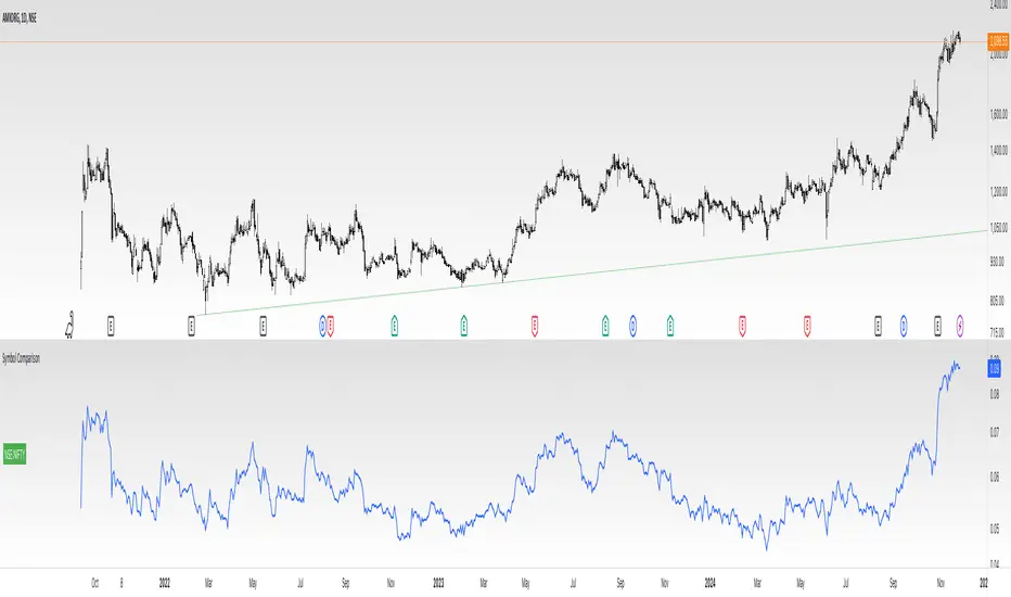
This indicator simplifies the comparison of a stock's performance against a specified index, such as the Nifty 50. By calculating and plotting the ratio between the two, it provides a clear visual representation of relative strength.
Key Features:
-Direct Comparison: Easily compare any stock against a selected index.
-Customizable Index: Choose from a dropdown menu or input a custom index symbol.
-Visual Clarity: Maximizing the chart provides a clear view of the relative performance.
-SMA Overlay: Add a Simple Moving Average (SMA) to identify trends and potential entry/exit
points.
-Customizable Appearance: Adjust background color, text color, and label size for personalized
visualization.
How to Use:
Add the Indicator: Add the indicator to your chart.
Select the Index: Choose the desired index from the dropdown menu or input a custom symbol.
Analyze the Ratio:
-A rising ratio indicates the stock is outperforming the index.
-A falling ratio suggests underperformance.
-The SMA can help identify potential trends and momentum.
Customize the Appearance: Adjust the background color, text color, and label size to suit your preferences.
Benefits:
-Improved Decision Making: Gain insights into a stock's relative strength.
-Faster Analysis: Quickly compare multiple stocks against a benchmark index.
-Enhanced Visualization: Customize the chart for better understanding.
-By leveraging this indicator, you can make informed trading decisions and gain a deeper
understanding of market dynamics.
ابحث في النصوص البرمجية عن "index"
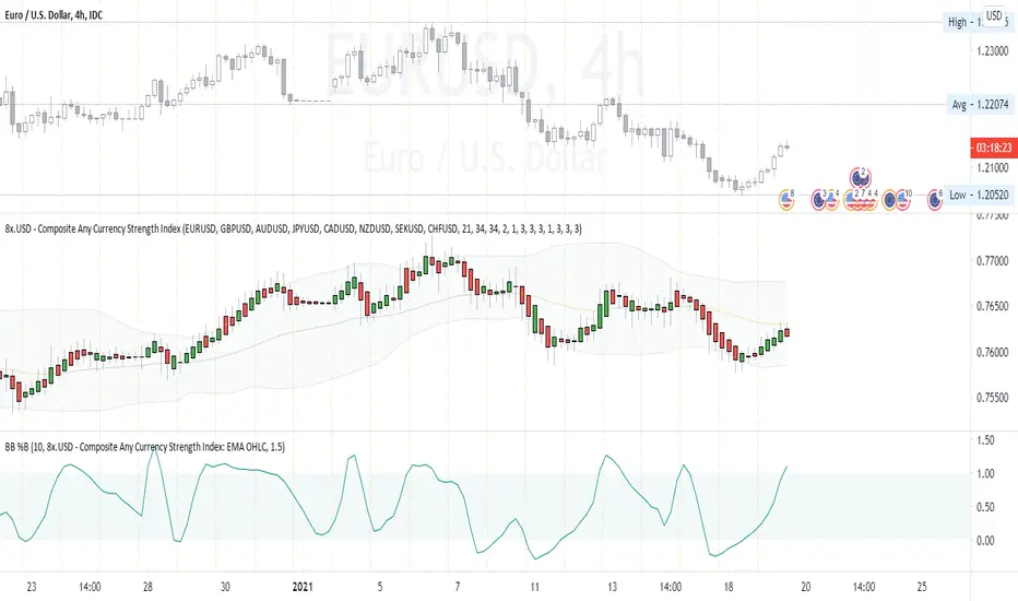
Composite Any Currency Strength IndexThis is a flexible currency strength indicator and you can adjust it to any currency you wish 'to measure'. By default, it is set to measure USD major pairs. Indicator calculates every pair you list, and plots one composite chart in the form of Heikin Ashi candles. Basically, you will get USD index in this case. Similarly, you can get AUD, EUR, CAD, JPY, CHF, etc indexes by specifying corresponding symbols. Remember about base and quote currencies and location of each for correct calculations. Simple adjustments in the script needed if you want to value USD by using USD in both base and quote (counter) currencies.
For example, when calculating USD strength by looking into USDJPY (not into JPYUSD) symbols, you will need to add minus "-" before corresponding security in the script itself, not in the Settings Inputs.
Default study script (with JPYUSD):
// Inputs
...
string sec3 = input(defval="JPYUSD", type=input.symbol, title="Symbol")
...
h_sec3 = security(heikinashi(sec3), timeframe.period, high)
l_sec3 = security(heikinashi(sec3), timeframe.period, low)
o_sec3 = security(heikinashi(sec3), timeframe.period, open)
c_sec3 = security(heikinashi(sec3), timeframe.period, close)
Adjusted study script with USDJPY:
// Inputs
...
string sec3 = input(defval="USDJPY", type=input.symbol, title="Symbol")
...
h_sec3 = -security(heikinashi(sec3), timeframe.period, high)
l_sec3 = -security(heikinashi(sec3), timeframe.period, low)
o_sec3 = -security(heikinashi(sec3), timeframe.period, open)
c_sec3 = -security(heikinashi(sec3), timeframe.period, close)
Unfortunately, I am not a coder specialist and perhaps someone here could improve this indicator for easier and more friendly adjustments. But thanks to variety of symbols on TradingView , you can ignore any changes in the script, and just use symbols with corresponding counter currency offered by this great platform.
Bollinger Bands, 2 x RMA, 4 x SMA/EMA were added for deeper analysing of the index. Other indicators with ability to select data sources (like CCI, StochRSI, Momentum etc) can be separately added to a current chart, but use Composite Any Currency Strength Index data as the source for analysing displayed pair, i.e. by selecting source - Composite Any Currency Strength Index: SMA Close or EMA HLC.
Thank you and good luck everyone!
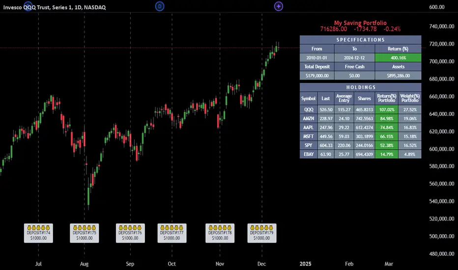
Employee Portfolio Generator [By MUQWISHI]▋ INTRODUCTION :
The “Employee Portfolio Generator” simplifies the process of building a long-term investment portfolio tailored for employees seeking to build wealth through investments rather than traditional bank savings. The tool empowers employees to set up recurring deposits at customizable intervals, enabling to make additional purchases in a list of preferred holdings, with the ability to define the purchasing investment weight for each security. The tool serves as a comprehensive solution for tracking portfolio performance, conducting research, and analyzing specific aspects of portfolio investments. The output includes an index value, a table of holdings, and chart plots, providing a deeper understanding of the portfolio's historical movements.
_______________________
▋ OVERVIEW:
● Scenario (The chart above can be taken as an example) :
Let say, in 2010, a newly employed individual committed to saving $1,000 each month. Rather than relying on a traditional savings account, chose to invest the majority of monthly savings in stable well-established stocks. Allocating 30% of monthly saving to AMEX:SPY and another 30% to NASDAQ:QQQ , recognizing these as reliable options for steady growth. Additionally, there was an admired toward innovative business models of NASDAQ:AAPL , NASDAQ:MSFT , NASDAQ:AMZN , and NASDAQ:EBAY , leading to invest 10% in each of those companies. By the end of 2024, after 15 years, the total monthly deposits amounted to $179,000, which would have been the result of traditional saving alone. However, by sticking into long term invest, the value of the portfolio assets grew, reaching nearly $900,000.
_______________________
▋ OUTPUTS:
The table can be displayed in three formats:
1. Portfolio Index Title: displays the index name at the top, and at the bottom, it shows the index value, along with the chart timeframe, e.g., daily change in points and percentage.
2. Specifications: displays the essential information on portfolio performance, including the investment date range, total deposits, free cash, returns, and assets.
3. Holdings: a list of the holding securities inside a table that contains the ticker, last price, entry price, return percentage of the portfolio's total deposits, and latest weighted percentage of the portfolio. Additionally, a tooltip appears when the user passes the cursor over a ticker's cell, showing brief information about the company, such as the company's name, exchange market, country, sector, and industry.
4. Indication of New Deposit: An indication of a new deposit added to the portfolio for additional purchasing.
5. Chart: The portfolio's historical movements can be visualized in a plot, displayed as a bar chart, candlestick chart, or line chart, depending on the preferred format, as shown below.
_______________________
▋ INDICATOR SETTINGS:
Section(1): Table Settings
(1) Naming the index.
(2) Table location on the chart and cell size.
(3) Sorting Holdings Table. By securities’ {Return(%) Portfolio, Weight(%) Portfolio, or Ticker Alphabetical} order.
(4) Choose the type of index: {Assets, Return, or Return (%)}, and the plot type for the portfolio index: {Candle, Bar, or Line}.
(5) Positive/Negative colors.
(6) Table Colors (Title, Cell, and Text).
(7) To show/hide any of selected indicator’s components.
Section(2): Recurring Deposit Settings
(1) From DateTime of starting the investment.
(2) To DateTime of ending the investment
(3) The amount of recurring deposit into portfolio and currency.
(4) The frequency of recurring deposits into the portfolio {Weekly, 2-Weeks, Monthly, Quarterly, Yearly}
(5) The Depositing Model:
● Fixed: The amount for recurring deposits remains constant throughout the entire investment period.
● Increased %: The recurring deposit amount increases at the selected frequency and percentage throughout the entire investment period.
(5B) If the user selects “ Depositing Model: Increased % ”, specify the growth model (linear or exponential) and define the rate of increase.
Section(3): Portfolio Holdings
(1) Enable a ticker in the investment portfolio.
(2) The selected deposit frequency weight for a ticker. For example, if the monthly deposit is $1,000 and the selected weight for XYZ stock is 30%, $300 will be used to purchase shares of XYZ stock.
(3) Select up to 6 tickers that the investor is interested in for long-term investment.
Please let me know if you have any questions
Moonhub Cycle IndexMoonhub Cycle Index is a composite index derived from three popular technical analysis indicators: Moving Average Convergence Divergence (MACD), Schaff Trend Cycle (STC), and Detrended Price Oscillator (DPO). The indicator is designed to help identify potential trends and market sentiment by combining the unique characteristics of each indicator.
Key components of the indicator include:
Input Parameters:
COEMA Length (len_DIema): The length of the Exponential Moving Average (EMA) applied to the Custom Index. Default is set to 9.
COSMA Length (len_DIsma): The length of the Simple Moving Average (SMA) applied to the Custom Index. Default is set to 30.
Indicators:
MACD: A momentum oscillator that shows the relationship between two moving averages of a security's price. It is calculated using the difference between the 12-period and 26-period EMA, and a 9-period EMA (signal line) of the MACD.
STC: A cyclic indicator that identifies cyclical trends in the market. It is calculated using the Stochastic oscillator formula applied to the close, high, and low prices over a 10-period lookback window.
DPO: A price oscillator that eliminates the trend from price data to focus on underlying cycles. It is calculated using a custom function that shifts the price by half the length and subtracts the SMA from the shifted price.
Custom Index: The composite index is calculated by taking the average of the MACD line, STC, and DPO.
COEMA and COSMA: Exponential and Simple Moving Averages applied to the Custom Index using the lengths specified by the input parameters (len_DIema and len_DIsma).
Plots: The Custom Index, COEMA, and COSMA are plotted with different colors and line widths to visualize their interaction and provide insights into potential market trends.
This Custom Index Indicator can be useful for traders who want to analyze the market using a combination of these indicators to make more informed decisions. It can also help identify potential trends and market sentiment by combining the unique characteristics of each indicator.

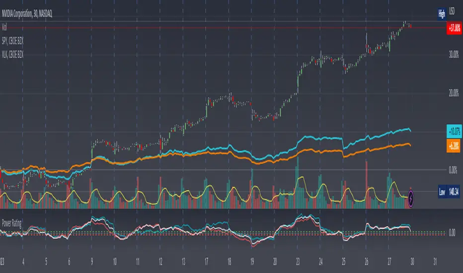
Stock Relative Strength Power IndexAs always, this is not financial advice and use at your own risk. Trading is risky and can cost you significant sums of money if you are not careful. Make sure you always have a proper entry and exit plan that includes defining your risk before you enter a trade.
This idea recently came out of some discussions I stumbled across in a trading group I am a part of regarding Relative Strength and Relative Weakness (shortened to RS and RW from here on out). The whole mechanism behind this trading system is to filter out underperforming securities relative to the current market direction to be in only the strongest or weakest stocks when the market is currently experiencing a bullish or bearish cycle. The idea behind this is there is no point in parking your money into a stock that is treading water or even going down if the market is making strong moves upwards. At that point, you are at worst losing money, and at best trading equal to the index/ETF, in which case the argument is why are you not just trading the index/ETF instead? RS or RW will filter out these sector laggards and allow you to position yourself into strong (or the strongest) stocks at any given time to help improve portfolio performance. Further, not only does it protect your position should the market shift against you briefly, it also often sees exceptional performance in the same cycle. For example, if $SPY makes a 5% move over the course of a month, a stock with RS/RW may make a 10% move, or more, allowing you to see increased profit potential.
RS/RW is based on the idea of performance, that is the raw percent change of a security over a given time period relative to a benchmark. This benchmark is often the S&P500 (ES/SPX/SPY and their derivatives). I have to stress that this is not beta, which measures the volatility of a stock over a given period (i.e. if $SPY moves $1, $NVDA will often move $1.74). This is a measurement of the market (i.e. $SPY) has moved 1% over the course of a day, $NVDA has moved 8% over the course of the day. This is very often used as a signal of institutional interest as apart from some very unique moments, retail traders cannot and will not provide enough market pressure to move a market outside of a stock's normal trading range, nor will they outperform the sector or market as a whole consistently over time without some big money to make them move. The problem with running strict performance analysis (i.e. % change from period T ago to period T + n at present) is that while it gives us a baseline of how much the stock has moved, it doesn't overall mean much. For instance, if a $100 stock has moved 5% today, but has been experiencing a period of increased volatility and it's Average True Range (ATR) (the amount a stock will move over X number of periods, on average) is $7, performance seems impressive but is actually generally fairly weak to what the stock has been doing recently. Conversely, if we take a second stock, this time worth $20, and it too has moved 5% in one day but has an ATR of only $0.25, that stock has made an exceptional move and we want to be part of that.
Here, I have created an indicator called the Stock Relative Strength Power Index. This takes the stock's rate of change (ROC) (the % move it has made over X number of periods), the stock's normalized ATR (the ATR represented as a percentage instead of a raw value), and compares these to one another to get the "Power Rating": a representation of the true strength of a stock over X number of periods. The indicator does two things. First, the raw ROC is divided by the stock's normalized ATR to assess whether the stock is moving outside of its normal range of variation or not. Second, since we are interested in trading only stocks with exceptional RS/RW to the market, I have also applied this same calculation to the S&P500 ($SPY) and the various SPDR sector indexes. These comparisons allow for a rapid and accurate assessment of the true strength of a stock at any given time on any given time frame. To cycle back above to our examples, the $100 stock has a Power Rating of only 0.71 (i.e. it is trading less than its current average), while our $20 stock has a Power Rating of 5. If we then compare these to both the market as a whole and the sector that the stock is a part of, we get a much clearer indication of the true buying or selling pressure imposed on the stock at any given time.
Use:
The indicator has 3 lines. The blue line is the security of interest, the red line is the market baseline (i.e. the sector ETF $SPY), and the white line is the sector index. I have given an example above on the semiconductor/tech stock $NVDA on a 30min timeframe. You can see that since the start of 2023, $NVDA has generally been strong to the market and its own sector since the blue line is greater than both the red and white lines over many days. This would have provided some nice day trading opportunities, or even some nice short term swing trades. The values themselves are generally meaningless outside of either the 1 or -1 value lines. All that matters is that the current ticker is surpassing both the market and the sector while being > 1.0 for a long trade or less than -1.0 for a short trade. However, I must stress this indicator gives no trade signals on its own, it is purely a confirmation indicator. An example of a trade would be if you had a trade signal given by either an indicator or by price action suggesting to buy some $NVDA for a trade to the upside, the Power Rating indicator would confirm this by showing if $NVDA was actually showing true strength by being both greater than 1 (the cutoff for it surpassing its ATR) and being above both the red and white lines. Further, you can see $NVDA has been stronger than the market when using the comparison function as well, but the has fluxed in and out of strength intraday when using the actual indicator vs. the static performance ratio chart (plotted as line graphs on the chart).
I have made it possible to change the colour of the plots and the line levels. The adjustment of the line levels gives the trader the flexibility to change their target breakout level (i.e. only trading stocks that have a Power Rating > 2, for example, meaning they are trading at least 2X their normal trading range). The third security comparison is flexible and can be used to compare to the sector ETF (initial intention) or it can be used to compare to other tickers within the same sector, for example. The trader should select the appropriate ETF for the given security of interest to avoid false confirmation if they want to use an ETF as their third input. The proper sector should be readily available on most online websites and accessible in a matter of seconds meaning that the delay is minimal, at worst. If a trader wishes to add additional functionality, such as a crypto trader using BTCUSD as the benchmark instead of $SPY, I encourage them to copy and paste this script and modify as needed since I have made this open source.
This indicator works on all timeframes. The lookback period can be changed, so a day trader who may use a 5min chart (and use a period of 12 to get the hourly Power Rating) will find this equally useful as someone who may be a core trader who wants to look at the performance over the course of years and may use a 60 period on a monthly chart.
Happy trading and I hope this helps!
Global Liquidity Index and DEMA1001. Global Liquidity Index:
The code calculates global liquidity from economic data from multiple countries and regions. Specifically, it aggregates money supply data from major economies such as the United States, Europe, China, and Japan, and sums and adjusts them to get a global liquidity index.
This index is calculated by summing data from different sources and subtracting the impact of some financial instruments (such as reverse repurchase agreements, etc.), and then converting the result into a number in trillions. This can help analyze the liquidity conditions in global money markets.
2. ROC SMA (Simple Moving Average of Rate of Change):
The code calculates the rate of change (ROC) of the global liquidity index, which is a way to measure the speed of change of the index.
Then, a simple moving average (SMA) is applied to the rate of change, which helps smooth the data and identify trends.
The ROC SMA curve is displayed in yellow to help users observe the trend of liquidity changes.
3. DEMA (Double Exponential Moving Average):
DEMA is a more complex moving average that attempts to reduce the lag of the moving average and provide a more sensitive trend response.
The calculation method is to first calculate a standard exponential moving average (EMA), then calculate the EMA of this EMA, and use these two results to calculate DEMA.
The code allows users to set the period length of DEMA (default is 100), which can adjust the speed of DEMA's response to price changes.
The DEMA curve is displayed in blue, helping users to more accurately capture the trends and changes of global liquidity indicators.

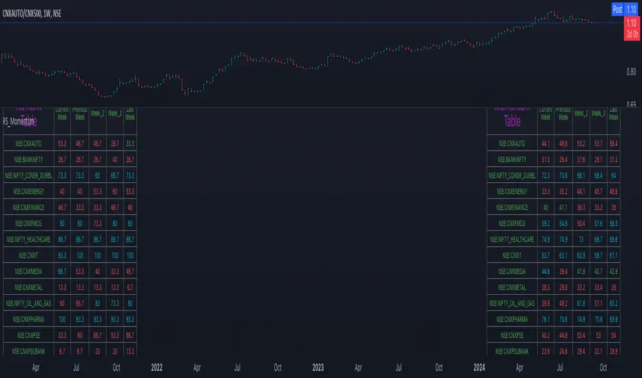
Relative Strength and MomentumRelative Strength and Momentum Indicator
Unlock deeper market insights with the Relative Strength and Momentum Indicator—a powerful tool designed to help traders and investors identify the strongest stocks and sectors based on relative performance. This custom indicator displays essential information on relative strength and momentum for up to 15 different symbols, compared against a benchmark index, all within a clear and organized table format.
Key Features:
1. Customizable Inputs: Choose up to 15 symbols to compare, along with a benchmark index, allowing you to tailor the indicator to your trading strategy. The 'Lookback Period' input defines how many weeks of data are analyzed for relative strength and momentum.
2. Relative Strength Calculation: For each selected symbol, the indicator calculates the Relative Strength (RS) against the chosen benchmark. This RS is further refined using an exponential moving average (EMA) to smooth the results, providing a more stable trend overview.
3. Momentum Analysis: Momentum is determined by analyzing the rate of change in relative strength. The indicator calculates a momentum rank for each symbol, based on its relative strength’s improvement or deterioration.
4. Percentile Ranking System: Each symbol is assigned a percentile rank (from 1 to 100) based on its relative strength compared to the others. Similarly, momentum rankings are also assigned from 1 to 100, offering a clear understanding of which assets are outperforming or underperforming.
5. Visual Indicators:
a. Green: Signals improving or stable relative strength and momentum.
b. Red: Indicates declining relative strength or momentum.
c. Aqua: Highlights symbols performing well on both relative strength and momentum—ideal candidates for further analysis.
6. Two Clear Tables:
a. Relative Strength Rank Table: Displays weekly rankings of relative strength for each symbol.
b. Momentum Table: Shows momentum trends, helping you identify which symbols are gaining or losing strength.
7. Color-Coded for Easy Analysis: The tables are color-coded to make analysis quick and straightforward. A green color means the symbol is performing well in terms of relative strength or momentum, while red indicates weaker performance. Aqua marks symbols that are excelling in both areas.
Use Case:
a. Sector Comparison: Identify which sectors or indexes are showing both relative strength and momentum to pick high-potential stocks. This allows you to align with broader market trends for improved trade entries.
b. Stock Selection: Quickly compare symbols within the same sector to find the stronger performers.
US Market Real Value Adjusted for CPI and Dollar IndexUS Market Real Value Adjusted for CPI and Dollar Index
Provides quick access to this formula: (SP:SPX+NASDAQ_DLY:IXIC+TVC:DJI+CAPITALCOM:RTY)/4/(ECONOMICS:USCPI*TVC:DXY*100)
Overview:
This indicator provides a dynamic view of the US stock market's real value, adjusted for inflation and currency strength. It combines major stock indices including the S&P 500, NASDAQ, Dow Jones, and Russell 2000, and adjusts the composite index using the US Consumer Price Index (CPI) and the US Dollar Index (DXY). This adjustment helps to reveal the true market performance, stripped of inflationary effects and currency valuation changes.
Key Features:
Composite Index Calculation: Averages the prices of SPX, IXIC, DJI, and RTY to create a broad market overview.
Inflation Adjustment: Uses the CPI to adjust for the effects of inflation, ensuring that the real value changes in the stock market are highlighted.
Currency Strength Adjustment: Applies the DXY to account for fluctuations in the strength of the US dollar, providing insights into how currency variations impact market valuation.
Dynamic Base Calculation: Utilizes a rolling window to dynamically update base values, allowing for continuous reassessment of the market’s adjusted value as new data becomes available.
This indicator provides:
Real Value Insights: By adjusting for both inflation and currency strength, this indicator offers a more accurate measure of the underlying market conditions.
Dynamic Updates: With a rolling window approach, the indicator continually adapts, providing up-to-date information.
Strategic Decisions: Helps in identifying true market growth or decline periods, aiding in strategic investment planning.
Usage:
To use this indicator, simply add it to your chart, and it will automatically display the adjusted composite index. This index can be particularly useful for investors looking to understand underlying market trends beyond nominal price movements, helping in making more informed investment decisions when comparing certain tickers to an average of the major US stock market indexes, adjusted for inflation and the strength of the US dollar.
Example Use Case:
A typical use case might involve comparing periods of high inflation to see how the overall US stock market performed in real terms, not just nominal terms. This can indicate whether the market growth was genuine or merely a reflection of inflation. By comparing this result to an average of these major indexes without adjusting for inflation or currency strength changes, you can see how significantly these forces can impact real gains or losses.

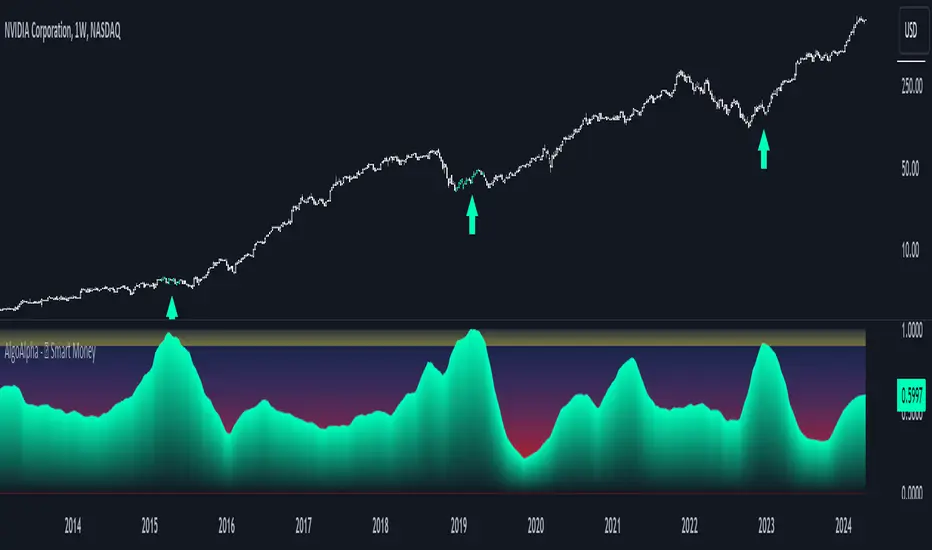
Smart Money Interest Index [AlgoAlpha]🌟 Smart Money Interest Index by AlgoAlpha 🌟
Welcome to the innovative Smart Money Interest Index indicator, designed meticulously by AlgoAlpha to revolutionize the way you trade! 📈🧠 This indicator is engineered to decipher the activities of smart money investors relative to the less informed (dumb money) and dynamically display their dominance in the trading landscape through a sophisticated visual index. 🚀💹
🔑 Key Features:
- Smart vs. Dumb Money Analysis: Tracks and compares the movements of smart money (informed investors) and dumb money (general public) within the market to identify potential investment signals.
- Relative Strength Index (RSI) Based Ratios: Utilizes RSI for both smart and dumb money to create a ratio that indicates buying or selling pressures.
- Dynamic Normalization: Employs a long-term peak normalization over a customizable period to ensure the index remains relevant regardless of market conditions.
- Visual Thresholds and Signals: Highlights significant shifts in market dynamics with color-coded thresholds, making it easier to spot changes at a glance.
🛠 How to Use the Smart Money Interest Index:
🔹 🚀 Step 1: Adding the Indicator
- Add the indicator to your favourites.
- Customize the settings according to your analysis needs:
- `Index Period`, `Volume Flow Period`, `Normalization Period`, `High Interest Threshold`
🔹 📊 Step 2: Interpretation of the Index
- Monitor the index plot; a rising index suggests increasing smart money interest, potentially indicating a buying opportunity.
- A value above the high interest threshold (in yellow) highlights significant interest by smart money, suggesting a good time to buy.
🔹 🔔 Step 3: Setting Alerts
- Configure alerts to notify you when the index crosses above the set threshold, enabling you to capitalize on trading opportunities timely and efficiently.
📐 Basic Logic Overview:
The Smart Money Interest Index by AlgoAlpha provides a unique metric that contrasts the investment behaviors of informed (smart money) and general (dumb money) investors. Utilizing the Relative Strength Index (RSI), this indicator evaluates the trading pressure exerted by both groups over specified periods, then forms a ratio of these activities to identify dominance in buying or selling trends. For example, when we see dumb money selling and smart buying, this suggests that the conditions for buying the asset is optimal as smart money is willing to buy the dip. The outputs are normalized against the highest values observed in a user-defined term to maintain consistency through varying market conditions. When the index exceeds a certain threshold, it suggests that smart money presence is particularly strong, possibly indicating that smart money is looking to enter positions on the asset. This tool serves as a sophisticated visual guide to understanding market dynamics and making well-informed trading decisions based on the activities of market-savvy investors. Smart money activity is identified during areas of low volume and the opposite for dumb money, the indicator uses the NVI and PVI metrics as its foundation for smart and dumb money analysis.
📊 Enhance Your Trading Strategy:
Leverage the Smart Money Interest Index to gain deeper insights into market dynamics and enhance your decision-making process with a powerful, data-driven approach. Whether you're looking to identify entry points or set strategic exits, this tool is designed to provide you with the competitive edge you need in the fast-paced world of trading. 🌐✨
Transform your trading with the power of smart money analysis—start using the Smart Money Interest Index today! 🚀🔔
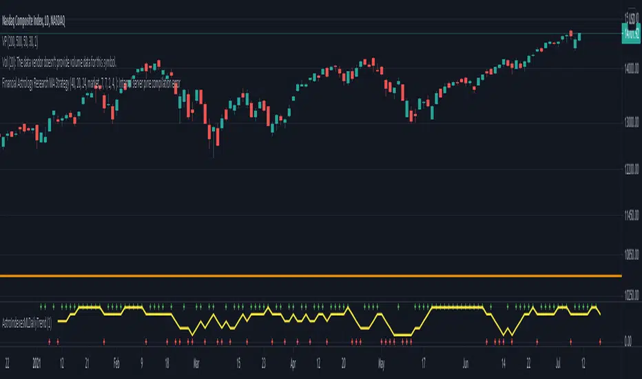
Financial Astrology Indexes ML Daily TrendDaily trend indicator based on financial astrology cycles detected with advanced machine learning techniques for some of the most important market indexes: DJI, UK100, SPX, IBC, IXIC, NI225, BANKNIFTY, NIFTY and GLD fund (not index) for Gold predictions. The daily price trend is forecasted through planets cycles (angular aspects, speed phases, declination zone), fast cycles are based on Moon, Mercury, Venus and Sun and Mid term cycles are based on Mars, Vesta and Ceres . The combination of all this cycles produce a daily price trend prediction that is encoded into a PineScript array using binary format "0 or 1" that represent sell and buy signals respectively. The indicator provides signals since 2021-01-01 to 2022-12-31, the past months signals purpose is to support backtesting of the indicator combined with other technical indicator entries like MAs, RSI or Stochastic . For future predictions besides 2022 a machine learning models re-train phase will be required.
When the signal moving average is increasing from 0 to 1 indicates an increase of buy force, when is decreasing from 1 to 0 indicates an increase in sell force, finally, when is sideways around the 0.4-0.6 area predicts a period of buy/sell forces equilibrium, traders indecision which result in a price congestion within a narrow price range.
We also have published same indicator for Crypto-Currencies research portfolio:
DISCLAIMER: This indicator is experimental and don’t provide financial or investment advice, the main purpose is to demonstrate the predictive power of financial astrology. Any allocation of funds following the documented machine learning model prediction is a high-risk endeavour and it’s the users responsibility to practice healthy risk management according to your situation.
Relative Strength Index of EU and US Stock Index Trends quality//Relative Strength Index of European and US Stock Index Trends quality
//This indicator reveals the relative strength of European and US stock index futures.
//take Bull trend as an example , the current closed price>EMA20 value and the current closed price >20th previous bar closed price( deduction price),
//it's defined as a lower level bull trend .If the current price EMA20>EMA60, it's defined as a higher level bull trend .If the EMA20>EMA60>EMA120,it's defined as the highest level bull trend.
//You can choose to draw the curve with the deviation rate of the original major indexes to 20EMA, or draw the deviation rate with the average value (default value is 5 bars).
//In addition, a more technical method is added to analyze the deviation changes of the major indexes.The deviation rate changing velocity value, parameter tan (abbreviated by t) of 1, 2, 5, 10 is introduced.
//You can have the option of calculate the tan using average value of 5 candlesticks or original value.
//Taking tan1 as an example, it indicates how much the deviation rate between the current price and the previous candlestick has changed.
//The indicator of the index color and the description of the trend quality color can be switched off in option.
//In addition, this code color scheme is only suitable for black background (the code color needs to be changed by yourself if you use white background).
S&P Merval Index Volume Indicator (Shares, ARS, U$S CCL GGAL)S&P Merval Index Volume Indicator (Shares, ARS, U$S CCL GGAL)
◾ This indicator reflects a close estimate of the traded volume in the S&P Merval Index BCBA:IMV for nominal shares, traded money in ARS & USD using a financial FX rate.
◾ The constituents of the index "must meet minimum size and liquidity requirements" as it is been declared by S&P Dow Jones Indexes. On this version of the indicator were reflected the current set of stocks for the Index as of Monday, July 27, 2020 for actual and historical sessions.
◾ Eventually, there could be changes in consitutents as per the S&P Dow Jones Indexes classification and re-balance that will be reflected on this script or a new one.
◾ Aggregated volume of nominal shares for each of the stocks constitutents is multiplied by their closing prices to estimates the effective volume in ARS & adjusted by the FX rate with "Contado con Liquidación" FX rate closing session price.
◾ It serves as a dynamical volume indicator available for standard and customized timeframes. Provides an assertive look over trading activity which allows the analyst to measure effectively either resistance or support zones in Bull / Flat or Bear markets.
◾ Output of 10 trading days of effective volume was cross-checked with "IAMC Informe diario" www.iamc.com.ar the official daily report by the exchange ByMA (Bolsas y Mercados de Argentina).
1) Trading Sessions Dates
7/27/20; 7/23/20; 7/22/20; 7/21/20; 7/20/20; 7/16/20; 7/15/20; 7/14/20; 7/13/20
2) IAMC Informe Diario S&P Merval Index Effective volume (ARS) for each of 1)
$1309.4M; $1999.3M; $1691.1M; $1585.6M; $949.7M; $818.6M; $1010.4M; $962.3M; $1515.7M
3) Pine indicator S&P Merval Index Effective volume (ARS) for each 1)
$1294.6M; $1911.7M; $1691.3M; $1526.6M; $901.4M; $796.7M; $961.9M; $939.7M; $1404.7 M
4) Variance 3) | 2)
-1%; -4%; 0%; -4%; -5%; -3%; -5%; -2%; -7%
Average Deviation: -4%
Standard Deviation: 2%
* This quick analysis depicts that effective volume displayed may (or not) have a non significance variance over the real data reported by the National Exchange due to the script calculation.
* Thanks to Alan who helped me a lot with the code!

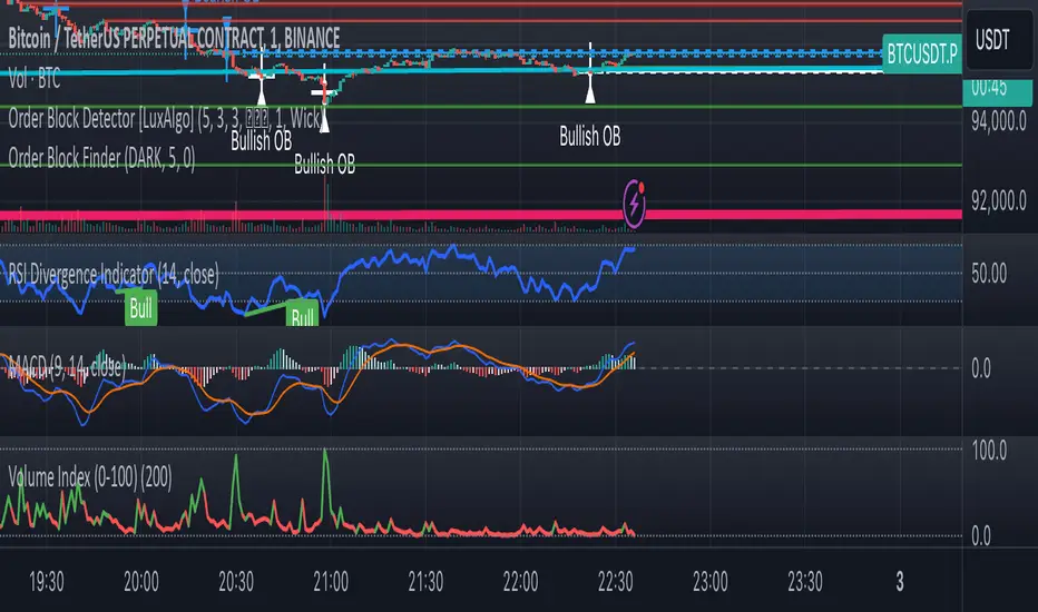
Volume Index (0-100)Volume Index (0-100) Indicator
The Volume Index (0-100) indicator is a powerful tool designed to help traders understand current volume levels in relation to past activity over a specified period. By normalizing volume data to a scale from 0 to 100, this indicator makes it easy to compare today's volume against recent history and gauge the strength of market movements.
Key Features:
Normalized Volume Index: The indicator indexes volume between 0 and 100, allowing traders to easily determine if the current volume is unusually high or low compared to recent trends.
Colored Visualization: The line graph is colored green for positive volume (increasing activity) and red for negative volume (decreasing activity). This helps traders quickly grasp the market sentiment and volume direction.
User-Defined Lookback Period: Traders can customize the lookback period to best fit their trading strategy, providing flexibility for different market conditions.
How Traders Can Use It:
Identifying Volume Extremes: The Volume Index helps identify periods of unusually high or low volume. Values approaching 100 indicate high volume, while values close to 0 indicate low volume.
Confirmation Tool: During price movements, high volume (near 100) can act as a confirmation signal for the strength of the trend. For instance, a high volume during an uptrend may indicate strong buying interest.
Divergence Analysis: Traders can look for divergences between volume and price. For example, if the price is consolidating while the Volume Index remains high, it could signal an impending breakout.
Volume Alerts: The indicator includes an alert feature when the Volume Index exceeds 80, helping traders stay informed about potential shifts in market volatility.
Global Index Spread RSI StrategyThis strategy leverages the relative strength index (RSI) to monitor the price spread between a global benchmark index (such as AMEX) and the currently opened asset in the chart window. By calculating the spread between these two, the strategy uses RSI to identify oversold and overbought conditions to trigger buy and sell signals.
Key Components:
Global Benchmark Index: The strategy compares the current asset with a predefined global index (e.g., AMEX) to measure relative performance. The choice of a global benchmark allows the trader to analyze the current asset's movement in the context of broader market trends.
Spread Calculation:
The spread is calculated as the percentage difference between the current asset's closing price and the global benchmark index's closing price:
Spread=Current Asset Close−Global Index CloseGlobal Index Close×100
Spread=Global Index CloseCurrent Asset Close−Global Index Close×100
This metric provides a measure of how the current asset is performing relative to the global index. A positive spread indicates the asset is outperforming the benchmark, while a negative spread signals underperformance.
RSI of the Spread: The RSI is then calculated on the spread values. The RSI is a momentum oscillator that ranges from 0 to 100 and is commonly used to identify overbought or oversold conditions in asset prices. An RSI below 30 is considered oversold, indicating a potential buying opportunity, while an RSI above 70 is overbought, suggesting that the asset may be due for a pullback.
Strategy Logic:
Entry Condition: The strategy enters a long position when the RSI of the spread falls below the oversold threshold (default 30). This suggests that the asset may have been oversold relative to the global benchmark and might be due for a reversal.
Exit Condition: The strategy exits the long position when the RSI of the spread rises above the overbought threshold (default 70), indicating that the asset may have become overbought and a price correction is likely.
Visual Reference:
The RSI of the spread is plotted on the chart for visual reference, making it easier for traders to monitor the relative strength of the asset in relation to the global benchmark.
Overbought and oversold levels are also drawn as horizontal reference lines (70 and 30), along with a neutral level at 50 to show market equilibrium.
Theoretical Basis:
The strategy is built on the mean reversion principle, which suggests that asset prices tend to revert to a long-term average over time. When prices move too far from this mean—either being overbought or oversold—they are likely to correct back toward equilibrium. By using RSI to identify these extremes, the strategy aims to profit from price reversals.
Mean Reversion: According to financial theory, asset prices oscillate around a long-term average, and any extreme deviation (overbought or oversold conditions) presents opportunities for price corrections (Poterba & Summers, 1988).
Momentum Indicators (RSI): The RSI is widely used in technical analysis to measure the momentum of an asset. Its application to the spread between the asset and a global benchmark allows for a more nuanced view of relative performance and potential turning points in the asset's price trajectory.
Practical Application:
This strategy works best in markets where relative strength is a key factor in decision-making, such as in equity indices, commodities, or forex markets. By assessing the performance of the asset relative to a global benchmark and utilizing RSI to identify extremes in price movements, the strategy helps traders to make more informed decisions based on potential mean reversion points.
While the "Global Index Spread RSI Strategy" offers a method for identifying potential price reversals based on relative strength and oversold/overbought conditions, it is important to recognize that no strategy is foolproof. The strategy assumes that the historical relationship between the asset and the global benchmark will hold in the future, but financial markets are subject to a wide array of unpredictable factors that can lead to sudden changes in price behavior.
Risk of False Signals:
The strategy relies heavily on the RSI to trigger buy and sell signals. However, like any momentum-based indicator, RSI can generate false signals, particularly in highly volatile or trending markets. In such conditions, the strategy may enter positions too early or exit too late, leading to potential losses.
Market Context:
The strategy may not account for macroeconomic events, news, or other market forces that could cause sudden shifts in asset prices. External factors, such as geopolitical developments, monetary policy changes, or financial crises, can cause a divergence between the asset and the global benchmark, leading to incorrect conclusions from the strategy.
Overfitting Risk:
As with any strategy that uses historical data to make decisions, there is a risk of overfitting the model to past performance. This could result in a strategy that works well on historical data but performs poorly in live trading conditions due to changes in market dynamics.
Execution Risks:
The strategy does not account for slippage, transaction costs, or liquidity issues, which can impact the execution of trades in real-market conditions. In fast-moving markets, prices may move significantly between order placement and execution, leading to worse-than-expected entry or exit prices.
No Guarantee of Profit:
Past performance is not necessarily indicative of future results. The strategy should be used with caution, and risk management techniques (such as stop losses and position sizing) should always be implemented to protect against significant losses.
Traders should thoroughly test and adapt the strategy in a simulated environment before applying it to live trades, and consider seeking professional advice to ensure that their trading activities align with their risk tolerance and financial goals.
References:
Poterba, J. M., & Summers, L. H. (1988). Mean Reversion in Stock Prices: Evidence and Implications. Journal of Financial Economics, 22(1), 27-59.

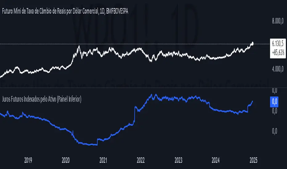
Future Interest Indexed by AssetEste script em Pine Script calcula e exibe o índice dos juros futuros (DI1) em relação ao preço de um ativo, utilizando o preço de fechamento do ativo e a taxa de juros futuros (DI1). O cálculo é realizado dividindo a taxa de juros pelos preços do ativo, resultando no índice indice_juros. Para evitar a divisão por zero, o script verifica se o preço do ativo é válido e não nulo. O índice calculado é então plotado em um painel inferior no gráfico, representado por uma linha azul, permitindo aos usuários observar a relação entre a taxa de juros futuros e o preço do ativo de forma clara e intuitiva.
This Pine Script script calculates and displays the future interest rate (DI1) in relation to the price of an asset, using the asset's closing price and the future interest rate (DI1). The calculation is carried out by dividing the interest rate by the asset prices, resulting in the index_interest index. To avoid division by zero, the script checks that the asset's price is valid and not null. The calculated index is then plotted in a lower panel on the chart, represented by a blue line, allowing users to observe the relationship between the future interest rate and the asset price clearly and intuitively.
Nifty / Banknifty Dashboard by RiTzNifty / Banknifty Dashboard :
Shows Values of different Indicators on current Timeframe for the selected Index & it's main constituents according to weightage in index.
customized for Nifty & Banknifty (You can customize it according to your needs for the markets/indexes you trade in)
Interpretation :-
VWAP : if LTP is trading above VWAP then Bullish else if LTP is trading below VWAP then Bearish.
ST(21,1) : if LTP is trading above Supertrend (21,1) then Bullish , else if LTP is trading below Supertrend (21,1) then Bearish.
ST(14,2) : if LTP is trading above Supertrend (14,2) then Bullish , else if LTP is trading below Supertrend (14,2) then Bearish.
ST(10,3) : if LTP is trading above Supertrend (10,3) then Bullish , else if LTP is trading below Supertrend (10,3) then Bearish.
RSI(14) : Shows value of RSI (14) for the current timeframe.
ADX : if ADX is > 75 and DI+ > DI- then "Bullish ++".
if ADX is < 75 but >50 and DI+ > DI- then "Bullish +".
if ADX is < 50 but > 25 and DI+ > DI- then "Bullish".
if ADX is above 75 and DI- > DI+ then "Bearish ++".
if ADX is < 75 but > 50 and DI- > DI+ then "Bearish+".
if ADX is < 50 but > 25 and DI- > DI+ then "Bearish".
if ADX is < 25 then "Neutral".
MACD : if MACD line is above Signal Line then "Bullish", else if MACD line is below Signal Line then "Bearish".
PDH-PDL : "< PDH > PDL" means LTP is trading between Previous Days High(PDH) & Previous Days Low(PDL) which indicates Rangebound-ness.
"> PDH" means LTP is trading above Previous Days High(PDH) which indicates Bullish-ness.
"< PDL" means LTP is trading below Previous Days Low(PDL) which indicates Bearish-ness.
Alligator : If Lips > Teeth > Jaw then Bullish.
If Lips < Teeth < Jaw then Bearish.
If Lips > Teeth and Teeth < Jaw then Neutral/Sleeping.
If Lips < Teeth and Teeth > Jaw then Neutral/Sleeping.
Settings :
Style settings :-
Dashboard Location: Location of the dashboard on the chart
Dashboard Size: Size of the dashboard on the chart
Bullish Cell Color: Select the color of cell whose value is showing Bullish-ness.
Bearish Cell Color: Select the color of cell whose value is showing Bearish-ness.
Neutral Cell Color: Select the color of cell whose value is showing Rangebound-ness.
Cell Transparency: Select Transparency of cell.
Columns Settings :-
You can select which Indicators values should be displayed/hidden.
Rows Settings :-
You can select which Stocks/Symbols values should be displayed/hidden.
Symbol Settings :-
Here you can select the Index & Stocks/Symbols
Dashboard for Index : select Nifty/Banknifty
if you select Nifty then Nifty spot, Nifty current Futures and the stocks with most weightage in Nifty index will be displayed on the Dashboard/Table.
if you select Banknifty then Banknifty spot, Banknifty current Futures and the stocks with most weightage in Banknifty index will be displayed on the Dashboard/Table.
You can Customise it according to your needs, you can choose any Symbols you want to use.
Note :- This is inspired from "RankDelta" by AsitPati and "Nifty and Bank Nifty Dashboard v2" by cvsk123 (Both these scripts are closed source!)
I'm not a pro Developer/Coder , so if there are any mistakes or any suggestions for improvements in the code then do let me know!

Option vs Index Performance**Indicator Name:** Option vs Index Performance
**Description:**
This indicator helps traders analyze the relative performance of options compared to their underlying index (e.g., Nifty 50). It evaluates and highlights zones based on two key metrics:
1. **Bar-to-Bar Performance:** Compares the percentage movement of the option price against the index movement on a bar-by-bar basis.
- **Green Zone**: Option outperforms the index.
- **Yellow Zone**: Option moves in sync with the index.
- **Red Zone**: Option underperforms the index.
2. **Swing Alignment:** Tracks the swing structure of the index (higher highs, higher lows) and compares it with the option chart. The indicator checks if the option's swings align with or deviate from the index's swing pattern.
The final output combines both conditions, providing clear visual zones below the chart:
- **Green**: Overperformance and alignment with the index.
- **Yellow**: Neutral performance or partial alignment.
- **Red**: Underperformance or misalignment with the index.
Use this tool on option charts to quickly identify opportunities and assess whether the option's movement is in line with the broader market trend.

[Pt] Premarket Breakout StrategyThis is a 1 trade per day strategy for trading SPY or QQQ index. By default, this is designed for 1 min time frame. This was an experimental script that seems to be profitable at the time of publication.
How it works:
Pre-market high and low is defined per trading day between 9:00 to 9:30 EST.
Then we looking for the first breakout on either PM high or PM low.
- Breakout high = long trade
- Breakout low = short trade
If long trade, we wait until Stochastic RSI D signal line to hit a lower threshold (18 by default). Then we enter long when K crosses above D line.
If short trade, we wait until Stochastic RSI D signal line to hit an upper threshold (82 by default). Then we enter short when K crosses below D line.
Stop loss for long
- set to PM low if entry is above PM high + %ATR buffer
- or set to PM range + %ATR buffer
Stop loss for short
- set to PM high if entry is below PM low + %ATR buffer
- or set to PM range + %ATR buffer
Profit target is set to 2x the risk by default.
*Note: Different Stochastic RSI lengths should be used if trading 5 min time frame. See tooltip.
Happy trading~~!

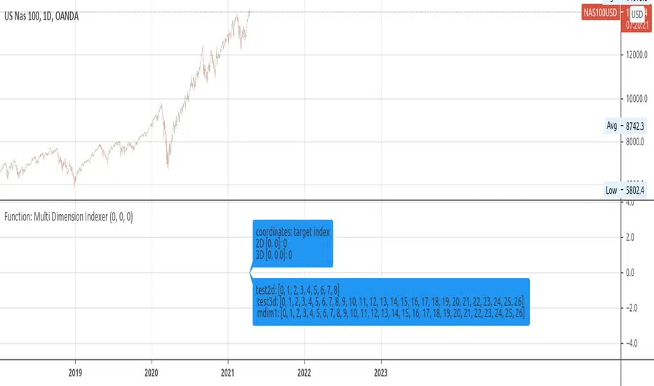
Function: Multi Dimension IndexerDescription:
A Function that returns the flat index of a N dimensions array.
Inputs:
_indices: Array containing dimension indices.¹
_limits: Array containing dimension size.¹
Note:
¹: _indices and _limits size must match. indices must be within dimension size.
Outputs:
_offset: the flat 1D index.
Resources:
eli.thegreenplace.net
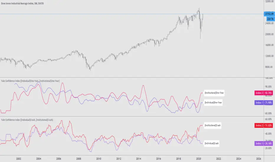
Yale Confidence Index [nb]These are the Yale confidence indexes that show individual and institutional sentiment.
Options include:
showing two different indexes at once
labels for them
to filter through a moving average
highlighting when the first chosen index is greater than the second
shifting the series 6 months ahead
showing an average of both indexes
U.S. One-Year Confidence Index
The percent of the population expecting an increase in the Dow in the coming year.
The One-Year Confidence Index is the percentage of respondents giving a number strictly greater than zero for "in 1 year." Note that the question is worded to mention the possibility that the respondent could predict a downturn, and so this question will obtain more such responses than more optimistically worded questions used by some other surveys. However, the issue is how the answers change through time, and the wording of the question has not been changed through time (except to add the 1-month and the ten-year categories, which were not on the earliest questionnaires).
U.S. Buy-on-Dips Confidence Index
The percent of the population expecting a rebound the next day should the market ever drop 3% in one day.
The Buy-On-Dips Confidence Index is the number of respondents who choose 1 (increase) as a percent of those who chose 1, 2 or 3. This question was never changed.
U.S. Crash Confidence Index
The percent of the population who attach little probability to a stock market crash in the next six months.
The Crash Confidence Index is the percentage of respondents who think that the probability is strictly less than 10%. There were slight wording changes in this question, but inessential.
U.S. Valuation Confidence Index
The percent of the population who think that the market is not too high.
The Valuation Confidence Index is the number of respondents who choose 1 (Too Low) or 3 (About right) as a percentage of those who choose 1, 2, or 3. The wording of this question was never changed, and it was always the first question on the questionnaire.
Source:
som.yale.edu
Includes methodology and questions used.
Japanese indexes aren't updated so I did not include them.
aivance_Multi-Index Performance Comparison# Multi-Index Performance Comparison
This indicator allows traders and investors to easily compare the performance of multiple global market and sector indexes from a user-defined start date. All indexes are normalized to 100% at the specified start date, making relative performance comparisons straightforward.
## Features:
- Customizable start date for performance comparison
- Toggleable global market indexes (S&P 500, MSCI World, DAX, Nasdaq 100, EURO STOXX 50, Japan, Hong Kong)
- Toggleable sector indexes (Materials, Health Care, Financial, Technology, AI & Robotics)
- Clear visualization with distinct colors for each index
- Reference line at 100% for easy benchmark comparison
## How to Use:
1. Set your desired start date for normalizing performance
2. Toggle indexes on/off under the "Inputs" tab
3. Compare relative performance across different markets and sectors
Perfect for identifying relative strength, sector rotation, or global market correlations over your specific timeframe of interest.

CAD CHF JPY (Index) vs USDDescription:
Analyze the combined performance of CAD, CHF, and JPY against the USD with this customized Forex currency index. This tool enables traders to gain a broader perspective of how these three currencies behave relative to the US Dollar by aggregating their movements into a single index. It’s a versatile tool designed for traders seeking actionable insights and trend identification.
Core Features:
Flexible Display Options:
Choose between Line Mode for a simplified view of the index trend or Candlestick Mode for detailed analysis of price action.
Custom Weight Adjustments:
Fine-tune the weight of each currency pair (USD/CAD, USD/CHF, USD/JPY) to better reflect your trading priorities or market expectations.
Moving Average Integration:
Add a moving average to smooth the data and identify trends more effectively. Choose your preferred type: SMA, EMA, WMA, or VWMA, and configure the number of periods to suit your strategy.
Streamlined Calculation:
The index aggregates data from USD/CAD, USD/CHF, and USD/JPY using a weighted average of their OHLC (Open, High, Low, Close) values, ensuring accuracy and adaptability to different market conditions.
Practical Applications:
Trend Identification:
Use the Line Mode with a moving average to confirm whether CAD, CHF, and JPY collectively show strength or weakness against the USD. A rising trendline signals currency strength, while a declining line suggests USD dominance.
Weight-Based Analysis:
If CAD is expected to lead, adjust its weight higher relative to CHF and JPY to emphasize its influence in the index. This customization makes the indicator adaptable to your market outlook.
Actionable Insights:
Identify key reversal points or breakout opportunities by analyzing the interaction of the index with its moving average. Combined with other technical tools, this indicator becomes a robust addition to any trader’s toolkit.
Additional Notes:
This indicator is a valuable resource for comparing the collective behavior of CAD, CHF, and JPY against the USD. Pair it with additional oscillators or divergence tools for a comprehensive market overview.
Perfect for both intraday analysis and swing trading strategies. Combine it with EUR GPB AUD (Index) indicator.
Good Profits!

RTI Thresholds Index | mad_tiger_slayerOverview of the Script
The Relative Trend Index (RTI) Threshold Index is a custom indicator for TradingView that enhances a Relative Trend Index (RTI) . The RTI is designed to reflect the market’s trend strength by comparing the current price to dynamically calculated upper and lower trend boundaries. Additionally, the indicator includes overbought and oversold thresholds, and Trend-coded signals to visually represent market conditions for easier analysis. The RTI Threshold Index is created and meant for long term investments targeted for longer swing trades over a few months to years.
How Do Investors Use the RTI Trend Index?
In the provided chart image, the indicator is displayed on a Bitcoin price chart. Here’s what each visual component represents:
INTENDED USES
The RTI Threshold Index is NOT intended for SCALPING.
With the nature of its components and calculations. This indicator will give false signals when the Timeframe is too low. The best intended use for high-quality signals are above the 12hr timeframes (Note: Coded to be used above 1 Day Timeframes)
The RTI Threshold Index is a TREND-FOLLOWING and MEAN REVERTING INDICATOR . With the explanation below of the image you can see both Trend-Following and Mean Reversion Uses.
A VISUAL REPRESENTATION INTENDED USES
Relative Trend Index Line (Green/Red): The main RTI line changes colors based on long or short conditions, providing an immediate visual cue of the trend direction. This conditional state enter long when the RTI is greater than the long threshold and will not enter short until it is less than the short threshold. (vice versa) When the RTI is less than the short threshold and will not enter long until it is greater than the long threshold.
EMA of RTI: A smoothed version of the RTI in yellow for more stable trend analysis. This EMA can be used for LONGER TERM trends. When the smoothed RTI is above 50, investors can assume that the trend will be in a trending state. Because this is slower than the RTI, you will get slower entries and slower exits.
Threshold Lines: Green and red lines for long and short thresholds, along with dashed lines for overbought and oversold levels. These lines can be calibrated to allow the RTI to enter a long trending or short trending state. The lower the value is for Long Threshold line , it will enter a long trend faster. The higher the value for Short Threshold Line , it will exit faster. We can also set Overbought and Oversold Thresholds. With the RTI entering above the Overbought Threshold line, Investors can assume that the environment is getting heated or is overbought. Same for oversold with the RTI entering below the Oversold Threshold line, Investors can assume that the environment is getting heated or is overbought.
Gradient Background: Shaded overbought and oversold areas improve readability by distinguishing these zones. This coloring of the shaded area tells us the oversold and overbought levels.
Colored Candles: Candles change color based on the RTI condition, aligning the price action visually with the trend status. The Green symbolizes a long state while red symbolizes a short state.
__________________________________________________________________________________
The indicator's primary elements include:
Input Parameters: Configurable settings for trend length, sensitivity, moving average (MA) period, thresholds, and overbought/oversold levels.
RTI Calculation: Computation of trend boundaries and the RTI value based on the price's position within these boundaries.
Visual Components: Horizontal threshold lines, plotted RTI values, color-coded candles, and gradient fills for overbought and oversold zones.
1. Input Parameters
The script includes several configurable inputs, allowing users to customize the indicator’s sensitivity and behavior according to market conditions:
Trend Length: Controls the number of data points for trend calculations. Higher values produce a smoother, less responsive trend, while lower values make the trend more sensitive to recent price changes.
Trend Sensitivity: Sets the sensitivity by defining the upper and lower percentiles for the trend boundaries. Higher sensitivity values make the RTI less reactive, while lower values increase responsiveness.
MA length: Defines the period for the Exponential Moving Average (EMA) applied to the RTI, smoothing its output.
longThreshold and shortThreshold: Set the levels for entering long and short positions. The RTI crossing above longThreshold or below shortThreshold signals a long or short condition, respectively.
Overbought and oversold thresholds: When RTI exceeds overbought or falls below oversold, it indicates overbought or oversold market conditions.
2. Relative Trend Index (RTI) Calculation
The RTI is calculated by dynamically setting upper and lower trend boundaries:
Upper Trend and Lower Trend: Calculated by adding and subtracting the standard deviation of the closing price to/from the close, providing a measure of price variation.
upper array and Lower Arrays : Arrays that hold the upper and lower trend values over the specified trend length period.
Sorting and Indexing: After sorting these arrays, the values at specific percentiles (based on trend sensitivity) are selected as UpperTrend and LowerTrend.
RTI formula: The RTI is calculated by normalizing the close price within the range of UpperTrend and LowerTrend. This yields a percentage that reflects the price's relative position within the trend range.
3. Threshold and Signal Lines
Several horizontal lines mark key threshold levels:
midline: A dashed line at 50, marking the RTI midpoint.
overbought and oversold: Dashed lines for the overbought and oversold levels as set by overbought and oversold.
long hline and short hline: Solid lines marking the longThreshold and shortThreshold levels for entering long and short trades. They are colored Green for long threshold and Red for short threshold
4. Long and Short Conditions
The script defines long and short conditions based on the RTI’s position relative to the longThreshold and shortThreshold:
isLong: Set to true when the RTI exceeds longThreshold, signaling a long condition.
isShort: Set to true when the RTI drops below shortThreshold, signaling a short condition. overboughtcandles and oversoldcandles: Boolean variables that indicate when the RTI crosses the overbought or oversold thresholds, enhancing visual feedback.
5. Color Coding
Color-coded elements help to visually indicate the RTI's current state:
rtiColor: Sets the RTI line color based on the long or short condition (green for long, red for short).
obosColor: Colors specific candles in the overbought (yellow) and oversold (purple) regions, adding clarity to these conditions.
6. Plotting and Visualization
The following components display the RTI indicator and its conditions visually:
RTI and EMA Plot: The RTI line is plotted alongside an EMA line for smooth trend observation. The RTI line uses the conditional colors to indicate market conditions.
Background Gradient Fill: Shaded areas between the overbought and oversold levels highlight these zones in the background.
Colored Candles: Candles on the price chart are color-coded based on the RTI condition (green for long, red for short), making it easy to see trend direction changes.
Overbought and Oversold Gradient Fill: Gradient fills are applied to the overbought and oversold regions, creating a visual effect when the RTI reaches extreme levels.
Conclusion
The RTI Threshold Indicator is a powerful tool for assessing trend strength and market conditions. With configurable parameters, it adapts well to various timeframes and market environments, providing investors with a reliable means to identify potential entry and exit points. With configurable parameters, RTI Threshold Indicator can identify market conditions for potential buy and sell zones.
