BigThree//Owner: Indicator Owner: Ben Losier
//Implemented by: Andrew Palladino
//Date Modified: 6/30/2017
ابحث في النصوص البرمجية عن "liquidity"

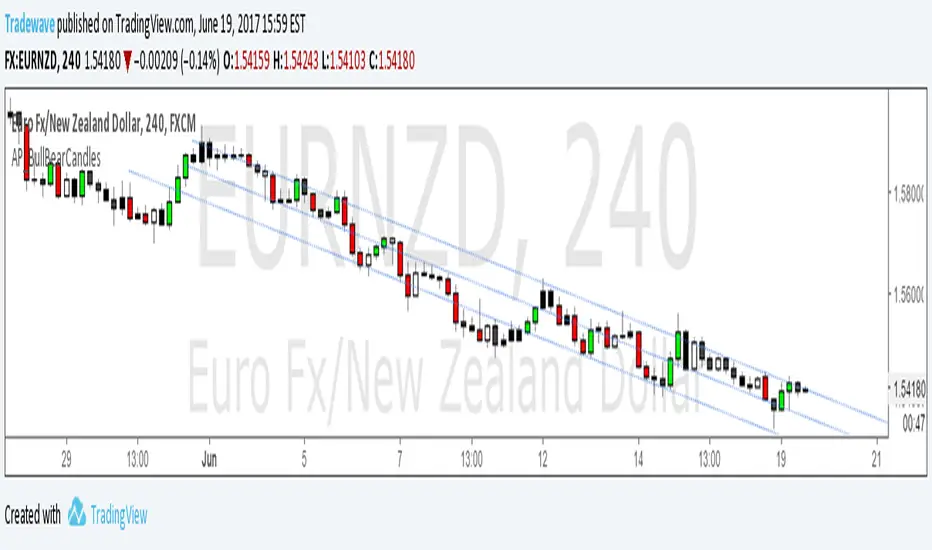
AP_BullBearCandles//Creator: Andrew Palladino
//Modified: 6/19/2017
//Description:
//Colors bar based on Bullish/Bearish Strength of each candlestick.
//Bullish candles are green and occur when the candle closes in the top range of the current candle and above the highest high of the last n bars.
//Bearish candles are red and occur when the candle closes in the bottom range of the current candle and below the lowest low of the last n bars.
//Any candles that are not bullish or bearish are colored white for up candles and black for down candles.
//The user has the ability to change the look back period of the High Low range.
PipsToEMA200StatsV1.0Creator: Andrew Palladino
Date: 5/20/2017
Description:
Plots distance in pips to 200 EMA .
Displays thresholds for vertical pip distance to 200 EMA calculated from 10 years worth of historical data.
Currently only working the following pairs:
"AUDCAD", "AUDCHF", "AUDJPY", "AUDNZD", "AUDSGD", "CADCHF", "CADJPY", "CHFJPY", "CHFSGD", "EURAUD", "EURCAD", "EURGBP", "EURJPY", "EURMXN", "EURNOK", "EURNZD", "EURUSD", "GBPAUD", "GBPCAD", "GBPCHF", "GBPJPY", "GBPNZD", "GBPNZD", "GBPUSD","NZDCAD", "NZDCHF", "NZDJPY", "NZDUSD", "USDCAD", "USDCHF", "USDJPY", "USDMXN"
Currently only working for the following time frames: m5, m15, h1, h4.
Current thresholds are set to:
90th percentile (green line)
95th percentile (yellow line)
99th percentile (orange line)
100th percentile (black line)
The oscillator measures vertical pip distance to 200 EMA . (BLACK LINE)
The trader has the ability to turn on/off the 4 thresholds in input properties.
The indicator background will turn green when pip distance is above green threshold and below yellow threshold.
The indicator background will turn yellow when pip distance is above yellow threshold and below red threshold.
The indicator background will turn red when pip distance is above red threshold
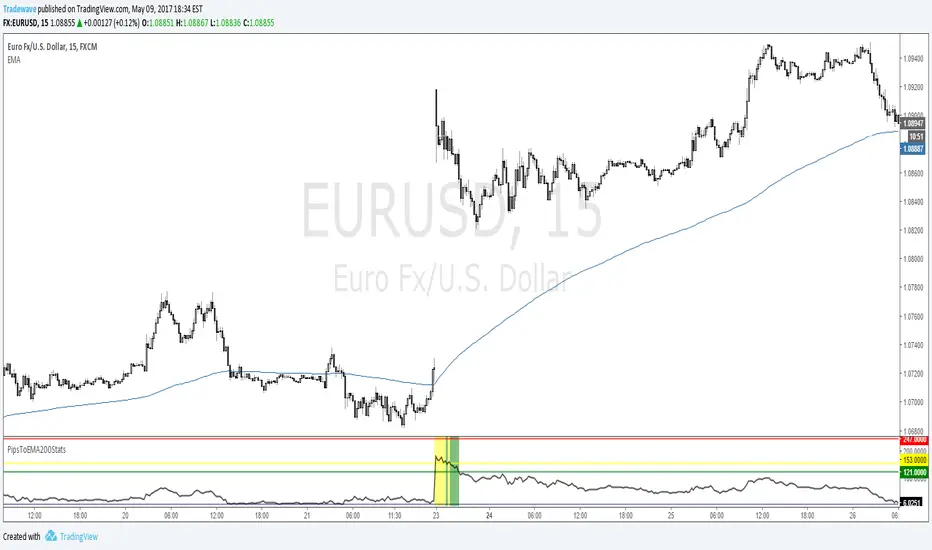
PipsToEMA200StatsTest Script:
Creator: Andrew Palladino
Date: 5/9/2017
Description:
Plots distance in pips to 200 EMA .
Displays thresholds for vertical pip distance to 200 EMA calculated from 10 years worth of historical data.
Currently only working ONLY with EURUSD 0.11% and AUDNZD 0.03% m15 time frames.
Will expand to all other pairs and time frames.
Current thresholds are set to:
90th percentile (green line)
95th percentile (yellow line)
99th percentile (orange line)
100th percentile (black line)
The oscillator measures vertical pip distance to 200 EMA . (BLACK LINE)
The trader has the ability to turn on/off the 4 thresholds in input properties.
The indicator background will turn green when pip distance is above green threshold and below yellow threshold.
The indicator background will turn yellow when pip distance is above yellow threshold and below red threshold.
The indicator background will turn red when pip distance is above red threshold
THIS INDICATOR IS IN TEST MODE.
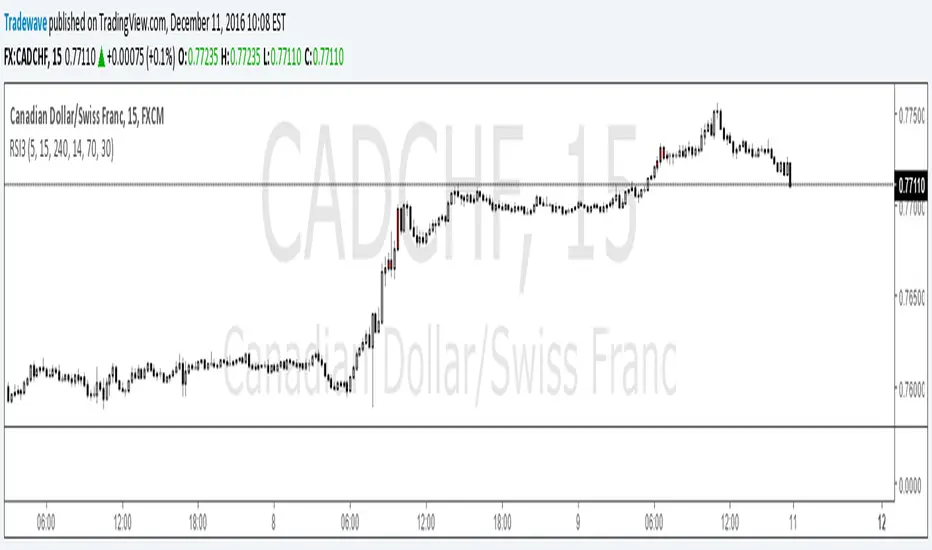
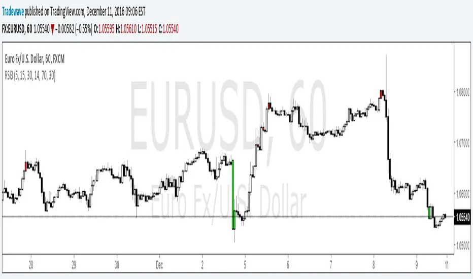
RSI5 Multiple Time Frame Overbought Oversold Indicator
Created by Andrew Palladino.
Modified: 04/01/2017
Checks overbought or oversold conditions across 5 time frames.
If Time frame 1, 2 and 3 are all overbought then bar color changes to red
If Time frame 1, 2 and 3 are all oversold then bar color changes to green
If Time frame 1, 2, 3, 4 and 5 are all overbought then a vertical red line is added to the plot
If Time frame 1, 2, 3, 4 and 5 are all oversold then a vertical green line is added to the plot
The user has the ability to change:
1) Any of the 5 time frames (Set in minutes: m5 = 5, m15 = 15, h1 = 60, h4 = 240, D = 1440...)
2) RSI overbought threshold Level
3) RSI oversold threshold Level
4) RSI Period
The user has the ability to set alerts.

EMABarCountCreator: Andrew Palladino
Date: 4/13/2017
Description:
The indicator counts the total number of bars since a price touch of a target exponential moving average.
The background will change color when 3 different bar count thresholds are exceeded.
1) Green = 200 <= bar count < 300
2) Yellow = 300 <= bar count < 400
3) Red = bar count >= 400
Thresholds and target EMA can be changed by user under indicator properties.
Tradingview Alerts are available for all three thresholds.

Pip Distance to EMA TargetCreator: Andrew Palladino
Modified: 3/31/2017
This script calculates the total number of pips between current close and a target EMA . There are three thresholds that can be specified to determine when that total number of pip spread exceeds a standard deviation multiple set by user. Current standard deviation thresholds on pip spread are set to 2, 2.5 and 3. A pip spread that goes above 3 standard deviations is considered very extreme. The standard deviation is calculated across a predetermined set of bars. Currently look back period for standard deviation count is set to 3000.
New Updates:
3/31/2017: The trader has now the ability to set Tradingview Alerts which trigger when any of the thresholds are exceeded.

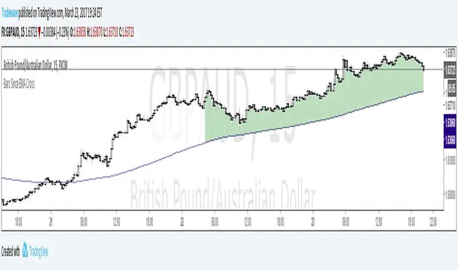
Bars Since EMA CrossCreator: Andrew Palladino
Date Modified: 3/23/2017
The indicator is used to alert the trader when the bar count since an EMA touch exceeds three different thresholds.
The default EMA period is set to 200.
The thresholds are currently set to: 100 bars, 300 bars and 400 bars.
When the specified limits are exceeded, the shading between price and the EMA will change color.
The trader has the ability to set TradingView alerts when the threshold limits are exceeded.
An additional TradingView alert can be set when price touches the EMA.
AP_NthPivot_v2Creator: Andrew Palladino
Date: 3/17/2017
Description:
The following indicator will show the most recent unhit pivot. A threshold can be set so the unhit pivot is displayed only if its the nth consecutive one.

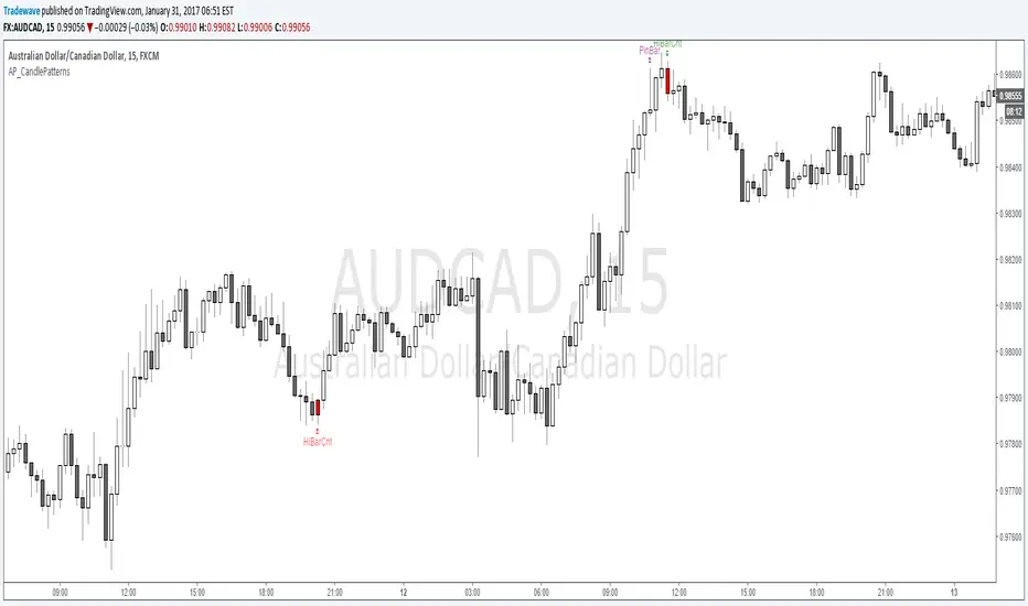
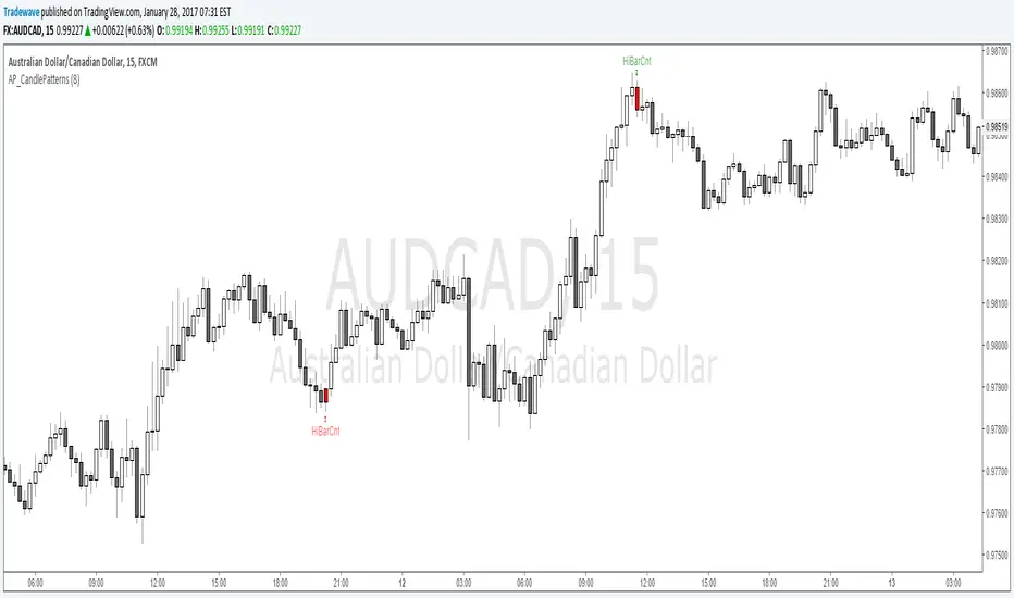
AP_CandlePatterns_V4
Created by : Andrew Palladino
Date: 3/3/2017
This indicator displays a message above/below a bar when certain candle patterns appear. The indicator currently supports two candle patterns.
Consecutive Up/Down Bars:
The indicator searches for instances where there are more than n number of consecutive up bars or down bars on a given time frame. For example, the user can specify the minimum number of consecutive up/down bars, default is set to 8. When the number of consecutive up/down bars is greater or equal to 8, a label will be displayed above the high, for up bars, and below the low for down bars. The color of the next candle will turn red when the criteria is met.
Bearish/Bullish Pin Bar Reversal Signals:
The indicator will alert the trader when there is a Pin bar formation on the current time frame.
The Pin bar trend period is currently set to 20 bars, which translates to the following:
In an uptrend, the high of the Pin bar must be the highest of the last 20 bars.
In a downtrend, the low of the Pin bar must be the lowest of the last 20 bars. The trend bar period acts as a filter which ignores any pin bar formation during a trend continuation move. A trend continuation move is subjective and must be quantified by the user by setting the trend period value accordingly.
Bearish/Bullish Piercing Pattern
The indicator will alert the trader when there is a Piercing pattern at an extreme level where reversals are more likely to occur.
The trader has the ability to enable or disable individual candle formations.
Additional patterns will be added in the future.

EMASpreadPrctilesEMA Spread Percentiles:
Author: Andrew Palladino
Date: 2/25/2017
Description:
The indicator will alert the trader when the difference in pips between an EMA of period N and close price is reaching extremes.
There are three extreme thresholds:
Green Threshold: When spread is above 95th percentile of the last X bars a vertical green line is displayed. Only 5% of the time the spread will exceed this threshold.
Yellow Threshold: When spread is above 97th percentile of the last X bars a vertical yellow line is displayed. Only 3% of the time the spread will exceed this threshold.
Red Threshold: When spread is above 99th percentile of the last X bars a vertical red line is displayed. Only 1% of the time within the past X bars the spread will exceed this threshold.
The trader can modify the following:
EMA Period (Default = 200)
Bars Back Lookback period for percentile calculation (Default = 500)
Green Percentile Threshold (Default = 95)
Yellow Percentile Threshold (Default = 97)
Red Percentile Threshold (Default = 99)

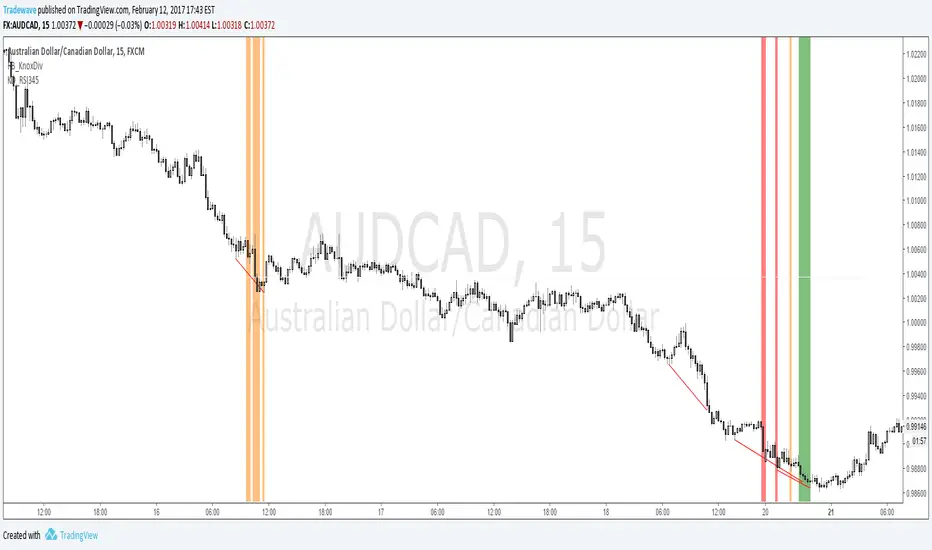
KD_RSI345Creator: Andrew Palladino/Rob Booker
Modified: 2/12/2017
Description:
The indicator searches for instances where there is a Knoxville divergence combined with multiple time frame RSI Oversold/Overbought conditions.
When a bullish Knoxville Divergence (KD) is present and price is oversold across 3 time frames, within the KD bar range, a vertical green line is displayed on the chart.
When a bullish Knoxville Divergence (KD) is present and price is oversold across 4 time frames, within the KD bar range, a vertical orange line is displayed on the chart.
When a bullish Knoxville Divergence (KD) is present and price is oversold across 3 time frames, within the KD bar range, a vertical red line is displayed on the chart.
Same applies for Bearish Knoxville Divergence in overbought conditions.
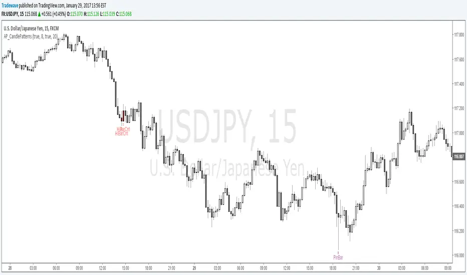
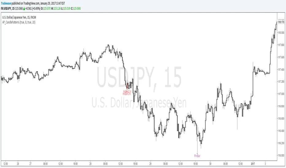
AP_CandlePatterns_v3
Created by : Andrew Palladino
Date: 1/29/2017
This indicator displays a message above/below a bar when certain candle patterns appear. The indicator currently supports two candle patterns.
Consecutive Up/Down Bars:
The indicator searches for instances where there are more than n number of consecutive up bars or down bars on a given time frame. For example, the user can specify the minimum number of consecutive up/down bars, default is set to 8. When the number of consecutive up/down bars is greater or equal to 8, a label will be displayed above the high, for up bars, and below the low for down bars. The color of the next candle will turn red when the criteria is met.
Bearish/Bullish Pin Bar Reversal Signals:
The indicator will alert the trader when there is a Pin bar formation on the current time frame.
The Pin bar trend period is currently set to 20 bars, which translates to the following:
In an uptrend, the high of the Pin bar must be the highest of the last 20 bars.
In a downtrend, the low of the Pin bar must be the lowest of the last 20 bars. The trend bar period acts as a filter which ignores any pin bar formation during a trend continuation move. A trend continuation move is subjective and must be quantified by the user by setting the trend period value accordingly.
The trader has the ability to enable or disable individual candle formations.
Additional patterns will be added in the future.
AP_CandlePatterns_V2Created by : Andrew Palladino
Date: 1/29/2017
This indicator displays a message above/below a bar when certain candle patterns appear. The indicator currently supports two candle patterns.
Consecutive Up/Down Bars:
The indicator searches for instances where there are more than n number of consecutive up bars or down bars on a given time frame. For example, the user can specify the minimum number of consecutive up/down bars, default is set to 8. When the number of consecutive up/down bars is greater or equal to 8, a label will be displayed above the high, for up bars, and below the low for down bars. The color of the next candle will turn red when the criteria is met.
Bearish/Bullish Pin Bar Reversal Signals:
The indicator will alert the trader when there is a Pin bar formation on the current time frame.
The Pin bar trend period is currently set to 20 bars, which translates to the following:
In an uptrend, the high of the Pin bar must be the highest of the last 20 bars.
In a downtrend, the low of the Pin bar must be the lowest of the last 20 bars. The trend bar period acts as a filter which ignores any pin bar formation during a trend continuation move. A trend continuation move is subjective and must be quantified by the user by setting the trend period value accordingly.
The trader has the ability to enable or disable individual candle formations.
Additional patterns will be added in the future.
AP_CandlePatternsCreated by : Andrew Palladino
Date: 1/29/2017
This indicator displays a message above/below a bar when certain candle patterns appear. The indicator currently supports two candle patterns.
Consecutive Up/Down Bars:
The indicator searches for instances where there are more than n number of consecutive up bars or down bars on a given time frame. For example, the user can specify the minimum number of consecutive up/down bars, default is set to 8. When the number of consecutive up/down bars is greater or equal to 8, a label will be displayed above the high, for up bars, and below the low for down bars. The color of the next candle will turn red when the criteria is met.
Bearish/Bullish Pin Bar Reversal Signals:
The indicator will alert the trader when there is a bearish or bullish Pin bar reversal on the current time frame.
The trader has the ability to enable or disable individual candle formations. Additional patterns will be added in the future.
AP_CandlePatterns_v1The indicator currently only looks for instances where there are more than n number of consecutive up bars or down bars on a given time frame. For example, the user can specify the minimum number of consecutive up/down bars, default is set to 8. When the number of consecutive up/down bars is greater or equal to 8, a label will be displayed above the high, for up bars, and below the low for down bars. The color of the next candle will turn red when the criteria is met.
Additional candle patterns will be added in the near future.
AP_NthPivotCreated by: Andrew Palladino
Date: 1/16/2017
This indicator will display ONLY unhit pivots preceded by additional consecutive unhit pivots.
A pivot is defined as unhit when price travels above or below it without ever crossing the pivot level. A pivot is hit only when prices crosses that level at any given time after the pivot is formed.
The trader can change the following settings:
Pivot Time Frame can be set to: 15, 60, 240, D, W, M or Y
Minimum number of consecutive unhit pivots to display: Default set to 1.
GBPAUD Example:
In the example above there are two AP_NthPivot indicators overlayed.
The blue pivot corresponds to the most recent unhit daily pivot preceded by a second unhit pivot. The red pivot corresponds to the most recent unhit weekly pivot preceded by a second unhit pivot.
The minimum number of consecutive unhit pivots to display, for both cases, is set to 2.
Unhit pivots can become high probability targets, especially when the count is set to 2 or more.

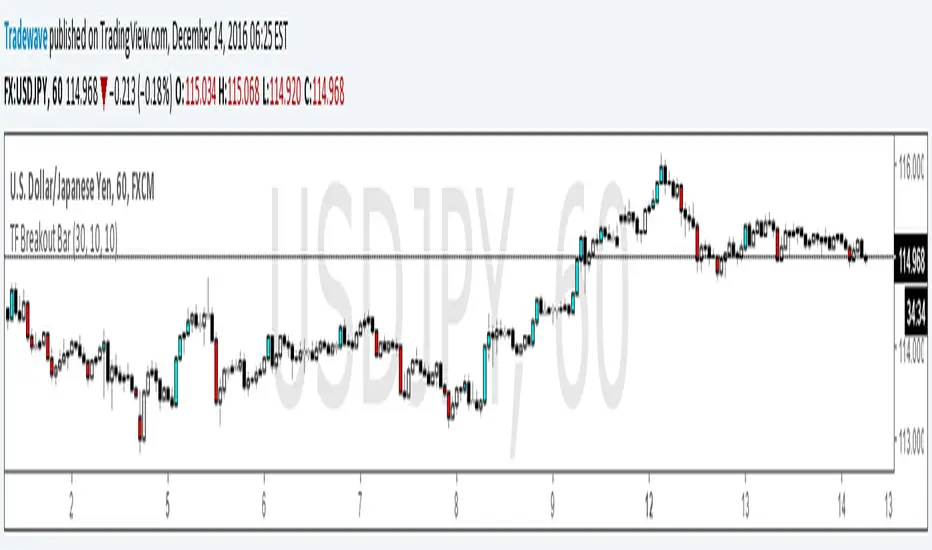
TF Breakout BarIndicator Name: TF Breakout Bar
Creator: Andrew Palladino
Date: 12/14/2016
The TF Breakout Bar allows the user to check for a breakout or a breakdown on a specific time frame regardless of what time frame resolution the current chart is on.
The user can change the following:
Breakout and Breakdown time frame
Lookback bar period for breakouts
Lookback bar period for breakdowns
RSI5 Multi Time Frame IndicatorCreated by Andrew Palladino.
Date of Creation: 12/13/2016
Checks overbought or oversold conditions across 5 time frames.
If Time frame 1, 2 and 3 are all overbought then bar color changes to red
If Time frame 1, 2 and 3 are all oversold then bar color changes to green
If Time frame 1, 2, 3, 4 and 5 are all overbought then a vertical red line is added to the plot
If Time frame 1, 2, 3, 4 and 5 are all oversold then a vertical green line is added to the plot
The user has the ability to change:
1) Any of the 5 time frames (Set in minutes: m5 = 5, m15 = 15, h1 = 60, h4 = 240, D = 1440...)
2) RSI overbought threshold Level
3) RSI oversold threshold Level
4) RSI Period
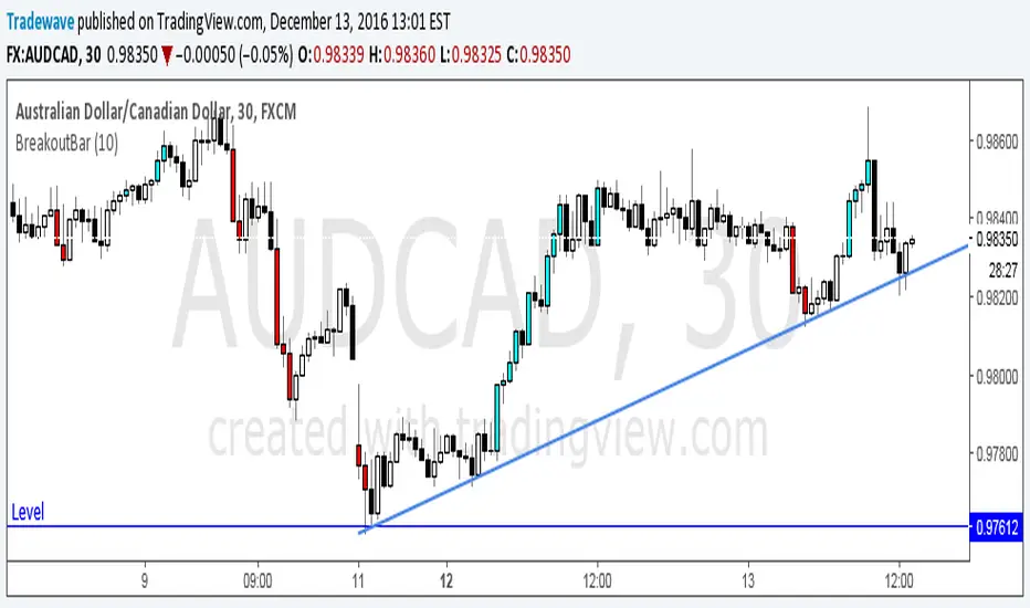
Breakout BarThe following script colors breakout bars.
The user can specify the look back period.
If current close is highest of the past n bars it will color the bar light blue.
If current close is lowest of the past n bars it will color the bar red.
All other bars are black for down bars and white for up bars.
RSI MultiTFLooks for Triple Overbought/Oversold RSI conditions. Paints the bar red when Triple Overbought, and Lime when Triple Oversold.
Multi Time frame RSITriple RSI Indicator.
Colors bars red when RSI is overbought across 3 time frames specified by user.
Colors bars lime when RSI is oversold across 3 time frames specified by user.
os/ob levels and RSI period can also be customized.
Pip Spread to EMA TargetThis script calculates the total number of pips between current close and a target EMA. There are three thresholds that can be specified to determine when that total number of pip spread exceeds a standard deviation multiple set by user. Current standard deviation thresholds on pip spread are set to 2, 2.5 and 3. A pip spread that goes above 3 standard deviations is considered very extreme. The standard deviation is calculated across a predetermined set of bars. Currently look back period for standard deviation count is set to 3000.
