EMASpreadPrctilesEMA Spread Percentiles:
Author: Andrew Palladino
Date: 2/25/2017
Description:
The indicator will alert the trader when the difference in pips between an EMA of period N and close price is reaching extremes.
There are three extreme thresholds:
Green Threshold: When spread is above 95th percentile of the last X bars a vertical green line is displayed. Only 5% of the time the spread will exceed this threshold.
Yellow Threshold: When spread is above 97th percentile of the last X bars a vertical yellow line is displayed. Only 3% of the time the spread will exceed this threshold.
Red Threshold: When spread is above 99th percentile of the last X bars a vertical red line is displayed. Only 1% of the time within the past X bars the spread will exceed this threshold.
The trader can modify the following:
EMA Period (Default = 200)
Bars Back Lookback period for percentile calculation (Default = 500)
Green Percentile Threshold (Default = 95)
Yellow Percentile Threshold (Default = 97)
Red Percentile Threshold (Default = 99)
ابحث في النصوص البرمجية عن "liquidity"

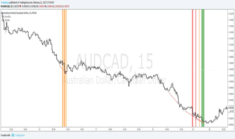
KD_RSI345Creator: Andrew Palladino/Rob Booker
Modified: 2/12/2017
Description:
The indicator searches for instances where there is a Knoxville divergence combined with multiple time frame RSI Oversold/Overbought conditions.
When a bullish Knoxville Divergence (KD) is present and price is oversold across 3 time frames, within the KD bar range, a vertical green line is displayed on the chart.
When a bullish Knoxville Divergence (KD) is present and price is oversold across 4 time frames, within the KD bar range, a vertical orange line is displayed on the chart.
When a bullish Knoxville Divergence (KD) is present and price is oversold across 3 time frames, within the KD bar range, a vertical red line is displayed on the chart.
Same applies for Bearish Knoxville Divergence in overbought conditions.
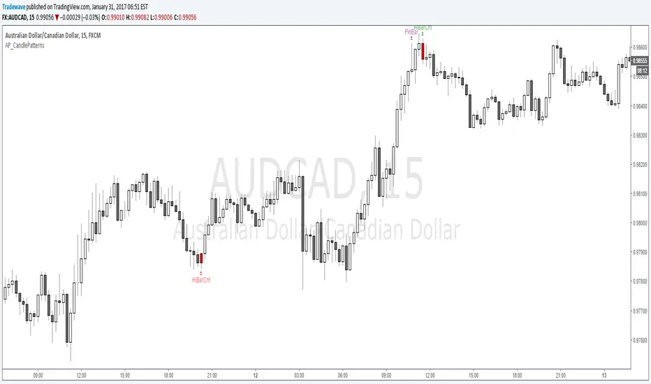
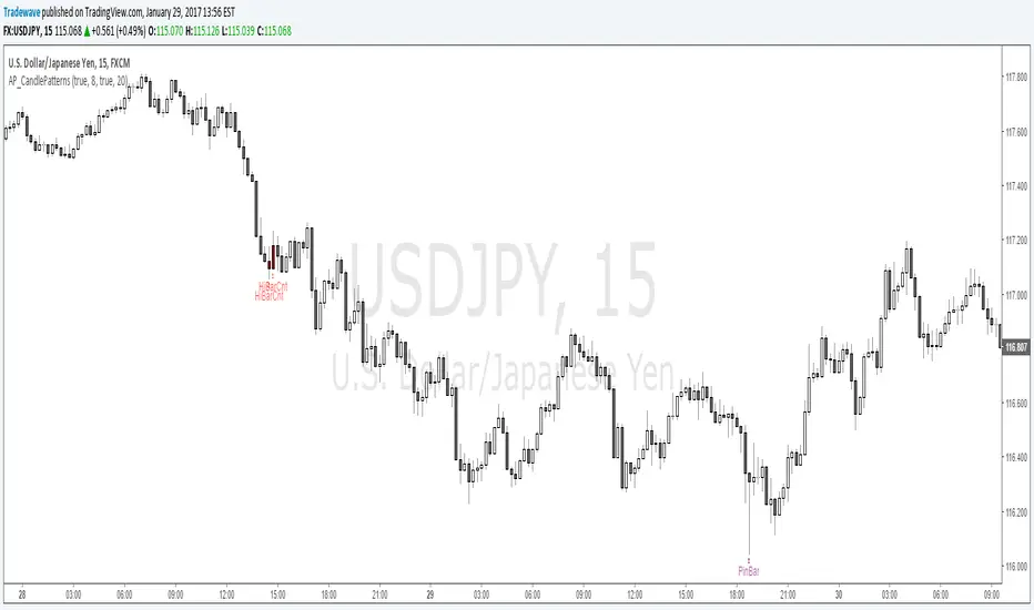
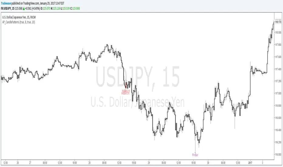
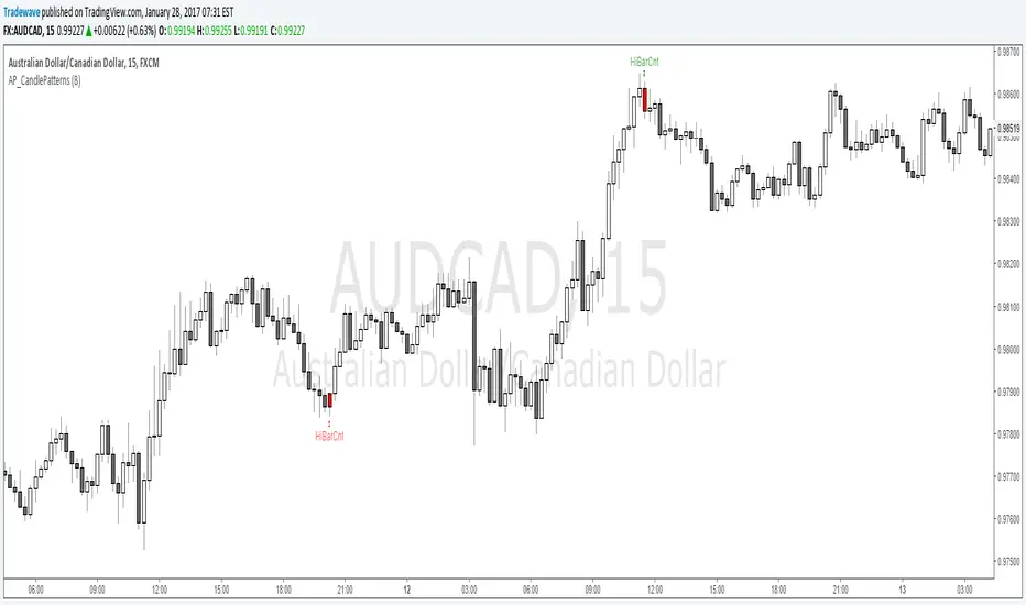
AP_CandlePatterns_v3
Created by : Andrew Palladino
Date: 1/29/2017
This indicator displays a message above/below a bar when certain candle patterns appear. The indicator currently supports two candle patterns.
Consecutive Up/Down Bars:
The indicator searches for instances where there are more than n number of consecutive up bars or down bars on a given time frame. For example, the user can specify the minimum number of consecutive up/down bars, default is set to 8. When the number of consecutive up/down bars is greater or equal to 8, a label will be displayed above the high, for up bars, and below the low for down bars. The color of the next candle will turn red when the criteria is met.
Bearish/Bullish Pin Bar Reversal Signals:
The indicator will alert the trader when there is a Pin bar formation on the current time frame.
The Pin bar trend period is currently set to 20 bars, which translates to the following:
In an uptrend, the high of the Pin bar must be the highest of the last 20 bars.
In a downtrend, the low of the Pin bar must be the lowest of the last 20 bars. The trend bar period acts as a filter which ignores any pin bar formation during a trend continuation move. A trend continuation move is subjective and must be quantified by the user by setting the trend period value accordingly.
The trader has the ability to enable or disable individual candle formations.
Additional patterns will be added in the future.
AP_CandlePatterns_V2Created by : Andrew Palladino
Date: 1/29/2017
This indicator displays a message above/below a bar when certain candle patterns appear. The indicator currently supports two candle patterns.
Consecutive Up/Down Bars:
The indicator searches for instances where there are more than n number of consecutive up bars or down bars on a given time frame. For example, the user can specify the minimum number of consecutive up/down bars, default is set to 8. When the number of consecutive up/down bars is greater or equal to 8, a label will be displayed above the high, for up bars, and below the low for down bars. The color of the next candle will turn red when the criteria is met.
Bearish/Bullish Pin Bar Reversal Signals:
The indicator will alert the trader when there is a Pin bar formation on the current time frame.
The Pin bar trend period is currently set to 20 bars, which translates to the following:
In an uptrend, the high of the Pin bar must be the highest of the last 20 bars.
In a downtrend, the low of the Pin bar must be the lowest of the last 20 bars. The trend bar period acts as a filter which ignores any pin bar formation during a trend continuation move. A trend continuation move is subjective and must be quantified by the user by setting the trend period value accordingly.
The trader has the ability to enable or disable individual candle formations.
Additional patterns will be added in the future.
AP_CandlePatternsCreated by : Andrew Palladino
Date: 1/29/2017
This indicator displays a message above/below a bar when certain candle patterns appear. The indicator currently supports two candle patterns.
Consecutive Up/Down Bars:
The indicator searches for instances where there are more than n number of consecutive up bars or down bars on a given time frame. For example, the user can specify the minimum number of consecutive up/down bars, default is set to 8. When the number of consecutive up/down bars is greater or equal to 8, a label will be displayed above the high, for up bars, and below the low for down bars. The color of the next candle will turn red when the criteria is met.
Bearish/Bullish Pin Bar Reversal Signals:
The indicator will alert the trader when there is a bearish or bullish Pin bar reversal on the current time frame.
The trader has the ability to enable or disable individual candle formations. Additional patterns will be added in the future.
AP_CandlePatterns_v1The indicator currently only looks for instances where there are more than n number of consecutive up bars or down bars on a given time frame. For example, the user can specify the minimum number of consecutive up/down bars, default is set to 8. When the number of consecutive up/down bars is greater or equal to 8, a label will be displayed above the high, for up bars, and below the low for down bars. The color of the next candle will turn red when the criteria is met.
Additional candle patterns will be added in the near future.
AP_NthPivotCreated by: Andrew Palladino
Date: 1/16/2017
This indicator will display ONLY unhit pivots preceded by additional consecutive unhit pivots.
A pivot is defined as unhit when price travels above or below it without ever crossing the pivot level. A pivot is hit only when prices crosses that level at any given time after the pivot is formed.
The trader can change the following settings:
Pivot Time Frame can be set to: 15, 60, 240, D, W, M or Y
Minimum number of consecutive unhit pivots to display: Default set to 1.
GBPAUD Example:
In the example above there are two AP_NthPivot indicators overlayed.
The blue pivot corresponds to the most recent unhit daily pivot preceded by a second unhit pivot. The red pivot corresponds to the most recent unhit weekly pivot preceded by a second unhit pivot.
The minimum number of consecutive unhit pivots to display, for both cases, is set to 2.
Unhit pivots can become high probability targets, especially when the count is set to 2 or more.

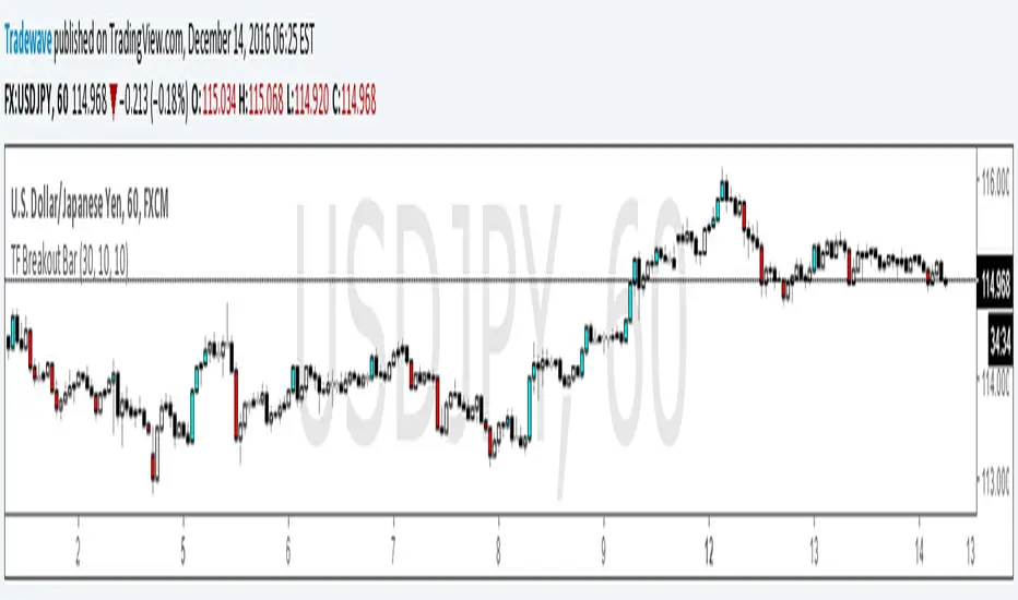
TF Breakout BarIndicator Name: TF Breakout Bar
Creator: Andrew Palladino
Date: 12/14/2016
The TF Breakout Bar allows the user to check for a breakout or a breakdown on a specific time frame regardless of what time frame resolution the current chart is on.
The user can change the following:
Breakout and Breakdown time frame
Lookback bar period for breakouts
Lookback bar period for breakdowns
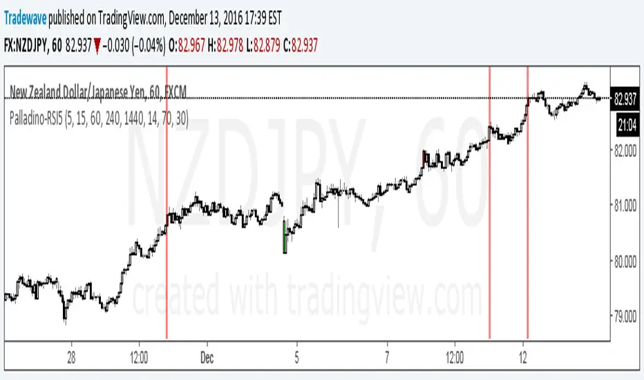
RSI5 Multi Time Frame IndicatorCreated by Andrew Palladino.
Date of Creation: 12/13/2016
Checks overbought or oversold conditions across 5 time frames.
If Time frame 1, 2 and 3 are all overbought then bar color changes to red
If Time frame 1, 2 and 3 are all oversold then bar color changes to green
If Time frame 1, 2, 3, 4 and 5 are all overbought then a vertical red line is added to the plot
If Time frame 1, 2, 3, 4 and 5 are all oversold then a vertical green line is added to the plot
The user has the ability to change:
1) Any of the 5 time frames (Set in minutes: m5 = 5, m15 = 15, h1 = 60, h4 = 240, D = 1440...)
2) RSI overbought threshold Level
3) RSI oversold threshold Level
4) RSI Period
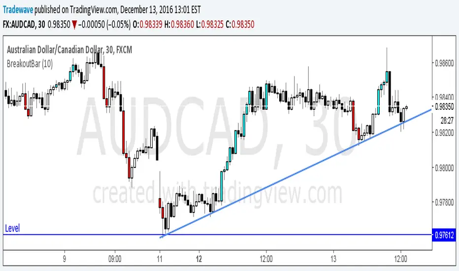
Breakout BarThe following script colors breakout bars.
The user can specify the look back period.
If current close is highest of the past n bars it will color the bar light blue.
If current close is lowest of the past n bars it will color the bar red.
All other bars are black for down bars and white for up bars.
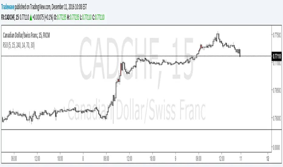
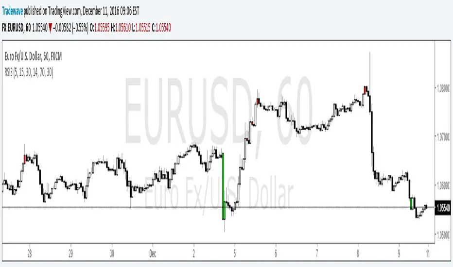
RSI MultiTFLooks for Triple Overbought/Oversold RSI conditions. Paints the bar red when Triple Overbought, and Lime when Triple Oversold.
Multi Time frame RSITriple RSI Indicator.
Colors bars red when RSI is overbought across 3 time frames specified by user.
Colors bars lime when RSI is oversold across 3 time frames specified by user.
os/ob levels and RSI period can also be customized.
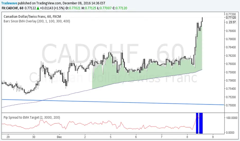
Pip Spread to EMA TargetThis script calculates the total number of pips between current close and a target EMA. There are three thresholds that can be specified to determine when that total number of pip spread exceeds a standard deviation multiple set by user. Current standard deviation thresholds on pip spread are set to 2, 2.5 and 3. A pip spread that goes above 3 standard deviations is considered very extreme. The standard deviation is calculated across a predetermined set of bars. Currently look back period for standard deviation count is set to 3000.

Pip Spread to EMA TargetCalculates the pip spread to a target EMA. When spread exceeds a standard deviation multiple set by user background area goes blue. Blue zones are extreme spreads and opportunities for a reversion to EMA Target trade.
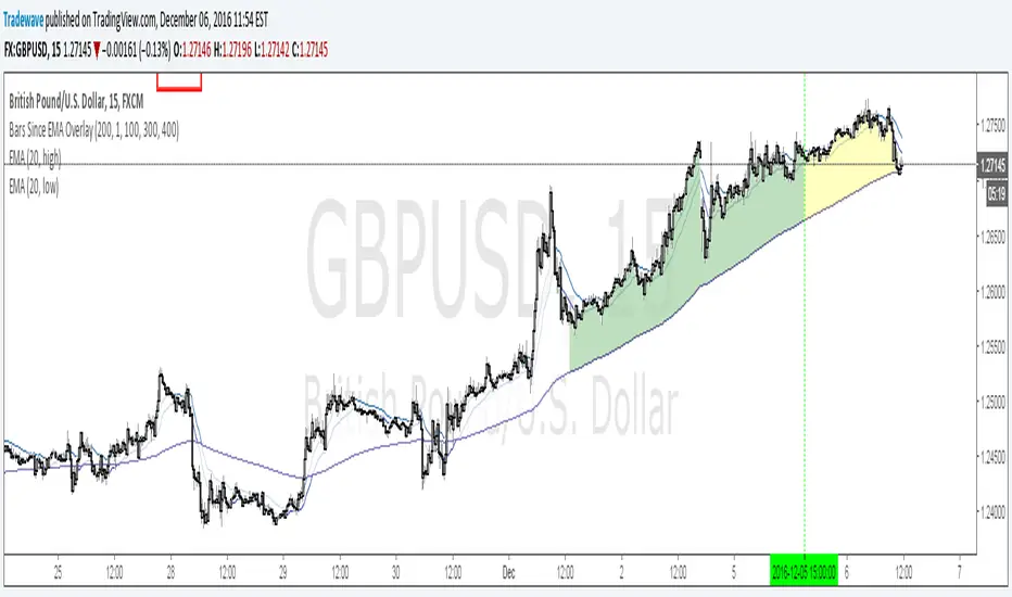
Bars Since EMA OverlayCounts number of bars since an EMA Touch or an EMA cross with close and shades the area when a threshold is exceeded. Currently supported for 3 thresholds.

TQ's Support & Resistance(My goal creating this indicator): Provide a way to categorize and label key structures on multiple different levels so I can create a plan based on those observable facts.
The Underlying Concept / What is Momentum?
Momentum indicates transaction pressure. If the algorithm detects price is going up, that would be considered positive momentum. If the algorithm detects price is going down negative momentum would be detected.
The Momentum shown is derived from a price action pattern. Unlike my previous Support & Resistance indicator that used Super Trend, this indicator uses a unique pattern I created. On the first bar bearish momentum is detected a resistance Level is made at the highest point of the previous bullish condition. On the first bar bullish momentum is detected a support Level is made at the lowest point of the previous bearish condition. This happens on 5 different Momentum Levels, (short-term to long-term). I currently use this pattern to trade so the source code is protected.
What is Severity?
Severity is How we differentiate the importance of different Highs and Lows. If Momentum is detected on a higher level the Supply or Demand Level is updated. The Color and Size representing that Level will be shown. Demand and Supply Levels made by higher levels are more SEVERE than a demand level made by a lower level.
Technical Inputs
- to ensure the correct calculation of Support and Resistance levels change BAR_INDEX. BAR_INDEX creates a buffer at the start of the chart. For example: If you set BAR_INDEX to 300. The script will wait for 300 bars to elapse on the current chart before running. This allows the script more time to gather data. Which is needed in order for our dynamic lookback length to never return an error (Dynamic lookback length can't be negative or zero). The lower the timeframe the greater the number of bars need. For Example, if I open up a 1min chart I would enter 5000 as my BAR_INDEX since that will provide enough data to ensure the correct calculation of Support and Resistance levels. If I was on a daily chart, I would enter a lower number such as 800. Don't be afraid to play around with this.
- Toggle options (Close) or (High & Low) creates Support and Resistance Levels using the Lowest close and Highest close or using the Lowest low and Highest high.
Level Inputs
- The indicator has 5 Different Levels indicating SEVEREITY of a Supply and Demand Levels. The higher the Level the more SEVERE the Level.
Display Inputs
- You have the option to customize the Length, Width, Line Style, and Colors of all 5 different
- This indicator includes a Trend Chart. To Easily verify the current trend of any displayed by this indicator toggle on Chart On/Off. You also get the option to change the Chart Position and the size of the Trend Chart
How Trend Is being Determined?
(Close > Current Supply Level) if this statement is true technically price made a HH, so the trend is bullish.
(Close < Current Demand Level) if this statement is true technically price made a LL, so the trend is bearish.
- Fully customize how you display Market Structure on different levels. Line Length, Line Width, Line Style, and Line color can all be customized.
How it can be used?
(Examples of Different ways you can use this indicator): Easily categorize the severity of each and every Supply or Demand Level in the market (The higher Level the stronger the level)
: Quickly Determine the trend of any Level.
: Get a consistent view of a market and how different Levels are behaving but just use one chart.
: Take the discretion from hand drawing support and resistance lines out of your trading.
: Find and categorize strong levels for potential breakouts.
: Trend Analysis, use Levels to create a narrative based on observable facts from these Levels.
: Different Targets to take money off the table.
: Use Severity to differentiate between different trend line setups.
: Find Great places to move your stop loss too.

Visible Range Support and Resistance [AlgoAlpha]🌟 Introducing the Visible Range Support and Resistance 🌟
Discover key support and resistance levels with the innovative "Visible Range Support and Resistance" indicator by AlgoAlpha! 🚀📈 This advanced tool dynamically identifies significant price zones based on the visible range of your chart, providing traders with crucial insights for making informed decisions.
Key Features:
Dynamic support and resistance levels based on visible chart range 📏
User-defined resolution for tailored analysis 🎯
Clear visual representation of significant key zones 🖼️
Easy integration with any trading strategy 💼
How to Use:
🛠 Add the Indicator : Add the indicator to favourites. Adjust settings like resolution and horizontal extension to suit your trading style.
📊 Market Analysis : Identify key support and resistance zones based on the highlighted areas. These zones indicate significant price levels where the market may react.
How it Works:
The indicator segments the price range into user-defined resolutions, analyzing the highest and lowest points to establish boundaries. It calculates the frequency of price action within these segments, highlighting key levels where price movements are least concentrated (areas where price tends to pivot). Customizable settings like resolution and horizontal extension allow for tailored analysis, while the intuitive visual representation makes it easy to spot potential support and resistance zones directly on your chart.
By leveraging this indicator, you can gain deeper insights into market dynamics and improve your trading strategy with data driven support and resistance analysis. Happy trading! 💹✨

Delta Magnet Zone Extended – Selective HideLiquidity Zone Reversal — Description 🔍📊
This indicator automatically identifies liquidity zones where price previously grabbed orders, swept highs/lows, or created strong reaction points. Instead of plotting thin lines, this version converts those levels into zones, giving traders a clearer view of where the market has unfinished business and where future reactions are likely to occur.
These zones act as institutional magnets — areas where liquidity providers, algos, and larger players commonly enter or exit positions.
How It Works ⚙️💡
The script scans recent price action and detects local swing highs and lows. It then builds rectangular liquidity zones around these levels, extending them forward so you can see:
🟥 Bearish liquidity sweep zones
🟩 Bullish liquidity sweep zones
🔁 Areas where price previously failed, rejected, or consolidated
🎯 Potential reversal targets on both sides of the market
These zones update automatically as new structure forms, giving you an always-current map of market memory.
Why the 9-Day Look-Back Is Powerful (My Default) 📅✨
I personally keep the look-back set to 9 days by default because:
✔️ It captures the entire previous trading week
✔️ It maps out where SPY/QQQ/ES has already tapped liquidity
✔️ It shows the true zones institutions defended
✔️ It reveals where price is most likely to react again moving forward
Using a 9-day window gives you a clean, high-signal map of:
Last week’s highs & lows
Prior liquidity sweeps
Rejection zones
Imbalance cleanup levels
This keeps the chart minimal, powerful, and hyper-relevant to current order flow.
How Traders Use These Zones 🎯📈
Here are the most common ways traders use these liquidity zones:
1️⃣ Identify High-Probability Reversal Areas 🔄
Price often reacts strongly when returning to a past liquidity zone — especially if it previously swept stops there.
2️⃣ Confirm Breakouts or Failures 🚪➡️
Break above a bearish zone?
Momentum continuation is likely.
Reject inside a zone?
Reversal or range expansion often follows.
3️⃣ Set Targets & Stop Placement 🎯🛡️
Zones give logical:
Profit targets
Trend exhaustion points
Areas to avoid entering new trades
4️⃣ Time 0DTE Scalps With Precision ⚡
Liquidity zones tighten your expectations for:
Where SPY/QQQ will bounce
Where reversals start
Where liquidity magnets pull price by end of day
Why This Indicator Matters 🧠🔥
Liquidity drives markets.
Not indicators.
Not moving averages.
Not random levels.
This tool shows you where actual orders exist, where they were previously swept, and where institutions are most likely to step in again.
It gives you:
Cleaner charts
Higher confidence
Better strike selection
More precise entries
Stronger exits
All without noise.

Directional Pressure (maybexo)Liquidity Candles, observed in financial markets, display distinctive candlestick patterns that are noteworthy. These candles exhibit intentional price behavior aimed at triggering stop-loss orders and momentarily misleading traders. The pattern typically starts with a price movement against the current trend, activating stop-loss orders and capitalizing on liquidity from traders anticipating the prevailing trend. Subsequently, the price swiftly changes course, breaking and conclusively closing beyond the prior candle's range, often surprising unsuspecting traders.
Characteristics:
1. Liquidity Grab:
- Liquidity Candles initiate with a deliberate move against the existing trend, aimed at triggering stop-loss orders and gathering liquidity from traders who have placed stops in anticipation of the initial trend.
- Notably, the size of the wick in this liquidity grab is significant; a larger wick indicates a more substantial liquidity grab and can strengthen the indication of a potential market reversal.
2. Swift Reversal and Breakout:
- Following the liquidity grab, the price swiftly changes direction, breaking and conclusively closing above or below the previous candle's range.
3. Institutional Behavior:
- These candles are often linked to institutional trading behavior, suggesting potential involvement by significant market participants due to their distinct and deliberate price action.
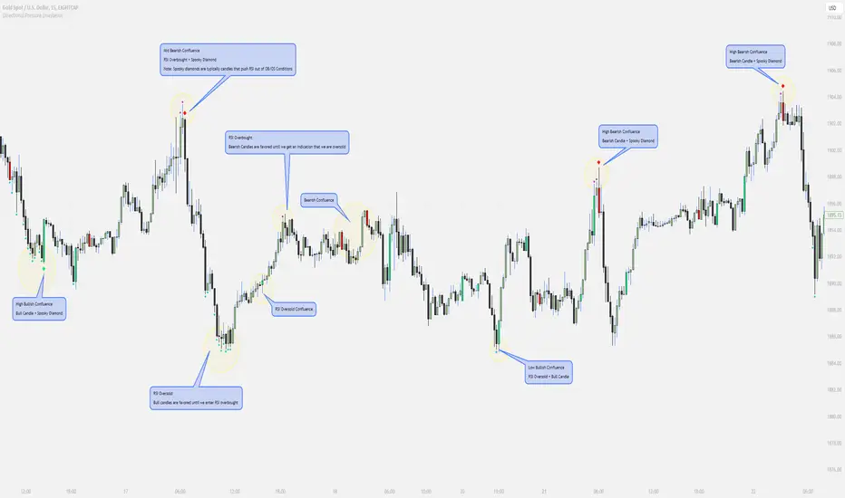
// Diamonds
1. RSI Diamonds:
The RSI Diamonds represent RSI entering either overbought or oversold levels.
These Diamonds serve as an early indication for "Spooky Diamonds" as Spooky Diamonds can only form in these conditions
2. Spooky Diamonds:
The Spooky Diamonds highlight specific candle conditions, aiding in the identification of bullish or bearish momentum in the market while considering the RSI status.
Bullish Candle Momentum: The candle size is greater than the previous candle multiplied by a user-defined factor (filterMultiplier) and the closing price is higher than the opening price. This can suggest bullish momentum.
Bearish Candle Momentum: The candle size is greater than the previous candle multiplied by the filterMultiplier, and the closing price is lower than the opening price. This can suggest bearish momentum.
Important Notes:
The Candles + Diamonds should not be used in isolation as buy or sell signals but rather as additional information for your trading strategy.
The goal of this indicator is to provide a visual representation of RSI data and potential momentum during overbought or oversold conditions.
By utilizing the diamonds and candles, you can easily identify RSI levels and their interaction with candles, aiding in decision-making within your trading strategy.
Disclaimer: Always consider your risk tolerance and conduct thorough analysis before making any trading decisions.
Inspiration Credits:
Vanitati
Mr. Casino
LQ plots w/filled - 0x/Gh0stLiquidity Indicator
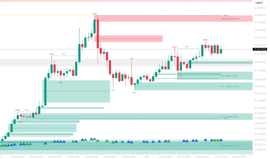
This indicator identifies significant swing highs and swing lows based on user-defined pivot strength and projects them forward as potential liquidity and reaction levels.
When a valid swing forms, the script:
1. Draws a horizontal level at the swing price
a. Optionally extends that level forward in time
b. Visualizes the level as a line and/or price box
c. Tracks the level until price interacts with or fills it
2. When price trades back through a level:
a. The level is marked as filled
b. A clear X marker is drawn at the point of fill
c. The level is optionally removed or hidden based on user settings
3. Useful for:
a. Designed for traders who focus on:
1. Market structure
2. Liquidity targets
Swing-based support and resistance
Identifying where price has already “paid” liquidity
This tool is structure-driven, it highlights where price has reacted and where it has not, letting YOU, the trader decide how to act.

🧠 Rogue BTC Dominance + BTC Price MonitorLiquidity never lies.
When whales are done pumping, they exit before price tanks, often during sideways chop or fake strength.
So we build a tracker that detects:
Volume drop during uptrend (distribution phase)
Exchange inflows of coins
Rising USDT.D while price holds → stealth exit
Divergence between price & on-chain flows
👁️ Quick Use Case: BTC/USDT with USDT.D Overlay
If you see this pattern:
BTC sideways or slow uptrend
Volume declining
USDT.D rising
BTC.D holding flat
→ Liquidity Exit Detected.
Smart money is exiting quietly, waiting for retail to hold the bag.
Liquidity Sweep Signals [cx.liquidityhunter]En Construcción
// Breakout bajista: rompe soporte con fuerza
if array.size(lsSupLevels) > 0
for i = array.size(lsSupLevels) - 1 to 0
if array.size(lsSupLevels) > i and i >= 0
lvl = array.get(lsSupLevels, i)
ln = array.get(lsSupLines, i)
// SIMPLE: Vela bajista grande que cierra por debajo del nivel
isBigBearCandle = close < open and lsBody > lsAtr * 0.3
closesBelow = close < lvl and high > lvl
noBottomWick = lsLowerWick < lsBody * 0.3
breakoutConfirm = isBigBearCandle and closesBelow and noBottomWick
breakoutCooldown = sweepCooldown * 2
if breakoutConfirm and bar_index > lastBearSweepBar + breakoutCooldown
lastBearSweepBar := bar_index
entrySell = close
slSell = lvl + lsAtr * lsSLBuffer
riskSell = slSell - entrySell
tp1Sell = entrySell - riskSell * lsRR1
tp2Sell = entrySell - riskSell * lsRR2
if lsShowLabels
bkTxt = "📉 BREAKOUT SELL\nEntry: " + str.tostring(entrySell, "#.##") + "\nSL: " + str.tostring(slSell, "#.##") + "\nTP1: " + str.tostring(tp1Sell, "#.##") + "\nTP2: " + str.tostring(tp2Sell, "#.##")
label.new(bar_index, low - lsAtr * 0.3, bkTxt, style = label.style_label_up, textcolor = color.white, size = size.small, color = lsBreakoutColor)
if lsShowSLTP
line.new(bar_index, slSell, bar_index + 20, slSell, color = color.red, width = 1, style = line.style_dashed)
line.new(bar_index, tp1Sell, bar_index + 20, tp1Sell, color = color.green, width = 1, style = line.style_dashed)
line.new(bar_index, tp2Sell, bar_index + 20, tp2Sell, color = color.lime, width = 1, style = line.style_dotted)
line.set_color(ln, lsBreakoutColor)
line.set_width(ln, 3)
