HMA ATR RangeIn Alan's books he talks about his 'range indicator' which is the HMA and ATR to give buy / hold / sell signals. This is my version as he doesnt give the formula.
It is the HMA with the ATR added and subtracted and plotted above & below the HMA to create a range.
According to Alan's terminology: HMA = Central Cord, SL = Lower deviation, TP = Upper deviation
ابحث في النصوص البرمجية عن "range"

Fibonacci Daily Limits (Expected Ranges)This indicator takes the price range from the previous day and plots 127% and 161% extension to the current trading day.This limit is often respected.
**Hopefully someone can improve this by making a version to only plot the current day ....Neat/Clean Charts :)
real body rangeHighlights point of largest positive and negative candle ranges based on the look back length. Works for all time frames May have some value added for points of support and resistance relative to the buyer and sellers associated with that specific candle.
For the sake of keeping the chart clean I elected to eliminate the first data point and used the "linebr" style and fill plots. I also used //@version=2 which works better for the fill plots. //@version=3 seemed to jam me up so if you edit and run with it you may need to retain the version=2 configuration. If you find an alternative method that works for version=3 please give me a shout. Apply at your own risk and discretion.
Squam

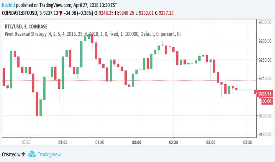
Pivot Reversal Strategy with backtest date rangeThis is standard Pivot Reversal Strategy with backtest date range added.
In parameters you can select from/to date for backtesting range.
Custom Time ranges
Description:
This script colours the background of any time range you specify, including weekend periods.
It can be useful for spotting patterns on Bitcoin (recurring times of buying or selling).
Checkboxes to switch on and off. Inputs to specify time and day of week.
Monday = 2
Tuesday = 3
Wednesday = 4
Thursday = 5
Friday = 6
Saturday = 7
Sunday = 1
Example 1:
1500-1800:2
This will colour the background between 3pm and 6pm on Mondays.
Example 2:
0000-0600:247
This will colour the background between midnight and 6am on Mondays, Wednesdays, and Saturdays.
Any questions you may have, please leave in comments below and I'll respond when I have time.

Consolidation Zones (Range + ATR + optional ADX)Consolidation Zones — Market Compression Visualizer
Consolidation Zones is a visual market-structure indicator designed to identify periods of price compression where volatility contracts and directional movement pauses. These zones often precede expansion, breakout, or trend continuation, making them critical areas for trade preparation and risk planning. Instead of relying on a single oscillator, this script evaluates price behavior over time to detect when the market is moving sideways within a defined range. When consolidation is present, the indicator highlights the zone directly on the chart, allowing traders to immediately see where balance is occurring.
What This Indicator Helps You Do:
Identify low-volatility, sideways markets
Spot compression before expansion
Avoid entering trades during chop and noise
Prepare for breakout or breakdown scenarios
Combine structure with your existing trend or momentum tools
How to Use It
Inside the zone: Expect indecision and mean-reversion behavior
Break above the zone: Potential bullish expansion
Break below the zone: Potential bearish expansion
Use zone boundaries as context for entries, stops, and targets
This indicator is intentionally non-predictive — it does not guess direction. Instead, it provides clarity, showing where the market is coiling so you can act when price reveals intent.
Best Paired With
Trend indicators (EMA, VWAP)
Momentum tools (RSI, MACD)
Volume or volatility expansion tools
Notes
Consolidation is timeframe-dependent — zones may differ across intervals
Designed as a context tool, not a standalone signal generator
This indicator is for educational and informational purposes only.


50% level of Daily RangeThe 50% or midpoint between the current days highest and lowest points be used to divide the premium and discount of the days range. Price often reacts at this point and it can be used as a target for reversal trades. This indicator plots the level as it moves through out each day so is useful for backtesting as well as determining whether the current price is in premium or discount.

Key Levels: PDH/L, PMH/L, Oopening RangeBasic scrip that shows Previous Day High and Low, and also Pre-Market High Lows, and also the Opening Range. Everything is adjustable.

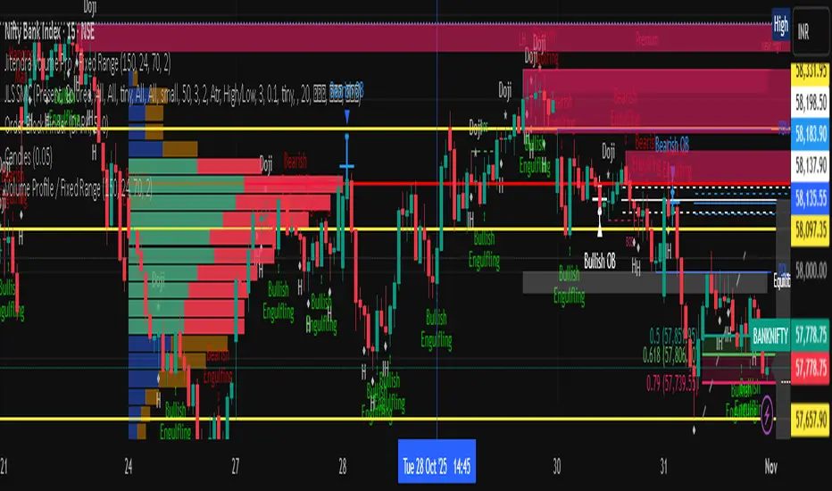
Jitendra Volume Pro / Fixed RangeHello All,
This script calculates and shows Volume Profile for the fixed range. Recently we have box.new() feature in Pine Language and it's used in this script as an example. Thanks to Pine Team and Tradingview!..
Sell/Buy volumes are calculated approximately!.
Options:
"Number of Bars" : Number of the bars that volume profile will be calculated/shown
"Row Size" : Number of the Rows
"Value Area Volume %" : the percent for Value Area
and there are other options for coloring and POC line style
Enjoy!
Jitendra Sankpal
Bull Run Galaxy
2.11.2025
50% Daily RangeIndicator plots the midpoint of the current Daily price range. This midpoint is very helpful since it acts as a point of interest where buyers or sellers might step in.
The midpoint line is dynamic and updates as price moves, in order to always have an accurate plot of the average price for the current day.
Average True Range DisplayThis is a simple number on the screen showing current timeframes average true range.

Fixed Range Volume Profile"Distribution of transaction volume by price group (transaction volume by price block)"
Instructions for use (Professional Manual)
1. a basic concept
By vertical axis (price), shows the cumulative trading volume traded in the segment.
The longer the block, the more transactions took place in that price range.
Colors distinguish between buying/selling strength (green = buying advantage, red = selling advantage).
2. Key components
POC (Point of Control)
→ Longest block (most traded price segment, "key selling point").
VAH / VAL (Value Area High/Low)
→ Top/bottom segments where approximately 70% of the total volume is formed.
→ Role of "Major Support/Resistance".
High Capacity Node (HVN)
→ Significantly higher trading volumes → strong support/resistance.
Low Volume Node (LVN)
→ Low volume section → areas where prices are easily passed.
3. practical application
Find Support/Resistance
The thickest block (POC) is used as a place where prices often rebound/resist.
a trading entry/liquidation strategy
Buy if the price is supported near HVN,
When breaking through the LVN, fast movement (gap movement) can be expected.
break/goal setting
Finger = Under the LVN,
Target = Next HVN.
Judgment of trends
When the block distribution is concentrated above, "Increase to Collection Section"
If you're driven below, you're "in a downtrend to a variance section."
4. Precautions
The volume distribution is "past data based" and is not an indicator of the future.
Rather than using it alone, it is more effective to combine with Fibonacci, trend lines, and candle patterns.
In particular, in the volatile market, the LVN breakthrough → may signal a surge/fall.
In summary, this block indicator is "a map showing the most market participants at any price point".
In other words, it is useful for finding support/resistance as a tool for analyzing sales and establishing the basis for trading strategies.

Date Range Performance
Calculates total change and percentage change between two dates.
Computes average change per bar and per day.
Offers arithmetic and geometric daily %.
Supports auto mode (last N trading days) and manual date range.
Displays results as a watermark on the chart.

Median True Range {Darkoexe}Simple and sweet, this is the median true range. It reviews the size of the previous period amount of candles, and displays the candle size value that is the median of those previous values.
//Darkoexe

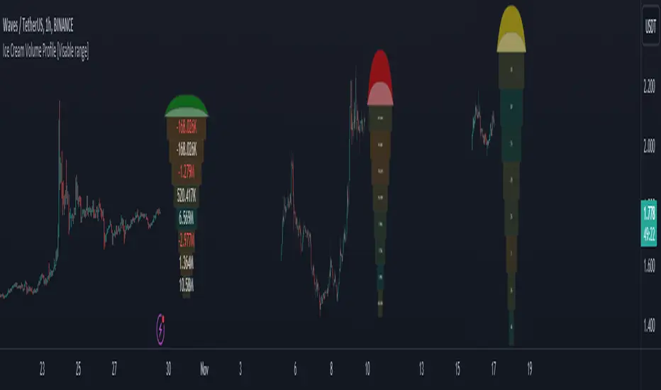
Ice Cream Volume Profile [Visible range]While exploring the new Pine Script feature, Polylines, I've created a fun project called the
Ice Cream Volume Profile for the visible range.
This fun project serves several purposes:
It displays the level at which the most trades (volume) occur.
It provides Delta volume information.
It counts how many times a bar closed within this level.
It assists in drawing support and resistance zones.
It aids in interpreting volume data.
The top part of the ice cream cone changes color as follows:
Green: When the bullish volume exceeds 55% of the total volume.
Red: When the bearish volume surpasses 55% of the total volume.
Yellow: When neither Green nor Red exceeds 55% of the total volume.
Polylines are an excellent feature that enables us to create even more intriguing visuals in Pine Script.
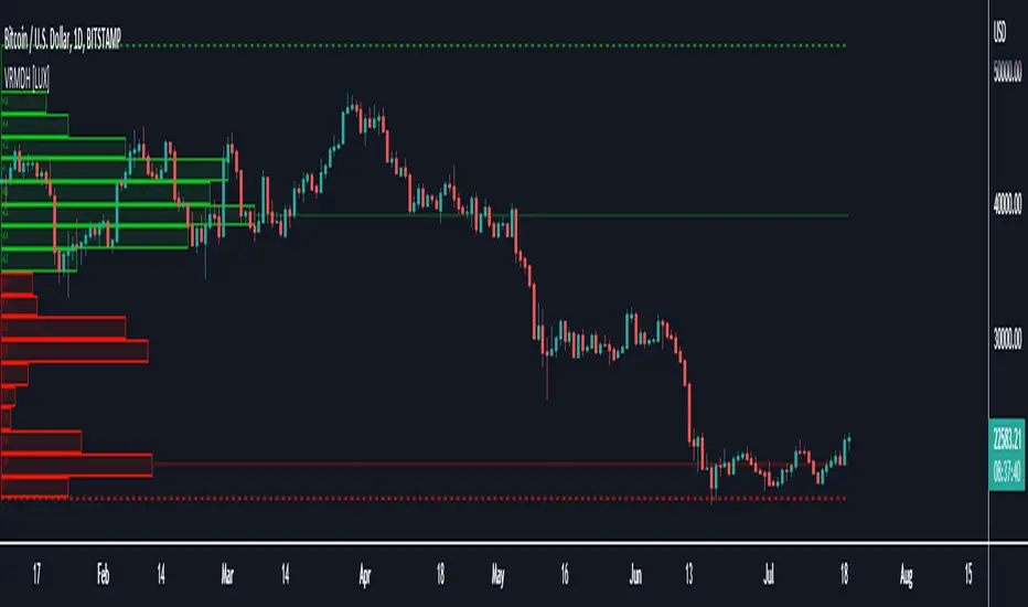
Visible Range Mean Deviation Histogram [LuxAlgo]This script displays a histogram from the mean and standard deviation of the visible price values on the chart. Bin counting is done relative to high/low prices instead of counting the price values within each bin, returning a smoother histogram as a result.
Settings
Bins Per Side: Number of bins computed above and below the price mean
Deviation Multiplier: Standard deviation multiplier
Style
Relative: Determines whether the bins length is relative to the maximum bin count, with a length controlled with the width settings to the left.
Bin Colors: Bin/POC Lines colors
Show POCs: Shows point of controls
Usage
Histograms are generally used to estimate the underlying distribution of a series of observations, their construction is generally done taking into account the overall price range.
The proposed histogram construct N intervals above*below the mean of the visible price, with each interval having a size of: σ × Mult / N , where σ is the standard deviation and N the number of Bins per side and is determined by the user. The standard deviation multipliers are highlighted at the left side of each bin.
A high bin count reflects a higher series of observations laying within that specific interval, this can be useful to highlight ranging price areas.
POCs highlight the most significant bins and can be used as potential support/resistances.

Logarithmic Average True Range
In the case of ATR, it is known to represent volatility by simply expressing the price range.
However, of course, as the value of an asset increases, it is not possible to simply compare it with a numerical value, so the ATR was expressed as a percentage using a logarithmic function.
This way we can see the volatility even with ATR.
ATR의 경우 단순하게 가격의 범위만을 표현하여 변동성을 나타낸다고 알려져있습니다.
하지만 당연하게도 자산의 가치가 높아질수록 단순하게 수치만으로 비교할 수는 없고, 따라서 로그함수를 사용해 %로 ATR을 표현하였습니다.
이렇게 표현하면 ATR로도 변동성을 볼 수 있습니다.

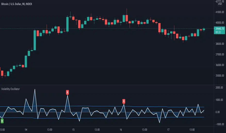
Volatility OscillatorThis tool displays relative volatility and directional trend. Excellent way to pickup diversions and reversals. Length can be lowered to 11 or 13 in settings to show price range.
Can be used to identify patterns such as parallel channels and likely direction of price action as pictured below.