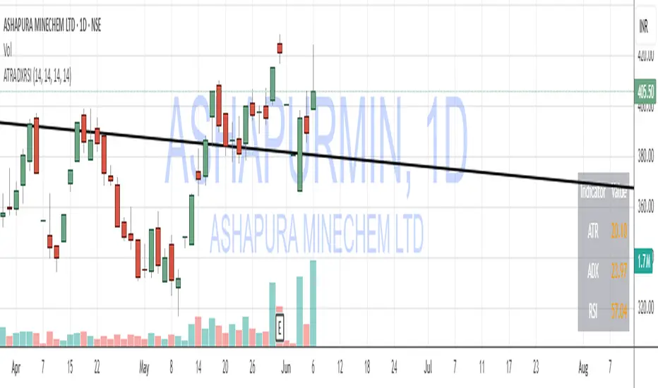
ATR, ADX, RSI TableATR, ADX & RSI Dashboard (Color-Coded)
Overview
This indicator provides a clean, all-in-one dashboard that displays the current values for three of the most popular technical indicators: Average True Range (ATR), Average Directional Index (ADX), and Relative Strength Index (RSI).
To make analysis faster and more intuitive, the values in the table are dynamically color-coded based on key thresholds. This allows you to get an immediate visual summary of market volatility, trend strength, and momentum without cluttering your main chart area.
Features
The indicator displays a simple table in the bottom-right corner of your chart with the following color logic:
ATR (Volatility): Measures the average volatility of an asset.
Green: Low Volatility (ATR is less than 3% of the current price).
Orange: Moderate Volatility (ATR is between 3% and 5%).
Red: High Volatility (ATR is greater than 5%).
ADX (Trend Strength): Measures the strength of the underlying trend, regardless of its direction.
Red: Weak or Non-Trending Market (ADX is below 20).
Orange: Developing or Neutral Trend (ADX is between 20 and 25).
Green: Strong Trend (ADX is above 25).
RSI (Momentum): Measures the speed and change of price movements to identify overbought or oversold conditions.
Green: Potentially Oversold (RSI is below 40).
Orange: Neutral/Normal Conditions (RSI is between 40 and 70).
Red: Potentially Overbought (RSI is above 70).
How to Use
This tool is perfect for traders who want a quick, at-a-glance understanding of the current market state. Instead of analyzing three separate indicators, you can use this dashboard to:
Quickly confirm if a strong trend is present before entering a trade.
Assess volatility to adjust your stop-loss and take-profit levels.
Instantly spot potential overbought or oversold conditions.
Customization
All input lengths for the ATR, ADX, and RSI are fully customizable in the indicator's settings menu, allowing you to tailor the calculations to your specific trading style and timeframe.
ابحث في النصوص البرمجية عن "sentiment"
DXY Z-ScoreThe "DXY Z-Score" indicator measures the US Dollar Index’s (DXY) current price relative to its recent average, normalized by its standard deviation.
It calculates a standardized Z-Score that oscillates around zero, highlighting when the DXY is significantly overbought or oversold.
Key features include:
- The Z-Score line oscillating between fixed upper (+2) and lower (-2) horizontal levels
- A shaded background to emphasize the Z-Score range between these bands
- A dynamic table showing the current Z-Score value linked linearly to the Z-Score plot
This indicator is useful for assessing the strength or weakness of the US Dollar relative to its recent history, providing insights into potential market reversals or trend continuations.
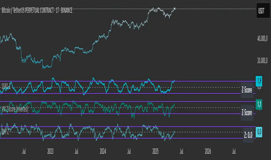
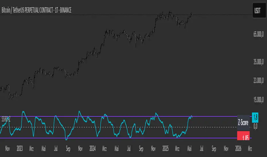
SSRO Z-ScoreSSRO Z-Score Indicator — Description
What it does:
This indicator measures the Stablecoin Supply Ratio (SSR) relative to Bitcoin’s market cap and calculates a normalized Z-Score of this ratio to help identify potential market tops and bottoms in the crypto market.
How it works:
The Stablecoin Supply Ratio (SSR) is calculated by dividing Bitcoin’s market capitalization by the combined market capitalization of major stablecoins (USDT, USDC, TUSD, DAI, FRAX).
The SSR is then smoothed over a user-defined lookback period to reduce noise.
A Z-Score is computed by normalizing the SSR over a specified moving window, which shows how far the current SSR deviates from its historical average in terms of standard deviations.
This Z-Score is further smoothed using an exponential moving average (EMA) to filter short-term volatility.
How to read the Z-Score:
Z-Score = 0: SSR is at its historical average.
Z-Score > 0: SSR is above average, indicating Bitcoin’s market cap is relatively high compared to stablecoin supply, potentially signaling bullish market conditions.
Z-Score < 0: SSR is below average, indicating stablecoin supply is high relative to Bitcoin’s market cap, possibly signaling bearish pressure or increased liquidity waiting to enter the market.
Upper and Lower Bands: These user-defined levels (e.g., +2 and -2) represent thresholds for extreme conditions. Values above the upper band may indicate overbought or overheated market conditions, while values below the lower band may indicate oversold or undervalued conditions.
Additional Features:
A dynamic table displays a linear scaled Z-Score alongside the main plot, clamped between -2 and +2 relative to the upper and lower bands for intuitive interpretation.
Usage Tips:
Combine the SSRO Z-Score with other technical indicators or volume analysis for more reliable signals.
Look for divergence between price and Z-Score extremes as potential reversal signals.
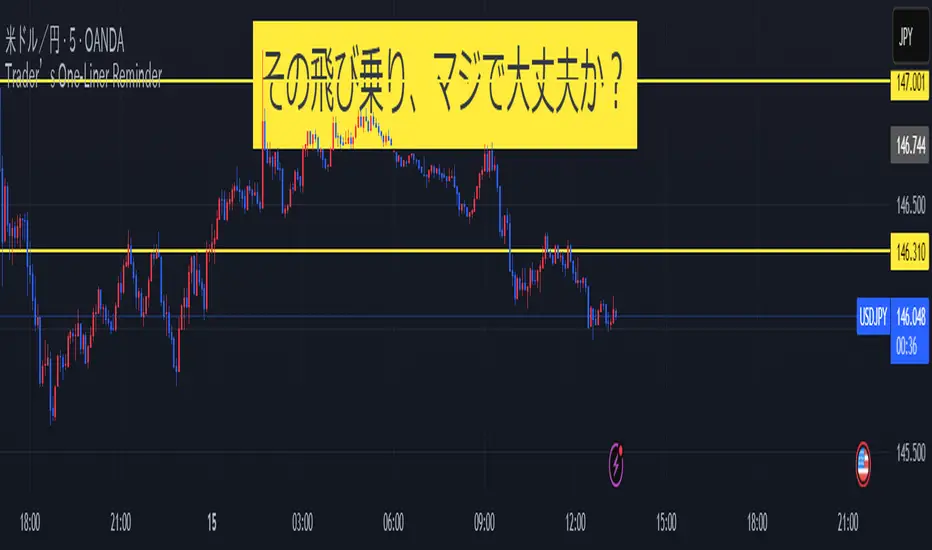
Trader’s One-Liner Reminder⚠️ このインジケーターは日本語でのメッセージ表示に特化しています。英語でのリマインドは含まれていません。
This script displays reminders only in Japanese.
【日本語説明】
本インジケーターは、日本時間(JST)8:00〜翌1:00までの時間帯に合わせて、15分刻みで一言メッセージを表示します。
トレード中の焦りや過信を防ぐための心理的リマインダーとして設計されています。
- 「Frankモード」では、関西弁風のユーモアあるメッセージを自動表示
- 「Customモード」では、全時間帯のメッセージを自分で自由に設定可能
- メッセージはチャート上部中央に、大きな文字・黄色背景で表示され、視認性にも配慮
💡ポジポジ病対策、メンタル強化、時間管理などに最適です。
---
【English Description】
This indicator displays motivational reminders in Japanese every 15 minutes from 8:00 JST to 1:00 JST (the next day).
It is designed to support traders mentally during market hours.
- “Frank mode” automatically shows prewritten humorous messages (in Kansai dialect tone)
- “Custom mode” lets users input their own message for each 15-minute time block
- Messages are shown in large text at the top-center of the chart with a yellow background for clear visibility
💡 Ideal for discipline, overtrading prevention, and improving trading psychology.
---
🔔 This indicator is intended for Japanese-speaking users. If you'd like an English version, feel free to fork and customize it!
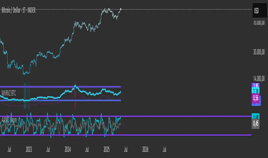
Active Addresses Z-ScoreActive Addresses Z-Score Indicator
The Active Addresses Z-Score Indicator is a fundamental analysis tool designed to evaluate the relationship between Bitcoin network activity and its price movements over a specified period. This indicator aims to provide insights into whether the market is showing signs of increasing or decreasing interest in Bitcoin, based on its network usage and activity.
How to Read the Indicator
Orange Line (Price Z-Score):
This line represents the Z-Score of the price change over a defined period (e.g., 28 days). The Z-Score normalizes the price change by comparing it to the historical mean and standard deviation, essentially measuring how far the current price change is from the average.
A positive Z-Score indicates that the price change is above the historical average (a bullish signal), while a negative Z-Score means the price change is below the historical average (a bearish signal).
Gray Line (Active Addresses Z-Score):
This line represents the Z-Score of the change in active addresses over the same period. The Z-Score here normalizes the change in the number of active Bitcoin addresses by comparing it to historical data.
A positive Z-Score suggests that the number of active addresses is increasing more than usual, which can be a sign of increased market activity and potential interest in Bitcoin.
A negative Z-Score suggests that active addresses are decreasing more than usual, which may indicate reduced interest or usage of Bitcoin.
Upper and Lower Threshold Lines:
The upper and lower threshold lines (set by the user) act as Z-Score boundaries. If either the price Z-Score or the active address Z-Score exceeds the upper threshold, it can signal an overbought or overactive condition. Similarly, if the Z-Score falls below the lower threshold, it could indicate an oversold or underactive condition.
These thresholds are customizable by the user, allowing for flexible interpretation based on market conditions.
Indicator Calculation
Price Change Calculation:
The percentage change in the Bitcoin price over a specified lookback period (e.g., 28 days) is calculated as:
Price Change
=
Close
−
Close
Close
Price Change=
Close
Close−Close
This shows the relative price movement during the specified period.
Active Address Change Calculation:
Similarly, the percentage change in active addresses is calculated as:
Active Address Change
=
Active Addresses
−
Active Addresses
Active Addresses
Active Address Change=
Active Addresses
Active Addresses−Active Addresses
This shows the relative change in the number of active Bitcoin addresses over the same period.
Z-Score Calculation:
The Z-Score for both the price and active address changes is calculated as:
𝑍
=
X
−
𝜇
𝜎
Z=
σ
X−μ
Where:
X is the current change (price or active addresses),
μ (mu) is the mean (average) of the historical data over the lookback period,
σ (sigma) is the standard deviation of the historical data.
This Z-Score tells you how far the current value deviates from its historical average, normalized by the volatility (standard deviation).
Smoothing (Optional):
A simple moving average (SMA) is applied to smooth out the Z-Score values to reduce noise and provide a clearer trend.
What the Indicator Does
Signals of Bullish or Bearish Market Behavior:
The Z-Score of Price tells you how strong or weak the price movement is relative to its past performance.
The Z-Score of Active Addresses reveals whether more users are interacting with the Bitcoin network, which can be an indication of growing interest or market activity.
When both the price and active address Z-Scores are high, it may indicate a strong bull market, while low Z-Scores may point to a bear market or decreasing interest.
Overbought/Oversold Conditions:
The upper and lower threshold lines help you visualize when the Z-Scores for either price or active addresses have reached extreme values, signaling potential overbought or oversold conditions.
For example, if the Price Z-Score exceeds the upper threshold (e.g., +2), it might indicate that the price has risen too quickly, and a correction may be due. Conversely, if it falls below the lower threshold (e.g., -2), it may indicate a potential buying opportunity.
Important Note on Activity and Price Movements:
After Rapid Price Increases:
A sharp increase in Bitcoin’s price followed by a spike in active addresses can be interpreted as a bearish signal. High network activity after a rapid price surge might indicate that investors are taking profits or that speculative interest is peaking, potentially signaling an upcoming correction or reversal.
After Extreme Price Declines:
Conversely, high network activity after a significant price drop may indicate a bottoming signal. A surge in active addresses during a price decline could suggest increased buying interest and potential accumulation, signaling that the market may be finding support and a reversal may be imminent.
Customization and Flexibility
The lookback period (default: 28 days) can be adjusted to suit different trading strategies or time horizons.
The smoothing length (default: 7 periods) allows for smoothing the Z-Score, making it easier to detect longer-term trends and reduce noise.
The upper and lower threshold values are fully customizable to adjust the indicator’s sensitivity to market conditions.
Conclusion
The Active Addresses Z-Score Indicator combines network activity with price data to give you a deeper understanding of the Bitcoin market. By analyzing the relationship between price changes and active address changes, this indicator helps you assess whether the market is experiencing unusual activity or if Bitcoin is trending in an extreme overbought or oversold condition.
It is a powerful tool for fundamental analysis and can complement traditional technical indicators for a more comprehensive trading strategy.
15-Min Opening Range Breakout STEP-BY-STEP RULES
1. Define the Opening Range (OR)
Mark the high and low of the first 15-minute candle of the session.
This creates your Opening Range.
Example: London session opens at 08:00 GMT. Use the 08:00–08:15 candle.
2. Set Entry Triggers
Buy Breakout: Place a Buy Stop order 1 pip above the Opening Range high.
Sell Breakout: Place a Sell Stop order 1 pip below the Opening Range low.
⚠️ Only one side should be triggered. Cancel the opposite order once one is active.
3. Set Stop Loss (SL)
For Buy trades:
SL = Opening Range Low - 2 pips
For Sell trades:
SL = Opening Range High + 2 pips
This ensures you give the price enough space, while keeping risk controlled.
4. Set Take Profit (TP)
Use either of these two approaches:
✅ Fixed Risk-Reward (Preferred)
Target 1: TP = 2R (i.e., 2 × SL distance)
Target 2 (optional): Leave runner for 3R or trail stop behind minor S/R
✅ Fixed Pip Target (alternative)
TP = +50 pips
SL = -20 pips
Matches your preferred risk model of 20 SL / 50 TP
5. Trade Management
If no breakout occurs within 1 hour, cancel the pending orders. No trade that day.
If trade triggers but fails to move, consider time-based exit after 2 hours.
Optional: Move SL to breakeven once price moves 1R in your favor.

BTC Mining Income Oscillator Z-ScoreBTC Mining Income Oscillator (Z-Score)
Overview
The BTC Mining Income Oscillator (Z-Score) is a custom technical indicator that analyzes Bitcoin mining income to help traders identify overbought and oversold conditions. The indicator uses a Z-Score to track deviations in mining income, highlighting periods of high or low mining profitability.
This indicator is made up of:
Z-Score Line (Blue): Measures how far the current mining income deviates from its historical mean.
Mining Income Oscillator (Orange): A scaled value of mining income that oscillates within a specific range to indicate overbought and oversold conditions.
How the Indicator Works
1. Mining Income Calculation
The BTC Mining Income is determined using two main factors:
Block Reward: The number of BTC miners earn for each block mined (currently 3.125 BTC, adjustable in settings).
Transaction Fees: The average transaction fees per block (default is 0.3 BTC).
Blocks per Day: The number of blocks mined per day (default is 144).
The daily mining income in BTC is calculated as:
Mining Income
=
(
Block Reward
+
Transaction Fees
)
×
Blocks per Day
Mining Income=(Block Reward+Transaction Fees)×Blocks per Day
This value is then converted to USD by multiplying it by the current Bitcoin price.
2. Z-Score Calculation
The Z-Score measures how far the current mining income deviates from its mean over a set period (default is 90 days). The Z-Score helps identify when mining income is unusually high or low:
A high Z-Score indicates that the mining income is significantly above the historical mean, signaling overbought conditions.
A low Z-Score indicates that the mining income is significantly below the historical mean, signaling oversold conditions.
The Z-Score is calculated as follows:
Z-Score
=
(
Current Mining Income
−
Mean Income
)
Standard Deviation
Z-Score=
Standard Deviation
(Current Mining Income−Mean Income)
The result is then smoothed over a period (default is 5) to reduce noise and provide a more stable value.
3. Mining Income Oscillator
The mining income is scaled to oscillate between +20 and +90. This oscillation makes it easy to track overbought and oversold conditions in the market:
Values between 85 and 90 indicate overbought conditions (high mining profitability).
Values between 20 and 22 indicate oversold conditions (low mining profitability).
Values between 22 and 85 indicate neutral conditions, where mining profitability is normal.
The mining income oscillator helps traders spot extreme conditions (overbought or oversold) in mining profitability.
How to Read the Indicator
1. Z-Score Line (Blue)
The Z-Score represents how far current mining income is from the historical average.
Above +2: The mining income is unusually high, indicating an overbought market.
Below -2: The mining income is unusually low, indicating an oversold market.
Between -2 and +2: This range is neutral, where the mining income is within the average historical range.
2. Mining Income Oscillator (Orange)
The Mining Income Oscillator is scaled between 20 and 90.
85–90: Overbought conditions, indicating high mining profitability.
20–22: Oversold conditions, indicating low mining profitability.
22–85: Neutral conditions, indicating moderate mining profitability.
3. Background Shading
Red Shading (85–90): Indicates overbought conditions (mining income is unusually high).
Green Shading (20–22): Indicates oversold conditions (mining income is unusually low).
The shaded regions provide a visual guide to spot periods when the market is overbought or oversold.
4. Key Horizontal Lines
0 Line: Represents the neutral level for the Z-Score, where the mining income is at the historical mean.
+2 and -2 Lines: Indicate overbought and oversold conditions for the Z-Score.
90 and 20 Lines: Indicate the upper and lower bounds for the mining income oscillator.
Where the Data Comes From
Bitcoin Price: The current Bitcoin price is pulled directly from the chart.
Block Reward and Transaction Fees: These values are set manually by the user or can be updated dynamically.
Mining Income: Calculated based on the block reward, transaction fees, and current Bitcoin price.
Z-Score and Oscillator Calculations: Both are calculated based on mining income in USD over a defined look-back period.
Best Timeframe for This Indicator
This indicator is designed to work best on the 2-day chart (2D) timeframe. On the 2-day chart, the mining income data, Z-Score, and the oscillator are less sensitive to noise and short-term volatility, providing more reliable signals. While it can be used on other timeframes, the 2-day chart offers the clearest and most stable analysis.

US Growth Momentum Index (UGMI)US Growth Momentum Index (UGMI) is a macroeconomic indicator designed to reflect the current economic health of the United States. The index combines four key economic factors—Industrial Production (INDPRO), Retail Sales (RSAFS), Unemployment Rate (UNRATE), and the 10Y-2Y Yield Curve Spread—and aggregates them into a single line representing overall growth momentum.
The UGMI is based on Z-Score calculations for each of these components, helping to identify whether the U.S. economy is in an expansionary growth phase or a contractionary recession phase.
How to Read the UGMI:
Core Growth Line (Blue): This is the main line representing the aggregated growth momentum. It is calculated using the Z-scores of the key economic indicators.
0 Line: The 0 line represents the neutral zone. If the UGMI is above the 0 line, it suggests that the economy is expanding. Below the 0 line indicates contraction or a potential recession.
Zones Above 1: When the UGMI is above 1, it represents a strong expansionary phase or boom, possibly signaling the top of a bull market or local peak.
Zones Below -1: When the UGMI falls below -1, it indicates a severe recession or significant contraction in the economy.
Color Coding:
Green: When the UGMI is above the 1 line, the background turns green, indicating a strong growth phase.
Red: When the UGMI is below -1, the background turns red, representing a recession or significant economic downturn.
This indicator helps traders and investors to understand whether the economy is growing or contracting, and is especially useful for identifying potential market tops or turning points.

Standardized Leveraged ETF Fund of FlowsThis indicator tracks and standardizes the 3-month fund flows of major leveraged ETFs across different asset classes, including equities, gold, and bonds.
The fund flows are summed over a 3-month period (63 trading days) and then standardized using a 500-day rolling mean and standard deviation.
The resulting normalized fund flow values are plotted in three distinct colors:
Blue for Equities Fund Flows
Yellow for Gold Fund Flows
Green for Bond Fund Flows

Multi-Stock Price AlertThis indicator is designed to track up to 25 stock tickers and trigger price alerts whenever their respective price targets are reached. The indicator allows users to input ticker symbols and corresponding price targets for multiple stocks. It continuously monitors the stock prices and generates alerts when the current price crosses or equals the specified target.
Holiday Cheer 🎄Features:
Snowflakes Animation: Creates a "falling snow" effect with small white circles drifting downwards.
Festive Candlesticks: Green for up candles, red for down candles, matching holiday vibes.
Greeting Label: Displays a cheerful holiday message on the chart
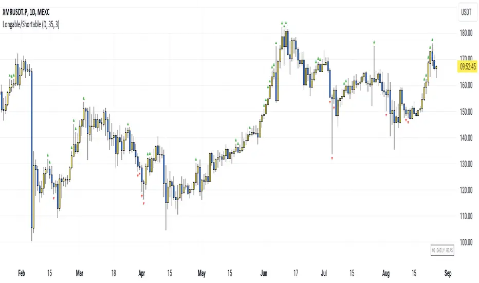
Longable/ShortableThis indicator advises intraday traders which direction NOT to take trades in, based on recent action in the daily chart. Works on any timeframe.
This is not a buy/sell indicator - it is a FILTER that is meant to SUPPRESS trades you may have wanted to take. Like a Daily Bias, but with a neutral position (no bias).
The indicator shows when NOT to take longs and when NOT to take shorts.
So you need an existing strategy to combine this with.
By default, the last 3 days are taken into account (smoothing=3). Change the threshold to get fewer or more warning signals.
The symbols are very simple:
Green triangle = Longs only
Red triangle = Shorts only
(Each signal is valid for the next candle. After that it expires.)
The current bias is also shown in the bottom right corner.
How it works: We look at which parts of the last candle overlap with the current one. When the new candle's low is far above the last candle's low, it is an indication not to go short. Similarly, when the new candle's high is far below the last candle's high, it is an indication not to go long.
For each direction, we calculate this as a percentage value (what percentage of the last candle is not overlapping the new one), smooth the value and give a signal when we are above the set threshold.
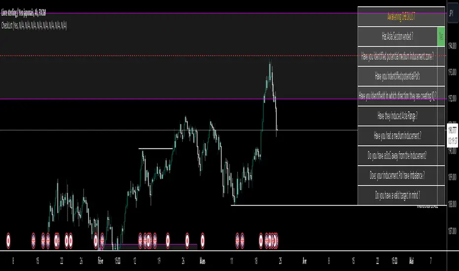
LIT - Awakening CheckList v.1The Awakening Checklist indicator is a tool designed to help traders evaluate certain key market conditions and elements before making trading decisions. It consists of a series of questions that the trader must answer using the options "Yes", "No" or "N/A" (not applicable).
“Has Asia Session ended?” : This question aims to determine if the Asian trading session has ended. The answer to this question can influence trading strategies depending on market conditions.
“Have you identified potential medium induction?” : This question concerns the identification of potential average inductions on the market. Recognizing these inductions can help traders anticipate future price movements.
"Have you identified potential PoI's": This question asks about the identification of potential points of interest on the market. These points of interest can indicate areas of significant support or resistance.
"Have you identified in which direction they are creating lQ?" : This question aims to determine in which direction market participants create liquidity (lQ). Understanding this dynamic can help make informed trade decisions.
“Have they induced Asia Range”: This question concerns the induction of the Asian range by market participants. Recognizing this induction can be important in assessing future price movements.
“Have you had a medium induction”: This question asks about the presence of a medium induction on the market. The answer to this question can influence trading prospects.
“Do you have a BoS away from the induction”: This question aims to find out if the trader has an offer (BoS) far from the identified induction. This can be a risk management strategy.
"Doas your induction PoI have imbalance": This question concerns the imbalance of points of interest (PoI) linked to induction. Recognizing this imbalance can help anticipate price movements.
“Do you have a valid target in mind”: This question aims to find out if the trader has a clear trading objective in mind. Having a goal can help guide trading decisions and manage risk.
Release Notes
The Awakening Checklist indicator is a tool designed to help traders evaluate certain key market conditions and elements before making trading decisions. It consists of a series of questions that the trader must answer using the options "Yes", "No" or "N/A" (not applicable).

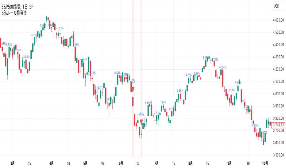
-5% Rule Investment Method @Ray_SP500NISASigns are displayed on the chart when the price drops more than 5% from the previous week. Otherwise, the previous week's change is displayed in a smaller size.
Buy if it falls 5% or more from the previous week, and do not buy if it does not fall. The sign is for the sole purpose of making it easier to understand.
This method is expected to be more effective and profitable than this method alone when used in conjunction with accumulation investing.
Details of the 5% Rule Investment Method
It is basically designed to be applied to the S&P 500.
The sign to follow is a simple rule: buy only when the S&P 500 has fallen 5% or more from the previous week. This makes this investment method easy for beginners.
Combined with accumulation: This method, when used in conjunction with accumulation, can be expected to produce higher returns than when used alone.
As an added bonus, we also provide a sign when the market rises 10% or more from the previous week, which is something to keep in mind.
First Candle DirectionWe determine the color of the first candle based on whether the closing price is greater than or equal to the opening price.
If the closing price is higher, the candle is green; otherwise, it’s red.

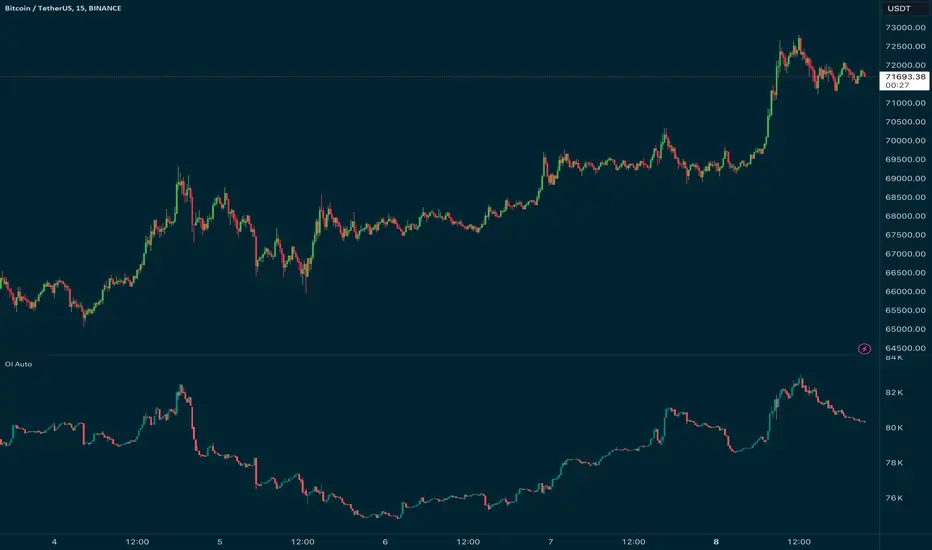
Open Interest Auto OverrideWhat does this “Open Interest Auto Override” Indicator
do?
Open Interest data is not supplied by every exchange to TradingView, however it is available on Binance Perpetual Futures. This script helps the crypto trader to identify the equivalent Binance Perpetual Futures Chart that has Open Interest Data available and automatically displays this on the traders chart.
How can a trader use this indicator?
This helps the trader to identify if there is Open Interest Data available in Binance and automatically displays it, making it easier to switch Coins whilst viewing the market.
What is Open Interest and how can I trade using this indicator?
Open Interest (OI) is the number of open futures contracts held by traders in active positions. The higher the value the Higher the number of open positions which indicates an increase in interest by traders in the asset.
If OI is increasing an equal number of longs and short positions are being opened.
If OI Decreases both longs and shorts are exiting the market.
If OI remains unchanged, no new contracts are entering or exiting, or an equal number of positions are being opened as there are being closed.
Open Interest can help traders by giving us a hint that a breakout may occur. If Open Interest is increasing whilst price is consolidating it may indicate that a breakout is imminent. If Open Interest is decreasing whilst price is consolidating it is likely that a false move in the form of a stop hunt may be issued prior to the actual breakout.
Usage of the Indicator:
By default the indicator will automatically use the Equivalent Binance Perpetual Chart for the Data
You can override the symbol manually if you what to view another exchanges data.
Awakening CHECHLISTThe Awakening Checklist indicator is a tool designed to help traders evaluate certain key market conditions and elements before making trading decisions. It consists of a series of questions that the trader must answer using the options "Yes", "No" or "N/A" (not applicable).
“Has Asia Session ended?” : This question aims to determine if the Asian trading session has ended. The answer to this question can influence trading strategies depending on market conditions.
“Have you identified potential medium induction?” : This question concerns the identification of potential average inductions on the market. Recognizing these inductions can help traders anticipate future price movements.
"Have you identified potential PoI's": This question asks about the identification of potential points of interest on the market. These points of interest can indicate areas of significant support or resistance.
"Have you identified in which direction they are creating lQ?" : This question aims to determine in which direction market participants create liquidity (lQ). Understanding this dynamic can help make informed trade decisions.
“Have they induced Asia Range”: This question concerns the induction of the Asian range by market participants. Recognizing this induction can be important in assessing future price movements.
“Have you had a medium induction”: This question asks about the presence of a medium induction on the market. The answer to this question can influence trading prospects.
“Do you have a BoS away from the induction”: This question aims to find out if the trader has an offer (BoS) far from the identified induction. This can be a risk management strategy.
"Doas your induction PoI have imbalance": This question concerns the imbalance of points of interest (PoI) linked to induction. Recognizing this imbalance can help anticipate price movements.
“Do you have a valid target in mind”: This question aims to find out if the trader has a clear trading objective in mind. Having a goal can help guide trading decisions and manage risk.
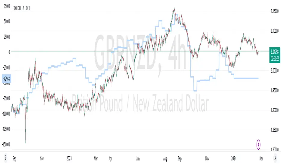
COT Delta CodeThis indicator is based on the code provided by ILuvMarkets.
This script nets the Institutional Long and Short contracts of a symbol and plot the result as a line (COT Delta).
Also the script can net the COT Delta's of 2 COT-symbols.
In the example chart COT Delta's of GBP and NZD are netted and plotted on the main chart.
BTC Perp/Spot Price DifferenceThis is a simple script that provides you with realtime information on the actual Bitcoin price difference between the Binance Perpetual Futures and the Coinbase Spot markets.
I consider this information very useful - especially on intraday timeframes - because it immediately shows the way the retail margin traders are skewed.
Positive values mean that the margin retail daytraders are mainly long, negative values mean the opposite.
I hope this indicator will help you in your intraday Bitcoin trades.

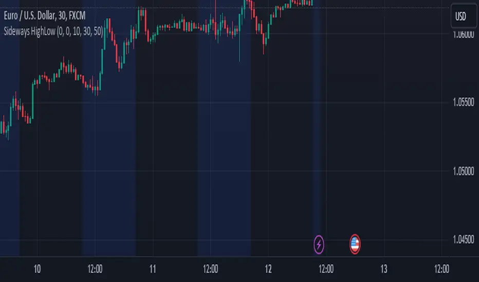
Sideways Market Detector with High/Low NJRCalculate the range as the difference between the high and low prices.
The maxRange input to specify the maximum allowable range that defines a sideways market.
The background color is set to blue during sideways market conditions, and it's transparent to some extent (transp=90). When the market is not sideways, the background color is not changed.
The indicator marks the start and end of the session with red triangles.
When the price range (high - low) is within the specified threshold, the indicator will indicate a sideways market with a blue background.
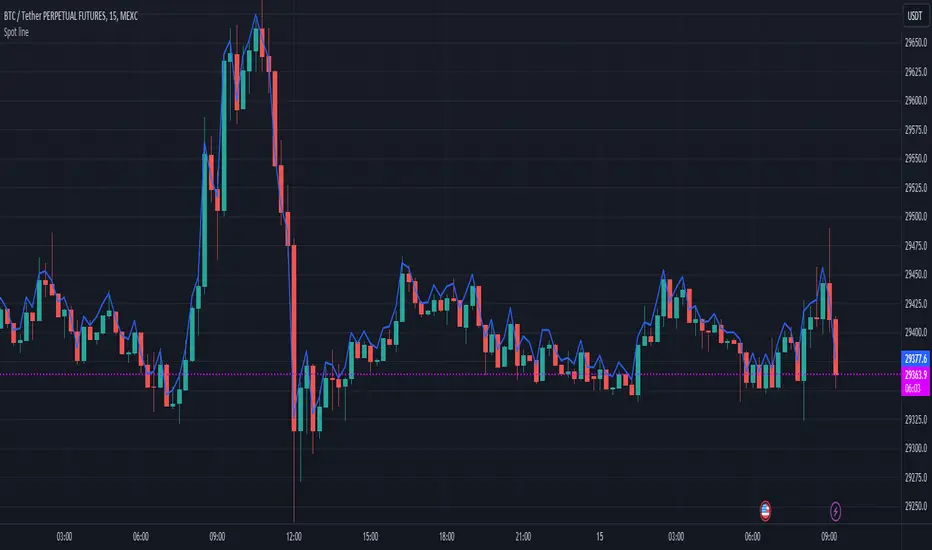
Spot lineSpot line serves the same purpose as the built-in "Compare or Add Symbol" feature, except it automatically switches symbols. It will try to find the spot version of whatever perpetual (.P) you're viewing on Binance, Coinbase, then KuCoin.
Source (O/H/L/C) is configurable in settings.
Each exchange is distinguishable by color.
War TimesPlots US Miltary operations start dates. Will update the script later to include more dates and end dates if there is one.

Majors HOD/LODThis simple script detects when the major American sectors — technology ( QQQ ), financials ( XLF ), and healthcare ( XLV ) — are at the high or low of the current day at the same time. This information can be useful to gauge the potential strength or weakness of the trading day. The script uses the security function to pull in data from the three major indices and keeps a running cache of the high and low of the day regardless of the time frame selected.
A small table in the top right corner displays the current status of the major sectors. The display table can read:
"Mixed" - Major sectors are not at the high or low of the day at the same time
"Majors @ HOD" - Major sectors are at the high of day at the same time
"Majors @ LOD" - Major sectors are at the low of the day at the same time
Labels (optional) show past moments when the major sectors were at the high or low of the day at the same time. A green label above a candle indicates major sectors were at the high of the day at the same time, and a red label below a candle indicates major sectors were at the low of the day at the same time. These labels can be toggled on or off in the indicator settings.
To receive an alert when either condition happens (all majors at high of day or all majors at low of day), click the more (...) icon next to the indicator settings button and click "Add alert on Majors HOD/LOD".
If you notice any problems with the script, feel free to DM me.
