Moving Candle VolumeShows which part of the candle was executed with the highest volume.
Different from Candle Volume Profile because more useful for indicators and scripts
VERY IMPORTANT TO CHANGE THE SETTING BASED ON THE TIMEFRAME.
Does not work on any timeframe lower than 20 minutes
ابحث في النصوص البرمجية عن "volume profile"

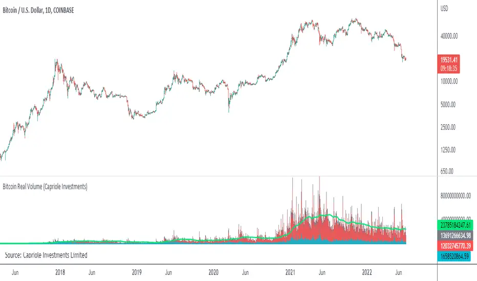
Bitcoin Real VolumeBitcoin’s Real Volume
An accurate read on the change in Bitcoin’s volume profile over time.
Based on 2019 reports by Bitwise and Alameda Research.
Please see the script code notes for assumptions and details on data selection.
Follow me for more information on this script.
Baseline-C [ID: AC-P]The "AC-P" version of jiehonglim's NNFX Baseline script is my personal customized version of the NNFX Baseline concept as part of the NNFX Algorithm stack/structure for 1D Trend Trading for Forex. Everget's JMA implementation is used for the baseline smoothing method, with optional ATR bands at 1.0x and 1.5x from the baseline.
NNFX = No Nonsense Forex
Baseline = Component of the NNFX Algorithm that consists of a single moving average
Baseline ---> Meant to be used in conjunction with ATR/C1/C2/Vol Indicator/Exit Indicator as per NNFX Algorithm setup/structure. C1 is 1st Confirmation Indicator, C2 is 2nd Confirmation Indicator.
JMA (Jurik Moving Average) is used for the baseline and slow baseline.
A slow baseline option is included, but disabled by default.
The faint orange/purple lines are 1.0x/1.5x ATR from the Baseline, and are what I use as potential TP/SL targets or to evaluate when to stay out of a trade (chop/missed entry/exit/other/ATR breach), depending on the trade setup (in conjunction with C1/C2/Vol Indicator/Exit Indicator)
This script is heavily based upon jiehonglim's NNFX Baseline script for signaling, barcoloring, and ATR.
SSL Channel option included but disabled by default (Erwinbeckers SSL component)
POC (Point of Control) from Volume Profile is included/enabled by default for both the current timeframe and 12HR timeframe
03.freeman's InfoPanel Divergence Indicator was used a reference to replace the current/previous ATR information infopanel/info draw from jiehonglim's script. I'm not sure whether I like the previous way ATR info was displayed vs how I have it currently, but it's something that is completely optional:
Specifically: I am tuning this baseline/indicator for 1D trading as part of the NNFX system, for Forex.
DO NOT USE THIS INDICATOR WITHOUT PROPER TUNING/ADJUSTMENT for your timeframe and asset class.
Note about lack of alerts:
Alerts for baseline crosses (and other crosses) have been purposefully omitted for this version upon initial publication. While getting alerts for baseline crosses under certain conditions/filtered conditions that eliminate low-importance signals and crossover whipsaw would be great, it's something I'm still looking into.
SPECIFICALLY: There are entry, exit, take profit, and continuation signal components in relation to the Baseline to the rest of the NNFX Algorithm stack (ATR/C1/C2/Vol Indicator/Exit Indicator), including but limited to the "1 candle rule" and the "7 candle rule" as per NNFX.
Implementing alerts that are significant that also factor in these rules while reducing alert spam/false signals would be ideal, but it's also the HTF/Daily chart - visually, entry/exit/continuation signal alignment is easy to spot when trading 1D - alerts may be redundant/a pursuit in diminishing returns (for now).
//-------------------------------------------------------------------
// Acknowledgements/Reference:
// jiehonglim, NNFX Baseline Script - Moving Averages
//
// Fractured, Many Moving Averages
//
// everget, Jurik Moving Average/JMA
//
// 03.freeman, InfoPanel Divergence Indicator
//
// Ggqmna Volume stops
//
// Libertus RSI Divs
//
// ChrisMoody, CM_Price-Action-Bars-Price Patterns That Work
//
// Erwinbeckers SSL Channel
//

Bonfire vs Algo Profile by CaptBlackBeard
Top Secret: Using reactive Bonfire math vs Volume Profile to show gaps in the Profit Algorithm guiding the price to balance the books. This is valued data

BTC Runner V1Bitcoin Runner V1 — advanced proprietary visual tool created specifically for long-term Bitcoin cycle research on 1D, 1W and 1M timeframes.
The indicator operates in two fundamentally different visual modes:
Buffett Mode (4-Year Halving Cycle Logic)
Fully built on Bitcoin’s historical ~4-year halving cycle. Using an original mathematical formula and real-time price data, the indicator continuously tracks whether the current cycle has reached the structural point that historically marked the final phase of previous bull markets.
As soon as ALL formula conditions are met for the first time:
- Chart background instantly changes color (green → red at cycle top, red → green at cycle bottom reversal)
- A large permanent non-repainting banner appears showing the exact date and price of the All-Time High (ATH) of the current cycle
- Fixed label “ATH” with price and timestamp is plotted and remains on the chart forever
Examples on charts:
- Chart #1 (20 Jan 2018) — green background still active, bull phase ongoing
- Chart #2 (22 Jan 2018) — exact moment all conditions triggered: background turns red + permanent ATH banner with unchangeable data appears
The same logic works in reverse when a bear cycle ends and a new bull cycle begins.
Cramer Mode (Historical Correction & Drawdown Zones Logic)
Based on over 10 years of personal observation of recurring percentage zones across multiple Bitcoin cycles:
• Major corrections historically reaching up to ~84% from local highs
• Intermediate drawdowns typically 20–55%
When ALL conditions of the multi-stage proprietary formula are satisfied for the first time after a prolonged decline or consolidation, the indicator automatically draws in real time:
1. Large green background banner with bold white text “AP” (Analyzed Point) — marking the price level where, according to many years of observation across several cycles, such deep corrections have historically completed.
2. Dynamic floating label “TP” (Tracked Progress) — a temporary price marker that moves with the current price in real time.
As soon as price touches or exceeds this level, the entire banner instantly and permanently turns blue and the text changes to “AP Completed”.
All banners, colors, and labels appear strictly automatically in live mode and never repaint.
Important:
- The script contains over 500 lines of completely original closed-source code.
- No standard indicators are used (moving averages, Fibonacci, waves, volume, volume profile, etc.). Only pure original mathematical modeling.
- The indicator is intended exclusively for research, educational, and informational purposes.
- It contains no trading recommendations, investment advice, or calls to action of any kind.
Respectful note to TradingView moderators and users:
If any visual elements or logic seem similar to previously published open-source scripts — feel free to use those open-source versions instead.
Bitcoin Runner V1 is a 100% original closed-source tool based on the author’s personal multi-year research and observations.

Quantum Flow ScannerOverview
The Quantum Flow Scanner is a comprehensive technical analysis indicator that combines trend detection, momentum analysis, and dynamic band systems to identify potential market opportunities. This indicator uses advanced filtering techniques and multi-factor detection strength calculations to help traders make informed decisions.
Key Features
Trend Detection System
Dual-period momentum analysis (Fast/Slow periods configurable)
Pattern recognition engine that analyzes recent price movements
Normalized momentum calculations adjusted for volatility
Bull and Bear detection generation based on trend changes
Dynamic Band System
Adaptive bands that adjust to market volatility using ATR (Average True Range)
Customizable band width and distance multipliers
Optional midline, upper band, and lower band displays
Visual channel fill options for enhanced clarity
Background color coding for trend direction
Detection Strength Rating
Multi-factor detection strength calculation (25-92% range)
Considers volatility, momentum, trend duration, and volume
Higher timeframe alignment analysis
Swing position evaluation
Real-time percentage display on detections
Performance Tracking
Live performance statistics table
Total detections counter
Successful detections vs unsuccessful detections tracking based on configurable stop loss and take profit levels
Success rate percentage calculation
Average detection strength monitoring
How It Works
The indicator employs a sophisticated filtering mechanism based on pole-zero placement algorithms to smooth price data and calculate dynamic bands. When price crosses these bands in conjunction with momentum shifts, the indicator generates Bull or Bear detections.
Detection strength is calculated using eight weighted factors:
Market volatility assessment
Momentum cluster analysis
Distance from dynamic midline
Trend consistency duration
Higher timeframe trend alignment
Volume profile analysis
Candle strength evaluation
Swing position context
Configuration Options
Period Settings:
Fast Period (1-200): Controls short-term momentum sensitivity
Slow Period (1-500): Defines longer-term trend context
Pattern Recognition Length (5-50): Sets momentum analysis window
Sensitivity Controls:
Distance Multiplier (1.0-10.0): Adjusts band width relative to volatility
Cluster Size (1-15): Number of bars analyzed for momentum clustering
Display Options:
Customizable detection colors
Optional detection markers and percentage labels
Dynamic band visibility toggles
Channel fill options
Background color coding
Performance Tracking:
Configurable stop loss and take profit levels (in points)
Optional performance statistics table
Success rate monitoring
Use Cases
This indicator is designed for:
Trend identification across multiple timeframes
Entry and exit timing optimization
Market volatility assessment
Detection quality evaluation through strength ratings
Strategy performance tracking
Important Notes
This indicator is for educational and informational purposes only
Past performance does not guarantee future results
Always use proper risk management and position sizing
Detections should be used as part of a comprehensive trading strategy
Test thoroughly on historical data before live trading
No indicator is 100% accurate; losses are part of trading

Ata✨ScalpingТолько для часовика! Скальп на движении.
Ata✨Scalping is a multi-functional scalping indicator for TradingView.
It features customizable moving averages (SMA, EMA, WMA, HMA), a visual volume profile, and automatic support/resistance level detection with strength ratings.
The script is designed for active traders and scalpers, providing clear visual cues for trend, volume, and key price levels, as well as optional breakout alerts.

SwiftTrend█ OVERVIEW
SwiftTrend is a trend-following indicator inspired by the classic SuperTrend, but built on a completely different calculation method — using the average candle body size and the body midpoint (bodyMid). It reacts very dynamically to changes in momentum strength. The indicator is clean, easy to read, and perfect for traders who want fast yet confirmed trend direction. By adjusting the settings, you can make signals extremely sensitive or, conversely, reduce their frequency to almost completely eliminate trend flips on minor price moves.
█ CONCEPT
The indicator was created to strike the perfect balance between signal speed and effective noise filtering.
Instead of using classic ATR and price extremes (high/low), SwiftTrend uses the average candle body size and the midpoint of the previous candle’s body as its core reference. The dynamic trend line (avgLine) is protected by a tolerance zone – the trend only changes after price closes beyond this zone. This approach delivers significantly faster reaction times than many traditional solutions while maintaining excellent resistance to false signals during ranging markets.
█ FEATURES
Data source:
- Average candle body size: SMA(|open – close|, period)
- Reference point: midpoint of the previous candle’s body (bodyMid )
Dynamic trend line (avgLine):
- Built using Band Multiplier
- The line is “attracted” toward price movement
Tolerance zone (margin):
- Tolerance = Tolerance Multiplier × avgBody
- Default: 2.5 (for both band and tolerance)
Trend change logic:
- Down → Up: close > avgLine + tolerance
- Up → Down: close < avgLine – tolerance
Visual signals:
- “Buy” label (green upward arrow) and “Sell” label (red downward arrow) only on confirmed trend change
- Optional soft gradient fill between trend line and price
- Optional bar coloring based on current trend
- Trend line with breaks at reversal points
Alerts:
- Buy alert – triggers only when the closing price crosses from below to above the marginLineBase
- Sell alert – triggers only when the closing price crosses from above to below the marginLineBase
█ HOW TO USE
Add to chart → paste the code in Pine Editor or search for “SwiftTrend”.
Main settings:
- Average Body Periods → default 100
- Band Multiplier → default 2.5
- Tolerance Multiplier → default 2.5 (key sensitivity parameter)
- Colors, fill, and bar coloring – fully customizable
Interpretation:
- Green line & shading = uptrend
- Red line & shading = downtrend
- Higher Tolerance Multiplier = fewer but higher-quality signals
- Tolerance Multiplier near 0 = ultra-fast signals (aggressive mode)
█ APPLICATIONS
Excellent for:
- Trend-following (enter with trend, exit on reversal)
- Breakout and momentum strategies
- Filtering consolidation and noise – thanks to the adjustable tolerance zone
Best combined with:
- Classic support/resistance levels
- Fibonacci retracements, Pivot Points, psychological round numbers
- Confirmation from oscillators (RSI, Stochastic, MACD)
- Volume or volume profile analysis
Style adaptation:
- Scalping / daytrading → lower Tolerance Multiplier (0.8–1.8) + shorter period
- Swing / position trading → higher values (2.5–5.0) + longer period
█ NOTES
- Works on all markets and timeframes
- Success depends on matching the Tolerance Multiplier to your strategy and the instrument’s volatility
- Higher multiplier & period values = fewer signals, significantly higher quality
- At Tolerance Multiplier = 0 the indicator becomes extremely responsive – perfect for aggressive momentum trading

Directional Strength and Momentum Index█ OVERVIEW
“Directional Strength and Momentum Index” (DSMI) is a technical analysis indicator inspired by DMI, but due to different source data, it produces distinct results. DSMI combines direction measurement, trend strength, and overheat levels into a single index, enhanced with gradient fills, extreme zones, entry signals, candle coloring, and a summary table.
█ CONCEPT
The classic DMI, despite its relatively simple logic, can seem somewhat chaotic due to separate +DI and -DI lines and the need for manual interpretation of their relationships. The DSMI indicator was created to increase clarity and speed up results, consolidating key information into a single index from 0 to 100 that simultaneously:
- Indicates trend direction (bullish/bearish)
- Measures movement strength
- Identifies overheat levels
- Generates ready entry signals
DMI (ADX + +DI / -DI) measures trend direction and strength, but does so based solely on comparing price movements between candles. ADX shows whether the trend is orderly and growing (e.g., above 20–30), but does not assess how dynamic the movement is.
DSMI, on the other hand, takes into account candle size and actual market aggression, thus showing directional momentum — whether the trend has real “fuel” to sustain or accelerate, not just whether it is orderly.
The main calculation difference involves replacing True Range with candle size (high-low) and using directional EMA instead of Wilder smoothing. This allows DSMI to react faster to momentum changes, eliminating delays typical of classic DMI based on TR.
This gives the trader an immediate picture of the market situation without analyzing multiple lines.
█ FEATURES
DSMI Main Line:
- EMA(Directional Index) based on +DS and -DS
- Scale 0–100, smooth color gradient depending on strength
+DS / -DS:
- Positive and Negative Directional Strength
- Gradient fill between lines — more intense with stronger trend
Extreme Zones:
- Default 20 and 80
- Gradient fill outside zones
Trend Strength Levels:
- Weak (<10) → neutral
- Moderate (up to 35)
- Strong (up to 45)
- Overheated (up to 55)
- Extreme (>55)
All levels editable
Entry Signals:
- Activated on crossing entry level (default 20)
Or on direction change when DSMI already ≥ entry level
- Highlighted background (green/red)
Candle Coloring:
- According to current trend
Trend Strength Table:
- Top-right corner
- Shows current strength (WEAK/STRONG etc.) + DSMI value
Alerts:
- DSMI Bullish Entry
- DSMI Bearish Entry
█ HOW TO USE
Add to Chart: Paste code in Pine Editor or find in indicator library.
Settings:
DSMI Parameters:
- DSMI Period → default 20
- Show DSMI Line → on/off
Extreme Zones:
- Lower Level → default 20
- Upper Level → default 80
Trend Strength Levels:
- Weak, Moderate, Strong, Overheated → adjust to strategy
Trend Colors:
- BULLISH → default green
- BEARISH → default red
- NEUTRAL → gray
Entry Signals:
- Show Highlight → on/off
- DSMI Entry Level → default 20
Signal Interpretation:
- DSMI Line: Main strength indicator.
- Gradient between +DS and -DS: Visualizes side dominance.
- Crossing 18 with direction confirmation → entry signal.
- Extreme Zones: Potential reversal or continuation points after correction.
- Table: Quick overview of current trend condition.
█ APPLICATIONS
The indicator works well in:
- Trend-following: Enter on signal, exit on direction change or overheat. When a new trend appears, consider entering a position, preferably with a rising trend strength indicator.
- Scalping/daytrading: Shorter period (7–10), lower entry level.
- Swing/position: Longer period (20–30), higher entry level, extreme zones as filters.
- Noise filtering: Ignores consolidation below “Weak” – increasing value e.g. to 15 highlights consolidation zones, but no signals appear there.
Style Adjustment:
- Aggressive strategies → shorten period and entry level
- Conservative → extend period, raise entry level (25–30), watch “Overheated”
“Weak” level (<10 default) → neutral; increasing it e.g. to 15 gives fewer but higher-quality signals. The Weak zone value controls the level below which no signals appear, and the gradient turns gray (often aligned with consolidation zones).
Combine with:
- Support/resistance levels
- Fair Value Gaps (FVG)
- Volume (Volume Profile, VWAP)
- Other oscillators (RSI, Stochastic)
█ NOTES
- Works on all markets and timeframes.
- Adjust period and levels to instrument volatility.
- Higher entry level → fewer signals, higher quality.
- Neutral color below “Weak” – avoids trading in consolidation.
- Gradient and table enable quick assessment without line analysis.

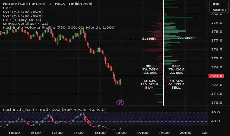
Kashinath Volume ProfileFor every bar in the window, its volume is proportionally distributed across the bins it overlaps, so wide-range bars contribute across multiple bins, while narrow bars concentrate where they traded most.
Custom Checklist# Custom Checklist - Trading Preparation & Reminders
A fully customizable checklist overlay indicator for TradingView that helps traders maintain discipline and follow their trading routine systematically.
## 🎯 Purpose
This indicator serves as a visual reminder system on your charts to ensure you complete all necessary analysis steps before entering a trade. Perfect for traders who want to maintain consistency and avoid emotional or rushed trading decisions.
## ✨ Key Features
- **20 Customizable Lines**: Create your own checklist items with any text you need
- **Flexible Display Options**:
- Show/hide title header
- Toggle entire checklist on/off
- Position anywhere on chart (9 positions available)
- Adjustable text size (tiny to huge)
- **Symbol Filtering**: Option to show checklist only on specific symbols (BTC/USD, GOLD, SPX500, USOIL)
- **Customizable Appearance**:
- Background color
- Text color
- Border color
- Transparency controls
- **Clean Interface**: Empty by default - add only the items you need
## 📋 Use Cases
- **Morning Routine**: Daily market preparation checklist
- **Trade Entry Rules**: Verify all setup conditions are met
- **Risk Management**: Confirm stop-loss, position size, and exit strategy
- **Multi-Timeframe Analysis**: Ensure you checked all required timeframes
- **Technical Analysis**: Track which indicators and patterns you've reviewed
- **News & Events**: Remember to check economic calendar and news
- **Personal Rules**: Your custom trading rules and reminders
## 🎨 Customization
Every aspect is customizable:
- All 20 lines can be edited to your needs
- Only non-empty lines are displayed
- Table position adjustable to any corner or middle position
- Color scheme fully customizable to match your chart theme
- Text size scalable for different screen sizes
## 💡 How to Use
1. Add indicator to your chart
2. Open Settings > Checklist Items
3. Fill in your checklist items (Line 1, Line 2, etc.)
4. Customize colors and position in Display Settings
5. Optional: Enable "Show Only on Specific Symbols" to show on select instruments
## 🔧 Display Settings
- **Checklist Title**: Custom header for your checklist
- **Show Title Header**: Toggle title display
- **Show Checklist**: Master on/off switch
- **Symbol Filter**: Restrict display to specific trading instruments
- **Position**: 9 placement options (corners and middle positions)
- **Text Size**: 5 size options (tiny, small, normal, large, huge)
- **Colors**: Background, text, and border fully customizable
## 📝 Example Checklist Ideas
**Swing Trading:**
- Support/Resistance levels identified
- Trend direction confirmed
- Volume analysis completed
- RSI/MACD signals checked
- Risk/Reward ratio calculated
**Day Trading:**
- Pre-market review done
- Key levels marked
- Economic calendar checked
- Trading plan written
- Position size calculated
**Technical Analysis:**
- Multiple timeframe alignment
- Chart patterns identified
- Moving averages reviewed
- Fibonacci levels drawn
- Volume profile analyzed
## ⚙️ Technical Details
- Pine Script v6
- Overlay indicator (displays on main chart)
- Lightweight - no complex calculations
- No repainting
- Works on all timeframes and instruments
## 🎓 Perfect For
- Beginner traders learning systematic analysis
- Experienced traders maintaining discipline
- Anyone who wants visual trading reminders
- Traders following multi-step strategies
- Those prone to FOMO or emotional trading
---
**Note**: This is a visual tool only. It does not generate trading signals or perform analysis. It serves as a reminder checklist to help you follow your own trading process consistently.

Previous Day Volume Profile NQ!This indicator takes the previous U.S. regular trading session and maps its most actively traded price zone onto the next day. It draws a shaded box representing the Value Area (≈68% of prior-day volume), bounded by VAH (Value Area High) and VAL (Value Area Low). A line through the middle marks the POC (Point of Control), the single price with the most traded volume. The box projects 15.5 hours into the new day so you can see where today’s action sits relative to yesterday’s “fair value.”
To help with intraday decisions, the indicator also extends VAH/VAL/POC as dotted lines. These extensions act like “guide rails” for context into the next trading session.
How to read it
Inside the box: Market is back in yesterday’s fair value. Expect mean-reversion behavior, with price often rotating between VAL and VAH.
Re-entry signals: When price comes from outside and establishes back inside, the script can flag a Long Re-entry (from below, bias toward VAH) or Short Re-entry (from above, bias toward VAL). Optional target lines show the opposite edge as a practical objective.
Rejection signals: When price tests a boundary (VAH/VAL) and fails to establish inside, it can reject and push away—often a clue for potential price discovery beyond the box.
POC focus: The POC often behaves like a magnet during balance and a pivot during imbalance; the dotted extension keeps it visible even after the box window.
Use case
Ideal for day traders and short-term swing traders who want a clear, repeatable framework.
Quickly judge whether today is balancing (staying within yesterday’s value) or seeking new value (rejecting and exploring).
Pair the signals with your execution rules (e.g., 5-minute closes, buffers, or confirmation candles).
Everything is configurable—colors, opacities, and whether to show extensions or target lines—so you can tailor the visuals to your style without clutter.

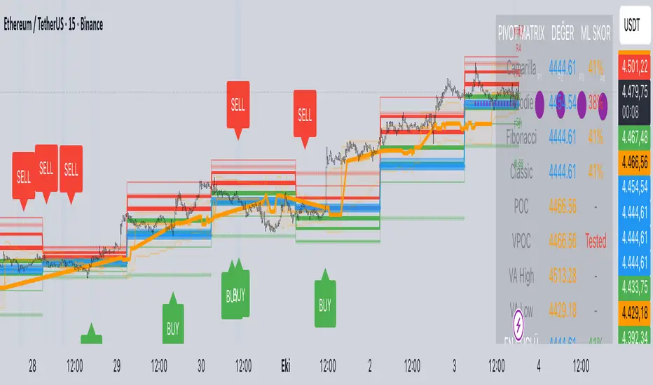
Predictive Pivot Matrix OHLC data, integrates volume profile for POC/Value Area tracking (including virgin POC), applies rule-based "ML" scoring to evaluate pivot strength via factors like proximity, volume, touches, trend, and confluence, monitors adaptive success rates, projects 5-day future pivots using trend/volatility, detects overlapping confluence zones, and generates visuals (lines, labels, table), alerts, and buy/sell signals on key crossings.
Gamma Exposure Levels by OMG (Oh My Gamma)OMG (Oh My Gamma) - Daily GEX Levels
An operational framework for Gamma analysis with daily data.
Indicator's Purpose & Demo Data
This indicator plots key strategic levels derived from Gamma Exposure (GEX) analysis. It showcases the operational logic of OhMyGamma analytical engine.
IMPORTANT: The levels plotted by this public script are based on a past date's snapshot for demonstration purposes. They are not valid for live trading and will not update automatically.
The real edge comes from using the fresh data structure provided daily.
How to Read the Levels
This indicator is designed to provide actionable intelligence, not just data. Here's how to read it:
The Levels: Each line represents a key strategic zone (Zero Gamma, Call/Put Walls, etc.) where a market reaction is statistically probable due to dealer hedging flows.
Line Thickness = Strategic Importance: The thickness of each line directly corresponds to its strategic rating. Thicker, solid lines represent higher-conviction zones.
Labels & Tooltips: Hover over a level's label on your chart to see its full description, confluences, and strategic rating.
Pro Tip: The Power of Confluence
This indicator is not a standalone "system". It's an institutional-grade intelligence layer. Its predictive power increases exponentially when used to find confluence with your own analysis.
The highest-probability trades occur when a key Gamma level aligns with:
Price Action: Key support/resistance zones, order blocks, or liquidity pools.
Volumetric Indicators: High/Low Volume Nodes (HVN/LVN) from Volume Profile, VWAP, and Anchored VWAP.
Use these levels to confirm your setups and gain the conviction to act.
How to Get the Daily Updated Script
This indicator requires a new Pine Script code each day to load the current session's data.
To get the daily updated code feel free to visit www.ohmygamma.com
Feedback & Suggestions
This tool is built for the community. Suggestions for improvements and new features are highly welcome and help the project evolve. Feel free to get in touch via the contact form on the website.
Disclaimer: This tool is for informational and educational purposes only. Trading involves significant risk. The authors assume no responsibility for any trading decisions.

Smash + Proba + BF + VWAP + VP + SessionsVWAP Addition Yearly, Monthly, Weekly and Daily.
Session boxes addition and volume and range in theses boxes.
Volume Profile in developpement

EMA50 + SR Boxes + VP Right + ATR + SL% + Entries + SentimentThis indicator combines several pro-grade building blocks to read the market at a glance:
EMA50 as a trend filter.
Smart Support/Resistance zones (rectangles) detected where price has touched multiple times.
“U / Inverted U” markers (confirmed pivots).
Optional Buy/Sell signals: only when a U appears inside a support zone with price above the EMA50 (buy), or an inverted U inside a resistance zone with price below the EMA50 (sell).
Simplified right-side Volume Profile (with a special Forex fallback if volume isn’t usable).
ATR & SL%: displays current ATR and an SL% based on ATR(100) Daily / Close × 100, attached to the latest candle.

Trend Indicator by anant_alwaysThis indicator analyses various market parameters, including RSI, moving averages, volume profile, and OI data, which help determine the market's direction. Based on the study of these parameters, it generates a signal in the form of a triangle to indicate the potential direction of the script being used upon. The indicator simply studies other parameters to generate a signal and does not create a mashup of these indicators. It also generates a table at the bottom, which shows basic information such as MA value, RSI value and positioning of MACD volume trend for easier information availability.

X Opens+Overview:
The X Opens+ indicator is a precision tool designed for traders seeking to analyze market structure and behavior around key timeframe opens. It highlights the open prices of custom-selected higher timeframes—such as daily, weekly, or monthly sessions—and visualizes them directly on lower timeframes. These open levels often coincide with high-volume zones, market imbalance, and institutional interest, making them powerful reference points for intraday and swing trading strategies.
Key Features:
Custom Timeframe Anchoring: Users can select any timeframe (e.g., daily, 4H, 1W) to display its current and previous session opens directly on their active chart. This allows for flexible multi-timeframe analysis within a single view.
Price Reaction Zones: Timeframe opens are frequently areas of heightened liquidity and directional bias. By identifying these opens and their relationship to current price action, traders can anticipate areas of support/resistance, trend continuation, or reversal.
Derived Midpoints and Ranges: The indicator also computes and displays the previous session’s range midpoint (EQ), as well as extension bands (e.g., ±1.0x or ±1.5x the prior range). These levels are useful for contextualizing volatility expansion and identifying breakout or fade setups around key open zones.
Historical Session Mapping: In addition to live opens, the tool optionally displays opens and range-based levels from previous sessions. This historical layering gives traders a broader context of how price has respected or rejected these levels over time.
Labeling and Customization: Each level can be labeled and color-coded to match user preferences. The visibility, size, and style of each element (e.g., lines, labels, bands) are fully configurable for visual clarity and user alignment.
Use Cases:
Confirming bias around daily or weekly opens, especially during market opens or key economic releases.
Identifying equilibrium levels for mean reversion or continuation setups.
Using ±1.0 and ±1.5 range projections as dynamic targets or invalidation zones.
Anchoring to key sessions for volume profile or order flow-based strategies.
Summary:
X Opens+ is a data-driven utility that transforms static session opens into dynamic market tools. By spotlighting where institutional interest likely concentrates—at the opens of significant timeframes—this indicator provides traders with a structural edge in identifying key zones that influence price behavior throughout the trading day or week

4 colour MACD with Delta % + Div LabelMACD 4C + Delta % + Divergence Label
This advanced MACD-based indicator is designed for professional traders seeking enhanced momentum analysis with visual clarity. It offers a multi-faceted view of MACD behavior with real-time insights into trend strength, acceleration, and divergence signals.
Key Features:
4-Color MACD Histogram:
Visually distinguishes between rising and falling MACD bars in both bullish and bearish zones for quicker momentum assessment.
Delta % Labels:
Each bar displays the percentage change in MACD compared to the previous bar, providing instant feedback on MACD acceleration and shift in momentum.
Automatic Divergence Detection:
Identifies regular bullish and bearish divergences using pivot-based logic. Displays clear, compact labels near MACD bars to highlight potential reversal zones.
Clean, Minimalist Design:
Divergence labels are sized for readability and positioned to avoid overlapping with MACD data, ensuring clean chart presentation.
No repainting or lag:
All divergence calculations are based on confirmed pivots, ensuring reliable signal generation without false alerts.
This tool is ideal for scalpers, swing traders, and momentum traders who rely on MACD dynamics for precise timing and directional bias. Use it to improve your entry and exit accuracy by combining traditional MACD signals with real-time volume and divergence insight.
🔹 Usage Notes
Recommended Timeframes:
Works well on all timeframes. For scalping, use 1m–5m; for swing trading, use 15m–1H+.
Best for:
Traders looking for a fast, visual way to assess trend strength and spot divergence-based reversal opportunities.
Pair With:
Can be used alongside price action, volume profile, RSI, or order flow-based indicators for confirmation.
How to Read:
Green/Red MACD bars indicate bullish/bearish momentum.
Delta % shows MACD change rate — increasing positive delta = strengthening trend.
Arrows/text labels signal potential divergence — pay attention when divergence aligns with support/resistance or price structure.
Notes:
No repainting — divergence is only drawn after pivots are confirmed.
All labels are automatically managed for clean display.
Can be customized further for hidden divergences or alert integration.
Apex Edge – Super RSIThe Apex Edge – Super RSI is not your average RSI. This is an institutional-grade signal engine designed for serious traders who want confluence, control, and confidence — all wrapped into one visual powerhouse.
━━━━━━━━━━━━━━━━━━━━
KEY FEATURES
━━━━━━━━━━━━━━━━━━━━
✔ **RSI + Divergence Engine**
• Classic & Hidden Divergences (auto-detected)
• Labelled with shapes:
▲ Green Triangle – Buy Signal (strength-based size)
▼ Red Triangle – Sell Signal
◆ Green Diamond – Classic Bullish Divergence
◆ Red Diamond – Classic Bearish Divergence
● Green Circle – Hidden Bullish Divergence
● Red Circle – Hidden Bearish Divergence
Note - Users can edit symbol colours in settings for better clarity
✔ **Trap Detection System**
• Detects low-move, high-signal clusters (liquidity traps)
• Automatically suppresses signals for X bars after detection
• Trap zones shown with shaded background (optional)
✔ **Signal Scoring Logic**
• Each signal is scored 1–6 based on:
• RSI Threshold Break
• RSI Slope
• Divergence Detected
• Trap Avoidance
• Multi-Timeframe Confluence (optional)
• The plotted shape size reflects the strength of the entry signal
✔ **Multi-Timeframe Confluence (MTF)**
• Optional filter that uses HTF and VHTF RSI alignment
• Prevents countertrend signals
• MTF Bias shown on HUD panel
✔ **Always-On HUD Panel**
• Displays:
• Signal Type
• Signal Score
• Divergence Type
• RSI (LTF & HTF)
• Trap & Cooldown Status
• MTF Bias
• Volatility %
✔ **Alert Ready**
• Buy/Sell alerts
• Trap Detected alert
• Divergence alert with dynamic message
• Perfect for webhook integrations
━━━━━━━━━━━━━━━━━━━━
📘 HOW TO TRADE IT
━━━━━━━━━━━━━━━━━━━━
✅ **Buy Setup**
• Green triangle (▲) appears **below bar**
• RSI is oversold and rising
• HTF RSI agrees (optional)
• Signal score is 3+ for best confidence
• Avoid signals during cooldown zone
✅ **Sell Setup**
• Red triangle (▼) appears **above bar**
• RSI is overbought and falling
• HTF RSI agrees (optional)
• Signal score is 3+ for best confidence
✅ **Divergences**
• Use diamonds/circles to identify momentum shifts
• Strongest when aligned with score 4–6
❗**Trap Zones**
• When background is shaded, wait for cooldown
• Signals during traps are suppressed for safety
━━━━━━━━━━━━━━━━━━━━
📊 BEST USED WITH
━━━━━━━━━━━━━━━━━━━━
🔹 Apex Edge – Session Sweep Pro (to visualize liquidity levels)
🔹 Volume Profile or OBV (volume-based confirmation)
🔹 EMA Ribbon (for trend alignment)
🔹 Fair Value Gap indicator (smart money models)
━━━━━━━━━━━━━━━━━━━━
🧠 PRO TIPS
━━━━━━━━━━━━━━━━━━━━
• Use the HUD for decision confidence — if everything aligns, you’ve got an Apex-grade setup.
• Wait for candle close to confirm divergence-based entries.
• Score 5–6 = sniper entries. Score 1–2 = warning shots.
This indicator can be used alongside Apex Edge Session Sweep Pro for better visual clarity.
━━━━━━━━━━━━━━━━━━━━
© Apex Edge | All rights reserved.
3 days ago
Release Notes
Update - Added a toggle to show/hide HUD when using on smaller mobile devices so as not to clutter the screen.

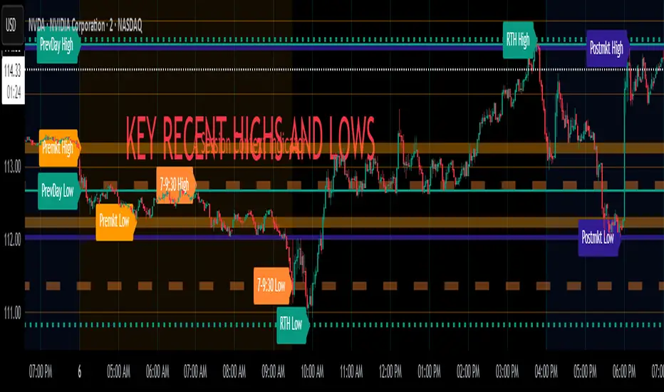
Key Recent Highs and LowsKey Recent Highs & Lows — Session‐Aware Market Structure
TL;DR
This tool plots the most important intraday price extremes for every U.S.‑equity trading segment—Early Premarket • Western Premarket • Regular Hours • Post‑Market Hours • Yesterday’s Range—and labels them so you can trade break‑outs, retests and mean‑reversion with instant context.
📐 Theory & Why These Levels Matter
Liquidity Pools
Visible session extremes attract resting orders (stop‑losses, take‑profits, opening prints). Price often accelerates into them and reacts at them.
Market Memory
The previous day’s high/low is a widely‑watched pivot for gap fills, overnight inventory corrections and multi‑day breakouts.
Mean‑Reversion Windows
Statistically, pre‑ and post‑market ranges are thin; an aggressive spike outside those bands often retraces when full liquidity returns.
Break‑Out Confirmation
A true breakout isn’t just a tick above RTH‑high—it usually closes or at least consolidates above the prior extreme. Seeing all bands lets you gauge whether a push is “real” or just probing thinner sessions.
Put simply, these levels help you decide:
Break‑out ➜ trade in the direction of expansion past a session extreme with follow‑through.
Fade/Mean‑Revert ➜ fade a spike that tags an extreme without commitment (e.g., hits Western‑Premkt‑High then stalls before RTH).
🔍 What the Script Draws
Session (UTC‑4 EST) Default Color / Style Typical Use‑Case
Early Premarket 4 – 7 AM Thick semi‑transparent orange line detect overnight retail spikes / fade plays
Western Premarket 7 – 9 : 30 AM Dashed orange‑red breakout watch as U.S. brokers open
Regular Session (RTH) 9 : 30 – 16 : 00 Bold teal dotted line core intraday structure; classic highs/lows
Post‑Market 16 – 23 : 59 Soft indigo band after‑hours news moves, earnings fades
Previous‑Day RTH Solid teal gap‑fill targets, trend continuation filters
(All colors, thicknesses and transparencies are editable in the settings.)
✨ Features
Real‑Time Updates
Levels refresh tick‑by‑tick inside their own session—no repainting later.
One‑Click Visibility Toggles
Show or hide any session extreme independently.
Clean Auto‑Labels
Optional right‑edge tags (“RTH High”, “Premkt Low”, etc.) keep your chart readable even when lines overlap.
Automatic Daily Reset
At midnight Eastern, buffers clear and yesterday’s extremes roll into the “Prev‑Day” pair.
Zero‑Noise Design
Transparencies and line styles are tuned so you can overlay on any symbol / timeframe without drowning candles.
📈 How to Trade with It
Intraday Breakout Strategy
Mark confluence (e.g., price pushes through Western Premkt High and Yesterday’s High).
Wait for a pullback that holds above the reclaimed band.
Enter with stop under that session line; target next band or measured‑move.
Fade / Mean‑Reversion
Pre‑market headline sends price 5 % above Early Premkt High.
Volume dries up before RTH open.
Short into exhaustion; cover near Western Premkt High or VWAP.
Gap‑Fill & Trend Days
Cash open gaps above Prev‑Day High.
If first 15‑min candle closes back inside yesterday’s range, bias shifts to downside fade.
If it holds above, treat gap as breakout and track RTH High extensions.
Pair it with volume‑profile, VWAP, or momentum oscillators for even higher‑confidence setups.
⚙️ Settings Cheat‑Sheet
Setting Effect
Show Regular / Premarket / Post‑market High/Low Master visibility per session
Show Previous Day High/Low Toggle yesterday’s anchor range
Show Session Labels Turn the right‑edge tags on/off
Style Panel Change each line’s color, width, transparency, dash/dot
🛠️ Best Practices
Works on any intraday timeframe (1‑min to 1‑hour).
Crypto or 24 h markets: adjust session times to match your exchange.
Combine with alerts (e.g., “price crossing RTH High”) for hands‑free monitoring.
Put KRHL on your chart and you’ll never wonder which high matters most again—because they’re all right there, clearly labeled and color‑coded. Trade breakouts or fades with confidence, armed with the exact market structure everyone else is watching.
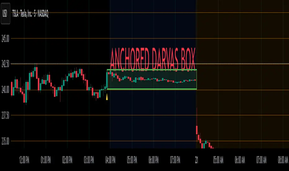
Anchored Darvas Box## ANCHORED DARVAS BOX
---
### OVERVIEW
**Anchored Darvas Box** lets you drop a single timestamp on your chart and build a Darvas-style consolidation zone forward from that exact candle. The indicator freezes the first user-defined number of bars to establish the range, verifies that price respects that range for another user-defined number of bars, then waits for the first decisive breakout. The resulting rectangle captures every tick of the accumulation phase and the exact moment of expansion—no manual drawing, complete timestamp precision.
---
### HISTORICAL BACKGROUND
Nicolas Darvas’s 1950s box theory tracked institutional accumulation by hand-drawing rectangles around tight price ranges. A trade was triggered only when price escaped the rectangle.
The anchored version preserves Darvas’s logic but pins the entire sequence to a user-chosen candle: perfect for analysing a market open, an earnings release, FOMC minute, or any other catalytic bar.
---
### ALGORITHM DETAIL
1. **ANCHOR BAR**
*You provide a timestamp via the settings panel.* The script waits until the chart reaches that bar and records its index as **startBar**.
2. **RANGE DEFINITION — BARS 1-7**
• `rangeHigh` = highest high of bars 1-7 plus optional tolerance.
• `rangeLow` = lowest low of bars 1-7 minus optional tolerance.
3. **RANGE VALIDATION — BARS 8-14**
• Price must stay inside ` `.
• Any violation aborts the test; no box is created.
4. **ARMED STATE**
• If bars 8-14 hold the range, two live guide-lines appear:
– **Green** at `rangeHigh`
– **Red** at `rangeLow`
• The script is now “armed,” waiting indefinitely for the first true breakout.
5. **BREAKOUT & BOX CREATION**
• **Up breakout** =`high > rangeHigh` → rectangle drawn in **green**.
• **Down breakout**=`low < rangeLow` → rectangle drawn in **red**.
• Box extends from **startBar** to the breakout bar and never updates again.
• Optional labels print the dollar and percentage height of the box at its left edge.
6. **OPTIONAL COOLDOWN**
• After the box is painted the script can stay silent for a user-defined number of bars, letting you study the fallout without another range immediately arming on top of it.
---
### INPUT PARAMETERS
• **ANCHOR TIME** – Precise yyyy-mm-dd HH:MM:SS that seeds the sequence.
• **BARS TO DEFINE RANGE** – Default 7; affects both definition and validation windows.
• **OPTIONAL TOLERANCE** – Absolute price buffer to ignore micro-wicks.
• **COOLDOWN BARS AFTER BREAKOUT** – Pause length before the indicator is allowed to re-anchor (set to zero to disable).
• **SHOW BOX DISTANCE LABELS** – Toggle to print Δ\$ and Δ% on every completed box.
---
### USER WORKFLOW
1. Add the indicator, open settings, and set **ANCHOR TIME** to the candle you care about (e.g., “2025-04-23 09:30:00” for NYSE open).
2. Watch live as the script:
– Paints the seven-bar range.
– Draws validation lines.
– Locks in the box on breakout.
3. Use the box boundaries as structural stops, targets, or context for further trades.
---
### PRACTICAL APPLICATIONS
• **OPENING RANGE BREAKOUTS** – Anchor at the first second of the session; capture the initial 7-bar range and trade the first clean break.
• **EVENT STUDIES** – Anchor at a news candle to measure immediate post-event volatility.
• **VOLUME PROFILE FUSION** – Combine the anchored box with VPVR to see if the breakout occurs at a high-volume node or a low-liquidity pocket.
• **RISK DISCIPLINE** – Stop-loss can sit just inside the opposite edge of the anchored range, enforcing objective risk.
---
### ADVANCED CUSTOMISATION IDEAS
• **MULTIPLE ANCHORS** – Clone the indicator and anchor several boxes (e.g., London open, New York open).
• **DYNAMIC WINDOW** – Switch the 7-bar fixed length to a volatility-scaled length (ATR percentile).
• **STRATEGY WRAPPER** – Turn the indicator into a `strategy{}` script and back-test anchored boxes on decades of data.
---
### FINAL THOUGHTS
Anchored Darvas Boxes give you Darvas’s timeless range-break methodology anchored to any candle of interest—perfect for dissecting openings, economic releases, or your own bespoke “important” bars with laboratory precision.