MACD Fake Filter [RH]Introducing a new indicator for the TradingView community based on the MACD indicator! This innovative tool goes beyond traditional MACD signals by analyzing positive and negative waves to determine the average height of the waves to filter false cross-over or cross-under signals during the sideways market.
There are two types of waves created by the MACD line, one is a positive wave above the "zero" line and another is a negative wave below "zero" line. Each wave has peaks. This indicator will find the average height of the positive waves' peaks and plot as a green line(by default). Vice-versa it will also find the average height of the negative waves' peaks and plot as a red line(by default).
Example :
This indicator will show labels when the MACD line crosses-under the MACD signal line above the average height of the positive waves.
Vice-versa, the indicator will show labels when the MACD line crosses-above the MACD signal line below the average height of the negative waves.
Example:
Alerts are also available for these types of cross-over and cross-under.
ابحث في النصوص البرمجية عن "wave"

GKD-V Weis Wave [Loxx]Giga Kaleidoscope GKD-V Weis Wave is a Volatility/Volume module included in Loxx's "Giga Kaleidoscope Modularized Trading System".
█ Giga Kaleidoscope Modularized Trading System
What is Loxx's "Giga Kaleidoscope Modularized Trading System"?
The Giga Kaleidoscope Modularized Trading System is a trading system built on the philosophy of the NNFX (No Nonsense Forex) algorithmic trading.
What is the NNFX algorithmic trading strategy?
The NNFX (No-Nonsense Forex) trading system is a comprehensive approach to Forex trading that is designed to simplify the process and remove the confusion and complexity that often surrounds trading. The system was developed by a Forex trader who goes by the pseudonym "VP" and has gained a significant following in the Forex community.
The NNFX trading system is based on a set of rules and guidelines that help traders make objective and informed decisions. These rules cover all aspects of trading, including market analysis, trade entry, stop loss placement, and trade management.
Here are the main components of the NNFX trading system:
1. Trading Philosophy: The NNFX trading system is based on the idea that successful trading requires a comprehensive understanding of the market, objective analysis, and strict risk management. The system aims to remove subjective elements from trading and focuses on objective rules and guidelines.
2. Technical Analysis: The NNFX trading system relies heavily on technical analysis and uses a range of indicators to identify high-probability trading opportunities. The system uses a combination of trend-following and mean-reverting strategies to identify trades.
3. Market Structure: The NNFX trading system emphasizes the importance of understanding the market structure, including price action, support and resistance levels, and market cycles. The system uses a range of tools to identify the market structure, including trend lines , channels, and moving averages.
4. Trade Entry: The NNFX trading system has strict rules for trade entry. The system uses a combination of technical indicators to identify high-probability trades, and traders must meet specific criteria to enter a trade.
5. Stop Loss Placement: The NNFX trading system places a significant emphasis on risk management and requires traders to place a stop loss order on every trade. The system uses a combination of technical analysis and market structure to determine the appropriate stop loss level.
6. Trade Management: The NNFX trading system has specific rules for managing open trades. The system aims to minimize risk and maximize profit by using a combination of trailing stops, take profit levels, and position sizing.
Overall, the NNFX trading system is designed to be a straightforward and easy-to-follow approach to Forex trading that can be applied by traders of all skill levels.
Core components of an NNFX algorithmic trading strategy
The NNFX algorithm is built on the principles of trend, momentum, and volatility . There are six core components in the NNFX trading algorithm:
1. Volatility - price volatility ; e.g., Average True Range , True Range Double, Close-to-Close, etc.
2. Baseline - a moving average to identify price trend
3. Confirmation 1 - a technical indicator used to identify trends
4. Confirmation 2 - a technical indicator used to identify trends
5. Continuation - a technical indicator used to identify trends
6. Volatility / Volume - a technical indicator used to identify volatility / volume breakouts/breakdown
7. Exit - a technical indicator used to determine when a trend is exhausted
What is Volatility in the NNFX trading system?
In the NNFX (No Nonsense Forex) trading system, ATR ( Average True Range ) is typically used to measure the volatility of an asset. It is used as a part of the system to help determine the appropriate stop loss and take profit levels for a trade. ATR is calculated by taking the average of the true range values over a specified period.
True range is calculated as the maximum of the following values:
-Current high minus the current low
-Absolute value of the current high minus the previous close
-Absolute value of the current low minus the previous close
ATR is a dynamic indicator that changes with changes in volatility . As volatility increases, the value of ATR increases, and as volatility decreases, the value of ATR decreases. By using ATR in NNFX system, traders can adjust their stop loss and take profit levels according to the volatility of the asset being traded. This helps to ensure that the trade is given enough room to move, while also minimizing potential losses.
Other types of volatility include True Range Double ( TRD ), Close-to-Close, and Garman-Klass
What is a Baseline indicator?
The baseline is essentially a moving average, and is used to determine the overall direction of the market.
The baseline in the NNFX system is used to filter out trades that are not in line with the long-term trend of the market. The baseline is plotted on the chart along with other indicators, such as the Moving Average (MA), the Relative Strength Index ( RSI ), and the Average True Range (ATR).
Trades are only taken when the price is in the same direction as the baseline. For example, if the baseline is sloping upwards, only long trades are taken, and if the baseline is sloping downwards, only short trades are taken. This approach helps to ensure that trades are in line with the overall trend of the market, and reduces the risk of entering trades that are likely to fail.
By using a baseline in the NNFX system, traders can have a clear reference point for determining the overall trend of the market, and can make more informed trading decisions. The baseline helps to filter out noise and false signals, and ensures that trades are taken in the direction of the long-term trend.
What is a Confirmation indicator?
Confirmation indicators are technical indicators that are used to confirm the signals generated by primary indicators. Primary indicators are the core indicators used in the NNFX system, such as the Average True Range (ATR), the Moving Average (MA), and the Relative Strength Index ( RSI ).
The purpose of the confirmation indicators is to reduce false signals and improve the accuracy of the trading system. They are designed to confirm the signals generated by the primary indicators by providing additional information about the strength and direction of the trend.
Some examples of confirmation indicators that may be used in the NNFX system include the Bollinger Bands , the MACD (Moving Average Convergence Divergence), and the Stochastic Oscillator. These indicators can provide information about the volatility , momentum, and trend strength of the market, and can be used to confirm the signals generated by the primary indicators.
In the NNFX system, confirmation indicators are used in combination with primary indicators and other filters to create a trading system that is robust and reliable. By using multiple indicators to confirm trading signals, the system aims to reduce the risk of false signals and improve the overall profitability of the trades.
What is a Continuation indicator?
In the NNFX (No Nonsense Forex) trading system, a continuation indicator is a technical indicator that is used to confirm a current trend and predict that the trend is likely to continue in the same direction. A continuation indicator is typically used in conjunction with other indicators in the system, such as a baseline indicator, to provide a comprehensive trading strategy.
What is a Volatility / Volume indicator?
Volume indicators, such as the On Balance Volume (OBV), the Chaikin Money Flow ( CMF ), or the Volume Price Trend ( VPT ), are used to measure the amount of buying and selling activity in a market. They are based on the trading volume of the market, and can provide information about the strength of the trend. In the NNFX system, volume indicators are used to confirm trading signals generated by the Moving Average and the Relative Strength Index . Volatility indicators include Average Direction Index, Waddah Attar, and Volatility Ratio. In the NNFX trading system, volatility is a proxy for volume and vice versa.
By using volume indicators as confirmation tools, the NNFX trading system aims to reduce the risk of false signals and improve the overall profitability of trades. These indicators can provide additional information about the market that is not captured by the primary indicators, and can help traders to make more informed trading decisions. In addition, volume indicators can be used to identify potential changes in market trends and to confirm the strength of price movements.
What is an Exit indicator?
The exit indicator is used in conjunction with other indicators in the system, such as the Moving Average (MA), the Relative Strength Index ( RSI ), and the Average True Range (ATR), to provide a comprehensive trading strategy.
The exit indicator in the NNFX system can be any technical indicator that is deemed effective at identifying optimal exit points. Examples of exit indicators that are commonly used include the Parabolic SAR , the Average Directional Index ( ADX ), and the Chandelier Exit .
The purpose of the exit indicator is to identify when a trend is likely to reverse or when the market conditions have changed, signaling the need to exit a trade. By using an exit indicator, traders can manage their risk and prevent significant losses.
In the NNFX system, the exit indicator is used in conjunction with a stop loss and a take profit order to maximize profits and minimize losses. The stop loss order is used to limit the amount of loss that can be incurred if the trade goes against the trader, while the take profit order is used to lock in profits when the trade is moving in the trader's favor.
Overall, the use of an exit indicator in the NNFX trading system is an important component of a comprehensive trading strategy. It allows traders to manage their risk effectively and improve the profitability of their trades by exiting at the right time.
How does Loxx's GKD (Giga Kaleidoscope Modularized Trading System) implement the NNFX algorithm outlined above?
Loxx's GKD v1.0 system has five types of modules (indicators/strategies). These modules are:
1. GKD-BT - Backtesting module ( Volatility , Number 1 in the NNFX algorithm)
2. GKD-B - Baseline module (Baseline and Volatility / Volume , Numbers 1 and 2 in the NNFX algorithm)
3. GKD-C - Confirmation 1/2 and Continuation module (Confirmation 1/2 and Continuation, Numbers 3, 4, and 5 in the NNFX algorithm)
4. GKD-V - Volatility / Volume module (Confirmation 1/2, Number 6 in the NNFX algorithm)
5. GKD-E - Exit module (Exit, Number 7 in the NNFX algorithm)
(additional module types will added in future releases)
Each module interacts with every module by passing data between modules. Data is passed between each module as described below:
GKD-B => GKD-V => GKD-C(1) => GKD-C(2) => GKD-C(Continuation) => GKD-E => GKD-BT
That is, the Baseline indicator passes its data to Volatility / Volume . The Volatility / Volume indicator passes its values to the Confirmation 1 indicator. The Confirmation 1 indicator passes its values to the Confirmation 2 indicator. The Confirmation 2 indicator passes its values to the Continuation indicator. The Continuation indicator passes its values to the Exit indicator, and finally, the Exit indicator passes its values to the Backtest strategy.
This chaining of indicators requires that each module conform to Loxx's GKD protocol, therefore allowing for the testing of every possible combination of technical indicators that make up the six components of the NNFX algorithm.
What does the application of the GKD trading system look like?
Example trading system:
Backtest: Strategy with 1-3 take profits, trailing stop loss, multiple types of PnL volatility , and 2 backtesting styles
Baseline: Hull Moving Average
Volatility/Volume: Weis Wave as shown on the chart above
Confirmation 1: Vortex
Confirmation 2: Williams Percent Range
Continuation: Fisher Transform
Exit: Rex Oscillator
Each GKD indicator is denoted with a module identifier of either: GKD-BT, GKD-B, GKD-C, GKD-V, or GKD-E. This allows traders to understand to which module each indicator belongs and where each indicator fits into the GKD protocol chain.
Giga Kaleidoscope Modularized Trading System Signals (based on the NNFX algorithm)
Standard Entry
1. GKD-C Confirmation 1 Signal
2. GKD-B Baseline agrees
3. Price is within a range of 0.2x Volatility and 1.0x Volatility of the Goldie Locks Mean
4. GKD-C Confirmation 2 agrees
5. GKD-V Volatility / Volume agrees
Baseline Entry
1. GKD-B Baseline signal
2. GKD-C Confirmation 1 agrees
3. Price is within a range of 0.2x Volatility and 1.0x Volatility of the Goldie Locks Mean
4. GKD-C Confirmation 2 agrees
5. GKD-V Volatility / Volume agrees
6. GKD-C Confirmation 1 signal was less than 7 candles prior
Continuation Entry
1. Standard Entry, Baseline Entry, or Pullback; entry triggered previously
2. GKD-B Baseline hasn't crossed since entry signal trigger
3. GKD-C Confirmation Continuation Indicator signals
4. GKD-C Confirmation 1 agrees
5. GKD-B Baseline agrees
6. GKD-C Confirmation 2 agrees
1-Candle Rule Standard Entry
1. GKD-C Confirmation 1 signal
2. GKD-B Baseline agrees
3. Price is within a range of 0.2x Volatility and 1.0x Volatility of the Goldie Locks Mean
Next Candle:
1. Price retraced (Long: close < close or Short: close > close)
2. GKD-B Baseline agrees
3. GKD-C Confirmation 1 agrees
4. GKD-C Confirmation 2 agrees
5. GKD-V Volatility / Volume agrees
1-Candle Rule Baseline Entry
1. GKD-B Baseline signal
2. GKD-C Confirmation 1 agrees
3. Price is within a range of 0.2x Volatility and 1.0x Volatility of the Goldie Locks Mean
4. GKD-C Confirmation 1 signal was less than 7 candles prior
Next Candle:
1. Price retraced (Long: close < close or Short: close > close)
2. GKD-B Baseline agrees
3. GKD-C Confirmation 1 agrees
4. GKD-C Confirmation 2 agrees
5. GKD-V Volatility / Volume Agrees
PullBack Entry
1. GKD-B Baseline signal
2. GKD-C Confirmation 1 agrees
3. Price is beyond 1.0x Volatility of Baseline
Next Candle:
1. Price is within a range of 0.2x Volatility and 1.0x Volatility of the Goldie Locks Mean
3. GKD-C Confirmation 1 agrees
4. GKD-C Confirmation 2 agrees
5. GKD-V Volatility / Volume Agrees
█ GKD-C Weis Wave
What is Weis Wave?
The Weis Wave Indicator is a technical analysis tool used by traders to analyze market trends and identify potential turning points in financial markets. It was developed by David Weis, a trader and market analyst with over 45 years of experience.
The Weis Wave Indicator is based on the principles of market waves, which are the repetitive patterns of market behavior that occur in financial markets. These waves are characterized by price movements that occur in a series of up and down trends, and they are used by traders to identify potential market reversals or breakouts.
The Weis Wave Indicator is a histogram that represents the difference between the cumulative sum of the bullish and bearish waves. The indicator is plotted on a chart as a series of bars that change color depending on the direction of the market trend. If the market is trending up, the bars will be green, while if the market is trending down, the bars will be red.
The formula for the Weis Wave Indicator is based on the accumulation and distribution of volume over time. It uses a cumulative delta volume calculation to determine the strength of market trends and identify potential turning points. The formula is as follows:
Weis Wave Volume = Net Buying Volume - Net Selling Volume
The Weis Wave Indicator is used by traders to identify potential market trends and turning points. It is particularly useful in identifying market breakouts and reversals, as well as in detecting divergences between price and volume. The indicator is commonly used in conjunction with other technical analysis tools, such as moving averages, trend lines, and support and resistance levels, to confirm market trends and generate trading signals.
Specifically, the Weis Wave Volume Indicator is an oscillator that measures the volume of price changes. It combines both momentum and volume to indicate buying and selling pressure. The indicator is designed to show a bull market when the volume is increasing and the price is rising, and a bear market when the volume is decreasing and the price is falling ¹.
The Weis Wave Plugin creates wave charts along with their corresponding wave volume. Wave charts were first created by Richard D. Wyckoff. In his famous course on stock market technique, he instructed students to “think in waves.” Wave analysis was an integral part of his trading method. The Weis Wave is an adaptation of Wyckoff’s method that handles today’s volatile markets ².
This indicator has the option of either ATR, volume, or partial close for source input.
(1) Weis Wave Volume Indicator - Trend Following System. www.trendfollowingsystem.com Accessed 4/7/2023.
(2) Weis Wave Plugin: A Modern Adaptation of the Wyckoff Wave & Volume. weisonwyckoff.com Accessed 4/7/2023.
(3) Weis Wave Volume Indicator: Simple But Extremely Effective. howtotradeblog.com Accessed 4/7/2023.
(4) How to use the Weis Waves indicator in ATAS. atas.net Accessed 4/7/2023.
Requirements
Inputs
Chained: GKD-B Baseline
Solo: NA, no inputs
Baseline + Volatility/Volume: GKD-B Baseline
Outputs
Chained: GKD-C indicators Confirmation 1 or Solo Confirmation Complex
Solo: GKD-BT Backtest
Baseline + Volatility/Volume: GKD-BT Backtest
Additional features will be added in future releases.

Direction Analysis WavesDescription
It is an indicator that aims to provide information about the direction of the trend, the basis of which is the CCI, CMO and MFI indices.
Symbols on the indicator are for informational purposes. Information about colors and symbols is given below.
Blue Wave: Graphical representation of the Commodity Channel Index (CCI) curve.
Green/Red Wave: Graphical representation of the Chande Momentum Oscillator (CMO) curve. This curve turns green when it rises above zero, and turns red when it falls below zero.
Yellow Wave: Graphical representation of the Money Flow Index (MFI) curve.
Blue Line: CCI line.
Green/Red Cross: CCI line shows green cross on red cross below 0 value.
Warning
As a result, this indicator should be expected to give an idea of the trend direction, not a trading signal.
Version
v1.0
Price action: Fibonacci + Support/Resistant + TrendlinePrice action: Fibonacci + Support/Resistant + Trendline
In this indicator, I find entry long/Short by combining: Fibonacci + Support/Resistant + Trendline (One of Advanced Price action Analysis).
How it works:
1. Find Impulse wave:
To findind Impulse wave, It uses Pivot High/Low to find Impulse wave. In case find entry Long, If having Pivot High higher Pivot High before, it will draw an Impulse wave.
2. Find entry at Fibonacci levels:
Draw Fibonacci fibonacci retracement from Pivot Low to Pivot High. A Fibonacci retracement forecast is created by taking two extreme points on a chart and dividing the vertical distance by important Fibonacci ratios. 0% is considered to be the start of the retracement, while 100% is a complete reversal to the original price before the move. Horizontal lines are drawn in the chart for these price levels to provide support and resistance levels. Common levels are 23.6%, 38.2%, 50%, and 61.8%
3. Find entry at Support/Resistant Zone:
Support/Resistant Zone drawed from Pivot High before, which price just breaken and return to retest.
4. Find entry at Trendline:
Trendline drawed from Pivot High/Low before, which price just breaken and return to retest.
This is study version. Having strategy version to backtesting.

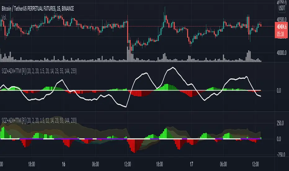
Squeeze M + ADX + TTM (Trading Latino & John Carter) by [Rolgui]About this indicator:
This indicator aims to combine two good performing strategies, which can be used separately or together, mainly for investment positions, although it can also be used for intraday trading.
Strategy 1) Squeeze Oscillator and Average Directional Index:
This strategy is taught by Jaime Aibsai, which determines market entries based on reading the direction of the price movement (Directionality of the Oscillator) along with the strength of the Oscillator (Slope of the ADX).
Both tools are configured according to Jaime Abisai's strategy, by default (note that point 23 of the ADX is represented by point 0 on the panel, to make reading easier, its interpretation is not affected). Anyway you can adjust the input data according to your interest.
*You can see this setting in the first panel.
Strategy 2) Squeeze Momentum and Trade The Market Waves:
This strategy can be consulted either in John F. Carter's books or on his website.
This market reading is based on Price Volatility (Bollinger Bands and Keltner Channels interaction) and its Trend (Exponential Moving Averages), showing entries at times when price volatility is low and taking filtering active trend using T.T.M. Waves.
To configure the indicator in the same way that Carter does, it would be enough to turn off the ADX, turn on the Squeeze Momentum signals along with the T.T.M. Waves, and importantly, change the Linear Momentum value to 12 (this configuration can be found in his book).
*You can see this setting in the second panel.
Why this indicator?
I've added and removed the above flags as I needed to query them (which became tedious for me). The main objective of having merged them into one is to make their reading more agile and comfortable and thus improve the decision-making capacity of the trader who wishes to use them.
Credits and Acknowledgments:
I would like to give credits to other authors, for the sections of code that I have used to make this technical indicator. Thanks to @LazyBear, @matetaronna, @jombie and @joren for contributing to the community and keeping their code open. It is priceless!
Feel free to combine and practice your trading with both strategies, personally, they improved my profitability and this is why I recommend researching more about them. I've been using it for crypto investing, let me know if it's worth for you on stock market!
If you have any questions or suggestions you can leave it in the comments!
Greetings!
test - autocorrelationExperimental:
finds and displays the wavelength index's of the autocorrelation wavelengths..

AustinJames: Yume Wave 2.0This is the all-access version of the Yume Wave 2.0
The wave uses the bottom, top, and mid line as resistance points. The upper limit is the resistance, the lower limit is support - and the middle line is the support when wave is above it, and resistance when wave is below it.
Check against trend lines to find the best buy/sell point based on the wave. The timeframe you select with the trendline should match the yume wave.
-----------
This is a upgraded version of the wave with modified parameters for a higher success rate. 3 New Lengths and 75 more lines of code added to the overall algorithm. Also included are 2 sublevel signals based on the Fib MA and pattern trading.
The Wave:
+ The Yume is the Fast length
+ The Akume is the Slow length
+ The Miaku is a median weighted length
+ The Upper Limit is an overbought asset indication
+ The Lower Limit is an oversold asset indication
+ The Wave is the spread between Yume and Miaku
Bullish Indications:
+ The Yume is above the Akume
+ The Yume is above the Miaku
+ The Yume is below the Lower Limit
Bearish Indications:
+ The Yume is below the Akume
+ The Yume is below the Miaku
+ The Yume is above the Upper Limit
Signal Strength Weights:
+ 50 = Yume Wave crossed a Limit Line
+ 100 = Yume Wave crossed a Limit Line + Close to a Fib Moving Average
+ 100 = Edge's Market Bottom/Top Algorithm is marked 'True'
Setting up Signals (Based on a 100 Signal Height):
+ Set the "Bull Signal" to be at 50 or 100
+ Set the "Bear Signal" to be at 50 or 100
+ 50 is Agressive, 100 is Conservative.
+ Bull/Bear are separate so you can play conservative bull with aggressive bear.

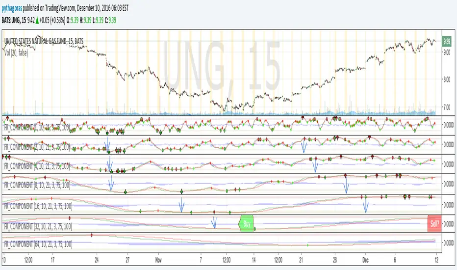
Fractal Resonance ComponentLazyBear's WaveTrend port has been praised for highlighting trend reversals with precision and punctuality (minimal lag). But strong "3rd Wave" trends can "embed" or saturate any oscillator flashing several premature crosses while stuck overbought/oversold. This happens when the trend stretches over a longer timescale than the oscillator's averaging window or filter time constant. Our solution: simultaneously monitor many oscillator timescales. Watch for fresh crossovers in "dominant" timescales alternating most smoothly between the overbought (red shade) and oversold (green shade) range.
Fractal Resonance Component facilitates simultaneous viewing of eight timescales that are power of 2 multiples of the chart timescale. Each timescale shows lead line, lag line, lead-lag difference, and crossover marks. Add 4 to 8 copies to your chart for a good multi-fractal read. Format * the "Timescale Multiplier" attribute of each row to be twice that of the row above for a sequence like 1, 2, 4, 8, 16, 32, 64, 128...
Fractal Resonance Component shifts its timescales along with your choice of main chart timescale:
1 minute chart: 1 minute through 128 minute (~2 hour) oscillators.
1 hour chart: 1 hour through 128 hour (~2 week) oscillators.
Daily chart: 1 day through 128 day (~4 month) oscillators.
Crossovers in different oscillator ranges tend to have different meanings:
Minor (< 75%) crossovers: small green/red dot
usually noise
Overbought/Sold crossovers (shaded 75 to 100%): black outlined dot (o)
reliable reversal indicators (when they appear alone)
Extreme Overbought (> 100%) crossovers: black outlined plus (+).
Can be a major reversal in fast markets, but usually portend the end of Elliot 3rd waves with just a small corrective (4th wave) retrace before the larger impulsive (5-wave) sequence resumes in original direction.
The final 5th-wave terminus should appear later as a lone non-extreme (black outlined circle) crossover on a slower timescale coincident with weaker (non-extreme) dot crosses on this timescale.
Careful examination of historical charts leads to many useful observations such as:
Dominant crossovers punctuating true reversals are usually in the green/red shaded ranges with black outlined dots (o) rather than minor or Extreme (+) ranges.
Due to market's fractal nature, two well-separated timescales like 1 minute and 1 hour can show dominant crosses simultaneously in opposite directions, e.g. the 1 minute showing a very short term high and the 1 hour a medium term low nearby.
Staying Nimble
Watch out for embedding on your supposedly dominant timescale -- a second cross while stuck in the overbought/oversold region suggests a stronger, longer trend than expected. Drop your eyes to a slower timescale below for the real dominant whose crossover will validate main trend reversal.
Embedding can often be predicted even at the first cross mark by checking whether the green lead line of the next slower timescale (one row below) has already hit the Overbought or especially the Extreme Overbought range but isn't close to rolling over. Fractal Resonance Bar (to be published) uses this principle to mark embedded timescales with white stripes, warning of a powerful trend wave on longer timescales you shouldn't fight until the white stripes subside.
Overnight gaps surge all timescales in ways that obscure the dominant timescale, so for shorter than daily charts, these methods work best on Futures contracts that only suffer weekend gaps.
Katz Impact Wave 🚀Overview of the Katz Impact Wave 🚀
The Katz Impact Wave is a momentum oscillator designed to visualize the battle between buyers and sellers. Instead of combining bullish and bearish pressure into a single line, it separates them into two distinct "Impact Waves."
Its primary goal is to generate clear trade signals by identifying when one side gains control, but only when the market has enough volatility to be considered "moving." This built-in filter helps to avoid signals during flat or choppy market conditions.
Indicator Components: Lines & Plots
Impact Waves & Fill
Green Wave (Total Up Impulses): This line represents the cumulative buying pressure. When this line is rising, it indicates that bulls are getting stronger.
Red Wave (Total Down Impulses): This line represents the cumulative selling pressure. When this line is rising, it indicates that bears are getting stronger.
Colored Fill: The shaded area between the two waves provides an at-a-glance view of who is in control.
Lime Fill: Bulls are dominant (Green Wave is above the Red Wave).
Red Fill: Bears are dominant (Red Wave is above the Green Wave).
Background Color
The background color provides crucial context about the market state according to the indicator's logic.
Green Background: The market is in a bullish state (Green Wave is dominant) AND the Rate of Change (ROC) filter confirms the market is actively moving.
Red Background: The market is in a bearish state (Red Wave is dominant) AND the ROC filter confirms the market is actively moving.
Gray Background: The market is considered "not moving" or is in a low-volatility chop. Signals that occur when the background is gray should be viewed with extreme caution or ignored.
Symbols & Pivot Lines
▲ Blue Triangle (Up): This is your long entry signal. It appears on the bar where the Green Wave crosses above the Red Wave while the market is moving.
▼ Orange Triangle (Down): This is your short entry signal. It appears on the bar where the Red Wave crosses above the Green Wave while the market is moving.
Pivot Lines (Solid Green/Red/White Lines): These lines mark confirmed peaks of exhaustion in momentum, not price.
Green Pivot Line: Marks a peak in the Green Wave, signaling buying momentum exhaustion. This can be a warning that the uptrend is losing steam.
Red Pivot Line: Marks a peak in the Red Wave, signaling selling momentum exhaustion. This can be a warning that the downtrend is losing steam.
▼ Yellow Triangle (Compression): This rare signal appears when buying and selling exhaustion pivots happen at the same level. It signifies a point of extreme indecision or equilibrium that often occurs before a major price expansion.
Trading Rules & Strategy
This indicator provides entry signals but does not provide explicit Take Profit or Stop Loss levels. You must use your own risk management rules.
Long Trade Rules
Entry Signal: Wait for a blue ▲ triangle to appear at the top of the indicator panel.
Confirmation: Ensure the background color is green, confirming the market is in a bullish, moving state.
Action: Enter a long (buy) trade at the open of the next candle after the signal appears.
Short Trade Rules
Entry Signal: Wait for an orange ▼ triangle to appear at the bottom of the indicator panel.
Confirmation: Ensure the background color is red, confirming the market is in a bearish, moving state.
Action: Enter a short (sell) trade at the open of the next candle after the signal appears.
Take Profit (TP) & Stop Loss (SL) Ideas
You must develop and test your own exit strategy. Here are some common approaches:
Stop Loss:
Place a stop loss below the most recent significant swing low on the price chart for a long trade, or above the recent swing high for a short trade.
Use an ATR (Average True Range) based stop, such as 2x the ATR value below your entry for a long, to account for market volatility.
Take Profit:
Opposite Signal: The simplest exit is to close your trade when the opposite signal appears (e.g., close a long trade when a short signal ▼ appears).
Momentum Exhaustion: For a long trade, consider taking partial or full profit when a green Pivot Line appears, signaling that buying momentum is peaking.
Fixed Risk/Reward: Use a predetermined risk/reward ratio (e.g., 1:1.5 or 1:2).
Disclaimer
This indicator is a tool for analysis, not a financial advisor or a guaranteed profit system. All trading and investment activities involve substantial risk. You should not risk more than you are prepared to lose. Past performance is not an indication of future results. You are solely responsible for your own trading decisions, risk management, and for backtesting this or any other tool before using it in a live trading environment. This indicator is for educational purposes only.

Elliott Wave Auto (Impulse + Correction) — stable deleteAutomatic pivot detection: The script identifies swing highs and swing lows using ta.pivothigh and ta.pivotlow.
Impulse wave labeling (1–5):
Detects 5 alternating pivots and labels them as waves 1 to 5.
Uses green/red labels for impulse and correction legs.
Connects waves with blue lines for visual clarity.
Corrective wave labeling (A–B–C):
Detects the next 3 alternating pivots after wave 5.
Labels them as A, B, C with orange lines connecting them.
Dynamic cleanup:
Stores labels and lines in arrays.
Deletes previous drawings automatically before redrawing, keeping the chart clean.
Optional pivot markers:
Plots tiny triangles for detected pivots (green for lows, red for highs).
Information table:
Displays the direction (Bullish/Bearish) and percentage move of the 1–5 impulse waves.
Pine Script v5 compliant:
Uses str.tostring() and array-based deletion to avoid tostring() or line.deleteall() errors.
If you want, I can also add an alert feature to notify you when a full impulse + corrective wave pattern completes. This makes it actionable for trading.

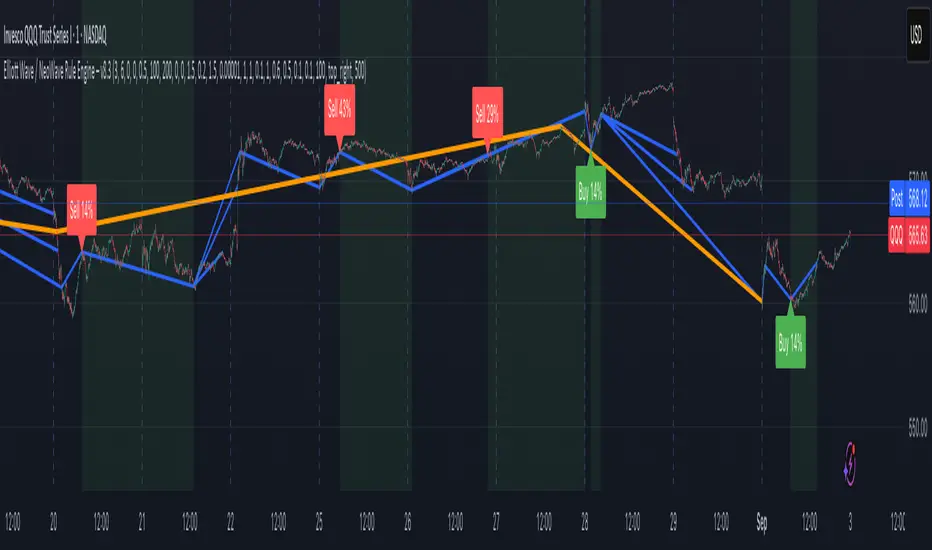
Elliott Wave / NeoWave Rule Engine – v6.9This script functions as a "rule engine" that automatically identifies significant price swings and then tests them against a comprehensive set of Elliott Wave rules and guidelines.
The goal is to filter out low-probability setups and identify valid motive (impulse and diagonal) waves by applying user-defined tolerances. The script plots swings on the chart and can display a real-time dashboard that shows which rules are passing or failing. When a valid motive wave is detected, it can generate buy or sell signals.
User Settings
The script's behavior is controlled by a set of user inputs, organized into four main groups.
Swing / ZigZag Detection
These settings control how the script identifies the price swings that form the basis of the wave patterns.
Pivot Left Bars & Pivot Right Bars: These two values determine the sensitivity of the swing detection. A pivot point (a high or low) is only identified if it is the highest or lowest price within the specified number of bars to its left and right. Increasing these numbers will result in fewer, larger swings.
Minimum swing % (filter micro noise): This is a crucial filter. It ignores swings that are too small to be considered significant, helping to clean up the chart and prevent the engine from analyzing "noise." For example, a value of 0.3 means any swing that is less than 0.3% of the price range will be ignored.
Rule Engine Tolerances
This group allows you to define how strict the validation rules are.
Fibonacci tolerance (±%): This sets the acceptable margin of error for Fibonacci relationships (e.g., a 0.618 retracement). A value of 0.001 means a retracement between 0.617 and 0.619 will be considered a valid match.
Same-degree TIME proportion max (x): This sets the maximum time difference allowed between waves of the same degree (e.g., Wave 1 and Wave 3) to still be considered "proportional." A value of 1 means Wave 3's duration can be up to 1 time longer than Wave 1's duration, and vice-versa.
Same-degree PRICE proportion max (x): Similar to the time tolerance, this sets the maximum price difference allowed between waves of the same degree to still be considered proportional.
Alternation slope ratio threshold: This is a key NeoWave guideline. It checks if Wave 2 and Wave 4 have different "sharpness" (price change per bar). A higher value makes the alternation rule stricter.
Min guideline passes for motive validation (0–7): This is the gating feature. Even if a pattern passes all the hard Elliott Wave rules (e.g., no overlap, Wave 3 isn't the shortest), you can still require it to pass a minimum number of guidelines (like Fibonacci relationships, alternation, etc.) before a signal is generated. A value of 7 means every guideline must be met.
Momentum / Volume Guidelines
These are additional checks for pattern validation.
Momentum length: This setting controls a proxy for momentum, which is calculated based on the speed of price movement.
Use volume checks: This is a placeholder for future functionality. It does not currently affect the script's behavior.
UI / Debug
These settings control the visual aspects of the script on your chart.
Max swings to keep/evaluate: This determines how far back the script looks to find and analyze swings. A larger number will analyze more historical patterns but may impact performance.
Show detected labels: Toggles the display of numerical (1-2-3-4-5) and letter (A-B-C) labels on the detected waves.
Show rule PASS/FAIL dashboard: Toggles the on-chart table that provides a detailed breakdown of which rules and guidelines are met.
Table Position: Controls where the rule dashboard is located on your chart.
Print debug info to Data Window: If you are a developer or want to see the underlying data, this will print information to TradingView's Data Window.
Show Buy/Sell Signals: Toggles the display of Buy/Sell signals. These signals are only generated when a pattern passes all the hard rules and your minimum guideline pass requirement.
Slope Based Divergences of Wavelet - (Multi-Length, Dual Price)
1. Summary
This is not a typical divergence indicator. Instead of comparing simple peaks and troughs in price and an oscillator, the Slope-Based Divergence Engine performs a far more rigorous analysis by measuring the rate of change (slope) itself.
It identifies high-probability divergence opportunities by detecting moments when price is accelerating strongly in one direction while the underlying momentum, measured by a sophisticated Scientific Wavelet Oscillator, is accelerating in the opposite direction. By requiring confirmation from two different price sources (high and low) and across multiple timeframes, it aims to filter out noise and pinpoint only the most potent moments of market exhaustion.
2. The Core Innovation: Why Slope?
Traditional divergence indicators look at levels (e.g., price made a higher high, RSI made a lower high). This script looks at momentum's momentum.
Traditional Method: "Price went up, but momentum went down."
This Script's Method: "Price is accelerating upwards faster than ever, but momentum is decelerating faster than ever."
By focusing on the slope, the indicator identifies points of maximum stress and disagreement in the market, which often precede sharp reversals.
3. Key Components & Logic
The script's power comes from its multi-layered filtering system:
Scientific Wavelet Oscillator: The indicator's engine is a custom oscillator built using a Haar Wavelet Transform. Unlike standard oscillators (like RSI or Stochastics) that use a single period, this one analyzes the price across multiple different time scales (or "octaves") simultaneously. It then fuses this information into a single, robust momentum reading that is normalized using a statistical Z-score.
Multi-Length Average Slope: The script doesn't just calculate a single slope. It calculates the slope across a range of lookback periods (e.g., from 1 to 30 bars) and then averages them. This creates a much smoother and more reliable measure of the trend's current velocity, filtering out the noise from any single period.
Dual Price Confirmation: To qualify a price trend, the script requires that the slope of two separate price sources (by default, high and low) are both in agreement. For a bearish divergence, the slopes of both the session high and low must be accelerating upwards aggressively. This ensures the entire price bar is participating in the move and avoids false signals from wicks or narrow ranges.
Multi-Timeframe Percent Rank: The script uses percentrank to normalize the calculated slopes, putting them on a scale of 0 to 100. This allows it to identify statistically extreme readings. A divergence is only confirmed if it meets the criteria on both a Long-Term (LL) and Short-Term (LS) lookback. This ensures the signal is not just a momentary fluke but is a valid point of exhaustion in both the immediate and broader context.
4. How to Interpret the Signals
The indicator plots simple labels on the chart when all conditions are met:
Green "Bull" Label (Bullish Divergence): Appears when:
The slopes of both high and low are accelerating downwards (in the bottom 8% of their historical readings for both long and short lookbacks).
Simultaneously, the slope of the wavelet oscillator is accelerating upwards (in the top 92% of its historical readings).
Meaning: Price is in a state of free-fall, but the underlying momentum is aggressively turning up. This signals that selling pressure is likely exhausted.
Red "Bear" Label (Bearish Divergence): Appears when:
The slopes of both high and low are accelerating upwards (in the top 92% of their historical readings).
Simultaneously, the slope of the wavelet oscillator is accelerating downwards (in the bottom 8% of its historical readings).
Meaning: Price is in a state of extreme ascent (a "blow-off top"), but the underlying momentum is collapsing. This signals that buying pressure is likely exhausted.
5. How to Use in Trading
Reversal Signals: The labels should be treated as high-probability signals that a trend is exhausted and a reversal or significant pullback is imminent.
Confirmation Tool: Do not use the labels as standalone entry signals. Always seek confirmation from other forms of analysis, such as a break of a trendline, a key support/resistance level holding, or a classic candlestick reversal pattern.
Exit Signals: A bearish divergence label can serve as a powerful signal to take profit on long positions, and a bullish label can be a signal to cover shorts.

Mohammad - OBs, BOS, S/R, Elliott Waves & Trend LinesProfessional Trading Indicator System - Technical Analysis Suite
Overview
Advanced technical analysis system integrating ICT/SMC methodologies with classical analysis tools. Features seven analytical components for comprehensive market structure analysis.
Components
1. Order Blocks (ICT/SMC)
Identifies institutional accumulation/distribution zones acting as future support/resistance.
Detection: Automatic identification based on price rejection patterns
Management: Dynamic updates and removal of invalidated blocks
Configuration: Sensitivity levels (High/Medium/Low), ATR-based parameters
Visual: Green support, red resistance with transparency
2. Break of Structure (BOS)
Detects significant structural breaks indicating trend changes.
Method: 5-bar swing point formation
Display: White horizontal lines with labels
Range: 50-bar maximum lookback
3. Support & Resistance
Classical horizontal levels from significant price pivots.
Analysis: 300-bar historical scan
Filter: 10-point duplicate tolerance
Display: Maximum 15 levels within 5% of current price
4. Fair Value Gaps (FVG)
Price inefficiencies that often get filled on return.
Types: Bullish gaps (up) and bearish gaps (down)
Size: Minimum 0.1 ATR or 5 points
Management: Auto-removal when filled
5. Elliott Wave Analysis
Advanced pattern recognition for impulse and corrective waves.
Patterns: 5-wave impulse (1-2-3-4-5), 3-wave corrective (A-B-C)
Adaptive: Auto-adjusts to timeframe (3-10 depth range)
Display: Small dots with large numbers, starts from hidden point 0
6. 45-Degree Momentum Lines
Revolutionary projection system based on consecutive candle sequences.
Bearish Lines (Red):
Trigger: 5+ consecutive red candles
Start: HIGH of first red candle
Labels: B1-B5
Bullish Lines (Green):
Trigger: 5+ consecutive green candles
Start: LOW of first green candle
Labels: T1-T5
Specifications:
Angle: 45° using ATR * 0.15
Extension: 30 bars forward
Display: 5 most recent patterns
7. Classical Trend Lines
Multi-touch diagonal support/resistance detection.
Validation: Minimum touch requirements
Tolerance: ATR-based touch detection
Display: Blue lines with optional labels
Configuration Summary
Global Settings:
Show/hide each component individually
Customizable colors and line widths
Label size options
Performance:
50-bar periodic cleanup
Maximum object limits (500 each)
Conditional processing on bar close
Trading Applications
Scalping: Order Blocks + FVGs + 45° Lines
Day Trading: All components with BOS emphasis
Swing Trading: Elliott Waves + Trend Lines
Position Trading: Major levels + Elliott Waves
Key Strategies:
Use 45° line bounces for entries
Combine Order Blocks with 45° lines for confluence
Confirm BOS breaks with 45° line violations
Place stops beyond projection lines
Technical Requirements
Platform: TradingView Pine Script v5
Minimum: 300 historical bars
Optimal: 15m-4H timeframes
Performance: Moderate CPU usage
Color Scheme
Green: Bullish/Support (#26a69a)
Red: Bearish/Resistance (#ef5350)
White: BOS/S&R lines
Blue: Elliott Waves/Trend Lines
Customizable: 45° projection lines
Risk Disclaimer
Educational tool only. Not financial advice. Combine with risk management and personal analysis. Past performance doesn't guarantee future results. Trading involves substantial risk.

Harmonic Pattern Detector [The_lurker]
📊 Harmonic Pattern Detector
An advanced indicator designed to automatically detect and visualize harmonic patterns on price charts with high accuracy. It is based on Fibonacci ratios, ZigZag structures, and pivot points, offering traders precise identification of potential reversal zones.
The indicator supports detection of 13 major harmonic patterns: Gartley, Butterfly, Bat, Crab, Deep Crab, AB=CD, Cypher, Shark, Three Drives, Wolfe Waves, 5-0, Black Swan, and Anti-Gartley.
Each pattern is matched using ideal Fibonacci ratios with a customizable error margin. Patterns are validated only if the similarity score (accuracy) is greater than or equal to 80%, ensuring reliable signals.
🔎 How It Works:
1️⃣ Pivot Point Detection
The indicator uses a function to find major swing highs and lows (`findPivots`), based on a configurable pattern length (default is 18 candles). These pivots are stored in arrays: `pivotPrices`, `pivotBars`, and `pivotDirections`.
2️⃣ ZigZag Construction
With the pivots detected, the indicator constructs a ZigZag structure by connecting the relevant price points using `buildZigZag`. These lines represent the fundamental price movements forming harmonic shapes.
3️⃣ Fibonacci Ratio Calculation
From the ZigZag, the indicator extracts points labeled X, A, B, C, and D, then calculates key Fibonacci ratios:
* XAB = |B-A| / |X-A|
* ABC = |C-B| / |A-B|
* XAD = |D-A| / |X-A|
4️⃣ Pattern Matching Algorithm
Each pattern has its ideal Fibonacci ranges. The ratios are compared with these ranges using adjustable error margins:
ERROR_MARGIN_MIN = (100 - DETECT_ERROR_MARGIN_PERCENT) / 100
ERROR_MARGIN_MAX = (100 + DETECT_ERROR_MARGIN_PERCENT) / 100
If all required ratios for a pattern fall within these bounds, the pattern is considered a potential match.
5️⃣ Similarity Score Calculation
To evaluate accuracy, each pattern gets a similarity score by comparing actual vs. ideal ratios. For example:
simXAB = min(xabRatio / idealXAB, idealXAB / xabRatio)
simABC = min(abcRatio / idealABC, idealABC / abcRatio)
simXAD = min(xadRatio / idealXAD, idealXAD / xadRatio)
similarity = (simXAB + simABC + simXAD) / 3
Only patterns with a similarity ≥ MIN\_RATING\_PERCENT (default 80%) are shown.
6️⃣ Visual Output
When a pattern is detected, it is displayed by connecting the points X→A→B→C→D. A label is drawn at point D showing:
* Pattern Name
* Emoji (e.g., 🦋 for Gartley)
* Similarity percentage (e.g., "92%")
Patterns are color-coded:
🟢 Green for Bullish
🔴 Red for Bearish
⚙️ Configurable Settings:
* ENABLE_PATTERN_DETECTION`: Toggle to enable or disable pattern detection
* PATTERN_LENGTH_INPUT`: Number of candles to consider for structure
* DETECT_ERROR_MARGIN_PERCENT`: Controls allowed deviation from ideal Fibonacci ratios
* MIN_RATING_PERCENT`: Minimum similarity percentage to display a pattern (e.g., 80%)
🎨 Display Customization:
* Customize ZigZag lines (solid, dotted, dashed)
* Control thickness, color, and style of lines
* Adjust label font size, position, and visibility
* Enable or disable specific pattern types
* Modify Fibonacci levels used per pattern
Labels include emojis for easier recognition:
🦋 Gartley | 🐝 Butterfly | 🦈 Shark | 🐺 Wolfe Waves | 🦢 Black Swan | ⚡ Anti-Gartley
📚 Pattern Definitions:
Gartley: XAB ≈ 0.618, ABC ≈ 0.382–0.886, XAD ≈ 0.786
Butterfly: XAB ≈ 0.786, XAD ≈ 1.272
Bat: XAB ≈ 0.382–0.50, XAD ≈ 0.886
Crab / Deep Crab: XAD ≈ 1.618–1.902
AB=CD: AB equals CD (symmetrical moves)
Cypher: ABC ≈ 1.13–1.414, XAD ≈ 0.786
Shark: XAD ≈ 1.0–1.13
Three Drives: Three legs with Fibonacci extensions
Wolfe Waves: Geometrically aligned points, XAD ≈ 1.272–1.618
5-0: CD retraces 50% of previous wave
Black Swan: Rare, sharp pattern, XAD ≈ 3.618–4.236
Anti-Gartley: Reverse Gartley with custom ratios
📈 Target Markets:
This indicator is effective for analyzing:
✔ Forex
✔ Stocks
✔ Crypto
✔ Commodities (Gold, Oil, etc.)
Suitable for multiple trading styles:
* Scalping
* Swing Trading
* Position Trading
✨ Key Features:
✅ 13 harmonic patterns supported
✅ Automatic detection with accuracy scoring
✅ Adjustable error margins
✅ Fully customizable display
✅ Pattern-specific toggles
✅ Bullish/Bearish color-coded output
✅ Informative labels with pattern name, emoji, and similarity
⚠️ Disclaimer:
This indicator is for educational and analytical purposes only. It does not constitute financial, investment, or trading advice. Use it in conjunction with your own strategy and risk management. Neither TradingView nor the developer is liable for any financial decisions or losses.
كاشف الأنماط التوافقية 📊
مؤشر متطور مصمم للكشف التلقائي عن الأنماط التوافقية على مخططات الأسعار وتصورها بدقة عالية. يعتمد على نسب فيبوناتشي، وهياكل الزجزاج، ونقاط الارتكاز، مما يوفر للمتداولين تحديدًا دقيقًا لمناطق الانعكاس المحتملة.
يدعم المؤشر الكشف عن 13 نمطًا توافقيًا رئيسيًا: جارتلي، الفراشة، الخفاش، السلطعون، السلطعون العميق، AB=CD، السايفر، القرش، ثلاثة محركات، موجات وولف، 5-0، البجعة السوداء، ومضاد جارتلي.
يتم مطابقة كل نمط باستخدام نسب فيبوناتشي مثالية مع هامش خطأ قابل للتخصيص. لا يتم التحقق من صحة الأنماط إلا إذا كانت درجة التشابه (الدقة) أكبر من أو تساوي 80%، مما يضمن إشارات موثوقة.
🔎 كيفية العمل:
1️⃣ اكتشاف نقاط الارتكاز
يستخدم المؤشر دالة للعثور على قمم وقيعان التأرجح الرئيسية (`findPivots`)، بناءً على طول نمط قابل للتخصيص (الطول الافتراضي هو 18 شمعة). تُخزّن هذه النقاط المحورية في مصفوفات: `pivotPrices`، `pivotBars`، `pivotDirections`.
2️⃣ بناء ZigZag
بعد اكتشاف النقاط المحورية، يُنشئ المؤشر بنية ZigZag بربط نقاط السعر ذات الصلة باستخدام `buildZigZag`. تُمثل هذه الخطوط تحركات الأسعار الأساسية مُشكّلةً أشكالًا توافقية.
3️⃣ حساب نسبة فيبوناتشي
من ZigZag، يستخرج المؤشر النقاط المُسمّاة X، A، B، C، وD، ثم يحسب نسب فيبوناتشي الرئيسية:
* XAB = |B-A| / |X-A|
* ABC = |C-B| / |A-B|
* XAD = |D-A| / |X-A|
4️⃣ خوارزمية مطابقة الأنماط
لكل نمط نطاقات فيبوناتشي مثالية. تُقارن النسب بهذه النطاقات باستخدام هوامش خطأ قابلة للتعديل:
ERROR_MARGIN_MIN = (100 - DETECT_ERROR_MARGIN_PERCENT) / 100
ERROR_MARGIN_MAX = (100 + DETECT_ERROR_MARGIN_PERCENT) / 100
إذا وقعت جميع النسب المطلوبة للنمط ضمن هذه الحدود، يُعتبر النمط مطابقًا محتملًا.
5️⃣ حساب درجة التشابه
لتقييم الدقة، يحصل كل نمط على درجة تشابه بمقارنة النسب الفعلية بالنسب المثالية. على سبيل المثال:
simXAB = min(xabRatio / idealXAB, idealXAB / xabRatio)
simABC = min(abcRatio / idealABC, idealABC / abcRatio)
simXAD = min(xadRatio / idealXAD, idealXAD / xadRatio)
التشابه = (simXAB + simABC + simXAD) / 3
يتم عرض الأنماط التي يكون تشابهها ≥ MIN\_RATING\_PERCENT (الافتراضي 80%) فقط.
6️⃣ المخرجات المرئية
عند اكتشاف نمط، يتم عرضه بتوصيل النقاط X→A→B→C→D. يتم رسم علامة عند النقطة D تُظهر:
* اسم النمط
* رمز تعبيري (مثل 🦋 لنمط جارتلي)
* نسبة التشابه (مثل "92%))
الأنماط مُرمَّزة بالألوان:
🟢 أخضر للارتفاع
🔴 أحمر للانخفاض
⚙️ إعدادات قابلة للتخصيص:
* تمكين كشف النمط: تفعيل أو تعطيل كشف النمط
* إدخال طول النمط: عدد الشموع المُراد حسابها للهيكل
* كشف الخطأ: نسبة الهامش: يتحكم في الانحراف المسموح به عن نسب فيبوناتشي المثالية
* الحد الأدنى لنسبة التشابه لعرض النمط (مثل 80%)
🎨 تخصيص العرض:
* تخصيص خطوط متعرجة (متصلة، منقطة، متقطعة)
* التحكم في السُمك واللون ونمط الخطوط
* ضبط حجم خط التسمية وموضعه ووضوحه
* تفعيل أو تعطيل أنواع أنماط محددة
* تعديل مستويات فيبوناتشي المستخدمة لكل نمط
تتضمن التسميات رموزًا تعبيرية لتسهيل التعرف عليها:
🦋 جارتلي | 🐝 فراشة | 🦈 سمكة قرش | 🐺 موجات وولف | 🦢 بجعة سوداء | ⚡ نمط مضاد لـ غارتلي
📚 تعريفات الأنماط:
غارتلي: XAB ≈ 0.618، ABC ≈ 0.382–0.886، XAD ≈ 0.786
فراشة: XAB ≈ 0.786، XAD ≈ 1.272
خفاش: XAB ≈ 0.382–0.50، XAD ≈ 0.886
سرطان البحر/سرطان البحر العميق: XAD ≈ 1.618–1.902
AB=CD: AB يساوي CD (حركات متماثلة)
سايفر: ABC ≈ 1.13–1.414، XAD ≈ 0.786
شارك: XAD ≈ 1.0–1.13
ثلاثة أرجل: ثلاثة أرجل مع فيبوناتشي امتدادات
موجات وولف: نقاط متوازية هندسيًا، XAD ≈ 1.272–1.618
5-0: تصحيح CD بنسبة 50% من الموجة السابقة
البجعة السوداء: نمط نادر وحاد، XAD ≈ 3.618–4.236
مضاد جارتلي: جارتلي معكوس بنسب مخصصة
📈 الأسواق المستهدفة:
هذا المؤشر فعال لتحليل:
✔ الفوركس
✔ الأسهم
✔ العملات المشفرة
✔ السلع (الذهب، النفط، إلخ)
مناسب لأنماط تداول متعددة:
* المضاربة السريعة
* تداول التأرجح
* تداول المراكز
✨ الميزات الرئيسية:
✅ دعم 13 نمطًا توافقيًا
✅ كشف تلقائي مع تسجيل الدقة
✅ هوامش خطأ قابلة للتعديل
✅ شاشة قابلة للتخصيص بالكامل
✅ مفاتيح تبديل خاصة بالأنماط
✅ مخرجات مرمزة بالألوان للصعود/الهبوط
✅ تسميات توضيحية مع النمط الاسم، والرموز التعبيرية، والتشابه
⚠️ إخلاء مسؤولية:
هذا المؤشر لأغراض تعليمية وتحليلية فقط. لا يُمثل نصيحة مالية أو استثمارية أو تداولية. استخدمه بالتزامن مع استراتيجيتك الخاصة وإدارة المخاطر. لا يتحمل TradingView ولا المطور مسؤولية أي قرارات مالية أو خسائر.

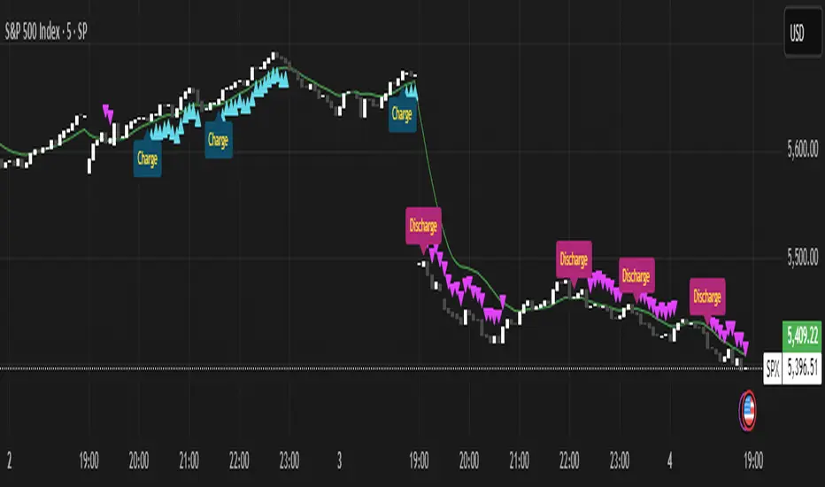
Momentum Charge Theory (MCT)-(TechnoBlooms)The Momentum Charge Theory (MCT) Indicator is an advanced physics and mathematics-inspired trend detection system designed to identify market energy shifts with precision. Unlike traditional indicators that rely on static formulas, MCT integrates entropy, volatility, kinetic energy, and wavelet transforms to map price dynamics in real time.
Built on Scientific Principles – This indicator applies quantum-inspired charge-discharge mechanics to spot early trend formations and reversals. Think of price action like an energy system: it charges (builds momentum) before an explosive move and discharges when that energy dissipates.
Core Concepts Behind MCT
1️⃣ Directional Market Entropy – Measuring Trend Strength
Entropy quantifies market randomness – is the trend structured or chaotic?
✅ A high-entropy market is uncertain (choppy price action), while a low-entropy market signals a strong directional trend.
✅ MCT normalizes entropy, allowing traders to differentiate trend acceleration from market noise.
2️⃣ Information Flow Volatility – Identifying Breakout Zones
Inspired by Econophysics, this component measures volatility based on information flow rather than simple price movements.
✅ Helps spot high-volatility breakout conditions before they occur.
✅ Filters out false breakouts caused by random market noise.
3️⃣ Kinetic Energy Momentum (KEM) – The Physics of Price Acceleration
Just like in physics, momentum is a function of mass and velocity – in trading, this translates to volume and price change.
✅ Uses kinetic energy equations to identify price acceleration zones.
✅ Helps detect momentum shifts before price visibly reacts.
4️⃣ Hilbert Transform Approximation – Slope & Trend Direction Analysis
Applies Hilbert Transforms to estimate trend angle shifts.
✅ Detects momentum decay and early reversal signals.
✅ Captures the true trend slope rather than relying on lagging moving averages.
5️⃣ Wavelet Transform – Advanced Noise Filtering & Trend Confirmation
Market movements contain multiple frequencies – wavelet transforms isolate dominant trends while removing short-term price noise.
✅ Improves trend clarity by reducing false signals.
✅ Acts as a final confirmation filter before generating Charge & Discharge signals.
Charge & Discharge – The Energy Behind Market Moves
🔹 Charge (Uptrend Activation)
A blue triangle appears below the candle when market conditions align for a strong bullish move.
📈 Indicates momentum buildup, low entropy, and trend strength confirmation.
🔸 Discharge (Downtrend Activation)
A purple triangle appears above the candle when price momentum weakens and market entropy increases.
📉 Suggests a potential trend exhaustion or reversal.
Best Use Cases for Traders
✅ Momentum Traders – Catch trend initiations before they gain full traction.
✅ Breakout Traders – Identify high-information flow zones with volatility-driven signals.
✅ Trend Followers – Avoid false signals by relying on entropy-driven confirmations.
The MCT indicator can be combined with any of your usual indicators for trend confirmation.
Smoothed Candle Averages- NovaTheMachineThis script utilizes a series of moving averages that the user is able to change as they see fit for their own use.
The averages plotted for the first 2 waves are the High-Low rays of the selected period of time with the chosen moving average style.
The Bias is the Heikin Ashi High-Low ray plotted over the chosen time period, while the Secondary Bias is a higher Timeframe Bias for the same period of time on a selected higher timeframe.
The visuals for each ray are able to be changed to either; lines, solid wave, or dynamic wave.
The Dynamic waves will change color according to the total dissection and utilize the Min-Max range selected as a weight for the strength of the trend. Thus providing an at-a-glance overview of the price relative to trend.
The key objective with this script is to gauge the longer term trend with the current price action, to establish patterns and determine strength of moves both away from and towards the moving average/bias.
When both waves are trending with the Bias, it can be reasoned that there is a strong trend established, when waves and Bias are mixed or trending sideways it can be reasoned there is a range forming or potential for a direction change. When price has broken the waves and biases we can reasonably assume that a new trend has been formed, using the waves and biases again to determine the strength and length of the trend.
The Table will display whether the current price is above or below each wave, and whether the price is continuing or retracing. The Signals plotted are used to help identify when price has broken a wave more swiftly.
Dow waveform analyzerDow Waveform Analyzer
1. Overview and Features of the Indicator
This indicator is a tool designed to analyze chart waveforms based on Dow Theory, identifying swing lows (support) and swing highs (resistance). It allows users to quickly and consistently determine trend direction. Compared to manual analysis, it provides more efficient and accurate results.
By using swing lows and swing highs, the indicator offers a more detailed understanding of trends than simple updates to highs and lows, aiding in the creation of effective trading strategies.
2. Identifying Wave Lows and Highs
Stock prices do not move in straight lines; instead, they rise and fall in waves. This indicator starts by identifying the wave lows and wave highs.
- Wave Low: The lowest point during a temporary price decline.
- Wave High: The highest point during a temporary price increase.
These are automatically identified using Pine Script’s built-in functions `pivotlow` and `pivothigh`.
3. Drawing the Waveform
The identified wave lows and highs are alternately connected to draw the waveform. However, there are cases where wave lows or highs occur consecutively:
- Consecutive Wave Lows: The lower low is used for drawing the waveform.
- Consecutive Wave Highs: The higher high is used for drawing the waveform.
4. Tracking Swing Lows/Highs and Trend Determination
Swing lows and swing highs are crucial markers that indicate the state of wave progression:
- Swing Low: The starting point of a wave (wave low) when the closing price exceeds the previous wave high.
- Swing High: The starting point of a wave (wave high) when the closing price falls below the previous wave low.
The changes in swing lows and swing highs as the waves progress allow for trend state determination.
5. Examples of Trend States
During an Uptrend:
- When the price surpasses a wave high, the swing low is updated, confirming the continuation of the uptrend.
End of an Uptrend:
- When the price falls below the swing low, the swing low disappears, and a swing high appears, signaling the end of the uptrend.
Sideways Movement:
- Swing lows and swing highs alternately appear, indicating a sideways trend.
Start of a Downtrend:
- When the price breaks below a wave low for the first time, the swing high is updated, confirming the start of the downtrend.
During a Downtrend:
- When the price breaks below a wave low, the swing high is updated, confirming the continuation of the downtrend.
End of a Downtrend:
- When the price surpasses a wave high, the swing high disappears, and a swing low reappears, signaling the end of the downtrend.
Restart of an Uptrend:
- When the swing low is updated, the uptrend resumes. The uptrend begins when the price surpasses a wave high, and the swing low is updated for the first time.
6. Applications
Trade Entries and Exits:
- Set stop orders for entry at the price level where a trend starts.
- Set stop orders for exit at the price level where a trend ends.
Trend Filtering:
- Use the indicator to confirm whether market conditions are suitable for entry based on the trend state. Analyze waveforms to aid trading strategies.
Guide for Drawing Trendlines:
- Utilize wave lows and highs as starting and ending points when drawing trendlines with drawing tools.
7. Parameters and Display Items
Pivot Points:
- Wave lows are marked with circles below the candlestick’s low, and wave highs are marked with circles above the candlestick’s high.
Number of Bars for Pivot Calculation:
- Specify the number of bars on either side used to identify highs (default: 2).
Waveform:
- Specify the color (default: blue) or toggle its visibility (default: visible).
Swing Lows/Highs:
- Displayed as large circles. The rightmost large circle on the chart indicates the current swing low or swing high. Historical swing points are also displayed to show the progression of state changes. Specify the color (default: green) or toggle visibility (default: visible).
1. インジケーターの概要と特徴
このインジケーターは、ダウ理論を基にチャートの波形を分析し、押し安値や戻り高値を特定するツールです。これにより、トレンドの方向を迅速かつ一貫して判断できます。手動での分析と比較して、効率的かつ精度の高い結果が得られる点が特徴です。
押し安値や戻り高値を利用することで、単純な高値・安値の更新よりも詳細にトレンドの状況を把握し、効果的な取引戦略の構築に役立ちます。
2. 波の谷と波の頂の特定
株価は直線的に動くのではなく、波を描きながら上昇や下落を繰り返します。このインジケーターは、まず波の谷と波の頂を特定するところから始まります。
波の谷: 一時的な下落の最安値
波の頂: 一時的な上昇の最高値
これらを Pine Script の内蔵関数(ピボットローとピボットハイ)を用いて自動的に特定しています。
3. 波形の描画方法
特定した波の谷と波の頂を交互に結んで波形を描画します。ただし、波の谷や頂が連続する場合があります。
波の谷が連続する場合: より低い谷を採用して波形を描く
波の頂が連続する場合: より高い頂を採用して波形を描く
4. 押し安値・戻り高値の追跡とトレンド判断
押し安値と戻り高値は、波の進行状況を示す重要な指標です。
押し安値: 終値が前回の高値を超えた際の波の谷
戻り高値: 終値が前回の安値を割り込んだ際の波の頂
波の進行に伴う押し安値・戻り高値の変化から、トレンドの状態を判断します。
5. トレンド状態の具体例
上昇トレンド中:
波の頂を株価が上抜け押し安値が更新され続けることで上昇トレンドを継続。
上昇トレンドの終了:
株価が押し安値を割ると、押し安値が消え、戻り高値が新たに出現して、上昇トレンドを終了。
横ばい状態:
押し安値と戻り高値が交互に切り替わる。
下降トレンドの開始:
波の谷を株価が下抜け戻り高値がはじめて更新されることで下降トレンド開始を確認。
下降トレンド中:
波の谷を株価が下抜け戻り高値が更新され続けることで下降トレンドを継続。
下降トレンドの終了:
株価が波の頂を超えると、戻り高値が消え、押し安値が再び出現して、下降トレンドを終了。
横ばい状態:
押し安値と戻り高値が交互に切り替わる。
上昇トレンドの再開:
押し安値が更新されることで上昇トレンドを確認。
波の頂を株価が上抜け押し安値がはじめて更新されることで上昇トレンド開始を確認。
6. 応用例
トレードのエントリーとエグジット:
トレンド発生の価格に逆指値を設定してエントリー。
トレンド終了の価格に逆指値を設定してエグジット。
トレンドフィルターとして活用:
エントリーに適したトレンド状況かを確認。波形を分析してトレード戦略の参考に。
トレンドラインを描く時の参考として活用:
波の谷と頂を描画ツールを使ってトレンドラインを描く時の起点や終点として活用。
7. パラメーターと表示項目
ピボット: 波の谷はローソク足の安値にサークルを表示、波の頂はローソク足の高値にサークルを表示。
ピボット計算用のバーの数: 高値を特定するために左右何本のローソク足を使用するかを設定(初期値: 2)。
波形: 色(初期値: 青)や表示(初期値: 表示)の指定。
押し安値・戻り高値: 大きなサークルで表示。チャートの一番右の大きなサークルが現在のもの。過去のものも状態変化の経緯を示すために表示。色(初期値: 緑)や表示(初期値: 表示)の指定。

Quarterly Sine Wave with Moving Averages - AYNETDescription
Sine Wave:
The sine wave oscillates with a frequency determined by frequency.
Its amplitude (amplitude) and vertical offset (offset) are adjustable.
Moving Averages:
Includes options for different types of moving averages:
SMA (Simple Moving Average).
EMA (Exponential Moving Average).
WMA (Weighted Moving Average).
HMA (Hull Moving Average).
The user can choose the type (ma_type) and the length (ma_length) via inputs.
Horizontal Lines:
highest_hype and lowest_hype are horizontal levels drawn at the user-specified values.
Quarter Markers:
Vertical lines and labels (Q1, Q2, etc.) are drawn at the start of each quarter.
Customization Options
Moving Average Type:
Switch between SMA, EMA, WMA, and HMA using the dropdown menu.
Sine Wave Frequency:
Adjust the number of oscillations per year.
Amplitude and Offset:
Control the height and center position of the sine wave.
Moving Average Length:
Change the length for any selected moving average.
Output
This indicator plots:
A sine wave that oscillates smoothly over the year, divided into quarters.
A customizable moving average calculated based on the chosen price (e.g., close).
Horizontal lines for the highest and lowest hype levels.
Vertical lines and labels marking the start of each quarter.
Let me know if you need additional features! 😊

WPO Modified [BackQuant]The Wave Period Oscillator (WPO), developed by Akram El Sherbini, is a sophisticated technical analysis tool that offers traders a dynamic way to interpret market cycles. Its design is inspired by the natural ebb and flow of markets, which often follow cyclical patterns driven by underlying economic, political, and psychological factors. The oscillator's unique contribution to market analysis lies in its ability to smooth out the "noise" inherent in daily price movements, thus providing a clearer view of the market's rhythmic fluctuations over time.
-----> Time Cycle Oscillators' in the IFTA Journal 2018 (page 66 - 77), as found below:
ifta.org
El Sherbini's WPO is grounded in the concept of wave period analysis, which suggests that financial markets move in waves or cycles. The oscillator translates these movements into a visual tool that oscillates above and below a central zero line. Peaks and troughs on the oscillator correspond to the crests and troughs of market price waves, providing a visual representation of the market's heartbeat.
The WPO is not merely a tool for identifying trends but also for detecting shifts in market momentum. It does this through a mathematical model that measures divergence—when the direction of the oscillator deviates from the direction of price movement. Such divergences can be precursors to potential reversals or continuations in the market, offering traders advance notice of significant changes in price direction.
Further refining its utility, the WPO incorporates methods for calculating divergence that are sensitive to the unique conditions of different markets and securities. This includes adjusting for volatility and market velocity, allowing the oscillator to provide relevant signals regardless of the market environment.
In practical terms, traders use the WPO to time their entries and exits with greater precision. When the oscillator shows a high peak or a deep trough, it can signal that a market is potentially overbought or oversold, respectively. The WPO's smoothing property ensures that these signals are not just reactionary to short-term price spikes or drops, but indicative of more substantial, sustained movements.
By providing a more measured and smoothed analysis of market cycles, the WPO helps to filter out insignificant price movements and focus on the ones that matter—those that indicate a significant wave of buying or selling pressure. This can be particularly valuable in the cryptocurrency markets, where volatility is high, and traditional indicators may struggle to provide clear signals.
For traders and analysts alike, the Wave Period Oscillator represents a convergence of technical precision and market psychology. By focusing on the periodic nature of market movements, it aligns traders with the rhythm of the markets, potentially leading to more harmonious trading decisions that are in step with the market's natural waves.
Please see the backtest here:
For more simple terms:
You can use this indicator as a the oscillator
Above 0 for long
Below 0 for short
OR
WPO MA
Above 0 for long
Below 0 for short

ABC on Recursive Zigzag [Trendoscope]There are several implementations of ABC pattern in tradingview and pine script. However, we have made this indicator to provide users additional quantifiable information along with flexibility to experiment and develop their own strategy based on the patterns.
🎲 Highlights of this indicator over other ABC implementations are:
Implementation is based on recursive multi level zigzag allows bigger as well as smaller patterns to be identified
Allows users to set their trading rules with respect to entry, target and stop ratios, experiment and build their own strategy based on the ABC pattern.
Back test summary including win ratio and risk reward will help users understand the profitability based on different settings being used.
🎲 Concept of ABC Pattern
The ABC pattern, also known as the "Corrective Wave" or "Zigzag Pattern," is a fundamental concept in Elliott Wave Theory, which is widely used in technical analysis to identify and predict price movements in financial markets.
The ABC pattern is a three-wave corrective pattern that typically occurs within the context of a larger impulse or trending wave. It consists of two smaller waves in the opposite direction (A and C) separated by a corrective wave (B). These waves are labeled alphabetically and represent price movements.
Wave A (Impulse Wave): Wave A is the first leg of the ABC pattern and is characterized by a strong price move in the opposite direction of the prevailing trend. It is often driven by a fundamental or sentiment-driven event that temporarily disrupts the trend.
Wave B (Corrective Wave): Wave B is the corrective wave that follows Wave A. It represents a partial retracement of Wave A's price movement. Wave B can take various forms, such as a simple correction or a complex correction (e.g., a triangle or a flat correction). It typically doesn't retrace the entire length of Wave A.
Wave C (Impulse Wave): Wave C is the final leg of the ABC pattern and is characterized by a strong price move in the same direction as the prevailing trend. It often surpasses the starting point of Wave A and confirms the resumption of the larger trend.
🎲 Indicator Components
Upon loading the indicator on the chart, we can observe the following components on the chart.
Pattern Drawings is the graphical representation of present patterns. Please note that it is not necessary for patterns to be there on the chart all the time. Patterns will appear on the chart when price makes the patterns.
Trade Box is the box representing trade signals of the pattern. These trade levels are generated based on the user settings.
Summary Table is the back test summary containing details of historical pattern performance including Win Ratio and Risk Reward.
🎲 Indicator Settings
Details of each user settings are provided in the tooltips. Below is the snapshot of it.
🎲 Alerts
Basic level of alerts are built in the script using alert function to highlight the following conditions:
New ABC Pattern
Updates to existing Pattern
Both conditions will alert simple text messages. There is not much customization provided as part of this indicator. We will consider providing more options in future versions based on the interest and demand shown by users.

Bitcoin Market Cap wave model weeklyThis Bitcoin Market Cap wave model indicator is rooted in the foundation of my previously developed tool, the : Bitcoin wave model
To derive the Total Market Cap from the Bitcoin wave price model, I employed a straightforward estimation for the Total Market Supply (TMS). This estimation relies on the formula:
TMS <= (1 - 2^(-h)) for any h.This equation holds true for any value of h, which will be elaborated upon shortly. It is important to note that this inequality becomes the equality at the dates of halvings, diverging only slightly during other periods.
Bitcoin wave model is based on the logarithmic regression model and the sinusoidal waves, induced by the halving events.
This chart presents the outcome of an in-depth analysis of the complete set of Bitcoin price data available from October 2009 to August 2023.
The central concept is that the logarithm of the Bitcoin price closely adheres to the logarithmic regression model. If we plot the logarithm of the price against the logarithm of time, it forms a nearly straight line.
The parameters of this model are provided in the script as follows: log(BTCUSD) = 1.48 + 5.44log(h).
The secondary concept involves employing the inherent time unit of Bitcoin instead of days:
'h' denotes a slightly adjusted time measurement intrinsic to the Bitcoin blockchain. It can be approximated as (days since the genesis block) * 0.0007. Precisely, 'h' is defined as follows: h = 0 at the genesis block, h = 1 at the first halving block, and so forth. In general, h = block height / 210,000.
Adjustments are made to account for variations in block creation time.
The third concept revolves around investigating halving waves triggered by supply shock events resulting from the halvings. These halvings occur at regular intervals in Bitcoin's native time 'h'. All halvings transpire when 'h' is an integer. These events induce waves with intervals denoted as h = 1.
Consequently, we can model these waves using a sin(2pih - a) function. The parameter determining the time shift is assessed as 'a = 0.4', aligning with earlier expectations for halving events and their subsequent outcomes.
The fourth concept introduces the notion that the waves gradually diminish in amplitude over the progression of "time h," diminishing at a rate of 0.7^h.
Lastly, we can create bands around the modeled sinusoidal waves. The upper band is derived by multiplying the sine wave by a factor of 3.1*(1-0.16)^h, while the lower band is obtained by dividing the sine wave by the same factor, 3.1*(1-0.16)^h.
The current bandwidth is 2.5x. That means that the upper band is 2.5 times the lower band. These bands are forming an exceptionally narrow predictive channel for Bitcoin. Consequently, a highly accurate estimation of the peak of the next cycle can be derived.
The prediction indicates that the zenith past the fourth halving, expected around the summer of 2025, could result in Total Bitcoin Market Cap ranging between 4B and 5B USD.
The projections to the future works well only for weekly timeframe.
Enjoy the mathematical insights!
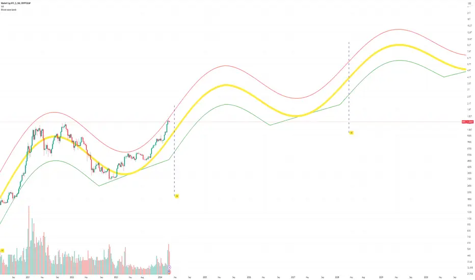
Bitcoin wave modelBitcoin wave model is based on the logarithmic regression model and the sinusoidal waves, induced by the halving events.
This chart presents the outcome of an in-depth analysis of the complete set of Bitcoin price data available from October 2009 to August 2023.
The central concept is that the logarithm of the Bitcoin price closely adheres to the logarithmic regression model. If we plot the logarithm of the price against the logarithm of time, it forms a nearly straight line.
The parameters of this model are provided in the script as follows: log (BTCUSD) = 1.48 + 5.44log(h).
The secondary concept involves employing the inherent time unit of Bitcoin instead of days:
'h' denotes a slightly adjusted time measurement intrinsic to the Bitcoin blockchain. It can be approximated as (days since the genesis block) * 0.0007. Precisely, 'h' is defined as follows: h = 0 at the genesis block, h = 1 at the first halving block, and so forth. In general, h = block height / 210,000.
Adjustments are made to account for variations in block creation time.
The third concept revolves around investigating halving waves triggered by supply shock events resulting from the halvings. These halvings occur at regular intervals in Bitcoin's native time 'h'. All halvings transpire when 'h' is an integer. These events induce waves with intervals denoted as h = 1.
Consequently, we can model these waves using a sin(2pih - a) function. The parameter determining the time shift is assessed as 'a = 0.4', aligning with earlier expectations for halving events and their subsequent outcomes.
The fourth concept introduces the notion that the waves gradually diminish in amplitude over the progression of "time h," diminishing at a rate of 0.7^h.
Lastly, we can create bands around the modeled sinusoidal waves. The upper band is derived by multiplying the sine wave by a factor of 3.1*(1-0.16)^h, while the lower band is obtained by dividing the sine wave by the same factor, 3.1*(1-0.16)^h.
The current bandwidth is 2.5x. That means that the upper band is 2.5 times the lower band. These bands are forming an exceptionally narrow predictive channel for Bitcoin. Consequently, a highly accurate estimation of the peak of the next cycle can be derived.
The prediction indicates that the zenith past the fourth halving, expected around the summer of 2025, could result in prices ranging between 200,000 and 240,000 USD.
Enjoy the mathematical insights!
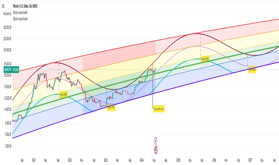
Market SniperThis Pine Script is a simplified trading algorithm designed to detect and signal potential buying and selling points based on the WaveTrend Oscillator and the volume traded.
Inputs and Setup:
The script initiates by defining key parameters: 'Wave Channel Length' (n1) set at 9 and 'Wave Average Length' (n2) set at 12. It also establishes a 'Volume Multiplier' (set at 2), and a 'Lookback Period' for volume calculation (set at 60 minutes). These values can be customized according to user preferences.
WaveTrend Oscillator Calculation:
It then calculates the WaveTrend Oscillator. The WaveTrend Oscillator is a momentum-based indicator that determines trend direction and potential reversal points. This is accomplished by applying an exponential moving average (EMA) and a simple moving average (SMA) to the average price data.
Volume Average Calculation:
Simultaneously, the script calculates the simple moving average of the volume over the defined 'Lookback Period'.
Buy and Sell Signals Definition:
The core of the trading signals lies in the crossing of the two lines of the WaveTrend Oscillator (wt1 and wt2) and whether the volume is higher than a certain threshold (defined by the 'Volume Multiplier' times the average volume). Specifically:
A 'Buy' signal is defined when the wt1 line crosses up the wt2 line and the volume is greater than the 'Volume Multiplier' times the average volume.
Conversely, a 'Sell' signal is defined when the wt1 line crosses down the wt2 line and the volume is greater than the 'Volume Multiplier' times the average volume.
Signal Plotting and Alert Creation:
Each time a 'Buy' or 'Sell' condition is met, the script plots a corresponding label directly on the price chart: a 'Buy' label below the bars for buy signals, and a 'Sell' label above the bars for sell signals. Additionally, it sets alerts based on these 'Buy' and 'Sell' signals with corresponding messages.