Flux-Tensor Singularity [FTS]Flux-Tensor Singularity - Multi-Factor Market Pressure Indicator
The Flux-Tensor Singularity (FTS) is an advanced multi-factor oscillator that combines volume analysis, momentum tracking, and volatility-weighted normalization to identify critical market inflection points. Unlike traditional single-factor indicators, FTS synthesizes price velocity, volume mass, and volatility context into a unified framework that adapts to changing market regimes.
This indicator identifies extreme market conditions (termed "singularities") where multiple confirming factors converge, then uses a sophisticated scoring system to determine directional bias. It is designed for traders seeking high-probability setups with built-in confluence requirements.
THEORETICAL FOUNDATION
The indicator is built on the premise that market time is not constant - different market conditions contain varying levels of information density. A 1-minute bar during a major news event contains far more actionable information than a 1-minute bar during overnight low-volume trading. Traditional indicators treat all bars equally; FTS does not.
The theoretical framework draws conceptual parallels to physics (purely as a mental model, not literal physics):
Volume as Mass: Large volume represents significant market participation and "weight" behind price moves. Just as massive objects have stronger gravitational effects, high-volume moves carry more significance.
Price Change as Velocity: The rate of price movement through price space represents momentum and directional force.
Volatility as Time Dilation: When volatility is high relative to its historical norm, the "information density" of each bar increases. The indicator weights these periods more heavily, similar to how time dilates near massive objects in physics.
This is a pedagogical metaphor to create a coherent mental model - the underlying mathematics are standard financial calculations combined in a novel way.
MATHEMATICAL FRAMEWORK
The indicator calculates a composite singularity value through four distinct steps:
Step 1: Raw Singularity Calculation
S_raw = (ΔP × V) × γ²
Where:
ΔP = Price Velocity = close - close
V = Volume Mass = log(volume + 1)
γ² = Time Dilation Factor = (ATR_local / ATR_global)²
Volume Transformation: Volume is log-transformed because raw volume can have extreme outliers (10x-100x normal). The logarithm compresses these spikes while preserving their significance. This is standard practice in volume analysis.
Volatility Weighting: The ratio of short-term ATR (5 periods) to long-term ATR (user-defined lookback) is squared to create a volatility amplification factor. When local volatility exceeds global volatility, this ratio increases, amplifying the raw singularity value. This makes the indicator regime-aware.
Step 2: Normalization
The raw singularity values are normalized to a 0-100 scale using a stochastic-style calculation:
S_normalized = ((S_raw - S_min) / (S_max - S_min)) × 100
Where S_min and S_max are the lowest and highest raw singularity values over the lookback period.
Step 3: Epsilon Compression
S_compressed = 50 + ((S_normalized - 50) / ε)
This is the critical innovation that makes the sensitivity control functional. By applying compression AFTER normalization, the epsilon parameter actually affects the final output:
ε < 1.0: Expands range (more signals)
ε = 1.0: No change (default)
ε > 1.0: Compresses toward 50 (fewer, higher-quality signals)
For example, with ε = 2.0, a normalized value of 90 becomes 70, making threshold breaches rarer and more significant.
Step 4: Smoothing
S_final = EMA(S_compressed, smoothing_period)
An exponential moving average removes high-frequency noise while preserving trend.
SIGNAL GENERATION LOGIC
When the tensor crosses above the upper threshold (default 90) or below the lower threshold (default 10), an extreme event is detected. However, the indicator does NOT immediately generate a buy or sell signal. Instead, it analyzes market context through a multi-factor scoring system:
Scoring Components:
Price Structure (+1 point): Current bar bullish/bearish
Momentum (+1 point): Price higher/lower than N bars ago
Trend Context (+2 points): Fast EMA above/below slow EMA (weighted heavier)
Acceleration (+1 point): Rate of change increasing/decreasing
Volume Multiplier (×1.5): If volume > average, multiply score
The highest score (bullish vs bearish) determines signal direction. This prevents the common indicator failure mode of "overbought can stay overbought" by requiring directional confirmation.
Signal Conditions:
A BUY signal requires:
Extreme event detection (tensor crosses threshold)
Bullish score > Bearish score
Price confirmation: Bullish candle (optional, user-controlled)
Volume confirmation: Volume > average (optional, user-controlled)
Momentum confirmation: Positive momentum (optional, user-controlled)
A SELL signal requires the inverse conditions.
INPUTS EXPLAINED - Core Parameters:
Global Horizon (Context): Default 20. Lookback period for normalization and volatility comparison. Higher values = smoother but less responsive. Lower values = more signals but potentially more noise.
Tensor Smoothing: Default 3. EMA period applied to final output. Removes "quantum foam" (high-frequency noise). Range 1-20.
Singularity Threshold: Default 90. Values above this (or below 100-threshold) trigger extreme event detection. Higher = rarer, stronger signals.
Signal Sensitivity (Epsilon): Default 1.0. Post-normalization compression factor. This is the key innovation - it actually works because it's applied AFTER normalization. Range 0.1-5.0.
Signal Interpreter Toggles:
Require Price Confirmation: Default ON. Only generates buy signals on bullish candles, sell signals on bearish candles. Reduces false signals but may delay entry.
Require Volume Confirmation: Default ON. Only signals when volume > average. Critical for stocks/crypto, less important for forex (unreliable volume data).
Use Momentum Filter: Default ON. Requires momentum agreement with signal direction. Prevents counter-trend signals.
Momentum Lookback: Default 5. Number of bars for momentum calculation. Shorter = more responsive, longer = trend-following bias.
Visual Controls:
Colors: Customizable colors for bullish flux, bearish flux, background, and event horizon.
Visual Transparency: Default 85. Master control for all visual elements (accretion disk, field lines, particles, etc.). Range 50-99. Signals and dashboard have separate controls.
Visibility Toggles: Individual on/off switches for:
Gravitational field lines (trend EMAs)
Field reversals (trend crossovers)
Accretion disk (background gradient)
Singularity diamonds (neutral extreme events)
Energy particles (volume bursts)
Event horizon flash (extreme event background)
Signal background flash
Signal Size: Tiny/Small/Normal triangle size
Signal Offsets: Separate controls for buy and sell signal vertical positioning (percentage of price)
Dashboard Settings:
Show Dashboard: Toggle on/off
Position: 9 placement options (all corners, centers, middles)
Text Size: Tiny/Small/Normal/Large
Background Transparency: 0-50, separate from visual transparency
VISUAL ELEMENTS EXPLAINED
1. Accretion Disk (Background Gradient):
A three-layer gradient background that intensifies as the tensor approaches extremes. The outer disk appears at any non-neutral reading, the inner disk activates above 70 or below 30, and the core layer appears above 85 or below 15. Color indicates direction (cyan = bullish, red = bearish). This provides instant visual feedback on market pressure intensity.
2. Gravitational Field Lines (EMAs):
Two trend-following EMAs (10 and 30 period) visualized as colored lines. These represent the "curvature" of market trend - when they diverge, trend is strong; when they converge, trend is weakening. Crossovers mark potential trend reversals.
3. Field Reversals (Circles):
Small circles appear when the fast EMA crosses the slow EMA, indicating a potential trend change. These are distinct from extreme events and appear at normal market structure shifts.
4. Singularity Diamonds:
Small diamond shapes appear when the tensor reaches extreme levels (>90 or <10) but doesn't meet the full signal criteria. These are "watch" events - extreme pressure exists but directional confirmation is lacking.
5. Energy Particles (Dots):
Tiny dots appear when volume exceeds 2× average, indicating significant participation. Color matches bar direction. These highlight genuine high-conviction moves versus low-volume drifts.
6. Event Horizon Flash:
A golden background flash appears the instant any extreme threshold is breached, before directional analysis. This alerts you to pay attention.
7. Signal Background Flash:
When a full buy/sell signal is confirmed, the background flashes cyan (buy) or red (sell). This is your primary alert that all conditions are met.
8. Signal Triangles:
The actual buy (▲) and sell (▼) markers. These only appear when ALL selected confirmation criteria are satisfied. Position is offset from bars to avoid overlap with other indicators.
DASHBOARD METRICS EXPLAINED
The dashboard displays real-time calculated values:
Event Density: Current tensor value (0-100). Above 90 or below 10 = critical. Icon changes: 🔥 (extreme high), ❄️ (extreme low), ○ (neutral).
Time Dilation (γ): Current volatility ratio squared. Values >2.0 indicate extreme volatility environments. >1.5 = elevated, >1.0 = above average. Icon: ⚡ (extreme), ⚠ (elevated), ○ (normal).
Mass (Vol): Log-transformed volume value. Compared to volume ratio (current/average). Icon: ● (>2× avg), ◐ (>1× avg), ○ (below avg).
Velocity (ΔP): Raw price change. Direction arrow indicates momentum direction. Shows the actual price delta value.
Bullish Flux: Current bullish context score. Displayed as both a bar chart (visual) and numeric value. Brighter when bullish score dominates.
Bearish Flux: Current bearish context score. Same visualization as bullish flux. These scores compete - the winner determines signal direction.
Field: Trend direction based on EMA relationship. "Repulsive" (uptrend), "Attractive" (downtrend), "Neutral" (ranging). Icon: ⬆⬇↔
State: Current market condition:
🚀 EJECTION: Buy signal active
💥 COLLAPSE: Sell signal active
⚠ CRITICAL: Extreme event, no directional confirmation
● STABLE: Normal market conditions
HOW TO USE THE INDICATOR
1. Wait for Extreme Events:
The indicator is designed to be selective. Don't trade every fluctuation - wait for tensor to reach >90 or <10. This alone is not a signal.
2. Check Context Scores:
Look at the Bullish Flux vs Bearish Flux in the dashboard. If scores are close (within 1-2 points), the market is indecisive - skip the trade.
3. Confirm with Signals:
Only act when a full triangle signal appears (▲ or ▼). This means ALL your selected confirmation criteria have been met.
4. Use with Price Structure:
Combine with support/resistance levels. A buy signal AT support is higher probability than a buy signal in the middle of nowhere.
5. Respect the Dashboard State:
When State shows "CRITICAL" (⚠), it means extreme pressure exists but direction is unclear. These are the most dangerous moments - wait for resolution.
6. Volume Matters:
Energy particles (dots) and the Mass metric tell you if institutions are participating. Signals without volume confirmation are lower probability.
MARKET AND TIMEFRAME RECOMMENDATIONS
Scalping (1m-5m):
Lookback: 10-14
Smoothing: 5-7
Threshold: 85
Epsilon: 0.5-0.7
Note: Expect more noise. Confirm with Level 2 data. Best on highly liquid instruments.
Intraday (15m-1h):
Lookback: 20-30 (default settings work well)
Smoothing: 3-5
Threshold: 90
Epsilon: 1.0
Note: Sweet spot for the indicator. High win rate on liquid stocks, forex majors, and crypto.
Swing Trading (4h-1D):
Lookback: 30-50
Smoothing: 3
Threshold: 90-95
Epsilon: 1.5-2.0
Note: Signals are rare but high conviction. Combine with higher timeframe trend analysis.
Position Trading (1D-1W):
Lookback: 50-100
Smoothing: 5-7
Threshold: 95
Epsilon: 2.0-3.0
Note: Extremely rare signals. Only trade the most extreme events. Expect massive moves.
Market-Specific Settings:
Forex (EUR/USD, GBP/USD, etc.):
Volume data is unreliable (spot forex has no centralized volume)
Disable "Require Volume Confirmation"
Focus on momentum and trend filters
News events create extreme singularities
Best on 15m-1h timeframes
Stocks (High-Volume Equities):
Volume confirmation is CRITICAL - keep it ON
Works excellently on AAPL, TSLA, SPY, etc.
Morning session (9:30-11:00 ET) shows highest event density
Earnings announcements create guaranteed extreme events
Best on 5m-1h for day trading, 1D for swing trading
Crypto (BTC, ETH, major alts):
Reduce threshold to 85 (crypto has constant high volatility)
Volume spikes are THE primary signal - keep volume confirmation ON
Works exceptionally well due to 24/7 trading and high volatility
Epsilon can be reduced to 0.7-0.8 for more signals
Best on 15m-4h timeframes
Commodities (Gold, Oil, etc.):
Gold responds to macro events (Fed announcements, geopolitical events)
Oil responds to supply shocks
Use daily timeframe minimum
Increase lookback to 50+
These are slow-moving markets - be patient
Indices (SPX, NDX, etc.):
Institutional volume matters - keep volume confirmation ON
Opening hour (9:30-10:30 ET) = highest singularity probability
Strong correlation with VIX - high VIX = more extreme events
Best on 15m-1h for day trading
WHAT MAKES THIS INDICATOR UNIQUE
1. Post-Normalization Sensitivity Control:
Unlike most oscillators where sensitivity controls don't actually work (they're applied before normalization, which then rescales everything), FTS applies epsilon compression AFTER normalization. This means the sensitivity parameter genuinely affects signal frequency. This is a novel implementation not found in standard oscillators.
2. Multi-Factor Confluence Requirement:
The indicator doesn't just detect "overbought" or "oversold" - it detects extreme conditions AND THEN analyzes context through five separate factors (price structure, momentum, trend, acceleration, volume). Most indicators are single-factor; FTS requires confluence.
3. Volatility-Weighted Normalization:
By squaring the ATR ratio (local/global), the indicator adapts to changing market regimes. A 1% move in a low-volatility environment is treated differently than a 1% move in a high-volatility environment. Traditional indicators treat all moves equally regardless of context.
4. Volume Integration at the Core:
Volume isn't an afterthought or optional filter - it's baked into the fundamental equation as "mass." The log transformation handles outliers elegantly while preserving significance. Most price-based indicators completely ignore volume.
5. Adaptive Scoring System:
Rather than fixed buy/sell rules ("RSI >70 = sell"), FTS uses competitive scoring where bullish and bearish evidence compete. The winner determines direction. This solves the classic problem of "overbought markets can stay overbought during strong uptrends."
6. Comprehensive Visual Feedback:
The multi-layer visualization system (accretion disk, field lines, particles, flashes) provides instant intuitive feedback on market state without requiring dashboard reading. You can see pressure building before extreme thresholds are hit.
7. Separate Extreme Detection and Signal Generation:
"Singularity diamonds" show extreme events that don't meet full criteria, while "signal triangles" only appear when ALL conditions are met. This distinction helps traders understand when pressure exists versus when it's actionable.
COMPARISON TO EXISTING INDICATORS
vs. RSI/Stochastic:
These normalize price relative to recent range. FTS normalizes (price change × log volume × volatility ratio) - a composite metric, not just price position.
vs. Chaikin Money Flow:
CMF combines price and volume but lacks volatility context and doesn't use adaptive normalization or post-normalization compression.
vs. Bollinger Bands + Volume:
Bollinger Bands show volatility but don't integrate volume or create a unified oscillator. They're separate components, not synthesized.
vs. MACD:
MACD is pure momentum. FTS combines momentum with volume weighting and volatility context, plus provides a normalized 0-100 scale.
The specific combination of log-volume weighting, squared volatility amplification, post-normalization epsilon compression, and multi-factor directional scoring is unique to this indicator.
LIMITATIONS AND PROPER DISCLOSURE
Not a Holy Grail:
No indicator is perfect. This tool identifies high-probability setups but cannot predict the future. Losses will occur. Use proper risk management.
Requires Confirmation:
Best used in conjunction with price action analysis, support/resistance levels, and higher timeframe trend. Don't trade signals blindly.
Volume Data Dependency:
On forex (spot) and some low-volume instruments, volume data is unreliable or tick-volume only. Disable volume confirmation in these cases.
Lagging Components:
The EMA smoothing and trend filters are inherently lagging. In extremely fast moves, signals may appear after the initial thrust.
Extreme Event Rarity:
With conservative settings (high threshold, high epsilon), signals can be rare. This is by design - quality over quantity. If you need more frequent signals, reduce threshold to 85 and epsilon to 0.7.
Not Financial Advice:
This indicator is an analytical tool. All trading decisions and their consequences are solely your responsibility. Past performance does not guarantee future results.
BEST PRACTICES
Don't trade every singularity - wait for context confirmation
Higher timeframes = higher reliability
Combine with support/resistance for entry refinement
Volume confirmation is CRITICAL for stocks/crypto (toggle off only for forex)
During major news events, singularities are inevitable but direction may be uncertain - use wider stops
When bullish and bearish flux scores are close, skip the trade
Test settings on your specific instrument/timeframe before live trading
Use the dashboard actively - it contains critical diagnostic information
Taking you to school. — Dskyz, Trade with insight. Trade with anticipation.
ابحث في النصوص البرمجية عن "黄金近50年的走势"

RSI VWAP EMA ON CHART1. Understand the components
VWAP (Volume Weighted Average Price)
Green: price is above VWAP → bullish trend
Red: price is below VWAP → bearish trend
Blue: price exactly at VWAP → neutral
Acts as a dynamic trend line and support/resistance.
4 Moving Averages (MA1–MA4)
Customizable lengths and type (SMA or EMA).
Useful for trend confirmation and dynamic support/resistance.
Typically:
MA1 = fastest (short-term)
MA4 = slowest (long-term)
When price is above multiple MAs → strong bullish trend; below → bearish trend.
RSI Overlay with VWAP Alignment
RSI line normalized to price scale.
Background shading indicates momentum aligned with VWAP trend:
Green shading: RSI > 50 and price above VWAP → bullish momentum
Red shading: RSI < 50 and price below VWAP → bearish momentum
Gray areas: neutral or momentum does not align with VWAP.
2. Basic usage workflow
Trend Confirmation
Look at VWAP color: price above → bullish, below → bearish.
Check RSI + VWAP shading: green confirms bullish momentum, red confirms bearish momentum.
Check MA alignment: shorter MAs above longer MAs = stronger bullish trend; vice versa for bearish.
Entry Signals (Scalping)
Long (Buy) Setup
Price above VWAP (green)
RSI green shading (RSI > 50)
Shorter MAs above longer MAs (trend support)
Short (Sell) Setup
Price below VWAP (red)
RSI red shading (RSI < 50)
Shorter MAs below longer MAs
Exits / Stops
Exit if price closes against VWAP trend (e.g., price drops below VWAP during a bullish trade).
Use nearest MA support/resistance as stop-loss or take-profit zones.
3. Optional adjustments for scalping
RSI length / thresholds
Shorter RSI (7–10) → faster response for scalping.
Standard RSI (14) → smoother, fewer false signals.
MA lengths
Short-term: 20–50
Medium-term: 50–100
Long-term: 100–200
Can tweak for the timeframe you trade (1m, 5m, 15m).
Timeframe
VWAP works best on intraday charts (1m, 5m, 15m).
Use higher timeframe (e.g., 15m or 1h) for trend direction and lower timeframe (1m–5m) for entries.
4. Example Scalping Setup
Bullish setup (buy):
Price above VWAP → VWAP green
RSI > 50 and green shading
Shorter MAs above longer MAs
Enter on small pullback or breakout
Stop: below nearest MA or VWAP
Bearish setup (sell):
Price below VWAP → VWAP red
RSI < 50 and red shading
Shorter MAs below longer MAs
Enter on minor bounce or breakdown
Stop: above nearest MA or VWAP
5. Visual cues summary
Element Interpretation
VWAP Green Price above VWAP → bullish trend
VWAP Red Price below VWAP → bearish trend
RSI Green Shading Bullish momentum aligns with VWAP
RSI Red Shading Bearish momentum aligns with VWAP
MA Alignment Trend strength (short above long = bullish, short below long = bearish)

VWAP + 4 MAs with RSI Overlay & VWAP Alignment1. Understand the components
VWAP (Volume Weighted Average Price)
Green: price is above VWAP → bullish trend
Red: price is below VWAP → bearish trend
Blue: price exactly at VWAP → neutral
Acts as a dynamic trend line and support/resistance.
4 Moving Averages (MA1–MA4)
Customizable lengths and type (SMA or EMA).
Useful for trend confirmation and dynamic support/resistance.
Typically:
MA1 = fastest (short-term)
MA4 = slowest (long-term)
When price is above multiple MAs → strong bullish trend; below → bearish trend.
RSI Overlay with VWAP Alignment
RSI line normalized to price scale.
Background shading indicates momentum aligned with VWAP trend:
Green shading: RSI > 50 and price above VWAP → bullish momentum
Red shading: RSI < 50 and price below VWAP → bearish momentum
Gray areas: neutral or momentum does not align with VWAP.
2. Basic usage workflow
Trend Confirmation
Look at VWAP color: price above → bullish, below → bearish.
Check RSI + VWAP shading: green confirms bullish momentum, red confirms bearish momentum.
Check MA alignment: shorter MAs above longer MAs = stronger bullish trend; vice versa for bearish.
Entry Signals (Scalping)
Long (Buy) Setup
Price above VWAP (green)
RSI green shading (RSI > 50)
Shorter MAs above longer MAs (trend support)
Short (Sell) Setup
Price below VWAP (red)
RSI red shading (RSI < 50)
Shorter MAs below longer MAs
Exits / Stops
Exit if price closes against VWAP trend (e.g., price drops below VWAP during a bullish trade).
Use nearest MA support/resistance as stop-loss or take-profit zones.
3. Optional adjustments for scalping
RSI length / thresholds
Shorter RSI (7–10) → faster response for scalping.
Standard RSI (14) → smoother, fewer false signals.
MA lengths
Short-term: 20–50
Medium-term: 50–100
Long-term: 100–200
Can tweak for the timeframe you trade (1m, 5m, 15m).
Timeframe
VWAP works best on intraday charts (1m, 5m, 15m).
Use higher timeframe (e.g., 15m or 1h) for trend direction and lower timeframe (1m–5m) for entries.
4. Example Scalping Setup
Bullish setup (buy):
Price above VWAP → VWAP green
RSI > 50 and green shading
Shorter MAs above longer MAs
Enter on small pullback or breakout
Stop: below nearest MA or VWAP
Bearish setup (sell):
Price below VWAP → VWAP red
RSI < 50 and red shading
Shorter MAs below longer MAs
Enter on minor bounce or breakdown
Stop: above nearest MA or VWAP
5. Visual cues summary
Element Interpretation
VWAP Green Price above VWAP → bullish trend
VWAP Red Price below VWAP → bearish trend
RSI Green Shading Bullish momentum aligns with VWAP
RSI Red Shading Bearish momentum aligns with VWAP
MA Alignment Trend strength (short above long = bullish, short below long = bearish)

Market Electromagnetic Field [The_lurker]Market Electromagnetic Field
An innovative analytical indicator that presents a completely new model for understanding market dynamics, inspired by the laws of electromagnetic physics — but it's not a rhetorical metaphor, rather a complete mathematical system.
Unlike traditional indicators that focus on price or momentum, this indicator portrays the market as a closed physical system, where:
⚡ Candles = Electric charges (positive at bullish close, negative at bearish)
⚡ Buyers and Sellers = Two opposing poles where pressure accumulates
⚡ Market tension = Voltage difference between the poles
⚡ Price breakout = Electrical discharge after sufficient energy accumulation
█ Core Concept
Markets don't move randomly, but follow a clear physical cycle:
Accumulation → Tension → Discharge → Stabilization → New Accumulation
When charges accumulate (through strong candles with high volume) and exceed a certain "electrical capacitance" threshold, the indicator issues a "⚡ DISCHARGE IMMINENT" alert — meaning a price explosion is imminent, giving the trader an opportunity to enter before the move begins.
█ Competitive Advantage
- Predictive forecasting (not confirmatory after the event)
- Smart multi-layer filtering reduces false signals
- Animated 3D visual representation makes reading price conditions instant and intuitive — without need for number analysis
█ Theoretical Physical Foundation
The indicator doesn't use physical terms for decoration, but applies mathematical laws with precise market adjustments:
⚡ Coulomb's Law
Physics: F = k × (q₁ × q₂) / r²
Market: Field Intensity = 4 × norm_positive × norm_negative
Peaks at equilibrium (0.5 × 0.5 × 4 = 1.0), and decreases at dominance — because conflict increases at parity.
⚡ Ohm's Law
Physics: V = I × R
Market: Voltage = norm_positive − norm_negative
Measures balance of power:
- +1 = Absolute buying dominance
- −1 = Absolute selling dominance
- 0 = Balance
⚡ Capacitance
Physics: C = Q / V
Market: Capacitance = |Voltage| × Field Intensity
Represents stored energy ready for discharge — increases with bias combined with high interaction.
⚡ Electrical Discharge
Physics: Occurs when exceeding insulation threshold
Market: Discharge Probability = min(Capacitance / Discharge Threshold, 1.0)
When ≥ 0.9: "⚡ DISCHARGE IMMINENT"
📌 Key Note:
Maximum capacitance doesn't occur at absolute dominance (where field intensity = 0), nor at perfect balance (where voltage = 0), but at moderate bias (±30–50%) with high interaction (field intensity > 25%) — i.e., in moments of "pressure before breakout".
█ Detailed Calculation Mechanism
⚡ Phase 1: Candle Polarity
polarity = (close − open) / (high − low)
- +1.0: Complete bullish candle (Bullish Marubozu)
- −1.0: Complete bearish candle (Bearish Marubozu)
- 0.0: Doji (no decision)
- Intermediate values: Represent the ratio of candle body to its range — reducing the effect of long-shadow candles
⚡ Phase 2: Volume Weight
vol_weight = volume / SMA(volume, lookback)
A candle with 150% of average volume = 1.5x stronger charge
⚡ Phase 3: Adaptive Factor
adaptive_factor = ATR(lookback) / SMA(ATR, lookback × 2)
- In volatile markets: Increases sensitivity
- In quiet markets: Reduces noise
- Always recommended to keep it enabled
⚡ Phase 4–6: Charge Accumulation and Normalization
Charges are summed over lookback candles, then ratios are normalized:
norm_positive = positive_charge / total_charge
norm_negative = negative_charge / total_charge
So that: norm_positive + norm_negative = 1 — for easier comparison
⚡ Phase 7: Field Calculations
voltage = norm_positive − norm_negative
field_intensity = 4 × norm_positive × norm_negative × field_sensitivity
capacitance = |voltage| × field_intensity
discharge_prob = min(capacitance / discharge_threshold, 1.0)
█ Settings
⚡ Electromagnetic Model
Lookback Period
- Default: 20
- Range: 5–100
- Recommendations:
- Scalping: 10–15
- Day Trading: 20
- Swing: 30–50
- Investing: 50–100
Discharge Threshold
- Default: 0.7
- Range: 0.3–0.95
- Recommendations:
- Speed + Noise: 0.5–0.6
- Balance: 0.7
- High Accuracy: 0.8–0.95
Field Sensitivity
- Default: 1.0
- Range: 0.5–2.0
- Recommendations:
- Amplify Conflict: 1.2–1.5
- Natural: 1.0
- Calm: 0.5–0.8
Adaptive Mode
- Default: Enabled
- Always keep it enabled
🔬 Dynamic Filters
All enabled filters must pass for discharge signal to appear.
Volume Filter
- Condition: volume > SMA(volume) × vol_multiplier
- Function: Excludes "weak" candles not supported by volume
- Recommendation: Enabled (especially for stocks and forex)
Volatility Filter
- Condition: STDEV > SMA(STDEV) × 0.5
- Function: Ignores sideways stagnation periods
- Recommendation: Always enabled
Trend Filter
- Condition: Voltage alignment with fast/slow EMA
- Function: Reduces counter-trend signals
- Recommendation: Enabled for swing/investing only
Volume Threshold
- Default: 1.2
- Recommendations:
- 1.0–1.2: High sensitivity
- 1.5–2.0: Exclusive to high volume
🎨 Visual Settings
Settings improve visual reading experience — don't affect calculations.
Scale Factor
- Default: 600
- Higher = Larger scene (200–1200)
Horizontal Shift
- Default: 180
- Horizontal shift to the left — to focus on last candle
Pole Size
- Default: 60
- Base sphere size (30–120)
Field Lines
- Default: 8
- Number of field lines (4–16) — 8 is ideal balance
Colors
- Green/Red/Blue/Orange
- Fully customizable
█ Visual Representation: A Visual Language for Diagnosing Price Conditions
✨ Design Philosophy
The representation isn't "decoration", but a complete cognitive model — each element carries information, and element interaction tells a complete story.
The brain perceives changes in size, color, and movement 60,000 times faster than reading numbers — so you can "sense" the change before your eye finishes scanning.
═════════════════════════════════════════════════════════════
🟢 Positive Pole (Green Sphere — Left)
═════════════════════════════════════════════════════════════
What does it represent?
Active buying pressure accumulation — not just an uptrend, but real demand force supported by volume and volatility.
● Dynamic Size
Size = pole_size × (0.7 + norm_positive × 0.6)
- 70% of base size = No significant charge
- 130% of base size = Complete dominance
- The larger the sphere: Greater buyer dominance, higher probability of bullish continuation
Size Interpretation:
- Large sphere (>55%): Strong buying pressure — Buyers dominate
- Medium sphere (45–55%): Relative balance with buying bias
- Small sphere (<45%): Weak buying pressure — Sellers dominate
● Lighting and Transparency
- 20% transparency (when Bias = +1): Pole currently active — Bullish direction
- 50% transparency (when Bias ≠ +1): Pole inactive — Not the prevailing direction
Lighting = Current activity, while Size = Historical accumulation
● Pulsing Inner Glow
A smaller sphere pulses automatically when Bias = +1:
inner_pulse = 0.4 + 0.1 × sin(anim_time × 3)
Symbolizes continuity of buy order flow — not static dominance.
● Orbital Rings
Two rings rotating at different speeds and directions:
- Inner: 1.3× sphere size — Direct influence range
- Outer: 1.6× sphere size — Extended influence range
Represent "influence zone" of buyers:
- Continuous rotation = Stability and momentum
- Slowdown = Momentum exhaustion
● Percentage
Displayed below sphere: norm_positive × 100
- >55% = Clear dominance
- 45–55% = Balance
- <45% = Weakness
═════════════════════════════════════════════════════════════
🔴 Negative Pole (Red Sphere — Right)
═════════════════════════════════════════════════════════════
What does it represent?
Active selling pressure accumulation — whether cumulative selling (smart distribution) or panic selling (position liquidation).
● Visual Dynamics
Same size, lighting, and inner glow mechanism — but in red.
Key Difference:
- Rotation is reversed (counter-clockwise)
- Visually distinguishes "buy flow" from "sell flow"
- Allows reading direction at a glance — even for colorblind users
📌 Pole Reading Summary:
🟢 Large + Bright green sphere = Active buying force
🔴 Large + Bright red sphere = Active selling force
🟢🔴 Both large but dim = Energy accumulation (before discharge)
⚪ Both small = Stagnation / Low liquidity
═════════════════════════════════════════════════════════════
🔵 Field Lines (Curved Blue Lines)
═════════════════════════════════════════════════════════════
What do they represent?
Energy flow paths between poles — the arena where price battle is fought.
● Number of Lines
4–16 lines (Default: 8)
More lines: Greater sense of "interaction density"
● Arc Height
arc_h = (i − half_lines) × 15 × field_intensity × 2
- High field intensity = Highly elevated lines (like waves)
- Low intensity = Nearly straight lines
● Oscillating Transparency
transp = 30 + phase × 40
where phase = sin(anim_time × 2 + i × 0.5) × 0.5 + 0.5
Creates illusion of "flowing current" — not static lines
● Asymmetric Curvature
- Upper lines curve upward
- Lower lines curve downward
- Adds 3D depth and shows "pressure" direction
⚡ Pro Tip:
When you see lines suddenly "contract" (straighten), while both spheres are large — this is an early indicator of impending discharge, because the interaction is losing its flexibility.
═════════════════════════════════════════════════════════════
⚪ Moving Particles
═════════════════════════════════════════════════════════════
What do they represent?
Real liquidity flow in the market — who's driving price right now.
● Number and Movement
- 6 particles covering most field lines
- Move sinusoidally along the arc:
t = (sin(phase_val) + 1) / 2
- High speed = High trading activity
- Clustering at a pole = That side's control
● Color Gradient
From green (at positive pole) to red (at negative)
Shows "energy transformation":
- Green particle = Pure buying energy
- Orange particle = Conflict zone
- Red particle = Pure selling energy
📌 How to Read Them?
- Moving left to right (🟢 → 🔴): Buy flow → Bullish push
- Moving right to left (🔴 → 🟢): Sell flow → Bearish push
- Clustered in middle: Balanced conflict — Wait for breakout
═════════════════════════════════════════════════════════════
🟠 Discharge Zone (Orange Glow — Center)
═════════════════════════════════════════════════════════════
What does it represent?
Point of stored energy accumulation not yet discharged — heart of the early warning system.
● Glow Stages
Initial Warning (discharge_prob > 0.3):
- Dim orange circle (70% transparency)
- Meaning: Watch, don't enter yet
High Tension (discharge_prob ≥ 0.7):
- Stronger glow + "⚠️ HIGH TENSION" text
- Meaning: Prepare — Set pending orders
Imminent Discharge (discharge_prob ≥ 0.9):
- Bright glow + "⚡ DISCHARGE IMMINENT" text
- Meaning: Enter with direction (after candle confirmation)
● Layered Glow Effect (Glow Layering)
3 concentric circles with increasing transparency:
- Inner: 20%
- Middle: 35%
- Outer: 50%
Result: Realistic aura resembling actual electrical discharge.
📌 Why in the Center?
Because discharge always starts from the relative balance zone — where opposing pressures meet.
═════════════════════════════════════════════════════════════
📊 Voltage Meter (Bottom of Scene)
═════════════════════════════════════════════════════════════
What does it represent?
Simplified numeric indicator of voltage difference — for those who prefer numerical reading.
● Components
- Gray bar: Full range (−100% to +100%)
- Green fill: Positive voltage (extends right)
- Red fill: Negative voltage (extends left)
- Lightning symbol (⚡): Above center — reminder it's an "electrical gauge"
- Text value: Like "+23.4%" — in direction color
● Voltage Reading Interpretation
+50% to +100%:
Overwhelming buying dominance — Beware of saturation, may precede correction
+20% to +50%:
Strong buying dominance — Suitable for buying with trend
+5% to +20%:
Slight bullish bias — Wait for additional confirmation
−5% to +5%:
Balance/Neutral — Avoid entry or wait for breakout
−5% to −20%:
Slight bearish bias — Wait for confirmation
−20% to −50%:
Strong selling dominance — Suitable for selling with trend
−50% to −100%:
Overwhelming selling dominance — Beware of saturation, may precede bounce
═════════════════════════════════════════════════════════════
📈 Field Strength Indicator (Top of Scene)
═════════════════════════════════════════════════════════════
What it displays: "Field: XX.X%"
Meaning: Strength of conflict between buyers and sellers.
● Reading Interpretation
0–5%:
- Appearance: Nearly straight lines, transparent
- Meaning: Complete control by one side
- Strategy: Trend Following
5–15%:
- Appearance: Slight curvature
- Meaning: Clear direction with light resistance
- Strategy: Enter with trend
15–25%:
- Appearance: Medium curvature, clear lines
- Meaning: Balanced conflict
- Strategy: Range trading or waiting
25–35%:
- Appearance: High curvature, clear density
- Meaning: Strong conflict, high uncertainty
- Strategy: Volatility trading or prepare for discharge
35%+:
- Appearance: Very high lines, strong glow
- Meaning: Peak tension
- Strategy: Best discharge opportunities
📌 Golden Relationship:
Highest discharge probability when:
Field Strength (25–35%) + Voltage (±30–50%) + High Volume
← This is the "red zone" to monitor carefully.
█ Comprehensive Visual Reading
To read market condition at a glance, follow this sequence:
Step 1: Which sphere is larger?
- 🟢 Green larger ← Dominant buying pressure
- 🔴 Red larger ← Dominant selling pressure
- Equal ← Balance/Conflict
Step 2: Which sphere is bright?
- 🟢 Green bright ← Current bullish direction
- 🔴 Red bright ← Current bearish direction
- Both dim ← Neutral/No clear direction
Step 3: Is there orange glow?
- None ← Discharge probability <30%
- 🟠 Dim glow ← Discharge probability 30–70%
- 🟠 Strong glow with text ← Discharge probability >70%
Step 4: What's the voltage meter reading?
- Strong positive ← Confirms buying dominance
- Strong negative ← Confirms selling dominance
- Near zero ← No clear direction
█ Practical Visual Reading Examples
Example 1: Ideal Buy Opportunity ⚡🟢
- Green sphere: Large and bright with inner pulse
- Red sphere: Small and dim
- Orange glow: Strong with "DISCHARGE IMMINENT" text
- Voltage meter: +45%
- Field strength: 28%
Interpretation: Strong accumulated buying pressure, bullish explosion imminent
Example 2: Ideal Sell Opportunity ⚡🔴
- Green sphere: Small and dim
- Red sphere: Large and bright with inner pulse
- Orange glow: Strong with "DISCHARGE IMMINENT" text
- Voltage meter: −52%
- Field strength: 31%
Interpretation: Strong accumulated selling pressure, bearish explosion imminent
Example 3: Balance/Wait ⚖️
- Both spheres: Approximately equal in size
- Lighting: Both dim
- Orange glow: Strong
- Voltage meter: +3%
- Field strength: 24%
Interpretation: Strong conflict without clear winner, wait for breakout
Example 4: Clear Uptrend (No Discharge) 📈
- Green sphere: Large and bright
- Red sphere: Very small and dim
- Orange glow: None
- Voltage meter: +68%
- Field strength: 8%
Interpretation: Clear buying control, limited conflict, suitable for following bullish trend
Example 5: Potential Buying Saturation ⚠️
- Green sphere: Very large and bright
- Red sphere: Very small
- Orange glow: Dim
- Voltage meter: +88%
- Field strength: 4%
Interpretation: Absolute buying dominance, may precede bearish correction
█ Trading Signals
⚡ DISCHARGE IMMINENT
Appearance Conditions:
- discharge_prob ≥ 0.9
- All enabled filters passed
- Confirmed (after candle close)
Interpretation:
- Very large energy accumulation
- Pressure reached critical level
- Price explosion expected within 1–3 candles
How to Trade:
1. Determine voltage direction:
• Positive = Expect rise
• Negative = Expect fall
2. Wait for confirmation candle:
• For rise: Bullish candle closing above its open
• For fall: Bearish candle closing below its open
3. Entry: With next candle's open
4. Stop Loss: Behind last local low/high
5. Target: Risk/Reward ratio of at least 1:2
✅ Pro Tips:
- Best results when combined with support/resistance levels
- Avoid entry if voltage is near zero (±5%)
- Increase position size when field strength > 30%
⚠️ HIGH TENSION
Appearance Conditions:
- 0.7 ≤ discharge_prob < 0.9
Interpretation:
- Market in energy accumulation state
- Likely strong move soon, but not immediate
- Accumulation may continue or discharge may occur
How to Benefit:
- Prepare: Set pending orders at potential breakouts
- Monitor: Watch following candles for momentum candle
- Select: Don't enter every signal — choose those aligned with overall trend
█ Trading Strategies
📈 Strategy 1: Discharge Trading (Basic)
Principle: Enter at "DISCHARGE IMMINENT" in voltage direction
Steps:
1. Wait for "⚡ DISCHARGE IMMINENT"
2. Check voltage direction (+/−)
3. Wait for confirmation candle in voltage direction
4. Enter with next candle's open
5. Stop loss behind last low/high
6. Target: 1:2 or 1:3 ratio
Very high success rate when following confirmation conditions.
📈 Strategy 2: Dominance Following
Principle: Trade with dominant pole (largest and brightest sphere)
Steps:
1. Identify dominant pole (largest and brightest)
2. Trade in its direction
3. Beware when sizes converge (conflict)
Suitable for higher timeframes (H1+).
📈 Strategy 3: Reversal Hunting
Principle: Counter-trend entry under certain conditions
Conditions:
- High field strength (>30%)
- Extreme voltage (>±40%)
- Divergence with price (e.g., new price high with declining voltage)
⚠️ High risk — Use small position size.
📈 Strategy 4: Integration with Technical Analysis
Strong Confirmation Examples:
- Resistance breakout + Bullish discharge = Excellent buy signal
- Support break + Bearish discharge = Excellent sell signal
- Head & Shoulders pattern + Increasing negative voltage = Pattern confirmation
- RSI divergence + High field strength = Potential reversal
█ Ready Alerts
Bullish Discharge
- Condition: discharge_prob ≥ 0.9 + Positive voltage + All filters
- Message: "⚡ Bullish discharge"
- Use: High probability buy opportunity
Bearish Discharge
- Condition: discharge_prob ≥ 0.9 + Negative voltage + All filters
- Message: "⚡ Bearish discharge"
- Use: High probability sell opportunity
✅ Tip: Use these alerts with "Once Per Bar" setting to avoid repetition.
█ Data Window Outputs
Bias
- Values: −1 / 0 / +1
- Interpretation: −1 = Bearish, 0 = Neutral, +1 = Bullish
- Use: For integration in automated strategies
Discharge %
- Range: 0–100%
- Interpretation: Discharge probability
- Use: Monitor tension progression (e.g., from 40% to 85% in 5 candles)
Field Strength
- Range: 0–100%
- Interpretation: Conflict intensity
- Use: Identify "opportunity window" (25–35% ideal for discharge)
Voltage
- Range: −100% to +100%
- Interpretation: Balance of power
- Use: Monitor extremes (potential buying/selling saturation)
█ Optimal Settings by Trading Style
Scalping
- Timeframe: 1M–5M
- Lookback: 10–15
- Threshold: 0.5–0.6
- Sensitivity: 1.2–1.5
- Filters: Volume + Volatility
Day Trading
- Timeframe: 15M–1H
- Lookback: 20
- Threshold: 0.7
- Sensitivity: 1.0
- Filters: Volume + Volatility
Swing Trading
- Timeframe: 4H–D1
- Lookback: 30–50
- Threshold: 0.8
- Sensitivity: 0.8
- Filters: Volatility + Trend
Position Trading
- Timeframe: D1–W1
- Lookback: 50–100
- Threshold: 0.85–0.95
- Sensitivity: 0.5–0.8
- Filters: All filters
█ Tips for Optimal Use
1. Start with Default Settings
Try it first as is, then adjust to your style.
2. Watch for Element Alignment
Best signals when:
- Clear voltage (>│20%│)
- Moderate–high field strength (15–35%)
- High discharge probability (>70%)
3. Use Multiple Timeframes
- Higher timeframe: Determine overall trend
- Lower timeframe: Time entry
- Ensure signal alignment between frames
4. Integrate with Other Tools
- Support/Resistance levels
- Trend lines
- Candle patterns
- Volume indicators
5. Respect Risk Management
- Don't risk more than 1–2% of account
- Always use stop loss
- Don't enter every signal — choose the best
█ Important Warnings
⚠️ Not for Standalone Use
The indicator is an analytical support tool — don't use it isolated from technical or fundamental analysis.
⚠️ Doesn't Predict the Future
Calculations are based on historical data — Results are not guaranteed.
⚠️ Markets Differ
You may need to adjust settings for each market:
- Forex: Focus on Volume Filter
- Stocks: Add Trend Filter
- Crypto: Lower Threshold slightly (more volatile)
⚠️ News and Events
The indicator doesn't account for sudden news — Avoid trading before/during major news.
█ Unique Features
✅ First Application of Electromagnetism to Markets
Innovative mathematical model — Not just an ordinary indicator
✅ Predictive Detection of Price Explosions
Alerts before the move happens — Not after
✅ Multi-Layer Filtering
4 smart filters reduce false signals to minimum
✅ Smart Volatility Adaptation
Automatically adjusts sensitivity based on market conditions
✅ Animated 3D Visual Representation
Makes reading instant — Even for beginners
✅ High Flexibility
Works on all assets: Stocks, Forex, Crypto, Commodities
✅ Built-in Ready Alerts
No complex setup needed — Ready for immediate use
█ Conclusion: When Art Meets Science
Market Electromagnetic Field is not just an indicator — but a new analytical philosophy.
It's the bridge between:
- Physics precision in describing dynamic systems
- Market intelligence in generating trading opportunities
- Visual psychology in facilitating instant reading
The result: A tool that isn't read — but watched, felt, and sensed.
When you see the green sphere expanding, the glow intensifying, and particles rushing rightward — you're not seeing numbers, you're seeing market energy breathing.
⚠️ Disclaimer:
This indicator is for educational and analytical purposes only. It does not constitute financial, investment, or trading advice. Use it in conjunction with your own strategy and risk management. Neither TradingView nor the developer is liable for any financial decisions or losses.
المجال الكهرومغناطيسي للسوق - Market Electromagnetic Field
مؤشر تحليلي مبتكر يقدّم نموذجًا جديدًا كليًّا لفهم ديناميكيات السوق، مستوحى من قوانين الفيزياء الكهرومغناطيسية — لكنه ليس استعارة بلاغية، بل نظام رياضي متكامل.
على عكس المؤشرات التقليدية التي تُركّز على السعر أو الزخم، يُصوّر هذا المؤشر السوق كـنظام فيزيائي مغلق، حيث:
⚡ الشموع = شحنات كهربائية (موجبة عند الإغلاق الصاعد، سالبة عند الهابط)
⚡ المشتريون والبائعون = قطبان متعاكسان يتراكم فيهما الضغط
⚡ التوتر السوقي = فرق جهد بين القطبين
⚡ الاختراق السعري = تفريغ كهربائي بعد تراكم طاقة كافية
█ الفكرة الجوهرية
الأسواق لا تتحرك عشوائيًّا، بل تخضع لدورة فيزيائية واضحة:
تراكم → توتر → تفريغ → استقرار → تراكم جديد
عندما تتراكم الشحنات (من خلال شموع قوية بحجم مرتفع) وتتجاوز "السعة الكهربائية" عتبة معيّنة، يُصدر المؤشر تنبيه "⚡ DISCHARGE IMMINENT" — أي أن انفجارًا سعريًّا وشيكًا، مما يمنح المتداول فرصة الدخول قبل بدء الحركة.
█ الميزة التنافسية
- تنبؤ استباقي (ليس تأكيديًّا بعد الحدث)
- فلترة ذكية متعددة الطبقات تقلل الإشارات الكاذبة
- تمثيل بصري ثلاثي الأبعاد متحرك يجعل قراءة الحالة السعرية فورية وبديهية — دون حاجة لتحليل أرقام
█ الأساس النظري الفيزيائي
المؤشر لا يستخدم مصطلحات فيزيائية للزينة، بل يُطبّق القوانين الرياضية مع تعديلات سوقيّة دقيقة:
⚡ قانون كولوم (Coulomb's Law)
الفيزياء: F = k × (q₁ × q₂) / r²
السوق: شدة الحقل = 4 × norm_positive × norm_negative
تصل لذروتها عند التوازن (0.5 × 0.5 × 4 = 1.0)، وتنخفض عند الهيمنة — لأن الصراع يزداد عند التكافؤ.
⚡ قانون أوم (Ohm's Law)
الفيزياء: V = I × R
السوق: الجهد = norm_positive − norm_negative
يقيس ميزان القوى:
- +1 = هيمنة شرائية مطلقة
- −1 = هيمنة بيعية مطلقة
- 0 = توازن
⚡ السعة الكهربائية (Capacitance)
الفيزياء: C = Q / V
السوق: السعة = |الجهد| × شدة الحقل
تمثّل الطاقة المخزّنة القابلة للتفريغ — تزداد عند وجود تحيّز مع تفاعل عالي.
⚡ التفريغ الكهربائي (Discharge)
الفيزياء: يحدث عند تجاوز عتبة العزل
السوق: احتمال التفريغ = min(السعة / عتبة التفريغ, 1.0)
عندما ≥ 0.9: "⚡ DISCHARGE IMMINENT"
📌 ملاحظة جوهرية:
أقصى سعة لا تحدث عند الهيمنة المطلقة (حيث شدة الحقل = 0)، ولا عند التوازن التام (حيث الجهد = 0)، بل عند انحياز متوسط (±30–50%) مع تفاعل عالي (شدة حقل > 25%) — أي في لحظات "الضغط قبل الاختراق".
█ آلية الحساب التفصيلية
⚡ المرحلة 1: قطبية الشمعة
polarity = (close − open) / (high − low)
- +1.0: شمعة صاعدة كاملة (ماروبوزو صاعد)
- −1.0: شمعة هابطة كاملة (ماروبوزو هابط)
- 0.0: دوجي (لا قرار)
- القيم الوسيطة: تمثّل نسبة جسم الشمعة إلى مداها — مما يقلّل تأثير الشموع ذات الظلال الطويلة
⚡ المرحلة 2: وزن الحجم
vol_weight = volume / SMA(volume, lookback)
شمعة بحجم 150% من المتوسط = شحنة أقوى بـ 1.5 مرة
⚡ المرحلة 3: معامل التكيف (Adaptive Factor)
adaptive_factor = ATR(lookback) / SMA(ATR, lookback × 2)
- في الأسواق المتقلبة: يزيد الحساسية
- في الأسواق الهادئة: يقلل الضوضاء
- يوصى دائمًا بتركه مفعّلًا
⚡ المرحلة 4–6: تراكم وتوحيد الشحنات
تُجمّع الشحنات على lookback شمعة، ثم تُوحّد النسب:
norm_positive = positive_charge / total_charge
norm_negative = negative_charge / total_charge
بحيث: norm_positive + norm_negative = 1 — لتسهيل المقارنة
⚡ المرحلة 7: حسابات الحقل
voltage = norm_positive − norm_negative
field_intensity = 4 × norm_positive × norm_negative × field_sensitivity
capacitance = |voltage| × field_intensity
discharge_prob = min(capacitance / discharge_threshold, 1.0)
█ الإعدادات
⚡ Electromagnetic Model
Lookback Period
- الافتراضي: 20
- النطاق: 5–100
- التوصيات:
- المضاربة: 10–15
- اليومي: 20
- السوينغ: 30–50
- الاستثمار: 50–100
Discharge Threshold
- الافتراضي: 0.7
- النطاق: 0.3–0.95
- التوصيات:
- سرعة + ضوضاء: 0.5–0.6
- توازن: 0.7
- دقة عالية: 0.8–0.95
Field Sensitivity
- الافتراضي: 1.0
- النطاق: 0.5–2.0
- التوصيات:
- تضخيم الصراع: 1.2–1.5
- طبيعي: 1.0
- تهدئة: 0.5–0.8
Adaptive Mode
- الافتراضي: مفعّل
- أبقِه دائمًا مفعّلًا
🔬 Dynamic Filters
يجب اجتياز جميع الفلاتر المفعّلة لظهور إشارة التفريغ.
Volume Filter
- الشرط: volume > SMA(volume) × vol_multiplier
- الوظيفة: يستبعد الشموع "الضعيفة" غير المدعومة بحجم
- التوصية: مفعّل (خاصة للأسهم والعملات)
Volatility Filter
- الشرط: STDEV > SMA(STDEV) × 0.5
- الوظيفة: يتجاهل فترات الركود الجانبي
- التوصية: مفعّل دائمًا
Trend Filter
- الشرط: توافق الجهد مع EMA سريع/بطيء
- الوظيفة: يقلل الإشارات المعاكسة للاتجاه العام
- التوصية: مفعّل للسوينغ/الاستثمار فقط
Volume Threshold
- الافتراضي: 1.2
- التوصيات:
- 1.0–1.2: حساسية عالية
- 1.5–2.0: حصرية للحجم العالي
🎨 Visual Settings
الإعدادات تُحسّن تجربة القراءة البصرية — لا تؤثر على الحسابات.
Scale Factor
- الافتراضي: 600
- كلما زاد: المشهد أكبر (200–1200)
Horizontal Shift
- الافتراضي: 180
- إزاحة أفقيّة لليسار — ليركّز على آخر شمعة
Pole Size
- الافتراضي: 60
- حجم الكرات الأساسية (30–120)
Field Lines
- الافتراضي: 8
- عدد خطوط الحقل (4–16) — 8 توازن مثالي
الألوان
- أخضر/أحمر/أزرق/برتقالي
- قابلة للتخصيص بالكامل
█ التمثيل البصري: لغة بصرية لتشخيص الحالة السعرية
✨ الفلسفة التصميمية
التمثيل ليس "زينة"، بل نموذج معرفي متكامل — كل عنصر يحمل معلومة، وتفاعل العناصر يروي قصة كاملة.
العقل يدرك التغيير في الحجم، اللون، والحركة أسرع بـ 60,000 مرة من قراءة الأرقام — لذا يمكنك "الإحساس" بالتغير قبل أن تُنهي العين المسح.
═════════════════════════════════════════════════════════════
🟢 القطب الموجب (الكرة الخضراء — يسار)
═════════════════════════════════════════════════════════════
ماذا يمثّل؟
تراكم ضغط الشراء النشط — ليس مجرد اتجاه صاعد، بل قوة طلب حقيقية مدعومة بحجم وتقلّب.
● الحجم المتغير
حجم = pole_size × (0.7 + norm_positive × 0.6)
- 70% من الحجم الأساسي = لا شحنة تُذكر
- 130% من الحجم الأساسي = هيمنة تامة
- كلما كبرت الكرة: زاد تفوّق المشترين، وارتفع احتمال الاستمرار الصعودي
تفسير الحجم:
- كرة كبيرة (>55%): ضغط شراء قوي — المشترون يسيطرون
- كرة متوسطة (45–55%): توازن نسبي مع ميل للشراء
- كرة صغيرة (<45%): ضعف ضغط الشراء — البائعون يسيطرون
● الإضاءة والشفافية
- شفافية 20% (عند Bias = +1): القطب نشط حالياً — الاتجاه صعودي
- شفافية 50% (عند Bias ≠ +1): القطب غير نشط — ليس الاتجاه السائد
الإضاءة = النشاط الحالي، بينما الحجم = التراكم التاريخي
● التوهج الداخلي النابض
كرة أصغر تنبض تلقائيًّا عند Bias = +1:
inner_pulse = 0.4 + 0.1 × sin(anim_time × 3)
يرمز إلى استمرارية تدفق أوامر الشراء — وليس هيمنة جامدة.
● الحلقات المدارية
حلقتان تدوران بسرعات واتجاهات مختلفة:
- الداخلية: 1.3× حجم الكرة — نطاق التأثير المباشر
- الخارجية: 1.6× حجم الكرة — نطاق التأثير الممتد
تمثّل "نطاق تأثير" المشترين:
- الدوران المستمر = استقرار وزخم
- التباطؤ = نفاد الزخم
● النسبة المئوية
تظهر تحت الكرة: norm_positive × 100
- >55% = هيمنة واضحة
- 45–55% = توازن
- <45% = ضعف
═════════════════════════════════════════════════════════════
🔴 القطب السالب (الكرة الحمراء — يمين)
═════════════════════════════════════════════════════════════
ماذا يمثّل؟
تراكم ضغط البيع النشط — سواء كان بيعًا تراكميًّا (التوزيع الذكي) أو بيعًا هستيريًّا (تصفية مراكز).
● الديناميكيات البصرية
نفس آلية الحجم والإضاءة والتوهج الداخلي — لكن باللون الأحمر.
الفرق الجوهري:
- الدوران معكوس (عكس اتجاه عقارب الساعة)
- يُميّز بصريًّا بين "تدفق الشراء" و"تدفق البيع"
- يسمح بقراءة الاتجاه بنظرة واحدة — حتى للمصابين بعَمَى الألوان
📌 ملخص قراءة القطبين:
🟢 كرة خضراء كبيرة + مضيئة = قوة شرائية نشطة
🔴 كرة حمراء كبيرة + مضيئة = قوة بيعية نشطة
🟢🔴 كرتان كبيرتان لكن خافتتان = تراكم طاقة (قبل التفريغ)
⚪ كرتان صغيرتان = ركود / سيولة منخفضة
═════════════════════════════════════════════════════════════
🔵 خطوط الحقل (الخطوط الزرقاء المنحنية)
═════════════════════════════════════════════════════════════
ماذا تمثّل؟
مسارات تدفق الطاقة بين القطبين — أي الساحة التي تُدار فيها المعركة السعرية.
● عدد الخطوط
4–16 خط (الافتراضي: 8)
كلما زاد العدد: زاد إحساس "كثافة التفاعل"
● ارتفاع القوس
arc_h = (i − half_lines) × 15 × field_intensity × 2
- شدة حقل عالية = خطوط شديدة الارتفاع (مثل موجة)
- شدة منخفضة = خطوط شبه مستقيمة
● الشفافية المتذبذبة
transp = 30 + phase × 40
حيث phase = sin(anim_time × 2 + i × 0.5) × 0.5 + 0.5
تخلق وهم "تيّار متدفّق" — وليس خطوطًا ثابتة
● الانحناء غير المتناظر
- الخطوط العلوية تنحني لأعلى
- الخطوط السفلية تنحني لأسفل
- يُضفي عمقًا ثلاثي الأبعاد ويُظهر اتجاه "الضغط"
⚡ تلميح احترافي:
عندما ترى الخطوط "تتقلّص" فجأة (تستقيم)، بينما الكرتان كبيرتان — فهذا مؤشر مبكر على قرب التفريغ، لأن التفاعل بدأ يفقد مرونته.
═════════════════════════════════════════════════════════════
⚪ الجزيئات المتحركة
═════════════════════════════════════════════════════════════
ماذا تمثّل؟
تدفق السيولة الحقيقية في السوق — أي من يدفع السعر الآن.
● العدد والحركة
- 6 جزيئات تغطي معظم خطوط الحقل
- تتحرك جيبيًّا على طول القوس:
t = (sin(phase_val) + 1) / 2
- سرعة عالية = نشاط تداول عالي
- تجمّع عند قطب = سيطرة هذا الطرف
● تدرج اللون
من أخضر (عند القطب الموجب) إلى أحمر (عند السالب)
يُظهر "تحوّل الطاقة":
- جزيء أخضر = طاقة شرائية نقية
- جزيء برتقالي = منطقة صراع
- جزيء أحمر = طاقة بيعية نقية
📌 كيف تقرأها؟
- تحركت من اليسار لليمين (🟢 → 🔴): تدفق شرائي → دفع صعودي
- تحركت من اليمين لليسار (🔴 → 🟢): تدفق بيعي → دفع هبوطي
- تجمّعت في المنتصف: صراع متكافئ — انتظر اختراقًا
═════════════════════════════════════════════════════════════
🟠 منطقة التفريغ (التوهج البرتقالي — المركز)
═════════════════════════════════════════════════════════════
ماذا تمثّل؟
نقطة تراكم الطاقة المخزّنة التي لم تُفرّغ بعد — قلب نظام الإنذار المبكر.
● مراحل التوهج
إنذار أولي (discharge_prob > 0.3):
- دائرة برتقالية خافتة (شفافية 70%)
- المعنى: راقب، لا تدخل بعد
توتر عالي (discharge_prob ≥ 0.7):
- توهج أقوى + نص "⚠️ HIGH TENSION"
- المعنى: استعد — ضع أوامر معلقة
تفريغ وشيك (discharge_prob ≥ 0.9):
- توهج ساطع + نص "⚡ DISCHARGE IMMINENT"
- المعنى: ادخل مع الاتجاه (بعد تأكيد شمعة)
● تأثير التوهج الطبقي (Glow Layering)
3 دوائر متحدة المركز بشفافية متزايدة:
- داخلي: 20%
- وسط: 35%
- خارجي: 50%
النتيجة: هالة (Aura) واقعية تشبه التفريغ الكهربائي الحقيقي.
📌 لماذا في المركز؟
لأن التفريغ يبدأ دائمًا من منطقة التوازن النسبي — حيث يلتقي الضغطان المتعاكسان.
═════════════════════════════════════════════════════════════
📊 مقياس الجهد (أسفل المشهد)
═════════════════════════════════════════════════════════════
ماذا يمثّل؟
مؤشر رقمي مبسّط لفرق الجهد — لمن يفضّل القراءة العددية.
● المكونات
- الشريط الرمادي: النطاق الكامل (−100% إلى +100%)
- التعبئة الخضراء: جهد موجب (تمتد لليمين)
- التعبئة الحمراء: جهد سالب (تمتد لليسار)
- رمز البرق (⚡): فوق المركز — تذكير بأنه "مقياس كهربائي"
- القيمة النصية: مثل "+23.4%" — بلون الاتجاه
● تفسير قراءات الجهد
+50% إلى +100%:
هيمنة شرائية ساحقة — احذر التشبع، قد يسبق تصحيح
+20% إلى +50%:
هيمنة شرائية قوية — مناسب للشراء مع الاتجاه
+5% إلى +20%:
ميل صعودي خفيف — انتظر تأكيدًا إضافيًّا
−5% إلى +5%:
توازن/حياد — تجنّب الدخول أو انتظر اختراقًا
−5% إلى −20%:
ميل هبوطي خفيف — انتظر تأكيدًا
−20% إلى −50%:
هيمنة بيعية قوية — مناسب للبيع مع الاتجاه
−50% إلى −100%:
هيمنة بيعية ساحقة — احذر التشبع، قد يسبق ارتداد
═════════════════════════════════════════════════════════════
📈 مؤشر شدة الحقل (أعلى المشهد)
═════════════════════════════════════════════════════════════
ما يعرضه: "Field: XX.X%"
الدلالة: قوة الصراع بين المشترين والبائعين.
● تفسير القراءات
0–5%:
- المظهر: خطوط مستقيمة تقريبًا، شفافة
- المعنى: سيطرة تامة لأحد الطرفين
- الاستراتيجية: تتبع الترند (Trend Following)
5–15%:
- المظهر: انحناء خفيف
- المعنى: اتجاه واضح مع مقاومة خفيفة
- الاستراتيجية: الدخول مع الاتجاه
15–25%:
- المظهر: انحناء متوسط، خطوط واضحة
- المعنى: صراع متوازن
- الاستراتيجية: تداول النطاق أو الانتظار
25–35%:
- المظهر: انحناء عالي، كثافة واضحة
- المعنى: صراع قوي، عدم يقين عالي
- الاستراتيجية: تداول التقلّب أو الاستعداد للتفريغ
35%+:
- المظهر: خطوط عالية جدًّا، توهج قوي
- المعنى: ذروة التوتر
- الاستراتيجية: أفضل فرص التفريغ
📌 العلاقة الذهبية:
أعلى احتمال تفريغ عندما:
شدة الحقل (25–35%) + جهد (±30–50%) + حجم مرتفع
← هذه هي "المنطقة الحمراء" التي يجب مراقبتها بدقة.
█ قراءة التمثيل البصري الشاملة
لقراءة حالة السوق بنظرة واحدة، اتبع هذا التسلسل:
الخطوة 1: أي كرة أكبر؟
- 🟢 الخضراء أكبر ← ضغط شراء مهيمن
- 🔴 الحمراء أكبر ← ضغط بيع مهيمن
- متساويتان ← توازن/صراع
الخطوة 2: أي كرة مضيئة؟
- 🟢 الخضراء مضيئة ← اتجاه صعودي حالي
- 🔴 الحمراء مضيئة ← اتجاه هبوطي حالي
- كلاهما خافت ← حياد/لا اتجاه واضح
الخطوة 3: هل يوجد توهج برتقالي؟
- لا يوجد ← احتمال تفريغ <30%
- 🟠 توهج خافت ← احتمال تفريغ 30–70%
- 🟠 توهج قوي مع نص ← احتمال تفريغ >70%
الخطوة 4: ما قراءة مقياس الجهد؟
- موجب قوي ← تأكيد الهيمنة الشرائية
- سالب قوي ← تأكيد الهيمنة البيعية
- قريب من الصفر ← لا اتجاه واضح
█ أمثلة عملية للقراءة البصرية
المثال 1: فرصة شراء مثالية ⚡🟢
- الكرة الخضراء: كبيرة ومضيئة مع نبض داخلي
- الكرة الحمراء: صغيرة وخافتة
- التوهج البرتقالي: قوي مع نص "DISCHARGE IMMINENT"
- مقياس الجهد: +45%
- شدة الحقل: 28%
التفسير: ضغط شراء قوي متراكم، انفجار صعودي وشيك
المثال 2: فرصة بيع مثالية ⚡🔴
- الكرة الخضراء: صغيرة وخافتة
- الكرة الحمراء: كبيرة ومضيئة مع نبض داخلي
- التوهج البرتقالي: قوي مع نص "DISCHARGE IMMINENT"
- مقياس الجهد: −52%
- شدة الحقل: 31%
التفسير: ضغط بيع قوي متراكم، انفجار هبوطي وشيك
المثال 3: توازن/انتظار ⚖️
- الكرتان: متساويتان تقريباً في الحجم
- الإضاءة: كلاهما خافت
- التوهج البرتقالي: قوي
- مقياس الجهد: +3%
- شدة الحقل: 24%
التفسير: صراع قوي بدون فائز واضح، انتظر اختراقًا
المثال 4: اتجاه صعودي واضح (لا تفريغ) 📈
- الكرة الخضراء: كبيرة ومضيئة
- الكرة الحمراء: صغيرة جداً وخافتة
- التوهج البرتقالي: لا يوجد
- مقياس الجهد: +68%
- شدة الحقل: 8%
التفسير: سيطرة شرائية واضحة، صراع محدود، مناسب لتتبع الترند الصعودي
المثال 5: تشبع شرائي محتمل ⚠️
- الكرة الخضراء: كبيرة جداً ومضيئة
- الكرة الحمراء: صغيرة جداً
- التوهج البرتقالي: خافت
- مقياس الجهد: +88%
- شدة الحقل: 4%
التفسير: هيمنة شرائية مطلقة، قد يسبق تصحيحاً هبوطياً
█ إشارات التداول
⚡ DISCHARGE IMMINENT (التفريغ الوشيك)
شروط الظهور:
- discharge_prob ≥ 0.9
- اجتياز جميع الفلاتر المفعّلة
- Confirmed (بعد إغلاق الشمعة)
التفسير:
- تراكم طاقة كبير جدًّا
- الضغط وصل لمستوى حرج
- انفجار سعري متوقع خلال 1–3 شموع
كيفية التداول:
1. حدد اتجاه الجهد:
• موجب = توقع صعود
• سالب = توقع هبوط
2. انتظر شمعة تأكيدية:
• للصعود: شمعة صاعدة تغلق فوق افتتاحها
• للهبوط: شمعة هابطة تغلق تحت افتتاحها
3. الدخول: مع افتتاح الشمعة التالية
4. وقف الخسارة: وراء آخر قاع/قمة محلية
5. الهدف: نسبة مخاطرة/عائد 1:2 على الأقل
✅ نصائح احترافية:
- أفضل النتائج عند دمجها مع مستويات الدعم/المقاومة
- تجنّب الدخول إذا كان الجهد قريبًا من الصفر (±5%)
- زِد حجم المركز عند شدة حقل > 30%
⚠️ HIGH TENSION (التوتر العالي)
شروط الظهور:
- 0.7 ≤ discharge_prob < 0.9
التفسير:
- السوق في حالة تراكم طاقة
- احتمال حركة قوية قريبة، لكن ليست فورية
- قد يستمر التراكم أو يحدث تفريغ
كيفية الاستفادة:
- الاستعداد: حضّر أوامر معلقة عند الاختراقات المحتملة
- المراقبة: راقب الشموع التالية بحثًا عن شمعة دافعة
- الانتقاء: لا تدخل كل إشارة — اختر تلك التي تتوافق مع الاتجاه العام
█ استراتيجيات التداول
📈 استراتيجية 1: تداول التفريغ (الأساسية)
المبدأ: الدخول عند "DISCHARGE IMMINENT" في اتجاه الجهد
الخطوات:
1. انتظر ظهور "⚡ DISCHARGE IMMINENT"
2. تحقق من اتجاه الجهد (+/−)
3. انتظر شمعة تأكيدية في اتجاه الجهد
4. ادخل مع افتتاح الشمعة التالية
5. وقف الخسارة وراء آخر قاع/قمة
6. الهدف: نسبة 1:2 أو 1:3
نسبة نجاح عالية جدًّا عند الالتزام بشروط التأكيد.
📈 استراتيجية 2: تتبع الهيمنة
المبدأ: التداول مع القطب المهيمن (الكرة الأكبر والأكثر إضاءة)
الخطوات:
1. حدد القطب المهيمن (الأكبر حجماً والأكثر إضاءة)
2. تداول في اتجاهه
3. احذر عند تقارب الأحجام (صراع)
مناسبة للإطارات الزمنية الأعلى (H1+).
📈 استراتيجية 3: صيد الانعكاس
المبدأ: الدخول عكس الاتجاه عند ظروف معينة
الشروط:
- شدة حقل عالية (>30%)
- جهد متطرف (>±40%)
- تباعد مع السعر (مثل: قمة سعرية جديدة مع تراجع الجهد)
⚠️ عالية المخاطرة — استخدم حجم مركز صغير.
📈 استراتيجية 4: الدمج مع التحليل الفني
أمثلة تأكيد قوي:
- اختراق مقاومة + تفريغ صعودي = إشارة شراء ممتازة
- كسر دعم + تفريغ هبوطي = إشارة بيع ممتازة
- نموذج Head & Shoulders + جهد سالب متزايد = تأكيد النموذج
- تباعد RSI + شدة حقل عالية = انعكاس محتمل
█ التنبيهات الجاهزة
Bullish Discharge
- الشرط: discharge_prob ≥ 0.9 + جهد موجب + جميع الفلاتر
- الرسالة: "⚡ Bullish discharge"
- الاستخدام: فرصة شراء عالية الاحتمالية
Bearish Discharge
- الشرط: discharge_prob ≥ 0.9 + جهد سالب + جميع الفلاتر
- الرسالة: "⚡ Bearish discharge"
- الاستخدام: فرصة بيع عالية الاحتمالية
✅ نصيحة: استخدم هذه التنبيهات مع إعداد "Once Per Bar" لتجنب التكرار.
█ المخرجات في نافذة البيانات
Bias
- القيم: −1 / 0 / +1
- التفسير: −1 = هبوطي، 0 = حياد، +1 = صعودي
- الاستخدام: لدمجها في استراتيجيات آلية
Discharge %
- النطاق: 0–100%
- التفسير: احتمال التفريغ
- الاستخدام: مراقبة تدرّج التوتر (مثال: من 40% إلى 85% في 5 شموع)
Field Strength
- النطاق: 0–100%
- التفسير: شدة الصراع
- الاستخدام: تحديد "نافذة الفرص" (25–35% مثالية للتفريغ)
Voltage
- النطاق: −100% إلى +100%
- التفسير: ميزان القوى
- الاستخدام: مراقبة التطرف (تشبع شرائي/بيعي محتمل)
█ الإعدادات المثلى حسب أسلوب التداول
المضاربة (Scalping)
- الإطار: 1M–5M
- Lookback: 10–15
- Threshold: 0.5–0.6
- Sensitivity: 1.2–1.5
- الفلاتر: Volume + Volatility
التداول اليومي (Day Trading)
- الإطار: 15M–1H
- Lookback: 20
- Threshold: 0.7
- Sensitivity: 1.0
- الفلاتر: Volume + Volatility
السوينغ (Swing Trading)
- الإطار: 4H–D1
- Lookback: 30–50
- Threshold: 0.8
- Sensitivity: 0.8
- الفلاتر: Volatility + Trend
الاستثمار (Position Trading)
- الإطار: D1–W1
- Lookback: 50–100
- Threshold: 0.85–0.95
- Sensitivity: 0.5–0.8
- الفلاتر: جميع الفلاتر
█ نصائح للاستخدام الأمثل
1. ابدأ بالإعدادات الافتراضية
جرّبه أولًا كما هو، ثم عدّل حسب أسلوبك.
2. راقب التوافق بين العناصر
أفضل الإشارات عندما:
- الجهد واضح (>│20%│)
- شدة الحقل معتدلة–عالية (15–35%)
- احتمال التفريغ مرتفع (>70%)
3. استخدم أطر زمنية متعددة
- الإطار الأعلى: تحديد الاتجاه العام
- الإطار الأدنى: توقيت الدخول
- تأكد من توافق الإشارات بين الأطر
4. دمج مع أدوات أخرى
- مستويات الدعم/المقاومة
- خطوط الاتجاه
- أنماط الشموع
- مؤشرات الحجم
5. احترم إدارة المخاطرة
- لا تخاطر بأكثر من 1–2% من الحساب
- استخدم دائمًا وقف الخسارة
- لا تدخل كل الإشارات — اختر الأفضل
█ تحذيرات مهمة
⚠️ ليس للاستخدام المنفرد
المؤشر أداة تحليل مساعِدة — لا تستخدمه بمعزل عن التحليل الفني أو الأساسي.
⚠️ لا يتنبأ بالمستقبل
الحسابات مبنية على البيانات التاريخية — النتائج ليست مضمونة.
⚠️ الأسواق تختلف
قد تحتاج لضبط الإعدادات لكل سوق:
- العملات: تركّز على Volume Filter
- الأسهم: أضف Trend Filter
- الكريبتو: خفّض Threshold قليلًا (أكثر تقلّبًا)
⚠️ الأخبار والأحداث
المؤشر لا يأخذ في الاعتبار الأخبار المفاجئة — تجنّب التداول قبل/أثناء الأخبار الرئيسية.
█ الميزات الفريدة
✅ أول تطبيق للكهرومغناطيسية على الأسواق
نموذج رياضي مبتكر — ليس مجرد مؤشر عادي
✅ كشف استباقي للانفجارات السعرية
يُنبّه قبل حدوث الحركة — وليس بعدها
✅ تصفية متعددة الطبقات
4 فلاتر ذكية تقلل الإشارات الكاذبة إلى الحد الأدنى
✅ تكيف ذكي مع التقلب
يضبط حساسيته تلقائيًّا حسب ظروف السوق
✅ تمثيل بصري ثلاثي الأبعاد متحرك
يجعل القراءة فورية — حتى للمبتدئين
✅ مرونة عالية
يعمل على جميع الأصول: أسهم، عملات، كريبتو، سلع
✅ تنبيهات مدمجة جاهزة
لا حاجة لإعدادات معقدة — جاهز للاستخدام الفوري
█ خاتمة: عندما يلتقي الفن بالعلم
Market Electromagnetic Field ليس مجرد مؤشر — بل فلسفة تحليلية جديدة.
هو الجسر بين:
- دقة الفيزياء في وصف الأنظمة الديناميكية
- ذكاء السوق في توليد فرص التداول
- علم النفس البصري في تسهيل القراءة الفورية
النتيجة: أداة لا تُقرأ — بل تُشاهد، تُشعر، وتُستشعر.
عندما ترى الكرة الخضراء تتوسع، والتوهج يصفرّ، والجزيئات تندفع لليمين — فأنت لا ترى أرقامًا، بل ترى طاقة السوق تتنفّس.
⚠️ إخلاء مسؤولية:
هذا المؤشر لأغراض تعليمية وتحليلية فقط. لا يُمثل نصيحة مالية أو استثمارية أو تداولية. استخدمه بالتزامن مع استراتيجيتك الخاصة وإدارة المخاطر. لا يتحمل TradingView ولا المطور مسؤولية أي قرارات مالية أو خسائر.

MULTI-CONDITION RSI SIGNAL GENERATOR═══════════════════════════════════════════════
MULTI-CONDITION RSI SIGNAL GENERATOR
═══════════════════════════════════════════════
OVERVIEW:
This indicator generates trading signals based on Relative Strength Index (RSI) movements with multiple confirmation layers designed to filter false signals and identify high-probability reversal opportunities.
═══════════════════════════════════════════════
WHAT MAKES THIS ORIGINAL:
═══════════════════════════════════════════════
Unlike basic RSI indicators that simply plot overbought/oversold crossovers, this system combines FOUR distinct confirmation mechanisms:
1. PERSISTENCE FILTERING - Requires RSI to remain in extreme zones for a minimum duration
2. LOOKBACK VALIDATION - Verifies recent extreme zone visits before signaling
3. DIVERGENCE DETECTION - Identifies price/RSI divergence for stronger signals
4. MOMENTUM CONFIRMATION - Provides trend-continuation entries via midline crosses
This multi-layered approach significantly reduces whipsaw trades that plague simple RSI crossover systems.
═══════════════════════════════════════════════
HOW IT WORKS (TECHNICAL METHODOLOGY):
═══════════════════════════════════════════════
STEP 1: RSI CALCULATION
- Standard RSI calculation using user-defined period (default: 14)
- Monitors two extreme zones: Overbought (default: 70) and Oversold (default: 30)
STEP 2: PERSISTENCE FILTERING
The script counts how many bars RSI has spent in extreme zones within the lookback period:
- For overbought signals: Counts bars where RSI > 70
- For oversold signals: Counts bars where RSI < 30
- Signal only triggers if count >= Minimum Duration (default: 4 bars)
This filters out brief spikes that immediately reverse, focusing on sustained extreme conditions that are more likely to lead to genuine reversals.
STEP 3: LOOKBACK VALIDATION
- Checks if RSI reached extreme zones within the Lookback Bars period (default: 20)
- Uses ta.highest() and ta.lowest() functions to verify recent extremes
- Ensures we're trading reversals from meaningful extremes, not random crossovers
STEP 4: BASIC SIGNAL GENERATION
- BUY SIGNAL: RSI crosses above the oversold level (30) after meeting persistence and lookback conditions
- SELL SIGNAL: RSI crosses below the overbought level (70) after meeting persistence and lookback conditions
STEP 5: DIVERGENCE DETECTION
The script identifies two types of divergence over the Divergence Lookback period (default: 5 bars):
A) BULLISH DIVERGENCE (indicates potential upward reversal):
- Price makes a lower low (current low < previous low)
- RSI makes a higher low (current RSI low > previous RSI low)
- Suggests weakening downward momentum
B) BEARISH DIVERGENCE (indicates potential downward reversal):
- Price makes a higher high (current high > previous high)
- RSI makes a lower high (current RSI high < previous RSI high)
- Suggests weakening upward momentum
STEP 6: STRONG SIGNAL CONFIRMATION
- STRONG BUY: Basic buy signal + bullish divergence present
- STRONG SELL: Basic sell signal + bearish divergence present
- These represent the highest-probability setups
STEP 7: MOMENTUM SIGNALS (OPTIONAL)
- MOMENTUM BUY: RSI crosses above 50 after being oversold (trend continuation)
- MOMENTUM SELL: RSI crosses below 50 after being overbought (trend continuation)
- Smaller signals for traders who want trend-following entries
═══════════════════════════════════════════════
SIGNAL TYPES AND VISUAL INDICATORS:
═══════════════════════════════════════════════
📈 GREEN TRIANGLE (below bar) - Standard Buy Signal
RSI crossed above oversold level with confirmation filters
📉 RED TRIANGLE (above bar) - Standard Sell Signal
RSI crossed below overbought level with confirmation filters
🔵 BLUE TRIANGLE (below bar) - Strong Buy Signal
Buy signal + bullish divergence (HIGHEST PRIORITY)
🟣 PURPLE TRIANGLE (above bar) - Strong Sell Signal
Sell signal + bearish divergence (HIGHEST PRIORITY)
🟢 GREEN CIRCLE (small) - Momentum Buy
RSI crosses above 50 after oversold conditions
🔴 RED CIRCLE (small) - Momentum Sell
RSI crosses below 50 after overbought conditions
BACKGROUND SHADING:
- Light red background: RSI currently overbought
- Light green background: RSI currently oversold
═══════════════════════════════════════════════
PARAMETER SETTINGS:
═══════════════════════════════════════════════
1. OVERBOUGHT LEVEL (default: 70, range: 50-90)
- Higher values = fewer but stronger overbought signals
- Lower values = more sensitive to overbought conditions
- Recommended: 70 for standard markets, 80 for crypto/volatile assets
2. OVERSOLD LEVEL (default: 30, range: 10-50)
- Lower values = fewer but stronger oversold signals
- Higher values = more sensitive to oversold conditions
- Recommended: 30 for standard markets, 20 for crypto/volatile assets
3. RSI PERIOD (default: 14, range: 2-50)
- Standard RSI calculation period
- Lower = more sensitive/faster signals
- Higher = smoother/slower signals
- Recommended: 14 (industry standard)
4. MINIMUM DURATION (default: 4, range: 1-20)
- Required bars in extreme zone before signal
- Higher values = fewer signals but better quality
- Lower values = more signals but more false positives
- Recommended: 3-5 for day trading, 5-10 for swing trading
5. LOOKBACK BARS (default: 20, range: 5-100)
- How far back to check for extreme zone visits
- Should match your typical trading timeframe
- Recommended: 20 for intraday, 50 for daily charts
6. DIVERGENCE LOOKBACK (default: 5, range: 2-20)
- Period for comparing price/RSI highs and lows
- Lower values = more frequent divergence signals
- Higher values = more significant divergences
- Recommended: 5-10 depending on timeframe
═══════════════════════════════════════════════
HOW TO USE THIS INDICATOR:
═══════════════════════════════════════════════
RECOMMENDED TRADING APPROACH:
1. PRIMARY ENTRIES: Focus on Strong Buy/Sell signals (blue/purple triangles)
- These have the highest win rate due to divergence confirmation
- Wait for price action confirmation (support/resistance, candlestick patterns)
2. SECONDARY ENTRIES: Regular Buy/Sell signals (green/red triangles)
- Use these when Strong signals are infrequent
- Require additional confirmation from other indicators or chart patterns
3. TREND CONTINUATION: Momentum signals (small circles)
- Best used when overall trend is clear
- Not recommended for reversal trading
4. FILTER TRADES: Use background shading as context
- Be cautious entering longs when background is red (overbought)
- Be cautious entering shorts when background is green (oversold)
RISK MANAGEMENT GUIDELINES:
- Never risk more than 2-5% of capital per trade
- Use stop losses below recent swing lows (buys) or above swing highs (sells)
- Target at least 1.5:1 reward-to-risk ratio
- Consider position sizing based on signal strength
TIMEFRAME RECOMMENDATIONS:
- 15min - 1hour: Day trading with adjusted parameters (lower minimum duration)
- 4hour - Daily: Swing trading with default parameters
- Weekly: Position trading with increased lookback periods
COMPLEMENTARY TOOLS:
This indicator works best when combined with:
- Support and resistance levels
- Trend indicators (moving averages, trend lines)
- Volume analysis
- Price action patterns (engulfing candles, pin bars)
═══════════════════════════════════════════════
LIMITATIONS AND CONSIDERATIONS:
═══════════════════════════════════════════════
- This is NOT a standalone trading system - requires additional analysis
- RSI-based strategies perform best in ranging/choppy markets
- May generate fewer signals in strong trending markets
- Divergence signals can be early - wait for price confirmation
- Not recommended for highly illiquid assets
- Backtest on your specific market before live trading
- No indicator is 100% accurate - always use proper risk management
═══════════════════════════════════════════════
TECHNICAL NOTES:
═══════════════════════════════════════════════
- Code is original and does not reuse external libraries
- Uses Pine Script v5 native functions only
- Alert conditions included for all signal types
- No repainting - signals appear and remain fixed
- Efficient calculation methods minimize processing load
═══════════════════════════════════════════════
ALERT SETUP:
═══════════════════════════════════════════════
Four alert conditions are available:
1. "Buy Alert" - Triggers on standard buy signals
2. "Sell Alert" - Triggers on standard sell signals
3. "Strong Buy Alert" - Triggers on divergence-confirmed buy signals
4. "Strong Sell Alert" - Triggers on divergence-confirmed sell signals
To set up alerts: Right-click chart → Add Alert → Select desired condition
═══════════════════════════════════════════════
This indicator is provided for educational and informational purposes. Always practice proper risk management and never trade with money you cannot afford to lose.
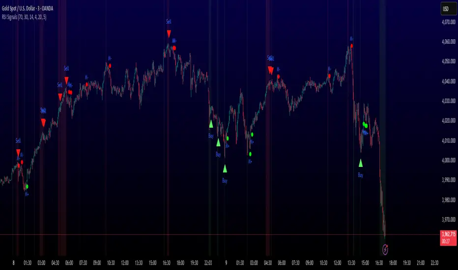
RSI: chart overlay
This indicator maps RSI thresholds directly onto price. Since the EMA of price aligns with RSI’s 50-line, it draws a volatility-based band around the EMA to reveal levels such as 70 and 30.
By converting RSI values into visible price bands, the overlay lets you see exactly where price would have to move to hit traditional RSI boundaries. These bands adapt in real time to both price movement and market volatility, keeping the classic RSI logic intact while presenting it in the context of price action. This approach helps traders interpret RSI signals without leaving the main chart window.
The calculation uses the same components as the RSI: alternative derivation script: Wilder’s EMA for smoothing, a volatility-based unit for scaling, and a normalization factor. The result is a dynamic band structure on the chart, representing RSI boundary levels in actual price terms.
Key components and calculation breakdown:
Wilder’s EMA
Used as the anchor point for measuring price position.
myEMA = ta.rma(close, Length)
Volatility Unit
Derived from the EMA of absolute close-to-close price changes.
CC_vol = ta.rma(math.abs(close - close ), Length)
Normalization Factor
Scales the volatility unit to align with the RSI formula’s structure.
normalization_factor = 1 / (Length - 1)
Upper and Lower Boundaries
Defines price bands corresponding to selected RSI threshold values.
up_b = myEMA + ((upper - 50) / 50) * (CC_vol / normalization_factor)
down_b = myEMA - ((50 - lower) / 50) * (CC_vol / normalization_factor)
Inputs
RSI length
Upper boundary – RSI level above 50
Lower boundary – RSI level below 50
ON/OFF toggle for 50-point line (EMA of close prices)
ON/OFF toggle for overbought/oversold coloring (use with line chart)
Interpretation:
Each band on the chart represents a chosen RSI level.
When price touches a band, RSI is at that threshold.
The distance between moving average and bands adjusts automatically with volatility and your selected RSI length.
All calculations remain fully consistent with standard RSI values.
Feedback and code suggestions are welcome, especially regarding implementation efficiency and customization.

MACD-V MomentumThe MACD-V (Moving Average Convergence Divergence – Volatility Normalized) is an award-winning momentum indicator created by Alex Spiroglou, CFTe, DipTA (ATAA). It improves on the traditional MACD by normalizing momentum with volatility, solving several well-known limitations of classic indicators:
✅ Time stability – readings are consistent across history
✅ Cross-market comparability – works equally on stocks, crypto, forex, and commodities
✅ Objective momentum framework – universal thresholds at +150 / -150, +50 / -50
✅ Cleaner signals – reduces false signals in ranges and lag in high momentum
By dividing the MACD spread by ATR, the indicator expresses momentum in volatility units, allowing meaningful comparison across timeframes and markets.
MACD-V defines seven objective momentum states:
Risk (Oversold): below -150
Rebounding: -150 to +50 and above signal
Rallying: +50 to +150 and above signal
Risk (Overbought): above +150
Retracing: above -50 and below signal
Reversing: -150 to -50 and below signal
Ranging: between -50 and +50 for N bars
Optional background tints highlight the active regime (Bull above 200-MA, Bear below 200-MA).
Rare extremes (e.g., MACD-V < -100 in a bull regime) are tagged for additional context.
Use Cases
Identify and track momentum lifecycles across any market
Spot rare extremes for potential reversal opportunities
Filter out low-momentum whipsaws in ranging conditions
Compare momentum strength across multiple symbols
Support systematic and rule-based strategy development
Volume-Weighted RSI & Multi-Normalized MACD### Description for Publishing: Volume-Weighted RSI & Multi-Normalized MACD
**Overview**
The "Volume-Weighted RSI & Multi-Normalized MACD" indicator is a powerful and versatile tool designed for traders seeking enhanced momentum and trend analysis. Combining a volume-weighted Relative Strength Index (VW-RSI) with a customizable Moving Average Convergence Divergence (MACD) featuring multiple normalization methods, this indicator provides deep insights into market dynamics. It supports multi-timeframe (MTF) analysis and includes an optional stepped plotting mode for discrete signal visualization, making it ideal for both trend-following and mean-reversion strategies across various markets (stocks, forex, crypto, etc.).
**Key Features**
1. **Volume-Weighted RSI (VW-RSI)**:
- A modified RSI that incorporates trading volume for greater sensitivity to market activity.
- Normalized to a user-defined range (default: -50 to +50) for consistent analysis.
- Optional smoothing with multiple moving average types (SMA, EMA, WMA, VWMA, SMMA, or SMA with Bollinger Bands) to reduce noise and highlight trends.
- Overbought (+20) and oversold (-20) levels for quick reference.
2. **Multi-Normalized MACD**:
- Offers six normalization methods for MACD, allowing traders to tailor the output to their strategy:
- Normalized Volume Weighted MACD (unbounded).
- Min-Max Normalization (bounded).
- Volatility Normalization (unbounded, volatility-adjusted).
- Volatility Normalization with Min-Max (bounded).
- Hyperbolic Tangent Normalization (bounded).
- Arctangent Normalization (bounded).
- Min-Max with Smoothing (bounded).
- All bounded methods scale to the user-defined range (default: -50 to +50), ensuring comparability with VW-RSI.
- Dynamic color changes for MACD line (lime/red) and histogram (aqua/blue/red/maroon) based on momentum and signal line crosses.
3. **Stepped Plotting Mode**:
- Optional mode to plot RSI and MACD as discrete, stepped lines, reducing noise by only updating when values change significantly (configurable thresholds).
- Ideal for traders focusing on clear, actionable signal changes.
4. **Multi-Timeframe Support**:
- Configurable timeframe input (default: chart timeframe) for analyzing RSI and MACD on higher or lower timeframes, enhancing cross-timeframe strategies.
5. **Customizable Display**:
- Toggle options to show/hide MACD line, signal line, histogram, and cross dots.
- Bollinger Bands for RSI smoothing (optional) with adjustable standard deviation multiplier.
- Clear visual cues with horizontal lines for overbought/oversold levels, midline, and MACD bounds.
**Usage Instructions**
1. **Add to Chart**: Apply the indicator to any symbol (e.g., BTCUSD, SPY) on any timeframe (1H, 1D, etc.).
2. **Configure Settings**:
- **General**: Adjust `Lower Bound` (-50 default) and `Upper Bound` (+50 default) for the output range. Set `Timeframe` for MTF analysis. Enable `Stepped?` for discrete plotting.
- **RSI**: Choose `Price Source` (default: ohlc4), `RSI Length` (default: 9), and smoothing options (e.g., EMA, Bollinger Bands). Adjust `RSI Diff Threshold` for stepped mode.
- **MACD**: Select `Price Source`, `Fast Length` (9), `Slow Length` (21), `Signal Length` (9), and a normalization method (default: Volatility Min-Max). Adjust `MACD Diff Threshold` for stepped mode.
- **Display Options**: Toggle MACD components and histogram colors for clarity.
3. **Interpretation**:
- **VW-RSI**: Watch for crosses above +20 (overbought) or below -20 (oversold) for potential reversals. Use smoothed RSI or Bollinger Bands for trend confirmation.
- **MACD**: Look for MACD/Signal line crosses (dots indicate crossings) and histogram changes for momentum shifts. Bounded normalizations align with RSI for unified analysis.
- **Stepped Mode**: Focus on significant changes in RSI/MACD for clearer signals.
4. **Companion Overlay**: For visualization on the main price chart, use the companion script "VW-RSI & MACD Price Overlay" (available separately, requires this script to be published). It plots RSI and MACD as price-scaled echo lines, with toggles to show/hide and customizable scaling (high/low or ATR).
**Who Is This For?**
- **Trend Traders**: Use MACD normalizations and MTF to identify momentum shifts across timeframes.
- **Mean-Reversion Traders**: Leverage VW-RSI’s overbought/oversold signals for entry/exit points.
- **Technical Analysts**: Customize normalization and smoothing to match specific market conditions.
- **All Markets**: Works on stocks, forex, cryptocurrencies, and more, with any timeframe.
**Notes**
- Unbounded MACD normalizations (`enable_nvw`, `enable_vol`) may produce values outside -50/+50, suitable for volatility-focused strategies.
- For price chart overlay, publish this script and use its ID in the companion script’s `request.security` call.
- Adjust scaling inputs in the companion script for optimal visualization on volatile or stable assets.
**Author’s Note**
Developed by NEPOLIX, this indicator combines volume-weighted precision with flexible normalization for robust technical analysis. Feedback and suggestions are welcome to enhance future versions!
SMA+MACD+RSI+Stoch Entry📌 Tools Used:
• SMA 21, SMA 50, SMA 200
• MACD (12, 26, 9)
• Pivot Point Standard
• RSI (length 75)
• Stochastic (14, 3, 3)
Trading Timeframe:
• Usable on all timeframes
Chart Preparation:
• Analyze the overall market trend and the instrument being traded
• Set an appropriate timeframe according to the market
• Apply SMA 21, SMA 50, SMA 200
• Apply MACD and Pivot Point Standard
• Ensure a proper market trend by checking the position of SMA 21, SMA 50, and SMA 200 relative to each other
If there are too many crossings between SMA 21, SMA 50, and SMA 200, do not enter any trades until the market trend stabilizes
Conditions for Entering a Long Trade (Bullish Trigger):
• Candle closes above the pivot line
• Confirm an uptrend by checking that SMA 21 is above SMA 50, and SMA 50 is above SMA 200
• RSI is above the midpoint
• Presence of a suitable corrective step with normal slope, considering the strength of the previous step
• MACD histogram indicates bullish momentum
• Stochastic shows a bullish crossover from below
Conditions for Entering a Short Trade (Bearish Trigger):
• Candle closes below the pivot line
• Confirm a downtrend by checking that SMA 21 is below SMA 50, and SMA 50 is below SMA 200
• RSI is below the midpoint
• Presence of a suitable corrective step with normal slope, considering the strength of the previous step
• MACD histogram indicates bearish momentum
• Stochastic shows a bearish crossover from above

Six Meridian Divine Swords [theUltimator5]The Six Meridian Divine Sword is a legendary martial arts technique in the classic wuxia novel “Demi-Gods and Semi-Devils” (天龙八部) by Jin Yong (金庸). The technique uses powerful internal energy (qi) to shoot invisible sword-like energy beams from the six meridians of the hand. Each of the six fingers/meridians corresponds to a “sword,” giving six different sword energies.
The Six Meridian Divine Swords indicator is a compact “signal dashboard” that fuses six classic indicators (fingers)—MACD, KDJ, RSI, LWR (Williams %R), BBI, and MTM—into one pane. Each row is a traffic-light dot (green/bullish, red/bearish, gray/neutral). When all six align, the script draws a confirmation line (“All Bullish” or “All Bearish”). It’s designed for quick consensus reads across trend, momentum, and overbought/oversold conditions.
How to Read the Dashboard
The pane has 6 horizontal rows (explained in depth later):
MACD
KDJ
RSI
LWR (Larry Williams %R)
BBI (Bull & Bear Index)
MTM (Momentum)
Each tick in the row is a dot, with sentiment identified by a color.
Green = bullish condition met
Red = bearish condition met
Gray = inside a neutral band (filtering chop), shown when Use Neutral (Gray) Colors is ON
There are two lines that track the dots on the top or bottom of the pane.
All Bullish Signal Line: appears only if all 6 are strongly bullish (default color = white)
All Bearish Signal Line: appears only if all 6 are strongly bearish (default color = fuchsia)
The Six Meridians (Indicators) — What They Mean:
1) MACD — Trend & Momentum
What it is: A trend-following momentum indicator based on the relationship between two moving averages (typically 12-EMA and 26-EMA)
Logic used: Classic MACD line (EMA12−EMA26) vs its 9-EMA signal.
Bullish: MACD > Signal and |MACD−Signal| > Neutral Threshold
Bearish: MACD < Signal and |diff| > threshold
Neutral: |diff| ≤ threshold
Why: Small crosses can whipsaw. The neutral band ignores tiny separations to reduce noise.
Inputs: Fast/Slow/Signal lengths, Neutral Threshold.
2) KDJ — Stochastic with J-line boost
What it is: A variation of the stochastic oscillator popular in Chinese trading systems
Logic used: K = SMA(Stochastic, smooth), D = SMA(K, smooth), J = 3K − 2D.
Bullish: K > D and |K−D| > 2
Bearish: K < D and |K−D| > 2
Neutral: |K−D| ≤ 2
Why: K–D separation filters tiny wiggles; J offers an “extreme” early-warning context in the value label.
Inputs: Length, Smoothing.
3) RSI — Momentum balance (0–100)
What it is: A momentum oscillator measuring speed and magnitude of price changes (0–100)
Logic used: RSI(N).
Bullish: RSI > 50 + Neutral Zone
Bearish: RSI < 50 − Neutral Zone
Neutral: Between those bands
Why: Centerline/adaptive bands (around 50) give a directional bias without relying on fixed 70/30.
Inputs: Length, Neutral Zone (± around 50).
4) LWR (Williams %R) — Overbought/Oversold
What it is: An oscillator similar to stochastic, measuring how close the close is to the high-low range over N periods
Logic used: %R over N bars (0 to −100).
Bullish: %R > −50 + Neutral Zone
Bearish: %R < −50 − Neutral Zone
Neutral: Between those bands
Why: Uses a centered band around −50 instead of only −20/−80, making it act like a directional filter.
Inputs: Length, Neutral Zone (± around −50).
5) BBI (Bull & Bear Index) — Smoothed trend bias
What it is: A composite moving average, essentially the average of several different moving averages (often 3, 6, 12, 24 periods)
Logic used: Average of 4 SMAs (3/6/12/24 by default):
BBI = (MA3 + MA6 + MA12 + MA24) / 4
Bullish: Close > BBI and |Close−BBI| > 0.2% of BBI
Bearish: Close < BBI and |diff| > threshold
Neutral: |diff| ≤ threshold
Why: Multiple MAs blended together reduce single-MA whipsaw. A dynamic 0.2% band ignores tiny drift.
Inputs: 4 lengths (default 3/6/12/24). Threshold is auto-scaled at 0.2% of BBI.
6) MTM (Momentum) — Rate of change in price
What it is: A simple measure of rate of change
Logic used: MTM = Close − Close
Bullish: MTM > 0.5% of Close
Bearish: MTM < −0.5% of Close
Neutral: |MTM| ≤ threshold
Why: A percent-based gate adapts across prices (e.g., $5 vs $500) and mutes insignificant moves.
Inputs: Length. Threshold auto-scaled to 0.5% of current Close.
Display & Inputs You Can Tweak
🎨 Use Neutral (Gray) Colors
ON (default): 3-color mode with clear “no-trade”/“weak” states.
OFF: classic binary (green/red) without neutral filtering.

ALEX - ATR Extensions + ADR + TableALEX - ATR Extensions + ADR + Table
Overview
The ALEX ATR Extensions indicator is a comprehensive volatility and momentum analysis tool that combines Average True Range (ATR), Average Daily Range (ADR), and moving average distance calculations in a single, customizable display. This indicator helps traders assess current price action relative to historical volatility and key moving averages, providing crucial context for risk management and trade planning.
Key Features
Multi-Metric Analysis
- ATR Percentage: Current ATR as a percentage of price for volatility assessment
- ADR Percentage: Average Daily Range as a percentage for typical daily movement
- Low of Day Distance: Distance from current price to daily low
- Moving Average Distance: ATR-normalized distance from 21 and 50 period moving averages
Flexible Moving Average Options
- Configurable MA Types: Choose between EMA or SMA for both 21 and 50 period averages
- Customizable Periods: Adjust moving average lengths to suit your trading style
- Daily Timeframe Data: Uses daily moving averages regardless of chart timeframe
ATR Extension Levels
- Dynamic Price Targets: Calculate extension levels based on ATR multiples from moving averages
- Visual Reference Lines: Optional overlay lines showing ATR extension targets
- Customizable Multipliers: Adjust ATR multipliers for different risk/reward scenarios
Smart Visual Alerts
- Color-Coded Distance Metrics: Automatic color changes based on distance thresholds
- Symbol Plotting: Customizable chart symbols when distance thresholds are exceeded
- Threshold-Based Alerts: Visual cues when price reaches significant ATR distances
Comprehensive Data Table
- Real-Time Metrics: Live updating table with all key measurements
- Customizable Display: Toggle individual metrics on/off based on preference
- Professional Styling: Adjustable colors, fonts, and transparency
How to Use
Volatility Assessment
- High ATR%: Indicates elevated volatility, larger position sizing considerations
- Low ATR%: Suggests compressed volatility, potential for expansion
- ADR% Comparison: Compare current day's range to historical average
Moving Average Analysis
- ATR Distance 21/50: Normalized distance showing how extended price is from key levels
- Positive Values: Price above moving average (bullish positioning)
- Negative Values: Price below moving average (bearish positioning)
- Color Changes: Automatic alerts when reaching threshold levels
Extension Target Planning
- ATR Extension Lines: Visual price targets based on volatility-adjusted projections
- Risk/Reward Planning: Use extension levels for profit target placement
- Breakout Confirmation: Extension levels can confirm breakout validity
Symbol Alert System
- Chart Symbols: Automatic plotting when distance thresholds are breached
- Customizable Triggers: Set your own threshold levels for alerts
- Visual Scanning: Quick identification of extended conditions across multiple charts
Settings
Display Controls
- Show ADR%: Toggle average daily range percentage display
- Show ATR%: Toggle average true range percentage display
- Show LoD Distance: Toggle low of day distance calculation
- Show LoD Price: Toggle actual low of day price display
- Show ATR Distance from 21/50 DMA: Toggle moving average distance metrics
- Show 21/50 DMA Price: Toggle actual moving average price display
- Show ATR Extension Levels: Toggle extension target display in table
Moving Average Configuration
- 21/50 DMA Type: Choose between EMA or SMA calculation methods
- 21/50 DMA Period: Customize moving average lengths
- ADR/ATR Length: Adjust calculation periods for range measurements
Color Thresholds
- Threshold Levels: Set distance levels for color changes (default 2.0 and 5.0)
- Custom Colors: Choose colors for different threshold breaches
- Separate 21/50 Settings: Independent color schemes for each moving average
Symbol Settings
- Show Char Symbol: Toggle symbol plotting for each moving average
- Custom Symbols: Choose any character for chart plotting
- Symbol Colors: Customize colors for visual distinction
- Threshold Levels: Set trigger points for symbol appearance
ATR Extension Lines
- Show Extension Lines: Toggle visual extension level lines
- ATR Multipliers: Customize extension distance (default 2.0x)
- Line Colors: Choose colors for extension level visualization
Table Customization
- Background Color: Adjust table transparency and color
- Text Color: Customize default text appearance
- Font Size: Choose from tiny to huge font options
Advanced Applications
Trend Strength Analysis
- Large ATR distances suggest strong trending moves
- Small ATR distances indicate potential consolidation or reversal zones
- Compare current readings to recent historical ranges
Risk Management
- Use ATR% for position sizing calculations
- Extension levels provide natural profit target zones
- Distance metrics help identify overextended conditions
Multi-Timeframe Context
- Apply to different timeframes for comprehensive analysis
- Daily data provides consistency across all chart intervals
- Combine with weekly/monthly analysis for broader context
Market Regime Identification
- High volatility periods: Increased ATR% readings
- Low volatility periods: Compressed ATR% readings
- Trending markets: Sustained high distance readings
- Consolidating markets: Low distance readings with frequent color changes
Best Practices
Volatility-Adjusted Trading
- Increase position sizes during low volatility periods
- Reduce position sizes during high volatility periods
- Use ATR% for stop-loss placement relative to normal market movement
Extension Level Usage
- Primary targets: 1.5-2.0x ATR extensions
- Secondary targets: 2.5-3.0x ATR extensions
- Avoid chasing prices beyond 3x ATR extensions
Threshold Optimization
- Backtest different threshold levels for your trading style
- Consider market conditions when setting alert levels
- Adjust thresholds based on instrument volatility characteristics
Integration Strategies
- Combine with momentum indicators for confirmation
- Use alongside support/resistance levels
- Incorporate into systematic trading approaches
Technical Specifications
- Compatible with Pine Script v6
- Uses daily timeframe data for consistency
- Optimized for real-time performance
- Works on all chart types and timeframes
- Supports all tradeable instruments
Ideal For
- Swing traders using daily charts
- Position traders seeking volatility context
- Day traders needing intraday reference levels
- Risk managers requiring volatility metrics
- Systematic traders building rule-based strategies
Disclaimer
This indicator is for educational and informational purposes only. It should not be used as the sole basis for trading decisions. Always combine with other forms of analysis, proper risk management techniques, and consider your individual trading plan and risk tolerance. Past performance does not guarantee future results.
Compatible with Pine Script v6 | Optimized for daily timeframe analysis | Works across all markets and instruments

Topological Market Stress (TMS) - Quantum FabricTopological Market Stress (TMS) - Quantum Fabric
What Stresses The Market?
Topological Market Stress (TMS) represents a revolutionary fusion of algebraic topology and quantum field theory applied to financial markets. Unlike traditional indicators that analyze price movements linearly, TMS examines the underlying topological structure of market data—detecting when the very fabric of market relationships begins to tear, warp, or collapse.
Drawing inspiration from the ethereal beauty of quantum field visualizations and the mathematical elegance of topological spaces, this indicator transforms complex mathematical concepts into an intuitive, visually stunning interface that reveals hidden market dynamics invisible to conventional analysis.
Theoretical Foundation: Topology Meets Markets
Topological Holes in Market Structure
In algebraic topology, a "hole" represents a fundamental structural break—a place where the normal connectivity of space fails. In markets, these topological holes manifest as:
Correlation Breakdown: When traditional price-volume relationships collapse
Volatility Clustering Failure: When volatility patterns lose their predictive power
Microstructure Stress: When market efficiency mechanisms begin to fail
The Mathematics of Market Topology
TMS constructs a topological space from market data using three key components:
1. Correlation Topology
ρ(P,V) = correlation(price, volume, period)
Hole Formation = 1 - |ρ(P,V)|
When price and volume decorrelate, topological holes begin forming.
2. Volatility Clustering Topology
σ(t) = volatility at time t
Clustering = correlation(σ(t), σ(t-1), period)
Breakdown = 1 - |Clustering|
Volatility clustering breakdown indicates structural instability.
3. Market Efficiency Topology
Efficiency = |price - EMA(price)| / ATR
Measures how far price deviates from its efficient trajectory.
Multi-Scale Topological Analysis
Markets exist across multiple temporal scales simultaneously. TMS analyzes topology at three distinct scales:
Micro Scale (3-15 periods): Immediate structural changes, market microstructure stress
Meso Scale (10-50 periods): Trend-level topology, medium-term structural shifts
Macro Scale (50-200 periods): Long-term structural topology, regime-level changes
The final stress metric combines all scales:
Combined Stress = 0.3×Micro + 0.4×Meso + 0.3×Macro
How TMS Works
1. Topological Space Construction
Each market moment is embedded in a multi-dimensional topological space where:
- Price efficiency forms one dimension
- Correlation breakdown forms another
- Volatility clustering breakdown forms the third
2. Hole Detection Algorithm
The indicator continuously scans this topological space for:
Hole Formation: When stress exceeds the formation threshold
Hole Persistence: How long structural breaks maintain
Hole Collapse: Sudden topology restoration (regime shifts)
3. Quantum Visualization Engine
The visualization system translates topological mathematics into intuitive quantum field representations:
Stress Waves: Main line showing topological stress intensity
Quantum Glow: Surrounding field indicating stress energy
Fabric Integrity: Background showing structural health
Multi-Scale Rings: Orbital representations of different timeframes
4. Signal Generation
Stable Topology (✨): Normal market structure, standard trading conditions
Stressed Topology (⚡): Increased structural tension, heightened volatility expected
Topological Collapse (🕳️): Major structural break, regime shift in progress
Critical Stress (🌋): Extreme conditions, maximum caution required
Inputs & Parameters
🕳️ Topological Parameters
Analysis Window (20-200, default: 50)
Primary period for topological analysis
20-30: High-frequency scalping, rapid structure detection
50: Balanced approach, recommended for most markets
100-200: Long-term position trading, major structural shifts only
Hole Formation Threshold (0.1-0.9, default: 0.3)
Sensitivity for detecting topological holes
0.1-0.2: Very sensitive, detects minor structural stress
0.3: Balanced, optimal for most market conditions
0.5-0.9: Conservative, only major structural breaks
Density Calculation Radius (0.1-2.0, default: 0.5)
Radius for local density estimation in topological space
0.1-0.3: Fine-grained analysis, sensitive to local changes
0.5: Standard approach, balanced sensitivity
1.0-2.0: Broad analysis, focuses on major structural features
Collapse Detection (0.5-0.95, default: 0.7)
Threshold for detecting sudden topology restoration
0.5-0.6: Very sensitive to regime changes
0.7: Balanced, reliable collapse detection
0.8-0.95: Conservative, only major regime shifts
📊 Multi-Scale Analysis
Enable Multi-Scale (default: true)
- Analyzes topology across multiple timeframes simultaneously
- Provides deeper insight into market structure at different scales
- Essential for understanding cross-timeframe topology interactions
Micro Scale Period (3-15, default: 5)
Fast scale for immediate topology changes
3-5: Ultra-fast, tick/minute data analysis
5-8: Fast, 5m-15m chart optimization
10-15: Medium-fast, 30m-1H chart focus
Meso Scale Period (10-50, default: 20)
Medium scale for trend topology analysis
10-15: Short trend structures
20-25: Medium trend structures (recommended)
30-50: Long trend structures
Macro Scale Period (50-200, default: 100)
Slow scale for structural topology
50-75: Medium-term structural analysis
100: Long-term structure (recommended)
150-200: Very long-term structural patterns
⚙️ Signal Processing
Smoothing Method (SMA/EMA/RMA/WMA, default: EMA) Method for smoothing stress signals
SMA: Simple average, stable but slower
EMA: Exponential, responsive and recommended
RMA: Running average, very smooth
WMA: Weighted average, balanced approach
Smoothing Period (1-10, default: 3)
Period for signal smoothing
1-2: Minimal smoothing, noisy but fast
3-5: Balanced, recommended for most applications
6-10: Heavy smoothing, slow but very stable
Normalization (Fixed/Adaptive/Rolling, default: Adaptive)
Method for normalizing stress values
Fixed: Static 0-1 range normalization
Adaptive: Dynamic range adjustment (recommended)
Rolling: Rolling window normalization
🎨 Quantum Visualization
Fabric Style Options:
Quantum Field: Flowing energy visualization with smooth gradients
Topological Mesh: Mathematical topology with stepped lines
Phase Space: Dynamical systems view with circular markers
Minimal: Clean, simple display with reduced visual elements
Color Scheme Options:
Quantum Gradient: Deep space blue → Quantum red progression
Thermal: Black → Hot orange thermal imaging style
Spectral: Purple → Gold full spectrum colors
Monochrome: Dark gray → Light gray elegant simplicity
Multi-Scale Rings (default: true)
- Display orbital rings for different time scales
- Visualizes how topology changes across timeframes
- Provides immediate visual feedback on cross-scale dynamics
Glow Intensity (0.0-1.0, default: 0.6)
Controls the quantum glow effect intensity
0.0: No glow, pure line display
0.6: Balanced, recommended setting
1.0: Maximum glow, full quantum field effect
📋 Dashboard & Alerts
Show Dashboard (default: true)
Real-time topology status display
Current market state and trading recommendations
Stress level visualization and fabric integrity status
Show Theory Guide (default: true)
Educational panel explaining topological concepts
Dashboard interpretation guide
Trading strategy recommendations
Enable Alerts (default: true)
Extreme stress detection alerts
Topological collapse notifications
Hole formation and recovery signals
Visual Logic & Interpretation
Main Visualization Elements
Quantum Stress Line
Primary indicator showing topological stress intensity
Color intensity reflects current market state
Line style varies based on selected fabric style
Glow effect indicates stress energy field
Equilibrium Line
Silver line showing average stress level
Reference point for normal market conditions
Helps identify when stress is elevated or suppressed
Upper/Lower Bounds
Red upper bound: High stress threshold
Green lower bound: Low stress threshold
Quantum fabric fill between bounds shows stress field
Multi-Scale Rings
Aqua circles : Micro-scale topology (immediate changes)
Orange circles: Meso-scale topology (trend-level changes)
Provides cross-timeframe topology visualization
Dashboard Information
Topology State Icons:
✨ STABLE: Normal market structure, standard trading conditions
⚡ STRESSED: Increased structural tension, monitor closely
🕳️ COLLAPSE: Major structural break, regime shift occurring
🌋 CRITICAL: Extreme conditions, reduce risk exposure
Stress Bar Visualization:
Visual representation of current stress level (0-100%)
Color-coded based on current topology state
Real-time percentage display
Fabric Integrity Dots:
●●●●● Intact: Strong market structure (0-30% stress)
●●●○○ Stressed: Weakening structure (30-70% stress)
●○○○○ Fractured: Breaking down structure (70-100% stress)
Action Recommendations:
✅ TRADE: Normal conditions, standard strategies apply
⚠️ WATCH: Monitor closely, increased vigilance required
🔄 ADAPT: Change strategy, regime shift in progress
🛑 REDUCE: Lower risk exposure, extreme conditions
Trading Strategies
In Stable Topology (✨ STABLE)
- Normal trading conditions apply
- Use standard technical analysis
- Regular position sizing appropriate
- Both trend-following and mean-reversion strategies viable
In Stressed Topology (⚡ STRESSED)
- Increased volatility expected
- Widen stop losses to account for higher volatility
- Reduce position sizes slightly
- Focus on high-probability setups
- Monitor for potential regime change
During Topological Collapse (🕳️ COLLAPSE)
- Major regime shift in progress
- Adapt strategy immediately to new market character
- Consider closing positions that rely on previous regime
- Wait for new topology to stabilize before major trades
- Opportunity for contrarian plays if collapse is extreme
In Critical Stress (🌋 CRITICAL)
- Extreme market conditions
- Significantly reduce risk exposure
- Avoid new positions until stress subsides
- Focus on capital preservation
- Consider hedging existing positions
Advanced Techniques
Multi-Timeframe Topology Analysis
- Use higher timeframe TMS for regime context
- Use lower timeframe TMS for precise entry timing
- Alignment across timeframes = highest probability trades
Topology Divergence Trading
- Most powerful at regime boundaries
- Price makes new high/low but topology stress decreases
- Early warning of potential reversals
- Combine with key support/resistance levels
Stress Persistence Analysis
- Long periods of stable topology often precede major moves
- Extended stress periods often resolve in regime changes
- Use persistence tracking for position sizing decisions
Originality & Innovation
TMS represents a genuine breakthrough in applying advanced mathematics to market analysis:
True Topological Analysis: Not a simplified proxy but actual topological space construction and hole detection using correlation breakdown, volatility clustering analysis, and market efficiency measurement.
Quantum Aesthetic: Transforms complex topology mathematics into an intuitive, visually stunning interface inspired by quantum field theory visualizations.
Multi-Scale Architecture: Simultaneous analysis across micro, meso, and macro timeframes provides unprecedented insight into market structure dynamics.
Regime Detection: Identifies fundamental market character changes before they become obvious in price action, providing early warning of structural shifts.
Practical Application: Clear, actionable signals derived from advanced mathematical concepts, making theoretical topology accessible to practical traders.
This is not a combination of existing indicators or a cosmetic enhancement of standard tools. It represents a fundamental reimagining of how we measure, visualize, and interpret market dynamics through the lens of algebraic topology and quantum field theory.
Best Practices
Start with defaults: Parameters are optimized for broad market applicability
Match timeframe: Adjust scales based on your trading timeframe
Confirm with price action: TMS shows market character, not direction
Respect topology changes: Reduce risk during regime transitions
Use appropriate strategies: Adapt approach based on current topology state
Monitor persistence: Track how long topology states maintain
Cross-timeframe analysis: Align multiple timeframes for highest probability trades
Alerts Available
Extreme Topological Stress: Market fabric under severe deformation
Topological Collapse Detected: Regime shift in progress
Topological Hole Forming: Market structure breakdown detected
Topology Stabilizing: Market structure recovering to normal
Chart Requirements
Recommended Markets: All liquid markets (forex, stocks, crypto, futures)
Optimal Timeframes: 5m to Daily (adaptable to any timeframe)
Minimum History: 200 bars for proper topology construction
Best Performance: Markets with clear regime characteristics
Academic Foundation
This indicator draws from cutting-edge research in:
- Algebraic topology and persistent homology
- Quantum field theory visualization techniques
- Market microstructure analysis
- Multi-scale dynamical systems theory
- Correlation topology and network analysis
Disclaimer
This indicator is for educational and research purposes only. It does not constitute financial advice or provide direct buy/sell signals. Topological analysis reveals market structure characteristics, not future price direction. Always use proper risk management and combine with your own analysis. Past performance does not guarantee future results.
See markets through the lens of topology. Trade the structure, not the noise.
Bringing advanced mathematics to practical trading through quantum-inspired visualization.
Trade with insight. Trade with structure.
— Dskyz , for DAFE Trading Systems
Pivot S/R with Volatility Filter## *📌 Indicator Purpose*
This indicator identifies *key support/resistance levels* using pivot points while also:
✅ Detecting *high-volume liquidity traps* (stop hunts)
✅ Filtering insignificant pivots via *ATR (Average True Range) volatility*
✅ Tracking *test counts and breakouts* to measure level strength
---
## *⚙ SETTINGS – Detailed Breakdown*
### *1️⃣ ◆ General Settings*
#### *🔹 Pivot Length*
- *Purpose:* Determines how many bars to analyze when identifying pivots.
- *Usage:*
- *Low values (5-20):* More pivots, better for scalping.
- *High values (50-200):* Fewer but stronger levels for swing trading.
- *Example:*
- Pivot Length = 50 → Only the most significant highs/lows over 50 bars are marked.
#### *🔹 Test Threshold (Max Test Count)*
- *Purpose:* Sets how many times a level can be tested before being invalidated.
- *Example:*
- Test Threshold = 3 → After 3 tests, the level is ignored (likely to break).
#### *🔹 Zone Range*
- *Purpose:* Creates a price buffer around pivots (±0.001 by default).
- *Why?* Markets often respect "zones" rather than exact prices.
---
### *2️⃣ ◆ Volatility Filter (ATR)*
#### *🔹 ATR Period*
- *Purpose:* Smoothing period for Average True Range calculation.
- *Default:* 14 (standard for volatility measurement).
#### *🔹 ATR Multiplier (Min Move)*
- *Purpose:* Requires pivots to show *meaningful price movement*.
- *Formula:* Min Move = ATR × Multiplier
- *Example:*
- ATR = 10 pips, Multiplier = 1.5 → Only pivots with *15+ pip swings* are valid.
#### *🔹 Show ATR Filter Info*
- Displays current ATR and minimum move requirements on the chart.
---
### *3️⃣ ◆ Volume Analysis*
#### *🔹 Volume Change Threshold (%)*
- *Purpose:* Filters for *unusual volume spikes* (institutional activity).
- *Example:*
- Threshold = 1.2 → Requires *120% of average volume* to confirm signals.
#### *🔹 Volume MA Period*
- *Purpose:* Lookback period for "normal" volume calculation.
---
### *4️⃣ ◆ Wick Analysis*
#### *🔹 Wick Length Threshold (Ratio)*
- *Purpose:* Ensures rejection candles have *long wicks* (strong reversals).
- *Formula:* Wick Ratio = (Upper Wick + Lower Wick) / Candle Range
- *Example:*
- Threshold = 0.6 → 60% of the candle must be wicks.
#### *🔹 Min Wick Size (ATR %)*
- *Purpose:* Filters out small wicks in volatile markets.
- *Example:*
- ATR = 20 pips, MinWickSize = 1% → Wicks under *0.2 pips* are ignored.
---
### *5️⃣ ◆ Display Settings*
- *Show Zones:* Toggles support/resistance shaded areas.
- *Show Traps:* Highlights liquidity traps (▲/▼ symbols).
- *Show Tests:* Displays how many times levels were tested.
- *Zone Transparency:* Adjusts opacity of zones.
---
## *🎯 Practical Use Cases*
### *1️⃣ Liquidity Trap Detection*
- *Scenario:* Price spikes *above resistance* then reverses sharply.
- *Requirements:*
- Long wick (Wick Ratio > 0.6)
- High volume (Volume > Threshold)
- *Outcome:* *Short Trap* signal (▼) appears.
### *2️⃣ Strong Support Level*
- *Scenario:* Price bounces *3 times* from the same level.
- *Indicator Action:*
- Labels the level with test count (3/5 = 3 tests out of max 5).
- Turns *red* if broken (Break Count > 0).
Deep Dive: How This Indicator Works*
This indicator combines *four professional trading concepts* into one powerful tool:
1. *Classic Pivot Point Theory*
- Identifies swing highs/lows where price previously reversed
- Unlike basic pivot indicators, ours uses *confirmed pivots only* (filtered by ATR)
2. *Volume-Weighted Validation*
- Requires unusual trading volume to confirm levels
- Filters out "phantom" levels with low participation
3. *ATR Volatility Filtering*
- Eliminates insignificant price swings in choppy markets
- Ensures only meaningful levels are plotted
4. *Liquidity Trap Detection*
- Spots institutional stop hunts where markets fake out traders
- Uses wick analysis + volume spikes for high-probability signals
---
## *📊 Parameter Encyclopedia (Expanded)*
### *1️⃣ Pivot Engine Settings*
#### *Pivot Length (50)*
- *What It Does:*
Determines how many bars to analyze when searching for swing highs/lows.
- *Professional Adjustment Guide:*
| Trading Style | Recommended Value | Why? |
|--------------|------------------|------|
| Scalping | 10-20 | Captures short-term levels |
| Day Trading | 30-50 | Balanced approach |
| Swing Trading| 50-200 | Focuses on major levels |
- *Real Market Example:*
On NASDAQ 5-minute chart:
- Length=20: Identifies levels holding for ~2 hours
- Length=50: Finds levels respected for entire trading day
#### *Test Threshold (5)*
- *Advanced Insight:*
Institutions often test levels 3-5 times before breaking them. This setting mimics the "probe and push" strategy used by smart money.
- *Psychology Behind It:*
Retail traders typically give up after 2-3 tests, while institutions keep testing until stops are run.
---
### *2️⃣ Volatility Filter System*
#### *ATR Multiplier (1.0)*
- *Professional Formula:*
Minimum Valid Swing = ATR(14) × Multiplier
- *Market-Specific Recommendations:*
| Market Type | Optimal Multiplier |
|------------------|--------------------|
| Forex Majors | 0.8-1.2 |
| Crypto (BTC/ETH) | 1.5-2.5 |
| SP500 Stocks | 1.0-1.5 |
- *Why It Matters:*
In EUR/USD (ATR=10 pips):
- Multiplier=1.0 → Requires 10 pip swings
- Multiplier=1.5 → Requires 15 pip swings (fewer but higher quality levels)
---
### *3️⃣ Volume Confirmation System*
#### *Volume Threshold (1.2)*
- *Institutional Benchmark:*
- 1.2x = Moderate institutional interest
- 1.5x+ = Strong smart money activity
- *Volume Spike Case Study:*
*Before Apple Earnings:*
- Normal volume: 2M shares
- Spike threshold (1.2): 2.4M shares
- Actual volume: 3.1M shares → STRONG confirmation
---
### *4️⃣ Liquidity Trap Detection*
#### *Wick Analysis System*
- *Two-Filter Verification:*
1. *Wick Ratio (0.6):*
- Ensures majority of candle shows rejection
- Formula: (UpperWick + LowerWick) / Total Range > 0.6
2. *Min Wick Size (1% ATR):*
- Prevents false signals in flat markets
- Example: ATR=20 pips → Min wick=0.2 pips
- *Trap Identification Flowchart:*
Price Enters Zone →
Spikes Beyond Level →
Shows Long Wick →
Volume > Threshold →
TRAP CONFIRMED
---
## *💡 Master-Level Usage Techniques*
### *Institutional Order Flow Analysis*
1. *Step 1:* Identify pivot levels with ≥3 tests
2. *Step 2:* Watch for volume contraction near levels
3. *Step 3:* Enter when trap signal appears with:
- Wick > 2×ATR
- Volume > 1.5× average
### *Multi-Timeframe Confirmation*
1. *Higher TF:* Find weekly/monthly pivots
2. *Lower TF:* Use this indicator for precise entries
3. *Example:*
- Weekly pivot at $180
- 4H shows liquidity trap → High-probability reversal
---
## *⚠ Critical Mistakes to Avoid*
1. *Using Default Settings Everywhere*
- Crude oil needs higher ATR multiplier than bonds
2. *Ignoring Trap Context*
- Traps work best at:
- All-time highs/lows
- Major psychological numbers (00/50 levels)
3. *Overlooking Cumulative Volume*
- Check if volume is building over multiple tests

EMA Scoring Strategy## **📊 EMA Scoring Strategy for Trend Analysis**
This strategy is designed to **identify bullish trends** based on multiple **Exponential Moving Averages (EMAs)**. It assigns a **score** based on how the price and EMAs interact, and highlights strong bullish conditions when the score reaches **4 or above**.
---
## **🔹 Strategy Logic**
### 1️⃣ **Calculating EMAs**
- **EMA 21** → Short-term trend
- **EMA 50** → Mid-term trend
- **EMA 100** → Long-term trend
---
### 2️⃣ **Scoring System**
For each trading day, the strategy assigns **+1 or -1 points** based on the following conditions:
| Condition | Score |
|-----------|-------|
| If **Price > EMA 21** | +1 |
| If **Price > EMA 50** | +1 |
| If **Price > EMA 100** | +1 |
| If **EMA 21 > EMA 50** | +1 |
| If **EMA 50 > EMA 100** | +1 |
| If **EMA 21 > EMA 100** | +1 |
| If **Price < EMA 21** | -1 |
| If **Price < EMA 50** | -1 |
| If **Price < EMA 100** | -1 |
| If **EMA 21 < EMA 50** | -1 |
| If **EMA 50 < EMA 100** | -1 |
| If **EMA 21 < EMA 100** | -1 |
---
### 3️⃣ **Bullish Confirmation** (Score ≥ 4)
- The **score is calculated every day**.
- When the **score reaches 4 or above**, it confirms a strong **bullish trend**.
- A **green background** is applied to highlight such days.
- A **histogram** is plotted **only when the score is 4 or higher** to keep the chart clean.
- A **buy signal** is generated when the score **crosses above 4**.
---
## **🔹 Visualization & Alerts**
### ✅ **What You See on the Chart**
1. **EMA Lines (21, 50, 100)** 📈
2. **Green Background for Strong Bullish Days (Score ≥ 4)** ✅
3. **Histogram Showing Score (Only for 4 and above)** 📊
4. **Buy Signal When Score Crosses Above 4** 💰
### 🔔 **Alerts**
- **An alert is triggered** when the score crosses **above 4**, notifying the user about a bullish trend.
---
## **📌 How to Use This Strategy**
1. **Identify Strong Bullish Trends:** When the score is **4 or above**, it suggests that price momentum is strong.
2. **Enter Trades on Buy Signals:** When the score **crosses above 4**, it could be a good time to buy.
3. **Stay in the Trade While Score is 4+:** The green background confirms a **strong uptrend**.
4. **Exit When Score Drops Below 4:** This suggests weakening momentum.
---
## **🔹 Advantages of This Strategy**
✅ **Simple & Objective** - Uses clear rules for trend confirmation
✅ **Filters Out Noise** - Only highlights strong bullish conditions
✅ **Works on Any Market** - Can be applied to stocks, indices, crypto, etc.
✅ **Customizable** - You can tweak EMAs or score conditions as needed
---
## **🚀 Next Steps**
Would you like me to add **stop-loss conditions**, **sell signals**, or any **extra confirmations like RSI or volume**? 😃

Cryptolabs Global Liquidity Cycle Momentum IndicatorCryptolabs Global Liquidity Cycle Momentum Indicator (LMI-BTC)
This open-source indicator combines global central bank liquidity data with Bitcoin price movements to identify medium- to long-term market cycles and momentum phases. It is designed for traders who want to incorporate macroeconomic factors into their Bitcoin analysis.
How It Works
The script calculates a Liquidity Index using balance sheet data from four central banks (USA: ECONOMICS:USCBBS, Japan: FRED:JPNASSETS, China: ECONOMICS:CNCBBS, EU: FRED:ECBASSETSW), augmented by the Dollar Index (TVC:DXY) and Chinese 10-year bond yields (TVC:CN10Y). This index is:
- Logarithmically scaled (math.log) to better represent large values like central bank balances and Bitcoin prices.
- Normalized over a 50-period range to balance fluctuations between minimum and maximum values.
- Compared to prior-year values, with the number of bars dynamically adjusted based on the timeframe (e.g., 252 for 1D, 52 for 1W), to compute percentage changes.
The liquidity change is analyzed using a Chande Momentum Oscillator (CMO) (period: 24) to measure momentum trends. A Weighted Moving Average (WMA) (period: 10) acts as a signal line. The Bitcoin price is also plotted logarithmically to highlight parallels with liquidity cycles.
Usage
Traders can use the indicator to:
- Identify global liquidity cycles influencing Bitcoin price trends, such as expansive or restrictive monetary policies.
- Detect momentum phases: Values above 50 suggest overbought conditions, below -50 indicate oversold conditions.
- Anticipate trend reversals by observing CMO crossovers with the signal line.
It performs best on higher timeframes like daily (1D) or weekly (1W) charts. The visualization includes:
- CMO line (green > 50, red < -50, blue neutral), signal line (white), Bitcoin price (gray).
- Horizontal lines at 50, 0, and -50 for improved readability.
Originality
This indicator stands out from other momentum tools like RSI or basic price analysis due to:
- Unique Data Integration: Combines four central bank datasets, DXY, and CN10Y as macroeconomic proxies for Bitcoin.
- Dynamic Prior-Year Analysis: Calculates liquidity changes relative to historical values, adjustable by timeframe.
- Logarithmic Normalization: Enhances visibility of extreme values, critical for cryptocurrencies and macro data.
This combination offers a rare perspective on the interplay between global liquidity and Bitcoin, unavailable in other open-source scripts.
Settings
- CMO Period: Default 24, adjustable for faster/slower signals.
- Signal WMA: Default 10, for smoothing the CMO line.
- Normalization Window: Default 50 periods, customizable.
Users can modify these parameters in the Pine Editor to tailor the indicator to their strategy.
Note
This script is designed for medium- to long-term analysis, not scalping. For optimal results, combine it with additional analyses (e.g., on-chain data, support/resistance levels). It does not guarantee profits but supports informed decisions based on macroeconomic trends.
Data Sources
- Bitcoin: INDEX:BTCUSD
- Liquidity: ECONOMICS:USCBBS, FRED:JPNASSETS, ECONOMICS:CNCBBS, FRED:ECBASSETSW
- Additional: TVC:DXY, TVC:CN10Y
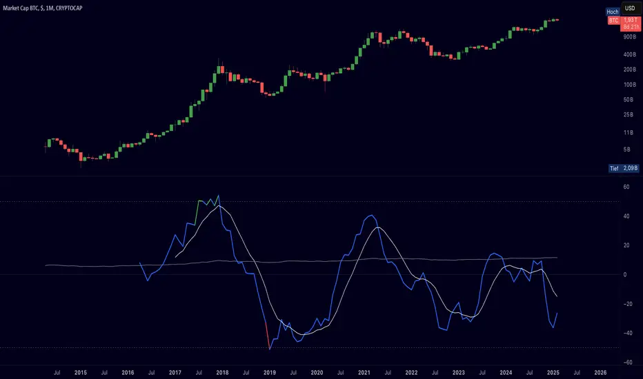
AI InfinityAI Infinity – Multidimensional Market Analysis
Overview
The AI Infinity indicator combines multiple analysis tools into a single solution. Alongside dynamic candle coloring based on MACD and Stochastic signals, it features Alligator lines, several RSI lines (including glow effects), and optionally enabled EMAs (20/50, 100, and 200). Every module is individually configurable, allowing traders to tailor the indicator to their personal style and strategy.
Important Note (Disclaimer)
This indicator is provided for educational and informational purposes only.
It does not constitute financial or investment advice and offers no guarantee of profit.
Each trader is responsible for their own trading decisions.
Past performance does not guarantee future results.
Please review the settings thoroughly and adjust them to your personal risk profile; consider supplementary analyses or professional guidance where appropriate.
Functionality & Components
1. Candle Coloring (MACD & Stochastic)
Objective: Provide an immediate visual snapshot of the market’s condition.
Details:
MACD Signal: Used to identify bullish and bearish momentum.
Stochastic: Detects overbought and oversold zones.
Color Modes: Offers both a simple (two-color) mode and a gradient mode.
2. Alligator Lines
Objective: Assist with trend analysis and determining the market’s current phase.
Details:
Dynamic SMMA Lines (Jaw, Teeth, Lips) that adjust based on volatility and market conditions.
Multiple Lengths: Each element uses a separate smoothing period (13, 8, 5).
Transparency: You can show or hide each line independently.
3. RSI Lines & Glow Effects
Objective: Display the RSI values directly on the price chart so critical levels (e.g., 20, 50, 80) remain visible at a glance.
Details:
RSI Scaling: The RSI is plotted in the chart window, eliminating the need to switch panels.
Dynamic Transparency: A pulse effect indicates when the RSI is near critical thresholds.
Glow Mode: Choose between “Direct Glow” or “Dynamic Transparency” (based on ATR distance).
Custom RSI Length: Freely adjustable (default is 14).
4. Optional EMAs (20/50, 100, 200)
Objective: Utilize moving averages for trend assessment and identifying potential support/resistance areas.
Details:
20/50 EMA: Select which one to display via a dropdown menu.
100 EMA & 200 EMA: Independently enabled.
Color Logic: Automatically green (price > EMA) or red (price < EMA). Each EMA’s up/down color is customizable.
Configuration Options
Candle Coloring:
Choose between Gradient or Simple mode.
Adjust the color scheme for bullish/bearish candles.
Transparency is dynamically based on candle body size and Stochastic state.
Alligator Lines:
Toggle each line (Jaw/Teeth/Lips) on or off.
Select individual colors for each line.
RSI Section:
RSI Length can be set as desired.
RSI lines (0, 20, 50, 80, 100) with user-defined colors and transparency (pulse effect).
Additional lines (e.g., RSI 40/60) are also available.
Glow Effects:
Switch between “Dynamic Transparency” (ATR-based) and “Direct Glow”.
Independently applied to the RSI 100 and RSI 0 lines.
EMAs (20/50, 100, 200):
Activate each one as needed.
Each EMA’s up/down color can be customized.
Example Use Cases
Trend Identification:
Enable Alligator lines to gauge general trend direction through SMMA signals.
Timing:
Watch the Candle Colors to spot potential overbought or oversold conditions.
Fine-Tuning:
Utilize the RSI lines to closely monitor important thresholds (50 as a trend barometer, 80/20 as possible reversal zones).
Filtering:
Enable a 50 EMA to quickly see if the market is trading above (bullish) or below (bearish) it.
EMA Crossover Strategy with Take Profit and Candle HighlightingStrategy Overview:
This strategy is based on the Exponential Moving Averages (EMA), specifically the EMA 20 and EMA 50. It takes advantage of EMA crossovers to identify potential trend reversals and uses multiple take-profit levels and a stop-loss for risk management.
Key Components:
EMA Crossover Signals:
Buy Signal (Uptrend): A buy signal is generated when the EMA 20 crosses above the EMA 50, signaling the start of a potential uptrend.
Sell Signal (Downtrend): A sell signal is generated when the EMA 20 crosses below the EMA 50, signaling the start of a potential downtrend.
Take Profit Levels:
Once a buy or sell signal is triggered, the strategy calculates multiple take-profit levels based on the range of the previous candle. The user can define multipliers for each take-profit level.
Take Profit 1 (TP1): 50% of the previous candle's range above or below the entry price.
Take Profit 2 (TP2): 100% of the previous candle's range above or below the entry price.
Take Profit 3 (TP3): 150% of the previous candle's range above or below the entry price.
Take Profit 4 (TP4): 200% of the previous candle's range above or below the entry price.
These levels are adjusted dynamically based on the previous candle's high and low, so they adapt to changing market conditions.
Stop Loss:
A stop-loss is set to manage risk. The default stop-loss is 3% from the entry price, but this can be adjusted in the settings. The stop-loss is triggered if the price moves against the position by this amount.
Trend Direction Highlighting:
The strategy highlights the bars (candles) with colors:
Green bars indicate an uptrend (when EMA 20 crosses above EMA 50).
Red bars indicate a downtrend (when EMA 20 crosses below EMA 50).
These visual cues help users easily identify the market direction.
Strategy Entries and Exits:
Entries: The strategy enters a long (buy) position when the EMA 20 crosses above the EMA 50 and a short (sell) position when the EMA 20 crosses below the EMA 50.
Exits: The strategy exits the positions at any of the defined take-profit levels or the stop-loss. Multiple exit levels provide opportunities to take profit progressively as the price moves in the favorable direction.
Entry and Exit Conditions in Detail:
Buy Entry Condition (Uptrend):
A buy position is opened when EMA 20 crosses above EMA 50, signaling the start of an uptrend.
The strategy calculates take-profit levels above the entry price based on the previous bar's range (high-low) and the multipliers for TP1, TP2, TP3, and TP4.
Sell Entry Condition (Downtrend):
A sell position is opened when EMA 20 crosses below EMA 50, signaling the start of a downtrend.
The strategy calculates take-profit levels below the entry price, similarly based on the previous bar's range.
Exit Conditions:
Take Profit: The strategy attempts to exit the position at one of the take-profit levels (TP1, TP2, TP3, or TP4). If the price reaches any of these levels, the position is closed.
Stop Loss: The strategy also has a stop-loss set at a default value (3% below the entry for long trades, and 3% above for short trades). The stop-loss helps to protect the position from significant losses.
Backtesting and Performance Metrics:
The strategy can be backtested using TradingView's Strategy Tester. The results will show how the strategy would have performed historically, including key metrics like:
Net Profit
Max Drawdown
Win Rate
Profit Factor
Average Trade Duration
These performance metrics can help users assess the strategy's effectiveness over historical periods and optimize the input parameters (e.g., multipliers, stop-loss level).
Customization:
The strategy allows for the adjustment of several key input values via the settings panel:
Take Profit Multipliers: Users can customize the multipliers for each take-profit level (TP1, TP2, TP3, TP4).
Stop Loss Percentage: The user can also adjust the stop-loss percentage to a custom value.
EMA Periods: The default periods for the EMA 50 and EMA 20 are fixed, but they can be adjusted for different market conditions.
Pros of the Strategy:
EMA Crossover Strategy: A classic and well-known strategy used by traders to identify the start of new trends.
Multiple Take Profit Levels: By taking profits progressively at different levels, the strategy locks in gains as the price moves in favor of the position.
Clear Trend Identification: The use of green and red bars makes it visually easier to follow the market's direction.
Risk Management: The stop-loss and take-profit features help to manage risk and optimize profit-taking.
Cons of the Strategy:
Lagging Indicators: The strategy relies on EMAs, which are lagging indicators. This means that the strategy might enter trades after the trend has already started, leading to missed opportunities or less-than-ideal entry prices.
No Confirmation Indicators: The strategy purely depends on the crossover of two EMAs and does not use other confirming indicators (e.g., RSI, MACD), which might lead to false signals in volatile markets.
How to Use in Real-Time Trading:
Use for Backtesting: Initially, use this strategy in backtest mode to understand how it would have performed historically with your preferred settings.
Paper Trading: Once comfortable, you can use paper trading to test the strategy in real-time market conditions without risking real money.
Live Trading: After testing and optimizing the strategy, you can consider using it for live trading with proper risk management in place (e.g., starting with a small position size and adjusting parameters as needed).
Summary:
This strategy is designed to identify trend reversals using EMA crossovers, with customizable take-profit levels and a stop-loss to manage risk. It's well-suited for traders looking for a systematic way to enter and exit trades based on clear market signals, while also providing flexibility to adjust for different risk profiles and trading styles.
RSI-Adjusted 9SMAThis indicator integrates the Relative Strength Index (RSI) and a Simple Moving Average (SMA) to create a more robust trading signal by blending momentum and trend analysis. Here's how they work together:
How the RSI and SMA Work in Harmony
RSI (Momentum Indicator):
The RSI measures the speed and change of price movements, oscillating between 0 and 100.
Typically, an RSI value above 50 suggests bullish momentum, while values below 50 indicate bearish momentum.
The script further refines this by applying a 9-period EMA to the RSI. This smoothing process filters out noise, providing a clearer picture of momentum shifts.
SMA (Trend Indicator):
The SMA calculates the average price over a specific period (9 in this case), helping to smooth out price fluctuations and identify the overall trend.
By observing the SMA, traders can determine whether the market is trending upward, downward, or moving sideways.
Combining the Two for Stronger Signals:
The RSI EMA acts as a momentum filter. When it is above 50, it indicates the presence of bullish momentum. Under such conditions, the SMA turning blue provides a stronger confirmation of an uptrend.
Conversely, when the RSI EMA is below 50, it signals weakening momentum. The SMA turning white underlines the caution, suggesting potential bearish conditions or a lack of trend strength.
This combination ensures that traders are not just relying on the SMA's trend-following behavior but also factoring in the market's underlying momentum for more reliable entries and exits.
Why This Approach is Robust
Avoid False Signals:
The SMA alone can generate false signals in choppy or range-bound markets. By incorporating the RSI EMA, the script reduces the likelihood of acting on weak or non-committal trends.
Timing Entries and Exits:
When both the SMA and RSI EMA align (e.g., blue SMA and RSI EMA > 50), it provides a stronger case for entering trades. Similarly, misalignment (e.g., white SMA and RSI EMA ≤ 50) warns against entering during uncertain conditions.
Adapting to Market Conditions:
This dual approach captures both short-term momentum shifts (RSI EMA) and longer-term trend direction (SMA), making it useful across different market phases.
Practical Application
Bullish Setup:
RSI EMA > 50 + Blue SMA → Enter or stay in long positions.
Bearish Setup:
RSI EMA ≤ 50 + White SMA → Exit long positions or consider short opportunities.
This combination of indicators offers traders a balanced strategy that considers both the direction of the trend and the underlying momentum, resulting in more confident and timely decision-making.

Composite Oscillation Indicator Based on MACD and OthersThis indicator combines various technical analysis tools to create a composite oscillator that aims to capture multiple aspects of market behavior. Here's a breakdown of its components:
* Individual RSIs (xxoo1-xxoo15): The code calculates the RSI (Relative Strength Index) of numerous indicators, including volume-based indicators (NVI, PVI, OBV, etc.), price-based indicators (CCI, CMO, etc.), and moving averages (WMA, ALMA, etc.). It also includes the RSI of the MACD histogram (xxoo14).
* Composite RSI (xxoojht): The individual RSIs are then averaged to create a composite RSI, aiming to provide a more comprehensive view of market momentum and potential turning points.
* MACD Line RSI (xxoo14): The RSI of the MACD histogram incorporates the momentum aspect of the MACD indicator into the composite measure.
* Double EMA (co, coo): The code employs two Exponential Moving Averages (EMAs) of the composite RSI, with different lengths (9 and 18 periods).
* Difference (jo): The difference between the two EMAs (co and coo) is calculated, aiming to capture the rate of change in the composite RSI.
* Smoothed Difference (xxp): The difference (jo) is further smoothed using another EMA (9 periods) to reduce noise and enhance the signal.
* RSI of Smoothed Difference (cco): Finally, the RSI is applied to the smoothed difference (xxp) to create the core output of the indicator.
Market Applications and Trading Strategies:
* Overbought/Oversold: The indicator's central line (plotted at 50) acts as a reference for overbought/oversold conditions. Values above 50 suggest potential overbought zones, while values below 50 indicate oversold zones.
* Crossovers and Divergences: Crossovers of the cco line above or below its previous bar's value can signal potential trend changes. Divergences between the cco line and price action can also provide insights into potential trend reversals.
* Emoji Markers: The code adds emoji markers ("" for bullish and "" for bearish) based on the crossover direction of the cco line. These can provide a quick visual indication of potential trend shifts.
* Colored Fill: The area between the composite RSI line (xxoojht) and the central line (50) is filled with color to visually represent the prevailing market sentiment (green for above 50, red for below 50).
Trading Strategies (Examples):
* Long Entry: Consider a long entry (buying) signal when the cco line crosses above its previous bar's value and the composite RSI (xxoojht) is below 50, suggesting a potential reversal from oversold conditions.
* Short Entry: Conversely, consider a short entry (selling) signal when the cco line crosses below its previous bar's value and the composite RSI (xxoojht) is above 50, suggesting a potential reversal from overbought conditions.
* Confirmation: Always combine the indicator's signals with other technical analysis tools and price action confirmation for better trade validation.
Additional Notes:
* The indicator offers a complex combination of multiple indicators. Consider testing and optimizing the parameters (EMAs, RSI periods) to suit your trading style and market conditions.
* Backtesting with historical data can help assess the indicator's effectiveness and identify potential strengths and weaknesses in different market environments.
* Remember that no single indicator is perfect, and the cco indicator should be used in conjunction with other forms of analysis to make informed trading decisions.
By understanding the logic behind this composite oscillator and its potential applications, you can incorporate it into your trading strategy to potentially identify trends, gauge market sentiment, and generate trading signals.
Macros ICT KillZones [TradingFinder] Times & Price Trading Setup🔵 Introduction
ICT Macros, developed by Michael Huddleston, also known as ICT (Inner Circle Trader), is a powerful trading tool designed to help traders identify the best trading opportunities during key time intervals like the London and New York trading sessions.
For traders aiming to capitalize on market volatility, liquidity shifts, and Fair Value Gaps (FVG), understanding and using these critical time zones can significantly improve trading outcomes.
In today’s highly competitive financial markets, identifying the moments when the market is seeking buy-side or sell-side liquidity, or filling price imbalances, is essential for maximizing profitability.
The ICT Macros indicator is built on the renowned ICT time and price theory, which enables traders to track and leverage key market dynamics such as breaks of highs and lows, imbalances, and liquidity hunts.
This indicator automatically detects crucial market times and optimizes strategies for traders by highlighting the specific moments when price movements are most likely to occur. A standout feature of ICT Macros is its automatic adjustment for Daylight Saving Time (DST), ensuring that traders remain synced with the correct session times.
This means you can rely on accurate market timing without the need for manual updates, allowing you to focus on capturing profitable trades during critical timeframes.
🔵 How to Use
The ICT Macros indicator helps you capitalize on trading opportunities during key market moments, particularly when the market is breaking highs or lows, filling Fair Value Gaps (FVG), or addressing imbalances. This indicator is particularly beneficial for traders who seek to identify liquidity, market volatility, and price imbalances.
🟣 Sessions
London Sessions
London Macro 1 :
UTC Time : 06:33 to 07:00
New York Time : 02:33 to 03:00
London Macro 2 :
UTC Time : 08:03 to 08:30
New York Time : 04:03 to 04:30
New York Sessions
New York Macro AM 1 :
UTC Time : 12:50 to 13:10
New York Time : 08:50 to 09:10
New York Macro AM 2 :
UTC Time : 13:50 to 14:10
New York Time : 09:50 to 10:10
New York Macro AM 3 :
UTC Time : 14:50 to 15:10
New York Time : 10:50 to 11:10
New York Lunch Macro :
UTC Time : 15:50 to 16:10
New York Time : 11:50 to 12:10
New York PM Macro :
UTC Time : 17:10 to 17:40
New York Time : 13:10 to 13:40
New York Last Hour Macro :
UTC Time : 19:15 to 19:45
New York Time : 15:15 to 15:45
These time intervals adjust automatically based on Daylight Saving Time (DST), helping traders to enter or exit trades during key market moments when price volatility is high.
Below are the main applications of this tool and how to incorporate it into your trading strategies :
🟣 Combining ICT Macros with Trading Strategies
The ICT Macros indicator can easily be used in conjunction with various trading strategies. Two well-known strategies that can be combined with this indicator include:
ICT 2022 Trading Model : This model is designed based on identifying market liquidity, structural price changes, and Fair Value Gaps (FVG). By using ICT Macros, you can identify the key time intervals when the market is seeking liquidity, filling imbalances, or breaking through important highs and lows, allowing you to enter or exit trades at the right moment.
Silver Bullet Strategy : This strategy, which is built around liquidity hunting and rapid price movements, can work more accurately with the help of ICT Macros. The indicator pinpoints precise liquidity times, helping traders take advantage of market shifts caused by filling Fair Value Gaps or correcting imbalances.
🟣 Capitalizing on Price Volatility During Key Times
Large market algorithms often seek liquidity or fill Fair Value Gaps (FVG) during the intervals marked by ICT Macros. These periods are when price volatility increases, and traders can use these moments to enter or exit trades.
For example, if sell-side liquidity is drained and the market fills an imbalance, the price might move toward buy-side liquidity. By identifying these moments, which may also involve breaking a previous high or low, you can leverage rapid market fluctuations to your advantage.
🟣 Identifying Liquidity and Price Imbalances
One of the important uses of ICT Macros is identifying points where the market is seeking liquidity and correcting imbalances. You can determine high or low liquidity levels in the market before each ICT Macro, as well as Fair Value Gaps (FVG) and price imbalances that need to be filled, using them to adjust your trading strategy. This capability allows you to manage trades based on liquidity shifts or imbalance corrections without needing a bias toward a specific direction.
🔵 Settings
The ICT Macros indicator offers various customization options, allowing users to tailor it to their specific needs. Below are the main settings:
Time Zone Mode : You can select one of the following options to define how time is displayed:
UTC : For traders who need to work with Universal Time.
Session Local Time : The local time corresponding to the London or New York markets.
Your Time Zone : You can specify your own time zone (e.g., "UTC-4:00").
Your Time Zone : If you choose "Your Time Zone," you can set your specific time zone. By default, this is set to UTC-4:00.
Show Range Time : This option allows you to display the time range of each session on the chart. If enabled, the exact start and end times of each interval are shown.
Show or Hide Time Ranges : Toggle on/off for visual clarity depending on user preference.
Custom Colors : Set distinct colors for each session, allowing users to personalize their chart based on their trading style.These settings allow you to adjust the key time intervals of each trading session to your preference and customize the time format according to your own needs.
🔵 Conclusion
The ICT Macros indicator is a powerful tool for traders, helping them to identify key time intervals where the market seeks liquidity or fills Fair Value Gaps (FVG), corrects imbalances, and breaks highs or lows. This tool is especially valuable for traders using liquidity-based strategies such as ICT 2022 or Silver Bullet.
One of the key features of this indicator is its support for Daylight Saving Time (DST), ensuring you are always in sync with the correct trading session timings without manual adjustments. This is particularly beneficial for traders operating across different time zones.
With ICT Macros, you can capitalize on crucial market opportunities during sensitive times, take advantage of imbalances, and enhance your trading strategies based on market volatility, liquidity shifts, and Fair Value Gaps.

Multiple SMA, EMA, and VWAP CrossoversMultiple SMA, EMA, and VWAP Crossovers with Alerts
Overview : The "Multiple SMA, EMA, and VWAP Crossovers" script is designed for traders who want to monitor various simple moving averages (SMAs), exponential moving averages (EMAs), and the volume-weighted average price (VWAP) to identify potential buy and sell opportunities. This script allows you to visualize key moving averages on your chart and create custom alerts for specific crossover events.
Detail s: This script plots the following moving averages:
Simple Moving Averages (SMA): 5, 10, 20, 50, 100, 200, and 325 periods
Exponential Moving Average (EMA): 9 periods
Volume-Weighted Average Price (VWAP)
It includes options to display these moving averages and set alerts for their crossovers.
Available Crossovers:
20/50 SMA, 20/100 SMA, 20/200 SMA, 20/325 SMA
50/100 SMA, 50/200 SMA, 50/325 SMA
100/200 SMA, 100/325 SMA
200/325 SMA
VWAP/20 SMA, VWAP/50 SMA, VWAP/100 SMA, VWAP/200 SMA, VWAP/325 SMA
Optional Lines to Add to the Chart:
9 EMA, 5 SMA, 10 SMA, 20 SMA, 50 SMA, 100 SMA, 200 SMA, 325 SMA, VWAP
How to Use:
Enable Indicators: Use the input options to select which SMAs, EMA, and VWAP you want to display on your chart.
Set Alerts: Choose the specific crossover events you want to monitor. For example, you can set an alert for the 20/50 SMA crossover or the VWAP/100 SMA crossover.
Monitor the Chart: The script will plot the selected moving averages on your chart. When a selected crossover event occurs, an alert will be triggered, notifying you of the potential trade opportunity.
Usage Tips:
Trending Market: Use the buy and sell alerts in trending markets where the moving averages can help confirm the direction of the trend.
Key Support and Resistance Levels: Combine crossover alerts with key support and resistance levels for more reliable trading signals.
Volume Confirmation: Ensure there is sufficient volume to support the crossover signals, indicating stronger momentum behind the move.
When NOT to Use Buy and Sell Alerts:
Low Volume: Avoid using buy and sell alerts during periods of low trading volume, as the signals may be less reliable.
Market Noise: Be cautious in highly volatile markets where frequent crossovers might generate false signals.
Sideways Market: In a sideways or range-bound market, crossover signals can result in multiple whipsaws, leading to potential losses.
Why Use This Script? This script provides a comprehensive tool for traders to monitor multiple moving averages and VWAP crossovers efficiently. It allows you to customize alerts based on your trading strategy and helps you make informed decisions by visualizing key technical indicators on your chart.
Legal Disclaimer: The information provided by this script is for educational and informational purposes only and should not be considered financial advice. The developer of this script is not responsible for any financial losses incurred from using this script.

Gold Scalping Strategy with Precise EntriesThe Gold Scalping Strategy with Precise Entries is designed to take advantage of short-term price movements in the gold market (XAU/USD). This strategy uses a combination of technical indicators and chart patterns to identify precise buy and sell opportunities during times of consolidation and trend continuation.
Key Elements of the Strategy:
Exponential Moving Averages (EMAs):
50 EMA: Used as the shorter-term moving average to detect the recent price trend.
200 EMA: Used as the longer-term moving average to determine the overall market trend.
Trend Identification:
A bullish trend is identified when the 50 EMA is above the 200 EMA.
A bearish trend is identified when the 50 EMA is below the 200 EMA.
Average True Range (ATR):
ATR (14) is used to calculate the market's volatility and to set a dynamic stop loss based on recent price movements. Higher ATR values indicate higher volatility.
ATR helps define a suitable stop-loss distance from the entry point.
Relative Strength Index (RSI):
RSI (14) is used as a momentum oscillator to detect overbought or oversold conditions.
However, in this strategy, the RSI is primarily used as a consolidation filter to look for neutral zones (between 45 and 55), which may indicate a potential breakout or trend continuation after a consolidation phase.
Engulfing Patterns:
Bullish Engulfing: A bullish signal is generated when the current candle fully engulfs the previous bearish candle, indicating potential upward momentum.
Bearish Engulfing: A bearish signal is generated when the current candle fully engulfs the previous bullish candle, signaling potential downward momentum.
Precise Entry Conditions:
Long (Buy):
The 50 EMA is above the 200 EMA (bullish trend).
The RSI is between 45 and 55 (neutral/consolidation zone).
A bullish engulfing pattern occurs.
The price closes above the 50 EMA.
Short (Sell):
The 50 EMA is below the 200 EMA (bearish trend).
The RSI is between 45 and 55 (neutral/consolidation zone).
A bearish engulfing pattern occurs.
The price closes below the 50 EMA.
Take Profit and Stop Loss:
Take Profit: A fixed 20-pip target (where 1 pip = 0.10 movement in gold) is used for each trade.
Stop Loss: The stop-loss is dynamically set based on the ATR, ensuring that it adapts to current market volatility.
Visual Signals:
Buy and sell signals are visually plotted on the chart using green and red labels, indicating precise points of entry.
Advantages of This Strategy:
Trend Alignment: The strategy ensures that trades are taken in the direction of the overall trend, as indicated by the 50 and 200 EMAs.
Volatility Adaptation: The use of ATR allows the stop loss to adapt to the current market conditions, reducing the risk of premature exits in volatile markets.
Precise Entries: The combination of engulfing patterns and the neutral RSI zone provides a high-probability entry signal that captures momentum after consolidation.
Quick Scalping: With a fixed 20-pip profit target, the strategy is designed to capture small price movements quickly, which is ideal for scalping.
This strategy can be applied to lower timeframes (such as 1-minute, 5-minute, or 15-minute charts) for frequent trade opportunities in gold trading, making it suitable for day traders or scalpers. However, proper risk management should always be used due to the inherent volatility of gold.
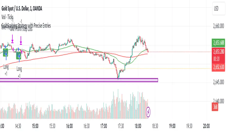
IBD PowerTrendThis IBD PowerTrend indicator is designed to help traders identify strong market uptrends based on the IBD Market School's Power Trend methodology. It is intended to be added to daily charts on major indexes.
Concept and Methodology
The IBD PowerTrend helps traders identify strong market uptrends. Markets generally exist in three states: uptrends, downtrends, and rangebound motion. This methodology focuses on:
Downtrends: Stay out of the market.
Rangebound markets: Often frustrating, best avoided.
Uptrends: Identify the strongest uptrends early.
This indicator uses IBD's research on historical uptrends to help traders get in and stay in during robust market phases.
How It Works
A PowerTrend starts when the following four conditions are met simultaneously on a major index:
10-Day Low Above 21-Day EMA : The market's low must be above the 21-day exponential moving average (EMA) for at least 10 consecutive days.
21-Day EMA Above 50-Day SMA : The 21-day EMA must be above the 50-day simple moving average (SMA) for at least five consecutive days.
50-Day SMA Uptrend : The 50-day SMA must be in an uptrend (one day is sufficient).
Market Closes Up : The market must close higher than the previous day's close.
A PowerTrend typically ends when the 21-day EMA crosses back below the 50-day SMA. However, there are rare cases where a PowerTrend can end early due to a circuit breaker or a follow-through day failure. In this script, a circuit breaker is defined as a break of the 50-day line and being more than 10% below recent highs (interpreted as three months).
How to Use
When the PowerTrend is active, the indicator will plot green circles, signaling a strong market uptrend. During these periods, traders might observe opportunities in growth stocks breaking out of sound bases and consider the use of margin. Conversely, during downtrends, the indicator suggests a more defensive approach.
It is recommended to use on daily timeframe.
Chart Description
Main Chart:
- EMA 21 (blue): The 21-day exponential moving average.
- SMA 50 (red): The 50-day simple moving average.
First Panel:
- IBD PowerTrend Indicator: Plots the PowerTrend status with green circles indicating an active PowerTrend.
Second Panel:
- Volume Bars
