Synthetic Implied APROverview
The Synthetic Implied APR is an artificial implied APR, designed to imitate the implied APR seen when trading cryptocurrency funding rates. It combines real-time funding rates with premium data to calculate an artificial market expectation of the annualized funding rate.
The (actual) implied APR is the market's expectation of the annualized funding rate. This is dependent on bid/ask impacts of the implied APR, something which is currently unavailable to fetch with TradingView. In essence, an implied APR of X% means traders believe that asset's funding fees to average X% when annualized.
What's important to understand, is that the actual value of the synthetic implied APR is not relevant. We only simply use its relative changes when we trade (i.e if it crosses above/below its MA for a given weight). Even for the same asset, the implied APRs will change depending on days to maturity.
How it calculates
The synthetic implied APR is calculated with these steps:
Collects premium data from perpetual futures markets using optimized lower timeframe requests (check my 'Predicted Funding Rates' indicator)
Calculates the funding rate by adding the premium to an interest rate component (clamped within exchange limits)
Derives the underlying APR from the 8-hour funding rate (funding rate × 3 × 365)
Apply a weighed formula that imitates both the direction (underlying APR) with the volatility of prices (from the premium index and funding)
premium_component = (prem_avg / 50 ) * 365
weighedprem = (weight * fr) + ((1 - weight) * apr) + (premium_component * 0.3)
impliedAPR = math.avg(weighedprem, ta.sma(apr, maLength))
How to use it: Generally
Preface: Funding rates are an indication of market sentiment
If funding is positive, generally the market is bullish as longs are willing to pay shorts funding
If funding is negative, generally the market is bearish as shorts are willing to pay longs funding
So, this script can be used like a typical oscillator:
Bullish: If implied APR > MA OR if implied APR MA is green
Bearish: If implied APR < MA OR if implied APR MA is red
The components:
Synthetic Implied APR: The main metric. At current setting of 0.7, it imitates volatility
Weight: The higher the value, the smoother the synthetic implied APR is (and MA too). This value is very important to the imitation. At 0.7, it imitates the actual volatility of the implied APR. At weight = 1, it becomes very smooth. Perfect for trading
Synthetic Implied APR Moving Average: A moving average of the Synthetic implied APR. Can choose from multiple selections, (SMA, EMA, WMA, HMA, VWMA, RMA)
How to use it: Trading Funding
When trading funding there're multiple ways to use it with different settings
Trade funding rates with trend changes
Settings: Weight = 1
Method 1: When the implied APR MA turns green, long funding rates (or short if red)
Method 2: When the implied APR crosses above the MA, long funding rates (or short when crosses below)
Trade funding rates with MA pullbacks
Settings: Weight = 0.7, timeframe 15m
In an uptrend: When implied APR crosses below then above the script, long funding opportunity
In an downtrend: When implied APR crosses above then below the script, shortfunding opportunity
You can determine the trend with the method before, using a weight of 1
To trade funding rates, it's best to have these 3 scripts at these settings:
Predicted Funding Rates: This allows you to see the predicted funding rates and see if they've maxxed out for added confluence too (+/-0.01% usually for Binance BTC futures)
Synthetic implied APR: At weight 1, the MA provides a good trend (whether close above/below or colour change)
Synthetic implied APR: At weight 0.7, it provides a good imitation of volatility
How to use it: Trading Futures
When trading futures:
You can determine roughly what the trend is, if the assumption is made that funding rates can help identify trends if used as a sentiment indicator. It should be supplemented with traditional trend trading methods
To prevent whipsaws, weight should remain high
Long trend: When the implied APR MA turns green OR when it crosses above its MA
Short trend: When the implied APR MA turns red OR when it below above its MA
Why it's original
This indicator introduces a unique synthetic weighting system that combines funding rates, underlying APR, and premium components in a way not found in existing TradingView scripts. Trading funding rates is a niche area, there aren't that many scripts currently available. And to my knowledge, there's no synthetic implied APR scripts available on TradingView either. So I believe this script to be original in that sense.
Notes
Because it depends on my triangular weighting algos, optimal accuracy is found on timeframes that are 4H or less. On higher timeframes, the accuracy drops off. Best timeframes for intraday trading using this are 15m or 1 hour
The higher the timeframe, the lower the MA one should use. At 1 hour, 200 or higher is best. At say, 4h, length of 50 is best
Only works for coins that have a Binance premium index
Inputs
Funding Period - Select between "1 Hour" or "8 Hour" funding cycles. 8 hours is standard for Binance
Table - Toggle the information dashboard on/off to show or hide real-time metrics including funding rate, premium, and APR value
Weight - Controls the balance between funding rate (higher values = smoother) and APR (lower values = more responsive) in the calculation, ranging from 0.0 to 1.0. Default is 0.7, this imitates the volatility
Auto Timeframe Implied Length - Automatically calculates optimal smoothing length based on your chart timeframe for consistent behavior across different time periods
Manual Implied Length - Sets a fixed smoothing length (in bars) when auto mode is disabled, with lower values being more responsive and higher values being smoother
Show Implied APR MA - Displays an additional moving average line of the Synthetic Implied APR to help identify trend direction and crossover signals
MA Type for Implied APR - Selects the calculation method (SMA, EMA, WMA, HMA, VWMA, or RMA) for the moving average, each offering different responsiveness and lag characteristics
MA Length for Implied APR - Sets the lookback period (1-500 bars) for the moving average, with shorter lengths providing more signals and longer lengths filtering noise
Show Underlying APR - Displays the raw APR calculation (without synthetic weighting) as a reference line to compare against the main indicator
Bullish Color - Sets the color for positive values in the table and rising MA line
Bearish Color - Sets the color for negative values in the table and falling MA line
Table Background - Customizes the background color and transparency of the information dashboard
Table Text Color - Sets the color for label text in the left column of the information table
Table Text Size - Controls the font size of table text with options from Tiny to Huge
Sentiment

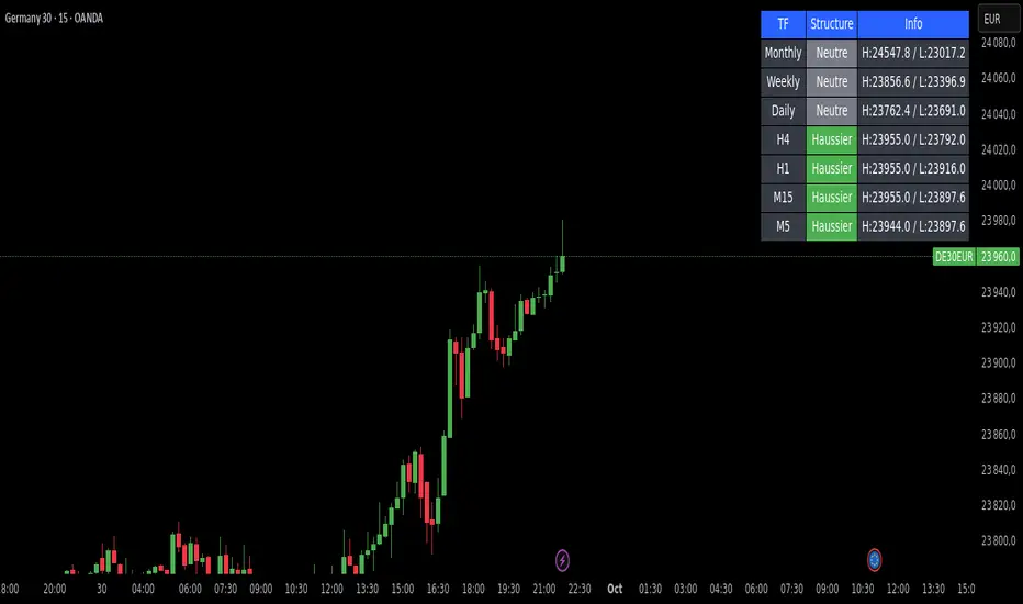
Market Structure DashboardThis indicator displays a **multi-timeframe dashboard** that helps traders track market structure across several horizons: Monthly, Weekly, Daily, H4, H1, M15, and M5.
It identifies the current trend (Bullish, Bearish, or Neutral) based on the progression of **swing highs and lows** (HH/HL, LH/LL).
For each timeframe, the dashboard shows:
* The **current structure** (Bullish, Bearish, Neutral) with a clear color code (green, red, gray).
* **Pivot information**:
* either the latest swing high/low values,
* or the exact date and time of their occurrence (user-selectable in the settings).
An integrated **alert system** notifies you whenever the market structure changes (e.g., "Daily: Neutral → Bullish").
### Key Features:
* Clear overview of multi-timeframe market structures.
* Customizable pivot info display (values or timestamps).
* Built-in alerts on trend changes.
* Compact and readable dashboard, displayed in the top-right corner of the chart.
This tool is ideal for traders who want to quickly assess the **overall market structure** across multiple timeframes and be instantly alerted to potential reversals.
Market Sentiment Trend Gauge [LevelUp]Market Sentiment Trend Gauge simplifies technical analysis by mathematically combining momentum, trend direction, volatility position, and comparison against a market benchmark, into a single trend score from -100 to +100. Displayed in a separate pane below your chart, it resolves conflicting signals from RSI, moving averages, Bollinger Bands, and market correlations, providing clear insights into trend direction, strength, and relative performance.
THE PROBLEM MARKET SENTIMENT TREND GAUGE (MSTG) SOLVES
Traditional indicators often produce conflicting signals, such as RSI showing overbought while prices rise or moving averages indicating an uptrend despite market underperformance. MSTG creates a weighted composite score to answer: "What's the overall bias for this asset?"
KEY COMPONENTS AND WEIGHTINGS
The trend score combines
▪ Momentum (25%): Normalized 14-period RSI, capped at ±100.
▪ Trend Direction (35%): 10/21-period EMA relationships,
▪ Volatility Position (20%): Price position, 20-period Bollinger Bands, capped at ±100.
▪ Market Comparison (20%): Daily performance vs. SPY benchmark, capped at ±100.
Final score = Weighted sum, smoothed with 5-period EMA.
INTERPRETING THE MSTG CHART
Trend Score Ranges and Colors
▪ Bright Green (>+30): Strong bullish; ideal for long entries.
▪ Light Green (+10 to +30): Weak bullish; cautiously favorable.
▪ Gray (-10 to +10): Neutral; avoid directional trades.
▪ Light Red (-10 to -30): Weak bearish; exercise caution.
▪ Bright Red (<-30): Strong bearish; high-risk for longs, consider shorts.
Reference Lines
▪ Zero Line (Gray): Separates bullish/bearish; crossovers signal trend changes.
▪ ±30 Lines (Dotted, Green/Red): Thresholds for strong trends.
▪ ±60 Lines (Dashed, Green/Red): Extreme strength zones (not overbought/oversold); manage risk (tighten stops, partial profits) but trends may persist.
Background Colors
▪ Green Tint (>+20): Bullish environment; favorable for longs.
▪ Red Tint (<-20): Bearish environment; caution for longs.
▪ Light Gray Tint (-20 to +20): Neutral/range-bound; wait for signals.
Extreme Readings vs. Traditional Signals
MSTG ±60 indicates maximum alignment of all factors, not reversals (unlike RSI >70/<30). Use for risk management, not automatic exits. Strong trends can sustain extremes; breakdowns occur below +30 or above -30.
INFORMATION TABLE INTERPRETATION
Trend Score Symbols
▲▲ >+30 strong bullish
▲ +10 to +30
● -10 to +10 neutral
▼ -30 to -10
▼▼ <-30 strong bearish
Colors: Green (positive), White (neutral), Red (negative).
Momentum Score
+40 to +100 strong bullish
0 to +40 moderate bullish
-40 to 0 moderate bearish
-100 to -40 strong bearish
Market vs. Stock
▪ Green: Stock outperforming market
▪ Red: Stock underperforming market
Example Interpretations:
-0.45% / +1.23% (Green): Market down, stock up = Strong relative strength
+2.10% / +1.50% (Red): Both rising, but stock lagging = Relative weakness
-1.20% / -0.80% (Green): Both falling, but stock declining less = Defensive strength
UNDERSTANDING EXTREME READINGS VS TRADITIONAL OVERBOUGHT/OVERSOLD
⚠️ Critical distinctions
Traditional Overbought/Oversold Signals:
▪ Single indicator (like RSI >70 or <30) showing momentum excess
▪ Often suggests immediate reversal or pullback expected
▪ Based on "price moved too far, too fast" concept
MSTG Extreme Readings (±60):
▪ Composite alignment of 4 different factors (momentum, trend, volatility, relative strength)
▪ Indicates maximum strength in current direction
▪ NOT a reversal signal - means "all systems extremely bullish/bearish"
Key Differences:
▪ RSI >70: "Price got ahead of itself, expect pullback"
▪ MSTG >+60: "Everything is extremely bullish right now"
▪ Strong trends can maintain extreme MSTG readings during major moves
▪ Breakdowns happen when MSTG falls below +30, not at +60
Proper Usage of Extreme Readings:
▪ Risk Management: Tighten stops, take partial profits
▪ Position Sizing: Reduce new position sizes at extremes
▪ Trend Continuation: Watch for sustained extreme readings in strong markets
▪ Exit Signals: Look for breakdown below +30, not reversal from +60
TRADING WITH MSTG
Quick Assessment
1. Check trend symbol for direction.
2. Confirm momentum strength.
3. Note relative performance color.
Examples:
▲▲ 55.2 (Green), Momentum +28.4, Outperforming: Strong buy setup.
▼ -18.6 (Red), Momentum -43.2, Underperforming: Defensive positioning.
Entry Conditions
▪ Long: stock outperforming market
- Score >+30 (bright green)
- Sustained green background
- ▲▲ symbol,
▪ Short: stock underperforming market
- Score <-30 (bright red)
- Sustained red background
- ▼▼ symbol
Avoid Trading When:
▪ Gray zone (-10 to +10).
▪ Rapid color changes or frequent zero-line crosses (choppy market).
▪ Gray background (range-bound).
Risk Management:
▪ Stop Loss: Exit on zero-line crossover against position.
▪ Take Profit: Partial at ±60 for risk control.
▪ Position Sizing: Larger when signals align; smaller in extremes or mixed conditions.
KEY ADVANTAGES
▪ Unified View: Weighted composite reduces noise and conflicts.
▪ Visual Clarity: 5-color system with gradients for rapid recognition.
▪ Market Context: Relative strength vs. SPY identifies leaders/laggards.
▪ Flexibility: Works across timeframes (1-min to weekly); customizable table.
▪ Noise Reduction: EMA smoothing minimizes false signals.
EXAMPLES
Strong Bull: Trend Score 71.9, Momentum Score 76.9
Neutral: Trend Score 0.1, Momentum Score -9.2
Strong Bear: Trend Score -51.7, Momentum Score -51.5
PERFORMANCE AND LIMITATIONS
Strengths: Trend identification, noise reduction, relative performance versus market.
Limitations: Lags at turning points, less effective in extreme volatility or non-trending markets.
Recommendations: View on multiple timeframes, combine with price action and fundamentals.

ActivTrades Europe Market Pulse – Ion JaureguiActivTrades Europe Market Pulse Indicator – Detailed Description
The ActivTrades Europe Market Pulse Indicator is a market analysis tool designed to assess overall risk sentiment in European financial markets. Unlike trading signals, it provides a clear view of market conditions, helping traders and analysts understand whether the market environment favors risk-taking or caution.
How it Works:
The indicator combines three key metrics to gauge European market sentiment:
1. Equity Index and Sector Performance:
o Compares the relative position of major European equity indices and sector ETFs to their 50-day moving averages.
o A performance above the moving average signals market strength, while below indicates relative weakness, reflecting investors’ appetite for risk.
2. German 10-Year Government Bond Yield:
o Monitors the level of the German 10-year bond yield relative to its 10-day moving average.
o Yields above the moving average indicate greater confidence and risk tolerance, while yields below suggest caution or risk aversion.
3. Point-Based Scoring System:
o Each instrument is assigned points depending on whether it is above or below its moving average.
o Points are combined to generate an overall Risk-On/Risk-Off score, which oscillates between -5 (Extreme Risk-Off) and +5 (Extreme Risk-On), providing a quantitative measure of European market sentiment.
Visual Output:
• The results are displayed as a colored histogram, allowing quick interpretation of market conditions.
• Labeled zones include:
o Extreme Risk-On: Indicates bullish conditions with high risk appetite.
o Extreme Risk-Off: Reflects heightened market caution or fear.
o Neutral Zone: Suggests mixed or balanced sentiment.
Purpose and Use:
• Provides investors, analysts, and traders with insight into the prevailing European market mood.
• Supports informed decision-making and risk management strategies without offering explicit buy or sell signals.
________________________________________
Disclaimer:
The information provided does not constitute investment research. It has not been prepared in accordance with legal requirements designed to promote the independence of investment research and should be considered marketing communication.
All information is prepared by ActivTrades ("AT") and does not contain a record of AT’s prices or constitute an offer or solicitation for a transaction in any financial instrument. No representation is made regarding its accuracy or completeness.
This material does not consider the specific investment objectives or financial situation of any individual. Past performance and forecasts are not reliable indicators of future results. AT provides execution-only services. Any action taken based on this information is at the recipient’s own risk. Political and central bank risks are unpredictable. Platform tools do not guarantee success.
Indicators Risk Advice: The indicator and publications do not constitute financial, investment, trading, or other advice. They are designed to provide trend guidance and filter market noise for international users and are not intended for use by users in Spain.

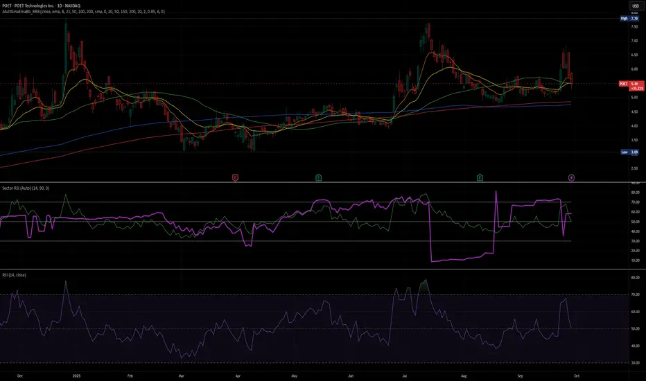
Sector RSI (Auto-Select)This indicator measures the relative strength momentum of any stock against its most closely correlated sector ETF, using the Relative Strength Index (RSI).
Auto sector selection: The script computes correlations between your symbol’s short-term returns and all major SPDR sector ETFs (XLB, XLE, XLF, XLI, XLK, XLP, XLU, XLV, XLY, XTN). The sector with the highest correlation is automatically chosen as the benchmark.
Sector vs Symbol RSI: It calculates RSI (default 14-period) for both the chosen sector and the current chart’s symbol.
Display modes:
Line mode: Plots both RSIs with colored fill (red if the sector RSI is stronger, green if the symbol RSI is stronger).
Histogram mode: Shows the difference between Sector RSI and Symbol RSI as a column chart.
RSI bands: Standard 70/50/30 reference lines are available in line mode.
Status line: The selected sector’s ticker is shown on the TradingView status line so you always know which sector is being used.
Use Cases:
Identify whether a stock’s momentum is driven by its sector or if it’s showing independent relative strength.
Detect sector rotations: when the stock begins to outperform or underperform its sector on momentum basis.
Combine with absolute RSI levels (overbought/oversold) to filter signals.
Notes:
This tool infers sector membership via rolling correlation, not from static classification metadata. This means in some cases (e.g. diversified companies or news shocks) the “best” sector may not be the official one, but the one most correlated in the current market regime.
Use min positive correlation input to filter out weak matches and enforce a fallback (defaults to Technology XLK).
3CRGANG - SESSIONSOverview
The "3CRGANG - SESSIONS" indicator is a comprehensive tool for visualizing and monitoring major global trading sessions on TradingView charts. It highlights sessions for key exchanges—New York (NYSE), London (LSE), Frankfurt (FSE), Sydney (ASX), Tokyo (TSE), and Hong Kong (HKSE)—with customizable alerts, background coloring on low timeframes, and an interactive dashboard table. Designed for traders who operate across timezones or need session-based context, it accounts for holidays, half-days, and daylight saving time (DST) adjustments to provide accurate, real-time session status. On charts of 1-minute or lower, it overlays semi-transparent background colors to mark active sessions visually. Across all timeframes, a compact table at the bottom center displays session cells with dynamic coloring, and hovering over each reveals a tooltip with the weekly schedule, time until open/close, and holiday notes.
Built on Pine Script v6, this overlay indicator enhances situational awareness for forex, stocks, futures, and other assets by syncing with exchange-specific calendars. Its invite-only status ensures access to refined features that go beyond standard session tools, making it ideal for multi-market strategies.
How It's Built: Core Concepts and Calculations
The indicator leverages a modular approach to session detection, drawing from time-based logic for precision. Sessions are defined by fixed start/end times in their native timezones (e.g., NYSE: 0930-1600 America/New_York), adjusted dynamically for DST via timezone-aware functions. Key components include:
Session Activation Checks: Using helper functions like f_isSessionActive, it evaluates if the current bar or real-time timestamp falls within session hours, excluding weekends. Time is broken into minutes since midnight for comparisons, with special handling for overnight sessions (though none here cross midnight significantly).
Holiday and Half-Day Integration: Pre-loaded holiday maps for each exchange detect full closures or early closes (e.g., NYSE half-days end at custom times like 1300). If a half-day is identified, session end times are overridden, and pre-close periods recalculated (e.g., 30/5 minutes before adjusted close).
Pre-Open/Pre-Close Detection: Sub-sessions (e.g., 30 minutes before open) use similar logic to flag impending events, triggering only on the first bar of these windows via f_SessionOpen and f_SessionClose for efficiency.
Timestamp Calculations: Functions like f_SessionTimes and f_SessionTimesForTooltip compute open/close timestamps from timenow, adjusting for next trading day if after close or on weekends/holidays. This ensures forward-looking accuracy in tooltips.
Alert System: Configurable per-session, it fires notifications for pre-open (30/5 min), open, pre-close (30/5 min), close, and holidays. Alerts use alert.freq_once_per_bar to avoid spam, gated by market open status.
Visual Dashboard: A 6-column table is drawn with table.new, positioned via input (default bottom-center). Cells update colors based on state: active (session color at 75% opacity), pre-active (yellow), or inactive (gray). Tooltips via f_getSessionTooltip compile weekly schedules using f_formatScheduleEntry, which converts session times to user timezone, formats dates (DD/MM), weekdays (padded for alignment), and notes holidays/early closes. Time remaining uses f_formatTimeRemainingtooltip for human-readable countdowns (e.g., "1h:30m").
Background Coloring: On ≤1m timeframes, bgcolor applies session-specific hues (e.g., green for NYSE) at 90-95% transparency, configurable via light/dark themes.
User Customization: Inputs handle timezone (90+ options with DST), time format (standard/military, though not fully implemented in script), device (adjusts text padding/sizes), and theme (swaps colors for readability).
This setup combines timestamp arithmetic, conditional mapping, and array-based date iteration to create a robust, adaptive system that respects global market nuances without relying on simplistic built-in session strings.
Why It's Useful
Trading sessions drive liquidity, volatility, and price action—e.g., London open often sparks trends in forex, while NYSE influences equities. This indicator demystifies these by providing at-a-glance visuals and alerts, reducing the need for manual timezone conversions or external calendars. Background colors on low TFs help spot session overlaps (e.g., London/NY for high volume), while the table's tooltips offer quick weekly overviews, ideal for planning around holidays like Lunar New Year (HKSE-specific additions). Alerts prevent missing key events, and holiday detection avoids false expectations during closures.
For global traders, it minimizes errors in multi-asset setups; scalpers benefit from pre-open warnings, while swing traders use schedules for longer-term context. Its non-intrusive design (transparent on higher TFs) keeps charts clean, enhancing overall workflow efficiency.
How to Use It
Add to Chart: Access via invite-only on TradingView; apply to any timeframe, best on intraday for backgrounds or any for the dashboard.
Configure Inputs:
Time Settings: Select your timezone (e.g., UTC+3 Jerusalem) for accurate tooltip conversions; choose time format (standard preferred for readability).
Visualization Setup: Pick device (Desktop/Tablet/Mobile) for optimized text sizing/padding; select Light/Dark theme to match your chart.
Sessions Dashboard: Adjust table position if needed (default bottom-center).
Notifications Settings: Toggle alerts per exchange (e.g., enable NYSE for US focus).
Trading Application:
Visual Cues: On ≤1m charts, watch for color changes to enter/exit during active sessions. Hover table cells for schedules—current day highlighted, future/past separated, holidays marked (*).
Alerts: Set up in TradingView's alert manager for "alert() function calls only" to get notifications like "New York Session is about to Open in less than 5 minutes!"
Strategies: Use pre-open for setups (e.g., range breaks), closes for profit-taking. Combine with volume indicators during overlaps.
Best Practices: Test on demo; adjust alerts to avoid overload. For non-realtime, tooltips use current date for projections.
Why It's Unique and Worth Invite-Only Access
Unlike basic session highlighters that use rigid time strings or ignore holidays, this indicator integrates a custom holiday library with half-day adjustments and additional events (e.g., Buddha's Birthday for HKSE), ensuring precision across exchanges. Its tooltip system—generating timezone-converted weekly schedules with day adjustments, countdowns, and holiday notes—provides unmatched planning utility, while adaptive visuals (device/theme-aware) and granular alerts (pre-events included) elevate it beyond public tools. The logic for timestamp forward-projection, weekend skipping, and formatted entries builds on but significantly enhances built-in functions and educational examples.
This originality—protecting the proprietary blend of global calendar handling, alert gating, and interactive dashboards—justifies closed-source status. As invite-only, it delivers premium value through reliable, low-maintenance features that free traders from external apps, warranting access for those seeking an edge in session-based trading. Contact via TradingView for support.
Disclaimer
This indicator is a tool for analyzing market sessions and does not guarantee success. Trading involves risk, and past performance is not indicative of future results. Always use proper risk management.

Gold NY Session Key TimesJust showing to us that news come out, open market, close bond for NY Session Time For Indonesia


ROGUE RSI PROThe ROGUE RSI PRO is a custom RSI with a floating 50 line that takes the classic Relative Strength Index and adds a dynamic midpoint that adapts to current market conditions. Instead of relying on the static 50-level, this indicator calculates a moving average of RSI to serve as a “floating 50 line,” helping traders better identify momentum bias and trend shifts.
Key Features:
-Dynamic Midpoint: The floating 50 line moves with RSI, providing a more adaptive measure of bullish/bearish control.
-Color-Coded RSI: The RSI line automatically changes color — green when bulls are in control, red when bears are in control, gray when neutral.
-Adaptive Bands (optional): Standard deviation bands around the floating line show when RSI is stretched relative to its own recent history.
-Classic Zones: Overbought (70) and oversold (30) levels remain for reference.
-Trend Context: Helps highlight when momentum is sustainably above or below its “normal” zone, filtering out false midline crosses.
How to Use:
-Watch the RSI line color — green = bullish momentum, red = bearish momentum.
-Use the floating 50 line as a dynamic pivot: RSI above it confirms strength, RSI below it confirms weakness.
-Look for band touches or extreme deviations as potential reversal or continuation signals.
*Combine with price action, volume, or higher timeframe bias for stronger setups.*

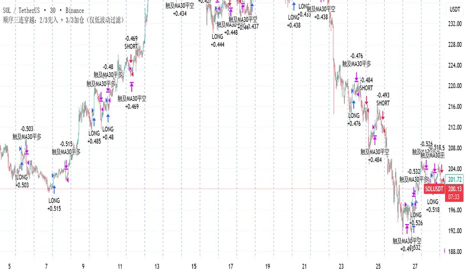
顺序三连穿越:2/3先入 + 3/3加仓(仅低波动过滤)策略描述(中文)
本策略基于 顺序三连穿越 原则:当 MA5 依次上穿 MA10、MA30、MA60 时,触发趋势做多信号;反之依次下穿时触发做空信号。
在完成 2/3 穿越时即可先行入场,完成 3/3 穿越时可选择加仓确认。
为减少震荡磨损,策略引入了布林带带宽过滤:当市场波动率过低时禁止入场。同时设有 冷静期,避免刚出场后立即反复进场。
该系统适用于趋势性较强或弱趋势行情,能够较好地捕捉单边走势,但在长时间震荡行情中仍可能遭遇利润侵蚀。
Strategy Description (English)
This strategy is built on the Sequential Triple Crossover principle:
When the 5-period moving average (MA5) sequentially crosses above MA10, MA30, and MA60, a bullish entry is triggered.
Conversely, when MA5 sequentially crosses below MA10, MA30, and MA60, a bearish entry is triggered.
An early entry is allowed once 2 out of 3 crossovers are completed, while the final crossover (3/3) can optionally serve as a confirmation add-on position.
To mitigate losses in choppy conditions, the system uses a Bollinger Bandwidth filter that blocks entries when volatility is too low. A cooldown period is also implemented to avoid immediate re-entries after closing a trade.
This setup performs well in trending or weak-trend environments, capturing directional moves effectively, but may still suffer from profit erosion during prolonged sideways markets.
ICT Cycle Boxes - MTFICT Cycle Boxes – Pro Strategy (3×MTF)
A multi-timeframe, confluence-driven strategy designed to capture impulsive moves, controlled pullbacks, and regime shifts. It evaluates three timeframes at once:
TF-A (Higher): establishes the broader regime.
TF-B (Mid): confirms trend context and momentum.
TF-C (Trade TF): times the entry.
Two entry tiers are used:
Very-Good Entries: all conditions align in the direction of the higher-timeframe regime, with fresh confirmation on the trade timeframe.
Medium Entries: directionally aligned but with lighter confirmation, for additional opportunities during established trends.
Risk is managed with ATR-based stops/targets on the trade timeframe, an optional trailing stop, position sizing by percent of equity, a cooldown after flat, and optional early exit when the trade timeframe returns to a neutral regime. Session filtering and flip-on-opposite are available for refined execution.
How to use
Set TF-A/TF-B/TF-C to suit your market (e.g., W/D/60, D/240/30).
Adjust risk parameters (stop/target, trailing, position size).
Enable session filtering if desired.
Review results in the Strategy Tester and fine-tune to your market and instrument.

Adaptive Fear & Greed Index with ML-Enhanced SD - HOSSAM Adaptive Fear and Greed Index with ML-Enhanced Standard Deviation
📊 Overview
A sophisticated market sentiment indicator that combines traditional Fear and Greed Index methodology with machine learning-inspired adaptive algorithms. This tool dynamically adjusts to changing market conditions, providing more accurate sentiment readings and early warning signals.
🔥 Key Features
Adaptive Standard Deviation: Automatically adjusts volatility bands based on market conditions
VWAP Integration: Incorporates volume-weighted average price for better price context
Machine Learning Elements: Self-adjusting parameters that learn from recent market behavior
Multi-Regime Detection: Identifies high/low volatility environments
Dynamic Weighting: Automatically adjusts component weights based on market performance
Z-Score Analysis: Statistical significance measurement for deviations
📈 How It Works
The indicator combines four key market components:
Price Momentum with VWAP deviation
Volume-Weighted Volatility
RSI with Volume Confirmation
Market Structure Analysis
🎯 Interpretation
0-30: Extreme Fear (Potential Buying Opportunity)
30-40: Fear
40-60: Neutral
60-70: Greed
70-100: Extreme Greed (Potential Selling Opportunity)
⚡ Unique Advantages
Self-Adjusting Bands: SD bands expand during high volatility, contract during calm periods
Regime Awareness: Different signals for high/low volatility environments
Volume Validation: All components include volume confirmation
Statistical Significance: Z-scores show how extreme current readings are
🚨 Alert Conditions
Extreme greed/fear in high volatility regimes
Statistical outliers (Z-score > 2.5)
Trend acceleration signals
💡 Ideal For
Crypto traders seeking sentiment-based entries/exits
Swing traders looking for mean reversion opportunities
Risk management and position sizing decisions
Market regime identification
⚙️ Customization
Adjustable parameters include lookback period, SD multiplier, smoothing, and ML learning rate to match your trading style.
Category: Strategy & Sentiment Analysis
Tags: #FearAndGreed #MarketSentiment #Volatility #Cryptocurrency #Trading #Indicator #MachineLearning #VWAP

ML+MA+ATRretardretardretardretardretardretardretardretardretardretardretardretardretardretardretardretardretardretardretardretard never believe this
ADX y DI + ATRADR + DI
Every time ADR cross 25, print an ATR value label
Every time ADR +25 and DI+ cross DI-, print an ATR value label
Every time ADR +25 and DI- cross DI+, print an ATR value label
I use ATR for my SL.

ST Market StructureStructure
MTUIP Main Trend Upward Inflection Point
MTDIP Main Trend Downward Inflection Point
KR + KEY Range Inflection for the Main trend (+/-)
KRI - KEY Range Inflection for the Main trend (+/-)
MS Market Sentiment
UT#1 New trend leg up target 1
BOC Breakout Confirmation
IB Intraday Bias
BDC Breakdown Confirmation
DT#1 New trend leg down target 1
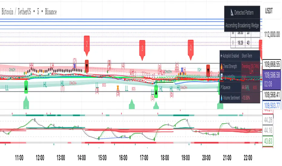
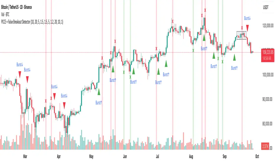
PCCE + False Breakout DetectorPCCE + False Breakout Detector
Type: Invite-Only Indicator (closed source)
Purpose : Detect price compression and the first expansion after it, while flagging failed breakouts (bull/bear traps) for risk control.
1) What’s original here!
This tool integrates three behaviour-driven tests that work in a single decision flow:
A compression score built from:
(a) monotonic body shrink,
(b) wick-dominance, and
(c) relative range contraction versus history.
This is not a bands/oscillator port; it’s a structure-first filter that isolates coils.
A thrusted expansion requirement that combines real-body impulse and relative-volume participation (+ optional EMA alignment) to qualify a breakout beyond the coil envelope.
An immediate post-breakout failure test (trap logic) that checks whether the breakout re-enters the prior swing range within a short window.
Used together, these steps turn raw breaks into contextual, risk-aware events: setup → trigger → validation. That is the value of the combination.
⸻
2) Concepts behind the calculations:
Let body_t = |close_t − open_t|,
uw_t = high_t − max(open_t, close_t) (upper wick),
lw_t = min(open_t, close_t) − low_t (lower wick),
R_t(k) = highest(high, k)_t − lowest(low, k)_t (range over k bars),
MA_body(k) = SMA(body, k), MA_vol(k) = SMA(volume, k).
2.1 Compression (coil) detection
We evaluate within a window k = coilLength:
• Body shrink count: number of consecutive steps where body_(t−i) < body_(t−i−1).
• Wick dominance: AvgWickBody = avg( (uw + lw) / body ) over the window; require AvgWickBody > wickRatioMin.
• Relative range contraction: current R_t(k) must be less than α × avg( R_(t−j)(k) ) computed over a lookback of rangeWindow windows, with α < 1 (tight market).
When all three are true, we mark a coil zone; the coil bounds are High_coil = highest(high, k), Low_coil = lowest(low, k).
2.2 Expansion (“Burst”) confirmation
A breakout is only qualified when all hold on bar close:
• Direction: close > High_coil → up; close < Low_coil → down.
• Body thrust: body_t > MA_body(k) × bodyMult.
• Participation: volume_t > MA_vol(k) × volumeMultiplier.
• Trend alignment (optional): close_t > EMA(emaLen) for up / < EMA for down.
• Cooldown: t − lastSignal > cooldownBars.
If satisfied, print Burst↑ or Burst↓ on that bar.
2.3 Failed breakout (trap) detection
Let H_s and L_s be the prior swing high/low from a lookback rangeLookback (excluding the current bar). Define:
• Bull break attempt: a bar that closed above H_s.
Bull trap: within fakeoutBars bars after that attempt, any close returns below H_s. Mark ❌ red above that bar.
• Bear break attempt: a bar that closed below L_s.
Bear trap: within fakeoutBars bars after that attempt, any close returns above L_s. Mark ❌ green below that bar.
Alerts fire on bar close only.
⸻
3) What you’ll see on the chart
• Coil box: shaded envelope (tight-range bounds).
• Burst labels: Burst↑ / Burst↓ only when thrust + volume (and optional EMA) confirm the break.
• Trap markers: ❌ red (failed bullish breakout) / ❌ green (failed bearish breakout).
• Alerts: “Burst Up” and “Burst Down” (close-based).
⸻
4) How to use it
1. Preparation : When a coil box appears, mark the bounds; expect expansion risk to rise.
2. Trigger : Act only on Burst labels (they already encode body/volume thrust and optional trend).
3. Validation : If a ❌ trap prints shortly after a breakout, treat it as a warning/exit event; breakouts that re-enter the prior swing range are statistically fragile.
4. Context : Works well on 15m–4H where structure is visible. Combine with your own higher-timeframe bias, S/R, liquidity pools, and risk rules.
5. Tuning :
• Tighten/loosen coil sensitivity via coilLength, wickRatioMin, and the range contraction factor.
• Use larger bodyMult / volumeMultiplier to demand stronger breaks.
• cooldownBars controls clustering in fast sessions.
• rangeLookback and fakeoutBars control how strict the trap check is.
⸻
5) Repainting, scope, and limitations
• Burst and trap labels are evaluated on bar close; once printed, they do not repaint. Coil boxes can update while forming; they stabilize once conditions are met.
• Sudden news/illiquid periods can defeat filters; adjust multipliers and cooldown for your instrument.
• This is an indicator, not a strategy; it does not publish PnL, win-rate, or forward promises.
Fetti Fields Header (Presets)This is for individuals that like to customize their charts and add some style and motivation

ORB Storico + Box Multipli + Notifiche (final clean v2)Session ORB Live Pro — Pre-Market Boxes & MA Suite
Description (EN):
Session ORB Live Pro is a Pine v6 indicator built for intraday traders who rely on Opening Range Breakouts. It draws session boxes for London, New York, and Asia—plus configurable Pre-London and Pre-New York windows—live from the very first candle (no waiting for 10 bars). The high/low levels update in real time, and optional breakout alerts fire the moment price closes beyond the range. To keep charts clean and relevant for scalping, the boxes auto-hide on chart timeframes above 20 minutes.
Beyond ranges, the tool adds a compact moving-average suite: SMA-50 and RMA-200 out of the box, plus three fully customizable MAs (SMA/EMA/RMA/WMA/HMA) with selectable color, thickness, and style (line, stepline, circles). Each session and pre-session can be toggled on/off and tinted with its own color, so you can tailor the visual map of liquidity grabs and range breaks to your strategy.
Key features
Live ORB boxes for London, New York, Asia (no 10-bar delay).
Pre-sessions: Pre-London & Pre-New York with independent time windows and colors.
Auto visibility filter: boxes show only on ≤ 20m chart TF; hidden on higher TFs.
Breakout alerts when price closes above/below the session range (ready for alert() rules).
MA toolkit: SMA-50, RMA-200 + 3 user MAs (SMA/EMA/RMA/WMA/HMA) with color, style, and width.
Clean inputs using input.session; robust, low-friction UX.
How to use
Set your ORB calculation timeframe (e.g., 15m) and choose which sessions/pre-sessions to display.
Pick colors for each box and enable alerts if you want instant breakout notifications.
Configure the MA suite for trend bias and dynamic S/R (e.g., SMA-50 for momentum, RMA-200 for bias).
Trade the first clean break or the retest of the ORB extremes—your choice. The visual map updates tick by tick.

X Trend dashboard (Lite)X Trend Dashboard
The X Trend Dashboard provides an instant snapshot of market sentiment by analyzing the aggregate "pressure" from 11 classic technical indicators. This version features a flexible EMA Fan (Fast, Medium, and Slow EMAs) instead of fixed timeframes, allowing for greater adaptability to any chart.
This tool is ideal for quickly assessing current market strength and identifying moments when bulls or bears are in control. The panel also displays the asset's correlation with BTC and ETH for additional market context.
Settings
Dashboard Settings: Change the panel's appearance and position.
Correlation Settings: Configure the BTC and ETH correlation.
Indicator Components: Enable or disable any of the indicators, including the three customizable EMAs, to tailor the pressure calculation to your trading style.

Crypto Market Dominance Stacked with LabelsA professional stacked area chart showing the dominance of major crypto market segments: BTC, ETH, Top 100 Altcoins, and #101+ Altcoins. Each layer is color-coded for clarity and includes dynamic labels with the current dominance percentage. Provides a clear visual representation of market share trends for traders, analysts, and crypto enthusiasts.
Features:
Stacked visualization of BTC, ETH, Top 100, and small-cap altcoins (#101+).
Color-coded areas for easy identification.
Dynamic labels showing each category’s current dominance percentage.
Horizontal reference lines for percentage levels.
Approximates top 100 and #101+ altcoins using TOTAL2 and TOTAL3 market cap tickers.
Use Case:
Track how market share shifts between BTC, ETH, large altcoins, and smaller altcoins over time. Ideal for analyzing trends, spotting dominance changes, and visualizing overall crypto market structure.

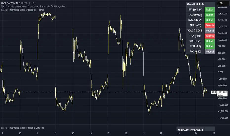
Market Internals Dashboard (Table) v5 - FixedHas a Dashboard for Market Internals and 3 Indices, very helpful
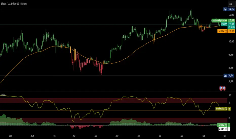
Irrationality Index by CRYPTO_ADA_BTC"The market can be irrational longer than you can stay solvent" ~ John Maynard Keynes
This indicator, the Irrationality Index, measures how far the current market price has deviated from a smoothed estimate of its "fair value," normalized for recent volatility. It provides traders with a visual sense of when the market may be behaving irrationally, without giving direct buy or sell signals.
How it works:
1. Fair Value Calculation
The indicator estimates a "fair value" for the asset using a combination of a long-term EMA (exponential moving average) and a linear regression trend over a configurable period. This fair value serves as a smoothed baseline for price, balancing trend-following and mean-reversion.
2. Volatility-Adjusted Z-Score
The deviation between price and fair value is measured in standard deviations of recent log returns:
Z = (log(price) - log(fairValue)) / volatility
This standardization accounts for different volatility environments, allowing comparison across assets.
3. Irrationality Score (0–100)
The Z-score is transformed using a logistic mapping into a 0–100 scale:
- 50 → price near fair value (rational zone)
- >75 → high irrationality, price stretched above fair value
- >90 → extreme irrationality, unsustainable extremes
- <25 → high irrationality, price stretched below fair value
- <10 → extreme bearish irrationality
4. Price vs Fair Value (% deviation)
The indicator plots the percentage difference between price and fair value:
pctDiff = (price - fairValue) / fairValue * 100
- Positive values → Percentage above fair value (optimistic / overvalued)
- Negative values → Percentage below fair value (pessimistic / undervalued)
Visuals:
- Irrationality (%) Line (0–100) shows irrationality level.
- Background Colors: Yellow= high bullish irrationality, Green= extreme bullish irrationality, Orange= high bearish irrationality, Red= extreme bearish irrationality.
- Price - FairValue (%) plot: price deviation vs fair value (%), Colored green above 0 and red below 0.
- Label: display actual price, estimated fair value, and Z-score for the latest bar.
- Alerts: configurable thresholds for high and extreme irrationality.
How to read it:
- 50 → Market trading near fair value.
- >75 / >90 → Price may be irrationally high; risk of pullback increases.
- <25 / <10 → Price may be irrationally low; potential rebound zones, but trends can continue.
- Price - FairValue (%) plot → visual guide for % price stretch relative to fair value.
Notes / Warnings:
- Measures relative deviation, not fundamental value!
- High irrationality scores do not automatically indicate trades; markets can remain can be irrational longer than you can stay solvent .
- Best used with other tools: momentum, volume, divergence, and multi-timeframe analysis.
Volume ClusteringThis Volume Clustering script is a powerful tool for analyzing intraday trading dynamics by combining two key metrics: volume Z-Score and Cumulative Volume Delta (CVD). By categorizing market activity into distinct clusters, it helps you identify high-conviction trading opportunities and understand underlying market pressure.
How It Works
The script operates on a simple, yet effective, premise: it classifies each trading bar based on its statistical significance (volume Z-Score) and buying/selling pressure (CVD).
Volume Z-Score
The volume Z-Score measures how far the current bar's volume is from its average, helping to identify periods of unusually high or low volume. This metric is a powerful way to spot when institutional or large players might be entering the market. A high Z-Score suggests a significant event is taking place, regardless of direction.
Cumulative Volume Delta (CVD)
CVD tracks the net buying and selling pressure across different timeframes. The script uses a lower timeframe (e.g., 1-minute) and anchors it to a higher timeframe (e.g., 1-day) to capture intraday pressure. A positive CVD indicates more buying pressure, while a negative CVD suggests more selling pressure.
Cluster Categories
The script analyzes the confluence of these two metrics to assign a cluster to each bar, providing actionable insights. The clusters are color-coded and labeled to make them easy to interpret:
🟢 High Conviction Bullish: Unusually high volume (high Z-Score) combined with significant buying pressure (high CVD). This cluster suggests strong bullish momentum.
🔴 High Conviction Bearish: Unusually high volume (high Z-Score) coupled with significant selling pressure (low CVD). This cluster suggests strong bearish momentum.
🟡 Low Conviction/Noise: Low to moderate volume and mixed buying/selling pressure. This represents periods of indecision or consolidation, where market noise is more prevalent.
🟣 Other Clusters: The script also identifies other combinations, such as high volume with moderate CVD, or low volume with high CVD, which can provide additional context for understanding market dynamics.
Key Features & Customization
The script offers several customizable settings to tailor the analysis to your specific trading style:
Z-Score Lookback Length: Adjust the lookback period for calculating the average volume. A shorter period focuses on recent volume trends, while a longer period provides a broader context.
CVD Anchor & Lower Timeframe: Define the timeframes used for CVD calculation. You can anchor the analysis to a daily or weekly timeframe while using a lower timeframe (e.g., 1-minute) to capture granular intraday pressure.
High/Low Volume Mode: Toggle between "High Volume" mode (which uses 90th and 10th percentiles for clustering) and "Low Volume" mode (which uses 75th and 25th percentiles). This allows you to choose whether to focus on extreme events or more subtle shifts in market sentiment.
