PumpC Opening Range Breakout (ORB) Stretch RangePumpC ORB Stretch
The PumpC ORB Stretch is a volatility-based indicator that helps traders identify potential breakout zones by analyzing how price typically behaves around the open. This tool is inspired by concepts introduced by Toby Crabel in his well-known book “Day Trading with Short-Term Price Patterns and Opening Range Breakout.”
Rather than predicting market direction, this indicator highlights areas where price is likely to expand based on recent volatility. It is designed for traders who prefer dynamic, data-driven breakout levels over static support and resistance zones.
What Is the "Stretch"?
In Toby Crabel’s framework, the Stretch is the average of the smaller of two price moves:
The distance from the open to the high of the bar
The distance from the open to the low of the bar
This smaller value captures the “quiet side” of the candle and reflects recent price compression. Averaged over multiple periods (commonly 10 daily bars), it creates a baseline to assess how far price may move away from the open under typical market conditions.
How the Indicator Works
The PumpC ORB Stretch follows this process:
Uses a higher timeframe (such as daily) to calculate the open, high, and low.
For each bar, measures the smaller of the two distances: open to high or open to low.
Applies a moving average to the result over a user-defined number of bars (default is 10).
Multiplies the average stretch by customizable levels (e.g., 0.382, 1.0, 2.0).
Plots breakout levels above and below the open of the selected timeframe.
The result is a set of adaptive levels that expand or contract with market volatility.
Customization Options
Stretch Timeframe: Choose the timeframe used for stretch calculation (default: Daily).
Stretch Length: Set the number of bars to include in the moving average.
Breakout Levels: Enable or disable individual levels and define multipliers.
Color Settings: Customize colors for each range level for easy visual distinction.
Plot Style: Circular markers are used to reduce chart clutter and improve readability.
How to Use It
Use plotted levels to anticipate possible breakouts from the open.
Adjust stretch length to reflect short-term or longer-term volatility trends.
Combine this tool with momentum indicators, volume, or price action for confirmation.
Use levels to help guide stop placement or profit targets in breakout strategies.
Important Notes
This script is based on an interpretation of Crabel’s concepts and is not affiliated with Crabel Capital or the original author.
The indicator does not predict direction; it is a tool for context and structure.
It is recommended that users test and validate this tool in a simulated environment before applying it to live trading.
This indicator is intended for educational purposes only.
Licensing and Attribution
This script is built entirely in Pine Script v5 and follows TradingView’s open-source standards. It does not include any third-party or proprietary code. If you modify or share it, please credit the original idea and follow all TradingView script publishing rules.
Sentiment

TICK Bias Timer with EMA Position📌 Description
This indicator tracks the time in minutes that the Exponential Moving Average (EMA) of the NYSE USI:TICK remains above or below the zero line. It serves as a powerful market breadth confirmation tool to support your intraday directional bias.
Rather than focusing on momentary TICK spikes, this tool emphasizes duration and persistence of buying/selling pressure across the entire NYSE – helping traders stay on the right side of the flow.
🔧 Features
✅ Measures how long the EMA of TICK stays above or below 0
✅ Visual plots of upward and downward pressure duration (in minutes)
✅ Background color changes based on EMA position relative to 0
✅ Automatic daily reset at a customizable time (e.g. 15:30 for RTH open)
✅ Gap filter to avoid spikes during overnight or weekend sessions
✅ Clean, minimalist design – built for real-time decision making
🎯 How to Use
EMA > 0 for 10+ minutes → sustained bullish breadth → intraday bullish bias
EMA < 0 for 10+ minutes → sustained bearish breadth → intraday bearish bias
Frequent flip between sides → uncertain or choppy market → trade with caution
Can be used in confluence with Volume Profile, VWAP, price action, and Bookmap to reinforce trade setups.
💡 Ideal For:
Scalpers looking for flow confirmation
Day traders who want to filter fake strength/weakness
Professionals using TICK, USI:ADD , USI:VOLD , and other internals for decision-making

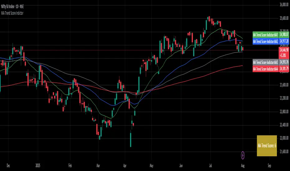
MA Trend ScoreA Trend Score Indicator inspired by an interview by Navy Ramavat, where I liked the idea presented and decided to publish a script for it.
Disclaimer: I am not associated with Navy Ramavat in any manner.
The goal is to objectify the trend of an instrument and calculate a score which represents the trend strength and direction.
The score is calculated as follows:
If price is > EMA 20 add 1 to the score
If price is > EMA 50 add 1 to the score
If price is > EMA 100 add 1 to the score
If EMA 20 is > EMA 50 add 1 to the score
If EMA 20 is > EMA 100 add 1 to the score
If EMA 50 is > EMA 100 add 1 to the score
If EMA 20 is < EMA 50 deduct 1 from the score
If EMA 20 is < EMA 100 deduct 1 from the score
If EMA 50 is < EMA 100 deduct 1 from the score
The highest score can be 6, and lowest score can be -6
The trend score can be used as per your discretion on the long and short side.
An example of using the trend score on the long side for position sizing is:
100% position size if Score greater than 4
75% position size if Score between 2-4
50% position size if Score between 0-2
25% position size if Score between 0 and -2
0% position size if Score is less than -2
Ranked Parabolic Curve Detector (Adaptive + Reversion Aware)The Parabolic Curve Detector is a smart, adaptable trading signal engine designed to help you spot true momentum — not the flashy head-fakes, but sustained, accelerating moves that have the potential to go parabolic. Whether you’re new to trading or looking to sharpen your edge, this tool combines a suite of time-tested and modern techniques into one unified signal, all while adjusting to changing market conditions.
The core idea is simple: detect when price is not just rising, but accelerating, like a curve bending upward. To do that, the script analyzes the log of price and calculates both:
Slope1: how fast the price is moving (momentum)
Slope2: how fast that momentum is changing (acceleration)
Over a user-defined number of bars (which amounts to sensitivity ), the script checks for consistency. So, for example, if both slope1 and slope2 have been positive for 4 bars, that’s a strong signal.
But it doesn’t stop there.
The key is weighted Intelligence
What makes this tool uniquely customizable is that each layer of signal logic is weighted:
Slope1 and Slope2: You can assign how much these matter (e.g., 60% for slope1, 20% for slope2)
Ichimoku Trend Filter: A bullish setup (Tenkan > Kijun) can contribute to the total score
RSI Context: The indicator checks for overextension (RSI > 70 and falling) and mean-reversion potential (RSI < 45 and rising), adjusting scores accordingly
You can fine-tune these weights to match your trading style — whether you prefer to catch early momentum, ride mature trends, or fade reversals.
Finally, there is adaptive Intelligence . This isn’t a static signal. The indicator auto-adjusts its strictness using:
Slope Flip Rate: If price changes direction frequently, the required bar count increases
Volatility (ATR): In volatile markets, the threshold for signal confirmation tightens to avoid noise
You can turn this adaptive behavior on or off. When enabled, it makes the script self-tuning across timeframes — more reactive on clean moves, more skeptical in chop.
How to Use It
Start on a log-scaled daily chart
Enable the indicator and optionally turn on Adaptive Sensitivity
Look for:
Green Circles = bullish signal with favorable RSI + trend
Orange Circles = still bullish, but possibly overextended
For bearish setups, enable Parabolic Drops in settings
I am still experimenting with it, so if you find a better way to use it, let us know!
My suggested tweaks :
sensitivity: 3–5 for normal, higher for stricter
signalThreshold: 0.7–0.85 depending on how picky you want to be
Weights for slope1/slope2/trend
RSI boost/penalty levels
Sentiment OscillatorIn the complex world of trading, understanding market sentiment can be like reading the emotional pulse of financial markets. Our Sentiment Oscillator is designed to be your personal market mood translator, helping you navigate through the noise of price movements and market fluctuations.
Imagine having a sophisticated tool that goes beyond traditional price charts, diving deep into the underlying dynamics of market behavior. This indicator doesn't just show you numbers – it tells you a story about market sentiment, combining multiple financial signals to give you a comprehensive view of potential market directions.
The Sentiment Oscillator acts like a sophisticated emotional barometer for stocks, cryptocurrencies, or any tradable asset. It analyzes price changes, market volatility, trading volume, and long-term trends to generate a unique sentiment score. This score ranges from highly bullish to deeply bearish, providing traders with an intuitive visual representation of market mood.
Green zones indicate positive market sentiment, suggesting potential buying opportunities. Red zones signal caution, hinting at possible downward trends. The oscillator's gray neutral zone helps you identify periods of market uncertainty, allowing for more calculated trading decisions.
What sets this indicator apart is its ability to blend multiple market factors into a single, easy-to-understand indicator. It's not just about current price – it's about understanding the deeper currents moving beneath the surface of market prices.
Traders can use this oscillator to:
- Identify potential trend reversals
- Understand market sentiment beyond price movement
- Spot periods of market strength or weakness
- Complement other technical analysis tools
Whether you're a day trader, swing trader, or long-term investor, the Sentiment Oscillator provides an additional layer of insight to support your trading strategy. Remember, no indicator is a crystal ball, but this tool can help you make more informed decisions in the dynamic world of trading.

Relative Crypto Dominance Polar Chart [LuxAlgo]The Relative Crypto Dominance Polar Chart tool allows traders to compare the relative dominance of up to ten different tickers in the form of a polar area chart, we define relative dominance as a combination between traded dollar volume and volatility, making it very easy to compare them at a glance.
🔶 USAGE
The use is quite simple, traders just have to load the indicator on the chart, and the graph showing the relative dominance will appear.
The 10 tickers loaded by default are the major cryptocurrencies by market cap, but traders can select any ticker in the settings panel.
Each area represents dominance as volatility (radius) by dollar volume (arc length); a larger area means greater dominance on that ticker.
🔹 Choosing Period
The tool supports up to five different periods
Hourly
Daily
Weekly
Monthly
Yearly
By default, the tool period is set on auto mode, which means that the tool will choose the period depending on the chart timeframe
timeframes up to 2m: Hourly
timeframes up to 15m: Daily
timeframes up to 1H: Weekly
timeframes up to 4H: Monthly
larger timeframes: Yearly
🔹 Sorting & Sizing
Traders can sort the graph areas by volatility (radius of each area) in ascending or descending order; by default, the tickers are sorted as they are in the settings panel.
The tool also allows you to adjust the width of the chart on a percentage basis, i.e., at 100% size, all the available width is used; if the graph is too wide, just decrease the graph size parameter in the settings panel.
🔹 Set your own style
The tool allows great customization from the settings panel, traders can enable/disable most of the components, and add a very nice touch with curved lines enabled for displaying the areas with a petal-like effect.
🔶 SETTINGS
Period: Select up to 5 different time periods from Hourly, Daily, Weekly, Monthly and Yearly. Enable/disable Auto mode.
Tickers: Enable/disable and select tickers and colors
🔹 Style
Graph Order: Select sort order
Graph Size: Select percentage of width used
Labels Size: Select size for ticker labels
Show Percent: Show dominance in % under each ticker
Curved Lines: Enable/disable petal-like effect for each area
Show Title: Enable/disable graph title
Show Mean: Enable/disable volatility average and select color

Volume Pro Indicator## Volume Pro Indicator
A powerful volume indicator that visualizes volume distribution across different price levels. This tool helps you easily identify where trading activity concentrates within the price range.
### Key Features:
- **Volume visualization by price levels**: Green (lower zone), Magenta (middle zone), Cyan (upper zone)
- **VPOC (Volume Point of Control)**: Shows the price level with the highest volume concentration
- **High and Low lines**: Highlights the extreme levels of the analyzed price range
- **Customizable historical analysis**: Configurable number of days for calculation
### How to use it:
- Colored volumes show where trading activity concentrates within the price range
- The VPOC helps identify the most significant price levels
- Different colors allow you to quickly visualize volume distribution in different price areas
Customizable with numerous options, including analysis period, calculation resolution, colors, and visibility of different components.
### Note:
This indicator works best on higher timeframes (1H, 4H, 1D) and liquid markets. It's a visual analysis tool that enhances your understanding of market structure.
#volume #vpoc #distribution #volumeprofile #trading #analysis #indicator #professional #pricelevels #volumedistribution

Cumulative Histogram TickThis script is designed to create a cumulative histogram based on tick data from a specific financial instrument. The histogram resets at the start of each trading session, which is defined by a fixed time.
Key Components:
Tick Data Retrieval:
The script fetches the closing tick values from the specified instrument using request.security("TICK.NY", timeframe.period, close). This line ensures that the script works with the tick data for each bar on the chart.
Session Start and End Detection:
Start Hour: The script checks if the current bar's time is 9:30 AM (hour == 9 and minute == 30). This is used to reset the cumulative value at the beginning of each trading session.
End Hour: It also checks if the current bar's time is 4:00 PM (hour == 16). However, this condition is used to prevent further accumulation after the session ends.
Cumulative Value Management:
Reset: When the start hour condition is met (startHour), the cumulative value (cumulative) is reset to zero. This ensures that each trading session starts with a clean slate.
Accumulation: For all bars that are not at the end hour (not endHour), the tick value is added to the cumulative total. This process continues until the end of the trading session.
Histogram Visualization:
The cumulative value is plotted as a histogram using plot.style_histogram. The color of the histogram changes based on whether the cumulative value is positive (green) or negative (red).
Usage
This script is useful for analyzing intraday market activity by visualizing the accumulation of tick data over a trading session. It helps traders identify trends or patterns within each session, which can be valuable for making informed trading decisions.

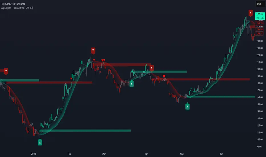
HEMA Trend Levels [AlgoAlpha]OVERVIEW
This script plots two Hull-EMA (HEMA) curves to define a color-coded dynamic trend zone and generate context-aware breakout levels, allowing traders to easily visualize prevailing momentum and identify high-probability breakout retests. The script blends smoothed price tracking with conditional box plotting, delivering both trend-following and mean-reversion signals within one system. It is designed to be simple to read visually while offering nuanced trend shifts and test confirmations.
█ CONCEPTS
The Hull-EMA (HEMA) is a hybrid moving average combining the responsiveness of short EMAs with the smoothness of longer ones. It applies layered smoothing: first by subtracting a full EMA from a half-length EMA (doubling the short EMA's weight), and then by smoothing the result again with the square root of the original length. This process reduces lag while maintaining clarity in direction changes. In this script, two HEMAs—fast and slow—are used to define the trend structure and trigger events when they cross. These crossovers generate "trend shift boxes"—temporary support or resistance zones drawn immediately after trend transitions—to detect price retests in the new direction. When price cleanly retests these levels, the script marks them as confirmations with triangle symbols, helping traders isolate better continuation setups. Color-coded bars further enhance visual interpretation: bullish bars when price is above both HEMAs, bearish when below, and neutral (gray) when indecisive.
█ FEATURES
Bullish and bearish bar coloring based on price and HEMA alignment.
Box plotting at each crossover (bullish or bearish) to create short-term decision zones.
Real-time test detection: price must cleanly test and bounce from box levels to be considered valid.
Multiple alert conditions: crossover alerts, test alerts, and trend continuation alerts.
█ USAGE
Use this indicator on any time frame and asset. Adjust HEMA lengths to match your trading style—shorter lengths for scalping or intraday, longer for swing trading. The shaded area between HEMAs helps visually define the current trend. Watch for crossovers: a bullish crossover plots a green support box just below price, and a bearish one plots a red resistance box just above. These zones act as short-term decision points. When price returns to test a box and confirms with strong rejection (e.g., closes above for bullish or below for bearish), a triangle symbol is plotted. These tests can signal strong trend continuation. For traders looking for clean entries, combining the crossover with a successful retest improves reliability. Alerts can be enabled for all key signals: trend shift, test confirmations, and continuation conditions, making it suitable for automated setups or discretionary traders tracking multiple charts.
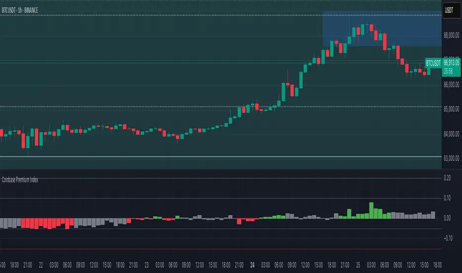
Coinbase Premium IndexThe Coinbase Premium Index is a measure of the percentage difference between the price of any coin on Coinbase Pro (USD pair) and the price on Binance (USDT trading pair). It helps differentiate between global and US-specific market sentiment
Major benefits:
Choose between USD or USDC for the Coinbase pair — they can behave differently in rare but actionable situations.
Apply it to any coin, not just BTC. Open any USDT-based chart on any exchange, and the script will automatically compare it with Coinbase’s USD or USDC price.
Highlight only active U.S. trading hours, cutting out irrelevant noise.
Display key thresholds that signal buying or selling pressure.
Rotational Factor CalculationThe Rotational Factor is a simple, objective means for evaluating day timeframe attempted direction based on the market's half hour auction rotations. At any point in time during the day, the running tally can help keep general awareness for whether buyers or sellers are in control, and if a transition is taking place. It is also helpful to use as one of a handful of variables that categorize the session's Directional Performance to assist in possible direction for the next session. This method is from Dalton's Mind Over Market's book and in part helps answer the question, which way is the market trying to go? This can then be applied to the second question, is the market doing a good job in it's attempted direction? Staying aware of these two questions keeps current sentiment and expectations in check.
Calculation method
Each 30min RTH candle gets a score:
if the high is higher than the previous candle's high: +1
if the high is lower than the previous candle's high: -1
if the low is higher than the previous candle's low: +1
if the low is lower than the previous candle's low: -1
if the high (or low) of a candle is equal to the high (or low) of the previous candle: 0
The running tally intraday text is displayed in blue. Once the session closes the text is displayed in orange and remains listed over the final candle of the day for 30 days. The RTH candles are calculated until the end of the RTH session (3pm EST) even though the session's full tally is displayed over the final candle at 3:30pm EST.

Session Profile AnalyzerWhat’s This Thing Do?
Hey there, trader! Meet the Session Profile Analyzer (SPA) your new go-to pal for breaking down market action within your favorite trading sessions. It’s an overlay indicator that mixes Rotation Factor (RF), Average Subperiod Range (ASPR), Volume Value Area Range (VOLVAR), and TPO Value Area Range (TPOVAR) into one tidy little toolkit. Think of it as your market vibe checker momentum, volatility, and key levels, all served up with a grin.
The Cool Stuff It Does:
Rotation Factor (RF) : Keeps tabs on whether the market’s feeling bullish, bearish, or just chilling. It’s like a mood ring for price action shows “UP ↑,” “DOWN ↓,” or “NONE ↔.”
ASPR : Averages out the range of your chosen blocks. Big swings? Tiny wiggles? This tells you the session’s energy level.
VOLVAR : Dives into volume to find where the action’s at, with a smart twist it adjusts price levels based on the session’s size and tiny timeframe moves (capped at 128 so your chart doesn’t cry).
TPOVAR : Grabs lower timeframe data to spot where price hung out the most, TPO-style. Value zones, anyone?
Dynamic Precision : No ugly decimal overload SPA matches your asset’s style (2 decimals for BTC, 5 for TRX, you get it).
How to Play With It:
Session Start/End : Pick your trading window (say, 0930-2200) and a timezone (America/New_York, or wherever you’re at).
Block Size : Set the chunk size for RF and ASPR like 30M if you’re into half-hour vibes.
Value Area Timeframe : Go micro with something like 1S for VOLVAR and TPOVAR precision.
Label : Size it (small to huge), color it (white, neon pink, whatever), and slap it where you want (start, mid, end).
How It All Works (No PhD Required):
RF : Imagine breaking your session into blocks (via Block Size). For each block, SPA checks if the high beats the last high (+1) or not (0), and if the low dips below the last low (-1) or not (0). Add those up, and boom positive RF means upward vibes, negative means downward, near zero is “meh.” Use it to catch trends or spot when the market’s napping.
ASPR : Takes those same blocks, measures high-to-low range each time, and averages them. It’s your volatility pulse big ASPR = wild ride, small ASPR = snooze fest. Great for sizing up session action.
VOLVAR : Here’s the fun part. It takes the session’s full range (high minus low), divides it by the average range of your tiny Value Area Timeframe bars (e.g., 1S), and picks a sensible number of price levels capped at 128 so it doesn’t overthink. Then it bins volume into those levels, finds the busiest price (POC), and grows a 70% value area around it. Perfect for spotting where the big players parked their cash.
TPOVAR : Grabs midpoints from those tiny timeframe bars, sorts them, and snips off the top and bottom 15% to find the 70% “value zone” where price chilled the most. Think of it as the market’s comfort zone great for support/resistance hunting.
Why You’ll Like It:
Whether you’re scalping crypto, swinging forex, or dissecting stocks, SPA’s got your back. Use RF to catch momentum shifts like jumping on an “UP ↑” trend or fading a “DOWN ↓” exhaustion. ASPR’s your secret weapon for sizing up trades: a big ASPR (say, 100 on BTC) means you can aim for juicy targets (like 1-2x ASPR) or set invalidations tight when it’s tiny (e.g., 0.001 on TRX) to dodge chop. VOLVAR and TPOVAR are your level-finders nail those key zones where price loves to bounce or break, perfect for entries, stops, or profit grabs. It’s like having a trading co-pilot who’s chill but knows their stuff.
Heads-Up:
Load enough history for those micro timeframes to shine (1S needs some bars to work with).
Keeps things light won’t bog down your chart even with decent-sized sessions.
Let’s Roll:
Slap SPA on your chart, tweak it to your style, and watch it spill the beans on your session. Happy trading, fam may your pips be plenty and your losses few!

Moon+Lunar Cycle Vertical Delineation & Projection
Automatically highlights the exact candle in which Moonphase shifts occur.
Optionally including shifts within the Microphases of the total Lunar Cycle.
This allow traders to pre-emptively identify time-based points of volatility,
focusing on mean-reversion; further simplified via the use of projections.
Projections are calculated via candle count, values displayed in "Debug";
these are useful in understanding the function & underlying mechanics.
GTC Liquidity OscillatorThe GTC Liquidity Oscillator is a groundbreaking tool in the realm of liquidity analysis, offering a first-of-it's-kind approach to market evaluation. Unlike traditional liquidity indicators that focus on isolated economic data, the GTC Liquidity Oscillator consolidates global Money Supply (M2) data from major economies and adjusts them using their corresponding exchange rates to create a unified liquidity measure.
What sets the GTC Liquidity Oscillator apart is its unique application to mean reversion trading. By transforming raw liquidity data into a smooth, oscillating value, it allows traders to visualize extreme liquidity conditions that often precede significant market shifts. The GTC Liquidity Oscillator excels at identifying moments when global liquidity conditions become overly stressed or excessively abundant—signals that have historically correlated with critical turning points in asset markets
Are you ready to harness the power of global liquidity like never before?
🌍 Why the GTC Liquidity Oscillator Is Different:
Unlike anything you’ve seen before, the GTC Liquidity Oscillator merges the Money Supply (M2) data from the largest economies on the planet—the USA, Europe, China, Japan, the UK, Canada, Australia, and India. It then transforms and consolidates this data into a single, powerful metric that exposes liquidity imbalances with precision.
💡 How It Works:
Forget cluttered indicators and noise. The GTC Liquidity Oscillator offers a crystal-clear, oscillating signal designed specifically for mean reversion traders. It highlights moments when global liquidity is stretched to extremes—an ideal setup for catching powerful reversals.
📈 Why You Need This Tool:
✅ First of Its Kind: No other indicator offers a comprehensive view of global liquidity, perfectly tuned for mean reversion trading.
✅ Perfect for Extreme Conditions: Identifies when liquidity levels become overly stressed or overly abundant, providing lucrative entry and exit signals.
✅ Works Across Markets: Stocks, forex, commodities, cryptocurrencies—you name it, the GTC Liquidity Oscillator enhances your trading strategy.
✅ Visual Clarity: Color-coded signals and smooth oscillation eliminate the guesswork, giving you a straightforward path to better trades.
🔥 How To Use It:
Identify Extremes: Look for the GTC Liquidity Oscillator entering overbought or oversold zones.
Time Your Entries & Exits: Capitalize on liquidity-driven market reversals before the crowd.
Stay Ahead of the Market: Use a global liquidity perspective to enhance your existing strategy or build a completely new one.
📌 Revolutionize Your Trading.
This is more than an indicator—it’s a global liquidity radar designed to give you a decisive edge in volatile markets. Whether you’re trading short-term reversals or looking for long-term opportunities, the GTC Liquidity Oscillator is your key to understanding how liquidity impacts price action.
👉 Don’t just trade. Trade with precision.
💥 Get the GTC Liquidity Oscillator now and start turning global liquidity insights into profits!
⚠️ Disclaimer:
The GTC Liquidity Oscillator is a powerful tool designed to enhance your market analysis by providing unique insights into global liquidity conditions. However, it is not a replacement for comprehensive market analysis or prudent risk management. Always combine this indicator with thorough research, technical analysis, and a well-structured trading plan. Past performance is not indicative of future results. Trade responsibly.
EMADC - BoB📌 EMADC - BoB Indicator Description
🔹 Introduction
The EMADC - BoB (Exponential Moving Average & Donchian Channel - Buy or Bear) is an advanced technical indicator designed to help traders identify optimal buy and sell zones in the market. It combines the Exponential Moving Average (EMA) and the median of the Donchian Channel, two powerful indicators widely used by professional traders.
The main goal of EMADC - BoB is to provide a clear trend reading by coloring the area between the EMA and the Donchian median. This allows traders to easily visualize buying and selling opportunities based on market dynamics.
⸻
🔹 How the Indicator Works
📌 Components of the Indicator:
• EMA (Exponential Moving Average): A reactive moving average that helps track short to medium-term trends.
• Median of the Donchian Channel (Donchian Median): Calculated as the average of the highest and lowest prices over the last X periods. It represents an equilibrium zone between supply and demand.
• Dynamic Colored Zone:
• 🟢 Green → Indicates a bullish phase → Look for buying opportunities.
• 🔴 Red → Indicates a bearish phase → Look for selling opportunities.
When the EMA is above the Donchian median, the market is in a bullish momentum, and it is preferable to focus on long positions (buys).
Conversely, when the EMA falls below the Donchian median, the market is under bearish pressure, and traders should look for short positions (sells).
⸻
🔹 Usage and Customization
The EMADC - BoB indicator is fully customizable to adapt to different trading strategies.
📌 Available Settings:
✅ EMA and Donchian Channel Periods → Adjustable to match your trading horizon (scalping, swing trading, long-term investing).
✅ EMA, Donchian, and Fill Area Colors → For improved readability based on your chart style.
✅ Line Thickness and Fill Transparency → To optimize visibility on your chart.
⸻
🔹 Trading Strategy
🔹 Buy Signal (Long): When the area turns green (EMA crosses above the Donchian median).
🔹 Sell Signal (Short): When the area turns red (EMA crosses below the Donchian median).
This indicator can be used on its own or combined with other technical tools such as RSI, MACD, Price Action for a more comprehensive decision-making process.
⸻
🔹 Why Use EMADC - BoB?
✅ Quick trend identification without cluttering the chart.
✅ Dynamic approach that adapts to market fluctuations.
✅ Easy interpretation for both beginner and advanced traders.
✅ Multi-timeframe usability (scalping, swing trading, long-term).
⸻
🚀 Add EMADC - BoB to your trading toolkit and make more informed decisions!
If you have any questions or suggestions for improvements, feel free to leave a comment. Happy trading! 📈🔥

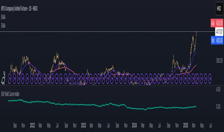
EM Yield Curve IndexThis script calculates the Emerging Markets (EM) Yield Curve Index by aggregating the 2-year and 10-year bond yields of major emerging economies. The bond yields are weighted based on each country's bond market size, with data sourced from TradingView. The yield curve is derived by subtracting the 2-year yield from the 10-year yield, providing insights into economic conditions, risk sentiment, and potential recessions in emerging markets. The resulting EM Yield Curve Index is plotted for visualization.
Note: In some cases, TradingView's TVC data did not provide a 2-year bond yield. When this occurred, the best available alternative yield (such as 3-month, 1-year or 4-year yields) was used to approximate the short-term interest rate for that country.
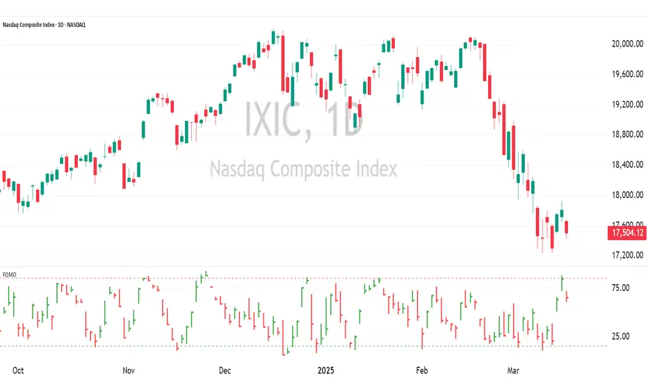
FOMO Indicator - % of Stocks Above 5-Day AvgThe FOMO Indicator plots the breadth indicators NCFD and S5FD below the price chart, representing the percentage of stocks in the Nasdaq Composite (NCFD) or S&P 500 (S5FD) trading above their respective 5-day moving averages.
This indicator identifies short-term market sentiment and investor positioning. When over 85% of stocks exceed their 5-day averages, it signals widespread buying pressure and potential FOMO (Fear Of Missing Out) among investors. Conversely, levels below 15% may indicate oversold conditions. By analyzing these breadth metrics over a short time window, the FOMO Indicator helps traders gauge shifts in investor sentiment and positioning.
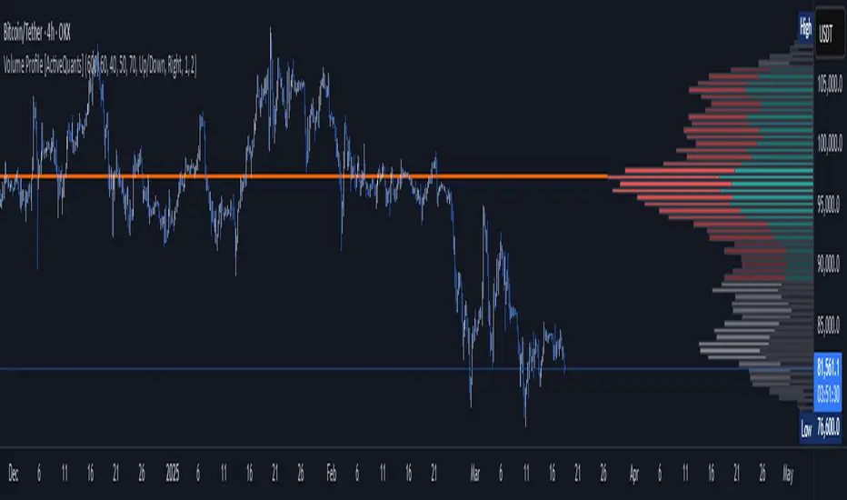
Volume Profile [ActiveQuants]The Volume Profile indicator visualizes the distribution of trading volume across price levels over a user-defined historical period. It identifies key liquidity zones, including the Point of Control (POC) (price level with the highest volume) and the Value Area (price range containing a specified percentage of total volume). This tool is ideal for traders analyzing support/resistance levels, market sentiment , and potential price reversals .
█ CORE METHODOLOGY
Vertical Price Rows: Divides the price range of the selected lookback period into equal-height rows.
Volume Aggregation: Accumulates bullish/bearish or total volume within each price row.
POC: The row with the highest total volume.
Value Area: Expands from the POC until cumulative volume meets the user-defined threshold (e.g., 70%).
Dynamic Visualization: Rows are plotted as horizontal boxes with widths proportional to their volume.
█ KEY FEATURES
- Customizable Lookback & Resolution
Adjust the historical period ( Lookback ) and granularity ( Number of Rows ) for precise analysis.
- Configurable Profile Width & Horizontal Offset
Control the relative horizontal length of the profile rows, and set the distance from the current bar to the POC row’s anchor.
Important: Do not set the horizontal offset too high. Indicators cannot be plotted more than 500 bars into the future.
- Value Area & POC Highlighting
Set the percentage of total volume required to form the Value Area , ensuring that key volume levels are clearly identified.
Value Area rows are colored distinctly, while the POC is marked with a bold line.
- Flexible Display Options
Show bullish/bearish volume splits or total volume.
Place the profile on the right or left of the chart.
- Gradient Coloring
Rows fade in color intensity based on their relative volume strength .
- Real-Time Adjustments
Modify horizontal offset, profile width, and appearance without reloading.
█ USAGE EXAMPLES
Example 1: Basic Volume Profile with Value Area
Settings:
Lookback: 500 bars
Number of Rows: 100
Value Area: 70%
Display Type: Up/Down
Placement: Right
Image Context:
The profile appears on the right side of the chart. The POC (orange line) marks the highest volume row. Value Area rows (green/red) extend above/below the POC, containing 70% of total volume.
Example 2: Total Volume with Gradient Colors
Settings:
Lookback: 800 bars
Number of Rows: 100
Profile Width: 60
Horizontal Offset: 20
Display Type: Total
Gradient Colors: Enabled
Image Context:
Rows display total volume in a single color with gradient transparency. Darker rows indicate higher volume concentration.
Example 3: Left-Aligned Profile with Narrow Value Area
Settings:
Lookback: 600 bars
Number of Rows: 100
Profile Width: 45
Horizontal Offset: 500
Value Area: 50%
Profile Placement: Left
Image Context:
The profile shifts to the left, with a tighter Value Area (50%).
█ USER INPUTS
Calculation Settings
Lookback: Historical bars analyzed (default: 500).
Number of Rows: Vertical resolution of the profile (default: 100).
Profile Width: Horizontal length of rows (default: 50).
Horizontal Offset: Distance from the current bar to the POC (default: 50).
Value Area (%): Cumulative volume threshold for the Value Area (default: 70%).
Volume Display: Toggle between Up/Down (bullish/bearish) or Total volume.
Profile Placement: Align profile to the Right or Left of the chart.
Appearance
Rows Border: Customize border width/color.
Gradient Colors: Enable fading color effects.
Value Area Colors: Set distinct colors for bullish and bearish Value Area rows.
POC Line: Adjust color, width, and visibility.
█ CONCLUSION
The Volume Profile indicator provides a dynamic, customizable view of market liquidity. By highlighting the POC and Value Area, traders can identify high-probability reversal zones, gauge market sentiment, and align entries/exits with key volume levels.
█ IMPORTANT NOTES
⚠ Lookback Period: Shorter lookbacks prioritize recent activity but may omit critical levels.
⚠ Horizontal Offset Limitation: Avoid excessively high offsets (e.g., close to ±300). TradingView restricts plotting indicators more than 500 bars into the future, which may truncate or hide the profile.
⚠ Risk Management: While the indicator highlights areas of concentrated volume, always use it in combination with other technical analysis tools and proper risk management techniques.
█ RISK DISCLAIMER
Trading involves substantial risk. The Volume Profile highlights historical liquidity but does not predict future price movements. Always use stop-loss orders and confirm signals with additional analysis. Past performance is not indicative of future results.
📊 Happy trading! 🚀
Sector ETFsSector ETFs
Cool unobtrusive way to keep your eye on the market or tickers of your choice without leaving your chart - Can keep you clued into relative strength and weakness between sectors as well as sector rotation.
This script tracks the percentage changes of a list of Sector ETFs and displays the results in a table on the chart. It also triggers an alert when all selected ETFs are either positive (green) or negative (red).
Key Features
1. Input: Users can amend the list of ETF symbols and basically fill the table with tickers of their preferred stocks
2. Percentage Change: Calculates the daily percentage change for each ETF or chosen stock
3. Color-Coding: This script is live in real time and dynamic the ETFs will be green if higher than the previous close (positive change), really bright green (>=10%), or red if lower than the previous close (negative change).
4. Table displays ETFs and their percentage changes at the top-right of the chart.
5. Alert Condition: Triggers an alert when all ETFs are simultaneously green or simultaneously red - this is done by right clicking on the table or going into settings. please note there will be a TV caution due to an indictor that can be repainted
How to Use
1. Add the script to your TradingView chart.
2. Keep or customize the ETF list by editing the input field.
3. The table will show each ETF's change and color-coded performance.
4. Set alerts based on the condition "All ETFs Turned Green or Red".
Also note pre and post market movements will not be captured by this indicator (did try does not appear to be possible - Pine Script limitation ) all movement is in comparison to prior close in regular market hours .
Does work in replay mode
Enjoy - Hope it helps with your trading !

TICK+ [Pt]█ TICK+ – Advanced US Market Internals & TICK Distribution Tool
TICK+ is a comprehensive indicator that decodes US market internals by leveraging the TICK index—the net difference between stocks ticking up and those ticking down. Unlike many standard TICK tools that only plot raw values, TICK+ provides multiple visualization modes, dynamic moving averages, an independent MA Ribbon, a detailed distribution profile, divergence and pivot analysis, and real-time data tables. This integrated approach offers both visual and quantitative insights into intraday market breadth, trend sustainability, and potential reversals—making it an indispensable tool for trading US indices, futures, and blue‑chip stocks.
Market internals enthusiasts often consider the TICK index indispensable for trading these markets. By offering an immediate snapshot of sentiment and confirming trends through additional analytics, TICK+ gives traders a decisive edge—helping to determine whether a rally is truly supported by broad participation or if caution is warranted.
--------------------------------------------------------------------------------------------------------
█ Key Features:
► Market Internal – Multiple Display Modes:
Line Mode: Plots the TICK index as a continuous line for a clear view of real‑time values and trend direction.
Bar Mode: Uses traditional bar charts to represent the TICK index, emphasizing the magnitude of changes.
Heikin Ashi Mode: Applies the Heikin Ashi technique to smooth out fluctuations, making the underlying trend easier to discern.
Iceberg TICK Mode: Fills the area between zero and the highs in green, and between zero and the lows in red—highlighting how long the market remains in positive versus negative territory.
How It Works & Usage:
These display modes enable traders to select the visualization that best fits their analysis style. For instance, Iceberg TICK Mode highlights the duration of market strength or weakness, a critical factor for intraday directional assessment.
Comparison of Display Modes
► Dual Moving Average – Fast & Slow:
Computes two moving averages on the TICK index:
• Fast MA – reacts quickly to recent changes.
• Slow MA – confirms the overall trend.
Crossovers provide clear signals:
• Fast MA crossing above the slow MA indicates rising bullish momentum.
• Fast MA crossing below the slow MA indicates increasing bearish pressure.
How It Works & Usage:
These dual moving averages assist in detecting momentum shifts. Crossover signals can be used to time entries and exits to align with prevailing market sentiment.
Dual MA Crossover Example
► Moving Average / Smoothed MA – Smoothed & Base Moving Averages:
Calculates a Base MA and a Smoothed MA on the TICK index to reduce short‑term volatility.
Helps clarify the prevailing trend, providing additional confirmation alongside the dual moving averages.
How It Works & Usage:
These averages filter out noise and offer extra validation of the current trend, enhancing the reliability of trading signals.
Base and Smoothed MA Example
► Moving Average Ribbon – MA Ribbon:
Independently plots several moving averages together as a “ribbon,” each line customizable in length and type.
Visually reflects overall market directional strength:
• Consistent green color indicate sustained bullish conditions.
• Uniform red color indicate prevailing bearish sentiment.
How It Works & Usage:
The MA Ribbon provides a layered perspective on market internals. It enables traders to quickly gauge the robustness of a trend or identify early signs of a potential reversal.
MA Ribbon Trend and Shading
► Divergence - Pivot based – Divergence & Pivot Analysis:
Integrates divergence detection with pivot-based trendline analysis.
Identifies instances when the TICK index and price action diverge, serving as an early warning of a weakening trend.
How It Works & Usage:
Divergence signals help refine trade entries and exits by indicating potential trend reversals or adjustments in market sentiment.
Divergence Analysis
► TICK Distribution Profile – TICK Distribution Profile:
Divides the TICK index range into multiple bins to create a profile of how TICK values are distributed.
Identifies the point of control—the level where most TICK readings concentrate—relative to zero.
Allows adjustment of the lookback period to detect shifts in market bias, such as a move from a neutral zone toward extreme levels.
How It Works & Usage:
By visualizing the distribution of TICK readings, traders can monitor changes in market internals that may precede significant trend changes.
TICK Distribution Profile
► ZigZag – ZigZag:
Applies a zigzag algorithm to filter out minor fluctuations and identify significant swing highs and lows.
Highlights trend extremities and potential reversal points.
Offers an optional extension to the last bar for dynamic trend tracking.
How It Works & Usage:
The ZigZag feature helps traders focus on the major price swings that define market structure, eliminating the noise of insignificant movements.
ZigZag Example
► Pivot Trendline – Pivot Trendline:
Draws trendlines connecting pivot highs and pivot lows.
Provides settings to display only the most recent trendline or extend the last trendline.
Assists in identifying evolving support and resistance levels.
How It Works & Usage:
Pivot trendlines offer clear visual cues for key price levels and potential reversal zones, aiding in the timing of trades.
Pivot Trendline Example
► TICK Levels – TICK Levels:
Defines key thresholds for the TICK index, including neutral levels, trend zones, and overbought/oversold (OB/OS) extremes.
Highlights these levels to assist in identifying conditions that may trigger caution or present opportunities.
How It Works & Usage:
Marking these levels provides an immediate reference for assessing when the TICK index enters critical zones, guiding risk management and trade planning.
TICK Levels
► Background Color – Background Color:
Optionally changes the chart background based on TICK or moving average thresholds.
Provides additional visual cues regarding shifts in market sentiment.
How It Works & Usage:
Background color changes help reinforce key signals by immediately indicating shifts in market internals, enhancing overall situational awareness.
Background Color Example
► Data Tables – Data Table:
Displays essential market data in a single, easy-to-read table, including the TICK index source, market sentiment (e.g. Bullish, Bearish, or Neutral), trend status (such as Accelerating ⇗ or Retracing ⇘), and the current TICK value with color-coded strength.
Consolidates numerical data for a quick and precise assessment of market internals.
How It Works & Usage:
The data tables provide live, numerical feedback that complements the visual analysis, making it easy to monitor market sentiment and trend changes at a glance.
Data Table Display with Metrics
--------------------------------------------------------------------------------------------------------
█ Customization & Input Flexibility:
TICK+ offers extensive input options organized into feature‑specific groups, enabling traders to tailor the tool to various strategies:
► Market Internals Group:
Selects the primary TICK index source (with an optional custom override).
Provides a choice of display modes (Line, Bar, Heikin Ashi, Iceberg TICK) with configurable color schemes.
Includes options for iceberg overlays and highlighting.
► Moving Averages Groups (Dual, Smoothed/Base, MA Ribbon):
Dual MA group: Settings for fast and slow moving averages, including type, length, color, and crossover alerts.
Smoothed/Base MA group: Additional methods to filter out short‑term noise and confirm trends.
MA Ribbon group: Independently plots multiple moving averages as a ribbon, with full customization for each line.
► Divergence & Profile Groups:
Includes inputs for divergence detection (source, pivot lookback) and customization of the TICK Distribution Profile (lookback period, color thresholds, layout details).
► ZigZag & Pivot Trendline Groups:
Allows customization of zigzag parameters to highlight trend extremities.
Provides settings for pivot trendline appearance and behavior.
► TICK Levels & Background Colors:
Defines thresholds for neutral, trend, and extreme levels.
Offers color selections for level markers and optional background shading.
► Data Table Configuration:
Enables setting of table location, lookback intervals, and font size to present essential TICK metrics in a user‑friendly format.
--------------------------------------------------------------------------------------------------------
█ Additional Insights:
► TICK Index Fundamentals:
Monitors the net difference between stocks ticking up and down.
A positive reading indicates broader market participation, while a negative reading suggests increased selling pressure.
Understanding how long the TICK stays above or below zero is crucial for gauging intraday momentum.
► Role of Moving Averages:
Smooth out short‑term fluctuations, helping to highlight the prevailing trend.
Crossovers between fast and slow MAs can serve as clear signals for market momentum shifts.
► Interpreting the MA Ribbon:
Provides a layered perspective on market direction.
Consistent color and alignment confirm a strong trend, while variations may hint at reversals.
► Utility of the Distribution Profile:
Breaks down the TICK index into bins, identifying the point of control.
Changes in this control zone—particularly over different lookback periods—can signal potential trend changes.
► Precision of Data Tables:
Supplies live numerical feedback on key market internals, ensuring trading decisions are based on precise, real‑time measurements.
► Comparative Advantage:
Unlike many TICK tools that simply plot raw values, TICK+ provides an integrated, multidimensional analysis of market internals.
Its advanced features—ranging from unique display modes to sophisticated analytical components—make it indispensable for trading US indices, futures, and blue‑chip stocks.
--------------------------------------------------------------------------------------------------------
Disclaimer
This indicator is provided for educational and research purposes only and does not constitute financial advice. Trading involves risk, and thorough testing on historical data is recommended before applying any strategy using TICK+ in live markets.

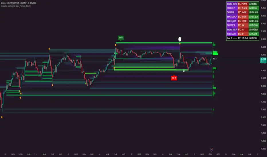
liquidation Heatmap [by Alpha_Precision_Charts]Indicator Description: Heatmap Longs/Shorts with OI Sensitivity & Aggregated Tools
Overview
The "Heatmap Longs/Shorts with OI Sensitivity & Aggregated Tools" is an advanced, multi-functional indicator crafted for futures traders seeking a deeper understanding of market dynamics. This tool integrates several key features—Heatmap of Longs and Shorts with Open Interest (OI) sensitivity, Histograms, Liquidity Exit Bubbles, Volume Bubbles, RSI Labels, Moving Averages, and an OI Table—into a single, cohesive package. By pulling real-time OI data from major exchanges (Binance, BitMEX, OKX, Kraken), it offers a robust framework for analyzing liquidity, order flow, momentum, and trends across various timeframes.
Why Aggregation Matters
Market analysis thrives on combining diverse insights, as relying on a single tool often leaves gaps in understanding. Each component of this indicator addresses a distinct aspect of market behavior:
Heatmap Longs/Shorts with OI Sensitivity: Maps potential liquidation zones based on OI, pinpointing where leveraged positions might cluster.
Histograms: Visualize the density of potential liquidity across price levels, enhancing OI-based analysis.
OI Table: Provides a breakdown of OI across all supported exchanges, offering transparency into total market exposure.
Liquidity Exit Bubbles: Highlight significant position exits (negative OI delta), signaling potential reversals or liquidations.
Volume Bubbles: Detect high-volume events from perpetual futures, revealing aggressive market participation.
RSI Labels: Track momentum with overbought and oversold conditions, refining entry and exit timing.
Moving Averages: Establish trend direction and dynamic support/resistance levels.
The power of aggregation lies in its ability to connect these dots. For instance, the Heatmap identifies potential liquidation zones, Volume Bubbles confirm aggressive moves, and RSI Labels add momentum context. Histograms and the OI Table further enrich this by detailing liquidity density and market exposure, creating a comprehensive view critical for navigating volatile markets.
Key Features
Heatmap Longs/Shorts with OI Sensitivity
Displays potential liquidation levels above (Shorts) and below (Longs) the price, with leverage settings from 5x to 125x.
Includes a Minimum Liquidity Sensitivity filter (0.1-1.0) to exclude small-order noise.
Features a dynamic gradient (purple to yellow) with adjustable intensity based on OI.
Note: Exact trader leverage isn’t known; liquidation zones are inferred from market psychology, as traders often favor specific leverage levels (e.g., 25x, 50x, 125x).
Histograms
Display the density of potential liquidity across price levels, complementing the Heatmap. Note that the largest histogram bars may appear in different locations compared to the most intense (yellow) areas of the Heatmap, as histograms primarily focus on the accumulation of smaller orders.
OI Table
Aggregates OI data from all supported exchanges (Binance, BitMEX, OKX, Kraken) in base currency and USD, sortable by volume.
Displays total OI and individual exchange contributions automatically.
Liquidity Exit Bubbles
Plots bubbles for significant negative OI changes, sized as small, medium, or large based on magnitude.
Positioned above or below candles depending on volatility direction, with customizable colors.
Volume Bubbles
Marks high-volume activity from perpetual futures, with sizes (normal, high, ultra-high) tied to intensity.
Offers adjustable sensitivity and offset for precise placement.
RSI Labels
Provides real-time RSI readings, highlighting overbought (≥70) and oversold (≤30) levels.
Configurable by price source (e.g., High/Low, Close) and timeframe, with customizable appearance.
Moving Averages
Supports SMA, EMA, WMA, and VWMA with three user-defined periods (default: 21, 50, 100).
Toggleable visibility and colors for trend analysis.
How to Use
Scalping/Day Trading (1m-15m):
Load the indicator three times: one at 125x leverage (visible), one at 50x (hidden), and one at 25x (hidden). Use the 125x Heatmap to identify immediate liquidation zones. When price breaks through the 125x liquidity pool, enable the 50x instance, then 25x as needed, to track cascading liquidations.
Pair with Histograms to monitor potential liquidity density, Volume Bubbles for breakout signals, and Liquidity Exit Bubbles for reversals.
Check RSI Labels on short timeframes (e.g., 15m) for overextended moves.
Swing Trading (1H-4H):
Set the Heatmap to lower leverage (e.g., 25x, 10x) and combine with Moving Averages to confirm trends.
Use RSI Labels on matching timeframes to time entries/exits based on momentum.
Reference the OI Table to assess overall market exposure.
Liquidity Analysis:
Adjust the Minimum Liquidity Sensitivity to focus on significant OI clusters. Higher filtering removes small orders, so use Volume Bubbles and the OI Table for broader context in sideways markets.
Use the OI Table to see total OI across all exchanges.
General Tips:
Toggle features (e.g., Bubbles, MAs) to focus on relevant data.
Test settings on your asset—optimized for Bitcoin, adjustable for altcoins.
Settings
Exchanges: Data from Binance, BitMEX, OKX, and Kraken is automatically included.
Heatmap: Enable Longs/Shorts, set start date, adjust leverage and color intensity.
Liquidity Filtering: Tune Minimum Liquidity Sensitivity (0.1-1.0) to balance detail and noise.
Histograms: Automatically active, showing potential liquidity density; no direct settings.
OI Table: Toggle visibility and choose position (e.g., Top Right).
Bubbles: Enable/disable Liquidity Exit and Volume Bubbles, set sensitivities and colors.
RSI: Pick price source, timeframe, and label style (size, color, offset).
Moving Averages: Select type, periods, and visibility.
Why It’s Unique
This indicator blends liquidity tools (Heatmap, Histograms, OI Table, Bubbles) with momentum and trend analysis (RSI, MAs). The adjustable Heatmap intensity enhances visibility of significant OI levels, while the multi-tool approach provides a fuller market perspective.
Notes
Best suited for perpetual futures; test on spot or other instruments for compatibility.
High leverage (e.g., 125x) excels on short timeframes; use 5x-25x for daily/weekly views.
Experiment with settings to optimize for your asset and timeframe.
This indicator relies on the availability of Open Interest (OI) data from TradingView. Functionality may vary depending on data access for your chosen asset and exchange.
Feedback
Your input is valued to enhance this tool. Enjoy trading with a fuller market perspective!
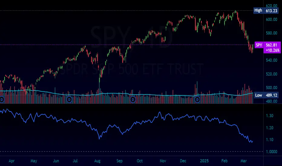
Normalized Equity/Bond RatioThis indicator calculates a normalized equity-to-bond ratio over a 252-day lookback (~1 trading year) to assess risk-on vs. risk-off sentiment. It addresses the issue of direct ratios (e.g., SPY/TLT) being visually dominated by high nominal stock prices, which can obscure bond price movements.
A rising ratio indicates equities are outperforming bonds, suggesting risk-on conditions, while a declining ratio signals a shift toward bonds, often associated with risk-off behavior. The normalization ensures better visibility and comparability of the trend over time.
A ratio > 1 means the equity (e.g., SPY) is outperforming the bond (e.g., AGG) since the lookback. A ratio < 1 means bonds are outperforming.
Mark Minervini + Pocket Pivot Breakout
MARK MINERVINI + POCKET PIVOT BREAKOUT INDICATOR
The Mark Minervini + Pocket Pivot Breakout indicator is a versatile tool designed for technical analysis. It combines principles from Mark Minervini’s trading strategy with Pocket Pivot Breakout patterns. This custom indicator highlights potential breakout opportunities based on specific criteria, helping traders identify stocks that meet both the trend-following conditions of Minervini’s methodology and the momentum-driven Pocket Pivot Breakout setup.
---------------------------------------------------------------------------------------------------------------------
MARK MINERVINI CRITERIA
The indicator evaluates the stock based on Minervini’s set of rules, which include:
Price above key moving averages:
Close > EMA50
Close >= EMA150
Close >= EMA200
EMA crossovers:
EMA50 > EMA150
EMA50 > EMA200
EMA150 >= EMA200
Price relative to 52-week range:
Close > 30% of 52-week low
Close within 25% of 52-week high
EMA200 relative to one month ago:
EMA200 > EMA200 one month ago
IMPORTANCE OF THIS TEMPLATE
How to Pinpoint Stage 2
As I’ve stated, history clearly shows that virtually every superperformance stock was in a definite uptrend before experiencing its big advances. In fact, 99 percent of superperformance stocks traded above their 200-day moving averages before their huge advance, and 96 percent traded above their 50-day moving averages.
I apply the Trend Template criteria (see below) to every single stock I’m considering. The Trend Template is a qualifier. If a stock doesn’t meet the Trend Template criteria, I don’t consider it. Even if the fundamentals are compelling, the stock must be in a long-term uptrend—as defined by the Trend Template—for me to consider it as a candidate. Without identifying a stock’s trend, investors are at risk of going long when a stock is in a dangerous downtrend, going short during an explosive uptrend, or tying up capital in a stock lost in a sideways neglect phase. It’s important to point out that a stock must meet all eight of the Trend Template criteria to be considered in a confirmed stage 2 uptrend.- By MARK MINERVINI
---
POCKET PIVOT VOLUME & GAP-UP DETECTION
1. Pocket Pivot Volume
The Pocket Pivot Volume indicator displays a blue arrow below the candle if:
- The stock's price rises more than 3% from the open.
- The day's volume exceeds the highest red volume of the past 10 days (as per the 'Pocket Pivot' concept by Gil Morales & Chris Kacher).
If only one condition is met, no arrow appears.
How to Use:
- Use the blue arrow as a buy signal when a stock breaks out from a proper base (e.g., cup & handle, Darvas box).
- For existing positions, it signals a continuation buy opportunity.
- Avoid entries if the stock is too extended from the 10-day moving average (10MA).
---
2. Gap-Up Detection (>0.5%)
A blue candle appears when a stock gaps up by more than 0.5% from the previous close. This indicator is off by default and can be enabled in settings.
How to Use:
- A strong close on a gap-up day indicates strength.
- Use it alongside proper base breakouts from tight consolidations.
- Avoid entries if the stock is extended from the 10MA.
---
Precautions & Key Points
- Avoid long entries in weak market conditions or below the 200MA.
- Prioritize fundamentally strong stocks with solid earnings, margins, and sales growth.
- Buy breakouts from well-formed bases for optimal setups.
----------------------------------------------------------------------------------------------------------------
CUSTOMIZABLE TABLE DISPLAY
Displays a table with the results of the Minervini conditions (whether each condition is met or not).
The table can be customized to show the title, position (top, center, bottom), and other visual features.
Mini Mode : When enabled, the table only displays the title when all conditions are met.
BACKGROUND CANDLE HIGHLIGHT
The chart background will be highlighted in a custom color whenever all of the Mark Minervini conditions are satisfied. (Adjust the transparency and color in setting)
This provides a quick visual cue of potential trades.
ALERTS
Alerts are set up for the following conditions:
Mark Minervini Passed: When all of Mark Minervini’s conditions are met.
Pocket Pivot Breakout: When a Pocket Pivot pattern is detected.
Gap-Up Alert: When a gap-up bar appears on the chart.
CUSTOMIZABLE INPUTS
TABLE CUSTOMIZATION
Vertical Position: Choose from "Top", "Center", or "Bottom".
Horizontal Position: Choose from "Left", "Center", or "Right".
MINI MODE
Enable or disable Mini Mode to show only the table title when all conditions are met.
CANDLE HIGHLIGHT COLOR
Select a custom color to highlight candles that meet all the conditions.
POCKET PIVOT SETTINGS
Barsize: Adjust the minimum percentage change for considering a green day.
Pocket Pivot Lookback Days: Specify the number of days to look back for Pocket Pivot patterns.
Gap-up Bar: Option to detect gap-up bars.
Gap-up Value: Set the minimum gap percentage to trigger a gap-up condition.
CONCLUSION
This indicator combines technical analysis with a specific focus on Mark Minervini’s strategies and Pocket Pivot breakouts, providing a comprehensive tool for traders looking for growth stocks with momentum. It offers flexibility in terms of display, customization, and alerts, allowing traders to tailor it to their specific trading style.
