Multi Time Frame RSI PanelDescription:
The "Multi Time Frame RSI Panel" indicator is a powerful tool designed to help traders analyze the Relative Strength Index (RSI) across multiple timeframes simultaneously. While the core logic of this indicator is proprietary, this description aims to provide traders with an understanding of its functionality and utility.
Key Features:
Multi-Timeframe Analysis: This indicator displays RSI values for different timeframes, including 1 minute (1m), 5 minutes (5m), 15 minutes (15m), 30 minutes (30m), 1 hour (1h), 2 hours (2h), 4 hours (4h), and 1 day (1d). Traders can choose which timeframes to display on their chart based on their trading strategy.
Customizable Thresholds: Users can set upper and lower RSI thresholds for each timeframe, allowing for the identification of overbought and oversold conditions. The indicator highlights RSI values that breach these thresholds in green (for overbought) or red (for oversold), providing visual cues for potential trading opportunities.
How to Use:
1. Add the "Multi Time Frame RSI Panel" indicator to your TradingView chart.
2. Configure the settings by selecting the timeframes you want to monitor and setting your preferred RSI thresholds.
3. Monitor the RSI values for each selected timeframe in the panel located at the top right corner of your chart.
4. Look for potential trading signals based on RSI conditions, such as overbought or oversold levels, across different timeframes.
Timeframe

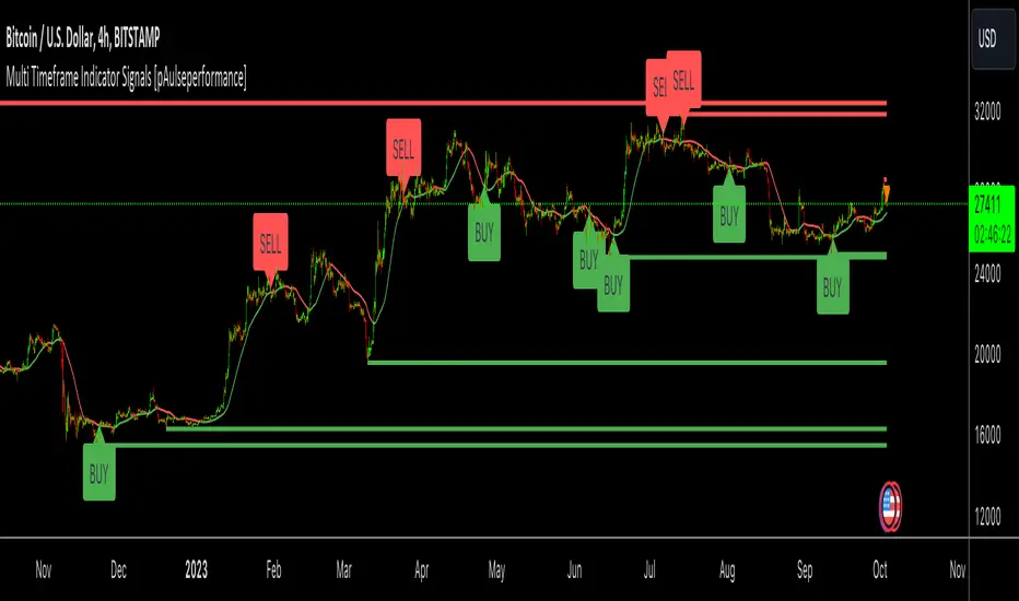
Multi Timeframe Indicator Signals [pAulseperformance]█ Concept:
In this TradingView Pine Script publication, we introduce a powerful tool that offers extensive capabilities for traders and analysts. With a focus on combining multiple indicators, analyzing various timeframes, and fine-tuning your trading strategies, this tool empowers you to make informed trading decisions.
█ Key Features:
1. Combining Multiple Rules with AND / OR Operations
• Example: You can combine the Relative Strength Index (RSI) with the Moving Average Convergence Divergence (MACD) by selecting the "AND" operation. This ensures that you only get a signal when both indicators generate signals. Alternatively, you can add custom indicators and select "OR" to create more complex strategies.
2. Selecting Multiple Indicators on Different Timeframes
• Analyze the same indicator on different timeframes to get a comprehensive view of market conditions.
3. Reversing Signals
• Reverse signals generated by indicators to adapt to various market conditions and strategies.
4. Extending Signals
• Extend signals by specifying conditions such as "RSI cross AND MA cross WITHIN 2 bars."
5. Feeding Results into Backtesting Engine
• Evaluate the performance of your strategies by feeding the results into a backtesting engine.
█ Available Indicators:
External Inputs
• Combine up to 4 custom indicators to assess their effectiveness individually and in combination with other indicators.
MACD (Moving Average Convergence Divergence)
• Analyze MACD signals across multiple timeframes and customize your strategies.
• Signal Generators:
• Signal 1: 🔼 (+1) MACD ⤯ MACD Signal Line 🔽 (-1) MACD ⤰ MACD Signal Line
• Signal 2: 🔼 (+1) MACD ⤯ 0 🔽 (-1) MACD ⤰ 0
• Filter 1: 🔼 (+1) MACD > 0 🔽 (-1) MACD < 0
RSI (Relative Strength Index)
• Utilize RSI signals with flexibility across different timeframes.
• Signal Generators:
• Signal 1: 🔼 (+1) RSI ⤯ Oversold 🔽 (-1) RSI ⤰ Overbought
• Signal 2: 🔼 (+1) RSI ⤰ Oversold 🔽 (-1) RSI ⤯ Overbought
• Filter 1: 🔼 (+1) RSI <= Oversold 🔽 (-1) RSI >= Overbought
MA1 and MA2 (Moving Averages)
• Choose from various types of moving averages and analyze them across multiple timeframes.
• Signal Generators:
• Filter 1: 🔼 (+1) Source Above MA 🔽 (-1) Source Below MA
• Filter 2: 🔼 (+1) MA Rising 🔽 (-1) MA Falling
• Signal 1: 🔼 (+1) Source ⤯ MA 🔽 (-1) Source ⤰ MA
Bollinger Bands
• Multi Time Frame
• Signal Generators:
• Signal 1: 🔼 (+1) Close ⤯ BBLower 🔽 (-1) Close ⤰ BBUpper
• Signal 2: 🔼 (+1) Close ⤰ BBLower 🔽 (-1) Close ⤯ BBUpper
Stochastics
• Customize your MTF Stochastics analysis between Normal Stochastic and Stochastic RSI.
• Signal Generators:
• Filter 1: 🔼 (+1) K < OS 🔽 (-1) K > OB
• Signal 1: 🔼 (+1) K ⤯ D 🔽 (-1) K ⤰ D
• Signal 2: 🔼 (+1) K ⤯ OS 🔽 (-1) K ⤰ OB
• Signal 3: 🔼🔽 Filter 1 And Signal 1
Ichimoku Cloud
• MTF
• Signal Generators:
• Signal 1: 🔼 (+1) Close ⤯ Komu Cloud 🔽 (-1) Close ⤰ Komu Cloud
• Signal 2: 🔼 (+1) Kumo Cloud Red -> Green 🔽 (-1) Kumo Cloud Green -> Red
• Signal 3: 🔼 (+1) Close ⤯ Kijun Sen 🔽 (-1) Close ⤰ Kijun Sen
• Signal 4: 🔼 (+1) Tenkan Sen ⤯ Kijun Sen 🔽 (-1) Tenkan Sen ⤰ Kijun Sen
SuperTrend
• MTF
• Signal Generators:
• Signal 1: 🔼 (+1) Close ⤯ Supertrend 🔽 (-1) Close ⤰ Supertrend
• Filter 1: 🔼 (+1) Close > Supertrend 🔽 (-1) Close < Supertrend
Support And Resistance
• Receive signals when support/resistance levels are breached.
Price Action
• Analyze price action across various timeframes.
• Signal Generators:
• Signal 1 (Bar Up/Dn): 🔼 (+1) Close > Open 🔽 (-1) Close < Open
• Signal 2 (Consecutive Up/Dn): 🔼 (+1) Close > Previous Close # 🔽 (-1) Close < Previous Close #
• Signal 3 (Gaps): 🔼 (+1) Open > Previous High 🔽 (-1) Open < Previous Low
═════════════════════════════════════════════════════════════════════════
Unlock the full potential of these indicators and tools to enhance your trading strategies and improve your decision-making process. With over 10 indicators and more than 30 different ways to generate signals you can rapidly test combinations of popular indicators and their strategies with ease. If your interested in more indicators or I missed a strategy, leave a comment and I can add it in the next update.
Happy trading!
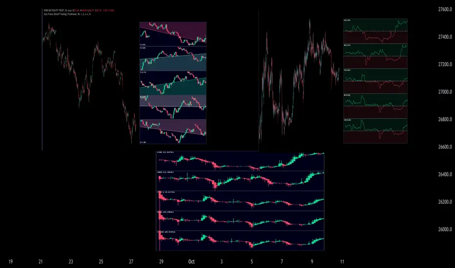
Sync Frame (MTF Charts) [Kioseff Trading]Hello!
This indicator "Sync Frame" displays various lower timeframe charts for the asset on your screen!
5 lower timeframe candle charts shown
Timeframes auto-calculated using the new timeframe.from_seconds() function
Heikin-Ashi candles available
Baseline chart type available
Dynamic Scaling for ease of use
User customizable timeframes
Simple script (:
The image above shows the baseline chart type.
Time image above shows a traditional candlestick chart.
The image above shows a hekin-ashi chart.
The image above shows the indicator when nearly zoomed in as much as possible. The lower timeframe charts adjust to my chart positioning.
The image above shows my screen fully zoomed out; the lower timeframe charts adjust in both height and width to accommodate my chart positioning!
Thank you for checking this out (:
[Holy] Candle BlocksThis experimental indicator overlays candles from higher timeframes directly onto your current chart. The concept of Candle Blocks aims to offer an intuitive way to view price action across multiple periods simultaneously.
FEATURES
Multiple Timeframe Support: Choose from various timeframes to overlay, such as hourly, daily, weekly, etc.
Customizable Opacity: Adjust the transparency of the overlay to ensure the primary chart remains visible.
Color Coding: The overlay uses distinct colors to indicate bullish and bearish candles from the higher timeframe.
Real-time Update: The overlay updates in real-time as new higher timeframe candles are formed.
USE CASES
Trend Confirmation: Validate the trend direction of your primary timeframe by examining higher timeframe Candle Blocks.
Support & Resistance: Identify key support and resistance levels more clearly by seeing them on multiple timeframes.
Fourth-Dimensional Decision Making: This indicator aims to move towards a 4th-dimensional trading perspective, where time is considered as a vector. This helps traders to always make decisions with multiple timeframes in mind.
EXPERIMENTAL
This indicator is in its experimental stage, and future updates will be made based on its effectiveness and the feedback received. If you find this concept useful or have suggestions for improvement, please provide feedback. This will aid in further development and refinement of the indicator.

Macd 6 timeframes ( include chart time with histogram) AboSary 15min, 1h, 4h, D, W, (chart time) + Histogram
All can be show or hide by you and change colors :)
ماكد يشمل 6 فواصل زمنية 15د، 1ساعة، 4ساعات, يوم، اسبوع بالاضافة الى مكاد للفاصل المستخدم بالشارت ايضاً هيستوغرام لنفس الفاصل المعروض في الشارت
مثال لو وضعت نصف ساعة تجد مكاد نص ساعة والهستوغرام كذلك نصف ساعة
جميع الخيارات يمكنك اغلاق اي منها وتغيير الوانها
ICT Clean Midnight [dR-Algo]
Are you a trader who values clean charts and precise indicators? Are you an avid follower of ICT Concepts? If so, the Midnight Marker is tailored for you. This ultra-simple, highly effective TradingView script draws a nearly transparent blue line at midnight on your chart, keeping your interface as clean as possible while delivering essential information.
Why is "ICT Clean Midnight" so Special?
Focus on Price Action: The minimalist design ensures that you can focus solely on price action, which is a core principle of ICT teachings.
Easy Back Testing: Whether you're trading live or back-testing strategies, the midnight marker helps you quickly identify key time points.
Customizable: Though designed to be subtle, the line's color and opacity can be easily customized to suit your charting needs.
This indicator embodies ICT's principle of maintaining a clutter-free, focus-driven trading environment. Perfect for both novice traders wanting to adopt ICT concepts and seasoned traders looking for minimalistic yet effective tools.

Consolidation Spotter Multi Time FrameThis tool is designed for traders looking to spot areas of consolidation on their charts across various time frames. It highlights these consolidation areas using visually appealing boxes, making it easier to identify potential breakout or breakdown zones.
How To Use:
Spotting Consolidation: When you see a box form on your chart, this represents a consolidation zone. Within this zone, the price is moving sideways without a strong upward or downward trend.
Anticipating Breakouts & Breakdowns: Watch the price as it approaches the edges of the box. A movement outside the box can signal a potential breakout (if above the box) or a breakdown (if below the box). This is where momentum shifts can happen.
Momentum Confirmation: Once the price clearly moves out of the box, it indicates a momentum shift. If the price moves upwards out of the box, this can be seen as bullish momentum. Conversely, if the price moves downwards out of the box, this can be seen as bearish momentum.
To use the tool effectively, adjust the settings to suit your trading style, choose your preferred visual theme, and watch as the script highlights key consolidation areas on your chart.
Tip: To visualize fractals, consider using multiple instances of the "Consolidation Spotter" indicator, each set to a different timeframe. This approach allows you to observe consolidations nested within larger consolidations, offering deeper insights into market structures. 😉
Papercuts Time Sampled Higher Timeframe EMA Without SecurityThis EMA uses a higher time sampled method instead of using security to gather higher timeframe data.
Its quite fast and worked well with the timeframes prescribed, up to 8hrs, after 8hrs, the formatting gets more complicated and i probably wouldn't use it anyway.
You can use this as a guide to avoid security and even f_security with this method.
NOTE: This includes the non repainting f_security call so that i woudl be able to check my results against what it does, thats not nessecary to keep at all.
There is some minor differences in data, but its so minor it doesnt bother me, though it would be interesting to know what the difference actually is. If anyone figures that out, leave a comment and let me know!
This is meant to be an example for others to build and learn and play with.. so enjoy!

External Indicator Analysis Overlay | Buy/Sell | HTF Heikin-AshiThis chart overlay offers multiple candlestick display options. The Regular (Japanese) and the Heikin-Ashi candles are well known. The Mari-Ashi (or Renko) option is something special as it should be timeframe independent, so that sideways action should be represented in one candle. That is difficult to realize as an overlay on the normal candlestick structure, but perhaps the chosen implementation is useful nonetheless. The Velocity option is experimental and is designed to show if the price has accelerated too much in a trend direction. In this case, the highs and lows do not reflect the actual highs and lows, but indicate the overshooting velocity. The opening of the candle also depends on the inherent velocity, but the close of the candle is always the actual close. Anyway, it doesn't look very useful, but the option is there.
All options can be applied to higher timeframes. A usable setting is obtained by disabling only the body of the TradingView candles in regular mode and enabling this overlay.
A large part of this overlay consists of buy/sell indication settings. For activation it is necessary to select an external source. For example the “Relative Bi-Directional Volatility Range”, specifically the Trend Shift Signal (TSS). This signal switches from 0 to 1, if the trend becomes bullish or from 0 to -1, if the trend becomes bearish. It will be automatically detected without specifying the Indication Type. Alternatively, the Volatility Moving Average (VMA) would meet the requirements for the Indication Type “Buy = positive | Sell = negative”. The Moving Average Convergence Divergence (MACD) also fulfills these conditions. Another example is to use any Moving Average with the Indication Type “Buy = rising | Sell = falling”. In the chart above the Hull Moving Average (HMA) is used. In addition, it is possible to reverse the signal, so that positive signals become negative and vice versa. The signals will be labeled as Buy or Sell on the chart.
The user can analyze whether the provided signals are good or bad indications for going long or short or simply for rebalancing a portfolio. Therefore, it is possible to set a starting point for the analysis and choose a weighting for the investments from 0% to 100% of the portfolio. To avoid sleepless nights, a very reliable (and conservative) setting seems to be Rebalancing with 50% (very similar to the well-known 60/40 portfolio). The calculation results are shown in a table.
As a small addition there is the possibility to label the peaks by setting the distance between the highs/lows. This will make the quality of the buy and sell signals even more clear.

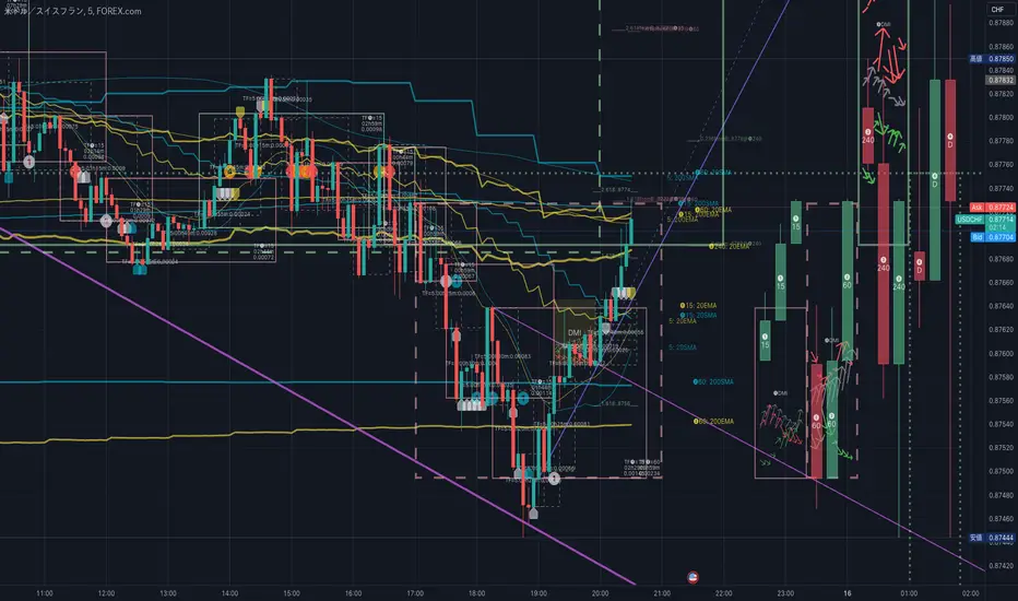
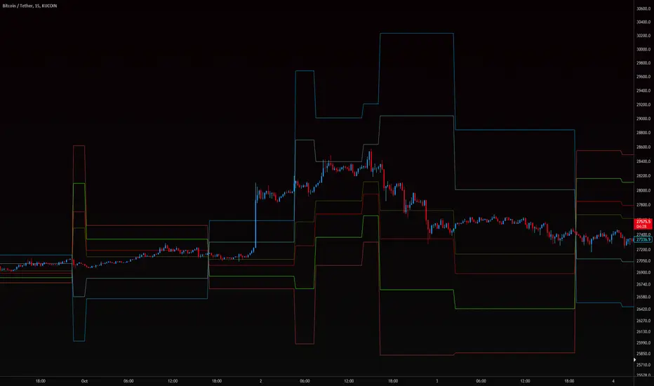
HighLowBox+220MAs[libHTF]HighLowBox+220MAs
This is a sample script of libHTF to use HTF values without request.security().
import nazomobile/libHTFwoRS/1
HTF candles are calculated internally using 'GMT+3' from current TF candles by libHTF .
To calcurate Higher TF candles, please display many past bars at first.
The advantage and disadvantage is that the data can be generated at the current TF granularity.
Although the signal can be displayed more sensitively, plots such as MAs are not smooth.
In this script, assigned ➊,➋,➌,➍ for htf1,htf2,htf3,htf4.
HTF candles
Draw candles for HTF1-4 on the right edge of the chart. 2 candles for each HTF.
They are updated with every current TF bar update.
Left edge of HTF candles is located at the x-postion latest bar_index + offset.
DMI HTF
ADX/+DI/DI arrows(8lines) are shown each timeframes range.
Current TF's is located at left side of the HighLowBox.
HTF's are located at HighLowBox of HTF candles.
The top of HighLowBox is 100, The bottom of HighLowBox is 0.
HighLowBox HTF
Enclose in a square high and low range in each timeframe.
Shows price range and duration of each box.
In current timeframe, shows Fibonacci Scale inside(23.6%, 38.2%, 50.0%, 61.8%, 76.4%)/outside of each box.
Outside(161.8%,261.8,361.8%) would be shown as next target, if break top/bottom of each box.
In HTF, shows Fibonacci Level of the current price at latest box only.
Boxes:
1 for current timeframe.
4 for higher timeframes.(Steps of timeframe: 5, 15, 60, 240, D, W, M, 3M, 6M, Y)
HighLowBox TrendLine
Draw TrendLine for each HighLow Range. TrendLine is drawn between high and return high(or low and return low) of each HighLowBox.
Style of TrendLine is same as each HighLowBox.
HighLowBox RSI
RSI Signals are shown at the bottom(RSI<=30) or the top(RSI>=70) of HighLowBox in each timeframe.
RSI Signal is color coded by RSI9 and RSI14 in each timeframe.(current TF: ●, HTF1-4: ➊➋➌➍)
In case of RSI<=30, Location: bottom of the HighLowBox
white: only RSI9 is <=30
aqua: RSI9&RSI14; <=30 and RSI9RSI14
green: only RSI14 <=30
In case of RSI>=70, Location: top of the HighLowBox
white: only RSI9 is >=70
yellow: RSI9&RSI14; >=70 and RSI9>RSI14
orange: RSI9&RSI14; >=70 and RSI9=70
blue/green and orange/red could be a oversold/overbought sign.
20/200 MAs
Shows 20 and 200 MAs in each TFs(tfChart and 4 Higher).
TFs:
current TF
HTF1-4
MAs:
20SMA
20EMA
200SMA
200EMA
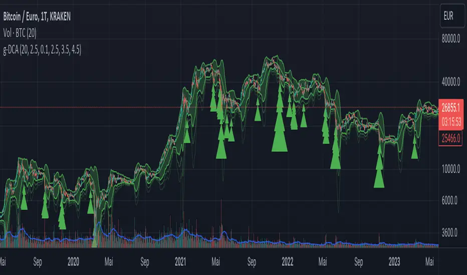
Greedy DCA█ OVERVIEW
Detect price crashes in volatile conditions. This is an indicator for a greedy dollar cost average (DCA) strategy. That is, for people who want to repeatedly buy an asset over time when its price is crashing.
█ CONCEPTS
Price crashes are indicated if the price falls below one or more of the 4 lower Bollinger Bands which are calculated with increasing multipliers for the standard deviation.
In these conditions, the price is far below the average. Therefore they are considered good buying opportunities.
No buy signals are emitted if the Bollinger Bands are tight, i.e. if the bandwidth (upper -lower band) is below the value of the moving average multiplied with a threshold factor. This ensures that signals are only emitted if the conditions are highly volatile.
The Bollinger Bands are calculated based on the daily candles, irrespective the chart time frame. This allows to check the strategy on lower time frames
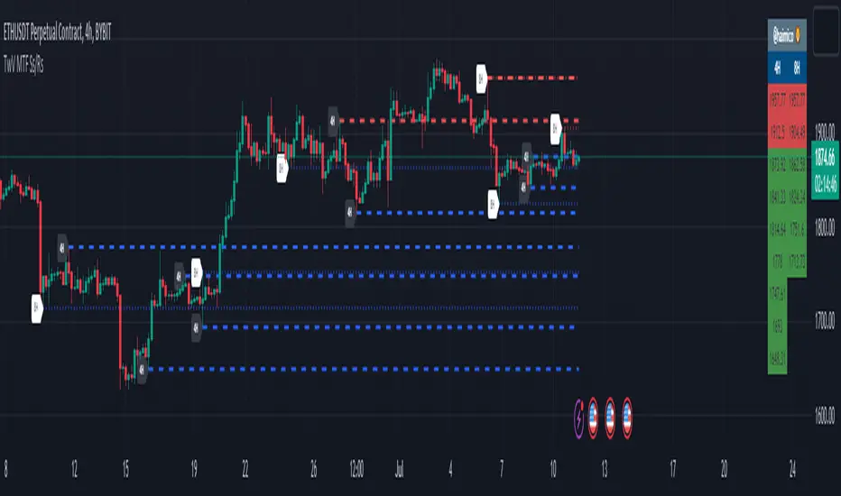
MTF Key Levels [Mxwll]Mxwll MTF S/R:
The Mxwll MTF Support & Resistance indicator is designed to identify crucial support and resistance levels across multiple timeframes. By considering various timeframes, this indicator provides a more comprehensive view of the market's underlying structure. It allows traders to extend lines in various configurations and covers timeframes ranging from 5 minutes to weekly. By considering price action across multiple timeframes, the indicator provides a more comprehensive understanding of the market's supply and demand dynamics. Traders can use the Mxwll MTF Support & Resistance Indicator to refine their trade entries and exits, manage risk, and establish potential price targets.
FEATURES
5 Minute to Weekly Key Levels
Accurate Multi-Timeframe Support and Resistance
Customize To Extend The Lines - Left, Right and Right Across The Chart
Interplay Between Support and Resistance Levels
Change Colours Of S&R
Change Colours Of S&R Lines
INSTRUCTIONS
Select Your Timeframe -> Unselect the S&R Levels That Are Less Than The Timeframe - Trade

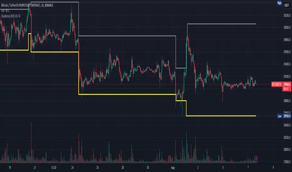
Brake Of Structure (BOS) By GadatasThis indicator is designed to identify and track swing highs and lows in a given market on any timeframe. It plots these swing highs and lows as solid lines on the chart. The indicator allows for customization of the line color and width and using another timeframe.
The indicator follows specific rules to determine when a new high or low is created. If the current range is considered bullish (meaning the most recent breakout was to the topside), the indicator will only update the low if a candle's body falls below the current low. However, if the current range is bearish (most recent breakout to the downside), the indicator will only update the high if a candle's body rises above the current high.
When a range is identified as bullish, the indicator will continue updating the high until a swing high is formed, denoting the high of the range. The high will only change if a candle's body surpasses the previous high. The low, on the other hand, will be updated based on the last time a candle's body falls below a previous candle's low. The lowest low after this condition is met will be assigned as the low of the range.
Conversely, when a range is identified as bearish, the indicator will continue updating the low until a swing low is formed, denoting the low of the range. The low will only change if a candle's body falls below the previous low. The high, in this case, will be updated based on the last time a candle's body rises above a previous candle's high. The highest high after this condition is met will be assigned as the high of the range.
Swing highs are determined by having lower highs to the left and right, while swing lows have higher lows to the left and right. These swings are used to determine the final high or low of a bullish or bearish range, respectively.
Tis Indicator differs from other indicators by incorporating this concept to track market structure. The indicator assumes that significant market players sell before making heavy purchases in bullish ranges and buy before selling heavily in bearish ranges. The lines on the chart represent prior highs and lows, as well as the current updated highs and lows based on this theory. By using this indicator, one can gain insights into the structure of price movement and potentially identify bullish or bearish continuations. It can also provide confluence when analyzing multiple timeframes to validate trend-following strategies.
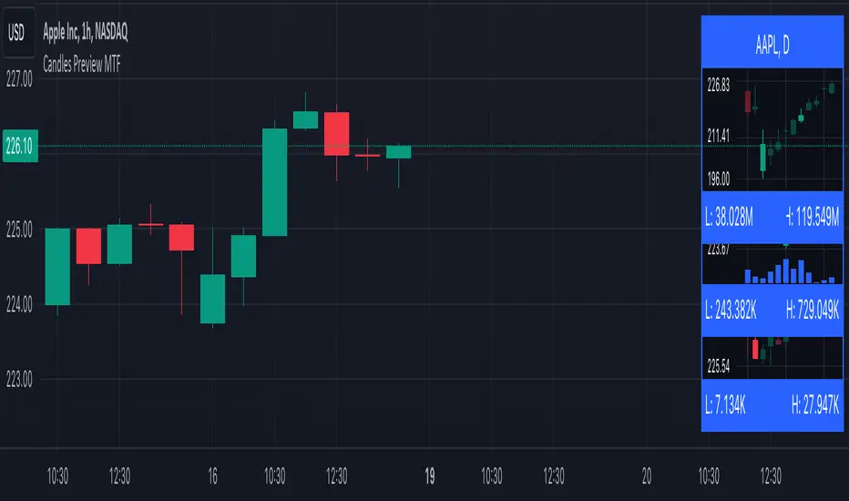
Candles Preview MTFDescription:
The script displays a mini-chart with candlesticks from different symbols and timeframes (up to 8 in total). It can display up to 24 candles. You can use it on any timeframe, but it is intended to work with the same or higher timeframes than the chart's. For example: you can add a mini-chart displaying candles of the chart's symbol from Weekly timeframe, while being on Daily timeframe. The script updates in realtime, but it is not recommended to use it on very low timeframes (1 second for example).
Below you can find some examples of using the indicator:
(custom colors, highest and lowest volume in footer, symbol name with exchange in header)
(a chart with Weekly and a chart with Monthly candles, custom colors, no footer, timeframe in header)
(charts for 5 different stocks, no footer, symbol name in header)
Along with the chart it displays a header with Symbol and Timeframe, as well as footer with highest and lowest Price or Volume for selected number of candles. Each candle displays a tooltip with the following information when hovered:
- Date / Time
- Open, High, Low and Close prices
- Price change (absolute and %)
- Volume
- Volume change (absolute and %)
By default the interface changes colors if you switch to / from "Dark mode", but you can also manually customise any colors to your likings. You can also hide both header and footer, customise what information is displayed in them, show / hide the chart's grid and change its "density", choose position and height for each of the 8 charts. Additionally, you can change the timezone used to calculate time and date.
Inputs:
The indicator's inputs are separated into groups:
- Other (contains the "Timezone" parameter)
- Chart 1 (contains parameters specific for each chart)
- Chart 2
- Chart N
- ...
- Charts (contains parameters that modify all the 8 charts)
- Colors (contains parameters for styling)
How to get it:
Contact me on Tradingview using private chat, and I will grant you a 3 day trial access
On a side note:
You can share your feedback or ideas in the comments, it will help me improve the indicator. Refer to "Release notes" section for any future updates. Thank you!
[volfgang] WAVE ScannerThe Wave Scanner helps you make more informed decisions about when to buy and sell.
This indicator operates on a series of inputs and global variable declarations. Based on the same parameters as the WAVE Indicator. It uses different parameters such as the closing price, Stochastic Momentum Index, and smoothing factors such as the EMA to calculate the potential trade signals.
The scanner allows you to adjust the thresholds for bullish and bearish counts, which can be tailored to your personal trading strategy.
The minimum value is 4 and maximum is 8.
In total you can use 8 different timeframes for your signals from the following;
3D
1D
12h
8h
4h
1h
15m
5m
The scanner's unique ability to scan across multiple timeframes is what makes this indicator unique. This multi timeframe analysis can be incredibly useful for identifying broader trends in the market.
The Wave Scanner settings also includes inputs for you to enter risk management settings, including your total capital and the risk percentage you are willing to take per trade. It uses this information to display data in a label on the chart including;
Position Size
Stop Loss Level
Potential Profit
Risk Reward Ratio
On your chart, the WAVE Scanner will plot the ideal Entry Levels, Stop Loss and Take Profit Levels by calculating Fibonacci Levels, which is a popular tool for identifying potential support and resistance levels.
These are marked as follows;
GREEN Lines: Entry Levels
PINK Line: Stop Loss (can be customized in the settings)
GREY Line: Breakeven Level (move SL to breakeven at this level)
BLUE Line: Take Profit Level
So, if you're a trader looking to level up your strategy, the Wave Scanner is a tool you won't want to miss out on.
Lower timeframe chartHi all!
I've made this script to help with my laziness (and to help me (and now you) with efficiency). It's purpose is to, without having to change the chart timeframe, being able to view the lower timeframe bars (and trend) within the last chart bar. The defaults are just my settings (It's based on daily bars), so feel free to change them and maybe share yours! It's also based on stocks, which have limited trading hours, but if you want to view this for forex trading I suggest changing the 'lower time frame' to a higher value since it has more trading hours.
The script prints a label chart (ASCII) based on your chosen timeframe and the trend, based on @KivancOzbilgic script SuperTrend The printed ASCII chart has rows (slots) that are based on ATR (14 bars) and empty gaps are removed. The current trend is decided by a percentage of bars (user defined but defaults to 80%, which is really big but let's you be very conservative in defining a trend to be bullish. Set to 50% to have the trend being decided equally or lower to be more conservative in defining a trend to be bearish) that must have a bullish SuperTrend, it's considered to be bearish otherwise. Big price range (based on the ATR for 14 bars) and big volume (true if the volume is bigger than a user defined simple moving average (defaults to 20 bars)) can be disabled for faster execution.
The chart displayed will consist of bars and thicker bars that has a higher volume than the defined simple moving average. The bars that has a 'big range' (user defined value of ATR (14 days) factor that defaults to 0.5) will also have a wick. The characters used are the following:
Green bar = ┼
Green bar with large volume = ╪
Green bar wick = │
Red bar = ╋
Red bar with large volume = ╬
Red bar wick = ┃
Bar with no range = ─
Bar with no range and high volume = ═
Best of trading!

RSI Multi Timeframe Based on Moving Average By Alireza PhoenixHi. I have prepared for you the multi-time frame RSI indicator based on moving average
You can use it in three different time frames
Open the settings and put the value you want in the Time 1 and Time 2 fields
In the fast and slow section, specify the length of the moving period of fast and slow origins as desired
In the offset section, you can add or reduce the time interval as you wish
This indicator shows you the RSI index in three different time frames along with two different lengths of the moving average based on the RSI index.
You can use this indicator in all financial, forex or crypto markets
The crossing of RSI and moving average lines in different time frames and lengths will give you a buy or sell signal.
Whenever the faster line or smaller RSI total frame succeeds in breaking the slower line or the RSI time is higher than the low, a free signal is issued and vice versa.
I do not guarantee that 100% of the issued signals are accurate and correct, and I have coded this indicator only for your convenience.
I hope you can get help from this indicator and make profit
Love From IRAN

TwV Dynamic Multi-Timeframe Supports and ResistancesDynamic Multi-timeframe Supports and Resistances
This indicator is designed to be able to get used in combination with others that can lead to a potential help for trading.
The indicator uses colors such us light blue, dark blue, light red and dark red. Light blue and light red to indicate whether we are looking at a support or resistance for the multi-timeframe and dark blue and dark red to indicate whether we are looking at a support or resistance for the current chart’s timeframe.
The indicator is multi-timeframe because the trader can configure within the menu a background timeframe, which plots new supports and resistances according to the timeframe selected. Therefore, traders can use daily or 4H supports and resistances in a 1H graph or lower. (Just as an example)
The Supports' and Resistances' for the different timeframes are clearly identified with a label at the specific candle where they are coming from.
Most Supports & Resistances indicators need to be adjusted to a FIXED LOOKBACK PERIOD , I made an improvement and different by giving the indicator the ability to identify the bars that are being LOOK AT IN THE SCREEN , this really gives traders the possibility and agility to identify potential support and resistance areas without the need to be changing any settings on the indicator. Just change the Fixed/Dynamic setting indicator to start using this great functionality.
Fundamentals
Support and resistance are two foundational concepts in technical analysis. Understanding what these terms mean and their practical application is essential to correctly reading price charts.
Prices move because of supply and demand. When demand is greater than supply, prices rise. When supply is greater than demand, prices fall. Sometimes, prices will move sideways as both supply and demand are in equilibrium.
Like many concepts in technical analysis, the explanation and rationale behind technical concepts are relatively easy, but mastery in their application often takes years of practice.
Technical analysts use support and resistance levels to identify price points on a chart where the probabilities favor a pause or reversal of a prevailing trend.
Support occurs where a downtrend is expected to pause due to a concentration of demand.
Resistance occurs where an uptrend is expected to pause temporarily, due to a concentration of supply.
Support and resistance areas can be identified on charts using trendlines and moving averages.
Summary Panel
This panel allows the trader to have a summary of the values of the supports and resistances. It has the following characteristics:
Can be placed anywhere in the chart.
Its size can be modified to fit any type of screens including mobile
The summary box the high and low prices for the supports and resistances.
Script’s Basics
The idea behind the script is to find out Long-term levels are used to help predict large price reversals marking the start and completion of price movements on longer timelines such as the daily or weekly charts, to achieve this the script uses K-Means clustering to identify long-term support and resistance levels.
K-means clustering is one of the most popular algorithms, the objective of K-means is to group similar data points together and discover underlying patterns. To achieve this objective, K-means looks for a fixed number (k) of clusters in a dataset.
A cluster refers to a collection of data points aggregated together because of certain similarities. For this, a target number k has to be defined, which refers to the number of centroids it is needed in the dataset.
Every data point is allocated to each of the clusters through reducing the in-cluster sum of squares.
In other words, it identifies the k number of centroids and then allocates every data point to the nearest cluster, while keeping the centroids as small as possible.
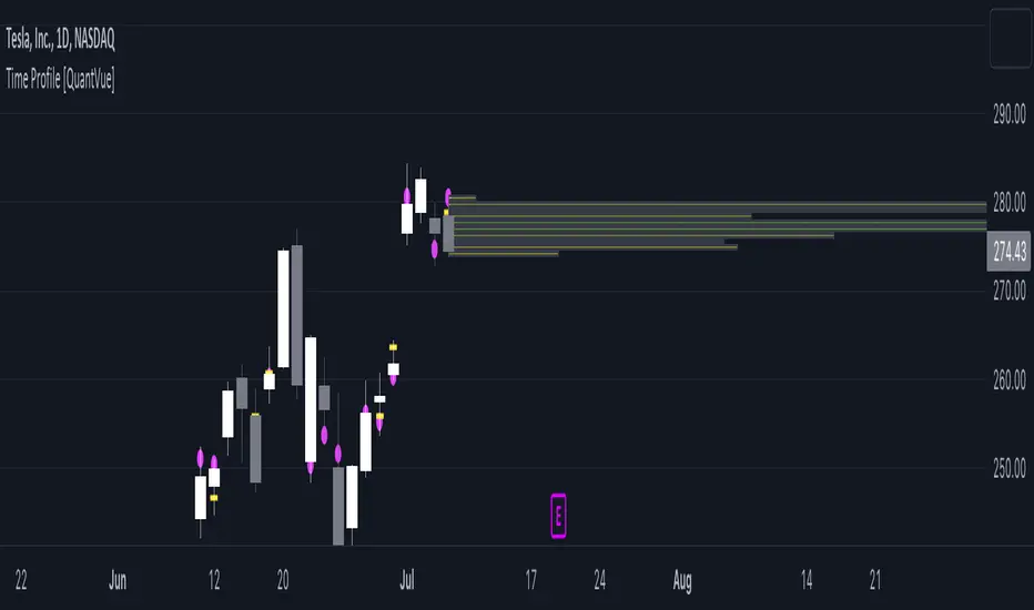
Time Profile [QuantVue]The Time Profile indicator provides traders with a comprehensive view of volume and time-based price activity. The indicator combines two essential components into one indicator: the volume profile and the time profile.
The volume profile represents the distribution of trading volume at different price levels over a specified period and is displayed as a circle on the chart.
It provides a visual representation of where the majority of trading volume occurred and often highlights significant support and resistance levels. The volume profile is calculated as the closing price of the highest volume intraday bar, based on the user selected lower time frame.
On the other hand, the time profile focuses on analyzing the time spent at certain price levels. The indicator divides the current bars range into 10 blocks and counts the number of user selected lower time frame closes within each time block.
The block with the most lower time frame closes in it is deemed the time point of control. Traders can use this information to identify time blocks where price movement was most significant.
The time profile is drawn on the Y axis of the current bar to allow for an easy visualization of where price spent most of its time. Historical time profiles are also noted on previous bars with a dash marking the level.
The Time Profile indicator offers several customization options. Traders can adjust the timeframe for the lower time frame data, decide whether to display the time profile, and customize colors for visual clarity.
Additionally, traders can choose to highlight instances where the Volume POC and Time POC align, indicating a strong concentration of volume and price activity.
Don't hesitate to reach out with any questions or concerns.
We hope you enjoy!
Cheers.
MultiTimeFrame Choppiness IndexThe Choppiness Index (CHOP) is an oscillator (range 0-100) designed to determine if the market is choppy (trading sideways, value is going up) or not choppy (trading within a trend, value is going down). In case of trend moves it do not determine trend direction (other indicators are needed to predict trend direction). Some see it as fuel for the upcoming movement.
This implementation shows the graph for 4 different time frames simultaneously. Time frames are selected in settings. The default set: 1h, 4h, 1D, 1W.
For each time frame we can show/hide chart line, pick timeframe, assigned a color and line width.
Troubleshooting:
In case od any problems, please send error details to the author of the script.

TimeLy Moving Average - TMAHello traders, I'm Only Fibonacci.
With this indicator, you will see the averages according to the hourly, weekly and monthly price movements in many periods on the chart.
This will show you the moving average values of the price over different periods in a progressive manner on the chart that is open to you.
Options and Usage
To see the hourly average, your chart's time range must be less than or equal to 60 minutes, otherwise it will produce a NaN value.
In order to see the daily average, your chart must be open for any minute period or (even if the second is open, it must be greater than 6 seconds). Otherwise, it does not produce any value.
Your chart must be larger than the second chart to see the weekly average. In other words, you can see the weekly average with at least 1 minute chart open.
In order to see the monthly average, your chart time interval must be above 10 minutes, otherwise you will not be able to see data again.
Settings
You choose the moving average type and the time interval value you want to see from the indicator settings.
You can also select a source for moving averages.
Enjoy it, you can make improvements on it.
Please do not forget to comment for various bug reports.

MTF Evolving Weighted Composite Value Area🧾 Description:
This indicator calculates evolving value areas across 3 different timeframes/periods and combines them into one composite, multi-timeframe evolving value area - with each of the underlying timeframes' VAs assigned their own weighting/importance in the final calculation. Layered with extra smoothing options, this creates an informative and useful 'rolling value area' effect that can give you a better perspective on the value area across multiple periods at once as it develops - without total calculation resets at the onset of every new period.
Let's start with a simplified primer on value areas and then jump in to the new ideas this indicator introduces.
🤔 What is a value area?
Value areas are a tool used in market profile analysis to determine the range of prices that represents where most trading activity occurred during a specific time period, typically within a single 'bar' of a certain higher timeframe, such as the 4-hour, daily, or weekly. It helps traders understand the levels where the market finds value.
To calculate the value area, we look at the distribution of prices and trading volume. We determine a percentage, usually 70% or 80%, that represents the significant portion of trading volume. Then, we identify the price range that contains this percentage of trading volume, which becomes the value area.
Value areas are useful because they provide insights into market dynamics and potential support and resistance levels. They show where traders have been most active and where they find value, and traders can use this information to make better-informed decisions.
For example, if price is trading within the value area, it suggests that it's within a range where traders see value and are actively participating, which could indicate a balanced market. If the price moves above or below the value area, it may signal a potential shift in market sentiment or a breakout/breakdown from the established range.
By understanding the value area, traders can identify potential areas of supply and demand, determine levels of interest for buyers and sellers, and make decisions based on the market's perception of value.
📑 Limitations of traditional value areas
Static representation: Value areas are usually represented as static zones calculated after the fact. For example, after a daily period is completed, a typical 1D VA indicator will display the value area for the past period with static horizontal lines. This approach doesn't give you the power to see how the value area evolved, or developed, during the time period, as it is only displayed retroactively. It also doesn't give you the ability to view it as it evolves in real-time. This is why we chose to use an evolving value area representation, specifically borrowed from @sourcey's Value Area POC/VAH/VAL script function for calculating evolving VAs.
Rollover resets - no memory of past periods!: The traditional value area is calculated over a static period - it is calculated from the beginning of the period, for example a 1 day period, to the end, and that's the end of it. When the next daily period begins, the calculation resets, and has no memory of the preceding period. This limits the usefulness of the value area visual when viewed near the beginning of a new period before price and volume have been given ample time to define an area.
Hard to absorb all of that information: Value areas aren't generally meant to be a hardline representation of something extremely exact - they're based on a percentage of the area where traders appeared to find value over a certain time period. Most traders use them as a guide for support and resistance levels or finding an expected range. Traders typically overlay multiple VAs - sometimes requiring several instances of the same indicator to be applied - to represent the VA across multiple timeframes such as the 4H, 1D, or 1W. The chart quickly gets cluttered and it's not necessarily easy to understand the relationship between these multiple periods' VAs at a glance.
🧪 New concepts introduced in this indicator
With the evolving weighted composite value area we tried to address these limitations, and we think the result can be useful and intuitive for traders who want more dynamic and practical VAs for their everyday technical analysis.
⚖️ 1. A composite, weighted multi-timeframe VA
This indicator's value areas represent a combination or composite of the value areas calculated across multiple timeframes. The VAs calculated across each timeframe are then given a weighting percentage, which determines their contribution to the final 'weighted composite value area'.
Pictured below: a 4H/1D/1W MTF evolving weighted composite VA on the BTCUSDT Perpetual Futures (Binance) 5 minute chart:
Traditionally, when traders wanted to get a view of where the majority of trading activity occurred over the past four hours, day, and week, they would need to apply three value area indicators (or sometimes one if it allows multiple custom timeframes), each set to a different period (4H, 1D, 1W). The chart gets cluttered quickly and the information is hard to absorb in one shot. Addressing this problem was the main impetus for creating this weighted composite process.
〰️ 2. Rolling and smoothed evolving VAs
Because the composite VA is calculated based on multiple period VAs, there is no one single point where the area calculation resets (unless all 3 selected timeframes happen to rollover on the same bar). This creates a 'rolling' effect that gives a sense of the progression of the VA as price transitions through the different underlying time periods, without the traditional 'jump' in calculations between periods.
Pictured below: a 1D/1W/1M MTF evolving weighted composite VA on the NQ futures 1H chart:
To help give even more of a sense of perspective and 'progression' of the VA, there are also smoothing options to even out the 'jumps' at period-rollover points.
✔️ What's it good for?
Smoothed, rolling, and evolving multi-timeframe VAs that give you a better real-time perspective of where traders are finding value across multiple time periods at once.
📎 References
1. @sourcey's Value Area POC/VAH/VAL script by adapting its f_poc(tf) function.
💠 Features:
A MTF evolving weighted composite value area based on 3 underlying VAs calculated across customizable timeframes
Aesthetic and flexible coloring and color theme styling options
Period-roller labels and options for ease-of-use and legibility
⚙️ Settings:
Calculation Decimal Resolution: This setting essentially determines how 'granular' the value area calculating process is. This value should be set to some multiple of the tick size/smallest decimal of the symbol's price chart. Eg. On BTCUSDT, the tick size/decimal is usually 0.1. So, you might use 0.5. On TSLA, the tick size is 0.01. You might use 0.05 or 0.25. Beware: if the resolution is too small, calculation will take too long and the script may timeout.
Show Me Suggested Resolutions: If enabled, a label will display in the bottom right of the chart with some suggested resolutions for the current chart.
Area Percentage: Set the displayed percentage of the calculated composite value area. Igor method = 70%; Daniel method: 68%.
Use a Color Theme: When this setting is enabled, all manual 'Bullish and Bearish Colors' are overridden. All plots will use the colors from your selected Color Theme - excepting those plots set to use the 'Single Color' coloring method.
Color Theme: When 'Use a Color Theme' is enabled, this setting allows you to select the color theme you wish to use.
Resistance Color: When 'Use a Color Theme' is disabled, this will set the 'resistance color' for the composite VA.
Support Color: When 'Use a Color Theme' is disabled, this will set the 'support color' for the composite VA.
Show Period Rollover Labels: When enabled, a label will show above or below the composite VA marking any underlying period rollovers with the label 'New __' (eg. 'New 4H', 'New 1D', 'New 1W').
Size: Sets the font size of the period rollover labels.
Show Period Rollover Lines: When enabled, a translucent vertical dashed line will be drawn across the composite VA when one of the underlying periods rolls over.
Fill Composite Value Area: When enabled, the composite VA will be filled with a gradient coloring from the support line to the resistance line using their respective colors.
Smooth: When enabled, a smoothing moving average will be applied to the composite value area.
Smoothing Period: Set the lookback period for the smoothing average.
Smoothing Type: Set the calculation type for the smoothing average. Options include: Exponential, Simple, Weighted, Volume-Weighted, and Hull.
Enable: Include/exclude a timeframe's VA in the composite VA calculation.
Timeframe: Set the timeframe for this specific underlying VA.
Weighting %: Set the weighting percentage or 'importance' of this timeframe's value area in calculating the composite VA. Beware! The sum of the weighting percentages across all enabled timeframes must ALWAYS add up to 100 in order for this indicator to work as designed.

MTF Fusion - SuperTrend [TradingIndicators]SuperTrend is undoubtedly one of the most popular and influential indicators ever developed, and by combining it with our MTF Fusion algorithm, we believe we have made it more useful and powerful than ever with MTF Fusion SuperTrend .
Let's start with a brief review of what the original SuperTrend indicator is and how it works.
What is SuperTrend?
The SuperTrend indicator is a popular technical analysis tool used in financial markets to identify the direction of a trend and potential entry and exit points for trading. It was developed by Olivier Seban, a French trader, and first introduced in his book "Tout le monde peut gagner en bourse" ("Everyone Can Win in the Stock Market") published in 2008.
SuperTrend is based on the concept of Average True Range (ATR) and uses two parameters: the multiplier and the period. The ATR measures the volatility of a financial instrument, and the SuperTrend indicator utilizes this information to plot a line above or below the price chart. It is an 'AITM' (Always In The Market) indicator, which, in its original form, is always 'long' or 'short' - and never 'flat'.
Here's a brief overview of how the SuperTrend indicator works:
Calculation of the ATR: The ATR is calculated using historical price data over a specified period. It measures the average range between high and low prices, reflecting the market's volatility.
Calculation of the upward (long/bullish) and downward (short/bearish) SuperTrend lines: The SuperTrend indicator multiplies the ATR by a specified multiplier (typically 2 or 3) and adds/subtracts the result from the current closing price. This calculation determines the upward and downward SuperTrend lines.
Plotting the Indicator: The SuperTrend indicator plots a line above the price chart when the price is trending upwards, and below the price chart when the price is trending downwards. The distance between the price and the indicator line provides insights into the strength of the trend.
Traders commonly use the SuperTrend indicator to identify potential buy or sell signals. For example, a buy signal may be generated when the price crosses above the indicator line, indicating an uptrend. Conversely, a sell signal may be triggered when the price crosses below the indicator line, signaling a downtrend.
What is MTF Fusion?
Multi-Timeframe (MTF) Fusion is the process of combining calculations from multiple timeframes higher than the chart's into one 'fused' value or indicator. It is based on the idea that integrating data from higher timeframes can help us to better identify short-term trading opportunities within the context of long-term market trends.
How does it work?
Let's use the context of this indicator, which calculates SuperTrend lines, as an example to explain how MTF Fusion works and how you can perform it yourself.
Step 1: Selecting Higher Timeframes
The first step is to determine the appropriate higher timeframes to use for the fusion calculation. These timeframes should typically be chosen based on their ability to provide meaningful price levels and action which actively affect the price action of the smaller timeframe you're focused on. For example, if you are trading the 5 minute chart, you might select the 15 minute, 30 minute, and hourly timeframe as the higher timeframes you want to fuse in order to give you a more holistic view of the trends and action affecting you on the 5 minute. In this indicator, four higher timeframes are automatically selected depending on the timeframe of the chart it is applied to.
Step 2: Gathering Data and Calculations
Once the higher timeframes are identified, the next step is to calculate the data from these higher timeframes that will be used to calculate your fused values. In this indicator, for example, the values of SuperTrend lines are calculated by determining the value of the SuperTrend indicator for all four higher timeframes.
Step 3: Fusing the Values From Higher Timeframes
The next step is to actually combine the values from these higher timeframes to obtain your 'fused' indicator values. The simplest approach to this is to simply average them. If you have calculated the value of a SuperTrend line from three higher timeframes, you can, for example, calculate your 'multi-timeframe fused level' as (HigherTF_SuperTrend_1 + HigherTF_SuperTrend_2 + HigherTF_SuperTrend_3) / 3.0.
Step 4: Visualization and Interpretation
Once the calculations are complete, the resulting fused indicator values are plotted on the chart. These values reflect the fusion of data from the multiple higher timeframes, giving a broader perspective on the market's behavior and potentially valuable insights without the need to manually consider values from each higher timeframe yourself.
What makes this script unique? Why is it closed source?
While the process described above is fairly unique and sounds simple, the truly important key lies in determining which higher timeframes to fuse together, and how to weight their values when calculating the fused end result in such a way that best leverages their relationship for useful TA.
This MTF Fusion indicator employs a smart, adaptive algorithm which automatically selects appropriate higher timeframes to use in fusion calculations depending on the timeframe of the chart it is applied to. It also uses a dynamic algorithm to adjust and weight the SuperTrend calculations depending on each higher timeframe's relationship to the chart timeframe. These algorithms are based on extensive testing and are the reason behind this script's closed source status.
Unlike in the original indicator, flat/'No Trend' areas exist in MTF Fusion SuperTrend!
MTF Fusion SuperTrend only shows a Fusion SuperTrend when the majority of SuperTrends from higher timeframes are in agreement and signaling the same trend direction . So, unlike the original SuperTrend indicator, MTF Fusion SuperTrend sometimes shows no SuperTrend line at all - typically in flat or indecisive areas, which we think is beneficial and helps to filter out noise on smaller timeframes.
Included Features
Fusion SuperTrend lines
Dynamic Multi-Timeframe SuperTrends
Filled zones to highlight trends
Full customization of SuperTrend parameters
Pre-built color stylings
Options
Fusion View: Show/hide the Fusion SuperTrends calculated from multiple higher timeframes
MTF View: Show/hide the SuperTrends from multiple higher timeframes used to calculate the Fusion SuperTrends
Fill Trending Zones: Show/hide the fill for 'trending zones' between price and the Fusion SuperTrends
Multiplier: Sets the multiplier for all SuperTrend calculations
ATR Period: Sets the ATR period for all SuperTrend calculations
Pre-Built Color Styles: Use a pre-built color styling (uncheck to use your own colors)
Manual Color Styles: When pre-built color styles are disabled, use these color inputs to define your own
