inside forex vip📌 SuperTrend
Based on:
ATR Period (default 10).
Multiplier ATR (default 3).
Calculates the trend direction (upward/downward).
Generates buy/sell signals:
Buy: Positive crossover with EMA color matching (bullish).
Sell: Negative crossover with EMA color matching (bearish).
Indicators
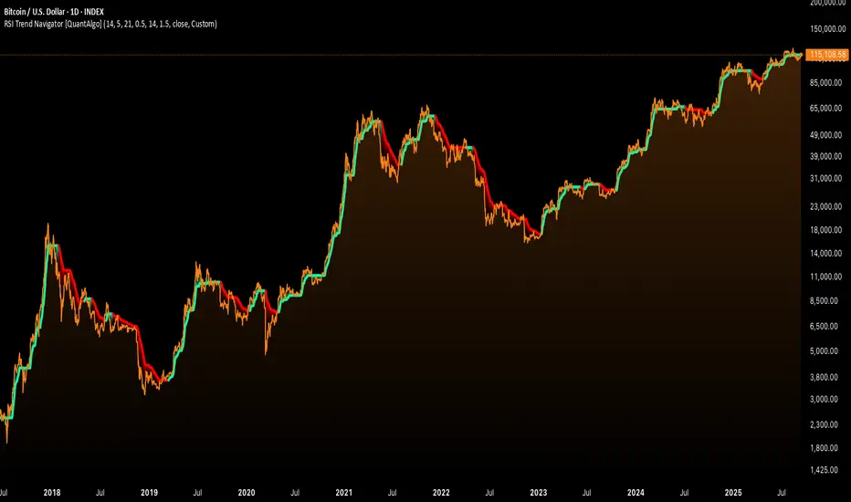
RSI Trend Navigator [QuantAlgo]🟢 Overview
The RSI Trend Navigator integrates RSI momentum calculations with adaptive exponential moving averages and ATR-based volatility bands to generate trend-following signals. The indicator applies variable smoothing coefficients based on RSI readings and incorporates normalized momentum adjustments to position a trend line that responds to both price action and underlying momentum conditions.
🟢 How It Works
The indicator begins by calculating and smoothing the RSI to reduce short-term fluctuations while preserving momentum information:
rsiValue = ta.rsi(source, rsiPeriod)
smoothedRSI = ta.ema(rsiValue, rsiSmoothing)
normalizedRSI = (smoothedRSI - 50) / 50
It then creates an adaptive smoothing coefficient that varies based on RSI positioning relative to the midpoint:
adaptiveAlpha = smoothedRSI > 50 ? 2.0 / (trendPeriod * 0.5 + 1) : 2.0 / (trendPeriod * 1.5 + 1)
This coefficient drives an adaptive trend calculation that responds more quickly when RSI indicates bullish momentum and more slowly during bearish conditions:
var float adaptiveTrend = source
adaptiveTrend := adaptiveAlpha * source + (1 - adaptiveAlpha) * nz(adaptiveTrend , source)
The normalized RSI values are converted into price-based adjustments using ATR for volatility scaling:
rsiAdjustment = normalizedRSI * ta.atr(14) * sensitivity
rsiTrendValue = adaptiveTrend + rsiAdjustment
ATR-based bands are constructed around this RSI-adjusted trend value to create dynamic boundaries that constrain trend line positioning:
atr = ta.atr(atrPeriod)
deviation = atr * atrMultiplier
upperBound = rsiTrendValue + deviation
lowerBound = rsiTrendValue - deviation
The trend line positioning uses these band constraints to determine its final value:
if upperBound < trendLine
trendLine := upperBound
if lowerBound > trendLine
trendLine := lowerBound
Signal generation occurs through directional comparison of the trend line against its previous value to establish bullish and bearish states:
trendUp = trendLine > trendLine
trendDown = trendLine < trendLine
if trendUp
isBullish := true
isBearish := false
else if trendDown
isBullish := false
isBearish := true
The final output colors the trend line green during bullish states and red during bearish states, creating visual buy/long and sell/short opportunity signals based on the combined RSI momentum and volatility-adjusted trend positioning.
🟢 Signal Interpretation
Rising Trend Line (Green): Indicates upward momentum where RSI influence and adaptive smoothing favor continued price advancement = Potential buy/long positions
Declining Trend Line (Red): Indicates downward momentum where RSI influence and adaptive smoothing favor continued price decline = Potential sell/short positions
Flattening Trend Lines: Occur when momentum weakens and the trend line slope approaches neutral, suggesting potential consolidation before the next move
Built-in Alert System: Automated notifications trigger when bullish or bearish states change, sending "RSI Trend Bullish Signal" or "RSI Trend Bearish Signal" messages for timely entry/exit
Color Bar Candles Option: Optional candle coloring feature that applies the same green/red trend colors to price bars, providing additional visual confirmation of the current trend direction
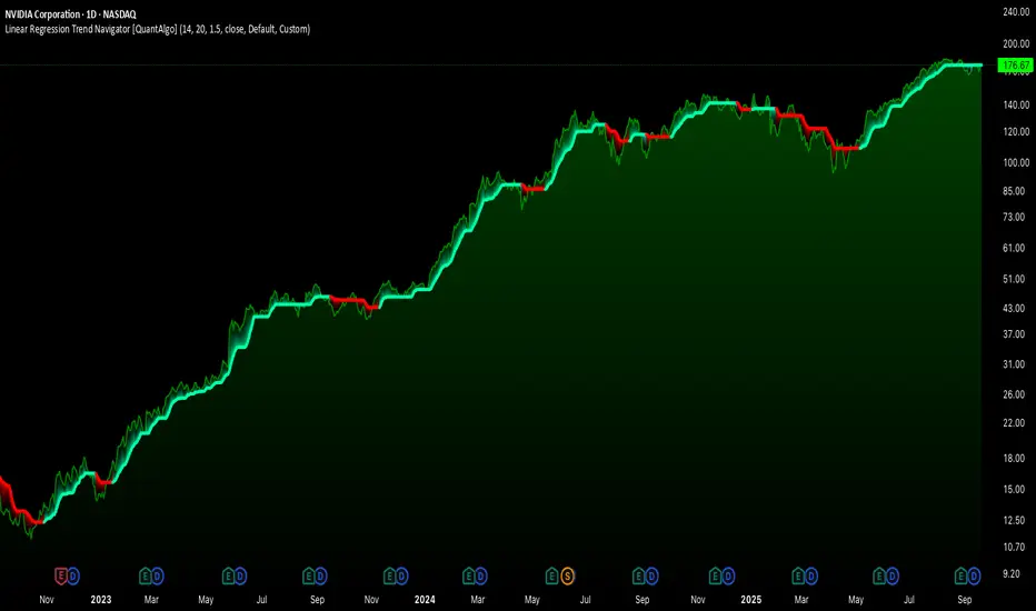
Linear Regression Trend Navigator [QuantAlgo]🟢 Overview
The Linear Regression Trend Navigator is a trend-following indicator that combines statistical regression analysis with adaptive volatility bands to identify and track dominant market trends. It employs linear regression mathematics to establish the underlying trend direction, while dynamically adjusting trend boundaries based on standard deviation calculations to filter market noise and maintain trend continuity. The result is a straightforward visual system where green indicates bullish conditions favoring buy/long positions, and red signals bearish conditions supporting sell/short trades.
🟢 How It Works
The indicator operates through a three-phase computational process that transforms raw price data into adaptive trend signals. In the first phase, it calculates a linear regression line over the specified period, establishing the mathematical best-fit line through recent price action to determine the underlying directional bias. This regression line serves as the foundation for trend analysis by smoothing out short-term price variations while preserving the essential directional characteristics.
The second phase constructs dynamic volatility boundaries by calculating the standard deviation of price movements over the defined period and applying a user-adjustable multiplier. These upper and lower bounds create a volatility-adjusted channel around the regression line, with wider bands during volatile periods and tighter bands during stable conditions. This adaptive boundary system operates entirely behind the scenes, ensuring the trend signal remains relevant across different market volatility regimes without cluttering the visual display.
In the final phase, the system generates a simple trend line that dynamically positions itself within the volatility boundaries. When price action pushes the regression line above the upper bound, the trend line adjusts to the upper boundary level. Conversely, when the regression line falls below the lower bound, the trend line moves to the lower boundary. The result is a single colored line that transitions between green (rising trend line = buy/long) and red (declining trend line = sell/short).
🟢 How to Use
Green Trend Line: Upward momentum indicating favorable conditions for long positions, buy signals, and bullish strategies
Red Trend Line: Downward momentum signaling optimal timing for short positions, sell signals, and bearish approaches
Rising Green Line: Accelerating bullish momentum with steepening angles indicating strengthening upward pressure and potential for trend continuation
Declining Red Line: Intensifying bearish momentum with increasing negative slopes suggesting persistent downward pressure and shorting opportunities
Flattening Trend Lines: Gradual reduction in slope regardless of color may indicate approaching consolidation or momentum exhaustion requiring position review
🟢 Pro Tips for Trading and Investing
→ Entry/Exit Timing: Trade exclusively on band color transitions rather than price patterns, as each color change represents a statistically-confirmed shift that has passed through volatility filtering, providing higher probability setups than traditional technical analysis.
→ Parameter Optimization for Asset Classes: Customize the linear regression period based on your trading style. For example, use 5-10 bars for day trading to capture short-term statistical shifts, 14-20 for swing trading to balance responsiveness with stability, and 25-50 for position trading to filter out medium-term noise.
→ Volatility Calibration Strategy: Adjust the standard deviation multiplier according to market volatility. For instance, increase to 2.0+ during high-volatility periods like earnings or news events to reduce false signals, decrease to 1.0-1.5 during stable market conditions to maintain sensitivity to genuine trends.
→ Cross-Timeframe Statistical Validation: Apply the indicator across multiple timeframes simultaneously, using higher timeframes for directional bias and lower timeframes for entry timing.
→ Alert-Based Systematic Trading: Use built-in alerts to eliminate discretionary decision-making and ensure you capture every statistically-significant trend change, particularly effective for traders who cannot monitor charts continuously.
→ Risk Allocation Based on Signal Strength: Increase position sizes during periods of strong directional movement while reducing exposure during frequent band color changes that indicate statistical uncertainty or ranging conditions.
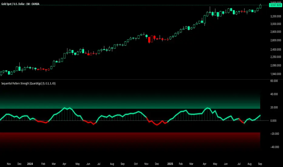
Sequential Pattern Strength [QuantAlgo]🟢 Overview
The Sequential Pattern Strength indicator measures the power and sustainability of consecutive price movements by tracking unbroken sequences of up or down closes. It incorporates sequence quality assessment, price extension analysis, and automatic exhaustion detection to help traders identify when strong trends are losing momentum and approaching potential reversal or continuation points.
🟢 How It Works
The indicator's key insight lies in its sequential pattern tracking system, where pattern strength is measured by analyzing consecutive price movements and their sustainability:
if close > close
upSequence := upSequence + 1
downSequence := 0
else if close < close
downSequence := downSequence + 1
upSequence := 0
The system calculates sequence quality by measuring how "perfect" the consecutive moves are:
perfectMoves = math.max(upSequence, downSequence)
totalMoves = math.abs(bar_index - ta.valuewhen(upSequence == 1 or downSequence == 1, bar_index, 0))
sequenceQuality = totalMoves > 0 ? perfectMoves / totalMoves : 1.0
First, it tracks price extension from the sequence starting point:
priceExtension = (close - sequenceStartPrice) / sequenceStartPrice * 100
Then, pattern exhaustion is identified when sequences become overextended:
isExhausted = math.abs(currentSequence) >= maxSequence or
math.abs(priceExtension) > resetThreshold * math.abs(currentSequence)
Finally, the pattern strength combines sequence length, quality, and price movement with momentum enhancement:
patternStrength = currentSequence * sequenceQuality * (1 + math.abs(priceExtension) / 10)
enhancedSignal = patternStrength + momentum * 10
signal = ta.ema(enhancedSignal, smooth)
This creates a sequence-based momentum indicator that combines consecutive movement analysis with pattern sustainability assessment, providing traders with both directional signals and exhaustion insights for entry/exit timing.
🟢 Signal Interpretation
Positive Values (Above Zero): Sequential pattern strength indicating bullish momentum with consecutive upward price movements and sustained buying pressure = Long/Buy opportunities
Negative Values (Below Zero): Sequential pattern strength indicating bearish momentum with consecutive downward price movements and sustained selling pressure = Short/Sell opportunities
Zero Line Crosses: Pattern transitions between bullish and bearish regimes, indicating potential trend changes or momentum shifts when sequences break
Upper Threshold Zone: Area above maximum sequence threshold (2x maxSequence) indicating extremely strong bullish patterns approaching exhaustion levels
Lower Threshold Zone: Area below negative threshold (-2x maxSequence) indicating extremely strong bearish patterns approaching exhaustion levels
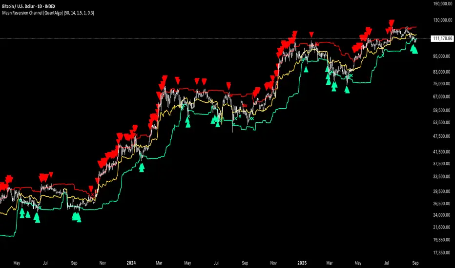
Mean Reversion Channel [QuantAlgo]🟢 Overview
The Mean Reversion Channel indicator is a range-bound trading system that combines dynamic price channels with momentum-weighted analysis to identify optimal mean reversion opportunities. It creates adaptive upper and lower reversion zones based on recent price action and volatility, while incorporating a momentum-biased equilibrium line that shifts based on volume-weighted price momentum. This creates a three-tier system where traders and investors can identify overbought and oversold conditions within established ranges, detect momentum exhaustion points, and anticipate channel breakouts or breakdowns. This indicator is particularly valuable for strategic dollar cost averaging (DCA) strategies, as it helps identify optimal accumulation zones during oversold conditions and provides tactical risk management levels for systematic investment approaches across different market conditions and asset classes.
🟢 How It Works
The indicator employs a four-stage calculation process that transforms raw price and volume data into actionable mean reversion signals. First, it establishes the base channel by calculating the highest high and lowest low over a user-defined lookback period, creating the foundational price range for mean reversion analysis. This channel adapts continuously as new price data becomes available, ensuring the system remains relevant to current market conditions.
In the second stage, the system calculates volume-weighted momentum by combining price momentum with volume activity. The momentum calculation takes the price change over a specified period and multiplies it by the volume ratio (current volume versus 20-period average volume, for instance) and a volume factor multiplier. This creates momentum readings that are more significant during high-volume periods and less influential during low-volume conditions.
The third stage creates the dynamic reversion zones using Average True Range (ATR) calculations. The upper reversion zone is positioned below the channel high by an ATR-based distance, while the lower reversion zone is positioned above the channel low. These zones contract when momentum is negative (upper zone) or positive (lower zone), creating asymmetric reversion bands that adapt to momentum conditions.
The final stage establishes the momentum-biased equilibrium line by calculating the midpoint between the reversion zones and adjusting it based on momentum bias. When momentum is positive, the equilibrium shifts upward; when negative, it shifts downward. This creates a dynamic reference level that helps identify when price action is moving against the prevailing momentum trend, signaling potential mean reversion opportunities.
🟢 How to Use
1. Mean Reversion Signal Identification
Lower Reversion Zone Signals: When price reaches or falls below the lower reversion zone with bearish momentum, the system generates potential long/buy entry signals indicating oversold conditions within the established range.
Upper Reversion Zone Signals: When price reaches or exceeds the upper reversion zone with bullish momentum, the system generates potential short/sell entry signals indicating overbought conditions.
2. Equilibrium Line Analysis and Momentum Exhaustion
Equilibrium Breaks: The dynamic equilibrium line serves as a momentum bias indicator within the channel. Price crossing above equilibrium suggests shifting to bullish bias, while breaks below indicate bearish bias development within the mean reversion framework.
Momentum Exhaustion Signals: The system identifies momentum exhaustion when price breaks through the equilibrium line opposite to the prevailing momentum direction. Bullish exhaustion occurs when price falls below equilibrium despite positive momentum, while bearish exhaustion happens when price rises above equilibrium during negative momentum periods.
3. Channel Expansion and Breakout Detection
Channel Boundary Breaks: When price breaks above the upper reversion zone or below the lower reversion zone, it signals potential channel expansion or false breakout conditions. These events often precede significant trend changes or range expansion phases.
Range Expansion Alerts: Breaks above the channel high or below the channel low indicate potential breakout from the mean reversion range, suggesting trend continuation or new directional movement beyond the established boundaries.
🟢 Pro Tips for Trading and Investing
→ Strategic DCA Optimization: Use the lower reversion zone as primary accumulation levels for dollar cost averaging strategies. When price reaches oversold conditions with bearish momentum exhaustion signals, it often represents optimal entry points for systematic investment programs, allowing investors to accumulate positions at statistically favorable price levels within the established range.
→ DCA Pause and Acceleration Signals : Monitor equilibrium line breaks to adjust DCA frequency and amounts. When price consistently trades below equilibrium with momentum exhaustion signals, consider accelerating DCA intervals or increasing investment amounts. Conversely, when price reaches upper reversion zones, consider pausing or reducing DCA activity until more favorable conditions return.
→ Momentum Divergence Detection: Watch for divergences between price action and momentum readings within the channel. When price makes new lows but momentum shows improvement, or price makes new highs with deteriorating momentum, these signal high-probability mean reversion setups ideal for contrarian investment approaches.
→ Alert-Based Systematic Investing/Trading: Utilize the comprehensive alert system for automated DCA triggers. Set up alerts for lower reversion zone touches combined with momentum exhaustion signals to create systematic entry points that remove emotional decision-making from long-term investment strategies, particularly effective for volatile assets where timing improvements can significantly impact overall returns.
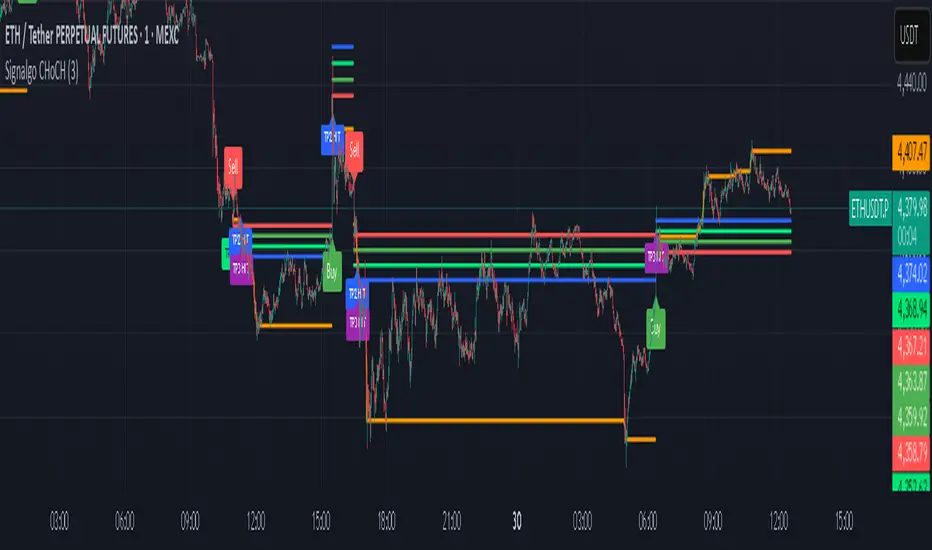
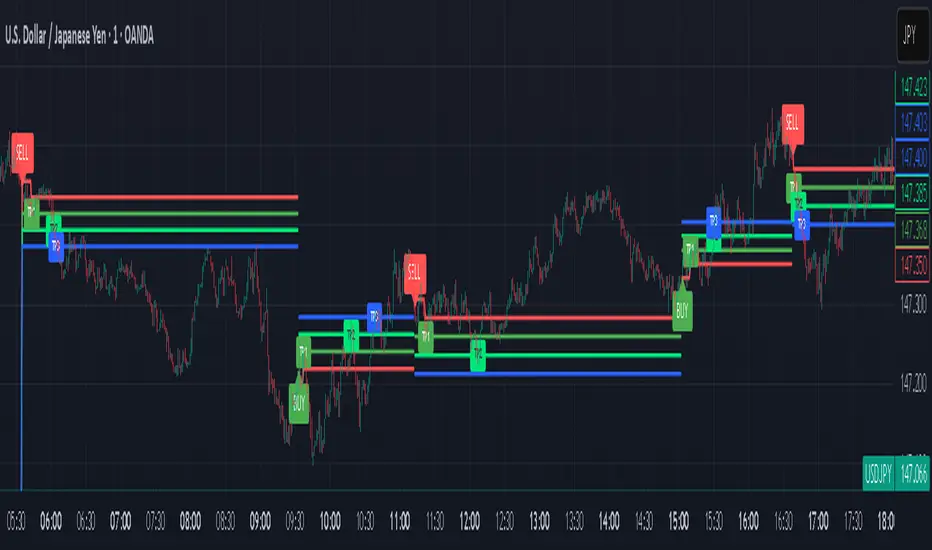
Signalgo CHoCHSignalgo CHoCH: Informative Technical Overview
Signalgo CHoCH is a multi-factor indicator designed for TradingView to detect “Change of Character” (CHoCH) shifts in market structure, signaling significant trend reversals and managing trades with risk control. This documentation details how it operates, its customizable parameters, signal methodology, what makes it different from traditional tools, and typical strategy applications.
How Signalgo CHoCH Works
1. Market Structure Detection
Swing High & Low Identification: The indicator uses an adaptive swing length to isolate important pivot highs and lows in price action. These pivots signal points where the market reversed direction or paused, forming the “swing structure” core to this strategy.
Body Strength Validation: Not every pivot break is meaningful. Signalgo CHoCH assesses price bar “body strength”—quantifying if the current candle’s body is disproportionately large compared to a recent average—to filter out weak or indecisive moves, retaining only those breaks likely to indicate genuine momentum.
2. Change of Character (CHoCH) Signal Logic
Bullish CHoCH: Triggered when price closes above the last significant swing low (the most recent support) with a strong candle body, indicating a transition from bearish to bullish market structure.
Bearish CHoCH: Triggered when price closes below the last significant swing high (key resistance) with a strong bearish candle, denoting a shift from bullish to bearish structure.
One-Time Event Recognition: Each break is tracked so that signals are issued only once per directional change, reducing repeated or redundant entries.
3. Higher Timeframe Confirmation
Multi-Timeframe Consistency: The indicator requires the CHoCH signal (on the current trading timeframe) to be confirmed by the market structure status of a selected higher timeframe. This adds an extra layer of validation, ensuring the signal aligns with broader trends.
Inputs
SwingLen: The number of bars used to define swing pivots.
bodyStrength & bodyLookback: Control sensitivity for body size validation, filtering which candle breaks are considered strong enough for signaling.
htfTf: Selects the higher timeframe for multi-timeframe checking.
show_tpsl: Toggle to show/hide automated Take Profit (TP) and Stop Loss (SL) levels on the chart.
ATR, TP/SL/RR/Trailing Settings: Determines how risk and reward are managed, using ATR for stop placement and multi-level profit targets with optional trailing stop activation after TP1.
Entry & Exit Strategy
Entry Logic
Long Entry: When a bullish CHoCH is detected, optionally confirmed by the higher timeframe, it marks a buy opportunity at the close of the breakout candle.
Short Entry: When a bearish CHoCH forms, also with optional higher timeframe confirmation, it identifies a sell entry at the close of the confirmation candle.
Exit & Trade Management
Stop Loss (SL): Automatically placed at a set ATR distance from entry, dynamically adapting to volatility.
Take Profits (TP1, TP2, TP3): Multiple reward targets are calculated and marked for systematic scaling out or profit-taking, based on a defined risk multiple.
Trailing Stop: Once the first profit target is hit, SL moves to breakeven, and a trailing stop engages, incrementally securing further gains if the trend continues.
State Tracking: All TP, SL, and trailing events are labeled on the chart for easy post-trade analysis.
Body Strength and Trend Filtering: Breakouts are only considered if the candle’s body confirms significant momentum, not just a fleeting spike, improving signal quality.
Event-Driven, Not Rolling: Each bullish or bearish “character change” is signaled only at the true point of structural shift, with strict per-event marking, not continuous signal generation as with typical MA cross strategies.
Integrated Multi-Timeframe Logic: higher timeframe validation minimizes false positives from short-term volatility noise, a capability not found in most indicator-based tools.
Automated, Dynamic Trade Management: This indicator overlays a complete trade management suite (TPs, SL, trailing) that moves with market conditions, allowing for risk handling directly from each signal.
Trading Strategy Application
Trend Reversal & Continuation: Suitable for identifying both sudden reversals and structural continuations, adaptable for intraday, swing, or positional trading styles.
Noise Filtering: Multiple checks (body strength, momentum, multi-timeframe) focus signals on genuine trend changes, filtering out most “whipsaws” seen in pure MA systems.
Visual Feedback: All transitions, TPs, SLs, and trailing events are visually annotated, enhancing the educational and review process.
Signalgo VSignalgo V: Technical Overview and Unique Aspects
Signalgo V is a technical indicator for TradingView that integrates multiple layers of analysis: moving averages, MACD, Bollinger Bands and RSI to deliver buy and sell signals. Below is an informational breakdown of how the indicator functions, its input parameters, signal logic, exit methodology, and how it stands apart from traditional moving average (MA) tools, without disclosing specifics that allow for code duplication.
How Signalgo V Works
1. Multi-Layered Technical Synthesis
Signalgo V processes several technical studies simultaneously:
Fast/Slow Moving Averages: Uses either EMA or SMA (user-selected) with adjustable periods. These are central to initial trend detection through crossovers.
MACD Filter: MACD line vs. signal line cross-check ensures trend direction is supported by both momentum and MA structure.
RSI Confirmation: The RSI is monitored to verify that signals are not excessively overbought or oversold, tuning the system to changing momentum regimes.
Bollinger Bands Context: Entry signals are only considered when price action is beyond the Bollinger Bands envelope, which further filters for unusually strong movements.
These strict, multi-indicator entry criteria are designed to ensure only the most robust signals are surfaced, each is contingent on the presence of aligned trend, momentum and volatility.
2. Exit Methodology
Take-Profit Levels: After entering a trade, the strategy automatically sets three predefined profit targets (TP1, TP2, TP3). If the price reaches any of these targets, the system marks it, helping you lock in profits at different stages.
Stop-Loss System: Simultaneously, a stop-loss (SL) value is set, protecting you from significant losses if the market moves against your position.
Dynamic Adjustment: When the first profit target (TP1) is hit, the system can automatically move the stop-loss to your entry price. This means your worst-case outcome is break-even from that point, reducing downside risk.
Trailing Stop-Loss: After TP1 is reached, a dynamic trailing stop can activate. This allows the stop-loss to follow the price as it moves in your favor, aiming to capture more profit if the trend continues, while still protecting your gains if the price reverses.
Visual Markers: The system plots all important exit levels (profit targets, stop-loss, trailing stop) directly on the chart. Optional labels also appear whenever a target or stop-loss is hit, making it easy to see progress.
Visual cues (labels) are plotted directly on the bar where a buy or sell signal triggers, clarifying entry points and aiding manual exit/risk management decisions.
Input Parameters
rsiLen: Lookback period for RSI calculation.
rsiOB and rsiOS: Overbought/oversold thresholds, adaptive to the indicator’s multi-layered logic.
maFastLen and maSlowLen: Periods for fast and slow MAs.
maType: EMA or SMA selectable for both MAs.
bbLen: Length for Bollinger Bands mean calculation.
bbMult: Standard deviation multiplier for BB width.
macdFast, macdSlow, macdSig: Standard MACD parameterization for nuanced momentum oversight.
What Separates Signalgo V from Traditional Moving Average Indicators
Composite Signal Architecture: Where traditional MA systems generate signals solely on MA crossovers, Signalgo V requires layered, cross-confirmational logic across trend (MAs), momentum (MACD), volatility (Bollinger Bands), and market strength (RSI).
Adaptive Volatility Context: MA signals only “count” when price is meaningfully breaking out of its volatility envelope, filtering out most unremarkable crosses that plague basic MA strategies.
Integrated Multi-Factor Filters: Strict compliance with all layers of signal logic is enforced. A marked improvement over MA strategies that lack secondary or tertiary confirmation.
Non-Redundant Event Limiting: Each entry is labeled as a unique event. The indicator does not repeat signals on subsequent bars unless all entry conditions are freshly met.
Trading Strategy Application
Trend Identification: By requiring concurrence among MA, MACD, RSI, and BB, this tool identifies only those trends with robust, multifactor support.
Breakout and Momentum Entry: Signals are bias-toward trades that initiate at likely breakout points (outside BB range), combined with fresh momentum and trend alignment.
Manual Discretion for Exits: The design is to empower traders with high-confidence entries and leave risk management or partial profit-taking adaptive to trader style, using visual cues from all component indicators.
Alert Generation: Each buy/sell event optionally triggers an alert, supporting systematic monitoring without constant chart watching.
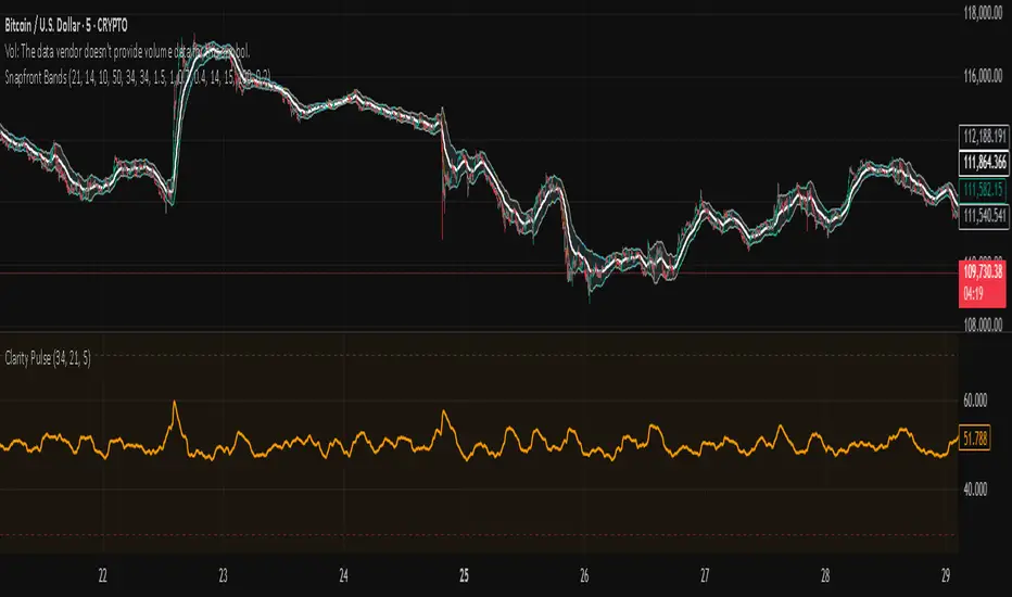
Snapfront Clarity PulseThe Clarity Pulse is a lightweight Snapfront oscillator that highlights when markets move from noisy and chaotic into clean, tradable clarity zones. It combines simple return, drift, and volume dynamics, then maps them through a φ²-based sigmoid for smooth, intuitive signals.
Features:
📊 Clean 0–100 clarity scale
🌈 Color-coded line + background shading (green = high clarity, red = noise)
📈 Alert conditions when crossing into high or low clarity regimes
⚡ Minimalist design, optimized for speed and simplicity
How to Use:
✅ When the Pulse enters the high clarity zone, trends are stronger and signals are more reliable.
❌ When it drops into the low clarity zone, conditions are noisy and prone to chop.
Use as a filter alongside your existing strategy or as a quick market condition gauge.
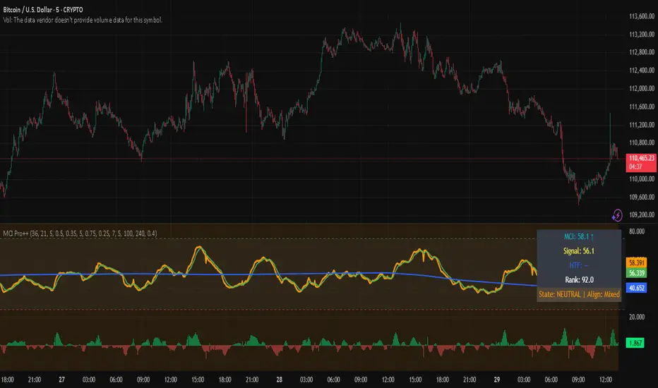
Market Clarity Index (MCI) — ProThe MCI Pro++ expands on the Lite version with deeper controls, higher-timeframe blending, slope analysis, and clarity ranking. It captures the balance between trend coherence vs. noise using entropy, drift, and volume dynamics mapped through a φ²-based sigmoid.
Key Features:
Fully adjustable weights (drift, volume shocks, entropy)
Higher-timeframe blending with adjustable weighting
Clarity slope + histogram for momentum tracking
Range rank (0–100) to spot relative extremes
Bull/Bear markers + HTF alignment markers
Optional status table with live clarity state
Trading Logic:
✅ High-clarity regime when MCI > high threshold
❌ Low-clarity regime when MCI < low threshold
Neutral otherwise; use slope, HTF alignment, and range rank as context filters.
⚠️ Invite-Only Access:
This Pro version is available by subscription through SnapfrontTech.
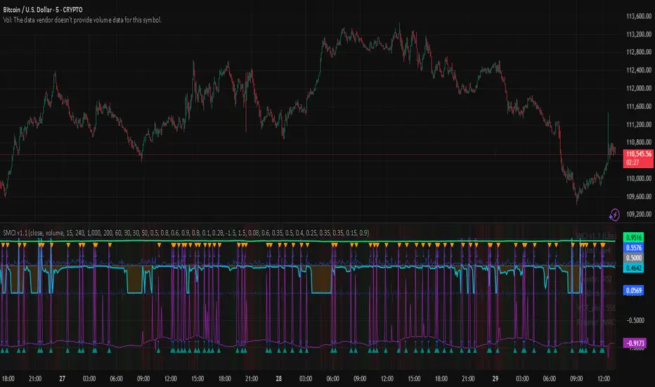
SCI - Snapfront Coherence IndicatorThe SMCI is an advanced, invite-only indicator designed to measure market coherence, volatility regimes, and trend stability. It combines entropy-based features, φ-cycle phase drivers, and custom exposure scaling into a single probabilistic framework.
Core outputs:
📈 I_hat (probability of upward drift) — coherence-weighted probability score.
📊 Exposure (scaled proxy) — dynamic sizing aligned with volatility and drawdown control.
💰 Equity curve (proxy) — running performance simulation.
🔎 WCTφ + dWCTφ — entropy-based coherence metrics.
⚠️ Regime detection — classifies conditions as Trend / Chop / Panic.
Signal Logic:
✅ Long bias when I_hat crosses above 0.5.
❌ Short bias when I_hat crosses below 0.5.
HUD overlay shows live coherence stats, exposure, and regime classification.
⚠️ Invite-Only Notice:
This script is restricted to approved users. Access requires subscription from Snapfront Technologies.
snapjames.gumroad.com
📌 Disclaimer:
For educational use only. This is not financial advice and should not be considered a trading recommendation.
Multi-Factor Crypto SignalsMulti-Factor Crypto Signals - Advanced Technical Indicator**
📊 **General Description**
The Multi-Factor Crypto Signals is an advanced technical indicator designed specifically for cryptocurrency analysis. This system combines 6 independent technical factors to generate more accurate and reliable buy and sell signals, significantly reducing the false positives common in simpler indicators.
🎯 **Technical Methodology**
**Theoretical Foundation**
This indicator is built on the principles of multi-factor technical analysis, where multiple independent indicators must align before generating a signal. This approach is widely recognized in financial literature as more effective than standalone indicators.
**Analyzed Factors**
1. **Time Momentum Oscillator (TMO)**
- **Function**: Detects overbought and oversold conditions
- **Calculation**: Based on the sum of price movements relative to the previous period
- **Application**: Identifies potential reversal points
- **Settings**: Length (14), Calculation Period (5), Smoothing (3)
2. **Customized MACD**
- **Function**: Analyzes momentum and trend changes
- **Modifications**: Optimized periods for crypto (8, 21, 5)
- **Application**: Detects bullish/bearish crossovers and histogram momentum
- **Advantage**: More responsive than traditional MACD (12, 26, 9)
3. **Volume Analysis**
- **Function**: Confirms the strength of price movements
- **Method**: Current volume vs. moving average with a multiplier
- **Application**: Filters signals without volume support
- **Settings**: MA Period (20), Multiplier (1.5)
4. **DXY Filter (U.S. Dollar Index)**
- **Function**: Considers the strength/weakness of the U.S. dollar
- **Correlation**: Weak DXY → bullish for crypto / Strong DXY → bearish for crypto
- **Data**: Uses TVC:DXY as the source
- **Settings**: 21-period EMA to determine trend
5. **Stochastic RSI**
- **Function**: A more sensitive version of RSI for reversals
- **Advantage**: Anticipates movements before traditional RSI
- **Levels**: Oversold < 20, Overbought > 80
- **Settings**: %K (14), %D (3)
6. **Precision Indicators**
- **Williams %R**: Momentum in volatile markets (-80/-20)
- **Money Flow Index (MFI)**: RSI with volume incorporation (20/80)
- **Bollinger Bands**: Price extremes with reversal (20, 2.0)
⚙️ **Settings and Parameters**
**Basic Settings**
- **TMO Length**: 14 (periods for TMO calculation)
- **TMO Calc Length**: 5 (periods for momentum)
- **TMO Smoothing**: 3 (line smoothing)
- **TMO Overbought/Oversold**: 6/-6 (entry levels)
**MACD Settings**
- **Fast Length**: 8 (fast EMA)
- **Slow Length**: 21 (slow EMA)
- **Signal Length**: 5 (signal line)
**Volume Settings**
- **Volume MA Length**: 20 (volume moving average)
- **High Volume Threshold**: 1.5 (multiplier for high volume)
**DXY Settings**
- **Use DXY Filter**: true/false (enable/disable filter)
- **DXY EMA Length**: 21 (EMA periods)
**Precision Settings**
- **Stochastic %K**: 14 (stochastic period)
- **Williams %R Length**: 14 (Williams period)
- **MFI Length**: 14 (MFI period)
- **BB Length/Multiplier**: 20/2.0 (Bollinger Bands)
**Main Setting**
- **Minimum Factors Required**: 3-6 (minimum factors to generate a signal)
🎨 **Visual Interpretation**
**Main Signals**
- 🚀 **Strong Buy (Large Green Arrow)**: 5+ factors aligned for a buy
- 🟢 **Buy Signal (Normal Green Arrow)**: 3-4 factors aligned for a buy
- 💥 **Strong Sell (Large Red Arrow)**: 5+ factors aligned for a sell
- 🔴 **Sell Signal (Normal Red Arrow)**: 3-4 factors aligned for a sell
**Warning Signals**
- ⚠️ **Yellow Triangle**: 2 bullish factors (approaching a buy signal)
- ⚠️ **Orange Triangle**: 2 bearish factors (approaching a sell signal)
📈 **How to Use**
**Step 1: Initial Setup**
- Add the indicator to the chart
- Adjust "Minimum Factors Required" (recommended: 3 for beginners, 4-5 for experienced traders)
- Configure periods based on your trading style
**Step 2: Signal Interpretation**
- **Strong Signals**: Wait for large arrows (5+ factors) for higher reliability
- **Normal Signals**: Normal arrows (3-4 factors) for frequent opportunities
- **Confirmation**: Check the status table to see which factors are active
**Step 3: Risk Management**
- **Stop Loss**: Place stops below/above supports/resistances
- **Take Profit**: Use Fibonacci levels or technical resistances
- **Timeframes**: Test across multiple timeframes for confirmation
**Recommended Settings by Profile**
- **Conservative Trader**:
- Minimum Factors: 4-5
- Use DXY Filter: true
- Use Volume Confirmation: true
- **Aggressive Trader**:
- Minimum Factors: 3
- Shorter indicator periods
- Focus on higher-frequency signals
- **Scalper**:
- TMO shorter periods (10, 3, 2)
- Faster MACD (5, 13, 3)
- Timeframes: 1m, 5m, 15m
🔔 **Available Alerts**
- 🟢 **Multi-Factor Buy**: Normal buy signal
- 🔴 **Multi-Factor Sell**: Normal sell signal
- 🚀 **Strong Buy**: Strong buy signal (5+ factors)
- 💥 **Strong Sell**: Strong sell signal (5+ factors)
Usage Recommendations**
- **Combine with Fundamental Analysis**: Use as a complement, not a standalone tool
- **Test in Paper Trading**: Practice before using real capital
- **Adjust Parameters**: Optimize for specific assets and timeframes
- **Risk Management**: Always use stops and size positions appropriately
📚 **Scientific Basis and References**
**Academic Foundation**
- **Multi-Factor Technical Analysis**: Based on studies by Murphy (1999) and Pring (2002)
- **Momentum Oscillators**: Grounded in Wilder (1978) and Lane (1984)
- **Confirmation Theory**: Dow Theory and convergence/divergence principles
- **Volume Analysis**: Concepts from Granville (1963) and Williams (1973)
**Implemented Innovations**
- **Crypto-Specific Combination**: Parameters optimized for high volatility
- **DXY Filter**: Incorporates crypto-dollar inverse correlation
- **Scoring System**: Quantitative approach to reduce subjectivity
- **Advanced Visual Interface**: Real-time feedback on factor status
💡 **Advanced Tips**
**Market Optimization**
- **Bitcoin/Ethereum**: Use default settings
- **Low-Cap Altcoins**: Increase sensitivity (shorter periods)
- **Stablecoins**: Not recommended (low volatility)
**Combination with Other Indicators**
- **Supports/Resistances**: Use for entry/exit timing
- **Moving Averages**: Combine with long-term trend
- **Volume Profile**: Confirm with high-activity levels
**Backtesting**
- Test in periods of high and low volatility
- Compare performance across different timeframes
- Adjust parameters based on historical results

Moving Average Adaptive RSI [BackQuant]Moving Average Adaptive RSI
What this is
A momentum oscillator that reshapes classic RSI into a zero-centered column plot and makes it adaptive. It builds RSI from two parts:
• A sensitivity window that scans several recent bars to capture the strongest up and down impulses.
• A selectable moving average that smooths those impulses before computing RSI.
The output ranges roughly from −100 to +100 with 0 as the midline, with optional extra smoothing and built-in divergence detection.
How it works
Impulse extraction
• For each bar the script inspects the last rsi_sen bars and collects upward and downward price changes versus the current price.
• It keeps the maximum upward change and maximum downward change from that window, emphasizing true bursts over single-bar noise.
MA-based averaging
• The up and down impulse series are averaged with your chosen MA over rsi_len bars.
• Supported MA types: SMA, EMA, DEMA, WMA, HMA, SMMA (RMA), TEMA.
Zero-centered RSI transform
• RS = UpMA ÷ DownMA, then mapped to a symmetric scale: 100 − 200 ÷ (1 + RS) .
• Above 0 implies positive momentum bias. Below 0 implies negative momentum bias.
Optional extra smoothing
• A second smoothing pass can be applied to the final oscillator using smoothing_len and smooth_type . Toggle with “Use Extra Smoothing”.
Visual encoding
• The oscillator is drawn as columns around the zero line with a gradient that intensifies toward extremes.
• Static bands mark 80 to 100 and −80 to −100 for extreme conditions.
Key inputs and what they change
• Price Source : input series for momentum.
• Calculation Period (rsi_len) : primary averaging window on up and down components. Higher = smoother, slower.
• Sensitivity (rsi_sen) : how many recent bars are scanned to find max impulses. Higher = more responsive to bursts.
• Calculation Type (ma_type) : MA family that shapes the core behavior. HMA or DEMA is faster, SMA or SMMA is slower.
• Smoothing Type and Length : optional second pass to calm noise on the final output.
• UI toggles : show or hide the oscillator, candle painting, and extreme bands.
Reading the oscillator
• Midline cross up (0) : momentum bias turning positive.
• Midline cross down (0) : momentum bias turning negative.
• Positive territory :
– 0 to 40: constructive but not stretched.
– 40 to 80: strong momentum, continuation more likely.
– Above 80: extreme risk of mean reversion grows.
• Negative territory : mirror the same levels for the downside.
Divergence detection
The script plots four divergence types using pivot highs and lows on both price and the oscillator. Lookbacks are set by lbL and lbR .
• Regular bullish : price lower low, oscillator higher low. Possible downside exhaustion.
• Hidden bullish : price higher low, oscillator lower low. Bias to trend continuation up.
• Regular bearish : price higher high, oscillator lower high. Possible upside exhaustion.
• Hidden bearish : price lower high, oscillator higher high. Bias to trend continuation down.
Labels: ℝ for regular, ℍ for hidden. Green for bullish, red for bearish.
Candle coloring
• Optional bar painting: green when the oscillator is above 0, red when below 0. This is for visual scanning only.
Strengths
• Adaptive sensitivity via a rolling impulse window that responds to genuine bursts.
• Configurable MA core so you can match responsiveness to the instrument.
• Zero-centered scale for simple regime reads with 0 as a clear bias line.
• Built-in regular and hidden divergence mapping.
• Flexible across symbols and timeframes once tuned.
Limitations and cautions
• Trends can remain extended. Treat extremes as context rather than automatic reversal signals.
• Divergence quality depends on pivot lookbacks. Short lookbacks give more signals with more noise. Long lookbacks reduce noise but add lag.
• Double smoothing can delay zero-line transitions. Balance smoothness and timeliness.
Practical usage ideas
• Regime filter : only take long setups from your separate method when the oscillator is above 0, shorts when below 0.
• Pullback confirmation : in uptrends, look for dips that hold above 0 or turn up from 0 to 40. Reverse for downtrends.
• Divergence as a heads-up : wait for a zero-line cross or a price trigger before acting on divergence.
• Sensitivity tuning : start with rsi_sen 2 to 5 on faster timeframes, increase slightly on slower charts.
Alerts
• MA-A RSI Long : oscillator crosses above 0.
• MA-A RSI Short : oscillator crosses below 0.
Use these as bias or timing aids, not standalone trade commands.
Settings quick reference
• Calculation : Price Source, Calculation Type, Calculation Period, Sensitivity.
• Smoothing : Smoothing Type, Smoothing Length, Use Extra Smoothing.
• UI : Show Oscillator, Paint Candles, Show Static High and Low Levels.
• Divergences : Pivot Lookback Left and Right, Div Signal Length, Show Detected Divergences.
Final thoughts
This tool reframes RSI by extracting strong short-term impulses and averaging them with a moving-average model of your choice, then presenting a zero-centered output for clear regime reads. Pair it with your structure, risk and execution process, and tune sensitivity and smoothing to the market you trade.

Xmoon – 3 Push Divergence – PremiumWhat the Xmoon Indicator Does and Why It’s Special
The Xmoon Indicator is an advanced and unique analytical tool, built on years of trading experience, research, and development. It is not merely a combination of a few simple indicators; it is a comprehensive, intelligent system that brings together the three main pillars of trading success—strategy, risk management, and trading psychology—into a single integrated tool.
Strategy
• Xmoon’s core algorithm is based on the 3 Push Divergence pattern in the RSI —a pattern not offered in other indicators. Most existing tools only detect divergence between two highs or two lows, whereas Xmoon can identify three consecutive highs or three consecutive lows with a momentum mismatch, which considerably increases the statistical likelihood of a trend reversal.
Risk Management
• Automatically calculates the size of each step entry based on per-step capital allocation, leverage, and entry/exit prices, using precise, weighted calculations.
• These multi-step calculations run in real time and are shown clearly in the Information Box for quick reading.
• A Liquidity Line (risk threshold) is computed for each setup and plotted on the chart so you can see at a glance where the position would be liquidated (futures) or where the analysis is invalidated (spot).
Psychology & Decision-Making
• From the moment a signal is generated, Xmoon plots all key levels— step entries, risk-free levels, targets, and the liquidity line —so the trader knows from the outset:
o where the profitable exit is if the market follows the analysis;
o where the break-even (risk-free) exit is if the market moves against the analysis.
• This approach significantly reduces stress and emotional decision-making, because both favorable and unfavorable scenarios are predefined.
Logic & Workflow of the Xmoon Indicator
1️⃣ Pivot Detection and Classification
Xmoon first detects price pivots on the chart and classifies them— based on the bar distance between consecutive pivot highs/lows—into four tiers: Super Minor, Minor, Mid-Major, and Major .
The greater the distance between pivots, the larger and more reliable the pivot becomes—though signals are generated less frequently.
2️⃣ Detecting the 3 Push Divergence Pattern
At this stage, Xmoon identifies 3 Push Divergence patterns. The pattern forms when price prints three consecutive pivots in the same direction, i.e.:
• Bullish: three successive higher highs
• Bearish: three successive lower lows
Meanwhile, at the corresponding points on the RSI , momentum moves the other way:
• Bullish case: RSI peaks step down each time — weakening buying pressure
• Bearish case: RSI troughs step up each time — weakening selling pressure
This repeated price–momentum disagreement three times in a row can significantly increase the likelihood of a trend reversal.
3️⃣ Plotting the Pattern and Key Levels
After the pattern is detected, Xmoon draws the divergence lines and plots the following levels on the chart:
• Step entry lines based on the user-defined number of steps and allocated capital.
• Risk-free (break-even) lines for exits without profit or loss.
• Target lines indicating minimum profit objectives.
• Liquidity level (risk threshold) marking where equity would be wiped out in futures.
These visuals let the trader see, at a glance, the full picture of the pattern, planned entries/exits, and the risk range.
4️⃣ Information Box
After the pattern is detected, Xmoon can display an on-chart Information Box alongside each detected pattern (when enabled in the settings). It includes:
• Pivot type: Super Minor, Minor, Mid-Major, or Major.
• Confirmation filters:
1. Higher-timeframe trend based on the 200-period moving average (MA200).
2. Higher-timeframe overbought/oversold status based on RSI.
• Suggested entry size: based on actual capital and leverage.
This box helps the trader quickly see the pattern quality, overall market context, and the suggested position size.
ℹ️ Explanation of Confirmation Filters
Using these filters can increase signal accuracy.
This information is built into the Xmoon indicator, so you don’t need to add any extra indicators or tools to the chart. Xmoon performs the comparisons in real time and displays the filter results in the Information Box .
• Higher-timeframe trend filter: If the higher-timeframe trend based on the 200-period moving average (MA200) is bullish, buy/long signals are stronger; if it’s bearish, sell/short signals are stronger.
• Higher-timeframe overbought/oversold filter: If RSI is in the overbought zone, the probability of success for sell/short signals is higher; in the oversold zone, the probability of success for buy/long signals is higher.
🧩 What are the components of the Xmoon indicator, and why are they combined?
• Core strategy: trend-reversal signals via a proprietary 3 Push Divergence algorithm.
• Multi-stage confirmation: higher-timeframe trend based on MA200 , plus higher-timeframe RSI overbought/oversold confirmation.
• Advanced position sizing: step-based sizing and weighted averaging .
• Structured exit management: risk-free levels, targets , and liquidity level.
• Supports fast decision-making: all vital information at a glance.
This combination turns Xmoon into a complete, practical system that has not been implemented in this integrated way in any similar tool on TradingView, and it is precisely the sum of these features in a single indicator that sets Xmoon apart from comparable tools.
How to Use the Xmoon Indicator
1️⃣ Add to chart: Add the indicator to the chart of your chosen symbol.
2️⃣ Configure parameters: In Settings , adjust the following to match your strategy:
• Number of Entry steps: 2 to 10 steps
• Pivot type: Super Minor / Minor / Mid-Major / Major
• Pattern direction: Bullish / Bearish
• Display options: show lines and the Information Box
• Capital per trade
• Higher-timeframe filters: timeframes for Trend and RSI
3️⃣ Enable alerts: Turn on alerts to receive immediate notifications when a 3 Push Divergence pattern is detected.
4️⃣ Review the Information Box: To assess pattern strength and alignment with the market after a signal appears, check:
• Pivot size: Super Minor / Minor / Mid-Major / Major (for gauging pattern strength)
• Confirmation filters:
1. Whether the detected pattern aligns with the higher-timeframe trend
2. Whether the detected pattern aligns with the higher-timeframe RSI overbought/oversold condition
These details help you decide whether to enter the trade.
5️⃣ Step Entries
After reviewing the conditions, open your first position at Step 1 . If price moves against you and reaches the Step 2 level, open a new position there, and continue opening additional positions at each subsequent step level.
Whenever price reverses from any of these levels and moves in the direction of your analysis, all open positions will move into profit .
In Xmoon, the number of entry steps is fully configurable ( 2 to 10 ). Set it according to your strategy—the system automatically calculates the size of each step based on the capital you allocate.
6️⃣ Exit Management
Depending on market conditions, you can choose one of the following:
• ⚖️ Exit at the risk-free level: when the market is uncertain and you prefer to close at break-even.
• 🎯 Exit at the target level: when price has followed your analysis and you want to realize profit.
⚠️ Liquidity Level
• Spot: analysis invalidation point.
• Futures: the price at which a leveraged position’s equity would be wiped out.
Why the Invite-Only Version of Xmoon Is Worth Getting
• Proprietary 3 Push Divergence detection and confirmation that isn’t available in the free version or generic indicators.
• Automatic, precise capital and step sizing, with visual plotting of key levels from the moment a signal is issued.
• Real-time market context and pattern quality shown in the Information Box—no need to switch timeframes or add extra indicators.
• Risk control and psychological support by outlining predefined scenarios from start to finish of the trade.
• Limited access to help prevent misuse and reduce users’ financial risk, with dedicated training before activation.
• Developed through extensive backtesting and live evaluation; outcomes depend on correct use and market conditions.
We sincerely hope you have successful and profitable trades.
📣 If you have any questions or need further guidance, we’ll be happy to hear from you.
It’s our pleasure to assist you anytime.
🔻🔻🔻 Persian Section – بخش فارسی 🔻🔻🔻
اندیکاتور ایکسمون چه کاری انجام میدهد و چرا خاص است
اندیکاتور ایکسمون یک ابزار تحلیلی پیشرفته و منحصربهفرد است که حاصل سالها تجربه ترید، تحقیق و توسعه است. این اندیکاتور صرفاً ترکیب چند اندیکاتور ساده نیست، بلکه یک سیستم جامع و هوشمند است که سه رکن اصلی موفقیت در معاملات یعنی استراتژی، مدیریت سرمایه و روانشناسی معاملهگری را در یک ابزار یکپارچه گردآورده است
در بخش استراتژی
* الگوریتم اصلی ایکسمون بر اساس الگوی سهپوش واگرایی (تری پوش دایورجنس) در آر-اِس-آی طراحی شده است؛ الگویی که در سایر اندیکاتور ها ارائه نشده است، بیشتر ابزارهای موجود تنها واگرایی بین دو قله یا دو کف را تشخیص میدهند، در حالی که ایکسمون توانایی شناسایی سه قله یا سه کف متوالی با تضاد مومنتوم را دارد که این موضوع از نظر آماری احتمال بازگشت روند را بهمراتب افزایش میدهد
در بخش مدیریت سرمایه
* محاسبه خودکار حجم هر پله، بر اساس سرمایه پله ای، لوریج و قیمتهای ورود/خروج بهصورت دقیق و وزنی انجام میشود
* این محاسبات پیچیده برای چندین پله به شکل لحظهای انجام شده و در باکس اطلاعات به سادهترین شکل نمایش داده میشود
* خط لیکوییدیتی (حد ریسک) برای هر الگو محاسبه و روی نمودار بصورت بصری رسم میشود تا کاربر در یک نگاه بداند سرمایهاش کجا صفر میشود (در فیوچرز) یا تحلیلش کجا باطل میشود (در اسپات)
در بخش روانشناسی و تصمیمگیری
* ایکسمون از همان لحظه صدور سیگنال، تمام خطوط کلیدی (ورودی پلهای، ریسکفری، تارگت، لیکوییدیتی) را رسم میکند تا معاملهگر از ابتدا بداند
* اگر بازار طبق تحلیل پیش برود، خروج سودآور کجاست
* اگر بازار بر خلاف تحلیل پیش برود، نقطه خروج بیضرر (ریسکفری) کجاست
* این رویکرد باعث کاهش شدید استرس و تصمیمگیری احساسی میشود، چون سناریوهای خوشبینانه و بدبینانه از پیش مشخص هستند
⚙️ منطق و روش کار اندیکاتور ایکسمون
1️⃣ شناسایی و طبقهبندی پیوتها
اندیکاتور ایکسمون ابتدا پیوتهای قیمتی را روی نمودار شناسایی کرده و بر اساس فاصلهی کندلی بین سقف یا کف ها، آنها را در چهار دسته طبقهبندی میکند : سوپر مینور، مینور، میدماژور و ماژور
هرچه فاصله بین پیوت ها بیشتر باشد، پیوت بزرگتر و معتبرتر است، اما سیگنالها کمتر تولید میشوند
2️⃣ تشخیص الگوی سهپوش واگرایی
اندیکاتور ایکسمون در این مرحله الگوهای سهپوش واگرایی را شناسایی میکند، این الگو زمانی شکل میگیرد که قیمت سه پیوت متوالی همجهت تشکیل دهد، یعنی
* حالت صعودی : سه سقف پیاپی بالاتر از قبلی
* حالت نزولی : سه کف پیاپی پایینتر از قبلی
و همزمان، در نقاط متناظر در آر-اِس-آی حرکت معکوس دیده شود، به این معنا که
* حالت صعودی، قلههای آر-اِس-آی هر بار پایینتر از قبلی قرار گیرند - کاهش قدرت خرید
* حالت نزولی، درههای آر-اِس-آی هر بار بالاتر از قبلی شکل گیرند - کاهش فشار فروش
این تضاد قیمت و مومنتوم، وقتی سه بار پیاپی رخ دهد، احتمال بازگشت روند را بهشدت افزایش میدهد
3️⃣ ترسیم الگو و نمایش سطوح کلیدی
پس از شناسایی الگو، ایکسمون خطوط واگرایی و همچنین خطوط و سطوح زیر را روی نمودار ترسیم میکند، این موارد شامل
* 📍 خطوط ورود پلهای بر اساس تعداد پله و سرمایه تنظیمشده توسط کاربر
* ⚖️ خطوط ریسکفری برای خروج بدون سود و زیان
* 🎯 خطوط تارگت به عنوان سطوح حداقل سود
* 🛡 سطح لیکوییدیتی (حد ریسک) برای مشخصکردن نقطه صفر شدن سرمایه در معاملات فیوچرز
این ترسیمات باعث میشود معاملهگر در یک نگاه تصویر کامل از الگو، سطوح ورود و خروج و محدوده ریسک داشته باشد
4️⃣ باکس اطلاعات
پس از شناسایی الگو، اندیکاتور ایکسمون یک باکس اطلاعات تکمیلی در کنار هر الگو نمایش میدهد، البته با فعالسازی گزینه مربوطه در تنظیمات، باکس اطلاعات در کنار الگو نمایش داده میشود و شامل موارد زیر میباشد
* 🏷 نوع پیوت : سوپر مینور، مینور، میدماژور یا ماژور
* 📋 فیلترهای تأییدی
یک - جهت روند در تایمفریم بالاتر بر اساس میانگین متحرک دویست
دو - وضعیت اشباع خرید/فروش در تایمفریم بالاتر بر اساس اندیکاتور آر-اِس-آی
* 📊 حجم پیشنهادی ورود : بر اساس سرمایه واقعی و لوریج
این باکس به معاملهگر کمک میکند در یک نگاه کیفیت الگو، شرایط کلی بازار و حجم پیشنهادی ورود را بداند
توضیح درباره فیلترهای تأییدی : استفاده از این فیلترها میتواند دقت سیگنالها را افزایش دهد. این اطلاعات در اندیکاتور ایکسمون موجود است و نیازی نیست اندیکاتور یا ابزار اضافه دیگری به چارت اضافه کنید. ایکسمون مقایسه ها را در لحظه انجام میدهد و نتیجه فیلترها را در باکس اطلاعات به شما نشان میدهد
* فیلتر جهت روند در تایمفریم بالاتر : اگر روند بالاتر بر اساس اِم-اِی-دویست صعودی باشد، سیگنالهای خرید/لانگ قویتر هستند و بالعکس
* فیلتر تشخیص نواحی اشباع خرید/فروش در تایمفریم بالاتر : اگر آر-اِس-آی در محدوده اُورباوت باشد، احتمال موفقیت فروش بیشتر است و در محدوده اُورسولد احتمال موفقیت خرید بالاتر میرود
🧩 اجزای اندیکاتور ایکسمون چه هستند و چرا این اجزا با هم ترکیب شدهاند
* استراتژی اصلی : سیگنال بازگشت روند با الگوریتم اختصاصی سهپوش واگرایی
* تأیید چندمرحلهای جهت روند در تایم فریم بالاتر بر اساس اِم-اِی-دویست و تایید وضعیت بیشینه خرید/فروش در تایم فریم بالاتر در اندیکاتور آر-اِس-آی
* مدیریت سرمایه پیشرفته : محاسبه حجم پلهای و میانگین وزنی
* مدیریت خروج ساختاریافته : سطوح ریسکفری، تارگت، لیکوییدیتی
* پشتیبانی از تصمیمگیری سریع : همه اطلاعات حیاتی در یک نگاه
این ترکیب، ایکسمون را به یک سیستم کامل و کاربردی تبدیل کرده که در هیچ ابزار مشابهی در تریدینگویو به این شکل یکپارچه پیادهسازی نشده است و دقیقاً مجموع این ویژگیها در یک اندیکاتور است که ایکسمون را از ابزارهای مشابه متمایز میکند
📖 نحوه استفاده از اندیکاتور ایکسمون
1️⃣ افزودن اندیکاتور به چارت : اندیکاتور را به نمودار نماد دلخواه اضافه کنید
2️⃣ تنظیم پارامترها : از بخش تنظیمات، موارد زیر را بر اساس استراتژی شخصی خودتان مشخص کنید
* تعداد پلههای ورود: از دو تا ده پله
* نوع پیوت ها: سوپر مینور/مینور/مید-ماژور/ماژور
* نوع الگوها: نزولی/صعودی
* نمایش خطوط و باکس اطلاعات
* تعیین سرمایه در هر معامله
* تایمفریمهای فیلتر اِم-اِی-دویست و آر-اِس-آی
3️⃣ فعالسازی هشدارها : برای اطلاع فوری از شناسایی الگوهای سهپوش واگرایی ، آلارمها را فعال کنید
4️⃣ بررسی باکس اطلاعات : برای سنجش قدرت الگو و همجهتی با بازار، پس از صدور سیگنال، اطلاعات زیر را در باکس مشکی اطلاعات بررسی کنید
* 🏷 نوع پیوت : بررسی میزان قدرت الگو - سوپر مینور، مینور، میدماژور یا ماژور
* 📋 فیلترهای تأییدی
یک - بررسی هم جهتی الگوی شناسایی شده با جهت روند در تایمفریم بالاتر
دو - بررسی هم جهتی الگوی شناسایی شده با وضعیت اشباع خرید یا فروش در اندیکاتور آر-اِس-آی در تایمفریم بالاتر
این اطلاعات به شما کمک میکند تصمیم بگیرید که آیا وارد معامله شوید یا خیر
5️⃣ ورود پلهای
اگر پس از بررسی شرایط تصمیم به ورود گرفتید، اولین پوزیشن را در پله اول باز کنید و در صورتی که بازار در خلاف جهت موردنظر شما حرکت کرد و به سطح پله دوم رسید، یک پوزیشن جدید در همان سطح باز کنید و با رسیدن به سطوح بعدی، پوزیشن های بعدی را باز می کنید
هر زمان که بازار از هر یک از این سطوح برگشت و در جهت تحلیل شما حرکت کرد، تمامی پوزیشنهای باز شده وارد سود میشوند
در اندیکاتور ایکسمون، تعداد پلههای ورودی کاملاً قابلتنظیم است (بین دو تا ده پله ) و شما میتوانید بر اساس استراتژی شخصی خود آن را تعیین کنید، سیستم بهطور خودکار حجم هر پله را بر اساس سرمایه واردشده محاسبه میکند
6️⃣ مدیریت خروج
بسته به شرایط بازار، میتوانید یکی از دو روش زیر را انتخاب کنید
* ⚖️ خروج در سطح ریسکفری : زمانی که بازار نامطمئن است و میخواهید بدون سود یا زیان از معامله خارج شوید
* 🎯 خروج در سطح تارگت : زمانی که قیمت طبق تحلیل شما حرکت کرده است و بدنبال کسب سود هستید
⚠️سطح لیکوییدیتی
* اسپات: نقطه ابطال تحلیل
* فیوچرز: نقطه صفر شدن سرمایه پوزیشن با لوریج
💎 چرا نسخه اینوایت اونلی ایکسمون ارزش تهیه دارد
* الگوریتم اختصاصی شناسایی و تأیید سهپوش واگرایی که در نسخه رایگان یا اندیکاتورهای عمومی وجود ندارد
* محاسبات سرمایه و حجم پلهای بهصورت خودکار و دقیق، همراه با رسم بصری سطوح کلیدی از لحظه صدور سیگنال
* نمایش آنی شرایط بازار و کیفیت الگو در باکس اطلاعات بدون نیاز به تغییر تایمفریم یا افزودن اندیکاتورهای اضافی
* کنترل ریسک و پشتیبانی روانی معاملهگر با ارائه سناریوهای مشخص از ابتدا تا انتهای معامله
* دسترسی محدود برای جلوگیری از استفاده نادرست و کاهش ریسک مالی کاربران، همراه با آموزش اختصاصی پیش از فعالسازی
* اثباتشده در تستها و معاملات واقعی با نتایج قابل اتکا، به شرط استفاده صحیح بر اساس آموزش
صمیمانه امیدواریم معاملات موفق و پرسودی داشته باشید
📣 اگر سوالی دارید یا نیاز به راهنمایی بیشتری دارید، خوشحال میشویم از ما بپرسید
با کمال میل در خدمتتان هستیم

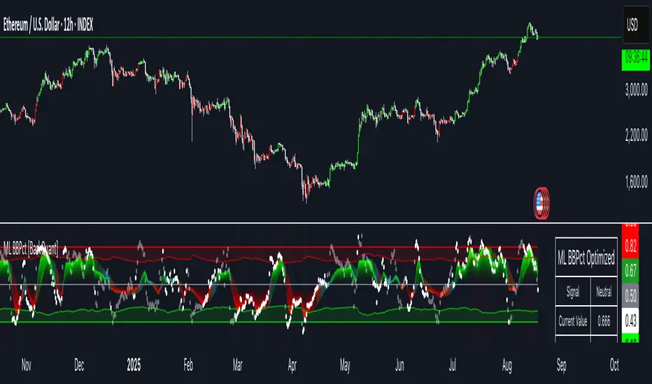
Machine Learning BBPct [BackQuant]Machine Learning BBPct
What this is (in one line)
A Bollinger Band %B oscillator enhanced with a simplified K-Nearest Neighbors (KNN) pattern matcher. The model compares today’s context (volatility, momentum, volume, and position inside the bands) to similar situations in recent history and blends that historical consensus back into the raw %B to reduce noise and improve context awareness. It is informational and diagnostic—designed to describe market state, not to sell a trading system.
Background: %B in plain terms
Bollinger %B measures where price sits inside its dynamic envelope: 0 at the lower band, 1 at the upper band, ~ 0.5 near the basis (the moving average). Readings toward 1 indicate pressure near the envelope’s upper edge (often strength or stretch), while readings toward 0 indicate pressure near the lower edge (often weakness or stretch). Because bands adapt to volatility, %B is naturally comparable across regimes.
Why add (simplified) KNN?
Classic %B is reactive and can be whippy in fast regimes. The simplified KNN layer builds a “nearest-neighbor memory” of recent market states and asks: “When the market looked like this before, where did %B tend to be next bar?” It then blends that estimate with the current %B. Key ideas:
• Feature vector . Each bar is summarized by up to five normalized features:
– %B itself (normalized)
– Band width (volatility proxy)
– Price momentum (ROC)
– Volume momentum (ROC of volume)
– Price position within the bands
• Distance metric . Euclidean distance ranks the most similar recent bars.
• Prediction . Average the neighbors’ prior %B (lagged to avoid lookahead), inverse-weighted by distance.
• Blend . Linearly combine raw %B and KNN-predicted %B with a configurable weight; optional filtering then adapts to confidence.
This remains “simplified” KNN: no training/validation split, no KD-trees, no scaling beyond windowed min-max, and no probabilistic calibration.
How the script is organized (by input groups)
1) BBPct Settings
• Price Source – Which price to evaluate (%B is computed from this).
• Calculation Period – Lookback for SMA basis and standard deviation.
• Multiplier – Standard deviation width (e.g., 2.0).
• Apply Smoothing / Type / Length – Optional smoothing of the %B stream before ML (EMA, RMA, DEMA, TEMA, LINREG, HMA, etc.). Turning this off gives you the raw %B.
2) Thresholds
• Overbought/Oversold – Default 0.8 / 0.2 (inside ).
• Extreme OB/OS – Stricter zones (e.g., 0.95 / 0.05) to flag stretch conditions.
3) KNN Machine Learning
• Enable KNN – Switch between pure %B and hybrid.
• K (neighbors) – How many historical analogs to blend (default 8).
• Historical Period – Size of the search window for neighbors.
• ML Weight – Blend between raw %B and KNN estimate.
• Number of Features – Use 2–5 features; higher counts add context but raise the risk of overfitting in short windows.
4) Filtering
• Method – None, Adaptive, Kalman-style (first-order),
or Hull smoothing.
• Strength – How aggressively to smooth. “Adaptive” uses model confidence to modulate its alpha: higher confidence → stronger reliance on the ML estimate.
5) Performance Tracking
• Win-rate Period – Simple running score of past signal outcomes based on target/stop/time-out logic (informational, not a robust backtest).
• Early Entry Lookback – Horizon for forecasting a potential threshold cross.
• Profit Target / Stop Loss – Used only by the internal win-rate heuristic.
6) Self-Optimization
• Enable Self-Optimization – Lightweight, rolling comparison of a few canned settings (K = 8/14/21 via simple rules on %B extremes).
• Optimization Window & Stability Threshold – Governs how quickly preferred K changes and how sensitive the overfitting alarm is.
• Adaptive Thresholds – Adjust the OB/OS lines with volatility regime (ATR ratio), widening in calm markets and tightening in turbulent ones (bounded 0.7–0.9 and 0.1–0.3).
7) UI Settings
• Show Table / Zones / ML Prediction / Early Signals – Toggle informational overlays.
• Signal Line Width, Candle Painting, Colors – Visual preferences.
Step-by-step logic
A) Compute %B
Basis = SMA(source, len); dev = stdev(source, len) × multiplier; Upper/Lower = Basis ± dev.
%B = (price − Lower) / (Upper − Lower). Optional smoothing yields standardBB .
B) Build the feature vector
All features are min-max normalized over the KNN window so distances are in comparable units. Features include normalized %B, normalized band width, normalized price ROC, normalized volume ROC, and normalized position within bands. You can limit to the first N features (2–5).
C) Find nearest neighbors
For each bar inside the lookback window, compute the Euclidean distance between current features and that bar’s features. Sort by distance, keep the top K .
D) Predict and blend
Use inverse-distance weights (with a strong cap for near-zero distances) to average neighbors’ prior %B (lagged by one bar). This becomes the KNN estimate. Blend it with raw %B via the ML weight. A variance of neighbor %B around the prediction becomes an uncertainty proxy ; combined with a stability score (how long parameters remain unchanged), it forms mlConfidence ∈ . The Adaptive filter optionally transforms that confidence into a smoothing coefficient.
E) Adaptive thresholds
Volatility regime (ATR(14) divided by its 50-bar SMA) nudges OB/OS thresholds wider or narrower within fixed bounds. The aim: comparable extremeness across regimes.
F) Early entry heuristic
A tiny two-step slope/acceleration probe extrapolates finalBB forward a few bars. If it is on track to cross OB/OS soon (and slope/acceleration agree), it flags an EARLY_BUY/SELL candidate with an internal confidence score. This is explicitly a heuristic—use as an attention cue, not a signal by itself.
G) Informational win-rate
The script keeps a rolling array of trade outcomes derived from signal transitions + rudimentary exits (target/stop/time). The percentage shown is a rough diagnostic , not a validated backtest.
Outputs and visual language
• ML Bollinger %B (finalBB) – The main line after KNN blending and optional filtering.
• Gradient fill – Greenish tones above 0.5, reddish below, with intensity following distance from the midline.
• Adaptive zones – Overbought/oversold and extreme bands; shaded backgrounds appear at extremes.
• ML Prediction (dots) – The KNN estimate plotted as faint circles; becomes bright white when confidence > 0.7.
• Early arrows – Optional small triangles for approaching OB/OS.
• Candle painting – Light green above the midline, light red below (optional).
• Info panel – Current value, signal classification, ML confidence, optimized K, stability, volatility regime, adaptive thresholds, overfitting flag, early-entry status, and total signals processed.
Signal classification (informational)
The indicator does not fire trade commands; it labels state:
• STRONG_BUY / STRONG_SELL – finalBB beyond extreme OS/OB thresholds.
• BUY / SELL – finalBB beyond adaptive OS/OB.
• EARLY_BUY / EARLY_SELL – forecast suggests a near-term cross with decent internal confidence.
• NEUTRAL – between adaptive bands.
Alerts (what you can automate)
• Entering adaptive OB/OS and extreme OB/OS.
• Midline cross (0.5).
• Overfitting detected (frequent parameter flipping).
• Early signals when early confidence > 0.7.
These are purely descriptive triggers around the indicator’s state.
Practical interpretation
• Mean-reversion context – In range markets, adaptive OS/OB with ML smoothing can reduce whipsaws relative to raw %B.
• Trend context – In persistent trends, the KNN blend can keep finalBB nearer the mid/upper region during healthy pullbacks if history supports similar contexts.
• Regime awareness – Watch the volatility regime and adaptive thresholds. If thresholds compress (high vol), “OB/OS” comes sooner; if thresholds widen (calm), it takes more stretch to flag.
• Confidence as a weight – High mlConfidence implies neighbors agree; you may rely more on the ML curve. Low confidence argues for de-emphasizing ML and leaning on raw %B or other tools.
• Stability score – Rising stability indicates consistent parameter selection and fewer flips; dropping stability hints at a shifting backdrop.
Methodological notes
• Normalization uses rolling min-max over the KNN window. This is simple and scale-agnostic but sensitive to outliers; the distance metric will reflect that.
• Distance is unweighted Euclidean. If you raise featureCount, you increase dimensionality; consider keeping K larger and lookback ample to avoid sparse-neighbor artifacts.
• Lag handling intentionally uses neighbors’ previous %B for prediction to avoid lookahead bias.
• Self-optimization is deliberately modest: it only compares a few canned K/threshold choices using simple “did an extreme anticipate movement?” scoring, then enforces a stability regime and an overfitting guard. It is not a grid search or GA.
• Kalman option is a first-order recursive filter (fixed gain), not a full state-space estimator.
• Hull option derives a dynamic length from 1/strength; it is a convenience smoothing alternative.
Limitations and cautions
• Non-stationarity – Nearest neighbors from the recent window may not represent the future under structural breaks (policy shifts, liquidity shocks).
• Curse of dimensionality – Adding features without sufficient lookback can make genuine neighbors rare.
• Overfitting risk – The script includes a crude overfitting detector (frequent parameter flips) and will fall back to defaults when triggered, but this is only a guardrail.
• Win-rate display – The internal score is illustrative; it does not constitute a tradable backtest.
• Latency vs. smoothness – Smoothing and ML blending reduce noise but add lag; tune to your timeframe and objectives.
Tuning guide
• Short-term scalping – Lower len (10–14), slightly lower multiplier (1.8–2.0), small K (5–8), featureCount 3–4, Adaptive filter ON, moderate strength.
• Swing trading – len (20–30), multiplier ~2.0, K (8–14), featureCount 4–5, Adaptive thresholds ON, filter modest.
• Strong trends – Consider higher adaptive_upper/lower bounds (or let volatility regime do it), keep ML weight moderate so raw %B still reflects surges.
• Chop – Higher ML weight and stronger Adaptive filtering; accept lag in exchange for fewer false extremes.
How to use it responsibly
Treat this as a state descriptor and context filter. Pair it with your execution signals (structure breaks, volume footprints, higher-timeframe bias) and risk management. If mlConfidence is low or stability is falling, lean less on the ML line and more on raw %B or external confirmation.
Summary
Machine Learning BBPct augments a familiar oscillator with a transparent, simplified KNN memory of recent conditions. By blending neighbors’ behavior into %B and adapting thresholds to volatility regime—while exposing confidence, stability, and a plain early-entry heuristic—it provides an informational, probability-minded view of stretch and reversion that you can interpret alongside your own process.
Price Acceleration Matrix [QuantAlgo]🟢 Overview
The Price Acceleration Matrix indicator is an advanced momentum analysis tool that measures the rate of change in price velocity across multiple timeframes simultaneously. It transforms raw price data into velocity measurements for each timeframe, then calculates the acceleration of these velocities to identify when momentum is building or deteriorating. By analyzing acceleration alignment across all three timeframes, the system can distinguish between strong directional moves (all timeframes accelerating in the same direction) and weak, choppy movements (mixed acceleration signals). This multi-timeframe acceleration matrix provides traders with early warning signals for momentum shifts, trend continuation and reversal opportunities across different timeframes and asset classes.
🟢 How It Works
The indicator employs a three-stage calculation process that transforms price data into actionable acceleration signals. First, it calculates velocity (rate of price change) for each of the three user-defined timeframes by measuring the percentage change in price over the specified lookback periods. These velocity calculations are normalized by their respective timeframe lengths to ensure fair comparison across different periods.
In the second stage, the system calculates acceleration by measuring the change in velocity from one bar to the next for each timeframe, effectively capturing the second derivative of price movement. This acceleration data reveals whether momentum is building (positive acceleration) or deteriorating (negative acceleration) at each timeframe level.
The final stage creates the acceleration matrix score by evaluating alignment across all three timeframes. When all timeframes show positive acceleration, the system averages them for maximum bullish signal strength. When all show negative acceleration, it averages them for maximum bearish signal strength. However, when acceleration signals are mixed across timeframes, the system applies a penalty by dividing the average by two, indicating consolidation or conflicting momentum forces. The resulting signal is then smoothed using an Exponential Moving Average and scaled to the -3 to +3 range using a user-defined threshold parameter.
🟢 How to Use
1. Signal Interpretation and Momentum Analysis
Positive Territory (Above Zero): Indicates accelerating upward momentum with bullish bias and favorable conditions for long positions
Negative Territory (Below Zero): Signals accelerating downward momentum with bearish bias and favorable conditions for short positions
Extreme Levels (±2 to ±3): Represent maximum acceleration alignment across all timeframes, indicating high-probability momentum continuation
Moderate Levels (±1 to ±2): Suggest building momentum with good timeframe alignment but less conviction than extreme readings
Near Zero (-0.5 to +0.5): Indicates mixed signals, consolidation, or momentum exhaustion requiring caution
2. Overbought/Oversold Zone Analysis
Above +2 (Overbought Zone): Markets showing extreme bullish acceleration may be due for profit-taking or short-term pullbacks
Below -2 (Oversold Zone): Markets showing extreme bearish acceleration may present reversal opportunities or bounce potential
Zone Exits: When acceleration retreats from extreme zones, it often signals momentum exhaustion and potential trend changes
🟢 Pro Tips for Trading
→ Early Momentum Detection: Watch for acceleration crossing above zero after periods of negative readings, as this often precedes major price movements by several bars, providing early entry opportunities before traditional indicators signal.
→ Momentum Exhaustion Signals: Exit or take profits when acceleration reaches extreme levels (±2.5 or higher) and begins to decline, even if price continues in the same direction, as momentum deterioration typically precedes price reversals.
→ Acceleration Divergence Strategy: Look for divergences between price highs/lows and acceleration peaks/troughs, as these often signal weakening momentum and potential reversal opportunities before they become apparent on price charts.
→ Threshold Optimization: Adjust the acceleration threshold based on asset volatility - higher thresholds (0.7-1.0) for volatile assets to reduce false signals, lower thresholds (0.3-0.5) for stable assets to maintain sensitivity.
→ Alert-Based Trading: Utilize the built-in alert system for bullish/bearish reversals (±2 level crosses) and trend changes (zero line crosses) to capture momentum shifts without constant chart monitoring, especially effective for swing trading approaches.
→ Risk Management Integration: Reduce position sizes when acceleration readings are weak (below ±1.0) and increase allocation when strong acceleration alignment occurs (above ±2.0), as signal strength correlates directly with probability of successful trades.

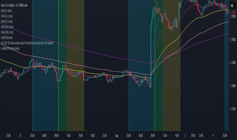
London/NY Forex SessionDesigned for Forex traders who want a clear view of market dynamics.
This tool highlights the most active trading windows of the day, helping you align with institutional moves and avoid low-liquidity periods.
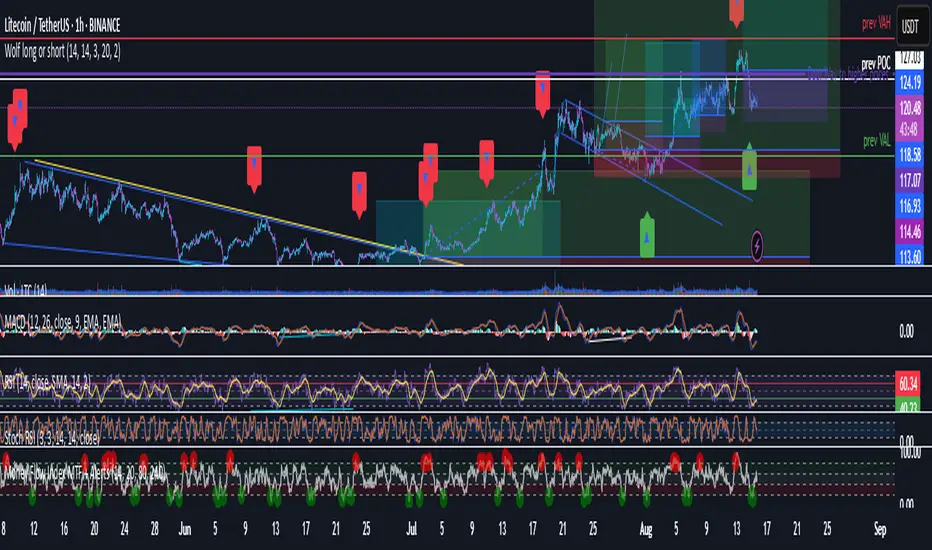
Wolf long or short this indicator is based on RSI, Stoch, BB , this indicator is giving a better understanding of short or long combined with 3 indicator
TCP | Market Session | Session Analyzer📌 TCP | Market Session Indicator | Crypto Version
A powerful, real-time market session visualization tool tailored for crypto traders. Track the heartbeat of Asia, Europe, and US trading hours directly on your chart with live session boxes, behavioral analysis, liquidity grab detection, and countdown timers. Know when the action starts, how the market behaves, and where the traps lie.
🔰 Introduction:
Trade the Right Hours with the Right Tools
Time matters in trading. Most significant moves happen during key sessions—and knowing when and how each session unfolds can give you a sharp edge. The TCP Market Session Indicator, developed by Trade City Pro (TCP), puts professional session tracking and behavioral insights at your fingertips.
Whether you're a scalper or swing trader, this indicator gives you the timing context to enter and exit trades with greater confidence and clarity.
🕒 Core Features
• Live Session Boxes :
Highlight active ranges during Asia, Europe, and US sessions with dynamic high/low updates.
• Session Start/End Labels :
Know exactly when each session begins and ends plotted clearly on your chart with context.
• Session Behavior Analysis :
At the end of each session, the indicator classifies the price action as:
- Trend Up
- Trend Down
- Consolidation
- Manipulation
• Liquidity Grab Detection: Automatically detects possible stop hunts (fake breakouts) and marks them on the chart with precision filters (volume, ATR, reversal).
• Session Countdown Table: A live dashboard showing:
- Current active session
- Time left in session
- Upcoming session and how many minutes until it starts
- Utility time converter (e.g. 90 min = 01:30)
• Vertical Session Lines: Visualize past and upcoming session boundaries with customizable history and future range.
• Multi-Day Support: Draw session ranges for previous, current, and future days for better backtesting and forecasting.
⚙️ Settings Panel
Customize everything to fit your trading style and schedule:
• Session Time Settings:
Set the opening and closing time for each session manually using UTC-based minute inputs.
→ For example, enter Asia Start: 0, Asia End: 480 for 00:00–08:00 UTC.
This gives full flexibility to adjust session hours to match your preferred market behavior.
• Enable or Disable Elements:
Toggle the visibility of each session (Asia, Europe, US), as well as:
- Session Boxes
- Countdown Table
- Session Lines
- Liquidity Grab Labels
• Timezone Selection:
Choose between using UTC or your chart’s local timezone for session calculations.
• Customization Options:
Select number of past and future days to draw session data
Adjust vertical line transparency
Fine-tune label offset and spacing for clean layout
📊 Smart Session Boxes
Each session box tracks high, low, open, and close in real time, providing visual clarity on market structure. Once a session ends, the box closes, and the behavior type is saved and labeled ideal for spotting patterns across sessions.
• Asia: Green Box
• Europe: Orange Box
• US: Blue Box
💡 Why Use This Tool?
• Perfect Timing: Don’t get chopped in low-liquidity hours. Focus on sessions where volume and volatility align.
• Pattern Recognition: Study how price behaves session-to-session to build better strategies.
• Trap Detection: Spot manipulation moves (liquidity grabs) early and avoid common retail pitfalls.
• Macro Session Mapping: Use as a foundational layer to align trades with market structure and news cycles.
🔍 Example Use Case
You're watching BTC at 12:45 UTC. The indicator tells you:
The Asia session just ended (label shows “Asia Session End: Trend Up”)
Europe session starts in 15 minutes
A liquidity grab just triggered at the previous high—label confirmed
Now you know who’s active, what the market just did, and what’s about to start—all in one glance.
✅ Why Traders Trust It
• Visual & Intuitive: Fully chart-based, no clutter, no guessing
• Crypto-Focused: Designed specifically for 24/7 crypto markets (not outdated forex models)
• Non-Repainting: All labels and boxes stay as printed—no tricks
• Reliable: Tested across multiple exchanges, pairs, and timeframes
🧩 Built by Trade City Pro (TCP)
The TCP Market Session Indicator is part of a suite of professional tools used by over 150,000 traders. It’s coded in Pine Script v6 for full compatibility with TradingView’s latest capabilities.
🔗 Resources
• Tutorial: Learn how to analyze sessions like a pro in our TradingView guide:
"TradeCityPro Academy: Session Mapping & Liquidity Traps"
• More Tools: Explore our full library of indicators on
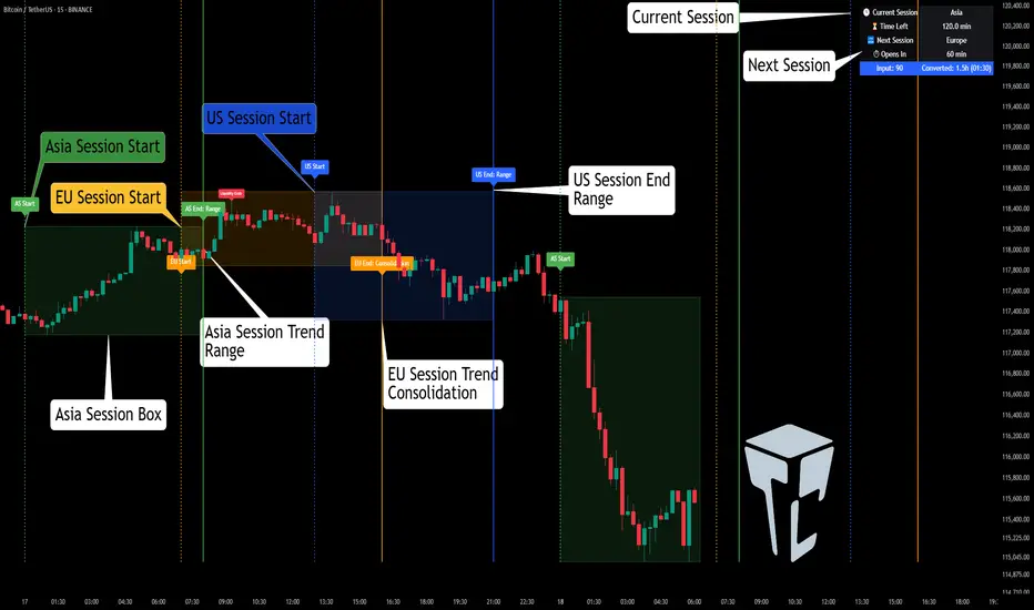
Smart Trend Signals [QuantAlgo]🟢 Overview
The Smart Trend Signals indicator is created to address a fundamental challenge in technical analysis: generating timely trend signals while adapting to varying market volatility conditions. The indicator distinguishes itself by employing volatility-adjusted calculations that automatically modify signal sensitivity based on current market conditions, rather than using fixed parameters that perform inconsistently across different market environments. By processing Long and Short signals through separate dynamic calculation engines, each optimized for its respective directional bias, the indicator reduces the common issue of delayed or conflicting signals that plague many traditional trend-following tools. Additionally, the integration of linear regression-based trend confirmation adds another layer of signal validation, helping to filter market noise while maintaining responsiveness to genuine price movements. This adaptive approach makes the indicator practical for both traders and investors across different asset classes and timeframes, from short-term forex/crypto scalping to long-term equity position analysis.
🟢 How It Works
The indicator uses a straightforward calculation process that combines volatility measurement with momentum detection to generate directional signals. The system first calculates Average True Range (ATR) over a user-defined period to measure current market volatility. This ATR value is then multiplied by the Smart Trend Multiplier setting to create dynamic reference levels that expand during volatile periods and contract during calmer market conditions.
For signal generation, the indicator maintains separate calculation paths for Long/Buy and Short/Sell opportunities. Long signals are generated when price moves above a dynamically calculated level below the current price, confirmed by an exponential moving average crossover in the same direction. Short signals work in reverse, triggering when price moves below a calculated level above the current price, also requiring EMA confirmation. This dual-path approach allows each signal type to operate with parameters suited to its directional bias.
🟢 How to Use
Long Signals (Green Labels): Appear as "Long" labels below price bars when the indicator detects upward price momentum above the calculated reference level, confirmed by EMA crossover. These signals identify moments when price action demonstrates bullish characteristics based on the volatility-adjusted calculations.
Short Signals (Red Labels): Display as "Short" labels above price bars when downward price momentum below the reference level is detected and confirmed by EMA crossover. These signals highlight instances where price action exhibits bearish characteristics according to the indicator's mathematical framework.
Customizable Bar Coloring: This feature colors individual price bars to match the current signal direction. When enabled, each bar reflects the indicator's current directional bias, creating a continuous visual representation of trend periods across the chart timeline.
Built-in Alert System: Provides automatic notifications for new signals with detailed exchange and ticker information. The alert system monitors the indicator's calculations continuously and triggers notifications when new long or short signals are generated, allowing traders/investors to track multiple instruments simultaneously.
🟢 Pro Tips for Trading and Investing
→ Parameter Adjustment: Higher Smart Trend Multiplier settings generate fewer signals that may be more selective, while lower settings produce more frequent signals that may include more false positives. Test different settings to find what works for your trading style and market conditions.
→ Timeframe Analysis: Using higher timeframes for general trend direction and lower timeframes for entry timing is a common approach.
→ Risk Management: No indicator eliminates the need for proper risk management. Use appropriate position sizing and stop-loss strategies regardless of signal quality or frequency.
→ Market Conditions: The indicator may perform differently in trending versus ranging markets. Frequent signal changes might indicate choppy conditions. Backtest and paper trade before risking real capital.

Cumulative Volume Delta (SB-1) 2.0
📈 Cumulative Volume Delta (CVD) — Stair-Step + Threshold Alerts
🔍 Overview
This Cumulative Volume Delta (CVD) tool visualizes aggressive buying and selling pressure in the market by plotting candlestick-style bars based on volume delta. It helps traders understand which side — buyers or sellers — is exerting more control on lower timeframes and highlights momentum shifts through stair-step patterns and delta threshold breaks. Resets to zero at EOD
Ideal for futures traders, scalpers, and intraday strategists looking for orderflow-based confirmation.
🧠 What Is CVD?
CVD (Cumulative Volume Delta) measures the difference between market buys and sells over a specific timeframe. When the delta is rising, it suggests buyers are being more aggressive. Falling delta suggests seller dominance.
This script aggregates volume delta from a lower timeframe and plots it in a higher timeframe context, allowing you to track microstructure shifts within larger candles.
📊 Features
✅ CVD Candlesticks
Each bar represents volume delta as an OHLC-style candle using:
Open: Delta at the start of the bar
High/Low: Peak delta range
Close: Final delta value at bar close
Teal candles = Net buying pressure
Red candles = Net selling pressure
✅ Threshold Levels (Key Visual Zones)
The script includes horizontal dashed lines at:
+5,000 and +10,000 → Signify strong buying pressure
-5,000 and -10,000 → Signify strong selling pressure
0 line → Neutrality line (no net pressure)
These levels act as volume-based support/resistance zones and breakout confirmation tools. For example:
A CVD cross above +5,000 shows buyers taking control
A CVD cross above +10,000 implies strong bullish momentum
A CVD cross below -5,000 or -10,000 signals intense selling pressure
📈 Stair-Step Pattern Detection
Detects two specific volume-based continuation setups:
Bullish Stair-Step: Both the high and low of the CVD candle are higher than the previous candle
Bearish Stair-Step: Both the high and low of the CVD candle are lower than the previous candle
These patterns often appear during trending moves and serve as confirmation of strength or continuation.
Visual markers:
🟢 Green triangles below bars = Bullish stair-step
🔴 Red triangles above bars = Bearish stair-step
🔔 Alert Conditions
Get real-time alerts when:
Bullish Stair-Step is detected
Bearish Stair-Step is detected
CVD crosses above +5,000
CVD crosses below -5,000
📢 Alerts only trigger on crossover, not every time CVD remains above or below. This avoids repetitive notifications.
⚙️ Inputs & Customization
Anchor Timeframe: The higher timeframe to which CVD data is applied (default: 1D)
Lower Timeframe: The timeframe used to calculate the CVD delta (default: 5 minutes)
Optional Override: Use custom timeframe toggle to force your own micro timeframe
📌 How to Use This CVD Indicator (Step-by-Step Guide)
✅ 1. Confirm Bias Using the Zero Line
The zero line (0 CVD) represents neutral pressure — neither buyers nor sellers are dominating.
Use it as your first filter:
🔼 If CVD is above 0 and rising → Buyer control
🔽 If CVD is below 0 and falling → Seller control
🧠 Tip: CVD rising while price is consolidating may signal hidden buyer interest.
✅ 2. Watch for Crosses of Key Levels: +5,000 and +10,000
These levels act as momentum thresholds:
Level Signal Type What It Means
+5,000 Buyer breakout Buyers are starting to dominate
+10,000 Strong bull bias Strong institutional or algorithmic buying flow
-5,000 Seller breakout Sellers are taking control
-10,000 Strong bear bias Heavy selling pressure is entering the market
Wait for CVD to cross above +5K or below -5K to confirm the active side.
Use these crossovers as entry triggers, breakout confirmations, or trade filters.
🔔 Alerts fire only when the level is first crossed, not every bar above/below.
✅ 3. Use Stair-Step Patterns for Continuation Confirmation
The indicator shows stair-step patterns using triangle signals:
🟢 Green triangle below bar = Bullish stair-step
Suggests a higher high and higher low in delta → buyers stepping up
🔴 Red triangle above bar = Bearish stair-step
Suggests lower highs and lower lows in delta → selling pressure building
Use stair-step signals:
To confirm a continuation of trend
As an entry or add-on signal
Especially after a threshold breakout
🧠 Example: If CVD breaks above +5K and forms bullish stairs → confirms strong trend, ideal for momentum entries.
✅ 4. Combine with Price Action or Structure
CVD works best when used with price, not in isolation. For example:
📉 Price makes a new low but CVD doesn’t → potential bullish divergence
📈 CVD surges while price lags → buyers are absorbing, breakout likely
Use it with:
VWAP
Orderblocks
Liquidity sweeps
Break of market structure/MSS/BOS
✅ 5.
Set Anchor Timeframe = Daily
Set Lower Timeframe = 5 minutes (default)
This lets you:
See intraday flow inside daily bars
Confirm whether a daily candle is being built on net buying or selling
🧠 You’re essentially seeing intra-bar aggression within a bigger time structure.
🧭 Example Trading Setup
Bullish Scenario:
CVD is rising and above 0
CVD crosses above +5,000 → alert fires
Green stair-step appears
Price breaks local resistance or liquidity sweep completes
✅ Consider long entry with structure and CVD alignment
🎯 Place stops below last stair-step or structural low
📌 Final Notes
This tool does not repaint and is designed to work in real-time across all futures, crypto, and equity instruments that support volume data. If your symbol does not provide volume, the script will notify you.
Use it in confluence with VWAP, liquidity zones, or structure breaks for high-confidence trades.

Ultimate Precision Buy/Sell with SL - Clean Labels FIXThis is a premium indicator designed for traders who demand accuracy, simplicity, and clean visual signals.
✅ Key Features:
📈 Precise Buy/Sell entries based on trend confirmation (EMA) and momentum (RSI)
🛡️ Automatic Stop Loss (SL) drawn for every trade, calculated from ATR
🔄 SL line dynamically moves with each new candle to reflect live action
❗ Only one active signal at a time – no clutter, no repaints
⏱ Optimized for 1H timeframe
💰 Best for Forex pairs, Gold (XAUUSD), Silver (XAGUSD), Platinum (XPTUSD)
🧠 How it works:
Buy Signal: When fast EMA > slow EMA & RSI crosses above 30
Sell Signal: When fast EMA < slow EMA & RSI crosses below 70
A single SL line is drawn per trade and remains until either:
Opposite signal appears, or
SL is hit
⚠️ No repainting. No noise. Just precision.
If you want to trade smart, clean and with confidence – this indicator is built for you.

SeikaAlgo–Long/Short Buy/Sell SignalSeikaAlgo–Long/Short Buy/Sell Signal — Simple, Visual, Reliable Signals
SeikaAlgo makes high-probability trading simple and actionable for everyone—no complex rules, no guesswork. Just follow these 3 steps:
How It Works
1. Watch for Buy/Sell Signals
Buy and Sell signals are printed right on your chart, only after the candle closes—never repaints, never lags. Trade with confidence.
2. Enter at Candle Close
Buy: Enter at the close of a candle when a green “B” label appears and price crosses above the green EMA 9.
Sell: Enter at the close of a candle when a red “S” label appears and price crosses below the red EMA 9.
3. Take Profit
Move your stop loss with each new candle (trailing stop), or use the EMA 9 line to trail stops.
Take profit when price reaches a Daily Fibonacci Level.
Example — 5min SPY
Buy Signal: Green label prints above green EMA 9 after candle closes. Enter at close, stop just below the signal candle’s low.
Sell Signal: Red label prints below red EMA 9 after candle closes. Enter at close, stop just above the signal candle’s high.
Key Features
No Lag, No Repainting: Signals only appear after a candle is complete—so you’re never chasing ghosts.
Clear Visual Cues: Instantly know when to buy, sell, or step aside.
Built-in Trailing Stop Logic: Protect your trades easily.
Works On Any Market/Timeframe: Perfect for stocks, futures, crypto, or forex.
SeikaAlgo is an invite-only indicator.
Add it to your chart, follow the labels and EMA, and trade with confidence—no clutter, no confusion. Simple, visual, reliable.

4 Anchored VWAPs This indicator shows 4 periods of Anchored VWAPs according to specific dates the user chose.
