Muros Multi-TF Pro Dashboard v2fwrvw w fw wf fs rf wf wf jni hb hu huhb yhi ib i ibb uoobu ic biicb ibc bic k
المؤشرات والاستراتيجيات

XAUUSD M15 momentum realDetects when xausd enters a healthy directional phase during the NY session, and only flags entries with real momentum and controlled volatility.

king 3//@version=5
indicator("BTC_QQQ_Crown_Indicator", overlay=true)
// 1. MACD Numbers (8, 16, 11)
= ta.macd(close, 8, 16, 11)
// 2. Engulfing Candle Logic
bull = close < open and open < close and close > open
bear = close > open and open > close and close < open
// 3. Crown Signal Condition
crownBuy = bull and hist > hist
crownSell = bear and hist < hist
// 4. Drawing Crowns on Chart
plotshape(crownBuy, title="Buy_Crown", style=shape.labelup, location=location.belowbar, color=color.yellow, size=size.normal, text="👑 BUY", textcolor=color.black)
plotshape(crownSell, title="Sell_Crown", style=shape.labeldown, location=location.abovebar, color=color.red, size=size.normal, text="👑 SELL", textcolor=color.white)

Ram Key Levels (Daily Horizontals) + Day SeparatorsRam Key Levels (Daily Horizontals) + Day Separators

Night Session Background V1.0This script can achieve the following functions:
Select a specified time period, such as the U.S. trading session, and mark this period on the background of the candlestick chart.
The purpose of doing this:
It allows you to more intuitively observe the candlestick patterns during specific time periods, such as the U.S. trading session.
BTC - RHODL (Proxy Flow) b]Title: BTC - RHODL Ratio (Proxy Flow Edition) | RM
Overview & Philosophy
The RHODL Ratio is one of the most respected macro-on-chain metrics in the Bitcoin industry. Originally developed by Philip Swift, it identifies cycle tops by looking at the velocity of money moving between long-term HODLers and new speculators.
Why a "Proxy" instead of the "Original"? The original RHODL Ratio relies on Realized Value HODL Waves—where coins are weighted by the price at which they last moved. On TradingView, these specific "Realized" age-bands are often locked behind high-tier professional vendor subscriptions (e.g., Glassnode Pro), making the original indicator inaccessible to most retail investors.
To solve this, I present this Proxy Flow Edition. Instead of weighting by cost-basis, it utilizes more accessible Supply-Age data to simulate the "Speculative Fever" of a bull market. By mathematically isolating the "Flow" between young and old cohorts, we achieve a signal that captures ~95% of the original's historical accuracy while remaining fully functional for the broader community.
Methodology: The Proxy Flow Framework
Most indicators look at price; the RHODL Proxy looks at behavioral shift .
1. The Young vs. Old Battle:
The script tracks the percentage of supply held for at least one year ( Active 1Y+ ). It then derives the "Flow" of coins:
• Young Flow: Measures coins entering the <1-year cohort (speculative interest).
• Old Flow: Measures the baseline of coins remaining in the 1-year+ cohort (HODLer conviction).
2. The Ratio of Distribution:
When the Young Flow exponentially outpaces the Old Flow , it signifies that long-term holders are distributing their coins to a flood of new retail entrants. Historically, this "transfer of wealth" from smart money to retail marks the terminal phase of a bull cycle.
3. Age Normalization:
Bitcoin’s network naturally matures over time. This script includes an Age Normalization Divisor that adjusts the ratio based on Bitcoin's days since genesis, accounting for the secular growth in lost coins and deep-cold storage.
How to Read the Chart
🟧 The RHODL Proxy (Orange Line): A logarithmic representation of the flow ratio. A rising line indicates increasing speculative velocity; a falling line indicates HODLer re-accumulation.
🔴 The Overheated Zone (> 0.5): The danger zone. This area captures the "Speculative Fever" typical of cycle peaks. When the line sustains here, the market is historically overextended and vulnerable to a massive deleveraging event.
🟢 The Accumulation Zone (< -0.5): The maximum opportunity zone. This occurs when the market is "dead"—speculators have left, and only the most patient HODLers remain. Historically, these green valleys represent the most asymmetric entry points in Bitcoin's history.
Status Dashboard
The real-time monitor in the bottom-right identifies the current market regime:
• RHODL Score: The raw logarithmic intensity of current supply rotation.
• Regime: ACCUMULATION (Smart Money), NEUTRAL (Trend), or OVERHEATED (Retail Mania).
Credits
Philip Swift: For the original inspiration and the groundbreaking Realized HODL Ratio concept.
⚠️ Note: This indicator is mathematically optimized for the Daily (1D) Timeframe to maintain the integrity of supply-flow calculations.
Disclaimer
This script is for research and educational purposes only. On-chain metrics are probabilistic, not deterministic. Always manage your risk according to your investment horizon.
Tags
bitcoin, btc, rhodl, on-chain, hodl, cycles, speculation, rotation, macro, Rob Maths


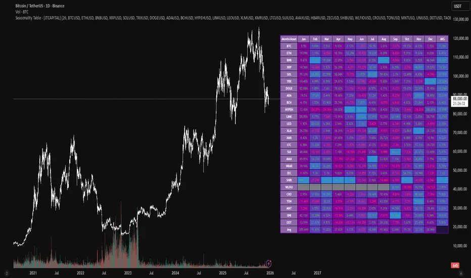
Seasonality Table - [JTCAPITAL]Seasonality Table - is a modified way to use monthly return aggregation across multiple assets to identify seasonal trends in cryptocurrencies and indices.
The indicator works by calculating in the following steps:
Asset Selection
The user defines a list of assets to include in the seasonality table. By default, the script allows up to 32 assets, including popular cryptocurrencies like BTC, ETH, BNB, XRP, and others. Each asset is identified by its symbol (e.g., "CRYPTO:BTCUSD").
Monthly Return Calculation
For each asset, the script requests monthly price data using request.security. Specifically, it retrieves the monthly open, close, and month number. The monthly return is calculated as:
Return = (Close - Open) / Open
This step provides a normalized measure of performance for each asset per month.
Data Aggregation
The script stores two key arrays for each asset and month combination:
sumReturns: The cumulative sum of monthly returns
countReturns: The number of months with valid data
This allows averaging returns later while handling months with missing data gracefully.
Table Construction
Rows representing months (January–December)
Columns representing each asset
An additional column showing the average return for all assets per month
A final row showing the yearly average return for each asset
Filling the Table
The table cells are filled as follows:
Monthly returns are averaged for each asset and displayed as a percentage.
Positive returns are colored green, negative returns red.
Missing data is displayed as a gray “—” placeholder.
Each row’s values are normalized for the color gradient to show relative performance.
Averages Computation
The script calculates two types of averages:
Monthly Average Across Assets : Sum of all asset returns for a month divided by the number of valid data points.
Yearly Average Per Asset : Sum of all monthly returns for an asset divided by the number of months with valid data.
These averages are displayed in the last column and last row respectively, with gradient coloring for visual comparison.
Buy and Sell Conditions
This indicator does not generate explicit buy or sell signals. Instead, it provides a visual heatmap of historical seasonality, allowing traders to:
Identify months where an asset historically outperforms (bullish bias)
Identify months with weak historical performance (bearish caution)
Compare seasonal patterns across multiple assets for portfolio allocation
Filters can be applied by adjusting the asset list, changing the color mapping, or focusing on specific months to highlight seasonal anomalies.
Features and Parameters
Number of assets: Set how many assets are included in the table (1–32).
Assets: Input symbols for the assets you want to analyze.
Low % Color: Defines the color for the lowest monthly returns in the gradient.
High % Color: Defines the color for the highest monthly returns in the gradient.
Cleaned asset names for concise display.
Gradient-based visualization for easier pattern recognition.
Monthly and yearly averages for comparative analysis.
Specifications
Monthly Return Calculation
Uses the formula (Close - Open) / Open for each asset per month. This standardizes performance across different price scales and ensures comparability between assets.
Arrays for Storage
sumReturns: Float array storing cumulative monthly returns.
countReturns: Integer array storing the number of valid data points per month.
These arrays allow efficient aggregation and average calculations without overwriting previous values.
Data Retrieval via Security Calls
Requests monthly OHLC data for each asset using request.security.
Ensures calculations reflect the correct timeframe and allow for historical comparison.
Color and Text Assignment
Green text for positive returns, red for negative returns.
Gray cells indicate missing data.
Gradient background shows relative magnitude within the month.
Seasonality Analysis
The table visually encodes which months historically produce stronger returns.
Useful for portfolio rotation, risk management, and identifying cyclical trends.
Scalability
Supports up to 32 assets.
Dynamically adapts to the number of assets and data availability.
Gradient scales automatically per row for consistent comparison.

EMAs ChimuTraderPublicoscrip de emas 200 y 50 periodos para anlizar todo BINANCE:SOLUSDT y muchas monedas mas

sullaojo 3mHere is the English translation for the alert setup instructions:
**How to Set Up Alerts (After Adding the Code)**
1. Click the **Add to chart** button to apply the indicator to your graph.
2. Click the **Alarm Clock icon (Alerts)** on the top right toolbar of TradingView, or press `Alt + A`.
3. In the **Condition** field:
* Select the indicator named **"MA Crossover Buy Alert..."**
* Select **"แจ้งเตือนซื้อ (Buy Alert)"** to receive only buy signals.
4. In the **Trigger** (or Options) section: Select **Once per bar close**.
*(This is recommended per the textbook to confirm that the closing price actually crossed the line, avoiding false signals during intraday volatility.)*
5. Check **Notify on App** (for mobile) or **Show pop-up** as desired, then click **Create**.
Now, when the moving averages cross according to the textbook's conditions, the system will send you an alert immediately!

Bullish/Bearish Movement SumThis indicator calculates and displays the cumulative sum of bullish and bearish price movements over a specified period.
Features:
- Green line: Cumulative sum of all bullish movements
- Red line: Cumulative sum of all bearish movements (absolute value)
- Blue area: Net difference (bullish - bearish)
- Information table showing current values and bull/bear ratio
Settings:
- Calculation Period: Choose rolling window size (default: 100 bars) or 0 for cumulative from start
- Calculation Mode: Choose between "Points" (absolute price changes) or "Percentage" (% changes)
Use Cases:
- Identify market directional strength
- Compare bullish vs bearish pressure
- Spot divergences between price and directional momentum
- Ratio > 1 indicates more bullish than bearish movement
Developed with assistance from Claude (Anthropic)

Market Efficiency DashboardDescription
This indicator is an analytical tool designed to visualize the relationship between price action and market efficiency. Based on the Choppiness Index (CI), this indicator identifies whether the market is in a state of Range Contraction (Consolidation) or Range Expansion (Trending) . This implementation introduces a unique 50-pivot baseline to better differentiate between these two market characters, providing traders with an objective view of volatility cycles.
Key Features
Volatility Cycle Logic: A refined implementation of the Choppiness Index that assists in filtering market noise during low-volatility periods.
Pivot-50 Visualization: A custom geometric layout that separates range contraction from trend expansion for faster visual interpretation.
Multi-Timeframe (MTF) Data Handling: Enables the monitoring of higher-timeframe efficiency cycles without switching charts.
Trend Context Filter: Integrates a 200-period EMA to provide a directional baseline relative to the current market state.
Real-Time Status Dashboard: A real-time data table providing a summary of current market efficiency and trend bias.
Signal Refinement: Includes optional smoothing (EMA/SMA/WMA) to reduce calculation "jitter" and provide clearer structural signals.
Inputs Overview
Choppiness Length: Sets the lookback period for the efficiency calculation (Default: 14).
Calculation Timeframe: Allows the user to select the source timeframe for the index data.
Smoothing Method: Users can choose between multiple moving average types to filter the raw index output.
Threshold Levels: Customizable Fibonacci-based levels (61.8 and 38.2) used to define the boundaries of "Choppy" and "Trending" environments.
EMA Filter: Toggle for the 200-period Exponential Moving Average used for directional bias.
How to Use
Context Identification: Observe the histogram’s position relative to the 50-pivot. Bars expanding upward toward the 61.8 level indicate the market is coiling/congested.
Trend Confirmation: Bars expanding downward toward the 38.2 level indicate the market is moving efficiently in a specific direction.
Bias Alignment: When the Trend Bias is Bullish and the state is Trending, price discovery is likely occurring to the upside. Conversely, a Bearish bias in a Trending state suggests efficient movement to the downside.
Risk Management: Rising choppiness levels often precede a period of trend exhaustion or reversal, signaling a potential time to reduce exposure.
How it Helps
This tool is designed to assist in objective decision-making by identifying the current "market character." By distinguishing between trending and non-trending environments, it helps traders select the appropriate strategy for the current context—avoiding trend-following entries during sideways markets and identifying when a market has entered a period of price expansion.
Alerts
Trend Starting: Triggers when the index crosses below the lower threshold, suggesting a transition into an efficient trend.
Squeeze/Consolidation: Notifies the user when the index crosses above the upper threshold, indicating range contraction.
Midpoint Cross: Signals when the index crosses the 50-level, marking a shift in market momentum.
⚠️ Disclaimer:
This script/indicator is not endorsed by, affiliated with, sponsored by, or connected to TradingView in any manner. The author is not a TradingView partner.
This script/indicator and all related content are provided “as is” and “as available,” without any warranties of any kind, express or implied. The content is strictly for educational and informational purposes and does not constitute financial, investment, trading, or legal advice.
The author makes no representations or guarantees regarding accuracy, reliability, profitability, or future performance. Use of this script/indicator is entirely at the user’s own risk, and the author assumes no liability for any losses, damages, or financial consequences arising from its use.

ARM-EMA TREND BARSPrice action trading is about reading what the market is doing, so you can deploy the right trading strategy to reap the maximum benefits. In simple words, price action is a trading technique in which a trader reads the market and makes subjective trading decisions based on the price movements, rather than relying on technical indicators or other factors.
At its most simplistic, it attempts to describe the human thought processes invoked by experienced, non-disciplinary traders as they observe and trade their markets. Price action is simply how prices change - the action of price. It is most noticeable in markets with high liquidity and price volatility, but anything that is traded freely (in price) in a market will per se demonstrate price action.

Volatility State Index [Interakktive]The Volatility State Index (VSI) classifies market volatility into three behavioral states: Expansion, Decay, and Transition. It answers one question visually: Is volatility supporting price movement, withdrawing, or unstable?
Unlike traditional volatility indicators that show levels or bands, VSI diagnoses the current volatility regime so traders can adapt their approach accordingly.
█ WHAT IT DOES
• Classifies volatility into three states: Expansion (teal), Decay (grey), Transition (amber)
• Measures volatility momentum as a percentage rate-of-change
• Applies stability filtering to detect unstable/choppy conditions
• Uses persistence logic to prevent state flickering
• Exports state data for use in alerts and strategies
█ WHAT IT DOES NOT DO
• NO buy/sell signals
• NO entry/exit recommendations
• NO alerts (v1 is diagnostic only)
• NO performance claims
This is a volatility diagnostic tool, not a trading system.
█ HOW IT WORKS
The VSI processes volatility through a five-stage pipeline:
STAGE 1 — Base Volatility
Calculates ATR as the foundation for volatility measurement.
STAGE 2 — Smoothing
Applies EMA smoothing to reduce noise in the volatility series.
STAGE 3 — Volatility Momentum
Computes the percentage rate-of-change of smoothed volatility:
Volatility Momentum (%) = ((Current ATR - Previous ATR) / Previous ATR) × 100
Positive values indicate expanding volatility; negative values indicate contracting volatility.
STAGE 4 — Stability Filter
Tracks how frequently volatility momentum changes direction. Frequent sign changes indicate unstable, choppy conditions.
Stability Score = 1 - (Average Flip Rate)
Low stability forces the Transition state regardless of momentum level.
STAGE 5 — State Classification
Combines momentum thresholds and stability to determine the final state:
• Expansion: Momentum ≥ +5% (default threshold)
• Decay: Momentum ≤ -5% (default threshold)
• Transition: Between thresholds OR low stability
A persistence filter requires states to hold for multiple bars before confirming, preventing visual noise.
█ INTERPRETATION
EXPANSION (Teal)
Volatility is increasing in a sustained way. Price moves are becoming larger.
What it suggests:
• Breakouts are more likely to follow through
• Stops may need wider placement
• Trend-following approaches tend to work better
• Mean-reversion weakens
DECAY (Grey)
Volatility is decreasing. Price is compressing into tighter ranges.
What it suggests:
• Breakouts are more likely to fail
• Ranges tend to hold
• Trend-following underperforms
• Mean-reversion strengthens
TRANSITION (Amber)
Volatility behavior is unclear or unstable. This is NOT neutral — it is uncertainty.
What it suggests:
• Mixed signals — one bar huge, next bar dead
• Higher whipsaw risk
• Reduced conviction in either direction
• Consider waiting for clarity
The key insight: Amber is a warning, not a middle ground. It appears when volatility cannot decide what it wants to do.
█ VISUAL DESIGN
The indicator uses a state-first histogram design:
• Histogram height shows volatility momentum percentage
• Histogram color shows the classified state
• Zero line provides visual anchor
• Optional momentum line for confirmation
• Optional background tint (default OFF for clean charts)
The visual hierarchy prioritizes instant state recognition. A trader should understand the volatility environment in under one second without reading numbers.
█ INPUTS
Core Settings
• ATR Length: Base volatility measurement period (default: 14)
• Smoothing Length: EMA smoothing applied to ATR (default: 10)
• Momentum Length: Rate-of-change lookback (default: 10)
State Classification
• Expansion Threshold (%): Momentum above this = Expansion (default: 5.0)
• Decay Threshold (%): Momentum below this = Decay (default: -5.0)
• Persistence Bars: Bars required to confirm state change (default: 3)
• Stability Lookback: Window for stability calculation (default: 20)
• Stability Threshold: Below this = forced Transition (default: 0.5)
Visual Settings
• Show State Histogram: Toggle main display (default: ON)
• Show Momentum Line: Thin confirmation line (default: OFF)
• Show Zero Line: Baseline reference (default: ON)
• Show Background Tint: Subtle state coloring (default: OFF)
█ DATA WINDOW EXPORTS
When enabled, the following values are exported:
• ATR (Raw)
• ATR (Smoothed)
• Volatility Momentum (%)
• Stability Score (0-1)
• State (-1/0/1): Decay = -1, Transition = 0, Expansion = 1
• Is Expansion (0/1)
• Is Decay (0/1)
• Is Transition (0/1)
These exports allow VSI to be used as a filter in Pine Script strategies or alert conditions.
█ ORIGINALITY
While ATR and volatility indicators are common, VSI is original because it:
1. Classifies volatility into behavioral states rather than showing raw levels
2. Applies momentum analysis to volatility itself (rate-of-change of ATR)
3. Uses stability filtering to detect genuinely unstable conditions
4. Implements persistence logic to prevent state flickering
5. Provides a state-first visual design optimized for instant recognition
VSI is state-first: it classifies volatility regimes (Expansion/Decay/Transition) rather than plotting volatility level alone, using momentum and stability to reduce false regime reads.
This is not a modified ATR or Bollinger Band — it is a volatility regime classifier.
█ SUITABLE MARKETS
Works on: Stocks, Futures, Forex, Crypto
Timeframes: All timeframes — state classification adapts accordingly
Best on: Instruments with consistent volatility patterns
█ RELATED
• Market Efficiency Ratio — measures price path efficiency
• Effort-Result Divergence — compares volume effort to price result
█ DISCLAIMER
This indicator is for educational purposes only. It does not constitute financial advice. Past performance does not guarantee future results. Always conduct your own analysis before making trading decisions.

CandelaCharts - Composite Pressure Index 📝 Overview
The CandelaCharts – Composite Pressure Index (CPI) is a multi-factor oscillator that blends RSI , Money Flow Index (MFI) , and Chaikin Money Flow (CMF) into a single, stretchable “pressure” line. Instead of looking at three separate indicators, CPI compresses price momentum and volume flow into one normalized curve around 0 , then amplifies extremes using a rolling z-score .
The result is a dynamic gauge of buying vs. selling pressure that can travel beyond ±1 during strong regime shifts, helping you spot exhaustion, climaxes, and trend-strength phases more intuitively.
📦 Features
Composite pressure engine – Combines RSI, MFI, and CMF into a single normalized oscillator around 0, giving you a unified view of market pressure.
Custom weighting of components – Independently weight RSI, MFI, and CMF to prioritize pure price momentum or volume-driven signals.
Rolling z-score stretch – Uses a configurable z-score window to “stretch” the composite values, letting the line exceed ±1 during extremes instead of staying capped.
Adaptive amplitude control – An amplitude (gain) factor lets you scale how aggressive or subtle the CPI swings appear.
EMA smoothing – Optional smoothing removes noise while preserving the timing of swings and reversals.
Visual pressure band – Zero, +1, and -1 reference lines with a shaded band make it easy to see when pressure is “normal” vs. extended.
Dynamic color gradients – Warm/orange tones above 0 for bullish pressure and cool/blue tones below 0 for bearish pressure, with saturation increasing as pressure intensifies.
NA-safe statistics – Custom mean and standard deviation routines ensure stable behavior from the start of the chart and during partial history.
⚙️ Settings
RSI Length : Lookback length for RSI . Higher values smooth the RSI component; lower values make it more reactive to short-term price momentum.
MFI Length : Lookback length for the manual Money Flow Index . Adjust this to control how sensitive CPI is to price–volume interaction.
CMF Length : Lookback length for Chaikin Money Flow . This defines the window used to assess accumulation/distribution through volume flow.
RSI Weight : Relative importance of RSI within the composite. Increasing this emphasizes pure price momentum in the CPI.
MFI Weight : Relative importance of MFI. Higher values strengthen the influence of volume-weighted price moves.
CMF Weight : Relative importance of CMF. Raising this highlights accumulation/distribution as a driver of the pressure index.
Smoothing : EMA length applied to the stretched CPI line. A value of 1 effectively disables smoothing, while higher values reduce noise at the cost of a slight lag.
Z-score Window : Rolling window used to compute the mean and standard deviation of the raw composite. This defines the statistical context for what counts as “extreme”. Shorter windows adapt faster; longer windows give a more stable regime.
Amplitude : Gain factor applied to the z-scored composite. Values above 1.0 exaggerate swings and make extremes more visually pronounced; values below 1.0 compress them.
⚡️ Showcase
Composite Pressure Index
Mean Line
Divergences
📒 Usage
1. Identify directional pressure regimes
Use 0 as the key balance line:
CPI > 0 → Net bullish pressure (buyers in control).
CPI < 0 → Net bearish pressure (sellers in control).
You can treat prolonged stays above or below 0 as confirmations of trend direction, especially when price structure agrees.
2. Read statistical extremes instead of fixed levels
Because CPI is stretched via a z-score , values beyond ±1 typically represent statistically meaningful extremes within your chosen window:
CPI > +1 → Overextended bullish pressure / potential euphoria.
CPI < -1 → Overextended bearish pressure / potential capitulation.
These zones are not automatic reversal signals, but they highlight areas where monitoring for exhaustion, blow-offs, or risk-reward shifts can be beneficial.
3. Spot divergences with price
Classic divergence logic applies particularly well when pressure is composite:
Bearish divergence – Price makes higher highs, but CPI makes lower highs or fails to confirm.
Bullish divergence – Price makes lower lows, but CPI makes higher lows or shows less downside extension.
These patterns can be integrated with support/resistance, liquidity levels, and other CandelaCharts tools.
4. Tune the weights to your strategy
Adjust the three weights to match your focus:
Higher RSI weight → More sensitivity to pure price momentum (good for breakout or trend-following systems).
Higher MFI weight → Greater emphasis on price–volume interaction (ideal for spotting volume-confirmed moves).
Higher CMF weight → Stronger focus on accumulation/distribution (helpful for swing and position traders).
5. Integrate with existing setups
The CPI is designed to sit comfortably below price:
Use it as a “context” oscillator underneath your main price-action and liquidity models.
Combine CPI extremes and divergences with key levels, range models, or order flow signals for higher-confluence entries.
🚨 Alerts
The indicator does not provide any alerts!
⚠️ Disclaimer
Trading involves significant risk, and many participants may incur losses. The content on this site is not intended as financial advice and should not be interpreted as such. Decisions to buy, sell, hold, or trade securities, commodities, or other financial instruments carry inherent risks and are best made with guidance from qualified financial professionals. Past performance is not indicative of future results.

SMH DualMomentum Signals (ROC + Volume)SMH Dual Momentum (ROC + Volume Confirmation)
This indicator identifies high-quality bullish trends by combining price momentum (Rate of Change) with volume confirmation, and exits when momentum structurally fails.
Core Logic
BUY signal
Rate of Change (ROC) over N periods is above a positive threshold (strong upside momentum)
Current volume is above its moving average (rising market participation)
SELL signal
ROC crosses below zero, indicating loss of bullish momentum
Why It Works
ROC measures the speed and strength of price movement, filtering out weak or drifting trends
Volume confirmation ensures momentum is supported by real capital flow, reducing false breakouts
Momentum-based exit avoids prolonged drawdowns and capital stagnation
Key Advantages
Focuses on trend continuation, not prediction
Filters out low-quality price moves and range-bound markets
Captures long, high-conviction trends with relatively few trades
Simple, robust rules using only price and volume
Best Use Cases
Designed for trend-driven ETFs such as SMH (Semiconductors)
Suitable for swing to position trading on daily charts
Works best in markets with strong sector rotation and institutional participation
Notes
This is a trend-following momentum tool, not a mean-reversion indicator
No stop-loss is built in; risk management should be handled externally if required
Parameters can be adjusted to match different timeframes or assets

Volume OscillatorDescription
The Volume Oscillator measures the momentum of trading volume by calculating the percentage difference between a fast and a slow Simple Moving Average (SMA) of daily volume. It helps traders identify periods of increasing or decreasing market participation, often signaling potential trend strength or exhaustion.
Key Features:
Adaptive to Trading Session:
Automatically adjusts SMA periods based on the actual trading session length (default: 8.5 hours for FTSEMIB, customizable for any market — e.g., 6.5h for US stocks, 24h for crypto).
Fast & Slow SMAs:
Compares a short-term SMA (default 10 days) with a longer-term SMA (default 25 days) of volume.
Oscillator Formula:
100 × (Fast SMA / Slow SMA - 1)
→ Positive values = increasing volume momentum (bullish)
→ Negative values = decreasing volume momentum (bearish)
Signal Line (optional):
A moving average of the oscillator (default 7 days) for smoother trend identification and crossover signals.
Overbought/Oversold Levels:
User-defined horizontal lines (default +40 / -40) to highlight extreme volume conditions.
Customizable Colors:
Change the oscillator and signal line colors to match your chart style.
How to Interpret:
Bullish Conditions:
Oscillator crosses above the zero line
Oscillator crosses above the signal line
Readings near or above +40 may indicate strong buying pressure (watch for possible exhaustion if too extreme)
Bearish Conditions:
Oscillator crosses below the zero line
Oscillator crosses below the signal line
Readings near or below -40 may indicate selling pressure or capitulation
Divergences:
Look for divergences between price and the Volume Oscillator (e.g., price makes new highs but oscillator fails to confirm with higher highs) — a classic sign of weakening momentum.
Best Use Cases:
Indices (FTSEMIB, DAX, CAC, SPX, etc.), stocks and futures with defined trading hours, crypto (set session duration to 24 hours).
Works well on intraday (e.g., 15m, 30m, 1h) and daily charts.
Customization Tips:
- Shorten fast/slow lengths for faster signals (more noise)
- Lengthen them for smoother, longer-term analysis
- Adjust session duration for non-standard market hours
- Enable/disable the signal line in the settings
Note: Volume data quality can vary by symbol and exchange. Always combine this indicator with price action and other tools. Use proper risk management.

3MA Alignment Ribbon [AlgoTraderPro]3MA Alignment Ribbon is a clean, visual trend-structure indicator based on the alignment of three moving averages.
Instead of focusing on crossovers, it highlights trend quality and direction by dynamically coloring the moving averages and the ribbon between them.
The goal is simple : See at a glance whether the market structure is bullish, bearish, or neutral.
⸻
How It Works
The indicator plots three moving averages (Fast, Medium, Slow) and evaluates their alignment:
Bullish → Fast > Medium > Slow
Bearish → Fast < Medium < Slow
Neutral → Any other configuration
The moving averages and the filled ribbon between them are automatically colored based on this alignment, making trend conditions immediately visible.
⸻
Key Features
✅Multi-MA Support
Choose between:
EMA (default)
SMA
WMA
VWMA
RMA
HMA
✅ Alignment Modes
Strict: classic Fast > Medium > Slow logic
Tolerant: requires a minimum percentage separation between averages to reduce noise in ranging markets
✅ Optional Slope Filter
Filter signals by requiring the slow MA to be rising or falling, helping avoid false trend states during flat conditions.
✅ Higher Timeframe (HTF) Ribbon
Overlay the same 3MA alignment logic from a higher timeframe on your current chart:
Fully optional
Correctly calculated on the HTF itself
Option to use confirmed HTF bars only (reduces repaint confusion)
✅ Alerts & Visual Signals
Alerts when alignment turns Bullish, Bearish, or Neutral
Optional on-chart markers when the alignment flips
✅ Custom Styling
Fully customizable colors and transparency
Designed to remain readable without cluttering the chart
⸻
How to Use It
This indicator works best as:
A trend filter for discretionary trading
A context tool for entries using other setups
A market structure overlay for scalping, swing trading, or position trading
It does not generate buy/sell signals by itself — instead, it helps you trade aligned with market structure.
⸻
Default Settings
The default lengths (50 / 100 / 200 EMA) are suitable for most markets and timeframes, including crypto, forex, indices, and equities.

My Price Curtain by @magasineMy Price Curtain by @magasine
Functional Description
My Price Curtain is a high-performance visual analysis tool designed to provide traders with immediate context regarding price positioning relative to institutional benchmarks. Unlike standard moving averages, this indicator creates a "curtain" of data that dynamically colors the chart background and provides real-time performance metrics to identify trend dominance at a glance.
Key Features & Differential Value
Multi-Method Dynamic Benchmarking: Choose between five different calculation methods: SMA, EMA, WMA, RMA, or a manual Fixed Price. This allows you to switch from a standard technical trend (MA) to a "break-even" or "entry point" analysis (Fixed Price) instantly.
Intelligent Visual Feedback: The "Curtain" logic automatically colors the chart background—Green for Bullish dominance and Red for Bearish dominance—reducing cognitive load during fast-paced sessions.
Advanced Statistical Tracking: The indicator includes a built-in Performance Table that tracks the percentage of bars closing above or below the selected benchmark. This helps traders quantify the strength of a trend over the entire visible dataset.
Precision Labeling & Distance Analysis: A dynamic, color-coded label tracks the price on the Y-axis. It calculates and displays the exact percentage distance from the price to the benchmark in real-time, helping to identify overextended moves.
Optional Deviation Zones: Enable visual "Safety Zones" (boxes) that project a user-defined percentage deviation from the average, assisting in identifying potential volatility expansion or exhaustion areas.
Trading Utilities
Trend Confirmation: Use the background color and "Bars Above" percentage to confirm if you are trading with the path of least resistance.
Scalping & Intraday Support: The "Distance" metric is essential for scalpers to avoid entering trades too far from the average (mean reversion risk).
Custom Strategy Benchmark: Use the "Fixed Price" mode to set your specific entry price and see your real-time performance and "curtain" status relative to your position.

ARM-EMA COLOR BUY SELLPrice action trading is about reading what the market is doing, so you can deploy the right trading strategy to reap the maximum benefits. In simple words, price action is a trading technique in which a trader reads the market and makes subjective trading decisions based on the price movements, rather than relying on technical indicators or other factors.
At its most simplistic, it attempts to describe the human thought processes invoked by experienced, non-disciplinary traders as they observe and trade their markets. Price action is simply how prices change - the action of price. It is most noticeable in markets with high liquidity and price volatility, but anything that is traded freely (in price) in a market will per se demonstrate price action.


Absorption DetectorSource: Prof Michael G.
Credit: GreatestUsername for the coding & implementation.
Zones of Support and Resistance can feel like drawing boxes on the chart. This indicator to help spot areas of possible reversal. It uses Volume Confirmation and Body-to-Wick Ratio to do this and defined as:
1. Volume Confirmation
High Volume: A candle that absorbs sitting limit orders is often accompanied with higher than average volume. The indicator define this type of candle if it has a volume is greater than 250%/350% of the average volume over the last 10 candles.
2. Body-to-Wick Ratio
Body vs. Wick: A candle with a small body and large wicks can indicate higher probability of reversal. You can define an absorption candle if the body of the candle is less than 50% of the total range (high-low).
These settings are also customizable to your own desired settings and should be used as a visual aid.
