OH2B Trading Indicator Ver2.0OH2B TRADING INDICATOR
The OH2B Trading Indicator is an indicator built for beginners.
It gives you entry points for BUY and SELL based on Trend Channel and Ema-Crossover.
It also gives you EXIT POINTS for taking profits based on the Average Directional Index and Relative Strength Index.
TRADING WITH OH2B INDICATOR
The OH2B Trading Indicator gives you entry points for BUY or SELL .
When the ema1 crosses above ema2, the trend channel will be painted GREEN in color, and a BUY signal will appear. = BUY
When the ema1 crosses below ema2, the trend channel will be painted RED in color, and a SELL signal will appear. = SELL
When a BUY or SELL signal appears on the chart, don't rush into any trade.
Please allow a few hours for confirmation of signals .
After confirmation, it is suggested to enter 50% first and another 50% near the Trendlines .
After entering a trade, please remember to set a stop-loss alert of an opposite signal.
To TAKE PROFIT , please follow the Triangles indicated on the chart
RED Triangles are the Take-Profit targets for the BUY (long) signal
GREEN Triangles are the Take-Profit targets for the SELL (short) signal
*After taking profit, please set a Stoploss to at least break-even level to protect your profits.
Often the price goes to the Trendlines after the signal, so keep some funds to increase the position or even open all position near the Trendlines , or use it for re-enter with SL after you closed position on TPs.
Setting alerts for Trade
Remember to set an alert so that you won't miss any opportunity.
TradingView will notify you immediately when a new signal pops up on the chart.
Tips for the beginners:
Recommended using the indicator at 1H - 2H Timeframe .
Recommended using the indicator for Spot Trading at both Crypto and Stock Market.
Do not use leverage above 5x.
No more than 5% of the deposit in one trade.
Do not rush into any trade when a new signal pops up, please allow a few hours for confirmation of signals.
ابحث في النصوص البرمجية عن "TRENDLINES"

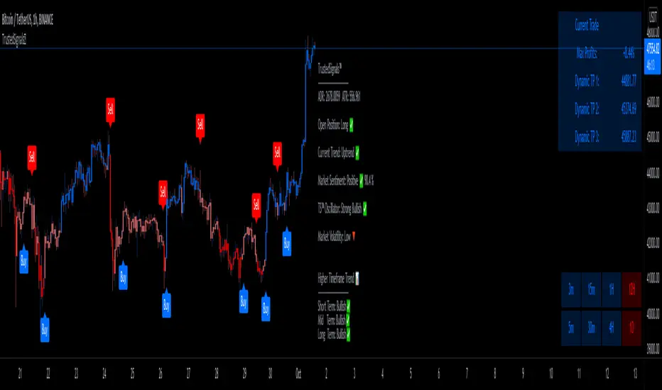
TrustedSignals™TrustedSignals Indicator includes standard Buy and Sell signals on the chart, Support & Resistance lines, Auto-Trendlines, AutoFibs and an All-in-One Market Dashboard.
(All these signals can be set up as Live Alerts directly in Tradingview)
The 2 main Input options for this algorithm are ' Reactivity ' and ' Depth '. By default, the indicator is added to your chart with the best settings we've found so far.
-The ' Reactivity ' controls how quickly the algorithm reacts to trend changes. The higher the reactivity, the fewer trades on the chart. If the Reactivity input is low, the algorithm will react more quickly, and show more frequent trades.
-The ' Depth ' controls the position of the signals relative to the trend swing. A lower Depth will allow for more frequent and earlier entries, while a higher Depth will give slower entries.
Our third (secondary) input is ' Trend Length ' (the Lookback of the ' Current Trend ' indicator). TrustedSignals™ is coloring the candles based on the current trend direction. The blue color shows an uptrend, while the red color shows a downtrend. Buy and Sell signals alerted while the current trend is showing pink (Sideways Market) should be taken carefully, as the market direction is not decided.
Since we believe in the idea of an ' All-in-One ' Indicator, we have included 3 more extremely useful and powerful trading tools.
-The first optional feature is the ' Support and Resistance ' lines. This feature can be activated to draw the key levels of Support and Resistance, easing your decision making and reinforcing the entry signals. Those levels can also be used as Stop Loss or Take Profit
-The second optional feature is the ' Auto-Trendlines '. This part of our amazing indicator automatically draws Trendlines based on the Lookback period the user inputs.
-The last and most important optional feature is the ' AutoFibs '. TrustedSignals™ will automatically draw Fibonacci Retracement levels from trend swing key points. (the lookback length can be adjusted by the user)
- Market Dashboard -
Within one simple panel on your chart, our Dashboard displays the most relevant data from all of our features in real-time.
Current Trend
(The bar color) is an indicator based on Murrey Math's lines. These lines are based on the idea that according to Gann, price moves in 1/8's that act as points of support and resistance. Given this 1/8 characteristic of price action, we assigned properties to each of the lines in a given octave, obtaining a perfect Trend Indicator shown by the candle color, ranging from red to orange to blue.
Market Sentiment
Market Sentiment is a zero lag, 'noise-free', custom improved version of the old 'Relative Strength Indicator ( RSI )' It measures trend velocity and momentum, while it charts the current and historical strength or weakness of the market. It is a much more accurate and vastly superior than the usual RSI.
Trusted Sginals Oscillator
TS Oscillator is our own branded indicator used to measure market momentum and determines whether bullish or bearish trend dominates the market. It measures the market momentum, with the aim to detect potential trend direction. Helping you to identify if the price is high or low in comparison to the recent price behavior.
Outputs: "Strong Bearish ", "Weak Bearish", "Strong Bullish ", "Weak Bullish"
Higher Timeframe Trend is a trend indicator based on our own non-repainting calculation of higher timeframe trend. It is based on a custom method that builds synthetic support and resistance lines from higher time, without repainting, while keeping the output extremely accurate.
Use the link below to obtain access to this indicator
[A618] Liquidity Tracker and Iceberg Detector V2 ProIntroduction
We all know markets and market makers work over liquidity concepts, Liquidity is what makes market cyclic and drives it!
The aim of this experimental Indicator is to identify the liquidation points and levels where the big players are actually playing.
When you’re trading financial markets, liquidity needs to be considered before every position is opened or closed. This is because a lack and increase of liquidity is often associated with increased risk.
You need to be able to put probabilities in your favour, understanding liquidity levels in the market is always a good to know thing for one to judge / estimate whether the market is behaving according to the analysis or not.
How Can you Get this Indicator
Just send me up a private message, (Please use comment box only for constructive comments, and community improvement)
What are icebergs
If you see the DOM data, you will see lots of orders on both side (buyers/sellers), Its just the tip of the iceberg that we are able to see in the order flow, the aim of the iceberg detection concept over here is to estimate when a large order is executed and in what direction.
What is the Use of Trendlines
Trendlines basic configuration is 50 back pivot levels, you can also configure it to 20, 10 depending on how fast you wanna track things
Use trendlines to detect the icebergs happening above and below it conjure it with your study.
Provision for Alerts
You can configure alerts over iceberg detection
Which market it will work and on what timeframes
This indicator will work for any liquid market,
Stocks, forex, Bitcoins etc
Since the order flow dynamics remains pretty much the same everywhere,
For efficient utilisation, use these timeframes
15s, 30s, 1 min, 3 min, 5 min, 15 min, 30 min, 1Hr

Trend LineBasic Trend Line base on fractals (v0.1)
Can not draw a line on the future X axis, So just a line segment but not a ray.
I don't have a better idea to upgrade...

Trend SniperThis is a leading indicator showing wave reversal points.
By drawing trendlines on this indicator you can quickly see a break of the trendline before the break on a price chart trendline.
Manually draw trendlines on the indicator to form an uptrend or downtrend.
A break down of the upward trendline gives a sell signal.
A break up of the downward trendline gives a buy signal.
Also included an extra timeframe (Blue Line) to give a bigger perspective from different timeframes. You can choose your own different timeframe that can be lower or higher than your current price chart timeframe.
For example: Place your chart on 1H and draw your trendlines on the indicator. Set the extra timeframe to 4H of 1D to see the overall trend and motion.
By using this indicator the way we suggest, you will be able to get good trend continuation signals

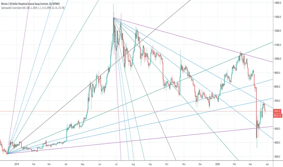
[astropark] I Love GannDear Followers,
yet another great tool! Gann was historically a great trader, who strictly followed his theory and died so rich!
Gann Fan is a great indicator: it draws a series of trendlines from important highs and lows in the chart and, as you will see from the chart itself, price action feels those trendlines, which acts as support and resistance !
Once a trendline is broken up, price tends to go upper to the next one, while the contrary happens when a trendline is broken down.
Here an example on BTCUSD:
Here an example on EURUSD:
This indicator
draws for you the Gann Fan, you don't need to do anything !
works on both cryptocurrencies, stocks and forex charts
works on every timeframe, but I suggest you to use it on high timeframes, where it's more reliable
lets you select the starting and the ending day-time from which and to which you want to see gann fans
lets you make trendlines be drawn dashed if you like, as well as you can edit their width
MKAST V2 (monthly)PLEASE READ THE ENTIRE POST BEFORE PURCHASING & USING THE MKAST Algorithm. Saves you and me some time in emails and messages. :)
This is the NEW MONTHLY ACCESS Version of the MKAST
The MKAST Buy Sell Algorithm is a very specific strategy, cut down to its roots and made perfect for the volatile crypto market.
Many Algorithms focus only on one aspect, one side, one specific rule.
As you know, this is not how life, the market or anything else works.
MKAST combines many different aspects at the same time, scans multiple other Algorithms and comes to a conclusion based on over 1350 lines of code.
It is based on Divergences, Elliott Waves , Ichimoku , MACD , MACD Histogram, RSI , Stoch , CCI , Momentum, OBV, DIOSC, VWMACD, CMF and multiple EMAs.
Every single aspect is weighted into the decision before giving out an indication.
Most buy/sell Algorithms FAIL because they try to apply the same strategy to every single chart, which
are as individual as humans.
To conquer this problem, MKAST has a wide range of settings and variables which can be easily
modified.
To make it a true strategy, MKAST has as well settings for Take Profit Points, Multiple Entries and Stop
Losses. Everything with an Alert Feature of course.
I know from experience that many people take one Algorithm and are simply too LAZY to add multiple Algorithms to make a rational choice.
The result of that is that they lose money, by following blatantly only one Algorithm.
MKAST has additional 9 Indicators, perfect for the crypto market, which can be turned on and off.
Manual
MKAST Signals Settings
“Show Signals?” - On/Off to show the Buy/Sell Signals.
“Aggressiveness” - Increase to make the signals less aggressive and decrease to make them more aggressive.
“Show Custom Signals?” - On/Off to show custom MKAST Signals as chosen in the settings below.
“Custom Buy/Sell Aggressiveness” - Choose a custom Aggressiveness for each buy and sell signal individually.
“TJ-Index Requirement For Buy/Sell” - If the TJ-Index is below the given number, it will show the signal in grey, this also applies for normal signals. Buy 0 and Sell 15 shows all signals in their original colour again.
“Don’t show signals that don’t meet index requirement?” - Checked, it will completely not show signals which would be “grey” as in the explanation above.
“Change Backgroundcolour if index is at 15 or 0?” - Checked, changes the colour of the chart if the index is at 15 or 0 points
MKAST Panel Settings
“Show Info Panel?” - Shows Info Panel on the chart.
“Move Info Panel UP by %” - Moves Info Panel up/down.
“Move Info Panel Left/Right ” - Moves Info Panel Left/Right.
“Show BitMEX Panel?” - Shows BitMEX Panel on the chart.
“Move BitMEX Panel by % ” - Moves BitMEX Panel up/down.
“Move BitMEX Panel Left/Right” - Moves BitMEX Panel Left/Right. “Signal Source” - Choose source of candle open/close for Equity calculation.
“Leverage Used?” - Select the used Leverage for your strategy and Equity calculation.
“Fees Per Trade in % ” - Deducts these fees after each trade from Equity calculation.
“Round Current Profit Price?” - Rounds the number on the Panel. “Trading Periods ” - Choose a trading Period which will be used to calculate Period Equity.
“Show separations of each Trading Period?” - Show separations on the chart of each Trading Period.
The very new feature on Tradingview and obviously now as well on MKAST are Information Panels.
I have chosen to add an Info Panel and a BitMEX Price Panel into MKAST, to make live and even
backtesting easier.
With only one blink of an eye the user is able to see ALL relevant information, without having to go
through various ways of checking and using other tools.
The Info Panel:
The first row shows the current profit. This is calculated since the signal initiation and the current candle close. Followed by a single number, which represents the current TJ-Index, removing the need of having to add the actual TJ-Index Oscillator on the chart.
The second row shows the current position and its status. This was added on request of many users wanting to know if their position is “about to change” or not. The status shows the users if the position is “endangered” or “okay”.
Followed by the “backtesting tool” already included inside the Panel. No need for complex oscillators with a hard reading for backtesting. With this one and simple panel, you see the Period Equity for the period chosen previously in the settings. This calculates all profits made inside that period and re-sets when the period ends. Right next to it, the Total Equity calculating ALL profits since the beginning of the chart.
Right below, you see the information about the last long and short position which have been open. This helps with the evaluation and documentation of the last trade.
The BitMEX Panel:
A convenient panel which shows all BitMEX contracts and their LIVE prices. The need for opening each chart goes away, the quality and experience of trading increases.
MKAST custom Signals are one of the notorious possibilities for ADVANCED strategies with MKAST.
Users who requested these features and use them frequently are the ones, having already a very unique trading strategy and they use these very custom signals as confluence or for multiple entry trades.
These custom signals and their settings can be mostly ignored by the majority of traders who are using this Algorithm.
The idea behind the grey signals has its roots in the idea of the TJ-Index. The TJ-Index being 15 Algorithms and conditions possible showing a bullish or bearish interpretation. The index counts the Algorithms which are showing a bullish interpretation.
Like that we can make sure that signals are shown in the original colour, are only those who have an additional confluence with the TJ-Index, not letting the user buy, if at least the majority is not bullish , and not letting the user sell, if at least the majority is bearish .
The custom buy and sell aggressiveness lets the user customise the MKAST algorithm even more.
Either the users wants to see how signals are changing on a different (slightly lower or higher) aggressiveness, being able to expect a change on their own settings. OR seeing that some signals of the same sort are a little out of place and is able to move these to a different aggressiveness, increasing the profitability even more.
Needless to say, custom signals are NOT a part of the Info Panel.
MKAST Label & Trendline Settings
“Show Labels?” - On/Off to show Labels above each signal, with the percentage gain or loss, calculated from the last signal to the new signal.
“Show Trendlines?” - On/Off to show automatic Trendlines following Gainzy Lines.
“Lookback Length” - Choose a length that the automatic trendiness use for calculation. Comparable to Aggressiveness.
“Wicks//Bodies” - Change between trendiness connecting from wick to wick or from body to body.
“Black lines// Coloured lines” - Change between simply black lines or changing colour lines.
“Filter Trendlines?” - On/Off to show all trendiness or just resistance decreasing and support increasing ones.
“Limit Extensions Of The Lines?” - This value increases by how much the trendiness are being extended. 0 = endless extension, otherwise 100 = maximum custom extension.MKAST Strategy “Take Profit 1” - On/Off to show TP1 points.
“Take Profit After %” - Set the percentage after which TP1 is active.
“Take Profit 2 ” - On/Off to show TP2 points.
“Take Profit 2 After %” - Set the percentage after which TP1 is
active.
“Take Profit 3” - On/Off to show TP3 points.
“Take Profit 3 After %” - Set the percentage after which TP1 is active.
“Second Entry” - On/Off to show Second Entry points.
“Second Entry After %” - Set the percentage after which Second Entry is active.
“Third Entry” - On/Off to show Third Entry points.
“Third Entry After %” - Set the percentage after which Third Entry is active.
“Stop Loss” - On/Off to show Stop Loss points.
“Stop Loss After %” - Set the percentage after which Stop Loss is active.
MKAST Strategy
To make the life of the MKAST user even easier, I have added all adjustable Take Profit Points, Multiple entry points and Stop Loss points.
I have never seen a sustainable and reliable trading strategy without TPs, Multiple entry and especially without a stop loss. Everything in the usual and fully customisable MKAST style.
Simply choose how many Take Profit points you would like to have and choose the percentage after which you would like to see the Take Profit point appear on the chart and notify you to take profits.
Are you a Trader who likes Multiple Entries? Also no problem with MKAST. Select how many additional entries you would like to have and after how many percent you would like them to appear on the chart and remind you of adding to the position.
What would a Strategy be without a Stop Loss? Same settings apply here as on the TPs and MEs .
All of the settings are able to take fractions of a number as well. This enables users to even use all of the strategy settings for scalping or FX pairs, where high leverage and the smallest of moves are used for trading.
Needless to say, all of these settings work on RENKO and Heikin Ashi as well. These might need adjustment, since the calculation is different, yet there is nothing standing in the way of it anymore.
Crypto Modified Indicators
“Show Divergences?” - On/Off to show Divergences on the Chart based on the data of 10 different Algorithms.
“Show Oversold/bought?” - On/Off to change the colour of the chart in Oversold/bought conditions.
“Oversold/bought value?” - Choose a value for which the chart is Oversold/bought.
“Show Fibonacci Levels?” - On/Off to show automatic Fibonacci Levels.
“Fibonacci Lookback Lenght” - This value states how many candles from right now are taken into account to paint the Fibonacci Levels.
“Fibonacci Custom Period” - Choose a custom Timeframe that should be used to paint the Fibonacci Levels.
“2nd-7th Fibonacci Level” - Enter a value for the Fibonacci Levels you would like to use and see on the chart.
“Plot 1.618 Level?” - On/Off for the Fibonacci extension level.
Crypto Modified Indicators
“Show Bands?” - On/Off to show the TJ-Bands on the chart.
“Bands Length” - Choose a value for the TJ-Bands Lenght
“Show Show EMA 1-3?” - On/Off to show the EMAs 1-3 on the chart.
“EMA Lenght 1-3” - Choose a value for the first to third EMA Lenght
“Show Ichimoku? ” - On/Off to show Ichimoku on the chart.
“Show Tenkin?” - On/Off to show Tenkin on the chart. “Tenkin” - Set the lenght of the Tenkin.
“Show Kijun?” - On/Off to show Kijun on the chart.
“Kijun” - Set the lenght of the Kijun.
“Show Senkou?” - On/Off to show the Senkou on the chart. “Senkou” - Set the lenght of the Senkou.
“Displacement” - Set the value of the Displacement.
“Show Chikou Span?” - On/Off to show the Chikou Span on the chart.
Crypto Custom Indicators
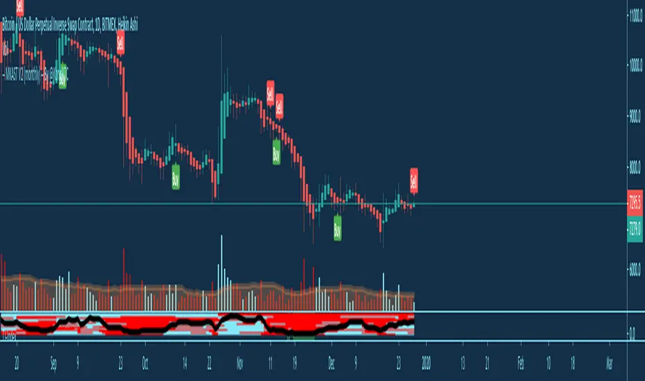
In the picture above, you see the first pair of Crypto Custom Indicators. The oversold and overbought conditions are highlighted.
Bullish and Bearish divergences are also plotted on the chart.
This is personally my favourite combination of Indicators and MKAST settings. It shows nicely
everything one needs to know and makes it easier to decide wether to follow a signal or not.
We here as well a perfect example of the Automatic Fibonacci Lines (Lookback 50, Timeframe 1D).
It shows all significant levels, which we can see being respected.
Orange = 23.6%, Green = 38.2%, Red = 50%, Yellow = 61.8%, Blue = 78.6%, White = 0%;100%
In this picture above, we observe the perfect ensemble of MKAST and an EMA strategy, especially modified for crypto markets.
Here, as by default, we have the EMAs at 21, 90 and 200. These have shown to be very significant moving support and resistance points in the crypto market.
In this picture above, I lowered the timeframe to show the highly significant levels of the Ichimoku . It has not the “usual values”. These here have been modified for the volatile crypto market and set as default.
An incredibly powerful tool for anyone who is ready to step up their trading game. It is a huge part of the MKAST back end and the strategy behind it.
MKAST Custom Alerts
1
MKAST without any doubt has Custom Alerts for all Signals that it is painting on the chart.
One can even choose to receive custom notifications for Take Profit points, Multiple Entry points and
the Stop Loss points.
The signals appear on the chart DURING the candle, not at the end of the candle. Therefore, the
alerts do this as well. These appear during the candle.
Here we can see all of the possible Alerts that can be chosen to be displayed. In total it is 14 different custom alerts, based on what the trader is looking for and how he is trading.
Personally, I have 10-15 coins that I trade the most and for these I have custom notifications, mostly though only the MKAST Buy/Sell and Stop Loss Signals.
To activate Alerts for MKAST,
1) Go to the “ALERT” icon on the top tool bar of your Tradingview.
2) Select “CONDITION” as “—MKAST—“
3) Then choose ONE condition from the list of conditions.
4) On “OPTIONS” you can set how many times it appears, I have “Once per Bar”.
4.1) If you want to make sure that the signal is truly there and not just a condition for a second during the candle, choose “ONCE PER BAR CLOSE”.
5) “Expiration Time” sets the time until the alert expires. PRO users have no expiration for alerts.
6) “Alert Actions” give you a row of choices what happens and how you want to be notified.
7) “Message” is the message that you receive inside the notification.
Thank you, Kong
MKAST V2 (lifetime)PLEASE READ THE ENTIRE POST BEFORE PURCHASING & USING THE MKAST Algorithm. Saves you and me some time in emails and messages. :)
This is the NEW LIFETIME ACCESS Version of the MKAST
The MKAST Buy Sell Algorithm is a very specific strategy, cut down to its roots and made perfect for the volatile crypto market.
Many Algorithms focus only on one aspect, one side, one specific rule.
As you know, this is not how life, the market or anything else works.
MKAST combines many different aspects at the same time, scans multiple other Algorithms and comes to a conclusion based on over 1350 lines of code.
It is based on Divergences, Elliott Waves, Ichimoku, MACD, MACD Histogram, RSI, Stoch, CCI, Momentum, OBV, DIOSC, VWMACD, CMF and multiple EMAs.
Every single aspect is weighted into the decision before giving out an indication.
Most buy/sell Algorithms FAIL because they try to apply the same strategy to every single chart, which
are as individual as humans.
To conquer this problem, MKAST has a wide range of settings and variables which can be easily
modified.
To make it a true strategy, MKAST has as well settings for Take Profit Points, Multiple Entries and Stop
Losses. Everything with an Alert Feature of course.
I know from experience that many people take one Algorithm and are simply too LAZY to add multiple Algorithms to make a rational choice.
The result of that is that they lose money, by following blatantly only one Algorithm.
MKAST has additional 9 Indicators, perfect for the crypto market, which can be turned on and off.
Manual
MKAST Signals Settings
“Show Signals?” - On/Off to show the Buy/Sell Signals.
“Aggressiveness” - Increase to make the signals less aggressive and decrease to make them more aggressive.
“Show Custom Signals?” - On/Off to show custom MKAST Signals as chosen in the settings below.
“Custom Buy/Sell Aggressiveness” - Choose a custom Aggressiveness for each buy and sell signal individually.
“TJ-Index Requirement For Buy/Sell” - If the TJ-Index is below the given number, it will show the signal in grey, this also applies for normal signals. Buy 0 and Sell 15 shows all signals in their original colour again.
“Don’t show signals that don’t meet index requirement?” - Checked, it will completely not show signals which would be “grey” as in the explanation above.
“Change Backgroundcolour if index is at 15 or 0?” - Checked, changes the colour of the chart if the index is at 15 or 0 points
MKAST Panel Settings
“Show Info Panel?” - Shows Info Panel on the chart.
“Move Info Panel UP by %” - Moves Info Panel up/down.
“Move Info Panel Left/Right ” - Moves Info Panel Left/Right.
“Show BitMEX Panel?” - Shows BitMEX Panel on the chart.
“Move BitMEX Panel by % ” - Moves BitMEX Panel up/down.
“Move BitMEX Panel Left/Right” - Moves BitMEX Panel Left/Right. “Signal Source” - Choose source of candle open/close for Equity calculation.
“Leverage Used?” - Select the used Leverage for your strategy and Equity calculation.
“Fees Per Trade in % ” - Deducts these fees after each trade from Equity calculation.
“Round Current Profit Price?” - Rounds the number on the Panel. “Trading Periods ” - Choose a trading Period which will be used to calculate Period Equity.
“Show separations of each Trading Period?” - Show separations on the chart of each Trading Period.
The very new feature on Tradingview and obviously now as well on MKAST are Information Panels.
I have chosen to add an Info Panel and a BitMEX Price Panel into MKAST, to make live and even
backtesting easier.
With only one blink of an eye the user is able to see ALL relevant information, without having to go
through various ways of checking and using other tools.
The Info Panel:
The first row shows the current profit. This is calculated since the signal initiation and the current candle close. Followed by a single number, which represents the current TJ-Index, removing the need of having to add the actual TJ-Index Oscillator on the chart.
The second row shows the current position and its status. This was added on request of many users wanting to know if their position is “about to change” or not. The status shows the users if the position is “endangered” or “okay”.
Followed by the “backtesting tool” already included inside the Panel. No need for complex oscillators with a hard reading for backtesting. With this one and simple panel, you see the Period Equity for the period chosen previously in the settings. This calculates all profits made inside that period and re-sets when the period ends. Right next to it, the Total Equity calculating ALL profits since the beginning of the chart.
Right below, you see the information about the last long and short position which have been open. This helps with the evaluation and documentation of the last trade.
The BitMEX Panel:
A convenient panel which shows all BitMEX contracts and their LIVE prices. The need for opening each chart goes away, the quality and experience of trading increases.
MKAST custom Signals are one of the notorious possibilities for ADVANCED strategies with MKAST.
Users who requested these features and use them frequently are the ones, having already a very unique trading strategy and they use these very custom signals as confluence or for multiple entry trades.
These custom signals and their settings can be mostly ignored by the majority of traders who are using this Algorithm.
The idea behind the grey signals has its roots in the idea of the TJ-Index. The TJ-Index being 15 Algorithms and conditions possible showing a bullish or bearish interpretation. The index counts the Algorithms which are showing a bullish interpretation.
Like that we can make sure that signals are shown in the original colour, are only those who have an additional confluence with the TJ-Index, not letting the user buy, if at least the majority is not bullish, and not letting the user sell, if at least the majority is bearish.
The custom buy and sell aggressiveness lets the user customise the MKAST algorithm even more.
Either the users wants to see how signals are changing on a different (slightly lower or higher) aggressiveness, being able to expect a change on their own settings. OR seeing that some signals of the same sort are a little out of place and is able to move these to a different aggressiveness, increasing the profitability even more.
Needless to say, custom signals are NOT a part of the Info Panel.
MKAST Label & Trendline Settings
“Show Labels?” - On/Off to show Labels above each signal, with the percentage gain or loss, calculated from the last signal to the new signal.
“Show Trendlines?” - On/Off to show automatic Trendlines following Gainzy Lines.
“Lookback Length” - Choose a length that the automatic trendiness use for calculation. Comparable to Aggressiveness.
“Wicks//Bodies” - Change between trendiness connecting from wick to wick or from body to body.
“Black lines// Coloured lines” - Change between simply black lines or changing colour lines.
“Filter Trendlines?” - On/Off to show all trendiness or just resistance decreasing and support increasing ones.
“Limit Extensions Of The Lines?” - This value increases by how much the trendiness are being extended. 0 = endless extension, otherwise 100 = maximum custom extension.MKAST Strategy “Take Profit 1” - On/Off to show TP1 points.
“Take Profit After %” - Set the percentage after which TP1 is active.
“Take Profit 2 ” - On/Off to show TP2 points.
“Take Profit 2 After %” - Set the percentage after which TP1 is
active.
“Take Profit 3” - On/Off to show TP3 points.
“Take Profit 3 After %” - Set the percentage after which TP1 is active.
“Second Entry” - On/Off to show Second Entry points.
“Second Entry After %” - Set the percentage after which Second Entry is active.
“Third Entry” - On/Off to show Third Entry points.
“Third Entry After %” - Set the percentage after which Third Entry is active.
“Stop Loss” - On/Off to show Stop Loss points.
“Stop Loss After %” - Set the percentage after which Stop Loss is active.
MKAST Strategy
To make the life of the MKAST user even easier, I have added all adjustable Take Profit Points, Multiple entry points and Stop Loss points.
I have never seen a sustainable and reliable trading strategy without TPs, Multiple entry and especially without a stop loss. Everything in the usual and fully customisable MKAST style.
Simply choose how many Take Profit points you would like to have and choose the percentage after which you would like to see the Take Profit point appear on the chart and notify you to take profits.
Are you a Trader who likes Multiple Entries? Also no problem with MKAST. Select how many additional entries you would like to have and after how many percent you would like them to appear on the chart and remind you of adding to the position.
What would a Strategy be without a Stop Loss? Same settings apply here as on the TPs and MEs.
All of the settings are able to take fractions of a number as well. This enables users to even use all of the strategy settings for scalping or FX pairs, where high leverage and the smallest of moves are used for trading.
Needless to say, all of these settings work on RENKO and Heikin Ashi as well. These might need adjustment, since the calculation is different, yet there is nothing standing in the way of it anymore.
Crypto Modified Indicators
“Show Divergences?” - On/Off to show Divergences on the Chart based on the data of 10 different Algorithms.
“Show Oversold/bought?” - On/Off to change the colour of the chart in Oversold/bought conditions.
“Oversold/bought value?” - Choose a value for which the chart is Oversold/bought.
“Show Fibonacci Levels?” - On/Off to show automatic Fibonacci Levels.
“Fibonacci Lookback Lenght” - This value states how many candles from right now are taken into account to paint the Fibonacci Levels.
“Fibonacci Custom Period” - Choose a custom Timeframe that should be used to paint the Fibonacci Levels.
“2nd-7th Fibonacci Level” - Enter a value for the Fibonacci Levels you would like to use and see on the chart.
“Plot 1.618 Level?” - On/Off for the Fibonacci extension level.
Crypto Modified Indicators
“Show Bands?” - On/Off to show the TJ-Bands on the chart.
“Bands Length” - Choose a value for the TJ-Bands Lenght
“Show Show EMA 1-3?” - On/Off to show the EMAs 1-3 on the chart.
“EMA Lenght 1-3” - Choose a value for the first to third EMA Lenght
“Show Ichimoku? ” - On/Off to show Ichimoku on the chart.
“Show Tenkin?” - On/Off to show Tenkin on the chart. “Tenkin” - Set the lenght of the Tenkin.
“Show Kijun?” - On/Off to show Kijun on the chart.
“Kijun” - Set the lenght of the Kijun.
“Show Senkou?” - On/Off to show the Senkou on the chart. “Senkou” - Set the lenght of the Senkou.
“Displacement” - Set the value of the Displacement.
“Show Chikou Span?” - On/Off to show the Chikou Span on the chart.
Crypto Custom Indicators
In the picture above, you see the first pair of Crypto Custom Indicators. The oversold and overbought conditions are highlighted.
Bullish and Bearish divergences are also plotted on the chart.
This is personally my favourite combination of Indicators and MKAST settings. It shows nicely
everything one needs to know and makes it easier to decide wether to follow a signal or not.
We here as well a perfect example of the Automatic Fibonacci Lines (Lookback 50, Timeframe 1D).
It shows all significant levels, which we can see being respected.
Orange = 23.6%, Green = 38.2%, Red = 50%, Yellow = 61.8%, Blue = 78.6%, White = 0%;100%
In this picture above, we observe the perfect ensemble of MKAST and an EMA strategy, especially modified for crypto markets.
Here, as by default, we have the EMAs at 21, 90 and 200. These have shown to be very significant moving support and resistance points in the crypto market.
In this picture above, I lowered the timeframe to show the highly significant levels of the Ichimoku. It has not the “usual values”. These here have been modified for the volatile crypto market and set as default.
An incredibly powerful tool for anyone who is ready to step up their trading game. It is a huge part of the MKAST back end and the strategy behind it.
MKAST Custom Alerts
1
MKAST without any doubt has Custom Alerts for all Signals that it is painting on the chart.
One can even choose to receive custom notifications for Take Profit points, Multiple Entry points and
the Stop Loss points.
The signals appear on the chart DURING the candle, not at the end of the candle. Therefore, the
alerts do this as well. These appear during the candle.
Here we can see all of the possible Alerts that can be chosen to be displayed. In total it is 14 different custom alerts, based on what the trader is looking for and how he is trading.
Personally, I have 10-15 coins that I trade the most and for these I have custom notifications, mostly though only the MKAST Buy/Sell and Stop Loss Signals.
To activate Alerts for MKAST,
1) Go to the “ALERT” icon on the top tool bar of your Tradingview.
2) Select “CONDITION” as “—MKAST—“
3) Then choose ONE condition from the list of conditions.
4) On “OPTIONS” you can set how many times it appears, I have “Once per Bar”.
4.1) If you want to make sure that the signal is truly there and not just a condition for a second during the candle, choose “ONCE PER BAR CLOSE”.
5) “Expiration Time” sets the time until the alert expires. PRO users have no expiration for alerts.
6) “Alert Actions” give you a row of choices what happens and how you want to be notified.
7) “Message” is the message that you receive inside the notification.
Thank you, Kong

Auto Trend Lines [Anan]Hello Friends..
This is Auto Trend Lines, A script that draws trendlines from the pivot points in the price chart,,
So helpful and smart !
Play with the options to adjust the precision.
This is my simple edition from " Trendlines - JD "

NIBIRU SUPPORT AND RESISTANCEThe Nibiru Support and Resistance Indicator is set of visual tools providing better trading experience. It is based on the classics of trading: horizontal trend lines and moving averages. It's main feature are automated support and resistance lines defining the main trading range and market structure, making it a superior tool to trade based on horizontal trend lines .
The set of moving averages along with entry and stop loss levels allows for easier risk management with trending strategies.
What does it plot?
Automatic horizontal support and resistance levels
Main and local trading ranges
Four moving averages with adjustable types and periods
Entry and stop-loss level hints for trending strategy
Pivot points based on candle patterns
London, New York and Tokyo trading sessions indication based on exchange time
Visual indication of current trend strength
Indicator components:
Horizontal trendlines
Main trading range – dictating general price structure
Local trading range – indicating current trading cluster
Fibonacci trendlines – Fibonacci based trendlines dividing main trading range into tradeable support and resistance lines
Fibonacci extensions of main trading range – for price trending out of main range it gives potential take profit levels by extending the range by selected Fibonacci ratio
Moving Averages
MA 1 – fastest moving average for trending strategy entries. In addition this moving average provides color based information on current short term trend:
Green – uptrend
Red – downtrend
Gray - indecision
MA 2 – slower moving average for trending strategy risk management
MA 3 and MA 4 – main trend change and support/resistance zone
Entry/Stop Loss hints
Entry dots – early entry for moving average trending strategy
Stop Loss (SL) dots – safe SL levels providing at least 1:2 RR setups at entry point
Pivot Points (beta) - Hints of potential short term trend reversals based on candle setups and patterns. Early beta, currently in testing–improvements and more patterns to be added.
Sessions - Indicating main trading sessions. This is a very important tool for trading traditional and OTC markets like forex. Knowing when money comes in and out of the market during the trading-day is crucial, because liquidity and volatility is the bread and butter for a consistently profitable trader. Due to limitations, this indicator is based on the exchange time zone. In the near future we will add a time offset option to fine tune to the time zone of the exchange you are trading on. Sessions are visible on all time frames below 4H.
The Nibiru Support and Resistance Indicator works on all assets that provide trading volume and all time frames.
Use the link below or PM me to gain access to the indicator.

Noro's SILA v1.2Noro's SILA v1.2 - these are 5 trend indicators in 1, for the sake of better accuracy.
Added:
1) Settings
2) Arrows
Noro's SILA v1.2 uses 5 trend indicators:
1) SuperTrend
2) DI Plus-Minus
3) WOW trend indicator (my idea)
4) BarColor indicator (my idea)
5) BestMA (or "BMA") indicator (my idea)
The user can switch-off any indicator from 5 to achieve big accuracy.
How does it work?
Each indicator from 5 defines a trend in own way. If two indicators report that there will be a uptrend, and three others the indicator report that there will be a downtrend - it is downtrend (a red background).
For an example
Now SuperTrend = uptrend = +1
Now DI Plus-Minus = downtrend = -1
Now WOW trend indicator = downtrend = -1
Now BarColor indicator = downtrend = -1
Now BestMA (or "BMA") indicator = uptrend = +1
Sum = + 1 - 1 - 1 - 1 + 1 = -1 = downtrend
If sum > 0 = uptrend
Sensivity
The user himself chooses what there will be a sensitivity (in settings).
If sensivity = 3:
sum > or = 3 - uptrend
sum < or = -3 - downtrend
sum > -3 and < 3 - NA-color of background
Trendlines
3 lower trendlines (blue plots) is "sum+3"
5 upper trendlines is "sum-5"
etc
Settings:
1) sensivity - you see above
2) distance - distance between the price and lines (for convenience)

HIT Trend & CrossoverThis indicator displays the trend of a declining stock using two yellow trendlines, and when a trend reversal occurs, it marks the buy price with a green trendline and the stop-loss price with a red trendline.
Investors can use these four trendlines as a reference to generate their own profits.

Red-E Market StructureRed-E Market Structure
📊 Overview
Red-E Market Structure is a comprehensive technical analysis tool that combines automated pivot detection, market structure analysis, volume delta tracking, and intelligent buy/sell signals into one powerful indicator. This script was created with the community in mind - we don't believe in gatekeeping tools that help traders succeed together.
🎯 What This Indicator Does
1. Intelligent Candle Coloring System
Royal Blue Candles: Strong bullish signals with high conviction
Baby Blue Candles: Moderate bullish signals for cautious entries
White Candles: Neutral market conditions
Orange Candles: Moderate bearish signals indicating potential weakness
Red Candles: Strong bearish signals with high conviction
2. Automated Pivot Point Detection
Automatically identifies and marks significant pivot highs and lows on your chart, helping you recognize key reversal zones and support/resistance levels without manual drawing.
3. Market Structure Analysis
Tracks and labels critical market structure patterns:
Higher Highs (HH): Bullish trend continuation
Higher Lows (HL): Bullish trend confirmation
Lower Highs (LH): Bearish trend formation
Lower Lows (LL): Bearish trend continuation
4. Automated Trendline Drawing
Connects pivot points with color-coded dashed trendlines (green for bullish, red for bearish), helping visualize trend direction and potential breakout zones.
5. Dynamic Buy/Sell Signals
Generates clear entry signals based on multiple factors including RSI, price vs moving average, and momentum analysis:
"STRONG BUY" labels for high-conviction long entries
"BUY" labels for moderate bullish opportunities
"SELL" labels for moderate bearish signals
"STRONG SELL" labels for high-conviction short entries
6. Real-Time Dashboard
A comprehensive dashboard displays:
Current signal status (Buy/Sell/Neutral)
Active market structure pattern
RSI value with color-coded zones
Volume Delta (cumulative buying vs selling pressure)
Bullish Dominance percentage
Bearish Dominance percentage
Price position relative to moving average
🔧 How to Use
Installation
Copy the Pine Script code
Open TradingView and navigate to the Pine Editor
Paste the code and click "Add to Chart"
Basic Setup
For Swing Trading:
Pivot Length: 7-10
RSI Length: 14
MA Length: 50
For Day Trading:
Pivot Length: 3-5
RSI Length: 14
MA Length: 20
For Scalping:
Pivot Length: 2-3
RSI Length: 7
MA Length: 9
Reading the Signals
Entry Signals:
Look for STRONG BUY labels combined with royal blue candles and Higher Lows for long entries
Look for STRONG SELL labels combined with red candles and Lower Highs for short entries
Confirm entries when volume dominance aligns with your direction (>55%)
Trend Confirmation:
Use the market structure labels to confirm trend direction
Higher Highs + Higher Lows = Uptrend intact
Lower Highs + Lower Lows = Downtrend intact
Exit Signals:
Exit longs when you see Lower Highs forming or orange/red candles appearing
Exit shorts when you see Higher Lows forming or blue candles appearing
Watch for trendline breaks as potential reversal signals
Volume Analysis:
Volume Delta above zero = Net buying pressure
Volume Delta below zero = Net selling pressure
Bullish Dominance >55% = Strong buying interest
Bearish Dominance >55% = Strong selling pressure
Dashboard Interpretation
RSI >70: Overbought - watch for reversals
RSI <30: Oversold - potential bounce zone
Price vs MA: Shows strength relative to trend (positive = above MA, negative = below MA)
💡 Why This Indicator Is Original
Red-E Market Structure is unique because it synthesizes multiple advanced concepts into a single, cohesive system:
Multi-Factor Signal Generation: Unlike single-indicator systems, this combines RSI, moving averages, volume analysis, and market structure into weighted signals
Adaptive Candle Coloring: The five-tier color system provides instant visual feedback on market conditions
Integrated Volume Delta: Real-time cumulative volume tracking shows institutional pressure
Automated Market Structure: Removes subjectivity by automatically identifying and labeling swing points
Comprehensive Dashboard: All critical metrics in one place for faster decision-making
🤝 Our Philosophy
We believe in empowering the trading community, not gatekeeping valuable tools. This indicator is shared freely because we all win when we share knowledge. Trading is challenging enough without artificial barriers to information and tools.
If this indicator helps your trading, pay it forward by helping other traders in your community. Success is more meaningful when it's shared.
⚙️ Customization Options
All settings are adjustable in the indicator settings panel:
Pivot Length: Sensitivity of pivot detection
RSI Parameters: Overbought/oversold levels
MA Length: Trend reference period
Dashboard Position: Top/Bottom, Left/Right placement
Toggle Features: Show/hide pivots, trendlines, or dashboard
⚠️ Disclaimer
This indicator is a technical analysis tool designed to assist in market analysis. It is not financial advice and should not be used as the sole basis for trading decisions. Always:
Use proper risk management
Combine with your own analysis
Practice on a demo account first
Never risk more than you can afford to lose
Consider multiple timeframes and confirmations
📈 Best Practices
Use Multiple Timeframes: Confirm signals on higher timeframes
Wait for Confirmation: Don't chase - wait for the signal and candle color to align
Respect Risk Management: Use stop losses below pivot lows (long) or above pivot highs (short)
Context Matters: Consider overall market conditions and major support/resistance zones
Volume Confirms: Stronger signals when volume dominance aligns with direction
🔄 Updates and Support
This script is provided as-is for the trading community. Feel free to modify and adapt it to your trading style. Share improvements with the community to help everyone succeed!
Remember: No indicator is perfect. This tool is designed to give you an edge, but successful trading requires discipline, risk management, and continuous learning. Trade responsibly and may your risk be ever in your favor! 📊✨

Kyle凯尔ATR精控引擎2.0What this indicator does
Blends Heikin Ashi smoothing with a Supertrend-style engine and an EMA filter to generate directional flips (Buy/Sell).
Auto-draws Supply/Demand zones with POI (point of interest) and marks BOS (Break of Structure).
Prints ATR-based Entry, Stop Loss, and TP1/TP2/TP3 levels; includes alerts.
Shows two dashboards: trend & momentum panel (top-right) and liquidity snapshot (bottom-right).
Adds auto trendlines and multi-timeframe horizontal S/R for context.
Quick start
Add the indicator to any symbol/timeframe.
Act on a fresh flip:
Long when direction flips Up and price is above EMA.
Short when direction flips Down and price is below EMA.
Look for confluence: reaction at Demand/Supply, BOS, trendline break, horizontal S/R, ADX > 20, supportive RSI and volume.
Manage risk with the ATR targets. Scale at TP1/TP2, let TP3 run (targets can “roll” after TP3 to rid trends).
Set alerts once per bar close for reliability.
How signals are formed
Heikin Ashi reduces noise by averaging price; ATR bands around HA price form two rails.
Direction flips when HA price crosses the opposite rail; EMA filter blocks counter-trend flips.
Buy/Sell signals are only valid on the bar close.
Supply/Demand, POI & BOS
Swing pivots create Supply (red) above and Demand (green) below; each zone shows a POI mdline.
When price breaks a zone boundary, the script stamps BOS at the midline and retires the old zone.
ATR risk targets
On a fresh signal, the tool snapshots Entry, then computes SL and TP1/2/3 as ATR multiples.
When TP3 hits, the module rolls targets from the new price to help ride sustained trends.
Optional on-chart lines + labels show Entry/SL/TPs.
Dashboards (how to read)
Top-right panel:
Direction (Up/Down/Neutral)
Momentum (close vs close 10 bars ago)
RSI(2) smoothed by 7: oversold/overbought cues + value
Volume bias: OBV minus its EMA (>0 = bullish)
ADX: >20 suggests stronger trend conditions
Multi-TF direction: 1m/5m/15m/1h/4h/D; more agreement = stronger setups
Bottom-right panel (“Liquidity”):
HA bias & intensity %, relative volume vs 20-SMA, and ATR.
Overlays
Trendlines auto-connect short/long window extremes; alerts on breaks.
Multi-TF S/R draws recent pivot highs/lows across selected TFs with de-overlapped labels.
Inputs to tune (common)
ATR Period / Multiplier: higher = smoother, fewer flips.
EMA Period: higher = stricter trend filter.
Supply/Demand: pivot sensitivity (swing_length), zone depth (box_width), number of zones to keep.
Risk/Targets: slMultiplier, tp1/2/3Multiplier (in ATRs), line/label toggles, colors.
Dashboards/Overlays: enable, position, size, S/R TFs, label spacing.
Suggested starting points (XAUUSD, intraday)
ATR(14), ATR Mult 1.3–1.6, EMA 9–21.
Risk: SL = 1.0–1.2 ATR; TPs at 1/2/3 ATR.
S/D: swing_length 8–12, box_width ~2–3.
Adjust per instrument and timeframe.
Example playbooks
Trend continuation: Fresh Buy (Up + above EMA) + pullback into Demand or near the midline; ADX > 20 preferred; scale at TP1/TP2, let TP3 run.
BOS retest: After BOS, trade the first retest into the broken area/POI in alignment with higher-TF direction; confirm with volume bias.
Breakout: Combine trendline break + Buy/Sell flip + S/R breach. Avoid low-liquidity hours.
Alerts included
Buy signal / Sell signal
Trendline break (Up/Down)
TP1/TP2/TP3 reached
Use “Once per bar close”.

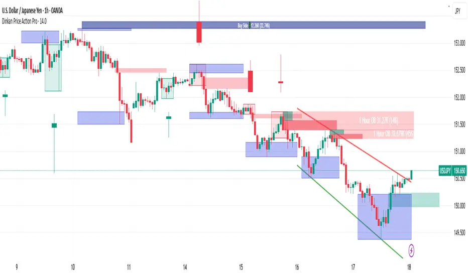
Dinkan Price Action Pro | Pure Price Action Toolkit🔸 Overview
Dinkan Price Action Pro is a pure price-action research toolkit that automatically detects and visualizes Order Blocks (OB), Fair Value Gaps (FVG), merged-candle hidden structures, liquidity zones (including HTF bias liquidity), and trendline & chart-pattern liquidity.
This indicator helps traders align with the Higher Time Frame (HTF) bias — the direction of the dominant institutional wave — and uncover hidden candlestick structures that normal timeframe charts never show.
⚙️ Core Features
✅ Automatic Order Block detection (bullish & bearish)
✅ Fair Value Gaps with real-time fill tracking
✅ Merged-Candle Engine — reveals hidden structures between standard timeframes
✅ Liquidity Zones — equal highs/lows, trendline liquidity & HTF liquidity pools
✅ HTF Bias Engine — detect directional bias across multiple timeframes
✅ Auto Trendlines & Chart Pattern Liquidity
🔍 How It Works (Step by Step)
🕯️ A. Merged Candle Engine (Hidden Structure)
1️⃣ Choose how many candles to merge (e.g., 3–5).
2️⃣ The script groups candles backward from the current bar in continuous sets.
3️⃣ Each merged candle forms using:
• Open = first candle’s open • Close = last candle’s close
• High = highest high • Low = lowest low
4️⃣ These new candles expose “hidden” structures between fixed timeframes — revealing true base-impulse patterns missed by normal charts.
🟩 B. Order Block Detection
Detects consolidation (base) followed by strong impulse.
Marks demand (green) and supply (red) zones automatically.
Strength calculated using impulse range (and volume, if available).
Older, mitigated OBs can be hidden for clarity.
🟦 C. Fair Value Gaps (FVG)
Automatically detects imbalances between consecutive candles.
Unfilled FVGs are highlighted; once filled, zones fade or gray out.
Works dynamically across merged and standard candles.
🟧 D. Liquidity Zones
Finds equal highs/lows, wick clusters, and structural liquidity.
Trendline liquidity and chart-pattern liquidity detected in real time.
Projects HTF liquidity zones from higher charts down to current timeframe.
🔺 E. HTF Bias Engine
Analyzes higher and medium timeframes (HTF/MTF) using CISD-style confirmation.
Bias auto-adjusts or can be manually selected.
🧭 Purpose: Identify the dominant institutional flow and trade in its direction.
⏰ Timeframe Alignment
Recommended structure:
HTF: 4H or 1D
MTF: 1H or 30M
LTF: 15M or 5M
Users may let the script auto-adjust or manually configure each timeframe combination.
📘 Inputs & Settings
🔹 OB sensitivity (Low / Medium / High)
🔹 Volume weighting toggle
🔹 HTF & MTF selection (Auto / Manual)
🔹 Multi-symbol mode
🔹 Visual toggles (OB, FVG, trendlines, merged candles, bias labels)
🔹 Alert toggles (zone touch, bias flip, hidden structure detection)
📊 How to Use — Workflow Example
1️⃣ Load the indicator on your chart.
2️⃣ Check the HTF Bias direction — trade only in that direction.
3️⃣ Identify nearby Order Blocks or FVGs inside HTF liquidity areas.
4️⃣ Watch the Merged Candle View to confirm hidden structures (base + impulse).
5️⃣ Wait for LTF confirmation (e.g., small structure break, wick rejection).
6️⃣ Place stop beyond the opposite OB edge; target next liquidity cluster.
🎯 This workflow aligns your lower-timeframe trades with the dominant higher-timeframe flow.
🧱 Repainting & Stability
Completed OBs and FVGs remain static — they do not repaint.
Real-time zones during candle formation can update until candle closes (standard behavior).
Merged candles are recalculated each bar; once a group closes, it remains fixed historically.
⚠️ Limitations
This is not a buy/sell signal generator.
Volume-weighted features require volume data.
Use responsible risk management and independent confirmation methods.
🔒 Invite-Only / Locked Code
The script is published as invite-only to protect proprietary implementations of:
The merged-candle engine
Liquidity and bias-detection heuristics
Invite-only publishing complies with TradingView rules.
All logic, purpose, and usage are fully described here for transparency.
🧩 Originality & Usefulness
This script is an original integrated system, not a simple mashup.
Each module is interconnected to provide a unified analytical process:
The Merged Candle Engine creates hybrid bars that expose hidden base–impulse patterns.
These merged bars feed into the Order Block and Fair Value Gap logic, refining zone accuracy.
The Liquidity Detector references those zones and merged bars to locate valid structural pools.
Finally, the HTF Bias Engine confirms directional context across multiple pairs and timeframes.
Together, these elements form a dynamic framework that interprets institutional footprints and structure flow — something no single indicator can achieve individually.
The combination produces new analytical value: a precise, adaptive HTF bias alignment and structure-based liquidity map in one visual system.
📜 Disclaimer
This tool is for educational and analytical use only.
It does not constitute financial advice.
Trading involves risk — always perform independent analysis and practice sound risk management.
Past performance does not guarantee future results.
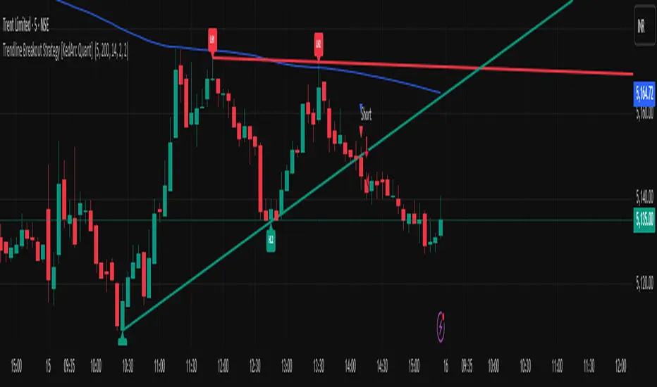
Trendline Breakout Strategy [KedArc Quant] Description
A single, rule-based system that builds two trendlines from confirmed swing pivots and trades their breakouts, with optional retest, trend-regime gates (EMA / HTF EMA), and ATR-based risk. All parts serve one decision flow: structure → breakout → gated entry → managed risk.
What it does (for traders)
Draws Up line (teal) through the last two Higher Lows and Down line (red) through the last two Lower Highs, then extends them forward.
Long when price breaks above red; Short when price breaks below teal.
Optional Retest entry: after a break, wait for a pullback toward the broken line within an ATR-scaled buffer.
Uses ATR stop and R-multiple target so risk is consistent across symbols/timeframes.
Labels HL1/HL2/LH1/LH2 so non-coders can verify which pivots built each line.
Why these components are combined
Pure breakout systems on trendlines suffer from three practical issues:
False breaks in chop → solved by trend-regime gates (EMA / HTF EMA) that only allow trades aligned with the prevailing trend.
Uneven volatility across markets/timeframes → solved by ATR-based stop/target, normalizing distance so R-multiples are comparable.
First break whipsaws near wedge apices → mitigated by the optional retest rule that demands a pullback/hold before entry.
These modules are not separate indicators with their own signals. They are support roles inside one method.
The pivot engine defines structure, the breakout detector defines signal, the regime gates decide if we’re allowed to take that signal, and the ATR module sizes risk.
Together they make the trendline breakout usable, testable, and explainable.
How it works (mechanism; each component explained)
1) Pivot engine (structure, non-repainting)
Swings are confirmed with ta.pivotlow/high(L, R). A pivot only exists after R bars (no look-ahead), so once plotted, the line built from those pivots will not repaint.
2) Trendline builder (geometry)
Teal line updates when two consecutive pivot lows satisfy HL2.price > HL1.price (and HL2 occurs after HL1).
Red line updates when two consecutive pivot highs satisfy LH2.price < LH1.price.
Lines are extended right and their current value is read every bar via line.get_price().
3) Breakout detector (signal)
On every bar, compute:
crossover(close, redLine) ⇒ Long breakout
crossunder(close, tealLine) ⇒ Short breakdown
4) Regime gates (trend filters, not separate signals)
EMA gate: allow longs only if close > EMA(len), shorts only if close < EMA(len).
HTF EMA gate (optional): same rule on a higher timeframe to avoid fighting the larger trend.
These do not create entries; they simply permit or block the breakout signal.
5) Retest module (optional confirmation)
After a breakout, record the line price. A valid retest occurs if price pulls back within an ATR-scaled buffer toward that broken line and then closes back in the breakout direction.
This reduces first-tick fakeouts.
6) Risk module (position exit)
Initial stop = ATR(len) × atrMult from entry.
Target = tpR × (ATR × atrMult) (e.g., 2R).
This keeps results consistent across instruments/timeframes.
Entries & exits
Long entry
Base: close breaks above red and passes EMA/HTF gates.
Retest (if enabled): after the break, price pulls back near the broken red line (within the ATR buffer) and holds; then enter.
Short entry
Mirror logic with teal (break below & gates), optionally with a retest.
Exit
strategy.exit places ATR stop & R-multiple target automatically.
Optional “flip”: close if the opposite base signal triggers.
How to use it (step-by-step)
Timeframe: 1–15m for intraday, 1–4h for swing.
Start defaults: Pivot L/R = 5, EMA len = 200, ATR len = 14, ATR mult = 2, TP = 2R, Retest = ON.
Tune sensitivity:
Faster lines (more trades): set L/R = 3–4.
Fewer counter-trend trades: enable HTF EMA (e.g., 60-min or Daily).
Visual audit: labels HL1/HL2 & LH1/LH2 show which pivots built each line—verify by eye.
Alerts: use Long breakout, Short breakdown, and Retest alerts to automate.
Originality (why it merits publication)
Trades the visualization: many “auto-trendline” tools only draw lines; this one turns them into testable, alertable rules.
Integrated design: each component has a defined role in the same pipeline—no unrelated indicators bolted together.
Transparent & non-repainting: pivot confirmation removes look-ahead; labels let non-coders understand the setup that produced each signal.
Notes & limitations
Lines update only after pivot confirmation; that lag is intentional to avoid repainting.
Breakouts near an apex can whipsaw; prefer Retest and/or HTF gate in choppy regimes.
Backtests are idealized; forward-test and size risk appropriately.
⚠️ Disclaimer
This script is provided for educational purposes only.
Past performance does not guarantee future results.
Trading involves risk, and users should exercise caution and use proper risk management when applying this strategy.
Trend FriendTrend Friend — What it is and how to use it
I built Trend Friend to stop redrawing the same trendlines all day. It automatically connects confirmed swing points (fractals) and keeps the most relevant lines in front of you. The goal: give you clean, actionable structure without the guesswork.
What it does (in plain English)
Finds swing highs/lows using a Fractal Period you choose.
Draws auto-trendlines between the two most recent confirmed highs and the two most recent confirmed lows.
Colours by intent:
Lines drawn from highs (potential resistance / bearish) = Red
Lines drawn from lows (potential support / bullish) = Green
Keeps the chart tidy: The newest lines are styled as “recent,” older lines are dimmed as “historical,” and it prunes anything beyond your chosen limit.
Optional crosses & alerts: You can highlight when price closes across the most recent line and set alerts for new lines formed and upper/lower line crosses.
Structure labels: It tags HH, LH, HL, LL at the swing points, so you can quickly read trend/rotation.
How it works (under the hood)
A “fractal” here is a confirmed pivot: the highest high (or lowest low) with n bars on each side. That means pivots only confirm after n bars, so signals are cleaner and less noisy.
When a new pivot prints, the script connects it to the prior pivot of the same type (high→high, low→low). That gives you one “bearish” line from highs and one “bullish” line from lows.
The newest line is marked as recent (brighter), and the previous recent line becomes historical (dimmed). You can keep as many pairs as you want, but I usually keep it tight.
Inputs you’ll actually use
Fractal Period (n): this is the big one. It controls how swingy/strict the pivots are.
Lower n → more swings, more lines (faster, noisier)
Higher n → fewer swings, cleaner lines (slower, swing-trade friendly)
Max pair of lines: how many pairs (up+down) to keep on the chart. 1–3 is a sweet spot.
Extend: extend lines Right (my default) or Both ways if you like the context.
Line widths & colours: recent vs. historical are separate so you can make the active lines pop.
Show crosses: toggle the X markers when price crosses a line. I turn this on when I’m actively hunting breakouts/retests.
Reading the chart
Red lines (from highs): I treat these as potential resistance. A clean break + hold above a red line often flips me from “fade” to “follow.”
Green lines (from lows): Potential support. Same idea in reverse: break + hold below and I stop buying dips until I see structure reclaim.
HH / LH / HL / LL dots: quick read on structure.
HH/HL bias = uptrend continuation potential
LH/LL bias = downtrend continuation potential
Mixed prints = rotation/chop—tighten risk or wait for clarity.
My H1 guidance (fine-tuning Fractal Period)
If you’re mainly on H1 (my use case), tune like this:
Fast / aggressive: n = 6–8 (lots of signals, good for momentum days; more chop risk)
Balanced (recommended): n = 9–12 (keeps lines meaningful but responsive)
Slow / swing focus: n = 13–21 (filters noise; better for trend days and higher-TF confluence)
Rule of thumb: if you’re getting too many touches and whipsaws, increase n. If you’re late to obvious breaks, decrease n.
How I trade it (example workflow)
Pick your n for the session (H1: start at 9–12).
Mark the recent red & green lines. That’s your immediate structure.
Look for interaction:
Rejections from a line = fade potential back into the range.
Break + close across a line = watch the retest for continuation.
Confirm with context: session bias, HTF structure, and your own tools (VWAP, RSI, volume, FVG/OB, etc.).
Plan the trade: enter on retest or reclaim, stop beyond the line/last swing, target the opposite side or next structure.
Alerts (set and forget)
“New trendline formed” — fires when a new high/low pivot confirms and a fresh line is drawn.
“Upper/lower trendline crossed” — fires when price crosses the most recent red/green line.
Use these to track structure shifts without staring at the screen.
Good to know (honest limitations)
Confirmation lag: pivots need n bars on both sides, so signals arrive after the swing confirms. That’s by design—less noise, fewer fake lines.
Lines update as structure evolves: when a new pivot forms, the previous “recent” line becomes “historical,” and older ones can be removed based on your max setting.
Not an auto trendline crystal ball: it won’t predict which line holds or breaks—it just keeps the most relevant structure clean and up to date.
Final notes
Works on any timeframe; I built it with H1 in mind and scale to H4/D1 by increasing n.
Pairs nicely with session tools and VWAP for intraday, or with supply/demand / FVGs for swing planning.
Risk first: lines are structure, not guarantees. Manage position size and stops as usual.
Not financial advice. Trade your plan. Stay nimble.

Supp_Ress_V1This indicator automatically plots support and resistance levels using confirmed pivot highs and lows, then manages them smartly by merging nearby levels, extending them, and removing them once price breaks through.
It also draws trendlines by connecting valid higher-lows (uptrend) or lower-highs (downtrend), ensuring they slope correctly and have enough spacing between pivots.
In short: it gives you a clean, trader-like map of the most relevant S/R zones and trendlines, updating dynamically as price action unfolds.
CleanBreak Lines (Break + First Retest)CleanBreak lines draws one robust support line (green) from swing lows and one robust resistance line (red) from swing highs, then optionally signals a confirmed break and the first clean retest back to that line. Lines are scored with a transparent W-Score (0–100) so traders can judge quality at a glance. The script is non-repainting and uses only confirmed bar data.
What it does
Auto-builds two trendlines that aim to represent meaningful support and resistance.
Uses a median-based slope so outliers and single spikes do not distort the line.
Computes a W-Score per line from three things: touches, span (how long it held), and respect (staying on the correct side).
Optionally triggers a single, tightly-gated signal on Break + First Retest.
How it works (plain English)
Detect recent swing highs and swing lows.
Fit one line through highs and one through lows using a robust, median-style slope estimate.
Score each line: more clean touches and longer span raise the W-Score; frequent violations lower it.
A break requires a candle close beyond the line by a small ATR margin.
A first retest requires price to come back to the line within a limited number of bars and hold on close.
A single arrow may print on that confirmed retest, with optional alerts.
What it is not
Not a prediction model and not a promises-of-profit tool.
Not a multi-signal spammer: by design it aims to allow one retest entry per break.
Not a regression channel or machine-learning system.
How to use
At a glance: treat the green line as candidate support and the red line as candidate resistance.
Conservative approach: wait for a break on close and then the first retest to hold; use the arrow as a prompt, not a command.
Context-only mode: hide arrows in Style if you want the lines and W-Score only.
Inputs (brief)
Core: Swing Length, Max Pivots, Min Touches, Min Span Bars.
Scoring: Touches Max (cap), Weights for touches vs span, Min W-Score to arm.
Break and Retest: Break Margin x ATR, Retest Tolerance x ATR, Retest Window (bars).
Visuals: Show Labels, Show Table, Line Width, Fade When Refit.
Recommended presets
Cleaner, fewer signals: Min Touches 4–5, Min Span Bars 100–150, Min W-Score 70–80, Break Margin 0.40–0.60 ATR, Retest Tolerance 0.10–0.15 ATR, Retest Window 8–12 bars.
Lines-only: keep defaults and uncheck the two plotshapes in Style.
Alerts
CB Long Retest: break above the red line and first retest holds.
CB Short Retest: break below the green line and first retest holds.
Use “Once per bar close” for consistency.
On-chart table (if enabled)
RES / SUP: W-Score and distance from price in ATR terms.
Status: “Waiting Long RT”, “Waiting Short RT”, or “Idle”.
Thresholds: MinScore and Retest bars for quick context.
Timeframes
Works well on 1h to 1D. On very low timeframes, raise Break Margin x ATR to reduce whipsaw effects. On higher timeframes, increase Min Touches and Min Span Bars.
Non-repainting policy
All logic uses confirmed pivots and confirmed bar closes.
Breaks and retests are validated on close; alerts reference only confirmed conditions.
No lookahead in any request.security call.
Original implementation focused on a median-based robust slope for auto trendlines, plus a transparent W-Score and a single retest gate.
Disclosure
This script is for education and charting. It does not guarantee outcomes, and past behavior does not imply future results. Always validate on historical data and practice risk management.

Range Trends Enhanced (eleven11)This indicator automatically draws your Range Trend lines based upon your timeframe. When you select a timeframe, in the options, those lines will be locked in, whenever you switch timeframes on the chart. This allows you to "lock in" a timeframe's trendlines and then view it on different timeframes. But if you want to view the current trendlines for a timeframe then you need to select that "lockdown" timeframe in the settings. The original code was created by eleven11

📱 Mobile EMA + V2L5 (edegrano)User Manual: Mobile EMA + V2 (edegrano)
Overview
This TradingView indicator combines EMA bias analysis and multi-timeframe linear regression trendlines with key crossover signals, displayed both on the chart and summarized in a colour-coded table for quick decision-making on mobile devices or desktops.
Inputs
Input Name Description Default
Custom EMA Timeframe Timeframe used to calculate EMA 50, 100, 200 "1" (1m)
Show EMAs on Chart Toggle to plot EMAs (50-blue, 100-black, 200-red) true
Linear Regression Length Period length for linear regression trendlines 20
Show EMA 50 > EMA 200 Bias Show EMA bias row in the table (Bullish/Bearish) true
Show Trendline Slope Bias Show trendline slope bias row in the table true
Price Distance % from Cross Percentage distance used to calculate above/below cross prices in table 2.0
What It Shows
On Chart:
EMA 50 (blue), EMA 100 (black), EMA 200 (red) lines
Vertical lines at EMA 50/200 crossover bars (blue for bullish, red for bearish)
Labels “Bull Cross” or “Bear Cross” on crossover bars
Signal dots (up to 3 consecutive strong buy or sell signals)
Table (bottom-left corner):
Row Description
EMA 50 > EMA 200 Bullish if EMA 50 is above EMA 200, Bearish otherwise (colored green/red text)
Trendline slope Bullish if all 1m, 3m, 5m regression slopes are up, Bearish if all down, Neutral otherwise (green/red/gray text)
Last EMA Cross Price Price where EMA 50 and EMA 200 last crossed (light blue text)
+% Above Cross Price percentage above last EMA cross price (dark orange text)
-% Below Cross Price percentage below last EMA cross price (red text)
Final Suggestion Overall signal: “Strong Buy 💎”, “Strong Sell 💎”, or “Mixed / Neutral” with green/red/gray background
How To Use
Set your preferred timeframe for EMA calculations using the Custom EMA Timeframe input. The default is 1 minute.
Enable or disable EMAs and table rows as you prefer with toggles.
Watch the table for quick bias and trend signals with color-coded text for easy interpretation.
Use the Last EMA Cross Price and the above/below percentage price points to identify key levels for entries, stops, or take profits.
Monitor the chart for EMA crossover vertical lines and labels to confirm signals visually.
Strong Buy or Sell dots indicate good entry opportunities — limited to 3 per consecutive trend.
Tips
Adjust the Price Distance % input to increase/decrease sensitivity of above/below price levels.
Combine this indicator with volume, price action, or other tools for best results.
Use on mobile or desktop with the compact table to stay informed without clutter.
📱 Mobile EMA + Trendline Bias (edegrano)📱 Mobile EMA + Trendline Bias (edegrano) — User Manual
What It Does
This indicator helps you spot strong bullish or bearish trends by combining:
EMA Bias: Using the relationship between EMA 50 and EMA 200 on your chosen timeframe.
Trendline Slope Bias: Using linear regression trendlines on fixed 1-minute, 3-minute, and 5-minute charts.
Signal Dots: Visual buy/sell signals limited to the first 3 occurrences after the last opposite signal to avoid noise.
Summary Table: Shows the current trend bias and final suggestion.
EMA Plots: Shows EMA 50, EMA 100, and EMA 200 lines on your chart.
Tag Label: Displays a small signature tag “📱 edegrano Mobile” on the chart.
Inputs
Input Name Description Default Notes
Custom EMA Timeframe (userTF) Timeframe used to calculate EMAs "1" (1 min) Choose your preferred timeframe (e.g., 1, 3, 5, 15, 60 minutes, etc.)
Show EMAs on Chart (showEMA) Toggle EMA lines visibility true Show or hide EMA 50, 100, and 200 lines
Linear Regression Length (regLen) Length of bars used in regression 20 Adjusts sensitivity of regression trendlines (lower = more responsive)
Show EMA Bias Row (showRowEMA50) Show/hide EMA bias row in the table true Display the EMA 50 > EMA 200 bias status in table
Show Trendline Bias Row (showRowTrend) Show/hide trendline slope row in table true Display the trendline slope bias status in table
How to Use
Set Your Timeframe:
Choose the timeframe for EMA calculations (userTF) depending on your trading style.
Scalpers might use 1-5 minute charts.
Day traders might choose 5-30 minutes.
Swing traders could go 1 hour or more.
Watch the EMA Lines:
EMA 50 (blue), EMA 100 (black), and EMA 200 (red) are plotted on your chart.
These lines help you visualize trend direction and momentum.
Understand the Bias Conditions:
EMA Bias:
Bullish: EMA 50 > EMA 200
Bearish: EMA 50 < EMA 200
Trendline Slope Bias:
Calculated on fixed 1m, 3m, and 5m charts.
Bullish if slope of all 3 regression lines is up (current value > previous).
Bearish if slope of all 3 regression lines is down.
Look for Signal Dots:
Green (lime) dots below bars: Strong Buy signals (first 3 occurrences only after last sell).
Red dots above bars: Strong Sell signals (first 3 occurrences only after last buy).
This limitation helps reduce noise from too many signals.
Check the Table (Bottom Left):
Shows EMA bias and trendline slope status.
Displays overall final suggestion:
Strong Buy 💎
Strong Sell 💎
Mixed / Neutral
Tag Label:
A small label "📱 edegrano Mobile" appears on the chart for easy identification.
Tips & Best Practices
Adjust Regression Length (regLen):
Lower values (e.g., 15-20) react faster but may generate false signals.
Higher values (30-50) smooth noise but react slower — better for longer-term trades.
Combine with Other Indicators:
Use volume, candlestick patterns, or support/resistance to confirm signals.
Don’t Trade Against the Signal:
Avoid entering buy trades during a “Strong Sell” phase and vice versa.
Monitor Multiple Timeframes:
Consider confirming trends on higher timeframes.
Parameter Suggestions by Trading Style
Style EMA Timeframe Regression Length (regLen)
Scalping 1 min 15 - 20
Day Trading 5 - 15 min 20 - 30
Swing Trading 1 hour or higher 30 - 50
Position Trading 4 hour, Daily, Weekly 50 - 100

📱 Mobile EMA + Trendline Bias (edegrano)📱 Mobile EMA + Trendline Bias (edegrano) — User Manual
Purpose
This indicator provides a simplified, mobile-friendly overview of trend bias using EMA and multi-timeframe regression trendline confluences, plus plots EMA lines and a small info table on the chart.
Inputs Explained
Input Name Description
Custom EMA Timeframe The timeframe on which the EMA 50 and EMA 200 calculations are based (e.g., 1, 3, 5 minutes). This lets you choose which timeframe to analyze EMA trend bias.
Show EMAs on Chart Toggle to show or hide EMA 50 (blue) and EMA 200 (red) lines on your chart.
Regression Length The length (number of bars) used for calculating the linear regression trendlines on fixed 1m, 3m, and 5m timeframes. Lower values make trendlines more reactive, higher values smooth out noise.
Show EMA 50 Bias Row Show or hide the EMA 50 vs EMA 200 bias row in the info table.
Show Trendline Slope Row Show or hide the multi-timeframe trendline slope bias row in the info table.
What It Shows
EMA Lines: EMA 50 (blue) and EMA 200 (red) based on your selected timeframe.
Trendline Slopes: Using linear regression on 1-minute, 3-minute, and 5-minute charts to gauge short-term trend direction.
Info Table (Bottom Left):
EMA 50 > EMA 200 status on your selected timeframe (Bullish/Bearish)
Trendline slope bias combining the 3 fixed timeframes (Bullish/Bearish/Neutral)
Final Suggestion showing overall bias:
Strong Buy 💎 if both EMA and trendline biases are bullish
Strong Sell 💎 if both are bearish
Mixed / Neutral otherwise
Tag on Chart Corner: Displays “📱 edegrano Mobile” label for quick identification.
How To Use
Set the Custom EMA Timeframe:
Choose a timeframe that fits your trading style (e.g., 1m for scalping, 5m for day trading).
Adjust Regression Length:
For faster signals, lower the regression length (e.g., 15).
For smoother, less noisy signals, increase it (e.g., 30 or higher).
Toggle EMA Lines Display:
Show or hide EMA lines based on your preference for chart clarity.
Use the Info Table:
Quickly glance at EMA and trendline bias across timeframes for confluence confirmation.
Interpret the Final Suggestion:
Follow “Strong Buy” or “Strong Sell” signals for potential entry points. If “Mixed / Neutral,” wait for stronger confirmation.
Suggested Parameters by Trading Style
Style EMA Timeframe Regression Length Notes
Scalping 1 min 15-20 Responsive, fast reaction to price
Day Trading 3-5 min 20-30 Balanced sensitivity
Swing Trading 15-30 min 30-50 Smoother trend detection
Position Trading 1 hr+ 50-100 Very smooth, low noise
Tips
Combine this indicator with volume or other indicators for stronger confirmation.
Use the EMA lines on chart visually to confirm trend direction.
The info table updates in real-time, making it easy for quick decisions on mobile.
Adjust inputs and observe how the final suggestion changes to tune for your asset and timeframe.
