Blockcircle Fair Value Gaps (FVG) and Volume ValidationWHAT MAKES IT ORIGINAL AND DIFFERENT
The BLOCKCIRCLE FAIR VALUE GAPS (FVG) AND VOLUME VALIDATION indicator solves the most common FVG (or price value gap) problem: chart clutter from irrelevant gaps and adds two important features, volume validation and trend filtering. It implements proximity filtering to only show gaps within a configurable percentage of the current price, automatic age-based deletion, and maximum gap size limits to exclude extreme moves. The result is a clean chart showing only actionable gaps near current price action.
HOW IT WORKS
Fair Value Gaps form when prices move aggressively, leaving an unfilled gap between consecutive candles. This indicator identifies gaps but applies multiple relevance filters: gaps must be within the proximity threshold of the current price, younger than the maximum age, and sized between the minimum and maximum thresholds. Gaps outside these parameters are automatically removed.
FEATURES
Proximity filter removes gaps far from the current price
Maximum age filter deletes stale gaps
Minimum and maximum gap size filters
Volume confirmation option
Three mitigation detection methods
Info table showing active gap counts
CONFIGURABLE SETTINGS
Maximum Zones to Display: Limit visual clutter
Minimum Gap Size Percent: Filter insignificant gaps
Maximum Gap Size Percent: Filter extreme moves
Proximity Filter Percent: Only gaps within this distance from the price
Maximum Age Bars: Delete gaps older than this
Require Above Average Volume: Institutional filter
Mitigation Type: Wick, Close, or 50% Fill
Delete Mitigated Zones: Automatic cleanup
USAGE NOTES
Default 30% proximity means gaps more than 30% away from the current price are hidden. Increase for longer-term analysis or decrease for tighter focus. The maximum age of 200 bars prevents ancient gaps from cluttering the chart, but this can be changed to 5,000!
If you have any questions, please don't hesitate to ask. I'd be happy to help!
القيمة

BTC Fundamental Value Hypothesis [OmegaTools]BTC Fundamental Value Hypothesis is a macro-valuation and regime-detection model designed to contextualize Bitcoin’s price through relative market-cap comparisons against major capital reservoirs: Gold, Silver, the Altcoin market, and large-cap equities. Instead of relying on traditional on-chain metrics or purely technical signals, this tool frames BTC as an asset competing for global liquidity and “store-of-value mindshare”, then estimates an implied fair value based on how BTC historically coexists (or diverges) from these benchmark universes.
Core concept: relative market-cap anchoring
The indicator builds a reference-based fair price by translating external market capitalizations into implied BTC valuation using a dominance framework. In practice, you choose one or more reference universes (Gold, Silver, Altcoins, Stocks). For each selected universe, the script computes how large BTC “should be” relative to that universe (dominance ratio), and converts that into an implied BTC price. The final fair price is the average of the implied prices from the enabled universes.
Two dominance modes: automatic vs manual
1. Automatic Dominance % (default)
When enabled, the model estimates dominance ratios dynamically using a 252-period simple moving average of BTC market cap divided by each reference market cap. This produces an adaptive baseline that follows structural changes over time and reduces sensitivity to short-term spikes.
2. Manual Dominance %
If you prefer a discretionary macro thesis, you can directly input dominance parameters for each reference universe. This is useful when you want to stress-test scenarios (e.g., “BTC should converge toward X% of Gold’s market cap”) or align the model with a specific long-term adoption narrative.
Reference universes and data construction
- BTC market cap: pulled from CRYPTOCAP:BTC.
- Gold and Silver market caps: derived from the corresponding futures symbols (GC1!, SI1!) multiplied by an assumed total above-ground quantity (constant tonnage converted to troy ounces). This provides a practical and tradable proxy for spot valuation context.
- Altcoin market cap: pulled from CRYPTOCAP:TOTAL2 (total crypto market excluding BTC).
- Stocks market cap proxy (Σ3): a deliberately conservative equity benchmark built from three mega-cap stocks (AAPL, MSFT, AMZN) using total shares outstanding (request.financial) multiplied by price. This avoids index licensing complexity while still tracking a meaningful slice of global equity beta/liquidity.
Valuation output: overvalued vs undervalued (log-based)
The valuation readout is expressed as a percentage derived from the logarithmic distance between BTC price and the model’s fair price. This choice makes valuation comparable across long time horizons and reduces distortion during exponential growth phases. A positive valuation indicates BTC trading below the model’s implied value (undervalued), while a negative valuation indicates trading above it (overvalued).
Oscillator: relative momentum and regime confirmation
In addition to fair value, the indicator includes a momentum differential oscillator built from RSI(50):
- BTC RSI is compared to the average RSI of the selected reference universes.
- The oscillator highlights when BTC strength is leading or lagging the broader macro benchmarks.
- Color is rendered through a gradient to provide immediate regime readability (risk-on vs risk-off behavior, expansion vs contraction phases).
Visualization and UI components
- Fair Price overlay: the computed fair price is plotted directly on the BTC chart for immediate comparison with spot price action.
- Valuation shading: the area between price and fair price is filled to visually emphasize dislocation and potential mean-reversion zones.
- Oscillator panel: a zero-centered oscillator with filled bands helps you identify persistent trend regimes versus transitional conditions.
- Summary table: a right-side table displays the current valuation (over/under) and, when Automatic mode is enabled, the live dominance ratios used in the model (BTC/GOLD, BTC/SILVER, BTC/ALTC, BTC/STOCKS).
How to use it (practical workflows)
- Macro valuation context: use fair price as a structural anchor to assess whether BTC is trading at a premium or discount relative to external liquidity baselines.
- Regime filtering: combine valuation with the oscillator to distinguish “cheap but weak” from “cheap and strengthening” (and the inverse for tops).
- Mean-reversion mapping: large, persistent deviations from fair value often highlight speculative extremes or capitulation zones; this can support systematic entries/exits, position sizing, or hedging decisions.
- Scenario analysis: switch to Manual Dominance % to model adoption outcomes, policy-driven shifts, or multi-year re-rating assumptions.
Important notes and limitations (read before use)
- This is a hypothesis-driven macro model, not a literal intrinsic value calculation. Results depend on dominance assumptions, proxies, and data availability.
- Gold/Silver market caps are approximations based on futures pricing and fixed supply constants; real-world supply dynamics, above-ground estimates, and spot/futures basis can differ.
- The Stocks (Σ3) benchmark is a proxy and intentionally not “the whole market”. It is designed to represent a large-cap liquidity reference, not total equity capitalization.
- Always validate signals with additional context (market structure, volatility regime, risk management rules). This indicator is best used as a macro layer in a broader decision framework.
Designed for clarity, macro discipline, and repeatability
BTC Fundamental Value Hypothesis by OmegaTools is built for traders and investors who want a clean, data-driven way to interpret BTC through the lens of competing asset classes and capital flows. It is particularly effective on higher timeframes (Daily/Weekly) where macro relationships are more stable and valuation signals are less noisy.
© OmegaTools, Eros

XRP Athey Mitchnick Implied Price (Ramp + Analytical 2030 Label)This indicator implements a fundamental valuation framework for XRP based on the Athey–Mitchnick cryptoasset valuation model. Unlike traditional technical indicators (RSI, MACD, etc.), this tool is not designed to predict short-term price movements. Instead, it models what XRP should be worth over time under explicit adoption and demand assumptions.
It answers the question:
If XRP becomes a real settlement rail and a long-term store of value, what price would be required for the system to function?
What This Indicator Adds
This implementation extends the static Athey–Mitchnick model by introducing a time-based ramp:
1. Adoption grows over time
You specify:
TV CAGR (%)
SoV CAGR (%)
These values compound annually from a start date to an end date (e.g., 2030), producing a dynamic implied valuation curve.
2. Terminal 2030 price is computed analytically
The indicator explicitly computes the implied price at the target year (e.g., 2030) and displays it as:
“2030 Implied Price = $X”
This is done analytically, so the chart does not need to extend to 2030 for you to see the terminal valuation.
3. This is not a trading indicator
This model is not designed for:
Scalping
Breakouts
Entry timing
Momentum trading
It is designed for:
Long-term valuation anchoring
Scenario modeling
Macro thesis testing
Adoption-based forecasting
Narrative vs fundamentals comparison
How to Read the Chart
Market Price (Close)
This is the actual XRP market price. It reflects:
Speculation
Liquidity
Leverage
Narrative
Emotion
Implied Price (Ramp)
This is the fundamental valuation curve.
It shows what XRP’s price would need to be at each point in time for your adoption and store-of-value assumptions to be true.
Bands (Optional)
The ±% bands are valuation tolerance zones. They are not volatility bands.
They help visualize:
Overvaluation
Undervaluation
Reversion zones
2030 Label
The label:
2030 Implied Price = $X
represents the terminal valuation implied by your assumptions. This is the most important output of the model.
What Makes the Price Go Higher
To increase the implied 2030 price, one or more of these must change:
1. Higher Transaction Adoption (TV)
Inputs:
TV0
TV CAGR %
This reflects real-world economic usage.
Higher TV means XRP is settling more real value per day.
Examples:
Cross-border payments
Tokenized assets
Treasury settlement
Interbank liquidity rails
2. Higher Store-of-Value Demand (SoV)
Inputs:
SoV0
SoV CAGR %
This reflects long-term holding demand.
This is the most powerful driver of long-term price.
It models:
Institutional holdings
Strategic reserves
Collateral usage
Long-term investor behavior
3. Lower Velocity
Input:
Velocity V
Lower velocity means XRP must be held longer to support the same transaction volume.
This implies:
Reserve-like behavior
Collateralization
Treasury holding
Structural stickiness
Price is inversely proportional to velocity.
4. Lower Effective Supply
Inputs:
Supply0
Supply CAGR
Supply cap
If XRP becomes locked, escrowed, staked, or structurally held, the effective circulating supply shrinks, increasing price.
Why This Matters
Most crypto price models are:
Technical
Reflexive
Narrative-driven
Non-falsifiable
This one is:
Structural
Adoption-based
Testable
Falsifiable
If XRP never achieves the adoption implied by your inputs, the model will not justify high prices.
This indicator is a forward-looking valuation engine, not a trading tool.
It shows:
What XRP’s price must be for your beliefs about its future to be true.
It forces clarity.
It forces discipline.
And it converts stories into structure.

Value Area PRO (TPO/Volume Session VAH/VAL/POC) 📌 AP Capital Value Area PRO (TPO / Volume)
AP Capital Value Area PRO is a session-based value area indicator designed for Gold (XAUUSD), NASDAQ (NAS100), and other CFD instruments.
It focuses on where the market has accepted price during the current session and highlights high-probability interaction zones used by professional traders.
Unlike rolling lookback volume profiles, this indicator builds a true session value area and provides actionable signals around VAH, VAL, and POC.
🔹 Core Features
Session-Anchored Value Area
Value Area is built only during the selected session
Resets cleanly at session start
Levels develop during the session and can be extended forward
No repainting or shifting due to lookback changes
TPO or Volume Mode
TPO (Time-at-Price) mode – ideal for CFDs and tick-volume data
Volume mode – uses broker volume if preferred
Same logic, different weighting method
Fixed Price Bin Size
Uses a fixed bin size (e.g. 0.10 for Gold, 0.25–0.50 for NAS100)
Produces cleaner, more realistic VAH/VAL levels
Avoids distorted profiles caused by dynamic bin scaling
VAH / VAL / POC Levels
VAH (Value Area High)
VAL (Value Area Low)
POC (Point of Control) (optional)
Lines can be extended to act as forward reference levels
🔹 Trading Signals & Alerts
Value Re-Entry
Identifies false breakouts where price:
Trades outside value
Then closes back inside
Often seen before strong mean-reversion or continuation moves.
Acceptance
Detects initiative activity using:
Multiple consecutive closes outside value
Filters out weak single-candle breaks
Rejection
Flags strong rejection candles:
Large candle body
Wick outside value
Close back inside the value area
These conditions are especially effective on Gold intraday.
🔹 Optional Profile Histogram
Right-side volume/TPO histogram
Buy/sell imbalance visualization
Fully optional to reduce chart clutter and improve performance
🔹 Best Use Cases
Recommended markets
XAUUSD (Gold)
NAS100 / US100
Other index or metal CFDs
Recommended timeframes
5m, 15m, 30m
Suggested settings
Mode: TPO
Value Area: 70%
Bin size:
Gold: 0.10
NAS100: 0.25 or 0.50
🔹 How Traders Use It
Trade rejections at VAH / VAL
Look for acceptance to confirm trend days
Use re-entries to fade failed breakouts
Combine with trend filters, EMA structure, or session context
⚠️ Disclaimer
This indicator is provided for educational and analytical purposes only and does not constitute financial advice. Always manage risk appropriately.

Performance Table: Standard DCA | Last 6-12-24-48MThis indicator visualizes Standard Dollar-Cost Averaging (DCA) performance across multiple time horizons (6M, 12M, 24M, 48M).
It summarizes invested capital, current portfolio value, net profit, and return percentage in a compact table, allowing quick comparison of short- and long-term DCA outcomes.
Designed for long-term investors, it helps evaluate how consistent periodic investments perform over time without relying on market timing.
The indicator is asset-agnostic and works on any symbol supported by TradingView.
Key use cases:
Long-term portfolio tracking
DCA strategy validation
Performance comparison across periods
Educational and analytical purposes
This tool focuses on clarity and realism, avoiding over-optimization and short-term noise.
--
I hope this table helps investors better understand long-term DCA performance.
Feedback and suggestions for improvement are always welcome.

A Humbled Trader Strategy + ChecklistHumbled Trader Swing Strategy + Checklist
This indicator is a complete swing trading system based on the high-probability strategies popularized by Humbled Trader. It is designed to help traders identify trend breakouts and low-risk momentum pullbacks on the Daily Timeframe.
The script combines trend filtering, automated resistance lines, and specific entry triggers into a single chart overlay, complete with a real-time Strategy Checklist Dashboard to confirm your setups instantly.
🎯 Core Components
Trend Filter (Purple Line): The 200 Simple Moving Average (SMA). This acts as your long-term trend filter. We only look for long trades when the price is above this line.
Momentum Guide (Orange Line): The 8 Exponential Moving Average (EMA). This tracks short-term momentum. In a strong trend, price will "ride" this line. We look to enter when price pulls back to touch this area.
Multi-Month Resistance (Orange Horizontal Line): Automatically plots the highest price over the last X Months (adjustable). This helps you instantly visualize the key level the stock needs to break out from.
Checklist Dashboard: A real-time table that evaluates Trend, Resistance, and Momentum conditions to give you a clear "✅ ENTER", "🚀 GAP UP", or "⏳ WAIT" signal.
🛠 How It Works
This indicator scans for two specific setups:
1. The Daily Gap Up ("GAP" Label) This signal appears when a stock shows strong momentum by gapping up overnight.
Condition: The stock opens at least 3% higher (adjustable) than the previous day's Close AND opens above the previous day's High.
Trend: Must be above the 200 SMA.
Visual: Marked with a green "GAP" label on the chart.
2. The Trend Pullback ("ENTER" Signal) This is a trend-following entry that lets you join an existing move with lower risk.
Condition: The stock is in an uptrend but dips down to touch or test the 8 EMA.
Validation: The candle must show a "dip" (red candle or lower close) to ensure we are buying a pullback, not chasing a top.
Visual: The Dashboard "Action Signal" will turn orange and display "✅ ENTER".
📋 The Checklist Dashboard
Located in the corner of your chart, this table provides a live status report for the current bar:
Trend (> 200 SMA):
🟢 Bullish: Price is in an uptrend. Safe to look for entries.
🔴 Bearish: Price is below the 200 SMA. Stay away.
Above Resistance?:
🟢 Breakout: Price has cleared the multi-month resistance line.
⚪ ---: Price is currently below the key breakout level.
Near 8 EMA?:
🟢 Yes: Price is near the "value zone" (8 EMA) for a potential pullback entry.
Action Signal:
🚀 GAP UP: Strong momentum gap detected.
✅ ENTER: Valid pullback entry detected.
⏳ WAIT: No clear setup found.
⚙️ Settings
Momentum EMA Length: Default is 8. Controls the sensitivity of the pullback line.
Trend SMA Length: Default is 200. The standard for long-term trend filtering.
Gap Up % Threshold: Default is 3.0%. Minimum overnight gap size required to trigger a signal.
Resistance Lookback (Months): Default is 3. The script will look back this many months to find and draw the key resistance line.
Table Position: Move the checklist to any corner of your screen.
⚠️ Disclaimer
This tool is for educational purposes only and does not constitute financial advice. Always manage your risk and use a stop loss.

Gold/Silver Ratio with Supply ZonesGold/Silver Ratio with Supply Zones
Overview
Professional-grade indicator that tracks the Gold/Silver Ratio in real-time
Identifies potential market imbalances and rotation opportunities between precious metals
Features customizable threshold bands, moving averages, and automated trading signals
Built on Pine Script v6 for maximum stability and performance
Key Features
Real-Time Ratio Calculation : Automatically calculates Gold/Silver ratio using OANDA:XAUUSD and OANDA:XAGUSD price feeds
Dynamic Threshold Zones : Visual bands showing when silver or gold may be undervalued relative to each other
Moving Average Overlay : 20-period SMA to identify trend direction and momentum
Automated Buy Signals : Triangle markers appear when ratio reaches extreme levels
Live Information Table : Displays current ratio, moving average, individual metal prices, and market interpretation
Custom Alerts : Set notifications when ratio crosses your defined thresholds
Color-Coded Zones : Green zones indicate gold undervaluation, red zones indicate silver undervaluation
Trading Applications
Mean Reversion Strategy : Enter silver positions when ratio exceeds 90, enter gold when ratio falls below 70
Rotation Trading : Switch between metals based on relative value signals
Portfolio Rebalancing : Identify optimal times to adjust precious metals allocation
Divergence Analysis : Compare ratio behavior against individual metal price action
Default Settings
High Threshold : 90.0 (Silver undervalued zone)
Low Threshold : 70.0 (Gold undervalued zone)
Moving Average : 20-period SMA
Historical Reference : 80:1 ratio marked as long-term mean
How to Interpret
Ratio Above 90 : Silver is undervalued relative to gold - consider increasing silver exposure
Ratio Below 70 : Gold is undervalued relative to silver - consider increasing gold exposure
Ratio Between 70-90 : Neutral range - no clear relative value advantage
Rising Ratio : Gold outperforming silver
Falling Ratio : Silver outperforming gold
Signal Logic
Green Triangle (Bottom) : Ratio crosses above high threshold → Buy Silver Signal
Red Triangle (Top) : Ratio crosses below low threshold → Buy Gold Signal
MA Crossovers : Use 20-period MA for trend confirmation and entry timing
Visual Elements
Blue Line : Current gold/silver ratio value
Orange Line : 20-period moving average smoothing
Red Shaded Zone : Area where gold is relatively expensive
Green Shaded Zone : Area where gold is relatively cheap
Gray Dotted Line : Historical mean at 80:1
Info Table : Real-time statistics and market interpretation
Best Practices
Use on daily timeframe or higher for most reliable signals
Combine with volume analysis and individual metal technicals
Monitor Federal Reserve policy and USD strength as macro context
Consider industrial demand factors for silver (solar, EV, electronics)
Watch safe-haven flows during economic uncertainty for gold
Customization Options
Adjust threshold levels based on your preferred lookback period
Modify moving average length to suit your trading timeframe
Toggle bands on/off for cleaner chart visualization
Change data source tickers if using different brokers (FXCM, FOREXCOM, etc.)
Alert Conditions
Silver Undervalued Alert : Triggers when ratio crosses above your high threshold
Gold Undervalued Alert : Triggers when ratio crosses below your low threshold
Receive notifications via TradingView mobile app , email , or webhook
Who This Is For
Precious metals traders seeking relative value opportunities
Portfolio managers balancing gold and silver allocations
Macro traders using metals as inflation hedges
Swing traders capitalizing on mean reversion patterns
Long-term investors optimizing entry points
Important Notes
This indicator tracks price ratios , not physical supply data
COMEX warehouse stocks are not directly available in TradingView
Ratio analysis assumes historical mean reversion tendencies
Always combine with fundamental analysis and risk management
Past performance does not guarantee future results
Data Sources
Gold Price : OANDA:XAUUSD (spot gold in US dollars)
Silver Price : OANDA:XAGUSD (spot silver in US dollars)
Update Frequency : Real-time during market hours
Historical Data : Full TradingView historical coverage available

Daily/Weekly FVG by KrisThis indicator is a Multi-Timeframe (MTF) tool designed to automatically identify and project Fair Value Gaps (Imbalances) from Daily and Weekly timeframes onto your current chart. It helps traders locate higher-timeframe Areas of Interest (POI) and liquidity voids without manually switching charts.
How it works:
The script utilizes `request.security` to fetch High and Low data from Daily and Weekly timeframes. It identifies a Fair Value Gap (FVG) based on the 3-candle formation logic where price moves inefficiently, leaving a gap between the wicks.
- Bullish FVG: Identified when the current Daily/Weekly Low is greater than the High of the candle from 2 periods ago.
- Bearish FVG: Identified when the current Daily/Weekly High is lower than the Low of the candle from 2 periods ago.
The indicator draws a box extending to the right to visualize the zone, along with a dotted midline which often acts as a sensitive support/resistance level.
Unique Feature: Smart Mitigation (Auto-Hide)
To keep your chart clean and focused on relevant data, the script includes a "Full Fill" logic. It continuously monitors price action relative to existing FVG boxes.
- If price completely crosses through a box (fully fills the gap), the indicator considers it "mitigated" and automatically hides the box and its midline (sets transparency to 100%).
- This ensures you only see "fresh" or unfilled gaps that are still relevant for trading.
Settings:
- TF Checkboxes (Daily/Weekly FVG): Toggle the visibility of Daily or Weekly gaps independently based on your analysis needs.
- Design Mode:
Colored: Uses classic Green (Bullish) and Red (Bearish) colors for easy trend identification.
Monochrome: Uses Gray tones for a minimalist look that reduces visual noise on the chart.
Usage:
Use these zones to identify potential reversal points or liquidity targets. Since these are higher-timeframe levels, they often carry more weight than intraday imbalances.

Auction Context Engine ( Value Area, VWAP & Regime)📌 Indicator Name
Auction Context Engine (Value Area, VWAP & Regime)
Short name: ACE Context
🧠 Description
Auction Context Engine (ACE) is a professional market context and structure indicator based on Auction Market Theory.It is designed to help traders understand where the market is positioned, not to generate trade signals.
ACE focuses on:
• Developing Value Area (VAH / VAL)
• Developing Point of Control (POC)
• Session VWAP positioning
• Volatility regime expansion
• Opening Range context
• Failed auction / trap detection
• Market bias and environment quality
This indicator provides context only and is intended to be used alongside a separate execution strategy or system.
🎯 What This Indicator Is
✔ A context engine
✔ A market structure filter
✔ A bias alignment tool
✔ A regime and environment classifier
❌ What This Indicator Is NOT
✘ Not a signal generator
✘ Not a buy/sell system
✘ Not a strategy
✘ Not a profitability promise
📊 How To Use
Use ACE to answer:
• Is price accepting or rejecting value?
• Is the market in balance or expansion?
• Is VWAP supporting or opposing price?
• Is this a breakout environment or a trap?
• Is volatility expanding?
• Is the market trending or ranging?
You may then use your own execution strategy aligned with this context.
🟢 Core Components
Developing Value Area
• VAH / VAL dynamically update through the session
• POC tracks highest traded volume area
VWAP Position
• Above VWAP = bullish bias
• Below VWAP = bearish bias
Opening Range Context
• Detects breakouts or balance after session open
Volatility Regime
• Identifies expansion vs normal conditions
Failed Auction Detection
• Highlights trap conditions near value extremes
Market Quality
• Strong / Mixed / Weak environment classification
Context Table
• Clean 1-column vertical dashboard with color-coded bias
🔵 Visual Elements
• Developing VAH, VAL, POC lines
• Session VWAP
• Small context dots when environment turns READY
• Compact professional context table
⚙️ Settings
• Value Area bin size
• Value area percentage
• Opening range duration
• Regime expansion factor
• Line colors and thickness
• Context table ON/OFF
• Context dots ON/OFF
🧩 Best Use Case
This indicator is ideal for:
• Intraday trading
• Index futures and equities
• Options context filtering
• Trend / range regime identification
• Professional discretionary traders
⚠️ Disclaimer
This script is provided for educational and informational purposes only.It does not constitute financial or investment advice.Trading involves risk. Always use proper risk management.

GOLD Dashboard: Realzins + DXY Filter (US10Y/T10YIE)The dashboard isn't a "signal generator," but a macro regime filter. It answers a single, core question:
Which direction do I currently have a structural advantage in gold—long, short, or neither?
I'll explain it to you clearly, practically, and without any theoretical baggage.

Dolar MEP Implicito de CEDEARs y ADRs**Implicit USD Exchange Rate from CEDEARs and ADRs**
This indicator calculates the implicit ARS/USD exchange rate using CEDEAR pairs traded on the Argentine stock exchange (BYMA). It compares the ARS price of a CEDEAR against its USD MEP version (D-suffix ticker) to derive the implicit dollar rate.
**How it works:**
Divide the ARS ticker price by the D-suffix ticker price. Example: AAPL / AAPLD = Implicit rate.
**Features:**
• Top 10 CEDEARs ranked by 30-day average volume
• AL30/AL30D bond benchmark as white reference line
• Filter: Top 5, Top 10, or All
• Custom ticker input field
• Info box with best buy and best sell rates
• Colored labels for each ticker
**Default Tickers:** PAMP, GGAL, AMZN, IBIT, GOOGL, NVDA, MELI, VIST, NFLX, GLD
**Usage:** Apply to any chart. Works independently of chart symbol.
**Disclaimer:** For informational and educational purposes only. Eco Valores S.A. does NOT provide investment advice. Consult a qualified financial advisor before investing.
Eco Valores S.A. - ALyC 109/CNV

Implicit Dolar MEPWhich stock or CEDEAR offers the best implied MEP dollar rate?
This indicator displays labels positioned at the level of the implied MEP dollar rate for the 10 equity instruments (stocks, CEDEARs and ETFs) with the highest trading volume in MEP dollars over the last month on the BYMA market.
The implied rate for each asset is calculated as the ratio between its price in ARS and its price in MEP dollars, for example:
GGAL / GGALD.
As a reference (benchmark), a white line is plotted representing the implied MEP dollar rate of the AL30 bond, calculated as AL30 / AL30D, which is the most liquid government bond in the BYMA market.
Settings
• The user may enter the ticker of any bi-currency instrument (fixed income or equity) to add its label to the chart.
Key information
An information box highlights:
• The asset with the most expensive implied dollar (Best SELL).
• The asset with the cheapest implied dollar (Best BUY).
Not an investment recommendation.
This information is provided for informational purposes only and does not constitute an offer, solicitation, or investment advice. Investment decisions are the sole responsibility of the investor.

Relative Value & Risk Analytics DashboardThis is your risk-adjusted alpha analysis tool - exactly what hedge fund and insurance company clients want to see.
Attractiveness Score | Composite score combining RV and Risk (0-100)
Relative Performance | vs Benchmark (SET/SPY), RS Ratio Trend, 52W Position, Spread Z-Score
Risk Metrics | Beta, Alpha, Sharpe, Sortino, Information Ratio, Volatility
Correlation | Benchmark Correlation, R-Squared, Regime Change Detection
Pair Trade | Peer Correlation, Pair Z-Score, Long/Short Signals
Factor Exposure | Momentum (1/3/6M), Mean Reversion Signal, Distance from SMA50
Drawdown | Current DD, Max DD, Recovery Needed, Ulcer Index, Calmar, VaR
Key Features:
Benchmark-Relative Analysis: Compare any stock vs SET Index or any other benchmark
Pair Trade Signals: Automatically generates long/short signals based on Z-score
Risk-Adjusted Returns: Sharpe, Sortino, Information Ratio - what your clients actually care about
Regime Change Detection: Alert when correlation dynamics shift
Drawdown Risk: VaR, Ulcer Index, Calmar Ratio for risk-conscious clients

FAIRPRICE_VWAP_RDFAIRPRICE_VWAP_RD
This script plots an **anchored VWAP (Volume Weighted Average Price)** that resets
based on the user-selected anchor period. It acts as a dynamic “fair value” line
that reflects where the market has actually transacted during the chosen period.
FEATURES
- Multiple anchor options: Session, Week, Month, Quarter, Year, Decade, Century,
Earnings, Dividends, or Splits.
- Intelligent handling of the “Session” anchor so it works correctly on both 1m
(resets each new day) and 1D (continuous, non-resetting VWAP).
- Manual VWAP calculation using cumulative(price * volume) and cumulative(volume),
ensuring the line is stable and works on all timeframes.
- Optional hiding of VWAP on daily or higher charts.
- Offset input for horizontal shifting if desired.
- VWAP provides a true “fair price” reference for trend, mean-reversion,
and institutional-level analysis.
PURPOSE
This indicator solves the common problem of VWAP behaving incorrectly on higher
timeframes, on synthetic data, or with unusual anchors. By implementing VWAP
manually and allowing flexible reset conditions, it functions reliably as
an institutional-style fair value benchmark across any timeframe.

ICT Fair Value Gap (FVG) Detector │ Auto-Mitigated │ 2025Accurate ICT / Smart Money Concepts Fair Value Gap (FVG) detector
Features:
• Detects both Bullish (-FVG) and Bearish (+FVG) using strict 3-candle rule
• Boxes automatically extend right until price mitigates them
• Boxes auto-delete when price closes inside the gap (true mitigation)
• No repainting – 100% reliable
• Clean, lightweight, and works on all markets & timeframes
• Fully customizable colors and transparency
How to use:
– Bullish FVG (green) = potential support / buy zone in uptrend
– Bearish FVG (red) = potential resistance / sell zone in downtrend
Exactly matches The Inner Circle Trader (ICT) methodology used by thousands of SMC traders in 2024–2025.
Enjoy and trade safe!

Market Extreme Zones IndexThe Market Extreme Zones Index is a new mean reversion (valuation) tool focused on catching long term oversold/overbought zones. Combining an enhanced RSI with a smoothed Z-score this indicator allows traders to find oppurtunities during highly oversold/overbought zones.
I will separate the explanation into the following parts:
1. How does it work?
2. Methodologies & Concepts
3. Use cases
How does it work?
The indicator attempts to catch highly unprobable events in either direction to capture reversal points over the long term. This is done by calculating the Z-Score of an enhanced RSI.
First we need to calculate the Enhanced RSI:
For this we need to calculate 2 additional lengths:
Length1 = user defined length
Length2 = Length1/2
Length3 = √Length
Now we need to calculate 3 different RSIs:
1st RSI => uses classic user defined source and classic user defined length.
2nd RSI => uses classic user defined source and Length 2.
3rd RSI => uses RSI 2 as source and Length 2
Now calculate the divergence:
RSI_base => 2nd RSI * 3 - 1st RSI - 3rd RSI
After this we need to calculate the median of the RSI_base over √Length and make a divergence of these 2:
RSI => RSI_base*2 - median
All that remains now is the Z-score calculations:
We need:
Average RSI value
Standard Deviation = a measure of how dispersed or spread out a set of data values are from their average
Z-score = (Current Value - Average Value) / Standard Deviation
After this we just smooth the Z-score with a Weighted Moving average with √Length
Methodology & Concepts
Mean Reversion Methodology:
The methodology behind mean reversion is the theory that asset prices will eventually return to their long-term average after deviating significantly, driven by the belief that extreme moves are temporary.
Z-Score Methodology:
A Z-score, or standard score, is a statistical measure that indicates how many standard deviations a data point is from the mean of a dataset. A positive z-score means the value is above the mean, a negative score means it's below, and a score of zero means the value is equal to the mean.
You might already be able to see where I am going with this:
Z-Score could be used for the extreme moves to capture reversal points.
By applying it to the RSI rather than the Price, we get a more accurate measurement that allow us to get a banger indicator.
Use Cases
Capturing reversal points
Trend Direction
- while the main use it for mean reversion, the values can indicate whether we are in an uptrend or a downtrend.
Advantages:
Visualization:
The indicator has many plots to ensure users can easily see what the indicator signals, such as highlighting extreme conditions with background colors.
Versatility:
This indicator works across multiple assets, including the S&P500 and more, so it is not only for crypto.
Final note:
No indicator alone is perfect.
Backtests are not indicative of future performance.
Hope you enjoy Gs!
Good luck!

PE Fair ValueIn short, it’s an automated fair value estimator based on the price-to-earnings model, with full manual control if TradingView’s fundamental data is missing.
Summary:
1. Lets the user choose the EPS source – either automatically from TradingView fundamentals (EPS TTM) or a manual value.
2. Attempts to fetch the stock’s P/E ratio (TTM) automatically; if unavailable, it uses a manual fallback P/E.
3. Calculates:
Actual P/E = current price ÷ EPS
Fair Value = EPS × chosen (auto/manual) P/E
Percentage difference between market price and fair value
4. Plots the fair-value line on the chart for visual comparison.
5. Displays a table in the top-right corner showing:
EPS used
Target P/E
Actual P/E
Fair value
Current price
Difference vs fair value (colored green or red)
6. Creates alerts when the stock is trading above or below the calculated fair value.
7. Also plots the current closing price for reference.

Ben's BTC Macro Fair Value OscillatorBen's BTC Macro Fair Value Oscillator
Overview
The **BTC Macro Fair Value Oscillator** is a non-crypto fair value framework that uses macro asset relationships (equities, dollar, gold) to estimate Bitcoin's "macro-driven fair value" and identify mean-reversion opportunities.
"Is BTC cheap or expensive right now?" on the 4 Hour Timeframe ONLY
### Key Features
✅ **Macro-driven**: Uses QQQ, DXY, XAUUSD instead of on-chain or crypto metrics
✅ **Dynamic weighting**: Assets weighted by rolling correlation strength
✅ **Mean-reversion signals**: Identifies when BTC is cheap/expensive vs macro
✅ **Validated parameters**: Optimized through 5-year backtest (Sharpe 6.7-9.9)
✅ **Visual transparency**: Live correlation panel, fair value bands, statistics
✅ **Non-repainting**: All calculations use confirmed historical data only
### What This Indicator Does
- Builds a **synthetic macro composite** from traditional assets
- Runs a **rolling regression** to predict BTC price from macro
- Calculates **deviation z-score** (how far BTC is from macro fair value)
- Generates **entry signals** when BTC is extremely cheap vs macro (dev < -2)
- Generates **exit signals** when BTC returns to fair value (dev > 0)
### What This Indicator Is NOT
❌ Not a high-frequency trading system (sparse signals by design)
❌ Not optimized for absolute returns (optimized for Sharpe ratio)
❌ Not suitable as standalone trading system (best as overlay/confirmation)
❌ Not predictive of short-term price movements (mean-reversion timeframe: days to weeks)
---
## Core Concept
### The Premise
Bitcoin doesn't trade in a vacuum. It's influenced by:
- **Risk appetite** (equities: QQQ, SPX)
- **Dollar strength** (DXY - inverse to risk assets)
- **Safe haven flows** (Gold: XAUUSD)
When macro conditions are "good for BTC" (risk-on, weak dollar, strong equities), BTC should trade higher. When macro conditions turn against it, BTC should trade lower.
### The Innovation
Instead of looking at BTC in isolation, this indicator:
1. **Measures how strongly** BTC currently correlates with each macro asset
2. **Builds a weighted composite** of those macro returns (the "D" driver)
3. **Regresses BTC price on D** to estimate "macro fair value"
4. **Tracks the deviation** between actual price and fair value
5. **Signals mean reversion** when deviation becomes extreme
### The Edge
The validated edge comes from:
- **Extreme deviations predict future returns** (dev < -2 → +1.67% over 12 bars)
- **Monotonic relationship** (more negative dev → higher forward returns)
- **Works out-of-sample** (test Sharpe +83-87% better than training)
- **Low correlation with buy & hold** (provides diversification value)
---
## Methodology
### Step 1: Macro Composite Driver D(t)
The indicator builds a weighted composite of macro asset returns:
**Process:**
1. Calculate **log returns** for BTC and each macro reference (QQQ, DXY, XAUUSD)
2. Compute **rolling correlation** between BTC and each reference over `corrLen` bars
3. **Weight each asset** by `|correlation|` if above `minCorrAbs` threshold, else 0
4. **Sign-adjust** weights (+1 for positive corr, -1 for negative) to handle inverse relationships
5. **Z-score normalize** each reference's returns over `fvWindow`
6. **Composite D(t)** = weighted sum of sign-adjusted z-scores
**Formula:**
```
For each reference i:
corr_i = correlation(BTC_returns, ref_i_returns, corrLen)
weight_i = |corr_i| if |corr_i| >= minCorrAbs else 0
sign_i = +1 if corr_i >= 0 else -1
z_i = (ref_i_returns - mean) / std
contrib_i = sign_i * z_i * weight_i
D(t) = sum(contrib_i) / sum(weight_i)
```
**Key Insight:** D(t) represents "how good macro conditions are for BTC right now" in a normalized, correlation-weighted way.
---
### Step 2: Fair Value Regression
Uses rolling linear regression to predict BTC price from D(t):
**Model:**
```
BTC_price(t) = α + β * D(t)
```
**Calculation (Pine Script approach):**
```
corr_CD = correlation(BTC_price, D, fvWindow)
sd_price = stdev(BTC_price, fvWindow)
sd_D = stdev(D, fvWindow)
cov = corr_CD * sd_price * sd_D
var_D = variance(D, fvWindow)
β = cov / var_D
α = mean(BTC_price) - β * mean(D)
fair_value(t) = α + β * D(t)
```
**Result:** A time-varying "macro fair value" line that adapts as correlations change.
---
### Step 3: Deviation Oscillator
Measures how far BTC price has deviated from fair value:
**Calculation:**
```
residual(t) = BTC_price(t) - fair_value(t)
residual_std = stdev(residual, normWindow)
deviation(t) = residual(t) / residual_std
```
**Interpretation:**
- `dev = 0` → BTC at fair value
- `dev = -2` → BTC is 2 standard deviations **cheap** vs macro
- `dev = +2` → BTC is 2 standard deviations **rich** vs macro
---
### Step 4: Signal Generation
**Long Entry:** `dev` crosses below `-2.0` (BTC extremely cheap vs macro)
**Long Exit:** `dev` crosses above `0.0` (BTC returns to fair value)
**No shorting** in default config (risk management choice - crypto volatility)
---
## How It Works
### Visual Components
#### 1. Price Chart (Main Panel)
**Fair Value Line (Orange):**
- The estimated "macro-driven fair value" for BTC
- Calculated from rolling regression on macro composite
**Fair Value Bands:**
- **±1σ** (light): 68% confidence zone
- **±2σ** (medium): 95% confidence zone
- **±3σ** (dark, dots): 99.7% confidence zone
**Entry/Exit Markers:**
- **Green "LONG" label** below bar: Entry signal (dev < -2)
- **Red "EXIT" label** above bar: Exit signal (dev > 0)
#### 2. Deviation Oscillator (Separate Pane)
**Line plot:**
- Shows current deviation z-score
- **Green** when dev < -2 (cheap)
- **Red** when dev > +2 (rich)
- **Gray** when neutral
**Histogram:**
- Visual representation of deviation magnitude
- Green bars = negative deviation (cheap)
- Red bars = positive deviation (rich)
**Threshold lines:**
- **Green dashed at -2.0**: Entry threshold
- **Red dashed at 0.0**: Exit threshold
- **Gray solid at 0**: Fair value line
#### 3. Correlation Panel (Top-Right)
Shows live correlation and weighting for each macro asset:
| Asset | Corr | Weight |
|-------|------|--------|
| QQQ | +0.45 | 0.45 |
| DXY | -0.32 | 0.32 |
| XAUUSD | +0.15 | 0.00 |
| Avg \|Corr\| | 0.31 | 0.77 |
**Reading:**
- **Corr**: Current rolling correlation with BTC (-1 to +1)
- **Weight**: How much this asset contributes to fair value (0 = excluded)
- **Avg |Corr|**: Average correlation strength (should be > 0.2 for reliable signals)
**Colors:**
- Green/Red corr = positive/negative correlation
- White weight = asset included, Gray = excluded (below minCorrAbs)
#### 4. Statistics Label (Bottom-Right)
```
━━━ BTC Macro FV ━━━
Dev: -2.34
Price: $103,192
FV: $110,500
Status: CHEAP ⬇
β: 103.52
```
**Fields:**
- **Dev**: Current deviation z-score
- **Price**: Current BTC close price
- **FV**: Current macro fair value estimate
- **Status**: CHEAP (< -2), RICH (> +2), or FAIR
- **β**: Current regression beta (sensitivity to macro)
---
## Installation & Setup
### TradingView Setup
1. Open TradingView and navigate to any **BTC chart** (BTCUSD, BTCUSDT, etc.)
2. Open **Pine Editor** (bottom panel)
3. Click **"+ New"** → **"Blank indicator"**
4. **Delete** all default code
5. **Copy** the entire Pine Script from `GHPT_optimized.pine`
6. **Paste** into the editor
7. Click **"Save"** and name it "BTC Macro Fair Value Oscillator"
8. Click **"Add to Chart"**
### Recommended Chart Settings
**Timeframe:** 4h (validated timeframe)
**Chart Type:** Candlestick or Heikin Ashi
**Overlay:** Yes (indicator plots on price chart + separate pane)
**Alternative Timeframes:**
- Daily: Works but slower signals
- 1h-2h: May work but not validated
- < 1h: Not recommended (too noisy)
### Symbol Requirements
**Primary:** BTC/USD or BTC/USDT on any exchange
**Macro References:** Automatically fetched
- QQQ (Nasdaq 100 ETF)
- DXY (US Dollar Index)
- XAUUSD (Gold spot)
**Data Requirements:**
- At least **90 bars** of history (warmup period)
- Premium TradingView recommended for full historical data
---
## Reading the Indicator
### Identifying Signals
#### Strong Long Signal (High Conviction)
- ✅ Deviation < -2.0 (extreme undervaluation)
- ✅ Avg |Corr| > 0.3 (strong macro relationships)
- ✅ Price touching or below -2σ band
- ✅ "LONG" label appears below bar
**Interpretation:** BTC is extremely cheap relative to macro conditions. Historical data shows +1.67% average return over next 12 bars (48 hours at 4h timeframe).
#### Moderate Long Signal (Lower Conviction)
- ⚠️ Deviation between -1.5 and -2.0
- ⚠️ Avg |Corr| between 0.2-0.3
- ⚠️ Price approaching -2σ band
**Interpretation:** BTC is cheap but not extreme. Consider as confirmation for other signals.
#### Exit Signal
- 🔴 Deviation crosses above 0 (returns to fair value)
- 🔴 "EXIT" label appears above bar
**Interpretation:** Mean reversion complete. Close long positions.
#### Strong Short/Avoid Signal
- 🔴 Deviation > +2.0 (extreme overvaluation)
- 🔴 Avg |Corr| > 0.3
- 🔴 Price touching or above +2σ band
**Interpretation:** BTC is expensive vs macro. Historical data shows -1.79% average return over next 12 bars. Consider exiting longs or reducing exposure.
### Regime Detection
**Strong Regime (Reliable Signals):**
- Avg |Corr| > 0.3
- Multiple assets weighted > 0
- Fair value line tracking price reasonably well
**Weak Regime (Unreliable Signals):**
- Avg |Corr| < 0.2
- Most weights = 0 (grayed out)
- Fair value line diverging wildly from price
- **Action:** Ignore signals until correlations strengthen

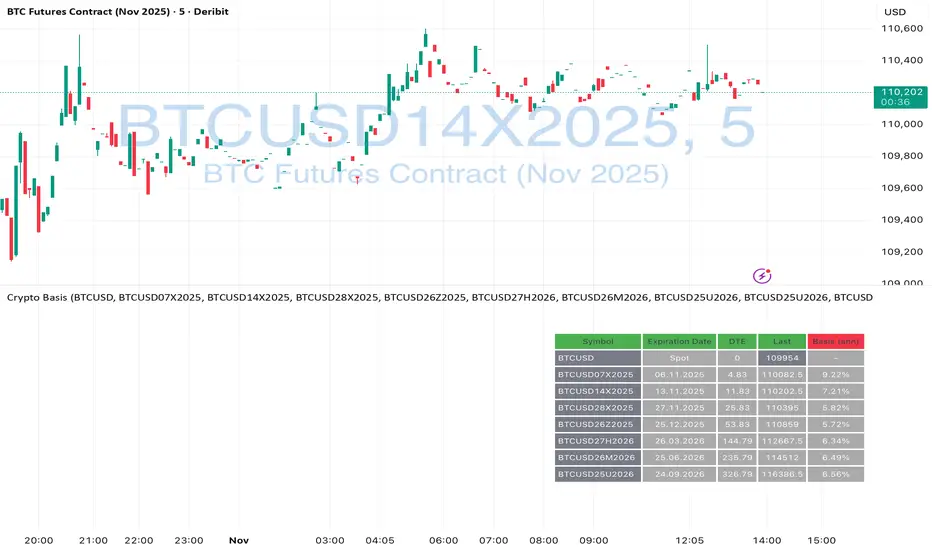
Crypto Futures Basis Tracker (Annualized)🧩 What is Basis Arbitrage
Basis arbitrage is a market-neutral trading strategy that exploits the price difference between a cryptocurrency’s spot and its futures markets.
When futures trade above spot (called contango), traders can buy spot and short futures, locking in a potential yield.
When futures trade below spot (backwardation), the reverse applies — short spot and go long futures.
The yield earned (or cost paid) by holding this position until expiry is called the basis. Expressing it as an annualized percentage allows comparison across different contract maturities.
⚙️ How the Indicator Works
This tool calculates the annualized basis for up to 10 cryptocurrency futures against a chosen spot price.
You select one spot symbol (e.g., BITSTAMP:BTCUSD) and up to 10 futures symbols (e.g., DERIBIT:BTCUSD07X2025, DERIBIT:BTCUSD14X2025, etc.).
The script automatically computes the days-to-expiry (DTE) and the annualized basis for each future.
A table displays for each contract: symbol, expiry date, DTE, last price, and annualized basis (%) — making it easy to compare the forward curve across maturities.
⚠️ Risks and Limitations
While basis arbitrage is often considered low-risk, it’s not risk-free:
Funding and financing costs can erode returns, especially when borrowing or using leverage.
Exchange or counterparty risk — if one leg of the trade fails (e.g., exchange default, margin liquidation), the hedge breaks.
Execution and timing risk — the basis can tighten or invert before both legs are opened.
Liquidity differences — thin futures may have large bid-ask spreads or slippage.
Use this indicator for analysis and monitoring, not as an automated trading signal.
Disclaimer: Please remember that past performance may not be indicative of future results. Due to various factors, including changing market conditions, the strategy may no longer perform as well as in historical backtesting. This post and the script don't provide any financial advice.
Purchasing Power vs Gold, Stocks, Real Estate, BTC (1971 = 100)Visual comparison of U.S. dollar purchasing power versus major assets since 1971, when the U.S. ended the gold standard. Each asset is normalized to 100 in 1971, showing how real value has shifted across gold, real estate, stocks, and Bitcoin over time.
Source: FRED (CPIAUCSL, SP500, MSPUS) • OANDA (XAUUSD) • TradingView (INDEX:BTCUSD/BLX)
Visualization by 3xplain

EV/FCFThis script in the 6 version of Pine brings you the most accurate multiple of "fundamental valuation" in my opinion. EV/FCF gives you a real metric of how profitable is the company in this exact moment and also if the company is overvaluated or undervaluated.

Intrinsic Value AnalyzerThe Intrinsic Value Analyzer is an all-in-one valuation tool that automatically calculates the fair value of a stock using industry-standard valuation techniques. It estimates intrinsic value through Discounted Cash Flow (DCF), Enterprise Value to Revenue (EV/REV), Enterprise Value to EBITDA (EV/EBITDA), and Price to Earnings (P/EPS). The model features adjustable parameters and a built-in alert system that notifies investors in real time when valuation multiples reach predefined thresholds. It also includes a comprehensive, color-coded table that compares the company’s historical average growth rates, valuation multiples, and financial ratios with the most recent values, helping investors quickly assess how current values align with historical averages.
The model calculates the historical Compounded Annual Growth Rates (CAGR) and average valuation multiples over the selected Lookback Period. It then projects Revenue, Earnings Before Interest, Taxes, Depreciation, and Amortization (EBITDA), Earnings per Share (EPS), and Free Cash Flow (FCF) for the selected Forecast Period and discounts their future values back to the present using the Weighted Average Cost of Capital (WACC) or the Cost of Equity. By default, the model automatically applies the historical averages displayed in the table as the growth forecasts and target multiples. These assumptions can be modified in the menu by entering custom REV-G, EBITDA-G, EPS-G, and FCF-G growth forecasts, as well as EV/REV, EV/EBITDA, and P/EPS target multiples. When new input values are entered, the model recalculates the fair value in real time, allowing users to see how changes in these assumptions affect the company’s fair value.
DCF = (Sum of (FCF × (1 + FCF-G) ^ t ÷ (1 + WACC) ^ t) for each year t until Forecast Period + ((FCF × (1 + FCF-G) ^ Forecast Period × (1 + LT Growth)) ÷ ((WACC - LT Growth) × (1 + WACC) ^ Forecast Period)) + Cash - Debt - Preferred Equity - Minority Interest) ÷ Shares Outstanding
EV/REV = ((Revenue × (1 + REV-G) ^ Forecast Period × EV/REV Target) ÷ (1 + WACC) ^ Forecast Period + Cash - Debt - Preferred Equity - Minority Interest) ÷ Shares Outstanding
EV/EBITDA = ((EBITDA × (1 + EBITDA-G) ^ Forecast Period × EV/EBITDA Target) ÷ (1 + WACC) ^ Forecast Period + Cash - Debt - Preferred Equity - Minority Interest) ÷ Shares Outstanding
P/EPS = (EPS × (1 + EPS-G) ^ Forecast Period × P/EPS Target) ÷ (1 + Cost of Equity) ^ Forecast Period
The discounted one-year average analyst price target (1Y PT) is also displayed alongside the valuation labels to provide an overview of consensus estimates. For the DCF model, the terminal long-term FCF growth rate (LT Growth) is based on the selected country to reflect expected long-term nominal GDP growth and can be modified in the menu. For metrics involving FCF, users can choose between reported FCF, calculated as Cash From Operations (CFO) - Capital Expenditures (CAPEX), or standardized FCF, calculated as Earnings Before Interest and Taxes (EBIT) × (1 - Average Tax Rate) + Depreciation and Amortization - Change in Net Working Capital - CAPEX. Historical average values displayed in the left column of the table are based on Fiscal Year (FY) data, while the latest values in the right column use the most recent Trailing Twelve Month (TTM) or Fiscal Quarter (FQ) data. The indicator displays color-coded price labels for each fair value estimate, showing the percentage upside or downside from the current price. Green indicates undervaluation, while red indicates overvaluation. The table follows a separate color logic:
REV-G, EBITDA-G, EPS-G, FCF-G = Green indicates positive annual growth when the CAGR is positive. Red indicates negative annual growth when the CAGR is negative.
EV/REV = Green indicates undervaluation when EV/REV ÷ REV-G is below 1. Red indicates overvaluation when EV/REV ÷ REV-G is above 2. Gray indicates fair value.
EV/EBITDA = Green indicates undervaluation when EV/EBITDA ÷ EBITDA-G is below 1. Red indicates overvaluation when EV/EBITDA ÷ EBITDA-G is above 2. Gray indicates fair value.
P/EPS = Green indicates undervaluation when P/EPS ÷ EPS-G is below 1. Red indicates overvaluation when P/EPS ÷ EPS-G is above 2. Gray indicates fair value.
EBITDA% = Green indicates profitable operations when the EBITDA margin is positive. Red indicates unprofitable operations when the EBITDA margin is negative.
FCF% = Green indicates strong cash conversion when FCF/EBITDA > 50%. Red indicates unsustainable FCF when FCF/EBITDA is negative. Gray indicates normal cash conversion.
ROIC = Green indicates value creation when ROIC > WACC. Red indicates value destruction when ROIC is negative. Gray indicates positive but insufficient returns.
ND/EBITDA = Green indicates low leverage when ND/EBITDA is below 1. Red indicates high leverage when ND/EBITDA is above 3. Gray indicates moderate leverage.
YIELD = Green indicates positive shareholder return when Shareholder Yield > 1%. Red indicates negative shareholder return when Shareholder Yield < -1%.
The Return on Invested Capital (ROIC) is calculated as EBIT × (1 - Average Tax Rate) ÷ (Average Debt + Average Equity - Average Cash). Shareholder Yield (YIELD) is calculated as the CAGR of Dividend Yield - Change in Shares Outstanding. The Weighted Average Cost of Capital (WACC) is displayed at the top left of the table and is derived from the current Market Cap (MC), Debt, Cost of Equity, and Cost of Debt. The Cost of Equity is calculated using the Equity Beta, Index Return, and Risk-Free Rate, which are based on the selected country. The Equity Beta (β) is calculated as the 5-year Blume-adjusted beta between the weekly logarithmic returns of the underlying stock and the selected country’s stock market index. For accurate calculations, it is recommended to use the stock ticker listed on the primary exchange corresponding to the company’s main index.
Cost of Debt = (Interest Expense on Debt ÷ Average Debt) × (1 - Average Tax Rate)
Cost of Equity = Risk-Free Rate + Equity Beta (β) × (Index Return - Risk-Free Rate)
WACC = (MC ÷ (MC + Debt)) × Cost of Equity + (Debt ÷ (MC + Debt)) × Cost of Debt
This indicator works best for operationally stable and profitable companies that are primarily valued based on fundamentals rather than speculative growth, such as those in the industrial, consumer, technology, and healthcare sectors. It is less suitable for early-stage, unprofitable, or highly cyclical companies, including energy, real estate, and financial institutions, as these often have irregular cash flows or distorted balance sheets. It is also worth noting that TradingView’s financial data provider, FactSet, standardizes financial data from official company filings to align with a consistent accounting framework. While this improves comparability across companies, industries, and countries, it may also result in differences from officially reported figures.
In summary, the Intrinsic Value Analyzer is a comprehensive valuation tool designed to help long-term investors estimate a company’s fair value while comparing historical averages with the latest values. Fair value estimates are driven by growth forecasts, target multiples, and discount rates, and should always be interpreted within the context of the underlying assumptions. By default, the model applies historical averages and current discount rates, which may not accurately reflect future conditions. Investors are therefore encouraged to adjust inputs in the menu to better understand how changes in these key assumptions influence the company’s fair value.

Quick Valuation V.1.0 (Ibo)This Pine Script indicator performs a Quick Discounted Cash Flow (DCF)-style Valuation to estimate the intrinsic value of a stock.
It calculates a projected Fair Value and a Margin of Safety based on user inputs or automatically pulled financial data from TradingView (like revenue, growth, margin, and exit P/E). It also automatically computes a Discount Rate using a modified CAPM model.
Key Features
Valuation Output: Calculates a target Fair Value and the resulting Margin of Safety.
Data Flexibility: Automatically pulls essential fundamentals (Revenue, Margins, Shares Outstanding, etc.) but allows the user to override any value (revenue, growth, P/E, shares, etc.) via the settings.
Automated Discount Rate: Calculates the Discount Rate (Cost of Equity) using the current 10-Year Real Yield and a computed or user-defined Beta.
Clear Display: Presents all input metrics, calculated values, and data sources (TradingView or User Input) in a neat table on the chart.
