Axioma VZO [Volume Zone Oscillator]Axioma VZO
This indicator is a professional evolution of the classic Volume Zone Oscillator (VZO), optimized for modern Market Structure trading and Pullback strategies.
Credits & Origins The underlying concept of the VZO was originally developed by Walid Khalil and David Steckler (published in the IFTA Journal). It is one of the few oscillators that combines price and volume data to precisely measure buying and selling pressure. Logic extension, Hybrid Trend Design & Coding by TradeQUO.
What makes the version special? We have expanded the classic VZO with a unique "Hybrid Market Structure" component:
Oscillating Trend Line: Instead of rigid levels, we use a smoothed "Slow VZO" curve to visualize market momentum. Fractal HTF Coloring: The color of this trend line is not simply based on price, but on the structural integrity of a Higher Timeframe (HTF). It glows Green when the HTF (e.g., 1H or 4H) has broken a Bullish Fractal, and Orange upon a Bearish Break.
Usage for Traders This indicator is excellent for Trend Followers and Pullback Traders:
Trend Identification: Look at the color of the thick Trend Line (Middle). Cyan = Bullish Structure, Orange = Bearish Structure. Pullback Entry: If the Trend Line is GREEN , but the fast VZO dips down into the oversold zone (or below 0), this is a high-quality buying opportunity within an existing trend. Exits: Use the Extreme Zones (+60 / -60) to take profits during parabolic moves.
Settings VZO Length: Standard 14. Trend Source (HTF): Select your anchor timeframe for the trend color here (Default: 60 min). Smoothing: Enabled for smoother signals.
Compliance & Source Code Note Although we are huge fans of Open Source, the source code of this script is protected . The reason is the unique Hybrid-Weighting-Logic which we developed specifically for the Axioma Suite. It ensures that the integrity of the signals is maintained and that no flawed copies circulate that could mislead traders. However, we provide this tool to the community free of charge to support your trading success.
Trade safe & responsible. Design by TradeQUO.
Volumeindicator

BT Smart CVDBT Smart CVD — Intelligent Delta, Inventory & Participation Context
What this is
BT CVD is an advanced Cumulative Volume Delta tool designed to show when delta actually matters .
Instead of treating all buying/selling equally, BT CVD contextualizes delta by:
• Existing inventory size
• Relative delta significance
• Participation momentum (CDC-weighted)
This is a context and permission tool , not a buy/sell signal generator.
In the example above advanced but common CVD interpretations can mislead traders into trap areas. The Smart CVD recognizes exhaustion in real time, informing traders when price is slowing down and possibly reversing
────────────────────────
Core concepts
CVD Line = Inventory
The CVD line shows cumulative net buying or selling since the selected anchor.
• Rising CVD → inventory accumulation
• Falling CVD → inventory distribution
• Flat CVD → balance / rotation
Delta Histogram = Activity
Each histogram bar represents delta on that candle only.
• Cyan = net buying on the bar
• Red = net selling on the bar
Important:
A cyan bar below zero does NOT mean the market is bullish.
It means buyers were aggressive on that candle, even if sellers still control inventory overall.
────────────────────────
Intelligent Delta Heatmap
BT CVD uses a gradient heatmap to highlight relative delta significance , not raw size.
Delta intensity is normalized by:
• Current inventory (CVD level)
• A stabilizing denominator floor
• A user-defined % threshold
Result:
• Dark / saturated bars = meaningful pressure
• Faded bars = low-impact activity
• Rapid intensity changes = acceleration or liquidation
This makes liquidation, exhaustion, and initiative moves visually obvious.
────────────────────────
CDC-Weighted Delta (Key Feature)
Delta only matters if participation supports it.
When CDC-weighting is enabled:
• Delta is emphasized only when participation expands in the same direction
• Decelerating participation is muted
• Direction-aware logic correctly handles both bullish and bearish flows
This dramatically reduces false breakouts and late-trend traps.
────────────────────────
State-Aware CVD
BT CVD classifies flow into behavioral states that guide trader behavior:
Inventory Building
• Strong delta + expanding participation
• Press-friendly environment
Fragile Inventory
• Strong delta + weak participation
• Breakouts vulnerable
Exhaustion
• Participation spikes without inventory follow-through
• Fade risk increases
Inventory Unwind
• Strong opposing delta
• Liquidation or rotation risk
No arrows. No signals. Just behavior.
────────────────────────
Anchoring & Scaling
• Session / Weekly / All anchors for inventory context
• Manual or Auto scaling keeps CVD readable across assets
• Optional intrabar delta for higher-fidelity flow
────────────────────────
How traders use BT CVD
• Press trades only when inventory and participation align
• Avoid chasing fragile breakouts
• Recognize liquidation and exhaustion early
• Stand down during low-quality participation
Bottom line
BT CVD doesn’t predict price.
It helps traders align with professional inventory behavior and avoid trading when delta doesn’t matter.
Full playbook and available separately.

Delta Volume EMA Strategy
================================================================================
DELTA VOLUME EMA STRATEGY - STRATEGY GUIDE 📊
================================================================================
💡 COLLABORATION & SUPPORT
---------------------------
If you want to collaborate, have an idea for a strategy, or need help writing
or customizing code, send an email to burdytrader@gmail.com or send me a
message. Suggestions, ideas, and comments are always welcome! 🤝
================================================================================
⚠️ IMPORTANT: INSTRUMENT SELECTION 📈
-------------------------------------
This strategy performs BEST with instruments that have a centralized data flow,
such as Futures contracts. Centralized markets provide more accurate and
reliable volume data, which is essential for Volume Delta analysis to work
effectively.
Why Futures? 🎯
- Centralized exchange = Accurate volume data
- All trades flow through a single exchange
- Volume reflects true buying/selling pressure
- Better correlation between volume and price movements
While the strategy can work with other instruments (stocks, forex, etc.),
volume data quality may vary, which can affect the reliability of Volume Delta
signals. For optimal performance, use Futures contracts or other instruments
with centralized, high-quality volume data.
================================================================================
WHAT DOES THIS STRATEGY DO? 🎯
---------------------------
This strategy uses Volume Delta analysis combined with Exponential Moving
Averages (EMA) to identify high-probability trading opportunities. The Volume
Delta measures the difference between buying and selling pressure, helping to
identify when strong institutional or smart money movements occur. The strategy
automatically enters trades when volume delta reaches extreme levels, indicating
potential trend continuation or reversal points.
HOW IT WORKS? ⚙️
---------------
1. VOLUME DELTA CALCULATION 📈
The strategy calculates the Volume Delta using the following formula:
- Volume Ratio (v) = Current Volume / Previous Volume
- EMA of Close (mac) = EMA(Close, MA Length) × Volume Ratio
- EMA of Open (mao) = EMA(Open, MA Length) × Volume Ratio
- Volume Delta (vd) = mac - mao
The Volume Delta shows:
- Positive values (green) = Buying pressure (buyers are more active)
- Negative values (red) = Selling pressure (sellers are more active)
2. VOLUME DELTA MOVING AVERAGE 📊
The strategy calculates an EMA of the Volume Delta (vdma) to smooth out
fluctuations and identify the overall trend of buying/selling pressure:
- vdma = EMA(Volume Delta, EMA Length)
- When vdma is above zero = Overall buying pressure
- When vdma is below zero = Overall selling pressure
3. PERCENTILE-BASED ENTRY CONDITIONS 🎲
Instead of using fixed thresholds, the strategy uses percentile analysis to
identify extreme volume delta movements:
For LONG entries:
- Analyzes seller volumes (negative volume delta) over the lookback period
- Calculates the percentile threshold (default: 80th percentile)
- Enters LONG when volume delta becomes positive AND exceeds the threshold
- This indicates a strong shift from selling to buying pressure
For SHORT entries:
- Analyzes buyer volumes (positive volume delta) over the lookback period
- Calculates the percentile threshold (default: 80th percentile)
- Enters SHORT when volume delta becomes negative AND exceeds the threshold
- This indicates a strong shift from buying to selling pressure
4. POSITION SIZING 💰
The strategy offers two position sizing methods:
a) RISK VALUE (Fixed Risk in Dollars):
- Calculates position size based on a fixed dollar risk amount
- Formula: Position Size = Risk Amount / (Entry Price × Stop Loss %)
- Ensures consistent risk per trade regardless of price level
b) LOTS SIZE:
- Uses a fixed lot size for all trades
- Simple and straightforward approach
- Useful when you want consistent position sizes
5. TAKE PROFIT & STOP LOSS SETTINGS 🎯
The strategy offers flexible TP/SL configuration in three modes:
a) PERCENTAGE (%):
- TP/SL calculated as a percentage of entry price
- Example: 2% TP means entry price × 1.02 (for LONG) or × 0.98 (for SHORT)
- Adapts automatically to different price levels
b) CURRENCY:
- TP/SL set as a fixed currency amount
- Example: $100 TP means entry price + $100 (for LONG) or - $100 (for SHORT)
- Useful for instruments with consistent price movements
c) PIPS:
- TP/SL set as a fixed number of pips
- Automatically converts pips to price using the instrument's minimum tick
- Ideal for forex and other pip-based instruments
6. AUTOMATIC TRADE EXECUTION ⚡
When entry conditions are met:
- Opens a position (LONG or SHORT) at market price
- Automatically sets Take Profit and Stop Loss based on selected mode
- Sends an alert with all trade information
- Only one position at a time (waits for current position to close)
AVAILABLE PARAMETERS ⚙️
----------------------
1. MA LENGTH (Default: 10)
- Length of the Exponential Moving Average used for close and open prices
- Lower values = More sensitive to recent price action
- Higher values = More smoothed, less sensitive
2. EMA LENGTH (Default: 20)
- Length of the EMA applied to Volume Delta
- Controls the smoothing of the volume delta signal
- Lower values = Faster signals, more trades
- Higher values = Slower signals, fewer but potentially more reliable trades
3. POSITION SIZE MODE
- "Risk Value": Calculate position size based on fixed dollar risk
- "Lots Size": Use fixed lot size for all trades
4. FIXED RISK IN $ (Default: 50)
- Only used when Position Size Mode = "Risk Value"
- The dollar amount you're willing to risk per trade
- Strategy calculates position size automatically
5. LOT SIZE (Default: 0.01)
- Only used when Position Size Mode = "Lots Size"
- Fixed lot size for all trades
6. TAKE PROFIT MODE
- "%": Percentage of entry price
- "Currency": Fixed currency amount
- "Pips": Fixed number of pips
7. STOP LOSS MODE
- "%": Percentage of entry price
- "Currency": Fixed currency amount
- "Pips": Fixed number of pips
8. TAKE PROFIT / STOP LOSS VALUES
- Different input fields appear based on selected mode
- Configure TP and SL independently
9. VOLUME LOOKBACK PERIOD (Default: 20)
- Number of bars used to calculate percentile thresholds
- Lower values = More sensitive, adapts faster to recent conditions
- Higher values = More stable, uses longer-term statistics
10. PERCENTILE THRESHOLD (Default: 80%)
- The percentile level used to identify extreme volume delta movements
- 80% means: only enter when volume delta exceeds 80% of recent values
- Higher values = Fewer but potentially stronger signals
- Lower values = More frequent signals
VISUALIZATION 📊
---------------
The strategy displays on the chart:
1. VOLUME DELTA COLUMNS
- Green columns = Positive volume delta (buying pressure)
- Red columns = Negative volume delta (selling pressure)
- Height represents the magnitude of buying/selling pressure
2. VOLUME DELTA MA AREA
- Two overlapping area plots showing the smoothed volume delta
- Black area (base layer) for overall visualization
- Green area (when positive) = Overall buying pressure trend
- Red area (when negative) = Overall selling pressure trend
- Helps identify the dominant market sentiment
3. ZERO LINE
- Horizontal line at zero
- Helps visualize when buying/selling pressure crosses the neutral point
ALERTS 🔔
--------
When enabled, the strategy sends alerts when a trade is opened. The alert
message includes:
- Direction: "Buy" for LONG positions or "Sell" for SHORT positions
- Entry Price: The price at which the position was opened
- TP (Take Profit): The target profit price
- SL (Stop Loss): The stop loss price
Example alert message:
"Buy | Entry: 1.2050 | TP: 1.2250 | SL: 1.1950"
Alerts can be configured in TradingView to send notifications via email,
SMS, webhooks, or other platforms.
RECOMMENDED SETTINGS 🎯
-----------------------
To get started, you can use these settings:
STRATEGY PARAMETERS:
- MA Length: 10 (default)
- EMA Length: 20 (default)
- Volume Lookback Period: 20 (default)
- Percentile Threshold: 80% (default)
POSITION SIZING:
- Position Size Mode: "Risk Value" (for risk management)
- Fixed Risk in $: Adjust based on your account size (e.g., 1-2% of account)
- OR use "Lots Size" with 0.01 lots for small accounts
TAKE PROFIT & STOP LOSS:
- TP Mode: "%" (recommended for most instruments)
- SL Mode: "%" (recommended for most instruments)
- Take Profit (%): 2.0% (adjust based on your risk/reward preference)
- Stop Loss (%): 1.0% (adjust based on your risk tolerance)
For Forex:
- Consider using "Pips" mode for TP/SL
- Typical values: 20-50 pips TP, 10-30 pips SL
For Stocks/Indices:
- Use "%" mode for TP/SL
- Typical values: 2-5% TP, 1-2% SL
PRACTICAL EXAMPLE 📝
-------------------
Scenario: LONG Entry on EUR/USD
1. Market conditions:
- Price: 1.1000
- Volume Delta becomes strongly positive
- Volume Delta exceeds 80th percentile of recent seller volumes
2. Strategy calculates:
- Entry Price: 1.1000 (current close)
- Position Size Mode: "Risk Value"
- Fixed Risk: $50
- Stop Loss Mode: "%"
- Stop Loss: 1.0%
- Position Size = $50 / (1.1000 × 0.01) = 4.55 lots
3. Strategy opens position:
- Direction: LONG (Buy)
- Entry: 1.1000
- Take Profit: 1.1220 (2% above entry)
- Stop Loss: 1.0890 (1% below entry)
- Alert sent: "Buy | Entry: 1.1000 | TP: 1.1220 | SL: 1.0890"
4. Outcome scenarios:
- If price rises to 1.1220 → Take Profit hit (profit)
- If price falls to 1.0890 → Stop Loss hit (loss limited to $50)
IMPORTANT NOTE ⚠️
-----------------
This strategy is a technical analysis tool based on volume delta analysis.
Like all trading strategies, it does NOT guarantee profits. Trading involves
significant risks and you can lose money, including your entire investment.
Past performance does not guarantee future results.
Always:
- Use appropriate risk management
- Never risk more than you can afford to lose
- Test the strategy on historical data (backtesting) before using real money
- Start with small position sizes or paper trading
- Understand that no strategy works 100% of the time
- Consider market conditions, news events, and other factors
- Keep a trading journal to learn and improve
The author and contributors are NOT responsible for any losses incurred from
using this strategy. Trading decisions are your own responsibility. Profits
are NOT guaranteed, and losses are possible.
LICENSE 📄
---------
This code is open source and available for modification. You are free to use,
modify, and distribute this strategy. If you republish or share a modified
version, please kindly mention the original author.
================================================================================

Multi-Distribution Volume Profile (Zeiierman)█ Overview
Multi-Distribution Volume Profile (Zeiierman) is a flexible, structure-first volume profile tool that lets you reshape how volume is distributed across price, from classic uniform profiles to advanced statistical curves like Gaussian, Lognormal, Student-t, and more.
Instead of forcing every market into a single "one-size-fits-all" profile, this tool lets you model how volume is likely concentrated inside each bar (body vs wicks, midpoint, tails, center bias, right-skew, heavy tails, etc.) and then stacks that behavior across a whole lookback window to build a rich, multi-distribution map of traded activity.
On top of that, it overlays a dynamic Center Band (value area) and a fade/gradient model that can color each price row by volume, hits, recency, volatility, reversals, or even liquidity voids, turning a plain profile into a multi-dimensional context map.
Highlights
Choose from multiple Profile Build Modes , including uniform, body-only, wick-only, midpoint/close/open, center-weighted, and a suite of probability-style distributions (Gaussian, Lognormal, Weibull, Student-t, etc.)
Flexible anchor layout: draw the profile on Right/Left (horizontal) or Bottom/Top (vertical) to fit any chart layout
Value Area / Center Band computed from volume quantiles around the POC.
Gradient-based Fade Metrics: volume, price hits, freshness (time decay), volatility impact, dwell time, reversal density, compression, and liquidity voids
Separate bullish vs bearish volume at each price row for directional structure insights
█ How It Works
⚪ Profile Construction
The script scans a user-defined Bars Included window and finds the full high–low span of that zone. It then divides this range into a user-controlled number of Price Levels (rows).
For each historical bar within the window:
It measures the candle’s price range, body, and wicks.
It assigns volume to rows according to the selected Profile Build Mode, for example:
* Range Uniform – volume spread evenly across the full high–low range.
* Range Body Only / Range Wick Only – concentrate volume inside the body or wicks only.
* Midpoint / Close / Open Only – allocate volume entirely into one price row (pinpoint modeling).
HL2 / Body Center Weighted – center weights around the middle of the range/body.
Recent-Weighted Volume – amplify newer bars using exponential time decay.
Volume Squared (Hard) – aggressively boost bars with large volume.
Up Bars Only / Down Bars Only – filter volume to only bullish or bearish bars.
For more advanced shapes, the script uses continuous distributions across the bar’s span:
Linear, Triangular, Exponential to High
Cosine Centered, PERT
Gaussian, Lognormal, Cauchy, Laplace
Pareto, Weibull, Logistic, Gumbel
Gamma, Beta, Chi-Square, Student-t, F-Shape
Each distribution produces a weight for each row within the bar’s range, normalized so the total volume remains consistent, but the shape of where that volume lands changes.
⚪ POC & Center Band (Value Area)
Once all rows are accumulated:
The row with the highest total volume becomes the Point of Control (POC)
The script computes cumulative volume and finds the band that wraps a user-defined Center of Profile % (e.g., 68%) around the center of distribution.
This range is displayed as a central band, often treated like a value area where price has spent the most “effort” trading.
⚪ Gradient Fade Engine
Each row also gets a fade metric, chosen in Fade Metric:
Volume – opacity based on relative volume.
Price Hits – how frequently that row was touched.
Blended (Vol+Hits) – average of volume & hits.
Freshness – emphasizes recent activity, controlled by Decay.
Volatility Impact – rows that saw larger ranges contribute more.
Dwell Time – where price “camped” the longest.
Reversal Density – where direction changes cluster.
Compression – tight-range compression zones.
Liquidity Void – inverse of volume (thin liquidity zones).
When Apply Gradient is enabled, the row’s bullish/bearish colors are tinted from faint to strong based on this chosen metric, effectively turning the profile into a heatmap of your chosen structural property.
█ How to Use
⚪ Explore Different Distribution Assumptions
Switch between multiple Profile Build Modes to see how your assumptions about intrabar volume affect structure:
Use Range Uniform for classical profile reading.
Deploy Gaussian, Logistic, or Cosine shapes to emphasize central clustering.
Try Pareto, Lognormal, or F-Shape to focus on tail / extremal activity.
Use Recent-Weighted Volume to prioritize the most recent structural behavior.
This is especially useful for traders who want to test how different modeling assumptions change perceived value areas and levels of interest.
⚪ Identify Value, Acceptance & Rejection Zones
Use the POC and Center of Profile (%) band to distinguish:
High-acceptance zones – wide central band, thick rows, strong gradient → fair value areas
Rejection zones & tails – thin extremes, low dwell time, high volatility or reversal density
These regions can be used as:
Targets and origin zones for mean reversion
Context for breakout validation (leaving value)
Bias reference for intraday rotations or swing rotations
⚪ Read Directional Structure Within the Profile
Because each row is split into bullish vs bearish contributions, you can visually read:
Where buyers dominated a price region (large bullish slice)
Where sellers absorbed or defended (large bearish slice)
Combining this with Fade Metrics like Reversal Density, Dwell Time, or Freshness turns the profile into a structural order-flow map, without needing raw tick-by-tick volume data.
⚪ Use Fade Metrics for Contextual Heatmaps
Each Fade Metric can be used for a different analytical lens:
Volume / Blended – emphasize where volume and activity are concentrated.
Freshness – highlight the most recently active zones that still matter.
Volatility Impact & Compression – spot areas of explosive moves vs coiled ranges.
Reversal Density – locate micro turning points and battle zones.
Liquidity Void – visually pop out thin regions that may act as speedways or magnets.
█ Settings
Profile Build Mode – Selects how each bar’s volume is distributed across its price range (uniform, body/wick, midpoint/close/open, center-weighted, or statistical distribution families).
Bars Included – Number of bars used to build the profile from the current bar backward.
Price Levels – Vertical resolution of the profile: more levels = smoother but heavier.
Anchor Side – Where the profile is drawn on the chart: Right, Left, Bottom, or Top.
Offset (bars) – Horizontal offset from the last bar to the profile when using Right/Left modes.
Apply Gradient – Toggles the fade/heatmap coloring based on the selected metric.
Fade Metric – Chooses the property driving row opacity (Volume, Hits, Freshness, Volatility Impact, Dwell Time, Reversal Density, Compression, Liquidity Void).
Decay – Time-decay factor for Freshness (values close to 1 keep older activity relevant for longer).
Profile Thickness – Relative thickness of the profile along the time axis, as a % of the lookback window.
Center of Profile (%) – Volume percentage used to define the central band (value area) around the POC.
-----------------
Disclaimer
The content provided in my scripts, indicators, ideas, algorithms, and systems is for educational and informational purposes only. It does not constitute financial advice, investment recommendations, or a solicitation to buy or sell any financial instruments. I will not accept liability for any loss or damage, including without limitation any loss of profit, which may arise directly or indirectly from the use of or reliance on such information.
All investments involve risk, and the past performance of a security, industry, sector, market, financial product, trading strategy, backtest, or individual's trading does not guarantee future results or returns. Investors are fully responsible for any investment decisions they make. Such decisions should be based solely on an evaluation of their financial circumstances, investment objectives, risk tolerance, and liquidity needs.

Bullish Volume RatioBullish Volume Ratio (BVR) Indicator
The Bullish Volume Ratio (BVR) is a sophisticated momentum oscillator designed to measure the true intensity of buying pressure versus selling pressure in the market. It provides a unique, statistically-driven view of market conviction, making it an essential tool for traders who seek to confirm trend health and anticipate major shifts.
BVR achieves its precision by not only assessing net volume but also using proprietary volume weighting logic to gauge the quality of participation in each candle, filtering out market noise to present a clear picture of underlying demand.
Key Features
Statistically-Driven Conviction: The indicator utilizes a Z-Score to measure how far the current BVR reading deviates from its historical average, providing an objective measure of whether buying or selling is truly exceptional or just noise.
Clear Visual Signals: The oscillator plot is designed for clear interpretation on a separate pane, helping you identify regime shifts without cluttering the main price chart.
Real-Time Data Dashboard (Optional): A customizable table on the chart displays the current BVR, Z-score, and other critical volume metrics at a glance.
Simplified Trading Guide
The BVR indicator simplifies volume analysis into clear, actionable signals that can be used for trend confirmation and reversal anticipation.
1. Trend Confirmation
Use the BVR to confirm the momentum of an existing trend:
Bullish Confirmation: When price is trending up, look for the BVR line to be rising and consistently above the center line. This signals that buyers are in firm control and the uptrend has strong volume conviction.
Bearish Confirmation: When price is trending down, look for the BVR line to be falling and deep below the center line. This indicates sellers are dominating the volume profile, confirming the strength of the downtrend.
2. Identifying Trade Entry/Exit Zones
The indicator's Z-Score component is key to spotting extremes that often precede a reversal:
Potential Long Entry: Look for a sustained negative Z-Score followed by a sharp crossover back towards the center line or into positive territory. This can signal that selling pressure has reached an exhaustion point and accumulation (buying) is beginning.
Potential Short Entry: Look for a sustained positive Z-Score followed by a sharp crossover back towards the center line or into negative territory. This suggests that buying momentum is exhausted and distribution (selling) is commencing.
3. The Volume Spike Filter
The indicator also alerts you to candles with significantly high volume relative to the recent average. Use this as a filter:
Breakout Validation: A price breakout is more likely to be legitimate if it is accompanied by a high volume spike confirmed by a strong BVR reading in the direction of the breakout.
Reversal Warning: A high volume spike at a key support or resistance level, particularly one that leads to a sharp turn in the BVR, can strongly signal a climactic reversal in progress.

PoC Migration Map [BackQuant]PoC Migration Map
A volume structure tool that builds a side volume profile, extracts rolling Points of Control (PoCs), and maps how those PoCs migrate through time so you can see where value is moving, how volume clusters shift, and how that aligns with trend regime.
What this is
This indicator combines a classic volume profile with a segmented PoC trail. It looks back over a configurable window, splits that window into bins by price, and shows you where volume has concentrated. On top of that, it slices the lookback into fixed bar segments, finds the local PoC in each segment, and plots those PoCs as a chain of nodes across the chart.
The result is a "migration map" of value:
A side volume profile that shows how volume is distributed over the recent price range.
A sequence of PoC nodes that show where local value has been accepted over time.
Lines that connect those PoCs to reveal the path of value migration.
Optional trend coloring based on EMA 12 and EMA 21, so each PoC also encodes trend regime.
Used together, this gives you a structural read on where the market has actually traded size, how "value" is moving, and whether that movement is aligned or fighting the current trend.
Core components
Lookback volume profile - a side histogram built from all closes and volumes in the chosen lookback window.
Segmented PoC trail - rolling PoCs computed over fixed bar segments, plotted as nodes in time.
Trend heatmap - optional color mapping of PoC nodes using EMA 12 versus EMA 21.
PoC labels - optional labels on every Nth PoC for easier reading and referencing.
How it works
1) Global lookback and binning
You choose:
Lookback Bars - how far back to collect data.
Number of Bins - how finely to split the price range.
The script:
Finds the highest high and lowest low in the lookback.
Computes the total price range and divides it into equal binCount slices.
Assigns each bar's close and volume into the appropriate price bin.
This creates a discretized volume distribution across the entire lookback.
2) Side volume profile
If "Show Side Profile" is enabled, a right-hand volume profile is drawn:
Each bin becomes a horizontal bar anchored at a configurable "Right Offset" from the current bar.
The horizontal width of each bar is proportional to that bin's volume relative to the maximum volume bin.
Optionally, volume values and percentages are printed inside the profile bars.
Color and transparency are controlled by:
Base Profile Color and its transparency.
A gradient that uses relative volume to modulate opacity between lower volume and higher volume bins.
Profile Width (%) - how wide the maximum bin can extend in bars.
This gives you an at-a-glance view of the volume landscape for the chosen lookback window.
3) Segmenting for PoC migration
To build the PoC trail, the lookback is divided into segments:
Bars per Segment - bars in each local cluster.
Number of Segments - how many segments you want to see back in time.
For each segment:
The script uses the same price bins and accumulates volume only from bars in that segment.
It finds the bin with the highest volume in that segment, which is the local PoC for that segment.
It sets the PoC price to the center of that bin.
It finds the "mid bar" of the segment and places the PoC node at that time on the chart.
This is repeated for each segment from older to newer, so you get a chain of PoCs that shows how local value has migrated over time.
4) Trend regime and color coding
The indicator precomputes:
EMA 12 (Fast).
EMA 21 (Slow).
For each PoC:
It samples EMA 12 and EMA 21 at the mid bar of that segment.
It computes a simple trend score as fast EMA minus slow EMA.
If trend heatmap is enabled, PoC nodes (and the lines between them) are colored by:
Trend Up Color if EMA 12 is above EMA 21.
Trend Down Color if EMA 12 is below EMA 21.
Trend Flat Color if they are roughly equal.
If the trend heatmap is disabled, PoC color is instead based on PoC migration:
If the current PoC is above the previous PoC, use the Up PoC Color.
If the current PoC is below the previous PoC, use the Down PoC Color.
If unchanged, use the Flat PoC Color.
5) Connecting PoCs and labels
Once PoC prices and times are known:
Each PoC is connected to the previous one with a dotted line, using the PoC's color.
Optional labels are placed next to every Nth PoC:
Label text uses a simple "PoC N" scheme.
Label background uses a configurable label background color.
Label border is colored by the PoC's own color for visual consistency.
This turns the PoCs into a visual path that can be read like a "value trajectory" across the chart.
What it plots
When fully enabled, you will see:
A right-sided volume profile for the chosen lookback window, built from volume by price.
Colored horizontal bars representing each price bin's relative volume.
Optional volume text showing each bin's volume and its percentage of the profile maximum.
A series of PoC nodes spaced across the chart at the mid point of each segment.
Dotted lines connecting those PoCs to show the migration path of value.
Optional PoC labels at each Nth node for easier reference.
Color-coding of PoCs and lines either by EMA 12 / 21 trend regime or by up/down PoC drift.
Reading PoC migration and market pressure
Side profile as a pressure map
The side profile shows where trading has been most active:
Thick, opaque bars represent high volume zones and possible high interest or acceptance areas.
Thin, faint bars represent low volume zones, potential rejection or transition areas.
When price trades near a high volume bin, the market is sitting on an area of prior acceptance and size.
When price moves quickly through low volume bins, it often does so with less friction.
This gives you a static map of where the market has been willing to do business within your lookback.
PoC trail as a value migration map
The PoC chain represents "where value has lived" over time:
An upward sloping PoC trail indicates value migrating higher. Buyers have been willing to transact at increasingly higher prices.
A downward sloping trail indicates value migrating lower and sellers pushing the center of mass down.
A flat or oscillating trail indicates balance or rotational behaviour, with no clear directional acceptance.
Taken together, you can interpret:
Side profile as "where the volume mass sits", a static pressure field.
PoC trail as "how that mass has moved", the dynamic path of value.
Trend heatmap as a regime overlay
When PoCs are colored by the EMA 12 / 21 spread:
Green PoCs mark segments where the faster EMA is above the slower EMA, that is, a local uptrend regime.
Red PoCs mark segments where the faster EMA is below the slower EMA, that is, a local downtrend regime.
Gray PoCs mark flat or ambiguous trend segments.
This lets you answer questions like:
"Is value migrating higher while the trend regime is also up?" (trend confirming value).
"Is value migrating higher but most PoCs are red?" (value against the prevailing trend).
"Has value started to roll over just as PoCs flip from green to red?" (early regime transition).
Key settings
General Settings
Lookback Bars - how many bars back to use for both the global volume profile and segment profiles.
Number of Bins - how many price bins to split the high to low range into.
Profile Settings
Show Side Profile - toggle the right-hand volume profile on or off.
Profile Width (%) - how wide the largest volume bar is allowed to be in terms of bars.
Base Profile Color - the starting color for profile bars, with transparency.
Show Volume Values - if enabled, print volume and percent for each non-zero bin.
Profile Text Color - color for volume text inside the profile.
PoC Migration Settings
Show PoC Migration - toggle the PoC trail plotting.
Bars per Segment - the number of bars contained in each segment.
Number of Segments - how many segments to build backwards from the current bar.
Horizontal Spacing (bars) - spacing between PoC nodes when drawn. (Used to separate PoCs horizontally.)
Label Every Nth PoC - draw labels at every Nth PoC (0 or 1 to suppress labels).
Right Offset (bars) - horizontal offset to anchor the side profile on the right.
Up PoC Color - color used when a PoC is higher than the previous one, if trend heatmap is off.
Down PoC Color - color used when a PoC is lower than the previous one, if trend heatmap is off.
Flat PoC Color - color used when the PoC is unchanged, if trend heatmap is off.
PoC Label Background - background color for PoC labels.
Trend Heatmap Settings
Color PoCs By Trend (EMA 12 / 21) - when enabled, overrides simple up/down coloring and uses EMA-based trend colors.
Fast EMA - length for the fast EMA.
Slow EMA - length for the slow EMA.
Trend Up Color - color for PoCs in a bullish EMA regime.
Trend Down Color - color for PoCs in a bearish EMA regime.
Trend Flat Color - color for neutral or flat EMA regimes.
Trading applications
1) Value migration and trend confirmation
Use the PoC path to see if value is following price or lagging it:
In a healthy uptrend, price, PoCs, and trend regime should all lean higher.
In a weakening trend, price may still move up, but PoCs flatten or start drifting lower, suggesting fewer participants are accepting the new highs.
In a downtrend, persistent downward PoC migration confirms that sellers are winning the value battle.
2) Identifying acceptance and rejection zones
Combine the side profile with PoC locations:
High volume bins near clustered PoCs mark strong acceptance zones, good areas to watch for re-tests and decision points.
PoCs that quickly jump across low volume areas can indicate rejection and fast repricing between value zones.
High volume zones with mixed PoC colors may signal balance or prolonged negotiation.
3) Structuring entries and exits
Use the map to refine trade location:
Fade trades against value migration are higher risk unless you see clear signs of exhaustion or regime change.
Pullbacks into prior PoC zones in the direction of the current PoC slope can offer higher quality entries.
Stops placed beyond major accepted zones (clusters of PoCs and high volume bins) are less likely to be hit by random noise.
4) Regime transitions
Watch how PoCs behave as the EMA regime changes:
A flip in EMA 12 versus EMA 21, coupled with a turn in PoC slope, is a strong signal that value is beginning to move with the new trend.
If EMAs flip but PoC migration does not follow, the trend signal may be early or false.
A weakening PoC path (lower highs in PoCs) while trend colors are still green can warn of a late-stage trend.
Best practices
Start with a moderate lookback such as 200 to 300 bars and a moderate bin count such as 20 to 40. Too many bins can make the profile overly granular and sparse.
Align "Bars per Segment" with your trading horizon. For example, 5 to 10 bars for intraday, 10 to 20 bars for swing.
Use the profile and PoC trail as structural context rather than as a direct buy or sell signal. Combine with your existing setups for timing.
Pay attention to clusters of PoCs at similar prices. Those are areas where the market has repeatedly accepted value, and they often matter on future tests.
Notes
This is a structural volume tool, not a complete trading system. It does not manage execution, position sizing or risk management. Use it to understand:
Where the bulk of trading has occurred in your chosen window.
How the center of volume has migrated over time.
Whether that migration is aligned with or fighting the current trend regime.
By turning PoC evolution into a visible path and adding a trend-aware heatmap, the PoC Migration Map makes it easier to see how value has been moving, where the market is likely to feel "heavy" or "light", and how that structure fits into your trading decisions.

Low-Volume Trend Reversal ProLow-Volume Trend Reversal Pro 的核心设计目标,是让交易者能更容易识别“低量变盘”与“高量趋势衰竭”这两类极其关键的市场信号。在趋势的发展过程中,最早发生变化的往往不是价格,而是成交量,也就是市场参与者的真实意愿。当量能突然变得极低时,通常意味着市场在当前价位已经不愿意继续推动趋势,无论是买方还是卖方都表现出明显的“无兴趣”,这种状态往往会发生在趋势进入末期、震荡前夕、反转开始之前。很多顶部和底部在价格上看起来依旧正常,但量能已经率先“退潮”,而这种低量行为正是行情准备改变方向的标志之一。通过对这些异常区域的高亮和标记,指标让交易者更早察觉趋势内部正在失去动力。
与低量信号相反,另一类值得高度关注的结构是“高量趋势结束”。极端高量看起来像是强势,但在趋势后半段,它往往代表的是趋势的耗尽、最后的冲刺或终结点。高量常出现在突破失败之前、反转前最后一跳、以及主力出货或吸引散户接盘的阶段。当市场在单一区域短时间内出现过高密度的成交,意味着大部分力量已经在此释放,后续难以再延续相同速度的趋势。这类高量行为往往不是趋势开始,而是趋势即将终结的信号。指标通过视觉化处理,将这些“过度活跃”的时刻从普通放量中区分出来,让交易者能更准确判断趋势是否仍然健康。
无论是极低量还是极高量,它们都揭示了“价格背后真实的交易意愿”。价格只是表面结果,而量能代表的是参与者是否愿意继续投入资金。当参与度下降时,趋势会在内部先断层;当参与度过度集中时,也往往意味着趋势已经走得太远。Low-Volume Trend Reversal Pro 的作用,就是把这种隐藏在价格背后的“真实态度变化”以最直观的方式呈现出来,而不是预测市场未来方向。对于使用趋势、结构、量价分析的交易者来说,它提供了一套稳定、客观的观察框架,让你在趋势即将结束时更及时警觉,也能在趋势健康时更有底气地持仓。
Low-Volume Trend Reversal Pro is designed with one goal in mind: to help traders identify two critical but often overlooked signals—low-volume reversal conditions and high-volume trend exhaustion. During the life cycle of a trend, volume often shifts earlier than price, revealing the true intentions of market participants before any visible price reaction. When volume collapses to unusually low levels, it often indicates that neither buyers nor sellers are willing to push the market further. This lack of commitment tends to appear near the end of a trend, ahead of consolidation phases, or before a reversal begins. Many tops and bottoms look completely normal on price, yet internally the market has already “gone quiet.” By highlighting these moments, the indicator helps traders detect fading momentum and weakening structure long before it becomes obvious to the crowd.
On the opposite end of the spectrum, extreme high-volume behavior can signal the exhaustion of a mature trend rather than strength. When participation becomes too concentrated within a short window, it often reflects the final push of buyers or sellers, peak activity, aggressive profit-taking, or even distribution to late participants. These high-volume spikes frequently appear right before failed breakouts, last-minute surges, or transition points into reversal. They do not represent healthy continuation but rather the final stage of an overextended move. The indicator visually distinguishes this type of abnormal activity from ordinary volume expansion, helping traders judge whether a trend is accelerating or burning out.
Both low-volume and high-volume signals offer insight into something price alone cannot reveal: the willingness of market participants to continue driving the trend. Price is only the final outcome; volume expresses actual intent. When participation fades, trends weaken internally before price reacts. When participation peaks excessively, the trend becomes unsustainable. Low-Volume Trend Reversal Pro does not predict future movements. Instead, it surfaces these underlying shifts in a clean and objective way, giving traders a clearer understanding of trend quality. For those who rely on structure, trend analysis, or volume-based decision-making, it adds a valuable layer of confirmation and helps improve timing around potential turning points.

Volume Gaps & Imbalances (Zeiierman)█ Overview
Volume Gaps & Imbalances (Zeiierman) is an advanced market-structure and order-flow visualizer that maps where the market traded, where it did not, and how buyer-vs-seller pressure accumulated across the entire price range.
The core of the indicator is a price-by-price volume profile built from Bullish and Bearish volume assignments. The script highlights:
True zero-volume voids (regions of no traded volume)
Bull/Bear imbalance rows (horizontal volume slices)
A multi-section Delta Panel, showing aggregated Buy–Sell pressure per vertical sector
A clean separation between profile structure, volume efficiency, and delta flows
Together, these components reveal market inefficiencies, displacement zones, and fair-value regions that price tends to revisit — making it an exceptional tool for structural trading, order-flow analysis, and contextual confluence.
Highlights
Identifies true volume voids (untraded price regions), more precisely than standard FVG tools
Plots Bull vs Bear volume at each price row for fine-grained imbalance reading
Includes a sector-based Delta Grid that aggregates Buy–Sell dominance
█ How It Works
⚪ Profile Construction
The indicator scans a user-defined Lookback window and divides the full high–low range into Rows. Each bar's volume is allocated into the correct price bucket:
Bullish volume when close > open
Bearish volume when close <= open
This produces three values per price level:
Bull Volume
Bear Volume
Total Volume & Imbalance Profile
Rows where no volume at all occurred are marked as volume gaps — signaling true untraded zones, often produced by impulsive imbalanced moves.
⚪ Zero-Volume Gaps (True Voids)
Unlike candle-based Fair Value Gaps (FVGs), volume gaps identify the deeper, structural inefficiency: Price moved so fast through a region that no trades occurred at those prices. These areas often attract revisits because liquidity never exchanged hands there.
⚪ Bull/Bear Volume Imbalance
Every price row is drawn using two colored horizontal segments:
Bull segment proportional to bullish volume
Bear segment proportional to bearish volume
This reveals where buyers or sellers dominated individual price levels.
⚪ Delta Panel
The full volume profile is cut into Summary Sections. For each block, the script computes: Δ = (Bull Volume − Bear Volume) ÷ Total Volume × 100%
█ How to Use
⚪ Spot True Voids & Inefficiencies
Zero-volume zones highlight where the price moved without trading. These areas often behave like:
Refill zones during retracements
Targets during displacement
Thin regions price slices through quickly
Ideal for both SMC-style trading and structural mapping.
⚪ Identify Bull/Bear Control at Each Price Level
Broad bullish segments show zones of buyer absorption, while wide bearish slices reveal seller control.
This helps you interpret:
Where buyers supported the price
Where sellers defended a level
Which price levels matter for continuation or reversal
⚪ Use Delta Sectors for Contextual Direction
The delta panel shows where market pressure is accumulating, revealing whether the profile is dominated by:
Bullish flow (positive delta)
Bearish flow (negative delta)
Neutral flow (balanced or minimal delta)
█ Settings
Lookback – Number of bars scanned to build the profile.
Rows – Vertical resolution of price bins.
Source – Price source used to assign volume into rows.
Summary Sections – Number of vertical delta sectors.
Summary Width – Horizontal size of the delta bar panel.
Gap From Profile – Distance between profile and delta grid.
Show Delta Text – Toggle Δ% labels.
-----------------
Disclaimer
The content provided in my scripts, indicators, ideas, algorithms, and systems is for educational and informational purposes only. It does not constitute financial advice, investment recommendations, or a solicitation to buy or sell any financial instruments. I will not accept liability for any loss or damage, including without limitation any loss of profit, which may arise directly or indirectly from the use of or reliance on such information.
All investments involve risk, and the past performance of a security, industry, sector, market, financial product, trading strategy, backtest, or individual's trading does not guarantee future results or returns. Investors are fully responsible for any investment decisions they make. Such decisions should be based solely on an evaluation of their financial circumstances, investment objectives, risk tolerance, and liquidity needs.

TernTable: VolViz
VolViz - Overview
VolViz is designed to give traders an instant volume strength visualisation tool using multiple timeframes. It provides an interactive table overlay that allows users to track volume metrics across a range of custom-selected timeframes. The table can dynamically display relative volume (RVOL), average volume, and current volume for each selected timeframes in real time.
Additionally, users can toggle various features and adjust thresholds to receive alerts for both high and low volume conditions.
Key Features
* Volume Metrics: Displays three main volume-related data points across multiple timeframes: Relative Volume (RVOL), Average Volume, and Current Volume.
* Timeframe Flexibility: Supports a range of customisable timeframes from seconds, minutes, hours to daily weekly and monthly intervals up to 12 months. Users can select which timeframes to display.
* Dynamic Table: A table is dynamically updated with data for each enabled timeframe, allowing traders to quickly compare volume data across different periods.
* Optional alert System: Includes alert functionality for high and low volume conditions based on customisable thresholds. Alerts can be set for a minimum number of timeframes for a condition to trigger.
Colour Logic
The script uses specific colours to enhance the visual alert properties that represent different ranges of Relative Volume (RVOL), which are used in the table to visually highlight the volume data:
1. Red: RVOL is less than 1.0, indicating low relative volume.
2. Green: RVOL is between 1.0 and 1.2, indicating moderate relative volume.
3. Purple: RVOL is between 1.2 and 1.5, indicating above average relative volume.
4. Orange: RVOL is between 1.5 and 2.0, indicating higher relative volume.
5. Yellow: RVOL is greater than 2.0, indicating very high relative volume.
How to use
1. Inputs:
* Volume Period: Set the period for calculating the moving average of volume (14 period default).
* The script defaults to the 2m 5m 15m 30m 1h 4h 12h D W M timeframes but user defined custom timeframes can be used (comma-separated) to specify the timeframes to track ( e.g "D,W,M,3M,6M,12M”) to a max of 10 timeframes. The table dynamically adjusts its size dependant on how many timeframes the user chooses to input.
* Table Position: Choose where to display the table: Top Left, Top Right, Bottom Left, or Bottom Right.
* Maximum Decimal Places: Control how many decimal places are shown for volume data.
2. Toggles:
* Enable High Volume Alert: Toggle this to activate the high volume alert.
* Enable Low Volume Alert: Toggle this to activate the low volume alert.
* Enable Minimum Timeframes for Alerts: Toggle this to require a specific number of timeframes to meet the alert condition before triggering.
* Pane Labels: There is also an optional debug label found in the Style tab to identify / confirm the current mode selected and the number of timeframes that meet the alert mode criteria.
The Show Row toggles can be utilised to include or exclude rows to take up less space on the chart.
* Show RVOL Row: Toggle to show the relative volume row in the table.
* Show Avg Volume Row: Toggle to show the average volume row in the table.
* Show Current Volume Row: Toggle to show the current volume row in the table.
* Show Spacer Row Below Table: Toggle to show or hide a blank spacer row below the table.
* Show Spacer Row Above Header: Toggle to show or hide a blank spacer row above the header.
3. How the Table Works:
* The table is populated with the following rows:
1. Spacer Row Above Header (optional): Adds space above the table header.
2. Header Row: Displays the timeframes (e.g., "1h", "4h", "12h", etc.).
3. Relative Volume (RVOL): Shows the RVOL for each timeframe, colored according to the thresholds.
4. Average Volume: Shows the average volume for each timeframe.
5. Current Volume: Displays the current volume for each timeframe.
6. Spacer Row Below Table (optional): Adds space below the data rows.
4. Optional Visual Alerts:
* High Volume Alert: When the current volume exceeds the default or user specified threshold compared to the average volume for the enabled timeframes.
* Low Volume Alert: When the current volume is below the default or user specified threshold compared to the average volume for the enabled timeframes.
When the visual alerts trigger unobtrusive diamonds will appear on the chart. White diamonds above the bar to indicate high volume and yellow diamonds below the bar to indicate low volume. These are not trend direction nor entry or exit signals but may be used in conjunction with other indicators for contextual purposes.
Questions or comments are always welcomed and I hope it helps with your trading !

Huge VolumesHuge Volumes indicator plots areas on the chart where trading volume spikes — showing where strong buying or selling pressure takes place.
It helps visualize how large players move in and out of positions, making it easier to spot potential turning points or confirm trends.

ICT HTF Volume Candles (Based on HTF Candles by Fadi)# ICT HTF Volume Candles - Multi-Timeframe Volume Analysis
## Overview
This indicator provides multi-timeframe volume visualization designed to complement price action analysis. It displays volume data from up to 6 higher timeframes simultaneously in a separate panel, allowing traders to identify volume spikes, divergences, and institutional activity without switching between timeframes.
**Original Concept Credits:** This indicator builds upon the HTF Candles framework by Fadi, adapting it specifically for volume analysis with enhanced features including gap-filling for extended hours, multiple scaling methods, and advanced synchronization.
## What Makes This Script Original
### Key Innovations:
1. **Three Volume Scaling Methods:**
- **Per-HTF Auto Scale:** Each timeframe scales independently for detailed comparison
- **Global Auto Scale:** All timeframes use unified scale for relative volume comparison
- **Manual Scale:** User-defined maximum for consistent analysis across sessions
2. **Bullish/Bearish Volume Differentiation:**
- Volume bars colored based on price movement (close vs open)
- Separate styling for bullish (green) and bearish (red) volume periods
- Helps identify whether volume supports price direction
3. **Advanced Time Synchronization:**
- Custom daily candle open times (Midnight, 8:30 AM, 9:30 AM ET)
- Timezone-aware calculations for New York trading hours
- Real-time countdown timers for each timeframe
- **Gap-filling technology** for continuous display during extended hours and weekends
4. **Flexible Display Options:**
- Configurable spacing and positioning
- Label placement (top, bottom, or both)
- Day-of-week or time interval labels on candles
- Works reliably in backtesting and live trading
## How It Works
### Volume Calculation
The indicator uses `request.security()` with optimized parameters to fetch volume data from higher timeframes:
- **Volume Open/High/Low/Close (OHLC):** Tracks volume changes within each HTF candle
- **Color Logic:** Compares HTF close vs open prices to determine bullish/bearish classification
- **Alignment:** All volume bars share a common baseline for easy visual comparison
- **Gap Handling:** Uses `gaps=barmerge.gaps_off` to maintain continuity during non-trading hours
### Technical Implementation
```
1. Monitors HTF timeframe changes using request.security() with lookahead
2. Creates new VolumeCandle object when HTF bar opens
3. Updates current candle's volume H/L/C on each chart bar
4. Applies selected scaling method to normalize display height
5. Repositions all candles and labels on each bar update
6. Fills gaps automatically during extended hours for consistent display
```
### Scaling Methods Explained
**Method 1 - Auto Scale per HTF:**
Each timeframe displays volume relative to its own maximum. Best for identifying patterns within each individual timeframe.
**Method 2 - Global Auto Scale:**
All timeframes share the same scale based on the highest volume across all HTFs. Best for comparing relative volume strength between timeframes.
**Method 3 - Manual Scale:**
User sets maximum volume value. Best for maintaining consistent scale across different trading sessions or instruments.
## How to Use This Indicator
### Setup
1. Add indicator to your chart (it appears in a separate panel below price)
2. Configure up to 6 higher timeframes (default: 5m, 15m, 1H, 4H, 1D, 1W)
3. Set number of candles to display for each timeframe
4. Choose volume scaling method based on your analysis needs
5. Enable "Fix gaps in non-trading hours" for extended hours trading (enabled by default)
### Interpretation
**Volume Spikes:**
- Sudden increase in volume height indicates institutional activity or strong conviction
- Compare volume between timeframes to identify where the real money is moving
- Look for volume spikes that appear across multiple timeframes simultaneously
**Bullish vs Bearish Volume:**
- **Green volume bars:** Price closed higher (buying pressure)
- **Red volume bars:** Price closed lower (selling pressure)
- High green volume during uptrend = confirmation of strength
- High red volume during downtrend = confirmation of weakness
- High volume opposite to trend = potential reversal warning
**Multi-Timeframe Context:**
- **5m/15m:** Scalping and day trading activity
- **1H/4H:** Swing trading and intraday institutional flows
- **Daily/Weekly:** Major position building and long-term trends
**Divergences:**
- Price making new highs but volume declining = weakening trend
- Volume increasing while price consolidates = potential breakout brewing
- Price breaks level but volume doesn't confirm = likely false breakout
### Practical Examples
**Example 1 - Institutional Confirmation:**
Price breaks above resistance. Check volume across timeframes:
- 5m shows spike = retail interest
- 15m + 1H + 4H all show spikes = institutional confirmation
- **Trade confidence: HIGH**
**Example 2 - False Breakout Detection:**
Price breaks resistance with:
- High volume on 5m only
- Normal/low volume on 1H and 4H
- **Interpretation:** Likely retail trap, institutions not participating
- **Action:** Wait for pullback or avoid
**Example 3 - Accumulation Phase:**
Price ranges sideways but:
- Daily volume gradually increasing
- Weekly volume above average
- **Interpretation:** Smart money accumulating
- **Action:** Prepare for breakout in direction of volume
**Example 4 - Volume Divergence:**
Price makes new high:
- Current high has lower volume than previous high across all timeframes
- **Interpretation:** Weakening momentum
- **Action:** Consider profit-taking or reversal trade
## Configuration Parameters
### Timeframe Settings
- **HTF 1-6:** Select timeframes (must be higher than chart timeframe)
- **Max Display:** Number of candles to show per timeframe (1-50)
- **Limit to Next HTFs:** Display only first N enabled timeframes (1-6)
### Styling
- **Bull/Bear Colors:** Separate colors for body, border, and wick
- **Padding from current candles:** Distance offset from live price action
- **Space between candles:** Gap between individual volume bars
- **Space between Higher Timeframes:** Gap between different timeframe groups
- **Candle Width:** Thickness of volume bars (1-4, multiplied by 2)
### Volume Settings
- **Volume Scale Method:** Choose 1, 2, or 3
- 1 = Auto Scale per HTF (each TF independent)
- 2 = Global Auto Scale (all TF unified)
- 3 = Manual Scale (user-defined max)
- **Auto Scale Volume:** Enable/disable automatic scaling
- **Manual Scale Max Volume:** Set maximum when using Method 3
### Label Settings
- **HTF Label:** Show/hide timeframe names with color and size options
- **Label Positions:** Display at Top, Bottom, or Both
- **Label Alignment:** Align centered or Follow Candles
- **Remaining Time:** Show countdown timer until next HTF candle
- **Interval Value:** Display day-of-week or time on each candle
### Custom Daily Candle
- **Enable Custom Daily:** Override default daily candle timing
- **Open Time Options:**
- **Midnight:** Standard 00:00 ET daily open
- **8:30 AM:** Align with economic data releases
- **9:30 AM:** Align with NYSE market open
- Useful for specific trading strategies or market alignment
### Advanced Settings
- **Fix gaps in non-trading hours:** Maintains alignment during extended hours and weekends (recommended: ON)
- Prevents visual gaps during forex weekend closures
- Ensures consistent display during crypto 24/7 trading
- Improves backtesting reliability
## Best Practices
1. **Pair with Price Action:** Use alongside HTF price candles indicator for complete picture
2. **Start Simple:** Enable 2-3 timeframes initially (e.g., 15m, 1H, 4H), add more as needed
3. **Match Settings:** Use same candle width/spacing as companion price indicator for visual alignment
4. **Scale Appropriately:**
- Use **Global scale** (Method 2) when comparing timeframes
- Use **Per-HTF scale** (Method 1) for pattern analysis within each timeframe
- Use **Manual scale** (Method 3) for consistent day-to-day comparison
5. **Watch for Volume Clusters:** High volume appearing simultaneously across multiple HTFs signals significant market events
6. **Confirm Breakouts:** Always check if volume supports the price movement across higher timeframes
7. **Extended Hours:** Keep "Fix gaps" enabled for 24/7 markets (Forex, Crypto) and weekend analysis
## Technical Notes
- **Timezone:** All calculations use America/New_York timezone for consistency
- **Real-time Updates:** Volume and timers update on each tick during market hours
- **Performance:** Optimized with max_bars_back=5000 for extensive historical analysis
- **Compatibility:** Works on all instruments with volume data (Stocks, Forex, Crypto, Futures)
- **Gap Handling:** Uses `barmerge.gaps_off` to fill data gaps during non-trading periods
- **Backtesting:** Uses `lookahead=barmerge.lookahead_on` for stable historical data without repainting
- **Data Continuity:** Automatically handles market closures, weekends, and extended hours
## Updates & Improvements
**Version 2.0 (Current):**
- ✅ Fixed alignment issues during extended hours and weekends
- ✅ Eliminated repainting in backtesting
- ✅ Added gap-filling technology for continuous display
- ✅ Improved data synchronization across all timeframes
- ✅ Enhanced NA value handling for data integrity
- ✅ Added advanced settings group for user control
## Support
For questions, suggestions, or feedback, please comment on the publication or message the author.
---
**Disclaimer:** This indicator is for educational and informational purposes only. It does not constitute financial advice. Past performance is not indicative of future results. Always perform your own analysis and implement proper risk management before making trading decisions.
Project Pegasus ChronosDescription
Project Pegasus Chronos is the flagship volume-intelligence overlay of the Pegasus suite, built for traders who read the tape. It spots where the tape gets hit, where moves get absorbed, and when pressure flips — in real time, without repainting. Chronos blends high-signal volume spikes, absorption, pure-delta mismatches, and two crisp market-pressure HUDs into one surgical visualization that stays readable even on noisy charts.
What’s unique
Layered volume intelligence that cuts through noise: spikes, absorption, delta traps, trend bias, and pressure — at a glance.
Absorption Engine – Proprietary scoring of wick/body/delta context to flag “hit & hold” moments where moves stall.
Pure-Delta Mismatch Bubbles – Instantly reveal fake strength or weakness when the candle fights the tape.
Mirage Filters (Add-on) – Smart VolSpike & PriceClamp regime tags (squeeze vs. burst) for clean entries and exits.
Pegasus TrendDynamic – Adaptive bias band with one-look flips and optional shadow fill for context.
Dual HUDs – Buy/Sell Volume HUD and Market Pressure HUD with a Shock badge for sudden impulses.
Readable by Design – Color presets, clustering, absolute filters, and performance scopes (12/24/48/72H) keep charts fast & clean.
Non-repainting – Signals are produced only on confirmed bars; no lookahead.
How it works
Chronos aggregates recent market behavior into simple, decisive visuals:
Bubbles scale by spike tier and direction to highlight initiative participation.
Absorption marks flag bars where flow hits and fails to push through.
Pure-delta markers expose liquidity traps (delta vs. candle color).
TrendDynamic provides a smooth, adaptive bias rail.
HUDs quantify who’s pressing harder and when a shock event fires.
How to use
Stalk large bubbles near key levels; pair them with absorption marks to time fades or continuations.
Treat pure-delta mismatches as early trap signals — especially near session highs/lows or FVGs.
Trade in alignment with the TrendDynamic bias; use Market Pressure HUD & Shock to time adds or cuts.
Refine visuals via clustering and absolute-volume filters on fast instruments.
Notes & limitations
Built for intraday futures, crypto, and FX — but works across assets and timeframes.
If visuals get heavy, use scope, clustering, and filters to keep it buttery smooth.
Analysis and visualization tool — not a signal service.
Disclaimer
For educational and informational purposes only. Not financial advice.

Volumetric Compressed MAVCMA (Volumetric Compressed Moving Average) uses the compressor and weighted standard deviation functions originally translated to pinescript by @gorx1 to plot moving averages in order to use for entry confirmation.
🔹 Concepts and Idea:
When we do music we always use different kinds of filters (low-pass, high pass, etc) for equalization and filtering itself. That stuff we use in finance as well. What we also always use in music are compressors, there dynamic processors that automatically adjust volume so it will be more consistent. Almost all the cool music you hear is compressed (both individual instruments (especially vocals) and the whole track afterwards), otherwise stuff will be too quite and too weak to flex on it, and also DJing it would be a nightmare.
🔹 Model:
I don't wanna explain it all in statistical / DSP way for once.
First of all, I think the population of volumes is log-normally distributed, so let's take logs of volumes, now we have a ~ normally distributed data. We take linearly weighted mean, add and subtract linearly weighted standard deviation from it, these would be our thresholds, the borders between different kinds of volumes explained before.
The upper threshold is for downward compression, that will not let volume pass it higher.
The lower threshold is for upward compression, all the volumes lower than this threshold will be brought up to the threshold's level.
Then we apply multipliers to the thresholds in order to adjust em and find the sweet spots. We do it the same way as in sound engineering when we don't aim for overcompression, we adjust the thresholds until they start to touch the signal and all good.
Afterwards, we delete all the number 1 and number 3 volume, leaving us exclusively with the clear main component, ready to be processed further.
We return the volumes to dem real scale.
For more info on Volume Compression it's highly advised to check @gorx1's initial script Volume Compressor
🔹 Settings:
MA Type: Moving average type to be used for comparison after calculating the compressed version of volume. This creates the second line after the compression line, so we can consider crossovers for confirmation entries.
Upward threshold: Upward threshold where the compression of volume is calculated. Increasing usually causes smoother lines.
Downward threshold: Downward threshold where the compression of volume is calculated. Decreasing usually causes smoother lines.
Compression Lookback: The Main lookback window of a volume that is used for compression. Increasing this would provide smoother lines but might cause delayed signals. Decreasing means more signals, but might cause whiplash and distorted signals.
Comparative Lookback: This is our lookback to be used with our ma type selection. There is no static better or worse lookback value for this indicator. It should be adjusted based on the pair.
🔹 Where to use:
This indicator should be used as another confirmation tool for your entry signals in your existing strategy/market following combination. Green dots (crossovers) mean bullish movement is expected, and red dots (crossbounders) mean bearish movement is expected. Automated crossover alerts are available. A reminder is that this kind of indicator should not be used on its own for trading, but rather should be used as a confirmation along with your trend detection and main entry indicators to provide additional confidence.
If you want to know under the hood, read the How it works section below.
🔹 How it works:
//This is our main compression calculation, which is used for the first line.
Compressed_out = compressor(volume, len_window, up_thresh, down_thresh)
//This is the secondary ratio calculation that we use for the second line.
Comp_ma = ma(ma_type, close * compressed_out, len_ml) / ma(ma_type, compressed_out, len_ml)
Vwma = ma(ma_type, close, len_window)
We calculate the ratio of the compressed volume and plot it against the base MA. Base MA's length is determined by the Compression Lookback input compared to the Comperative Lookback that is used for the compressed version. This provides us with another possible confirmation indicator that can be used to take advantage of volume ranges.
Volume Demand & Supply IndicatorTitle: VDS - Volume Demand & Supply Indicator
Description:
The VDS (Volume Demand & Supply) Indicator is a powerful analysis tool designed for traders who rely on understanding volume to make informed decisions. Unlike traditional volume indicators, VDS goes beyond just showing total volume by separating it into Up Volume and Down Volume, giving you a clear view of the buying and selling pressure in the market.
Key Features:
Precise Volume Analysis: The indicator scans data from lower timeframes to more accurately approximate up and down volume, providing you with detailed insights into market dynamics.
Identify Buying vs. Selling Pressure:
Up Volume: Represents the volume traded when the price rises, indicating dominant buying power.
Down Volume: Represents the volume traded when the price falls, indicating significant selling pressure.
Volume Moving Average (MA): A volume moving average is included to help you easily identify normal versus abnormal market activity, which is crucial for spotting strong trends and breakouts.
Delta Signal: The small "Delta" character indicates the difference between up volume and down volume. A green delta suggests buying dominance (demand), while a red delta points to selling dominance (supply).
Customizable: You have the ability to customize the lower timeframe used for analysis, allowing you to tailor the indicator to your specific trading strategy and style.
How to Trade with the VDS Indicator?
The VDS indicator isn't just a data visualization tool; it's a practical guide that can be used to confirm or deny trading signals. Here are a few suggested strategies:
Confirming Breakouts:
When the price breaks above a key resistance level, look for a significant increase in Up Volume. This confirms the breakout is genuine and supported by strong buying power.
A breakout with weak volume might be a "fakeout" and should be treated with caution.
Validating Trends:
In an Uptrend: You should consistently see the Up Volume (green columns) higher than the Down Volume (red columns). This shows that buyers are in control.
In a Downtrend: You should consistently see the Down Volume higher than the Up Volume, indicating sellers are dominant.
Detecting Trend Weakness (Divergence):
If the price is making new highs but the Up Volume is decreasing, it could signal a weakening of buying pressure, potentially leading to a trend reversal.
The opposite is true in a downtrend: if the price is making new lows but the Down Volume is weakening, a reversal may be imminent.
Using the Delta Signal for Reversals:
When the Delta signal turns from red to green at a price low (near a support level), it can confirm the beginning of new buying strength.
When the Delta turns from green to red at a price high (near a resistance level), it can confirm the start of new selling pressure.
The VDS indicator is a valuable addition to any trading strategy, adding a new dimension to volume analysis and helping traders understand what's really happening behind price movements.

VWAP Multi-TimeframeThis is a multi-timeframe VWAP indicator that provides volume weighted average price calculations for the following time periods:
15min
30min
1H
2H
4H
6H
8H
12H
1D
1W
1M
3M
6M
1Y
You can use the lower timeframes for short term trend control areas and use the longer timeframes for long term trend control areas. Trade in the direction of the trend and watch for price reactions that you can trade when price gets close to or touches any of these levels.
This indicator will provide a data plot value of 1 for bullish when price is above all VWAPs that are turned on, -1 for bearish when price is below all VWAPs that are turned on and 0 for neutral when price is not above or below all VWAPs. Use this 1, -1, 0 value as a filter on your signal generating indicators so that you can prevent signals from coming in unless they are in the same direction as the VWAP trend.
Features
Trend direction value of 1, -1 or 0 to send to external indicators so you can filter your signal generating indicators using the VWAP trend.
Trend table that shows you whether price is above or below all of the major VWAPs. This includes the daily, weekly, monthly and yearly VWAPs.
Trend coloring between each VWAP and the close price of each candle so you can easily identify the trend direction.
Customization
Set the source value to use for all of the VWAP calculations. The default is HLC3.
Turn on or off each VWAP.
Change the color of each VWAP line.
Change the thickness of each VWAP line.
Turn on or off labels for each VWAP or turn all labels on or off at once.
Change the offset length from the current bar to the label text.
Change the label text color.
Turn on or off trend coloring for each VWAP.
Change the color for up trends and down trends.
Turn on or off the trend direction display table.
Change the location of the trend direction display table.
Adjust the background and text colors on the trend direction display table.
How To Use The Trend Direction Filtering Feature
The indicator will provide a data plot value of 1 for bullish when price is above all of the VWAPs that are turned on, a value of -1 for bearish when price is below all of the VWAPS that are turned on and a value of 0 for neutral when price is above and below some of the VWAPs that are turned on.
The name of the value to use with your external indicators will show up as: VWAP Multi-Timeframe: Trend Direction To Send To External Indicators
Make sure to use that as your source on your external indicators to get the correct values.
This 1, -1 or 0 value can then be used by another external indicator to tell the indicator what is allowed to do. For instance if you have another indicator that provides buy and sell signals, you can use this trend direction value to prevent your other indicator from giving a sell signal when the VWAP trend is bullish or prevent your other indicator from giving a buy signal when the VWAP trend is bearish.
You will need to program your other indicators to use this trend filtering feature, but this indicator is already set up with this filtering code so you can use it with any other indicator that you choose to filter(if you know how to customize pine script).
Markets You Can Use This Indicator On
This indicator uses volume and price to calculate values, so it will work on any chart that provides volume and price data.

Volume Pressure Analysis - Live DataVolume Pressure Gauge and Volume Percentage Indicator – Pine Script Guide
This indicator provides a simplified, real-time visualization of both volume pressure (buy vs. sell activity) and today’s trading volume in comparison to historical averages. It is designed to help traders assess whether buyers or sellers dominate the current session and whether today’s volume is significant relative to recent behaviour.
________________________________________
Key Functional Segments
1. Inputs and Configuration
Users can configure the length of the Simple Moving Average (SMA) used to calculate average volume, set the position of the gauge table on the chart, and toggle the visibility of the volume pressure display. This allows flexibility in integrating the tool with various trading styles and chart layouts.
2. Volume Data Calculations
The indicator calculates three key volume metrics:
• volToday: The current day’s volume.
• volAvg: The average volume over the user-defined SMA period (default is 20 bars).
• volPct: The current volume as a percentage of the average.
This enables traders to quickly recognize whether current trading activity is above or below normal, which can be a precursor to potential trend strength or weakness.
3. Volume Pressure Calculation
The script estimates buying and selling pressure based on price movement and volume. It distributes volume into upward (buy) and downward (sell) segments and expresses them as percentages of the total volume. This gives an immediate sense of whether bulls or bears are more active in the current session.
4. Visual Representation (Progress Bars)
The indicator renders a simplified visual gauge using horizontal bar segments (pseudo-bars) to reflect the proportion of buy and sell pressure. The length of each bar correlates with the strength of pressure from buyers or sellers, helping users assess dominance without analyzing candlestick behavior in depth.
5. Table Display
A compact table is drawn on the chart showing:
• Buy pressure percentage and corresponding bar.
• Sell pressure percentage and corresponding bar.
• Volume percentage compared to the recent average.
This format makes it easy to evaluate volume dynamics at a glance, without cluttering the price chart or relying on separate overlays.
________________________________________
How Traders Benefit from This Indicator
• Momentum Shift Detection: Early signs of trend reversal can be observed when volume pressure flips direction.
• Breakout Validation: High volume combined with dominant pressure supports the credibility of breakout moves.
• False Move Avoidance: If price moves on low volume or mixed pressure, traders can avoid low-probability entries.
• Market Context Awareness: Users can assess whether a day is behaving normally in terms of participation or is unusually quiet or aggressive.
________________________________________
Basic Usage Guide
1. Add the script to your TradingView chart and set your preferred SMA length for volume comparison.
2. Customize the table’s position using the X and Y settings for clarity and alignment.
3. Interpret the outputs:
o A higher red bar indicates dominant sell pressure.
o A higher green bar indicates dominant buy pressure.
o Volume % above 100% suggests above-average activity, while values below 100% may imply low conviction.
4. Apply to trading decisions:
o High buy pressure and high volume may indicate a strong long opportunity.
o High sell pressure and high volume may support short setups.
o Low volume or conflicting signals may call for caution.
5. Combine with other tools such as trend indicators, support/resistance zones, or price action patterns for more reliable trade setups.
________________________________________
Practical Example
• Sell Pressure: 70% → Suggests strong seller control; potential for short setups.
• Buy Pressure: 30% → Weak buying interest; long trades may carry risk.
• Volume Percentage: 120% → Indicates a surge in participation; movement may have greater validity.
________________________________________
Tips for New Traders
• Use this indicator as a confirmation tool rather than a standalone strategy.
• Begin on higher timeframes (4-hour or daily) to develop familiarity.
• Compare multiple examples to identify reliable patterns over time.
• Always incorporate proper risk management, including stop losses.
________________________________________
Disclaimer from aiTrendview
This indicator is intended solely for educational and informational use. It does not constitute investment advice, trade signals, or financial recommendations. aiTrendview and its affiliates are not liable for any trading losses incurred through use of this tool. All trading involves risk. Past performance of any indicator does not guarantee future results. Users should conduct independent research and consult with a certified financial advisor before making any trading decisions.
52SIGNAL RECIPE Bid/Ask Intensity Monitor═══ 52SIGNAL RECIPE Bid/Ask Intensity Monitor ═══
◆ Overview
52SIGNAL RECIPE Bid/Ask Intensity Monitor is a technical indicator that visualizes the balance of buying and selling forces in the market in real-time. Based on candle structure, this indicator calculates the relative strength of buying and selling pressure, displaying it through an intuitive color gradient gauge that allows traders to instantly grasp short-term market psychology and trading activity.
─────────────────────────────────────
◆ Key Features
• Intuitive Visualization: Instantly recognize buy/sell ratios through color gradient gauges
• Real-time Force Balance: Accurately display the buy/sell force ratio as a percentage in the current candle
• Candle Structure Analysis: Interpret market participant behavior through relationships between high, low, and close prices
• Chart Overlay: Displayed on the chart to observe changes in force balance alongside price movements
• Color Psychology: Provides intuitive psychological understanding through blue series (buy) and red series (sell) colors
─────────────────────────────────────
◆ Technical Foundation
■ Buy/Sell Ratio Calculation
• Basic Principle: Measure the relative strength of buyers and sellers by analyzing candle structure
• Buy Ratio Calculation: (Close - Low) ÷ (High - Low)
• Sell Ratio Calculation: 1 - Buy Ratio
• Interpretation Logic: The closer the closing price is to the high, the stronger the buying force; the closer to the low, the stronger the selling force
■ Visualization Mechanism
• Gradient Color Map: Express buy/sell intensity through 12-level color gradients
• Buy Color Range: Gradual change from light sky blue (#8be2ff) to deep navy blue (#103c60)
• Sell Color Range: Gradual change from light pink (#f65575) to deep burgundy (#3d101a)
• Gauge Structure: Vertical table positioned in the middle right of the chart for enhanced visual focus
─────────────────────────────────────
◆ Practical Applications
■ Market Psychology Identification
• Strong Buying Pressure Signals:
▶ When buy ratio is displayed as 70% or higher
▶ When the gauge is filled with bright blue shades
• Strong Selling Pressure Signals:
▶ When sell ratio is displayed as 70% or higher
▶ When the gauge is filled with bright red shades
• Force Balance State:
▶ When buy/sell ratio is in the 40-60% range
▶ When the color distribution in the gauge is even
■ Trading Strategy Application
• Trend Confirmation Strategy:
▶ Consecutive high buy ratios (70% or more) signal uptrend confirmation
▶ Consecutive high sell ratios (70% or more) signal downtrend confirmation
• Reversal Detection Strategy:
▶ Decreasing sell ratio during a downtrend suggests potential rebound
▶ Decreasing buy ratio during an uptrend suggests potential correction
• Volatility Breakout Strategy:
▶ Rapid changes in buy/sell ratio from a balanced state (50%) provide breakout signals
▶ Dramatic shifts in the opposite direction after extreme ratios signal trend reversals
─────────────────────────────────────
◆ Advanced Setting Options
■ Gauge Settings
• Gauge Width: Default value 15 (can be adjusted narrower or wider)
• Position Adjustment: Can be positioned at various locations on the chart (default is middle right)
• Border Thickness: Adjust border thickness for gauge visibility (default is 4)
■ Color Customization
• Buy Gradient: Color range can be modified according to personal preference
• Sell Gradient: Color range can be modified according to personal preference
• Transparency Settings: Optimize chart readability by adjusting background color transparency
■ Display Frequency Settings
• Update Cycle: Can be set to update every bar or at specific intervals
• History Length: Set display range for historical data
─────────────────────────────────────
◆ Synergy with Other Indicators
• Volume Profile: Analyze the Bid/Ask Intensity Monitor together with volume distribution to confirm buying/selling pressure at key price levels
• RSI: Improve signal reliability by checking extreme values of the Bid/Ask Intensity Monitor alongside RSI's overbought/oversold levels
• Moving Averages: Observe changes in the Bid/Ask Intensity Monitor when price is near key moving averages to assess support/resistance strength
• Bollinger Bands: Observe the Bid/Ask Intensity Monitor's reaction at band boundaries to evaluate potential reversals or trend continuation
─────────────────────────────────────
◆ Conclusion
52SIGNAL RECIPE Bid/Ask Intensity Monitor is a powerful tool that visualizes market participants' psychology and behavior in real-time based on candle structure. Through intuitive color gradients and percentage displays, it allows for immediate understanding of the balance between buying and selling forces, greatly aiding in predicting short-term market direction and momentum. When used in conjunction with other technical indicators, it provides a comprehensive understanding of market conditions, contributing to more accurate entry and exit timing decisions. This indicator, particularly useful in scalping and short-term trading, will enhance the chart analysis capabilities of all traders.
─────────────────────────────────────
※ Disclaimer: Past performance does not guarantee future results. Always use appropriate risk management strategies.
═══ 52SIGNAL RECIPE Bid/Ask Intensity Monitor ═══
◆ 개요
52SIGNAL RECIPE Bid/Ask Intensity Monitor는 실시간으로 시장의 매수/매도 세력 균형을 시각화하는 기술적 지표입니다. 이 지표는 캔들 구조를 기반으로 매수와 매도 압력의 상대적 강도를 계산하고, 직관적인 그라데이션 색상 게이지를 통해 표시함으로써 시장 참여자들의 단기 심리와 거래 활동을 한눈에 파악할 수 있게 합니다.
─────────────────────────────────────
◆ 주요 특징
• 직관적인 시각화: 매수/매도 비율을 색상 그라데이션 게이지로 즉각적으로 인식
• 실시간 세력 균형: 현재 봉에서의 매수/매도 세력 비율을 백분율로 정확히 표시
• 캔들 구조 기반 분석: 고가, 저가, 종가의 관계를 통해 시장 참여자 행동 해석
• 차트 오버레이: 차트 위에 표시되어 가격 움직임과 함께 세력 균형 변화 관찰 가능
• 색상 심리학 활용: 파란색 계열(매수)과 붉은색 계열(매도)로 직관적인 심리적 이해 제공
─────────────────────────────────────
◆ 기술적 기반
■ 매수/매도 비율 계산
• 기본 원리: 캔들의 구조를 분석하여 매수자와 매도자의 상대적 강도 측정
• 매수 비율 계산: (종가 - 저가) ÷ (고가 - 저가)
• 매도 비율 계산: 1 - 매수 비율
• 해석 논리: 종가가 고가에 가까울수록 매수 세력이 강하고, 저가에 가까울수록 매도 세력이 강함
■ 시각화 메커니즘
• 그라데이션 컬러 맵: 12단계 색상 그라데이션으로 매수/매도 강도 표현
• 매수 색상 범위: 밝은 하늘색(#8be2ff)에서 짙은 남색(#103c60)까지 점진적 변화
• 매도 색상 범위: 밝은 분홍색(#f65575)에서 짙은 적갈색(#3d101a)까지 점진적 변화
• 게이지 구조: 세로형 테이블로 우측 중앙에 배치되어 시각적 주목도 향상
─────────────────────────────────────
◆ 실용적 응용
■ 시장 심리 파악
• 강한 매수 압력 신호:
▶ 매수 비율이 70% 이상으로 표시될 때
▶ 게이지가 밝은 청색 계열로 채워질 때
• 강한 매도 압력 신호:
▶ 매도 비율이 70% 이상으로 표시될 때
▶ 게이지가 밝은 적색 계열로 채워질 때
• 세력 균형 상태:
▶ 매수/매도 비율이 40-60% 범위에 있을 때
▶ 게이지의 색상 분포가 균등할 때
■ 트레이딩 전략 적용
• 추세 확인 전략:
▶ 연속적인 높은 매수 비율(70% 이상)은 상승 추세 확인 신호
▶ 연속적인 높은 매도 비율(70% 이상)은 하락 추세 확인 신호
• 반전 탐색 전략:
▶ 하락 추세 중 매도 비율 감소는 반등 가능성 시사
▶ 상승 추세 중 매수 비율 감소는 조정 가능성 시사
• 변동성 돌파 전략:
▶ 균형 상태(50%)에서 급격한 매수/매도 비율 변화는 돌파 신호 제공
▶ 극단적 비율 후 반대 방향으로의 급격한 변화는 추세 전환 신호
─────────────────────────────────────
◆ 고급 설정 옵션
■ 게이지 설정
• 게이지 너비: 기본값 15 (좁게 또는 넓게 조정 가능)
• 위치 조정: 차트의 다양한 위치에 배치 가능 (우측 중앙 기본값)
• 테두리 두께: 게이지 가시성을 위한 테두리 굵기 조절 (기본값 4)
■ 색상 커스터마이징
• 매수 그라데이션: 개인 선호에 따라 색상 범위 수정 가능
• 매도 그라데이션: 개인 선호에 따라 색상 범위 수정 가능
• 투명도 설정: 배경색 투명도 조절로 차트 가독성 최적화
■ 표시 빈도 설정
• 업데이트 주기: 모든 봉마다 또는 특정 간격으로 업데이트 설정 가능
• 히스토리 길이: 과거 데이터에 대한 표시 범위 설정
─────────────────────────────────────
◆ 다른 지표와의 시너지
• 볼륨 프로파일: Bid/Ask Intensity Monitor와 볼륨 분포를 함께 분석하여 주요 가격대의 매수/매도 압력 확인
• RSI: Bid/Ask Intensity Monitor의 극단치와 RSI의 과매수/과매도 수준을 함께 확인하여 신호 신뢰도 향상
• 이동평균선: 가격이 주요 이동평균선 근처에서 Bid/Ask Intensity Monitor 변화를 관찰하여 지지/저항 강도 판단
• 볼린저 밴드: 밴드 경계에서의 Bid/Ask Intensity Monitor 반응을 관찰하여 반전 또는 추세 지속 가능성 평가
─────────────────────────────────────
◆ 결론
52SIGNAL RECIPE Bid/Ask Intensity Monitor는 캔들 구조를 기반으로 시장 참여자들의 심리와 행동을 실시간으로 시각화하는 강력한 도구입니다. 직관적인 색상 그라데이션과 백분율 표시를 통해 매수/매도 세력의 균형을 즉각적으로 파악할 수 있어, 시장의 단기적 방향성과 모멘텀을 예측하는 데 큰 도움이 됩니다. 다른 기술적 지표와 함께 사용하면 시장 상황에 대한 종합적인 이해를 얻을 수 있으며, 이는 더 정확한 진입 및 퇴출 타이밍을 결정하는 데 기여합니다. 특히 스캘핑과 단기 트레이딩에서 유용하게 활용될 수 있는 이 지표는 모든 트레이더의 차트 분석 능력을 한 단계 향상시켜 줄 것입니다.
─────────────────────────────────────
※ 면책 조항: 과거 성과가 미래 결과를 보장하지 않습니다. 항상 적절한 리스크 관리 전략을 사용하세요.
Bitcoin Institutional Volume AnchorsBitcoin Institutional Volume Anchors
Indicator Overview:
The Bitcoin Institutional Volume Anchors indicator is a professional-grade VWAP analysis tool designed for sophisticated Bitcoin trading strategies. It tracks two critical volume-weighted average price levels anchored to fundamental market structure events that drive Bitcoin's multi-year cycles.
-Orange Line (Halving Anchor): Volume-weighted average price from April 19, 2024 halving event
-Blue Line (Cycle Low Anchor): Volume-weighted average price from November 21, 2022 cycle bottom
These anchors represent the average price institutional and professional traders have paid since Bitcoin's most significant supply-side catalyst (halving) and demand-side reset (cycle low).
Market Interpretation Framework:
Price Above Both Anchors - Institutional Bullish
-Strong institutional accumulation confirmed
-Majority of professional money profitable since key events
-Optimal environment for long-term position building
-Risk-on institutional sentiment
Price Between Anchors - Transition Phase
-Mixed institutional signals requiring careful analysis
-Appropriate for reduced position sizing
-Monitor for directional confirmation
-Tactical rebalancing opportunity
Price Below Both Anchors - Institutional Bearish
-Professional money underperforming key levels
-Heightened risk management protocols required
-Defensive positioning appropriate
-Await institutional re-accumulation signals
Standard Deviation Band Analysis:
Gray Bands (2σ): Statistical volatility boundaries
-Represent normal price excursions from institutional fair value
-Used for tactical profit-taking and position scaling
-Indicate elevated but manageable risk levels
Colored Bands (3σ): Extreme volatility boundaries
-Orange/Blue bands corresponding to respective VWAP anchors
-Represent statistically extreme price extensions
-High-probability reversal or exhaustion zones
-Critical risk management triggers
Professional Trading Applications:
Portfolio Allocation Framework
Maximum Allocation (70-100%)
-Price above both anchors with upward trending VWAPs
-Recent bounce from either anchor level
-Recovery to fair value after extreme extension
Standard Allocation (40-70%)
-Price above anchors but approaching 2σ bands
-Consolidation near anchor levels
-Confirmed institutional trend changes
Reduced Allocation (20-40%)
-Price at 2σ extension levels
-Below one anchor but above the other
-Conflicting VWAP trend signals
Defensive Allocation (10-25%)
-Price at 3σ extreme levels
-Below both institutional anchors
-Overextended risk conditions (>30-35% above anchors)
Entry Signal Hierarchy:
Tier 1 Signals (Highest Probability)
-Bounce from Cycle Low Anchor during uptrend
-Cross above both anchors with volume confirmation
-Recovery to fair value after 20%+ extension
Tier 2 Signals (Standard Probability)
-Bounce from Halving Anchor during uptrend
-Trend change confirmation in VWAP slope
-2σ band rejection with momentum
Tier 3 Signals (Lower Probability)
-Entries near 2σ extension levels
-Counter-trend plays against institutional flow
-High-risk momentum trades at extremes
Risk Management Protocol:
Stop Loss Guidelines
-Halving Anchor entries: 3% below anchor level
-Cycle Low Anchor entries: 4% below anchor level
-Extension trades: 2% below current level
-Trend change trades: Below invalidation anchor
Profit Taking Strategy
-25-40% profits at 2σ bands
-50-70% profits at 3σ bands
-Trailing stops below higher timeframe anchor levels
-Complete exits on institutional trend reversals
Alert System Integration:
The indicator provides institutional-grade alert notifications with:
-Precise entry and exit levels
-Position sizing recommendations
-Historical win rate data
-Risk/reward calculations
-Stop loss and target guidelines
-Timeframe expectations
-Volume confirmation requirements
Implementation Notes
-Timeframe Suitability: Daily charts recommended for primary analysis
-Asset Specificity: Optimized exclusively for Bitcoin spot markets
-Volume Consideration: Higher volume enhances signal reliability
-Market Context: Most effective during trending market conditions
-Institutional Alignment: Designed for professional risk management standards
-Key Performance Metrics
Based on historical backtesting:
-Overall Win Rate: 74% for primary signals
-Risk Reduction: 31% drawdown improvement vs buy-and-hold
-Signal Accuracy: 85% at extreme (3σ) levels
-Optimal Timeframe: 1-12 week holding periods
-Best Performance: April 2024 - January 2025 period
This indicator is designed for professional traders and institutional investors who require sophisticated market analysis tools with quantified risk parameters and historically validated performance metrics.

Volumatic Support/Resistance Levels [BigBeluga]🔵 OVERVIEW
A smart volume-powered tool for identifying key support and resistance zones—enhanced with real-time volume histogram fills and high-volume markers.
Volumatic Support/Resistance Levels detects structural levels from swing highs and lows, and wraps them in dynamic histograms that reflect the relative volume strength around those zones. It highlights the strongest price levels not just by structure—but by the weight of market participation.
🔵 CONCEPTS
Price Zones: Support and resistance levels are drawn from recent price pivots, while volume is used to visually enhance these zones with filled histograms and highlight moments of peak activity using markers.
Histogram Fill = Activity Zone: The width and intensity of each filled zone adjusts to recent volume bursts.
High-Volume Alerts: Circle markers highlight moments of volume dominance directly on the levels—revealing pressure points of support/resistance.
Clean Visual Encoding: Red = resistance zones, green = support zones, orange = high-volume bars.
🔵 FEATURES
Detects pivot-based resistance (highs) and support (lows) using a customizable range length.
Wraps these levels in volume-weighted bands that expand/contract based on percentile volume.
Color fill intensity increases with rising volume pressure, creating a live histogram feel.
When volume > user-defined threshold , the indicator adds circle markers at the top and bottom of that price level zone.
Bar coloring highlights the candles that generated this high-volume behavior (orange by default).
Adjustable settings for all thresholds and colors, so traders can dial in volume sensitivity.
🔵 HOW TO USE
Identify volume-confirmed resistance and support zones for potential reversal or breakout setups.
Focus on levels with intense histogram fill and circle markers —they indicate strong participation.
Use bar coloring to track when key activity started and align it with broader market context.
Works well in combination with order blocks, trend indicators, or liquidity zones.
Ideal for day traders, scalpers, and volume-sensitive setups.
🔵 CONCLUSION
Volumatic Support/Resistance Levels elevates traditional support and resistance logic by anchoring it in volume context. Instead of relying solely on price action, it gives traders insight into where real conviction lies—by mapping how aggressively the market defended or rejected key levels. It's a visual, reactive, and volume-conscious upgrade to your structural toolkit.

Smart Money Liquidity Zones ProThe Smart Money Liquidity Zones Pro indicator identifies and visualizes key liquidity areas in the market where institutional traders (smart money) are likely to have placed their stop-loss orders. These zones represent areas of high liquidity that often act as magnets for price, making them valuable reference points for trading decisions.
What the Indicator Does
Core Functionality
Swing Point Detection: The indicator identifies significant swing highs and lows using three different methods (Classic, Fractal, or Combined) to locate potential liquidity pools.
Liquidity Zone Creation: At each valid swing point, the indicator creates a horizontal zone representing an area where stop-loss orders are likely clustered.
Zone Clustering: When multiple swing points occur near the same price level, the indicator intelligently combines them into larger cluster zones, indicating stronger liquidity areas.
Volume Confirmation: The indicator can filter zones based on volume, showing only those swing points that occurred with significant trading volume.
Zone Break Detection: When price closes through a liquidity zone, the indicator marks it as "Liquidity Taken" and removes the zone from the chart.
Zone Types
Buy-Side Liquidity Zones (Green): Created at swing highs where short sellers' stop-losses are likely placed
Sell-Side Liquidity Zones (Red): Created at swing lows where long traders' stop-losses are likely placed
Trading Strategies
Basic Concepts
Liquidity Runs: Price often moves toward these zones to trigger stop-loss orders before reversing. This creates trading opportunities.
Support and Resistance: Unbroken liquidity zones can act as support (sell-side) or resistance (buy-side) levels.
Breakout Confirmation: When price breaks through a zone with strong momentum, it often continues in that direction.
Entry Strategies
Strategy 1: Liquidity Grab Reversa l
Wait for price to spike into a liquidity zone
Look for rejection candles (wicks) at the zone
Enter in the opposite direction after confirmation
Place stop-loss beyond the liquidity zone
Strategy 2: Zone Break Continuation
Wait for price to close decisively through a zone
Enter on the retest of the broken zone
Target the next liquidity zone in the direction of the break
Strategy 3: Zone Clustering Trade
Focus on areas with multiple overlapping zones (clusters)
These areas offer higher probability setups
Trade bounces from cluster zones with tighter risk management
Risk Management
Always use stop-losses beyond the liquidity zones
Consider the overall market context and trend
Zones on higher timeframes are generally more significant
Volume-confirmed zones have higher reliability
Settings Explanation
Swing Detection Settings
Swing Strength (Lookback Bars)
Determines how many bars to look back for swing point validation
Higher values find more significant swings but fewer zones
Recommended settings:
1m-5m charts: 3-5
15m-1h charts: 5-8
Daily charts: 5-10
Weekly charts: 3-5
Monthly charts: 2-3
Adaptive Swing Detection
Automatically adjusts swing detection based on available historical data
Prevents errors when there's limited chart history
Recommended to keep enabled
Minimum Bars for Swing
Sets the absolute minimum bars required for swing detection
Lower values allow detection in limited data conditions
Swing Detection Method
Classic: Strict price comparison for pure swing highs/lows
Fractal: Williams Fractal pattern (2 bars on each side)
Combined: Uses both methods for maximum zone detection
Auto-Adjust for Timeframe
Automatically optimizes settings based on chart timeframe
Prevents inappropriate settings on higher timeframes
Zone Settings
Max Number of Visible Zones
Limits the number of zones displayed to prevent chart clutter
Older zones are automatically removed
Max Zone Duration (Bars)
Zones older than this are automatically deleted
Keeps the chart focused on recent liquidity areas
Enable Zone Clustering
Groups nearby zones into larger clusters
Identifies stronger liquidity areas
Cluster Threshold (%)
Maximum price distance for zones to be clustered
Lower values create tighter clusters
Show Cluster Labels
Displays "Cluster x2", "Cluster x3" etc. on grouped zones
Volume Filter Settings
Enable Volume Filter
When enabled, only creates zones at high-volume swing points
Increases zone quality but reduces quantity
Volume Multiplier
Multiplier for average volume to determine "high volume"
Lower values (0.7-0.9) create more zones
Higher values (1.2+) create fewer, higher-quality zones
Volume SMA Period
Period for calculating average volume
Higher values create smoother volume baseline
Show Volume Confirmation Icon
Displays a fire emoji on volume-confirmed zones
Volume Visualization Settings
Show Volume Dots
Displays dots below high-volume bars
Dynamic Zone Colors
Volume-confirmed zones appear with more intense colors
Show Volume Background
Highlights the chart background on high-volume bars
Visual Settings
Buy-Side/Sell-Side Zone Colors
Customize colors for long and short liquidity zones
Border Width
Thickness of zone borders (1-3)
Show 'Liquidity Taken' Labels
Displays labels when zones are broken
Label Size
Size of the liquidity taken labels
Show Swing Point Markers
Displays triangles at detected swing points
Show Debug Info
Shows diagnostic information for troubleshooting
Dashboard Settings
Show Dashboard
Toggles the information panel display
Dashboard Position
Choose from 6 positions on the chart
Background Color
Dashboard background color
Text Color
Dashboard text color
Text Size
Dashboard text size (tiny/small/normal/large)
Tips for Effective Use
Start with default settings and adjust based on your trading style and timeframe
Use multiple timeframes to identify confluence between zones on different scales
Combine with other indicators like trend analysis or momentum oscillators
Pay attention to clusters as they represent stronger liquidity areas
Monitor volume-confirmed zones for higher probability setups
Adjust zone duration based on your trading timeframe (shorter for scalping, longer for swing trading)
Use the debug feature if zones aren't appearing to understand why
Keep the chart clean by limiting the number of visible zones
Common Issues and Solutions
No zones appearing:
Lower the Swing Strength setting
Switch to Combined detection method
Disable volume filter if active
Check if there's enough historical data
Too many zones:
Increase Swing Strength
Enable volume filter
Reduce Max Number of Visible Zones
Increase Cluster Threshold
Zones disappearing too quickly:
Increase Max Zone Duration
Check if zones are being broken by price
Poor performance on higher timeframes:
Enable Auto-Adjust for Timeframe
Use appropriate Swing Strength for the timeframe
Consider using Classic method instead of Fractal
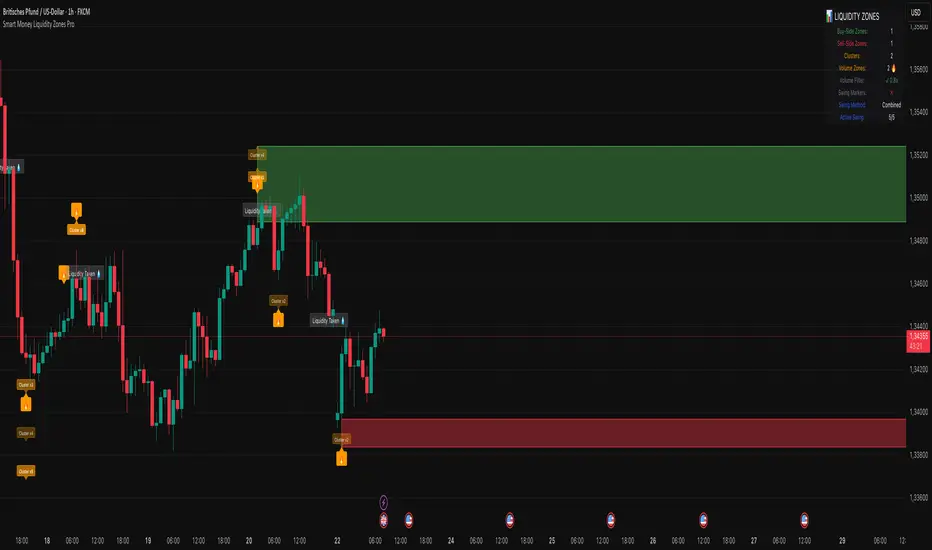
Volume Spike Alert & Overlay"Volume Spike Alert & Overlay" highlights unusually high trading volume on a chart. It calculates whether the current volume exceeds a user-defined percentage above the historical average and triggers an alert if it does. The information is also displayed in a customizable on-screen table.
What It Does
Monitors volume for each bar and compares it to an average over a user-defined lookback period.
Supports multiple smoothing methods (SMA, EMA, WMA, RMA) for calculating the average volume.
Triggers an alert when current volume exceeds the threshold percentage above the average.
Displays a table on the chart with:
Current Volume
Average Volume
Threshold Percentage
Optional empty row for spacing/formatting
How It Works
User Inputs:
lookbackPeriods: Number of bars used to calculate the average volume.
thresholdPercent: % above the average that triggers a volume spike alert.
smoothingType: Type of moving average used for volume calculation.
textColor, bgColor: Formatting for the display table.
tablePositionInput: Where the table appears on the chart (e.g., Bottom Right).
Toggles for showing/hiding parts of the table.
Volume Calculations:
Calculates current bar's volume.
Calculates average volume using the selected smoothing method.
Computes the threshold: avgVol * (1 + thresholdPercent / 100).
Compares current volume to threshold.
Table Display:
Dynamically creates a table with volume stats.
Adds rows based on user preferences.
Alerts:
alertcondition fires when currentVol crosses above the calculated threshold.
Message: "Volume Threshold Exceeded"
Usage Examples
Example 1: Spotting High Activity
Apply the script to a stock like AAPL on a 5-minute chart.
Set lookbackPeriods to 20 and thresholdPercent to 30.
Use EMA for more reactive volume tracking.
When volume spikes more than 30% above the 20-period EMA, an alert triggers.
Example 2: Day Trading Filter
For scalpers, apply it to a 1-minute crypto chart (e.g., BTC/USDT).
Set thresholdPercent to 50 to catch only strong surges.
Position the table at the top left and reduce visible info for a clean layout.
Example 3: Long-Term Context
On a daily chart, use SMA and set lookbackPeriods to 50.
Helps identify breakout moves supported by strong volume.
How this is different from Trading View's Volume indicator:
The standard volume plot from trading view allows users to set a alert when the average line is crossed, but it does not allow you to set a custom percentage at which to trigger an alert. This indicator will allow you to set any percentage you wish to monitor and above that percentage threshold will trigger your alert.
===== ORIGINAL DESCRIPTION =====
Volume Spike Alert & Overlay
This indicator will display the following as an overlay on your chart:
Current volume
Average Volume
Threshold for Alert
Description:
This indicator will display the current bar volume based on the chart time frame,
display the average volume based on selected conditions,
allow user selectable threshold over the average volume to trigger an alert.
Options:
Average lookback period
Smoothing type
Alert Threshold %
Enable / Disable Each Value
Change Text Color
Change Background Color
Change Table location
Add/Remove extra row for placement in top corner
Usage Example:
I use this indicator to alert when the current volume exceeds the average volume by a specified percentage to alert to volume spikes.
Set the threshold to 25% in the settings
Create an alert by clicking on the 3 dots on the right of the indicator title on the chart
When the threshold is exceeded the alert will trigger
ADR, ATR & VOL OverlayThis is a combined version of 2 of my other indicators:
ADR / ATR Overlay
VOL / AVG Overlay
This indicator will display the following as an overlay on your chart:
ADR
% of ADR
ADR % of Price
ATR
% of ATR
ATR % of Price
Custom Session Volume
Average For Selected Session
Volume Percentage Comparison
Description:
ADR : Average Day Range
% of ADR : Percentage that the current price move has covered its average.
ADR % of Price : The percentage move implied by the average range.
ATR : Average True Range
% of ATR : Percentage that the current price move has covered its average.
ATR % of Price : The percentage move implied by the average true range.
Custom Session Volume : User chosen time frame to monitor volume
Average For Selected Session : Average for the custom session volume
Volume Percentage Comparison : Current session compared to the average (calculated at session close)
Options:
ADR/ATR:
Time Frame
Length
Smoothing
Volume:
Set Custom Time Frame For Calculations
Set Custom Time Frame For Average Comparison
Set Custom Time Zone
Table:
Enable / Disable Each Value
Change Text Color
Change Background Color
Change Table location
Add/Remove extra row for placement
ADR / ATR Example:
The ADR and ATR can be used to provide information about average price moves to help set targets, stop losses, entries and exits based on the potential average moves.
Example: If the "% of ADR" is reading 100%, then 100% of the asset's average price range has been covered, suggesting that an additional move beyond the range has a lower probability.
Example: "ADR % of Price" provides potential price movement in percentage which can be used to asses R/R for asset.
Example: ADR (D) reading is 100% at market close but ATR (D) is at 70% at close. This suggests that there is a potential (coverage) move of 30% in Pre/Post market as suggested by averages.
Custom Volume Session Example:
Set indicator to 30 period average. Set custom time frame to 9:30am to 10:30am Eastern/New York.
When the time frame for the calculation is closed, the indicator will provide a comparison of the current days volume compared to the average of 30 previous days for that same time frame and display it as a percentage in the table.
In this example you could compare how the first hour of the trading day compares to the previous 30 day's average, aiding in evaluating the potential volume for the remainder of the day.
Notes:
Times must be entered in 24 hour format. (1pm = 13:00 etc.)
Volume indicator is for Intra-day time frames, not > Day.
How I use these values:
I use these calculations to determine if a ticker symbol has the necessary range to achieve target gains, to determine if the price oscillation is within "normal" ranges to determine if the trading day will be choppy, and to determine placement of stops and targets within average ranges in combination with support, resistance and retracement levels.

Vacuum Candles [XrayAlgo]The Vacuum Candles indicator helps traders identify inefficient price movements—where the price moves significantly but lacks sufficient volume to support it. These inefficiencies may signal weak trends, potential reversals, or false breakouts/breakdowns.
Inefficient candles are visually marked with a darker / black body to indicate when the price movement is disproportionate to the volume.
1. Spotting Potential Reversals
When the indicator marks an inefficient candle, it signals that the price movement may be unsustainable.
In an uptrend: A inefficient bullish candle suggests that the uptrend is losing momentum, potentially leading to a downward reversal.
In a downtrend: A inefficient bearish candle signals that the downtrend may be weakening, with a potential bullish reversal.
2. Identifying Breakout and Breakdown Failures
This indicator is useful for recognizing false breakouts or false breakdowns.
If price breaks resistance but the candle is inefficient, the breakout may be weak and could fail quickly.
If price breaks support with an inefficient bearish candle, the breakdown could be a false signal, with price reverting back above support.
3. Recognizing Weak Trends
Inefficient candles help you spot when a trend is losing strength and could soon reverse or consolidate.
In an uptrend: A series of dark body bullish candles suggests that the uptrend may be weakening, signaling a potential correction or trend reversal.
In a downtrend: A series of dark body bearish candles suggests that the selling pressure is weakening, indicating a potential bullish reversal.
4. Fine-Tuning Entries and Exits
Inefficient candles offer an opportunity to fine-tune your entries and exits based on weak price moves.
Entering a trade: An inefficient candle near key support or resistance can indicate a reversal, making it a good entry point for a counter-trend position.
Exiting a trade: If you're already in a trend, and an inefficient candle appears, it suggests the trend is losing strength, indicating it may be a good time to exit before a potential reversal.
5. Fine-Tuning with Inputs
The Vacuum Candles indicator includes two key inputs:
Length: The number of candles used to calculate the average price movement and volume. A longer length (e.g., 20-30) smooths out the inefficiencies, while a shorter length (e.g., 10-15) makes the indicator more sensitive to recent price moves.
Multiplier: Controls the threshold for what is considered an inefficient candle:
A higher Multiplier (e.g., 1.5–3) filters out smaller inefficiencies and focuses on large discrepancies.
A lower Multiplier (e.g., 0.1–0.9) captures even smaller inefficiencies in highly efficient markets.
