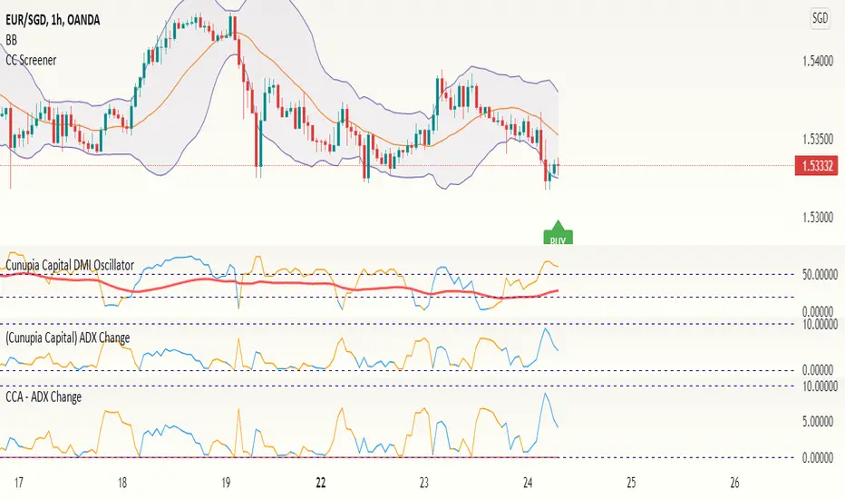
ADX Change
––––History & Credit
The idea of ADX change came from a trading book I read by Charles Le Beau and David Lucas (Computer Analysis of the Futures Market).
–––––What it does
The script calculates the Average Directional Index (ADX) and the period to period change. The script calculated 4 conditions:
– ADX accelerating to the upside (color cyan):
ADX>20
DMI+>DMI-
This period's absolute ADX number is HIGHER than pervious' period ADX number
- ADX momentum slowing to the upside (color blue):
ADX>20
DMI+>DMI-
This period's absolute ADX number is LOWER than pervious' period ADX number
- ADX momentum accelerating to the downside (color yellow):
ADX>20
DMI->DMI+
This period's absolute ADX number is HIGHER than pervious' period ADX number
- ADX momentum slowing to the downside (color yellow):
ADX>20
DMI->DMI+
This period's absolute ADX number is LOWER than pervious' period ADX number
–––––How to use it
I combine the ADX Change as a secondary indicator, that confirms my positions. I combine it with other momentum indicators like the TTM Squeeze.
If I am in position and the ADX Change is cyan, I would hold on the position until I see some shift in momentum or ADX change. This helps me hold on to my winners.
For the more advanced traders, it could be used to indicate shifts in momentum and buy points.
ADX

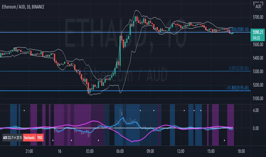
Didi Index PlusAbout this indicator (translation to Portuguese on the second half of the description):
The indicator follows the way Didi Aguiar teaches his trading system. Didi Aguiar is an old school Brazilian trader with over 40 years experience, who created the Didi Index and the famous agulhadas - or how I like to say in English: threads in the needle, an explosive price movement.
This version of the Didi Index adds what matters about DMI/ADX, Stochastic and TRIX to the regular Didi Index indicator.
The lines indicate alert and confirmations:
BLUE line crossing UP white line - BUY alert
PINK line crossing DOWN white line - BUY confirmation
Simultaneous Buy Alert and Confirmation = BUY AGULHADA.
BLUE line crossing DOWN white line - SHORT alert
PINK line crossing UP white line - SHORT confirmation
Simultaneous Short Alert and Confirmation = SHORT AGULHADA.
The background color changes according to the way Didi Aguiar reads the DMI and ADX.
Blue = Up trend
Bright Blue = Accelerating up trend
Purple = Down trend
Bright Purple = Accelerating down trend
Change from bright to dark color = ADX's bounce.
No coloured background = no trend.
The triangles on the top and bottom of the chart are the exit indicators.
They appear every time the Fast Stochastic and TRIX are in agreement:
Triangle on TOP of the chart means to EXIT LONG position.
- TRIX is selling and Stochastic just gave the sell signal; OR
- Stochastic is selling and TRIX just gave the sell signal
Triangle on BOTTOM of the chart means to EXIT SHORT position.
- TRIX is buying and Stochastic just gave the buy signal; OR
- Stochastic is buying and TRIX just gave the buy signal
Use this indicator with Bollinger Bands or other volatility indicator.
Not recommended for color-blind people :)
-----------------------------------------
Esse indicador segue a maneira que Didi Aguiar ensina o seu "trading system". Didi Aguiar é um trader velha-guarda com mais de 40 anos de experiência, que criou o Didi Index e as famosas Agulhadas, um movimento the preço explosivo.
Essa versão do Didi Index inclui o que interessa sobre outros três indicadores que o Didi usa em seu sistema: DMI/ADX, TRIX, e Estocástico.
As linhas indicam alerta e confirmação para o trade:
Linha AZUL cruzando a linha branca de BAIXO PARA CIMA - Alerta de compra
Linha ROSA cruzando a linha branca de CIMA PARA BAIXO - Confirmação de compra
ALERTA e CONFIRMAÇÃO de compra simultaneos = AGULHADA DE COMPRA
Linha AZUL cruzando a linha branca de CIMA PARA BAIXO - Alerta de venda
Linha ROSA cruzando a linha branca de BAIXO PARA CIMA - Confirmação de venda
ALERTA e CONFIRMAÇÃO de cenda simultaneos = AGULHADA DE VENDA
A cor do fundo muda de acordo com a maneira que o Didi lê o DMI e ADX
Fundo AZUL = Tendencia de compra
Fundo ROXO = Tendencia de venda
Cor mais saturada (vibrante) = Tendencia acelerante
Passou de cor mais clara para mais escura = Kick do ADX
Sem coloração de fundo = Sem tendencia
Os triângulos brancos na parte de cima e de baixo do indicador sinalizam a saida do trade.
Aparecem todas a vezes que o Etocastico e o TRIX ficam de acordo.
Triangulo na parte de CIMA sinaliza a SAÍDA da COMPRA.
- TRIX está vendido e o Estocástico acabou de vender; OU
- Estocástico está vendido e o TRIX acabou de vender
Triangulo na parte de BAIXO sinaliza a SAÍDA da VENDA.
- TRIX está comprado e o Estocástico acabou de comprar; OU
- Estocástico está comprado e o TRIX acabou de comprar
Use esse indicador em conjunto com as Bandas de Bollinger ou outro indicador de volatilidade.
Não é indicado para pessoas que sofrem de daltonismo :)
DMI (Multi timeframe) DI Strategy [KL]Directional Movement Index Strategy
Entry conditions:
- (a) when DI+ > DI- on timeframe #1, and
- (b) Confirmation: when DI+ > DI- on timeframe #2
In the shown example, timeframe1 was same as the chart (1H) and timeframe2 was 1D.
Stop Loss: ATR based trailing stop
About DMI
Can refer to Investopedia for general understanding.
Applications of DMI in this strategy:
- Assumes uptrend when DI+ is above DI- (when green DI+ lines above red DI-), vice versa for downtrend. This is checked in two different timeframes that can be set by user in settings.
- DX is ignored, it doesn't give a direction of the trend. But if DX was applied, it would be a good indicator for quantifying the strength of uptrend/downtrend. This measurement would typically be read along a threshold (i.e. if below 20, then market is likely consolidating). All of these have been commented out (ignored by pinescript's interpreter via //) in the codes, as said; we are not using DX for sake of simplicity.
Visualizations
To make the chart look cleaner, DMI plots have been simplified to just down/up arrows placed at bottom of the chart.
Referring to the example chart:
- Green arrows : when DI+ > DI- for both timeframes, implies uptrend
- Red arrows: other way around (DI+ < DI-), implies downtrend

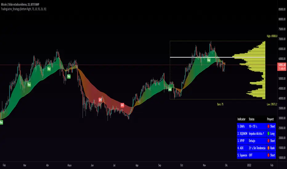
TradingLatino_StrategySPANISH:
TL_STRATEGY:
El TL_STRATEGY, es todo un ecosistema de indicadores que conforman una estrategia bastante potente y famosa en el trading de criptomonedas, está compuesta por los siguientes indicadores:
• Bandas de medias móviles exponenciales (10 y 55)
• Squeeze Momentum Indicator (SQZMON PRO+).
• Volume Profile (VP Desarrollado por APIDEVs).
• Average Directional Index ( ADX PRO+).
En ApiDev, decidimos optimizar visualmente esta estrategia, es por ello que creamos un panel informativo que muestra la proyección conjunta de todos los indicadores que ya mencionamos.
MEJORAS REALIZADAS EN LA ESTRATEGIA:
Más simple: Simplificamos la interfaz de todos los indicadores [para que el operador pueda seguir el ABC de su estrategia sin mucha complicación.
Señales de compra y venta: Basado en una estrategia que incorpora dos medias móviles de 10 y 55 periodos, la observación de la fuerza del ADX y la direccionalidad de los osciladores del SQZMON, señales de compra y venta para ser valorado por el comerciante.
Panel lateral: Integramos un panel lateral que permite observar la valoración y dirección de todos los indicadores que componen la estrategia.
Tiene un sistema de alerta que enviará notificaciones sobre los cambios que se produzcan en el indicador.
ENGLISH:
TL_STRATEGY:
The TL_STRATEGY , is a whole ecosystem of indicators that make up a quite powerful and famous strategy in cryptocurrency trading, it is composed of the following indicators:
• Exponential moving media bands (10 and 55).
• Squeeze Momentum indicator (SQZMON PRO +).
• Volume profile (VP Developed by APIDEVs).
• Average directional index ( ADX PRO +).
In ApiDev , we decided to visually optimize this strategy, that is why we created an information panel that shows the joint projection of all the indicators that we already mentioned.
IMPROVEMENTS MADE IN THE STRATEGY:
Simpler: We simplified the interface of all indicators [so that the trader can follow the ABCs of his strategy without much complication.
Buy and sell signals: Based on a strategy that incorporates two moving averages of 10 and 55 periods, the observation of the strength of the ADX and the directionality of the oscillators of the SQZMON, signals of buying and selling to be valued by the trader.
Side panel: We integrate a side panel that allows observing the assessment and direction of all the indicators that make up the strategy.
It has an alert system that will send notifications about the changes that occur in the indicator.
ADX Heatmap & Di's + Fib Referencial by [JohnnySnow]For quicker and easier interpretation, ADX line is displayed in a heatmap style. The more absolute difference between both DIs, the more intense the color.
Because some people use 20 ADX reference and others use 25 ADX reference to confirm the trend, I just add both as reference lines in a 'golden box'
Additionally, reference lines were added with default values set to Fib levels
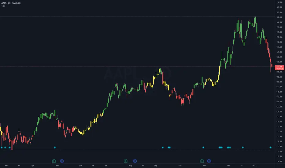
10X Market DirectionMy interpretation of John Carter's popular Simpler Trading 10X Bars indicator. Now you can see directional market strength for a variety of key futures , indices and industry groups for quick comparison with individual stocks.
Momentum is displayed to quickly see the quality and strength of a trend based on a calculation of the Directional Movement Index (DMI). The DMI is an indicator developed by J. Welles Wilder in 1978 that identifies in which direction the price of an asset is moving. The DMI is calculated by comparing prior highs and lows and produces 2 measurements illustrating the strength of the current trend:
-> a positive directional movement line ( +DI ); and
-> a negative directional movement line ( -DI ).
The average directional index ( ADX ) measures the strength of the current trend, either +DI or +DI ; a reading above 20 typically indicates a strong trend.
-> Green bars indicate an uptrend i.e. when +DI is above -DI and ADX is greater than 20 - there is more upward pressure than downward pressure in the price;
-> Red bars indicate a downtrend i.e. when -DI is above +DI and ADX is greater than 20 - there is more downward pressure on the price; and
-> Yellow bars indicate no strong directional trend and potential for a reversal.
This indicator should compliment other popular indicators, as confirmation whether to stay in a position or not.

10X Bars - Directional TrendsMy interpretation of John Carter's popular Simpler Trading 10X Bars indicator.
Momentum is displayed to quickly see the quality and strength of a trend based on a calculation of the Directional Movement Index (DMI). The DMI is an indicator developed by J. Welles Wilder in 1978 that identifies in which direction the price of an asset is moving. The DMI is calculated by comparing prior highs and lows and produces 2 measurements illustrating the strength of the current trend:
-> a positive directional movement line (+DI); and
-> a negative directional movement line (-DI).
The average directional index (ADX) measures the strength of the current trend, either +DI or +DI; a reading above 20 typically indicates a strong trend.
-> Green bars indicate an uptrend i.e. when +DI is above -DI and ADX is greater than 20 - there is more upward pressure than downward pressure in the price;
-> Red bars indicate a downtrend i.e. when -DI is above +DI and ADX is greater than 20 - there is more downward pressure on the price; and
-> Yellow bars indicate no strong directional trend and potential for a reversal.
Volume spikes 50% above average volume are then flagged as dots at the bottom of the chart (although you can change this location), confirming the momentum further.
This indicator should compliment other popular indicators, as confirmation whether to stay in a position or not.
ADX Screener// Identify potential trend reversals using ADX on up to 40 crypto assets.
// ADX shows the strength of a trend, not the direction.
// By monitoring the difference of ADX values between candles, you can potentially identify reversals before they happen.
// A strong trend has a 14 period ADX slope increasing .5 or more from the prior candle.
// At a minimum, a weak trend has a 14 period ADX slope of +.25 or less, and strictly it would be decreasing.
// This indicator prints one row for each asset with three columns for ADX differences one candle back each.
// The asset name is colored green or red dependent on whether +DI > -DI or not.
The market was in a down trend (-DI > +DI).
A bullish wave moved price up to EMA 8 resistance with strong ADX momentum (ADX diff of prior candle >= 0.5).
A Spinning Top showed that the trend was losing momentum (ADX diff lower than previous candle, showed the bullish wave losing momentum).
A Morning Star bearish reversal pattern draws resistance at the high of the pattern. (ADX Bullish momentum exhausted).
Symbol: -DI > +DI
2: Strong momentum
1: Losing momentum (spinning top)
0: Trend reversal (bearish engulfing pattern)

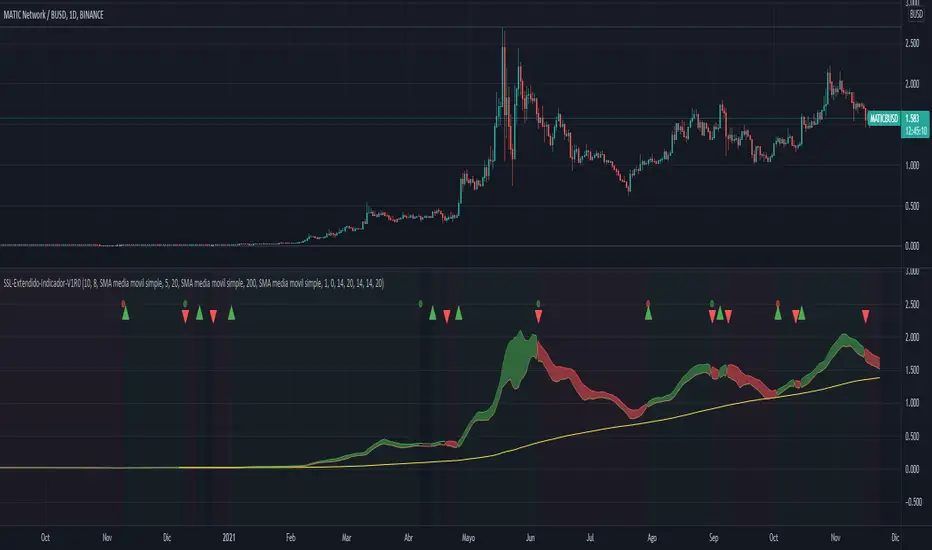
SSL-Extendido-Indicador Por NeilDESCRIPTION
SSL Indicator with ATR, Volume, ADX, TakeProfit, Profit Cycle Indicator and Extended Trend Control.
The component is based on moving averages, its effectiveness is greater in long periods: 4H, 1D, 1S
HOW DOES IT WORK
The component works with a fluctuation band in which the price moves, it consists of an upper moving average of 10 periods and a lower moving average of 8 periods, both configurable according to the volatility of the asset. Since the band has little width, prices trigger buy and sell alerts frequently, but the component has a trend control based on SMA, EMA, VWAP, HMA that allows to take advantage of the intermediate trend of the asset and cancel the early buy alerts and sale, maximizing the development of the parabola, additionally the component allows to confirm the entries with indicators such as: ATR (valatility), Volume and ADX (direction strength), this to achieve entries with a greater probability of success.
WHY USE IT
Its configuration is simple, it requires adjusting few parameters and although it is ideal for long-term operations, it allows periodic take profit, under the philosophy of profit evaluation at present point and not profit evaluation at future point, ensuring income in less time. additionally it has a visual profit indicator, which allows you to graphically see if a money generation cycle (buy or sell) is a winner or a loser, it also allows you to operate according to the general trend of the asset, that is, you can adjust the behavior of the resource to carry out purchase and sale operations or only purchase or only sale. This component not only graphically indicates when to take profit (takeProfit), but it is responsible for closing the current operation and opening a new operation in the same direction. This is the ideal resource for automated alert-based trading against platforms such as 3Commas.
HOW TO USE IT
Press the "Indicators" option, go to the "Public Library" segment, write the name "SSL-Extendido-Indicador por Neil", double-click on the record and it will be added to your work panel, now, all that remains is to configure its parameters and use it. By pressing the Reset Values Option, you will have a basic configuration that respects the fundamental concepts of trading and the use of multiple indicators in a single study.
--
DESCRIPCIÓN
Indicador SSL con ATR, Volume, ADX, TakeProfit, indicador de ciclo de ganancia y control de tendencia extendida.
El componente se basa en medias móviles, su efectividad es mayor en temporalidades largas: 4H,1D,1S
COMO FUNCIONA
El componente trabaja con una banda de fluctuación en la que se mueve el precio, consta de una media móvil superior de 10 periodos y una media móvil inferior de 8 periodos, ambas configurables según la volatilidad del activo. Dado que la banda tiene poca amplitud, los precios gatillan alertas de compra y venta frecuentemente, pero el componente posee un control de tendencia basado en SMA, EMA, VWAP, HMA que permite aprovechar la tendencia intermedia del activo y anular las alertas tempranas de compra y venta, maximizando el desarrollo de la parábola, adicionalmente el componente permite confirmar las entradas con indicadores como: ATR (volatilidad), Volumen y ADX (fuerza de la dirección), esto para lograr entradas con mayor probabilidad de éxito.
POR QUÉ USARLO
Su configuración es simple, requiere ajustar pocos parámetros y aunque es ideal para operaciones de temporalidad larga, permite efectuar take profit periódicos, bajo la filosofía de evaluación de ganancia a punto presente y no evaluación de ganancia a punto futuro, asegurando ingresos en menor tiempo, adicionalmente posee un indicador de ganancia visual, que permite ver gráficamente si un ciclo de generación de dinero (compra o venta) es ganador o perdedor, también permite operar según la tendencia general del activo, es decir que usted puede ajustar el comportamiento del recurso para efectuar operaciones de compra y venta o solo compra o solo venta. Este componente no solo indica gráficamente cuando tomar ganancias (takeProfit), sino que se encarga de cerrar la operación en curso y abrir una nueva operación en la misma dirección. Este es el recurso ideal para efectuar trading automatizado basado en alertas, contra plataformas como 3Commas.
COMO USARLO
Presione la opción "Indicadores", ubíquese en el segmento "Libreria Publica", escriba el nombre "SSL-Extendido-Indicador por Neil", haga doble clic sobre el registro y lo tendrá agregado en su panel de trabajo, ahora, solo resta configurar sus parámetros y usarlo. Presionando la opción Reestablecer Valores, ya tendrá una configuración básica que respeta los conceptos fundamentales del trading y el uso de múltiple de indicadores un un solo estudio.
CCA - ADX ChangeThis shows the velocity in which the ADX value is moving. If the velocity is decreasing, the value will go to 0, if it's negative, the line will change to orange. Very useful to tell when the momentum is changing in a particular direction.
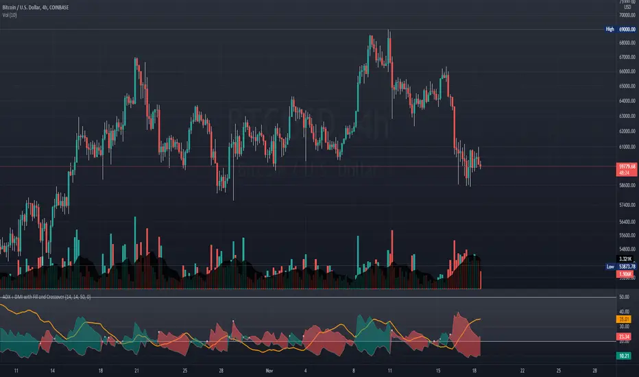
ADX + DMI with Fill and CrossoverBetter visuals for the ADX/DMI technical indicator.
I filled the DI+ and DI- with color to easily track the trend. Also, I added shapes (+) / (x) once the DI+ and DI- crossover each other.
You can also set two horizontal lines so you can easily track where the ADX value is at.
Multiple Indicators ScreenerA screener for multiple indicators with nice table output.
I was asked many times to update custom screener to display results in a table form. This way it looks much better.
You can play with background colors depend on values you're looking for.
In the screener, for example, I'm highlighting overbought/oversold RSI values, big ADX levels and trend of the Supertrend.
In parameters you can change settings for all indicators and change/disable tickers if 40 is too many for you.
There is only 1 function that calculates all these indicators. Potentially you can change and even add more indicators to this function.
Writing code for these kind of screener is a bit time consuming, so I even created a code generator in Python for these kind of indicators :) .
Disclaimer
Please remember that past performance may not be indicative of future results.
Due to various factors, including changing market conditions, the strategy may no longer perform as well as in historical backtesting.
This post and the script don’t provide any financial advice.

ADXI + DMI Performance - TradingEDThis case study is based on a previous ADX + DM study, but with three different counts to compare different trends. The use of this indicator is restricted to private use, and it can be used only by invitation. Different functionalities have been added to the original code, such as alerts and signals that seek to make trading much easier to interpret by any type of trading operator of any experience level, from beginner to intermediate and advanced .
Key components of the original indicator:
• The DIRECTIONAL MOVEMENT INDEX (DMI) is a technical indicator that measures both the strength and direction of a price movement and is intended to reduce false signals.
• The DMI uses two standard indicators, one negative ( -DI ) and one positive ( +DI ), in conjunction with a third, the AVERAGE DIRECTIONAL INDEX ( ADX ), which is non-directional but shows momentum.
• The larger the spread between the two primary lines, the stronger the price trend. If +DI is way above -DI the price trend is strongly up. If -DI is way above +DI then the price trend is strongly down.
• ADX measures the strength of the trend, either up or down; a reading above 20 indicates a strong trend.
ADX is plotted as a single line with values ranging from a low of zero to a high of 100. ADX is non-directional; it registers trend strength whether price is trending up or down. The indicator is usually plotted in the same window as the two DMI lines, from which ADX is derived. When +DI is above -DI, there is more upward pressure than downward pressure in the price. Conversely, if -DI is above +DI, then there is more downward pressure on the price. This indicator may help traders assess the trend direction. Crossovers between the lines are also sometimes used as trade signals to buy or sell, theay are the main trade signals. A long trade is taken when the +DI crosses above the -DI and an uptrend could be underway. Meanwhile, a sell signal occurs when the +DI instead crosses below the -DI.
Main functions of this modified indicator:
1) You can select the type of MOVING AVERAGE, among many available options ( SMA , EMA , DEMA , HMA , etc.)
2) The SOURCE for the counts can be determined by the trader (close, open, etc).
3) The MEASURE can be based on a CANDLES count if you are trading OHLC Charts from 1D onwards, or if your trading is intraday, you can also select counts by MINUTES, HOURS or DAYS, depending on your trading style.
4) LENGTH, by default it will be loaded as in the STRATEGY, but considering the previous point, you can modify it according to your convenience.
5) You have the option to hide or show a LABEL at the top of the chart, with respect to the signals: BULLISH green, BEARISH red.
Main performance functions of this modified indicator:
I) In the case of the PERFORMANCE that appears at the right of the chart, you have the option to adjust the WIDTH of each box.
II) The TEXT of the PERFORMANCE is not modifiable, but you can customize the default color. *
III) The BACKGROUND of the PERFORMANCE, you can customize the default color. *
IV) You have the option to hide or show a PERFORMANCE that appears at the right of the chart.
Main functions to customize the style of this indicator:
a) You can select the color for ADX and for DMI, with the colors that best suit you.
b) The CROSSOVER/CROSSUNDER signal between DI+ and DI- can also be customized. *
c) For any type of SIGNAL, it is painted as a VERTICAL LINE in the graph, you can change the color that comes by default. *
d) In the case of the LABELS that appear at the top, the text is not modifiable, but you can customize both the type of label and change the default color. *
e) You can select the colors for the BACKGROUND of the indicator according to the trend, whether it is BEARISH or BULLISH, with the colors that best suit you. *
* By default, they are marked as red for downtrends and green for uptrends.

DI Crossing Daily Straregy HulkTradingSimple strategy based on crossing DI+ and DI- and Average True Range.
Long entry when DI+ crossover DI-
Short entry when DI+ crossunder DI-
Stop Loss and Take Profits based on Average True Range.
Default values are 1*ATR(14) for stop loss and 2*ATR(14) for Take Profit.
Risk reward 1 to 2 ratio.
Recommended default values, but you can change it if you want.
Recommended timeframe - 1D.
Script was tested on BTCUSDT pair and have a 2.4 profit factor.

EMA RSI ADX Scalping StrategyThis is the strategy version of my ERA Indicator. You can check my scripts if you'd like to use only study indicator.
Strategy Rules For Long Entry:
- Check if price above the set EMA (Can disable this rule if you'd like in the settings)
- RSI is in Oversold
- ADX is above set "Trend Ready" threshold (Meaning there is a trend going on)
- Price must approve the trend of previous candles. This is bullish for buy entries and bearish for sell entries.
- Enter with stop loss below last swing low with 1:1 or 1.5:1 take profit ratio.
Strategy Rules For Short Entry:
- Check if price below the set EMA (Can disable this rule if you'd like in the settings)
- RSI is in Overbought
- ADX is above set "Trend Ready" threshold (Meaning there is a trend going on)
- Price must approve the trend of previous candles. This is bullish for buy entries and bearish for sell entries.
- Enter with stop loss above last swing high with 1:1 or 1.5:1 take profit ratio. (Can be adjusted)
Features:
- You can modify a lot values to your liking.
- Choose Fixed or Trailing Stop Loss / Take Profit with detailed modifiers.
- You can connect it to bots if you'd like.
- It does NOT repaint.
- Since it's a scalping strategy recommended to use on 15 min or below timelines.
- Choose if you want to stop entry on opposite signals.
- And some other things i may not remember right now...
I tried to code this as modifiable as possible. Let me know if there are any problems you encounter. Open to suggestions as well.
Happy Trading.

TridentI call this strategy "Trident", as it uses three different, modified, customizable indicators:
50 Exponential Moving Average (Trend)
Relative Strength Index (Momentum)
Average Directional Index (Volatility)
Strategy will be improved with future updates. You alone decide when to enter and when to exit a trade. PRICE ACTION IS KING and the TREND IS YOUR FRIEND
What do these three indicators tell us
Exponential Moving Average:
Trend
Price < EMA = downtrend
Price > EMA = uptrend
trend direction and reducing noise
Average Directional Index:
Volatility
direction of market movement when there is a sharp increase in volatility
Relative Strength Index:
Momentum
Strength
Possible shift in momentum
How this strategy works
As I mentioned above, this strategy uses uses three different, modified, customizable indicators:
Exponential Moving Average (50) (Trend): When price closes above or below the 50 period EMA, then the first condition is met. I know some people use multiple EMAs as dynamic support and resistance levels. Therefore, I also added a 21 and a 200 period EMA, but this strategy uses specifically the 50 period EMA as one of three conditions. All EMAs can be adjusted, turned on and off.
Relative Strength Index (80, 20, 3) (Momentum): In his video, TSM uses a 3 period RSI and 80 and 20 bands. If price is above 80, it`s overbought and if it`s below 20, then it`s oversold. Two out of three conditions are met.
Average Directional Index (5, 5) (Volatility): TSM uses the ADX to measure the volatility. Both ADX Smoothing and DI Length are set to 5. If this indicator moves above 30, then the third contidion is met.
Rules to enter the trade
Long Entry:
50 EMA < Price
RSI < 20
ADX > 30
Enter trade at breakout of high of the green candle, which is the candle that pulls the RSI from oversold conditions back inside.
Short Entry:
50 EMA > Price
RSI > 80
ADX > 30
Enter trade at breakout of low of the red candle, which is the candle that pulls the RSI from overbought conditions back inside.
Risk:Reward and Timeframe
Use a 1:1 to 1:1.5
Set your S/L below key levels (-> 2nd point @ Tips), or twice the length of the signal candle
Preferably 5 Minute Time Frame, but at the end you decide
Tips
Avoid periods of consolidation
Trade from support/resistance-levels, supply/demand-levels, pivot points-levels, Fibonacci-levels, swing high/low-levels
Trade during market hours, for example London and New York Session
Trade narrow spreads, if you scalp
Use Price Action
Trade with the trade, not against
The further away the price moves from the EMA the stronger the trend
The long the price doesn't touch the EMA the stronger the trend
RSI + ADX: Confirm when the market is turning and pick a good entry point
ADX + 50 EMA: Filters trades when there is not much activity in the market
I mentioned above that the code of this strategy is still under development. You can not only rely on this strategy alone as it might give you false signals. I coded this, because it makes it easier to visualize were all three conditions are met.
Use your brain, use price action, use these tips, use this strategy.
Frequently Asked Questions
Does it only work for scalping? - No, but try it out yourself
Does it only work for Forex? - No, but try it out yourself
Does only work on the 5 Minute Timeframe? - No, but try it out yourself
Good Luck!

Scalping EMA ADX RSI with Buy/Sell AlertsThis is a study indicator that shows the entries in the strategy seen in one of the youtube channel so it does not belong to me. I can't tell who it is because it's against the House Rules to advertise but you can find out if you look for it on youtube. Default values of oscilators and ema adjusted as suggested. He says he got the best results in 5 min timeframe but i tried to make things as modifiable as possible so you can mess around with the settings and create your own strategy for different timeframes if you'd like. Suggested to use with normal candlestick charts. The blue line below indicates the ADX is above the selected threshold set in the settings named "Trend Ready Limit". You can set alerts for Buy, Sell or Buy/Sell signal together.
The entry strategy itself is pretty straight forward.
The rules for entry are as follows, the script will check all of this on auto and will give you buy or sell signal :
Recommended time frame: 5 min
For Long Entry:
- Check if price above the set EMA (Can disable this rule if you'd like in the settings)
- RSI is in Oversold
- ADX is above set "Trend Ready" threshold (Meaning there is a trend going on)
- Price must approve the trend of previous candles. This is bullish for buy entries and bearish for sell entries.
- Enter with stop loss below last swing low with 1:1 or 1.5:1 take profit ratio.
For Short Entry:
- Check if price below the set EMA (Can disable this rule if you'd like in the settings)
- RSI is in Overbought
- ADX is above set "Trend Ready" threshold (Meaning there is a trend going on)
- Price must approve the trend of previous candles. This is bullish for buy entries and bearish for sell entries.
- Enter with stop loss above last swing high with 1:1 or 1.5:1 take profit ratio.
This is my first indicator. Let me know if you want any updates. I am not sure if i can add everything but i'll try nonetheless.
Changed: Signals will check up to 2 candles before if the RSI is below or above the set value to show signal. This is because sometimes the entry signal is right but the response might be a bit late.

MACD With Crossings and Above Below ZeroMACD with MACD Derivative, Crossings Above and Below Zero, Shading for ADX Smoothing and Overlayed RSI
Primarily a moving average convergence divergence (MACD) momentum indicator. Also includes a MACD Derivative overlay to show when momentum has peaked. Displays triangle symbols when the MACD line crosses the signal line (larger triangle when MACD crosses above/below zero to indicator stronger momentum trend). Includes shading for average directional index (ADX) to futher determine when the price is trending strongly (red when the ADX value is greater than 25, and idicating a strong trend; otherwise blue). Lastly, has a relative strength index (RSI) momentum indicator overlayed to help evaluate periods of overbought or oversold conditions.

Rising ADX strategyI have always been a huge fan of ADX. Its good for finding out good trending moves.
But it has been said that only ADX after 20 or 25 is good for trending market, but few trend gets completed at that level.
So I have come up with a logic to find out the rising ADX. This could be used to determine the trending moves from the start.
Buy signal:
When close is greater than moving average 1 and 2. This moving average can be SMA, EMA, WMA or HMA.
When ADX is greater than the threshold range. I have taken 10 as my minimum range.
Of course important of all ADX should be rising which implies trend is about to start.
Buy exit:
When close is less than moving average 1 and 2. This moving average can be SMA, EMA, WMA or HMA.
When ADX is lesser than the threshold range. I have taken 10 as my minimum range.
ADX falling which implies trend is about to end.
Sell signal:
I don't repeat the above logic again.
Everything similar to buy signal except above moving average. For selling it should be below moving average.
Strategy can be tested for long and short sides.
Note: No Repainting as the logic is very simple.
Using this script we can identify the best timeframe the script trend yields profit.
Test and provide your comments.

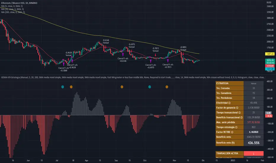
GEMA-Indicador por Neil-------------------
DESCRIPTION
GEMA-INDICATOR is a indicator based on SMA, EMA, WMA, RMA that considers elements such as ADX, DMI, RSI, stochastic, Stoploss, Takeprofit, angles and values at present point.
HOW DOES IT WORK
The component works as an assistant to which you configure the previous elements and you see the performance that it offers you, in such a way that you pass that configuration to GEMA-INDICATOR so that you can receive alerts and do visual trading with notifications or automated trading by sending messages to platforms like 3Commas.
WHY USE IT
The resource operates with one of the most important strategies in the market, which is the price tracking line, which means that if prices go up, we follow it, if prices go down, we follow it; in this way you do not need to make large investments as is often the case with pure BOTs, which require large reserves for security orders.
HOW TO USE IT
Press the "Indicators" option, go to the "Public Library" segment, write the name "GEMA-Indicador por Neil", double click on the record in question and you will have it added in your work panel, now, it only remains to use it and configure its parameters.
-------------------
DESCRIPCIÓN
GEMA-INDICADOR en un indicador basado en SMA, EMA, WMA, RMA que considera elementos como ADX, DMI, RSI, Estocastico, Stoploss, Takeprofit, ángulos y valores a punto presente.
COMO FUNCIONA
El componente funciona como un asistente al que vas configurando lo elementos anteriores y vas viendo el rendimiento que te ofrece, de manera tal, que pases esa configuración a GEMA-INDICADOR para que puedas recibir alertas y hagas trading visual con notificaciones o trading automatizado enviando mensajes a plataformas como 3Commas.
POR QUÉ USARLO
El recurso opera con una de las estrategias mas importantes del mercado, que es la linea de seguimiento de precio, lo que significa que si los precios suben, lo seguimos, si los precios bajan, lo seguimos; de esta manera no necesita realizar grandes inversiones como suele ocurrir con los BOT puros, que exigen grandes reservas para las ordenes de seguridad.
COMO USARLO
Presione la opción "Indicadores", ubíquese en el segmento "Libreria Publica", escriba el nombre "GEMA-Indicador por Neil", haga doble clic sobre el registro en cuestión y lo tendrá agregado en su panel de trabajo, ahora, solo resta usarlo y configurar sus paramertos.

GEMA-Estrategia por neil-------------------
DESCRIPTION
GEMA-STRATEGY is a strategy generator based on SMA, EMA, WMA, RMA that considers elements such as ADX, DMI, RSI, stochastic, Stoploss, Takeprofit, angles and values at present point.
HOW DOES IT WORK
The component works as an assistant to which you configure the previous elements and you see the performance that it offers you, in such a way that you pass that configuration to GEMA-INDICATOR so that you can receive alerts and do visual trading with notifications or automated trading by sending messages to platforms like 3Commas.
WHY USE IT
The resource operates with one of the most important strategies in the market, which is the price tracking line, which means that if prices go up, we follow it, if prices go down, we follow it; in this way you do not need to make large investments as is often the case with pure BOTs, which require large reserves for security orders.
HOW TO USE IT
Press the "Indicators" option, go to the "Public Library" segment, write the name "GEMA-Estategia por Neil", double click on the record in question and you will have it added in your work panel, now, it only remains to use it and configure its parameters.
-------------------
DESCRIPCIÓN
GEMA-ESTRATEGIA en un generador de estrategias basado en SMA, EMA, WMA, RMA que considera elementos como ADX, DMI, RSI, Estocastico, Stoploss, Takeprofit, ángulos y valores a punto presente.
COMO FUNCIONA
El componente funciona como un asistente al que vas configurando lo elementos anteriores y vas viendo el rendimiento que te ofrece, de manera tal, que pases esa configuración a GEMA-INDICADOR para que puedas recibir alertas y hagas trading visual con notificaciones o trading automatizado enviando mensajes a plataformas como 3Commas.
POR QUÉ USARLO
El recurso opera con una de las estrategias mas importantes del mercado, que es la linea de seguimiento de precio, lo que significa que si los precios suben, lo seguimos, si los precios bajan, lo seguimos; de esta manera no necesita realizar grandes inversiones como suele ocurrir con los BOT puros, que exigen grandes reservas para las ordenes de seguridad.
COMO USARLO
Presione la opción "Indicadores", ubíquese en el segmento "Libreria Publica", escriba el nombre "GEMA-Estrategia por Neil", haga doble clic sobre el registro en cuestión y lo tendrá agregado en su panel de trabajo, ahora, solo resta usarlo y configurar sus paramertos.
MACD PlusMoving Average Convergence Divergence – MACD
The MACD is an extremely popular indicator used in technical analysis. It can be used to identify aspects of a security's overall trend. Most notably these aspects are momentum, as well as trend direction and duration. What makes the MACD so informative is that it is actually the combination of two different types of indicators. First, the MACD employs two Moving Averages of varying lengths (which are lagging indicators) to identify trend direction and duration. Then, it takes the difference in values between those two Moving Averages (MACD Line) and an EMA of those Moving Averages (Signal Line) and plots that difference between the two lines as a histogram which oscillates above and below a center Zero Line. The histogram is used as a good indication of a security's momentum.
Added Color Plots to Settings Pane.
Switched MTF Logic to turn ON/OFF automatically w/ TradingView's Built in Feature.
Added Ability to Turn ON/OFF Show MacD & Signal Line.
Added Ability to Turn ON/OFF Show Histogram.
Added Ability to Change MACD Line Colors Based on Trend.
Added Ability to Highlight Price Bars Based on Trend.
Added Alerts to Settings Pane.
Customized Alerts to Show Symbol, TimeFrame, Closing Price, MACD Crosses Up & MACD Crosses Down Signals in Alert.
Alerts are Pre-Set to only Alert on Bar Close.
Added ability to show Dots when MACD Crosses.
Added Ability to Change Plot Widths in Settings Pane.
Added in Alert Feature where Cross Up if above 0 or cross down if below 0 (OFF By Default).
Squeeze Pro
Traditionally, John Carter's version uses 20 period SMAs as the basis lines on both the BB and the KC.
In this version, I've given the freedom to change this and try out different types of moving averages.
The original squeeze indicator had only one Squeeze setting, though this new one has three.
The gray dot Squeeze, call it a "low squeeze" or an "early squeeze" - this is the easiest Squeeze to form based on its settings.
The orange dot Squeeze is the original from the first Squeeze indicator.
And finally, the yellow dot squeeze, call it a "high squeeze" or "power squeeze" - is the most difficult to form and suggests price is under extreme levels of compression.
Colored Directional Movement Index (CDMI) , a custom interpretation of J. Welles Wilder’s Directional Movement Index (DMI), where :
DMI is a collection of three separate indicators ( ADX , +DI , -DI ) combined into one and measures the trend’s strength as well as its direction
CDMI is a custom interpretation of DMI which presents ( ADX , +DI , -DI ) with a color scale - representing the trend’s strength, color density - representing momentum/slope of the trend’s strength, and triangle up/down shapes - representing the trend’s direction. CDMI provides all the information in a single line with colored triangle shapes plotted on the bottom. DMI can provide quality information and even trading signals but it is not an easy indicator to master, whereus CDMI simplifies its usage. The CDMI adds additional insight of verifying/confirming the trend as well as its strength
Label :
Displaying the trend strength and direction
Displaying adx and di+/di- values
Displaying adx's momentum (growing or falling)
Where tooltip label describes "howto read colored dmi line"
Ability to display historical values of DMI readings displayed in the label.
Added "Expert Trend Locator - XTL"
The XTL was developed by Tom Joseph (in his book Applying Technical Analysis ) to identify major trends, similar to Elliott Wave 3 type swings.
Blue bars are bullish and indicate a potential upwards impulse.
Red bars are bearish and indicate a potential downwards impulse.
White bars indicate no trend is detected at the moment.
Added "Williams Vix Fix" signal. The Vix is one of the most reliable indicators in history for finding market bottoms. The Williams Vix Fix is simply a code from Larry Williams creating almost identical results for creating the same ability the Vix has to all assets.
The VIX has always been much better at signaling bottoms than tops. Simple reason is when market falls retail traders panic and increase volatility , and professionals come in and capitalize on the situation. At market tops there is no one panicking... just liquidity drying up.
The FE green triangles are "Filtered Entries"
The AE green triangles are "Aggressive Filtered Entries"

DMI Trade Zone [Alorse]Through the DMI Trade Zone you can find safe areas to trade in the Spot market.
The logic behind the indicator is:
- If the Positive Directional Movement (+DI) is greater than the Negative Directional Movement (-DI) then the Average Directional Movement Index (ADX) will be green with an opaque white background.
- If the Positive Directional Movement (+DI) is less than the Negative Directional Movement (-DI) then the Average Directional Movement Index (ADX) will be red.
