BTC STH Proxy vs Realized Price (RP) Ratio | STH : LTH📊 REALIZED PRICE MARKET SIGNAL
Indicator that builds a Short-Term Holder (STH) price proxy using a configurable moving average of Bitcoin’s market price and compares it to Bitcoin’s Realized Price (RP) derived from on-chain data.
Realized Price (RP) is calculated from CoinMetrics Realized Market Cap divided by Glassnode circulating supply.
STH Proxy is a user-defined moving average (EMA/SMA/WMA) of BTC price, designed to mimic the behavior of the true STH Realized Price.
Users can adjust the MA type, length, and RP smoothing to closely replicate the STH curve seen on Glassnode, Bitbo, and Bitcoin Magazine Pro.
Optionally, the indicator can display the STH/RP ratio, which highlights transitions between market phases.
This tool provides a simple but effective way to visualize short-term vs long-term holder cost-basis dynamics using only publicly accessible on-chain aggregates and price data.
----------
💡TLDR: An alt take on the Short-Term Holder Realized Price / Long-Term Holder Realized Price cross model | (STH/LTH cross)
- A mix of MAs are used to mimic STH.
- RP here used as a proxy for the long-term holder (LTH) cost basis.
- Bull/Bear signals are generated when the STH proxy crosses above or below RP.
⭐ Free to use • Leave feedback • Happy trading!
Cycle

MTF Market Structure Pro [Elykia]MTF Market Structure Pro - Fractal Flow System
Overview
The MTF Market Structure Pro is a comprehensive trading system designed to decode the fractal nature of the markets.
Most traders fail because they focus on a single timeframe, missing the "Big Picture". This algorithm simultaneously maps market structure (Highs/Lows) across 3 distinct timeframes overlaid on your chart.
It automatically identifies trends, pivot points, and price inefficiencies (EPA/FVG), giving you an X-ray vision of institutional order flow.
💎 The Strategy: "Fractal Alignment"
This tool is optimized for the "Triple Sync" strategy. Never trade against the macro trend.
1. The Bias (Sequence C / TF3): Look at the highest structure (e.g., H4). If the markers are Green/Ascending (HH/HL), the flow is Bullish. Look for buys only.
2. The Retracement (Sequence B / TF2): On the intermediate timeframe (e.g., M15), wait for price to pull back into an inefficiency zone (dashed "EPA" lines) or test a previous structural level.
3. The Entry (Sequence A / TF1): This is your trigger (e.g., M1 or M5). Wait for the structure to realign with Sequence C.
Buy Signal: TF3 is Bullish + Price retraces + TF1 breaks structure to the upside (creating a new HH).
Key Features
⚡ Multi-Timeframe Analysis (3-Layer): Displays 3 independent structures (A, B, C) with distinct colors for instant readability.
📊 Smart Dashboard: A summary panel shows real-time Trend (Bull/Bear) and Market State (Balanced or Open Gap) for each Timeframe.
🎯 Inefficiency Lines (EPA): Automatically plots unvisited price zones (Imbalances) that act as magnets for price action.
⚙️ 100% Customizable: Choose your timeframes, colors, and dashboard position.
Settings Guide
Sequence A: Your execution timeframe (e.g., Current Chart or M5).
Sequence B: Your intraday trend (e.g., M15 or H1).
Sequence C: Your macro bias (e.g., H4 or Daily).
Tip: Ensure you use distinct colors for each sequence to keep the chart clean.
⚠️ DISCLAIMER
This indicator is a technical analysis support tool and does not constitute financial advice. Trading involves a risk of capital loss. Past performance does not guarantee future results.

[iQ]PRO Dealing Range Cycle & Spectral Regression Histogram+🌟 PRO Dealing Range Cycle & Spectral Regression Histogram+ (DRC/SRH+)
Category: Advanced Market Cycle, Momentum, and Trend Analysis
The PRO Dealing Range Cycle & Spectral Regression Histogram+ is a meticulously engineered analytical tool, designed to provide our members with a superior, proprietary view of market structure, momentum, and mean reversion dynamics. This professional-grade indicator operates on a non-overlay panel, offering a clean and powerful interpretation layer distinct from the main price action.
🔬 Core Mechanism: Dual-Layered Analysis
This indicator combines two distinct, yet complementary, proprietary mathematical frameworks to deliver a holistic market picture:
The Dealing Range Cycle (DRC):
Utilizes a sophisticated, custom-displaced detrending oscillator built upon specialized percentage mathematics, rather than simple raw price differences.
The DRC identifies the latent cyclical forces within the price action, separating short-term noise from dominant swings.
It defines a "Dealing Range" through dynamically calculated High and Low Anchors, which represent the proprietary extremes of the current cycle. This framework provides invaluable context for understanding current price compression and expansion potentials.
The Quant Trend Signal is an integral component of the DRC, employing an adaptive logic to color-code the underlying direction of the core cyclical momentum, offering a robust directional confirmation.
The Spectral Regression Histogram (SRH+):
This component serves as the "Underpin Momentum" layer, a sensitive reading of current market velocity and pressure.
It employs a customized Spectral Regression Model to calculate deviations from an idealized price path. This is then passed through an advanced filtering and smoothing pipeline to extract high-frequency momentum components.
The SRH+ is visually presented as a Heatmap Histogram, dynamically color-graded to reflect the intensity of bullish (Gold/Yellow) or bearish (Bright Fuchsia) pressure. This gives users an immediate, spectral sense of the market's internal kinetic energy.
✨ Distinctive Features & Advantages
Proprietary Math Functions: The indicator relies on internalized custom mathematical functions (including specialized averages and high-precision linear regression) to generate unique, non-standard outputs that cannot be replicated with conventional indicators.
Decoupled Visualization: By operating on a separate panel, the DRC and SRH+ provide a noise-free environment for analysis, allowing for unambiguous interpretation of cyclical turning points and momentum shifts.
Intuitive Configuration: All core parameters, including Cycle Length, Regression Lookback, and Spectral Scale Factor, are meticulously organized into logical groups, allowing advanced users to fine-tune the engine without disrupting its proprietary internal logic.
The PRO DRC/SRH+ is not just an indicator; it is a diagnostic tool for the serious market participant, providing a powerful, proprietary lens to anticipate structural shifts and capitalize on the true rhythm of the market. Access is restricted to our most dedicated members, ensuring its edge remains sharp and exclusive.

Market CycleMarket Cycle Indicator
This indicator identifies the four classic market cycle phases — Accumulation, Markup, Distribution, and Markdown — using a combination of trend, momentum, and volatility signals. It helps traders quickly understand the current market context and avoid trading against major structural shifts.
How It Works
The algorithm evaluates multiple conditions:
• Trend direction based on EMA Fast vs EMA Slow
• Momentum strength using MACD histogram and its slope
• Overbought / oversold zones with RSI
• Trend strength / weakness via ADX (DMI)
Each bar is classified into one of the following phases:
• Accumulation: Low trend strength, rising momentum, mid-range RSI
• Markup: Strong uptrend with rising positive momentum
• Distribution: Weakening momentum after an uptrend, high RSI
• Markdown: Strong downtrend with falling momentum and low RSI
The indicator highlights the active phase using background color and displays a real-time label on the chart.
Main Features
• Automatic detection of 4 market cycle phases
• Background color shading for easy visualization
• Real-time label showing the current phase
• Optional alerts for each phase change
• Clean and optimized code (Pine Script v5)
Recommended Use
Use this indicator to:
• Identify the broader market context
• Avoid entering during distribution or late markup zones
• Time entries better during accumulation or early markup
• Combine with price action, volume, and support/resistance for best results
Note:
This is not a buy/sell signal generator. It provides context, not predictions. Always manage risk appropriately.

Thiru 369 LabelsThiru 369 Labels
**Thiru 369 Labels** is a sophisticated time-based indicator that calculates the numerical sum of time digits and displays visual labels when the sum matches harmonic values (3, 6, or 9). Based on the mathematical principles popularized by Nikola Tesla, this indicator helps traders identify potential market timing opportunities during major trading sessions.
📊 What It Does
This indicator monitors the current time (hour and minute) and calculates the sum of all digits, reducing it to a single digit. When this final sum equals 3, 6, or 9, a label is displayed on the chart. The indicator specifically focuses on three major trading sessions:
- **London Session**: 02:30 - 07:00 (GMT-5)
- **NY AM Session**: 07:00 - 11:30 (GMT-5)
- **NY PM Session**: 11:30 - 16:00 (GMT-5)
🔢 How It Works
### Time Sum Calculation
The indicator uses a standard mathematical reduction method:
1. **Extract Digits**: Takes the hour and minute (e.g., 09:51)
2. **Sum All Digits**: Adds all digits together (0 + 9 + 5 + 1 = 15)
3. **Reduce to Single Digit**: Continues reducing until single digit (15 → 1 + 5 = 6)
4. **Check Match**: If result equals 3, 6, or 9, displays label
Examples:
- **03:30** → 0 + 3 + 3 + 0 = **6** ✅ (Perfect 6)
- **12:06** → 1 + 2 + 0 + 6 = **9** ✅ (Perfect 9)
- **09:51** → 0 + 9 + 5 + 1 = 15 → 1 + 5 = **6** ✅
- **14:22** → 1 + 4 + 2 + 2 = 9 ✅ (Perfect 9)
Session Detection
The indicator automatically detects when the current time falls within active trading sessions and only displays labels during these periods. This ensures you're only seeing relevant timing signals during market hours.
Cycle Detection
The indicator can also detect different time cycles within sessions:
- **90-minute cycles**: Major session periods
- **30-minute cycles**: Sub-cycles within sessions
- **10-minute cycles**: Detailed intervals
🎯 Key Features
✅ Time Sum Detection
- Calculates time sum using standard 369 method
- Displays labels when sum matches 3, 6, or 9
- Customizable target sums (default: 3, 6, 9)
✅ Session Monitoring
- London Session (02:30 - 07:00)
- NY AM Session (07:00 - 11:30)
- NY PM Session (11:30 - 16:00)
- Enable/disable individual sessions
✅ Cycle Detection
- 90-minute cycles
- 30-minute cycles
- 10-minute cycles
- Optional cycle information display
✅ Visual Customization
- Label size options (Auto, Tiny, Small, Normal, Large, Huge)
- Custom colors for each sum (3, 6, 9)
- Session-based colors (Purple=London, Green=NY AM, Blue=NY PM)
- Label transparency control
- Text-only labels (no background box)
✅ Display Options
- Show/hide time text
- Show/hide cycle information
- Drawing limit options (Current Day, Last 2/3/5 Days, All Days)
- Debug table for real-time monitoring
✅ Advanced Settings
- Timezone selection (27 timezone options)
- Swing sensitivity for label positioning
- Label offset control
- Confirmed bars only option
📖 How to Use
Step 1: Add Indicator to Chart
1. Open TradingView
2. Click "Indicators" button
3. Search for "Thiru 369 Labels"
4. Click to add to chart
Step 2: Configure Basic Settings
**Time Sum Settings:**
- Enable Time Sum Detection: ✅ (default: ON)
- Target Sums: "3,6,9" (default)
- Label Size: Choose your preferred size
- Drawing Limit: "All Days" (default) or limit to specific periods
**Session Settings:**
- Monitor London Session: ✅ (default: ON)
- Monitor NY AM Session: ✅ (default: ON)
- Monitor NY PM Session: ✅ (default: ON)
**Cycle Settings:**
- 90 Minute Cycles: ✅ (default: ON)
- 30 Minute Cycles: ✅ (default: ON)
- 10 Minute Cycles: ✅ (default: ON)
Step 3: Customize Appearance
**Label Colors:**
- Use Custom Sum Colors: OFF (default) - Uses session colors
- OR Enable to use: Blue (3), Red (6), Maroon (9)
**Display Settings:**
- Label Transparency: Adjust as needed
- Show Time Text: Optional
- Show Cycle Information: Optional
- Show Debug Table: ✅ (recommended for monitoring)
Step 4: Set Timezone
**General Settings:**
- Session Timezone: Select your timezone (default: GMT-5)
- Choose from 27 timezone options
Step 5: Monitor Labels
- Labels will automatically appear when:
- Time sum equals 3, 6, or 9
- Current time is within an active session
- Drawing limit allows it
💡 Use Cases
1. Market Timing Entries
Use 3, 6, 9 labels as potential entry signals when combined with other technical analysis:
- Wait for label to appear
- Confirm with price action
- Enter trade with proper risk management
2. Session Analysis
Identify optimal trading times within sessions:
- Monitor which sessions show most labels
- Track label frequency per session
- Plan trading around high-frequency periods
3. Cycle Recognition
Understand market rhythm patterns:
- 90-minute cycles for major moves
- 30-minute cycles for intermediate moves
- 10-minute cycles for precise timing
4. Time-Based Confirmation
Use labels to confirm other indicators:
- Combine with price action
- Use with support/resistance levels
- Confirm with volume analysis
⚙️ Settings Overview
Time Sum Settings
- **Enable Time Sum Detection**: Master switch for the indicator
- **Target Sums**: Comma-separated list of target values (default: "3,6,9")
- **Label Size**: Size of displayed labels
- **Show Time Text**: Display time along with sum
- **Show Cycle Information**: Display cycle type (90m, 30m, 10m)
- **Drawing Limit**: Limit labels to specific time periods
- **Show Debug Table**: Real-time monitoring table
- **Only Show on Confirmed Bars**: Wait for bar confirmation
Session Settings
- **Monitor London Session**: Enable/disable London session (02:30-07:00)
- **Monitor NY AM Session**: Enable/disable NY AM session (07:00-11:30)
- **Monitor NY PM Session**: Enable/disable NY PM session (11:30-16:00)
Cycle Settings
- **90 Minute Cycles**: Enable 90-minute cycle detection
- **30 Minute Cycles**: Enable 30-minute cycle detection
- **10 Minute Cycles**: Enable 10-minute cycle detection
Display Settings
- **Label Transparency**: Control label background transparency
Label Colors
- **Color for Sum 3**: Custom color for sum = 3
- **Color for Sum 6**: Custom color for sum = 6
- **Color for Sum 9**: Custom color for sum = 9
- **Use Custom Sum Colors**: Toggle between custom and session colors
General Settings
- **Session Timezone**: Select timezone for calculations (27 options)
- **Swing Sensitivity**: Bars for swing detection
- **Label Offset**: Vertical spacing for labels
🔍 Debug Table
The debug table provides real-time information:
- **Time**: Current time with seconds
- **Sum**: Calculated time sum
- **Session**: Active session (London, NY AM, NY PM, or None)
- **Cycle**: Active cycle (90min, 30min, 10min, or None)
- **Status**: Match status (MATCH! or No Match)
- **Targets**: Configured target sums
- **Next**: Next potential sum value
Enable the debug table to monitor the indicator's calculations in real-time.
📊 Examples
Example 1: Perfect 6
**Time**: 03:30
**Calculation**: 0 + 3 + 3 + 0 = 6
**Result**: Label "6" appears (if in active session)
Example 2: Perfect 9
**Time**: 12:06
**Calculation**: 1 + 2 + 0 + 6 = 9
**Result**: Label "9" appears (if in active session)
Example 3: Reduced to 6
**Time**: 09:51
**Calculation**: 0 + 9 + 5 + 1 = 15 → 1 + 5 = 6
**Result**: Label "6" appears (if in active session)
Example 4: Reduced to 3
**Time**: 11:10
**Calculation**: 1 + 1 + 1 + 0 = 3
**Result**: Label "3" appears (if in active session)
🎨 Visual Features
Label Display
- **Text Only**: Clean text labels without background boxes
- **Color Coded**: Different colors for different sums or sessions
- **Smart Positioning**: Labels positioned above/below candles based on swing detection
- **Adaptive Offset**: Automatic spacing to avoid overlap
Session Colors (Default)
- **London Session**: Purple labels
- **NY AM Session**: Green labels
- **NY PM Session**: Blue labels
Custom Colors (Optional)
- **Sum 3**: Blue
- **Sum 6**: Red
- **Sum 9**: Maroon
📜 License & Attribution
**Copyright**: © 2025 ThiruDinesh
**License**: Mozilla Public License 2.0
**Contact**: TradingView @ThiruDinesh
This indicator is based on mathematical principles of numerical reduction and harmonic numbers, concepts popularized by Nikola Tesla and used in various trading methodologies.

Thiru Macro Time Cycles🕐 Thiru Macro Time Cycles - Advanced Multi-Session Trading Indicator
═══════════════════════════════════════════
📋 WHAT IT DOES:
Thiru Macro Time Cycles is a professional-grade trading indicator that automatically identifies and visualizes 10 critical macro trading sessions throughout the trading day. This indicator helps traders identify optimal entry windows during high-probability market periods across London and New York sessions.
The indicator displays horizontal lines and labels marking specific 30-minute time windows that are known for significant price movements and institutional trading activity. Perfect for traders who follow ICT (Inner Circle Trader) methodologies, session trading strategies, and time-based market analysis.
═══════════════════════════════════════════
✨ KEY FEATURES:
🕐 MULTI-SESSION COVERAGE
10 Distinct Macro Sessions:
- London Sessions: 2 sessions (2:45-3:15 AM & 3:45-4:15 AM EST)
- NY AM Sessions: 4 sessions (7:45-8:15 AM, 8:45-9:15 AM, 9:45-10:15 AM, 10:45-11:15 AM EST)
- NY PM Sessions: 4 sessions (11:45-12:15 PM, 12:45-1:15 PM, 1:45-2:15 PM, 2:45-3:15 PM EST)
• Each session is a precise 30-minute window optimized for institutional activity
🎨 FULLY CUSTOMIZABLE VISUALS
• Individual Color Control: Set unique colors for each of the 10 sessions
• Plain Text Labels: Clean labels without background boxes for better visibility
• Label Customization: Show/hide labels, adjust text alignment (Left/Center/Right), size (Tiny to Huge)
• Line Customization: Adjustable width (1-10px), style (Solid/Dotted/Dashed), transparency
• Professional Color Coding: Different colors for London vs NY sessions
• Clean Visual Design: Horizontal lines with optional plain text labels
⏰ INTELLIGENT TIME MANAGEMENT
• Days to Show: Control how many days of sessions to display (1-30 days, default: 5)
• Weekend Filtering: Option to skip Saturday and Sunday for cleaner weekly view
• Automatic Cleanup: Smart memory management prevents chart clutter
• Timezone Aware: Uses Eastern Time (EST/EDT) with automatic DST handling
• Historical Tracking: View past sessions for pattern analysis
📊 SESSION CONTROL SYSTEM
• Individual Session Control: Enable/disable each of the 10 sessions independently
• Session Group Toggles: Show/hide all London, NY AM, or NY PM sessions at once
• London Sessions: Marked as "LO 1" and "LO 2"
• NY AM Sessions: Marked as "AM 1", "AM 2", "AM 3", "AM 4"
• NY PM Sessions: Marked as "PM 1", "PM 2", "PM 3", "PM 4"
• Clear Label System: Easy to identify which session you're viewing
═══════════════════════════════════════════
🚀 HOW TO USE:
BASIC SETUP:
1️⃣ Add the indicator to your chart
2️⃣ The indicator will automatically display sessions for the current and past days
3️⃣ Sessions appear as horizontal lines at the bottom of the indicator pane
4️⃣ Labels show session names (LO 1, LO 2, AM 1-4, PM 1-4)
CUSTOMIZATION:
1️⃣ Open Settings (gear icon)
2️⃣ Adjust "Days to Show" to control historical display (1-30 days recommended)
3️⃣ Enable/disable individual sessions or entire session groups
4️⃣ Toggle "Show Labels" on/off based on your preference
5️⃣ Choose "Text Alignment" (Left/Center/Right) and label size
6️⃣ Customize line width, style, and transparency
7️⃣ Customize colors for each session in the "Colors" section
8️⃣ Enable "Skip Weekends" for cleaner weekly view
FOR SESSION TRADING:
• Monitor the horizontal lines to identify active macro sessions
• Watch for price reactions during these specific 30-minute windows
• Use session labels to quickly identify which macro period is active
• Track multiple days to see session patterns and consistency
FOR ICT/SMC TRADERS:
• London sessions (LO 1, LO 2) align with London Killzone periods
• NY AM sessions (AM 1-4) cover the New York morning session
• NY PM sessions (PM 1-4) cover the New York afternoon session
• Use these windows for optimal entry timing in your trading setups
FOR MULTI-TIMEFRAME ANALYSIS:
• Works on all timeframes (optimized for 15m, 30m, 1h, 4h)
• Adjust "Days to Show" based on your timeframe:
- Lower timeframes (15m, 30m): 3-5 days
- Higher timeframes (4h, Daily): 5-10 days
═══════════════════════════════════════════
⚙️ SETTINGS OVERVIEW:
📌 DISPLAY SETTINGS:
• Days to Show: Number of days to display (default: 5, range: 1-30)
• Skip Weekends: Toggle to skip Saturday and Sunday (default: ON)
• Line Y Position: Adjust vertical position of lines (-1.0 to 1.0)
📌 SESSION GROUPS:
• Show London Sessions: Toggle all London sessions on/off
• Show NY AM Sessions: Toggle all NY AM sessions on/off
• Show NY PM Sessions: Toggle all NY PM sessions on/off
📌 INDIVIDUAL SESSIONS:
• Enable/disable each of the 10 sessions independently
📌 LABEL SETTINGS:
• Show Labels: Toggle labels on/off (default: ON)
• Text Alignment: Left, Center, or Right positioning
• Label Size: Tiny, Small, Normal, Large, or Huge (default: Small)
• Label Y Position: Adjust vertical position (-1.0 to 1.0)
• Label Text Color: Customize text color
📌 LINE APPEARANCE:
• Line Width: 1-10 pixels (default: 7)
• Line Style: Solid, Dotted, or Dashed
• Line Transparency: 0-100% (default: 0 = fully opaque)
🎨 COLORS:
• London Macro 1 Line Color (2:45-3:15 AM): Default Blue
• London Macro 2 Line Color (3:45-4:15 AM): Default Blue
• NYAM Macro 1 Line Color (7:45-8:15 AM): Default Orange
• NYAM Macro 2 Line Color (8:45-9:15 AM): Default Orange
• NYAM Macro 3 Line Color (9:45-10:15 AM): Default Blue
• NYAM Macro 4 Line Color (10:45-11:15 AM): Default Blue
• NYPM Macro 1 Line Color (11:45-12:15 PM): Default Orange
• NYPM Macro 2 Line Color (12:45-1:15 PM): Default Orange
• NYPM Macro 3 Line Color (1:45-2:15 PM): Default Blue
• NYPM Macro 4 Line Color (2:45-3:15 PM): Default Blue
═══════════════════════════════════════════
💡 TIPS & BEST PRACTICES:
✅ RECOMMENDED SETTINGS:
• Days to Show: 5 days (good balance of history and clarity)
• Show Labels: ON (helps identify sessions quickly)
• Text Alignment: Center (best visibility)
✅ TRADING STRATEGIES:
• Combine with price action analysis during macro sessions
• Watch for breakouts or reversals at session boundaries
• Use in conjunction with other ICT/SMC indicators
• Track which sessions show highest volatility for your instrument
✅ CHART SETUP:
• Works best on clean charts (minimal other indicators)
• Recommended instruments: Forex pairs, indices, futures
• Optimal timeframes: 15m, 30m, 1h for intraday trading
• Can be used on 4h/Daily for swing trading context
✅ PERFORMANCE OPTIMIZATION:
• Reduce "Days to Show" if chart becomes cluttered
• Turn off labels if you prefer cleaner visual
• Use consistent colors to build visual memory
• Adjust based on your trading style and preferences
═══════════════════════════════════════════
📈 SESSION TIMES (Eastern Time):
🌍 LONDON SESSIONS:
• LO 1: 2:45 AM - 3:15 AM EST
• LO 2: 3:45 AM - 4:15 AM EST
🇺🇸 NEW YORK AM SESSIONS:
• AM 1: 7:45 AM - 8:15 AM EST
• AM 2: 8:45 AM - 9:15 AM EST
• AM 3: 9:45 AM - 10:15 AM EST
• AM 4: 10:45 AM - 11:15 AM EST
🇺🇸 NEW YORK PM SESSIONS:
• PM 1: 11:45 AM - 12:15 PM EST
• PM 2: 12:45 PM - 1:15 PM EST
• PM 3: 1:45 PM - 2:15 PM EST
• PM 4: 2:45 PM - 3:15 PM EST
═══════════════════════════════════════════
🔧 TECHNICAL DETAILS:
• Pine Script Version: v6
• Indicator Type: Non-overlay (separate pane)
• Timezone: America/New_York (Eastern Time)
• Automatic DST Handling: Yes
• Memory Management: Optimized with automatic cleanup
• Performance: Lightweight and efficient
═══════════════════════════════════════════
🎯 USE CASES:
1️⃣ SESSION TRADING
Identify optimal entry windows during high-probability trading sessions
2️⃣ ICT/SMC METHODOLOGY
Align with Inner Circle Trader and Smart Money Concepts time-based strategies
3️⃣ INSTITUTIONAL TIMING
Track when institutional traders are most active in the market
4️⃣ MULTI-SESSION ANALYSIS
Compare price action across different macro sessions to find patterns
5️⃣ TIME-BASED ENTRIES
Use macro sessions as timing filters for your trading setups
═══════════════════════════════════════════
📝 NOTES:
• All times are in Eastern Time (EST/EDT)
• The indicator automatically handles daylight saving time changes
• Sessions are displayed as horizontal lines in a separate indicator pane
• Works with all instruments: Forex, Stocks, Futures, Crypto
• Compatible with all timeframes, optimized for intraday trading
═══════════════════════════════════════════
👤 AUTHOR & SUPPORT:
Created by: ThiruDinesh
TradingView Profile: @ThiruDinesh
For questions, feedback, or support, please contact through TradingView.
═══════════════════════════════════════════
© 2025 ThiruDinesh - All Rights Reserved
Proprietary Algorithm - Do Not Redistribute
This indicator contains proprietary trading logic and methodology
developed exclusively by ThiruDinesh. Unauthorized copying,
distribution, or reverse engineering is strictly prohibited.
═══════════════════════════════════════════

Thiru Time CyclesThiru Time Cycles - Advanced Time-Based Market Analysis System
WHAT IT DOES:
Automatically identifies and visualizes trading sessions, time cycles, and market structure elements. Helps traders identify optimal entry times, track session ranges, and monitor market structure through ICT/SMC methodologies.
KEY FEATURES:
1. SESSION KILLZONES
- Asia, London, NY AM, NY PM, Lunch, Power Hour sessions
- Customizable colors, transparency, and visual styles (Filled, Outline, TopLine, SideBars)
- Real-time high/low tracking within each session
2. 90-MINUTE TIME CYCLES
- Divides major sessions into three 90-minute cycles (A/M/D phases)
- London: LO A, LO M, LO D
- NY AM: AM A, AM M, AM D
- NY PM: PM A, PM M, PM D
3. 30-MINUTE SUB-CYCLES
- Granular 30-minute breakdowns (A1-A3, M1-M3, D1-D3)
- Precise entry timing within larger cycles
4. TOI (TIME OF INTEREST) TRACKER
- London: 2:45-3:15 AM, 3:45-4:15 AM
- NY AM: 9:45-10:15 AM, 10:45-11:15 AM
- NY PM: 1:45-2:15 PM, 2:45-3:15 PM
5. TRADE SETUP TIME WINDOWS
- London: 2:30-4:00 AM
- NY AM: 9:30-10:30 AM
- NY PM: 1:30-2:30 PM
6. TOI VERTICAL LINES
- 90-minute and 30-minute cycle boundary markers
- Customizable opacity, style, and height
7. PIVOT ANALYSIS
- High/Low pivot identification per session
- Pivot midpoints
- Customizable labels with price display
- Extension options (until mitigated/past mitigation)
8. SESSION RANGE TABLE
- Real-time range display
- Average range calculation
- Color-coded active sessions
9. OPENING PRICE LINES
- Daily Chart Open, hourly opens
- Customizable session opens
10. DAY/WEEK/MONTH FILTERS
- Filter by day of week
- Current week/last 4 weeks options
- D/W/M high/low tracking
HOW TO USE:
BASIC SETUP:
1. Add indicator to chart
2. Set timezone (default: America/New_York)
3. Enable desired sessions in Killzones section
4. Customize colors and styles
FOR SESSION TRADING:
- Enable session killzones you trade
- Monitor session boxes for high/low ranges
- Use range table for current/average ranges
FOR TIME CYCLE ANALYSIS:
- Enable 90-min or 30-min cycles
- Watch price action at cycle boundaries
- Use vertical lines for cycle transitions
FOR PIVOT TRADING:
- Enable "Show Pivots" in Killzone Pivots
- Use pivots as support/resistance
- Set alerts for pivot breaks
FOR TOI TRADING:
- Enable TOI Tracker
- Monitor specific time windows
- Use for precise entry timing
UNIQUE FEATURES:
✓ Custom visual system (Filled/Outline/TopLine/SideBars box styles)
✓ Proprietary color processing functions
✓ Dual cycle system (90-min + 30-min simultaneous tracking)
✓ Integrated TOI system with vertical line visualization
✓ Smart label positioning with collision detection
✓ Comprehensive range analysis with averaging
✓ Flexible session management with custom time windows
TECHNICAL:
- Pine Script v6
- 500 max labels/lines/boxes
- Full DST-aware timezone support
- Multi-timeframe compatible
- Customizable timeframe limits
BEST PRACTICES:
- Start with session killzones, add cycles gradually
- Set appropriate timeframe limits to avoid clutter
- Use consistent colors for clarity
- Enable only sessions you actively trade
- Monitor range table for session volatility
- Set pivot break alerts for your trading sessions
Compatible with all instruments (forex, stocks, futures, crypto). Works on all timeframes, optimized for intraday trading.
For support: @thirudinesh on TradingView
© 2025 thirudinesh - Advanced Time Cycle Analysis System
Proprietary Algorithm - All Rights Reserved

FLD 3DFLD 3D - Future Lines of Demarcation Indicator
═══════════════════════════════════════════════════
THEORETICAL FOUNDATION
═══════════════════════════════════════════════════
This indicator implements Future Lines of Demarcation (FLD), a key concept from J.M. Hurst's cyclic analysis theory. FLDs are price-based lines displaced forward in time by half the wavelength of a dominant cycle, creating a predictive framework for price movement analysis.
The core principle: when price crosses an FLD line, it indicates a potential change in the current cycle phase. FLDs act as dynamic support/resistance levels that "anticipate" where price should be based on the dominant cycle's rhythm.
═══════════════════════════════════════════════════
CALCULATION METHODOLOGY
═══════════════════════════════════════════════════
The indicator calculates three FLD lines:
1. FLD HIGH: Takes the bar's high price and shifts it forward by offset bars
2. FLD LOW: Takes the bar's low price and shifts it forward by offset bars
3. FLD MEDIAN: Calculates a median price using the selected method, then shifts forward
The offset is calculated as: offset = Period / 2
This displacement represents the half-cycle concept: if a cycle has a period of 48 bars, the FLD will be displaced 24 bars into the future. This creates a "lead" indicator that shows where price should theoretically be based on the cycle's wave pattern.
PRICE METHODS AVAILABLE:
- HL2: (High + Low) / 2 - Simple midpoint
- HLC3: (High + Low + Close) / 3 - Weighted with close
- HLCC4: (High + Low + Close + Close) / 4 - Close has double weight
- OHLC4: (Open + High + Low + Close) / 4 - Full bar average
- VWAP-like: Volume-weighted high/low average
- True Range: Uses previous close for range calculation
═══════════════════════════════════════════════════
AUTO-PERIOD ADJUSTMENT FEATURE
═══════════════════════════════════════════════════
The indicator includes multi-timeframe adaptation logic. When "Auto Period" is enabled:
1. Detects current chart timeframe (minutes, hours, days, weeks)
2. Compares it to the reference timeframe setting
3. Calculates adjustment ratio: Reference TF / Current TF
4. Applies ratio to base period: Adjusted Period = Base Period × Ratio
Example: If Base Period = 48, Reference TF = 60min, Current chart = 15min
→ Ratio = 60/15 = 4
→ Adjusted Period = 48 × 4 = 192 bars
This ensures the indicator tracks the same real-time cycle length across different chart timeframes, maintaining consistency in cycle analysis.
═══════════════════════════════════════════════════
VISUAL COMPONENTS
═══════════════════════════════════════════════════
- RED LINE: FLD High (upper boundary)
- BLUE LINE: FLD Low (lower boundary)
- ORANGE LINE: FLD Median (centerline)
- GRAY AREA: Fills between High and Low FLDs
- RIGHT LABEL: Shows FLD identifier and period used (asterisk indicates auto-adjustment)
All lines extend into the future by the calculated offset, creating a "projection zone" ahead of current price.
═══════════════════════════════════════════════════
ACKNOWLEDGMENTS
═══════════════════════════════════════════════════
This work is inspired by the Italian cyclic analysis community and dedicated educators. Due to TradingView's House Rules on promotional content, I cannot mention specific names or groups, but my gratitude goes to those who know they contributed to this development through their teaching and guidance. Thank Emiliano!

Axel AltsOverview
Axel Alts is a higher-timeframe-aware overlay that forms a two-line support band for altcoins using a sticky, threshold-and-step progression. It draws an Upper Support (mid) and a Lower Support (low) derived from evolving local lows, with smoothed transitions and an optional halving-cycle bear-window background.
The goal is disciplined context: identify controlled pullbacks into support in constructive regimes and avoid emotional chasing. All core settings are fixed for consistent behavior across symbols.
Core logic (concepts, not implementation)
• Two baseline levels are computed as fractional distances from the current base and then smoothed.
• A sticky mechanism advances each line toward its target only when deviation is material, and in capped steps. This reduces whipsaw and preserves structure.
• Visual easing smooths transitions so curves remain stable and readable.
• Rendering accounts for higher-timeframe structure and uses interpolation on lower timeframes for visual continuity; values do not look ahead and finalize on higher-timeframe closes.
• An optional bear-window background is derived from halving dates to flag a more cautious phase between the late part of one cycle and the run-up to the next.
Inputs
• Parameters are locked (lengths, fractions, sticky thresholds/steps, easing radii, bear-window bounds). No user-tweakable inputs—this prevents overfitting and improves repeatability.
How to read it
• The zone between Upper Support and Lower Support is the preferred “controlled pullback” area in constructive regimes.
• Persistent closes above Upper Support indicate strength; orderly reactions into the band can be constructive.
• Sustained closes below Lower Support warn of deterioration; be cautious with aggressive longs until recovery.
• The bear-window background suggests a more conservative stance on risk and size.
• Confirmations are best taken on daily/weekly closes; short-term pokes through the band are often noise.
Practical use cases
• Altcoin rotation: prioritize names holding the band; de-prioritize those persisting below it.
• Dollar-Cost Averaging (DCA) context: scale within the band during favorable regimes.
• Risk framing: tighten or reduce exposure on breaks below Lower Support or during the bear window.
• Confluence: combine with volume/volatility tools and market-wide risk gauges.
Best practices
• Rely on daily/weekly closes for confirmation.
• Pair with market structure (HH/HL vs. LH/LL) and higher-timeframe support/resistance.
• Consider broader cycle context (e.g., halving windows) before scaling risk.
Technical notes
• Non-repainting: values finalize on the close of the higher timeframe used by each calculation.
• Interpolation on lower timeframes is for continuity only; it is not forward-looking.
• Bear-window boundaries are fixed and derived from publicly known Bitcoin halving dates.
• The fill between lines is fixed in the current configuration.
Who it is for
• Traders who want a fixed-rules, repeatable context for alt pullbacks and trend health.
• Systematic users who prefer deterministic, non-tunable overlays for portfolio discipline.
Limitations & disclosures
• Closed-source; for educational and analytical use only.
• Not financial advice. Markets involve risk; past performance does not guarantee future results.
Release notes
• Includes sticky progression for both support lines with eased transitions.
• Improved visual continuity on lower timeframes while respecting higher-timeframe structure.
• Added halving-based bear-window highlighting (bounds are fixed).
Originality & why closed-source
This is not a reimplementation of public open-source scripts. Axel Alts integrates (1) sticky threshold-and-step progression, (2) dual support lines built from fractional levels off evolving lows with separate smoothing, (3) visual easing for stability, and (4) a halving-based bear window. The interaction of thresholds/steps, smoothing, and the regime window is proprietary and tuned to retain structure while limiting lag. The source is closed to protect this implementation.
Integration, not a mashup
Axel Alts is a single, self-contained framework. It does not merely merge indicators; its components are designed to work together to form a unified support band with a clear reading protocol (hold within the band, caution below, close-based confirmations, optional bear-window context).
Indicator, not a strategy
This publication is an indicator overlay, not a trading strategy. It includes no backtests, position logic, performance claims, or risk assumptions. Use it as analytical context within your own risk management.
Comparison to common tools
Compared to standard moving-average channels or volatility bands, Axel Alts emphasizes (1) structure retention via sticky thresholds/steps, (2) smoother visuals through eased transitions, and (3) explicit cycle context via the halving-based bear window.

Advanced Time TechniqueAdvanced Time Technique (ATT)
The Advanced Time Technique (ATT) identifies mathematically significant price levels based on candle count sequences within higher timeframes. The indicator tracks specific numerical patterns to project potential reversal zones.
Calculation Methodology:
- Monitors candle cycles in user-selected higher timeframes (1H, 2H, 3H)
- Identifies key candle counts: 3, 11, 17, 29, 41, 47, 53, 59
- Projects these counts as visual markers on the current chart
- Uses pure price action without lagging indicators
Key Features:
- HTF Candle Boxes: Displays higher timeframe candle ranges as colored boxes
- ATT Circles: Places circular markers at specified candle counts
- Multi-timeframe Analysis: References 1-hour, 2-hour, or 3-hour timeframes
- Prediction Labels: Shows upcoming ATT levels within user-defined range
- Historical Display: Optional viewing of past ATT markers
Visual Components:
- Colored boxes representing HTF candle ranges (bullish/bearish)
- Circle markers positioned above/below bars based on candle color
- Optional numerical display on ATT circles
- Customizable colors and transparency settings
Trading Applications:
- Identifies potential reversal zones at mathematically significant intervals
- Highlights liquidity concentration areas
- Useful for intraday and scalp trading strategies
- Complements price action and market structure analysis
The indicator works by counting candles within the selected higher timeframe and marking specific numerical sequences where price reactions commonly occur.

Cyclical Phases of the Market🧭 Overview
“Cyclical Phases of the Market” automatically detects major market cycles by connecting swing lows and measuring the average number of bars between them.
Once it learns the rhythm of past cycles, it projects the next expected cycle (in time and price) using a dashed orange line and a forecast label.
In simple terms:
The indicator shows where the next potential low is statistically expected to occur, based on the timing and depth of previous cycles.
⚙️ Core Logic – Step by Step
1️⃣ Pivot Detection
The script uses the built-in ta.pivotlow() and ta.pivothigh() functions to find local turning points:
pivotLow marks a local swing low, defined by pivotLeft and pivotRight bars on each side.
Only confirmed lows are used to define the major cycle points.
Each new pivot low is stored in two arrays:
cycleLows → price level of the low
cycleBars → bar index where the low occurred
2️⃣ Cycle Identification and Drawing
Every time two consecutive swing lows are found, the indicator:
Calculates the number of bars between them (cycle length).
If that distance is greater than or equal to minCycleBars, it draws a teal line connecting the two lows — visually representing one complete cycle.
These teal lines form the historical cycle structure of the market.
3️⃣ Average Cycle Length
Once there are at least three completed cycles, the script calculates the average duration (mean number of bars between lows).
This value — avgCycleLength — represents the dominant periodicity or cycle rhythm of the market.
4️⃣ Forecasting the Next Cycle
When a valid average cycle length exists, the model projects the next expected cycle:
Time projection:
Adds avgCycleLength to the last cycle’s ending bar index to find where the next low should occur.
Price projection:
Estimates the vertical amplitude by taking the difference between the last two cycle lows (priceDiff).
Adds this same difference to the last low price to forecast the next probable low level.
The result is drawn as an orange dashed line extending into the future, representing the Next Expected Cycle.
5️⃣ Forecast Label
An orange label 🔮 appears at the projected future point showing:
Text:
🔮 Upcoming Cycle Forecast
Price:
The label marks the probable area and timing of the next cyclical low.
(Note: the date/time calculation currently multiplies bar count by 7 days, so it’s designed mainly for daily charts. On other timeframes, that conversion can be adapted.)
📊 How to Read It on the Chart
Visual Element Meaning Interpretation
Teal lines Completed historical cycles (low to low) Show actual periodic rhythm of the market
Orange dashed line Projection of the next expected cycle Anticipated path toward the next cyclical low
Orange label 🔮 Upcoming Cycle Forecast Displays expected price and bar location
Average cycle length Internal variable (bars between lows) Represents the dominant cycle period
📈 Interpretation
When teal segments show consistent spacing, the market is following a stable rhythm → cycles are predictable.
When cycle spacing shortens, the market is accelerating (volatility rising).
When it widens, the market is slowing down or entering accumulation.
The orange dashed line represents the next expected low zone:
If the market drops near this line → cyclical pattern confirmed.
If the market breaks well below → cycle amplitude has increased (trend weakening).
If the market rises above and delays → a new longer cycle may be forming.
🧠 Practical Use
Combine with oscillators (e.g., RSI or TSI) to confirm momentum alignment near projected lows.
Use in conjunction with volume to identify accumulation or exhaustion near the expected turning point.
Compare across timeframes: weekly cycles confirm long-term rhythm; daily cycles refine short-term entries.
⚡ Summary
Aspect Description
Purpose Detect and forecast recurring market cycles
Cycle basis Low-to-Low pivot analysis
Visuals Teal historical cycles + Orange forecast line
Forecast Next expected low (price and time)
Ideal timeframe Daily
Main outputs Average cycle length, next projected cycle, visual cycle map

𝑨𝒔𝒕𝒂𝒓 - HelAstar – Hel is an adaptive ATR stop system that finds the best ATR length in real time.
@v1.0
Optimizes ATR length automatically within a defined range
Plots dynamic long/short stops with ATR multiplier
Option to use Super Smoother (FFT-lite) filtering
On-chart stats table with performance & win probability
Lightweight, efficient, and no repainting

Long-Term Trend & Valuation Model [Backquant]Long-Term Trend & Valuation Model
Invite-only. A universal long-term valuation strategy and trend model built to work across markets, with an emphasis on crypto where cycles and volatility are large. Intended primarily for the 1D timeframe. Inputs should be adjusted per asset to reflect its structure and volatility.
If you would like to checkout the simplified and open source valuation, check out:
What this is
A two-layer framework that answers two different questions.
• The Valuation Engine asks “how extended is price relative to its own long-term regime” and outputs a centered oscillator that moves positive in supportive conditions and negative in deteriorating conditions.
• The Trend Model asks “is the market actually trending in a sustained direction” and converts several independent subsystems into a single composite score.
The combination lets you separate “where we are in the cycle” from “what to do about it” so allocation and timing can be handled with fewer conflicts.
Design philosophy
Crypto and many risk assets move in multi-month expansions and contractions. Short tools flip often and can be misleading near regime boundaries. This model favors slower, high-confidence information, then summarizes it in simple visuals and alerts. It is not trying to catch every swing. It is built to help you participate in the meat of long uptrends, de-risk during deteriorations, and identify stretched conditions that deserve caution or patience.
Valuation Engine, high level
The Valuation Engine blends several slow signals into one measure. Exact transforms, windows, and weights are private, but the categories below describe the intent. Each input is standardized so unlike units can be combined without one dominating.
Momentum quality — favors persistent, orderly advances over erratic spikes. Helps distinguish trend continuation from noise.
Mean-reversion pressure — detects when price is far from a long anchor or when oscillators are pulling back toward equilibrium.
Risk-adjusted return — long-window reward to variability. Encourages time in market when advances are efficient rather than merely fast.
Volume imbalance — summarizes whether activity is expanding with advances or with declines, using a slow envelope to avoid day-to-day churn.
Trend distance — expresses how stretched price is from a structural baseline rather than from a short moving average.
Price normalization — a long z-score of price to keep extremes comparable across cycles and symbols.
How the Valuation Engine is shaped
Standardization — components are put on comparable scales over long windows.
Composite blend — standardized parts are combined into one reading with protective weighting. No single family can override the rest on its own.
Smoothing — optional moving average smoothing to reduce whipsaw around zero or around the bands.
Bounded scaling — the composite is compressed into a stable, interpretable range so the mid zone and extremes are visually consistent. This reduces the effect of outliers without hiding genuine stress.
Volatility-aware re-expansion — after compression, the series is allowed to swing wider in high-volatility regimes so “overbought” and “oversold” remain meaningful when conditions change.
Thresholds — fixed OB/OS levels or dynamic bands that float with recent dispersion. Dynamic bands use k times a rolling standard deviation. Fixed bands are simple and comparable across charts.
How to read the Valuation Oscillator
Above zero suggests a supportive backdrop. Rising and positive often aligns with uptrends that are gaining participation.
Below zero suggests deterioration or risk aversion. Falling and negative often aligns with distribution or with trend exhaustion.
Touches of the upper band show stretch on the optimistic side. Repeated tags without breakdown often occur late in cycles, especially in crypto.
Touches of the lower band show stretch on the pessimistic side. They are common in washouts and early bases.
Visual elements
Valuation Oscillator — colored by sign for instant context.
OB/OS guides — fixed or dynamic bands.
Background and bar colors — optional, tied to the sign of valuation for quick scans.
Summary table — optional, shows the standardized contribution of the major categories and the final composite score with a simple status icon.
Trend Model, composite scoring
The trend side aggregates several independent subsystems. Each subsystem issues a vote: long, short, or neutral. Votes are averaged into a composite score. The exact logic of each subsystem is intentionally abstracted. The families below describe roles, not formulas.
Long-horizon price state — checks where price sits relative to multiple structural baselines and whether those baselines are aligned.
Macro regime checks — favors sustained risk-on behavior and penalizes persistent deterioration in breadth or volatility structure.
Ultimate confirmation — a conservative filter that only votes when directional evidence is persistent.
Minimalist sanity checks — keep the model responsive to obvious extremes and prevent “stuck neutral” states.
Higher timeframe or overlay inputs — optional votes that consider slower contexts or relative strength to stabilize borderline periods.
You define two cutoffs for the composite: above the long threshold the state is Long , below the short threshold the state is Short , in between is Cash/Neutral . The script paints a signal line on price for an at-a-glance view and provides alerts when the composite crosses your thresholds.
How it can be used
Cycle framing in crypto — use deep negative valuation as accumulation context, then look for the composite trend to move through your long threshold. Late in cycles, extended positive valuation with weakening composite votes is a caution cue for de-risking or tighter management.
Regime-based allocation — increase risk or loosen take-profits when the composite is firmly Long and valuation is rising. Decrease risk or rotate to stable holdings when the composite is Short and valuation is falling.
Signal gating — run shorter-term entry systems only in the direction of the composite. This reduces counter-trend trades and improves holding discipline during strong uptrends.
Sizing overlay — scale position sizes by the magnitude of the valuation reading. Smaller sizes near the upper band during aging advances, larger sizes near zero after strong resets.
DCA context — for long-only accumulation, schedule heavier adds when valuation is negative and stabilizing, then lighten or pause adds when valuation is very positive and flattening.
Cross-asset rotation — compare symbols on 1D with the same fixed bands. Favor assets with positive valuation that are also in a Long composite state.
Interpreting common patterns
Early build-out — valuation rises from below zero, but the composite is still neutral. This is often the base-building phase. Patience and staged entries can make sense.
Healthy advance — valuation positive and trending up, composite firmly Long. Pullbacks that keep valuation above zero are usually opportunities rather than trend breaks.
Late-cycle stretch — valuation pinned near the upper band while the composite starts to weaken toward neutral. Consider trimming, tightening risk, or shifting to a “let the market prove it” stance.
Distribution and unwind — valuation negative and falling, composite Short. Rallies are treated as counter-trend until both turn.
Settings that matter
Timeframe
This model is intended for 1D as the primary view. It can be inspected on higher or lower frames, but the design choices assume daily bars for crypto and other risk assets.
Asset-specific tuning
Inputs should be adjusted per asset. Coins with high variability benefit from longer lookbacks and slightly wider dynamic bands. Lower-volatility instruments can use shorter windows and tighter bands.
Valuation side
Lookback lengths — longer values make the oscillator steadier and more cycle-aware. Shorter values increase sensitivity but create more mid-zone noise.
Smoothing — enable to reduce flicker around zero and around the bands. Disable if you want faster warnings of regime change.
Dynamic vs fixed thresholds — dynamic bands float with recent dispersion and keep OB/OS comparable across regimes. Fixed bands are simple and make inter-asset comparison easy.
Scaling and re-expansion — keep this enabled if you want extremes to remain interpretable when volatility rises.
Trend side
Composite thresholds — widen the neutral zone if you want fewer flips. Tighten thresholds if you want earlier signals at the cost of more transitions.
Visibility — use the price-pane signal line and bar coloring to keep the regime in view while you focus on structure.
Alerts
Valuation OB/OS enter and exit — the oscillator entering or leaving stretched zones.
Zero-line crosses — valuation turning positive or negative.
Trend flips — composite crossing your long or short threshold.
Strengths
Separates “valuation context” from “trend state,” which improves decisions about when to add, reduce, or stand aside.
Composite voting reduces reliance on any single indicator family and improves robustness across regimes.
Volatility-aware scaling keeps signals interpretable during quiet and wild markets.
Clear, configurable visuals and alerts that support long-horizon discipline rather than frequent toggling.
Final thoughts
This is a universal long-term valuation strategy and trend model that aims to keep you aligned with the dominant regime while giving transparent context for stretch and risk. For crypto on 1D, it helps map accumulation, expansion, distribution, and unwind phases with a single, consistent language. Tune lookbacks, smoothing, and thresholds to the asset you trade, let the valuation side tell you where you are in the cycle, and let the composite trend side tell you what stance to hold until the market meaningfully changes.

Killzone za Indexe - @mladja123This indicator highlights the Kill Zones on index charts, showing key market sessions where high-probability price movements are likely to occur. It helps traders identify optimal entry and exit points based on session dynamics and market rhythm, enhancing strategy precision for swing and intraday trading on indices.
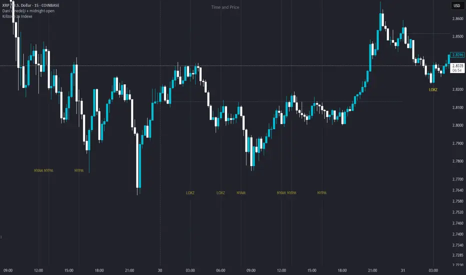
Dani u nedelji + midnight open @mladja123This indicator breaks the weekly timeframe into cycles and marks the midnight open for each day. It helps traders visualize weekly structure, identify key daily openings, and track market rhythm within the week. Perfect for analyzing trend patterns, swing setups, and session-based strategies.

Market State Momentum OscillatorMarket State Momentum Oscillator (MSMO)
Overview
The MSMO combines three elements in one panel:
Momentum oscillator (gray/blue area with aqua signal line)
Market State filter (green/red background area)
Money Flow Index (orange line)
Works on all markets and all timeframes. Non-repainting at bar close.
Colors and meaning
Gray area: Momentum above 0 (bullish bias)
Blue area: Momentum below 0 (bearish bias)
Aqua line: Signal line smoothing the oscillator
Green background: Market state bullish (price above moving average)
Red background: Market state bearish (price below moving average)
Orange line: Money Flow Index (volume-weighted momentum)
How to use
Always wait for confirmation of the green or red market state before acting.
Trend alignment: Watch the slope of the Weekly and Daily 200 MA and Weekly and Daily 50 MA to understand higher-timeframe trend direction. Trade only in alignment with the broader trend.
Entries:
Long: Green state + gray histogram rising + MFI trending up
Short: Red state + blue histogram falling + MFI trending down
Exits: Histogram crossing back through 0, or state background flips against the position.
Users can add chart alerts on plot crossings if needed.
Inputs
Lengths for oscillator pivot, signal smoothing, state moving average, trend weight, return %, and Money Flow Index. Defaults work for most charts.
Note
Educational use only. Not financial advice.
Tags
trend, oscillator, market state, momentum, money flow, crypto, forex, stocks, indices, futures

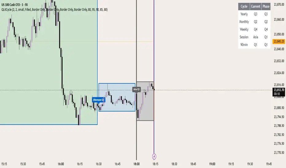
QLitCycle QuarterlyQLITCYCLE
QLitCycle is an intraday cycle visualization tool that divides each trading day into multiple segments, helping traders identify time-based patterns and recurring market behaviors. By splitting the day into distinct periods, this indicator allows for better analysis of intraday rhythms, cycle alignment, and time-specific market tendencies.
It can be applied to various markets and timeframes, but is most effective on intraday charts where precise time segmentation can reveal valuable insights.
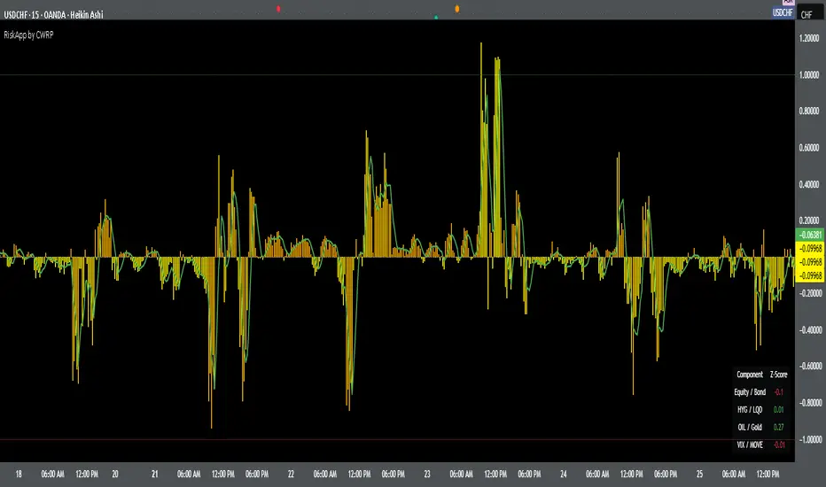
Cross-Asset Risk Appetite IndexCross-Asset Risk Appetite Index (RiskApp) by CWRP combines multiple asset classes into a single risk sentiment signal to help traders and investors detect when the market is in a risk-on or risk-off regime.
It calculates a composite Z-score index based on relative performance between:
SPY / IEF: Equities vs Bonds
HYG / LQD: High Yield vs Investment Grade Credit
CL / GC: Oil vs Gold
VIX / MOVE: Equity vs Bond Market Volatility (inverted)
Each component reflects capital flows toward riskier or safer assets, with dynamic weighting (Equity/Bond: 30%, Credit: 25%, Commodities: 25%, Volatility: 20%) and smoothing applied for a cleaner signal.
How to Read:
Highlighting
Yellow = Risk-On sentiment (market favors risk assets)
Orange = Risk-Off sentiment (flight to safety)
Black Background = Neutral design for emotional detachment
Table
Equity/Bond Z-Score:
Positive (> +1) --> Stocks outperforming bonds --> Risk-On
Negative (< -1) --> Bonds outperforming stocks --> Risk-Off
Credit Spread Z-Score (HYG/LQD):
Positive --> High yield outperforming --> Investors seeking yield
Negative --> Flight to quality --> Credit concerns
Oil/Gold Z-Score:
Positive --> Oil outperforming --> Economic optimism
Negative --> Gold outperforming --> Defensive positioning
Volatility Spread (VIX/MOVE):
Positive --> Equity vol falling relative to bond vol --> Risk stabilizing
Negative --> Equity vol rising --> Caution / Risk-Off
Composite Index:
> +1 --> Strong Risk Appetite
< -1 --> Strong Risk Aversion
Between -1 and +1 --> Neutral regime
Thank you for using the Cross-Asset Risk Appetite Index by CWRP!
I'm open to all critiques and discussion around macro-finance and hope this model adds clarity to your decision-making.
Shift 3M - 30Y Yield Spread🟧 Shift 3M - 30Y Yield Spread
- This indicator visually displays the **inverse of the US Treasury short-long yield spread** (3-month minus 30-year spread reversal signal) in a "price chart-like" form.
- By default, the spread line is shifted by 1 year to help anticipate forward market moves (you can adjust this offset freely).
- Especially customized to be analyzed together with the movements of US indices like the S&P 500, and to help understand broader market cycles.
✅ Description
- Normalizes the spread based on a rolling window length you set (default: 500 bars).
- Both the normalization window and offset (shift) are fully customizable.
- Then, it scales the spread to match your chart’s price range, allowing you to intuitively compare spread movements alongside price action.
- Instantly see the **inverse (reversal) signals of the short-long yield spread**, curve steepening, and how they align with actual price trends.
⚡ By reading macro yield signals, you can **anticipate exactly when a market crash might come or when an explosive rally is about to start**.
⚡ A perfect tool for macro traders and yield curve analysts who want to quickly catch major market turning points!
copyright @invest_hedgeway
============================================================
🟧3개월 - 30년 물 장단기 금리차 역수
- 이 인디케이터는 미국 국채 **장단기 금리차 역수**(3개월물 - 30년물 스프레드의 반전 시그널)를 시각적으로 "가격 차트"처럼 표시해 줍니다.
- 기본적으로 스프레드 선은 **1년(365봉) 시프트**되어 있어, 시장을 선행적으로 파악할 수 있도록 설계되었습니다 (값은 자유롭게 조정 가능).
- 특히 S&P500 등 미국 지수 흐름과 함께 분석할 수 있도록 맞춤화되었으며, 시장 사이클을 이해하는 데에도 큰 도움이 됩니다.
✅ 설명
- 지정한 롤링 윈도우 길이(기본: 500봉)를 기준으로 스프레드를 정규화합니다.
- 정규화 길이와 오프셋(시프트) 모두 자유롭게 설정 가능
- 이후 현재 차트의 가격 레인지에 맞게 스케일링해, 가격과 함께 흐름을 직관적으로 비교할 수 있습니다.
- **장단기 금리차의 역전(역수) 시그널**, 커브 스티프닝 등과 실제 가격 움직임의 관계를 한눈에 확인
⚡ 거시 금리 신호를 통해 **언제 폭락이 올지, 언제 폭등이 터질지** 미리 감지할 수 있습니다.
⚡ 시장의 전환점을 빠르게 캐치하고 싶은 매크로 트레이더와 금리 분석가에게 완벽한 도구!
copyright @invest_hedgeway

Chandelier Exit Oscillator [LuxAlgo]The Chandelier Exit Oscillator is a technical analysis tool that provides insights into potential trend reversals, momentum shifts, and trend continuation patterns, helping traders pinpoint optimal exit points for both long and short positions.
By calculating trailing stop levels based on a multiple of the Average True Range (ATR), the oscillator visually indicates when prices move above or below these critical stop levels.
This script uniquely combines the Chandelier Exit indicator with an oscillator format, equipping traders with a versatile tool that leverages ATR-based levels for enhanced trend analysis.
🔶 USAGE
Displaying the Chandelier Exit as an oscillator allows traders to gauge trend momentum and strength, recognize potential reversals, and refine their market insights.
The Timeframe option specifies the timeframe used for calculations, enabling multi-timeframe analysis and allowing traders to align the indicator’s signals with broader or narrower market trends.
The Chandelier Exit Oscillator allows users to select between a Regular or Normalized oscillator type. The Regular option displays raw oscillator values, while the Normalized version smooths values and scales them from 0 to 100.
The Chandelier Exit Overlay allows users to enable or disable the display of Chandelier Exit levels directly on the price chart. When enabled, this overlay plots trailing stop levels for both long and short positions, helping traders visually monitor potential exit points and trend boundaries alongside the price action.
The Trend-based Bar Color feature allows users to color the bars on the price chart according to the current trend direction. This visual differentiation aids in quicker decision-making and provides a clearer understanding of market dynamics.
🔶 SETTINGS
🔹 Chandelier Exit Settings
Timeframe: Sets the timeframe for calculations, allowing multi-timeframe analysis.
ATR Length: Defines the number of bars used for calculating the Average True Range (ATR), which helps in setting Chandelier Exit levels.
ATR Multiplier: Adjusts the sensitivity of the Chandelier Exit lines based on the ATR. Higher values make the indicator more conservative, while lower values make it more responsive.
🔹 Chandelier Exit Oscillator
Chandelier Exit Oscillator: Allows users to choose between a Regular or Normalized oscillator type. The Regular option displays raw oscillator values, while the Normalized version smooths values and scales them from 0 to 100.
Oscillator Smoothing: Controls the level of smoothing applied to the oscillator. Higher smoothing values filter out minor fluctuations.
🔹 Chandelier Exit Overlay
Chandelier Exit Overlay: Enables or disables the display of Chandelier Exit levels directly on the price chart.
Trend-based Bar Colors: Allows users to color bars based on trend direction, enhancing the visual analysis of market direction.
🔶 RELATED SCRIPTS
Market-Structure-Oscillator

Quarterly Cycles [EETrade]The idea of Quarterly Theory is -
Each timeframe is split into 4 "quarters", derived based on logical subdivisions:
- Year: Divided into calendar quarters (Jan-Mar, Apr-Jun, etc.).
- Tertiary (sub-year): Each year quarter is subdivided into 4 parts dynamically based on timestamp deltas.
- Month: Weekly-based logic using Sunday cutoffs and session switch time (18:00 US/Eastern).
- Week: Divided using daily boundaries starting from Sunday 18:00 (based on US futures session logic).
- Day: Split into 4 blocks (Asia, London, AM, PM) using 6-hour segments.
- Session and Macro Quarters: Session is divided further into 4 quarters of 6 hours, then each of those into 15-minute blocks for ultra-granular cycle mapping.
Where we split them into Q1, Q2, Q3 and Q4.
Usually we address
Q1 as accumulation,
Q2 as manipulation
Q3 as Distribution
Q4 as Continuation/Reversal
If we trade Q3 for example, we'd like to use price action mainly from previous Q3s.
Plus there are Semi Cycles which we can utilize
- Q1 with Q3
- Q2 with Q4
- Q3 with Q1
- Q4 with Q2
So we can also use Q1 price action when we are trading Q3
True Open Logic:
The open candle price of the second quarter is the true open for us, it will help us understand if we're on premium or discount area.
Plus this indicator providers a table to dynamically show the premium and discount
We can use this indicator to understand optimal times to trade as we'd like to trade mostly Q3

Multi-Session MarkerMulti-Session Marker is a flexible visual tool for traders who want to highlight up to 10 custom trading sessions directly on their chart’s background.
Custom Sessions: Enter up to 10 time ranges (in HHMM-HHMM format) to mark any market session, news window, or personal focus period.
Visual Clarity: For each session, toggle the highlight on or off and select a unique background color and opacity, making it easy to distinguish active trading windows at a glance.
Universal Time Handling: Session times automatically follow your chart’s time zone—no manual adjustment required.
Efficient and Fast: Utilizes TradingView’s bgcolor() for smooth performance, even on fast timeframes like 1-second charts.
Clean Interface: All session controls are grouped for easy editing in the indicator’s settings panel.
How to use:
In the indicator settings, enter your desired session times (e.g., 0930-1130) for each session you want to highlight.
Toggle “Show Session” and pick a color for each session.
The background will automatically highlight those periods on your chart.
This indicator is ideal for day traders, futures traders, or anyone who wants to visually segment their trading day for better focus and analysis.

Crypto Cycle Projection📈 Crypto Cycle Projection – Indicator Description
This indicator is designed to visually track and forecast repeating price cycles in the crypto market. It highlights a defined time-based cycle starting from a chosen date or the latest bar on the chart. By identifying cycle Start, Midpoint, and End zones, traders can gain insights into timing-based market structure and possible pivot periods.
⚙️ User Settings Explained
Start Point
Start from Last Candle (useLastCandle) – When enabled, the cycle begins from the most recent candle on the chart.
Manual Date (Year / Month / Day) – If Start from Last Candle is disabled, you can manually set a specific start date for the cycle.
Display Options
- Show Projection (showZone) – Toggles the display of the main cycle projection.
- Show Outer Bars (showOuter) – Adds faded edge bars around the key cycle zones for better visual emphasis.
- Show Previous Cycle (showPreviousCycle) – Adds the prior cycle to the chart, going one full cycle period back from the main start point.
Show Next Cycle (showNextCycle) – Projects one additional cycle forward beyond the current.
Cycle Parameters
Cycle Period (cyclePeriod) – Defines the number of bars in a full cycle (e.g., 60 = 60 bars). This sets the spacing between Start → Midpoint → End.
Each cycle section is color-coded:
Start = White
Midpoint = Yellow
End = Green
These reference lines and zones help you align trades with cycle timing for potential reversals, continuations, or volatility expansions.
Co-author Credit:
Matthew Hyland @ParabolicMatt
