Bhuvana Retrace Predictor (ATR + RSI Dive + St Break)It’s a “retracement warning + confirmation” tool. Nothing more.
Concept in simple words
Price runs too far too fast
The script uses EMA + ATR bands to detect when price is “stretched” (far from normal).
The run is losing power
It checks RSI divergence:
Price makes a new high but RSI doesn’t → buyers are getting weaker.
Price makes a new low but RSI doesn’t → sellers are getting weaker.
It waits for proof the pullback started
It then waits for a small structure break:
For a drop: price closes below a recent minor low.
For a bounce: price closes above a recent minor high.
What each label means
SETUP = “Retracement is likely soon” (don’t chase).
CONFIRM = “Retracement probably started” (now it’s tradable).
Brutal truth
This doesn’t predict perfectly. It just stacks 3 common signs:
overextended + weakening momentum + structure break.
Educational

Bhuvana Retrace Predictor It’s a “retracement warning + confirmation” tool. Nothing more.
Concept in simple words
Price runs too far too fast
The script uses EMA + ATR bands to detect when price is “stretched” (far from normal).
The run is losing power
It checks RSI divergence:
Price makes a new high but RSI doesn’t → buyers are getting weaker.
Price makes a new low but RSI doesn’t → sellers are getting weaker.
It waits for proof the pullback started
It then waits for a small structure break:
For a drop: price closes below a recent minor low.
For a bounce: price closes above a recent minor high.
What each label means
SETUP = “Retracement is likely soon” (don’t chase).
CONFIRM = “Retracement probably started” (now it’s tradable).
Brutal truth
This doesn’t predict perfectly. It just stacks 3 common signs:
overextended + weakening momentum + structure break.

InCrypto WatermarkInCrypto Watermark
A customizable overlay indicator that displays essential trading information directly on your TradingView charts. This tool helps traders quickly access key market data without cluttering the chart interface.
KEY FEATURES:
• Symbol Information: Displays current trading pair and active timeframe
• Price Display: Optional current price with smart precision formatting
• Price Change: Optional price change percentage over 24 bars with color-coded indicators
• Date & Time: Multiple format options for date (DD/MM/YYYY, MM/DD/YYYY, YYYY-MM-DD, DD.MM.YYYY) and time (HH:MM, HH:MM:SS)
• Custom Text: Customizable title and subtitle text
• Full Customization: Adjustable positioning, colors, sizes, alignment, and opacity for all elements
• Visibility Controls: Show/hide individual elements independently
• Background Options: Customizable background color, opacity, and optional borders
SETTINGS:
The indicator is organized into logical groups:
- Text Content: Title and subtitle customization
- Visibility: Individual show/hide controls for each element
- Watermark Position: Flexible placement options
- Symbol Info Position: Separate positioning controls
- Cell Size: Width and height adjustments
- Title/Subtitle/Symbol Info Settings: Color, size, alignment, and opacity controls
- Background Settings: Background color, opacity, and border options
USE CASES:
• Chart branding for trading groups or channels
• Quick reference for essential trading information
• Professional-looking charts for screenshots
• Multi-timeframe analysis assistance
TECHNICAL DETAILS:
• Pine Script v6
• Overlay indicator
• Works on all TradingView-supported markets and timeframes
• Real-time updates
HOW TO USE:
1. Add the indicator to your chart
2. Customize title and subtitle in Text Content settings
3. Adjust positioning for watermark and symbol info sections
4. Enable/disable individual information elements as needed
5. Fine-tune colors, sizes, and opacity to match your chart style
The indicator automatically adjusts price precision based on the asset's price level. Price change is calculated over 24 bars of the current timeframe (not 24 hours).
DISCLAIMER:
This indicator is for informational purposes only. It does not constitute investment advice, financial advice, trading advice, or any other type of advice. Past performance does not guarantee future results. Always conduct your own research and risk management before making trading decisions. Trading involves substantial risk of loss and is not suitable for every investor.

XAU Seasonality + Setup Quality + Month Strength | WarRoomXYZXAU Seasonality Engine is a technical analysis indicator developed for the study of recurring, calendar-based behavior on XAUUSD (Gold).
The tool blends month-of-year seasonality statistics with higher-timeframe context and a setup-quality gate to help users observe when market conditions historically lean strong, weak, or neutral — and how strict trade selection should be during each regime.
Indicator Concept
An indicator for XAUUSD that combines:
1. Seasonality Regime (Month-of-Year Bias)
► Classifies the current month as Strong / Weak / Neutral based on either:
• Preset months (user-defined)
or
• Auto mode (computed from historical monthly performance)
► Strong months suggest a bullish tailwind (not a signal).
► Weak months suggest headwind / caution and require stricter setup quality.
2. Monthly Performance Engine (Under the Hood)
► Uses the symbol’s monthly timeframe data to compute, per calendar month:
• Average monthly return (%)
• Win rate (%) — how often that month closes positive
• Month Strength Score (0–100) — a blended score derived from performance data
► The score is designed to provide a relative strength snapshot of seasonality by month.
3. Month Strength Histogram
► Plots a histogram (0–100) of the current month’s strength score.
• Higher bars = historically stronger month tendency
• Lower bars = historically weaker month tendency
► Optional horizontal reference lines mark “strong” and “weak” zones to make regimes obvious at a glance.
4. Setup Quality Meter (Confluence Filter)
► The indicator calculates a Setup Quality Score (0–100) using market structure and momentum components, such as:
• EMA trend alignment
• Momentum confirmation (EMA fast vs slow)
• Structure break confirmation (BOS)
• Liquidity sweep behavior
• Candle confirmation logic
► This score is intended as a trade-selectivity filter , not a trade executor.
5. Adaptive Rules for Weak Months (Strict Mode)
► When the indicator detects a weak seasonal regime, conditions automatically tighten:
• The A+ threshold increases (adaptive thresholding)
• Optional rule: Weak months require BOS + Sweep + FVG simultaneously before any A+ condition is considered valid
This forces the user into “higher-quality-only” behavior during historically weaker seasonal periods.
🔹1 Visual Components Included
• Seasonality regime label (Strong / Weak / Neutral)
• Optional background shading based on regime
• Month Strength Score histogram (0–100)
• Current month stats: Avg return + win rate
• Setup Quality Meter value (0–100)
• Adaptive A+ threshold display
• Weak-month confluence gate status (BOS / Sweep / FVG pass/fail)
• Optional alerts when strict criteria are met
➣What Means in the XAU Indicator
🔹 Definition (in THIS indicator)
Win Rate = the percentage of historical months that closed positive for the same calendar month.
It is NOT:
trade win rate ❌
signal accuracy ❌
It is a s tatistical seasonality metric .
How It’s Calculated
For each calendar month (January, February, etc.), the indicator:
1.Looks at historical monthly candles (Monthly timeframe).
2. Counts how many times that month:
•Closed higher than it opened (or higher than previous month close).
3. Divides:
Number of positive months
÷
Total number of observed months
× 100
Example: September
If over the last 20 years:
September closed green 14 times
September closed red 6 times
Then:
Win Rate = (14 / 20) × 100 = 70%
That’s what you see as in the dashboard.
What the Win Rate Is Used For
1️⃣ Part of the Month Strength Score
The indicator blends:
•Average Monthly Return (%) → measures magnitude
•Win Rate (%) → measures consistency
Combined into:
Month Strength Score (0–100)
This avoids a common trap:
•A month with 1 huge rally but many losses ≠ reliable
•A month with steady positive closes = higher quality environment
What Win Rate Tells You
High Win Rate (e.g. 65–75%)
•Gold more often closes higher in this month
•Continuation is statistically more likely
•Pullbacks are more likely to resolve in trend direction
Low Win Rate (e.g. 35–45%)
•Gold more often fails to close higher
•More chop, deeper retracements, false breakouts
•Continuation trades statistically struggle
What It Does NOT Tell You
🚫 It does NOT mean:
•“You will win 70% of your trades”
•“Every setup in this month works”
•“Direction is guaranteed”
Seasonality is context, not prediction.
Why This Is Powerful When Combined With Your System
On its own, win rate is just data.
But in your indicator, it’s used to:
•🔒 Raise the A+ threshold in weak months
•🧠 Force BOS + Sweep + FVG confluence
•❌ Block marginal setups automatically
So instead of guessing:
-“Why is gold so choppy this month?”
You know:
-“This month historically underperforms SO I must be stricter.”
➣What Means in the XAU Seasonality Indicator
🔹 Definition (in THIS indicator)
Avg Monthly Return = the average percentage gain or loss of XAUUSD for a specific calendar month, calculated across many years.
It measures magnitude , not frequency.
It is NOT:
•trade profit ❌
•expected return for the next month ❌
•guaranteed performance ❌
It is a historical seasonality tendency.
How It’s Calculated
For each calendar month (January, February, etc.), the indicator:
1.Takes every historical occurrence of that month.
2.Calculates the percentage change of the monthly candle:
(Monthly Close − Previous Monthly Close)
÷ Previous Monthly Close × 100
3. Adds all those percentage changes together.
4. Divides by the total number of observations.
Example: September
Assume over 20 years:
+2.4%, +1.1%, −0.6%, +3.0%, +1.8%, ...
If the sum of all September returns = +28% across 20 years:
Avg Monthly Return = +1.40%
That’s the number displayed in the indicator.
What Avg Monthly Return Is Used For
1️⃣ Measuring Strength of Movement
•Win Rate → “How often does it close green?”
•Avg Monthly Return → “How big are the moves when it works?”
Both are needed.
A month can:
•Win often but move very little
•Move a lot but only occasionally
The indicator combines both to avoid misleading conclusions.
How to Interpret Avg Monthly Return
Positive Avg Return (e.g. +0.8% to +2.0%)
•Gold tends to expand during this month
•Continuation phases are more likely
•Pullbacks are often absorbed
Near-Zero Avg Return (e.g. −0.2% to +0.2%)
•Market is statistically balanced
•Expect chop, rotations, false breaks
•Continuation is less reliable
Negative Avg Return (e.g. −0.5% or worse)
•Downward pressure or heavy mean reversion
•Rallies often fade
•Risk of aggressive stop hunts
What Avg Monthly Return Does NOT Mean
🚫 It does NOT mean:
•“Price will move +1.4% this month”
•“You should buy because the number is positive”
•“This is a guaranteed edge”
It describes historical behavior, not future certainty.
Why Avg Monthly Return Matters More Than People Think
Two months can have the same win rate but behave very differently:
Example:
Month Win Rate Avg Return Reality
Month A 65% +0.2% Small, choppy wins
Month B 55% +1.6% Fewer wins, but strong expansions
Your indicator would rank Month B as stronger, which is correct for continuation-based strategies.
How It Feeds the Month Strength Score
The indicator blends:
•60% Avg Monthly Return (normalized)
•40% Win Rate
This means:
•Big moves matter more than small consistency
•But consistency still matters enough to prevent distortion
Result:
Month Strength Score (0–100)
Which is then used to:
•tighten or relax A+ thresholds
•activate weak-month strict rules
•control trade frequency
🔹2. Intended Use
The indicator is designed as a discretionary analysis tool to support study of:
• seasonal bias and calendar tendencies
• relative strength/weakness across months
• how strict trade selection should be across different regimes
• confluence behavior when seasonal conditions are unfavorable
The tool does not generate forecasts, does not guarantee outcomes, and should not be relied upon as a stand-alone decision mechanism.
🔹3.How to Use XAU Seasonality Engine
Recommended charts: XAUUSD, intraday (5m–15m) with a HTF context (1H–4H).
1. Identify the Seasonal Regime
• Strong month → you can allow more continuation bias (still require structure).
• Neutral month → trade normally, standard criteria.
• Weak month → tighten selection, demand clean A+ conditions only.
2. Read the Month Strength Histogram
• If the score is high (e.g., 70+), the month has historically shown stronger tendency.
• If the score is low (e.g., 40 and below), expect slower conditions, deeper pullbacks, or more chop — and reduce marginal trades.
3. Use the Setup Quality Meter as the Gate
► In normal/strong months:
• A+ threshold is moderate (e.g., 70)
► In weak months:
• A+ threshold is higher (e.g., 80+)
• Optional strict mode: must also pass BOS + Sweep + FVG alignment
4. Example Trade Logic (Framework, Not Signals)
► Bullish framework in a Strong Month:
• Seasonal regime = Strong (tailwind)
• Structure supports bullish continuation (trend alignment)
• Sweep occurs into demand / liquidity grab
• Setup Quality reaches A+ threshold
• Entry: confirmation candle or retrace to key level
• SL: beyond sweep low / invalidation
• TP: nearest liquidity / prior highs / HTF level
► Weak Month rule-set (Strict Mode):
• Seasonal regime = Weak (headwind)
• Only consider trades if:
✅ BOS confirms direction
✅ Sweep occurs and rejects cleanly
✅ FVG exists recently (or is mitigated if you choose that model)
✅ Setup Quality exceeds the elevated adaptive threshold
If any one is missing → no trade
This is not meant to “predict” gold — it’s meant to enforce discipline when seasonality historically underperforms.
🔹4.Limitations and User Responsibility
► The indicator does not represent financial advice or imply performance expectations.
► Seasonality is statistical tendency, not certainty — macro conditions can override it.
► Results vary by broker feed, timeframe, and settings.
► Users should test thoroughly in simulation before applying to live markets.
► All trading decisions, risk management, and execution remain solely the responsibility of the user.
🔹5. Alerts
Optional alerts can notify when:
• a new month begins and the seasonal regime changes
• A+ criteria are met
• weak-month strict conditions pass (BOS + Sweep + FVG)
Alerts are informational only and do not constitute actionable recommendations.
Disclaimer
This script is provided for informational and educational purposes only . It does not provide financial, investment, or trading advice, and it does not guarantee profits or future performance. All decisions made based on this script are solely the responsibility of the user.
This script does not execute trades, manage risk, or replace the need for trader discretion. Market behavior can change quickly, and past behavior detected by the script does not ensure similar future outcomes.
Users should test the script on demo or simulation environments before applying it to live markets and must maintain full responsibility for their own risk management, position sizing, and trade execution.
Trading involves risk, and losses can exceed deposits. By using this script, you acknowledge that you understand and accept all associated risks.

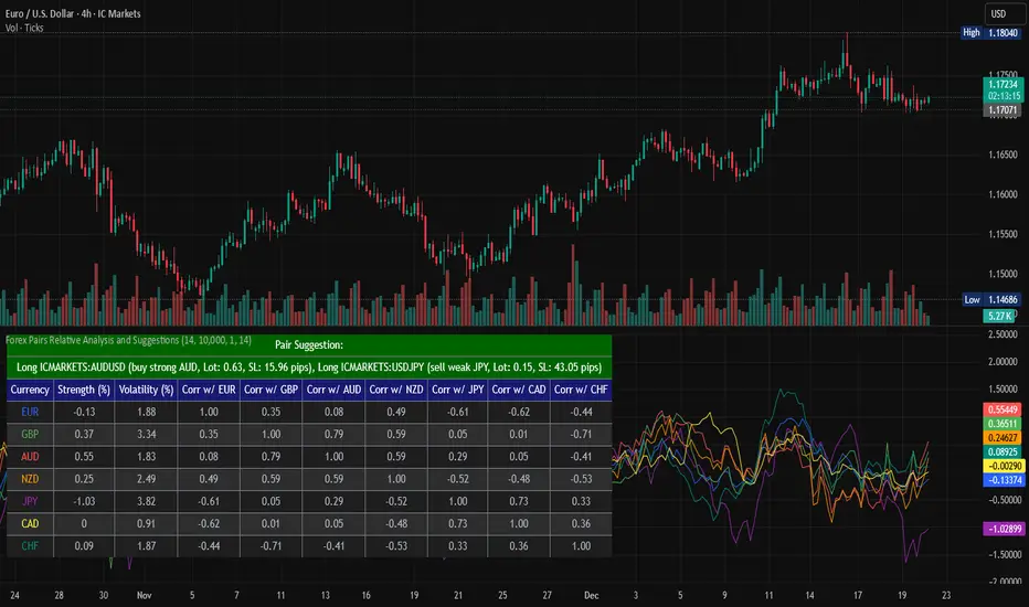
Forex Pairs Relative Analysis and SuggestionsThis Pine Script (version 5) indicator, titled "Forex Pairs Relative Analysis and Suggestions," is designed for use on TradingView charts. It provides real-time analysis of major forex pairs sourced from the IC Markets exchange, facilitating relative value or pair trading strategies by evaluating currency strengths against the US Dollar (USD). The script focuses on seven major currencies—EUR, GBP, AUD, NZD, JPY, CAD, and CHF—through their respective pairs: EURUSD, GBPUSD, AUDUSD, NZDUSD, USDJPY, USDCAD, and USDCHF.
Key features include:
Relative Currency Strengths: Calculated using the Rate of Change (ROC) over a user-defined lookback period (default: 14 bars), normalized to reflect performance versus USD. Positive values indicate strengthening, while negative values denote weakening.
Annualized Volatilities: Derived from the standard deviation of logarithmic returns, annualized assuming 252 trading days, and expressed as percentages to compare risk levels across pairs.
Full Pairwise Correlations: A comprehensive matrix displaying Pearson correlation coefficients between all pairs over the lookback period, aiding in identifying hedging opportunities (e.g., low or negative correlations for diversification).
Automated Pair Suggestions: Identifies the strongest and weakest currencies, proposing a long position in the pair to buy the strong currency and a short position (or opposite direction) to sell the weak currency against USD. Suggestions include estimated lot sizes based on user-input account balance, risk percentage (default: 1%), and a stop-loss proxy using 1x Average True Range (ATR).
Visual Elements: A table displays all metrics with color-coded rows for readability (optimized for dark mode), alternating backgrounds, and merged cells for suggestions. Strengths are also plotted in a separate pane with matching colors for trend visualization.
Customization: Users can adjust the lookback length, ATR period, account balance, and risk percentage via indicator settings to tailor the analysis.
Ensure access to IC Markets data in your TradingView account. The table appears in the top-left position by default and updates on the last bar. This tool is intended for educational and analytical purposes, supporting informed decision-making in forex trading by highlighting relative strengths, risks, and potential hedges.
Guidance on Choosing a Timeframe:
The indicator adapts to the chart's timeframe, with the lookback period influencing the historical window for metrics. Select based on your strategy:
Short-Term (Intraday/Scalping): Use 15-minute to 1-hour charts for timely signals; adjust lookback to 5–10 for responsiveness.
Medium-Term (Swing Trading): Opt for 4-hour to daily charts (recommended default) for balanced trends; 14-bar lookback covers days to weeks.
Long-Term (Position Trading): Choose weekly or monthly charts for macro views; increase lookback to 20–50 for smoother data.
Test across timeframes via backtesting to align with your risk and objectives.
Disclaimer:
This script is provided for informational and educational purposes only and does not constitute financial, investment, or trading advice. Trading forex involves significant risk of loss and is not suitable for all individuals. Past performance is not indicative of future results. The calculations, suggestions, and metrics (including lot sizes) are based on historical data and simplified assumptions, such as using ATR for stop-loss estimation, and may not account for real-time market conditions, slippage, commissions, or other factors. Users should conduct their own research, consult with qualified financial professionals, and verify the script's outputs before making any trading decisions. The author assumes no responsibility or liability for any losses incurred from the use of this script.
Gold Smart Scalper V3 - Clean ChartOverview
The Gold Smart Scalper V3 is a trend-following momentum strategy specifically optimized for XAU/USD (Gold). It focuses on catching "value pullbacks" within a strong trend, avoiding the noise of sideways markets. Unlike many scalpers that use lagging indicators for exits, this version uses fixed ATR-based targets to lock in profits during high-volatility moves common in Gold.
Core Methodology
The strategy operates on three layers of confirmation:
Macro Trend (HTF Filter): Uses a 50-period EMA to ensure trades are only taken in the direction of the higher-timeframe momentum.
The Value Zone: Instead of "chasing" green or red candles, the script waits for a pullback to the space between the 9 EMA and 21 EMA. This ensures a better risk-to-reward entry point.
The Trigger: A trade is only executed when price confirms the resumption of the trend by crossing back over the signal EMA after the pullback.
Key Features
Fixed Profit Targets: Replaced dynamic trailing stops with fixed Take Profit (TP) and Stop Loss (SL) levels based on ATR, ensuring exits aren't "hunted" by Gold's signature volatility spikes.
C lean Chart Interface : All moving average plots are hidden. The only visuals provided are the active TP/SL levels when a trade is live, keeping your workspace clutter-free.
Single-Trade Logic: The script includes a "One Trade Per Cross" gate, preventing the strategy from over-trading or "stacking" positions during choppy price action.
Settings & OptimizationATR Multipliers :
Stop Loss (SL): Default $2.0 \times ATR$. Protects against standard market noise.Take Profit (TP): Default $3.0 \times ATR$. Designed for a high Risk/Reward profile.Timeframe Recommendation: Optimized for 15m and 1H for swing scalping, or 5m for aggressive scalping.Instrument: Specifically tuned for Gold (XAU/USD), but applicable to other high-volatility pairs like GBP/JPY or NASDAQ.
Disclaimer
This script is for educational and backtesting purposes only. Past performance does not guarantee future results. Always practice proper risk management.

ODR BoxThis indicator automates the Opening Range Definition (ODR) based on the Ali Khan / ICT Model 1 framework. By capturing the 07:00-09:25 AM Dealing Range, it projects institutional quadrants and standard deviation targets. It is designed to filter out 'retail noise' and highlight the mathematical levels where price delivery is most likely to accelerate or reverse.

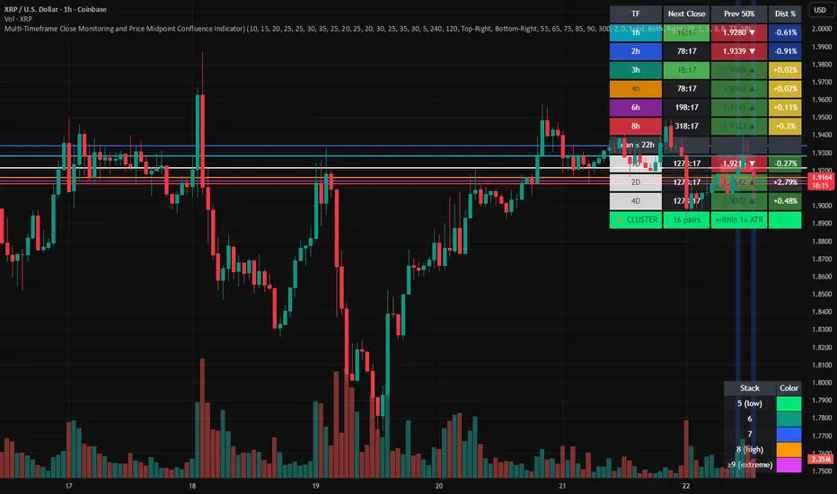
Multi-Timeframe Close and Midpoint ConfluenceMulti-Timeframe Close Monitoring and Price Midpoint Confluence Indicator
This indicator is designed to assist traders in monitoring multiple timeframe candle closes and identifying areas where price midpoints (50% levels) from different timeframes cluster together.
The tool focuses on timing awareness and structural context, helping users observe periods where multiple timeframe events occur close together, which may coincide with increased market activity.
What the Indicator Tracks
The indicator monitors candle close timing and price context across multiple timeframes, including:
Intraday timeframe closes (30m, 1h, 2h, 3h, 4h, 6h, 8h)
Higher-timeframe closes (Daily, Weekly, Monthly) when within a defined scan window
The midpoint (50%) of the previous candle for each tracked timeframe
The distance between current price and each midpoint level
This information is evaluated independently for each timeframe.
Timeframe Close Confluence
When multiple timeframes are approaching a candle close within a short window, the indicator highlights this period visually.
These moments can be useful for observing potential shifts in activity or volatility, particularly when combined with other forms of analysis.
Visual markers and optional alerts are used to draw attention to these timing clusters.
Midpoint (50%) Level Clustering
The indicator also evaluates whether multiple 50% levels from different timeframes are located within a user-defined proximity.
When several midpoints cluster closely together, the area is highlighted as a zone of interest for further observation, as overlapping price references may act as areas of interaction.
Countdown & Information Panel
An optional on-chart panel displays:
A live countdown to upcoming timeframe closes
Relative urgency based on proximity to each close
Whether current price is above or below each midpoint
Distance metrics to help gauge proximity
Color coding is used to improve readability rather than indicate trade direction.
Visual Context Tools
Additional visual options include:
Background shading when multiple timing or midpoint conditions overlap
Adjustable thresholds to control sensitivity
Customizable colors, opacity, and panel placement
These visuals are intended to provide contextual awareness, not trade signals.
Intended Use
Style: Multi-timeframe analysis and timing awareness
Markets: Forex, crypto, equities, futures
Purpose:
Monitor upcoming timeframe closes
Observe overlapping price reference zones
Improve preparation around potential activity windows
The indicator is best used as a supplementary tool alongside independent analysis.
Important Notes
This script is provided for educational and analytical purposes only.
It does not predict market outcomes and should not be used as a standalone decision-making tool. Users are encouraged to apply appropriate risk controls and confirm observations with additional analysis.
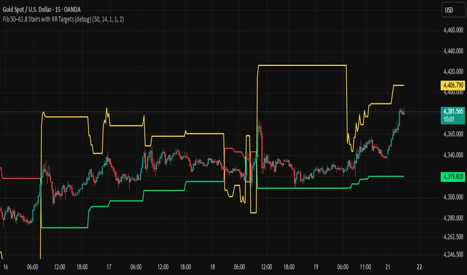
BHUVANA Fib 50/61.8 Stairs with RR Targets Fib 50–61.8 Stairs with RR Targets (debug) automatically tracks the latest swing and draws a 50%–61.8% Fibonacci pullback zone as step-like “stairs.” From that zone it plots a planned trade framework: entry reference, stop/invalidation, and multiple Risk:Reward targets (e.g., 1R/1.5R/2R/3R).
What it’s for
Visualize the “buy/sell pullback” area (50–61.8) in trending moves
Standardize exits with RR targets instead of guessing
Quickly see when the swing/zone updates as structure changes
How to use (simple)
Wait for a clear impulse swing to form.
Let price retrace into the 50–61.8 zone.
Take entries only with your own trigger (reclaim / rejection / BOS).
Use the plotted stop and RR targets for management.
Inputs
Swing detection / lookback
RR multiples and target count
Show/hide stairs, labels, debug visuals
Important
This is a mapping tool, not a standalone signal. If you trade every touch of 50–61.8 without confirmation, you’ll get chopped. Debug version may show extra visuals and can repaint on swing updates. Not financial advice.
Weekly Bullish Engulfing ScreenerThis is a weekly Bullish engulfing screener to find the stocks ready to breakout

Jim Kombein Ph.D. Core Engine (Invite-Only)This invite-only script is a research-oriented framework for analyzing market structure and price dynamics.
It is intended solely for educational and informational use.
No trading advice, buy/sell recommendations, or profit guarantees are provided.
All decisions and associated risks remain the sole responsibility of the user.

Quant_DCA**Quant_DCA - Smart Dollar-Cost Averaging with Dynamic Position Sizing**
Designed for SPY,QQQ,BTC
Transform your DCA strategy with intelligent dip-buying. Instead of buying a fixed amount every week, Quant_DCA identifies quality dips and scales position sizes dynamically - buying more during significant corrections.
**✨ KEY FEATURES**
• 4% Minimum Threshold - Quality dips only, eliminates noise
• Volume Confirmation - Requires 2x average volume spike
• Volatility Confirmation - ATR and StdDev elevation required
• 9-Tier Multiplier System - 1x to 20x based on dip severity
• Conservative Risk - Max 20x multiplier, not extreme
• Capital Efficient - Deploys ~60% of DCA capital, not 2-3x more
• Real-Time Comparison - See DCA vs Quant performance live
• Color-Coded Signals - Visual strength indicators
• Smart Alerts - Detailed execution instructions
**💰 POSITION SIZING**
4% dip → 1.0x
7.5% dip → 2.0x
10% dip → 2.8x
17% dip → 5.5x
28% dip → 10.5x
35% dip → 15.0x
Max → 20.0x
**📈 EXPECTED RESULTS (Realistic)**
Based on QQQ 4H, 2022-2024 backtest:
✅ +10-20% share advantage vs DCA
✅ 15-20% better average cost
✅ ~60% capital deployment (similar to DCA)
✅ 30-45 quality signals per year
✅ +15-30% ROI advantage over 5-10 years
**💡 CAPITAL REQUIREMENTS**
**⚙️ QUICK START**
1. Add to QQQ 4H chart (optimized timeframe)
2. Keep default settings (pre-optimized)
3. Backtest from 2022-01-01 to present
4. Verify 10-20% share advantage shown
5. Create alerts for buy signals
6. Start with 50% position size
7. Execute ALL signals for 3 months
8. Scale to 100% after confidence built
**🎯 WHO IS THIS FOR**
✅ Long-term investors (5+ year horizon)
✅ Accounts $25k+ (preferably $50k+)
✅ Those wanting better DCA results
✅ Disciplined traders who execute all signals
✅ Comfortable buying during crashes
✅ SPY/QQQ/GLD/BTC or any Index that always goes up over the long period of time
❌ NOT for: Day traders
**⚠️ IMPORTANT DISCLAIMERS**
• works best in volatile conditions
• Requires 75%+ signal execution to achieve results
• Need liquid reserves (5x max buy) ready at all times
• Some years will lag DCA (wins over full market cycles)
• Past performance does not guarantee future results
• This is NOT financial advice - educational purposes only
• Always do your own research and consult a financial advisor
**🔧 SETTINGS**
Pre-optimized for QQQ 4H timeframe. All settings are customizable:
Dip Detection:
• Min Dip: 4.0% (adjustable 1-10%)
• Lookback: 10 bars
• Fast EMA: 20 / Slow EMA: 50
• Volume: 2.0x threshold
• Volatility: 1.5x threshold
Multipliers:
• 9 customizable tiers
• Conservative 1-20x range
• Exponential scaling
Strategy:
• Base: $1,000 (match your DCA)
• DCA Frequency: Weekly
• Start Date: Any backtest period
**📊 RESULTS TABLE**
Real-time metrics displayed:
• Portfolio values (DCA vs Quant)
• ROI percentages
• Capital deployed (with ratio)
• Share counts (with advantage %)
• Average cost per share
• Buy frequency and averages
• Winner declaration
**💡 PRO TIPS**
1. Execute within 1 hour of signal
2. Keep 5x max buy in liquid reserves
3. Don't skip signals - even small dips matter
4. Track actual vs backtest monthly
5. Think long-term (5-10 years)
6. Accept that some years lag DCA
7. Start conservative (50% size)
8. Build to 100% over time
**🎓 WHY THIS WORKS**
Academic research shows buying dips beats random timing over long periods:
• Price advantage from buying declines
• Psychological edge (buy fear)
• Mean reversion tendency
• Volume spikes mark capitulation
• Volatility premium rewards patience
Quant_DCA systematizes this with objective rules, quality filters, and conservative position sizing.
**📝 VERSION INFO**
Version: 1.0 - Balanced Edition
License: Mozilla Public License 2.0
Author: Sahebson
Optimized For: QQQ 4H timeframe
**💬 FEEDBACK WELCOME**
Share your backtest results or real-world performance in the comments! Questions? Ask below.
Like this indicator? Give it a boost! 👍
Have suggestions? Comment! 💬
---
*Disclaimer: This indicator is for educational purposes only and does not constitute financial advice. Trading involves risk of loss. Past performance does not guarantee future results. Always do your own research and consult with a qualified financial advisor before making investment decisions. The author is not responsible for any trading losses incurred using this indicator.*
---
**Tags:** #DCA #SmartInvesting #DipBuying #QQQ #LongTerm #PositionSizing #RiskManagement #TradingStrategy

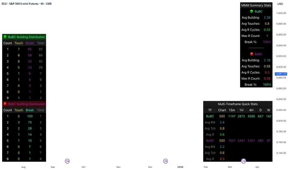
Body Close Continuity & failure Backtesting @MaxMaseratiThis indicator, is a highly advanced institutional-grade tool designed to track the "lifespan" of a trend based on Body Close (BC) sequences.
Unlike basic indicators that just show direction, this script analyzes the structural integrity of a trend by monitoring how many candles continue the move before a "Touch" (retest) or a "Break" (failure) occurs.
The Continuity & Failure Stats indicator tracks sequences of Bullish Body Closes (BuBC) and Bearish Body Closes (BeBC). It measures three critical phases: Building (pure momentum), Touching (price retesting the low/high of the sequence), and Resumption (price continuing the trend after a retest). It provides a statistical distribution of how long these "buildings" typically last before failing, allowing traders to know exactly when a trend is overextended.
This comprehensive analysis blends the statistical breakdown of the Continuity & Failure Stats indicator to provide a deep understanding of the structural momentum for the S&P 500 E-mini (ES1!) on a 4-hour timeframe.
1. Extensive Table Breakdown
A. Building Distribution (Left Table): The Fatigue Gauge
This table acts as a histogram of momentum, tracking the "Building Count"—the number of consecutive candles closing in a trend without price returning to its origin.
Count Column: Represents the streak length (e.g., 1, 2, or 3 candles).
Touch Column: Shows how many times a streak was interrupted by a retest ("touch") but remained structurally intact.
Break Column: Counts total structural failures where price closed beyond the sequence's anchor.
Data Insight: For BuBC, 92 sequences reached Count 1, but only 28 remained by Count 4. This reveals a steep momentum decay after the 3rd candle, establishing a "Statistical Wall" where only 2 sequences in history reached a count of 9.
B. MMM Summary Stats (Top Right): The Mathematical DNA
This table provides the "Expected Value" and behavior of a trend over the lookback period.
Avg Building (2.39 for BuBC): On average, a bullish move lasts ~2.4 candles of pure momentum before a retest or reversal occurs.
Avg Touches (0.8): This low number indicates "clean" trends that rarely wobble back to retest levels multiple times before reaching a conclusion.
Avg R Cycles (0.55): This suggests that once a bullish trend is interrupted, it only successfully resumes its momentum about half the time.
Max R Count (1): Typically, once a trend is "touched," it only manages one more push before failing.
C. Multi-Timeframe (MTF) Quick Stats (Bottom Right): Trend Weight
This compares the 4H chart against other layers of the market to identify "global" alignment.
Sample Comparison: There are 3,594 tracked BuBC sequences on the 4H compared to only 142 on the Weekly chart.
Fractal Law: The Avg Building (2.4) is consistent across several timeframes, implying that the "Rule of Three" (momentum fading after 3 candles) is a fractal characteristic of this asset.
2. Table Comparison: Synthesizing the Data
To trade effectively, you must compare Distribution (timing) against Summary Stats (averages):
Continuity vs. Failure: The Summary Stats show an average building of 2.39. When checking the Distribution table at Count 2, the "Break" count (58) is already high relative to the "Total". This confirms that the risk of failure increases exponentially the moment you exceed the average.
Momentum vs. Mean Reversion: Distribution tells you when a trend is "tired". If the 4H is at a "Building Count 4" (statistically overextended) while the Weekly chart is at "Building Count 1" (fresh momentum), you may choose to prioritize the higher timeframe's strength despite the local overextension.
3. Strategic Summary & Application
This indicator proves that market momentum follows a predictable "Building" cycle rather than an infinite streak.
The "Rule of Three" for ES1! 4H:
The Entry Zone (Momentum Start): The most profitable entries occur at Building Count 1. Statistically, you have a high probability of reaching a count of 2 or 3.
The Exit Zone (Momentum Limit): Take profits or tighten stops at Count 3. The data shows the sample size drops by nearly 50% between Count 3 and Count 4.
The "Touch" Rule (Retest Reliability): If price returns to the sequence low (a "Touch"), do not expect a massive continuation. The Max R Count of 1 tells us that resumptions are usually short-lived.
Danger Zone: Entering at Building Count 4 or higher is statistically dangerous, as the "Break" probability significantly outweighs the "Touch" or continuation probability.
Long Short Trading System With TableSmart Trading System Pro is an advanced TradingView indicator designed for precision and clarity.
It combines Order Blocks, Liquidity Zones, EMA trend alignment, MACD, RSI, Volume, and ATR-based risk management to generate high-quality LONG / SHORT signals.
🔹 Clear trade direction
🔹 Smart entry, stop-loss & multi-level take-profit
🔹 Automatic risk/reward & leverage calculation
🔹 Clean visual dashboard for fast decision-making
Built for traders who value structure, confirmation, and risk control.
Best suited for crypto, forex, and indices on all timeframes.
Disclaimer:
This indicator is for educational and informational purposes only and does not constitute financial advice.
Trading involves risk, and past performance does not guarantee future results.
You are solely responsible for your trading decisions and outcomes.

ALIEN WARP CORE [ULTIMATE] ALIEN WARP CORE is a multi-engine oscillator designed for chart analysis and visual clarity.
It lets you switch between several popular momentum engines and provides consistent visuals, optional filters, and clear signal markers.
What it includes
Multiple engines (selectable): Laguerre RSI, Connors RSI, Stochastic RSI, MFI, TDI, Standard RSI, and MACD (MT5-style).
Two-line systems: Signal line support in Stoch RSI / TDI / Standard RSI / MACD modes.
Trinity Color Logic: A dynamic gradient that helps visualize momentum bias (sell → neutral → buy).
Optional visual layers: “Nebula mist” bands and background warp color for easier reading.
Signals & markers: Buy/Sell labels, divergence markers, and midline retest markers (optional).
Filters (optional)
This script can apply extra confirmation filters:
EMA 200 trend filter
Momentum EMA filter (EMA 10 vs EMA 12)
ADX strength filter
RSI “safety” filter (blocks buys in extreme overbought, blocks sells in extreme oversold)
You can also enable Specific Signals for Standard RSI and MACD crossovers.
If Bypass Global Filters is enabled, those crossover signals can work independently from EMA/ADX filters.
How to use
Choose your preferred Engine in the settings.
Adjust lengths and visuals (line width, solid/gradient, mist opacity).
Enable filters if you want fewer signals and more confirmation.
Use divergence and retest markers as context, not as standalone trade triggers.
Important notes
This indicator is for educational and informational purposes only and does not provide financial advice.
Signals are not guaranteed and may repaint visually around pivot-based divergence detection.
Always backtest and combine with your own risk management.

SMC SNI LAP ULTRA This indicator is a multi-tool market-structure and confluence signal assistant designed for EDUCATIONAL PURPOSES ONLY. It combines Smart Money Concepts (SMC) and classic technical confirmations to help visualize context, zones, and potential trade ideas.
What it shows
• Market Structure: Swing/Internal pivots, BOS / CHoCH / MSS labels and structure lines
• Liquidity Concepts: EQH/EQL style areas and liquidity sweep detection (when enabled)
• Zones & Areas of Interest: Supply/Demand, Order Blocks (OB), Fair Value Gaps (FVG) and key levels (depending on settings)
• Confirmation Tools: Pin bar / engulfing patterns, RSI-based filters and optional divergence
• Confluence Scoring (AI-like): A rule-based scoring system that weights multiple conditions (trend alignment, momentum strength, volume spike, sweep, zone location, RR quality, etc.)
• Risk Visualization: Optional Entry / TP / SL guide lines based on selected TP/SL modes and RR settings
• Alerts: Optional alerts that can be used for notifications or webhook integrations (signals only)
About “AI” / Scoring
The “AI” features in this script are NOT machine learning and do NOT predict the future. They are rule-based calculations that assign a score from multiple factors and track simple win/loss statistics based on user-defined TP/SL logic. Results depend on market conditions and your settings.
Important Disclaimer
This indicator does NOT provide financial advice and does NOT guarantee profits. Trading involves risk and you can lose money. Any signals, scores, or projections are informational and for research/testing only. Always do your own analysis, manage risk properly, and consider using a demo account for evaluation.
Recommended Use
Use it as a context tool:
1) Identify structure (BOS/CHoCH) and trend bias
2) Mark zones (OB/FVG/Supply-Demand)
3) Wait for confirmation (candle patterns, RSI/divergence, volume, etc.)
4) Use the scoring as a filter—not as a guarantee
If you need automated execution, connect alerts to your own external system at your own responsibility. This script itself is an indicator (not an auto-trading system).

Triangles [Bulkowski v6]Title: Ascending & Descending Triangles (v6)
Description:
Overview This indicator automates the detection of Ascending and Descending Triangles, two of the most reliable chart patterns documented in Thomas Bulkowski’s Encyclopedia of Chart Patterns. By utilizing Pine Script v6 and an Object-Oriented architecture, this tool scans market structure in real-time to identify valid "Flat Limit" setups that manual charting often misses.
The Theory: How It Works Pattern recognition is often subjective. This script removes the guesswork by applying strict algorithmic rules based on Bulkowski’s statistical findings:
Ascending Triangles (Green): The script looks for a "Flat Top" (Resistance) where price hits a similar level multiple times, coupled with "Rising Bottoms" (Higher Lows). This creates a squeeze indicating potential bullish accumulation.
Descending Triangles (Red): The script looks for a "Flat Bottom" (Support), coupled with "Falling Tops" (Lower Highs). This indicates sellers are becoming more aggressive while buyers are barely holding the floor.
Key Features
Smart "Flatness" Detection: Markets are rarely perfect. The script includes a Tolerance (%) input, allowing you to define how "flat" a resistance or support line must be to qualify.
Strict Trend Validation: It checks for rising or falling pivots specifically within the timeframe of the flat level, ensuring the geometry of the triangle is valid.
Pine Script v6 Architecture: Built using the latest User-Defined Types (UDTs) and Methods for optimized performance and memory management.
Historical Logging: Draws patterns on historical data (within the buffer limit) so you can backtest the visual reliability of the signals.
Settings & How to Use
Pivot Left / Pivot Right: Determines the "size" of the pattern.
Lower values (5-10): Finds smaller, intraday triangles.
Higher values (15-20): Finds macro, swing-trading structures.
Flatness Tolerance (%): The most critical setting.
Default (1.5%): Requires the flat side of the triangle to be very precise.
Increase (2.0% - 3.0%): Allows for "messier" wicks and creates more pattern detections.
Trading Tips (Based on Bulkowski)
Wait for the Breakout: Triangles are coiling mechanisms. While Ascending triangles have a bullish bias, they can break downward (and vice versa). Professional traders often wait for a candle close outside the triangle boundary.
False Breakouts: Be aware of "Premature Breakouts" where price pierces the flat line but retreats.
Volume: Watch for declining volume as the triangle develops and an expansion of volume on the break.
Disclaimer This tool is for educational purposes and chart analysis assistance only. Automated pattern recognition should always be verified by the human eye. Past performance of a pattern does not guarantee future results.

RSI Strategy with Auto Tuner (PF)# RSI Auto‑Tuner Strategy — How To Use
This document explains **how to use** the RSI Auto‑Tuner strategy. It intentionally avoids math and implementation details. Follow this as an operating guide.
---
## 1. What This Tool Is For
This strategy helps you:
* Discover **which RSI length works best** on a given ticker and timeframe
* Measure performance using **Profit Factor (PF)**
* Improve RSI performance on noisy markets by **transforming price first**
The auto‑tuner is a **research tool**, not a live trading signal generator.
---
## 2. Two Modes You Must Treat Differently
### Research Mode
Used to explore and discover parameters.
* Auto‑Tune: **ON**
* Parameters are allowed to change
* Results may look very good
* Overfitting risk is real
### Trading Mode
Used for forward testing or live trading.
* Auto‑Tune: **OFF**
* Parameters are fixed
* Behavior is stable and repeatable
* This is the only acceptable mode for live use
**Never trade live with Auto‑Tune enabled.**
---
## 3. Manual Mode (Trading Mode)
Use this after parameters are finalized.
Steps:
1. Set **Auto‑Tune = OFF**
2. Choose:
* Source (raw price or transformed price)
* RSI Length (manual, default 14)
* Oversold / Overbought levels
3. The strategy will:
* Enter long when RSI crosses up through Oversold
* Enter short when RSI crosses down through Overbought
* Flip positions on opposite signals
This mode is predictable and safe for forward testing.
---
## 4. Auto‑Tune Mode (Research Mode)
Use this to find optimal RSI lengths.
Steps:
1. Set **Auto‑Tune = ON**
2. Configure the search range:
* Minimum Length (default 5)
* Maximum Length (default 14)
* Step Size (default 1)
3. The strategy will:
* Internally simulate trades for each RSI length
* Track gross profit, gross loss, and trades
* Select the length with the highest Profit Factor
4. The best length is applied automatically
Auto‑Tune evaluates historical data only.
---
## 5. Using a Transform on Price (Critical)
RSI does **not** have to run on raw price.
You can significantly improve results by:
* Applying a **price transform** first
* Feeding the transformed series into the RSI Source input
Examples of transforms:
* Moving averages
* Low‑pass filters
* Butterworth filters
* Any smoother or denoiser
Why this works:
* Busy, wicky markets cause RSI to whipsaw
* Transforms remove micro‑noise
* RSI responds to structure instead of chaos
* Profit Factor often increases dramatically
Best practice:
* Auto‑tune on raw price
* Auto‑tune on transformed price
* Compare PF, trade count, and stability
---
## 6. Reading the Status Label
At the last bar, the on‑chart label shows:
* Whether Auto‑Tune is ON or OFF
* Whether candidates were built successfully
* Number of RSI lengths tested
* Best RSI length found
* Profit Factor and trade count
If Auto‑Tune is OFF, the label shows the manual length.
---
## 7. Recommended Workflow
1. Choose ticker and timeframe
2. Enable Auto‑Tune on **raw price**
3. Record best RSI length and PF
4. Enable Auto‑Tune on **transformed price**
5. Compare results
6. Lock parameters
7. Disable Auto‑Tune
8. Forward test
---
## 8. Warnings and Discipline
* High PF with few trades is unreliable
* Transforms can hide execution costs
* Always validate on a different period
* Auto‑Tune is a **lens**, not an edge
Treat this tool as a research microscope, not an autopilot.

VWAP TOOL KIT (RyanTradesES)VWAP TOOL KIT — RyanTradesES
The VWAP Tool Kit is a session-aware, intraday market structure indicator designed for futures and active index traders who rely on VWAP, opening range behavior, and RTH context to frame high-probability trades.
This tool consolidates multiple VWAP regimes, key session levels, and adaptive EMA smoothing into a single, clean overlay—removing the need to stack multiple indicators or scripts.
Core Features
Opening Range (9:30–9:45 NY)
Automatically tracks and shades the Opening Range
Extends through RTH to provide a clear structural reference
Rendered behind price for clarity (non-intrusive)
VWAP Suite
Overnight VWAP (resets at 6:00 PM NY)
24-Hour NY VWAP (resets at 9:30 AM NY)
Previous Day NY VWAP (calculated from prior RTH)
Anchored VWAP with manual date/time control
Each VWAP can be independently enabled, styled, and sourced.
RTH High / Low
Tracks Regular Trading Hours (9:30–16:00 NY)
Updates dynamically and resets daily
Useful for range expansion, rejection, and bias confirmation
EMA + Advanced Smoothing
Base EMA with adjustable length, source, and offset
Optional EMA-based smoothing layer:
SMA
EMA
RMA (SMMA)
WMA
VWMA
SMA + Bollinger Bands
Bollinger Bands adapt directly to EMA behavior, not raw price
Legend / HUD
Compact, auto-updating legend in the chart corner
Displays only active modules
Fully optional and customizable
Design Philosophy
This indicator is built for clarity and context, not signals.
It is meant to help traders:
Identify VWAP acceptance vs rejection
Frame bias using session structure
Align EMA behavior with VWAP positioning
Reduce chart clutter while increasing information density
All components are modular—use everything, or only what fits your strategy.
Recommended Use
Intraday futures (ES, NQ, RTY, YM)
VWAP-based mean reversion and trend continuation
Opening range and RTH structure trading
Discretionary or rules-based execution
Notes
Times are calculated using New York session logic
This indicator does not generate trade signals
Designed for educational and analytical use
How I Personally Use This
I use this tool primarily for context, not entries. My focus is on how price behaves around the Overnight VWAP, 24H NY VWAP, and Previous Day VWAP during the first part of RTH. I pay close attention to whether price is accepting above or below VWAPs rather than crossing them. The Opening Range gives me an early framework for volatility and directional intent, while RTH High/Low helps me stay aware of where price is expanding versus stalling. The EMA and smoothing layer are used to judge momentum quality—when EMA structure aligns with VWAP positioning, I’m more interested; when they diverge, I’m more patient.
Example Framework (Not Trade Advice)
One way this indicator can be used is by observing price behavior after the Opening Range is set. If price holds above the Overnight and 24H VWAPs and the EMA structure remains supportive, that suggests stronger acceptance during RTH. In contrast, repeated failure to reclaim VWAP levels while EMA smoothing rolls over may indicate weakening participation. Anchored VWAP can be used to measure response around specific events such as session opens, highs/lows, or high-volume turns. This framework is intended to help structure decisions, not automate them.

CGM - Options Trial [Basic] - by ChartGptMarathiCGM - Options Premium Trial - by ChartGptMarathi
Description:
The CGM - Options Premium Trial is the introductory version of the advanced CGM Sniper suite, designed specifically for Option Buyers who need clarity in a chaotic market.
This indicator allows you to plot and compare Call (CE) and Put (PE) option charts simultaneously on a single pane, providing a direct view of premium behavior without switching tabs. It includes essential trend-following tools to help you identify momentum shifts instantly.
Key Features:
Dual Charting: Visualizes both Call and Put option candles on one screen for real-time comparison.
Trend Confirmation: Includes a built-in 8 EMA to gauge short-term momentum.
Volume Analysis: Integrated VWAP (Volume Weighted Average Price) for institutional level tracking.
Spot Tracking: Monitors the underlying Spot symbol (e.g., NIFTY/BANKNIFTY) data for better context.
Visual Clarity: Clean, color-coded candles (Green/Red) with customizable widths and visibility toggles.
How to Use:
Add the indicator to your chart.
In the settings, select your Call (CE) and Put (PE) symbols (e.g., NIFTY24000CE, NIFTY24000PE).
Select the Spot Symbol (e.g., NSE:NIFTY) for underlying data reference.
Use the EMA and VWAP lines to determine trend direction. If the premium price is above both lines, the momentum is bullish for that option.
Disclaimer:
This indicator is for educational and analytical purposes only. It does not constitute financial advice. Trading options involves significant risk. Please perform your own due diligence before executing any trades.
All rights reserved with ChartGptMarathi. For any feedback or support, contact at: chartgptmarathi@gmail.com

DCA Destroyer[Sahebson]Smart DCA Signal Calculator with Dynamic Position Sizing: (Designed for SPY or QQQ)
Transform your dollar-cost averaging strategy with intelligent position sizing.
This indicator identifies market exhaustion points where price reversals are likely, then calculates optimal position sizes based on the severity of the correction. Instead of buying fixed amounts on fixed dates, it deploys capital strategically when assets show oversold conditions, automatically scaling investment amounts from small positions on minor dips to aggressive positions during major corrections.
Core Features:
Exhaustion Detection: Identifies reversal points using swing analysis and momentum indicators
Dynamic Position Sizing: 8-tier multiplier system (0.1x to 25x base amount) based on drawdown depth
Real-Time Comparison: Side-by-side performance tracking vs traditional DCA
Adaptive Scaling: Exponential curve matches market volatility patterns
Risk Management: Tracks average cost, share accumulation, and ROI metrics
Visual Signals: Color-coded buy arrows with multiplier and amount labels
How It Works:
Monitors price for exhaustion patterns (sustained selling pressure followed by reversal)
Measures current drawdown from recent highs
Calculates position multiplier based on correction severity
Displays buy signal with recommended purchase amount
Tracks cumulative performance vs baseline DCA strategy
Use Cases:
Systematic accumulation of long-term positions
Optimizing entry timing for core holdings
Capital-efficient portfolio building
Crash buying with predetermined rules
Emotion-free position sizing
Ideal For:
Long-term investors building positions
Traders seeking systematic dip-buying rules
Portfolio managers optimizing capital deployment
Anyone practicing dollar-cost averaging who wants better results
Customizable Parameters:
Adjust exhaustion sensitivity (swing length, bar count)
Configure multiplier tiers for your risk tolerance
Set lookback period for drawdown measurement
Define base position size and DCA comparison amount
Performance Metrics:
Real-time ROI comparison (strategy vs DCA)
Share accumulation efficiency
Average cost basis tracking
Signal quality analytics
Tier distribution analysis

Multi-TF ATR + ORB + EMA PRO ver. 3.0Multi-TF ATR + ORB + EMA PRO v3.0
Professional Trading Indicator Update - Complete Documentation
🎯 MAJOR ENHANCEMENTS OVERVIEW
1. ORB Logic Completely Redesigned
✅ Show Only Previous ORB - Extended line display of previous session's ORB
✅ Multi-Session Support - NY, EU, ASIA sessions with independent on/off toggles
✅ Dynamic Timeframe Selection - Switch between 4H, 1H, 30M, 15M, 5M in settings
✅ Previous Session Tracking - Separate variables for previous ORB highs/lows
2. Enhanced ATR Table with Color Signals
✅ Signal-Based Color Coding - Green (●) for active signals, Gray (○) for inactive
✅ Modern Design - Professional dark theme with gradient colors
✅ Quick Recognition - Color-coded cells for instant signal identification
✅ Fully Customizable - Position, size, and styling in settings
3. Full Syntax Validation & No Errors
✅ All Pine Script v6 syntax validated
✅ Proper type annotations on all variables
✅ Correct indentation (4 spaces throughout)
✅ Function declarations follow v6 standards
✅ Request.security() calls optimized

