RSI + ARBR 组合指标The RSI + ARBR indicator mainly harmonizes the values of the two indicators, enabling investors to exit at market tops or buy at market bottoms when market sentiment surges or collapses.
### 补充说明:
- **RSI**:全称为Relative Strength Index(相对强弱指数),是常用的技术分析指标,用于衡量市场多空双方力量的对比。
- **ARBR**:由AR(Activity Ratio,人气指标)和BR(Buying Ratio,意愿指标)两个子指标组成,主要反映市场交易的活跃程度和投资者的买卖意愿。
- 句中“逃顶”译为“exit at market tops”,“抄底”译为“buy at market bottoms”,均为金融领域常用表达,准确对应“在高位卖出规避风险”和“在低位买入等待上涨”的操作含义。
Sentiment
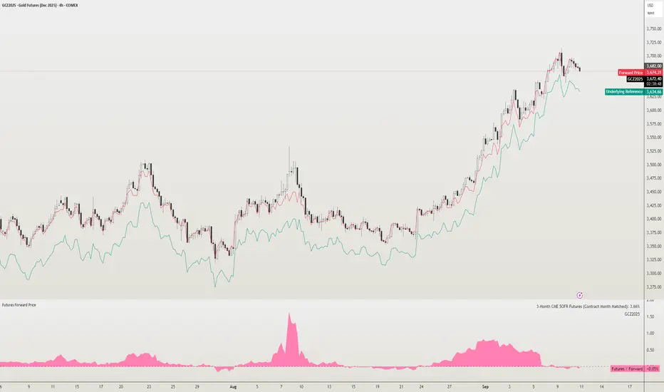
Futures Forward Price [NeoButane]In futures markets, the theoretical value of a futures contract can be derived from its underlying price and cost of carry. By baking in the costs and potential yields, the theoretical forward price then be used in basis against futures prices in place of the underlying spot price.
Usage
The script creates plots on the main chart and a separate window pane. Both are meant to be used to visualize dislocations in the market.
By using a futures vs. forward basis instead of futures vs. spot basis, discounts in the market are clearer.
Last month, the gold futures market GCZ2025 traded >1% above forward price when tariffs were announced and fell back in line once the tariffs were verbally retracted.
View roll spreads over a back-adjusted continuous chart. I guess. I don't think spread traders only look at one chart. This is as educational for me as it is you.
Configuration
The underlying reference needs to be changed to match the futures contract you are using.
The Risk-Free Rate defaults to FRED:SOFR. I found the contract month matched 3-Month SOFR Futures to be the closest for forward price.
Risk-Free Rate: The interest rate source for forward price.
Constant Risk-Free Rate: a static interest rate that can be used in advance of future changes in risk-free rate.
Underlying Reference: spot or index price. Some examples include TVC:SPX, TVC:GOLD, CRYPTO:BTCUSD, TVC:USOIL.
Forward Price Compounding: determines which formula to use. They're similar and become closer as the contract matures.
Alternative Contract: enable and select a futures contract to use it on a chart different than the main.
Storage Cost and Yield: for use with commodities. I haven't found a proper use for them yet but enabling is simple if you are able to.
The following are meant to be used with the continuous formula as they are compounded. However the rate sources don't differ much for the purpose of futures prices.
3-Month CME SOFR Futures
3-Month ICEEUR SONIA Futures
3-Month Osaka TONA Futures
The other rate sources are either meant for futures contracts shorter than quarterly such as monthly crypto futures or were meant to help myself understand how different rates would align with futures prices, like inflation.
What this script does
It uses the cost of carry formula to output the forward price (red line). The underlying reference (green line) is plotted alongside and a futures-derived reference (blue line) can be displayed to see how it looks next to the real reference price.
The data pane displays either the nominal difference or percentage difference between the real futures price and the calculated forward price.
Further reading
www.investopedia.com
www.cmegroup.com
www.oxfordenergy.org
www-2.rotman.utoronto.ca
www.cmegroup.com
3-month rate futures
www.cmegroup.com
www.ice.com
www.bankofengland.co.uk
www.jpx.co.jp
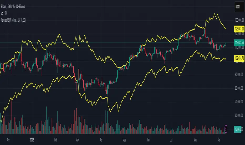
Reverse RSI [R] – Predictive RSI Price LevelsReverse RSI – Predictive RSI Price Levels
Description
This indicator is a modified and enhanced version of the original "Reverse RSI" by Franklin Moormann (cheatcountry), published under the MIT License. It estimates the price levels at which the RSI would reach specific thresholds, typically RSI = 30 (oversold) and RSI = 70 (overbought), based on current market conditions.
Key Features
Calculates price levels corresponding to RSI = 30 and RSI = 70
Helps forecast potential support and resistance zones based on RSI targets
Automatically updates with each new candle
Supports custom RSI length and price source (close, hl2, ohlc4, etc.)
Designed for traders who want to anticipate momentum extremes before they occur
Use Cases
Estimate how far the price must move to reach RSI oversold or overbought levels
Plan limit entries or exits based on projected RSI thresholds
Combine with standard RSI or other indicators for confirmation and analysis
Credits
This script is based on the original "Reverse RSI" by Franklin Moormann (cheatcountry) and released under the MIT License.
Modified and maintained by bitcoinrb.
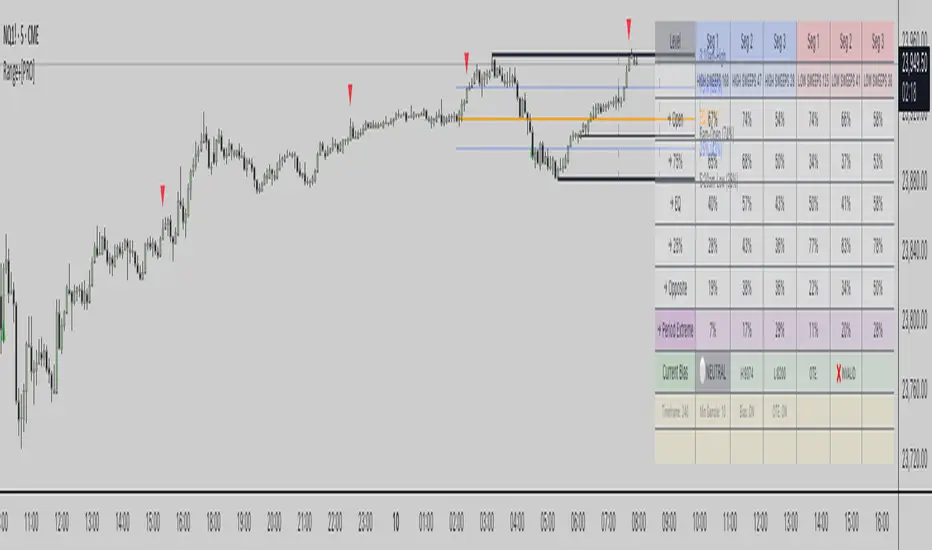
Range Stats with Sweeps + Time Analysis + BiasRange Stats with Sweeps + Time Analysis + Bias
Advanced range-based trading analysis with comprehensive sweep detection, time-based probability modeling, and intelligent bias calculation for institutional-grade market insights.
Overview
Range Stats with Sweeps + Time Analysis + Bias is a sophisticated Pine Script indicator designed for professional traders who demand precision in range-based market analysis. This comprehensive tool combines traditional range level analysis with advanced sweep detection algorithms, time-based probability modeling, and dynamic bias calculation to provide institutional-quality insights into market behavior patterns.
Core Features
Multi-Timeframe Range Analysis
Automatic or manual timeframe selection with intelligent defaults
Comprehensive range level calculation including High, Low, Open, 75%, EQ (50%), and 25% retracements
Dynamic period detection supporting both traditional timeframes and custom session-based analysis
Real-time range updates with historical data preservation
Advanced Sweep Detection System
Configurable sweep validation with customizable bar confirmation periods
Optional wick-based sweep requirements for enhanced precision
Segment-based sweep tracking dividing periods into three analytical zones
Real-time sweep markers with probability-enhanced labeling
Comprehensive Bias Calculation Framework
Intelligent range bias determination based on price action relative to range boundaries
Dynamic bias tracking with bullish, bearish, and neutral state identification
Historical bias performance statistics with hit rate analysis
Optimal Trade Entry (OTE) box generation based on current bias and displacement analysis
Time-Based Probability Analysis
Formation time tracking for high and low levels with customizable time buckets
Sweep probability calculation based on exact formation timing
Multiple time range displays including Full 24H, Extended Trading, US Market, EU Market, and Asia Market sessions
Custom session configuration with intelligent session-based level detection
Professional Visualization System
Customizable line styles, colors, and transparency settings for all range levels
Segment projection lines for period structure visualization
Comprehensive probability tables with real-time statistics
Time-enhanced labels showing formation times and sweep probabilities
Technical Implementation
Range Detection Logic
The system employs sophisticated algorithms to identify range boundaries using either traditional timeframe-based detection or custom session-based analysis. Range levels are calculated with mathematical precision, providing 75%, 50%, and 25% retracement levels based on period high-low ranges.
Sweep Analysis Framework
Advanced sweep detection monitors price action for liquidity grabs above highs and below lows, with configurable validation periods ensuring sweep authenticity. The system tracks sweep occurrences across three distinct period segments, enabling granular probability analysis.
Bias Calculation Engine
The intelligent bias system analyzes price behavior relative to range boundaries, considering factors such as wick interactions, close positioning, and directional momentum. This generates dynamic bias signals that adapt to changing market conditions.
Time-Based Modeling
Sophisticated time bucket analysis tracks formation times for range extremes, building comprehensive probability models that identify optimal trading windows based on historical performance patterns.
Configuration Options
Core Settings
Automatic or manual timeframe selection with comprehensive options
Global timezone support with major market timezone presets
Configurable label sizing and time format preferences
Advanced sweep validation parameters with wick-based options
Range Level Customization
Individual control over all range level displays and styling
Custom color schemes with transparency controls
Line style selection including solid, dashed, and dotted options
Adjustable line widths for enhanced visual hierarchy
Advanced Features
Segment projection line configuration for period structure analysis
Bias calculation toggle with OTE box generation
Sweep extreme probability tracking with period extreme analysis
Comprehensive sweep marker system with probability labeling
Time Analysis Configuration
Multiple time bucket options including 20-minute, 1-hour, 2-hour, and custom session buckets
Flexible time range displays optimized for different trading sessions
Custom session configuration with intelligent session-based level detection
Advanced table positioning and sizing options
Trading Applications
Range-Based Strategy Development
Identify key support and resistance levels within established ranges, analyze retracement probabilities for optimal entry timing, and utilize segment-based analysis for precise trade planning.
Sweep-Based Trading
Monitor liquidity grab events with high-probability retracement targets, track sweep occurrences across different period segments, and leverage time-based sweep probability for enhanced timing.
Bias-Driven Analysis
Utilize dynamic bias calculation for directional trade alignment, implement OTE box strategies for institutional-style entries, and monitor bias shifts for trend change identification.
Time-Based Optimization
Optimize trade timing using formation time probability analysis, focus on high-probability time windows for specific market behaviors, and customize analysis for preferred trading sessions.
Technical Specifications
Built on Pine Script v6 with advanced optimization techniques
Comprehensive data collection with intelligent memory management
Real-time probability calculation with historical data preservation
Multi-session support with custom timezone handling
Professional-grade visualization with institutional styling
Important Considerations
This indicator is designed for experienced traders familiar with range-based analysis and institutional trading concepts. Optimal performance requires adequate historical data for probability calculation accuracy. Users should ensure proper timeframe and session configuration alignment with their trading strategy.
Disclaimer
This indicator is provided for educational and informational purposes only. It does not constitute financial advice, investment recommendations, or trading signals. All trading decisions should be based on your own analysis, risk tolerance, and financial situation. Past performance does not guarantee future results. Trading involves substantial risk of loss and is not suitable for all investors. The probability statistics and bias calculations are based on historical data and may not predict future market behavior. Always conduct thorough research and consider consulting with qualified financial professionals before making trading decisions.
Copyright
© 2025 OmarxQQQ. All rights reserved. This Pine Script indicator and its associated documentation are protected by copyright law. Unauthorized reproduction, distribution, or modification is prohibited. This code is subject to the terms of the Mozilla Public License 2.0.
Range Stats with Sweeps + Time Analysis + Bias - Professional range analysis with institutional-grade probability modeling.
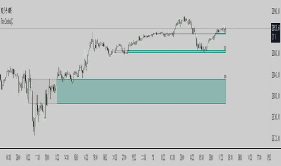
Time Clusters {X}Time Clusters - Dynamic Session Bias Analysis
Professional time-based session analysis with intelligent bias detection and real-time visual feedback.
Overview
Time Clusters is a sophisticated Pine Script indicator engineered for precision session-based market analysis. It creates visual time zones at user-defined session periods and dynamically tracks price bias evolution using institutional-grade detection logic. The tool empowers traders to identify critical time periods and monitor market sentiment transitions with professional-grade accuracy.
Core Features
Multi-Session Time Analysis
Six fully customizable time cluster configurations
Comprehensive global timezone support with automatic DST handling
Individual session control with unlimited or restricted display options
Precision 1-minute session detection for maximum accuracy
Dynamic Bias Detection System
Real-time bullish/bearish sentiment identification based on breakout patterns
Instant color transitions reflecting market bias shifts
Professional inversion logic adapted from institutional trading methods
Comprehensive color customization with separate transparency controls
Advanced Visual Framework
Custom border styling with dotted highs/lows and solid connection lines
Clear visual hierarchy distinguishing historical from dynamic zones
Configurable line styles and adjustable border thickness
Open left-side design for clean professional appearance
Intelligent Session Management
Smart cutoff handling preventing premature midnight session termination
Next-day extension logic for overnight session continuity
Flexible timing controls respecting user-defined cutoff parameters
Technical Implementation
Session Creation Process
Time zones generate at specified session intervals using high-precision 1-minute data, establishing clear high/low boundaries from session opening candles with dynamic extension until session completion or cutoff activation.
Bias Analysis Framework
The system monitors full-body closes above/below established ranges, determines initial sentiment direction from breakout patterns, detects bias inversions when price returns to range and breaks opposite boundaries, then updates visualizations from exact inversion points forward.
Visual Feedback Architecture
Historical zones maintain original session colors while dynamic zones reflect current market bias, creating split visualization that clearly distinguishes between past and present market sentiment.
Configuration Options
Core Settings
Session drawing limits and timeframe restrictions
Global timezone selection with daylight saving awareness
Label sizing, positioning, and text color controls
Independent transparency settings for boxes and text elements
Bias Detection Controls
Toggle automatic bias detection functionality
Custom color selection for bullish, bearish, and neutral states
Separate transparency controls for auto-coloring mode
Signal preference selection between close and wick-based analysis
Visual Customization
Individual border styling for top, bottom, and right edges
Line style selection with solid, dotted, or dashed options
Border width adjustment from 1-5 pixel thickness
Professional visual hierarchy configuration
Trading Applications
Session-Based Strategy Development
Analyze opening range dynamics during key session periods, identify recurring time-based behavioral patterns, and coordinate multiple session monitoring for comprehensive market coverage.
Sentiment Analysis
Visualize real-time market bias transitions, validate directional movements with time-based context, and understand price interaction dynamics with established session boundaries.
Strategic Market Planning
Optimize position entry timing around critical session periods, utilize session boundaries for logical stop placement, and develop comprehensive intraday market structure understanding.
Technical Specifications
Built on Pine Script v6 with latest optimization features
High-precision 1-minute data integration for accurate session detection
Efficient memory management with intelligent cleanup protocols
Multi-timeframe compatibility optimized for sub-hourly analysis
Real-time processing with live bias detection and visual updates
Important Considerations
This indicator focuses specifically on time-based session analysis with dynamic bias detection rather than traditional gap identification. Optimal performance occurs on timeframes below one hour. Users must ensure session times align with their trading timezone for accurate analysis.
Disclaimer
This indicator is provided for educational and informational purposes only. It does not constitute financial advice, investment recommendations, or trading signals. All trading decisions should be based on your own analysis, risk tolerance, and financial situation. Past performance does not guarantee future results. Trading involves substantial risk of loss and is not suitable for all investors. Always conduct thorough research and consider consulting with qualified financial professionals before making trading decisions.
Copyright
© 2024 omarxqqq. All rights reserved. This Pine Script indicator and its associated documentation are protected by copyright law. Unauthorized reproduction, distribution, or modification is prohibited.
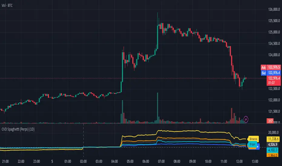
CVD Spaghetti - Multi-Exchange (Perpetuals)CVD Spaghetti – Multi-Exchange (Perpetuals) is designed to track and visualize Cumulative Volume Delta (CVD) across multiple cryptocurrency perpetual futures exchanges in one consolidated view. This indicator provides traders with a clearer perspective on buying and selling pressure by monitoring how order flow develops on different venues simultaneously.
What it does
The script calculates the CVD for each enabled exchange and plots them as separate lines on a single chart, creating a “spaghetti” style visualization. This allows traders to identify relative strength or weakness between major exchanges, which can often hint at institutional positioning, liquidity shifts, and potential market imbalances.
Why it’s useful
Order flow and liquidity dynamics can differ significantly between exchanges. By aggregating and comparing these flows, traders can:
Detect which venue is leading during trend development.
Spot divergences between exchanges, which may indicate inefficiencies or arbitrage-driven movements.
Gauge overall sentiment strength by comparing multiple sources instead of relying on a single dataset.
Technical details
Anchor Period Reset: The cumulative calculation resets based on the user-defined Anchor Period (default: daily), keeping data relevant for the chosen trading horizon.
Dynamic Resolution: The script automatically selects an appropriate lower timeframe for data requests based on the chart timeframe to maintain responsiveness and accuracy.
Normalization: Not all exchanges report volume in the same way—some use quote currency (USD), others in contracts or ticks. To ensure comparability, this indicator normalizes volumes where necessary:
Bybit USD and OKX contracts are divided by price to approximate base-coin terms.
Single-contract venues (e.g., Deribit) are normalized similarly.
Exchanges already reporting in the base currency remain unchanged.
Multi-Exchange Coverage: Supports major venues including Binance, Bybit, OKX, Bitget, Coinbase, and optional secondary exchanges like Blofin, Whitebit, and Deribit.
Visual Aids:
Zero baseline for directional reference.
Vertical session markers at each reset point.
Optional exchange labels positioned dynamically on the last bar for quick identification.
How traders might use it
Trend confirmation: Strong synchronized CVD across all major exchanges supports continuation; fragmentation may suggest weakening conviction.
Cross-exchange divergence: When one exchange’s CVD diverges from others, it can signal localized liquidity shocks or large player activity.
High-frequency strategies: On lower timeframes, the spaghetti view can highlight which venue is absorbing or providing liquidity fastest, aiding short-term decision-making.
RSI + Stochastic Alert with Advanced Doji ConfirmationCredits to Ahmed Alasfoor and Somou by Zakariya Hamad AlJulandani
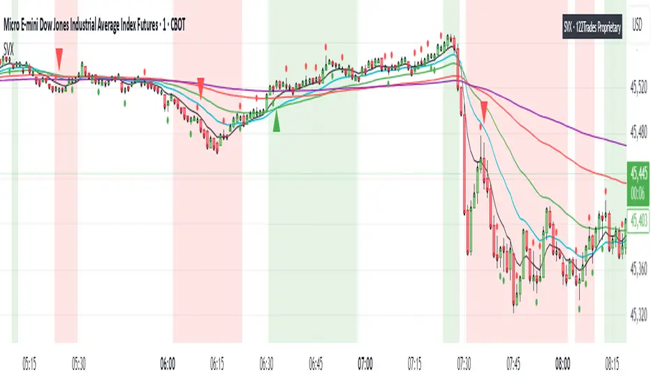
SVX (Sentiment Velocity Index) EMA & Slope StructureThe SVX Momentum Framework is designed as a momentum and slope visualization tool. Designed to identify momentum shifts and pre-move conditions within price action.
What it draws:
- Plots five EMAs (8, 20, 40, 100, 200) To visualize short/medium trend structure. You can pick which ones to see.
- Calculates an EMA-based slope (rate of change) from actual closing-price movement and colors a neutral/positive/negative background for context. This is not ATR or Supertrend.
- Shows optional triangle context markers on bars that meet wick/body conditions that often precede momentum transitions (off by default / user-controlled).
- Shows Reference close (optional): Use when you need to verify price relative to standard closes for easier zone and level marking.
How the components work together:
- The EMA stack provides directional alignment (compression/expansion and relative order of 8/20/40/100/200).
- The slope quantifies whether recent movement is neutral, building (Green), or fading (Red); the background simply reflects that state.
- The triangle context markers flag a bar-shape condition (wick/body relationship) that can precede changes in behavior.
- The reference close is a visual aid for clarity when users compare candle closes and trading zones or levels .
How to read it:
- Structure: Look for EMA ordering (at least 8/20/100 recommended) and spacing to understand the underlying bias and compression/expansion.
- Slope state: Neutral (no bias, white), positive (building, green), or negative (fading, red). Use it as context, not as entries/exits.
- Context markers (optional): Treat them as visual highlights.
- Reference close (optional): Use when you need to verify price relative to candle close for easier zone and level marking.
How to use it (general guidance):
- Read structure first (EMA order/spread), then consider the slope state to understand whether conditions are neutral or possibly momentum-driven in the indicated direction.
- Combine with your own entry rules and/or engulfing candle patterns for timing, risk, and apply your preferred management.
What’s original here:
- The slope visualization is derived from actual closing-price movement, not Supertrend or ATR overlays.
- The wick/body context markers focus on bars that often precede transitions, presented as optional visuals.
- The reference close overlay is included purely to aid interpretation when comparing views to the native close and for more clear zone and level marking.
Access & intent:
- Educational visualization of structure and slope, providing a framework traders can build upon.
- The author does not provide financial advice. Use at your own discretion.
Disclaimer
This script is provided for educational and informational purposes only. It does not constitute financial advice, investment recommendations, or a solicitation to trade. Past performance is not indicative of future results. The author assumes no responsibility for losses incurred from the use of this tool. TradingView, Inc. has no liability related to this script or its use.
Full Candle Higher/Lower (No Repeats)🔎 What the Script Does (Pine Script v6)
Keeps track of the last signal
Uses a persistent variable lastSignal (initialized once as "none").
Ensures that if a signal repeats consecutively, it won’t be triggered again.
Defines the conditions for a “Higher” or “Lower” candle sequence
Higher condition:
Current close > previous high, AND previous low ≤ the high of two bars ago.
→ This means the candle has fully broken higher.
Lower condition:
Current close < previous low, AND previous high ≥ the low of two bars ago.
→ This means the candle has fully broken lower.
Checks for new signals only
If a candle meets the condition and the last signal wasn’t the same, a new signal is triggered.
Updates lastSignal to prevent repeats.
Plots labels/arrows
A “Higher” signal shows a green label below the bar.
A “Lower” signal shows a red label above the bar.
Sets alerts
So you can be notified in TradingView whenever a “Higher” or “Lower” flag is detected.
📊 Trading Logic in Words
The indicator is looking for full candle breakouts.
If a candle closes above the previous high (with some confirmation from older bars), it flags it as a “Higher” signal.
If a candle closes below the previous low (with similar confirmation), it flags it as a “Lower” signal.
It avoids duplicate consecutive signals by remembering what the last one was.
✅ Why It’s Useful
Helps traders spot momentum continuation candles (strong push candles).
Reduces noise by not repeating the same signal multiple times in a row.
Works like a breakout detector that tells you when the market is making a new leg up or new leg down.
Crypto OI AgregatedCrypto OI Aggregated — Open Interest Aggregator for Crypto Exchanges
General Description
The indicator is designed for comprehensive analysis of Open Interest (OI) across major cryptocurrency exchanges. It consolidates data from multiple platforms, visualizes it as candlestick charts or deltas, and builds tables with breakdowns by exchange and contract type. This allows traders to quickly understand where market interest is concentrated and how the market structure is shifting.
Unlike standard tools that only show data from a single exchange, this indicator provides a full market overview and makes it easy to compare dynamics across different platforms.
⸻
Key Features
• Aggregation of OI data from exchanges: Binance, Bybit, OKX, Bitget, Kraken, HTX, Deribit (feel free to leave a comment if you’d like me to add other exchanges that provide open interest data)
• Support for contract types: USDT.P, USD.P, USDC.P, USD.PM
• Automatic normalization of various OI data formats from different providers
• Display modes:
• OI candlestick chart (total aggregated OI)
• OI Delta (change in OI per bar)
• Full table with detailed data by exchange and contract type
• Short summary table with totals in USD and base assets
• Support for USD or COIN denomination
• Convenient formatting for large numbers
• Customizable colors
⸻
How to Use the Indicator
1. Select Exchanges
In the settings, enable or disable specific exchanges. It is recommended to activate only the ones you need for analysis — this will make the indicator faster.
2. Choose Data Type
• OI — aggregated open interest from selected exchanges.
• OI delta — delta (change in OI compared to the previous bar).
3. Denomination
• USD — values are converted into USD equivalents.
• COIN — values are shown in the base asset (BTC, ETH, etc.).
4. Reading the Chart
• OI candlesticks show the overall OI dynamics.
• Delta histogram highlights how much OI has grown or decreased per bar.
• Colors are fully customizable.
5. Tables
• Enabled via the Show table option.
• Full Table → Rows = exchanges, Columns = contract types. Cells contain OI values in either USD or the base asset, depending on settings. Quickly shows where the main interest is concentrated.
• Short Table → Displays only the total OI values in USD and the base asset.
⸻
Important Notes
• For better readability of large values, two custom formatting functions were implemented. They work similarly to format.volume, but with improved digit grouping and adjustable decimal precision. In the tables, the top row is formatted using format.volume, while the bottom row uses the improved formatting functions for clearer representation.
str(d, n, s) =>
str.substring(d, 0, str.length(d) - n) + '.' + str.substring(d, str.length(d) - n, str.length(d) - (n - 2)) + s
format(_r) =>
d = str.tostring(math.round(_r))
str.length(d) > 9 ? str(d, 9, " B") : str.length(d) > 6 ? str(d, 6, " M") : str.length(d) > 3 ? str(d, 3, " K") : d
⸻
Conclusion: Crypto OI Aggregated is a convenient and powerful tool for cryptocurrency derivatives traders. It enables tracking of OI dynamics across multiple exchanges simultaneously, detecting imbalances between contracts, and identifying signals that are not visible when analyzing a single exchange.

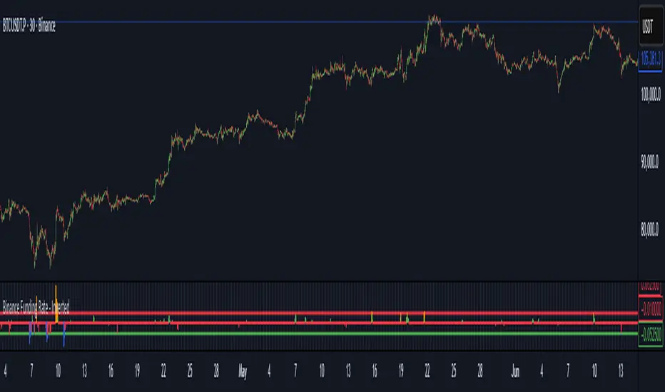
Binance Funding Rate - InvertedThe Funding Rate Formula
-Binance uses this formula every 8 hours:
-Funding Rate = Premium Index + clamp(Interest Rate - Premium Index, -0.05%, +0.05%)
-Breaking this down:
Premium Index:
-Measures the difference between futures price and spot price
-Interest Rate: Fixed at 0.01% per 8 hours (0.03% daily)
-Clamp Function: Limits the adjustment to ±0.05%, preventing extreme swings
When futures trade above spot (bullish sentiment), the funding rate becomes positive and longs pay shorts. When futures trade below spot (bearish sentiment), it becomes negative and shorts pay longs. This mechanism keeps perpetual futures prices aligned with spot prices.
How to Read This Indicator
The Inverted Display:
-This indicator flips the traditional display to make it more intuitive:
-Green bars pointing up = Negative funding (shorts paying) = Bullish pressure
-Red bars pointing down = Positive funding (longs paying) = Bearish pressure
The Clamp Lines:
-Green line at bottom: Maximum positive funding (-0.06% inverted)
-Red line at top: Maximum negative funding (+0.04% inverted)
-When bars hit these lines and turn blue/orange, it signals extreme market positioning
Practical Trading Applications
1. Identifying Market Extremes
-Small bars (near zero): Balanced market
-Growing bars: Building directional bias
-Bars at clamp lines: Maximum pain for one side, potential reversal
2. Timing Entries/Exits
-Blue bars at bottom: Longs are capitulating, consider buying
-Orange bars at top: Shorts are capitulating, consider selling
-But remember: extremes can persist longer than expected
3. Managing Costs
Check the Data Window (hover over chart) for:
-Actual Funding %: What you'll pay/receive
-Cumulative Fund %: Total impact over your selected period
-If holding positions against the funding direction, you're paying fees 3 times daily
Optimal Usage
-Timeframe: Use 30-minute to 8-hour charts only
-30m: Most responsive to changes
-4h: Cleaner trends
-8h: Aligns with funding periods
Auto-Clamp Setting: Keep enabled - it automatically adjusts the clamp ranges for different timeframes
Risk Considerations
-Funding ≠ Price Direction: High funding doesn't guarantee immediate reversal
-Costs Accumulate: 0.01% three times daily = 10.95% annually
-Whipsaw Risk: Funding can reverse quickly during volatile periods
-Not Standalone: Always confirm with price action and volume
Simple Decision Framework
-Persistent red bars + holding longs = You're bleeding fees
-Persistent green bars + holding shorts = You're bleeding fees
-Bars hitting clamps = Extreme positioning, watch for reversal
-Bars crossing zero = Sentiment shifting
Data Window Values
To see detailed metrics:
-Move cursor over any candle
-Or press Alt+D (Windows) / Option+D (Mac) to open Data Window panel
Key values to monitor:
-Actual Funding %: Real rate (not inverted)
-Cumulative Fund %: Your P&L impact from funding
-Momentum: Rate of change in funding
Remember: This indicator shows market positioning extremes, not guaranteed reversal points. Extreme funding can persist during strong trends. Use it as one input among several for decision-making, not as a sole trading signal.
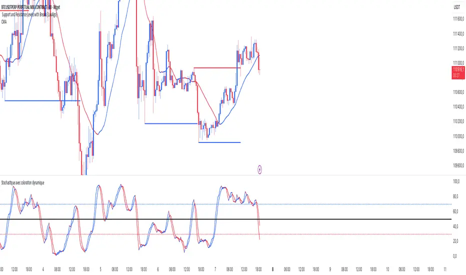
Stochastic ColorStochastic Color. A momentum indicator that compares a particular closing price of an asset to a range of its prices over a specific period of time. It helps identify overbought and oversold conditions in the market. The indicator ranges from 0 to 100, with readings above 80 typically considered overbought and readings below 20 considered oversold. It is often used to anticipate potential price reversals.
SMI Ergodic Oscillator ColorSMI Ergodic Oscillator Color. A variation of the True Strength Index (TSI), the SMI Ergodic Oscillator is a momentum indicator used to identify trend direction and potential reversals. It consists of a double-smoothed price momentum line and a signal line, helping traders spot buy and sell signals when the two lines cross. It is particularly useful for filtering out market noise and confirming the strength of a trend.
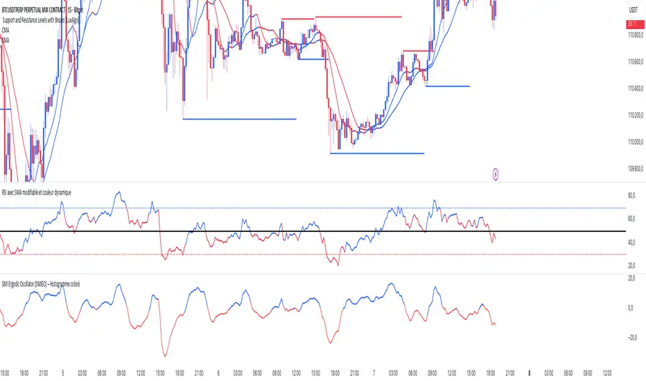
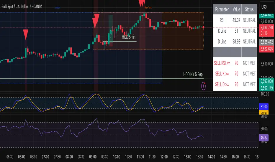
RSI SMA ColorRSI 14 with SMA 21 Color. A momentum oscillator that measures the speed and change of price movements. It ranges from 0 to 100 and is typically used to identify overbought or oversold conditions in a market. An RSI above 70 may indicate that an asset is overbought, while an RSI below 30 may suggest it is oversold.

Swing Elite Macro Valuation ToolThis tool evaluates macro valuation conditions by comparing the current price of an asset to key macroeconomic instruments (like ZB1 bonds, DXY dollar index, and GC1 gold or more futures, like silver, sf, jpy and many others). It provides normalized valuation readings, plots overvalued/undervalued zones, and includes a live table and alerts.
⸻
Key Features:
1. Macro Valuation Indexes
• Compare the charted asset against up to 3 macro symbols.
• Normalize performance as % move from historical baseline.
• Modes: Short-term or Long-term .
2. Over/Undervaluation Detection
• Choose manual levels or automatic dynamic bands based on standard deviation.
• Default thresholds: Overvalued ≥ 88, Undervalued ≤ 10.
3. Visual Outputs
• Colored plots per macro asset:
• 🔴 Red = Overvalued
• 🟢 Green = Undervalued
• 🔵 Neutral/Normal
• Upper, lower, and mid reference lines.
4. Valuation Table
• Displays each macro asset’s:
• Name
• Current valuation %
• Status (Over / Under / Normal)
• Color signal dot
5. Multi-Timeframe Support
• Choose chart timeframe or set a custom valuation timeframe.
6. Alerts
• Alert conditions for over/undervalued signals per macro symbol.
⸻
Usage Instructions:
1. Select Valuation Mode
• Use "Short-term" for recent sentiment.
• Use "Long-term" to evaluate deeper macro positioning.
2. Choose Comparison Symbols
• Enable/disable ZB1, DXY, GC1 or replace with any symbols you want.
3. Adjust Levels
• Select "ManualLevels" or "AutoLevels".
• Tune Overvalued, Undervalued, Lookback, and Multiplier.
4. Set Table Display
• Enable "Show Table" and select its screen position.
5. Set Alerts
• Configure alert triggers from the alert panel (based on valuation levels).
⸻
Perfect For:
Traders who want to analyze asset pricing in context of macro trends, mean reversion, and relative strength/weakness of bonds, the dollar, or gold. Ideal for intermarket analysis and value-based swing trading.

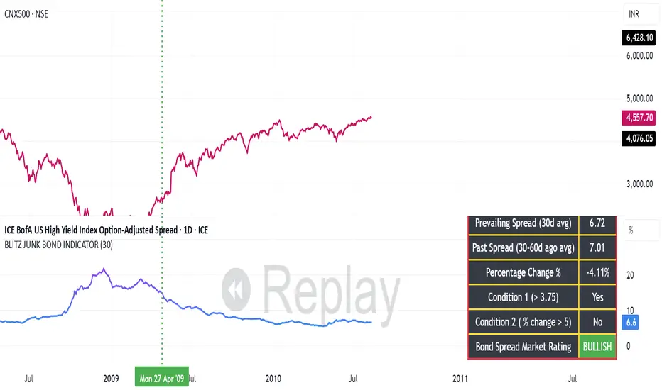
BLITZ JUNK BOND INDICATORThe given indicator considers the fluctuations in the bond market and the spread that are existing as a premium demanded by investors for high risk corporate junk bonds.
1. The junk bond spread indicator precisely anticipates market phases, especially any panic kind of scenario.
2. Junk bond spread indicator often face choppy market zone and entirely we must rely on our portfolio churning skills if such scenario occurs and the broader markets failed to perform even if the indicator has made us to make a buy position
3. Whenever Bullish signal comes, same is to be confirmed with the price action of the broader market index, then same to be confirmed in the junk bond spreads chart if the spreads are going down steadily or is breaking down from the nearest swing low and cooling off. This, scenario indicates we must expose our portfolio to equities
4. Whenever Bearish signal comes, same to be cofirmed with the price action of the broader market index, then same to be confirmed in the junk bond spread charts if the spreads are heating up breaking nearby swing highs or steadily moving up. In such scenario, we must prepare for heavy market drawdowns or must anticipate some panic scenario in the markets and thus should avoid equities.
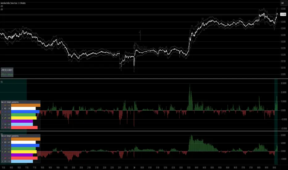
Forex Currency Strength What this indicator does
It compares the relative strength of the 8 major currencies (USD, EUR, GBP, JPY, AUD, CAD, NZD, CHF) by looking at all 28 currency pairs. Each currency is smoothed (averaged) with a moving average to reduce noise.
From this it shows:
• Currency strength lines → how each major currency is performing over time (optional view).
• Pair divergence histogram → the difference in strength between the two currencies of the chart pair (e.g. EUR vs USD on an EURUSD chart). Green means the base currency is stronger, red means the quote currency is stronger.
• Ranking table → shows the strongest to weakest currency at the current moment. The strongest is highlighted green, the weakest red.
• Session highlighting → shows your chosen trading session on the chart (background shading, optional vertical line at the session start).
• Alerts → you can set TradingView alerts when:
• the pair divergence crosses above or below zero
• the divergence strength gets big enough (above your threshold)
• the difference between the strongest and weakest currency becomes large
⸻
👉 In plain words:
This indicator helps you quickly see which currencies are strong, which are weak, and whether the pair you are trading has a clear directional bias. It also highlights trading sessions and can notify you when strong moves or imbalances appear.
// ─────────────────────────────────────────────────────────────
// Forex Currency Strength (8 Majors, %R) + Divergence + Ranking
// ─────────────────────────────────────────────────────────────
//
// === Inputs ===
//
// exchPrefix → Broker/feed prefix (e.g. "OANDA:", "FX:", or "" for ICMarkets)
// tf → Data timeframe (empty = chart timeframe)
// smoothLen → Smoothing length (MA) for currency strength (default = 14)
// smoothMethod → MA method (SMA, EMA, WMA, DEMA)
// viewMode → Display mode: "Strength Lines", "Pair Divergence", "Both"
// (Tip: set to "Pair Divergence" to hide lines by default)
// barsLimit → Number of bars to display
//
// sessionStr → Trading session time (e.g. "0800-1700"); session is highlighted on chart
//
// alertDivAbs → Threshold for alerts on |divergence|
// alertGapTF → Threshold for alerts on Top–Flop ranking gap
//
// scaleK → Scaling factor (here ×1000)
//
// rankPos → Position of the ranking table (top/bottom left/right)
// rankTextSize → Font size for the ranking table (tiny, small, normal, large, huge)
//
// === Outputs ===
//
// • 8 currency strength lines (optionally visible)
// • Divergence (current pair) as histogram
// • Ranking table (top & flop highlighted)
// • Session highlighting (background color + optional vertical line)
// • Alerts on divergence crosses, |divergence| thresholds & top–flop gaps
//
// === Alert Conditions ===
//
// longDivCross → Divergence (current pair) crosses above 0
// shortDivCross → Divergence (current pair) crosses below 0
// divAbsUp → |Divergence| exceeds alertDivAbs threshold
// gapUp → Top–Flop ranking gap exceeds alertGapTF threshold
//
// ─────────────────────────────────────────────────────────────
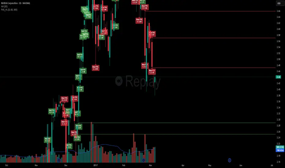
Daily FVG H/L with Sweep RemovalThis indicator marks swing highs or lows of the daily candles from which the fair value gaps were created.
It gives you insight to crucial prices such as the highs and lows by this indicator and whether they have been swept or not.
The first reaction of the high or low will be counted as a sweep.
Once we run the high or low created by the reaction, then the indicator will mark that as a used high or low and will get rid of the line drawn to mark the high/low.
This can be used to watch important levels being swept which can sometimes indicate potential reversals on lower time frames.
Note : this indicator does not give you 100% accurate results or reliability and it requires you to conduct further research on the markets to create a reliable strategy.
This indicator may be of benefit if merged with other technical indicators or can support your technical strategies.
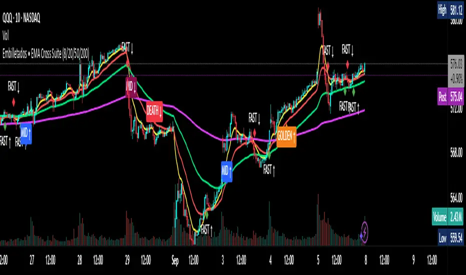
EMA Cross Suite (8/20/50/200) GOLDEN/DEATH by Carlos Chavez📜 Short Description (max 160 characters)
“Advanced EMA crossover system with FAST, MID, GOLDEN, and DEATH signals. Includes alerts, optimized visuals, and full customization.”
📄 Full Description (Paste in the box)
📌 Overview
The Embilletados • EMA Cross Suite is a professional trading indicator designed for intraday traders, scalpers, and swing traders.
It provides clear crossover signals using 4 EMAs combined with optimized visualization and built-in alerts to help you catch opportunities faster.
✨ Key Features:
🔹 4 configurable EMAs → 8, 20, 50, and 200.
🔹 Instant visual signals with colored labels:
FAST CROSS (8/20) → Quick momentum shifts.
MID CROSS (20/50) → Trend confirmation signals.
GOLDEN CROSS (50/200) → Strong bullish trend signals.
DEATH CROSS (50/200) → Strong bearish trend signals.
🔹 Built-in alerts → Get notified instantly for all crossover events.
🔹 Optimized visualization → Clean and easy-to-read interface.
🔹 Highly customizable → Enable/disable signals, labels, colors, and alerts according to your strategy.
📊 Recommended Timeframes:
10-minute charts → Best for intraday setups.
1-hour charts → Ideal for swing trading and trend confirmation.
🚀 How to Use:
Add the indicator to your chart.
Set up alerts for the desired crossovers: FAST, MID, GOLDEN, or DEATH.
Trade confidently using clear visual confirmations and real-time notifications.
🌟 Perfect for:
✅ Intraday traders
✅ Scalpers
✅ Swing traders
✅ Trend-following strategies
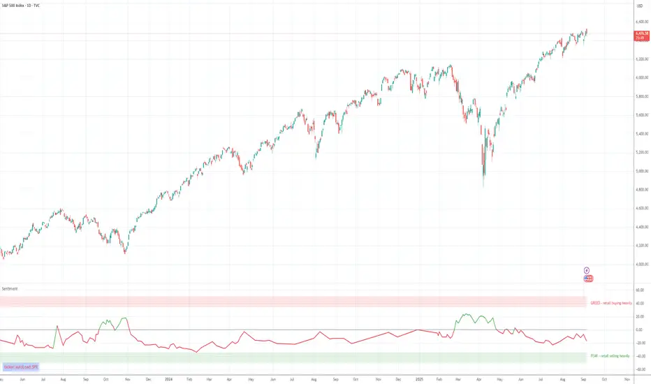
Retail Sentiment Indicator - Multi-Asset CFD & Fear/Greed IndexRetail Sentiment Indicator - Multi-Asset CFD & Fear/Greed Index
Overview
The Retail Sentiment Indicator provides real-time sentiment data for major financial instruments including stocks, forex, commodities, and cryptocurrencies. This indicator displays retail trader positioning and market sentiment using CFD data and fear/greed indices.
Methodology and Scale Calculation
This indicator operates on a **-50 to +50 scale** with zero representing perfect market equilibrium.
Scale Interpretation:
- **Zero (0)**: Market balance - exactly 50% of investors buying, 50% selling
- **Positive values**: Majority buying pressure
- Example: If 63% of investors are buying, the indicator shows +13 (63 - 50 = +13)
- **Negative values**: Majority selling pressure
- Example: If 92% of investors are selling, the indicator shows -42 (50 - 92 = -42)
BTC Fear & Greed Index Scaling:
The original `BTC FEAR&GREED` index is natively scaled from 0-100 by its creator. In our indicator, this data has been rescaled to also fit the -50 to +50 range for consistency with other sentiment data sources.
This unified scaling approach allows for direct comparison across all instruments and data sources within the indicator.
-Important Data Source Selection-
Bitcoin (BTC) Data Sources
When viewing Bitcoin charts, the indicator offers **two different data sources**:
1. **Default Auto-Mode**: `BTCUSD Retail CFD` - Retail CFD traders sentiment data (automatically loaded).
2. **Manual Selection**: `BTC FEAR&GREED` - Fear & Greed Index from website: alternative dot me
**To access BTC Fear & Greed Index**: Input settings -> disable checkbox "Auto-load Sentiment Data" -> manually select "BTC FEAR&GREED" from the dropdown menu.
US Stock Market Data Sources
For US stocks and indices (S&P 500, NASDAQ, Dow Jones), there are **two data source options**:
1. **Default Auto-Mode**: Individual retail CFD sentiment data for each instrument
2. **Manual Selection**: `SNN FEAR&GREED` - SNN's Fear & Greed Index covering the overall US market sentiment. SNN was used as the name to avoid any potential trademark infringement.
**To access SNN Fear & Greed Index**: When viewing US market charts, disable in input settings checkbox "Auto-load Sentiment Data" and manually select "SNN FEAR&GREED" from the dropdown menu.
This distinction allows traders to choose between **instrument-specific retail sentiment** (auto-mode) or **broader market sentiment indices** (manual selection).
Features
- **Auto-Detection**: Automatically loads sentiment data based on the current chart symbol
- **Manual Selection**: Choose from 40+ supported instruments when auto-detection is unavailable
- **Multiple Data Sources**: Combines retail CFD sentiment with Fear & Greed indices
- **Visual Zones**: Clear greed/fear zones with color-coded backgrounds
- **Real-time Updates**: Live sentiment data from merged data sources
Supported Instruments
Major Indices
- S&P 500, NASDAQ, Dow Jones 30, DAX
Forex Pairs
- Major pairs: EURUSD, GBPUSD, USDJPY, USDCHF, USDCAD
- Cross pairs: EURJPY, GBPJPY, AUDUSD, NZDUSD, and 20+ others
Commodities
- Precious metals: Gold (XAUUSD), Silver (XAGUSD)
- Energy: WTI Oil
- Agricultural: Wheat, Coffee
- Industrial: Copper
Cryptocurrencies
- Bitcoin (BTC) sentiment data
- BTC & SNN Fear & Greed indices
How to Use
1. **Auto Mode** (Default): Enable "Auto-load Sentiment Data" to automatically display sentiment for the current chart symbol
2. **Manual Mode**: Disable auto-load and select from the dropdown menu for specific instruments
3. **Interpretation**:
- Values above 0 (green) indicate retail greed/bullish sentiment
- Values below 0 (red) indicate retail fear/bearish sentiment
- Fear & Greed indices use 0-100 scale (50 is neutral)
Data Sources
This indicator uses curated sentiment data from retail CFD providers and established fear/greed indices. Data is updated regularly and sourced from reputable financial data providers.
Trading Strategy & Market Philosophy
Contrarian Trading Approach
The primary purpose of this indicator is based on the fundamental market principle that **the majority of retail investors are often wrong**, and markets typically move opposite to the positions held by the majority of market participants.
Key Strategy Guidelines:
- **Contrarian Signal**: When the majority of users are positioned on one side of the market, there is statistically greater market advantage in taking positions in the opposite direction
- **Trend Exhaustion Signal**: An interesting observed phenomenon occurs when, during a long-lasting trend where the majority of investors have consistently been on the wrong side, the Sentiment indicator suddenly shows that the majority has flipped and opened positions in the direction of that long-running trend. This is often a signal of fuel exhaustion for further movement in that direction
Interpretation Examples
- High greed readings (majority bullish) → Consider bearish opportunities
- High fear readings (majority bearish) → Consider bullish opportunities
- Sudden sentiment flip during established trends → Potential trend reversal signal
Technical Notes
- Built with PineScript v6
- Dynamic symbol detection with fallback options
- Optimized for performance with minimal resource usage
- Color-coded visualization with customizable zones
Data Sources & Expansion
Acknowledgments
We extend our gratitude to **TradingView** for enabling the use of custom data feeds based on GitHub repositories, making this comprehensive sentiment analysis possible.
Data Expansion Opportunities
As the operator of this indicator, I am **open to suggestions for new data sources** that could be integrated and published. If you have ideas for additional instruments or sentiment data:
How to Submit Suggestions:
1. Send a **private message** with your proposal
2. Include: **instrument/data type**, **source**, and **brief description**
3. If technically feasible, we will work to import and publish the data
Data Infrastructure Status
Current Data Upload Process:
Please note that sentiment data uploads may occasionally experience minor interruptions. However, this should not pose significant issues as sentiment data typically changes gradually rather than rapidly.
Infrastructure Development:
We are actively working on establishing permanent cloud-based infrastructure to ensure continuous, automated data collection and upload processes. This will provide more reliable and consistent data availability in the future.
Disclaimer
This indicator is for educational and informational purposes only. Sentiment data should be used as part of a comprehensive trading strategy and not as the sole basis for trading decisions. Past performance does not guarantee future results. The contrarian approach described is a market theory and may not always produce profitable results.
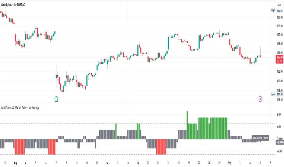
ActivTrades US Market Pulse – Ion JaureguiActivTrades US Market Pulse Indicator – Detailed Description
The ActivTrades US Market Pulse Indicator is a market analysis tool designed to assess overall risk sentiment in U.S. financial markets. Rather than generating trade signals, it provides a snapshot of the prevailing market environment, helping traders and analysts understand whether conditions favor risk-taking or caution.
How it Works:
The indicator combines three key market metrics:
1. Sector Momentum:
o Compares the performance of cyclical sectors (e.g., technology, consumer discretionary, industrials) with defensive sectors (e.g., utilities, consumer staples, healthcare) relative to their 50-day moving averages.
o Stronger cyclical sector performance indicates higher market risk tolerance, while stronger defensive sector performance suggests increased risk aversion.
2. Volatility Measure – VIX Index:
o Incorporates the CBOE Volatility Index (VIX), a widely used gauge of market fear.
o Higher VIX levels indicate elevated uncertainty and a risk-off environment, whereas lower levels suggest calmer markets and greater investor confidence.
3. Interest Rate Spread:
o Monitors the yield difference between the 10-year and 2-year U.S. Treasury bonds.
o A wider spread typically reflects economic optimism and greater risk appetite, while a narrower or inverted spread signals caution.
Risk Sentiment Index:
• Each metric is assigned points based on its level, which are then combined to create an index representing overall market sentiment.
• The index oscillates between Risk-On (high risk appetite) and Risk-Off (heightened caution), with a neutral zone for balanced conditions.
Visual Output:
• The results are displayed as a colored histogram, making it easy to interpret market sentiment at a glance.
• Labeled zones include:
o Extreme Risk-On: Indicates a strong risk-taking environment.
o Extreme Risk-Off: Reflects heightened fear or uncertainty.
o Neutral Zone: Suggests a balanced or mixed market sentiment.
Purpose and Use:
• Helps traders, analysts, and investors gauge the prevailing mood of the market.
• Provides context for risk management and strategic positioning without offering explicit trade recommendations.
*******************************************************************************************
The information provided does not constitute investment research. The material has not been prepared in accordance with the legal requirements designed to promote the independence of investment research and such should be considered a marketing communication.
All information has been prepared by ActivTrades ("AT"). The information does not contain a record of AT's prices, or an offer of or solicitation for a transaction in any financial instrument. No representation or warranty is given as to the accuracy or completeness of this information.
Any material provided does not have regard to the specific investment objective and financial situation of any person who may receive it. Past performance and forecasting are not a synonym of a reliable indicator of future performance. AT provides an execution-only service. Consequently, any person acting on the information provided does so at their own risk. Political risk is unpredictable. Central bank actions can vary. Platform tools do not guarantee success.
INDICATORS RISK ADVICE: The information and publications are not meant to be, and do not constitute, financial, investment, trading, or other types of advice or recommendations supplied or endorsed by ActivTrades. This script intends to help follow the trend and filter out market noise. This script is meant for the use of international users. This script is not meant for the use of Spain users.