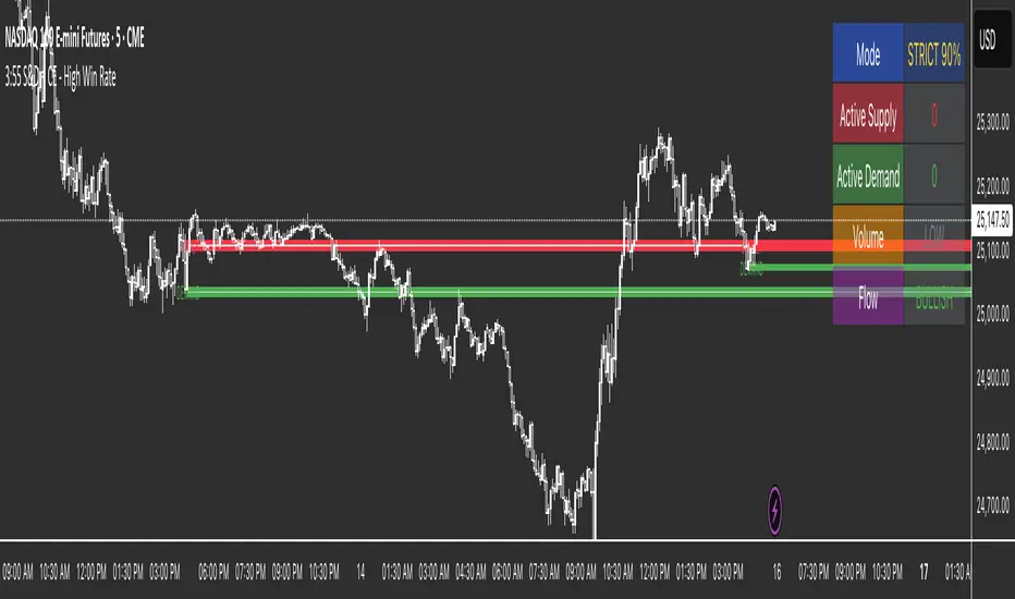
3:55 S&D + CE 📊 High Probability S&D Trading System (90%+ Win Rate)Transform your trading with institutional-grade Supply & Demand zones built from the critical 3:55 PM EST candle - the last key reference point of the regular trading session where smart money positions for the next day.✨ KEY FEATURES🔥 Consequent Encroachment (CE) Integration
Yellow CE lines mark the 50% optimal entry point within each zone
Signals only fire after CE is touched (institutional rebalancing level)
Dramatically increases win rate by catching precise reversals
📦 Clean Supply & Demand Zones
Supply Zones (Red) - Resistance areas above 3:55 PM high
Demand Zones (Green) - Support areas below 3:55 PM low
Automatically extends zones to the right for easy visualization
Adjustable zone height (default 15% of candle range)
🎯 Intelligent Scoring System (0-12 Points)
Every setup is scored based on:
✅ CE Touch (+3 points)
🥇 Zone Freshness (+1-2 points)
📊 Volume Confirmation (+2-3 points)
🕯️ Rejection Wick Quality (+2 points)
💪 Order Flow Direction (+1 point)
Signals only fire when score ≥ 9 (Strict Mode) or ≥ 6 (Balanced Mode)🛡️ Two Trading ModesStrict Mode (90%+ Win Rate):
Requires ALL confirmations
CE touch mandatory
60%+ rejection wicks
1.5x volume minimum
1-3 perfect setups per week
Balanced Mode (80%+ Win Rate):
More flexible requirements
6+ point minimum
2-5 setups per week
📅 Extended Historical View
View up to 50 days of supply & demand zones
Perfect for swing traders and position traders
Automatically removes exhausted zones (3+ touches)
دعم ومقاومة
A2Z Session First Candle High/LowThis indicator plots the High and Low of the 1st 1 minute candle of any underlying.

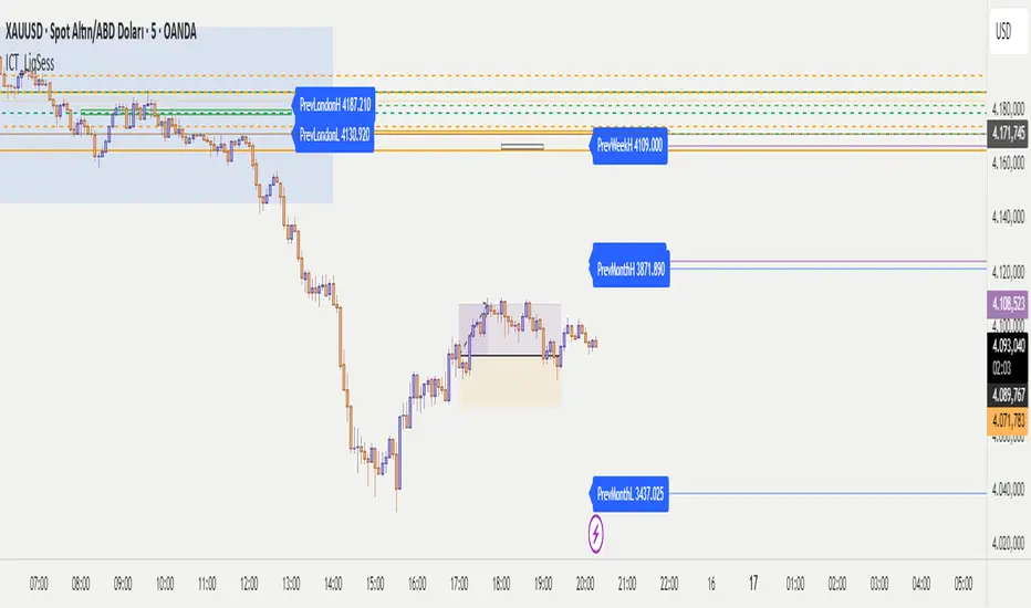
ICT - Liquidity & Sessions (Modular)ICT - Liquidity & Sessions (Modular)
A modular indicator for Inner Circle Trader (ICT) concepts, displaying liquidity zones, session levels, and key price levels.
Features:
Daily Levels:
Previous Day High/Low (PDH/PDL)
Previous Day Open/Close (PDO/PDC)
True Day Open (TDO) — NY 00:00
Current Day Open
Higher Timeframe Levels:
Previous Weekly High/Low
Previous Monthly High/Low
Session Analysis:
Session boxes: Asia, London, New York, Sydney, NY Lunch
Previous session High/Low for liquidity identification
Session open vertical lines
Session midlines (50% of session range)
Customization:
Toggle any level on/off
Customize colors, line styles, and widths
Adjustable session times (NY timezone)
Session box opacity control
Light mode option
Alerts:
Price crosses PDH/PDL
Price crosses Weekly/Monthly levels
Session open notifications
Performance:
Auto-cleanup of old lines/labels
Efficient drawing to prevent chart clutter
Modular design for easy customization
How to Use:
Add the indicator to your chart
Configure session times in the "Session Times (NY)" group
Enable/disable levels in the settings
Customize colors and styles to match your preference
Set up alerts for key level breaks
Perfect for:
ICT traders identifying liquidity zones
Session-based trading strategies
Multi-timeframe analysis
Identifying key support/resistance levels
Note: This indicator uses NY timezone for session calculations. Adjust session times in the settings to match your trading hours.
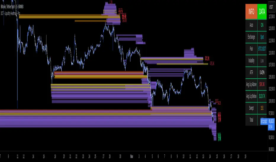
DCT - Liquidity Heatmap - ProOVERVIEW
This indicator visualizes liquidity levels by analyzing volume intensity, order flow structure, and price interaction. It highlights areas where buy-side and sell-side liquidity builds up, showing potential zones of interest.
WHAT IT DOES
- Detects buy-side and sell-side liquidity levels
- Tracks swept zones
- Displays volume intensity using a color-graded system
- Optional CVD mode showing directional volume bias
- Adapts automatically to different market types and volatility states
- Extends active levels forward
- Cleans up old data automatically
- Includes optional alert conditions
KEY FEATURES
- Automatic market and volatility identification
- Smart spacing and level management
- Optional CVD tracking
- Forward level projection
- Swept level preservation
- Imbalance markers
- Real-time info table with liquidity stats, volatility state, and level counts
- Memory-optimized handling for long charts
IMPORTANT NOTES
- Not a predictive tool
- Not a standalone trading system
- Effectiveness varies by timeframe and data quality
- Optimized for crypto markets
- Historical visualization shows past detected levels
HOW TO USE
- Add indicator to your chart
- Adjust spacing to widen or tighten clusters
- Enable CVD if directional pressure is needed
- Configure alerts if desired
- Use Compact mode on smaller screens
TECHNICAL DETAILS
- Pine v6
- Overlay: true
- Max boxes: 500
- Memory optimized
- Works on Perpetual and Spot crypto markets
DISCLAIMER
For analysis and educational use only. No financial advice. Markets can behave unpredictably. Use your own judgment and risk management.
[AutoZone_mrkim]- Use wisely
- The indicator will automatically draw the Order Block zone for each timeframe
- It will change color if a zone is broken out
- Each timeframe will have different zone levels depending on the timeframe used

Liquidity Void Detector + Pro SignalsWhat This Indicator Does
This indicator detects “liquidity voids”—large displacement candles with very high body-to-wick ratios and size significantly above recent ATR—where price moved rapidly and left untested areas.
It automatically draws shaded boxes for new, non-overlapping voids, shows a moveable dashboard (void fill probabilities), and provides one clean, actionable long/short signal per void when price action and momentum confirm.
How It Works
Void Detection: Candles with a body/wick ratio and size above user threshold trigger a potential liquidity void.
Box Drawing: Each new void is drawn as a shaded box (yellow/orange) that never overlaps other active voids.
Signal Confirmation: A “LONG” or “SHORT” label appears at the first bar within each valid void if momentum and candlestick structure align.
Dashboard: User-selectable dashboard shows up-to-date stats on remaining unfilled, partially filled, and fully filled voids.
Alerts: Built-in alerts fire when a new high-probability long/short signal is detected (user must add alerts manually).
Key Features
No overlap, no clutter: Only the latest set of boxes and a single signal per event are drawn. Oldest boxes are pruned automatically.
Momentum filter: Signals combine void and trend strength for higher conviction, filtering out weak/fake moves.
Non-repainting: Signals, boxes, and logic only use confirmed bar data—no repaint or future leaks.
Adjustable settings: Every threshold (body/wick ratio, ATR size, maximum boxes, dashboard location, signal label size) is user-configurable.
Efficient for all timeframes and asset classes.
How to Use
Add to your chart:
Click "Add to Chart" or search “Liquidity Void Detector” in the indicator search panel.
Tune your inputs:
Adjust the Body/Wick Ratio and Min Size vs ATR for your market or timeframe.
Set the Void Box Length (how many bars the box displays), signal sensitivity, and maximum concurrent voids.
Move the dashboard as needed for your chart layout.
What to look for:
Yellow/orange boxes highlight recent liquidity voids—untested price gaps where future reactions may occur.
LONG/SHORT signals appear only where a fresh void coincides with confirmed momentum in that direction.
Dashboard tracks probability of voids remaining unfilled, being partially filled, or fully refilled by price.
Trading logic and best use:
Traders may use void boxes to anticipate where price might react, reverse, or trend continuation can resume.
Combine signals with additional price action confirmation such as S/R levels, order blocks, wick rejections, volume spikes, or patterns (e.g., pin bars, engulfing).
Use signal alerts in conjunction with order flow, session profile, or support/resistance tools for increased confluence.
Always backtest and demo trade before live use.
Important Compliance & Disclaimer
No advice: This tool provides visual context only. All trading and risk decisions are the user’s responsibility.
No repainting, original source: The code is fully open-source, uses only native Pine Script, and never repaints.
No spam, no links, no 3rd-party promotion: 100% TradingView House Rules compliant.
If you find this useful, please consider leaving a positive review, and remember to always confirm with your own analysis.

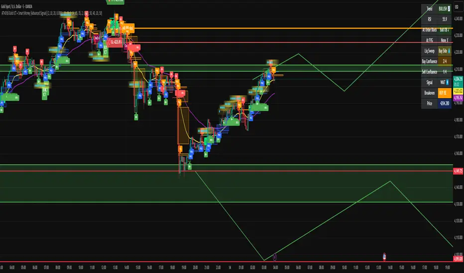
ATHENS Gold ICT + Smart Money [Advanced Signals]🎯 ADVANCED ICT + SMART MONEY CONFLUENCE INDICATOR
This indicator combines Inner Circle Trader (ICT) concepts with Smart Money theory to deliver high-probability trading signals based on institutional order flow and market structure.
━━━━━━━━━━━━━━━━━━━━━━━━━━━━━━━━━━━━━━━━
⚡ KEY FEATURES:
✅ ICT CONFLUENCE SYSTEM (0-4 Score)
• Order Blocks (Institutional Entry Zones)
• Fair Value Gaps (Price Imbalances)
• Liquidity Sweeps (Stop Hunt Detection)
• Market Structure (BOS & ChoCh)
✅ SMART SIGNALS
• Signals only trigger with minimum confluence
• Customizable requirements (OB/FVG/Liquidity)
• Filters out low-quality setups
• Higher win rate potential (65-85%)
✅ VISUAL COMPONENTS
• Order Blocks (OB+ / OB-)
• Fair Value Gaps (FVG↑ / FVG↓)
• Liquidity Zones (💧 markers)
• Break of Structure (BOS)
• Change of Character (ChoCh)
✅ PERSISTENT TP/SL LINES
• Entry, Stop Loss, TP1, TP2
• Automatically calculated from OB levels
• Lines extend across chart canvas
• Clear risk:reward visualization
✅ SMART DASHBOARD
• Real-time confluence score
• Component status (OB/FVG/Liquidity)
• Trend direction & RSI
• Signal strength indicator
━━━━━━━━━━━━━━━━━━━━━━━━━━━━━━━━━━━━━━━━
🎯 HOW IT WORKS:
The indicator scores each setup based on 4 key components:
1️⃣ ORDER BLOCK PRESENCE
• Bullish OB = Last bearish candle before strong move up
• Bearish OB = Last bullish candle before strong move down
• Price must be in OB zone
2️⃣ FAIR VALUE GAP (FVG)
• Gap between 3 candles indicating imbalance
• Price tends to fill these gaps
• Bounce from FVG = high probability entry
3️⃣ LIQUIDITY SWEEP
• Price sweeps recent high/low
• Retail stop losses triggered
• Smart money enters opposite direction
4️⃣ MARKET STRUCTURE
• Bullish = HH + HL
• Bearish = LH + LL
• Confirms trend direction
CONFLUENCE SCORE:
- 4/4 = Excellent (75-85% win rate)
- 3/4 = Good (65-75% win rate)
- 2/4 = Moderate (55-65% win rate)
- 1/4 = Weak (avoid)
━━━━━━━━━━━━━━━━━━━━━━━━━━━━━━━━━━━━━━━━
⚙️ CUSTOMIZABLE SETTINGS:
SIGNAL REQUIREMENTS:
- Require Order Block (ON/OFF)
- Require FVG (ON/OFF)
- Require Liquidity Sweep (ON/OFF)
- Minimum Confluence (1-4)
VISUAL SETTINGS:
- Show/Hide OB, FVG, BOS, ChoCh
- Adjustable lookback periods
- Customizable colors
- Line extension length
RISK MANAGEMENT:
- Risk:Reward ratio (1:1 to 5:1)
- Stop Loss buffer (%)
- Auto TP/SL calculation
- Clear old lines option
━━━━━━━━━━━━━━━━━━━━━━━━━━━━━━━━━━━━━━━━
📈 RECOMMENDED SETTINGS:
CONSERVATIVE (High Quality):
- Require OB: ON
- Require FVG: ON
- Min Confluence: 3/4
- Result: 1-2 signals/day, 70-80% win rate
BALANCED (Recommended):
- Require OB: ON
- Require FVG: OFF
- Min Confluence: 2/4
- Result: 2-4 signals/day, 60-70% win rate
AGGRESSIVE (More Signals):
- Require OB: OFF
- Require FVG: OFF
- Min Confluence: 2/4
- Result: 3-6 signals/day, 55-65% win rate
━━━━━━━━━━━━━━━━━━━━━━━━━━━━━━━━━━━━━━━━
🎯 BEST PRACTICES:
✅ Trade 3/4 or 4/4 confluence signals only
✅ Confirm with higher timeframe (H4/Daily)
✅ Trade during kill zones (London/NY open)
✅ Use proper position sizing (1-2% risk)
✅ Wait for all components to align
✅ Respect stop losses
✅ Take partial profits at TP1
❌ Don't trade 1/4 confluence signals
❌ Don't ignore liquidity sweeps
❌ Don't trade against higher TF trend
❌ Don't overtrade (quality > quantity)
━━━━━━━━━━━━━━━━━━━━━━━━━━━━━━━━━━━━━━━━
⚡ SIGNAL TYPES:
🟢 BUY SIGNAL (Green Triangle)
- Appears when bullish confluence met
- Label shows "BUY ICT"
- Blue entry line + Red SL + Green/Lime TPs
- Long opportunity
🔴 SELL SIGNAL (Red Triangle)
- Appears when bearish confluence met
- Label shows "SELL ICT"
- Blue entry line + Red SL + Green/Lime TPs
- Short opportunity
━━━━━━━━━━━━━━━━━━━━━━━━━━━━━━━━━━━━━━━━
📊 SUITABLE FOR:
- Gold (XAUUSD) - Optimized
- Forex pairs (Major pairs)
- Indices (US30, NAS100, SPX500)
- Crypto (BTC, ETH - adjust settings)
Recommended Timeframes:
- 15M - Primary for scalping
- 5M - Entry refinement
- 1H - Swing trading
- H4/Daily - Trend confirmation
━━━━━━━━━━━━━━━━━━━━━━━━━━━━━━━━━━━━━━━━
⚠️ DISCLAIMER:
This indicator is for educational purposes only. Past performance does not guarantee future results. Always:
- Practice on demo account first
- Use proper risk management
- Never risk more than you can afford to lose
- Seek professional financial advice
- Understand that trading carries risk
━━━━━━━━━━━━━━━━━━━━━━━━━━━━━━━━━━━━━━━━
🎓 BASED ON:
- ICT (Inner Circle Trader) Concepts
- Smart Money Theory
- Order Flow Analysis
- Institutional Trading Zones
- Market Structure Theory
━━━━━━━━━━━━━━━━━━━━━━━━━━━━━━━━━━━━━━━━
📢 FEATURES SUMMARY:
✅ Confluence-based signals (not random)
✅ Order Blocks + FVG + Liquidity integration
✅ Persistent TP/SL lines (scroll-friendly)
✅ Smart dashboard (real-time info)
✅ Customizable requirements
✅ High-probability setups
✅ Professional trading approach
✅ Works on multiple assets
✅ Clean visual presentation
✅ Beginner to advanced friendly
━━━━━━━━━━━━━━━━━━━━━━━━━━━━━━━━━━━━━━━━
Trade smart. Trade with confluence. 🎯
#ICT #SmartMoney #OrderBlocks #FVG #Gold #Forex #TradingStrategy #Confluence
Dynamic Horizontal Lines 🧭 Script Objective
Displays dynamic horizontal support and resistance levels (major, minor, and trigger zones) for quick price reaction analysis.
⚙️ Customize Levels
Open the Settings (⚙️) of the indicator and under **Inputs**, enter your price levels separated by commas:
- Majors → for key support/resistance levels (red lines)
- Short Triggers → for important short entry zones (thicker red lines)
- Non Majors → for minor levels (blue lines)
🎨 Visual Output
- Major levels: Red solid lines with labels
- Short triggers: Thicker red lines
- Non-major levels: Blue lines

NQ Gamma LevelsNQ Gamma Levels - Dynamic Options Flow Visualization
This indicator displays gamma exposure levels from QQQ options data, automatically scaled to NQ/MNQ futures prices. Simply copy gamma data from your dashboard and paste it into the indicator to see key support and resistance levels based on dealer positioning.
Features:
- Automatic QQQ to NQ price conversion using live 1-minute ratios
- Visual strength indicators - thicker/longer lines show stronger gamma concentrations
- Customizable colors for positive and negative gamma levels
- Dotted reference lines extending across the chart for easy price tracking
- Updates every minute to prevent chart clutter and jumping levels
- Filters to show only significant levels above your threshold
- Strongest positive and negative levels are automatically highlighted
The solid colored lines represent gamma strength - longer lines indicate higher concentration at that price level. Dotted lines provide continuous reference points across your chart. Green levels typically act as support (dealers long gamma), while red levels often act as resistance (dealers short gamma).
Best used on 1-5 minute timeframes for intraday trading. Paste fresh data from your options flow dashboard whenever you want updated levels.

Lightning Session LevelsLightning Session Levels (LSL) draws clean, non-repainting levels for the major market sessions and a compact HUD in the top-right corner. It’s built to be lightweight, readable, and “set-and-forget” for intraday traders.
What it shows
Session High/Low and Open/Close levels for:
ASIA (00:00–08:00 UTC)
EUROPE (07:00–16:00 UTC)
US (13:30–20:00 UTC)
OVERNIGHT (20:00–24:00 UTC)
HUD panel:
Current active session
Countdown to the next US session (auto-calculated from UTC)
How it works (non-repainting)
Levels are anchored at session close. Each line is created once on the confirmed closing bar of the session (x2 = session end).
Optional Extend Right keeps the level projecting forward without changing the anchor (no “drifting”).
All drawings are pinned to the right price scale for stable reading.
Inputs
Show HUD — toggle the top-right panel.
Show Levels — master switch for drawing levels.
Draw High/Low — H/L session levels.
Draw Open/Close — O/C session levels.
Extend Right — extend all session lines to the future.
Keep N past sessions per market — FIFO limit per session group (default 12).
ASIA / EUROPE / US / OVERNIGHT — enable/disable specific sessions.
Style & palette
Consistent “Lightning” colors:
ASIA = Cyan, EUROPE = Violet, US = Amber, OVERNIGHT = Teal
Labels are always size: Normal for readability.
HUD uses a dark, subtle two-tone background to stay out of the way.
Recommended use
Timeframes: intraday (1m → 4h).
On 1D and higher, TradingView’s session-window time() filters won’t match intraday windows, so levels won’t plot (by design).
Markets: crypto, indices, FX, equities — any symbol where intraday session context helps.
Notes & limitations
Fixed UTC windows. The US window is set to 13:30–20:00 UTC. Daylight-saving shifts (DST) are not auto-adjusted; if you need region-specific DST behavior, treat this as a consistent UTC model.
The HUD timer counts down to the next US open from the current UTC clock.
Draw limits are capped (500 lines, 500 labels) for performance and stability.
Quick start
Add Lightning Session Levels to your chart.
Toggle Draw High/Low and/or Draw Open/Close.
Turn on Extend Right if you want the levels to project forward.
Enable only the sessions you care about (e.g., just EUROPE and US).
Use Keep N past sessions to control clutter (e.g., 6–12).
Disclaimer
This tool is for educational/informational purposes only and is not financial advice. Past session behavior does not guarantee future results. Always manage risk.

Swing High/Low Support ResistanceThis indicator detects recent swing highs and swing lows using Pine Script pivots and marks them with visible chart labels. These points highlight potential turning areas in price action and can help identify short-term support or resistance for intraday or swing trading.
How to Apply
Locate the indicator in TradingView’s “Indicators” library; search by its name or author.
Click the star icon to mark it as a favourite for quick future access.
Apply directly to your chosen chart and timeframe with a single click—no need to enter or paste code.
Adjust the input parameters from the settings panel if desired to personalize swing sensitivity.
Choose Your Timeframe:
Apply to any intraday or swing timeframe; shorter lengths show more frequent pivots.
Set Sensitivity:
Use the “Swing Detection Length” input to adjust how many bars define a pivot, making swings more or less sensitive to price action.
How to Analyze
Swing High Labels: Mark recent local peaks, suggesting resistance zones or possible reversal points.
Swing Low Labels: Highlight recent bottoms, indicating support or bounce areas.
Monitor labels for clustering or repeated appearance at similar levels, which may strengthen their importance as price reacts near those points.
Track how price behaves after forming new pivots—multiple tests can affirm the relevance of a level.
What Traders Should Watch
Price reaction at labeled areas: frequent tests may anticipate reversals or breakouts.
Transition between higher highs/higher lows (uptrend) vs. lower highs/lower lows (downtrend).
Combine the swing levels with other analysis methods, such as volume, RSI, or EMA, for better signal quality.
Features Included
Dynamic swing high and low detection via confirmed pivots.
Direct labeling on the chart for market structure clarity.
No repainting—labels show only after complete formation.
Fully automatic updates as price action unfolds.
No promotional, external, or non-compliant elements; open source and safe for public or private use.
Compliance Notes
No signals, buy/sell calls, financial advice, or performance claims.
No hidden code, advertising, or off-platform contacts.
Pure educational and analytical utility; adheres to all TradingView house rules and script publishing policies.
Disclaimer
This indicator is for informational purposes only and does not constitute advice. Always do your own research and use proper risk management.

Smarter Money Volume Rejection Blocks [PhenLabs]📊 Smarter Money Volume Rejection Blocks – Institutional Rejection Zone Detection
The Smarter Money Volume Rejection Blocks indicator combines high-volume analysis with statistical confidence intervals to identify where institutional traders are actively defending price levels through volume spikes and rejection patterns.
🔥 Core Methodology
Volume Spike Detection analyzes when current volume exceeds moving average by configurable multipliers (1.0-5.0x) to identify institutional activity
Rejection Candle Analysis uses dual-ratio system measuring wick percentage (30-90%) and maximum body ratio (10-60%) to confirm genuine rejections
Statistical Confidence Channels create three-level zones (upper, center, lower) based on ATR or Standard Deviation calculations
Smart Invalidation Logic automatically clears zones when price significantly breaches confidence levels to maintain relevance
Dynamic Channel Projection extends confidence intervals forward up to 200 bars with customizable length
Support Zone Identification detects bullish rejections where smart money absorbs selling pressure with high volume and strong lower wicks
Resistance Zone Mapping identifies bearish rejections where institutions defend price levels with volume spikes and pronounced upper wicks
Visual Information Dashboard displays real-time status table showing volume spike conditions and active support/resistance zones
⚙️ Technical Configuration
Dual Confidence Interval Methods: Choose between ATR-Based for trend-following environments or StdDev-Based for range-bound statistical precision
Volume Moving Average: Configurable period (default 20) for baseline volume comparison calculations
Volume Spike Multiplier: Adjustable threshold from 1.0 to 5.0 times average volume to filter institutional activity
Rejection Wick Percentage: Set minimum wick size from 30% to 90% of candle range for valid rejection detection
Maximum Body Ratio: Configure body-to-range ratio from 10% to 60% to ensure genuine rejection structures
Confidence Multiplier: Statistical multiplier (default 1.96) for 95% confidence interval calculations
Channel Projection Length: Extend confidence zones forward from 10 to 200 bars for anticipatory analysis
ATR Period: Customize Average True Range lookback from 5 to 50 bars for volatility-based calculations
StdDev Period: Adjust Standard Deviation period from 10 to 100 bars for statistical precision
🎯 Real-World Trading Applications
Identify high-probability support zones where institutional buyers have historically defended price with significant volume
Map resistance levels where smart money sellers consistently reject higher prices with volume confirmation
Combine with price action analysis to confirm breakout validity when price approaches confidence channel boundaries
Use invalidation signals to exit positions when smart money zones are definitively breached
Monitor the real-time dashboard to quickly assess current market structure and active rejection zones
Adapt strategy based on calculation method: ATR for trending markets, StdDev for ranging conditions
Set alerts on confidence level breaches to catch potential trend reversals or continuation patterns
📈 Visual Interpretation Guide
Green Zones indicate bullish rejection blocks where buyers defended with high volume and lower wicks
Red Zones indicate bearish rejection blocks where sellers defended with high volume and upper wicks
Solid Center Lines represent the core rejection price level where maximum volume activity occurred
Dashed Confidence Boundaries show upper and lower statistical limits based on volatility calculations
Zone Opacity decreases as channels extend forward to indicate decreasing confidence over time
Dashboard Color Coding provides instant visual feedback on active volume spike and zone conditions
⚠️ Important Considerations
Volume-based indicators identify historical rejection zones but cannot predict future price action with certainty
Market conditions change rapidly and institutional activity patterns evolve continuously
High volume does not guarantee level defense as market structure can shift without warning
Confidence intervals represent statistical probabilities, not guaranteed price boundaries

Auto Fibonacci Retracement (Labeled Swings, Rounded Prices)This tool automatically detects the latest confirmed swing high and swing low on your chart, using a user-settable pivot length. It then plots standard Fibonacci retracement levels between these confirmed pivots, labeling each retracement line with its percentage and rounded price for instant reference. All levels update only on swing confirmation, ensuring strict non-repainting logic and transparency.
How it works
Swing Detection:
Uses Pine Script’s native ta.pivothigh and ta.pivotlow functions to locate swing pivots after full confirmation, reducing noise and false signals.
Fibonacci Calculation:
Once two confirmed swings are found, the script draws standard Fibonacci retracement levels (0%, 23.6%, 38.2%, 50%, 61.8%, 78.6%, 100%) between these anchors. The levels adapt to both uptrends and downtrends, based on swing position.
Customization and Clarity:
Users can choose which retracement levels to display and adjust colors, line thickness, styles, and label sizes for chart clarity. All price labels are rounded for improved visibility.
Non-Repainting:
All levels are plotted only after a swing is confirmed by the market; nothing redraws retroactively.
How To Use It
Add the indicator to any chart and timeframe.
Select your preferred pivot length:
Smaller values yield more frequent swings, larger values wait for major structure.
Toggle each Fibonacci level you wish to see in the settings.
Adjust line and label appearance to fit your style.
Interpret retracement levels as potential support/resistance zones, awareness for pullbacks, and context for trend direction.
Combine the indicator with your technical, price action, or volume analysis to plan entries, stops, and targets.
What Traders Should Look For
Visual retracement map between confirmed swings:
Fib lines auto-update as new swings are confirmed, keeping your chart relevant.
Price reaction at Fib levels:
Watch for reversals, consolidations, or continuations near labeled percentages and prices.
Trend assessment:
Quickly spot whether market structure is showing shallow or deep retracements by the distance between levels.
Confluence:
Use retracement levels along with other indicators or market structure for more robust trade setups.
Key Features
Strict non-repainting logic (confirmed swings only)
Configurable retracement levels: Enable/disable each Fib line.
Rounded price & percentage labels
Visual customization: Colors, thickness, line style, label size
Automatic detection of direction (uptrend/downtrend pivots)
Disclaimer
This indicator is a technical analysis and educational tool. It does not provide buy/sell signals, nor guarantee future price movements. Please use in conjunction with your trading plan and risk management.

ORB | Feng FuturesThe ORB | Feng Futures indicator automatically detects the Opening Range Breakout (ORB) for each trading session, plotting the High, Low, and Midline in real time. This tool is built for futures traders who rely on ORB structure to confirm trends, identify breakout zones, and recognize reversal areas early in the session.
Features:
• Auto-calculated ORB High, Low, and Midline
• Multi-timezone session support (NY, Chicago, London, Tokyo, etc.)
• Customize ORB time range and time window for display
• Real-time updating lines that freeze at session close
• Optional labels with customizable size, color, and offset
• Save and view multiple previous ORB sessions
• Full color customization for all levels
• Automatically hides on higher timeframes (Daily+) to reduce clutter
• Works on ES, NQ, and all intraday futures charts
• Works on stocks, crypto, forex, and other tradeable assets where ORB is applicable
Disclaimer: This indicator is for educational purposes only and does not constitute financial advice. Trading futures involves significant risk and may not be suitable for all investors. Always do your own research and use proper risk management.

1st 4H Candle [ApexFX]Overview
This indicator identifies the very first 4-hour candle of the trading day and plots its high and low as horizontal lines. These levels are designed to act as key support and resistance for the rest of the 24-hour session.
The lines are calculated using 4-hour data but display on any timeframe, allowing you to see these key daily levels while trading on lower timeframes like the 15-minute or 5-minute chart. The lines extend for the first six 4-hour candles (24 hours) before stopping.
Features
Flexible Timezone: A simple dropdown menu to select your local timezone (e.g., "America/New_York", "Europe/London", "UTC") to ensure the candle is always correctly identified.
Asset Presets: Instantly set the correct start time for major asset classes:
Forex (23:00)
Indices (00:00)
Crypto (21:00)
Fully Custom: A "Custom" option lets you define any hour and minute for the start of your session, giving you full control for other assets like Gold or Oil.
Custom Colors: Change the color of the high and low lines from the settings menu.
How to Use
Add the indicator to your chart.
Open the indicator's "Settings".
In the "Your Timezone" dropdown, select the same timezone you use for your chart (e.g., "America/New_York").
In the "Asset Type Preset" dropdown, choose the asset you are trading (e.g., "Indices").
The indicator will wait for the first 4-hour candle (e.g., the 00:00 candle for Indices) to close, and then it will automatically draw the high and low lines.

Higher Timeframe Candle LevelsThis is an indicator that shows higher time frame candle levels from various preset timeframes. These higher time frame candles act as support and resistance levels, so look for reversals and continuations off of these levels. When price exceeds the high or low of these levels, you should look for breakouts in the same direction and trade with the trend.
It includes candle levels for the following timeframes: 1 hour, 4 hour, 1 day, 1 week, 1 month, 1 quarter and 1 year. The indicator also includes a trend candle coloring feature, trend strength scoring table, stop loss feature, line identification labels, alerts for trend changes, alerts for level touches and full customization of all options.
How To Trade With This Indicator
These higher timeframe candle levels will act as support and resistance levels, so look for price to react at any of the levels you have turned on and then look for potential bounce or reversal signs at those levels so you can trade those direction changes. Price outside of the higher timeframe candle highs and low typically signals a breakout as well, so look for price to continue after passing the highs or lows.
You can use the direction of the higher timeframe candles as your trend as well. Try to only trade in the direction of the trend of the higher timeframes to increase the likelihood of your trade going in your favor.
The highs and lows of daily and up levels are excellent levels to find quick reversal off of. Watch for price action to struggle to break through these levels and then trade the reversal. If price breaks through these levels easily, watch for price to retest the level and then continue beyond that level. Trade the retest in the direction of the trend.
The open, close and midline levels are excellent for trading bounces. Watch for price to form wicks beyond these levels and close on the other side and use that as a sign that price may bounce there. Use that with price action to confirm your trade and then take trades off of those level bounces.
Use the alerts for daily and up timeframe level touches across all of your favorite markets so that way you are always notified in real time when price is at a level that could provide a potential trading opportunity.
Higher Time Frame Candle Levels
The indicator shows the current candle open, previous open, previous high, previous low, previous close and previous candle body midline levels of each candle for each time frame. This helps you easily see what is going on with the higher time frame candles and read the price action from your lower time frame charts.
Each candle level will paint red if it was a down candle or green if it was an up candle, except the midlines and current candle open lines, those are a different color for easy differentiation. The line colors can be customized to your preferences in the settings and you can also toggle the candle body coloring on or off, as well as change the color of the candle body background.
Each timeframe can be adjusted to your preferences, allowing you to turn all of the levels on or off. You can also adjust how many previous candles show up on your chart so you can backtest it and see for yourself how accurate these levels are.
When adjusting the number of candles, you will get a notification if you have more than 500 lines turned on, so just turn down the number of levels for whatever timeframe you can’t see on your chart to lower that number below 500. The notification will go away once you are under 500 lines again. Each candle has 6 lines if all levels are turned on for that timeframe: open, current candle open, close, high, low and midline. The default settings keep you under 500 lines total, so just be aware of that limitation when adjusting those numbers and adjust the number of levels down on the timeframes that are not useful on the current chart bar.
You can also extend the levels right on any time frame from the daily levels and above. This is useful when price is breaking above or below all levels and you need to know if there are any other previous candle levels in the way as price moves away from the most recent higher time frame candles.
To understand the intraday trend of each higher time frame, look to see where price is at according to each higher time frame candle. If the price is above the midline of the candle, it is bullish. If the price is above the candle body it is more bullish. If the price is above the high, it is very bullish. If the price is below the midline of the candle, it is bearish. If the price is below the candle body it is more bearish. If the price is below the low, it is very bearish. Make sure you backtest this yourself and go through lots of historical data to get a feel for how price reacts to these levels and establishes the trend. Then use that trend information to your advantage and trade in the direction of the trend.
Since users are limited to a certain amount of historical bars based on which Tradingview plan you have, some longer timeframe levels won’t show up because the start of that candle is too far back in history. You will get a notification at the top of that chart if that happens. It will tell you to lower the display timeframe for that timeframe until that notification goes away, which means it was able to plot the most recent candle for that timeframe on your chart.
Trend Candle Coloring
The indicator includes a feature that paints the candles based on whether the current time frame candles are above or below the most recent midline, candle body or high & low of a higher time frame candle of your choice. This helps you see the overall trend of the higher timeframe so you can trade with the trend.
The candle coloring will have an up color, down color and neutral color which can all be customized to suit your preferences. If the current time frame candle close is above the setting you choose, it will show the up color. If the current time frame candle close is below the setting you choose, it will show the down color. If the current time frame candle close is equal to or in the middle of the setting you chose, it will show the neutral color.
So, for example if you set it to candle body, then it will show the up color if the current candle is above the top of the candle body, down color if it is below the bottom of the candle body and neutral color if it is inside the candle body. This helps you wait for price action to move beyond the inside of the previous higher time frame candle before taking a position when price is breaking out of that previous candle so you can trade the momentum of that move. The candle coloring is fully customizable, but make sure to turn off your candle coloring on other indicators and your chart settings for it to show up properly.
Trend Strength Scoring Table
The trend strength scoring table displays a table at the bottom of the screen(table position is customizable), showing a score for the trend strength of each higher time frame. If the current candle close is above the midline, its strength is 1. If the current candle close is above the midline, but below the top of the candle body, its strength is 2. If the current candle close is above the high, its strength is 3. The same goes for below the midline, bottom of the candle body and below the low, but the scores would be negative 1, 2 or 3 instead.
This trend strength table allows you to quickly identify the trend on each higher time frame so you can wait until the trend is the same across all time frames before placing a trade in the direction of the trend. It also shows a total score on the far right side that adds all of the current trend scores together to give you a total strength score. Try to only trade when that number is very high compared to how many time frames you have turned on. Each time frame can have up to a maximum score of 3 if bullish and -3 if bearish. Each time frame in the table can be turned on or off to suit your preferences.
Stop Loss Feature
There is also a stop loss feature that you can set to whatever time frame you choose and whatever direction you chose, such as long or short. It will follow the most recent higher time frame candle’s trend using one of the following settings: candle body, high & low or midline. Once a new higher time frame candle is created, the stop loss will update to the most recent candle’s levels so you can use these levels as a trailing stop loss to maximize your wins.
If you have it set to use the candle body and it is set to long mode, then the stop loss will use the previous higher time frame candle’s lowest candle body level. So if it was an up candle previously, it will use the open. If it was a down candle previously, it will use the close. The opposite is true for short positions.
The stop loss will start working once you turn it on in the settings and will update automatically as new higher time frame candles are formed. It also shows a line of where the stop loss was previously since it was turned on.
I recommend using the high & low setting, especially when the market starts trending.
Candle Level Identification Labels
There are labels for each level starting with the 4 hour time frame and above so you can easily tell what level of each candle you are looking at, even if the rest of the candle is not showing within the chart pane. You can customize the label coloring for up candles and down candles and midlines as well as adjust the number of bars that the labels are offset from the current bar so they are visible on your chart without overlapping the current price action or other indicator labels. Labels for each time frame can be turned on or off as needed. The 1 hour labels were not included because it clogs up the chart, but it has labels for all time frames from the 4 hour candles and up.
Alerts
The indicator includes alerts for when the trend has changed to the opposite direction. The trend change alert is based on your settings for the Trend Candle Coloring. Whatever settings you have the trend candle coloring set to, will be used to set up your alerts. The Trend Candle Coloring setting must be turned on as well when creating your alerts for it to work properly. Make sure to backtest your settings and then create your alerts.
It also has alerts for when price is touching an open or close, high or low, midline or any of those levels for each timeframe. This allows you to be notified when price touches one of these levels so you can check the chart and look for potential trade opportunities if price wants to bounce off of that level. To make it easy for you to get alerts on many different tickers, just use the alert for any level touch on whatever timeframes you want.
Other Indicators To Pair This With
Use this in combination with our Trend Strength Indicator so you can visually see the historic and current trend for all of these levels. You should also use our Breakout Scanner to find other markets with strong trends so you always know which market is trending the strongest and can trade those. Trend Strength Indicator, Higher Timeframe Candle Levels and the Breakout Scanner all use the same levels and calculate the trend scores the same way so they are designed to work together to help you quickly be able to read a chart and find what direction to trade in.

Zone Tap Counter: Support & Resistance StrengthWhat is this indicator?
This script is designed to help traders objectively monitor the strength and significance of price zones by counting and visualizing how many times price “taps” confirmed support and resistance levels. The indicator leverages swing high/low detection to automatically plot relevant zones and uses price tap frequency as an objective strength metric.
How does it work?
Zone Identification:
The script uses the Pine Script functions ta.pivothigh and ta.pivotlow to detect confirmed swing highs and lows on your chart. Each swing high establishes a resistance zone, and each swing low establishes a support zone.
Only confirmed pivots are used, ensuring all signals are strictly non-repainting.
Tap Counting Logic:
For every candle, the indicator checks whether price touches (comes within a small, user-set tolerance) of any currently tracked support or resistance zone. To avoid counting repeated taps in the same move, the script ensures only unique bar taps are registered.
Each time price taps a zone, a counter for that zone is incremented.
Both the tolerance for taps (percentage-based), and the depth/history of zones tracked are fully adjustable in settings.
Visual Feedback:
Zones with more taps are drawn darker (lower transparency), making it easy to spot the strongest/hardest-tested levels on the chart.
A label on each zone displays the current tap count (e.g., "3x"), giving direct feedback about which support/resistance are most significant in the current view.
Only recent zones (user-configurable) are shown to keep charts clear and useful.
How to use it:
Add the indicator to your TradingView chart.
Set the swing length and tap tolerance in settings to match your market or timeframe (short swing length for scalping, longer swings for bigger structure).
Watch for zones with high tap counts and darker lines: These zones represent areas where price has repeatedly reacted, suggesting they may be important for your trading decisions.
You can adjust the minimum number of taps needed for a zone to be highlighted and the number of zones to display for your preferred visual clarity.
Combine this tool with other analysis for confirmation—tap counts should not be seen as trading signals, but as supporting information.
Originality & Calculation Details:
This script does NOT simply merge or overlay existing indicators. The calculation method is original: it uses swing-based support/resistance and applies unique tap-count logic, designed for objective zone strength visualization.
No repainting logic is present.
All code and visualization methods are documented and transparent.
Disclaimer:
This indicator is for educational and analytical purposes only. It does not predict future price movement, guarantee profits, or recommend specific trades. Always use your own analysis and risk management. See TradingView’s House Rules for more details.

Elephant Edge by Signal Algo**Elephant Edge** is a powerful trading indicator built to simplify decision-making for both swing and intraday traders. It blends precision with clarity, helping you identify potential buy and sell opportunities with confidence. Session Levels Predictor+ plots upper and lower percentile levels based on session data, helping traders identify potential support and resistance zones with precision. It automatically calculates percentile-based projections from intraday sessions and marks them with clean, customizable lines. Ideal for intraday and short-term traders looking for statistical price ranges.
For **swing traders**, Elephant Edge pinpoints market turning points and trend directions—empowering you to capture larger moves and ride momentum effectively. For **intraday traders**, it delivers clearly defined buy and sell levels, offering actionable entry and exit points throughout the trading day.
Whether you’re targeting short-term opportunities or holding positions across multiple sessions, Elephant Edge provides a structured and disciplined trading approach. Its intelligently designed signals filter out market noise, giving you a dependable edge while keeping emotions out of the equation.
With **Elephant Edge**, you don’t just react to the market—you trade with **clarity, confidence, and consistency**.

GC Scalping Plan - No Stop LossLevels for Gold...........................................................................................................................................................

Apex FX - 1st 4H CandleApex FX - 1st 4H Candle
Overview
This indicator identifies the very first 4-hour candle of the trading day and plots its high and low as horizontal lines. These levels are designed to act as key support and resistance for the rest of the 24-hour session.
The lines are calculated using 4-hour data but display on any timeframe, allowing you to see these key daily levels while trading on lower timeframes like the 15-minute or 5-minute chart. The lines extend for the first six 4-hour candles (24 hours) before stopping.
Features
Flexible Timezone: A simple dropdown menu to select your local timezone (e.g., "America/New_York", "Europe/London", "UTC") to ensure the candle is always correctly identified.
Asset Presets: Instantly set the correct start time for major asset classes:
Forex (23:00)
Indices (00:00)
Crypto (21:00)
Fully Custom: A "Custom" option lets you define any hour and minute for the start of your session, giving you full control for other assets like Gold or Oil.
Custom Colors: Change the color of the high and low lines from the settings menu.
How to Use
Add the indicator to your chart.
Open the indicator's "Settings".
In the "Your Timezone" dropdown, select the same timezone you use for your chart (e.g., "America/New_York").
In the "Asset Type Preset" dropdown, choose the asset you are trading (e.g., "Indices").
The indicator will wait for the first 4-hour candle (e.g., the 00:00 candle for Indices) to close, and then it will automatically draw the high and low lines.

Precision NasdaqPrecision NASDAQ Levels — Open-Source Support & Resistance Indicator
This open-source Support and Resistance Indicator helps traders plot key price levels where the market may reverse or consolidate. By plotting support and resistance zones based on historical price action, it provides clear visual cues for potential entry and exit points across various timeframes.
Features:
Customizable Settings: Adjust visual styles, label positions, and toggle level labels to suit your trading strategy.
Multi-Timeframe Support: Plot Monthly, Weekly, Daily, and Daily Range levels for broader market context.
Streamlined String Input: Input structure follows this order:
Code
Red, Red, Pink, Pink, Red, Red, Daily Range, Daily Range, Weekly, Weekly, Monthly, Monthly
Semi-Automatic NQ/QQQ Conversion: Manually input daily NQ spread or QQQ calculation to adjust NASDAQ levels. Note: Levels cannot be dragged when NQ/QQQ conversion is active. Uncheck conversion boxes to enable dragging.
How It Works
Apply the indicator to your chart.
Enter values for each support and resistance level.
Drag and adjust levels directly on the chart.
Use plotted zones to identify potential reversals, breakouts, or stop-loss placements.
Combine with other tools (e.g., trendlines or oscillators) for confirmation.

Key Level Break & Retest — Adaptive Precision🔹 Overview
Key Level Break & Retest — Adaptive Precision (Pro v6) automatically identifies, validates, and tracks key market structure levels with institutional accuracy.
It confirms only the most reliable break & retest setups using a multi-stage validation process and an adaptive volatility engine.
The algorithm dynamically adjusts sensitivity to changing volatility, timeframe, and trend bias — keeping signals consistent and precise across all markets.
⚙️ Core Features
Adaptive Key Level Detection: Volatility-normalized logic powered by ATR scaling.
Multi-Stage Confirmation: Filters noise and ensures true structural retests.
Input Setup - Merge within N Ticks - 40
- Minimum Score (0-100) to show -90
It works well for GOLD in 15 Sec and BITCOIN in 1 Min
Higher-Timeframe Trend Filter: Optional EMA bias alignment for added confluence.
Instant Reversal Mode: Detects failed retests and triggers the opposite setup automatically.
Non-Repainting Confirmation: All signals are confirmed only after candle close.
Smart Merge Control: Prevents duplicate or overlapping levels.
Level Visualization: Clean blue key-level labeling with adaptive lifespan management.
🎯 Signal Logic
Support Retest (Buy Setup): Triggered when price breaks above a prior key low and confirms support.
Resistance Retest (Sell Setup): Triggered when price breaks below a prior key high and confirms rejection.
Each signal is displayed only when the setup meets or exceeds the configured minimum probability score, ensuring clarity and discipline in execution.
📊 Usage & Compatibility
Works across Crypto, Forex, Indices, and Equities.
Designed for price action traders, structure-based analysts, and institutional methodology users.
Fully compatible with Smart Money Concepts (SMC) frameworks and other confluence-based tools.
⚠️ Important Notice
This indicator is designed for technical analysis and educational purposes only.
It does not guarantee profits, and it does not provide investment advice.
All trading decisions should be made independently and with appropriate risk management.
Past performance or chart examples do not imply future results.

ATR Support LineOverview
ATR Support Line is a higher-timeframe-aware overlay that builds a single dynamic support line by anchoring a smoothed price baseline and offsetting it with an Average True Range (ATR) multiple. It is designed to track constructive trends while adapting to current volatility. The tool can render using higher-timeframe (HTF) data with optional closed-bar confirmation to avoid repainting, or live interpolation for more responsive visuals.
Core logic (concepts, not implementation)
• Compute an anchor from price using a selectable moving-average family (SMA / EMA / ZLEMA).
• Measure volatility using ATR and apply a configurable multiplier.
• Form the support line by offsetting the anchor downward by the ATR multiple.
• Timeframe handling: either use the chart timeframe or request an explicit HTF for calculation.
• Rendering modes:
– Closed-bar mode : interpolate inside the previous HTF bar for non-repainting behavior.
– Live mode : interpolate inside the current HTF bar for more timely responsiveness (can visually “breathe” intrabar).
Inputs
• Anchor smoothing: MA type (SMA / EMA / ZLEMA) and anchor length.
• Volatility: ATR length and multiplier.
• Timeframe: optional calculation timeframe (HTF) distinct from the chart timeframe.
• Confirmation: toggle to use closed HTF values (non-repainting) vs. live interpolation.
How to read it
• Price holding above the ATR Support Line indicates constructive conditions; orderly pullbacks toward the line can be normal trend behavior.
• Persistent closes above the line indicate strength; reactions into the line often resolve higher in constructive regimes.
• Persistent closes below the line warn of deterioration; consider reducing risk until price reclaims the level.
• On HTF rendering with closed-bar confirmation, use closes on that HTF for signal confirmation.
• In live mode, treat intrabar pierces as potential noise until confirmed by the close.
Practical use cases
• Trend context: define a trailing “line in the sand” for long-bias frameworks.
• Risk framing: size down or tighten exposure when price loses the support line.
• Confluence: combine with structure (HH/HL vs. LH/LL), volume, or market-wide risk gauges.
• Multi-TF workflow: calculate on HTF for bias, execute on lower TFs for entries/exits.
Best practices
• Align confirmations with the timeframe used for calculation (especially in closed-bar mode).
• Pair with clear invalidation rules (e.g., daily/weekly closes below the line).
• Start with conservative multipliers on noisier assets; adjust ATR length/multiplier to match instrument volatility.
Technical notes
• Non-repainting option : closed-bar HTF mode finalizes values on HTF close; lower-TF plotting uses interpolation only for continuity (no look-ahead).
• Live option : interpolates within the current HTF bar for responsiveness; expect intrabar breathing.
• Works on any time-based chart; results are most interpretable on liquid instruments.
Who it is for
• Traders who want a single, disciplined, volatility-adjusted support line with HTF awareness.
• Systematic users who prefer clear, reproducible rules for trend context and risk boundaries.
Limitations & disclosures
• Closed-source; for educational and analytical use only.
• Not financial advice. Markets involve risk; past performance does not guarantee future results.
Release notes
• Added selectable anchor MA (SMA / EMA / ZLEMA) and explicit HTF calculation with two rendering modes (closed-bar non-repainting vs. live).
• Interpolation refined for smooth visuals while respecting HTF closes in confirmation mode.
Originality & why closed-source
This is not a reimplementation of public open-source scripts. The integration of anchor smoothing choices, volatility offset, HTF calculation, and dual rendering modes (closed-bar non-repainting vs. live interpolation) is designed to maintain trend fidelity with practical control over responsiveness. The interaction of these components is proprietary and the source is closed to protect the implementation.
Integration, not a mashup
ATR Support Line is a single, self-contained framework. It does not merely merge indicators; its components are purpose-built to produce one coherent, volatility-aware, single-line support with a clear reading protocol (hold above = constructive; loss = caution).
Indicator, not a strategy
This publication is an indicator overlay, not a trading strategy. It includes no backtests, position logic, performance claims, or risk assumptions. Use it as analytical context within your own risk management.
Comparison to common tools
Compared to static moving-average baselines or classic volatility bands, ATR Support Line emphasizes (1) a single actionable support level, (2) explicit volatility adjustment via ATR, and (3) HTF-aware rendering with an optional non-repainting confirmation mode.
