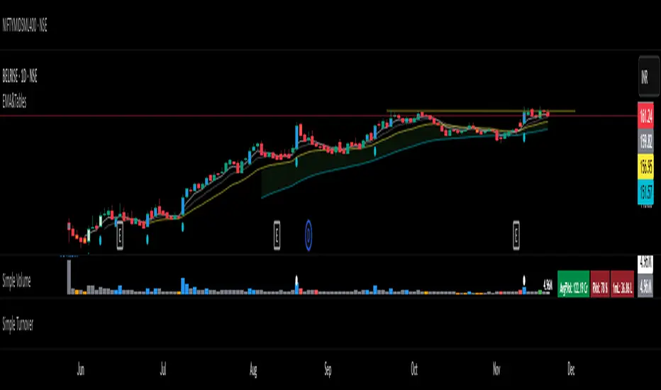
盯盘-平均K线图This is a Pine Script v6 indicator/strategy designed to assist traders with clear, configurable trend and momentum signals. It combines adaptive filters and volatility-aware logic to highlight high‑quality entries and exits, includes optional multi‑timeframe confirmation, and supports risk controls such as stop loss/target levels. Signals are visualized directly on the chart with arrows/labels and can trigger TradingView alerts for real‑time notifications. The tool offers smoothing and sensitivity settings to tune responsiveness, overlay mode for price action, and strategy mode for backtesting performance. It’s built to be lightweight, transparent, and easy to adjust, helping traders streamline decision‑making while maintaining control over parameters and risk.
النطاقات والقنوات

Gold Magic 1. Watch for the Icon
When you see the 💰 icon appear above or below the Bollinger Bands, it’s your first signal.
• An icon above the upper band means price has broken out to the upside.
• An icon below the lower band means price has broken out to the downside.
2. Wait for the Fair Value Gap
After the icon appears, the indicator will highlight the first Fair Value Gap (FVG) that forms.
• The FVG will show you exactly where a potential entry point is.
• It will also mark the suggested stop-loss level on the chart.
3. Prepare to Enter the Market
With the FVG and stop-loss levels in place, you have a clear idea of where to buy or sell and where to place your stop.
• This makes it easier to enter the market with confidence.

Guardian Entry Signal - FreeYou’ll instantly see big green triangles under the candles when all conditions line up. That’s your entry.
Set an alert and it will ping your phone the second one fires.

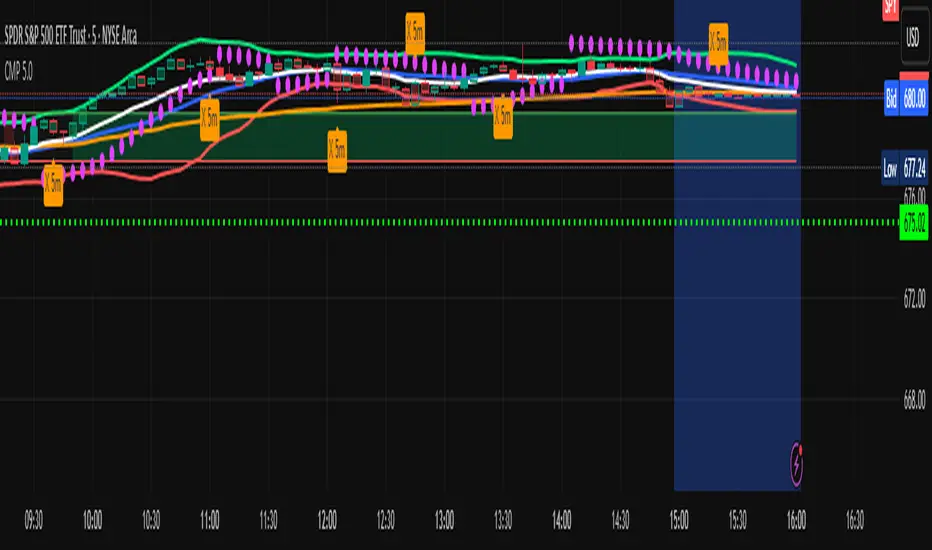
Carlos Money Printer (CMP 4.5)⭐ Carlos Money Printer (CMP 4.5) – Overview
Designed for precision day trading, swing filtering, and high-accuracy scalping.
Carlos Money Printer (CMP) 4.5 is a next-generation trading system engineered to identify high-probability trend expansions and disciplined exits using a multi-layer confirmation engine. CMP is built for traders who want clean visual signals, reduced noise, and a systematic approach that avoids emotional decision-making.
What CMP 4.5 Does
CMP analyzes market structure across multiple dimensions and automatically highlights:
🔥 1. High-Accuracy Entry Zones
CMP detects early-stage price expansions using a proprietary volatility engine (“BAM” signals) plus directional confirmation, giving traders visibility into explosive trend opportunities before most indicators react.
📈 2. Trend Direction & Strength
CMP reads trend behavior using a dynamic trend spine, allowing the system to clearly distinguish between pullbacks, trend continuation, and early reversal conditions.
🧠 3. Multi-Timeframe Confirmation
The built-in 6-timeframe dashboard shows whether higher-timeframes agree with the chart you're trading — giving you a fast snapshot of market alignment without flipping charts.
🎯 4. Sniper Entry System (Full/Moderate Modes)
CMP 4.5 offers two confluence-based entry models:
FULL Sniper Mode – highest confidence, strongest confluence
MOD Sniper Mode – more frequent entries with controlled risk
Both modes emphasize clean structure and avoid low-quality signals.
🚀 5. Intelligent Exit Engine (5m-Based)
CMP includes a hybrid exit model that combines:
Trend deceleration
Momentum reversal
Volatility exhaustion
Structural flip signals
This gives you objective, systematic exit points — no guessing, no chasing.
📊 6. Built-In Tools for Traders
ORB High/Low Zones (first 15 minutes)
ADR / ADT Daily Range Tracking
VWAP
Trend coloring
Clean chart-optimized visuals
Everything is integrated so you can trade from a single indicator.
🌟 Why Traders Like CMP
CMP is engineered to remove noise from the chart and show only the most useful information:
No clutter
No complicated settings
No lagging confirmation
No hype indicators
Just clean trend signals, controlled entries, and disciplined exits.
⚠️ Important Notice
CMP 4.5 is proprietary and licensed exclusively under the K&T Trust.
This is a private-use system intended for educational and non-commercial analysis.
Reproduction or redistribution of the source code is prohibited.
⚠️ Disclaimer
The Carlos Money Printer (CMP 4.5) indicator is a technical analysis tool designed for educational and informational purposes only. It does not constitute financial advice, investment advice, or trading recommendations. Like all trading indicators, CMP 4.5 cannot guarantee future performance, profitability, or accuracy. Markets involve risk, including the potential loss of capital.
By using CMP 4.5, the trader acknowledges and agrees that:
All trading decisions are made at their own risk,
Past performance does not guarantee future results,
CMP 4.5 is not a substitute for personal research or professional financial advice,
Neither the creator, K&T Trust, nor any affiliates are responsible for losses, damages, or outcomes resulting from its use.
CMP 4.5 is a tool — powerful, refined, and more advanced than many indicators — but it is not a promise, not a guarantee, and not liability-bearing.
Use it with proper risk management, discipline, and personal judgment.
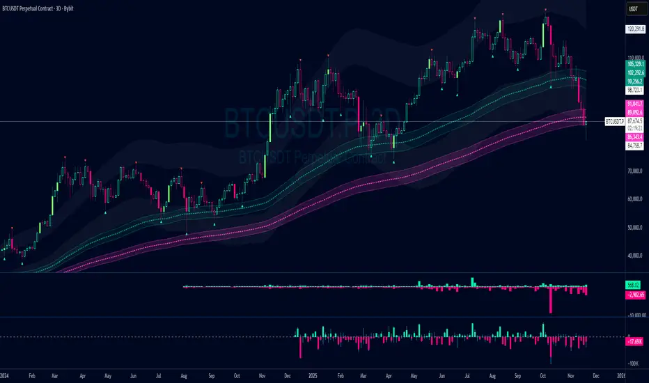
Damo's Custom EMA Bands 1.0I was making these manually for a long time. They just give me more peace of mind when I'm using EMAs. They feel more like a net catching price. These are easy to make. All they are is 3 EMAs with the Source at High, Low and (H+L)/2 for the midpoint.
I find on a 3-Day chart on BTC the 100 EMA is great for telling what trend we're are in.
i.postimg.cc
NeuraAlgo - Market DynamicsNeuraAlgo – Market Dynamics
Simplyfying the Market Dynamics
Unlock the complexity of financial markets with NeuraAlgo – Market Dynamics. Designed for traders and investors alike, this intelligent tool distills the chaos of price movements, volume fluctuations, and trend directions into clear, actionable insights. With advanced algorithms working behind the scenes, it simplifies market dynamics so you can focus on making informed decisions, spotting opportunities, and managing risk with confidence.
Behind this simple overlay lies a powerful, complex algorithm.
Main Settings -Main Algorithm
Timeframe – Choose the chart timeframe that the indicator will analyze. It adapts the calculations to the selected interval for precise market insights.
Preset – Select the operating mode:
Main Trend: Focuses on the dominant market trend.
Multi Trend: Analyzes multiple trend layers for a broader perspective.
Sensitivity – Adjusts the indicator’s responsiveness to price changes. Higher values make the system more reactive to market fluctuations, while lower values smooth out minor noise.
Smooth Tuner – Controls the smoothing of the underlying calculations, helping to reduce false signals and provide cleaner trend visualization.
Orderflow Statistics – Toggle to display detailed order flow statistics directly on the chart for deeper market analysis.
Performance Statistics – Toggle to enable backtesting tables, showing historical performance metrics of the indicator for strategy evaluation.
2.Art Settings -Change Visuals
Color Scheme – Select a pre-defined visual theme for your charts:
Bright Light – High-contrast, vibrant colors for maximum clarity.
Freezer Mode – Cool-toned palette for calm, visually comfortable analysis.
Standard Mode – Balanced, neutral colors for everyday use.
Delta Mode – Highlights key differences and movements with distinct colors.
Custom – Fully customize the colors of bullish, bearish, and range elements.
Green / Red / Range (Custom Colors) – When “Custom” is selected, these options allow you to define the colors for bullish (Green), bearish (Red), and neutral/range areas (Range) according to your preference.
Candle Coloring Type – Choose how candles are highlighted based on market signals:
Confirmation Simple – Basic signal-based coloring for clear, direct visualization.
Confirmation Gradient – Smooth gradient-based coloring for more dynamic and aesthetic signal representation.
3.Dashboard -Market Statistics
The Dashboard provides a compact, at-a-glance overview of key market conditions and indicator metrics, helping traders make faster and more informed decisions.
Functionality & Layout – The dashboard dynamically displays multiple sections:
Optimal Scale ⚖️ – Shows key market scaling metrics like volatility for better decision-making.
Risk Manager 📊 – Indicates the active risk management strategy (e.g., Risk-Reward, Partial Exits, or Trailing Stop Loss).
Orderflow Statistics 📈 – Displays market sentiment, footprint strength, and delta trends for precise order flow analysis.
Market Status 🌐 – Highlights current trend conditions and trend strength across different timeframes.
Bias Scores 🎯 – Provides trend strength percentages across multiple timeframes (5min, 15min, 30min, 1H, 4H, 1D) to quickly gauge market bias.
Backtest Performance -A summary panel showing the overall performance of the strategy.
Deposit -The starting capital used for backtesting.
Win Trades -Total number of profitable trades.
Winrate -Percentage of winning trades out of all trades.
Max DD -Maximum drawdown — the largest peak-to-trough loss.
PnL -Net profit or loss generated by the strategy.
Return -Percentage growth of the account during the test.
Profit Factor -Ratio of total profits to total losses.
The dashboard uses color-coded indicators (green for bullish, red for bearish, yellow for neutral) and merged cells for a clean and organized display.
It’s designed to simplify complex market dynamics into a visually intuitive interface, giving traders real-time insights without cluttering the chart.
4.Neura Engineering – Enhancements
This section provides advanced filtering options to fine-tune market analysis, reduce noise, and highlight meaningful trends.
Noise Filter – Smoothens minor price fluctuations to reduce false signals.Noise Sensitivity helps Adjust how aggressively the filter suppresses noise.
Gap Filter – Detects and smooths price gaps to improve trend clarity.Gap Sensitivity helps Controls the responsiveness of the gap filter.
Range Filter – Filters out small-range price movements to focus on significant market swings.helps Adjusts how tightly the filter defines meaningful ranges.
Volatility Filter – Highlights periods of high market volatility while filtering less active periods.helps Sets the threshold for what constitutes high volatility.
Trend Filter – Focuses analysis on strong trends by filtering out weaker signals.helps Determines the minimum strength required for a trend to be considered valid.helps Uses Average True Range to dynamically adjust trend filtering based on market movement.
These enhancement tools allow traders to customize signal clarity, reduce noise, and focus on meaningful market dynamics, creating a cleaner and more actionable charting experience.
5.Neura Overlays – Market Visual Enhancements
These overlays add visual intelligence to your chart, helping you instantly understand trend behavior, sentiment shifts, and price structure.
Reversal Cloud - Highlights potential reversal zones where price may change direction.Reversal Sensitivity helps Controls how quickly the cloud reacts to shifts in momentum.
Sentiment Cloud -Maps the underlying market mood—bullish, bearish, or neutral—directly onto the chart.Sentiment Sensitivity helps Adjusts how sensitive the sentiment readings are.
Price Steps -Draws structured “price steps” that reveal hidden market rhythm, impulse strength, and trend flow.Price Step Depth helps Determines the size and spacing of these steps.
Market Bias -Shows directional bias based on deeper trend pressure and underlying orderflow.Bias Sensitivity helps Controls how strict or lenient the bias detection is.
6.Risk Management Settings – Intelligent Trade Control
This module controls how your trades manage themselves after entry. Choose between traditional Risk/Reward exits, partial profit-taking, or an adaptive trailing stop system.
RiskReward
A classic risk-to-reward exit system.You set a risk multiple (e.g., 1:2), and the indicator automatically sets one Stop Loss and one Take Profit based on that ratio.
Partials
Scales out your position at multiple take-profit levels.Instead of closing the entire trade at once, the system secures profits gradually at TP1, TP2, and TP3 while keeping the remainder running.
TrailingStop
Uses a dynamic stop loss that follows price as it moves in your favor.There is no fixed Take Profit; instead, the trailing stop locks in profit and exits the trade automatically when momentum reverses.
7.Automatic Alert System
This is the System that organizes all settings related to the automatic webhook alert creator inside the indicator.
Rule No. 1 is never lose money. Rule No. 2 is never forget Rule No. 1.
Warren Buffet
NeuraAlgo – Market Dynamics transforms complex market behavior into clear, actionable insights for smarter trading decisions.

Shareline Normalized Momentum Indicator V1.1Normalized Momentum Indicator with Grimes MACD and CVD and VSI.


45DS v6.0 FULL FINAL1-5-15-30-60 dakıkalık zaman dlimlerinde sculp indikatörü . Başarısına inanamayacalsınız..
Market Range OracleMarket Range Oracle is an advanced volatility-adaptive projection tool designed to help traders anticipate future price behaviour, identify probabilistic ranges, and understand how markets historically expand or contract from the price open.
📊 By analysing historical bar-to-bar performance, ATR-filtered volatility, and fast-RSI momentum, the indicator creates a complete forward-looking range map for any timeframe.
📈 What Market Range Oracle Does
Calculates Expected Price Movement From the Open for any selected timeframe, the indicator measures thousands of past bars (or your chosen lookback) to determine:
Average % Gain
Average % Loss
Max Adjusted Gain (ATR-filtered projected peaks)
Max Adjusted Loss (ATR-filtered projected troughs)
Rate of green and red candle closes in the selected lookback period
Projected price levels for all of the above
These projections are then plotted directly on the chart or drawn as offset lines with detailed labels, all the colours, text size, show/hide elements are customisable from the indicator dashboard.
🧠 How does work and how to use it
The indicator computes projections across three independent timeframes:
Plots Timeframe — where visual projection bands are drawn
Lines & Labels Timeframe — creates separate-TF projection levels & labels
Forecast Timeframe — allows forward bar forecasting for the next candle
Forecast projections (when enabled) can be used to show the next future candle of any timeframe.
Example 1: Plots Timeframe set to current timeframe and the Forecast Timeframe option to the same timeframe, this will show an adaptive range moving with the price for current timeframe.
Example 2 : Find the potential Future range long term, the current timeframe is an weekly and we set the Forecast Timeframe to 2 weeks, as want to see potential top and bottom range for the next 2 weeks
Example 3 : Scalping with Market Range Oracle - Set the Bands to current timeframe and set the Projections lines and labels to a higher timeframe (in our case 15 minutes and a 4h)
⚡ Momentum Overlay (Fast RSI Hybrid)
A fast-RSI (RSI-2) colour code system measures short-term momentum and the top and bottom of the ranges display momentum.
Also the middle RSI 50 value equivalent EMA shows directional bias visualized with colour-shifting dashed line on the chart to help traders with clear trend direction.
🔔 Built-In Alert System
Alerts trigger on Price-Level Events and on momentum shift:
Price reaches projected Avg Loss
Price reaches projected Max Gain
Price reaches projected Max Loss
Midpoint Cross Events
Price crosses above mid-range
Price crosses below mid-range
Fast RSI bullish momentum
Fast RSI bearish momentum
Fast RSI strong bullish spike
Fast RSI strong bearish spike
🧩 Market Range Oracle is ideal for scalping, day-trading, swing trading, and position traders.
💬 Notes
Market Range Oracle does not predict future price — it projects statistically probable ranges based on historical behaviour and volatility. It is a decision-support tool to help traders navigate expected expansion from the open.


MA200 Parallel ChannelDynamic MA100 Parallel Bands – Precision S/R Levels
This indicator builds a clean, parallel channel around the 100-period moving average using a fixed ±4 offset.
Because the offset mirrors the short-term MA1 fluctuations, the channel reveals highly accurate support and resistance zones that react instantly to market micro-structure.
Unlike Bollinger Bands—which expand with volatility—this tool stays perfectly parallel and trend-aligned, making breakouts and pullbacks incredibly easy to spot.
How it works:
Centerline: 100-period moving average (MA100)
Upper Band: MA100 + 4
Lower Band: MA100 – 4
MA1 used as a sensitivity reference for micro-trend behavior
Parallel structure ensures stable, predictable levels
Why it’s powerful:
The ±4 channel creates extremely precise S/R zones
Price respecting the lower band = dynamic support
Price rejecting the upper band = dynamic resistance
A clean break above or below the bands highlights strong momentum shifts
Perfect for intraday traders needing structure without noise
Perfect for:
Identifying high-probability bounce levels
Spotting early trend continuation
Confirming MA100 breakouts
Filtering weak signals and fake volatility spikes
If you want razor-sharp support & resistance levels that stay consistent across all timeframes, these MA100 parallel bands deliver exceptional clarity.
SwRp - TWMA + Multi BBSwRp – TWMA + Multi Bands combines a Time-Weighted Moving Average with multi-standard-deviation bands to create a smooth, adaptive structure for tracking trend strength and volatility. The entire calculation is timeframe-aware, allowing you to shift the logic to any higher or lower timeframe while still viewing it on your chart.
This tool includes seven source modes, including a unique High + Low + HL2 option that plots three separate TWMA centres with their own deviation bands. You can switch between single-source, pair mode, or triple-source visualization depending on what you want to study.
Key Features
• TWMA smoothing: Adjustable weighted percentage for stronger trend clarity.
• Up to 5 deviation bands: Multi-level Bollinger-style bands for each source.
• Triple-source mode: High, Low, and HL2 each generate their own centres and bands.
• Pair mode controls: Show only centres, only a chosen σ level, or both.
• Flexible fills:
– Fill all levels up to a chosen deviation
– Or fill only one specific band
– Separate centre-fill when viewing TWMA pairs
• Timeframe-aware computing: Use any custom timeframe for the TWMA and band calculations.
Support & Resistance Visualization
The multiple deviation layers act as dynamic support and resistance zones.
Price often reacts, stalls, or reverses around these bands. The script makes it easy to see:
• Which band the price is respecting
• Whether volatility is compressing or expanding
• Where pullbacks are finding support
• Where rallies are facing resistance
• How the High, Low, and HL2 structures behave relative to each other
This makes it especially helpful for identifying high-probability entries, reversals, and continuation points.
Best For
• Intraday and swing traders
• Nifty, BankNifty, indices, futures.


MA % Deviation ChannelMA % Deviation Channel — an indicator for measuring price deviation from the moving average
MA % Deviation Channel (MA%DC) is a visual analysis tool that shows how far the current price deviates from a selected moving average, expressed in percentages. The indicator builds dynamic channels based on historical percentage deviations, helping traders identify statistical extremes and use them as potential reversal or continuation zones.
How the indicator works
MA%DC calculates the percentage deviation of High and Low from the chosen MA and stores these values in arrays. Based on the average deviation values, the script plots four key levels:
Avg. High Dev. — average deviation of highs from the MA
Avg. Low Dev. — average deviation of lows from the MA
Avg. Extreme High Dev. — extreme (above-average) deviations of highs
Avg. Extreme Low Dev. — extreme (below-average) deviations of lows
The width of the channel automatically adapts to the selected MA period — the longer the period, the deeper the historical analysis.
Purpose and use cases
MA % Deviation Channel helps:
Evaluate volatility relative to the moving average
Identify overbought and oversold zones based on real price behavior
Filter breakouts and false impulses
Build trend-following and counter-trend strategies using statistical deviations
Advantages
Based on percentage deviation rather than fixed distances
Adaptive to changing market conditions
Supports 5 popular types of moving averages
Settings
MA Source — data source for the moving average
MA Type — moving average type (SMA, EMA, WMA, VWMA, RMA)
MA Length — smoothing period
Visual elements
The moving average line
Average deviation channels
Extreme deviation channels
Color fills between levels for improved readability

Multi EMAThis is a multiple EMA setup, EMA 5 to EMA 200. This is having color band with 20 and 50 EMA
SIGMA 0.21✨ Professional Description for the SIGMA 0.21 Script:
The code is a custom indicator built for the TradingView platform, written in Pine Script (version 6). It is an advanced technical analysis tool designed to intelligently interact with price action across multiple timeframes. The script provides entry and exit signals, dynamic support and resistance zones, linear regression channels, all supported by an informative dashboard and a rich visual interface.
✨ وصف احترافي للكود SIGMA 0.21:
الكود هو مؤشر مخصص لمنصة TradingView مكتوب بلغة Pine Script (الإصدار السادس)، وهو أداة تحليل فني متقدمة تركّز على التفاعل الذكي مع حركة السعر عبر عدة أطر زمنية. يوفر إشارات دخول وخروج، مناطق دعم ومقاومة ديناميكية، وانحدارات خطية، وكل ذلك مدعوم بلوحة معلومات وواجهة عرض بصرية غنية.
📌 إخلاء مسؤولية قانونية (Disclaimer):
هذا المؤشر لأغراض تعليمية وتحليلية فقط، ولا يُعد نصيحة استثمارية أو توصية بالشراء أو البيع.
يعتمد المستخدم على المؤشر تحت مسؤوليته الشخصية الكاملة. لا يتحمل مطوّر المؤشر أو أي جهة مرتبطة به أي مسؤولية عن أي خسائر مالية قد تنتج عن استخدام هذا المؤشر في التداول. يُنصح دائمًا باستخدام المؤشرات الفنية مع استراتيجيات إدارة المخاطر وعدم الاعتماد عليها بشكل منفرد في اتخاذ القرارات الاستثمارية.
📌 Legal Disclaimer:
This indicator is intended for educational and analytical purposes only and does not constitute financial advice or a recommendation to buy or sell any asset.
The user assumes full personal responsibility for any trading decisions made based on this indicator. The developer or any associated parties are not liable for any financial losses that may occur from the use of this tool. It is strongly recommended to use this indicator in combination with sound risk management strategies and not as a standalone decision-making tool.

NinKa• Regression Length (200)
This value represents the reference period used to identify the trend.
A higher value captures broader market movements,
while a lower value makes the indicator respond more sensitively for short-term scalping.
• Normalization (100)
This parameter adjusts how smooth the indicator’s movements appear.
If the value is too low, you will see more noise.
If it is too high, the response becomes slower.
• Signal Line (100)
This line is the threshold for buy and sell signals.
When the indicator crosses above or below this level,
it is interpreted as a signal.
The current settings are optimized for observing stable market trends.
If you prefer more sensitivity for fast scalping entries,
you can reduce the Length value.
Feel free to adjust the parameters according to your trading style,
but using the default settings is perfectly fine as well.

Vital Wave 20-50Simplicity is almost always the most effective approach, and here I’m giving you a trend-following system that exploits the bullish bias of traditional markets and their trending nature, with very basic rules.
Rules (long entries only)
• Market entry: When the EMA 20 crosses above the EMA 50 (from below)
• Main market exit: When the EMA 20 crosses below the EMA 50 (from above)
• Fixed Stop Loss: Placed at the price level of the Lower Bollinger Band at the moment the trade is entered.
In my strategy, the primary exit is when the EMA 20 crosses below the EMA 50. However, this crossover can sometimes take a while to occur, and in the meantime the price may have already dropped significantly. The Stop Loss based on the Lower Bollinger Band is designed to limit losses in case the market moves sharply against the position without giving the bearish crossover signal in time. Having two exit conditions makes the strategy much more robust in terms of risk management.
Risk Management:
• Initial capital: $10,000
• Position size: 10% of available capital per trade
• Commissions: 0.1% on traded volume
• Stop Loss: Based on the Lower Bollinger Band
• Take Profit / Exit: When EMA 20 crosses below EMA 50
Recommended Markets:
XAUUSD (OANDA) (Daily)
Period: January 3, 1833 – November 23, 2025
Total Profit & Loss: +$6,030.62 USD (+57.57%)
Maximum Drawdown: $541.53 USD (3.83%)
Total Trades: 136
Winning Trades (Win Rate): 36.03% (49/136)
Profit Factor: 2.483
XAUUSD (OANDA) (12-hour)
Period: March 19, 2006 – November 23, 2025
Total Profit & Loss: +$1,209.56 USD (+11.89%)
Maximum Drawdown: $384.58 USD (3.61%)
Total Trades: 97
Winning Trades (Win Rate): 35.05% (34/97)
Profit Factor: 1.676
XAUUSD (OANDA) (8-hour)
Period: March 19, 2006 – November 23, 2025
Total Profit & Loss: +$1,179.36 USD (+11.81%)
Maximum Drawdown: $246.88 USD (2.32%)
Total Trades: 147
Winning Trades (Win Rate): 31.97% (47/147)
Profit Factor: 1.626
Tesla (NASDAQ) (4-hour)
Period: June 29, 2010 – November 23, 2025
Total Profit & Loss (Absolute): +$11,687.90 USD (+116.88%)
Maximum Drawdown: $922.05 USD (6.50%)
Total Trades: 68
Winning Trades (Win Rate): 39.71% (27/68)
Profit Factor: 4.156
Tesla (NASDAQ) (3-hour)
Total Profit & Loss: +$11,522.33 USD (+115.22%)
Maximum Drawdown: $1,247.60 USD (8.80%)
Total Trades: 114
Winning Trades: 33.33% (38/114)
Profit Factor: 2.811
Additional Recommendations
(These assets have shown good trending behavior with the same strategy across multiple timeframes):
• NVDA (15 min, 30 min, 1h, 2h, 3h, 4h, 6h, 8h, 12h, Daily)
• NFLX (1h, 2h, 3h, 4h, 6h, 8h, 12h, Daily)
• MA (1h, 2h, 3h, 4h, 6h, 8h, 12h, Daily)
• META (1h, 2h, 3h, 4h, 6h, 8h, 12h, Daily)
• AAPL (1h, 2h, 3h, 4h, 6h, 8h, 12h, Daily)
• SPY (12h, Daily)
About the Code
The user can modify:
• EMA periods (20 and 50 by default)
• Bollinger Bands length (20 periods)
• Standard deviation (2.0)
Visualization
• EMA 20: Blue line
• EMA 50: Red line
• Green background when EMA20 > EMA50 (bullish trend)
• Red background when EMA20 < EMA50 (bearish trend)
Important Note:
We can significantly increase the profit factor and overall profitability by risking a fixed percentage per trade instead of a fixed amount. This would prevent losses from fluctuating with changes in volatility.
This could be implemented by reducing position size or adjusting leverage based on the volatility percentage required for each trade, but I’m not sure if this is fully possible in Pine Script. In my other script, “ Golden Cross 50/200 EMA ,” I go deeper into this topic and provide examples.
I hope you enjoy this contribution. Best regards!


RSI Hybrid + EMA Cloud + Swings(15m/2H)RSI Hybrid + EMA Cloud (15m Trend + 2H Momentum)
A dual-timeframe trading system combining fast 15-minute trend structure with higher-timeframe 2-Hour momentum, volume and structural levels.
🧩 What This Indicator Does
This tool blends:
🔹 15m Trend (EMA Cloud) – 2 Points
EMA 7 vs 21 → Short trend
EMA 30 vs 74 → Long trend
Cloud shading highlights bullish/bearish alignment
Faster, intraday trend sensitivity
🔹 2H Momentum (RSI Hybrid) – 3 Points
RSI > 50
RSI > SMA(4)
RSI > SMA(12)
Gives short / medium / long momentum confirmation from the higher timeframe.
🔹 2H Volume Pressure – 1 Point
Volume vs 20-SMA
Mild / Moderate / Strong Bull/Bear
Confirms true participation behind price moves
⭐ Score System (0–6 Total)
Component Points
15m EMA Trend 2
2H RSI Hybrid 3
2H Volume Power 1
Total 6
Interpretation:
5–6 → High-confluence direction
3–4 → Partial confluence
1–2 → Weak bias
0 → No reliable direction
Designed for discretionary and semi-systematic intraday traders.
📊 15m Structural Levels
Includes:
✔ Last confirmed 15m Swing High / Swing Low
Based on close-price pivots, not highs/lows.
✔ Live Running High since last Swing LOW
Tracks how far price has extended upward.
✔ Live Running Low since last Swing HIGH
Tracks downward extension after a swing high.
✔ ATR(15m)
Volatility reference for SL/TP or risk modeling.
These levels help in timing entries, managing stops, and identifying breakout/breakdown zones.
🖥 On-Chart Info Table
Summarizes:
15m EMA short & long trend
2H RSI short/medium/long momentum
RSI vs 50
2H volume power
Bull & Bear score (with breakdown)
Last 15m swing highs/lows
ATR(15m)
Color-coded for clarity
💡 Why Use This Indicator
High-speed 15m trend detection
Higher-TF 2H momentum & volume confirmation
Multi-layered bias presented in a simple score
Built-in structure for more intelligent entries/exits
Works on indices, stocks, FX, crypto
Ideal for intraday traders who want speed + reliability
