Gap finder (gold minds)This tool highlights where gaps happens and outlines in the chart where the gap zones are. If there is a gap up there is a green line, a gap down it is red. The gap zone is highlighted in blue. You can choose the size of your gap with the input menu to the desired size. Feel free to ask comment below. Made for the Gold Minds group
ابحث في النصوص البرمجية عن "zone"

MTI Stochastic RSI with Color Bars and ZonesPlots the %D line of a Stochastic Oscillator calculated from the RSI of close of length 14.
Red Sell Zone above 80, candles paint red
Green Buy Zone below 20, candles paint green

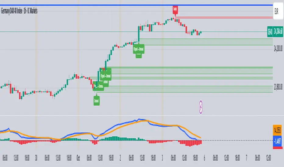
Unmitigated Liquidity ZonesUnmitigated Liquidity Zones
Description:
Unmitigated Liquidity Zones is a professional-grade Smart Money Concepts (SMC) tool designed to visualize potential "draws on liquidity" automatically.
Unlike standard Support & Resistance indicators, this script focuses exclusively on unmitigated price levels — Swing Highs and Swing Lows that price has not yet revisited. These levels often harbor resting liquidity (Stop Losses, Buy/Sell Stops) and act as magnets for market makers.
How it works:
Detection: The script identifies significant Pivot Points based on your customizable length settings.
Visualization: It draws a line extending forward from the pivot, labeled with the exact Price and the Volume generated at that specific swing.
Mitigation Logic: The moment price "sweeps" or touches a level, the script treats the liquidity as "collected" and automatically removes the line and label from the chart. This keeps your workspace clean and focused only on active targets.
Key Features:
Dynamic Cleanup: Old levels are removed instantly upon testing. No chart clutter.
Volume Context: Displays the volume (formatted as K/M/B) of the pivot candle. This helps you distinguish between weak structure and strong institutional levels.
High Visibility: customizable bold lines and clear labels with backgrounds, designed to be visible on any chart theme.
Performance: Optimized using Pine Script v6 arrays to handle hundreds of levels without lag.
How to trade with this:
Targets: Use the opposing liquidity pools (Green lines for shorts, Red lines for longs) as high-probability Take Profit levels.
Reversals (Turtle Soup): Wait for price to sweep a bold liquidity line. If price aggressively reverses after taking the line, it indicates a "Liquidity Grab" setup.
Magnets: Price tends to gravitate toward "old" unmitigated levels.
Settings:
Pivot Length: Sensitivity of the swing detection (default: 20). Higher values find more significant/long-term levels.
Limit: Maximum number of active lines to prevent memory overload.
Visuals: Toggle Price/Volume labels, adjust line thickness and text size.

Prev Day & Prev Hour Fibo Zones (Normal + Reverse)this works on previous day and hour fibb golden zone

Value Zones Indicator. Value Zones Indicator blends RSI-based momentum exhaustion, distance from the 200-day moving average, and position within a 2-year moving-average valuation band to quantify multi-horizon market stretch.
These components are normalized, averaged, inverted, and smoothed to form a regime-level “temperature” that distinguishes depressed, mean-reversion-favorable conditions from extended, higher-risk environments, with shaded zones highlighting historical extremes for macro risk-on / risk-off timing.
Works best on 1D TOTAL:INDEX, But not limited to does work across multiple assests, Just remember the lower down the MC ladder the less signal you will receive.
As always no one indicator is perfect, So best stacked with others to produce most alpha.
As always enjoy!!

POI Zones with Imbalance- Ahmed AwadHighlights Point of Interest (POI) zones on the chart where a significant price imbalance occurs between the candle’s open and close. The indicator draws semi-transparent orange zones to mark potential buy or sell areas, helping traders spot strong price moves and key levels. Adjustable imbalance threshold and transparency for flexibility.

Gap Zones with Unfilled AreasA very efficient scalping strategy for BTC. Both for the sell and buy. Take the trade when the price retraces back into 50% of the zone and and aim for a an easy 1:2

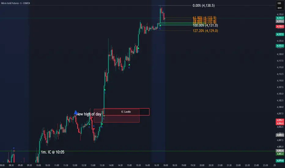
IC Opposite Candle Zones – BOXESWhat this does
✔ Detects bullish & bearish institutional candles
✔ Finds the last opposite candle before it
✔ Creates a zone using that candle’s full wick range
✔ Draws it with actual boxes that extend forward
✔ Deletes old boxes so your chart doesn’t get cluttered
TNT TRADER Sessions and Zones Premarket sessions and zone indicator full customization for premarket, yesterdays high and low , london, asia after hours etc.
R Dominant Range [CRT] by Sergi SernaR Dominant Range identifies the most influential R range located to the left of the current price action. It highlights the dominant zone that still impacts market behavior, helping traders understand which range is controlling the current structure.

Phoenix Smart ZoneThe Golden Trend Cloud Indicator is a professional trend-identification tool that combines Ichimoku Cloud with a 20-period Moving Average (MA20) to clearly define the market’s dominant direction.
It visually highlights bullish and bearish momentum using dynamic support and resistance zones derived from the Kumo cloud structure.

ICT Daily Levels & Liquidity Zones [HatefBW]ICT Daily Levels & Liquidity Zones
This indicator automatically detects and plots the daily high and low levels for the current day and the two previous days.
Each level dynamically tracks the exact candle that created it, allowing traders to identify where short-term liquidity pools form across multiple timeframes.
What makes this tool unique:
• Three-day structure: Displays current, previous, and 2-day-old highs/lows for contextual price action.
• Dynamic mapping: On lower timeframes, each level aligns precisely with the candle that created the daily high or low.
• Full customization: Traders can toggle each day’s levels, colors, label size, and extension behavior independently.
• Adaptive logic: Lines automatically extend or stay fixed depending on the chosen setting, avoiding chart clutter.
This tool helps ICT traders and smart money practitioners visualize daily liquidity zones — potential areas of stop hunts or institutional targeting.
The script is originally coded by @HatefBW from scratch, with no reused or modified open-source code

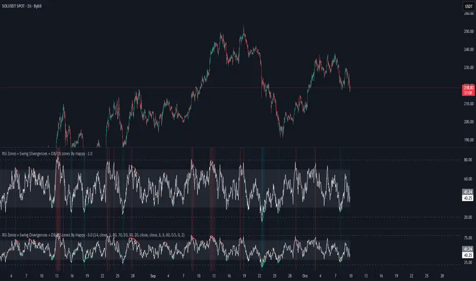
RSI Zones + Swing Divergences + OB/OS zones By HappyRsi with + divergences/ convergences + OB/OS zones
hidden bull/bear
Supply/Demand Zones & EMA CrossSupport and Resistance Zone based on past ten days for daily, weekly, with this ema 8,20,50,200 and vwap also inclued

Supply/Demand Zones & EMA CrossSupply and Demand Zone based on past ten days for daily, weekly, with this ema 8,20,50,200 and vwap also inclued

Two-Part Supply & Demand Zones with Role ReversalWill show demand and supply with boxes
Once a zone is used it will be removed to keep the chart clean
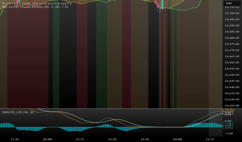
BB vs KC Visual Zones 📌 BB vs KC Visual Zones
This script combines the power of two popular volatility indicators — Bollinger Bands (BB) and Keltner Channels (KC) — into one intuitive and visually enhanced tool. It is designed to help traders identify high-volatility moments in the market, often signaling potential breakouts.
✅ What’s Included:
Bollinger Bands based on SMA and standard deviation.
Keltner Channels based on EMA and ATR.
Color-coded highlights for quick visual analysis:
Upper BB in bold red when it crosses above the upper KC.
Lower BB in bold green when it drops below the lower KC.
Background color dynamically adjusts based on breakout conditions.
Clear visualization of Squeeze and Breakout scenarios directly on the main chart.
🎯 Best Used For:
Spotting potential breakout zones when BB expands beyond KC.
Understanding underlying market volatility conditions.
Using as a standalone volatility filter, or integrating into broader trading systems.
1H intraday Percentiles ZonesThe 1H intraday Percentiles Zones indicator measures the percentage distance between price and its 200-period EMA on the 1-hour timeframe. It classifies this distance into historical percentile zones (P25, P50, P65, P76), helping traders identify when the asset is cheap, fairly valued, overextended, or very expensive relative to its 1H trend.

Volatility Zones (VStop + Bands) — Fixed (v2)📝 What this indicator is
This script is called “Volatility Zones (VStop + Bands)”.
It is an ATR-based volatility indicator that combines dynamic volatility bands, a Volatility Stop line (VStop), and volatility spike detection into a single tool.
Unlike moving average–based indicators, this tool does not rely on averages of price direction. Instead, it measures the market’s true volatility and reacts to expansions or contractions in price ranges.
________________________________________
⚙️ How it is built
The indicator uses several volatility-based components:
1. Average True Range (ATR)
o ATR is calculated over a user-defined length.
o It measures how much price typically moves in a given number of bars, making it the foundation of this indicator.
2. Volatility Bands
o Upper band = close + ATR × factor
o Lower band = close - ATR × factor
o The area between them is shaded.
o This gives traders an immediate visual sense of market volatility width — wide bands = high volatility, narrow bands = quiet market.
3. Volatility Stop (VStop)
o A stateful trailing stop based on ATR.
o It tracks the highest (or lowest) price in the current trend and places a stop offset by ATR × multiplier.
o When price crosses this stop, the indicator flips trend direction.
o This creates a dynamic stop-and-reverse mechanism that adapts to volatility.
4. Trend Zones
o When the trend is bullish, the stop is green and the chart background is shaded softly green.
o When bearish, the stop is red and the background is shaded softly red.
o This makes the market’s directional bias visually clear at all times.
5. Flip Signals (Buy/Sell Arrows)
o Whenever the VStop flips, arrows appear:
Green BUY arrows below price when the trend turns bullish.
Red SELL arrows above price when the trend turns bearish.
o These are also tied to built-in alerts for automation.
6. Volatility Spike Detection
o The script compares current ATR to its recent average.
o If ATR suddenly expands above a threshold, a small yellow “VOL” marker appears at the top of the chart.
o This highlights potential breakout phases or unusual volatility events.
7. Stop Labels
o At every trend flip, a small label appears at the bar, showing the exact stop level.
o This makes it easy to use the stop as a reference for risk management.
________________________________________
📊 How it works in practice
• When price is above the VStop line, the market is considered in an uptrend.
• When price is below the VStop line, the market is in a downtrend.
• The bands expand/contract with volatility, helping traders gauge risk and position sizing.
• Flip arrows signal when trend direction changes.
• Volatility spikes warn traders that the market is entering a higher-risk phase, often before strong moves.
________________________________________
🎯 How it may help traders
• Trend following → Helps traders identify whether the market is trending up or down.
• Stop placement → Provides a dynamic stop level that adjusts to volatility.
• Volatility awareness → Shaded bands and spike markers show when the market is likely to become unstable.
• Trade timing → Flip arrows and labels help identify potential entry or exit points.
• Risk management → Wide bands indicate higher risk; narrow bands suggest safer, tighter ranges.
________________________________________
🌍 In what markets it is useful
Because the indicator is based purely on volatility, it works across all asset classes and timeframes:
• Stocks & ETFs → Helps identify breakouts and long-term trends.
• Forex → Very useful in spot FX where volatility shifts frequently.
• Crypto → ATR reacts strongly to high volatility, helping traders adapt stops dynamically.
• Futures & Commodities → Great for tracking trending commodities and managing risk.
Scalpers, swing traders, and position traders can all benefit by adjusting the ATR length and multipliers to suit their trading style.
________________________________________
💡 Originality of this script
This is not just a mashup of existing indicators. It integrates:
• ATR-based Volatility Bands for context,
• A stateful Volatility Stop (adapted and rewritten cleanly),
• Flip arrows and labels for actionable trading signals,
• Volatility spike detection to highlight regime shifts.
The result is a comprehensive volatility-aware trading tool that goes beyond just plotting ATR or trend stops.
________________________________________
🔔 Alerts
• Buy Flip → triggers when the trend changes bullish.
• Sell Flip → triggers when the trend changes bearish.
Traders can connect these alerts to automated strategies, bots, or notification systems.

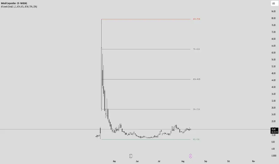
All-Time High/Low Levels with Dynamic Price Zones📈 All-Time High/Low Levels with Dynamic Price Zones — AlertBlake
🧠 Overview:
This powerful indicator automatically identifies and draws the All-Time High (AT.H) and All-Time Low (AT.L) on your chart, providing a clear visual framework for price action analysis. It also calculates and displays the Midpoint (50%), Upper Quartile (75%), and Lower Quartile (25%) levels, creating a dynamic grid that helps traders pinpoint key psychological levels, support/resistance zones, and potential breakout or reversal areas.
✨ Features:
Auto-Detection of All-Time High and Low:
Tracks the highest and lowest prices in the full visible historical range of the chart.
Automatically updates as new highs or lows are created.
Dynamic Level Calculation:
Midpoint (50%): Halfway between AT.H and AT.L.
25% Level: 25% between AT.L and AT.H.
75% Level: 75% between AT.L and AT.H.
Each level is clearly labeled with its corresponding value.
Labels are positioned to the right of the price for easy reading.
Color-Coded Lines (customizable)
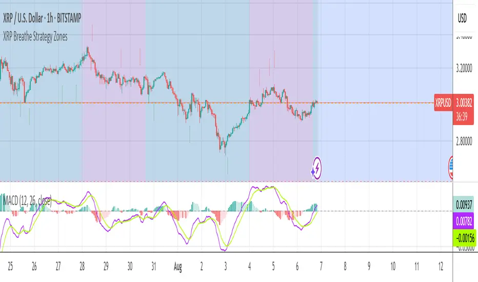
XRP Breathe Strategy Zones +🫁 XRP Breathe Strategy Zones
A time-based trading overlay designed specifically for XRPUSD.
This tool highlights weekly "Inhale" and "Exhale" phases based on a 20-day cycle of price action. It visually guides traders through expected accumulation and distribution zones, helping align trades with market rhythm.
🔹 Key Features:
Color-coded Inhale and Exhale phases
Critical price levels marked for support and resistance
Built-in signal arrows for trend confirmation
Perfect for swing traders and intraday strategists looking to trade XRP with more structure, timing, and confidence.
XRP Breathe Strategy Zones🫁 XRP Breathe Strategy Zones
A time-based trading overlay designed specifically for XRPUSD.
This tool highlights weekly "Inhale" and "Exhale" phases based on a 20-day cycle of price action. It visually guides traders through expected accumulation and distribution zones, helping align trades with market rhythm.
🔹 Key Features:
Color-coded Inhale and Exhale phases
Critical price levels marked for support and resistance
Built-in signal arrows for trend confirmation
Perfect for swing traders and intraday strategists looking to trade XRP with more structure, timing, and confidence.

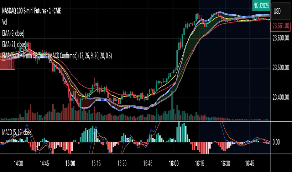
EMA Cloud + 5-min OB Zones (MACD Confirmed)What This Does:
OB detection runs only on 5-minute candles
Script works perfectly even if you're on a 1-minute chart
You’ll still see clean 5-min OB boxes extending into your execution zone