200 Week MA Extensions (Crypto Currently Strategy)Bitcoin 200 Week MA Extensions
The 200-week moving average has never been breached in Bitcoin's history, making it one of the most reliable indicators for identifying absolute market bottoms. This indicator plots the 200 Week MA along with percentage extensions above it to help identify potential cycle tops and key resistance levels during bull markets.
What is the 200 Week MA?
The 200-week simple moving average is the average closing price of Bitcoin over the past 200 weeks (approximately 3.8 years). It's a ultra-long-term trend indicator that:
Has never been broken to the downside in Bitcoin's entire history
Acts as the ultimate floor for Bitcoin price during bear markets
Rises steadily over time, reflecting Bitcoin's long-term growth trajectory
Moves slowly, making it a stable reference point for market cycles
Key Components:
200 Week MA - Blue Line (Base Level)
The foundation line that has historically marked absolute bottoms
Currently around $62,000 (and rising ~$500-800 per week)
Touching this level has historically represented generational buying opportunities
Last tested during the COVID crash (March 2020) and 2022 bear market
+50% Extension - Green Line (1.5x the 200 Week MA)
First major resistance zone above the base
Often acts as support during healthy bull market corrections
Historically a comfortable zone for accumulation in early bull markets
+100% Extension - Yellow Line (2.0x the 200 Week MA)
Double the 200 Week MA value
Represents a well-developed bull market
Often tested multiple times during mid-cycle consolidations
Can act as strong resistance when first approached
+150% Extension - Orange Line (2.5x the 200 Week MA)
Advanced bull market territory
Historically marks the acceleration phase of bull runs
Breaking above this level often signals euphoric market conditions approaching
+200% Extension - Red Line (3.0x the 200 Week MA)
Triple the 200 Week MA value
Extreme overextension zone
Historically near or beyond previous cycle tops
Suggests extreme caution and profit-taking considerations
Historical Context:
2020-2021 Bull Market:
March 2020: Price touched the 200 Week MA (~$5,000) - absolute bottom
Throughout 2020: Price traded between +50% and +100% extensions
Late 2020 - Early 2021: Price broke above +100%, accelerated to +150%
April 2021 & November 2021: Price reached +200% extension area, marking local/cycle tops
2022 Bear Market:
Price fell from +200% extension back toward the 200 Week MA
June 2022: Price came within 10% of the 200 Week MA ($18,000)
Bounce from near the 200 Week MA marked the bear market bottom
2023-2024 Recovery:
Price recovered from near 200 Week MA back through the extension levels
Each extension level acted as resistance, then support as bull market developed
Current position relative to extensions helps gauge cycle maturity
How to Use This Indicator:
For Long-Term Accumulation:
At 200 Week MA: Maximum conviction buying zone - historically has never failed
+0% to +50%: Excellent accumulation zone, low risk relative to reward
+50% to +100%: Good accumulation zone during bull market dips
Above +100%: Consider reducing accumulation, focus on holding or taking profits
For Profit Taking:
Approaching +100%: Consider taking initial profits (10-20% of position)
+100% to +150%: Take incremental profits as price advances
+150% to +200%: Increase profit-taking pace significantly
Above +200%: Maximum caution - historically unsustainable levels
For Risk Management:
Distance from 200 Week MA indicates market risk level
Further above = higher risk, more extended, closer to top
Closer to = lower risk, better value, closer to bottom
Use extensions as profit-taking targets in bull markets
Use extensions as re-entry targets during corrections
For Cycle Timing:
Bear Market: Price converges toward 200 Week MA
Early Bull: Price in +0% to +50% range, building base
Mid Bull: Price in +50% to +100% range, healthy growth
Late Bull: Price in +100% to +150% range, acceleration
Euphoric Top: Price at +150% to +200%+, extreme extension
Key Insights:
The 200 Week MA as Ultimate Support:
Bitcoin has touched or approached this level during every major bear market
It rises consistently (~$30,000 per year currently), creating a rising floor
Breaking below would be unprecedented and signal a fundamental market structure change
Provides enormous psychological and technical support
Extension Levels as Resistance/Support:
Bull markets often stall at each extension level before breaking through
Once broken, extensions often flip from resistance to support
Rejections from higher extensions can signal local or cycle tops
Corrections back to lower extensions offer re-entry opportunities
Diminishing Returns:
Each cycle's top has formed at progressively lower extension multiples
2013: ~10x the then-200WMA
2017: ~5x the then-200WMA
2021: ~3x the then-200WMA
Suggests future tops may not reach +200% extension (market maturation)
Best Practices:
Do:
Use the 200 Week MA as your ultimate risk-off level for long-term holdings
Scale into positions as price approaches the 200 Week MA
Take profits incrementally as price rises through extensions
View corrections back to lower extensions as opportunities
Combine with other on-chain metrics (MVRV, Realized Price) for confirmation
Don't:
Expect the 200 Week MA to provide perfect entry timing (you might be early)
Assume price will reach +200% extension every cycle
Sell all holdings at first extension level during bull markets
Ignore price action and volume when making decisions
Panic if price approaches the 200 Week MA (historically the best time to buy)
Why This Indicator Works:
The 200 Week MA represents nearly 4 years of price data, which:
Encompasses approximately one full Bitcoin halving cycle
Smooths out all short and medium-term volatility
Reflects Bitcoin's true long-term adoption and growth trend
Provides a slow-moving, stable reference that doesn't whipsaw
The extension levels work because:
They create objective profit-taking targets based on historical overextension
They account for the rising base (200 Week MA) over time
They've proven reliable across multiple market cycles
They help remove emotion from buy/sell decisions
Technical Notes:
Calculations performed on weekly timeframe data for consistency
The indicator displays correctly on any chart timeframe (Daily, 4H, etc.)
Uses lookahead_on to prevent repainting and show consistent historical values
All extension levels update automatically as the 200 Week MA rises
Best viewed on logarithmic scale for full historical perspective
Important Reminders:
Past performance does not guarantee future results - while the 200 Week MA has never been breached, future market conditions could differ
Market maturation - as Bitcoin matures, cycle dynamics may change
Black swan events - unexpected macro events could temporarily break historical patterns
Not financial advice - this is an educational tool, always do your own research
Recommended Usage:
Best Timeframes: Daily, Weekly, Monthly charts
Pair With: MVRV Ratio, Realized Price, Stock-to-Flow, Fear & Greed Index
Update Frequency: Weekly (the base 200 Week MA only changes weekly)
Chart Type: Logarithmic scale recommended for full historical view
Strategy Example:
Buy aggressively when price is within 20% of 200 Week MA
Hold and accumulate between 200WMA and +50% extension
Begin scaling out profits at +100% extension (20% of position)
Scale out more at +150% extension (40% of position)
Significant profit-taking at +200% extension (remaining position)
Wait for next cycle and repeat
This indicator provides a simple, objective, and historically reliable framework for navigating Bitcoin's market cycles. By respecting the 200 Week MA as the ultimate floor and using the extensions as profit-taking guides, investors can remove emotion and develop disciplined strategies for long-term success.
المتوسط المتحرك البسيط

BTC Key Support Levels (True Market Mean, Realized Price, MVRV)Bitcoin Key Onchain Support Levels + Moving Averages
This indicator combines critical Bitcoin on-chain metrics with traditional technical analysis to identify key support levels and price trends. It's designed to help traders and investors understand Bitcoin's fundamental value zones and market positioning.
Key Metrics Included:
On-Chain Support Levels:
True Market Mean (Active Coins) - Blue Line
Calculates investor capital (Realized Cap minus Thermocap) divided by active supply (coins moved in last year)
Represents the average cost basis of active market participants
Historically acts as strong support during bull markets
True Market Mean (Free Float) - Green Line
Same investor capital calculation but divided by free float supply
Provides a more conservative support estimate
Useful for identifying extreme value zones
Realized Price - Purple Line
The average price at which all bitcoins last moved on-chain
Represents the aggregate cost basis of all Bitcoin holders
Historical major support level during bear markets
Delta Realized Price - Red Line
Realized Price minus its all-time average
Helps identify when Bitcoin is trading below or above its historical average cost basis
Useful for spotting macro trend shifts
MVRV 0sd (Mean MVRV) - Yellow Line
Price level where Market Value equals the historical average MVRV ratio times Realized Value
Represents "fair value" based on Bitcoin's historical valuation patterns
Strong dynamic support/resistance level
Traditional Moving Averages:
50 Day SMA - White Dotted Line
Short-term trend indicator
Common entry/exit signal for swing traders
200 Day SMA - White Dashed Line
Long-term trend indicator
Classic bull/bear market dividing line
50 Week SMA - Orange Dotted Line
Medium-term trend on weekly timeframe
Historically strong support in bull markets, some traders use as dividing line between bull and bear markets
200 Week SMA - Orange Dashed Line
Long-term weekly trend
Very rarely breached; considered ultimate bottom indicator representing the deepest possible value for long term investors
How to Use This Indicator:
For Long-Term Investors:
Look for price approaching the Red (Delta Realized Price) or Purple (Realized Price) lines during corrections as potential accumulation zones
The 200 Week SMA (orange dashed) has historically marked cycle bottoms
When price is above the Blue line (True Market Mean - Active), the bull market is typically healthy
For Traders:
Use the moving averages for trend confirmation and entry/exit signals
The Yellow line (MVRV 0sd) often acts as dynamic support/resistance
Watch for price interactions with the Blue line during consolidations
Cross-referencing on-chain levels with moving averages provides high-probability trade setups
Market Cycle Context:
Bull Market: Price typically stays above the Yellow and Blue lines
Bear Market: Price often trades between Purple (Realized Price) and Red (Delta Realized Price)
Extreme Value: Price near or below Red line and 200 Week SMA
Overheated: Price significantly above all on-chain metrics
Technical Notes:
This indicator uses real Bitcoin on-chain data including:
Realized Cap from CoinMetrics
Supply and active supply metrics from Glassnode
Block mining data and transaction fees
Thermocap calculation (cumulative security spend)
All calculations are performed on daily data and maintain consistency across different chart timeframes. The on-chain metrics provide fundamental value floors that complement traditional technical analysis.
Best Practices:
Use on logarithmic scale for better visualization across Bitcoin's entire price history
Most effective on daily, weekly, and monthly timeframes
Combine with volume analysis and other indicators for confirmation
On-chain levels are slow-moving; don't expect daily precision
Historical support levels are not guarantees of future performance

Mambo MA & HAMambo MA & HA is a combined trend-view indicator that overlays Heikin Ashi direction markers and up to eight customizable moving averages on any chart.
The goal is to give a clear, uncluttered visual summary of short-term and long-term trend direction using both regular chart data and Heikin Ashi structure.
This indicator displays:
Heikin Ashi (HA) directional markers on the chart timeframe
Optional Heikin Ashi markers from a second, higher timeframe
Up to eight different moving averages (SMA, EMA, SMMA/RMA, WMA, VWMA)
Adjustable colors and transparency for visual layering
Offset controls for HA markers to prevent overlap with price candles
It is designed for visual clarity without altering the underlying price candles.
Heikin Ashi Direction Markers (Chart Timeframe)
The indicator generates HA OHLC values internally and compares the HA open and close:
Green (bullish) HA candle → triangle-up marker plotted above the bar
Red (bearish) HA candle → triangle-down marker plotted above the bar
The triangles use soft pastel colors for minimal obstruction:
Up marker: light green (rgb 204, 232, 204)
Down marker: light red (rgb 255, 204, 204)
The “HA Offset (chart TF ticks)” input lets users shift the triangle vertically in price terms to avoid overlapping the real candles or MAs.
Heikin Ashi Markers from a Second Timeframe
An optional second timeframe (default: 60m) shows additional HA direction:
Green HA (higher timeframe) → tiny triangle-up below the bar
Red HA (higher timeframe) → tiny triangle-down below the bar
This allows a trader to see higher-timeframe HA structure without switching charts.
The offset for the second timeframe is independent (“HA Offset (extra TF ticks)”).
Custom Moving Averages (Up to Eight)
The indicator includes eight individually configurable MAs, each with:
On/off visibility toggle
MA type
SMA
EMA
SMMA / RMA
WMA
VWMA
Source
Length
Color (with preset 70% transparency for visual stacking)
The default MA lengths are: 10, 20, 50, 100, 150, 200, 250, 300.
All MA colors are slightly transparent by design to avoid obscuring price bars and HA markers.
Purpose of the Indicator
This tool provides a simple combined view of:
Immediate trend direction (chart-TF HA markers)
Higher-timeframe HA trend bias (extra-TF markers)
Overall moving-average structure from short to very long periods
It is particularly useful for:
Monitoring trend continuation vs. reversal
Confirming entries with multi-TF Heikin Ashi direction
Identifying pullbacks relative to layered moving averages
Viewing trend context without switching timeframes
There are no signals, alerts, or strategy components.
It is strictly a visual trend-context tool.
Key Features Summary
Two-timeframe Heikin Ashi direction
Separate offsets for HA markers
Eight fully configurable MAs
Clean color scheme with low opacity
Non-intrusive overlays
Compatible with all markets and chart types

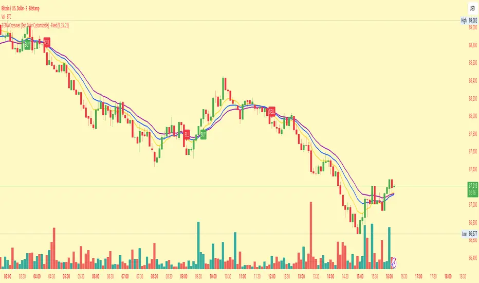
3 EMA Crossover (Text Color Customizable) - Fixed3 Ema crossover 9/15/21
it will generate buy and sell signal on crossover.
MACD Divergence auto displayed on chart, with alertsMACD Pivot Divergence Detector
This tool identifies MACD histogram divergences based on confirmed pivot highs and lows.
Instead of comparing swing points on the MACD line, this script focuses specifically on the histogram, which measures momentum shifts between MACD and Signal.
How it works
The script detects confirmed pivots using a two-bar swing structure.
When price breaks above a previous pivot high, the script compares the MACD histogram value at that pivot to the current histogram value:
• If price makes a higher high while the histogram makes a lower high, a potential bearish divergence is marked.
The reverse logic is applied for bullish divergence when price breaks below a pivot low.
What makes this script unique
It uses pivot-confirmed histogram values, not lookback-based divergence.
It evaluates divergence only at actual highs/lows, reducing false positives.
It marks divergence directly on the candles for visual clarity.
Alert conditions are included for automated detection.
How to use
Bullish signals may highlight potential momentum loss in downtrends; bearish signals may highlight momentum loss near highs. Divergence does not guarantee reversal and should be combined with broader context, structure, or trend analysis.

13 / 26 / 52 SMA Overlay13 / 26 / 52 SMA Overlay showing how short term is performing relative to long term.

Simple Moving Averages (5, 10, 20, 60, 120, 200SMA for different time frames.
Covers 5, 10, 20, 60, 120, 200 sma units
200SMA Distance OscillatorThe oscillator measures the percentage deviation of closing price x from SMA200.
The idea behind the oscillator was preceded by an analysis of how often MAs in the index hold/bounce or are broken through.
Basically, the idea was about index analysis, i.e., the macro picture of a market.
Who wants to buy individual stocks when the overall market is plummeting ;-)
Or in other words: How long are you long in a market? When is it time to take profits?
After the analysis of the stability of SMAs in the index was rather modest (ratio of just under 6:4 for bounce to breakout – overall in 20, 50, 100, and 200 frames from 2020 to 2025), it was noticeable that the percentage over- or underperformance was scalable, especially in indices.
And since indices generally move upwards, there were fixed limits for over- and underestimations – especially in the longer term (SMA200) – unlike with individual stocks.
It is therefore more a question of macro trends and less of short-term movements, e.g., in day trading.
It was now interesting to see at what percentage range counter-movements were likely – particularly in the positive range for profit-taking, but of course also in the negative range for entry into sold-off markets.
If, for example, closing prices around +25% above SMA200 were reached in the NDX, the probability is very high that the market has overreacted and an interim correction will follow – so the theory goes.
On the other hand, continuous levels of +5 to +10% are a product of healthy positive development in a bull market and do not necessarily require action.
The oscillator was specifically designed for the NDX, but can also be used for the SPX and others.
The style was based on the RSI, so that the color level rises from 10% to 20% (overbought/oversold principle).
Based on manually examined movements, the criteria were set as follows:
+/-10% = flow / no color background
> +/-10% = border areas / color background
The center line represents the 252 average of the percentage deviations and could also be used as a trigger, provided it has been historically examined and is valid.
The oscillator is very interesting because it behaves completely differently from one financial instrument to another and, as a result, also in the timeframes (4h, D, W).
It would probably make sense to change the flow and border levels in the code when using it outside of indices.
The fact is that the oscillator must be “adjusted” to each instrument in order to achieve its goal of providing the best possible prediction. “Adjusting” refers to the analysis of the levels at which an instrument/asset usually reacts.
As with all indicators and oscillators, it is advisable to take other indicators and, in particular, macro news into account when analyzing this development.
If I find any substantial correlations with other indicators, I will be happy to provide an update.
The idea came from me, the code from Grok.
The code is not 100% perfect, but the data (percentage deviation, color background) is correct according to initial analysis.
In the settings, you can make the lines of the plots invisible. This makes the oscillator clearer. You can also adjust the settings for the average line.
3x Moving Averages with Optional Background FillThree MAs with toggles to fill MA2–MA1 and MA3–MA2.
below is Japanese too.
English
This Pine Script plots three moving averages—MA1, MA2, MA3—each with its own type, length, source, color, and offset. You can independently toggle background fills between MA2–MA1 and MA3–MA2.
- Common MA function: Selects calculation among SMA, EMA, SMMA, WMA, VWMA.
- Inputs: Each MA group defines settings; MA2 has a toggle for filling MA2–MA1, MA3 has a toggle for filling MA3–MA2.
- Computation: Each MA is computed only when its type isn’t “None”.
- Plotting: Three plot lines, hidden if disabled.
- Background fill: Uses translucent colors; fill(p1, p2, ...) for MA2–MA1 and fill(p2, p3, ...) for MA3–MA2, gated by their toggles.
Behavior notes: If either line in a pair is disabled, that fill won’t show. Different offsets can shift visuals; keep offsets aligned for clean fills.
日本語
このPineスクリプトは3本の移動平均(MA1・MA2・MA3)を描画し、各ラインに対してタイプ、期間、ソース、色、オフセットを個別設定できます。背景塗りはMA2とMA1、MA3とMA2のペアでそれぞれオン/オフ可能です。
- 共通MA関数: SMA、EMA、SMMA、WMA、VWMAから計算方式を選択。
- 入力: 各MAグループで設定を持ち、MA2は「MA2–MA1塗り」、MA3は「MA3–MA2塗り」のトグルを備えます。
- 計算: タイプが「None」でない場合のみ各MAを算出。
- 描画: 3本のplotで表示し、無効時は非表示。
- 背景塗り: 透過色を使用し、fill(p1, p2, ...)でMA2–MA1、fill(p2, p3, ...)でMA3–MA2を塗り、各トグルで制御します。
注意点: ペアのどちらかが無効なら塗りは出ません。オフセットが異なると塗り位置がずれるため、揃えると見やすくなります。

4-Line RibbonRibbon for 20, 50, 100, 200 EMA/ SMA.
2 colour areas for bullish or bearish.
3 shade gradient between the different MA's.

Vortex Pro with Moving average [point algo]Vortex Pro with MA Dropdown is an enhanced version of the classic Vortex Indicator (VI), designed to help visualize directional strength by comparing positive and negative trend movement.
This version includes a smoothed “Vortex Pro” line, adjustable moving-average filtering, and dynamic zone coloring for improved readability.
How It Works:
The script calculates VI+ and VI− using directional movement and true range.
“Vortex Pro” is derived from the difference between VI+ and VI−, scaled for clarity.
A customizable moving average (EMA, SMA, HMA, WMA) is applied to help smooth volatility and highlight shifts in momentum.
Features :
• Vortex Pro Line
A scaled trend-strength line showing when positive movement is dominating or weakening.
• MA Type Dropdown
Choose between EMA, SMA, HMA, or WMA to smooth the Vortex Pro line.
• Zero-Line Structure
A plotted zero line is used to compare positive vs. negative strength visually.
• Dynamic Fill Zones
Green shading when the Vortex Pro line is above zero, red when below.
Usage:
This tool is designed for visual analysis of trend direction and momentum strength.
It does not generate buy/sell signals and should be used as part of a broader analysis approach.
Suitable for all timeframes and markets.

SMC Lite + PVSRA + MA Combo HELL 1great trading tool what you see is what you get supply and resistance pvsra candles

Moving Aaverage (EMA) & VWAP by Vish
Multi-Timeframe Moving Averages with VWAP
This indicator combines essential moving averages with VWAP to provide comprehensive trend analysis on a single chart. Designed for traders who need quick visual reference of multiple timeframes and volume-weighted price levels.
Features:
• Six customizable moving averages: 8, 13, 21, 50, 100, and 200 periods
• Toggle between Simple Moving Average (SMA) and Exponential Moving Average (EMA) for all lines
• Individual on/off controls for each moving average
• Volume Weighted Average Price (VWAP) with customizable settings
• VWAP anchor options: Session, Week, Month, Quarter, and Year
• Clean, color-coded visualization for easy identification
• Fully customizable through settings panel
Use Cases:
• Identify trend direction across multiple timeframes
• Find dynamic support and resistance levels
• Spot potential entry and exit points
• Analyze price action relative to volume-weighted average
• Confirm trend strength with multiple MA convergence/divergence
Settings:
All parameters are adjustable including MA type (SMA/EMA), individual MA visibility, VWAP source, and VWAP anchor period.
Suitable for all markets and timeframes. Works on stocks, forex, crypto, commodities, and indices.
#moving average #MA #EMA #SMA #VWAP #trend #support #resistance #multi-timeframe

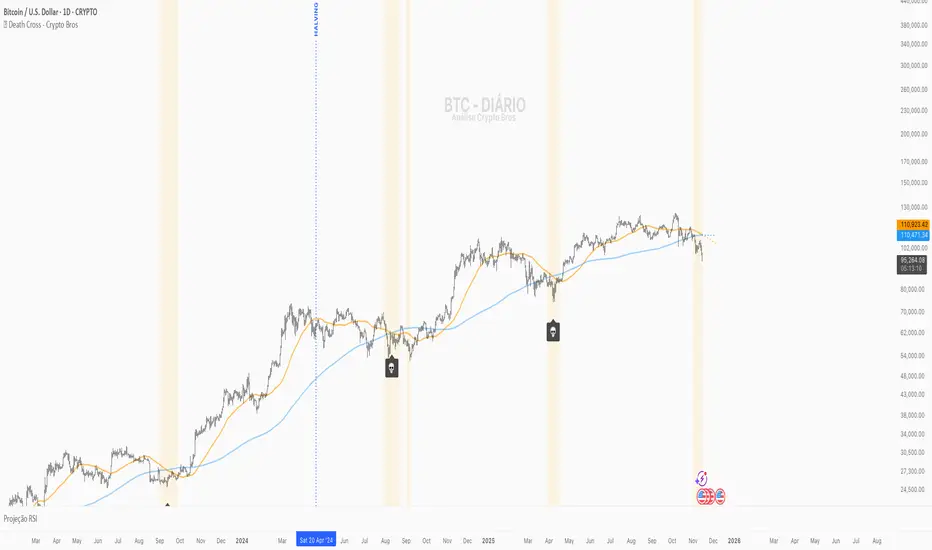
💀 Death Cross - Crypto Bros💀 Death Cross – Crypto Bros
Identify the most important crossover of CRYPTO:BTCUSD and visualize attention zones before and after the event.
What This Indicator Does
The Death Cross – Crypto Bros indicator monitors the structural relationship between the 50-period and 200-period moving averages, using a selectable timeframe (default: 1D).
It provides three core features:
1. Death Cross Detection
The Death Cross occurs when the MA50 crosses below the MA200.
The indicator automatically displays:
- a 💀 callout below the candle
- a highlighted background
- optional alerts
2. Attention Zone (Before and After the Cross)
The indicator highlights bars where structural weakness is developing.
Before the Death Cross:
- MA50 above MA200
- MA50 pointing downward
- Distance between MAs ≤ 4% (configurable)
After the Death Cross:
- MA50 below MA200
- MA50 still pointing downward
- Distance between MAs ≤ 4%
This creates a clear visual map of structural weakness around the cross.
3. MA Projections
Dotted projection lines show the current slope and momentum of MA50 and MA200.
When to Use It
This indicator is designed for traders who want to:
- spot early macro weakness
- manage exposure near trend shifts
- avoid premature long entries
- track Bitcoin's macro structure
- combine it with other confluence tools
Key Settings
- Timeframe for MAs – default 1D
- Type of Moving Average – SMA (default) or EMA
- Attention Zone – background color + maximum MA distance (%)
- Projections – enable/disable dotted forward MAs
Alerts Available
You can enable:
- Death Cross Alert
Triggers when MA50 crosses downward through MA200.
- Attention Zone Start
Triggers when the Attention Zone becomes active for the first time.
Create one or both depending on your strategy.
How to Interpret the Visuals
- 💀 Highlighted Candle + Skull Icon
→ The Death Cross has occurred.
- 🟡 Attention Zone Before the Cross
→ MA50 is turning downward and approaching MA200.
- 🟠 Attention Zone After the Cross
→ Post-cross weakness remains elevated.
- 🔮 MA Projections
→ Show the directional momentum of MA50 and MA200.
Suggested Confluence Tools
For better accuracy, combine with:
- RSI
- OBV
- Market Structure (BOS/CHoCH)
- Volume
- Macro sentiment
About This Indicator
Created for the Crypto Bros community to deliver:
- clean macro trend visualization
- early warning signals
- smart exposure and risk management
Feedback & Improvements
If you’d like more features or enhancements, feel free to reach out!
SMA 50 DerivativeThis approach uses calculus concepts:
First Derivative (slope): Rate of change of the SMA → ta.change(sma50)
Second Derivative (acceleration): Rate of change of the slope → ta.change(smaSlope)
1. First Derivative (smaSlope)
Measures: The instantaneous rate of change between the current bar and previous bar
Formula: sma50 - sma50
Interpretation:
> 0 = SMA is rising (uptrend)
< 0 = SMA is falling (downtrend)
= 0 = SMA is flat
2. Second Derivative (smaAcceleration)
Measures: How the slope itself is changing
Formula: smaSlope - smaSlope = (sma50 - sma50 ) - (sma50 - sma50 )
Interpretation:
> 0 = Slope is increasing (trend is accelerating)
< 0 = Slope is decreasing (trend is decelerating)
= 0 = Slope is constant
**For scalping, very short-term signals**

SMA 50 Acceleration/Deceleration DetectorThis indicator shows you when there is a decrease in acceleration on the sma50
S indicates a slowing of the increase
B indicates a slowing of the decrease

VWAP / MA + Average Candle Size [MaximizedTrading]VWAP / MA + Average Candle Size
Bring structure and precision to your trading with the VWAP / MA + Average Candle Size indicator, a comprehensive tool that combines every major Moving Average and VWAP variation in one adaptive system. Built for traders who want flexibility, accuracy, and a clear view of market volatility, this indicator gives you full control over your preferred averaging method and visualizes dynamic ACS-based bands that adjust automatically to changing conditions.
🧠 Why I Created This Indicator
Every trader has a favorite moving average or VWAP setup, but switching between them, recalibrating settings, and adding volatility bands can be a hassle. I built this indicator to unify all those features into a single, streamlined tool. Whether you’re a scalper using anchored VWAPs or a swing trader relying on EMAs, this indicator adapts to your workflow instantly.
I also integrated the Average Candle Size (ACS) concept to bring volatility into the equation. By combining VWAP or MA with ACS-based bands, you can instantly visualize how volatile the market is — and use those bands as dynamic zones for stop-loss or take-profit placement. This way, your strategy adapts naturally to real-time market conditions instead of relying on fixed levels.
🔧 Key Features:
All-in-One VWAP & MA Selection:
Choose between VWAP, SMA, EMA, SMMA (RMA), WMA, or VWMA — all within a single indicator.
Switch seamlessly without adding multiple tools to your chart.
Full VWAP Flexibility:
Customize your VWAP with adjustable anchor points such as Session, Week, Month, or Year — ideal for both intraday and swing trading setups.
Dynamic ACS Bands:
Up to three adaptive bands are automatically calculated based on the Average Candle Size.
Each band expands or contracts with volatility, allowing you to gauge market rhythm at a glance.
Stop-Loss & Take-Profit Guidance:
Use ACS bands as natural dynamic levels — a practical way to set stop-losses or take-profits that move with volatility rather than against it.
Visual Volatility Insights:
Quickly see when the market is quiet or active. During low volatility, the bands tighten; during strong movements, they widen — making volatility visually intuitive.
Clean and Minimal Layout:
Optimized for clarity and performance. All elements are easy to toggle on or off depending on your trading style.
📸 Example!
In this example, VWAP is anchored to the session while ACS bands (×1 and ×3) dynamically expand and contract with market volatility. Notice how price often finds resistance near the outer bands — a perfect visual guide for potential take-profit or re-entry zones.
In another setup, the 50 EMA serves as the main trend filter, with ACS bands framing price movement. During quiet periods, bands stay close to price, while during volatility spikes, they widen — clearly showing changing market conditions.
💬 I am dedicated to making this indicator as practical and user-friendly as possible. Feedback is always welcome — feel free to leave a comment or suggestion for future improvements!

SMA 500 Direction Change SignalsThis indicator alert when there is a change in the direction of the sma500, with a small triangle.
It also alerts when there are 3 changes within 10 bars, big triangle

Daily MA — Higher-Timeframe Daily Moving Average OverlayThis indicator plots a clean, higher-timeframe daily moving average directly on any chart, so you can always see where price sits relative to the daily trend — even while trading on lower timeframes (1m, 5m, etc.).
It’s designed to be:
Simple – a single, configurable daily MA line
Consistent – always anchored to the 1D timeframe
Flexible – choose EMA or SMA and customize line width/color
⸻
What This Indicator Does
Pulls the 1-Day (1D) moving average of the current symbol, regardless of your chart timeframe.
Lets you choose between EMA (Exponential Moving Average) or SMA (Simple Moving Average).
Plots that daily MA as a smooth overlay on your current chart.
Keeps the line visually clean and continuous, making it easy to see daily trend and dynamic support/resistance.
This is not a signals/strategy script. It doesn’t generate buy/sell arrows or backtest logic. It’s a context tool for visualizing the daily trend while you execute your own strategy.
⸻
Why a Daily MA Overlay Is Useful
Traders commonly use a daily moving average to:
Anchor intraday trades to the higher-timeframe trend
Longs when price is holding above the Daily MA
Shorts or caution when price is rejecting from the Daily MA
Identify dynamic support/resistance
Price often reacts around well-watched daily MAs (e.g., 50, 100, 200)
Filter setups
Only take long setups when price is above the daily trend line
Avoid counter-trend trades when price is extended far from the Daily MA
Because this script forces the MA to always be computed on 1D, you don’t have to switch back and forth between intraday and daily charts to keep track of the bigger picture.
⸻
Inputs & Settings
MA Length
Default: 200
Any positive integer (min 1)
Common examples: 50, 100, 200 for trend structure
MA Type
EMA – reacts faster to recent price (default)
SMA – smoother, slower, more “classic” feel
Line Width
Default: 2
Range: 1 to 10
Increase if you want the Daily MA to stand out clearly against other indicators
Color
Default: Purple tone
Fully customizable – pick any color that works with your chart theme
⸻
How to Use It in Your Workflow
Intraday traders (scalpers/day-traders):
Apply the indicator to your 1m/5m/15m charts.
Use the Daily MA as a trend filter :
Only look for long scalps when price is above the Daily MA.
Be more cautious with longs or consider shorts when price is below it.
Swing traders :
Use it on 1H/4H charts to see where price sits relative to a longer-term daily trend.
Watch for:
Pullbacks to the Daily MA in an uptrend as potential demand zones.
Rejections at the Daily MA in a downtrend as potential supply zones.
Risk management & context :
Avoid chasing extended moves far from the Daily MA.
Mark confluence with other tools (support/resistance, volume profile, etc.) around the Daily MA.
⸻
Notes & Limitations
The moving average itself is calculated from daily candles , then displayed on your current timeframe.
This is a visual aid only . It does not guarantee future performance or provide financial advice.
Always combine this indicator with your own analysis, risk management, and trading plan.
⸻
Disclaimer :
This script is provided for educational and informational purposes only. It is not financial advice and does not constitute a recommendation to buy or sell any financial instrument. Always do your own research and trade at your own risk.

PSAR with ATR Trailing Stop + SMA Filter📈 Strategy Overview: PSAR + 6×ATR Trailing Stop with SMA Filter
This strategy is built around the principle of “Cut the losers, let the winners run” — a disciplined, trend-following approach that combines the Parabolic SAR indicator with dynamic risk management and a Simple Moving Average (SMA) trend filter.
🔍 Strategy Logic
Trend Filter Trades are only taken in the direction of the prevailing trend, defined by a user-selected SMA (default: 100).
✅ Long trades only when price is above the SMA
✅ Short trades only when price is below the SMA
Entry Signal: A trade is triggered when the Parabolic SAR flips to the opposite side of the price bars, signaling a potential trend reversal.
Stop Loss: The stop loss is dynamically set at 6×ATR from the entry price. This adapts to market volatility and is recalculated every bar — effectively acting as a trailing stop.
Exit Logic: There is no fixed take profit. The trade remains open until the trailing stop is hit — allowing winners to run and losers to be cut quickly.
Risk Management: Each trade risks 0.5% of total equity, ensuring consistent position sizing and capital preservation.
📊 Visual Elements
PSAR dots mark trend direction changes
SMA line shows the broader trend filter
Trailing stop crosses (with 50% opacity) indicate the current stop level without cluttering the chart
⚙️ Customizable Inputs
PSAR parameters: Start, Increment, Maximum
ATR length and multiplier
SMA length
Risk percentage per trade
This strategy is ideal for traders who want to stay aligned with the trend, automate disciplined exits, and avoid emotional decision-making. Clean, simple, and powerful.
Wishing you calm and successful trades!

Close Below MAClose Below MA (SMA or EMA)
This indicator helps traders quickly identify when a candle closes below a moving average — a classic signal of potential bearish momentum or a shift in trend.
You can choose between Simple Moving Average (SMA) or Exponential Moving Average (EMA) from a convenient dropdown menu, and customize the MA length to fit your strategy.
When a candle closes below the selected MA, a small black arrow appears above the bar, and an alert can be triggered for instant notifications.
Features:
Choose between SMA or EMA.
Adjustable MA length.
Visual signal (arrow) when the close is below the selected MA.
Built-in alert support
Usage Ideas:
Spot early signs of a bearish reversal.
Use alerts for automated trade monitoring.

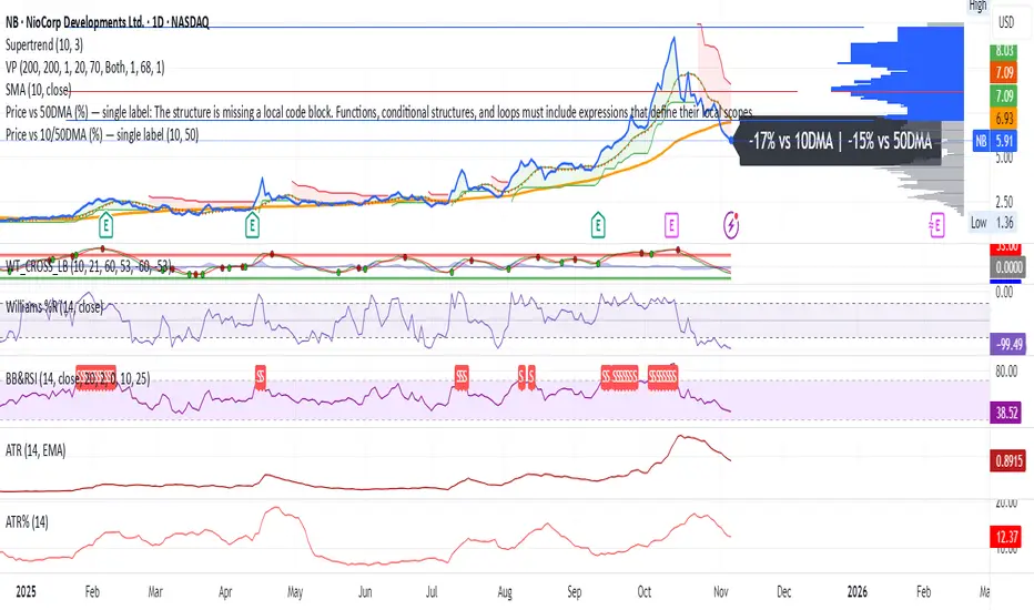
Price vs 10/50DMA (%) — single labelThis TradingView script shows how far the current price is from its 10-day and 50-day moving averages (DMAs), expressed as percentages, and displays both values as a single label near the latest candle — for example, “+3% vs 10DMA | +8% vs 50DMA.” You can switch between simple and exponential moving averages using the “Use EMA” checkbox, and adjust the period lengths in the input panel. To use it, simply copy the code into TradingView’s Pine Editor, click Add to chart, and you’ll see one live label updating each bar along with the plotted 10- and 50-day average lines.
dO / wO / mO + MA 50/200 + PrevDay H/L Description
This indicator plots key reference levels used by professional traders:
Daily Open (dO)
Weekly Open (wO)
Monthly Open (mO)
Previous Day High (pdH) and Previous Day Low (pdL)
Moving Averages: 50 & 200 SMA
Each level is drawn as a clean dotted white line with a fixed label directly on the price chart.
All levels can be individually toggled on or off via checkboxes in the settings panel.
The pdH/pdL lines start exactly from the candles that created them, providing clear structure for breakout, retracement, and liquidity analysis.
The 50/200 SMA are included for long-term trend context.
This tool is designed for traders who rely on multi-timeframe structure and precision levels for both intraday and swing strategies.
Features
Toggle visibility for dO, wO, mO, pdH, and pdL
Accurate placement of previous day levels
Lightweight and responsive
Clean minimal visual design
Supports any symbol and timeframe
Usage Notes
Perfect for confluence-based trading:
Combine pdH/pdL with session opens to identify key liquidity zones
Use SMA 50/200 for directional bias
Works on crypto, forex, indices, and equities
