
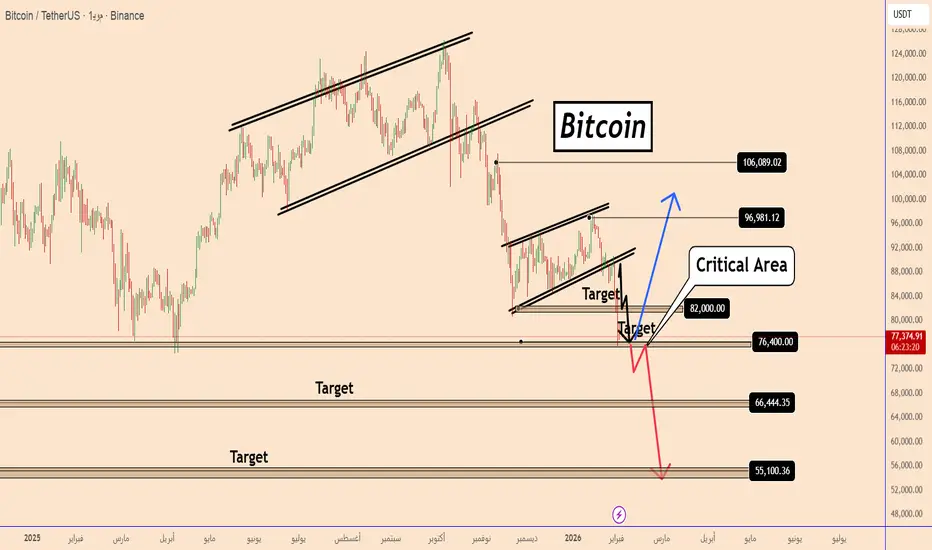
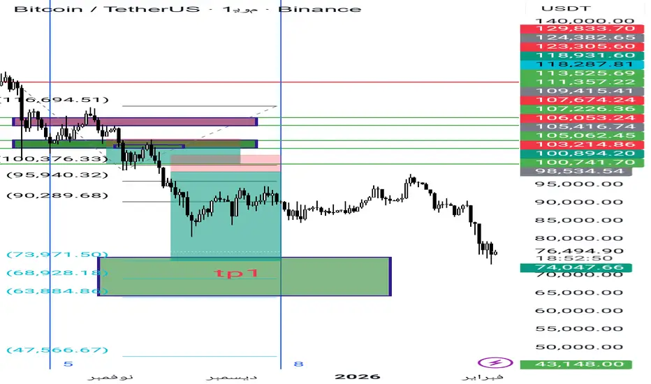
البيتكوين بين الانهيار والانفجاركما هو موضح كسرمستويات 74 مع الاغلاق السلبي الاسبوعي دلاله واشاره قويه علي الدخول في البير ماركت
وربما يتزامن مع ازمه عالميه يطول فيها الهبوط
او يحافظ علي 74 ويتجاوز 98 هنا من الممكن ان يستمر الصعود بشرط اختراق القمه التاريخيه 126 الف

تتطلب أفضل الصفقات البحث المعمق، ثم الالتزام بخطتك.
ابدأ مجانًا0 دولار إلى الأبد، لا حاجة لبطاقة ائتمان

Scott "Kidd" Poteetرائد فضاء بولاريس داون

قد ينخفض سعر البيتكوين أكثر...قد ينخفض سعر البيتكوين أكثر...
كانت توقعاتي الهبوطية للبيتكوين فكرةً نشرتها قبل ستة أيام.
وصل السعر إلى الهدف الثاني ويبدو أنه مُهيأ لمزيد من الانخفاض.
علينا توخي الحذر لأن البيتكوين قد يرتد من مستواه الحالي.
لا يزال من غير الواضح بشكل عام ما الذي يفعله البيتكوين، نظرًا لتقلب توقعاته من صعودية
الفضة تحت الضغط قبل الإغلاق الأسبوعي | تصحيح صحي أم بداية انعكاس📉 تحليل الفضة XAGUSD | هل انتهى التصحيح أم ما زال مستمراً؟
الإطار الزمني: 4 ساعات | التاريخ: 30 يناير 2026
تتعرض الفضة حالياً لهبوط حاد وسريع بعد موجة صعود قوية أوصلتها إلى مناطق 120 دولار للأونصة، لتعود اليوم وتتداول قرب 98.7 دولار، وذلك بالتزامن مع الإغلاق الأسبوعي والشهري للسوق الأمريكية، ما يجع

نظرة تحليلة للنفط في الايام و الاسابيع القادمة شهد النفط تمركزاً عند مناطق مفصلية جداً قرب سعر 55 دولار، وهي مستويات مهمة على فريم الستة أشهر وتُعتبر مناطق اهتمام واضحة للمستثمرين. من هذه المستويات انطلق السعر باندفاع قوي، وصولاً إلى إغلاق شهري أعلى منها، وهذا يعكس قوة الدفع الشرائي.
حالياً، من المتوقع حصول تصحيح سعري يعيد النفط إلى مناطق ارتكاز
تقلبات عالية بعد بيع حاد، السوق في مرحلة إعادة التوازنسياق السوق
لقد شهدت الذهب للتو بيعًا حادًا وعدوانيًا على إطار الساعة H1، مما أدى إلى كسر الهيكل الصعودي قصير الأجل بعد اندفاع قوي مستمر. هذا النوع من الحركة يعكس عادة توزيع السيولة وإعادة التوازن لرأس المال، وهو شائع خلال الفترات التي تزداد فيها التقلبات المدفوعة بالعوامل الكلية.
من منظور كلي:
تظ
ارتفاع أسعار الذهب، استمروا في البيع!
شهد الذهب مؤخرًا تقلبات حادة نتيجة للاضطرابات الدولية وتأثير الاحتياطي الفيدرالي. وبالنظر إلى حركة سعر الإغلاق، من المرجح أن تستمر أسعار الذهب في الضغط الهبوطي الأسبوع المقبل، لكن هذا لا يعني أنني أفتقر إلى الثقة في زخم صعود الذهب. باختصار، كان الارتفاع في بداية الأسبوع بعيدًا كل البعد عن التحليل ا

تحليل فني للذهب مقابل الدولار M30تصحيح طفيف قبل القمة التالية | لانا ✨
لقد امتد الذهب بشكل حاد وهو يتداول الآن في منطقة مقاومة عالية، حيث يحتاج السعر غالبًا إلى تصحيح خفيف أو توطيد لإعادة بناء السيولة قبل محاولة مستويات أعلى مرة أخرى. تظل الاتجاهات العامة صاعدة، لكن فرصة الدخول التالية الأكثر نظافة من المحتمل أن تأتي من تراجع إلى

RBRK يصل الى مناطق جيده للشراء السهم : rbrk
نبذه مبسطة عن الشركة : شركة رائدة في مجال الأمن السيبراني لديها نمو ممتاز في الإيرادات ولكن التدفق النقدي الحر غير موجود حاليا ...
التحليل الفني
التوجه : صعود
اسباب الشراء :
1-السهم تراجع الى مستويات تفاعل سعري سابق
2- وصل مؤشر rsi الى تشبع البيع
3-شمعة اليوم جيده وليست ممتازه ( ن

EURUSD كسر شرائي قوي !
HI,Traders !
يتداول زوج #EURUSD في اتجاه صعودي،
وقد حقق الزوج اختراقًا صعوديًا قويًا لمستوى
الدعم الرئيسي 1.17784. وقد تأكد هذا الاختراق،
لذا نتوقع مزيدًا من الارتفاع يوم الاثنين !
Comment and subscribe to help us grow

(WTI) زخمه الصعوديكما كان متوقعاً في تحليلاتي السابقة، يؤكد خام غرب تكساس الوسيط(WTI) زخمه الصعودي . هيكلية السعر تؤكد قوة المشترين، بدعم من سياق جيوسياسي وطاقي متوتر مع بداية عام 2026.
📌 نقاط التحليل الرئيسية:
تأكيد الانحياز: لا تزال الرؤية طويلة المدى قائمة. السعر يحترم مستويات الدعم ويتجه نحو مستويات المقاومة ال

مشاهدة جميع اتحاليل المختارة من المحررين
Smart Trader, Episode 03, by Ata Sabanci, Candles and TradelinesA volume-based multi-block analysis system designed for educational purposes. This indicator helps traders understand their current market situation through aggregated block analysis, volumetric calculations, trend detection, and an AI-style narrative engine.
━━━━━━━━━━━━━━━━━━━━━━━━━━━━━━━━━━━━━━━

Asset Drift ModelThis Asset Drift Model is a statistical tool designed to detect whether an asset exhibits a systematic directional tendency in its historical returns. Unlike traditional momentum indicators that react to price movements, this indicator performs a formal hypothesis test to determine if the observed d

Hyperfork Matrix🔱 Hyperfork Matrix 🔱 A manual Andrews Pitchfork tool with action/reaction propagation lines and lattice matrix functionality. This indicator extends Dr. Alan Andrews' and Patrick Mikula's median line methodology by automating the projection of reaction and action lines at equidistant intervals, cr

Arbitrage Matrix [LuxAlgo]The Arbitrage Matrix is a follow-up to our Arbitrage Detector that compares the spreads in price and volume between all the major crypto exchanges and forex brokers for any given asset.
It provides traders with a comprehensive view of the entire marketplace, revealing hidden relationships among d

Wyckoff Schematic by Kingshuk GhoshThe "Wyckoff Schematic" is a Pine Script indicator that automatically detects and visualizes Wyckoff Method accumulation and distribution patterns in real-time. This professional tool helps traders identify smart money movements, phase transitions, and critical market structure points.
Key Features

Volume Cluster Profile [VCP] (Zeiierman)█ Overview
Volume Cluster Profile (Zeiierman) is a volume profile tool that builds cluster-enhanced volume-by-price maps for both the current market window and prior swing segments.
Instead of treating the profile as a raw histogram only, VCP detects the dominant volume peaks (clusters) insid

DeeptestDeeptest: Quantitative Backtesting Library for Pine Script
━━━━━━━━━━━━━━━━━━━━━━━━━━━━━━━━━━
█ OVERVIEW
Deeptest is a Pine Script library that provides quantitative analysis tools for strategy backtesting. It calculates over 100 statistical metrics including risk-adjusted return ratios (Sharpe

Arbitrage Detector [LuxAlgo]The Arbitrage Detector unveils hidden spreads in the crypto and forex markets. It compares the same asset on the main crypto exchanges and forex brokers and displays both prices and volumes on a dashboard, as well as the maximum spread detected on a histogram divided by four user-selected percenti

Multi-Distribution Volume Profile (Zeiierman)█ Overview
Multi-Distribution Volume Profile (Zeiierman) is a flexible, structure-first volume profile tool that lets you reshape how volume is distributed across price, from classic uniform profiles to advanced statistical curves like Gaussian, Lognormal, Student-t, and more.
Instead of forcin

Multi-Ticker Anchored CandlesMulti-Ticker Anchored Candles (MTAC) is a simple tool for overlaying up to 3 tickers onto the same chart. This is achieved by interpreting each symbol's OHLC data as percentages, then plotting their candle points relative to the main chart's open. This allows for a simple comparison of tickers to tr
شاهد جميع المؤشرات والاستراتيجيات
اهتمامات المجتمع
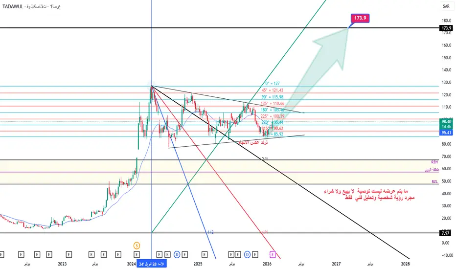
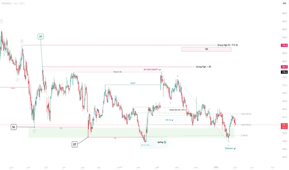
قو للاتصالات /7040 / اسبوعي السهم حقق مستهدفات الزوايا السعرية الهابطة وكون نموذج عاكس الاتجاه قاع أعلى من قاع في منطقة الزوايا السعرية وتم تحديد الاتجاه تصاعدي نحوهدف القمة التاريخية السابقة 173.90 كمرحلة أولى..... لنتابع وبالله التوفيق
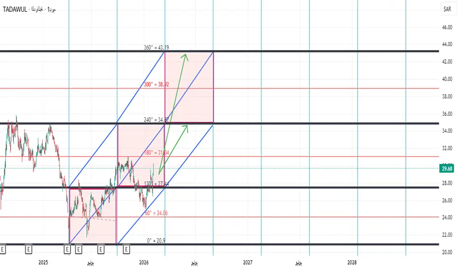
تحليل سهم الدوائية (السوق اسعودى)
تحليل سهم الدوائية (السوق اسعودى)
بثبات السهم اعلى 26 ريال وعدم كسر هذا الرقم بشمعه يوميه نتوقع له الصعود الى 34.80 وباختراقها يستهدف 43
اكواالانجاه العام:
قصير المدى هابط / ضعيف داخل نطاق عرضي مائل للهبوط.
السعر حالياً حول 187.3 بعد كسر واضح لعدة دعوم قصيرة
187.0 دعم لحظي (تم اختباره).
186.5 دعم مهم – كسره يفتح الطريق إلى:
185.8 – 186.0 هدف هابط تالي.
🔺 المقاومات
188.5 مقاومة فورية (متوسط + رفض سعري).
189.2 – 189.5 مقاومة قوي

العثيم تبادل أدوارعلى فاصل الساعة فالسهم قد حصل عليه تقاطع ذهبي، ومن المحتمل أن ينطبق عليه تبادل الأدوار
ليست توصية وإنما دراسة فنية
بدعمكم نستمر وبنقدكم نتطور
♥️النماء المالية ♥️
نظرة على سهم تسهيل ( التحديث الرابع نجاح التوقع )نظرة على سهم تسهيل ( التحديث الرابع نجاح التوقع )بتوفيق من الله كانت النظرة السابقة على سهم تسهيل من الناحية الفنية والتحليلية صائبة ومازالت توقع ان يكون هناك سلوك تجميعي مشابه لنموذج وايكوف قيد التكوين قائم بحيث :
1- توقفنا سابقا عند انه تم اختبار مناطق LPS + breaker وتم كسرها واننا نبحث عن علا
الماجد للعود / فاصل اسبوعينموذج انعكاسي يكتمل بالاغلاق الاسبوعي اعلى من خط العنق والمستهدف اعلى قمة حققها السهم

تحليل إغلاق سهم المنجم – استمرار الهيكل الصاعد بتاريخ 25 يناير 2شهد سهم المنجم اليوم إغلاقًا إيجابيًا عند مستوى 54.70 ريال بيع / 54.75 ريال شراء، مما يعكس استمرار الزخم الصاعد الذي بدأ منذ جلسة 20 يناير. هذا الإغلاق يُعتبر تأكيدًا إضافيًا على اختراق هيكلي سابق (BOS) على الإطار اليومي، ويعزز من احتمالية استمرار الاتجاه الصاعد خلال الأسبوع القادم.
السهم حافظ على ت

رؤية جميع تحاليل الأسهم
اليوم
6002هرفي للأغذية
Actual
—
Estimate
−0.05
SAR
اليوم
2290ينساب
Actual
—
Estimate
0.06
SAR
اليوم
4001أسواق ع العثيم
Actual
—
Estimate
0.09
SAR
اليوم
2020سابك للمغذيات الزراعية
Actual
—
Estimate
2.24
SAR
اليوم
1211معادن
Actual
—
Estimate
0.57
SAR
8 فبراير
2223لوبريف
Actual
—
Estimate
0.55
SAR
9 فبراير
4191أبو معطي
Actual
—
Estimate
—
9 فبراير
1830لجام للرياضة
Actual
—
Estimate
1.84
SAR
See more events
اهتمامات المجتمع
وصل سعر البيتكوين إلى مستوى دعم رئيسي، مع توقعات ببعض عمليات الشوصل سعر البيتكوين إلى مستوى دعم رئيسي، مع توقعات ببعض عمليات الشراء.
لا يزال الاتجاه العام للسوق هبوطيًا؛ إلا أن البيتكوين قد وصل إلى مستوى دعم رئيسي، ما بدأ يجذب اهتمام المشترين. عند هذه النقطة، يُتوقع حدوث تحول في السوق، ما يشير إلى إمكانية حدوث ارتفاع قصير الأجل.
يتم الاحتفاظ بالمراكز صغيرة مع

ETH في نطاق ضعيف بعد البيع، والارتداد محكوم بالفجواتشهد ETH موجة هبوط حادة ذات طابع اندفاعي، تلتها مرحلة تماسك أفقي عند مستويات منخفضة بدلاً من ارتداد قوي. هذا السلوك يعكس سوقاً ما زال في وضعية دفاعية، مع ميل واضح للاتجاه الهابط على المدى القصير والمتوسط. فوق السعر الحالي تتواجد مناطق SELL FVG متراكمة تشكلت أثناء الهبوط السريع، ما يدل على اختلال ناتج

البيتكوين (ساعتان) - ضغط هبوطي مستمرلا يزال سعر البيتكوين يتحرك ضمن قناة سعرية هابطة على مدى ساعتين. يحافظ هيكل السوق على قمم أدنى باستمرار، مما يشير إلى استمرار سيطرة ضغط البيع. وتُعدّ الارتفاعات في الغالب تصحيحات فنية، حيث يعود السعر لملء منطقة FVG (مكاسب القيمة العائمة) قبل أن يواصل الهبوط.
حاليًا، يتفاعل السعر عند منطقة العرض داخ

يواصل سعر البيتكوين انخفاضه - تم رفض منطقة المقاومةيتفاعل سعر البيتكوين بشكل ضعيف للغاية عند منطقة المقاومة السميكة أعلاه، وهي منطقة سبق أن انخفض سعرها عدة مرات.
لا يزال هيكل السوق هابطًا، وإذا لم يتمكن البيتكوين من اختراق هذه المنطقة، فقد يعيد اختبار مستوى 72,553 كما هو موضح في السيناريو.
- يشهد مؤشر الدولار الأمريكي وعوائد السندات ارتفاعًا طفيفً

BTC: يقترب من 100K📢 بعد تصحيح هابط، أكد BTC وجود دعم قوي عند 74K. لقد قمنا بتراكم مراكز شراء عند القيعان، والآن يُظهر السوق علامات على التعافي. على الرغم من أن السوق الصعودي الكامل لا يزال يحتاج إلى وقت للتطور، يجب أن نستعد تحت مستوى 80K ونتظر اختراق السوق للصعود.
💡 استراتيجية تداول BTC لليوم:
💰 شراء BTCUSDT عند 7

BTCUSD – سيناريو ارتداد صعوديسجّل السعر أدنى مستوى جديد، لكن ضغط البيع تراجع، وظهر ضغط شراء واضح عند منطقة الدعم.
يشير هذا النمط إلى احتمال حدوث تصحيح فني بعد الانخفاض الحاد.
ركّز على عمليات الشراء قصيرة الأجل عند الارتداد، مستهدفًا مستوى 69,000.
يبقى الاتجاه العام هبوطيًا، لذا ركّز فقط على صفقات الارتداد، وتوخَّ الحذر في إد

هدف البتكوين اذا على الشارت الاسبوعي للبتكوين نلاحظ نموذج.ايجابي رأس وكتفين مقلوبة وهو الآن يختبرها اذا نجح الاغلاق الاسبوعي فوق خط.العنق الهدف واضح 323478 ولكن إذا فشل في الوقوف فوق خط العنق بأغلاق اسبوعي فهذا فشل النموذج
كل أحد.مسؤول عن قرار الشراء والبيع
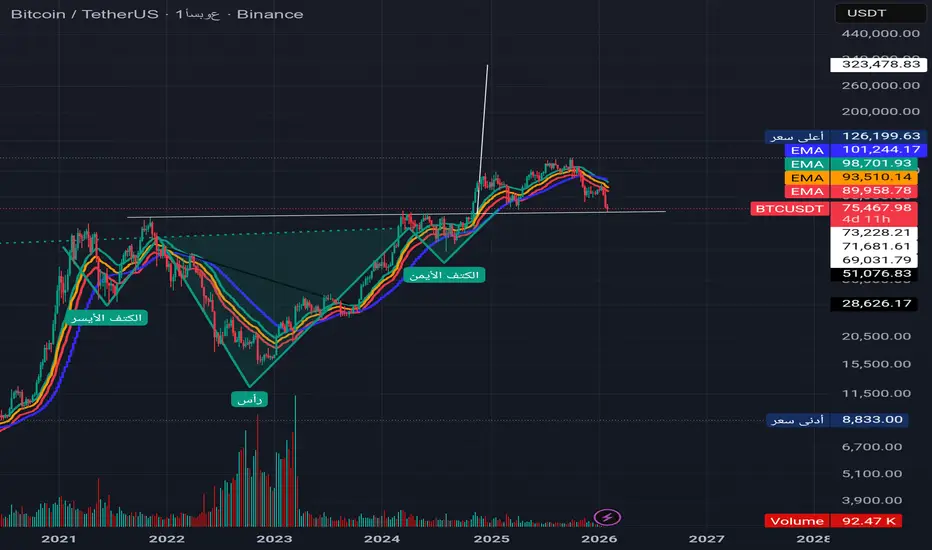
هذا التحليل من اربع أشهر هذه منطقه دعم قويه ممكن يرجع يصحح لفوق يعني يرتد من هنا واذا ما لم يخترق وبقي الاتجاه هابط سنرى مستويات اذني من ذالك والله تعالى أعلم واعلم
يواجه BTCUSD مخاطر مستمرةتتراكم عملة البيتكوين بشكل جانبي بعد الانخفاض الحاد، لكن الهيكل العام لا يزال لا يدعم سيناريو الزيادة المستدامة.
شهد السعر عمليات بيع قوية، ثم شكل تراجعًا فنيًا وتحرك جانبيًا أسفل منطقة مقاومة مهمة جنبًا إلى جنب مع سحابة إيشيموكو. حقيقة بقاء السعر تحت السحاب بشكل مستمر تظهر أن القوة الشرائية دفاعية

الموجة الصعبة انتهت تقريبًا… هل اقتربت مكافأة الصبر؟ETH – تحليل موجات إليوت
• الإيثريوم أنهى موجة دافعة قوية قرب 3,800–4,000$.
• الهبوط الحالي يُقرأ كموجة (4) تصحيحية وليس تغيير اتجاه.
• الموجة (4) غالبًا تأخذ طابع تصحيح جانبي/زمني (إرهاق وصبر).
منطقة نهاية الموجة (4):
2,100 – 1,900$
(وفي السيناريو الأعمق: 1,700$)
ما بعد التصحيح:
بانتهاء (4) يُت
شاهد جميع تحاليل العملات الرقمية
توازن الذهب مع تقلبات الفيدرالي المتزايدةXAUUSD | خطة المال الذكي اليومية – H1
الذهب لم يعد في وضع التوسع. بعد الحركة الصعودية القوية من نطاق التجميع، قدم السعر سيولة الشراء إلى الارتفاعات السابقة المتميزة وأظهر فورًا علامات على البيع المؤسسي. الرفض الحاد من منطقة البيع FVG + OB السابقة يؤكد التوزيع بدلاً من الاستمرار.
السعر الحالي يعكس

الذهب يشهد تقلبات حادة، والمتداولون يواجهون صعوبات1️⃣ الاتجاه الرئيسي
السعر يتحرك ضمن اتجاه صاعد متوسط المدى.
خط الاتجاه الصاعد (الخط المتقطع) يعمل كـ دعم ديناميكي.
2️⃣ المقاومة المهمة
منطقة المقاومة 5100 في الأعلى هي المنطقة التي تم رفض السعر عندها عدة مرات.
تُعد هذه منطقة عرض قوية، مع احتمال كبير لظهور ضغط بيعي عند عودة السعر إليها.
3️⃣ أقرب

GOLD قريب من منطقة بيعية !
HI,Traders !
ان #GOLD على وشك إعادة اختبار مستوى
مقاومة أفقي جديد عند 5100.38 وهو
مستوى عرض قوي يُتوقع منه حدوث
ارتداد هبوطي !
Comment and subscribe to help us grow !

تحليل حصري لتداول الذهب!
تراجعت محاولة الذهب الثانية للارتفاع مبكرًا؛ واستراتيجية اليوم هي التداول ضمن نطاق واسع، الشراء عند انخفاض السعر والبيع عند ارتفاعه!
تداول الذهب ضمن نطاق واسع أمس، وأغلق على نمط دوجي على الرسم البياني اليومي. وكما ذكرت سابقًا، يُعد مستوى 5100 نقطة اتجاه رئيسية. بعد ما يقرب من يومين من حركة صعودية

الذهب | حذر الاحتياطي الفيدرالي وضغوط الدولار القوية على الأسعارالذهب | حذر الاحتياطي الفيدرالي وضغوط الدولار القوية على الأسعار
انخفض سعر الذهب إلى ما يقارب 4800 دولار للأونصة، منهيًا بذلك انتعاشًا قصيرًا مع ارتفاع قيمة الدولار الأمريكي بعد أن أشار الاحتياطي الفيدرالي إلى توخي الحذر بشأن خفض أسعار الفائدة. وأكدت ليزا كوك، محافظ الاحتياطي الفيدرالي، على استمرار

إكس أو (H45) – رؤية ليامXAUUSD (H45) – رأي ليام
تصاعد المخاطر الجيوسياسية | الذهب يتفاعل من الطلب
يمت stabilizing الذهب حول منطقة الطلب 4745، حيث يتفاعل السعر من خط الاتجاه الصاعد بعد انخفاض تصحيحي. الهيكل الحالي يشير إلى تجمع قصير الأجل، مع المشترين المدافعين عن القيمة بدلاً من استمرار البيع العدواني.
من منظور كلي، فإن

تراجع حاد في سوق الذهب: فرصة أم فخ؟ استيقظتُ هذا الصباح لأجد أنتراجع حاد في سوق الذهب: فرصة أم فخ؟
استيقظتُ هذا الصباح لأجد أن الذهب قد استعاد تقريبًا خسائره، بينما لا تزال الفضة منخفضة بنسبة 11%. ولكن ما أهمية ذلك؟ إنها مجرد عملية تهدئة للسوق؛ فالسوق يتعرض للتلاعب، سواء كانت الانخفاضات كبيرة أم صغيرة، فالنتيجة واحدة. والخبر السار هو أنه بعد هذه الاضطرابات، ان

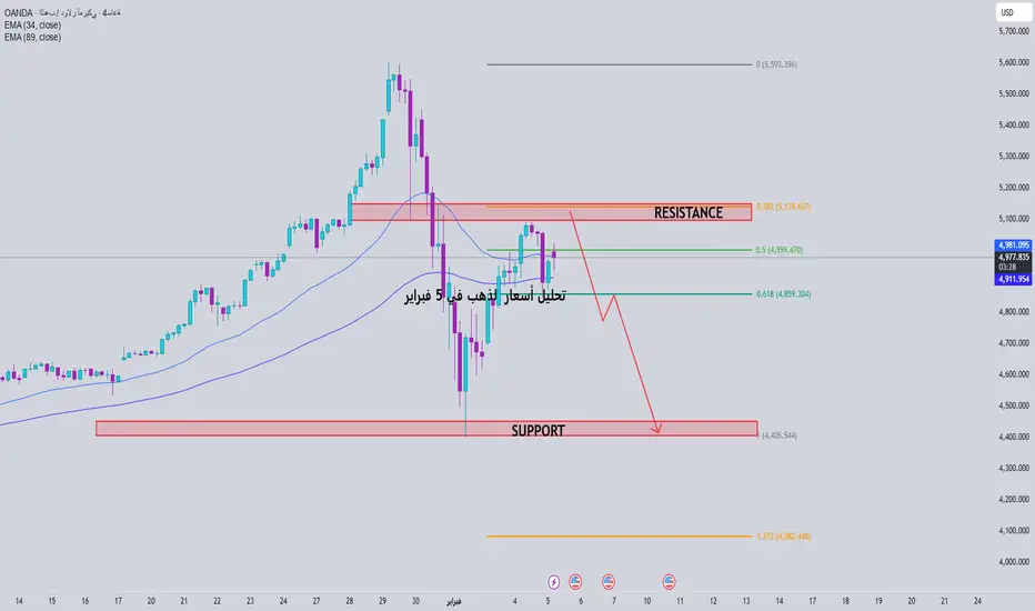
تحليل أسعار الذهب في 5 فبراير📊 نظرة عامة على هيكل السعر
لا يزال الاتجاه صعوديًا على المدى المتوسط، بينما يمر السعر على المدى القصير بمرحلة تصحيح فني/ارتداد جانبي بعد انخفاض حاد.
يقع السعر الحالي عند حوالي 4.97xx، محصورًا بين منطقتي المقاومة العلوية والدعم السفلية ← السوق متردد، ومن المرجح حدوث اختراق قوي.
🔴 منطقة مقاومة مهمة
توقع حركة الذهب لهذا اليوم و الاسبوع القادمتوقعات بعد الهبوط العنيف و التمركز على المنطقه اسبوعيه التي شاركتها في تحليل السابق و تفاعل قوي من ثم تصحيح اننا صنعنا ثاني قاع لموجه صاعده والله اعلم
(الله يرزقكن ويرزق منكن)

هل سيستمر سعر الذهب في الانخفاض؟التحليل الفني للذهب:
المقاومة اليومية: 5100، الدعم: 4500
المقاومة على الرسم البياني لأربع ساعات: 5980، الدعم: 4660
المقاومة على الرسم البياني لساعة واحدة: 4900، الدعم: 4800
أكمل الذهب نموذج قمة مزدوجة على الرسم البياني اليومي، حيث ارتد إلى حوالي 5091 قبل أن يبدأ تصحيحًا هبوطيًا ثانيًا. على الرغم

شاهد كل تحاليل العقود المستقبلية
اليورو دولار: خارطة الطريق بعد قرارات الفائدة الأوروبيةتحليل لزوج اليورو مقابل الدولار الأمريكي EUR/USD – آخر التحركات والسيناريوهات المتوقعة
أهم الأحداث على الأجندة الاقتصادية اليوم:
قرار الفائدة الصادر عن بنك إنجلترا (فبراير): جاء القرار بالتثبيت عند 3.75%.
قرار الفائدة الصادر عن البنك المركزي الأوروبي (فبراير): جاء القرار بالتثبيت أيضاً عند 2.15%

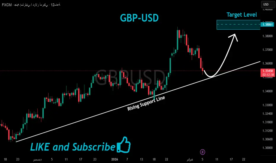
GBPUSD قريب من دعم صاعد !
HI,Traders !
زوج #GBPUSD على وشك إعادة اختبار
مستوى الدعم الصاعد، بينما يتداول
في اتجاه صعودي، لذا أنا متفائل، وأعتقد
أننا سنشهد ارتدادًا صعوديًا !
Comment and subscribe to help us grow !
تحليل أسعار الذهب في 4 فبراير📊 زوج الذهب XAUUSD - سعر الذهب الفوري | التحليل الفني (الساعة)
بعد الانخفاض الحاد السابق، يمر الذهب بمرحلة ارتداد فني، لكنه لم يؤكد بعد انعكاس الاتجاه. يشير الوضع الحالي إلى أن السوق يتراجع ضمن اتجاه هبوطي أوسع.
🔎 الهيكل والاتجاه
لا يزال السعر أدنى مستوى مقاومة قوي، ولم يتمكن من تكوين قمة أعلى.

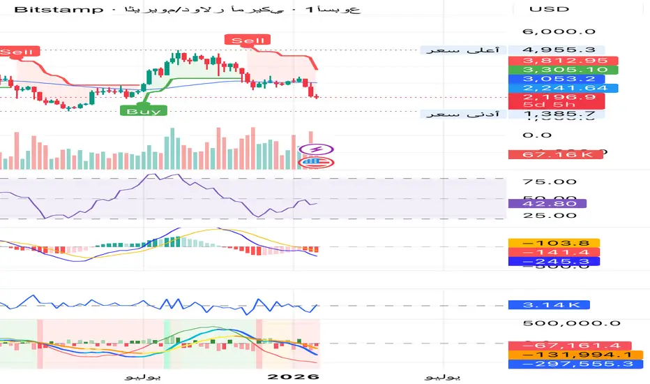
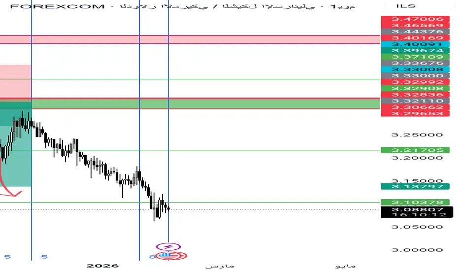
هذا تحليل للدولار مقابل الشيكل قبل أربع أشهر كان 3.45توقعنا هبوط الى هذا المستوى من أربع أشهر لمنطقه 3.12 _ 3.08
الكندي يلامس السقف… هل يبدأ الضغط البيعي؟🔍 الوضع الحالي
زوج CADJPY اندفع بقوة نحو الأعلى، لكنه الآن يقترب من منطقة عرض واضحة كانت سابقاً نقطة انعكاس قوية للسعر ⚠️
📍 أين نقف الآن؟
السعر يختبر منطقة عرض (Supply Zone) حساسة، وهي منطقة يُتوقع عندها دخول البائعين مجدداً، خاصة بعد الحركة الصاعدة الأخيرة 👀
📉 السيناريو المفضل
مع اقتراب السعر

زوج EUR/USD تحت الضغط — الزخم الهبوطي مستمريواصل زوج EUR/USD التداول تحت ضغط واضح مع بداية جلسة يوم الاثنين، حيث لا يزال الاتجاه يميل إلى الهبوط في ظل قوة الدولار الأمريكي عقب إعلان الرئيس دونالد ترامب ترشيح كيفن وورش لتولي منصب رئيس الاحتياطي الفيدرالي (Fed) القادم.
على صعيد الحركة السعرية، يدخل الزوج حاليًا مرحلة استقرار وتذبذب قصير الأجل

اليورو/دولار يحافظ على الصعود لكن الزخم يتباطأارتفع الزوج بقوة من مستوى 1.16 مع تكوين قمم وقيعان أعلى والخروج الواضح فوق السحابة، ما عكس سيطرة المشترين. لكن عند منطقة 1.20 وما فوق بدأت السرعة تتراجع، وظهرت شموع بأجسام صغيرة وظلال علوية طويلة مع عودة لاختبار فجوات القيمة العادلة أسفل السعر، وهو سلوك شائع لاتجاه صاعد يمتص جني الأرباح لا لانعكاس ف

شاهد كل تحاليل الفوركس
تداول مباشرة على Supercharts عبر الوسطاء المدعومين لدينا، والمُعتمدين بالكامل، والمقيّمين من قِبل المستخدمين.


