
الجنيه الإسترليني مقابل الدولار: الاتجاه الصاعد ما زال مسيطراًعلى إطار H4، لا يزال زوج GBP/USD محافظاً على هيكل صاعد واضح، حيث لم يتم كسر تسلسل القمم والقيعان الصاعدة. التراجع الأخير ذو طابع فني بحت، ما يشير إلى استمرار سيطرة المشترين وغياب إشارات توزيع حقيقية.
مناطق FVG السفلية ما زالت تُحترم بشكل واضح؛ فكل تصحيح يجذب طلباً جديداً يملأ فجوات القيمة قبل استئن

تتطلب أفضل الصفقات البحث المعمق، ثم الالتزام بخطتك.
ابدأ مجانًا0 دولار إلى الأبد، لا حاجة لبطاقة ائتمان

Scott "Kidd" PoteetThe unlikely astronaut

إكس أو يو دولار: مخاطر جيوسياسية تدعم الذهب | تداول التراجع.XAUUSD (H2) – وجهة نظر ليام: المخاطر الجيوسياسية تظل ساخنة، والذهب يبقى مدعومًا | تداول الانخفاض، استهدف السيولة ATH
ملخص سريع
الرسائل الأخيرة من البيت الأبيض حول فنزويلا مباشرة جدًا: المسؤولون يشيرون إلى أن واشنطن ستدفع كراكاس لـ "العمل لمصلحة أمريكا"، حيث يتم الإبلاغ عن أن روبيو على تواصل، في حين

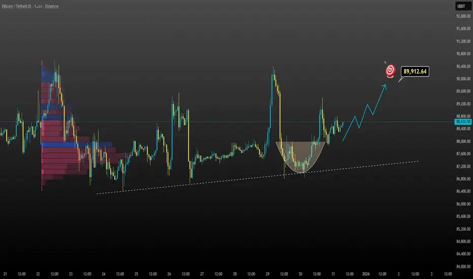
انتعاش قوي للبيتكوين هذا الأسبوع!يحافظ البيتكوين على اتجاه صعودي واضح ضمن نطاقه السعري الصاعد. بعد الاختراق، تراجع السعر إلى منطقة الطلب (المنطقة الخضراء) وتم استيعابه جيدًا، مما يشير إلى ضغط شراء نشط.
السيناريو المفضل (صعودي):
يستقر السعر لفترة وجيزة ضمن منطقة الدعم قبل استئناف الاتجاه الصعودي.
الهدف هو الحد العلوي للنطاق السعري

تحليل يورو دولار
� التحليل الشامل
1️⃣ التحليل الفني (Technical Analysis)
• الاتجاه العام على فريم 4H:
◦ صاعد تصحيحي داخل نطاق عرضي
•
• السعر حالياً:
◦ أسفل منطقة عرض واضحة
◦ أعلى مناطق طلب قوية
•
• الزخم:
◦ ضعف شرائي واضح قرب القمة
◦ بداية ضغط بيعي قصير المدى
•
2️⃣ التحليل الموجي (Elliott

XAGUSD الفضة حين تتصارع الذاكرة مع القرارقراءة محمد الحلواني 🔱
تنبيه صارم للمحافظ الصغيرة:
الفضة في هذه المرحلة ليست أداة رحيمة. الحركة سريعة، والارتدادات خادعة، وأي دخول بلا خطة خروج واضح = استنزاف.
التحليل
ما نراه على الفضة ليس اتجاهًا صريحًا، بل مرحلة توازن حاد بعد تصريف علوي.
السعر صعد بقوة، تم بيعه من القمم، ثم عاد ليستقر فوق طلب و

سهم طيبه فريم يومي تم التنويه عنه مسبقا على فريم اسبوعي ان منطقة (35) منطقة شراء جيده
الان على الفريم اليوم
التوجه : شراء
الأسباب :
1- تشبع بيع على مؤشر RSI
2-لدينا شمعة سلبيه حمراء باحجام تداول عاليه (خلال الاسبوع الماضي)في منطقة دعم تاريخه(قمم تاريخيه سابقه من 2006) ثم جائت بعدها ثلاث شموع لم تكسر قاع الشمعة الح

تحليل الذهب - استمرار الاتجاه الصعودي في دائرة الضوء"الذهب يتوقف مؤقتًا، وليس في حالة انعكاس - هل هذه مجرد فترة راحة قبل موجة صعودية جديدة؟"
لا يزال الاتجاه الصعودي قائمًا بعد الاختراق القوي. يتذبذب السعر حاليًا بشكل جانبي فوق مستوى الدعم 4440، مشكلاً نمطًا من قمة أعلى وقاع أعلى. ويُعد هذا التذبذب الجانبي الحالي بمثابة توطيد صعودي بعد النبضة الدافعة

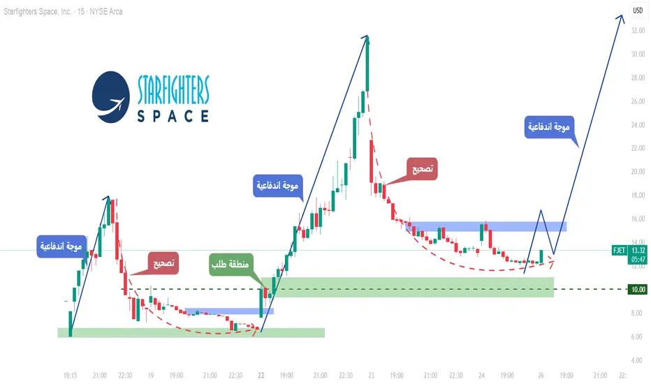
FJET – هيكل ما بعد الطرح العام يبدأ بالتشكّل!بعد ظهوره الأول في الأسواق العامة، قدّم Starfighters Space (FJET) ما نراه عادةً في الإدراجات القوية:
اندفاع سعري واضح 📈، تلاه تصحيح صحي 📉، والآن بدأت ملامح الهيكل السعري بالظهور.
هذه المرحلة تحديدًا هي التي تبدأ فيها الفرص الحقيقية بالظهور.
📊 التحليل الفني
الدورات تتكرر بوضوح على FJET 🔄
في ا
[تحليل اتجاهات الذهب: عودة السيولة تعزز الزخم الصعودي؛ التصحيح ق
افتتحت أسعار الذهب العالمية يوم الجمعة (26 ديسمبر) بأداء قوي متواصل. وقد تعافت سيولة السوق تدريجيًا بعد العطلات، بالتزامن مع تزايد التوقعات بخفض سعر الفائدة من قبل الاحتياطي الفيدرالي، مما دفع عمليات شراء مستمرة. ورغم أن مؤشر الدولار الأمريكي أظهر انتعاشًا فنيًا قصير الأجل، إلا أنه لا يزال تحت ضغط

هل يواصل مؤشر الدولار الهبوط؟ مستويات فنية مهمة تحت المجهرتحليل مؤشر الدولار (US Dollar Index - DXY) على المدى القصير – آخر التحركات والسيناريوهات المتوقعة؟
بعد استمرار ضعف الدولار بدعم من البيانات الاقتصادية المتعلقة بخفض أسعار الفائدة الأمريكية، ووجود توقعات برؤية مزيد من الخفض خلال عام 2026.
وبناءً على هذه التحركات حتى الآن، فهناك سيناريوهات محتملة خ

مشاهدة جميع اتحاليل المختارة من المحررين
Arbitrage Detector [LuxAlgo]The Arbitrage Detector unveils hidden spreads in the crypto and forex markets. It compares the same asset on the main crypto exchanges and forex brokers and displays both prices and volumes on a dashboard, as well as the maximum spread detected on a histogram divided by four user-selected percenti

Multi-Distribution Volume Profile (Zeiierman)█ Overview
Multi-Distribution Volume Profile (Zeiierman) is a flexible, structure-first volume profile tool that lets you reshape how volume is distributed across price, from classic uniform profiles to advanced statistical curves like Gaussian, Lognormal, Student-t, and more.
Instead of forcin

Multi-Ticker Anchored CandlesMulti-Ticker Anchored Candles (MTAC) is a simple tool for overlaying up to 3 tickers onto the same chart. This is achieved by interpreting each symbol's OHLC data as percentages, then plotting their candle points relative to the main chart's open. This allows for a simple comparison of tickers to tr
Vdubus Divergence Wave Pattern Generator V1The Vdubus Divergence Wave Theory
10 years in the making & now finally thanks to AI I have attempted to put my Trading strategy & logic into a visual representation of how I analyse and project market using Core price action & MacD. Enjoy :)
A Proprietary Structural & Momentum Confluence System

Per Bak Self-Organized CriticalityTL;DR: This indicator measures market fragility. It measures the system's vulnerability to cascade failures and phase transitions. I've added four independent stress vectors: tail risk, volatility regime, credit stress, and positioning extremes. This allows us to quantify how susceptible markets are

Volatility Risk PremiumTHE INSURANCE PREMIUM OF THE STOCK MARKET
Every day, millions of investors face a fundamental question that has puzzled economists for decades: how much should protection against market crashes cost? The answer lies in a phenomenon called the Volatility Risk Premium, and understanding it may fundam

Volume Gaps & Imbalances (Zeiierman)█ Overview
Volume Gaps & Imbalances (Zeiierman) is an advanced market-structure and order-flow visualizer that maps where the market traded, where it did not, and how buyer-vs-seller pressure accumulated across the entire price range.
The core of the indicator is a price-by-price volume prof

Match Finder [theUltimator5]Match Finder is the dating app of indicators. It takes your current ticker and finds the most compatible match over a recent time period. The match may not be Mr. right, but it is Mr. right now. It doesn't forecast future connection, but it tells you current compatibility for today.
Jokes aside,

Trend Line Methods (TLM)Trend Line Methods (TLM)
Overview
Trend Line Methods (TLM) is a visual study designed to help traders explore trend structure using two complementary, auto-drawn trend channels. The script focuses on how price interacts with rising or falling boundaries over time. It does not generate trade sign

Breakouts & Pullbacks [Trendoscope®]🎲 Breakouts & Pullbacks - All-Time High Breakout Analyzer
Probability-Based Post-Breakout Behavior Statistics | Real-Time Pullback & Runup Tracker
A professional-grade Pine Script v6 indicator designed specifically for analyzing the historical and real-time behavior of price after strong All-Ti

شاهد جميع المؤشرات والاستراتيجيات
اهتمامات المجتمع


إكستراعلى فاصل الساعة فالسهم في مناطق جذابة، ومرشح للصعود بشكل كبير.
هذه قراءة فنية وليست توصية
بدعمكم نستمر وبنقدكم نتطور
❤️النماء المالية ❤️

قد يرتفع الى 23يحدث الانحراف الإيجابي (Bullish Divergence) عندما:
تُشكل حركة السعر قاعاً أدنى من قاع (السعر ينخفض).
بينما يُشكل المؤشر الفني (مثل RSI أو MACD) قاعاً أعلى من قاع.
الدلالة: هذا يشير إلى ضعف قوة البيع واحتمال انعكاس الاتجاه من الهبوط إلى الصعود.
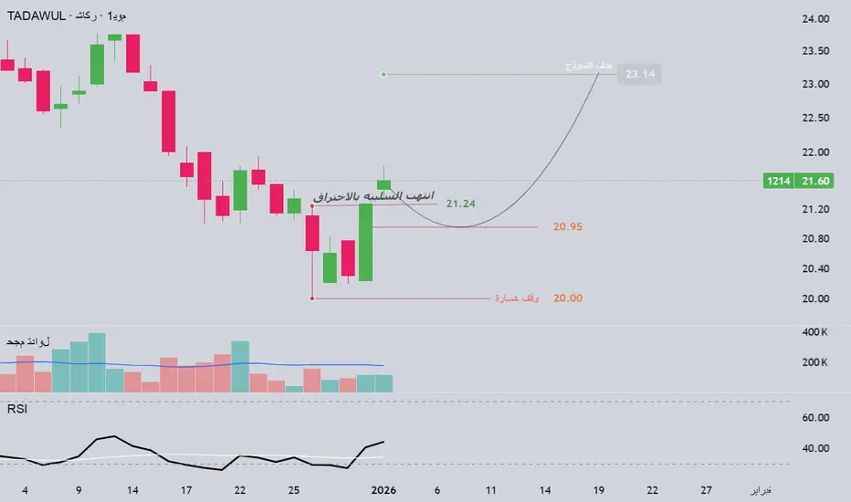
1214 شاكرجفاف العروض شمعه سلبيه تم اختراقها السهم اقرب ما يكون انه انتهى السلبيه والان متوجه الى اول هدف
ليست توصيه بيع ولا شراء
الهدف واضح ووقف الخساره واضح
اتوقع يرجع لمنطقه الشراء ولكن هذا التوقع ضعيف TADAWUL:1214
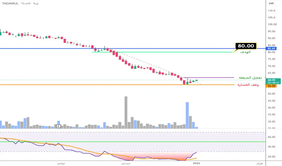
سهم الأسماك 6050 سهم الأسماك6050
التوجه : شراء
الأسباب :
1- تراجع الى مستويات 57 ووصل مؤشرRSI الى مستويات تشبع البيع على الفريم اليومي وكذلك الأسبوعي
2- ظهرت لدينا احجام تداول عاليه في يوم 29 ديسمبر2025 قبل 3 ايام
3- الشموع التي تشكلت بعديوم 29 ديسمبر جيده نوعا ما
4-اختراق الترند الهابط
متى يتم تفعيل الصفقه ؟

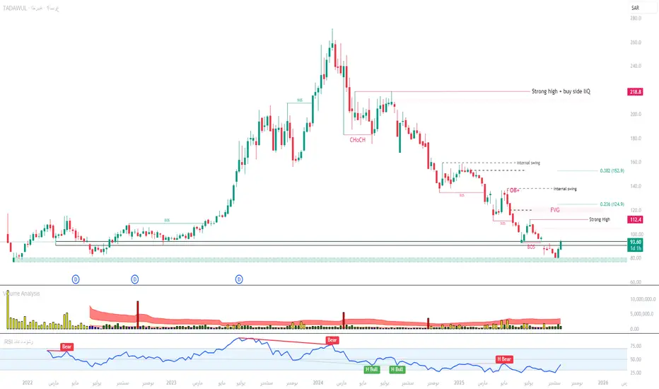
نظرة على سهم العربية للتعهدات الفنيةبعد التحية
تعتبر هوامش ومكررات سهم العربية للتعهدات الفنية تحت الضغط حاليا نظرا لوجود مخصصات مالية لعقد ريمات الرياض مع وجود نظره تفائلية مستقبلية محتملة للشركة نظرا للاحدث المستقبلة و احتمال تزايد الطلب على خدمات الشركة
فيما يخص الرسم البيان فالسهم مازال بمسار تصحيحي ومن المحتمل دخوله بمسار عرض
اشتر كهرباء السعوديةالنصيح التداول على المدى القصير من Naranj Capital
اشتر كهرباء السعودية(TADAWUL:5110)
● نطاق الشراء- 13.7 - 13.9
● هدف البيع- 15 - 15.3
● وقف الخسارة- أقل من 13.5
● العائد المحتمل- 8% - 10%
● فترة الاحتفاظ بالتجارة التقريبية- 14-15 يوم

مسار / 4 ساعات / 4325السهم حقق مستويات الزوايا السعرية وهو الآن في منطقة الطلب المحددة على الشارت وفقا لقاعدة AB=CD وتم تحديد الأهداف على الشارت على التوالي .... لنتابع وبالله التوفيق

رؤية جميع تحاليل الأسهم
لا توجد تقارير مجدولة
اهتمامات المجتمع
بيتكوين يواصل الصعود بثقة — قراءة هادئة من منظور أنثويبيتكوين (BTCUSDT) يتداول حاليًا قرب 93,300–93,400 USDT، محافظًا على زخمه الإيجابي بعد الاختراق القوي في بداية يناير. من وجهة نظري، المشهد العام لا يزال مريحًا؛ فالمشترون هم الطرف المسيطر، بينما التراجعات الأخيرة تبدو مجرد تصحيح طبيعي وليست إشارة على ضعف الاتجاه.
على نطاق أوسع، مزاج سوق العملات الرق

الاتجاه لا يزال قائماً، فالبيتكوين يستعد للمرحلة التالية.يواصل زوج BTCUSDT الحفاظ على اتجاه صعودي واضح، مع نمط قمم وقيعان متصاعدة. يتحرك السعر فوق خط الدعم الصاعد، مما يشير إلى استمرار ضغط الشراء بعد تصحيح قصير.
إذا استقر السعر فوق خط الاتجاه الحالي ومنطقة الدعم، فإن استمرار الاتجاه الصعودي نحو القمة العليا يبقى السيناريو الأرجح. أما التراجع الطفيف، فهو

هل يستمر الاتجاه الصعودي لزوج BTC/USDT؟يواصل زوج BTC/USDT تحركه ضمن قناة صاعدة، حيث يستقر السعر فوق المتوسط المتحرك الأسي 34 و89. وكان التصحيح الأخير مجرد تراكم عند مستويات أعلى، ولم ينكسر هيكل الاتجاه الصعودي.
الدعم الكلي:
لا تزال تدفقات رأس المال المؤسسي مستقرة، وتستمر توقعات تخفيف السياسة النقدية، والتوجه الإيجابي نحو المخاطرة في ب

BTC/USD H4 – توقف مؤقت لتجميع الزخم الصاعدمرحبًا بالجميع،
عند النظر إلى مخطط BTC/USD على إطار الأربع ساعات (H4)، ما يلفت انتباهي ليس بضع الشموع الحمراء الأخيرة، بل الطريقة التي بدأ بها السوق يهدأ بعد موجة صعود حاسمة وواضحة. فبعد التحرك من منطقة 88,000 وصولًا إلى ما يقارب 95,000، بدأ بيتكوين في التراجع التدريجي والدخول في نطاق 92,000–93,00

BTC - منطقة قرار داخل نطاق واسعالوضع الحالي
البيتكوين يتداول حاليًا داخل نطاق عرضي كبير على الإطار اليومي. بعد الهبوط القوي، السعر يتمركز فوق منطقة الطلب السفلية، بينما لا تزال منطقة العرض العلوية تفرض ضغطًا واضحًا.
منطقة الطلب السفلية كانت نقطة ارتداد قوية سابقًا، وما زالت تلعب دور الدعم الرئيسي.
السعر يتحرك حاليًا داخل قناة/

يشهد سعر البيتكوين انكماشًا، فهل يتجه نحو توسع؟البنية: يحافظ زوج BTCUSDT على اتجاهه الصعودي، حيث ارتد السعر صعودًا من خط الدعم وشكّل قاعًا مستديرًا، مما يشير إلى ضعف ضغط البيع وعودة تدريجية لتدفق الأموال.
السيناريو: السيناريو المُرجّح هو استمرار السعر في التماسك فوق منطقة الدعم، ثم مواصلة زخمه الصعودي نحو منطقة السيولة.
إذا بقي السعر فوق منطقة
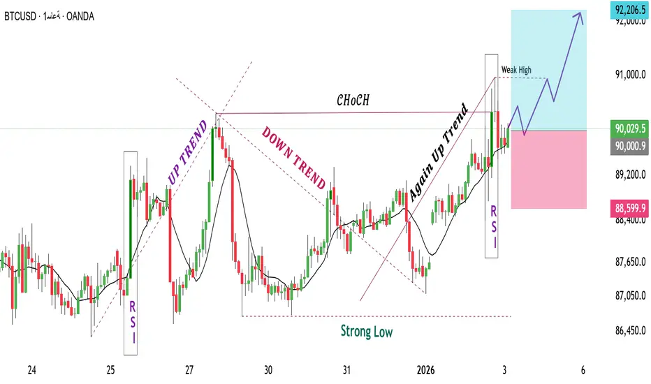
هيكل سوق BTCUSD إطار الساعة والمستويات الرئيسيةيُظهر زوج BTCUSD على إطار الساعة هيكلاً سعرياً مستقراً بعد اكتمال الحركة التصحيحية. وجد التراجع الأخير دعماً قرب مستوى 86,500 حيث تباطأ الزخم الهابط واستقر السعر. من هذه المنطقة، استعاد السوق مستوى 90,000 مما يشير إلى عودة السيطرة الإيجابية.
أعلى هذا المستوى، يبدأ السعر بتكوين قمم وقيعان أعلى، مما
البيتكوين في نطاق سعري حاسم: اختراق أم انهيار؟
يتذبذب سعر البيتكوين حاليًا ضمن نطاق سعري واضح، مع توازن بين المشترين والبائعين، مما يُؤدي إلى حالة من عدم اليقين في السوق. ويحوم السعر حول الحدين العلوي والسفلي لهذا النطاق، مما يجعله منطقة حاسمة لاتخاذ القرارات.
السيناريو الصعودي:
قد يُمهد اختراق مؤكد فوق 90,200 دولار الطريق لمزيد من المكاسب نحو

ETHUSD الإيثيريوم ارتداد ذكي… أم فخ سيولة جديد؟قراءة محمد الحلواني 🔱
تنبيه مباشر للمحافظ الصغيرة:
الإيثيريوم الآن في منطقة تُكافئ الهادئ وتُعاقب المتسرّع. الحركة ليست عشوائية، لكنها أيضًا ليست آمنة.
التحليل
الإيثيريوم خرج من نطاق تجميع سفلي طويل، ثم نفّذ اندفاعًا صاعدًا من الطلب القوي قرب القيعان، لكن الصعود الحالي يصطدم بعرض علوي ضعيف لم يُح

الاستفادة من تذبذب dash/usd بهذه الحدود.خلال هذا الاسبوع يكون محتمل تذبذب dash بهذه الحدود
نزولا الى مستوي 41.10
ثثم يصعد الى مستوي 44.77

شاهد جميع تحاليل العملات الرقمية
تحليل أسعار الذهب في 7 ينايريتحرك الذهب حاليًا وفقًا للسيناريو المذكور سابقًا، حيث يتفاعل السعر بوضوح عند منطقة المقاومة النفسية حول 4500. مع بداية جلسة التداول الآسيوية، بدأت تظهر ضغوط بيع، مما يشير إلى بدء عمليات جني الأرباح على المدى القصير.
على المدى القريب، من المرجح أن يستمر هذا التصحيح، حيث تُشكل منطقة السعر حول 4400 م

تحليل الفضة في الإتجاه الصاعدالسلام عليكم
تحليل الفضة الذي يتداول في الإتجاه العام الصاعد إخترق السعر منطقة 78.00 للأعلى التي كانت تشكل منطقة مقاومة والآن أصبحت منطقة دعم عندما أصبح السعر فوقها، يمكن للسعر أن يستكمل السعر الإتجاه الصاعد نحو القمة التاريخية 84.50 وربما الى قمة جديدة في ظل التطورات السياسية والأزمات الجديدة الت

تحليل موجات إليوت XAUUSD – 07/01/2025
1. الزخم (Momentum)
الإطار الزمني D1
– زخم D1 يقترب حاليًا من منطقة التشبع الشرائي
– نحتاج إلى انتظار إغلاق شمعة D1 اليوم للتأكيد:
– إما أن يدخل الزخم بالكامل منطقة التشبع الشرائي
– أو يبدأ بالانعكاس الهبوطي
– ننتظر إغلاق الشمعة لتأكيد الإشارة التالية
الإطار الزمني H4
– زخم H4 في حالة تراجع
– وهذ

الذهب: ارتداد وتطورات جيوسياسية، هل نرى قممًا تاريخية جديدة؟تحليل الذهب (XAUUSD) – في ظل التطورات الجيوسياسية الأخيرة والسيناريوهات المتوقعة؟
ارتدت أسعار الذهب اليوم أعلى مستوى 4290 دولار للأونصة بعد التصحيح من أعلى مستوى تم الوصول إليه حول 4550، مدفوعًا بكثير من العوامل وأهمها الآتي:
التطورات الجيوسياسية الأخيرة في فنزويلا وتأثيرها على كثير من الأصول ال

تحليل منتصف الأسبوع للذهب: تزايدت المخاوف بشأن المخاطر الجيوسياستحليل منتصف الأسبوع للذهب: تزايدت المخاوف بشأن المخاطر الجيوسياسية وتوقعات خفض أسعار الفائدة، مما أدى إلى تقلبات فنية قوية في أسعار الذهب.
نظرة عامة على السوق: يوم الثلاثاء (6 يناير)، وخلال جلسات التداول الآسيوية والأوروبية، ارتفع سعر الذهب الفوري إلى أعلى مستوى له في أسبوع عند 4474.11 دولارًا للأو

الوضع الراهن لا يزال على حاله.١️⃣ خطوط الاتجاه
شرح:
يُحافظ خط الاتجاه الهابط على استقرار السعر ← تُعدّ هذه المنطقة حاسمة في تحديد الحركة التالية.
صورة: على الرغم من أن الأسعار تُسجّل قيعانًا أعلى على المدى القصير، إلا أنها لم تخترق خط الاتجاه الهابط بعد ← لم يتم تأكيد انعكاس الاتجاه على المدى المتوسط.
٢️⃣ المقاومة
٤٥٢٠ - ٤

الذهب H1: قراءة تصحيح صحي عند منطقة المقاومةمرحبًا، أنا كاميلا.
عند ملاحظتي للرسم البياني H1، أرى أن الذهب قد وصل إلى منطقة مقاومة محددة بوضوح، وهو يتفاعل معها حاليًا بدلًا من اختراقها بشكل اندفاعي. وبدلًا من استمرار صعودي قوي، تُظهر حركة السعر حالة من التردد، مع شموع أقصر ونطاقات متداخلة. هذا السلوك يشير بالنسبة لي إلى أن الزخم الصاعد يمر

XAUUSD (H1) – قناة صعود قائمة، تصحيح قصير الأجل...سياق السوق
في 7 يناير، تعرض الذهب والفضة الفوريان لضغوط بيع قصيرة الأجل.
انخفض الذهب الفوري نحو 4450–4455 دولار أمريكي/أونصة بعد ارتفاعه الأخير.
وانخفض الفضة الفوري تحت 79 دولارًا، مما يعكس جني الأرباح القصيرة الأجل عبر المعادن الثمينة.
يبدو أن هذا التصحيح فني وتصحيحي، وليس تحولًا في الاتجاه الص

XAUUSD – هيكل صعودي سليم، التركيز على شراء التصحيح📌 سياق السوق
يستمر الذهب في التداول ضمن هيكل صعودي قصير الأجل بعد إكمال المرحلة التصحيحية وتشكيل قاع أعلى واضح. تشير consolidation الأخيرة أدنى المقاومة إلى أن السوق في مرحلة إعادة التوازن، وليس في مرحلة العكس.
من منظور أساسي، لا يزال الدولار الأمريكي تحت الضغط في ظل مشاعر المخاطر الحذرة وتوقعات ا

يلا XAUMO — تقرير يومي شامليلا XAUMO — تقرير يومي شامل (نسخة مؤسسية واعية بالعطلات)
وقت التقرير (Africa/Cairo): الأربعاء 07-يناير-2026 08:58 (UTC+2)
النطاق: خريطة XAUUSD + إطار تنفيذ (تعليمي فقط — ليس نصيحة مالية)
0) لقطة سريعة (من بياناتك وقت الالتقاط)
- XAUUSD (سبوت): 4,446.19 (-1.08%)
- GC1!: 4,456.20 (-0.89%)
- GC2!: 4

شاهد كل تحاليل العقود المستقبلية
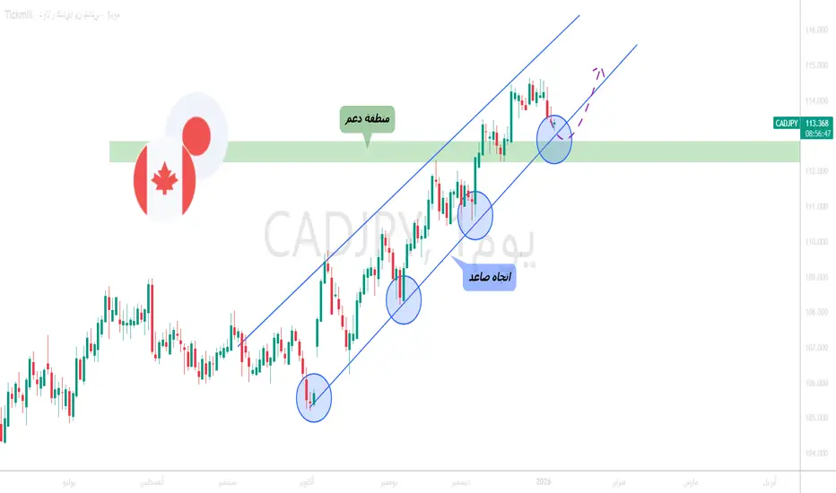
CADJPY - الشراء مع الاتجاه الصاعد!الوضع الحالي
زوج CADJPY يتحرك منذ فترة ضمن قناة صاعدة واضحة باللون الأزرق، مع قمم وقيعان أعلى، ما يؤكد أن الزخم العام ما زال صاعدًا.
ما نراقبه الآن
السعر يتداول حاليًا قرب تقاطع منطقة الدعم مع الحد السفلي للقناة الصاعدة، وهي منطقة تقنية مهمة غالبًا ما تعطي فرصًا جيدة للدخول مع الاتجاه.
السينار
NZDJPY كسر بيعي قوي !
HI,Traders !
كان زوج #NZDJPY يتداول على طول خط الدعم الصاعد.
لكننا نشهد الآن اختراقًا هبوطيًا.
لذا نحن متحيزون هبوطيًا، ونتوقع مزيدًا من الانخفاض!
Comment and subscribe to help us grow !

النيوزيلاندي عند مفترق طرق: الضغط البيعي مستمر أم عودة الصعود؟تحليل فني لزوج الدولار النيوزيلندي مقابل الدولار الأمريكي (NZD/USD) – آخر التحركات والسيناريوهات المتوقعة؟
بناءً على التحركات حتى الآن، فهناك سيناريوهات محتملة خلال التداولات القادمة:
السيناريو السلبي:
رؤية مزيد من الهبوط وكسر والثبات أدنى 0.57357 قد يشير ذلك إلى السيطرة البيعية من جانب العرض ع

الجنيه الإسترليني مقابل الدولار: الاتجاه الصاعد ما زال مسيطراًعلى إطار H4، لا يزال زوج GBP/USD محافظاً على هيكل صاعد واضح، حيث لم يتم كسر تسلسل القمم والقيعان الصاعدة. التراجع الأخير ذو طابع فني بحت، ما يشير إلى استمرار سيطرة المشترين وغياب إشارات توزيع حقيقية.
مناطق FVG السفلية ما زالت تُحترم بشكل واضح؛ فكل تصحيح يجذب طلباً جديداً يملأ فجوات القيمة قبل استئن
زوج GBP/USD يواصل الارتفاع مع تبلور هيكل فني في بداية العامتحرّك زوج الجنيه الإسترليني/الدولار (GBP/USD) صعودًا خلال أول جلسة تداول كاملة في العام الجديد، مخترقًا مستوى مقاومة قصير الأجل يوم الاثنين. وينصبّ التركيز الآن على ما إذا كان الزوج قادرًا على البناء على هيكل فني أخذ بالتحسّن بهدوء منذ أوائل ديسمبر، في ظل عودة السيولة تدريجيًا إلى الأسواق.
اتجاه

GBP/USD – تم تفعيل الزخم الصاعد بعد اختراق حاسميُظهر زوج GBP/USD حركة صعودية قوية مع استمرار ضعف الدولار الأمريكي في ظل توقعات بأن يحتفظ الاحتياطي الفيدرالي بسياسة نقدية ميسّرة. ومع بداية العام، يتجه تدفق السيولة بعيدًا عن الدولار، ما يمنح الجنيه الإسترليني فرصة للظهور كبديل أكثر استقرارًا على المدى القصير.
على الرسم البياني، اخترق السعر بوضوح

AUD/USD – تباطؤ الزخم الصاعد وتزايد ضغوط التصحيحبعد موجة تعافٍ سريعة نسبيًا، بدأ زوج AUD/USD يُظهر علامات ضعف مع اقترابه من منطقة مقاومة علوية. ويبدو أن الارتفاع الحالي يعتمد بشكل أكبر على عوامل فنية، وليس على دعم قوي من الأساسيات الاقتصادية، ما يدفع السوق إلى تبني موقف أكثر حذرًا تجاه الدولار الأسترالي.
على صعيد الأخبار، تشير بيانات التضخم في أ

تحليلي لزوج اليورو باوند فريم الأربع ساعات ( EURGBP) - 4H كماهو موضح بالشارت يتداول زوج اليورو باوند ضمن تركيبة وولف ويف المكونة من 5 أضلع 1و2و3و4و5 وحاليا السعر عند الضلع رقم 5 ومن المتوقع الصعود من هذه المنطقة ليلامس تقاطع 1مع 4 .
المهم مراقبة السعر وانتظار تأكيدات للدخول .
إدارة رأس المال .
إدارة المخاطر .

GBPJPY عندما تُستدرج السيولة قبل الانطلاقمحمد الحلواني 🔱
زوج GBPJPY لا يتحرك بعشوائية، بل ضمن نطاق تراكمي واضح استُهلكت فيه السيولة على مدار جلسات متتالية.
ما نراه حاليًا ليس ضعفًا، بل عملية استنزاف ذكي للمراكز المتسرعة ، مع كسرات شكلية وارتدادات محسوبة.
المنطقة المحورية بين 210.00 – 210.90 تمثل قلب المعركة:
هي منطقة طلب قوية
شهدت تفا


شاهد كل تحاليل الفوركس
| - | - | - | - | - | - | - | - | ||
| - | - | - | - | - | - | - | - | ||
| - | - | - | - | - | - | - | - | ||
| - | - | - | - | - | - | - | - | ||
| - | - | - | - | - | - | - | - | ||
| - | - | - | - | - | - | - | - | ||
| - | - | - | - | - | - | - | - | ||
| - | - | - | - | - | - | - | - | ||
| - | - | - | - | - | - | - | - |
تداول مباشرة على Supercharts عبر الوسطاء المدعومين لدينا، والمُعتمدين بالكامل، والمقيّمين من قِبل المستخدمين.


